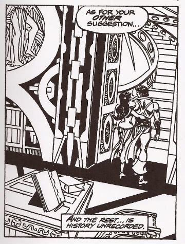
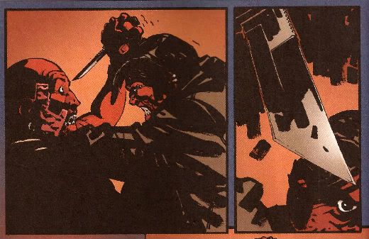
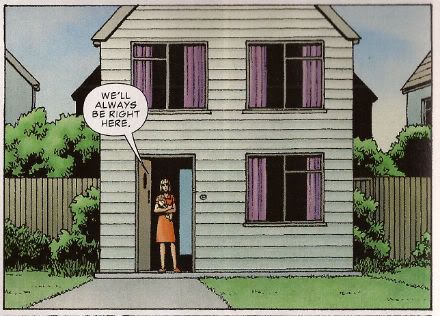
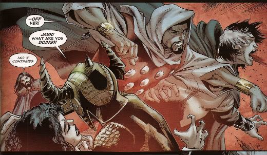
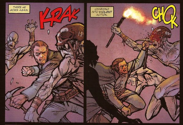
"Like Porcelain, They Shattered." Comics! Sometimes They Contain Ageless Horror!

Photobucket An eerie sense of deja vu descends upon you now as I talk about Richard Corben, Simon Revelstroke and a very odd house indeed. Viewings by appointment only, please call first to avoid disappointment!

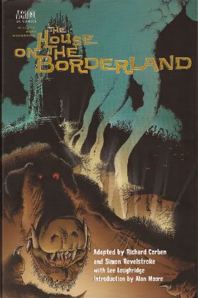
THE HOUSE ON THE BORDERLAND Adapted by Richard Corben and Simon Revelstroke Art by Richard Corben Words by Simon Revelstroke Coloured & separated by Lee Loughridge Lettered by Clem Robbins Introduction by Alan Moore Based on the book THE HOUSE ON THE BORDERLAND by William Hope Hodgson (Vertigo/DC Comics, H/B, Colour, $29.95 (2000))

Photobucket

Corben and Revelstroke’s 2000 adaptation of Hodgson’s 1908 novel is fronted by a lucid and informative introduction by one Alan Moore. Moore, not for the last time, reveals he has in fact not read the work (the adaptation rather than the novel, which he has read) in its entirety but assures his notional reader that it is no doubt of merit because Richard Corben is involved. No, this would not be the last time Moore would pass judgement on work he had not read but since his verdict here is positive and concerns the adaptation of a dusty old tome by an exponent of Comix it appears to have passed unnoticed and failed to ignite a conflagration of unfortunate dimensions.

Today such terms as “a conflagration of unfortunate dimensions” are applied to a bunch of people being vocal about their hurt feelings concerning what an exasperated old man whose opinion they don’t value thinks about some comics written by people who are a bit touchy and which involve characters shooting lasers from their eyes and flying about a bit. A scant few decades earlier such a description would have been applied to something like World War 1 (1914-1918). Now, the novel clearly precedes The Great War but Moore suggests it could reasonably be placed in the literary genre of ‘Invasion Literature’. Basically this is a series of novels/short stories produced independently by various and diverse authors such as H.G. Wells and John Buchan which seem to prefigure the horrendous event with their imaginative toying with the anxieties of society. I don’t recall if anyone ever actually claimed credit for predicting the apocaluptically sorry mess; it seems a little unlikely since people had some measure of self respect and would have drawn the line at enhancing their own reputations at the expense of an entire generation turned to bone meal. And Mark Millar hadn't been born then. Moore’s suggestion is novel since THOTB is initially a far less obvious candidate for inclusion in Invasion Literature than something like The War of The Worlds. Because THOTB is a far more chimerical beast indeed.

Photobucket

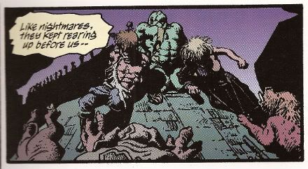
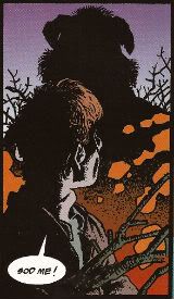
Moore’s claim is sound though as of the 85 pages which make up this adaptation fully 26 are concerned with the defense of the titular house from wave upon wave of animalistic invaders. It’s a relentless and exhausting read as the two humans, and Pepper the dog!, are driven further and further back; first into the house then to the very roof of the structure where the tide of mutant mis-shapes ceases finally but the horrors merely burrow deeper and attack more subtly. From hereonin the battle becomes apparently one between the narrator and the house itself characterised by sly suggestions and dark discoveries. The darkest of these is perhaps that the battle is intended not to destroy the narrator but to sway him to the house’s true purpose. For is it not called The House on the Borderland? Through the destruction of the narrator the intention seems to be to rebirth him as the master of the house, to accord him the function of guardian of The Borderlands. While defeat will entail his destruction the narrator’s victory can only ensure an eternal struggle to avoid a more encompassing and apocalyptic defeat.

Photobucket

But The Borderlands of what? The simple answer would be between sanity and insanity and, yes, that reading is here too. The narrator and his sister are initially presented as the ossified and reserved pair of any fiction which involves the wearing of top hats and frock coats on a daily basis. Soon though they are torn and dishevelled by their strenuous fight against “The Other” but once the physical forces recede the supernatural forces swell. Emotions become unseemly and desires best beaten with a stick become…apparent. Things fall apart. The narrator descends to the bowels of the house and becomes untethered from time (from reality?). Reality can no longer be trusted, surety is cast aside and as all times become one and the Black Sun (Black Hole?) with its boundless hunger can only be delayed not destroyed.

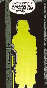
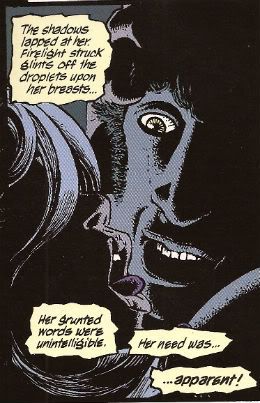
It’s pretty phantasmagorical stuff at once inviting and repelling comprehension. Aside from the inherent humour in Corben’s exaggerated stylings the adaptors play the whole thing straight. A prologue and epilogue are added to brace the main narrative with at least some form of closure without eroding any of the themes or atmosphere but the meat of the matter is as ever in the adaptation itself. While Corben is the star and the draw here Revelstroke does a nice job that shouldn't go unacknowledged. Confined largely to captions taken from the narrator’s recollections he (and Corben: synergy!) do a grand job of yoking them to images to their best effect. Sometimes the image will belie the caption, sometimes the caption will purposefully be woefully inadequate at describing the illustrated horrors and at times the horrors will be so overwhelming the caption is dropped entirely. Corben and Revelstroke understand about words and pictures and here they subdue their creative egos to the end of creating a satisfactory work. It would be easy to dismiss the writing as it never flails for your attention as though the writer were desperately elbowing the artist out of the way for the crumbs of your attention. Easy but wrong. Often the taut restraint pays off beautifully and I’ll try and demonstrate that now with my favourite bit. Here is something that would appear in the original novel upon the printed page without visual reinforcement:

The shadows lapped at her. Firelight struck glints off the droplets upon her breasts…Her grunted words were unintelligible. Her need was…apparent!

Nice stuff, particularly as you know, if you read it in context, that “she” is his sister. Such interactions between siblings, at least in England, are generally regarded as being wrong. Not even if she has an anachronistically denuded pudenda. So, nice, yes, but not as nice as:

Photobucket

Isn’t that jolly super! I thus trust Simon Revelstroke’s talent is…apparent!

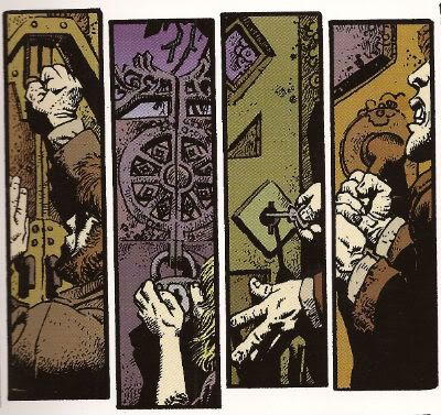
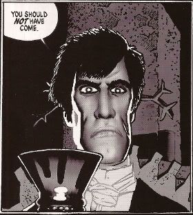
And Corben? Alan Moore says in his introduction, “Mr. Richard Corben, in his finest visionary form, a genuine giant of his chosen medium.” And he ain't pissing up a rope there, kids! To adapt something as well-regarded as THOTB the comic has to bring something special. As good as Mr. Revelstroke is his words are no replacement for the Hope Hodgson's originals. But add them to the bloated beauty of Richard Corben and we've got something magical happening. While in RAGEMOOR Corben utilises a more traditional technique, one appropriate to the traditional genre trappings of his tale, in THOTB Corben embraces the swirling nuttiness of the on-page happenings to bust out some smooth moves visually. There’s plenty of variations on these pages in panel size, shape and position and they all have their part to play in the narrative structure Corben’s embedded them into. If there’s a page which consists solely of a grid then it’s a rarity and such a rarity that it doesn't spring to my mind. Corben’s varying variations keep the eye moving about and engaged.

Photobucket

There’s no extended stretch where the eye can become complacent. Even panels simply placed next to each other will be slightly larger or smaller than their neighbours. The mission here seems to be to keep the eye moving, keep the eye interested, keep that eye engaged, keep that eye on its toes. The contents of the panels are the usual Corben glories. Everything has that weirdly organic texture whether it be flesh, fauna, smoke or stone. And he does that thing with the angles. That thing where he draws a scene from an unfamiliar angle but also positions the elements in a fresh way usually with shadows employed to further occlude the meaning of the image; forcing you to halt your gaze and look at it until it reveals itself. It’s a great way to control the pace of the reader without having to use up real estate on splash pages. Embracing the lurid and fanciful shenanigans he’s asked to illustrate Corben’s pages are at times hypnotically arresting. The savage combat, the twisted landscapes, the mis-shapes and malformations and the whole bizarre and disconcerting deal play to Corben’s strengths. And yet the finest part of his work here, for me, is one of the more subdued scenes where the narrator has laid behind him a trail of candles which begin to go out one by one as the darkness, and whatever calls it home, relentlessly pursues him.

In the introduction Alan Moore also makes mention that he is pleased that the novel THOTB has escaped the attempted whitewashing of genre fiction from earlier centuries. Corben and Revelstroke’s adaptation should help entail the novel remains in the public imagination. Provided someone points out that said adaptation exists and that it is VERY GOOD! Of course it'd probably help if some other folks read it too.

Photobucket

And like all sense of sanity, decorum or restraint I am gone!

Hope you had a nice weekend and read some COMICS!!!

"It Has A HEART And A MIND!" Comics! Sometimes They Are Dissolute.

Photobucket Come Sir, or Madam, set yourself beside this hearth and join me in a snifter as we peruse a periodical of low-repute and learn of a very naughty home, a most naughty home indeed!

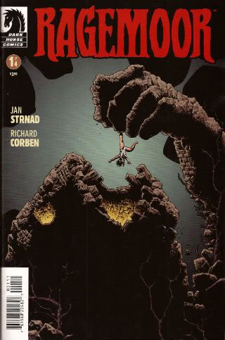
RAGEMOOR #1 (of 4) Art by Richard Corben Story by Jan Strnad Letters by Nate Piekos of Bambot ® RAGEMOOR created by Richard Corben and Jan Strnad (Dark Horse Comics, 2011,$3.50,B&W)

Centuries before The Nazarene Castle Ragemoor fed upon pagan blood and grew. Without the hand of man Castle Ragemoor found shape and substance. Now Castle Ragemoor sleeps a dark sleep. Now interlopers have invaded its walls with profit in mind. They have brought with them man’s base nature and awakened the dark appetites of Castle Ragemoor itself. Appetites that only the interlopers themselves can sate. Castle Ragemoor stirs and hungers and whatever walks within Castle Ragemoor walks alone (and probably has very large secondary sexual characteristics).

Photobucket

One needs only the most cursory of acquaintances with the work of Mr. Richard Corben to realise that he is partial to The Gothic, to The Horror. Throughout his career it is a genre he returns to again and again. He has produced numerous adaptations of the works of such lurid luminaries as Mr.Poe, Mr. Lovecraft and Mr. Hope Hodgson and RAGEMOOR shows he is not above creating such works from whole cloth, aided and abetted in this latest endeavour by his common collaborator Mr. Jan Strnad.

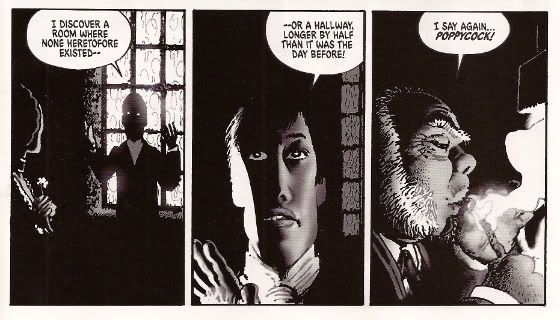
Mr. Strnad sets the scene simply and elegantly for it is a simple scene to set for it is a simple story; one of greed and gory. It must have been tempting to lard great globs of prose most purple over the art. It would have probably failed to harm the work but Mr. Strnad resists this inclination, instead leaving the characters to reveal themselves through dialogue, actions and Mr. Corben’s singular art. For Mr. Corben's art is indeed most singular. Its most singular aspect being in the nature of its excess. Fat people are not just fat they are bloated, the repressed are not just repressed they are practically frozen, the bosoms are not just large they are monumental and, aye,  gravity weighs heavily upon them. Mr. Corben's art is exaggerated to the very brink of parody, indeed the very edge of tastefulness. Given the genre this is fitting, this is meet.

Photobucket

Given the primacy of Mr. Corben's visuals when considering the low-born medium of this comical periodical it would seem most just to refer to the debased shadowplays of the Hammer and American International Pictures studios of days now dead. Films that beneath staid surfaces fair roiled with debauchery, degradation and decay. Films that displayed a society whose grandeur had passed its peak and was now spotted with rot. A society where Man could hide his decadence behind piety but never from forces older than Man's God. Such vengeful forces as are embodied, quite literally, by Castle Ragemoor itself.

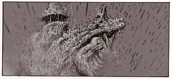
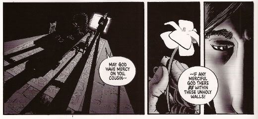
Castle Ragemoor is a massive edifice cosseted by shadows without and decorated by darkness within. Mr. Corben chooses to err on the side of suggestion and minimalism in much the same way that Roger Corman’s Poe films did. Although Mr. Corman’s inventions were spurred by budgetary constraints Mr. Corben’s budget is unlimited and yet he still chooses to nail each interior scene onto the page with great slabs of black. One can only surmise that these deep, dark walls of nullity are intentional. Characters are fixed within settings of stark darkness which fade to grey at times revealing surroundings warped and flaking with age. Where there is light, and there is light upon occasion, it flares its brightest at times of violence.

Photobucket

Only from the illumination provided by the violence of flame, of storm, of a new day being born does the darkness of Castle Ragemoor recede. But it only ebbs to reveal a scene of implicit or explicit horror  and while,yes,  near pages' end the sun’s light gains ascendancy it is only a brief respite as darkness moves in from the edges of the final panel, remorselessly reclaiming Castle Ragemoor. For Castle Ragemoor is a dark place because Castle Ragemoor is A Dark Place. This darkness is fitting, this darkness is meet.

Photobucket

Indeed to the uncharitable reader RAGEMOOR could be dismissed as mere homage, mere pastiche, but could only be dismissed entirely as such by one who feels both terms are themselves lacking in value from the off. And yet, and yet, is it not oft-times a case not of what has been done but how well that thing has been done? Given that your author has a weakness for both pastiche and homage he finds RAGEMOOR has been done very well indeed and is thus compelled, though it be an affront to nature and The Lord, to accord it a most boisterous VERY GOOD!

Have a most blessed weekend all and in the name of the one true God I implore you to read some COMICS!!!
Quick Notice: Because There Are Reviews, There Will Be No Reviews.

Hibbs is out of town but he emailed me yesterday, breathlessly and with that slipshod sense of punctuation you expect from people on the road (oh how I wish I had that excuse!), to let me know that it was very important that  I tell everyone that, yes, he had written reviews but no, he had not thought to bring his password with him and so, even more so, no, there will be no reviews from him until after 4/3...not because there aren't reviews, mind you! (No, of course not.) So...there's that.  In the interim, please check out John K's excellent review of the Goodwin/Simonson adaptation of Alien and also, Tucker Stone's latest slate of reviews over at The Comics Journal, complete with a most excellent cameo from Abhay.  It is a fine, fine way to start your day, and a healthy part of this complete breakfast.

Carry on!

"I Admire Its PURITY." Comics! Sometimes They Are A Bit Like Films (ALIEN)!

Photobucket (Or: Never Put an Englishman called Kane in charge.)

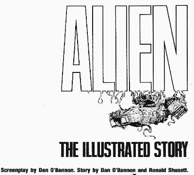
Photobucket ALIEN: THE ILLUSTRATED STORY Art by Walter Simonson (b.1946) Words by Archie Goodwin (1937 - 1998) Lettered by John Workman (b.1950) Based on 20th Century Fox's science fiction hit, ALIEN (Heavy Metal Futura Publications, £2.50, 1979)

1. "It's Not Our Sysyem..." or I Start Talking.

It's only a slim volume this, a hair over 6o pages so the team have it all on to pack in the 117 movie minutes. In fact it's a ridiculously small amount of space but the bizarre thing is that they have any space at all. Why a comic adaptation of a film in 1979 of all years?  STAR WARS is why. Just as STAR WARS' mind damaging box-office success is the reason ALIEN was green-lit so was STAR WARS the reason for the existence of a comics adaptation. The comics adaptation of STAR WARS was very, very, very successful (alas, this had nothing to do with the fact that the world had woken up to the magic of Howard Victor Chaykin). Also the people working on ALIEN were pretty comics savvy and were familiar with HEAVY METAL (Ridley Scott has described his storyboards as being very "Moebius"). So that's why a comic and that's why a comic by HEAVY METAL.

Photobucket

ALIEN:THE ILLUSTRATED STORY(A:TIS) was intendended to spearhead a series of movie adaptations that would be serialised in HEAVY METAL and then collected. I don't know how many others were produced but I know there was the Veitch/Bissette 1941 adaptation (way better than the inert film) and Steranko's OUTLAND (like getting Picasso to adapt BEN10). This latter has never been collected in English so I guess the run of adaptations fizzled out pretty quickly. The then Art Director at HEAVY METAL John Workman was tasked with bringing the ALIEN adaptation to term and rang Carmine Infantino with the intention of having Infantino do pencils and Simonson do the inks.  Infantino's phone was busy so Workman rang Simonson and by the end of the call Simonson had smooth talked his way into doing the whole job. Simonson had the very bright idea of roping in editor par excellence Archie Goodwin for the non-pictorial tasks. It was one sweet team thus assembled and the results were the first comic to squat on the New York Times bestseller list and, even better, remain there for 7 weeks.

Photobucket

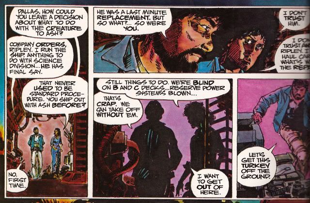
It's important to remember that A:TIS  is an adaptation not a replication. Some dialogue you may be familiar with is missing some you might not recognise is present. It's a little hard at this date to actually remember what dialogue is actually in the film what with Scott's incessant tinkering. As regards the 1979 original version there are, I assure you, textual differences. This is because Simonson & Goodwin (S&G) had access to 3 drafts of the script and used these to piece together a narrative they found most satisfying to the comics presentation. From the ground up the piece was built with its format in mind. They had also seen a cut of the film and had access to an abundance of stills so the book's visuals are clearly sourced on the cinematic offering. Not being composed of pure tedium S&G don't do a lumpen shot for shot representation so the familiarity with the settings/costumes etc. allow them to vamp some stuff and use unusual POVs without losing the visual consistency afforded by the production's tip-top designs. S&G don't have to design anything because it's all been done for them by Ron Cobb (ship interiors), Cris Foss (ship exteriors), Moebius (spacesuits) and H.R. Giger (alien stuff). They can just concentrate on designing the comic. And design it they do. Rather than go through the whole thing page by page which would break even the strongest reader's spirit I will now briefly alight on a few instances I find pleasing to mine eye.

2. "Oh, I Feel Dead." or (Slow) Motion.

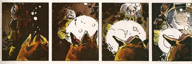
ALIEN the movie opens with a languorously paced sequence in which a strange transmission is received and the Nostromo's crew are awakened from hyper-sleep. This takes quite a bit of screen time but the comic doesn't have the same luxury in terms of space (using a shorthand of time=pages). What S&G do is pretty neat. They go to the opposite extreme and slow the scene down further. You could call it decompression even but it's a strange kind of decompression. They counterintuitively concentrate on the opening of a single eye to both illustrate the process of waking and set the tempo for the scene they are illustrating. Witness the four panels given over to Kane's eye opening:

Photobucket

This effectively sets the sluggish pace for the happenings depicted on the page and cues us in that the others will be waking equally slowly, because this is a slow process. It's a bold move to use so much of the sparse space available on so few seconds of screen time. Bold but effective as the sequence is emblematic of the waking process as a whole. The visual decompression acts a form of compression with regard to the content.

There then follows a depiction of Kane brewing up for his colleagues. I like this sequence because it shows the intelligence behind S&G's choices, because as in any adaptation choices have to be made. This takes up quite a lot of space, relatively speaking anyway. It is after all just a man brewing up which is precisely the kind of mundane task that you might think could be jettisoned

Photobucket

from the narrative without any loss being felt. But S&G recognise it is important in its very mundanity. When you wake up, you have a coffee. Even in space. It's a recognition of the crucial interplay of the familiar and the unfamiliar which anchor the film and allow for the later excesses to be accommodated without a break in the suspension of disbelief. Also, a lot more is happening in those panels than those of the preceding waking sequence. Note the single panel of the steaming cups indicating the repetition of the task without the need to actually repeat the other panels. The density of the panels indicate the pace is picking up compared to the sleepy start. With Kane's salutation the reader effectively receives a signal that the plot is now in motion.

3. "It Doesn't Look Like An S.O.S." or Sounds Without Sound.

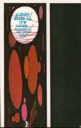
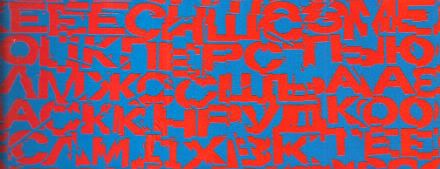
The movie uses sound design beautifully to evoke the otherness of certain occurrences such as the meaty phlop of the egg flaps opening or the screech of the skedadilling chest burster. Naturally the mute medium of  comics can do little but suggest these; usually through distortions in the lettering. With A:TIS S&G demonstrate that the power of suggestion can be surprisingly powerful. They attempt to replicate the scouring howl of the howling distress/warning transmission by choosing the most godawful combination of text and background colours known to reading beings. That's no accident. It's supposed to be perturbing. It'd be hard to make text anymore unsettling than engineering it to actually move around in a queasy manner at the slightest variation in your gaze. The fracturing of the letter shapes and the vibrating effect of the colour combination rattle the reader's gaze in a really quite clever manner.

Photobucket

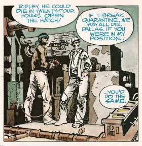
Unable to replicate the staticky crackle and insistent hiss of communication over comm-channels the decision was made to colour such speech blue. This doesn't actually communicate the texture of the noise but it does at least imply a difference in the sound emitted by the characters and the  sounds emitted by the technology around them. It would be hard for a non comics-savvy reader to parse the panel below without the visual cue of the colours. But because the rules of the text/colour device have been set up clearly in the earlier pages any reader would know that Brett and Parker were not hallucinating but hearing a comm transmission from someone not pictured in the scene.

Photobucket

4. "Open The Door!" or It's Constraining Men (and Two Women).

A key element in the tension that underscores the movie is the pervasive sense of claustrophobia.  The physical environment aids the film makers here with the sets being fixed and the ceilings having been lowered by some four feet to create a physically oppressive reality in which the action unfolds. Archie Goodwin was responsible for the placement of the balloons on the page while Workman lettered within them. Goodwin was an excellent editor and his positioning of the balloons suggests the presence of some considered intention. Now while it's possible to argue that the density of the speech is a result of the space limitations it's also possible to argue that the placement of the balloons is used to hem in the figures to create an additional level of constriction.

Photobucket

The words on the page are read as equally physical and present as the drawn environment in which the action occurs.The characters are doubly restricted by the ship drawn around around them with all its clutter and shadows and the very words they are speaking.

5. "All Other Priorities Rescinded." or Toeing The Company Line.

There are very few instances where this atmosphere of restriction are alleviated but there is a particularly jarring one which is used in the service of both characterisation and foreshadowing. There are some things a film can do which it is impossible to reproduce on the page. Crucially these include the incredibly convincing performances of all the actors involved. These are some good performances right there. There's no way via words and pictures to fully convey the shrill flakiness of Lambert (Veronica Cartwright), the passive-aggressive sniping of Brett and Parker (Harry Dean Stanton & Yaphet Kotto), the chafing enthusiasm of Kane (John Hurt), the fake-matiness of Ash (Ian Holm), the eroding confidence of Dallas (Tom Skerritt) and the uncertain certainty of Ripley (Sigourney Weaver). I can't believe even the best comic writer and the best comic artist could do more than approximate the fusion of emotional flavours in Weaver's reading of the simple line, "Micro changes in air density, my ass." I only point out this 'failure' so I can concentrate on the work's successes because Simonson & Goodwin do achieve some fantastic successes here. One of them is this:

Photobucket

During the film Ian Holm is able to subtly suggest Ash's oddness with a series of brief bizaritties that verge on the subliminal; his little standing jog, the intermittent twitchy moues and his inflexibly diagnostic gaze during the 'birth' sequence for example. It's a subtle string of hints and tics that build towards his character's revelatory scene. S&G don't have room for that but they get one good shot in with the above panel. From the stance to the complete nullity of the background they manage to communicate that as far as Ash is concerned only he exists and has any real import. Nothing around him matters, particularly not his crew-mates. He's the perfect Company Man. And like all Company Men he isn't really a man at all. Um, spoiler?

6. "It's Got A Wonderful Defense Mechanism. You Don't Dare Kill It." or (Quick) Motion.

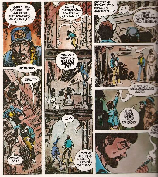
Punctuating the unhurried pacing of the film like a steel toothed phallus piercing a Brit thesp's chest are scenes of abruptly frantic action. One of the earliest of these occurs when the crew discover that the xenomorph sat on Kane's face has a charming defense mechanism in the form of acid for blood. S&G don't have a physical set they can hurtle through with a soundtrack and editing enhancing the action but they have a good go nevertheless.

Photobucket

The page itself is pressed into service as the film set with the panel breaks and gutters providing the editing. The eye has to travel from the top of the first column to the base then in the gutter it moves swiftly to the top of the second vertical which is interrupted by the in-panel floor levels suggesting "soft" breaks in the page which the eye lingers on but less so than "hard" white breaks. The speed of the gaze downwards is thus increased but not actually interrupted before zipping back up via the gutter again to the top of the third vertical where the division into four panels by "hard" breaks cause the gaze to slow before halting on the final panel. Reading the sequence the eye really covers some ground and together with the diminishing pace this adroitly captures the essence of the scene.

7. "Now, This Air-Shaft May Work To Our Advantage." or The Suspense of Uncertainty.

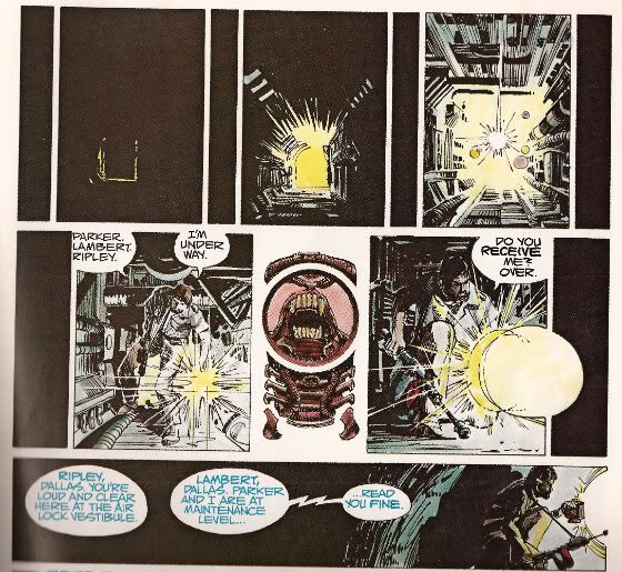
The sequence where Dallas scurries around in the guts of the ship in pursuit of the Alien is also rendered effectively despite the static nature of the form although here the techniques are a little more ambiguous. Purposefully so, I'd say. In the top layer we are adopting the POV of something other than Dallas, its uncertain whether we are seeing things from the Alien viewpoint or just a non specific POV. Then there are the thin vertical panels breaking up the larger images. Are these the Alien's POV? The increasingly illuminated panels interrupting these flat blacks indicate Dallas' imminent arrival.  When Dallas reaches our POV the interruption changes from black to a blare of white dominated by a bizarre image. It's clearly related to the Alien but is it the Alien reflected in Dallas' lamp lens? Is it the Alien sheltering in some comfy duct now the light has invaded its previously dark nest? Dallas forges on to the outer edge of the last horizontal panel but behind him there is darkness.

Photobucket

In fact there's an uncomfortable amount of darkness behind him, more than there is light in front; is that to indicate how far he's come or to indicate that now there is something behind him? The whole sequence depicts Dallas nearing our POV on the top layer, arriving at that POV in the middle layer and then moving away again in the final lower panel. There's a definite sense that what he was heading towards is now behind him. Something happened in there, the exact nature of which is imprecise but the implication is it isn't going to be good. There's just something really creepy and suspenseful about the whole thing which is perfectly appropriate and the uncertainty of it all exacerbates this.

8. "I Wanna Go Home And Party" or Hurray, I Shut up!

Yeah, sure, despite all this craft, talent and enthusiasm A:TIS never once manages to replace the audio-visual thrill of the film itself. But this would be an expectation held only by someone possessing an excess of optimism or a shortage of sense. It does however provided a surprisingly innovative comics experience. One that's still fresh and surprising on a technique level some three decades later. As I say I've just highlighted some of my favourite parts. There's plenty of other stuff on the pages such as Simonson's occasional use of organic bio-form borders, the use of splash pages at moments when they are most useful and even one page that is composed entirely of colour elements with no line work. This all sounds positivley innovative and challenging particularly as the modern tendency would surely be to to slap verbatim dialogue on unvaryingly widescreen panels. And, yes, if you break down the techniques on show they are quite complex but this complexity is  used entirely in the service of transparency of meaning. While Simonson has claimed that the book was accompanying a hit movie accounts for its unprecedented success it wouldn't be too outlandish to think that the high quality and accessibility of the end product itself might not have helped as well. ALIEN: THE ILLUSTRATED STORY is, after all, VERY GOOD!

Note: ALIEN: THE ILLUSTRATED STORY is due to be reprinted in May 2012.

Acknowledgements: If any facts have made it into this waffle that is due purely to the following sources: MODERN MASTERS: WALTER SIMONSON (TwoMorrows, 2006) THE ALIEN ANTHOLOGY (20th Century Fox, 2010 (Blu-Ray))

Photobucket Have a good weekend, all, and remember to read some COMICS!!!
Hibbs says "Heeellllo 3/14's comics!"

Two weeks in a row, yeah, baybee. AVENGERS ASSEMBLE #1: Yeowch, that was rather poor. Part of it is just how inconsequential the story felt (and part of that is having the stupid "Zodiac" characters as the antagonists... ugh, have they EVER been interesting?), part of it was the need for "Marvel Continuity" to now reflect "movie continuity" (despite the fact that this kind of material DOESN'T BRING IN A MEASURABLE NUMBER OF NEW READERS from the films to comics), so we've got "Dumb Hulk" running around here (And I think Bendis totally doesn't "get" his voice, sorry), despite that not being the Status Quo in the Marvel universe, or in any currently published "Hulk" comic, oops. I guess this entire comic is a spoiler? Weightless, flabby, and, of course, $4 for the privilege. Ew, this is absolutely EH work.

CROSSED BADLANDS #1: Gahd, what a horrible title. Well, at least Garth's back on the book he created, but I seriously think that this comic isn't sustainable 24 times a year, and that by June we'll be selling under half of what we might sell of this first issue. Anyway, it's Crossed, and it's Ennis, and so it's filled with all kind of depraved stuff you can just hear that naughty little boy giggling over, and while I like it, I don't really love it, and it's effectively an anthology series now, so we'll see what happens going forward, but for now: I like it, but don't love it. OK

FANTASTIC FOUR #604: I strongly liked this issue, even with it's fairly heavy Deux Ex Machina (even if that's an established plot point) -- I like it's message of Hope and family, even if I'm not exactly sure why the plan worked, or even how it got came up with or anything like that. Still: GOOD.

LUTHER: Hey, not at all a print comic, but Mark Waid's free "proof of concept" for his vision of Digital comics, where you advance through it with the arrow keys.  I liked the story quite a bit, but there's something that's not quite "comics" to me about the whole process.

Sometimes it is overt, like the panel where the shovel suddenly appears in frame, where I think "well, that's just animation, just only two frames, isn't it?"; sometimes it's more covert like all of the times where Waid is actually controlling the reading experience by forcing when balloons or panels actually appear.

I think that comics are, in some ways, as much about time and space as anything else, but all of those elements really should remain in the hand of the reader -- it's my choice if I want to read all of the captions on the page first, or which elements of the illustration I choose to believe are the most significant and deserve my focus.

One last consideration is that this story is all of 33 panels long. Just over 3 pages, if it was a Watchmen-style 3x3 grid. (This is, of course, a stupid thing to say -- if this same story was told on a print page, even if it was 3x3, the rhythm of it would be ENTIRELY different; this same story would, of necessity, be a different size and shape) And while it was a well told and reasonably engaging story, I can't really see spending (let's say) 99 cents for 33 panels of comics.

Having said that, I did very much like the story, and judging it entirely on the basis of the content, I'd call it GOOD. Sadly, it also has the tech issues, and those distracted me, rather than drawing me in, and that reduces my grade, ultimately, to an OK. Still, can't beat the price, go give it a read.

SAGA #1: Now this, on the other hand, I loved.  So much so that we've put a copy is (almost) every subscribers box and are offering it 100% money-back guarantee. "Star Wars meets Game of Thrones" is the easy log-line, but the more important thing is the characters are rich, the world intriguing, the dialogue crisp, and the art really swell. There's kind of this weird "MOONSHADOW" vibe going on with the narration, but, thankfully, without the hippies. Either way, this is a wholly wonderful start to a series by Brian K. Vaughan and Fiona Staples, and I thoroughly recommend this book as one to read. EXCELLENT.

SAUCER COUNTRY #1: Hrm. On the one hand, I find a lot compelling in here (especially the ghosts [?] of Pioneer 10), on the other hand I'm not sure that the lead thrust of the book is adequately established. It's weird when the supporting characters make more of an impression than the protagonist. I'll most certainly give this another issue (or two) to grab me, but this first one didn't GRAB me all by itself. I want to give it a low GOOD, but I'm having a really hard time actually doing so... it's more like an extremely high OK.

SECRET HISTORY OF DB COOPER #1: Here's the thing: the charm of the title rally depends on you know WHO "DB Cooper" is, and based on a bunch of informal polling virtually none of my customers do (Or, perhaps, some do once you explicitly say it to them -- "oh, yeah, I've heard of him"), which means that a huge chunk of the high concept is immediately swept away. The second problem is that this issue kind of just stops, and I could not, if you put a gun to my head and forced me to jump out of an airplane with $200k, tell you whatsoever what the premise of this book ACTUALLY is, other than the vague notion from the title. There just isn't anything here to get me to come back for issue #2, I'm sorry, which is the only real goal of a first issue. So: I liked what I read, and I liked the surreal concepts I saw, but I don't know why I would spend $4 for it exactly, or why I would want to come back for #2, unlike SAUCER COUNTRY which intrigued me JUST enough to say "Sure, give me another dose". So, yeah, this is merely OK, despite my enjoying the ride as I sat on it. I'd just never stand in line for a second go, y'know?

SHADE #6: I hate this comic because the art from Javier Pulido is SO good, and yet I don't give a single wet fart about any of the not-Shade characters, or what the superhero situation in Barcelona is, at all. It's "The Atlantis Problem" for me (I care about Aquaman and Namor; I DON'T care about "Atlantis". I care about Black Bolt and Medusa; I don't give a fuck about "The Inhumans". I very much love Wonder Woman; I'd rather like the street clean than read about Amazonian culture or what the Greco-Roman gods are doing in modern America. And so on). Y'know, I think that STARMAN worked because Jack was a fine "everyman" of a protagonist; and Shade was a TREMENDOUS foil/friend for him... but I think I only care about Shade in the context of Jack's world, because every issue I sit down, eager to read, and I walk away feeling "Man, that was just OK"

WOLVERINE AND X-MEN #7: Have I said this already? If every Marvel comic was at least as good and dense and humorous as this, then maybe people would be happy to pay $4 for it. But because so many Marvel books just aren't worth the four bones, nowhere enough people are buying this book in my store, and there's this (wrong, so far, in this case) feeling like you can't just read "one" X-book. Well, you can, and it should very much be this one -- it's action packed, it's hilarious, it's incredibly energetic. Jason Aaron is one of the very few writers in comics that I can think of that seems to be able to equally handle "dense, gritty narrative" and "light-hearted romp". I love Nick Bradshaw's art, too -- it's got this nice Art Adams-y thing going on without being derivative. This is probably my favorite superhero comic being published today, and I thought this issue was VERY GOOD.

That's me, this week -- what did YOU think?

-B

"And Kindly Remove Your Pelvis..." Comics! Sometimes They Are A Lot Like Last Time But Newer (John Carter pt.2)!

Photobucket  My name is John Kane and if my instructions have been honoured then what now assails your minds will be a continuation of the unfeasible events that occurred when I persisted in following the course of John Carter comics into the current Century. It is not for such as I to grant such an endeavour any merit for such a task can only fall to those who suffer the results. My chore has ended and yours has only begun...

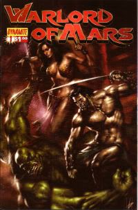
WARLORD OF MARS #1 - #14 (of an ongoing series) Art by Stephen Sadowski, Lui Antonio, Edgar Salazar Written by Arvid Nelson Coloured by Adriano Lucas, Shane Rooks, Maxflan Araujo, Marcello Pinto Lettered by Troy Peteri, Marshall Dillon Based on the stories by Edgar Rice Burroughs (Dynamite Entertainment, $3.99ea (except #1 which was $1.00))

Photobucket

Previously on 'An Old Man Talks Uninformed Shite About Comics No one Cares About' I discussed comics from 1952-3 and 1972-79 and went on about changes in comic storytelling between the '50s and the '70s. But only in a general way; not in a way that's going to suggest the presence of any original thought or anything. I was pretty happy to report that comics had come on a bit in terms of technique but what about by 2010 when this Dynamite series began? That'd be roughly 60 years since the Jesse Marsh Stuff and, say, around 30 years since the DC/Marvel stuff ended. Those numbers making up in roundness what they lack in precision, somewhat akin to a large boned gentleman's reflection in a fun-house mirror.

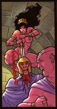
Photobucket Mars circa 2010.

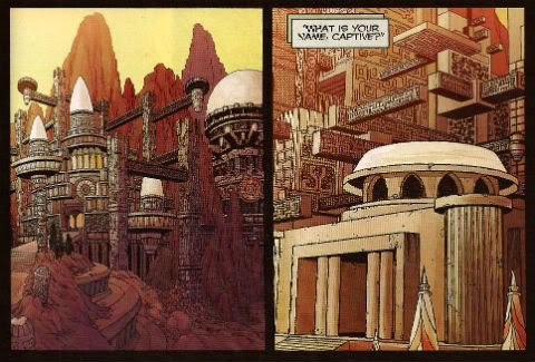
It takes this series 9 issues to adapt A Princess of Mars. That's a fact. Another fact is the same ERB book was adapted by Dell and Marvel in one issue. Okay those adaptations are hardly the most elegant of things but they are certainly entertaining and have momentum. So, no, they probably aren't as rich an experience as reading the novel but they are quite a good experience as far as reading a comic goes. To pack all that stuff into one issue some pretty brutal choices have to be made about what to include and where the narrative emphasis should lie. Even though the Dynamite series has room to sprawl about the place like a boneless teenager choices have also been made. I haven't read the original ERB novels but thanks to this pointless task I have set myself I have now read no less than 5 (FIVE!!!) comic book adaptations of A Princess of Mars. None of these are exactly the same in either events or tone. In every case decisions have been made.

Photobucket The Incomparable Dejah Thoris circa 2010

Tellingly the Dynamite series is touted as an "expansion of the sci-fi classic". So the fact it takes a whole heck of a lot longer to cover the same ground as previous adaptations is unsurprising. What is surprising is the time taken to get John Carter onto Mars. In the Dell series JC is on Mars by p.2, in the DC series he's there on p.5 while the Marvel series starts with him already there up to his cute tuchus in trouble! In 2010 (now sit down and have someone nearby ready to call the emergency services before you read this next bit) John Carter manifests on Mars on the 1st page of the...THIRD issue.

The only real reason to stick with a series clearly sold as being about a man having robust frolics on Mars for three issues in which his frolics are neither robust nor Mars-based is if you are a fan of ERB (or pulp) already. So, yeah, pretty much two of my least favourite modern tendencies (as in suicidal) in comics: no attempt to appeal to new readers and decompression. Stylistically this latter would be the biggest difference to have occurred in the 60 some years separating the Dell and Dynamite material. The boon of having plenty of room to spread any artistic wings is pissed away due to a lack of inclination to do so in a way which is constructive and a maddening tendency to prevaricate. But it's okay for modern comics to do that because the audience isn't going anywhere is it? Well, I guess I'm looking at different sales figures because that audience certainly seems to be going somewhere.

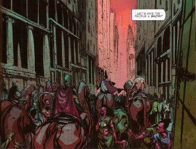
Photobucket Mars Action circa 2010.

(About decompression. Now, I'm aware that decompression can be a valid literary device but I am also aware that the term is often invoked in order to lend legitimacy to what is clearly better described as taking the piss. Language is quite a powerful thing and I think it is time we reclaimed "decompression" from those who abuse it to the furtherance of fluffing up both their own and their audience's egos. Next time you see the word 'decompression' try mentally replacing it with 'taking the piss'. I think the results will delight you! (Note: unless you are a diver in which  case I suggest you stick to 'decompression'.))

Photobucket John Carter circa 2010.

Now those are harmful inclinations but they are hardly unique to this comic (which is why they are so especially infuriating) and to judge this series on those grounds alone would be unfair. It's not a bad little series. There's evidence that some thought has gone into the presentation of the material. The narration is presented in a typeface akin to that in a words-alone book, there's some attempt at supplementary material intended to evoke the "true story" aspect of the original novels and the choice to up the ante on the tits'n'gizzards has clearly been made at an early stage. And, like a Calot returning to its own vomit, it's this I'd like to look at again.

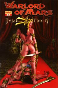
You could be forgiven for believing that I am some kind of sweaty one-handed reader who won't be satisfied until all comics resemble nothing so much as a fiesta of fur and quivering meat but this isn't the case. I just think you should show commitment to things. Commitment is a big thing in my household. I know my Incomparable partner is always trying to get me committed. Particularly after reading one of these things.  But although there is more gore and more nekkidery than in any previous iteration of this here ERB IP, it's all a bit half-assed. People like the nudey-roo aspect to this stuff so: John Carter does at least have the (in)decency to be swinging in the wind initially, the incomparable Dejah Thoris is unlikely to suffer from rashes due to her detergent,  and then there are those "risque" covers. But... John Carter has to contort himself comically to avoid a glimpse of his carrot and taters, the incomparable one is too often shown quailing or threatened and those covers are censored.  There just doesn't seem to be much point to it really. If you're going to get down there then get down and roll around,  I say. After all, it isn't as if Dynamite are in thrall to the demands of the ERB estate is it? Which reminds me:

Photobucket Martian irony circa 2010.

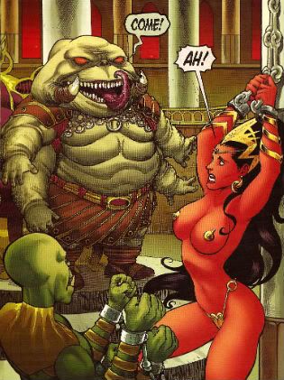
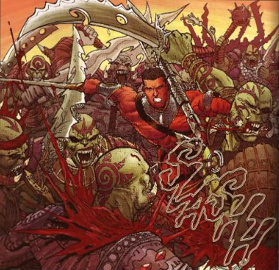
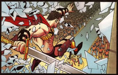
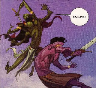
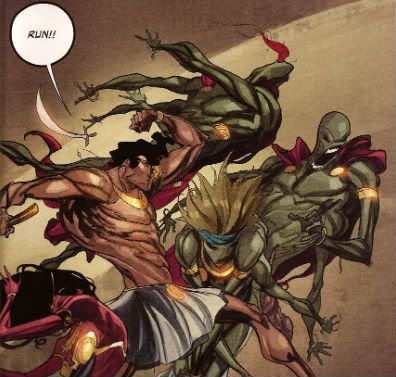
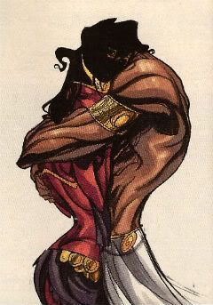
There are three different artists throughout the course of the book so far. Initially it's Stephen Sadowski and I'll just say that if you're having cowboys in your book it's probably best get people who can draw hats on people's heads. I know it's not the easiest thing in the world and even Lovely Lou Fine wasn't very good at it, but still. Sadowski crops up later on and hilariously depicts the incomparable Dejah Thoris wearing more to bed than at any other point in the series. Sadowski's photo derived work bookends the contributions of Lui Antonio who has a nicely blocky approach that's kind of sub-Art Adams. It's clean, nice art but, unlike Art Adams, a little light on the details and Antonio has a tendency to give JC a big vein on each arm suggesting nothing so much as sword wielding phalli. Which could be entirely intentional but is surely unnerving. Salazar crops up in the later issues and I really don't like his brittle line, lacking as it does any confidence in itself and lending the book a hesitant and scratchy look. (Pulp should never be hesitant.) On words Nelson does a decent job. It all bustles along, things happen and it's entertaining enough with even a glimpse of humour here and there ("Kiss me, you Calot!"). He really earns his money with the second arc which is a kind of murder mystery without JC but starring his son and is, thus, about as satisfying as tuning into Scooby-Doo only to find it's an episode all about Scrappy. Still Nelson manfully manages to keep it rolling along and through into the latest issues where unfortunately, for this reader, his solid work is unable to distract from the eye-prickling art. Overall, since most of my quibbles and carps were aimed at modern comics generally rather than this one in particular, the series is OKAY!


WARLORD OF MARS: DEJAH THORIS #1 - #9 (of an ongoing series) Art by Carlos Rafael Written By Arvid Nelson Coloured by Carlos Lopez Lettered by Marshall Dillon Based on the stories by Edgar Rice Burroughs (Dynamite Entertainment, $3.99ea)

Photobucket

Ah. Yes. Another tendency in the modern genre comic scene is to milk that IP teat until it is sore. So here we have a solo title for The Incomparable One. These tales are set before John Carter turns up so The incomparable one is only a mere slip of a girl at this stage, probably barely in her 5th Century. Oh yes, from reading all these books I have learned that Martians are born from eggs, mature quickly and age slowly, live to be about 1,000 years old (unless someone stabs them or they are eaten by some of the more agile fauna) at which point they go off and commit unassisted suicide by the River Iss (a kind of more brutal Dignitas). Unsettlingly this means John Carter has shacked up with some old crone who lays eggs. This makes John Carter possibly the only fictional character who engages in procreation with a geriatric, suicidal monotreme.

Photobucket "...(s)he's an egg-laying mammal of action!.."

Unfortunately the reality of this series is entirely more conventional than the preceding would have you believe. (Pulp should never be conventional). Illustrated in a sub-Frank Cho style the art is clean and cartoony. Although both male and female Martians are both dressed quite minimally it's clear that The Incomparable Dejah Thoris is dressed more minimally than most. Since these stories are solid little genre adventures in which the main novelty is the fact that the lead character is a capable and independent lady equally comfortable politicking or shellacking they sound quite progressive. Progressive for mainstream genre comics anyway. Sadly this is somewhat undermined by the fact that The Incomparable Dejah Thoris is continually contorting herself to display her assets to their best advantage. This can be overlooked in action scenes due to their physical nature but the  talking scenes are somewhat undermined by her tendency to present herself like a horny ape to some invisible suitor.  The series is, however, in no way the kind of sordid disgrace that mainstream genre comics featuring partially robed ladies are inclined towards and is entertaining in a lurid and daft way. And in Pulp that is OKAY!

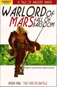
WARLORD OF MARS: FALL OF BARSOOM #1 - #2 ( of Four) Art by Roberto Castro Written by Robert Place Napton Coloured by Alex Guimaraes Lettered by Simon Bowland Inspired by the stories of Edgar Rice Burroughs (Dynamite Entertainment, $3.99ea)

Photobucket

Or Palping The Teat Part Two. This comic is is set "100,000 years before John Carter arrived on Mars." That's ludicrous. Which is a shame as the thrice-named Napton delivers a decent three stranded pulp narrative that is only slightly undermined by decompression and generic dialogue.  Roberto Castro is a bit too cross-hatchy for my tastes even going so far as to edge into Liefeldian which, since I am not one of those youngsters with their elder-baiting Liefeld-revisionism, is not a good thing for me. It's EH! which is not something that a spin-off title needs to be. What with WoM:DT and this we can see the third fatal tendency of the modern marketplace in full effect: dilution of the IP, over-saturation of the market, cutting off your nose to spite your face, call it what you will it's not good. Now Dynamite are publishing Not-Tarzan comics I am waiting with bated breath for Cheetah: Year One! filled with all the shit slinging, nit picking, teeth baring and frenzied humping fans of chimps all over the world have come to know and love. Seriously, "100,000 years before John Carter arrived on Mars." Christ.

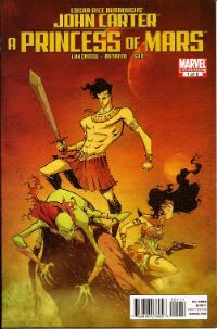
JOHN CARTER OF MARS: A PRINCESS OF MARS #1 - #5 (of Five) Art by Filipe Andrade Written by Roger Langridge Coloured by Sonny Gho Lettered by VC's Cory Petit Based on the works of Edgar Rice Burroughs (Marvel Comics, $2.99ea)

Photobucket

This was by far the best of the JC comics I read during this expensive and time consuming exercise in senseless self-flagellation. Roger Langridge's script is fast paced (JC's already on Mars when it starts), packed with well paced incident, brief suspensions of action to allow for the smaller, quieter scenes to occur and it's also a little bit tongue-in-cheek. It's good stuff but the humour doesn't quite sit right. In the merit column it does allow John Carter to actually appear to possess some form of personality. Such a thing hasn't really been in evidence in the comics prior to this. Pulp heroes not being noted for their rich (or indeed any) characterisation I can't say I'd really noticed until Langridge offered up an alternative. Usually John Carter is in love with Dejah Thoris, good at killing stuff and, er, generally upbeat. Here John Carter has a sense of humour as well. However, he appears to have Roger Langridge's sense of humour; which is okay as Roger Langridge is a funny man but isn't okay because, unless I missed something, Roger Langridge isn't a Virginian gentleman of the 1860's. So when John Carter makes jokes about mints on pillows, giving only his name rank and serial number or uses a particularly legendarily bad chat-up line it does tend to ruffle the reader's immersion in the doings.

Photobucket Mars circa 2011.

Mind you, the flashback sequence is brief and none too clear. It could very well be that the intention was to leave Carter's earthly origins vague to allow just such humour to be possible. It may be that I brought an ungodly amount of prior John Carter comics to bear on this series and got the wrong end of the stick. If I did, I apologise and I do at least concede that Langridge's humour is actually funny, which is probably the most important thing really.

Photobucket The Incomparable Dejah Thoris circa 2011

The series also dodges the problems with gore'n'genitals by opting to go the clean-cut route. This turns out to be a wise decision. The incomparable Dejah Thoris is well covered and so it is easier to believe John Carter is in actual fact in love with her as a person rather just in love with having her fine caboose ride his cock horse. That's nice. I can do romantic too. I can. Stop laughing.

Photobucket Mars Action circa 2011.

The violence is good and violent but not overdone. Thanks to Filipe Andrade's fine work the fight scenes are more suggestive than ham-handedly bloody. In fact Filipe Andrade's work on this is pretty great. It's like the designs on an Ancient Greek vase have come to life and started running around and having smashing adventures. It is visually stylish and arresting work that nicely embodies the archaic nature of both the setting and the source material itself while being visually inventive enough to appear startlingly fresh, particularly in comparison with the somewhat familiar styles of art present in the other modern day John Carter books. Filipe Andrade - I like him!

Photobucket John Carter circa 2011.

I was expecting the least from this one given it's origins but it just goes to show that you should always go on the talent rather than the publisher. (I have no idea why people have a loyalty to particular comics publishers. It baffles me.) Langridge rarely disappoints and continues not to here and Andrade is a lovely discovery for me. It isn't my ideal JC comic (That would be: cover by Corben, words by Lansdale, art by Veitch. Thanks for asking. Took you long enough.) but it ain't half bad. In fact I'll go up to VERY GOOD!

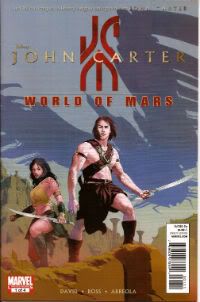
JOHN CARTER: THE WORLD OF MARS #1 - #4 (of Four) Art by Luke Ross Written By Peter David Coloured by Ulises Arreola Lettered by VC's Cory Petit Based on characters created by Edgar Rice Burroughs and the screenplay JOHN CARTER by Andrew Stanton, Mark Andrews and Michael Chabon. (Marvel Comics, $3.99ea)

Photobucket

This one I regret to inform all is a blatant cash-grab that takes up four issues with what can generously be described as one issues worth of content. That's not to insult the creative team who I am sure enhance the lives of everyone they come into contact with. They've clearly been given the thankless task of providing a prequel to a film which by the very nature of the premise it is prequelling cannot actually feature the main character of said film or even allow the supporting characters to meet even though their adventures must have some connection. The real interest thus becomes seeing how Peter David will negotiate this thankless task. He has a good stab but the unavoidably inessential nature of the material is never in doubt, which really spoils the reading experience. Luke Ross' art is odd because he's really good at the bits that don't involve humans. He's got a nice thick line with a lovely crayon like effect that lends life and vigour to creatures that are clearly only of the imagination. Alas, his humans are stiff and overact and his landscapes are just photographs with minimal effects. Look, I'm tired of John Carter now so let's just say it was AWFUL!


So, 60 some years of John Carter comics there. I guess I should draw some conclusions? Up to 1979 there's one defining characteristic of the JC comics. The people involved seem to be having fun. Whether it's Jesse Marsh amusing himself by drawing works of art on the walls of his backgrounds, Sal Amendola outstripping his talent with his ambition or just the prurient purple prose of the Marvel stuff fun is clearly being had. It's an inclusive kind of fun, too.

There's less of this in the 21st Century stuff. Less enjoyment in both the form and the content. A lot of the time it just reads like it was work, a job. Which it was, of course. But equally so was the earlier stuff. That's why the Langridge/Felipe series seems so much brighter than all those series surrounding it. Heck, I'm sure everyone involved in all these comics had fun. There are probably interviews where they stress how much fun it was, how it engendered an almost obscene thrill to be involved in the expansion of his venerable ERB IP. There are always interviews alike that, about everything. What there aren't a lot of are comics that actually feel like they are interested in reaching out and including the audience in that fun. Look, I don't really know what pulp should be but I think it should be fun. Thankfully Roger Langridge and Felipe Andrade at least seem to agree.

Photobucket

Now that I have fulfilled the instructions of my delusional relative and allowed the clearly addled fruit of his stunted tree of a mind to fall before your eyes but one task remains to me. For I shall tell you now that he directed that I remove his body to Yorkshire without embalming and that he be laid in a Mylar bag of unfeasible dimensions upon an acid free board of card of similar size, therein to be sealed with tape. Clearly the man was a fool of the first order but I did as bade and can testify with a true tongue that, to this day, although his body has yellowed around the edges somewhat he remains, these many years hence, still Mint to Near Mint. Remarkable indeed.

Yours very sincerely

ERB

Have a good weekend, all, and remember to read some COMICS!!!
How can ya' miss me when you've forgotten who I am?

Ah yes, reviews, I remember those! Been a while, but I think I'm finally back on the weekly-review-train now! ACTION COMICS #7: I know the book's been a little uneven, but the issues that are good are so good that it makes my teeth hurt. I thought this was one of those issues. I'd rather read Morrison doing Superman than almost any other superhero comic by almost any other creator. I'm a little amused, however, that Brainiac is, y'know, the internet. VERY GOOD.

AGE OF APOCALYPSE #1: I have little-to-no natural affection for any of these characters (I sort of think the IDEA of the original AoA was more interesting then the actual execution), but I thought this was non-heinous, with some pretty nice art from Roberto De La Torre. What I don't see is how this is an ongoing series, because I can't imagine that (even with the X-Force lead in), there's more than, say, 10k people (by issue 4 or 5) who will want to read about alternate universe version of the X-Men? it's strange to me -- this is the kind of book that Marvel used to make fun of DC about (alternate versions of the same characters), but that Marvel is doing in multiple ways now (Ultimates, Zombies, this) -- this is the kind of thing that led to CRISIS ON INFINITE EARTHS, y'know? Anyway, this comic is perfectly OK for the kind of thing it is

AVENGERS ACADEMY #27: This, on the other hand, I thought was terrific -- funny, and real conflict and stakes, and just really being the "legacy" comic in a way that DC has entirely walked away from now with the 52. The "voice" of some of the Runaways is a little off, but over all, I thought this was a fun little romp of a comic, and was VERY GOOD.

AVENGERS CHILDRENS CRUSADE #9: If this had come out over the course of 9 months, I think we'd all be talking about what a great comic it was; but, of course, it has been TWENTY months, and the Marvel universe this story began in is kinda different than the one today. Characters live, characters die, and "Young Avengers" is largely thrown away as a concept by the end of this -- which is too bad, because I liked that first incarnation a whole lot. I'm glad Hulkling and Wiccan get their kiss at the end, though. Overall, I'll go with GOOD here, I think.

DEFENDERS #4: I pretty much flat out hated the first three issues -- I'd probably not have disliked it had it been, like, "Magic Man" and "Kung Fu Guy" instead of "Doctor Strange" and "Iron Fist", if you see what I mean? I just don't think that the characterization Fraction tried to graft on here really bore any relationship to past characterizations -- but this issue I kinda liked just fine. The problem is, at $4 a throw, the audience has now made up their minds about whether they like the book or not, and you have to hit the ball right in the first issue... you can't wait until #4. Either way, I can give it a low GOOD, but it's probably too late -- we sold 32 copies of #1, and just a meager 13 of #3.

FAIREST #1: I thought the premise of this FABLES spin-off was "it focuses on the female Fables"? *looks at the cover* Yeah, that's how they're selling it. So... why no female Fables as anything other than furniture here? This is the comics equivalent of the Senate hearing on Contraception, isn't it? Also, I have to say that I think the choice of the flat matte paper was a poor one with fully digital painted art -- it looks muddy and bland, and, frankly, ugly to my eye. Shockingly EH.

GREEN ARROW #7: Ann Nocenti's first issue... and it's just kind of weird, sort of like her later DD run. I mean, I liked it, don't get me wrong, and it's a big step up from the first six issues of this version, but triplet mutant killer seductresses? Mm, dunno. Also: what on the earth could they possible have "twelve of these" be referring to? Did they each lose eight toes, somehow?

Oh, and here's where I'll slot in the rant against the new DC logo. Here's how you know it is an utter and abject failure as a static object: they have to print the words "DC Comics" underneath it so that anyone could POSSIBLY tell that that is what it means. *sigh*

Anyway, Green Arrow #7: A strong OK.

MANHATTAN PROJECTS #1: I thought this was utterly spiffy, with a wonderful Jonathan Hickman high concept (if I tell you it, I'll thoroughly spoil the comic), and some really terrific art from Nick Pitarra. Man, it's kinda like a younger Frank Quitely. Image is on a helluva roll these days, isn't it? VERY GOOD.

NIGHT FORCE #1: Well, it was fairly pretty, but I really had no idea why I should care, or whom I should root for. Much like the original series, when i think about it. EH.

STORMWATCH #7: Paul Jenkins comes in as new writer, and it's a little better, though I'm still not finding the compelling reason for these characters to be together. At least when it was THE AUTHORITY, you got the who "We're smarter than you" Warren Ellisy vibe going for it. Very strongly OK, but not any better than that.

SUPURBIA #1: Ah, if only this hadn't been so strictly mapped to existing archetypes, I might have been more attracted to it, but I don't really need YET ANOTHER pastiche of Superman and Batman and Wonder Woman, I don't think. "The Real Housewives of Superville" is a fun enough pitch, and the execution was at least competent, but this largely feels recycled and warmed over. OK.

SWAMP THING #7: SEVEN ISSUES for the protagonist to actually appear in his own comic, terrific. And yet, I still like it adequately. I really do rather hope that out protagonist and antagonist both manage to defy their expectations -- but I also think that this "rot" plotline just can't go on indefinitely, and may already be outstaying it's welcome. One problem: the big Green Guy is too wicked powerful -- look at the way he routed all of those minions in a single double page spread. I'll just barely give it a low GOOD.

ULTIMATE COMICS SPIDER-MAN #8: I'm kind of creeped out that the guy on the cover looks very little like the guy actually in the comic book. There's also something boringly predictable about the Aunt May and Uncle Prowler scenes -- now all we need is for Nick Fury to step back in where he left off. When you add that to how Miles' voice is virtually identical to Peter's... well, I'm kind of not feeling this book, sorry. (especially for $4, jebus!) EH.

Right, that's me... what did YOU think?

-B

"I'm A MAN, And I'll LOVE You As A Man Loves A ..." Comics! Sometimes There's A Film Out As Well! (John Carter!)

So, yeah, there's a John Carter film out on Friday. Not that I ever get to the pictures anymore but, hey, you might! In the meantime you could read this about some comics featuring the same character. It's a thought isn't it. Probably one more than went into the writing of this. Hey, can CGI do this?: Photobucket

No, no it can not. You lose CGI!

I guess I should start with a disclaimer: I'm not really an Edgar Rice Burroughs fan; indeed I don't even know if I have read the source novels for these comics. So if you're looking for an informed Burroughsian monograph you might want to jump off right here. What follows is just some old gimp prattling about some comics, because what he really likes is comics. And prattling.


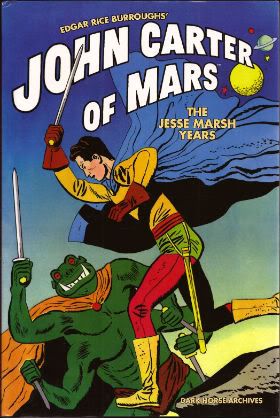
EDGAR RICE BURROUGHS’ JOHN CARTER OF MARS: THE JESSE MARSH YEARS Drawn by Jesse Marsh. Scripted by Paul S. Newman. Foreword by Mario Henandez. Collects Four Color Comics #375, #437 and #488, originally published in 1952 and 1953 by Dell Publishing Co., inc. (Dark Horse Books, 2010, $29.99)

Photobucket

I bought this book because once I'd seen the cover it refused to entirely leave my mind and was constantly hovering there urgently pressing me to purchase it at some point. I think it was the really solid no-nonsense blacks that fixed the image to the page and into my mind. At the time I had been admiring Don Heck's solid blacks and this seemed to play off and feed into that brief flare of interest. Also, there was something very Gilbert Hernandez about it what with the intentionally(?) stilted poses , the harsh crease lines and the occasional smattering of dots for texture. So I bought the book with some Christmas money and prepared to be disappointed. Obviously the cover was just a lucky image that Dark Horse were using to lure credulous punters like myself into buying reprints of justly forgotten chaff as the Hollywood version of the material slowly hove into view.

I was wrong.

Photobucket

Mars circa 1952.

This book was fantastic. Jesse Marsh is fantastic. This isn't actually news to anyone except me it seems. He's actually on the list of possible inductees into the 2012 Eisner's Hall of Fame. Casting my mind back I recall interviews with Alex Toth and Howard Victor Chaykin (who is also on the 2012 Hall of Fame list. What a dilemma!) in which both mention Jesse Marsh. Still, it's one thing hearing about a comic artist's work and seeing it.

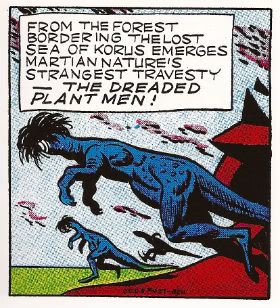
Actually looking at it Marsh's work looks totally ahead of its time. Wait, let's back up. I'm not saying anyone could mistake these comics for modern comics. The very nature of the material works against Marsh in this regard. For a start each of the three reprinted comics are tasked with adapting an entire Edgar Rice Burroughs' novel in 32 pages. There's no time for shilly-shallying, no room for indulgences like splash pages, very little chance for a panel's art to be unadorned by narration or dialogue. No, Marsh has to fit it all in to a series of pages consisting of (roughly) 6x6 grids where his greatest indulgence is to let two such panels bleed together either vertically or horizontally. And he doesn't get to do that all that often. Cramped and constricted as he is by the format Marsh has the technique to deliver the equivalent of putting on a musical in an elevator. That's where the 'ahead of its time' bit comes in; in the actual art.

Photobucket

The Incomporable Dejah Thoris - Circa 1952.

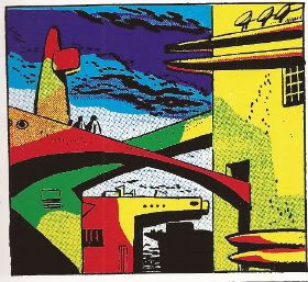
There's a colossally impressive understanding of design on show. Because Marsh is working in the highly strictured world of '50s comics (and Gold Key were particularly inflexible in format) Marsh is unable to do anything about the actual page design but the design of the panels themselves are beautifully chosen to balance the elements within them. And (get this) the actual elements within the panels are further forays into design by an artist who was clearly just so incredibly good at what he did he could do the incredible just to keep himself amused. What other reason can there be for the pictures/sculptures/scenery with which Marsh surrounds his characters? His sculptures and pictures are so good I have the suspicion that they are actual object d'art that only my lack of breeding and education prevent me from identifying. The fact they change from panel to panel (even when the scene has not changed!) suggest Marsh was just larking about. But, what larks!

Photobucket

Martian Action! Circa 1952.

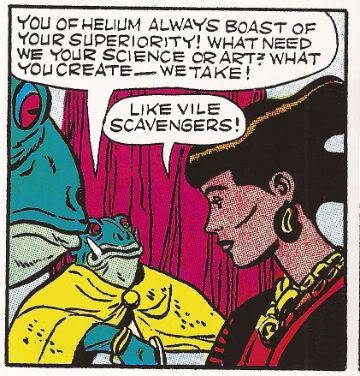
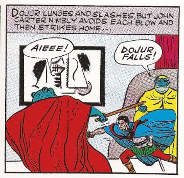
But, no, you aren't going to mistake these comics for the cutting edge of Now. Marsh's work does have its failings but although the characters may be stiff  it must be said they are distinctive. The "incomparable" Dejah Thoris seems to have been modelled on the actor Emily Watson which can't be right? John Carter isn't terribly expressive but he does look like himself in every scene and doesn't look like anyone else and you can't always say that about even modern comics. Although the big thing everyone gets sweaty about with Burrough's Mars novels is that everyone is nudey rude except for weapons and jewelry everyone here is fully dressed.  So, I guess purist might balk but all the incident, adventure and momentum of good pulp entertainment remain intact. Given the task of illustrating the functional script of Paul S. Newman Marsh manages to not only provide work which does so but at the same time carves out room to indulge his own idiosyncrasies and interests in a way which actually serves to enhance the work rather than distract or undermine its primary purpose: to entertain.

Photobucket

John Carter circa 1952.

One for the folks interested in form rather than content, or the talent rather than the character if you like.  VERY GOOD!


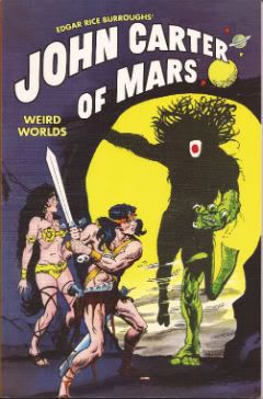
EDGAR RICE BURROUGHS’ JOHN CARTER OF MARS: WEIRD WORLDS Art by Sal Amendola, Murphy Anderson, Gray Morrow and Joe Orlando. Written by Marv Wolfman. Introduction by Marv Wolfman. Collects stories from Tarzan #207-209 and Weird Worlds #1-#7, originally published in 1972 and 1973 by DC Comics. (Dark Horse Books, 2011, $14.99)

Photobucket

In 1971 as a hedge against the possibility that super-heroes had outstayed their welcome DC comics cast about for properties to replace them. Tarzan and the other ERB properties, including John Carter, caught DC's fancy since they were still adventure themed but more sober in appearance than super-heroes. This tells us that people are always predicting the end of super-hero comics and sobriety is pretty subjective. Good news for drunks, then! Great news for The Incomparable Joe Kubert who took the lead on the project. While his creative talents were focused on Tarzan he took on editorial duties for the other ERB character, such as John Carter. According to Bill Schelly's Man of Rock: A Biography of Joe Kubert (which I am filleting facts from in an attempt to look knowledgeable) Murphy Anderson and Marv Wolfman got the John Carter assignment because they were big John Carter fans. Apparently Michael William Kaluta wanted the gig but Murphy Anderson got it, mostly because he shared an office with Pappy Joe Kubert and was asked first. Not exactly high drama but that's what happened.  (You could have guessed Granite Joe Kubert had edited these stories because he can't help sticking his inky fingers in the Gray Morrow chapter on on pg17-22.) Anyway, the comics that resulted are collected in this book.

Photobucket

Mars circa 1972.

Given the fact that fully two decades separate the work in this volume and that contained in the Marsh volume discussed earlier it's interesting to see how the comic art approach has changed. There's a lot more variety in page design in 1971 with panels inset into double page splashes, flashback panels with wobbly edges, decorative chapter headings a la old timey newspaper strips and on and on. What's clear is that the artist has far more freedom to control the visual presentation of the material. In between Marsh and Anderson's work something new has appeared: pacing. There is no pacing in the Marsh book; there's no opportunity for it. But in this volume it's evident that the writer/artist are able to actually pace their material. The material may have set limits as to length but these limits are far more generous than those Marsh was labouring under.

Photobucket The Incomparable Dejah Thoris circa 1972.

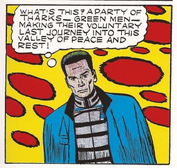
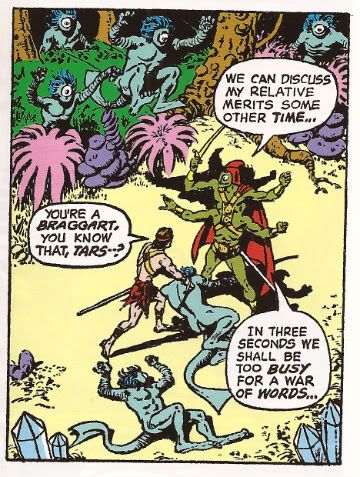
There's also a lot more freedom with regards to sex'n'violence. In the '50s material the incomparable Dejah Thoris was wrapped up like a shoolmarm but by the '70s she's certainly giving herself a good airing. Don't worry though because in the '50s John Carter was decked out like a Hussar but by the '70s he's all raggedy loincloth and musky muscles so noone's playing favourites here. Poor old Jesse Marsh had at best a couple of panels to depict savage action on worlds unknown but Anderson et al fare better with plenty of room to swing a Thark.

Photobucket

Martian Action! Circa 1972.

The ERB books didn't really sell very well and after a while moves were made to bring in cheaper foreign artists which probably explains why Murphy Anderson's contributions stop on pg. 68 and Sal Amendola finishes off the rest of the book. I'm not saying Sal Amendola was foreign (to American shores) but I am betting he was cheaper.  After the somewhat traditional art preceding it the book suddenly explodes into a Barbarellatastic mindmelt of groovy layouts and gear designs, man. Well, it tries to. Alas, Sal Amedola is hampered by a lack of talent but the surfeit of ambition he possesses almost overcomes this. I said "almost". It isn't very pretty but I admire the energy; that's about as good as it gets with the Sal Amendola stuff. He does, however, chuck in some nudey rudery for the hardcore Burroughs' fans which is amusingly cheeky of him.

Photobucket

John Carter circa 1972.

As a complete TPB this one disappoints in that it starts off with some strong and solid work by industry vets but is compromised halfway through by market considerations to ultimatley produce a collection that I can only call OKAY!


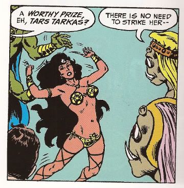
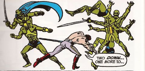
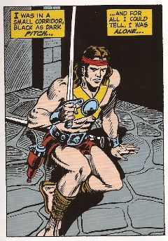
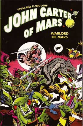
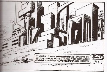
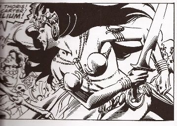
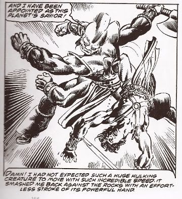
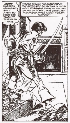
EDGAR RICE BURROUGHS’ JOHN CARTER OF MARS: WARLORD OF MARS Art by Ross Andru, Bob Budiansky, Sal Buscema, Ernie Chan, Dave Cockrum, Ernie Colon, Frank Giacoia, Larry Hama, Carmine Infantino, Gil Kane, Bob McLeod, Frank Miller, George Perez, Walt Simonson, Mike Vosburg and Alan Weiss. Words by Chris Claremont, Peter Gillis, Bill Mantlo, Alan Weiss and Marv Wolfman Foreword by Michael Chabon Collects John Carter, Warlord of Mars #1-#28 and Annuals #1-#3 originally published in 1977-79 by Marvel Comics. (Dark Horse Books, 2011, $29.99)

Photobucket

Pulp got Gil Kane early and pulp got Gil Kane but good. Although he was often opining that Comics needed to mature itself in terms of subject matter, he, himself, was never able to escape the grip pulp held on his imagination. Gil Kane was a great, great man but his tastes could tend to the unsophisticated. Luckily since that was the very problem he berated comics for he may have been held back creatively but it didn't hurt him commercially. Particularly in the '70s when pulp's stock was strong in the comics market and he had plenty of juice himself.

Photobucket

Mars circa 1977.

In the '70s Kane spent a lot of time working up books he'd be interested in doing, starting them, realising he couldn't produce pages fast enough to pay him enough, leave the book, work up a book he's be interested in doing...and rinse, repeat. He was like the goddamn Littlest Hobo of comics or something ("There’s a voice that keeps on calling me. Down the road is where I’ll always be").  I'm being 'exasperated' because that behaviour makes it really hard to get good long runs of his stuff in collections. Obviously I know that's really not any concern of Gil Kane but  equally obviously it does mean I'm glad to have this volume.

Photobucket

The Incomparable Dejah Thoris circa 1977.

So, yeah, my primary interest in this volume is the Gil Kane stuff. That's a good 190 pages. After that my attention started to wander a bit but I can assure you that the Gil Kane on these pages is some good Gil. As usual his natural glory is clothed by inks by someone else which isn't ideal but hardly a deal breaker. Most of the time the inks are by Rudy Nebres or other Filipino artists of the period. Which is fine as this  lends everything an ornate quality appropriate to the pulp material. It helps make up for Kane's shortcomings. Oh, I love old Gil I do, I do but he did suffer from visual generalisation quite a bit. C'mon, we speak freely here; his future buildings and his ancient buildings are only distinguishable because the latter have some cracks in and a tree growing out of a window while the former doesn't. So, while it's usual to bemoan the fact it isn't Kane on Kane action for this volume it works out okay; the ripe inking lends everything a distinctive character Kane would probably have omitted if left to his own devices.

Photobucket

Martian Action! Circa 1977.

Where Kane doesn't need any help is in portraying the supple violence of well honed bodies in motion, communicating the lusty allure of his sexy ladies and his even more alluring men and basically creating such an atmosphere of raw physicality that it practically removes the readers glasses and tells them they are beautiful. Or something. I like Gil Kane's art, it sends me. Of course like any good bad boy he's gone when he's had his fill and Kane's departure makes the book stumble a little but the continued use of Rudy Nebres gives it enough visual continuity to keep it upright and interesting. For a while anyway. Storywise it's just the usual pulp stuff. In that it's more important that things happen than that the things that happen actually make sense. In fact the more outlandish and sense defying the better. The Headmen of Mars by Bill Mantlo and Ernie Chan is a particularly proud erection to the joys of sheer momentum and excess over intellect. It's pulp and it's written as such so the words don't treally bear close examination. Ah, but that's what they want you to think. If, however, you do pay attention to the words you find that EDGAR RICE BURROUGHS’ JOHN CARTER OF MARS: WARLORD OF MARS is in fact lubricated with sly innuendo and at times this reaches such steamy excess that it wouldn't be too great a surprise if the pages dilated at the touch of your enquiring fingers or let loose a soft sigh at the insistent pressure of your questing gaze.

I'm not joking. Not only are John Carter and the Incomparable Dejah Thoris continually on their way to/from the boudoir but you get the impression that if it weren't for all these Master Assassins of Mars, zombie hordes, air-pirates of Mars etc. they would be quite happy just letting John Carter make good on all his multiple breathy promises to "love her as only a husband can love a wife", "kiss her as she has never been kissed before" and "get right in there and root around like a monkey looking for nuts".  This reaches delirious heights on p. 306 when the text reads:

"With a SKILL that still occasionally SURPRISES me--I MATCHED course and speed with Dejah's flier and DOCKED the two craft together. A moment later I was at her ENTRY HATCH--With a cry torn from her SOUL, she sprang into my arms --I will not DWELL on what happened next."

Oh, do dwell, Chris Claremont, dwell!

Photobucket

John Carter circa 1977.

And you know what? That's great! The John Carter and The Incomparable Dejah Thoris actually resemble a couple with a working sexual attraction. Okay, it might be somewhat exaggerated in a pulp stylee but maybe if my muscles were three times as powerful as any other males I imagine I'd be a lot more popular too.

I really liked this book but I think I've made it clear that that that's primarily because of the presence of Gil Kane, a tendency for my own interests to run to the unsophisticated and an appreciation for healthy smut. If you do not share these pleasures you probably won't find this to be GOOD!

(Apparently Marvel have released the same comics in a colour over-sized Omnibus. They are probably even better in colour. Sighhhhhhh.)

Photobucket

Mars. The Incomparable Dejah Thoris. John Carter. ('Mars Action' about to occur) circa 1977.

Have a good weekend and remember to read some COMICS!!!
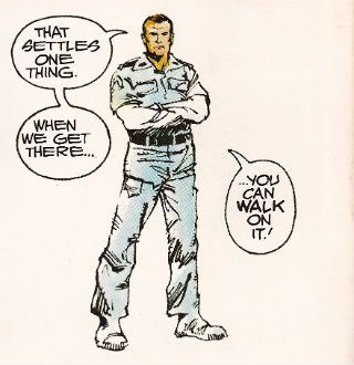
February 2012: The Month Where I Really Felt The Loss of John Candy

What follows is the second in a series of 12 posts, capturing the official Savage Critics rating for all of the comics that I read but couldn’t find the time (or space) to write about in a more “professional” capacity. The first one is here.

Hotel Harbour View Taniguchi Viz

Weird, wonderful stuff. I first heard about these stories via the Savage’s own Joe McCulloch. The big draw for today's reader is obviously going to be the chance to see Jiro Taniguchi drawing crime, but the curious will probably walk away just as impressed with the script, which is oddly sweet for such a bullet-laden plot. VERY GOOD!
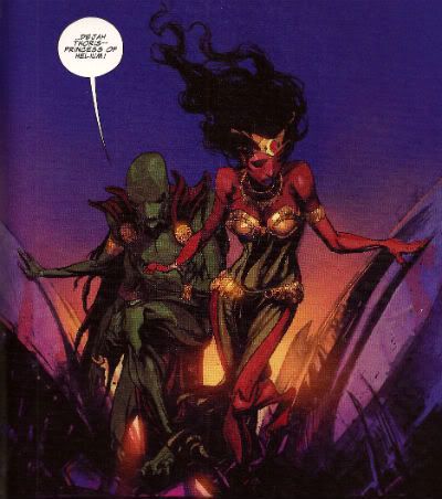
Silence of Our Friends Long, Demonakos, Powell First Second

Hey, did you know this thing existed? Yeah, neither did anybody else. It’s a Nate Powell drawn graphic novel detailing some real life civil rights history in one of the two writer’s past. It’s pretty terrible, although Powell acquits himself well. There's probably an interesting story to be made out of what Mark Long’s family experienced, but it’s pretty clear that neither he nor his co-writer cared to try and find that story. Instead, you’ve got 200 pages detailing social back-and-forths between a white family and their black counterparts in 1968 Texas, most of which revolves around shining a spotlight on the audacious realization that people are often more complicated than pat racial stereotypes might lead one to believe. For example, sometimes a black man will slap his child out of anger. Other times a white man who is normally polite drinks too much. Sometimes the two of them behave in a way that seems racist to onlookers out of a fear of social reprisal. Will these two groups be able to come together over a shared mutual affection for Sam & Dave?

Things pick up later in the book when it depicts a protest gone wrong, but all of that interest evaporates as the book meanders its way through the most boring court trial comics has ever produced. A really cynical reader might think that the people involved in this comic’s production have so little imagination that they honestly believe that "boring" = "intelligent", but it seems more likely that there just wasn’t anything here to get excited by. That’s sort of First Second’s bag, if you’re keeping score--with very few exceptions (George O’Conner’s comics, Gipi, Blaine), they pretty much stick to rushing out middlebrow crap designed by committees, for a fabled "adult" audience that's perfectly content to stick with television. EH, because Powell certainly tries his best.

Fatale #2 Brubaker, Phillips Image

I like this issue. It’s more Ellroy-tinged set-up stuff, with an angry alcoholic (i’m assuming he is one, but I think the ground is safe) twisting lives into violent, confused contortions for the sake of a woman who they already know they’re gonna lose, and there’s a nasty cult thing going on in the background--this comic is sour, it feels irritated, like the actions depicted within the panels are a little pissed off that they’re on display. Brubaker’s best comics are the ones that have a freighted plot moving through them, something that crushes and mangles the lives of the people that populate them. (If you go back and read his Captain America run from the beginning, you’ll see that the absolute best parts are whenever Steve is depicted as being alone, scared, or exhausted. That character has unfortunately been taken over by the incessant need of Marvel, and it’s unlikely that their new publishing style will ever allow for somebody to do the kind of long-range work Brubaker got to do in those first 30-40 issues of Cap, but the current status quo doesn’t render those stories any significant damage.) Fatale: GOOD!
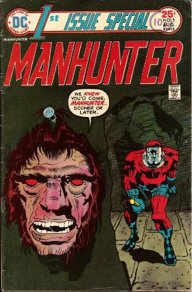
Chopper: Surf’s Up Wagner, Ennis, Artists 2000AD

Decent shit, Douglas has you covered on this one. There’s some fascinating panels in this collection that are worth excavating for examination, but this collection is mostly interesting for the way it drags a shitload of material (most of which is solid) out of a character that internalizes all of his feelings, choosing to express himself by action. He’s a skysurfer who lives with his eyes half-closed. OKAY!

Walt & Skeezix Volume 5 King D&Q

There’s no massive plot driving this collection the way the previous volumes were, and in fact, it reads a bit like a mild reworking of Frank King’s greatest hits--there’s the backdoor conniving regarding Skeezix’ inheritance (bringing with it Walt’s old fears of kidnapping, which means PUNCHING), a bit of romantic bungling with Lora that recalls those sleazeballs who used to pursue Phyllis, and then, of course, there’s a new baby and all the cutesy bits that bring with it. As is always the case with these collections, there’s some random bits of difficulty in tow--Phyllis is often depicted as disturbingly greedy as her past nemesis, Mme. Octave, and it's impossible not to squirm at Rachel. Still a great collection though, one of the best things Drawn & Quarterly publishes. There’s some extra stuff in here too--essays and a DVD--but most of that stuff seems like fetish objects for people who want all comics to be autobiographical. I’m sure it’s quite lovely, but I have a decent enough relationship with my father, and thus have no need to pretend that Frank King would have been a better one. EXCELLENT!

Athos In America Jason Fantagraphics

The “autobio” strip in here is my hands-down full-stop favorite thing Jason has ever done, earning this book the EXCELLENT rating for that reason alone. The rest of the book is totally satisfying, but I can’t pretend I didn’t read all of it with my brain obsessing over all the little beats in “A Cat From Heaven”. There isn’t a dead moment in the thing. “Hey, Fuckface”...so funny, this thing.

Prophet #22 Graham, Roy, Ballerman Image

Dug the first issue, loved the second. One of Graham’s greatest strength is that he’s actually read and watched different stuff, so when he’s resorting to inspiration, it isn’t the same crop of minimalist Wu-Tang covers or Wong-Kar Wai screengrabs as everybody else. In comics, it’s hard to ignore the fact that everybody wants everybody else to have the same line-up of idols as they do, which is why Graham is so interesting: he seems to have escaped all of that and forged a taste all his own. It’s unfortunate for Roy that he’s having to work under such a big shadow--he’s doing good work, and definitely getting better--but I’d imagine he sees this as too good an opportunity to pass up. Comics could use a lot more people like Brandon. We already know what it’s like to have a whole lot of people who aren’t. VERY GOOD!

Batman The Dark Knight #6 Finch, Jenkins DC

This one was pretty weird. It’s just Bane fighting Batman and Batman running away. They talk about Knightfall a bunch. There’s a really bad drawing of Superman. Remember when David Finch was supposed to be a big win for DC? There must have been a bunch of people at Marvel giggling when that announcement was made. This comic isn’t as bad as the Superman one that has a different creative team on every other page, but that doesn’t mean it's any good, either. AWFUL!

Ultimate Spider-Man #7 Bendis, Samnee Marvel

Well, that’s how you waste a date with Chris Samnee. If this guy has an agent, he should fire that person. I’d like to believe that his Daredevil stint is going to be special, and it probably will be...but c’mon, all Marvel does is bean this guy every time he gets up to the plate. AWFUL!

The Flash #6 Manapul DC

Very pretty comic book here. The inclusion of Barry Allen saying things like “girlfriend” and “is that okay” and “I have feelings” will certainly appeal to a type of personality (unfortunately, I very much doubt that type of personality would find much else in super-hero comics worth their time), and I’d overall call this one OKAY! I can’t make myself read this title, but I hope somebody can. Super pretty.

Judge Dredd Complete Case Files 13 Misc Dredd Folks 2000AD

Solid collection of stuff here, if I had notes to refer to, I would do so now. The biggest stand out in my mind is the introduction of Giant, who will become a big part of Necropolis (which is in the 14th Case File), but there’s a whole crop of solid short bits in here. Reading these, I can’t help but wonder what kind of world Wagner would have created if he’d stuck around the Batman franchise. Grant did fine without him, but...that could have been something. Oh well. GOOD!

The Dead Man Ridgway, Wagner 2000AD

Great stuff here, here’s another Douglas Wolk write-up for those who like detail. I wish I could have read this as it was happening without having to live in Britain whenever that was. But even if you the big reveal in advance, it’s still a pretty satisfying read. Call it GOOD!

Voyages Volume 1 Toth, Chaykin, Geary, Vess, Russell, Muth, Robbins, Dowling Nautilus Dreams

There’s a great Alex Toth story in this, a Bravo For Adventure story that I’d never read and which is, contrary to what I’ve always heard, solidly written. It gets really abstract near the end in this really ballsy way, with these grids of jagged lines tracing the movement of excited protagonists. It ends up being so good that it (unfortunately) overshadows everything else you read. That being said, the only things in here that are anywhere near Toth’s level are Rick Geary’s murder standard and a nasty color insert by Howard Chaykin about a guy on his way to serial killing. Everything else is trash. For the Toth alone (which is the longest thing here), call this one VERY GOOD!

The Broken Ear Herge Little, Brown

I find it very easy to get wrapped up in how these comics look, chasing Herge’s lines around to see where they begin and end. I kept forgetting to read the dialog, I just liked watching things move around. I'm mostly interested in reading these Tintin stories to see how they relate to Swarte and Chaland, but I'm also always curious about things that are amazingly popular. I don't know that I learned much here. It’s fun to watch Tintin get wasted with the guy who is supposed to kill him, or to see the general get his feelings hurt when he thinks he’s been betrayed. The actual goal of this one--the location of a stolen curio--seems to get away from Herge a bit eventually, but I can’t say that I really care, or that I think he should have done it differently so that hadn’t happened. It’s just a lot more fun to watch the kid fuck around and do shit than would have been to be all serious about the treasure hunt aspect. VERY GOOD!

Is That All There Is Swarte Fantagraphics

Everything I feel comfortable saying about this book right now already came stumbling out on this Inkstuds podcast I did with Jog, Seneca and the Studster, but it deserves some kind of Savage rating. How about EXCELLENT? There’s stuff in here that I wish was bigger in size, but...so what? I hope every single person who complains about the size of this book gets buried in shit after being murdered by their family, and I hope they get murdered with Lou Gehrig’s disease. If they're a cartoonist, I hope it happens to them twice.

The Blobby Boys Schubert Zine Police

A short, very funny comic featuring what acts like a regular cast of oddly colored humanoid creatures acting like assholes in urban environments. Blobby Boys was oversold to me as someone’s favorite comic at the Brooklyn Comics and Graphics Festival, so the initial read through was a bit like a confused treasure hunt. Reading it again, I just see it as an extremely funny comic with unusually vivid art. That’s not a bad thing at all. VERY GOOD.

Comics Class Forsythe Koyama

Pseudo autobiographical comic (“mostly untrue”, according to the back cover) about a comics class for 11 year old children, taught by the author. It’s very funny at times, other times it’s trying too hard, but the scale mostly ends up in Forsythe’s favor. The art is pleasant, chunky stuff, there’s just not a whole lot that’s very visually exciting about a guy standing in front of kids, talking. Does anyone talk about the cinematography in Stand and Deliver? Lean On Me? Dangerous Minds? I rest my case, my case is rested. I’d still call this one GOOD.

Night Business #4 Marra Traditional Comics

I love this comic, love all the comics this guy makes. I also have a lot of affection for the movie Cobra and the sex act, so I was pretty much swimming in clover the whole time I read this, because it has all of those things put together all at once. VERY GOOD.

Now that I think about it, it kind of disgusts me that there's comics bloggers out there who sit around reviewing Marra's work all willy-nilly, without having experienced the movie Cobra.

White Whore Funnies #1 Misc Ful-Horne

This is a group of black cartoonists making fun of racist stereotypes. Some of it is very extreme and funny, like the symbol of a black power fist punching its way into a Venus symbol while the text screams “LET US ENTERTAIN YOU”. Some of it is just disconcerting and obnoxious. The art is mostly terrible, with most of the cartoonists delivering weirdly prudish takes on naked women. I’d be disappointed, but I’m convinced the primary point of this project was to entertain the guys who created it. It’s AWFUL otherwise.

Lone Wolf and Cub #26, 28, 29, 30, 31, 34, 35 Kojima, Koike First Comics

I’ve read all of these stories before, but I’d only read about half of the First Comics editions. Not all of Goseki Kojima’s work is “better” in the standard American comic size--some of it just looks unfinished and schizoid--but so much of it is that it still stings that First went out of business before they could finish printing these glorious comics. There’s translation screw-ups, printing errors, ordering mishaps; if you’re an obsessive type, yes, there’s much to be irritated by! But there’s also perfect comics here; a story that grapples and explodes, visual moments of perfection--violence and silence both--and it would have taken serious, nefarious dedication to destroy that. Lone Wolf and Cub is EXCELLENT, and anyone who says different is a huge, huge racist.

Time Twisters #2 Moore, Morrison, Gibbons, Ridgway, Milligan Quality

This is basically the Alan Moore issue, and while the reproduction value still lingers somewhere between “absolute shit” and “also shitty”, the old wizard shines through with a couple of smart Future Shocks. Milligan rips off the Thing--it doesn’t really work--and Morrison rips off Ray Bradbury, which works fine. This is the best issue of this comic I’ve read, in heroic spite of the people who so horribly printed it. GOOD!

------------

How anticlimactic. I should really come up with a conclusion for these. The only thing that comes to mind right now is AIDS AIDS AIDS AIDS AIDS HUNTA VIRUS, and that's just a meaningless string of words. I'm not even sure that's how you spell Hunta virus. I spent most of the month of February obsessively singing the song "i want to fuck my own father" to my coworkers and wife, but that doesn't conclude anything either. I give these last few sentences the rating of EXCELLENT.

"Clod. I Have WEAPONS..." Comics! Sometimes They Are Almost Fresh!

It's a post about comics! Is it early? Is it late? Time is in flux!Only if one man can face his Pull List can The Balance be restored!

One Man. One Pull List. There will be Words... (...probably the wrong ones). Photobucket

ACTION COMICS #6 “When Superman Learned To Fly” by By Andy Kubert/John Dell(a), Grant Morrison(w), Brad Anderson(c) and Patrick Brosseau(l) and “Last Day” by Chriscross(a), Sholly Fish(w), Jose Vallarubia(c) and Carlos M. Mangual(l) (DC Comics, $3.99) Superman created by Jerry Siegel and Joe Shuster.

Photobucket

 I like that stuff in my comics but I'm not unaware that in real life that kind of thinking gets you killed.

While there could be said to be many faults with the lead story in this issue such as an apparent attempt to distract from a lack of clarity (or indeed even sense) with a belligerently unslackening pace and art that once again belies Andy Kubert's alleged superstar status it remains a fact that in this story Superman's enemies conduct an auction for Kryptonite within Superman's own brain (physically, literally within Superman's own brain) and Superman uses his own Kryptonite poisoned body as a battery to save his both his own sentient ship and the day entire. Yes, Superman's enemies conduct an auction for Kryptonite within Superman's own brain (physically, literally within Superman's own brain) and Superman uses his own Kryptonite poisoned body as a battery to save his both his own sentient ship and the day entire. That's Superman comics enough for me!

The backup is the kind of sweet and tender emotional snapshot of a transitional moment in life that anyone under forty will treat as though it were sentient dog-muck hellbent on French kissing them; that's okay because I enjoyed it enough for y'all! Yup, ACTION COMICS was GOOD!

 STATUS: REMAINS ON THE LIST!


ALL-STAR WESTERN #6 “Beneath The Bat-Cave” by Moritat(a), Justin Gray & Jimmy Palmiotti(w), Gabriel Bautista(c) and Rob Leigh(l) and “The Barbary Ghost Part 3” by Phil Winslade(a), Justin Gray & Jimmy Palmiotti(w), Dominic Regan(c) and Rob Leigh(l) (DC Comics, $3.99) Jonah Hex created by John Albano and Tony Dezuniga. The Barbary Ghost created by Gray, Palmiotti and Winslade

Photobucket

Kids! How many owls can you spot!

Thank the Great Spirit! Next issue ol' bacon face is off to N'Orleans! where there will no doubt be "gumbo" galore but at least there won't be anymore shoehorning of Batman references into a book that doesn't need them. A cave beneath Wayne Manor! Filled with Bats! This cretinous continuity reached a kind of hilarious nadir with the sudden slew of references to Owls: because Batman is currently encountering stress of a strigiform stripe by all accounts in the here and now! So we get about two pages in which the characters can barely move around the mansion setting for all the owls dangling, roosting, flopping and just plain flailing around the place. It's as though Moritat has snapped and gone "You want owls? Here! Here are your owls! Got enough owls yet? I don't think so! Owls! Here! Now! In your face! All! Owls! Touch them! Touch my owls! Tell me they're pretty! Owls!" and then gone for a long lie down. Stupid owls. Anyway I'm a little bit partial to Jonah so it was still OKAY!

 STATUS: REMAINS ON THE LIST!

ANIMAL MAN #6 “Tights” by Jean Paul Leon & Travel Foreman/Jeff Huett(a), Jeff Lemire(w), Lovern Kindzierski(c) and Jared K. Fletcher(l) (DC Comics,$2.99) Animal Man created by Dave Wood and Carmine Infantino

Photobucket

Movie Cliche #23415678: Sad Dad at fridge with beer and photo of son. Collect the set!

Tricky one this. Has Jeff Lemire done a pitch-perfect satire of the vapid screenwriting cliches that have run roughshod over comics beautiful storytelling devices or does he actually believe this is a decent film script made comics? It's hard to tell isn't it. Heck, I don't know maybe you thought it was awesome? Luckily it's easy to tell that Jean Paul Leon is an awesome artist and hopefully one day he will draw comics as awesome as WINTER MEN again. This issue is a complete waste of time and is clearly a fill-in so next issue we should be back to Travel Foreman and his nightmarish body horror.

After I read the previous issue I fell into a light doze and dreamt about a man in a chair. I was holding the man in the chair via the power of some unknown threat. The man was crying and peeling his own skin off his own face with a small knife. I was then forcing him to eat it via the unspoken promise that if he did as I asked he could go free. The fact that the man was eating his own face was terrible but the worst thing was that we both knew I was lying and he wasn't leaving alive. But he had no choice but to do as I asked because that was his only hope. Yes, it's been a trying few months. They say there's nothing as boring as listening to someone else's dreams but they forgot about reading film scripts masquerading as comics which is so boring such comics are EH!

STATUS: REMAINS ON THE LIST (BUT WATCH IT)!


BATWOMAN#6 “To Drown The World - Part One” by Amy Reeder/Rob Hunter/Richard Friend(a) J.H. Williams III & W. Haden Blackman(w), Guy Major(c) and Todd Klein(l) (DC Comics,$2.99) Batwoman created by Bob Kane and Sheldon Moldoff (modern version by Greg Rucka and Alex Ross).

Photobucket

"Given the state of your medical insurance talking's about all you can afford so knock yourself out is my advice."

Wuh-hoof! That's certainly a change in artist alright. I'll stick it out for a bit because I always like people to get a fair shake of the critic stick. Initially I'm not  finding myself a fan of Reeder's thin line but I appreciate her attempts to step up her layouts. Given the writing is competent at best (actually that's a compliment in today's world o'comics) Reeder's got it all on her to raise this one up from EH!

STATUS: REMAINS ON THE LIST (FOR NOW!)

DAREDEVIL #9 By Paolo Rivera/Joe Rivera(a), Mark Waid(w), Javier Rodriguez(c) and VC’s Joe Caramagna(c) (Marvel Comics, $2.99) Daredevil created by Bill Everett and Stan Lee.

Photobucket

Storytelling in 'Not Dead' shock!

Unless Howard Victor Chaykin has been reactivated without my knowledge I guess this is the only Marvel comic I'm buying. That doesn't seem right, I'll have to check. Anyway, I'm buying this because Mark Waid understands that the bit with the boot is funnier and cleverer because it only takes up one panel. It's because Rivera Jnr and Snr make all kinds of spooky magic happen on these pages. It's because together the team on the book achieve the kind of synergy that results in the storytelling stuff from which the above image is but a sample. Yup, DAREDEVIL is a purchase because it is VERY GOOD!

(Hey, I hear Chris Samnee is coming aboard! I told you all I'd wait for him!)

STATUS: REMAINS ON THE LIST!

DEMON KNIGHTS #6 “The Balance” by Diogenes Neves & Robson Rocha with Oclair Albert(a), Paul Cornell(w), Marcelo Maiolo(c) and Jared K. Fletcher(l)(DC Comics, $2.99) The Demon created by Jack Kirby. Shining Knight originally created by Creig Flessel (modern incarnation created by Simone Bianchi and Grant Morrison). Vandal Savage created by Alfred Bester and Martin Nodell. Madame Xanadu created by Michael William Kaluta.

Photobucket

His reply is actually quite funny but I'm still baling.

Nah. I'm done. It just didn't work for me. Which is a shame as it wasn't terrible as such it just never gelled. Way too diffuse and lacking in focus both from a scripting and art standpoint. I mean, how big was this village, where was everything in relation to everything else? But like I say it wasn't terrible and I wish all involved well and hope the book works out further down the line but there are plenty of books I can read that aren't EH! And that's where my money's got to go. It's the Law of The Direct Market; savage and unrestrained!

STATUS: OFF THE LIST!

FATALE Number Two By Ed Brubaker, Sean Phillips and Dave Stewart (Image Comics, $3.50) Fatale created by Ed Brubaker and Sean Phillips.

Photobucket

 ...probably because for some odd reason she's drawn to look about 8 years old and acts as subtly as a silent movie siren?

People tend to refer to books by this team as "Brubaker" books don't they? Which is odd as I find Brubaker to be the least of the appeal they hold. I guess it's that whole Cult of The Writer thing or something. Hey now, hang on, I'm not saying Brubaker isn't good. He's got craft/technique/skill/whatever we're calling it now in spades it's just the result is, for me, mostly solid rather than inspired. Except when he gets Meta which is when the wheels start wobbling like they're about to pitch a fit (remember INCOGNITO where working in an office was "like" doing Indie comics but taking to the streets and letting your inner nature run wild was "like" working in the mainstream? Really? Um.). On the whole though I get well crafted genre staples served up with a slight twist but the real pleasure I get from this team's comics is in the form of Phillips and Stewart in conjunction with Brubaker. I'm not going to just roll around showing my belly because it hasn't got capes'n'tights in it, okay?

Here, I guess the High Concept (sigh) is Crime and Horror - together! Like Hope and Cosby! Like Morecambe and Wise! Which is fine because,hey, I like both. I'm not sure they belong smushed together though except as one of those novelty type deals. Y'know, all those Steve Niles things Steve Niles does. I guess Crime fiction tells us about the worst in ourselves and so does Horror fiction; they just use different tools. Using both sets just seems like doubling up and risking the results seeming lesser. Early days though, I mean, look at what porting Horror tropes into Crime did for James Ellroy ($$$$ is what it did, kids. Woof! Woof!). I don't think we're looking at an Ellroy here but we may be looking at an Angel Heart. And that's fine. I got a thing about chickens, Mr. Cyphre; as in I don't like to count them too soon but this one looks GOOD! so far.

STATUS: REMAINS ON THE LIST!

FRANKENSTEIN: AGENT of S.H.A.D.E. #6 “The Siege of S.H.A.D.E. City – Part One” by Alberto Ponticelli(a), Jeff Lemire(w), Jose Villarrubia(c) and Travis Lanham(l) (DC Comics, $2.99) Frankenstein: Agent of S.H.A.D.E created by Doug Mahnke and Grant Morrison (and Mary Shelley).

Photobucket

I am always happy to see the word "buffoons"!

There's a bit in this issue that is pretty much a stealth WATCHMEN (by Alan Moore, Dave Gibbons and John Higgins) reference. It's the scene in the 'Nam bar between The Comedian and Doc Manhattan but here with Franky and a red, bald dude who is, basically, Dr. Manhattan and without any pregnant woman shooting or face glassing. That is to say without any of the actual important or troubling content. I'd call that an Omen were I of a credulous nature. Otherwise it's yet another issue of Hellboy in the DCU and which is Okefenokee by me!

STATUS: REMAINS ON THE LIST!


JUSTICE LEAGUE DARK#4 and #5 “In The Dark - Part Four and Finale” by Mikel Janin(a), Peter Milligan(w), Ulises Arreola(c) and Rob Leigh(l) (DC Comics, $2.99ea) John Constantine created by Alan Moore, John Totleben, Rick Veitch and Steve Bissette. Madame Xanadu created by Michael William Kaluta. Deadman created by Arnold Drake and Carmine Infantino. Shade, The Changing Man created by Steve Ditko. Zatanna created by Gardner Fox and Murphy Anderson. Enchantress created by Bob Haney and Howard Purcell. Dove created by Steve Ditko. Mindwarp created by Peter Milligan.

Photobucket

Stealth WATCHMEN reference#2. We get it, DC! You WIN!

I haven't enjoyed this. It's all been a bit like warmed-over '90s Milligan with stuff like "In Nebraska The Pokemon come alive and the screams of the bread-cakes dance like glass-kneed OAPs." Okay, not as warmed-over '90s Milligan as that DEFENDERS#1 preview perhaps but still not terribly inspired. I mean the sheer scale of events would suggest the body count is in the hundreds of thousands not to mention the country-wide trauma involved but there's no sense of any consequences.

No, I didn't like it. I did, however, enjoy Milligan's skeevy interpretation of Deadman. I would totally read a Peter Milligan Deadman series in which Deadman acted like one of those fantastic men who pressure their missus into all kinds of sexual situations that the missus clearly isn't all that into and it's all just about the guy exerting power over her so that's she's eventually roiling around in moral squalor with only the "fact" that he loves her to keep her sane. At which point the hilarious rogue tells her she's a sl*t and leaves her to fall to pieces while he starts the whole cycle with some other vulnerable woman. I think a comic like that would bring in new readers. Sh*theads mostly, but hey, sales are down! We can't afford to be be proud anymore! Despite creepy Deadman JLA: DARK was EH!

STATUS: DROPPED!

O.M.A.C. #5 and #6 “Occasionally Monsters Accidentally Crossover” By Keith Giffen/Scott Koblish(a), Dan Didio, Jeff lemire & Keith Giffen(w), Hi-Fi(c) and Travis Lanham(l) “One More Amorous Conflict” By Scott Kolins/Scott Koblish(a), Dan Didio & Keith Giffen(w), Hi-Fi(c) and Travis Lanham(l) (DC Comics, $2.99ea) O.M.A.C. created by Jack Kirby.

Photobucket

It's the hot dog that makes it great!

In #5 O.M.A.C. and Frankenstein Agent of S.H.A.D.E have a great big slobberknocker which entertains and amuses me on a base level which I have no shame in gratifying since I am okay with comics just being goofy, colourful fun. With #6 I realise that the main reason I like O.M.A.C is because of Keith Giffen's art because with #6 the artwork is by Scott Kolins and the only memorable thing about the issue is the fact that Leilani's breasts are pancaked in the same manner that Caroline Munro's were in The Golden Voyage of Sinbad. Yes, I realise that reflects badly on me as a human being but, honestly, what reflects badly on us as a society is the fact that we have fallen so low so fast that when you read The Golden Voyage of Sinbad you automatically assumed I was talking about a p*rn film rather than a children's fantasy film from the '7os.  So, um, anyway O.M.A.C was GOOD!

STATUS: REMAINS ON THE LIST!


PUNISHERMAX#22 “War’s End” By Steve Dillon(a), Jason Aaron(w), Matt Hollingsworth(c) and VC’s Cory Pettit(l) (MAX/Marvel Comics, $3.99) The Punisher created by Gerry Conway, Ross Andru and John Romita Snr.

Photobucket

"Now that we've solved the Energy Crisis! Who's up for a brewski!"

PUNISHERMAX#22 may just be the most subversive comic I read this year. Oh, not because of the ending because...really, Jason Aaron? Really? That's your ending? We can solve all societies problems by just rising up and killing the sh*t out of other folks? Really? Heck, maybe we just need a strong leader as well? Fancy your chances do you, Jason Aaron? What a crappy ending. Mind you, I live in a country where we only arm The Police, The Army and farmers. What? No, I don't know why we arm farmers, maybe because of all the lions? Or maybe they keep being carried off by subsidies in the night. Stop getting distracted by details. So, okay, maybe that ending is a bit more reasonable over there in The Americas. If it is, I will pray for you all. Christ, that irresponsible ending.

No, PUNISHERMAX #22 may just be the most subversive comic I have read all year because of the scene involving Elektra. Elektra is at the Hand headquarters after a savage battle with Frank. Elektra has served The Hand well for many years but now Elektra needs help from The Hand. Specifically medical help. But I guess The Hand doesn't have Health Insurance for its employees and since Elektra is no longer of any use to them they have no qualms in cutting her loose in the most final of ways. Despite knowing full well the conditions of her employment Elektra is still surprised and dismayed at this turn of events. But she should have expected it, really, because that's what you get for working for Marv..I mean The Hand. Say, is something bothering you, Jason Aaron? Stuff on your mind?

Oh, PUNISHERMAX was entertaining enough and the fact that I could never reconcile the interesting parts with the witless parts of it actually made it more interesting and brought the whole thing up to GOOD!

STATUS: Cancelled or Came To A Natural End When The Author Had Told The One Frank Castle Story He Felt He Was Born To Write. (Oh, yeah!)

RASL #13 By Jeff Smith (a/w/l) (Cartoon Books, $3.50) RASL created by Jeff Smith.

Photobucket

There's a couple of reasons I really like RASL. There used to be pretty much just one reason; that although none of the individual elements actually seemed unique in and of themselves they were combined in such a way as to present a story notable for its novelty and also the freshness of its presentation. There are many scenes in RASL which you have seen in other stories but this is not a problem with RASL because it isn't really a problem at all unless it is a problem with all stories. It is a problem with some stories because they will just go for the default setting of said scene; the one that's floating closest to the surface of the popular imagination due to repetition and exposure via Hollywood blockbusters for example.

Look at the Avengers Vs. X-Men preview and ask yourself whether the life sappingly tedious familiarity of every scene is intentional and while you have your own attention ask also how many pages until The President says "And may God have Mercy on us all." It's all about familiarity, oh yes, I am aware it's all pitifully legitimised by claims of "homage" but that's cockrot, it's all about familiarity; giving people what they already know they like. Of course eventually familiarity forgets to put its rubber on and breeds something; contempt. Not in the case of RASL though. RASL keeps me on my toes, RASL demands something from me - attention. In return it rewards me with quality entertainment. That seems fair enough to me.

The other, more recent, reason for liking RASL is that unless Jeff Smith has some kind of catastrophic breakdown involving his identity he won't be suing himself anytime soon. Yup, RASL is VERY GOOD!

STATUS: REMAINS ON THE LIST!

STATIC SHOCK #5 and #6 “True Natures” and “Unrepentant” by Scott McDaniel/Andy Owens(a), Scott McDaniel(w), Travis Lanham & Dezi Sienty(l) and Guy Major(c) (DC Comics, $2.99ea) Static created by Dwayne McDuffie and Jean Paul Leon.

Photobucket

 A DC writer on The Internet: Yesterday.

Well, that was certainly a stinker of a thing. I have no problem with Scott McDaniel's art by the way. Sometimes it lacks clarity but I respond well to the boldness of his line and the chunkiness of his figures. I find it quite pleasing on the whole. His writing has, however, been less than stellar. It's hard to know what to say about this disaster really except if you employ someone to write - let them write and let the artist take care of the pictures. It isn't like there's no room for synergy; the two can be responsible for both of those separate aspects but combine them when it comes to the storytelling. It's a collaborative medium, so I've heard. A mess like this just makes me sad. I'm not very savage at all because it dismays me to say STATIC SHOCK was AWFUL!

STATUS: DROPPED!

SWAMP THING#6 “The Black Queen” by Marco Rudy(a), Scott Snyder(w), Val Staples & lee Loughridge(c) and Travis Lanham(l) (DC Comics, $2.99) Swamp Thing created by Len Wein and Berni Wrightson.

Photobucket

This is horrible in all the wrong ways. It's nice having little shout outs to Dick Durock and Len Wein and my Nana Alice and all but, hey, where's the...well, where's anything? Splash page after splash page of nigh-contextless horror does not a narrative make. Seriously, I need to know what's going on on those pages if it's going to freak me out. Marco Rudy's art works hard to evoke the scabby nastiness of the Bissette, Veitch, Totleben years but what is going on? Something to do with rot, something to do with flesh. I'm sympathetic to the notion that specificity kills horror dead on the page but y'know I need some clue or it's just...stuff. And stuff isn't specific enough to be scary. And... The Parliament of Trees? Apparently you just walk up to them with a box of matches and, hey, game over Parliament of Trees. That's...stupid. Worst of all this turns out have just been one of those crappy origins that take six issues. Sure they could wrong foot us at the last and Abby could adopt the mantle but...it still took six issues. Six not very good issues. So yeah, SWAMP THING is EH! Moley, I just checked and it's six issues and counting to the origin, that doesn't help at all.

STATUS: DROPPED!

T.H.U.N.D.E.R. AGENTS #3 “A Godawful Small Affair” by Wes Craig & Walter Simonson/Bob Wiacek(a), Nick Spencer(w), Hi Fi & Lee Loughridge(c) and Jared K. Fletcher (l) (DC Comics, $2.99) T.H.U.N.D.E.R. Agents created by Wallace (“Woody” not “Wally”) Wood and Len Brown.

Photobucket

'Nuff Said!

STATUS: STICKING IT OUT FOR THE LAST THREE ISSUES!


So yeah, hope that was okay. If you disagree with any of it that's fine just let me know and we can throw it around like a pack of terriers with a rat. If you thought it was all totally spot-on then, Hi, Mom! Whatever happens those were my comics and that's what I thought.

Have a good week and remember to read some COMICS!

JOHN CARTER? It's terrific!

I thought the trailers were all incredibly blah, but I thought "Well, it's the director of FINDING NEMO and WALL-E, so it's probably got to have something going for it.", so when the envelope arrived with the free movie tickets, I thought, "OK, for once, I'll go stand in line for one of these" (Though, god, am I schmuck or what? I shoulda just put the call in, and I totally could have reserved seats to a press screener...)

Also? Took Ben with me -- and he loved it too.

Here's the first thing I'll say? The "Host" of the screener was KOFY TV. They're an independent local station. And when I say "independent", I don't mean "The WB" or something -- seriously, go look at their web site... they host a dance party on air, for god's sake! Actually, I think they're great because how many markets truly have a indy TV station like this any longer? But, from Disney's POV, it's the promotional partner you go to when you're trying to help the movie, but you expect it's just going to die.

The second thing? The theater was like half-empty. Damn, I didn't even need to stand in line, I guess... (oh well, an hour with my boy is an hour with my boy!) -- but clearly, the movie is in trouble, if they can't even get people to see it for FREE.

I'm not sure if I've ever actually read the ERB original (most everything "I remembered", but was it from the prose, or from like an adaptation or pastiche or homage, since there have been so many? If it was the prose, it was when I was maybe 12 or something? I know I didn't read them all), but there is a surprisingly deep world and backstory going on here with three different factions in battle, and another pulling various strings. There's culture and language and all kinds of crazy-ass world-building going on, and yet it's very open and very accessible, and very... mm, what's the right word? "Vital", maybe? I actually began to care about the cultures and the CGI characters inhabiting them, in a way that I very much don't usually get in Science Fiction.

The action is big and grand, the characters vivid, and the world engrossing; it's got a nice light touch for humor as well -- pretty much everything you want from a big Science Fiction movie... and if AVATAR made 2 gajillion dollars, there's no reason this shouldn't make at least a zillion.

I have problems with the movie (when do I not have problems with things?): It is a bit long, and I think that's almost all from the ERB-related wrap-around story that, while charming (IF you already knew that "Ned" was Edgar Rice Burroughs, which I kind of think less than half of the audience understood), it didn't add much to the tale itself. I also thought the flashbacks to pre-War JC didn't fit in the jump-cut way and when they were inserted, but that's small concern.

We saw a 3-D showing, but I didn't think it added anything -- I'd not hesitate to see it in regular old 2-D. In fact, there were maybe 2-3 places where I thought the 3-D made the CGI look really fakey. At least I assume it was the 3-D?

The lead, Taylor Kitsch, was actually quite good, but his look is a little "pretty boy" for me. Dejah Thoris was played by Lynn Collins, and she played both "hot" and "lethal" and "smart" equally well. Dejah kicked ass, and I think would be a good "role model" for girls, for those of you who care about such things.

I took Ben (who is 8 and in third grade), and it's probably a smidge more violent then I should have let him see, BUT virtually all of the blood is blue, so I was ... well, not "OK", but less than "annoyed" about the spurting blood. There wasn't any language stronger than "god damn", that I remembered. His favorite scene was the White Ape fight, and especially the end when JC comes bursting through the monster, sword in hand, which, had it been red, would have been gory and gross, but in blue was actually pretty funny.

The media has it marked as DOA, and the turnout at the theater would seem to indicate the audience doesn't know it wants to see it -- the marketing has been atrocious (and the end credits say that the name of the film is "John Carter of Mars", BTW), and while I don't know that I necessarily have any interest in making Disney profitable, this might really be one of those places where we need a Nerdtervention -- I strongly think you should see it because it's far far better than the trailers would seem to indicate.

Ben gave it a 9 (but, to be fair, he gives anything with a high enough wonder-factor a 9), and I'm quite happy to report that I thought it was VERY GOOD, and you definitely should go give it a see in a movie theater.


I'd ask "what did YOU think"? But it's still like a week from release, sorry.

-B

"The Cane Does The Rest." Comics! Sometimes They Are Butch!

So I managed to get an hour and I wrote this.  So, you know, it's hardly incisive or anything and certainly not structured but I hope it entertains. People like seeing other people fail, right? Tuck in! Photobucket PUNISHER: BARBARIAN WITH A GUN By John Buscema (Artist), Chuck Dixon (Writer), Tom Palmer, Klaus Janson & Art Nichols (Inkers), Kevin Tinsley (Colourist and Jim Novak (Letterer) Collects PUNISHER: WAR ZONE #26-30 (Marvel Comics, $15.99, 2008)

Photobucket

This comic features the character of The Punisher created by Gerry Conway, John Romita Snr and Ross Andru here presented in an adventure I was drawn to purchase by the title and the presence of John Buscema. Also - it was on sale at my LCS for a fiver. In fact I was initially misled by the presence of John Buscema and the title to expect Frank to be swept up by a Time-Space vortex and dumped into Hyboria where he would initially act like Conan but with a gun but upon exhausting his ammo would then turn his 'Nam sharpened reflexes upon the populace of the stinky primitive land before being hailed King. This does not happen. However, if there is a comic where this does happen (and how could there not be?) then I am all ears.


What the comic delivers is, I guess, the next best thing. On the trail of a drug dealing brother-sister combo Frank is soon removed from the civilised and hygienic milieu of lovely America to the stinky and primitive land of The Caribbean jungle. No offense to my Caribbean chums but that’s how it’s presented here. This is a tale from the time before The Punisher was taken seriously (if anyone can in fact take PUNISHERMAX seriously; which it appears they can) but after the time when he wore white disco boots. The boots have been ditched by this stage which is a shame because I always believed they were his dead wife’s and he wore them as tribute to her memory. Luckily he still retains several of the goofier elements that I always enjoy about The Punisher. In several scenes Frank is pictured in a nice Hawaiian cut shirt emblazoned with his TM skull motif. This suggests that either Frank, like myself, holidays in Whitby and is partial to frequenting the make-your-own design T-Shirt shop just back from the sea front or that he spends his free time sewing and indulging his passion for crafts. Also, early on in the story Frank adopts a disguise. Now, Punisher disguises are one of my favourite things being as they are so terrible as to inspire hooting. My favourite was in the Punisher/Ghost Rider/Wolverine one-shot HEARTS OF DARKNESS written by Howard MacKie and illustrated by John Romita Jnr. In that one Frank grew a pencil tache and slicked his hair back. Luckily Wolverine’s acute smell sense pierced this quickly. I think he used his smell-sense but in all honesty he could have just used his eye-sense. In BARBARIAN WITH A GUN Frank wears a brown wig of no fixed style and another mustache. This works out pretty well until he meets a woman who had earlier seen him shoot the guy he’s disguised as and was also physically pleasured by said guy. Oh, Frank undone by sentiment!

Photobucket

So. Yes, it’s one of those old timey adventures where Frank has all the moral complexity of a brick and just batters himself against the obstacles in his way until everybody who should be dead is dead and then he gets on with a nice bit of sewing. It’s pretty well done, too. Chuck Dixon is certainly a professional at this stuff. He’s certainly professional enough not to let his personality infect the work and thus Frank never spends anytime whatsoever worrying about what consenting adults of the same gender choose to do with their genitals. Dixon is also professional enough to deliver a satisfyingly violent action-adventure romp that takes itself seriously enough but never too seriously. He does a really smart job on Frank’s clipped narration which includes gems like, “Carbine goes Winchester on me.” and “He’s asking for mercy. Sorry. Fresh out.” I dig that stuff, that He-Man steak and taters stuff and it’s all over this one.


There’s no politics either despite the fact that the island of Porta Dulce is bursting into revolution more often than a teen’s face bursts into zits. The ruling class are corrupt and violent, the peasants are corrupt and violent, the Americans there to make a buck are corrupt and violent even the crocs are violent (but not corrupt). The nicest character is a pig that just ambles through and rescues our bunch of heroes with its unerring sense of direction. And it is a bunch by this point because Frank has called in Micro and Ice Phillips. This latter character is a new one on me but he’s obviously got some “juice” because the back of the TPB declares “Guest starring Ice Phillips from Marvel’s controversial series The ‘Nam!” (The ‘Nam was indeed controversial since (at least for a while when it was written by Doug Murray and illustrated by Michael Golden)  Marvel published it and it wasn't awful and was in fact quite good). So one for Ice Phillips fans here! There’s a great scene between the trio where Micro almost spills the beans on why Frank does what he does to Ice (who apparently thinks Frank is just doing it for chuckles or something) and Frank says, “Don’t tell him. Don’t ever tell him. He doesn't deserve to know.” Which is super-pissy of Frank. Then he just flounces off! Ooooh, get her!

Photobucket

Of course all this is illustrated by John Buscema. Or John “The Don” Buscema. Now John Buscema wasn’t really the paterfamilias of a crime family in much the same way as Gene Colan wasn’t the head of a faculty in a school or college but Gene was still “The Dean” and John will always be “The Don”. He was also referred to as The Rembrandt of Comics which means he was frickin aces. It’s important to remember that John Buscema was frickin’ aces because the production of monthly comics didn't do him any favours really. He was mostly relegated to pencils so they could get more of him out there but, man, he loved inking his own stuff. And if you see any you’ll love it too. BARBARIAN WITH A GUN is typically Marvel Buscema as here he provides pencils and as bare as they may seem they still display his talent for framing and generally getting the stuff that matters into the panel in a way that’s unfussy and pleasing. Oh, and he still got emough ink on his brush to draw smoking hot ladies that embody the word "fleshy". Mind you he’s not helped by the buggers muddle of inkers, sometimes there’s more than one of them having a pop at his pencils in one issue.


These comics were originally published in 1994, I think, and John Buscema died in 2002 so we're definitely looking at a Lion in Winter here or at least one that’s feeling the chill a bit. It’s all still there though, all the Buscematic bustle and muscular pop just a bit sticky with the ink of others. It’s a bit odd really because we’re talking about John Buscema here and you’d think he’d have been treated a bit better. It isn't as though Marvel were unaware of the importance of Buscema’s work in identifying Marvel as being quite good. In fact as far back as 1978 Buscema was chosen to illustrate the book HOW TO DRAW COMICS THE MARVEL WAY. His art was chosen as the template for the sausage factory. Not Gil Kane or Jack Kirby,no, John Buscema. Mind you Jack Kirby and Gil Kane would probably have told Marvel to take a flying f*** at a rolling doughnut by that point. Or at least have pointed out that How To Draw Comics The Marvel Way was to have sound legal representation at all times, never depend on verbal promises and remember that you might need money in the future. So, John Buscema’s value was clearly acknowledged by Marvel but at the end they have him pump out some books that have to have the heavy hands of others all over them in order for them to come out on time. Kirby forbid John Buscema be given time to do some stuff the way he wanted at the end of career. Nah, just get those books out, Buscema? Never heard of him, never did anything for us. Where’s my Punisher comics?!?

Photobucket

This lack of respect extends to the physical artifact itself. While the creative contents are fine, even managing to entertain despite the mish-mash of inking, the physical contents lack even cursory care and attention. The cover is a graduate of the school of Intern With Photoshop, the colouring in general is imprecise and wishy-washy and when blood is shown to fly from punctured bodies it is coloured yellow. Yellow. Maybe The Punisher fires harmless custard bullets? Maybe the people he kills are aliens? Maybe Kevin Tinsley needs biology lessons? Maybe Marvel don’t give a chuff? Which, y’know, is their prerogative and all but this costs $15.99 and I don’t think it’s whiny for someone handing over that amount of cash to expect a decent product in return. I hear your TPBs don’t sell so well, Marvel? Maybe that’s why.


Despite all that it is still a sound piece of hugely testicular entertainment which does its job well due to the professionalism of Dixon, Buscema et al. but the fact that it’s such a cheapjack package makes it only EH! If, however, you like John Buscema, daft violence and got it for a fiver it’s really GOOD!


And that’s it from me and now...back to the COMICS!

"...Until You Flood Me In A Milky Way of Pleasure!" Comics! Sometimes I Spend The Weekend At Bernet’s!

And then I talk about some European comics illustrated by Jordi Bernet and the room gets blue quite quick. It’s not an appealing prospect I know so: Contains traces of adult subjects. NSFW. Danger, Will Robinson! DANGER! For the sake of The Children, turn back NOW! Photobucket

(This being The Internet I’m sure this will work out just great but just in case: I believe you’ll be able to visit me on Wednesdays but they will frisk you and no physical contact will be allowed. I may also be sedated but don’t worry it’ll be for my own good. Bring cigarettes.)

BERNET Edited by Manuel Auad Introduction by Will Eisner Foreword by Joe Kubert Art by Jordi Bernet Words by various European writers (Auad Publishing, 2003, $24.95, B/W)

Photobucket

This handsome book is like one of those dinners where everyone dresses in tux’n’tails and one by one steps up to the podium to talk about how swell the guy at the front table is. Over here that usually happens when someone's dead but Europe values its artists so this was published while Jordi Bernet was still alive. Which he still is unless I missed something.  These celebratory text pieces punctuate the visually splendid stories, sketches, spot illos., advertisements and book covers reproduced here in a valiant attempt to suggest the massive talent whose name is on the front.

Now, I know as much about Spanish comics as they do about me but on this evidence they are very varied. The full stories reprinted here cover cowboys, war, crime, sword & sorcery fantasy, smutty gag strips, sci-fi and each of these has either a horrific or comical aspect which points to a healthy disrespect for conventions. There’s one page here with Batman on and that’s from the U.S. BATMAN:BLACK&WHITE series (words: Howard Victor Chaykin). just in case a super-hero fan wandered in by mistake and was looking for something familiar to cling on to. Truly, all comers are catered for here. If you're looking for an "in" on the whole Bernet thing this book is the best place to start and if you just like great comic art you should be halfway to your LCS already.

Photobucket

That’s Jordi Bernet up there. Isn't he just the cutest little rascal! That picture is taken from the brief bio of The Bernet at the front of the book. After some facts it pretty much settles into a list of what comics he's drawn because apparently sitting in a chair drawing isn't really the stuff of high adventure. It still manages to be revealing about the great man despite this. As we can see Jordi Bernet grew up when people dressed their kids like it was Awesome Time all of the time. Or at least kids dressed more like grown-ups than grown ups do today. (Ha! You hated that!) When Jordi Bernet was 15 his father, one Jorge Bernet  a successful newspaper cartoonist, died and the the bereaved child took over the strip in order to support his family. This tells us three things; unlike me at 15 Jordi Bernet had better things to do than stick pictures of Sybil Danning inside his underpants with nature’s solvent, child labour laws in Spain were quite lax and Jordi Bernet certainly had the motivation and talent to become great. Just how great he became is the whole point of this book as is some idea of how long it took him to become so. Turns out it didn't take him long at all. There’s work here from 1966 which is good and then he just gets better and better. Once he reaches a certain point (tough to pinpoint but I'll say the late '70s?) though the improvements take longer and are harder to see because by that point he is Bernet and improving on perfection is tougher work than achieving it.

Photobucket

Bernet is great and I think I can demonstrate that best by talking about hair. Obviously. Now, hair in most comics is just stuff on somebody's head. Sometimes it's black, sometimes it's not. On the whole about as much attention is paid to hair as there is hair on my bonce (not a lot). When you notice how Bernet draws hair you notice how little care most artists take. I love the way Bernet draws hair. Bernet understands that there are different kinds of hair. There isn’t just Woman hair (long) and Man hair (short). Hair has different textures and qualities depending on the head upon which it resides. If you use products on it hair appears different again. Sometimes Bernet will give his women’s hair a great bold holding line with just the tiniest touch of detailing meant to represent it being blow-dried and lacquered.You don't see that attention to detail a lot.

Photobucket

When people sweat their hair gets spiky and sticks up and out, when people are active their hair is active too, and, yes, less so if it is lacquered and blow-dried. There is a picture in the book (p.16) of Bernet, Frank Robbins and Bertha Robbins on a beach which might as well be captioned “When Comb-overs Were King!” Bernet knows that it's important to capture what is important about life if you are going to try and represent it on the page. Hair is important and Bernet is good at the hair but he’s good at everything else. Bernet’s drapery, lighting and staging are all fantastic, informed by his decades of experience. He might be able to just toss that stuff off now but as I’m sure someone more intelligent commented about someone else; that particular picture didn't take him 5 minutes to draw it took him decades plus the five minutes. (N.B. If someone knows the quote, who it's from and who it's about let me know and I'll edit it in so it looks like I actually worked on this thing properly) Bernet’s great. Don't get me started on his dry brushing.

Bernet’s realism is concrete enough to apprehend the realistic qualities of the worlds he builds but also elastic enough to accommodate cartoony exaggeration without undermining the ever important verisimilitude. But Bernet never gets bogged down in detail. He manages to solve the problem of continuity which (generalisation) plagues European artists. This is a different continuity problem to the one which plagues American genre comics. It isn't the one about how every time I see Luke Cage the seedy vision of him having bum fun with Jessica Jones rears up like a terrible recovered memory. No, the European continuity problem involves the continuity from panel to panel. Bernet gives just enough detail to convince but not so much detail that the eye stops and derails the viewing momentum. But then again Bernet’s learned from the best, which of course means he learned from Alex Toth amongst others. Bernet’s kineticism, inventive staging and just damn good storytelling are very reminiscent of Toth. There’s a TORPEDO sequence atop a half constructed building ("I Spit On Your Cards" ,p.83-92) and a whole story involving a plane ("Number One Joe", p.150-154) which are so Toth-heavy the influence is undeniable. It’s still just an influence though, strong as it is, Bernet’s no copyist; he takes the influence and makes it work with his own talent to produce better work. No, calm down, I'm not saying he's better than Toth I'm saying he's better than he would otherwise be for having studied Toth.

Photobucket

Bernet probably had to go out of his way to study American artists like Toth but he certainly never had to go out of his way to study America. Because America is everywhere. Being Spanish and thus lacking a common language Bernet’s impressions of America naturally resort to the primarily visual. And of course his visuals of America are those America provides in the form of its entertainments. Bernet’s America-set work gives you back a reflection of the reflection of America. He sells you back your (you Americans that is) own dream and improves it while he’s at it. Western, crime, sci-fi are all here, all of them set in America, which is The Dream America all we non-Americans mistake for the reality. Well they’re set in America unless there are different parts of Spain that look like America at various points in history. I don’t know I've never been.

Photobucket

So good, so fine are Bernet’s individual panels that he can produce work for advertising and book covers that look exactly like panels pulled from a narrative and they still work as individual illustrations. Bernet is able to pick the precise frozen moment in time to capture all the information required of a scene. In a comic narrative that’s skillful enough but to pick the exact moment when Jim Thompson’s Savage Night turns into a book that is going to eternally squat in the dark corners of your mind without actually giving anything away is either genius or chance at work. I'll give you some help; it isn't chance where Bernet's concerned.

Photobucket

Ah, Europe with your sex and your violence, your sexy violence and your violent sex. Now it’s probably in all our interests if I ignore these aspects, yes, that would certainly be healthy but why deny myself the delightful opportunity to be labelled a misogynist or have someone wish that I die in a fire. Ah, Internet. Oh, Europe. Ah. Oh. Ah. Oh. Ohohoh. Ah. O. ! So violence first. Everyone loves violence in their entertainment but not everyone loves violent violence. On these Euro-pages, violence happens a lot just as in American genre comics but although sometimes it’s no less stylized it is less fetishised. Violence in American genre comics is pretty much just presented as action.

Photobucket

Which makes sense as they started out as children’s entertainments and, despite what insecure adults who spend their lives writing about people in pajamas hitting each other (for reasons!) would wish you to think, this largely remains the case. Over in Europe, however they appear to have been producing comics material aimed at a wide range of ages since, well, since they started. As a result in European comics, certainly these European comics at least, violence remains fanged and retains its tang. Unlike most American genre comics which are content to provide nothing more challenging than a gummy nip. Which may be why American genre comics are more comfortable with representations of violence than of sex.

Photobucket

And, yes, there is some sexy stuff in this book. Again, like the violence, it’s a very European sexiness. Looking at the sexy stuff, mostly pin-ups and sketches but some of the stories have “mature” encounters also, here I think it’s presented honestly and openly. There’s just a real pleasure in the human form being communicated by Bernet’s lines on paper and that’s a nice thing I think. I believe there’s a very real difference between a drawing which says, isn’t that nice? and when it is saying hurr, hurr, boobz! One is healthy and one is just bloody tiresome. Bernet’s gaze come across as lusty rather than leering. Sometimes everyone’s two favourite subjects collide and result in a subject very few people enjoy; sexual violence. But don't worry because there is male on male sexual violence as well as the usual sort so at least they don't play favourites over in that there Europe. Sex and violence, they seem to nonchalantly inform you, are just parts of life’s sick pageant; so it’s all grist for the mill. I don't think European comics' attitudes to these areas is condoning or endorsing anything horrible. At worst it may just be reflecting aspects of our lives we might want to examine. You don't usually solve a problem by ignoring it after all.

That's all in the general though. Here's some specific Bernet books containing either sex, violence or sexy violence:

THE BEST OF JORDI BERNET'S CLARA Drawn by Jordi Bernet , written by Carlos Trillo and Eduardo Maicas (Big Wow Art and Auad Publishing, 2006, $24.95)

Photobucket

This is a lovely volume that contains a selection of strips from the long running (1992 -?) strip Clara de Noche. These are three-pagers that explore the lighter side of working in the sex industry as we follow the impossibly attractive Clara on her day to day business and learn to laugh with people selling their bodies like bags of crisps. It's is cheeky fun presented in a looser cartoony style; it’s very Sergio Aragones so it’s no surprise he’s a fan. Even though there are plenty of panels of people at it at no point does it ever look anything less than cute or at least amusing. There’s a sense of humour about the whole sex thing; a vigorous acceptance of the ridiculousness of the whole business. The fact that Clara has a kid might seem to be a tonal mis-step but at least it indicates an attempt to deal with sex-workers on human terms rather than as robotic orgasm dispensers. Okay, the actual jokes aren't that hot but, y’know, senses of humour are very different from person to person never mind between countries. Mostly it's humour about what utter tools men are. Which is fair enough.

Photobucket

According to the informative text in the book some people got offended by the kid, but they were probably just upset that they'd have to consider a streetwalker as a mother too, possibly even as a human being, and that might ruin their jollies next time they visited one. I don't know.  I don’t think the actual contents would upset anyone unless they were actually gynophobic or just really poor company to be in generally. Clara’s pretty healthy, I think. Sure, she looks like a straight male fantasy made, er, ink but she does have a personality and a range of emotions far beyond the blow up dolls of North American genre fiction’s female characters. Underneath the unspectacular humour there’s some good character work but I think the best joke is that an unsuspecting reader might be crouched over it enjoying themselves only to have their quiet moment of self satisfaction derailed by a sad eyed kid bemoaning the fact his mother is a prostitute. Clara is titillating stuff with more sensitivity and empathy than you'd expect from the premise. It's a tricky one to pull of but they've got Bernet and Bernet? Bernet makes it look easy.

Photobucket

CHICA Vol.1 and 2. Drawn by Jordi Bernet, written by Carlos Trillo (Eurotica, $10.95 ea)

Photobucket

Chica on the other hand is quite clearly a spank mag so to expect it to be anything else would be foolish but, astonishingly, it turns out sometimes fools win because Chica is also an exciting period piece adventure strip. It starts out circa 1929 and proceeds to graphically display the misadventures of our lusty lady with the lust for life whose lust perpetually saves her life. The actual adventure story is pretty engaging and, excuse me while I put on my tall buckled hat, the bits where people start sticking bits of themselves into each other just irritated me by interrupting the narrative. But, as I say this material is for those who enjoy feeling their pants move around like a small warm animal is slowly coming awake in them as they read. Actually that’s being coy, this is definitely for those who prefer to combine friction with fiction. It’s also quite straight stuff there’s plenty of ladies who like ladies because straight men like ladies who like ladies (but really like men) and not a lot of men who like men and when there are this is usually used for comic effect; because straight men also like men liking men dressed as ladies but only if it is a mistake. There’s no poo or wee involved and it’s clearly just nonsense designed to get a reaction; the reaction porn requires you to have. Yes, that one. So I didn't have a problem with it, really. It’s porn so that’s what it does. It’s nice that it bothers to do something else as well.Bernet doesn't slack a jot, this is as good as his (excellent) work on Torpedo. It's just that amongst all the fantastically accomplished and immersive art there's a lot of genitals and people making monkey noises. I'd attempt to convince you it's worth reading just for the art but it'd sound like I'm the kind of guy who buys Razzle for the articles.

Photobucket

Now, whether it is crude, exploitative, misogynistic or sleazy that’s purely due to the response of the reader. The response of the reader is neither right nor wrong but it is purely the response of that individual reader. The stuff you’re responding to is just the facts, Ma’am. Or, just the f*cks, ma’am, anyway. And the fact is that some stuff is just sexy and how you react to that is on your head. Or in your head. In the case of this stuff you need to be prepared to be responsible for your own reactions. Porn is a problematic thing and this is porn so don’t bother with it if you’re going to have problems with it. Otherwise have at it, but remember; when there’s just dust coming out it’s probably time to stop. I’m a professional so don’t try this at home unless you want to end up with stacks of soggy paper in your wet right hand (Ding! Ding! WhooOOOOooo!). That’s right, I’m a professional idiot. I've heard shame is a natural part of porn but there’s nothing shameful about Bernet’s work here and the only real shame is that the fact it is porn will prevent people from appreciating his usual technical excellence, period detail and smooth storytelling. And dry brushing.

Photobucket

So, there's some comics adorned by Jordi Bernet's art. I wouldn't have read them had they not been but after reading them I think the least I can say is that it’s to the benefit of the entire comics medium and its audience that Jordi Bernet has graced comics with his majestic talents. Talents which are on display in each of these volumes, talents large enough to encompass a wide range of genres and styles and large enough again to meet each of these challenges and both defy and exceed expectations. Judging by the stuff on these pages Jordi Bernet isn't really a comic book artist he’s an Artist. His presence in comics elevates the entire medium and as such he, his work and all these book are EXCELLENT! Yes, even the ones with tits and dicks in.

Have a good weekend everyone and remember to read some COMICS!

(Christ, that took some doing. I might have next week off.)

"It Relates To Justice!" Comics! Sometimes The King Did 'em!

Jack Kirby (28 August 1917 - 6th February 1994).The King of Comics.

Photobucket

Actually, off-panel speaker, I was thinking more of Jack Kirby. Because on 6th February 1994 Jack Kirby died so on 6th February 2012 I read this comic and, later than anticipated because I got distracted, I posted these words about it and about Jack Kirby. Or as he is known 'round here "The King."


1ST ISSUE SPECIAL Vol.1 #5 “MANHUNTER” By Jack Kirby & D. Bruce Berry DC Comics, $0.25 (Aug 1975)

Photobucket

This comic was published by DC Comics in 1975. Also in 1975 Jack Kirby returned to Marvel. When he was creating this comic The King must have known he was on the way out from DC. He must have known what was coming. He must have felt awful. The hideous knowledge that he had to return to where he had once fled from must have been eating him up. But to dwell on his private pain would be unbecoming and I mention it only to say that it is likely that when this comic was created Jack Kirby was probably not in a Good Place.

Photobucket

Looking at the comic it’s easy to see that The King’s heart isn't in it. The cover is oddly un-dynamic, unsettlingly un-Kirby, and on a page turn reveals itself to be a flipped and recoloured reworking of the splash page. The inking is by D. Bruce Berry, who is no Vince Colletta but neither is he Mike Royer. The character Manhunter is a reinvention of an old character The King and Joe Simon had already reinvented in 1942. There are only two fight scenes, only a modicum of Kirby-tech and just a smattering of crackle. It doesn't look like his heart is in this one at all.

Photobucket

Reading the comic it’s obvious that The King’s Heart (capital H) is on every page. D. Bruce Berry dispenses with his often weak line and achieves an almost Royer-esque level of inky excellence. It’s a great performance. After all the Top Ten Jack Kirby inkers are: Mike Royer. All ten of them. So raising your game that high is no small thing, D. Bruce Berry. The King seizes on his old re-invention and breathes life and energy into it; life and energy fuelled by his own inner pain. The fighting, Kirby-tech and krackling are back-benched so as not to distract from the message he needs to impart. And the message? What message could The King want to send the world as once again he turned back to that black maw? I think The King could be forgiven if the comic were an angry howl of despair. We need not forgive The King for it is, in fact, an acknowledgment of life’s imperfections yet also an optimistic call to arms. No, it is not The King that needs forgiving.

Yes, The King’s Heart is on every page of this comic. Listen now and hear it beat:

Photobucket

It begins with severed heads taunting the hero as he descends to confront "The Chopper". So far so standard but the uncanny weirdness on display is mere prologue. The Timeless Fight between Good and Evil enacted one more time according to all the old familiar rules is here displayed in all The King’s mastery. But things are different when the dust settles. Manhunter has won but Manhunter is revealed to be old and near his end. Who will hunt the men who seek to evade Justice when Manhunter is gone? Though the man fails the cause must continue.  For Manhunter is a hunter of men but he is also a hunter who is a man. And in the end all men fail before Time. All men fall before Time. Even Kings for Kings are also mortal. Manhunter embodies mortality and fear for the future; fear for those who will survive us. (B-Dum! Hear The King’s Heart beat.)

Photobucket

While Manhunter ages and frets Mark Shaw, Public Defender, is finding out that sometimes the system fails the people it’s designed to protect. Mark Shaw, Public Defender, is growing up but Mark Shaw, Public Defender, is not giving up. As luck would have it Mark Shaw, Public Defender, has an ex-archaeologist uncle who enjoys wearing dressing gowns during the day and possesses a collection of arcane and mysterious objects. Some of these pertain to the “Shan” who, so it is said, wore the “Face of The Manhunter” to battle injustices in times past. Mark Shaw, Public Defender, who is beginning to suspect injustice is in fact Timeless, contacts the “Shan” via a combination of a lion medallion and good timing because it so happens that the “Shan” are in when he calls. They are also glad to accept his call. The keen reader may have picked up on a few unlikely coincidences by this point in the comic but these are there for a reason. What appear to be unlikely coincidences are in fact manifestations of Fate and, we are repeatedly told, “Fate is KIND!” The Salvation of the future will come from the Young. And there will be Salvation. (B-Dumba-Dum! Hear The King’s Heart beat!)

Photobucket

More things happen and they are the things you expect and they happen much as you expect but what is of importance has already happened. An angry man, a wounded man, a man returning to the Trap his Gift has condemned him to has spoken in the language that has never failed him (the language of Comics; his Gift, his Trap) and spoken of the thing that has never failed him, that will never fail him; Hope. Hope in us. Because, and I may have mentioned this, Jack Kirby NEVER gave up on us.

Photobucket

And then, lo,  an editorial page on which The King speaks so clearly, so plainly it is as though he is there before us, resplendent in his finery (the high-waisters hoisted high, the tank top and short sleeve shirt combo, comfy brogues perchance) his perma-furrowed brow inclined as he speaks from the Heart. Speaking words from The Past to be carried into The Future:

Photobucket

On 6th February 1994 Jack Kirby’s mortal heart beat its last beat. On 6th February 2012 I read this comic and heard his creative Heart beat again. A Heart beating like Thunder. A Heart beating for Justice. A Heart beating for “the little guy”. As long as there are people there will be Injustice. But Jack Kirby knew that as long as there are people there will also be Justice. And I know that as long as there are Kirby Comics the Heart of Jack Kirby will always be beating. Beating for us. Because Jack Kirby, and I may have mentioned this before, NEVER gave up on us. And because of Comics Jack Kirby's Heart will never be still and because of this miracle Jack Kirby never will give up on us.

Which is why Jack Kirby remains EXCELLENT!

Have a good weekend and remember the pleasure of Comics!

"Do They Come In KID'S Sizes?" Comics! Sometimes I Get A Bit Grumpy.

Whoops. Lost my momentum there. Trying to get it back by looking at some comics and then blurting thoughts out in the form of words. Disaster? I have a recipe for that! Here's the ingredients:

BATMAN: THE BRAVE AND THE BOLD #15 By Stewart McKenney/Dan Davis(a), Sholly Fisch(w), Guy Major(c) and Dezi Sienty(l) (DC Comics, $2.99) "No Exit" If he is to survive an unending series of death traps of unknown origin The Caped Crusader is going to need a miracle! Luckily he brought one along...MISTER MIRACLE!

Photobucket

""No...spears!" HAHAHAHAHAHA. Damn, even Kids think that joke is shit. Judgemental buggers."

This is a comic for Kids, is that alright? Is it alright if Kids have comics too? Because I know comics aren't for kids anymore. I know that the works of such mature intellects as Mark Millar, Brian Bendis and Geoff Johns have lifted the fights'n'tights funnybook up beyond the meagre intellects of children into a new and special place where they are exactly like comics for Kids but not as good; which in a very real sense is just like growing up. Everything's the same as when you were a Kid it's just a bit more shit. Comics for Kids, okay? Is that alright? Because if it isn't then there's no place for a PG version of CUBE starring Batman and Mister Miracle in which Batman solves the confounding conundrum bedevilling our two plucky chums by noticing that he doesn't need a shave and if that's true then I guess there's no place for the following exchange:

DOCTOR BEDLAM: However your MEAGER INTELLECT is no match for the brilliance of DOCTOR BEDLAM.

BATMAN: Really? How about my FIST?

There's always a place for that. Even though they do not use the correct English spelling of "meagre" and plump for the Colonial mutation. Yes, even though Mister Miracle looks creepy without a nose this is still VERY GOOD!

SCALPED #55 By R.M. Guera(a), Jason Aaron(w), Giulia Brusco(c) and Sal Cipriano(l) (Vertigo/DC Comics, $2.99) "Knuckle-Up" Conclusion

Photobucket

"Fact: I, John, actually have a thing about traumatic eye wounds. In that I fear them not that I get off on them. I know this is The Internet but be nice, now."

Now that's a fight scene! So that's GOOD!

PUNISHERMAX #21 By Steve Dillon(a), Jason Aaron(w), Matt Hollingsworth(c) and VC’s Cory Petit(l)(Marvel Comics, $3.99) "Homeless" Conclusion Frank and The Kingpin finally collide in a femur shattering confrontation from which only one will walk away! Actually they both walk away but The Kingpin has a hammer stuck in his head and scratches at the glass door of his apartment like a wet brained stray cat before Frank brings him down and then Frank falls over and so I guess it's really a femur shattering confrontation from which both walk away - but only for a bit!

Photobucket

"The White Male Heterosexual's Worst Nightmare"

Frank Castle is homeless. And he stands there singing for money. La da dee la dee da. Ladies and gentlemen, Ms. Crystal Waters! Terrible song that but, hey, I was watching THE HURT LOCKER the other night because I like to watch films everyone has already watched and moved on from. It's important to be timely, to be relevant, I feel. It was okay, really quite a decent film until the end when they did the thing with the guy at home. I didn't really like that bit because as is usual with cool hard asses we were invited to feel sorry for him because being such a hard ass he could find no pleasure in the real treasures of life such as cleaning out the guttering and shopping for cereal (don't load the dice too much, eh, Mark Boal) and yet we were also invited to admire him as the romantic lone wolf; true to himself and his manly nature. There are a lot of these films and they seem to fulfil the same function as Chick Flicks. They kind of undermine the gender stereotype while at the same time finding shelter within it. I call the male variation Dick Flicks. PUNISHERMAX is a Dick Flick. Y'know, that weirdly pathetic male wish fulfillment where you can be free at last to be a manly man but it has come at such a cost that you get to be both pitied and feared. Like a baby the size of a tower block crying for Mama to change its nappy. You'd be scared if that turned up outside your window but you'd feel a bit sorry for it as well. Unless you were a manly man in which case you would shoot it in its big fleshy demanding face and turn away before we saw your single, solitary tear.

Someone has to say it, Frank. You are a weak man, Frank. It isn't a sign of strength to run away from responsibility, Frank. You are a weak man, Frank Castle, to rather have your family die than pick up those toys one more time, rather than sit through The Only Way is Essex one more time, rather than have to sit through those shitty Star Wars films one more time...actually, Frank, I'm starting to see your point.I am a man after all and as a man I found PUNISHERMAX was GOOD! After all, I cannot tell a lie, like most men I like a good Dick Flick.

DEMON KNIGHTS #5 By Diogenes Neves/Oclair Albert(a), Paul Cornell(w), Marcelo Maiolo(c) and Jared K. Fletcher(l) (DC Comics, $2.99) "The Traitor"

Photobucket

"Meet The Twin Fists of Tolerance!"

The best thing about this comic, because it's important to be positive about comics or so people keep bleating, is the character of Jabr. Now it seems to me that this guy is rational, educated, level-headed, tasty in a fight and quite possibly not of European extraction. He's all those things and yet not boring, he is fact the best character in this except for "Sir" Justin because us Brits love a bit of crossdressing fun. Deny it to your Mother, pal, don't waste your breath denying it to me. Astonishingly The Internet has not lost its collective mind over Jabr and it's this magical fact, this clear indication that we have at last, as a species, grown enough to, finally, recognise the transitory nature of our fragile lives and put aside our differences to become, in effect, tolerant and wise and thus strong enough to forge the collective future all our predecessors suffered and died to accomplish. Or maybe nobody is reading this as it is, after all, just OKAY!


ALL-STAR WESTERN #4,#5 By Moritat, Phil Winslade(a), Justin Gray, Jimmy Palmiotti(w)Gabriel Bautista, Dominic Regan(c) and Rob Leigh(l) (DC Comics, $2.99) Jonah Hex in "Gotham Underground" and The Barbary Ghost in, er, "The Barbary Ghost" In the caverns beneath Gotham Jonah Hex finds not only a fine example of the unfettered free market in action but also ancient evil. And some bats. Because it is Gotham. Also in this issue: The Barbary Ghost makes a spooky debut!

Photobucket

It was kind of okay having Arkham around for a bit but now his role seems to have quickly devolved into basically telling us when Jonah Hex is being an asshole and getting himself in a pickle Jonah has to help him out of. This erodes a large portion of the appeal of Jonah for me. I like not knowing if he is actually going to help whoever's in trouble or if he's going to just be an ornery asshole. Obviously he has to save Arkham all the time or the Asylum will never be built and Batman's continuity will be all wronged-up. Oh noes! And also I like to decide myself when Jonah has been an asshole. On occasion it has taken me several pages to realise just how big an asshole Jonah has been on that occasion several pages previous to the point at which said realisation alights upon my mind. I like that. So, yeah, shut yer fancy yapper, Arkham! And let's get out of Gotham and light out for the territories; it's too constrictive, Jonah works best out in The Big Country where he can tread in big shit in all manner of unlikely ways. I like the colours by Bautista they are kind of organic but inorganic at the same time, like laser-pastels or something. Yes, people my age still think putting "laser" in front of something suggests The Future. Aren't old people just the cutest!

Oh, the backup is The Barbary Ghost; a new creation by Gray, Palmiotti and Winslade. While Winslade's brittle lines manfully attempt to ground the story in a specific milieu at once both evocative and atmospheric this is somewhat undermined by the fact that The Barbary Ghost's knockers are kind of flopping about a lot. Now I'm no Henry History but I would have thought that a Chinese lady in the 1870's would have been personally inclined, in large part due to the mores and customs of both the particular point in history she occupied and the heritage of her own people's customs and traditions, to keep her tits shut in a bit more. Or maybe I missed the class where we were taught about The Great 1870's Chinese Tunic Button Shortage. I could have; I was a bit of a git as a kid.

Still, credit given for an original character. After all in 2012 DC's big old money fountain will be WATCHMEN: HOW I MET YOUR MOTHER. No doubt JMS is going to improve the original by, apparently, so he says,  explaining about how Jon was obsessed with time yet he still went into that time-locked room! I don't know. I guess I missed the bits in WATCHMEN where Jon was continually asking people what time it was and craning his neck to look at clocks and banging his girlfriend from behind so he could put his hand on the base of her neck in such a way that it seemed erotically stimulating due to its sensual forcefulness but at the same time afforded him an uninterrupted view of his watch. Or maybe his Dad was a watchmaker and he thus believed in Design but he was changed into a God by a complete ACCIDENT! and that was a metaphor or an analogy or even the whole meshuggener point already or, Christ, who gives a shit. Yes, okay, it was strange. Really strange. I need it explaining in a book illustrated by a cheesecake maker. I'm glad it isn't someone muttonheadly literal who's got this gig, rather someone as dependable and imaginative as JMS who is going to bless us with a mini-series in which, let's face it, quite probably Dr Manhattan reaches back trough time to give events a nudge so that he effectively creates himself! SPOILER! Christ. Mind you I know it has always troubled me, raised a question in my mind, why Rorschach wears a woman's gusset on his face. Hopefully Brian Azzarrello will be setting my mind to rest on that score. Hurm.  In 2013: CAMELOT 3010!

Do you see what I did there? I did an impression of The Internet and played right into DC's hands and I missed the point. The point about WATCHMEN: BEFORE THEY WERE FAMOUS not being a nice thing is that endorsing this is endorsing DC's treatment of Alan Moore. DC own WATCHMEN so they can do what they want with WATCHMEN and what they want to do with WATCHMEN is make money because they are a business. I can understand that, I see that, thanks. DC do not own Alan Moore and they have treated him, and continue to treat him, in a shabby fashion unbecoming of adults. That's the issue here. If they can do that to Alan Moore and it is all right because we get our nice new comics then it is all right for them to continue treating creators in such a fashion. It isn't all right. It will never be all right. That's the point here, for me, not whether the books will be any good, or any of that other diversionary horse shit. Nut up or shut up, DC. Nut up or shut up.

ALL-STAR WESTERN was GOOD! if you can remember that far back.

AMERICAN VAMPIRE #23 By Rafael Albuquerque(a), Scott Snyder(w), Dave McCaig(c) and Jared K. Fletcher(l) (Vertigo/DC Comics,$2.99) "Death Race" Part Two of Four I haven't actually read this one. I don't know if you noticed that bit up there, the boring bit, yeah? The "Part Two of Four" bit? I wouldn't have; I'd have skipped it and looked at the scan (which isn't there because I haven't read it, see) and then read the text I judged most likely to contain a cock joke or insult a noted comic creator. So I can fully understand if you missed the whole "Part Two of Four" bit. I didn't though and since I have yet to receive "Part One of Four" I am unable to read this comic. I don't mention that for any other reason than the fact that Mr. Jeff Lester and Mr. Graeme McMillan were talking about how weird their comics reading patterns can be (I mean I've got this comic bought and paid for but I'm not going to read it? Saywhanow?!) And I just wanted to mention that I share their sickness; I sup from the same trough of pain as they. Also, just thinking about them both brings me physical pleasure. Hurm.NuuuuhHHHH.


Sorry about this one, folks, hopefully it'll be better next week. Have a good weekend with COMICS!

January 2012: Tucker Had To File These At Some Point

What follows is the first in what will become a series of 12 posts, capturing the official Savage Critics rating for all of the comics that I read but couldn't find the time (or space) to write about in a more "professional" capacity. [Note: this post includes comics read in 2011 as well as stuff from January, so you can expect some cursory bits here. Also: I missed you guys. I miss your face, your moist carcass, your buttermilk porpoise, your tender kiss and your sloppy tongues. Joe McCulloch is going to make a great father to what I've got growing inside me right now, and I hear great things are brewing in the Loins of Khosla. This is dedicated to Brian Hibbs, who is a great man, but would be even greater if he threw away all the sandals I feel sure he must own.]

Herbie #1 Ogden Whitney A+ Comics, 1990

This was the first in a short lived series of reprints of the old Herbie comics, most of which are known due to their inclusion in Dan Nadel's Art Out of Time as well as being referred to by Alan Moore as his favorite super-hero comic. It's about a fat kid who solves problems and sometimes wears a costume while doing so. Most of its appeal escaped me, but I greatly enjoyed Herbie's parents, who seem to find him almost as obnoxious as I eventually did. OKAY!

What Makes A Man Dress Up Like A Bat?? Miscelleanous Philly Comix Jam, 2009

A short comics anthology of Batman parodies on newsprint. The strongest entries are the ones that go weird, like one where Batman's biggest emergency is helping liven up a shitty lawn party, but those are few and far between. The majority are just low-rent imitations of Mad magazine, and for whatever reason, many of those are just really obvious gay jokes. EH! (I really think that if you're going to do a superheroes-are-gay-haw-haw comic, it should go all the way--either full on hardcore sex, like that comic Dirk Deppey linked to once where Optimus Prime forced himself upon Megatron (don't look it up, seriously) or full on tortured romance, like that scene in the Ethan Hawke Great Expectations where he's yelling at what he thinks is Gwyneth Paltrow.)

Kramers Ergot 3 Miscelleanous Avodah, 2003

Fun stuff here. Soto, Nilsen and Harkham (especially Harkham) are the big stand outs of the volume, although there's a couple of much longer pieces that probably had some measure of appeal at the time. On the negative side, it proves a pet theory true: most cute indie comics are meaningless exercises best reserved for the portfolios of people trying to get work storyboarding children's cartoons. If it isn't being done for small children, what's the point of these kinds of comics? They're never interesting to anyone, they're so basic in construction that "good drawing" is essentially shorthand for "easy drawing", and it doesn't take but a few years for the creators to invariably fuck off back to whatever their other interests are. Still VERY GOOD! overall.

Garden Yuichi Yokoyama Picturebox, 2011

This is the only one of Yokoyama's books that features characters that should get beaten to death, but considering how quickly he seems to be working these days, he'll probably add to that eventually. Mostly, this book is just not as good as Travel in every way that it can be ranked, even down to the way it's printed. It's a testament to how interesting this guy is that "nowhere near as good as something else" still translates to VERY GOOD! on the Savage Critics scale.

Omelett Menu Reprodukt, 2000

This is one of the most depressing comics about motherhood you're ever going to read. The number of abortions would quadruple overnight if it were more easily available. Makes me wish there was a rating higher than EXCELLENT!

Cabbie Marti Fantagraphics, 2011

The page in here where the cabbie brings his father's sewage covered remains home and puts them in what's left of the coffin and then puts the coffin on top of his mother's recently deceased body tells you everything you need to know. Unless you're a Prince Valiant dude, this is the best reprint of the year. Impregnable would be the best word, EXCELLENT! will have to do.

Judge Dredd Tour of Duty: Mega-City Justice John Wagner, Colin Macneil, Carlos Ezquerra, John Higgins, other british people 2000AD, 2011

A lot of this feels retready--there's a bad Judge who does bad things and makes bad calls, and PJ Maybe is around--but it's Judge Dredd, and there's something kind of gross about the idea of Judge Dredd being a thing that should be constantly reworked and innovated. Look at the way they ruined MILF porn, you know? Don't do that to Dredd. GOOD!

Darkie's Mob The Secret War of Joe Darkie John Wagner, Mike Western Titan, 2011

If you've always wanted to read Bad Company but would rather exchange the alien world setting for the hardcore no-apology racism of 1942-era Burma, then get yourself a copy of Darkie's Mob. Like all the other Titan reprints of British war comics, it's good looking, bound well, and hates you more than anything else you've ever let into your home. Bonus points for the introduction by Garth Ennis, because it's the best thing he's written since Valley Forge, Valley Forge. GOOD!

I Will Bite You and Other Stories Joseph Lambert Secret Acres, 2011

These comics are all pretty great, even though sometimes it feels like Lambert is more invested in fucking with the panel borders and general comic-y shit than he is in doing anything on the story front. At the same time, he's way more interesting than most of the people who do that sort of experimenting, and his usage of color in the cave people story in the back is fascinating. GOOD!

Real Deal #1 By the Real Deal guys, ask Seneca or Marra to explain 'em Real Deal 1989

The main problem with Real Deal is that there aren't enough sexy drawings in it. These kinds of comics--gutter violence, crazy logic rough trade comics--always work best when they have drawings of women with large breasts in them. That's just a fact of life, and if you don't like that, that's totally fine: but honestly, you weren't going to like the part in Real Deal where a prostitute gets her head smashed into the sidewalk with a garbage can either. OKAY!

Punisher War Journal #28 Mike Baron, Tex, Greg Wright Marvel, 1991

A done in one story about Frank Castle checking in on an old flame, who is now dating your standard rich fuck-up. This rich fuck-up is in the meatpacking business, and there's some leftover "let's give a shit" from the 80's about meat-eating, but mostly it's just an opportunity for Frank to kill people in a processing facility, with Texas Chainsaw type implements. Also, the rich guy is a crackhead. Great Michael Golden cover. VERY GOOD!

Cable #1 Fabian Nicieza, Art Thibert, Marie Javins Marvel, 1993

A confusing comic about Cable. There's a shiny print effect on the cover, but it only applies to the future-style bandolier that Cable is wearing. So many 90's super-hero comics have covers that look like the company went straight to print with what they were finding in high school kid's sketchbooks. "I see you like tracing Jim Lee comics, kid. Well, it's time to become a star!" AWFUL!

Grit Bath #1-3 Renee French Fantagraphics, 1993-4

These are the best comics I read in 2011, and I know that to be true, because I fucking read these comics over and over and over again. I read them like they were going to bring Patrice O'Neal back to life. There's a letter in the second issue where Jim Woodring says that the comic scared him, and I can see why. Grit Bath #2 makes Pim & Francie look like an issue of the Tiny Titans. Renee French makes everybody else look like a weak piece of shit. EXCELLENT!

Acme Novelty #5 Chris Ware Fantagraphics, 1995

This has my favorite part of Jimmy Corrigan in it, the part where he smashes his glass into his father's face and says "I brought you a basket of fruit" right before slicing his dad's back wide open. People who prefer graphic novel collections of comics like this don't seem to understand how super-fucking awesome it would have been to have read that sequence in this fashion. It's two pages from the end of the comic. That's so much better than it happening on some random page in the middle of some 400 page thing you're plowing through on the fucking couch while some garbage wallpaper music plays in the background. I feel weaker as a man when I have to bookmark a comic book, and I should. EXCELLENT!

Jimbo #1 Gary Panter Zongo, 1995

This is probably the most read Jimbo comic, I bet. How many of these did Groening print? The nicest thing about those Slings and Arrows guys is the way they just jump right at the meat of the response. Regarding this, their reviewer says "it's almost impossible to explain the quality of his work if you don't see it immediately." Like one of those posters at the mall, I guess. Garloo makes me completely out of proportion angry, it's really unfair. VERY GOOD!

Space Adventures Presents UFO #60 Jim Aparo, Denny O'Neil, Anonymous Charlton, 1967

An early Aparo comic done under a nom de plume. It doesn't look like him yet, although the classic Aparo face does look buried underneath some of the faces on display. For the brevity of the comic, the story is relatively extensive--the first part is ground level espionage shit that gives way to post orbit combat--but it's weirdly cheap, as if the artists (Aparo wasn't alone on the book) didn't have the money to draw cool space shit. I know that doesn't make sense. EH!

Batman #221 Frank Robbins, Irv Novick, Dick Giordano DC, 1970

From that great period where Bruce Wayne wore yellow ties and a gigantic hair helmet, this has to be the only Batman comic where the Tales From The Crypt denouement is the bad guy dying in a pit at the choppers of his own bloodthirsty lamb. Batman doesn't give a fuck, because the guy is a Nazi-loving German. The next story is about some firemen, Vietnam, and a fire-starting idol from Vietnam. It seems to be missing a plot, because the comic ends on the page where the setup finishes. It's actually a pretty funny story if you read it as a fireman comic where a crazy person in a Batman outfit jumps through the window and attacks a tiny statue while the firemen are trying to get their job done. Pretty much EH!

Time Twisters #5, 12, 13 Various Quality, Unknown

2000AD shorts, horrible reprint quality. Tge Peter Milligan stuff is alright. There's one story by "K. Gosnell" about a soul collecting devil who forces dead men down to Airbase Hell, and the last page of that comic should have been the first page of a much longer one. Four page comics have to be tough though. These reprints are cherry picked from all over the place, and there's still times when you see the construction seams. Comics wise they probably deserve better, but the reproduction value alone makes for an AWFUL read.

The Shadow #1-7 Denny O'Neil, Mike Kaluta, Berni Wrightson, Len Wein, Frank Robbins DC, 1974

Super good comics. Even when it's just Kaluta that keeps you moving forward--which is about half the time, although O'Neil does knock a few plotlines out of the park--these are really satisfying single issue comics, and the art is just fucking astounding to look at. The Shadow really is a great character--so creepy, an extremely weird holdover that's still just pulpy enough to make super-hero comics seem too weak to contain him--and yet there's something kind of wonderful about the little material we have to judge him by. Gorgeous. VERY GOOD!

Unknown Soldier #219 Frank Miller, Bob Haney, Dick Ayers, Romeo Tanghal, Elliot Maggin DC, 1978

The end of the Bob Haney story is classic Haney weirdness, with three panels of people laughing at the German High Command's attempt to paint a loss as a victory and the last panel being concentration camp inmates laughing while a Nazi guard holds a tommy gun on them while bullwhipping them with the other. It's completely fucking insane. The Frank Miller part is him and another guy drawing a Maggin five pager about an Achaean battle. The comic is pretty terrible. Except for the cover, which is slap-your-mother amazing. Joe Kubert in blue: that really doesn't happen enough. Miller stuff: AWFUL. Haney stuff: GOOD!

Weird War Tales #64 Frank Miller, others DC, 1978

Had to figure out where this was, it wasn't very memorable. The Miller story (again, he's not alone) is so much the sort of thing you'd find in an EC Comic that I'd be surprised to find out it was all original. Again, a great Kubert cover on an EH! comic.

Judge Anderson The PSI Files Volume 1 Grant, Wagner, Ewins, Kitson, Simpson, Ezquerra, others Rebellion, 2009

Heavily front loaded, with almost everything after the half-way mark almost unendurably bad. There's a story in here where Anderson shots a kid she's come to save point blank (she has no choice), and it's surprising how satisfying that little twist on the old song turns out to be. That story and a few others, as well as some pretty great art push this one into the OKAY! category.

Cable #96 Robert Weinberg, Michael Ryan Marvel, 2001

Recommended by David Wolkin, who is something of a connoisseur of weird Cable comics. This is probably going to be the high water mark all stand in fear of, as it features Cable agreeing to an arm wrestling match with an immortal caveman who lived through the pre-Ice Age alien invasion, Biblical times, and now runs a bar? It's also from that time period where Richard Starkings was able to convince everybody on the planet that Comicraft lettering was the best thing since smoking cocaine. EH!

Psycho Comics #1 Daniel Clowes, Rick Altergott, Pete Friedrich, Joe Kerswild Look Mom, 1981

Malicious, weird, amatuerish horror stuff from a surprising cast of creators. None of this is that remarkable, but I'd still call it OKAY!

Tarzan #74 People, for sure Dell, 1955

One of Gary Panter's favorite comics, according to one of those websites that ask about that sort of thing. It's really fucking funny, both because it means to be and because it's a weird old Tarzan comic. There's a back story called "Brothers of the Spear" which seems kind of forward thinking for a 50's comic. VERY GOOD!

Heavy Metal Presents Moebius Moebius, Fellini Heavy Metal, 1981

One of the easiest Moebius collections to find, definitely the cheapest. To some people, this is probably the equivalent of It Takes A Nation of Millions or Giant Steps in terms of just being a thing you own until you die, because it does everything the way everything is supposed to be done. EXCELLENT.

The Phantom Stranger #1 Mignola, Kupperberg, Russell DC, 1987

If I had time to scan in some panels--and I promise to make time for that the next time I do one of these--this would be one of those comics where I just throw my hands up and start ripping the whole thing like we're on Scans Daily in 06. Everything in this comic looks fucking great, from the trash in an alley to the look in Jimmy Olsen's eyes. It's impossible to read, but man: it's a beauty to drink. VERY GOOD!

Wrath of the Spectre #1-4 Aparo, Fleisher DC 1988 (reprinting old material)

I read this a while back, after Darwyn Cooke told me it was his favorite super-hero comic. I don't know if he was being serious, but I'll be goddamned if it hasn't become one of mine. Everything in here--from the unbelievable violence to the brilliant pisstake humiliation the Clark Kent stand-in goes through--is note perfect. EXCELLENT. If you don't get why guys like me live and die by the mere mention of Jim Aparo's name, buy these four comics (they're easily available) and you'll see why.

Wolverine Cable: Guts and Glory Casey, Platt Marvel, 1999

I was hoping this would have the same dumpster badass quality of Hearts of Darkness (which still has the best Ghost Rider plot of all time) but it's just a by-the-numbers adventure that feels like Casey was trying to plagiarize a Garth Ennis story from memory, on a dare. Stephen Platt seems like one of those artists who never met a super-hero story they couldn't take way too fucking seriously. The whole thing is AWFUL.

Shaolin Cowboy #3, 7 Darrow Burlyman

I could look at these all day, I can't read them for more than a page at a time. EXCELLENT and AWFUL, all in one.

Wolverine Revolver #1 Gischler, Pastoras Marvel, 2009

I actually had post-it notes stuck in this issue, I so wanted to write a long essay on it, the sort of thing that would shake the comics world to its core and cry out for More Das Pastoras Wolverine comics, and now I'm not even sure I could tell you why that is. I think I read this comic every day for a straight month, and I think I could do that again and not feel like the time was wasted. Jog likes it too? I don't know what to tell you here. I love this fucking thing. EXCELLENT!

Acme Novelty Library #8 Ware Fantagraphics 1996-7

Lovely comic, purchased cover price at a store in the South and given to me as a gift. This is a tougher chapter than the one mentioned above--Jimmy loses his tooth, there's an accident, lots of nature drawings. The stand-out sequences are all about color--the red double pager, the shades of blue when the cane is waved, the blue/red boxes that yell LATER and THEN...it's EXCELLENT, we got a few of those in a row.

The Body of Work Huizenga, 2011

The Fielder stuff and more, hand colored cover--ah, Kevin Huizenga deserves more than the short shrift he's going to get here. Smart, smart stuff. At some point, I'm going to only read Huizenga/Ware/Otomo/Kirby an entire year. I won't come out of that year any smarter, but I'll bet I'll be so happy that my buttons will burst. Body of Work: you're EXCELLENT.

Danger Country #1-2 Levon Jihanian, 2001

Sort of like Dungeon Quest or Mourning Star, but stiffer and with a set of bad guys so intense they're almost out-of-place. It's always sort of a rough start for me with these things, but I'm pretty convinced that's all me: I just can't tell if I'm supposed to take the gigantic cat-man Conan character seriously, you know? It's say this is GOOD, I'm definitely curious to see where it goes.

Peter Parker The Spectacular Spider-Man #28 Frank Miller, Bill Mantlo Marvel, 1978

One of those super-hero comics where the layouts probably looked way more interesting than the finished drawings. There's a panel in here where Spider-Man blows some shit up in a squatting position--or something, I can't really comprehend the writing--and it's hard not to stare at it over and over again. GOOD, sure.

Judge Dredd: The Restricted Files #2 Various Rebellion, 2010

A torturous collection of some of the worst Dredd stories I've ever read, with the only bright spots being random bits of lunacy, like an airbrushed story about a rat who wears his dead rat father's top hat (it's an old Mean Machine story, don't worry about it). It's AWFUL stuff, although the Wolk doesn't share that opinion.

Cranky! Hibbs mutters about 1/25

Cranky Cranky Cranky! JUSTICE LEAGUE #5: Well, at least it finally came out.

Like I had said, I was liking each issue a little bit more than the one before, but that ground to a stop on this issue. Screeeeeeeech!

Part of it is surely the dumb presentation of Darkseid.  To me, at least, Darkseid is a master planner, a manipulator, and while, yes, he CAN surely kick your ass, why would he bother sullying himself on a "gnat" like you?

This one, though... hrf, he has one whole line (his name), and he's just smashing things up otherwise. Where's the depth? Where's the grandeur of Kirby's Fourth World?

Why the hell do his Omega Beams not work?!?! They hit Superman and, like, not much happens? Huh?

Darkseid isn't Doomsday, and it's frustrating they're playing him that way, essentially turning one of the darkest villains in the DCU into an one-dimensional cardboard cutout.

I also can't for the life of me figure out why Cyborg is on this team, at all. Hell, or even what Aquaman and Wonder Woman were doing for most of the issue?

There were things I DID like: I don't know that it makes any sense whatsoever, but I really liked this Batman dropping his defenses (and mask) like that to GL; and I liked the "We got this!" "You call that a battle-cry?" thing... but those are beats, not cohesive elements of the story, and none of it elevates over an "EH".


SECRET AVENGERS #21.1: Actually, what I mostly really want to talk about is how the hell much I hate that new Hawkeye uniform -- I mean, I get how they want to appeal to people who see the Avengers movie, or whatever, and this is pretty much the costume there, but, damn it, that's not Hawkeye's costume, and that's not even a "costume" per se anyway. The only bit you couldn't buy in a store is those funky shades, and it really doesn't make Clint look like a Hero at all.

I don't know, gross.

The comic itself was, I thought, fairly bad -- yet another new made-up crime-driven nation (what's wrong with Madripor, then?), and it's got Captain America running around in a flag, lecturing Hawkeye on stealth. Yes, that's kind of a hot mess. Pretty AWFUL.


OK< all I have time for today -- what did YOU think?


-B

"It Feels So GOOD To Be A Hero..." COMICS! Sometimes They Are Too Good!

The Church of Howard Victor Chaykin (as named by Corey of The Ottowan Empire) is now in session. Now bend your knees and bow your heads…oh, you have such filthy minds. Shame on you. Photobucket

As is customary many ill-judged words will now follow…

MIDNIGHT MEN Story and art by Howard Victor Chaykin Colouring by Tom Vincent Lettering by John Workman, Jim Novak (Epic Comics/Heavy Hitters/Marvel, $1.95ea, 1993)

Handsome Jewish schmuck Barnett Pasternak returns to L.A. to attend the funeral of his father. But Barnett’s father died no ordinary death – his thyroid was removed! And L.A. is no ordinary city - protected as it is by a seemingly ageless protector who to the wider world remains an urban legend. In short order Barnett finds himself reunited with an old flame, an accessory to murder, on the outs with ex-KGB in cahoots with a Hollywood Player who just might hold the key to his father’s death and all the while Barnett Pasternak is unknowingly on a collision course with his Destiny. Barnett Pasternak is about to discover that you should never mistake honour for weakness and that you can’t kill…THE MIDNIGHT MEN!

Photobucket

For the sake of everyone’s sanity Howard Victor Chaykin shall, mostly, be referred to throughout as HVC. Although it strikes me now that that sounds like some kind of Home Shopping Channel. One that specialises in marital aids and Mai-Tai mix, maybe. Oh, well too late now. HVC it is.

Here’s a couple of facts before we even crack the covers of these beauties:

Fact One: MIDNIGHT MEN is © Howard Chaykin, so it ain't work for hire. I believe all the original titles released under the Heavy Hitters banner from Epic (Marvel) were creator owned. Imagine that. And it wasn't some kind of sop to creators already working at Marvel where they could pursue more personal and ambitious works (i.e. TV pitches). No, MIDNIGHT MEN was published by Marvel but is owned by Howard Chaykin. That’s because HVC is many things but one thing he isn’t is daft enough to end his days rooting through bins like some kind of rakish urban fox.

Fact Two: This may not actually be a fact but the way I understand it is that MIDNIGHT MEN is a retooling of HVC’s original pitch to DC when they decided they were going to mess up Batman big time. HVC didn't get the gig as it seems DC probably weren't really receptive to the idea of Batman dying as a result of an alcohol enabled intersection with a broken flag pole. So they went with the whole spinal injury/crack addict wrestler thing. The success of that would lead to a string of such bloat as BRUCE WAYNE: COCKKNOCKER! and GOTHAM: POOR ROAD SURFACE MAINTENANCE! Events have continued to emit from The Big Two with such decreasing returns that by this stage such events enhance the North American genre comics scene in the same way that injecting chicken meat with water enhances that particular product. Tasty!

It’s a mark of how far Events have lost the plot (and the pacing, characterisation, etc.) that I look back on KNIGHTFALL with a certain level of fondness. As indeed in all probability do DC. This year their Big Thing (i.e. short term sales spike!) looks like being, maybe, WATCHMEN 2. Crack those bones, there’s marrow inside! It’s okay though, comics are saved because Marvel have got AVENGERS Vs. X-MEN. This is a series which will take a bus load of men to produce a story of two groups of people with magic powers hitting each other for REASONS! So special, sophisticated, insightful and nuanced will this prove to be that all the fight scenes are actually going to be in another series. Yes, DC and Marvel are going to save comics by pretty much acting like they are trying to help someone whose hair is on fire by stamping on their head. I guess these series could be great, I guess that could happen. I guess the audience might not react exactly as they have every time one of these things has ended i.e. like James Spader on the grass verge at the end of Cronenberg’s CRASH: “Maybe the next time, Darling. Maybe the next time.” Sweet Mercy, I am now actually more jaded than James Spader in CRASH. A big round of applause for mainstream North American genre comics, people! Time to put those pennies on your eyes, Big Two! Going on a boat trip! In fact the best result of KNIGHTFALL is that MIDNIGHT MEN exists. I suppose I should stop mouthing off like a jackass and talk about that now.

Photobucket

The biggest problem with MIDNIGHT MEN is that it is a HVC comic. This means that people who don’t like HVC comics won’t like it (it is very HVC) but that’s their loss. For people who like HVC comics the fact that it is very much a HVC comic is also a problem. Because this means it is incredibly slick with every one of the elements under the author’s control working to the sweet end of entertaining the audience. It is so good at doing this that it is easy to overlook how clever it is. It’s ultimately too good for its own good.

Photobucket

By 1993 HVC had pretty much nailed down all the techniques that worked in order for him to produce a quality piece of work. Following his development through the stumbles and mis-steps of the ‘70s through to his glorious moment(s) of clarity in the ‘80s and ‘90s with AMERICAN FLAGG!, BLACKHAWK, TIME2, BLACK KISS and MIDNIGHT MEN it's clear that with AMERICAN FLAGG! he finally consolidated all his (hard) work and learning to create a new comics grammar and that everything after represented honing. By MIDNIGHT MEN his comics “voice” is so fluent and captivating it’s easy to miss what he’s saying and how well he's saying it.

Photobucket

A lot of what HVC is saying in MIDNIGHT MEN is what HVC is often saying in his comics. Foremost is the fact that in a HVC comic it would be totally dreamy to be HVC. (I imagine it ain't too shabby being HVC in real life either.) All HVC’s heroes are HVC to some extent or other. If you had all his characters team-up in one book not only would I soil my pants with glee but it would also resemble THE SAILOR ON THE SEAS OF FATE but with louche chiseled jawed Jews being witty and quick with their fists and good with the ladies. So, yes, Barnett Pasternak is a HVC hero. And like all HVC’s latter day heroes he follows the usual HVC character path.

Photobucket

This recurring character development lurking in HVC’s work can clearly be identified as originating in the phrase “overcame a youthful attitude problem”. Now this phrase occurs often in HVC’s blurbs and interviews. It really does, you can take my word as I’m sure you've got better things to do than check. That porn don’t watch itself, kids! Clearly HVC reached a point in his life when (Jewish literary reference ahoy!) something happened. I don’t know what all but whatever it was HVC clearly thinks that at one point he was a schmuck and then he was a mensch and ever since he’s felt glad all over. Which is precisely what happens to Barnett Pasternak. Although I imagine the real biographical details don’t involve HVC donning the mantle of an urban legend vigilante who lost his life saving him. But then who knows what HVC does at the weekend? (Ladies do!) MIDNIGHT MEN is the story of Barnett Pasternak (HVC?) learning to man up and develop some moral balls. If I were a blunt man I’d say that HVC feels that it’s a crucial part in becoming an adult to stop wanking and start fucking. Ethically speaking, of course. Aren’t you glad I’m not a blunt man.

Photobucket

Usually this Hero’s Journey is contrasted with a Villain who has failed to make this course correction. Here we have Noble Youngblood and he is what is known in the Chaykinverse as a Moral Cripple. It’s a pretty self explanatory term, I feel. Now all the hoo-ha in MIDNIGHT MEN is caused by Youngblood’s desire to get his hands on an anti-aging formula. The only problem is that for it to work it requires thyroid glands and the natural habitat of the thyroid gland is the human being. Luckily Youngblood can get round this by having his ex-KGB chums harvest them from the worthless. To people like Youngblood anyone who isn’t as rich or powerful as him is worthless (because they didn't try hard enough, they weren't hungry enough probably.) For, as we all know, being poor and fucked up is obviously a conscious choice. The fact that Youngblood is an ex-movie star is another Chaykin favourite, for HVC never tires of pointing out the differences between the heroes on the silver screen and the failings of the individuals portraying them (even today; see the John Wayne comments by Nick Fury in AVENGERS 1959). Humour is always present in a HVC book and the stuff outlined in the previous sentences make the fact that Youngblood is killing people who won’t contribute as much as he will to the world a real yucker. C’mon you might take a bullet for the guy working on a cancer cure but Robert Pattinson can invest in his own damned bullet proof jacket. I get the impression the fact that such importance is placed on an anti-aging formula is also amusing to HVC. Finally in possession of the formula Pasternak solves the humongous moral quandary it presents by just eating it. I like to believe HVC believes that it isn't how long you live but how big you live that matters. Mind you, I also like to believe you are still reading this far in despite the paltry return on the investment of your attention.

Photobucket

HVC does add a new wrinkle with his emphasis on sons and fathers. It isn't often a HVC hero weeps so I think the fact that this one does is notable. And who does he weep for? His father. Pasternak is initially involved via the death of his father, a career criminal who we are led to believe was a better criminal than he was a father. Youngblood has an illegitimate son who is a tubby fucknut. HVC’s not too interested in the fathering part of the equation though it’s probable that the scenes in which Youngblood verbally and physically abuses his nutty son shouldn't be taken as examples of How To Bring Up A Kid. Unless you are a shithead. I’d say it seems like these fathers have failed as men but that doesn't mean their kids have to. And in the end one of them doesn't. I guess HVC is saying, if you’re an asshole it might not be your Dad’s fault you’re an asshole? Maybe. I guess MIDNIGHT MEN is the old Nature vs Nurture debate but with better dressed people doing more exciting things than anyone in my Sociology classes ever did. Although I was pretty dapper truth be told. It’s a shame for my endless need to put meaning where there is none that it was some years after this series that HVC discovered he was in fact adopted (your ChaykinFact for the day! No charge!). That’s right, Abhay fans, EVERYTHING HOWARD VICTOR CHAYKIN KNEW ABOUT HIS DAD WAS WRONG!

Photobucket

Visually MIDNIGHT MEN looks like a HVC comic but the familiarity of the elements does tend to obscure the fact that it isn't repetition it’s refinement. In the first issue HVC kicks off with a first page that incorporates photographs and silent movies.  Static pictures and moving pictures presented on the immobile page. But you still know which part is the moving picture. It’s easy to miss that it's very clever. The same issue sees HVC splash out on two pages of 4x3 grids to illustrate a safecracking which reveals much about the three characters present, is convincing in its safe crackery details and has time to include a fat man’s hand inadvertently touching a statue’s penis. Throughout the series there’s also a recurring vertical panel layout tracking the motion of a body through the panels. This striking and effective visual also foreshadows the final act in which Pasternak’s ethical nuts swell and provides contrast with the scene in which Pasternak meets and kind-of kills the man whose role he will ultimately fill. It’s great stuff and it’s HVC all the way. It’s never a one man show though and John Workman and Jim Novak’s sound FX are great throughout ( particularly when suggesting the aural smog of traffic) despite the multiple fonts and creative placing they never jar the attention and only serve to accentuate the reading experience. When I read MIDNIGHT MEN I just enjoyed it but when I flicked through it and looked at the pages in isolation I realized what a great service HVC had done the reader. Visually it is an eminently subtle work and rewards close examination on a technical level but is so good at its job that it stops the reader realising how good at its job it is. Which is a mistake people often make with HVC himself I feel.

Photobucket

So, MIDNIGHT MEN is every bit as good as all the good HVC comics but not quite as good as the best. Which makes MIDNIGHT MEN, for me, GOOD!

CHAYKINMANIAC NOTE: This series remains uncollected despite DYNAMITE threatening to do so.


I thank you for your attentions.

Have a smashing weekend with some COMICS!


NEXT TIME: Not Howard Victor Chaykin! Not War Comics! (Unless I have to fall back on those, otherwise my word is my bond!)

Hibbs remembers reviews, sure, faintly

I feel fairly awful because I really didn't want to post anything anywhere on SOPA-protest day, but I also really really want to tell you about a comic I truly enjoyed, and since I've been so crappy in saying anything about any comic for the last few weeks (seriously, mid-November through to February is terrible for me because I'm so stupidly busy at the whole "owning your own retail business" thing from the holidays and year-end work), if I don't write it today, I don't write it at all this week. So, join me below the jump?

JUSTICE LEAGUE #5: After what I thought was a really weak start, I think each issue of JL has gotten better than the last, and this issue is... is... er, is not here?

I feel like one of those cartoons where someone get's so mad that their head transforms into an old-timey whistle, and steam flies out of their ears.

My first point of frustration is that this is THE best-selling DCnu title, and the one that DC should be going to measures up to and including sending the marketing team to individually hand-deliver copies to stores if needed. If one of the already-cancelled books like MISTER TERRIFIC ships a week late, "it doesn't matter", but JL #5 would have been my single number one dollar item of the week, and is a large traffic driver.

Second, it makes me a liar, even indirectly -- I've really been stressing to local consumers that DC books now have ACTUAL ship weeks these days, I had to explain a lot right during the 5th week hole. And this claim was especially repeated with JL (and it's funky start pattern) -- "JUSTICE LEAGUE *IS* a third week book!". Except now it's not.

Third, it totally screws up FOC, which are placed 3 weeks before print date, and thus is meant to give us the first week sales patterns on books before we order the next one. Now we'll have to order #6 without that information. That's very very messed up.

Fourth, DC HAS NOT SAID ANYTHING through established communication channels. Well, unless you count those bullshit tweets insisting the book was shipping on time, despite not being on anyone's invoice, which were then retracted. They certainly didn't bother to tell any retailer in any official way (I'm looking at the last two weeks of DIRECT CHANNEL [DC's retailer newsletter], and the best they did was to slide the new shipdate into a story about JL#1 getting a sixth printing), nor is there anything out there for consumers either on the Source, or on any of the "major news sites". Where is the explanation, where is the apology?

Fifth, of course it has to happen with on the book by the Chief Creative Officer, and the Co-Publisher -- two people who probably can not be removed from the book or even penalized in any way. Way to provide the best possible example.

(And if you're one of those darling little apologists who want to bray "give Jim Lee a break, he just had a baby", let me point you to Jim's tweet on 12/27 [how the hell do you find a permalink from Twitter?!?!?] that says "Introing our newest creation-River Charlotte Lee!7.10# She waited til my deadline was done! Mom @joke2far doing great http://pic.twitter.com/iZQHe85y" which would indicate to me, at least, the birth did NOT interfere.)

(Congrats on the birth, by the way, Jim -- children are a blessing, and I hope River has a long and wonderful life!)

Clearly, life will go on, and the sun will rise, despite comic books being late, but I'm pretty appalled they couldn't even make it a full year before they blew it. And on this book, of all books.

*sigh*


And for the comic that actually arrived...

PROPHET #21:  Wowsers, I haven't read such a good debut in a very long time. It's very Heavy Metal Sans Titties -- maybe "Conan meets Ringworld"? And it's smart, and world buildy, and challenging, and yet totally action-packed and forward-sprinting. I haven't liked a comic as much as this one since XOMBI #1, and, unlike that one, the sales threshold is unlikely to cancel it by #6 (I hope at least!)

The bad news is that the West Coast (I think.. at least three stores in California...) got allocated to 90% of their orders, and I don't see the balance on next week's invoice, so you might have to wait until your store gets the (already announced) second printing -- I've got twice my initials coming as a reorder next week (though how those all fill when I'm *not* getting the balance due of my allocation is a wonderful Mystery of Diamond Comics) -- but this is a comic that you VERY much want.

It's EXCELLENT!


As always, what do you think?


-B


"I Want To Be That Man!" Comics! Sometimes A Little Melodrama Doesn't Hurt!

Happy New Year and I do so hope you all had a very Merry Season of Cheer! Sadly I read some more DC war comics from the '70s and then wrote about 'em! Photobucket

I think you'll find I can and, worse, I did!

SHOWCASE PRESENTS: THE UNKNOWN SOLDIER By Joe Kubert, Irv Novick, Doug Wildey, Dan Spiegle, Jack Sparling, Gerry Talaoc (Art) with  Joe Kubert, Bob Haney, Robert Kanigher, Archie Goodwin, Frank Robbins and David Michelinie (Words) (DC Comics, $16.99, 2006)

Photobucket

Art by Joe Kubert

(N.B. All images are taken from original copies of the comics on loan from the Kane Archive. The book under discussion itself is B&W. However the guy who wrote this was unable to satisfactorily wrestle his SHOWCASE onto the scanner and achieve pleasing results. The images in the book are excellent but THEY ARE IN BLACK AND WHITE!)

1. The Twice Born Man: Origin(s) of A Living Legend

It sounds like something Steve Allen might drone as he extended a limp arm in welcome to his next guest; “And now…the man no one knows yet is known by everyone…!” but it isn't rather it’s the tag line for the Immortal G.I. himself  - The Unknown Soldier. This SHOWCASE PRESENTS volume collects his first 38 issues in the form a big B&W brick of crisply reproduced pages. The Soldier (as I shall for brevity’s sake refer to him hereafter) was created by Robert Kanigher and Joe Kubert in OUR ARMY AT WAR #168 (June 1966). In 1970 The Soldier took over the lead in STAR SPANGLED WAR STORIES with #151. Judging by the letter columns (not reproduced) it seems the then lead Enemy Ace feature while popular wasn't popular enough, so The Soldier’s appearance was intended to find a lead feature which would engage with enough readers to prevent cancellation. The concept seems to have been an attempt to create a super-hero for WW2 but one with at least some realistic grounding.

In his first appearance The Soldier is presented as the latest in a family in which the males are bred to serve the US in times of war as troubleshooting masters of disguise. They have been doing this since The Revolutionary War. Don’t worry if this is news to you because someone clearly had an attack of sense and this silliness was redacted in #154 with a second origin. According to the second, more popular, and better, origin The Immortal G.I. was originally a (never named) grunt who lost both his brother (Harry) and his face in a Japanese attack.  Just before death and disfigurement visit the pair Harry tells the Legend-to-be that “one guy can affect the outcome of a whole war! One guy in the right place…at the right...time…”  It’s lucky for comics that Harry didn't choose to that moment regale his sibling with tales of which cheerleaders he wished he’d banged back home or how he was shipping machine gun parts back piece by piece to settle scores when he got Stateside; lucky because it’s these words that lead the defaced survivor to dedicate his life to being that “one guy in the right place…” and in being such a man to become a Legend. The Legend of The Unknown Soldier.

Photobucket

Art by Gerry Talaoc

Following his training the Soldier is a dab hand at creating an accurate mask of a person, impeccable at intuiting their body language and mannerisms and very convincing when it comes to replicating vocal inflections. And he can usually do all that from just a photograph. Look, it’s a ‘70s WW2 war comic dreamt up on the fly about a guy with a bandaged face who can impersonate anyone; a comic largely intended to entertain; a series that ends with The Soldier making Hitler die like a dog in his bunker while on a mission to stop vampiric octopi being unleashed (note: not in this volume as it is a couple of decades later).  It’s just one of those series where the dumb and the excessive combine to create a flavour of awesome only some palates will savour. Most of the time.

Sometimes the comic goes off-mission and starts to stray into more realistic areas.  And it’s when the realism starts to chafe at the entertainment that I find the series at its most interesting. So, those are the aspects I’ll be concentrating on as I drivel on about a select few issues of STAR SPANGLED WAR STORIES Featuring: THE UNKNOWN SOLDIER.

2. Unrealistic Realism: Joe Kubert

The first phase of The Soldier’s adventures in this book are dominated by Joe Kubert. Kubert’s tales typically place The Soldier in a real event (The Doolittle raid on Tokyo, the July 20th bomb plot against Hitler) or make broad points about heroism and sacrifice in at least marginally realistic scenarios. On the whole the comic booky nature of the hero and Kubert’s obvious brief to entertain work against his more serious intentions and so I've picked an issue which demonstrates this tension between the real and the fantastic more than most:

The Unknown Soldier in TOTENTANZ By Joe Kubert (a) and Bob Haney (w) Originally appeared in STAR SPANGLED WAR STORIES #158 (DC Comics, $0.25, 1971) Reprinted in black & white in SHOWCASE PRESENTS: THE UNKNOWN SOLDIER (DC Comics, $16.99, 2006)

 Totentanz is German for “dance of death” and it is used here as the name of the concentration camp setting for the latest mission for The Soldier. Unlike most concentration camp stories it starts with a joke:

Photobucket

Art by Joe Kubert

Threatening the inmates of a Concentration Camp with death may very well be the very definition of black humour. Beyond black even; anthracitic humour. It’s not a nice joke, but it is a joke. Beyond the gallows humour it’s pretty much the usual Joe Kubert war comic cover (which is to say it is a piece of excellence in and of itself, never mind the pages it is stapled to) in form at least. But in content it’s far from usual. There are children staring out from behind the wire. If you think that’s funny, congratulations, you’re really transgressive.

Photobucket

Art by Joe Kubert

Joe Kubert edited and drew this story so I’m going to assume he was the driving force behind the result.  Now, given his decades of excellence in and influence upon comics I doubt I have to tell anyone that Joe Kubert is Jewish. He also appears to be quite serious about this Jewishness. ( If the dryly amusing introduction to THE ADVENTURES OF YAAKOV AND JOSEF (2004) is to be believed Kubert only did the series of faith based stories after being browbeaten by a Rabbi.) Also, Kubert hasn't been one to shirk from documenting man’s inhumanity to man as the OGN FAX FROM SARAJEVO (1996) attests. Then there’s the OGN YOSSEL:APRIL 19, 1943 (2003). Basically if you read a decent proportion of Joe Kubert’ work you will soon start to see recurring themes and interests; Jewishness, The Holocaust, man's inhumanity to man and Tor. (Christ, Joe Kubert will never give up on Tor.) There’s all that stuff and more but essentially there’s this:  Joe Kubert’s family fled Poland to America to escape the Nazis. At least those of Joe Kubert’s family who survived the Nazis did so.

Photobucket

Art by Joe Kubert

I’ll not lie; Totentanz is as silly a story as most Unknown Soldier tales. The actual plot doesn't even make much sense. It’s very Bob Haney (1926 – 2004); which is to say his brio and level of craft manage to keep you reading despite all the increasing inconsistencies and illogicalities. That’s okay because Joe Kubert just wants a story set in a concentration camp and Bob Haney gives him that. And Joe Kubert wants a story set in a concentration camp so that he can at least suggest some of the inhuman foulness of such a place. And Joe Kubert gives us that. He gives us that right from the off with an opening splash that looks like this:

Photobucket

Art by Joe Kubert

And the whole story is basically an excused to present a series of terrible images of terrible things, a succession of suffering. Sadly for Joe Kubert this comic was made in 1971 and I don’t believe there was a writer working in comics then who could provide a text able to completely vanquish any qualms concerning tastelessness or, perhaps worse to today's audience, obviousness. Haney has a good go though with stuff like “testifying to the awful “fuel” within!” but he’s still effectively hamstrung by the fact that he’s writing what is essentially a children’s comic and his own limitations as a writer. Which is to say; he’s a fine ‘70s comic book writer but this tale’s a bit out of his reach. By their very nature Comics have always lagged in the writing department (and they still do despite what the writers say) but the Kubert's horrifically arresting art here is sufficient to achieve his purpose but it has to do it bluntly; so bluntly it might repel modern sensibilities. Also, maybe a subject like The Holocaust can’t be finessed. Once you get behind the wire things get primitive real fast and maybe intellectualizing this stuff just serves to dilute the impact. If a comic about Concentration camps doesn't leave you feeling sick that’s probably a worse comic about concentration camps than one that’s got a silly plot but does, at least, leave you feeling like someone’s hit you in the face with a shovel a few times. So yeah, like most of these stories in the Kubert part of the book Totentanz is hampered by the limits of mainstream genre comics of its time but is still pretty entertaining due to the strengths such comics had (compression, momentum, clarity of purpose). Unlike the other Kubert tales it aims a bit higher and, alas, fails a bit more but it gets its point across alright which isn't too shabby an achievement.

Photobucket

Art by Joe Kubert

3. Ruddy Good Fun And Race Hate: Archie Goodwin & Frank Robbins

Phew! Industrialised genocide sure puts a damper on things doesn't it? Let’s try and fill that uncomfortable silence and get the party mood going again with some race hate! It’s surprising to find such a subject in the next section of the book which I have designated as being The Goodwin/Robbins Bit. Archie Goodwin (1937-1998) was, of course, possibly the greatest Editor in comics. He’s certainly one of my favourites (along with Andrew Helfer in case anyone gave a toss) and back when Editors did Editing Stuff rather than whatever they do now he was The Best. I suppose you want some kind of supporting evidence because you have mistaken this for some kind of disciplined text instead of the rambling nonsense it so clearly is. Well, do you know how Archie Goodwin edited STARSTRUCK? By doing nothing to it. Clearly Archie Goodwin knew when to hold ‘em and when to fold ‘em. He was also a pretty good writer but his work in the BLAZING COMBAT collection is better evidence of that than anything here. Here Goodwin has clearly been asked to provide espionage capers and he does so. They are okay, they are entertaining but they aren't as good as Frank Robbins’ (1917 – 1994) stories. Or at least one of Frank Robbins’ stories. This one:

The Unknown Soldier in A TOWN CALLED HATE! By Jack Sparling(a) and Frank Robbins(w) Originally appeared in STAR SPANGLED WAR STORIES #179 (DC Comics, $0.20, 1974) Reprinted in black & white in SHOWCASE PRESENTS: THE UNKNOWN SOLDIER (DC Comics, $16.99, 2006)

Photobucket

Art by Joe Kubert

Unlike Totentanz this tale succeeds on the strength of the writing rather than the art. Jack Sparling was, I’m sure, a lovely man and a joy to all he met but his art here is functional; this being no small praise in the days when they had to chuck this stuff out at a rate of knots. But it’s the writing that makes this one worthy of attention. Which is a bit of a shocker I can tell you. Prior to this issue Frank Robbins has seemed content to provide capers in the style of Goodwin bur with the pulp ridiculousness turned up to Purple. Entertainment is the name of the game with these and as a result they haven’t aged too well although I’m sure any 7 year olds were thrilled to bits which, let’s be fair, was pretty much the point of this stuff. Following tales in which shaven headed Nazis torture young Belgian girls while leering over the contents of their straining sweaters and flicking fag ash in their desperate eyes to have Robbins suddenly get all serious is certainly arresting. It’s just not what you expect from someone who has committed “What—What does an apprentice cheese-maker know of…DEATH DEVICES?” to posterity. I mean I’m glad he did because I like a laugh too but I’m more grateful for A Town Called Hate.

Photobucket

Art by Jack Sparling

In “a small French town near the Malmedy area” (which probably isn't really called "Hate") an all-black engineers corps are greeted by a white soldier with some racist banter. That night several of them are machine gunned in their bunks. The survivors immediately blame “Those dirty, muther-lovin’ WHITE TRASH...!” and toss a grenade into a bunkhouse of their sleeping Caucasian comrades. The town is now a battleground with sides divided on racial grounds. Enter The Soldier. Except...The Soldier is unavailable so the task falls to his comrade Chat Noir. As is explained by the man himself “..it means “Black Cat!” I AM black …and PROUD of it!” Robbins’ does a nice job in the conversation between Chat and a General of showing how racism exists in less overt forms than the violence we have seen. Chat picks him up on the use of “your people” and seethes over being addressed as “boy”. If the current conflict can be ceased that isn't going to mean the end of racism and the beginning of a bold new dawn but first things first and off Chat trots.

Luckily The Soldier ends up in the same town (it’s a comic!) but he’s posing as a German and then joins some Germans disguised as Americans which makes him an American posing as a German who is posing as an American. This is confusing but accurate what with the Germans actually using such tactics during the Battle of The Bulge. So there are German wandering around disguised as G.I.s and…oh, you've figured it out! Clearly the black soldiers were killed by a German posing as a Yank!  And, yes, so the evidence indicates and the plucky G.I.s team back up and start fighting the right war again. How neat and quaint except…it isn't. Robbins has The Soldier and Chat realize that in fact the violence was sparked by a racist G.I. but the obvious, yet wrong, solution was used to get the guys back together and pointing their guns in the right direction. I like that a lot. I like the fact Robbins doesn't take the easy way out, in fact I like it so much I brought it to your attention. Robbins takes a pretty big subject dresses it in genre trappings without losing sight of the fact the subject is bigger than the tale he’s telling. He does a good job. There’s not a lot of nuance, y’know. But again, how much nuance do you really need? Racism isn't right. It’s not open to debate. That’s it. End of.

Photobucket

Art by Jack Sparling

4. Subterfuge And (Sub)Text: Michelenie & Talaoc

I am a great fan of the Michelinie/Talaoc stories. This may be because this is where I came in when I was a kid but it may also be because they are very good. For me Michelinie seems to be the first writer to really nail the concept. Given the evidence in this book his stories take the form of morality plays spliced with espionage thrillers. There’s always a more personal, more human conflict being addressed within the wider conflict of WW2 in which the stories take place. Again, they aren't big on nuance (today's word is: nuance!); there is never any doubt what the stories are supposed to be demonstrating but they are big on characterisation and entertainment. They never forget that they are pulp and this together with a pretty dark sense of humour saves them from becoming preachy. No one likes preachiness! Except preachers, I guess.

The Unknown Soldier in 8,000 To One By Gerry Talaoc(a) and David Michelinie(w) Originally appeared in STAR SPANGLED WAR STORIES #183 (DC Comics, $0.20, 1974) Reprinted in black & white in SHOWCASE PRESENTS: THE UNKNOWN SOLDIER (DC Comics, $16.99, 2006)

Photobucket

Art by Joe Kubert

Did you know that Hitler had a “hands off” policy regarding Jews in Denmark? Well in 1943 it appeared Der Fuhrer regretted his largesse and changed his nasty mind. In this tale plans have been made to ship 8,000 Jews to safety , but this plan has been compromised – enter The Soldier! Posing as a Kommando The Soldier hits an early roadblock when upon reporting to his superior the Colonel orders his men to “Kill Him!” Naturally The Soldier goes Mortal Kombat on them and it turns out that this was only “a test!”. This is awesome pulpness but Michelinie slips in the caption, “…no time to think of the lives hanging in the balance. I had only time to – REACT!” A caption which appears redundant but is important later. Shortly thereafter The Soldier meets Inger.

Photobucket

Art by Gerry Talaoc

Inger’s a real piece of work. Inger is a Jew working with the Nazis who will do “anything” to stay alive. That’s what Inger’s about – staying alive. Like The Bee Gees. She knows what the Nazis are all about when it comes to The Jews (what the Nazis are all about with The Jews is bad). A failed attempt is made on Inger’s life and she recognises the dead assassin as her brother. She weeps but doesn't recant. This is pretty good stuff. I mean, I don’t want to die and I also don’t want to help Nazis and I know I’d like to make the right choice but…hey, you never know do you? I don’t like Inger but I understand Inger. A couple of pages later in fine pulp tradition Inger has outlived her usefulness and become “expendable!” As a final test of loyalty (the Germans still have suspicions what with The Soldier getting up to all kinds of stuff I haven’t told you about) The Soldier is ordered to shoot her.

Does he:

a) Shoot her. b) Turn his weapon on the Germans, escape with her and sail off with The 8,000 Jews. c) Disarm everyone with laughter by doing an impression of a drunk monkey.

The correct answer is:

Photobucket

Art by Gerry Talaoc

I mean he isn't happy about it or anything. In fact he even has a caption: “Like the trembling girl before me the War left me no choice…Remember Soldier, one slip-up…and 8,000 innocent people…will die!”” Hey, maybe this can usefully be juxtaposed with the earlier caption where he didn't have time to think. Here he has time to think, but in the end he still has to do the same thing: kill. One more time in case anyone missed it: “Like the trembling girl before me the war left me no choice…” Because isn't that the point of the whole story? Inger made a choice but in the end she might as well not have done: she still ended up dead. She just betrayed 8,000 people for a couple more weeks of life. It’s pretty sad really. What? Oh, The 8,000 Jews get away but it wasn't really about them it was about one Jew who should have been hateful but ended up being tragic. As ever there’s not a lot of nuance (!) but there is a lot of excitement, action and heart. And I guess that’s why, despite the formidable talent preceding them Michelinie and Talaoc’s Unknown Soldier stories are the best in this book. Or maybe it’s just because I read them when I was a kid. This stuff really did a number on your head as a kid, y’know?

5. Gerry’s Vase

Alright! Stop shuffling about in your seats this is the last bit. I just wanted to draw attention to the work of Gerry Talaoc in this book. Gerry Talaoc was never better than here. Which is a stupid thing to say since I haven’t seen everything Gerry Talaoc’s ever done. But since the stuff here is so freaking awesome it’s hard to believe he did better stuff and everyone’s just keeping quiet about it when I enter the room. People aren't exactly shouting about this stuff after all are they? Talaoc’s art on these Unknown Soldier stories is fantastic. Everything has a really grubby look to it. Absolutely no one looks like a movie star, everyone looks human and by “human” I mean a bit weird, a bit like life’s had a good go at them. He does have a tendency to make his figures gangly but that just works out really well too because when he cracks out the action it has a unique flailing look. Have you ever been in a fight? It isn't like a Bourne film (I’m assuming you’re a normal person not a professional cage fighter or something) it’s like a Gerry Talaoc comic. Lots of flailing, gnarled face pulling, shabby desperation, yeah, Gerry Talaoc’s fighting is pretty convincing. Best of all though is what I’m calling, in an attempt to get in The Comics Journal, Gerry’s Vase. In 8,000 To One there’s this bit of business with a vase. It’s totally inconsequential to the action but its beautiful. Look:

Photobucket

Art by Gerry Talaoc

I bet that vase wasn’t in the script he just did it. Physical objects in the drawn environment reacting to the actions within that environment. Should be standard stuff but it isn’t. After all when was the last time you saw Gerry’s Vase?

Hopefully I’ve managed to give some indication of why SHOWCASE PRESENTS: THE UNKNOWN SOLDIER is VERY GOOD! If I haven’t, well, that’s on me because it is. That’s it. Well done, thanks for coming. Don’t forget to collect your coats.

Have a good weekend everyone!