“Lew's Gettin' Me BUPKIS." COMICS! Sometimes I Wonder Who Will Think Of The Children!

“Lew's Gettin' Me BUPKIS." COMICS! Sometimes I Wonder Who Will Think Of The Children!

In which I talk about a kid’s comic featuring Space Ghost and Green Lantern. That’s right, I’m 47 years old. It’s called living the dream, baby. Living the dream! RUFF'N'REDDYby Chaykin, Quintana and Brosseau

GREEN LANTERN/SPACE GHOST SPECIAL #1 Art by Ariel Olivetti and Howard Victor Chaykin Written by James Tynion IV: The Voyage Home & Christopher Sebela, and Howard Victor Chaykin Lettered by A Larger Word Studios and Pat Brosseau Coloured by Ariel Olivetti and Wil Quintana Cover by Ariel Olivetti DC Comics, £2.99 (2017) Green Lantern created by John Broome, Gil Kane, Bill Finger, Martin Nodell & Gardner Fox Space Ghost created by Alex Toth, William Hanna & Joseph Barbera Ruff And Reddy created by William Hanna & Joseph Barbera

Read More

“****ing WHITE People, Know'm Sayin'?” COMICS! Sometimes People Are...Complicated!

That surly rogue Howard Victor Chaykin had a new comic out, so I took a look. Buckle up, Sunshine...  photo DSoHboomB_zpsidiy88g7.jpg THE DIVIDED STATES OF HYSTERIA by Chaykin, Bruzenak & Arbutov

Anyway, this…

THE DIVIDED STATES OF HYSTERIA© #1 Art by Howard Victor Chaykin Written by Howard Victor Chaykin Lettered by Ken Bruzenak Coloured by  Jesus Arbutov Cover Colourist Wil Quintana With thanks to Ramon Torres and Calvin Nye A tip of the Chaykin chapeau to Sabrina Pandora Image Comics, £2.49 (digital), (2017) © HOWARD CHAYKIN INC

 photo DSoHCoverB_zpss8nxdor0.jpg

1. An Actual Honest To Gosh Synopsis To Start Us Off, Like I hear The  Professionals Do…

THE DIVIDED STATES OF HYSTERIA (TDSoH) is the latest paper swagger from cerebral beefcake, Howard Victor Chaykin (Tony Curtis), and his unruly crew, Ken “The Bruise” Bruzenak (Russ Tamblyn) and Jesus “No Relation” Arbutov (Channing Tatum). It’s set in a kind of alternate reality that doesn’t seem altogether all that more awful than, uh, actual reality; it’s just slightly more awful in different ways. A Presidential coup has been averted but America is getting low on Presidents, and paranoia is the new normal as the skies are spattered with drones and besmirched with the babble of conspiratorial chat rooms. Besmirched visually, because interestingly this latter internet chatter is given concrete form by “King” Ken Bruzenak, giving the pages a chaotic ugliness I’d guess is entirely intentional. It’s an ugly world under Arbutov’s crisp kitchen-catalogue sheen. Basically The War on Terror isn’t going well in this one, particularly for CIA spook-meister Frank Villa whose career just turned to wet shit and in order to save his rep and the world itself he’s going to need the help of polite society’s worst nightmares.

 photo DSoHCrowdB_zpslcsqzri6.jpg THE DIVIDED STATES OF HYSTERIA by Chaykin, Bruzenak & Arbutov


2. The Bad Ham Sandwich of History Always Repeats Itself

Judging by this first issue it looks like Howard Victor Chaykin is tweaking his 2004 CHALLENGERS OF THE UNKNOWN series for the 2010s. That is, a ragbag of ragamuffins are introduced and clearly set up to combat the instigators of a terrorist attack on American soil. Close reading Chaykinmaniacs will note the recurrence of the terror-attack-on-American-soil motif from both CHALLENGERS and CITY OF TOMORROW (2005), even closer reading Chaykinmaniacs will smugly recall this goes back through BLACKHAWK: BLOOD AND IRON (1988) and, yea, even unto AMERICAN FLAGG!(1983). That’s because, unlike 99.9% of North American Comic Creators Howard Victor Chaykin didn’t just start thinking about terrorism post 11th September 2001. And that’s because Howard Victor Chaykin knows that there are fundamental forces which move through history, thanks to the delightful intransigence of human nature.

Alas, terrorism itself is far more persistent than it is modern, staining history’s robes from the 1st Century AD  Sicarii Zealots’ opposition to the Roman occupation of Judea, to, well, that Islamophobe in a van just the other day in dear old London town. (Yes, it’s still terrorism if the perpetrator is a white dude.) That’s two thousand and seventeen magical years of terrorism, not that anybody’s counting. There are other tangy chunks of familiarity in Howard Victor Chaykin’s latest jam, such as the fractious domestic doonybrook (see also MARKED MAN (2012)), because although somewhere in-between 1590 and 1597 William Shakespeare wrote that “the course of true love never did run smooth” (A Midsummer Night’s Dream), it was true before that and it’s still true today. Chuck in kids, as Chaykin does, and make the bloke a philandering schmuck and it’s truer than ever. Truth persists after all. But so do shitty interpersonal relationships and terrorism. But there are other forces equally tenacious.

 photo DSoHstreetB_zpsfb40tniv.jpg THE DIVIDED STATES OF HYSTERIA by Chaykin, Bruzenak & Arbutov


3. Exit Hubris, Pursued by Nemesis

“Theresa May is more popular with voters than any leader since the late 1970s, a new poll shows…” The Daily Telegraph, 26 April 2017.


What with a clutch of terrorist attacks, a general election, the resulting hung parliament, the possibility of the Tories propping themselves up with a party that doesn’t believe in either dinosaurs or homosexuals, a horrific fire so horrific it resists acceptance and sundry other whatnots and wellnows, the world of comics has been far from my senescent mind. Seriously, with all the real world upheaval I can’t even pretend to care about Nick Spencer’s Captain America comics, Marvel’s shrinking share of the market, or even DC’s latest attempt to use some dust they found trapped in an Alan Moore script to wrap Geoff Johns’ latest bovine Event comic maunderings around. As to that last, it seems that there is just too much honour and decency in comics (sarcasm), so DC have had to outsource the latest corporate fracking of Watchmen to some ex-CIA dude. Hey, I’m not saying the CIA are hazy on morals, but it wouldn’t surprise me if they thought ethics is a county in England immediately north-east of London.

All of which is a typically round the houses way of saying that like DC’s latest wunderkind homunculus TDSoH’s main protagonist, Frank Villa, is CIA, although Villa’s still employed by The Agency and currently riding a crack-head high on results and reputation. Nope, old Villa won’t have to write comics about Batman finding buttons (UK: badges) in his Batcave anytime soon.  Crucially Villa also displays all the humility of a Marvel editor on Twitter. Pride goeth before a fall, as my old Mum used to say (she had a lisp). But it’s a pattern even older than my old Mum (bless ‘er oxen heart). Aye, truth be told  thousands of years before Geoff Johns bought his first baseball cap the ancient  Greeks noted that Hubris (the god of arrogance) was oft followed by Nemesis (the goddess of fate and revenge).

 photo DSoHwolfB_zps0mdboqe3.jpg THE DIVIDED STATES OF HYSTERIA by Chaykin, Bruzenak & Arbutov

But since Howard Victor Chaykin isn’t Greek lets stick to the Hebrews, who stuck it in a book for posterity: Proverbs 16:18 to be precise in a little tome called The Bible. Said spiritual foundation would of course be familiar to our Prime Minister, Theresa May, who is keen to remind everyone at every opportunity that she is a vicar’s daughter; as though this were the 1930’s and somehow that accident of birth meant anything at all with regard to morals or the lack thereof. For as Saint Francis of Assisi (and indeed Otis Redding in 'Hard To Handle'), would have it, “actions speak louder than words”, and her actions contain as much Christian charity as Turkish Delight contains vitamins. In essence, my mum was a Nursing Auxiliary but I think there’d be some raised eyebrows if I started bed bathing strangers. Anyway, that’s got nothing to do with anything, I’m just sick of Theresa May. In a minute I’ll go on about her again, but it will actually be relevant. Which will make a nice change for us all.

So, yeah, what I’m getting at is the pursuit of Hubris by Nemesis is not some cobwebby redundancy to be disdained in this age of wifi, streaming content and fidget spinners. It was true back when men wore togas and were lot looser about where folks’ gristly bits went, and it’s no less true now. What’s that? “Can you give me an example, John? Perhaps involving Theresa May?” I’m glad you asked, imaginary reader! Flex your brain and imagine being so secure of your political position that you called a General Election three years early with the stated intention of gaining a massive majority and driving the opposition back into the sea for a generation or more. (That’s Hubris.) Now, keep that brain flexing and imagine if the election results came back and you not only had lost any previous advantage you had, but were now dependent on alliances with other parties in order to have a functional government, and even better, the opposition you sought to scour from the face of the earth had risen up and pushed back hard, in the process rediscovering its fire and grit. (All that bit would be Nemesis.) There’s a lot of it about, basically, and there’s been a lot of it about for a long, long time; so it’s exceedingly apt that Chaykin chooses this as his starting point. Hubris is all over the pages featuring Frank Villa, but on the last page, in the very last panel, Nemesis roars.

 photo DSoHsniperB_zpswkq6afng.jpg THE DIVIDED STATES OF HYSTERIA by Chaykin, Bruzenak & Arbutov

4. All The Action Is Always At The Shit End of The Stick

“The scum of the earth... but what fine soldiers we have made them.” The Duke of Wellington on the British soldier.


Knowing he’ll set Nemesis loose at the close of the issue Chaykin fills the preceding pages with introductions for his motley cast of embryonic leads. He makes some, er, interesting choices here; choices so extreme in their awfulness I suspect some dark joke is being played. I think part of the set up for that joke is recognition of who exactly ends up being the boots on the ground when a geopolitical fart unfortunately follows through. Because, c’mon, it is always, always, down to the ordinary Joes and Josephines to come to the rescue.  Christ, these days even the spooks themselves don’t even have to get their hands wet; they sip their root beer in a shed a thousand miles from the zone, drawling instructions to some Iowa farmboy weighed down with a cam set into his breastplate, like it’s Call of Duty 15: It’s Not My Balls On The Wire. Yeah, should things turn to shit in a hot second it won’t be the sugar rushed Yalie whose mum gets folded flag and  a telegram. And all for the benefit of the Status Quo (not the Dad-Rock band) and those who benefit most from the Status Quo (still not the Dad-Rock band); all of whom it would be pushing things to say gave even the slightest wisp of a shit for the human lives spent keeping them fat and happy.

More realistically, and more pertinently to us all on a day to day basis, take the low regard with which Emergency service workers are held by the political class. Their disdain for these mere cogs is clearer than a Cornwall summer dawn. Over here the emergency services have  suffered more cuts than a sadist’s Sunday roast under the last 7 years of Tory austerity. But when the bombs go off, when the knives come out, when the cars slam into crowds and when the buildings burn, who is there saving lives, containing chaos, stacking the dead and stockpiling nightmare scenes for the rest of their nights? It’s not the politicians. It’s the mortgage slaves and the supermarket shoppers; the people who always have to do more with less. Ordinary people in extraordinary circumstances. It’s not the people who start the shit who finish it, it’s the people who get stuck in the shit. In a bleaker than bleak gag Howard Victor Chaykin overeggs this propensity  to the extent that his whole sick crew are plucked from the ranks of the razor taloned boogeymen under the bed of western civilisation: the real bottom rungers. These being Henry John Noone, a black racist fresh off a shooting spree; Paul Evan Berg, a confidence trickster with a yen for mass murder; John Cesare Nacamulli, a serial killing shithead; and Christopher Michael Silver, a chick with a dick kicking violently against the pricks.  And Howard Victor Chaykin, a comic book prince, sets these utter sweethearts the task of saving the world. Or he will do, next issue. Unless his pacing is totally fucked.

 photo DSoHdroneB_zpsak4gcd42.jpg THE DIVIDED STATES OF HYSTERIA by Chaykin, Bruzenak & Arbutov


5. Offence Is In The Eye of The Beholder

Even in my privileged cis cocoon of blithe obliviousness I heard some people were offended by this comic, now I’m no fan of Arbutov’s colouring myself but really, people, chill! Ah, a little cornball humour there. The thing is if people were offended then people were offended, I’m not about to argue against that. But if Comics as a whole is to be offended it’s probably best to nail down the nature of the offence. In the pages of DIVIDED STATES OF HYSTERIA is Howard Victor Chaykin transphobic, homophobic or (God forbid) neither? After all, the point of contention appears to be the portrayal of the character Christopher Michael Silver, and the book’s not entirely crystal on Silver's status. As I understand it a “chick with a dick” can be either a passive male homosexual or transvestite, or a trans woman (i.e. male to female) with male genitalia. Silver's one of them. Unfortunatley Silver is also beaten savagely while turning a trick and kills in self-defence. This, it has been argued, is a less than wholesome representation of an already besieged section of society. Well, yeah, it is. And?

Look, Chaykin has long been active in at least promoting the existence of the, uh, sexually lavish. I don’t know how many Trial By Internet points that’s worth, but it must have some traction. But just because he has a preoccupation with this aspect of human diversity I don’t think an automatic blanket condemnation is due. That would be as moronic as pointing out there’s a lot of rape in Alan Moore’s work and thinking that you had thus proved Alan Moore himself is a bit rapey. You’ve got to take it on a case by case basis. If the approach is consistently derogatory or repellent then, fine, fuck off, Sunshine; but if it isn’t… And just in case you think I am contorting myself unnecessarily to support an inherent bias, you’ll be pleased to note that, on a case by case basis the results are not entirely wonderful.

 photo DSoHvictimsB_zpsan653xfx.jpg THE DIVIDED STATES OF HYSTERIA by Chaykin, Bruzenak & Arbutov


6. An Incomplete Look At The Many Chicks With Dicks of Howard Victor Chaykin

In AMERICAN FLAGG! comedy occurs when Reuben kicks a chick and his foot finds a dick. Comic relief is one of the earliest stages of societal acceptance when it comes to types considered outside the norm (see all the homosexuals in the sit-coms of the homophobic ‘70s), so…not great, but okay. Ah, but there’s also a whole plot in FLAGG! revolving around a kind of transvestite twist on Vertigo, which is pointedly humane in its portrayal of the (then) improper. Big points go in the pot for that one.  The camp comedy stylings continue with a urinal encounter between the plucky fireplug Maxim and a hefty transvestite in POWER AND GLORY (1994). Significantly Chaykin’s bold as brass about it all, and the real punchline arrives with the superhero’s full pelt flight from the glam man, powered not by the atom or nanotech, but by his super-homophobia. So, still in the realms of humour, but since the brunt of it falls fully on the homophobe, some strong points awarded there. Unfortunately, in PULP FANTASTIC (2000) Chaykin’s portrayal of the sexually versatile reaches a sour nadir, so we’ll just say that the series itself has a thoroughly distempered air that does none of the contents any favours. Oof, some genuine demerits there. It’s okay though, because the spectacularly unpleasant BLACK KISS/BLACK KISS 2 is Chaykin’s ace in the hole. BLACK KISS (1988) prominently features a chick with a dick and while this prominence is slightly undermined by the fact s/he is used as none too flattering metaphor, by BLACK KISS 2 (2012) Chaykin, in a quite phenomenal feat of artistic sleight of hand, delivers a romantic horror comedy in which the demonic chick with a dick finds true love and peace (of a kind) with Chaykin’s doppelgänger, Cass Pollack. There are probably some I missed but I think that gives the gist.

 photo DSoHmurderB_zps5el7dea3.jpg THE DIVIDED STATES OF HYSTERIA by Chaykin, Bruzenak & Arbutov

Pillory Chaykin if you wish, it’s your dime and I’m sure he couldn’t give less of a shit; but I can’t think of another white male whose work extends to chicks with dicks the ultimate compliment of treating them just like everyone else. No, I don’t know why I  am even bothering; it’s not going to change your mind. Howard Victor Chaykin’s a transphobe, a homophobe a Francophobe and a chifforobe. Think what you like. Sure, The Anti-Chaykin Grant Morrison had a  chick with a dick in the waywardly great THE INVISIBLES, but s/he was an avatar of bullshit magicky wagicky woo-wooooooh! Maybe that’s better, more helpful to the cause, but I don’t think so. In his grumpy back matter Chaykin chunters on about identity politics, and I think this point gets lost in his anger at Trump winning the election. (There are many reasons Trump won, but mostly it’s because The Democrats didn’t campaign on policies, and seemed to believe they should win just because Trump is a dick. SPOILER!) Because I think his point is...that you shouldn’t define people by their labels, but instead by their behaviour. Define them by who they are, not what they are. There are white shitheads and there are black shitheads; there are hetero shitheads and there are queer shitheads; there are cis shitheads and there are chicks with dicks shitheads. Real equality is not achieved by singling a group out, but by treating that group as individuals, and treating all individuals equally. So, to take an example from TDSoH, it might rankle that Chaykin’s black character, Noone, is a racist murderer, but it’s not his skin that defines him, it’s his racism.

I was a bit naughty there. I overplayed how equally Howard Victor Chaykin treats, Silver. Mostly because the Witchfinder Internet also ignored this (how odd!). Howard Victor Chaykin does in fact apportion a greater measure of narrative sympathy to Silver than any of the other misfits. Significantly the only one of the characters whose situation is adulterated by backstory is the trans/queer character. It’s fairly clear from the punchy and unself-pitying internal monologue that the situation in which Silver finds him/herself is down to society’s failure to adapt or include. So, yes, there is transphobia and homophobia on the pages of TDSoH, but it belongs to the characters not to the author of those characters. The only two protagonists who don’t come across as monsters are Villa and Silver. Hey you know, this could turn out to be a love story after all. Let the chick with a dick get the guy. It’s 2017 after all, so why the fuck not?

 photo DSoHBronxB_zpsyunhf5qn.jpg THE DIVIDED STATES OF HYSTERIA by Chaykin, Bruzenak & Arbutov


7. Poor Old Ken Bruzenak

The real loser after all that noise is Ken Bruzenak. I intended to spend the bulk of this thing digging into the colossal contribution of Ken Bruzenak to the look of TDSoH, but now I have neither time nor room. Also, he goes over it himself in the backmatter. That's right! The backmatter in TDSoH is actually of interest! Sure, there's Howard Victor Chaykin's provocative screed about the election and how it messed up his intentions for the series, which is nice. But, better yet, Ken Bruzenak takes us through the creation of one single panel, from a black and white bitmap devoid of letters to the lushly layered final product. In the process he cements his right to be considered as much the artist as the colourist, Jesus Arbutov or the penciller, Howard Victor Chaykin. He puts a ridiculous amount of work into every panel and I'd like to single out his contribution for applause and pony rides but I've run out of room. Maybe next time, Ken Bruzenak. Because there will be a next time since THE DIVIDED STATES OF HYSTERIA was VERY GOOD!

 photo DSoHpainB_zpsiii06fcc.jpg THE DIVIDED STATES OF HYSTERIA by Chaykin, Bruzenak & Arbutov


NEXT TIME: Hopefully something a bit sooner, lighter and altogether shorter than this, and involving the plural of comic, which is – COMICS!!!

“They Could Be A Crosstown Bus, A Croissant Or A Crossdresser By Now…” COMICS! Sometimes You Should Have Put  A Ring On It!

So I took a break and now I’m back! Like rickets! So here’s far more words than anyone sane would ever need to read about a two-issue comic Howard Victor Chaykin did in 2006. Because, that’s why. Just because. Also: because. Because.  photo GGCD_logoB_zpsmu81xngi.jpg GUY GARDNER: COLLATERAL DAMAGE by Chaykin, Madsen & Balsman

GUY GARDNER: COLLATERAL DAMAGE #1-2 Art by Howard Victor Chaykin Written by Howard Victor Chaykin Coloured by Michelle Madsen Lettered by Phil Balsman DC Comics (2006) Green Lantern created by Gil Kane, John Broome, Bill Finger, Martin Nodell and Gardner Fox Guy Gardner created by Gil Kane, John Broome G’Nort created by Keith Giffen & J. M. deMatteis

 photo GGCC_CoversB_zpsoiauznan.jpg

“Guy Gardner: Collateral Damage” is part of the second of Mount (as in “Mountain”; it’s not an instruction) Chaykin’s twin creative peaks. The first peak, as any fule kno, was in the ‘80s when Howard Victor Chaykin stopped putzing about and found his suave groove. In this period, covering “American Flagg!” thru to “Black Kiss”, Chaykin was amazing. The second, less trumpeted, peak occurred in the ‘00s and marked Howard Victor Chaykin’s full-time return to comics after toiling in the soulless arena of Television for much of the ‘90s. What he did in Television was make money, any more detail and you’ll need someone who gives a shit about Television. A comic writer with an Image book, say. Me, I think a talking car was involved and some Marvel show about mutants; I’m already falling asleep, zzzzzzz. Anyway, everyone needs money so whatever and well done to him. Howard Victor Chaykin burst back onto the comics scene with “Mighty Love”, and followed it with a fiesta of fun concepts, nut-tight art, smart scripting and…no one gave much of a shit, to be honest. Which is a stain on Comics’ collective Report Card. (Also, Comics must try harder in gym and stop being so easily distracted, there are no jobs out there for class clowns.) Luckily I am here to heroically, singlehandedly and, above all, modestly rescue Howard Victor Chaykin’s ‘00s output from the ignominy of thoughtless neglect. I picked “Guy Gardner: Collateral Damage” because as we’ll see it is an unlikely place (a continuity burdened Event tie-in) for his characteristic strengths to find purchase. But, like Nature, Howard Victor Chaykin finds a way. Also I’d just bought it on The ‘Ology.

 photo GGCD_gunsB_zps8tykyj3z.jpg GUY GARDNER: COLLATERAL DAMAGE by Chaykin, Madsen & Balsman

Yes! This aptly named series originally appeared in 2006 as two “prestige” format comics and is now available in 2017 digitally (and, crucially, cheaper) on the ‘Ology.  This means I can write about it without breaking the spines of my originals while scanning them. (Such are the trials which mar my life!) The book lived up to its title (“Collateral Damage”, see) by being barely noticed on publication due to most eyes being filled to the brim by the rest of the “Infinite Crisis” lardfest, of which this was but one small part. In the same way that “House of M” (2005) sounded the death knell for my interest in Marvel’s output, “Infinite Crisis” would place the pillow over the face of my interest in DC and begin to apply pressure. Lest we forget, because after all it was 11 years ago now,  “Infinite Crisis” was the core series in which Geoff Johns wrote a load of typically mawkish continuity-chuff drizzled in saucy gore, and peppered with his childish resentment at internet commentators; all in an attempt to hornswoggle the audience into believing something of merit and depth had occurred. (It hadn’t.) Worse, there were ancillary mini-series like “The Rann-Thanagar War”, which, while decently written, was a waste of the unique talents of Dave Gibbons. Getting Dave Gibbons to write corporately mandated tie-ins to short-term sales bloating events is a bit like getting Isambard Kingdom Brunel in to unblock your sink because the boss is coming round for dinner.  It’s unseemly, and speaks to a total lack of appreciation of his gift. Which is the ability to draw real well, DC Comics. I thought I should spell that out for you; although I guess for DC the real gift of Dave Gibbons is his ability to maintain a dignified silence while they fart once more into the face of  “Watchmen”’s corpse. Although there is a certain grim irony in the fact that DC’s latest attempt to reduce one of the (very few) decent cape comics into something they can eventually team-up with Scooby fucking Doo starts with Batman finding a “Watchmen” promotional button in his cave. After all DC’s underhand antics with promotional badges are what started the whole sorry “Let’s All Hunt And Kill Alan Moore” shitshow off aren’t they? (Yes.)

 photo GGCD_punchB_zpszkvihayg.jpg GUY GARDNER: COLLATERAL DAMAGE by Chaykin, Madsen & Balsman

But this isn’t about that, this is about a Howard Victor Chaykin comic which was secreted somewhere within  muddled parpstorm of a terrible Event. An Event so larded in extraneous chaff that I’ve hardly even begun to scratch the surface. I can’t even be arsed to look it up, so demoralising is the memory of all that Trex, so I may have a few facts wrong when I say there was also “The OMAC Project” which involved Greg Rucka, so it was probably a bit like drowsing while watching a TV show about a strong! independent! female! written with all the élan and excitement of a spreadsheet macro; “Villains United” which tried to make Catman a sexy badass, so enough said there, and a series about the return of Donna Troy (imaginatively and thrillingly entitled “The Return of Donna Troy”) which I imagine no one read, since no one shares DC’s insane belief in the character of Donna Troy. Although it is sobering to note that they have treated Donna Troy, a fictional character, with more love and respect than they have treated Alan Moore, a real human being. Maybe Alan Moore should start wearing a tight cat suit with little stars on it; it wouldn’t change anything but I think the world would be fundamentally a far sexier place. He could maybe jump around a bit and giggle for Peak Sexy. Uh, anyway, Donna Troy, I don’t know; that probably went about as well as expected, I think they found her weeing in a grate outside IKEA while singing showtunes. I could be wrong. Oh, and then all the regular DC series had a tie-in of some description, that description probably involving the terms “irritating”, “disruptive” and “unwelcome”. Best of all (i.e. worst of all) every title then zipped forward 12 months and the series created specifically to fill in this blank, “52”, didn’t. But everyone writing it had fun and readers did get to see small child torn to pieces by a talking crocodile, which is worth more than rubies to Geoff Johns. In essence the “Infinite Crisis” Event turned out as well as any Event could which starts off with the chirpy schmuck Blue Beetle’s brains being blown out. Fucking grown up stuff, that. If I have made any errors in that brief rundown I want to assure you now that I don’t care. Not a jot. What is undeniable is that the only worthwhile reason to brave this blizzard of inconsequential pablum was Howard Victor Chaykin; who, working diligently away in a neglected corner of the DC Universe, produced another Howard Victor Chaykin comic.

 photo GGCD_barB_zpskqh8e7mj.jpg GUY GARDNER: COLLATERAL DAMAGE by Chaykin, Madsen & Balsman

Given the nature of the Event beast Howard Victor Chaykin must here sup from the cup of continuity somewhat deeper than is his wont, yet Chaykin still ably finagles his way into writing what he’d rather be writing about: a horny jackass accidentally doing the right thing for all the wrong reasons. First though he has to pay lip service to the corporate tie-in friendly setup, which is that G’Nort (AKA G'nort Esplanade G'neesmacher the canine looking alien Green Lantern) is looking for an independent entity to broker peace between Rann (the planet of boffins Adam Strange knocks about with) and Thanagar (the planet of winged fascists like that Hawkman). Caught between these two cheeks of the same warmongering arse G’Nort’s home planet has fared poorly. What with his family having being offed the usually played for laffs character is thus portrayed as a bitter champion of peace. An upright talking dog with a magic wishing ring rancorously lamenting its slaughtered family is a pretty good joke about “gritty” superheroes, I think. So, back at the point: G’Nort chooses Guy Gardner, who is the “edgy Green Lantern”. Since the only Green Lantern I have any familiarity with is Hal Jordan, in comparison to whom even I appear “edgy”, I don’t really know how “edgy” Guy Gardner is usually. I’m not really interested either. Here Howard Victor Chaykin writes Guy Gardner as “Howard Victor Chaykin” (Legal Note i.e. not really Howard Victor Chaykin but the cartoonish exaggeration he uses as his default protagonist. Hence the rabbit’s ears round his name.) Or “Howard Victor Chaykin” if he owned his own bar (namely Warriors: “…the finest meat rack the world’s ever seen”) and had a magic wishing ring. It goes without saying that this is the single best set up for a series ever, ever, ever and the very real tragedy is we only have two issues. To recap for Green Lantern newbs: If you stick your finger in Guy Gardner’s ring and make a wish, that wish briefly becomes a physical, but green, reality. But should you stick your finger in Howard Victor Chaykin’s ring and make a wish you end up with a few less teeth and a restraining order. A little lesson in the difference between fantasy and reality there, kids. So, yeah, since there’s a six-issue mini-series occurring somewhere beyond these pages about the Rann-Thanagar War the whole peace process business is a bit of a McGuffin. Okay, a lot of a McGuffin. Everyone gathers in Guy’s bar and then the Tormocks burst in and wreck it and the comic forgets what it was supposed to be about while Guy goes and finishes off the Tormocks. The Tormocks having just finished off the Vuldarian race. I just looked on Wikipedia and, oh wow, it turns out Guy Gardner is the first successful example of the merging of Vuldarian (the Tormock’s hated enemies)  and human DNA. Guy was also born in Baltimore, Maryland. There are people out there who know all that but don’t know who their MP is. Think about that for a minute. This comic is a lot of fun but not quite as much fun as imagining Howard Victor Chaykin’s face as he read Guy Gardner’s backstory.  Bojemoi!

 photo GGCD_stanceB_zpsszd2o8ur.jpg GUY GARDNER: COLLATERAL DAMAGE by Chaykin, Madsen & Balsman

Given his oft expressed preference for comics’ form over comics’ content I was amazed that Chaykin had immersed himself in Guy Gardner’s typically ridiculous (not a criticism) continuity to the extent he had, but it’s all part of Chaykin’s sleight of hand as he refocuses the tie-in not too subtly onto his pet concerns. Basically the Tormocks allow him to provide his arrogant schmuck of a protagonist with the usual “moral cripple” opposition. Since Guy Gardner is the “hero” it’s important he come into conflict with someone demonstrably worse. Which is kind of tough because Gardner is a leering oaf, a blunt concoction of braggadocio, poor impulse control and genitally driven self-interest.  And he also has the worst haircut in comics. The guy’s a walking pile of soiled jock straps with all the self-awareness of a stump. Much of the comedy comes from Chaykin nakedly embracing Guy’s faults, with only Guy’s wishing ring’s sardonic commentary, acting as a kind of unheeded conscience, as a balm to the buffoonish sexism on display. I kid you not when I say there are no less than three panels in which Gardner is clearly ogling a boob while talking to its owner, and his interest in heroism is a poor second to his interest in troilism. Even back when it was just called dickheadedness Chaykin showed a  concern with toxic masculinity, a concern which persists in his work. Because he doesn’t actively undermine it to the extent people expect someone to I think he gets a raw deal, and people interpret his depiction as an endorsement. (Also it’s easier to dismiss him that way.) Chaykin’s mature (i.e. Flagg! onwards) work is festooned with protagonists hampered by their toxic masculinity. Usually violent, sexually aggressive and emotionally restricted many of Chaykin’s male leads are walking (but charming) embodiments of toxic masculinity. But the stories they inhabit are often misinterpreted as celebrating this, because Chaykin doesn’t tut and shake his head enough to sate political correctness. Yet Chaykin’s usually kneecapping male bravado as thoroughly as a bolt gun. in “American Flagg!” our cocky protagonist  is brought firmly down to earth, only prevailing through fear driven violence and ending a weeping wreck in the arms of a woman despite all the swagger of preceding issues. “Midnight Men” is as much about a man breaking out of the emotional inertia of maleness so he can finally mourn his father, as it is about the joys of punching assholes in the face. Blackhawk doesn’t win by fighting, he wins by thinking. Cass Pollack in “Black Kiss” is thoroughly punished, emasculated even, for his moral feebleness. And Guy Gardner, well, Guy Gardner is just an unrepentant prick. And remains so. Which is fine, but it makes it hard to root for him. Hence the Tormocks. This bunch of charmers are basically engaged in ethnic cleansing on a universal scale, and not only kill people but turn them into a kind of paste and then get schwifty while rolling about in it. So, yeah, as unrepentant as he may be Guy Gardner doesn’t look too bad in comparison. I’ll take toxic males over space Nazis anyoldday.

 photo GGCD_spaceB_zpsqzvwly9g.jpg GUY GARDNER: COLLATERAL DAMAGE by Chaykin, Madsen & Balsman

Visually, Chaykin returned from Television with a new lucidity and boldness which the pages of  “Guy Gardner: Collateral Damage” testify loudly to. His figures are big and his layouts regimented. It’s easy to rip the piss out of the predictability of his layouts, with their strict regime of vertical or horizontal panels interrupted by insets, but it works because his aim is clarity, not pizzazz. Sometimes his aim’s off though. No, it’s not all unrestrained gushing from my end (ooer!), Chaykin’s pages definitely work best on the horizontal pattern; the vertical doesn’t give him enough space to stage action, which he forgets sometimes. Confusion ensues. (A dependency on vertical panels would somewhat tarnish, and for some fatally undermine, the many other pleasures of the later “Century West” OGN) Mostly though it’s good lookin’ stuff! There’s a real bounce to it all, a real sense Chaykin’s having a good time. This pleasure is particularly evident in the glee with which he yanks back the clock on the sci-fi stuff. Chaykin’s space jalopies are fantastically old school, each a knowing throwback to the thrilling days of yesteryear. Specifically 1938-40,  when Olympic swimmer Larry “Buster” Crabbe (1908-1983) was so virile he portrayed not just Flash Gordon but Buck Rogers to boot. With their rococo ornamentation and redundant aerodynamic tapering Chaykin’s ships just need a fire cracker stuck up the jacksie and to be hoisted aloft by wires moving in a circular but persistently vertical motion. (Also, I’m pretty sure one of the characters is using a hairdryer as a gun at one point.) This obvious affection for the outmoded, impractical but beautiful would find later and fuller expression in Chaykin’s “Buck Rogers” revamp. Here though it’s super heroes a-go-go and Chaykin goes appropriately brash and big with the figurework. Surely no heart can remain unmoved by the five (count them: five!) double page splashes which open the book in a suitably dynamic and sweeping style. Oh yeah, there’s also some debonair styling going on as Chaykin continues his wholly understandable love affair with the visual of a man in a nice suit. And woven in among it all are some sweet little touches of humour, such as the repeating GL symbol on Guy’s tie. It helps that the book’s coloured by Michelle Madsen, whose contribution to this ‘00s second peak period of Chaykin is considerable. Embracing lurid and fruity colours as befits such a lurid and fruity book, Madsen’s colouring here is delightfully essential rather than dutifully unobtrusive. The lettering is fine, but it’s not Ken Bruzenak. It’s fine though. But not Ken. Okay I’ve run out of time so “Guy Gardner: Collateral Damage” is undoubtedly a minor work by a major talent, but it’s still VERY GOOD! Let those who worship evil’s might, beware my power – COMICS!!!

“F*** you, Tarzan.” COMICS! Sometimes ‘Tis Pity She’s A Whore!

In which I aimlessly amble around Howard Victor Chaykin’s recent series ‘Midnight of the Soul’ and see what strikes my fancy. No, really, even more than usual, I just sort of prattle on rather aimlessly and hope some kind of coherent point emerges. It probably won’t, but as I haven’t written it yet we’ll have to find out together. Take my hand, fellow stranger in paradise! Take my hand...  photo MotStabuB_zpsngnrr5c3.jpg MIDNIGHT OF THE SOUL by Chaykin, Arbutov and Bruzenak Anyway, this...

MIDNIGHT OF THE SOUL #1-5 Written by Howard Victor Chaykin Art by Howard Victor Chaykin Coloured by Jesus Aburtov Lettered by Ken Bruzenak Image Comics, $3.50 each (2016)

 photo MotSCoversB_zps4ay4i1ei.jpg

On one level ‘Midnight of the Soul’ is exactly the kind of comic everyone thinks Howard Victor Chaykin makes, but on another level it isn’t, and the abrasion between what you expect to read and what you actually read creates some smart sparks. I think. The success of Chaykin’s smuggling run in 'Midnight of the Soul' is aided no end by the fact he draws it and so, inevitably, it looks just like a Howard Victor Chaykin comic. This is the bit that misleads because the surface is flawlessly “Chaykin”. Obviously. What did you want, Dave McKean? The guy’s in his sixties, he’s not likely to be suddenly incorporating mixed media and sculpture into his work. Not when “Diagnosis: Murder” is on and there’s kosher Franks in the pan! Thus, the art is as Late Chaykin as Late Chaykin gets. And, yes, it breaks my heart too, but it is getting late in the Seasons of The Chaykin. But dry your eyes, o feral child, because he’s still with us, and he’s still delivering his pugnaciously suave art. Sure, some eyes will still be perturbed by the clip art that doesn’t quite gel and flinch at the odd lapse in positioning. I’m a Chaykin maniac but I’m not blind to his transgressions; there’s one panel of Patricia in a doorway that doesn’t work – at all, and he’s stuck himself with a motorbike image that doesn’t always suit the angle of his composition, and that precise image of a woman was in Satellite Sam, and that cop’s all out of whack with that barrier and, and, and, you know, we could carp all day, but what matters is that for the most part, most of it works. As your eye sweeps over it, as you read it, it works. If you sit and look at each panel, eh, not so much. But who’d do that? Whaddya think comics are? Art? Comics are for reading first and looking at second. 'Midnight of the Soul' is a VERY GOOD! read.

 photo MotSsailorB_zpszow0ttqs.jpg MIDNIGHT OF THE SOUL by Chaykin, Arbutov and Bruzenak

The occasional glaring visual infelicity aside, Chaykin definitely gets in a major artistic victory by resurrecting a sense of of New York as 'twas. While Arbutov’s colours remain a little too garishly lacquer-ish for my sedate tastes, they contribute enormously to this effect as well. The interiors of the dance halls and gin-joints are particularly noteworthy and Arbutov lays down some seriously hot pinks and cool greens. So, y’know, yay. The ‘50s being the Golden Age of The Billboard, omitting to mention the phantasmagoria of styles and fonts Bruzenak scatters as gloriously and as evocatively as the notes Gershwin throws over the opening of ‘Manhattan’(1979) would be a serious dereliction of duty. Bruzenak also subtly colour codes his speech bubbles so you know who is speaking even when they are “offscreen”. The big thing about Big Ken Bruzenak is that he never stands still (artistically, that is), and his stylistic evolution continues here with a pretty darn exciting and innovative mock 3-D lettering effect, used sparingly and effectively. Conjuring a particular time and  a particular place from the past into the present via paper and ink is a very Chaykin preoccupation. The man’s rightly proud that locations in the original ‘Black Kiss’ are so redolent of ‘80s Los Angeles that readers’ noses start convulsing for coke in sympathy. In ‘Midnight of The Soul’ Chaykin (and Arbutov and Bruzenak) work a similar feat for ‘50s New York, though here it’s your stomach that rumbles for coffee and a doughnut, rather than your nose for Class ‘A’s.

 photo MotSHornB_zpstexcff1j.jpg MIDNIGHT OF THE SOUL by Chaykin, Arbutov and Bruzenak

Not that the New York of ‘Midnight of the Soul’ is drug free. Au contraire, mon frère! On past evidence Chaykin’s not one of those selective amnesiacs who thinks the past was a magical Eden, to which the present is a disgraceful relative. If anything he’s prone to wallowing in the seamier side of things, and we’re not just talking about stockings there. And so it goes that Joel Breakstone’s search for his errant wife brings him up against a rash of rascals, a pair of gun slinging gunsels (in the correct sense of "catamites"), a saucy whip-smart dancer, a corrupt cop, and a boss man with a ginger flattop. This is after all, the ‘Midnight of The Soul’, so a certain sense of threat and moral conflict come with the territory. I mean, I could be wrong, but I believe the title alludes to ‘The Dark Night of the Soul’ (AKA ‘Noche obscura del alma’). That’s not because I am an expert on the poetry of St. John of the Cross (1542-1591), but because ‘Midnight of the Soul’ has a familiar structure, one which accords with the ‘time of testing’ the poem assures us we must all go through before reaching a state of Grace. Something to look forward to there, kids. That’s some high falutin’ stuff, poncho! Don’t worry, it just means ‘Midnight of the Soul’ is a lot like, oh, ‘After Hours’ (1985). Basically in these things you get some dude (or maybe a lady these days) out of his depth flailing about a thoroughly threatening city, encountering threats embodying his inner failings, while his intended goal remains persistently out of reach until his ordeal has suitably shriven him for the final confrontation. After which he’s a lot more at peace than he was when he started. And so it is for our slightly schmucky and typically Chaykin-esque looking lead, Joel Breakstone.

 photo MotSRedB_zpsbeyr6ifw.jpg MIDNIGHT OF THE SOUL by Chaykin, Arbutov and Bruzenak

Joel’s a failed writer but a successful drunk who slouches despondently in the garage of a house he sold to his Brother-in-Law to clear debts accrued, pecking out unwanted alt-History tales of a World where Germany won WW2. If Joel punched himself every time he ate a bagel he couldn't be more obviously a self-hating Jew. He doesn’t hate himself because he's a Jew though, he hates himself for some unpleasantness which occurred during the liberation of a Concentration Camp in WW2. Something, as Joseph Heller famously had it, happened. Coming to terms with that memory is Joel's key to Grace, but to do it he'll have to navigate his 'Midnight of the Soul'. Meanwhile, just to underline his emasculation, his wife is out bringing home the bread working as a night-court stenographer. Except she isn't, as Joel finds out while pathetically creeping the house for booze. Turns out she's turning tricks. The lit match of his self-righteous indignation plops straight into the accumulated reservoir of self-hatred, and the resulting explosion of dumb machismo is sufficient to propel the cuckolded schmuck out into the city in search of vengeance. New York, however, has other ideas. 'Midnight of the Soul' is a picaresque adventure comic in which a man finds out a lot of the things he thought he knew about himself aren't true, and that the truth might hurt but not as much as living a lie does. Also: violence, jazz, profanity, blow jobs, snappy patter, racism, jokes and a man dressed as a baby in an Irish bar. 'Midnight of the Soul' has something for everyone! Except humourless drips.

 photo MotSBlamB_zps7jnc9rwm.jpg MIDNIGHT OF THE SOUL by Chaykin, Arbutov and Bruzenak

Joel's a luckless boob for the most part, but he is ultimately lucky because he gets to inhabit one of Chaykin's more vital narratives. From the first loaded word (“Parallels”) there’s a sense of Howard Victor Chaykin pushing through the pages of the narrative at the reader. The explicit fictional narrative of the book seems shaken every now and then by subsurface ructions, barely repelled authorial outbursts, which threaten to make it lose its footing.  Which it never quite does, but it comes close. There’s a lack of commitment to the pulp fiction on show, as though Howard Victor Chaykin is intermittently is gripped by the urge to be doing something else. And I think he probably is. In a sense 'Midnight of the Soul' works as a big kiss-off to a bunch of tropes you suspect Chaykin feels he’s outgrown. Joel enters a midnight world of Chaykin standards, but always at an odd angle, always a few beats behind thee action, always playing catch-up, as though trying to find his way into the story proper. A story which seems to be occurring in parallel(!) to his search. This story, the story Joel circles for the bulk of the book, is the “usual” Chaykin, the Chaykin we expect; all bad behaviour, colourful characters, sassy patter and blunt force violence. For much of the book Joel never quite connects with this pulp strand, instead he keeps bouncing off it into a more sedate but no less colourful screwball romantic comedy. Both strands hinge on a portrait of New York anchored by visual verisimilitude and the odd nod to reality (is that Joe Gould reciting 'The Face on The Bar-room Floor'? In #3?) but both run parallel(!) to each other; until the final pages, anyway. And it's on these final pages that Chaykin seemingly states his current genre preference. But is it “Goodbye” or just “Au Revoir” to the genre staples that made his name and brought him fame? Alas, despite what I tell ladies in bars, I don't know Howard Victor Chaykin personally, so we'll all just have to wait and see together...

NEXT TIME: Take a guess, punchy. That's right - COMICS!!!

Don't Look Back. Don't Ever Look Back! Sometimes it's 2017!

 photo FireWorksNY_zpshx7h0r7t.jpgSHE WOLF by Rich Tommaso

Happy New Year from all aboard The Savage Critics! Okay, now look, it's a New Year so it's important we all get off on the right foot. We need some smiles, people!

Sure, I could let the continuing fascistic farce of BREXIT Britain bring me down...

 photo BrexitNYB_zpsckiodj7h.jpg V for VENDETTA by David Lloyd and Alan Moore

Or...I could accentuate the positive and look ahead to all the magical joys COMICS!!! have in store in 2017!

So chip in below and tell the world (well, the infinitesimal portion of the world that reads The Savage Critics) what's looking to brighten up your life in the twelve months ahead! Or don't. Free Will, yeah? So here are two to start you off:

 photo ChaykinNYB_zpsrxv5p9r0.jpg

 photo SWolfNYB_zpslqvlxqte.jpg

So what's got you 'orrible lot salivatin'? Oi, cheeky chops! Keep it to COMICS!!!

Happy New Year!

“Well, Chuck you, Farley!” COMICS! Sometimes Life is Cheap But That’s Okay Because So Are the Bananas!

Sure, right now the site is just saying: 403: FORBIDDEN. Which is less than ideal, and I think a lot of us can relate. But this isn’t the time to roll over, Savage Critics server, this is the time to stand up and keep, uh, writing self-indulgent “things” about old comics no one cares to remember. That’ll show those Ctrl-Alt-Del Nazis! So, anyway, if you can read this then the site’s no longer 403: FORBIDDEN. Hurrah! Let’s bloviate! Well, I’ll bloviate and you can run out of patience once we hit the bit about Ike.  photo ACplaneB_zpsfbeoaftp.jpg

AMERICAN CENTURY by Laming, Stokes, Chaykin, Tischman, Bruzenak, Rambo and Jamison

Anyway, this…

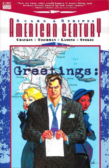
AMERICAN CENTURY:SCARS AND STRIPES Penciled by Marc "No Blaming" Laming Inked by John "Doris" Stokes Written by Howard "Victor" Chaykin & David "Tsk" Tischman Lettered by Ken "The Bruise" Bruzenak Coloured by Pam "This Time We Win" Rambo Seperations by Jamison Logo Design by Rian Hughes Original Cover Paintings and Thumbnails by Howard Victor Chaykin 
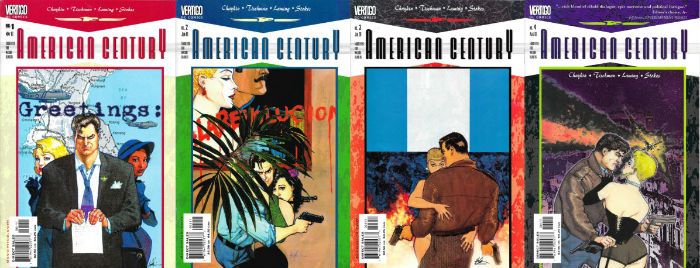
Originally published in single magazine form as AMERICAN CENTURY 1-4 DC Comics/Vertigo, $8.95 (2001) American Century Created by Howard Victor Chaykin

 photo ACtpbCovB_zps9rcgmk2n.jpg

Usually I ignore the quotes on books unless it’s from someone whose opinion I respect. Since for comics these are usually sourced from Neil Gaiman, mostly I ignore the quotes on books. (Hee hee!) The TPB of AMERICAN CENTURY: SCARS & STRIPES has a nice, refreshingly non-Gaiman, quote though:

"Now we know what would happen if James Ellroy and Graham Greene hooked up and wrote comics." - Editor's Choice, Entertainment Weekly

Yes, you could dismiss it as glib but it’s actually pretty smart, especially as Graham ‘Brighton Rock’ Greene isn’t the usual point of comparison for Comics’ Greatest Ballroom Dancer, Howard Victor Chaykin. James Ellroy’s name is not so surprising: unpleasant people doing unpleasant things against an unpleasant historical backdrop; the fictional creating literary friction with the factual; ayup, AMERICAN CENTURY is squarely in ‘American Tabloid’ territory. Less liberal-baiting racial slurs than the Demon Dog, though. But, Graham ‘The End of the Affair’ Greene? Yeah, it works. Just as Graham ‘The Human Factor’ Greene’s work took place in Greeneland so does Chaykin’s work take place in Chaykinland; both imaginary lands bearing some resemblance to the real world, but largely defined by the idiosyncrasies of the authors in question. Graham ‘The Power and the Glory’ Greene had Catholicism and Chaykin has Judaism; but whereas Graham ‘The Quiet American’ Greene wore his religion like itchy fetters, Chaykin sports his like a natty hat. Both Graham ‘Our Man in Havana’ Greene & Chaykin evince a healthy interest in the world around them, its history, and how this history affected people and vice versa (emphasis on the vice, alas). As approaches go the whole saying something about the world we all inhabit approach sadly proves, when it comes to comics, to be rare as hen’s teeth. So, despite the eruptions and ructions of the very recent past North American genre comics can be relied upon to continue on their merrily emptyheaded and decompressed way, telling us very little about not very much. Exceptions exist, but I put it to the Court, m’lud, that no one has so stubbornly endeavoured to elevate North American genre comics from insubstantial Pablum to something with some mental traction, than the thermodynamic miracle, Howard Victor Chaykin. (Well, no American anyway.) Of course there are very clear differences between Chaykin and Greene; Graham ‘The Third Man’ Greene definitely wrote ‘Travels With My Aunt’, but let’s face it Chaykin would be more likely to write ‘Travels With My Cock’. Comparisons only go so far, after all.

 photo AMCLedgeB_zpssfvgsfqy.jpg

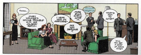
In many ways AMERICAN CENTURY (the 2001 Vertigo Comics series, of which this TPB collects the first four issues) is a succession of travels with Howard Victor Chaykin’s cock. Or his analogue’s cock at least. This time out that analogue is one Harry Block (later Harry Kraft) by name. Harry’s a Portuguese ginger midget with a wooden leg and halitosis that can stun an ox…oh, okay, Harry’s a tall, handsome, physically fit, dark haired, realistically cynical (or cynically realistic), heterosexual American Jew who might not be too smart, but is pretty wily and kind of self-righteous. That is, it’s the usual Chaykin mix of mensch and schmuck we know and love so much. Harry’s come back from the War and unsuccessfully settled into the suburbs. His wife’s a nag and his life is drab. Then he gets drafted for the Korean “Police (cough!) Action” And like any responsible adult he just ups and fucks off, leaving it all behind and sets out into the…(ta da!) American Century! Because, okay, sure, we have to give America that much; the 20th Century belonged to America. (Sorry, Yanks, the 21st Century is earmarked for Tonga. It’s Tonga’s Century, we’re all just living in it!)

 photo ACwakeB_zpsaj4rsgio.jpg AMERICAN CENTURY by Laming, Stokes, Chaykin, Tischman, Bruzenak, Rambo and Jamison

The book is set in the ‘50s which is an interesting period in American history, one when America’s Imperialism, emboldened by the fact everywhere else was just plain tuckered out after WW2, was still a tad heavy handed. The ‘60s of course would force a slicker and quieter approach after Vietnam black America’s eyes (e.g. in 1968: 16,592 American deaths were reported in Vietnam versus, say, in 2014: the first McDonalds was opened in Vietnam. I don’t like McDonald’s, but I’d much rather dead cows than dead people. Sorry, vegetarians.) Of course Howard Victor Chaykin isn’t the only name involved here. Writing wise it’s Chaykin & Tischman, which, well, it’s a gobstopper isn’t it? I was going to go with “C&T”, “Tishkin” or maybe “Chayk-Man” for brevity’s sake. But “C&T” sounds like a cheap cocktail (or a regrettable medical procedure people who respect life but kill doctors want to ban), “Tishkin” sounds like a 19th Century Russian poet (author of ‘The Bronze Cocksman’, perchance) and Chayk-Man sounds like a really bad idea for a superhero (don’t ask). So, I’ll be sticking with Chaykin & Tischman, thanks.

 photo ACpartyB_zpswfrooqew.jpg AMERICAN CENTURY by Laming, Stokes, Chaykin, Tischman, Bruzenak, Rambo and Jamison

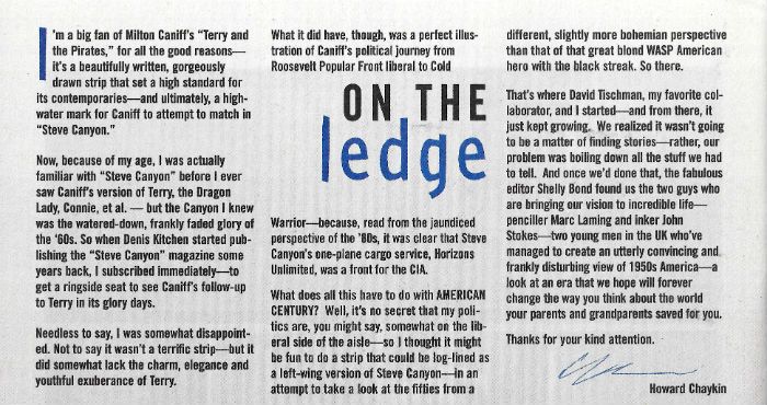
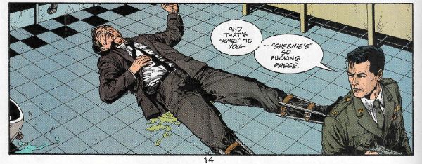
On art there’s Marc Laming, with inks by John Stokes. Laming’s cut quite the rug lately over at Dynamite with his pleasantly solid work on the Kings Features characters, but back in 2001 he was a greenhorn and, alas, it shows. Working from breakdowns by Howard Victor Chaykin, Laming’s work is never less than efficient but hardly more than that either. Problems are apparent on the first page where he fluffs the distance between a coupling couple and a pile of books. The whole point of the scene is their physical infidelity topples the books and causes a crack in a wedding photo (SYMBOLISM!) Yet, the books are either too far away for it to work and the couple appear to throw themselves across the room, or they are comically large books.  Perspective, innit. Tricky stuff. (Wittily, one of the books is Norman Mailer’s 1948 novel ‘The Naked and The Dead’, wherein Mailer was swayed into the use of “fug” rather than “fuck”, because, uh, moral decency and all that good stuff. By 2001 Chaykin & Tischman are under no such constraints and revel in it. Swear like fucking sailors they do. Disgraceful fuckers.) Laming’s faces are also less than ideal, tending toward a samey-ness which can confuse. But, hey, that never stopped Jim Lee.  And it probably didn’t take Laming 6 months to draw someone’s tear duct. John Stokes’ inks manage to elevate Laming’s art for the most part but, alas, the art is at root the kind of stiff that results from artistic stage fright. Hey, it’s a big gig for someone starting out, and while Laming never excels, he doesn’t disgrace himself either. He’s good on the hardware and environment; cars, houses, offices all have that authentic repressed ‘50s flavour. Racism and homophobia saturated the '50s but they could sure design cars and fridges. Now we stil ahve all the bad stuff but everything looks like cheap crap. Uh, anyway. Fair’s fair, the story gets told; which is more than many can manage first time out. Some established pros still struggle don’t they, Tony S Daniel? Laming and Stokes’ art is given some visual pop via Ken “The Bruise” Bruzenak’s reliably playful lettering, but he struggles to integrate it as smoothly as he can with Howard Victor Chaykin’s art. Luckily with Chaykin & Tischman’s script there’s a surfeit of bawdy energy and surly humour which helps to paper over the artistic cracks somewhat. Unusually for comics then, AMERICAN CENTURY fares better on the writing than the art, with the script retaining the urbane combination of aloof and louche which makes Howard Victor Chaykin’s solo work sparkle so. I don’t know what the actual split on scribing duties were, but if Tischman was just tasked with putting Howard Victor Chaykin into historical scenarios and ensuring the tiny dynamo was waist deep in fighting and fucking, he couldn’t have done a better job. Tischman also writes the introduction to the TPB, and it’s a nice piece of clipped prose, evoking the hard-boiled likes of Cain and Hammett which the series seeks to channel, but also with that undercurrent of self-aware humour characteristic of Chaykin’s work. Even when others are involved.

 photo ACslursB_zpsqxsmgym4.jpg AMERICAN CENTURY by Laming, Stokes, Chaykin, Tischman, Bruzenak, Rambo and Jamison

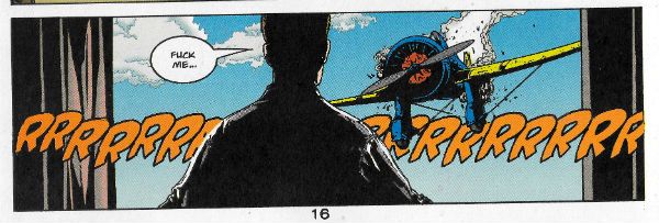
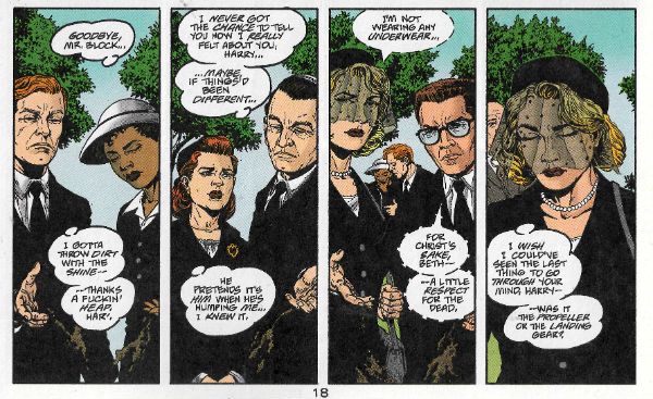
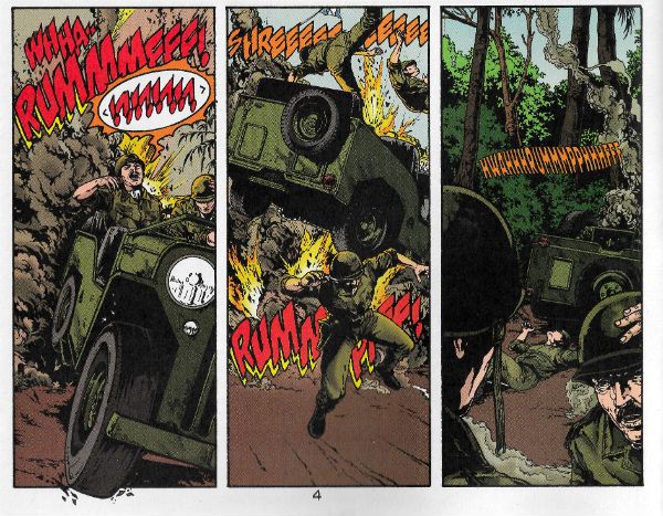
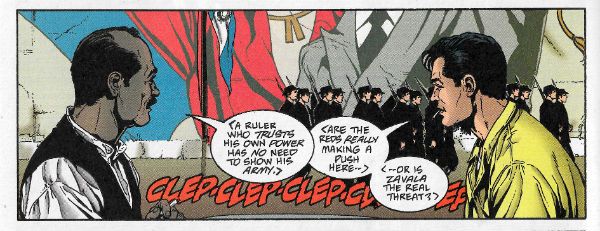
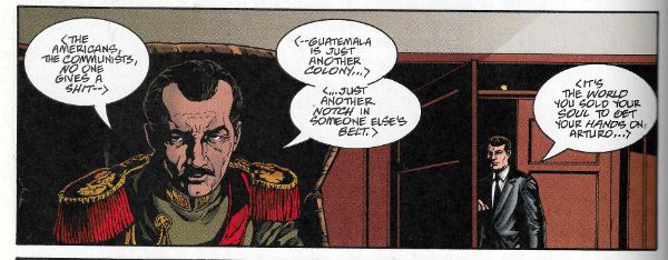
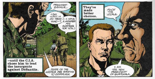
The post-WW2 period when America was still King Shit of Cock Mountain, all swagger and unreflecting self-righteousness, unsurprisingly provides plenty of grist for AMERICAN CENTURY’s revisionist mill. The book starts off with a swift precis of ‘50s suburban Hell; people living the American Dream, but finding dreams are just fantasies which reality rides roughshod over. These people don’t just play charades at dinner parties, you hear me? People being piss poor fits for perfection, AMERICAN CENTURY shows how everyone is unhappy in a different way despite the air-con, fridges, autos and rictus grins. But the book isn’t interested in everyone; it’s interested in Harry Block/Kraft. A lot of the characters get short shrift because of this, but only in comparison. (And the series swings back in later issues to see how most of them are doing.) Character-wise, considering the set-up takes place in one issue it’s an impressive piece of compression. The book’s cast is swiftly delineated as being an All-American rainbow of racists, repressed homosexuals, sexists, dipsos, adulterers, anti-Semites, moral cripples, physical cripples, and probably a few other things I forgot; all swiftly and ably done in less than one issue to boot. It’s a lot to take in in a short span of pages. But the key here is to read the book slow. Seriously, you can’t breeze your way through AMERICAN CENTURY like most comics; you have to take your time. AMERICAN CENTURY assumes you want to spend time with it and operates accordingly. If you just zip through the book like it’s a chore to be done rather than a pleasure to be savoured you’ll think it’s a jumbled mess. It ain’t. Having done all that scene setting spade work AMERICAN CENTURY then throws it all out of the window as Harry absconds in an aeroplane, and Chaykin & Tischman drop Harry into a fantastical scenario where America is sticking its oar into another country’s business. What utter nonsense! Ah, well, unfortunately it isn’t. For the rest of the book Harry has to fictionally negotiate the factual US backed Guatemalan coup of 1954 in a tale which is both lurid and educational, both fiction and fact, with not a little Howard Victor Chaykin sexual wish-fulfilment on the side. Yes, all the Ladies Love Cool Howard, from the dirt poor hooker to the Eva Perón-a-like. It’s a curse, I imagine. Hang on, John, the US backed Guatemalan Coup of 1954? The US backed What of The When?

 photo ACbattleB_zpsiagjq0fb.jpg AMERICAN CENTURY by Laming, Stokes, Chaykin, Tischman, Bruzenak, Rambo and Jamison

Remember Ike, whom buttons proclaim we all like? Well, in 1952 people liked Ike enough that Eisenhower became President of America on the back of a campaign, within which was snugly nestled a promise to actively combat, rather than inertly contain, communism (N.B. America is not a big fan of communism. Just so you know. They hide it well, but they can’t fool me.) The prior Truman administration had been increasingly wary of communist influence in Guatemala but had played largely fair, using only economic and diplomatic pressures. (PBFORTUNE its one attempt at covert action was quickly shelved once it became somewhat less than covert. Oops!) Fairness was off the board post-Truman as McCarthyism (i.e. the hysterical self-aggrandising scaremongering of Senator Joseph McCarthy, not an outbreak of impressions of Edgar Bergen’s ventriloquist doll Charlie McCarthy) was rife within Eisenhower’s Government, the Cold War was escalating and Russia was a totalitarian shitshow giving socialism a bad name (link to Bon Jovi: “BAD NAME!”); all in all things were looking bleak for Guatemala on the non-intervention front. Geopolitically speaking America was cracking its knuckles in an alley waiting for someone to distract Guatemala’s attention. But why? Guatemala? Bizarrely the culprit was a fruit company with its nose bent out of shape. I didn’t even know they had noses!

 photo ACfruitB_zpso03659x2.jpg AMERICAN CENTURY by Laming, Stokes, Chaykin, Tischman, Bruzenak, Rambo and Jamison

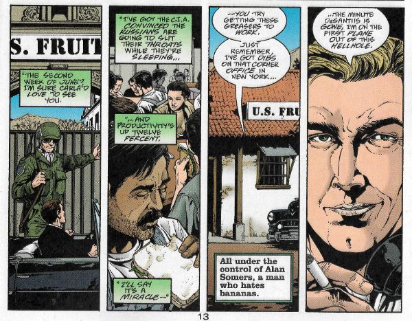
Because I am largely docile I have spent a large part of my life thinking the United Fruit Company (UFC) was just some kind of CIA front with a typically silly code name, and while the CIA and the UFC were indeed linked, it turns out the UFC was actually and primarily a fruit company, probably a united one to boot. Yeah, fruit; Bananas and that. I find it odd to this day that a fruit company (!) could have such an effect on history as this one. Well, any effect on history besides providing people with fruit. Now, because unrestrained capitalism is just great, just absolutely fantastic, this US based company had basically ended up running a private fiefdom within Guatemala; true this was via concessions from various Guatemalan rulers who liked money rather more than their people. Hold on though, fruit isn’t the only fall guy in this scenario as these bad practices had their root in the 19th Century and the concessions made to plantation owners when coffee demand blossomed. So the humble coffee bean has to shoulder some of the blame. Yes, History makes even breakfast a guilt trip! What larks.  In clear violation of anything even remotely close to human decency, land was sold from under the (poorly shod, I imagine) feet of the Guatemalan population to the plantation owners and, acting like monopoly is just a board game, the UFC ended up being the only banana game in town, with control over the communication and distribution infrastructure required by such a business. You know, little things like roads and rail tracks. Things were pretty awesome for the UFC all told, but less so for the average Guatemalan. I don’t know, but I imagine they were controlled by repression and violence, which are all okay obviously as long as they are happening out of the customers’ sight and people get their iPads, I mean, bananas. In 1929 the Great Depression happened and, boy, that was what historians call “a doozy”, there are books about it and everything. Surprisingly though, The Great Depression didn’t just affect America; everywhere was a bit down in the mouth. In Guatemala it was all getting a bit much; life was shit and now this? Finally, the Guatemalan people rose up (hurrah!)…and were pushed back down (boo!). Actually they were pushed even further back and even further down by Jorge Ubico’s (US Supported) regime, for which the word repressive is probably soft soaping it. The important thing here though is Jolly Jorge Ubico not only gave the UFC massive amounts of public land, but also exempted it from all taxes.

 photo ACmarchB_zpsfw5cv8rp.jpg AMERICAN CENTURY by Laming, Stokes, Chaykin, Tischman, Bruzenak, Rambo and Jamison

Taxes! People fucking hate paying taxes don’t they? I just want to make this point here because currently people seem to think paying tax is some kind of cheeky imposition, some kind of theft. Look, tax puts the money back. Not all of it; you can keep some for being successful, because there’s nothing wrong with success and the rewarding thereof. (Despite what they tell you Socialism doesn’t punish success.) Hey, I’m no economist (SPOILER!) but here’s a clue about trickle-down economics – if you divert all the money into bank accounts in Panama it isn’t going to trickle anyfuckingwhere, certainly not back into society where it is needed. It’s really cute that you can afford someone to cook your books so you avoid paying what you should, but don’t expect us peons who have to pay full whack or face going to prison to be cheering you on. If you are paying someone to get creative with your taxes I’m not sure you should do that. It’s “From each according to his ability, to each according to his needs.” It’s not “From each as little as you can fucking get away with, to each none of mine if at all possible.” Squirrelling your money away off-shore is as Left Wing as Enoch Powell’s arse. Yeah, I do know the difference between tax evasion and tax avoidance. And, yeah, I know one’s not illegal, but I also know it is still immoral. So, yeah, my names JohnK, and I think my shit don’t stink or whatever you think will shut me up, but, hey, pay your taxes. It’s not a little game between your accountant and the gubbermint; people die due to lack of adequate funding. You know - human beings. Die. And they don’t come back like in the comics. But of course you’ll never see them die and you’ve got your bananas, right? You’ve got aaaaaaaaaaaalllllll the bananas. Well done you. Hang onto those bananas. Like a big fucking chimp. Man, 2016’s really soured my mood. Sorry about that. No, no I’m not. Scratch that.

 photo ACbeltB_zpskiargxk8.jpg AMERICAN CENTURY by Laming, Stokes, Chaykin, Tischman, Bruzenak, Rambo and Jamison

So, uh, where were we? (Christ, who was that guy? “Immoral”? Dude, it ain’t the 16th Century. What a fucking “snowflake”. Hurr.) Right, so, if history has shown us anything it’s that The People will put up with far too much shit before kicking back. But eventually kick back they do, and in 1954 the Guatemalan people did so and Ubico valiantly ran off, leaving a Junta in his place which continued his charming policies. This being a less than ideal outcome, the Guatemalan people had another crack at it. Persistence paid off as The October Revolution threw the Junta out. A real kick in the Juntas there and, miracle of miracles, there was a free election. Like, uh, democracy and that. Democracy, which America loves; unless it gets in the way of its bananas. Juan José Arévalo won the election and while he was by no means a communist, he was certainly an improvement and sensibly pragmatic. He shook things up, but not enough to shake them to pieces. Education, health and the labour code all improved, and there was even a minimum wage. Civilised stuff, I trust you agree. Keeping America sweet he was openly anti-communist (America still had its doubts about him, because being anti-communist would be perfect cover for a communist wouldn’t it? Yes, America. Keep taking the pills, America.) Human nature being what it is, for improving the lot of the Guatemalan people Arévalo’s reward was around 25 attempted coups. Over here Jeremy Corbyn (who also only wants to improve people’s lot) has only had one attempted coup so far, but there’s time yet. Jacobo Árbenz was elected next and he started to step on some UFC toes. (Uh oh.) He began to roll back some of the ridiculous concessions granted under Ubico and, worse (i.e. better), his 1952 Agrarian Reform Law (sexy stuff! Batman? Pah! Agrarian Reform Law, that’s the sexy business.) confiscated 100s of 1000s of acres of uncultivated land from the UFC, with compensation based (get this, this is truly excellent, I like this bit:) on the valuation used by the company for its tax payments. I adore the chutzpah of that. Let’s see, who thinks the valuation the UFC used for its tax payments was anywhere in the region of the real worth of that land? Hmmm. Anyone? I’m not seeing any hands. Good, so we all know how the world works. So, hoo boy, that pissed the UFC off. Big mistake. I know; it’s a fruit company (bananas and that) so how come the CIA would help it stage a coup? How precisely do you get from bananas to blood in the street?

 photo ACsuperB_zpsqzpb0pfw.jpg AMERICAN CENTURY by Laming, Stokes, Chaykin, Tischman, Bruzenak, Rambo and Jamison

Unfortunately, I don’t know. I doubt anyone knows. To this day the reasons why the Eisenhower administration backed a coup in Guatemala due to the discomfort of a fruit company forced to exhibit the barest modicum of decency are shrouded in eerie wisps of mystery. While it is true that Secretary of State John Foster Dulles and CIA Director Allen Dulles had both arranged several deals for the UFC while previously working in Law, and it is true also that Undersecretary of State Bedell Smith later became a UFC Director, and it is additionally true that the wife of the UFC Public Relations Director was personal assistant to Dwight D. Eisenhower, the President of The United States of America, surely to suggest any inappropriate conflation of interests is tantamount to an act of treason, sir. I mean, good luck trying to join those dots, huh? Paging Woodward and Bernstein! Geraldo, even! It’s a two-pipe problem and no mistake, Sherlock. Golly, I guess we’ll just never know. Unless you read about the Guatemalan coup on Wikipedia, where there is also a handy cut out and keep list of all the regime changes America has had a hand in (although it misses off the Australian coup Britain also had a hand in. (Sorry, Australia; poor form on our part there.)) Coups always make for good reading, as there are always unbelievable bits like that part where a force of  60 (US supported) insurgents were arrested by a single policeman before they even crossed the border from Ecuador. Coups also make for sad reading, because they mean something’s gone wrong. In the end the US Sponsored Guatemalan coup won, not because it was well planned, efficient, or in any way professional, but because everyone knew America was behind it (America wanted everyone to know for precisely this reason), and knowing that once you’ve got rid of the "rebels" America is going to start swinging its nuclear powered fists takes the wind out of most country’s sails. Or maybe it succeeded because America is the Hand of God working upon this Earth. Yeah, if you’re a stone cold lunatic, that’s certainly another explanation you could go with. In 1999 the renowned woman botherer and then President of the United States of America Bill Clinton apologised for all the US shenanigans in Guatemala, which made everything okay, and America never messed in other countries’ affairs again, the wicked stepmother recanted, the dish ran away with the spoon and we all lived happily ever after.

 photo AMCcoversB_zpsvojsowcn.jpg

Aren’t you all glad I didn’t go all the way back to The Monroe Doctrine? I know I am. Obviously you don’t need to know all that up there to enjoy AMERICAN CENTURY. I didn’t know all that. I had to go and look it up on Wikipedia; it’s not like I carry around ‘Ye True and Fplendide Hiftory of Guatemala’ in my head. But the point (yes there is one) is that Howard Victor Chaykin and David Erasmus Tischman had to know it, and the fact that they succeeded in spinning it into an entertainingly racy tale is even further to their credit. The value of fiction in giving us tools by which to apprehend the nature of the world we live in seems to have been forgotten by most comic creators. Stick your head in the sand too long and history will kick you in the arse. This year History’s been kicking far too many arses, and it might be beneficial if comics remembered there was a world beyond their borders, and helped push our heads out of the sand. Just a thought.

In case you were wondering, AMERICAN CENTURY was VERY GOOD!

NEXT TIME: Less strident half-witted recapping of Wikipedia and more COMICS!!!

“...Even LIMP, That Bat's Too Much For ME.” COMICS! Sometimes It's The Cat Which is The Unnameable.

This time out: a lady werewolf, the slightly lighter side of Lovecraft and a drunk cuckold finds the vengeance trail's gone cold.  photo MotSTopB_zpspubovcvt.png Midnight of the Soul by Chaykin, Arbutov & Bruzenak

What's not to love about that, am I right or am I right?

Anyway, this... SHE WOLF #1 All by Rich Tommaso Image Comics, Inc., $3.99 (2016) She Wolf created by Rich Tommaso She Wolf © 2016 Rich Tommaso

 photo SWCovB_zpspae8lmxo.png

The slightly creepy theme (from my more than slightly creepy self) this week kicks off with Rich Tommaso's teenage werewolf comic. Pretty straightforward stuff you'd think, teenage werewolf comics; but you'd be wrong. Maybe. I mean she might be a werewolf, she might not, and if she is, well, she might have been bitten by one, or maybe a shape changing spell went wrong. Or she just doesn't like dogs and, uh, wait her boyfriend was a ...no, wait now she's fighting her priest but...maybe not. This hallucinatory narrative uncertainty is intentional, I would guess given that Tomasso's comic is a visually resplendent wonder indeed. You don't get the skill to draw something as phenomenally vital as this unless you know what you're doing. Of course, whether you want to let the reader in on what you are doing is another thing altogether.

 photo SWPicB_zps8clcxffl.png She Wolf by Rich Tommaso

Now as we have all noted on numerous occasions, I am terrible when it comes to colour in comics but even I can see that colours here are some kind of spectacular you'd do well not to miss. At first I thought the colour coding of scenes was the key (red for dreams, blue for night, various for daytime reality) but everything starts to get blurry, and reality and fantasy are all mucked about, and you soon don't know which end is up. Which, you might hazard should you be able to rememebr that far back, is what being a teenager is like. (The way I remember it is this: being a teenager is A!W!F!U!L!). Tomasso certainly draws his heroine as a true to teenhood gawky flail of elbows and knees, like a young Laura Dern; in gangly contrast to the smooth swoosh of movement personifying the animal identity. Then there's the great scene where the Principal is reassuring our heroine, but she can also see a black and red doppleganger Principal whose every word drips mistrust and belligerence. Yeah, adults say they want to help you but they LIE because they HATE you! Man, it's a great scene. But then there are a few of those here. More great scenes in one comic than most series manage in toto. Tomasso's cartoony style may bely the horror, particularly in a viscerally unsettling dream sequence, but this lends everything a kind of comedic undercurrent. Or maybe it's a comedy with a horrific undercurrent. I don't know, but what I do know is I'm sticking with this one because Rich Tomasso's SHE WOLF is VERY GOOD! AAAAARrrrrrrrrrrrroooOOOOOOOOOAAAAOOoooooHHHH! WEIRD DETECTIVE #1 (of 5) Art by Guiu Vilanova Written by Fred Van Lente Coloured by Mauricio Wallace & Josan Gonzalez Lettered by Nate Piekos of Blambot ® Dark Horse Comics Inc., $3.99 (2016) Weird Detective ™ created by Fred Van Lente & Guiu Vilanova Weird Detective ™ indebted to the work of H P Lovecraft Text and illustrations of Weird Detective ™ © 2016 Fred Van Lente & Guiu Vilanova

 photo WDCovB_zps6556lw3x.png

Standing in stark contrast to Alan Moore & Jacen Burrows reverent and stately paced dark hymn to the majesty of HP Lovecraft, here we have Van Lente & Vilanova's somewhat more modern take. Mash-ups are still modern right? Because what WEIRD DETECTIVE ™ is is HP Lovecraft smushed up with the detective genre, hence the title. It's a lot of fun, whether it's more fun than PROVIDENCE I don't know, because anyone who measures fun is someone who isn't having any. Personally I had fun with both, just different kinds. WEIRD DETECTIVE is plump with cliches, but that's because the detective genre is filled with cliches rather than due to any lack on Van Lente's part. Van Lente in fact proves pretty smart at playing with the conventions and part of this smartness is displayed in his clever sense of humour. The scene where Greene watches TV detectives to get tips on behaviour almost buckles under all the referencing (Lovecraft, Rockford Files, Martian Manhunter, etc) but is instead impressive in both its levels of humour and intelligence. This undercurrent of drollery prevents things becoming too rote or too unpleasant. Because some of the book is pretty gross, there's the standout death by toilet but there are quieter horrors at play too. And all the horrors are derived from the Lovecraftian mythos and blatantly so. You won't be scratching your spade-like chin with this one trying to figure out the links, because the links come fast and blatant as Owen Smith's strings.

 photo WDRFPicB_zpsrhupicvf.png Weird Detective by Vilanova, Van Lente, Wallace & Gonzales, Piekos

I liked Vilanova's art, although it takes a dip near the middle of the book but swiftly recovers. His real world is realistic and his creatures are unpleasantly convincing. Let's face it, it takes no little talent to make unsettling some of Lovecraft's creations, which essentially resemble an overcooked carrot, some ping pong balls and a brace of drinking straws. The action is nicely done with a particularly good fall from a high place but Vilanova also keeps the quieter scenes interesting, such as the parts where our weird detective communicates with his cat through slight twitches of his facial muscles. Although any conversation with a surly cat is by definition interesting, I guess. WEIRD DETECTIVE is clever, funny, gross and GOOD!


MIDNIGHT OF THE SOUL #2 (of 4) Art by Howard Victor Chaykin Written by Howard Victor Chaykin Coloured by Jesus Arbutov Lettered by Ken Bruzenak Image Comics, Inc., $3.50 (2016) Midnight of the Soul created by Howard Victor Chaykin Midnight of the Soul © Howard Victor Chaykin

 photo MotSCovB_zps5io07zfc.png

Lycanthropy and Lovecraft are creepy but the creepiest of all must be my fawning over the work of Howard Victor Chaykin. Occasionally some luckless naif will have the temerity to question why I like the work of Howard Victor Chaykin quite as much as I do. He, they often persist, always makes the same comic. This, and here is where their lucklessness comes in, spurs me to anecdotal reminiscence thusly: It was the 1990s and far too many people were taking Paul Weller seriously. One day I had a visitor who upon entering traversed the floor with the healthy, male clutter of batch (crispy tissues, ragged jazz mags, suffocated ashtrays, the glutinous residue of alcoholic frolics, etc etc) to the bookshelves.

 photo MotSPicB_zps0zebqrnq.png Midnight of the Soul by Chaykin, Arbutov & Bruzenak

Despite the variety and fine taste on show said visitor was evidently puzzled, breaking their silence with, “You have an awful lot of Elmore Leonard here.” I conceded the truth in this observation, yet couched within my tone was my evident uncertainty as to why precisely that might be so remarkable. “But doesn't he just write the same book all the time?” came the withering parry. “Yes”, I said “but it's a good one.” Then I started searching for a vein. (Not really.) VERY GOOD!

Remember: Stay on the road. Keep clear of the – COMICS!!!

“I Myself Played A Zobo Kazoo.” COMICS! Sometimes Comedy Lurks In The Unlikeliest of Places!

Yeah, uh,  sorry. Didn't mean to be gone quite so long. Got distracted by the real world. Big Mistake. What an awful place the real world is. Simply dreadful. So, yeah, not a good year thus far for any of us, huh? Hey, I know what we need, some sweet, sweet COMICS!!! (DISCLAIMER: Contains words of praise for Alan Moore.)  photo MotTOP_zps8wymixgp.png Midnight of the Soul by Chaykin, Arbutov & Bruzenak

Anyway, this... MIDNIGHT OF THE SOUL #1 Art by Howard Victor Chaykin Written by Howard Victor Chaykin Coloured by Jesus Arbutov Lettered by Ken Bruzenak Image Comics, Inc., $3.50 (2016) Midnight of the Soul created by Howard Victor Chaykin

 photo MotSCovB_zpsgxts8vht.png

So, yeah, at long damn last Howard Victor Chaykin's MIDNIGHT OF THE SOUL strikes at your eyes like a comic book cobra! My son (“Gil”) wasn't even born when the coiner of the phrase “moral cripples” started talking this one up. You can't rush awesome though, so here we are. Fifteen hairline depleting years later, here we are. This time out Howard Victor Chaykin's dreamy doppelganger is one Joel Breakstone who as ever looks good, looks fine, maybe a little too good, a tad too fine for someone in Joel Breakstone's position. That being one of a man wallowing in a self medicated haze of booze following an as yet unrevealed incident while liberating the WW2 Death Camps.

We'll obviously be coming back to the Death Camps of WW2. Largely because Joel Breakstone keeps going back to the Death Camps of WW2. Because, as Joseph Heller might have it “something happened” in the Death Camps of WW2. Not just the stuff we all know went on in the Death Camps of WW2 but something particular to Joel Breakstone. Because Joel Breakstone helped liberate one and what occurred in The Death Camps of WW2 is the gift that keeps giving. But then don't judge the book too quickly, because there is such a thing as an unreliable narrator and a pretty good candidate for such a post would be a man whose spent five years coping with PTSD by self medicating himself with alcohol and refusing to leave his house. That's Joel Breakstone, not me. On the very first page turn Chaykin seamlessly entwines the past and the present via the images of chimneys and he keeps this high standard of storytelling up for the duration. He seems more than present, he seems engaged, and because Howard Victor Chaykin is engaged the words on the page matter and no word matters more than the first word here “Parallels.”

 photo MotS003B_zpsi7gbqzio.png Midnight of the Soul by Chaykin, Arbutov & Bruzenak

Art-wise it's looking good, it' s looking cleaner and smarter than a Howard Victor Chaykin joint has for a while. The big test of Chaykin art in 2016 is how is going with the cheeks'n'chins? I checked with my eyes and the cheeks and chins in MotS seem altogether more controlled than they have for awhile. Chaykin's reigning in his prognathous tendencies and no one is stylin' Jō Shishido cheeks,so that's good. His figure work's sweet, with a killer panel of Breakstone kicking his TV in. And that TV, like everything around it, seems period authentic so I guess he's as reliable as ever in that respect. There's still a little ghost-float where the images don't quite cohere ideally, but Jesus Arbutov's shadows attempt a corrective tethering. And Ken Bruzenak, lovely, lovely Ken Bruzenak continues his ridiculously innovative attempts to visually represent the purely audible; by now his constructions of visual onomatopoeia are as integral to the art as a whole as any pictures Chaykin lays down. It's a finely honed machine, is what I'm saying.

MIDNIGHT OF THE SOUL is as ridiculously virile, as cheekily provocative, as visually intelligent and as resolutely “Chaykin” as anyone could wish. VERY GOOD!

THE TWILIGHT ZONE: THE SHADOW #3 Art by Dave Acosta Written by David Avallone Coloured by Omi Remalante Lettered by Taylor Esposito Cover by Francesco Francavilla Dynamite Entertainment, $3.99 (2016) The Twilight Zone created by Rod Serling The Shadow created by Walter B Gibson

 photo TZSCovB_zpsxud4eqf5.jpg

Here's a thing, my LCS just automatically sends me every comic about The Shadow. I'm not entirely sure why that is, but it is. Maybe they think I am so old I remember the pulps or something. Anyway, this isn't what I was expecting at all. I was hoping The Shadow would be maybe fixing Burgess Meredith's glasses, or leaning past William Shatner and firing his twin .45s through the plane window and blowing that thing to fuck and back, or maybe saving the world by saying, “For the Love of God, it's a cookbook, you blithering fools.” Nope, it's some kind of meta affair whereby Shads has entered The Twilight Zone and every issue he is plonked into some situation where The Shadow is a fictional construct (i.e. kind of our reality; last issue he was an Orson Welles doppler, this issue he's “Maxwell Grant”, and thus deucedely confused) and learns a lesson which brings him that bit closer back to the humanity he had been in the process of losing.

 photo TZSpicB_zpsycbpmhrg.jpg The Twilight Zone: The Shadow by Acosta, Avallone, Remalante & Esposito

It's a clever little set up and while David Avallone might have bitten off a little more than he can chew and the spindly art by Dave Acosta is more game than it is successful, it's neat enough stuff. The kind of thing Neil Gaiman makes such bloody heavy weather out of , but Avallone & Acosta keep it all light with just the right amount of humour and some inventive set pieces. What could be more Twilight Zone-y than The Shadow being attacked by giant typewriter keys spelling J-U-S-T-I-C-E? Not much, I trust you'll agree. GOOD! PROVIDENCE #9 Art by Jacen Burrows Written by Alan Moore Coloured by Juan Rodriguez Lettered by Kurt Hathaway Cover by Jacen Burrows Avatar Press Inc, $4.99 (2016) Providence created by Alan Moore & Jacen Burrows Inspired by and indebted to the works of Howard Philips Lovecraft

 photo ProvCovB_zpsumncfz0i.jpg

In which everyone's favourite ginger haired Jewish homosexual nebbish glides blithely nearer a Stygian fate swarming with noisome and gibbering cyclopean terrors whose preternatural forms possess angles in defiance of all mortal conceptions of GEOMETRY!!! It took a bit of getting into to be honest, this one. Burrows' art was a bit of an impediment to immersion until I figured it out. It's purposefully bland. Being, I think, the visual equivalent of Lovecraft's dense and willfully archaic texts, which softly lull you into a kind of waking stupor, allowing the horrors to encroach subtly but decisively even as your eyes glaze over. Thus leaving you ripe for the final unveiling of...no, no, it cannot be named! At first I thought the series could be improved by having, say, Cam Kennedy or Richard Corben draw over the, uh, unutterable aspects. But then they'd really stand out, which isn't what they're after, I think. Even the, uh, eldritch elements have to be visually contiguous so that our protagonist’s rationalising of the thoroughly irrational has some credence.

 photo ProvPicB_zpspf590exx.jpg Providence by Burrows, Moore, Rodriguez & Hathaway

Sure PROVIDENCE took some effort to read, but it repaid that work. Heck, I even started rereading Lovecraft hissownself, and I haven't touched the stuff since I was 15. Lovecraft that is, not the glue. Yes, I'm still merrily huffing into my forties. No, but, anyway re-reading Lovecraft? Hoo boy is he racist! It's right on the page as well. I missed that when I was fifteen, so either I was a bit thick or I was very racist myself, because seriously HP Lovecraft? Big racist. Just lays it right out there. Turns out he was the kind of racist who was anti-Semitic too. Lovely. Funny thing is though he was the kind of anti-Semite who marries a Jewish woman, because racists never make sense. (That's because racism doesn't make sense.) Anyway that marriage was less than successful (I know! SURPRISE!), but it does lend HP Lovecraft's jolly time with our Jewish friend herein a undercurrent of humour. Because there's a lot of humour in PROVIDENCE, some of it quite dark but some of it just plain funny. I mean, HP Lovecraft on these pages is a hilarious creation, seemingly inhabiting the century just prior to the one everyone else is living in. His erudite vocabulary set to task on the most mundane of conversational niceties is a proper hoot. He was actually a bit like that as well, so they say. Odd cove all round that HP Lovecraft. Say, did I mention the racism?

With PROVIDENCE Alan Moore brings a depth, intelligence and care to his writing which makes most everything surrounding it in the mainstream comics world seem as unto hurried mush, and Jacen Burrows acquits himself well r.e. his apparent brief to keep it real. The book repays the work you put in, basically. That dumpy looking washer woman staring balefully from the tower in this issue? It's not the first time she's appeared in the series. But to what end. To what...END!!! VERY GOOD!


That is not dead which still reads – COMICS!!!

"Bedlam In Bug's Back Yard!" Sometimes The Visual Tribute To Battlin' Bill Mantlo Has A Second Part!

Yes! The post no one demanded! All the visual ephemera I could find within my battered back-issues of Battlin' Bill Mantlo and Michael "is" Golden's fizzy kid's comic confection THE MICRONAUTS. I may have missed one or two, but even so here is art from Michael Golden, Steve Ditko, Gil Kane, Butch Guice etc.. which may very well be shortly lost to time. Not on this old fool's watch! Feast your eyes! BONUS: Is MICRONAUTS #39 the "Rosebud" to Citizen Hibbs? Wilder things have happened, pilgrim! Have a happy Bank Holiday, from your pugnacious pal Jabberin' John K of the UK! EXCELSIOR!  photo HibbsB_zpsvpcxcwpl.jpg MICRONAUTS#39 by Steve Ditko, Danny Bulandi, Bill Mantlo, Jim Novak & Bob Sharen

Anyway, this...

 photo TP002B_zpstxlfgfub.jpg

 photo TP005B_zpsr6ronjt9.jpg

 photo TP006B_zps9pd69oto.jpg

 photo TP003B_zpstg7jvdib.jpg

 photo TP001B_zpsgssoqmvx.jpg

 photo TP009B_zpshjjzhfuj.jpg

 photo TP004B_zpsgzomv9fi.jpg

 photo TP010B_zpsyxgcxadu.jpg

 photo TP007B_zps8eymugxp.jpg

 photo TP015B_zpsufibgtmh.jpg

 photo TP013B_zpsalhduhpe.jpg

 photo TP014B_zpssmqf74hs.jpg

 photo TP017B_zps2y3xmxvq.jpg

 photo TP018B_zpshgvi6tfc.jpg

 photo TP019B_zpsh6vyv2nz.jpg

 photo TP020B_zpsknccam7d.jpg

 photo TP008B_zpsswr7u2oy.jpg

 photo TPAn06B_zpscm4mlhq1.jpg

 photo TPAn01B_zps67y3lhbb.jpg

 photo TPAn05B_zpsbvqeynkl.jpg

 photo TPAn04B_zpsddlwznyd.jpg

 photo TPAn03B_zpsdqlice2p.jpg

 photo TPAn02B_zpsrs4gxd0s.jpg

 photo TP035B_zpswwdaw7cg.jpg

 photo TP034B_zpspg9e06wo.jpg

 photo TP032B_zps8hsfioki.jpg

 photo TP031B_zpsaw6sxobw.jpg

 photo TP029B_zpsbhxn5wq8.jpg

 photo TP030B_zpsbghu6shb.jpg

 photo TP028B_zpsrzgtviha.jpg

 photo TP027B_zpsy2jwg2si.jpg

 photo TP026B_zpsb8v5vmym.jpg

 photo TP024B_zpsbaggdukd.jpg

 photo TP023B_zpsian0sctw.jpg

 photo TP022B_zpsvtdxeg8u.jpg

 photo TP025B_zpsc2xyfjaj.jpg

 photo TP021B_zps0wvxicua.jpg

 photo TP036B_zpstoujynfj.jpg

Thanks, Battlin' Bill and all your artistic partners! This kid appreciated it!

NEXT TIME: Words about COMICS!!!

"If Only I Could Convince BEVERLY That He's As IMPORTANT As I Know He Is." COMICS FOLK! Sometimes It's 65 Pictures For 65 Years!

It's the 7th October 2015 and that means it's been 65 years of the chunky wee thermodynamic miracle Howard Victor Chaykin! Today is his day, so I'm going to shut my yapper and below the break you can feast your eyes on 65 images culled from The Chaykin Section in The Kane Garage Archives. Raise your root beers high and let's all drink to another 65 years of the amazing Mr. Chaykin!  photo HeaderB_zpswlcrwrik.jpg

THE SHADOW by Chaykin, Bruzenak & Wald

Anyway, this...

 photo BBKISS1B_zpscqcybakq.jpg

 photo BBKISS2B_zpsbx6hbkyd.jpg

 photo BBKISS3B_zpsrpsevtxg.jpg

 photo BCAT1B_zpshj3ybymm.jpg

 photo BDA1B_zpsjg697xkn.jpg

 photo BHAWK1B_zpsr4487rn3.jpg

 photo BHAWK2B_zps2ntwbeuc.jpg

 photo BHAWK3B_zpslvaerurz.jpg

 photo BHAWK4B_zpsk9qjgymk.jpg

 photo BHAWK5B_zps9a2zkarw.jpg

 photo BHAWK6B_zpsbwixzqwy.jpg

 photo BKISS1B_zpsbg26cktv.jpg

 photo BKISS2B_zpsixbybehi.jpg

 photo BKISS3B_zpswd42yorp.jpg

 photo BKISS4B_zpswyfe0lnr.jpg

 photo BKISS5B_zpsgawdprvh.jpg

 photo BKISS6B_zpsb7omu6u0.jpg

 photo BKISS7B_zps47re8s8w.jpg

 photo BKISS8B_zpsn2qnfe7e.jpg

 photo BKISS9B_zpsfdao5lzz.jpg

 photo BKISS10B_zpsjfu5iebi.jpg

 photo BKISS11B_zpsks0dj48k.jpg

 photo BKISS12B_zpsqd0wnip4.jpg

 photo BKISSH1B_zpsq46doo9k.jpg

 photo BKISSX1B_zpsowjphyl1.jpg

 photo CITY1B_zpsmkfccd2o.jpg

 photo CITY2B_zpsm7tiu6ot.jpg

 photo CITY3B_zps9surjwfn.jpg

 photo CITY4B_zpsvv8qmrom.jpg

 photo CITY5B_zpsmkdz07ai.jpg

 photo CITY6B_zpspo9ywqk4.jpg

 photo CWEST1B_zpsrtl5ojfr.jpg

 photo DFORT1B_zpsjajk764h.jpg

 photo DFORT2B_zps94izj2pn.jpg

 photo DFORT3B_zpsefbkrdjp.jpg

 photo DFORT4B_zps7hefoksy.jpg

 photo FMAELS1B_zpsgmzh6rzo.jpg

 photo INDY1B_zpsrpe6idky.jpg

 photo MIDM1B_zpsobgnd7pt.jpg

 photo MIDM2B_zpsh3pxjf2d.jpg

 photo MIDM3B_zpsyrcirgpt.jpg

 photo MIDM4B_zpsvhdgfj65.jpg

 photo MOSC1B_zpsuoxb7nua.jpg

 photo MOSC2B_zpskpwftthy.jpg

 photo MOSC3B_zps1nhfas1u.jpg

 photo MOSC4B_zpskwu3ln8f.jpg

 photo MOSC5B_zpsa4lkjeg0.jpg

 photo MOSC6B_zpsbphlehsa.jpg

 photo MPREM1B_zpsh10ank2y.jpg

 photo PGLORYA1B_zpsle3tw7lt.jpg

 photo PGLORYB1B_zpskjlqzisx.jpg

 photo PGLORYS1B_zps27ytwlkh.jpg

 photo PGLORY2B_zps6ra5rpby.jpg

 photo PGLORY3B_zpsre61dvlm.jpg

 photo PGLORY4B_zpsswgs4usu.jpg

 photo PGLORYX1B_zpszijwnjbw.jpg

 photo SBUCK1B_zpswi0wsvgc.jpg

 photo SCORP1B_zpsmsk1cxee.jpg

 photo SHAD1B_zpstshhzvyx.jpg

 photo SHAD2B_zpszrzln0nc.jpg

 photo SHAD3B_zpskkszmlj7.jpg

 photo SHAD4B_zpscbmpxflh.jpg

 photo SOL1B_zpsarx20xkk.jpg

 photo SREACH1B_zpsvukxd4xw.jpg

 photo SSTALK1B_zpszp9ajyca.jpg

  Happy Birthday, Mr. Chaykin and thanks for all the - COMICS!!!

"I Have Got To Be Sure, You Old Poop!" COMICS! Sometimes Democracy Comes Second!

Yes! Beat out that rhythm on a drum! Here's the only comic reviews worth reading on The Internet. No, Not really. No, not really in the mood either but if I don't put something up They come round and stand outside my windows in silent judgement. Hoopla! Also, don't forget to Save The Hibbs - HERE!  photo JaimePanelB_zpsui3bzwcz.jpg LOVE AND ROCKETS NEW STORIES by Jaime Hernandez

Anyway, this... GILBERT AND JAIME HERNANDEZ' LOVE AND ROCKETS NEW STORIES ISSUE 7 IS “FRISKILY AGAINST THE PRIVATISATION OF THE PENAL SERVICE” IN AN ISSUE WHICH IS “BOUNCY.”

LOVE AND ROCKETS NEW STORIES #7 Everything by Gilbert & Jaime Hernandez Fantagraphics, $14.99 (2014) Love And Rockets created by Jaime & Gilbert Hernandez  photo LRockCovB_zpsiqwifvto.jpg

My LCS always forgets to send me this because, I guess, they are young and they think my aged mind is rotted like the teeth of a candy addicted child, and probably also being like super old and intellectually vulgar I can't appreciate The Good Stuff. That John, they think, he just likes 1970s war comics and Howard Victor Chaykin. He's just not been the same, that John, since his cock left him for the circus, they say opening themselves to a libel suit. Or slander. I'm not the lawyer, that’s the other chap. Either way, you know what I mean. Eventually though I remember to ask for it and they send it and it arrives and I read it. Write what you know, right? Have you seen this stuff? Look, someone in Comics needs to talk to someone in a position of authority pretty damn sharpish before things get out of hand. I'd say send Tom Spurgeon because he is disturbingly level headed about everything but they'd bang him up before he got a word out, what with his not exactly being dissimilar to that rangy dude out of Manhunter.

 photo GilbPanelB_zpspcyd6kux.jpg LOVE AND ROCKETS NEW STORIES by Gilbert Hernandez

So, no, don't send him, but someone needs to be sent. Because on the evidence of the last few LOVE AND ROCKETS NEW STORIES it's just a matter of time before Gilbert Hernandez flies a dirigible painted to resemble a giant, solitary boob at the Superbowl while spraying jellybeans and blue urine from an intricate system of nozzles and feeder tubes while playing MMMBop! at a volume sufficient to shatter skulls like plates chucked at a fireplace. Gilbert Hernandez' contributions here look like he just got a felt pen and proceeded to set down a bunch of pages so ridiculously bizarre that they threaten at any moment to explode into a nightmarishly profound revelation about the very nature of reality itself. I mean, after the dirigible thing, people are going to ask why no one saw the warning signs, and we're all going to have to hide our copies of LOVE AND ROCKETS NEW STORIES and act sheepish until the hullabaloo dies down. Then the other one, that Jaime, he's doing his thing about relationships and the past and learning to live, learning to die and all that, and I realise he is excellent at it but all that? it's just not me but BOOMSHAMALAMABINGBANG! he then only goes and equals the derangement which fists its way through every page of his siblings efforts, and what we have here is a comic so insanely aflame with creative fire that we have to break the Emergency Glass and throw the word ART! at it. No doubt, no doubt at all, The Bros Hernandez are still simply the best; better than all the rest; NA NA NA NA STEAMY WINDOWS! BONUS: KIDS! Can you spot the two Thomas Harris references in the preceding? Bully for you; you'll still get old and hate everything you once held dear! EXCELLENT!

REVIEW: FRACTION, CHAYKIN & BRUZENAK’S SATELLITE SAM #12 WISHES IT “HAD MORE THAN ONE LIFE TO GIVE FOR ITS COUNTRY” WHILE ALSO REGRETTING “TAPING “EVERYBODY LOVES RAYMOND”.”

SATELLITE SAM #12 Art by Howard Victor Chaykin Written by Matt Fraction Lettered by Ken Bruzenak Image Comics, $3.50 (2015) Satellite Sam created by Matt Fraction & HowardVictor Chaykin

 photo SSamCovB_zpslngtotgz.jpg

Show me the man who has greater love for Howard Victor Chaykin and Ken Bruzenak. (Show me! Show me!) No, that guy doesn’t count he’s just some bum you bribed with a cot and two squares to say that. Me, I’m the real deal; I‘m the original walking bias when it comes to Howard Victor Chaykin and Ken Bruzenak so it pains me to say that this (the twelfth; what will be the first in the third trade paperback; what is already $42.00 in real money) issue of Satellite Sam is the only one so far to actually have worked. A bit. That’s just me though. Matt Fraction described this comic as “the ultimate Howard Chaykin(sic) comic” apparently blind to the arrogant condescension within his glib shilling. (What about all the Howard Victor Chaykin comics Howard Victor Chaykin wrote and drew? What about The Shadow: Blood And Judgement, Blackhawk: Blood and Iron, American Flagg!, Time2, Midnight Men, Black Kiss, Black Kiss2, and all the ones that aren’t as good as those (but are still better than Satellite Sam)? Sweet Mother of Pearl, the unmitigated gall of the man.) Anyway, in this issue characters suddenly realise the series is almost over and stop aimlessly noodling about and start blurting lines more suited to those movies Sally Field and Brian Dennehy are in that only children and people old enough to have varicose veins in their eyes watch, because only they are at home during the day. “I'm just another hole your Daddy left behind that you can't fill!” shrills one character and we all pretend that this isn't just a Empty Bullshit Moment unattached to anything in the preceding issues. It's the pact we make with today's writers. A pact signed in lattes.

 photo SatPanelB_zpsovokltb1.jpg SATELLITE SAM by Howard Victor Chaykin, Matt Fraction & Ken Bruzenak

As full of blazingly manipulative yet calorifically negligent emotional bombast as this issue is it's still better than any of the preceding issues. Mainly, it's better because every scene isn't at least a third too long, hanging about like a hammy actor reluctant to leave the stage and Howard Victor Chaykin seems to no longer, apparently, be drawing in a state of arousal so heated he can barely see. Ken Bruzenak remains flawless as ever. When people tell you this comic was mature, provocative and insightful always remember it was dumb enough to have a character blackmail a writer and for that not actually be a joke. As it enters the home stretch it looks like SATELLITE SAM will wind up being a gauche muddle of half-digested research that expects everyone to share its naive shock that in the past there was racism, homophobia and sexual intercourse other than the missionary position. Anyway, this thing is over soon and then we can all concentrate on an actual Ultimate Howard Victor Chaykin Comic. One that will hopefully be better than OKAY!


REVIEW: MAHNKE, ALAMY, IRWIN, CHAMPAGNE, MENDOZA AND MORRISON'S THE MULTIVERSITY: ULTRA COMICS #1 "RESTS ITS BALLS FOURSQUARE ON THE CHIN OF FANDOM."

THE MULTIVERSITY: ULTRA COMICS #1 Art by Doug Mahnke & Christian Alamy, Nark Irwin, Keith Champagne, Jaime Mendoza Written by Grant Morrison Coloured by Gabe Eltaeb, David Baron Lettered by Steve Wands DC Comics, $4.99 (2015) Superman created by Jerry Siegel & Joe Shuster

 photo MultCovB_zpsa20ixglv.jpg

It was VERY GOOD! Because it was smart and entertaining but mostly because Mahnke & a crowded taxicab of inkers' art just plain fit like flesh on a skull. Those dudes are the dreamiest team. I hear inkers are on the outs what with there being no real need to divide the work that way for the hyper streamlined assembly line of 21st comic book production. I hope some teams stay together: this Sunday 5-a-side Team obviously, and Alan Davis & Mark Farmer, John Romita Jnr & Klaus Janson, Jack Kirby & Mike Royer, oh wait...Anyway back at Grant Morrison, we can't talk about the artists more than Grant Morrison now, can we? He'll get in a right snit. So, yeah, really now, can we have a moratorium on whining about Internet criticism within the books themselves. This childishly one sided last-wordism is even more distasteful as it always comes from the writers  criticism can’t touch.  Like Elvis sang, why are writers always first to feel the hurt and always hurt the worst. Or was it children? Is there even a difference? Questions. Anyway, thanks, Elvis; see yourself out. Loves his Mum, you know. Also, for someone so keen to be understood Morrison is remarkably opaque about the nature of his eggy Evil here. It’s the critics; no, wait, it’s the comics companies; no wait, it’s the fans; hang on, it's Terry Blesdoe from next door but one to me Mum; no, wait, it’s poor people; no, wait, it’s rich people; no wait, it’s Alan Moore! (It’s always Alan Moore! That utter, utter shit! Look at him over there apparently minding his own business, but we know he’s really biding his time. Oh, we’ve got your (big) number, Alan Moore!)

 photo MultPanelB_zpsqc3rza9j.jpg THE MULTIVERSITY: ULTRA COMICS by Mahnke, Alamy, Irwin, Champagne, Mendoza, Morrison, Eltaeb, Baron & Wands

I think (and I didn’t think too hard) it ended up being just that nasty old Negativity; it’s Bad Thoughts that are Dragging Us All Down, Maaaaan! If You Can’t Saying Anything Nice…Then You’re Evil. Seems fair enough. That’s the world’s problems sorted out then; who’s for a cuppa! Maybe I’m wrong. No doubt a small Commonwealth of vastly more gifted bloggers will shortly refract their own intelligence through the prism of this comic to reveal its hidden intricacies which, naturally, were there all along! It’s a smart book but it's a canny sort of smart; it’s all surface and any depth is dependent on the willingness of the reader to muck in and add it. I mean, seriously, there’s a bit about what’s the difference really between soldiers and murderers (Maaaaan)? #BIKOBAR! So, yeah, everyone just be nice; the Corporations are coming to save us!  Which is about the level of connection with the real world I’d expect from someone who lives in a castle with a medal from the Queen. MULTIVERSITY thus far is a mixed bag; MULTIVERSITY is pastiche, capiche? And Morrison can do pastiche well (Thunderworld) and he can do pastiche badly (Mastermen) so it all tends to even out. Here Grant Morrison's pastiche is of Grant Morrison so, of course , it works really well. When you can no longer impersonate yourself it's time to turn off the lights. It's not that time yet. Despite the niggling sense that behind the wonderful, intentionally slightly off-kilter art someone was throwing their toys out of their pram, this was smart and entertaining; it was VERY GOOD!


REVIEW: BURNHAM & MORRISON'S NAMELESS #3 “PREFERS ‘(NOT ENOUGH) LOVE AND UNDERSTANDING’ TO ‘GYPSIES, TRAMPS AND THIEVES’” LARGELY DUE TO “MISGIVINGS ABOUT FEDORAS FOR PIGS.”

NAMELESS #3 Art by Chris Burnham Written by Grant Morrison Coloured by Nathan Fairbairn Lettered by Simon Bowland Logo and Design by Rian Hughes Image Comics, $2.99 (2015) Nameless created by Chris Burnham & Grant Morrison

 photo NameCovB_zpst4tqjlpi.jpg

There are two reasons why this book works as well as it does (and it works very well indeed): Chris and Burnham. If it wasn't for Chris Burnham's Sunday joint textured art I'd have noticed that the first issue was a dense blizzard of folderol designed more to excite than deliver. Were Chris Burnham not so wonderful at imbuing every panel with sneakily discombobulating detail and at setting said panels in slyly unbalanced page designs I'd have maybe thought that the only real development in issue two was the jolly obvious “flu” reveal. And had it not been for Chris Burnham's deftly unsettling scale games in this, the most recent issue, better folk than I would have perhaps suspected that the pace was somewhat, ahem, leisurely and that narratively this should have all happened within the first two issues at most.

 photo NamePanelB_zpsacxr88xf.jpg NAMELESS by Burnham, Morrison, Fairbairn & Bowland

Luckily though I was aware of none of that so dazzled was I by Chris Burnham's muscularly disturbing performance here. I didn't even notice that for someone so magically special and all that our hero is pretty crap. Even though NAMELESS remains basically Event Horizon - But Not Shit NAMELESS is VERY GOOD! because last time I looked NAMELESS still had Chris Burnham.

NEAL, SCHIGEL, KOCHALKA, WICKS, SIENKIEWICZ, DESTEFNO, DEPORTER, BRUBAKER, WEISER, HI-FI, JIHANIAN, KUBINA AND LEIGH'S SPONGEBOB COMICS #43 BELIEVES IN “FROM EACH ACCORDING TO THEIR ABILITY, TO EACH ACCORDING TO HIS NEED” AND SO DOES EVERYONE ELSE WITH EVEN A SHRED OF GODDAMN HUMAN DECENCY.

SPONGEBOB COMICS #43 Art by Nate Neal, Gregg Schigel, James Kochalka, Maris Wicks, Bill Sienkiewicz, Stephen DeStefano, Vince DePorter, Charles Brubaker Written by Nate Neal, James Kochalka, Maris Wicks, Joey Weiser, Vince DePorter, Charles Brubaker Coloured by Hi-Fi, Levan Jihanian, Monica Kubina Lettered by Rob Leigh

 photo SBobCovB_zpsksqdbhes.jpg

This isn't a particularly spectacular issue of SPONGEBOB COMICS; it does remain, however, beautifully illustrated and amusing enough to be a papery riposte to the idea that this kind of thing must needs be crapped out hackery. I mention it not because Bill Sienkiewicz has provided a cover with the titular spongiform loon in his best Wolversponge pose, but because Bill Sienkiewicz also provided a pull out two-page poster of Spongebob as a kind of symbiotic melange of kitchen utensils and undersea cretin. What this means, in effect, for people of a certain age is that Bill Sienkiewicz has provided a poster in a children's comic which readily brings to mind his creator owned '90s epic of child-murder, mental breakdowns, talking birds and general nutjobbery, STRAY TOASTERS. Now, tell me that ain't GOOD!

 photo SpongePanelB_zpspipgnxok.jpg

SPONGEBOB COMICS by DeStefano, Weiser, Jihanian & Leigh

We're having an Election over here but when the dust settles and it's all over no matter who is in charge we'll still have – COMICS!!!

"Plus, I Was HIGH As F***ing S***." COMICS! Sometimes Justice Is Like A Cop Who Gets Shot In The Face, It Must Go Hooded!"

Half-term's over! So, at the risk of sounding like I’m the kind of guy who smells like wet newspaper and breathes like his nose doesn’t work, I took a look into Archie’s Dark Circle. Putting my trademark amusingly poor intimations that I am talking about peering up a man called Archie’s arse aside for the moment let's consider that Black Mask comic that came out not an incredibly long time ago.  photo BMStartB_zpsjdevwxtz.jpg THE BLACK HOOD by Gaydos, Swierczynski, Deering & Fitzpatrick

Anyway, this... REVIEW: SWIERCYZNSKI & GAYDOS’ BLACK MASK IS “NOT GUILTY OF ANY CRIMES INVOLVING CONGESS WITH DOMESTICATED FOWL ,AS FAR AS WE CAN TELL”: THREE STARS!!!!

BLACK MASK #1-2 Art by Michael “Gay Deer” Gaydos Written by Duane “Scrabble” Swierczynski Lettered by Rachel “One Shot” Deering Coloured by Kelly “Irish Pants” FitzPatrick Cover by Howard Victor “Flashdance” Chaykin and Jesus “Wept” Arbuto Archie Comic publications, $3.99 each (2015) Black Hood created by Harry “Mama's Little Baby Loves” Shorten in Nineteen Goddamn Forty

 photo BMCoversB_zps4kmvn8di.jpg

I guess my LCS sent this because Howard Victor Chaykin did the covers; it certainly isn’t because I’m a fan of Archie Comics.  In fact I’m not even going to pretend I know anything about Archie Comics and, frankly, while I am paid a King’s ransom (a really unpopular king judging by the ransom) to do this I’m not paid enough for me to bother doing any research. It seems though that until recently Archie Comics survived far longer than anyone had any right to expect by producing amiable exercises in non-threatening nostalgia. This nostalgia was of a very American stripe and centred largely around milkshakes, paper crowns and perpetually deferred troilism. However, a few years back someone at Archie (hopefully someone actually called “Archie”.) realised Eisenhower was dead, Korea was never going to actually officially surrender and people of all colours could now use the drinking fountains. Basically, it was time to move with the times and, without ever actually having read any of their stuff, it seems they’ve done a pretty decent job. Archie Comics proper continue on but now with gay people and gun crime, and for the teen crowd there’s Archie versus zombies (with added patricide and pet sadness) and Sabrina versus Leatherface, Pumpkinhead and Cthulhu.  Well, maybe something like that, because as I say I haven’t actually bothered to read any of that stuff. Despite Archie Comics taking the absurd approach of putting some thought into what they’ve done and employing talented, creative people this seems to have paid off for them with success both in sales terms and critical reception. I certainly hope no one learns from their example!

 photo BMDogB_zpsxzrpd1ku.jpg THE BLACK HOOD by Gaydos, Swierczynski, Deering & Fitzpatrick

So, Black Mask is produced under Archie’s Dark Circle imprint. Archie’s Dark Circle is, as I just said, part of Archie Comics’ ongoing revelation that  Zap! Pap! Pap! comics aren’t just for people who eat mashed beets anymore! Yeah! Fuck the fucking fuck off, Pops, because Dark Circle is for slightly older teens - being basically Archie’s version of Marvel’s MAX. Here, within Archie’s Dark Circle (hurr!), people are free to do what they want to do; provided what people want to do is say “fuck a doodle doo” and get shot in the face. Black Mask is a character I have no history with (e.g. I was unaware until 30 seconds ago that Rick Burchett did some pretty sweet work on the character back in the ‘90s) so I just read this comic like any other jackass. Is it true to the character? I don’t know. There it is -the kind of quality reviewing that keeps you coming back.

 photo BMFighta_zpsdc3u0ycl.jpg THE BLACK HOOD by Gaydos, Swierczynski, Deering & Fitzpatrick

Physically these issues are pretty unpleasant things with the cover stock being disagreeably tactile; like the scratch pad on the side of a box of matches. Ugh! Nice art though by Howard Victor Chaykin on my covers. Inside it’s Michael Gaydos doing his very best “Tonight, Matthew, I’m going to be Alex Maleev…!” In fact someone should go check on Alex Maleev to see if he's okay. Michael Gaydos' art here is so much “Alex Maleev” it's not entirely beyond possibility that he fried Maleev up with some onions to ingest his essence. Y'know, like they used to do in primitive cultures, mostly around Brighouse. Look, cards, table and all that; Gaydos’ art isn’t a style I like, which doesn’t mean it isn’t any good, it just means I don’t like it. Here it’s basically the same style as Alex Maleev - all photo references and digital manipulation. To my eyes it all looks like a collage where the elements don’t sit quite right, locations are sparsely peopled, the acting veers from corpse-like to boggle eyed mania and inertia constantly presses a pillow over the face of any sense of motion. It's kind of like fumetti but with scribbling on top. (In Italy (Ay! Caramba!) I hear fumetti means all comics but I’m not in Italy, so here I just mean photographic comics. I’m very popular in Italy so I wanted to avoid any confusion amongst my Italian fans. Auf Wiedersehen, mes amis!) Unluckily for Gaydos I was reared on the revived Eagle with its Doomlord fumetti and, y’know, Alex Maleev & Michael Gaydos aren’t fit to touch the hem of Doomlord’s spangly space gown. Scribble on Doomlord and he'd take you down with a hot blast from his ring. Honestly, the art’s fine; I’m just old. Sometimes you’re just old, and shouting “Just try fucking drawing!” says more about your ossified tastes than the work at hand, so you're probably as well just waving it through and keeping schtumm. The style wasn't to my taste but it was well executed. Man, this is some even handed shit I’m doling out today. Take a picture!

 photo BMSwearB_zpsj2wb0y5o.jpg THE BLACK HOOD by Gaydos, Swierczynski, Deering & Fitzpatrick

Really, old man carping aside, the photographic realism underlaying it all is a good choice because I get what they are after. Yeah, I get what they are after; they are after communicating a real sense of place, that place being Philadelphia. Grounding the somewhat outré events in a hyper mundane setting isn’t a bad idea at all. Because these are some seriously outré (French for “out there”) events. Usually I get my wattles flapping over the, uh, “languorous” pacing of modern comics but here I think maybe Black Mask goes a bit too fast. Sure the hustle helps you crest the speed bumps of disbelief but the brisk pace tends to rush past stuff better dwelt on. It feels like Swierczynski is trying to get to a place where he can start his story proper, but I think he’s got enough of a proper story here already.  Hopefully he’ll develop some of the stuff he’s touched on because faceache’s partner is just there, the lady is too nice, faceache’s back at work a bit quick (would you even go back to work in that state?), the drug habit is a bit “comic booky” (it only has consequences when narratively required) but, but, but, you know, shit’s happening. I mean, we’re two  issues in and more has happened than in a year of most books. In the second issue the bad guys have already framed our protagonist with a combination of cat burglary and Unknown Soldier level mimicry. These pivotal bad guys just appear and do their job and while I don't want to see them quipping at each other for six bloody issues before they actually do something it's all, y'know, a bit sudden. The book goes for an odd tone – a little bit grounded but with plenty of pulp daftness. Our hero is one unlucky sumbitch and while I'm not going into it much to avoid spoilers, well, I’m not saying they lay it on a bit thick but I was waiting for a scene where he caught his balls in a drawer while looking for his socks. And it...works. I'll give it that. Beyond his plotting and tone (which is due to Gaydos in great part) I liked Swierczynski's writing. By which I mean his writing writing – the words. Not so much the dialogue, which is okay in that real-people-don't-talk-like-this-except-in-movies-but-let's-pretend-they-do way, but rather the narration. This is in that flat style crime books favour but Swierczynski doesn’t pare it back so much it’s like the narrator’s got neurological damage (“I pulled the trigger. And I didn’t stop until the fast things stopped coming out. My shoes are brown. Cake is nice.” (Brubaking as it’s called; it’s a joke! Lighten up, or you’ll get lines on your face!)) (Hard) boiled down as it is Swiercynski, retains a sense of character, and that's no small writing trick to pull.

 photo BMFightb_zps5maah9dr.jpg THE BLACK HOOD by Gaydos, Swierczynski, Deering & Fitzpatrick

Oh yeah, so going back a bit, the creators are clearly all about a convincing real world setting. Philadelphia is, apparently, real. (I know! You come for the scans but you stay for the facts!) In the letters column Duane Swierczynski says that apparently some people call it ‘Killadelphia’. Having endured certain other people’s backmatter in the past I suspected a bit of, um,over dramatizing there but, because I am a fair man, I googled it and, yes, Philadelphia is apparently “the murder capital of the USA”, which is some kind of achievement. With, no doubt, a heavy heart indeed Duane Swierczynski makes the place look even worse. People love that don’t they? There are going to be letters galore for this book, and I bet you a night down the Bingo not one (Not. A. Single. Solitary. One.) will say “Actually, there are some very nice bits of Philadelphia, and to be honest I don’t think you’re doing the place any favours at all.” No, it’ll all be about how the letter writer had to kick their way through piles of burning dogs to get to their LCS and how they were stabbed ninety seven times just cleaning the oven and ,damn, if Black Hood hasn’t just captured to a tee the filthy depravity that is every square Hellish inch of Philadelphia (motto: “Stay the fuck away!”) Bunch of lightweights, I say. Check Basingstoke out sometime: everyone there uses each others faces as toilets – out of choice! So, yeah, people are weird; people’s pride manifests in strange ways, but it always manifests in some way. I think it would be a mite healthier if the creatives involved took pride in having made an enjoyable and decent comic. If you enjoyed Alex Maleev’s work on Daredevil but wished it was better written Black Mask might well be the book for you. Black Mask is GOOD! I'll probably keep getting it – result!

"I Was Gone For Only THREE YEARS." COMICS! Sometimes A Bit More Thought Wouldn't Go Amiss!

Okay, here are some words about some (near)recent comics. I guess they are capsules, relatively speaking that is. Although, after this one some of my relatives won't be speaking to me, particularly the Morrison branch.

 photo AxisArgotB_zps8lvgw0ky.jpg

Anyway, this... AXIS: REVOLUTIONS #4 Art by Gullermo Mogorron & Felix Ruiz, Howard Victor Chaykin Written by John Barber, Howard Victor Chaykin Coloured by Rachelle Rosenberg Lettered by VC's Travis Lanham Marvel,$3.99 (2015) Ice Man created by Jack Kirby & Stan Lee Doctor Doom created by Jack Kirby & Stan Lee

 photo AxisCovB_zpsaj8swgeo.jpg

You could be forgiven for thinking that this comic has little reason to exist, being as it is one of those inessential spin-off things  barely connected to the latest Godawful Event comic to clog up the rapidly thickening arteries of the Direct Market. And yet, there are many reasons for this comic to exist (beyond Marvel's contractually stipulated page quota with the printing company). Firstly, it allows John Barber to introduce himself to me with a comical study of overweening youthful angst most familiar to those who inhabited the 1980s, as represented by Ice Man (who is a lot pointier than I recall), versus the more incurious, practical and contented youth of the noughties, represented by a young lady who probably has an App to handle all that emotional crap. Secondly, I get to see the art of Guillermo Mogorron & Felix Ruiz; art which reminds me of the work of Phil Hester ovelaid with the signature urgent scribbliness of Bill Sienkiewicz; it doesn't work as such, but it's still fun to look at.

 photo AxisCoatB_zps0atqda3t.jpg

Third, I get to imagine Howard Victor Chaykin's little face as he listened to the premise of the Axis "concept" and also get to wonder where exactly his pragmatism kicked in and he said "sure.", because it never hurts to keep a door open to Marvel, and even Living Comic Book Legends have bills to pay. Fourth, Howard Victor Chaykin gets to demonstrate that no matter what nonsensical shit he's handed he can sculpt it into a passingly convincing simulacrum of a decent story. Despite at no point ever suggesting he was in any danger of spending more than a morning on it, his part of the book is a surprisingly taut and suspenseful look at conflicting loyalties centred around the world's most dangerous (and ghastliest patterned) waistcoat. It's all particularly effective since it is set in Latveria, a country which resembles a never ending beer festival held inside a cuckoo clock.  Necessary or no, this was OKAY!

THE MULTIVERSITY: MASTERMEN #1 Art by Jim Lee, Scott Williams, Sandra Hope, Mark Irwin, Jonathan Glapion Written by Grant Morrison Coloured by Alex Sinclair, Jeromy Cox Lettered by Rob Leigh DC Comics, $4.99 (2015) Superman created by Jerry Siegel & Joe Shuster

 photo MultMMCovB_zpsqdosevlq.jpg

I recall in 1991 (I know!) being tickled by the televisual sight of the poet Tom Paulin splutteringly declaring Martin Amis' Times Arrow to be "boneheaded!". Time's Arrow, you need not be reminded, is the one where Amis fils runs the Holocaust backwards like that one Dresden bombing chapter in Vonnegut's Slaughterhouse 5. "Boneheaded!" or not Time's Arrow does at least have the decency to include an attempt at suggesting the indecency of the Holocaust in its backwards pelt through Nazi Germany. Which is more than Grant Morrison can be bothered to do here.

 photo MultMMDreamB_zpsvsvixhrp.jpg

I started high on the cultural scale there because, for some reason, in comics Grant Morrison is held up as beacon of intellectual dynamism. Having characters in panels directly address the reader is apparently world shakingly profound in its inventiveness, despite being a device used approximatively five minutes into the Golden Age and ever since. Wait! What's this! You can hear my voice in your head! Yet I am not in the room! Is it some form of Shamanic magic! Or is it just how writing has worked ever since its invention millennia ago, and to pretend to be surprised that words on paper become thoughts in your head is the behaviour of a poltroon! Perhaps! Your world is dying! Now read on! Also, a belief in the possibility of fictional super hero universes achieving independent and pulsatingly active existence is a great idea, but only if you are 8 years old. These are all the things I am repeatedly told are fascinating about Grant Morrison's work but none of them are as fascinating to me as the fact that his work's total retreat from the real world has resulted in his apparent inability to write comics about anything other than other comics. Obviously, this is not without entertainment value and to pretend otherwise would be unfair in the extreme. However, to produce a (skeletally illustrated by Jim Lee) comic about a world in which Nazi Germany won in which the Nazis are portrayed as just another bunch of bad guys and the Holocaust is treated like a larger scale version of The Joker poisoning a reservoir is...(words fail me). I wonder what Tom Paulin would make of a comic where The Holocaust was given the same weight as Mr. Mxyzptlk turning all the cars in Metropolis to ice cream. I don't think boneheaded! would be enough, I think he'd go straight for CRAP!

THE MULTIVERSITY GUIDEBOOK #1 Art by Marcus To, Paolo Siqueira, Brett Booth, Norm Rapamund, Gary Frank, Nicola Scott, Trevor Scott, David Finch, Juan Jose Ryp, Cameron Stewart, Marcus To, Joe Prado, Bryan Hitch, Dan Jurgens, Mike Hawthorne, Emanuela Lupacchino, Jake Wyatt, Jae Lee, Prado, Ben Oliver, Kalman Andrasofszky, Andrew Robinson, Giusepe Camuncoli, Richard Friend, Chris Sprouse, Karl Story, Darwyn Cooke, Yildiray Cinar, Gene Ha, Chris Burnham, Declan Shalvey, Todd Nauck, Jeff Johnson, Evan Shaner, Jed Dougherty, Jon Bogdanove, Kelley Jones, Duncan Rouleau, Andy McDonald, Scott Hepburn, Paolo Siqueira, Rian Hughes Written by Grant Morrison Coloured by Dave McCaig, Hi-Fi, Nathan Fairbarn, Pete Pantazis, Sonia Oback, Tomeu Morey, Marcelo Maiolo, Alex Sinclair, June Chung, Jake Wyatt, Gabe Eltaeb, Dave McCaig, Jordie Bellaire Lettered by Todd Klein DC Comics, $7.99 (2015) Superman crated by Jerry Siegel & Joe Shuster

 photo MultMGCovB_zpscixuaqbt.jpg

The pages of this book which are actually comics are pretty good. There's a section involving the brutal murder of child-like versions of DC heroes, and one involving 1970 Jack Kirby's DC creations. There are no prizes awarded today for guessing which section I liked most. And I did like the comic booky bits even though, as ever, Grant Morrison soars above the base need to actually provide a proper comic. And so this is just te usual Late (how late it is, eh?) Morrison-ian explosive entrances, gnomic asides, exclamatory burst of bombastic exposition and grand hints at great developments which will not disappoint on their arrival (honest, guv!), and all this in a fashion so disjointed and cursory it must be really, really clever. I don't know if it's all that clever but it isn't unentertaining. Unfortunately most of the (SEVEN! DOLLARS! AND! NINETY! NINE! CENTS!) book is padded out with one paragraph summations of alternate Earths accompanied by a little picture of the main capes domiciled thereupon. Even as someone who actually spent some of his youth reading RPG manuals for fun I found this a bit lacking. If that's all it takes to float your boat here's one for free: On Earth-74 Batman wees from his ears, Superman poos from his nose and Wonder Woman is made of burlap sacks. Get Frank Quitely to waste his time illustrating that and we're off! EH!

Speaking of off, so am I. But there's still - COMICS!!!

"If I'm Reading Those Erect Nipples Right, YOU'RE Having A Good Time." COMICS! Sometimes They Might Be A Wee Bit Too Hard-Boiled.

Hey, I wrote some words about a comic. They're under the break, somewhere. I think that's how it works. Mostly this one is about how people will still be awful in the future and how Rick Burchett is The Balls. Sorry, still shaking the rust off.  photo PFWorthB_zpsde7q1vob.jpg PULP FANTASTIC by Burchett, Chaykin & Tischman, Bruzenak & Loughridge Anyway, this... PULP FANTASTIC #1-3 Art by Rick Burchett Written by Howard Victor Chaykin & David Tischman Lettered by Ken Bruzenak Coloured byand Seperated by Lee Loughridge Covers by Rick Burchett & Howard Victor Chaykin Logo by 52MM DC Comics/Vertigo, $2.50 each Pulp Fantastic created by Howard Victor Chaykin

 photo PFCoversB_zpsi1xni5na.jpg

Pulp Fantastic was published in 2000 as part of DC Comics’ fifth week wave of millennially themed/inspired mini-series. Older folk will recall that everyone expected the world to die screaming on the millennial stroke of midnight as toasters exploded, shoes refused to work and milk demanded equal rights. By continuing to publish comics in the face of this certain (certain, I say!) Apocalypse DC/Vertigo showed a touching faith in the survival of the human race. A faith that was well founded since we can all agree the world is still here. (Unless you are particularly philosophically minded, in which case; who knows?) What isn’t here in 2015 is a TPB collecting Pulp Fantastic, so it’s to the back-issue bins if you want to experience a beautifully illustrated but markedly mean spirited exercise in genre repurposing. Because while the series is draped in sci-fi schmutter so it can fulfil its future themed remit, it is quite clearly an exercise in the hard-boiled PI genre.

 photo PFchairB_zpsa1ifzyq8.jpg

PULP FANTASTIC by Burchett, Chaykin & Tischman, Bruzenak & Loughridge

Pulp Fantastic is set on a future world far way to which the members of a (presumably very large) cult ascended on New Year’s Eve thanks to the benevolence of some passing aliens. The aliens have gone AWOL and the cultists have developed a society not entirely unlike a ‘50s noir world crossed with a Roman Catholic mall. It’s an utterly bizarre set-up that doesn’t seem to have much purpose as anything other than set dressing until the many, many, plot threads Chaykin & Tischman have been waving gaily in your face knit together to make an utterly bizarre pullover, I mean ending, in the third and final issue. Our narrator for the course of the series is one Vector Pope; a foul-mouthed cynic with the sex life of an alleycat who is drawn by the incredibly talented Rick Burchett as resembling a Peter Gunn/Howard Victor Chaykin hybrid. Pope is an ex-cop PI hired to find some shmuck’s frail but what looks like a cakewalk is complicated by the fact that the cake, it soon transpires, was baked with sinister motivations and fateful ramifications. And eggs, probably. Also, cakes don’t have legs, so I don’t know what that expression means but it sounded old-timey. And Pulp Fantastic is an old timey throwback with a vicious modern streak on top. I guess that's the cherry on the cake. (N.B. Writing is hard.)

 photo PFDinerB_zpsq5pl7kib.jpg

PULP FANTASTIC by Burchett, Chaykin & Tischman, Bruzenak & Loughridge

Just as Robert Altman and Leigh Brackett famously updated Chandlers’ Marlowe to excellently sour effect in The Long Good-bye (“…it happens everyday…” Cheers, John Williams and Jonny Mercer. ) so Chaykin & Tischman, maybe, (possibly) try a similar trick with Hammett’s Sam Spade. Altman & Brackett recast Marlowe as comfortably inert (“It’s all right with me.”) until the accumulated effects of his inertia actually affects him personally. Beautifully played by Elliot Gould, he’s an affable prick; it just takes a while for the prick to kick in. Spade was already scrappier, blunter and, well, prickier, than Marlowe in the source books so Chaykin & Tischman’s trick doesn’t work so well. Also, Pope starts off as a turbo-charged prick so his pitiless pursuit of prickishness over the three issues means that when he performs an actual act of kindness at the end it’s as unexpected and shocking as someone shooting their best friend like a dog. If (if!) it is an update of Hammett’s Spade for a more cynical age it works a bleak trick indeed. In at the kill of the fin de siècle Pulp Fantastic suggests kindness is the surprise and cruelty the norm. Maybe they aren’t even doing that, how the good fuck would I know, I’m just spitballing here.

 photo PFActionB_zpsnhivoemd.jpg

PULP FANTASTIC by Burchett, Chaykin & Tischman, Bruzenak & Loughridge

Anyway, it’s rapidly apparent that Hammett’s The Maltese Falcon is (really) being playfully, and primarily, bludgeoned throughout Pulp Fantastic but there are also nods to the usual commonplaces of crime fiction. Regular head traumas resulting in unconsciousness at narratively opportune moments for our protagonist? Check. Ladies who are like trouble: they’re easier to get into than they are to get out of? Check? Ladies who just like trouble. Check. Troubled ladies who like The Who? No, don't get smart. A client and a case neither of which are what they first appear? Check. A duplicitous dame who plays men like the spoons. Check. A maguffin. Check. A fool, a foil and a frail? Sordid secrets of the rich and powerful? Check. Check. Check. And Checkity-Check. Waiter! Check! As countless comics can bear tedious witness this kind of thing can quickly descend into lifeless homage, but whatever Pulp Fantastic’s faults (and there’s a few of ‘em) it’s certainly lively. A lot of this life comes from Chaykin & Tischman’s choice to be almost provocatively vulgar but this does have its drawbacks. The most successful spark is in the art, and the only drawback there is that there’s only three issues of it.

 photo PFshipB_zps4w7nmxv4.jpg

PULP FANTASTIC by Burchett, Chaykin & Tischman, Bruzenak & Loughridge

The cleanest thing about the book by far is Rick Burchett’s line which lends the world of Pulp Fantastic a hygienic aspect which the nasty narrative can bounce loutishly off to nauseous effect. Burchett’s future is an idealised one; a future informed primarily by ‘50s/’60s art-deco. It is in this sanitary and regular environment Chaykin & Tischman’s grubbily ‘70s inflected characters brutalise, intimidate and kill each other. And all those awful, awful characters are expertly designed by Burchett. I particularly liked the fact that Pope’s legs are clad in trousers so tight that his legs suggest those of a satyr. And Burchett’s got storytelling down pat. Guy’s got range, is what I’m saying. He can give you dynamic splash pages as with the opener of Pope hurtling through a stained glass window. Or if it’s a talky scene why not have Rick Burchett sprinkle some well-judged expressions to soften the exposition? Fancy a cat’n’mouse scene but don’t want the reader to notice it’s happening until afterwards? Call Rick Burchett on 0800 DOESITALL. Ma Burchett's boy - your one-stop shop for all your storytelling needs. Overall I get the sense Rick Burchett had a sweet time drawing these pages; I know for a fact that I had a sweet time looking at what Rick Burchett had drawn. Burchett’s often remembered for his work on the Batman animated comics but his work on Blackhawk in Action Comics Weekly and then, later, in the short lived Blackhawk series is well worth whatever pitiful sum your comic vendor will charge you. As is Pulp Fantastic.

 photo PFPopB_zpswhxjybxw.jpg

PULP FANTASTIC by Burchett, Chaykin & Tischman, Bruzenak & Loughridge

So, Pulp Fantastic has a lot going for it. It’s got Rick Burchett. It’s got Ken Bruzenak too. The extraordinary Ken Bruzenak spatters the whole thing with his typographic magic. The world of Pulp Fantastic is lent an extra level of conviction through his wonderful skill with visual onomatopoeia, which proves valuable beyond the wealth of man in world building and character definition (some characters speak in different fonts). Ken Bruzenak’s lettering forms another layer of art, but one which works with Burchett’s, avoiding clutter and achieving a dreamy seamlessness of purpose and effect. It’s got those Chaykin names that crackle with fanciful implausibility to such an extent that you suspect they might actually turn out to be filthy anagrams. It's got a plot that just won't stop. It's got Lee Loughridge's colours which are super good but I lack the knowledge to pinpoint why (I liked the greens in the church scenes, they contrasted nicely with the purples. But I don't know why purple or green, see?) According to the credits Loughridge's colours are having such a good time that had to be separated like randy dogs.

 photo PFChurchB_zpskxs0k8il.jpg

PULP FANTASTIC by Burchett, Chaykin & Tischman, Bruzenak & Loughridge

Unfortunately, there are some editorial aspects which suggest something rushed about the series. The first issue says it’s “1 of 4” but by the second issue this is truncated to 3. Misprint or something else? My money’s on something else. But then I have no money, so the joke’s on you! Chaykin usually works at his best in a three act structure; four or five and some padding slips in; six issues and he gets a bit wheel spinney, but three issues is usually pretty golden. Yet Pulp Fantastic is three issues and things are clearly a bit awry. Only the thundering pace of the thing distracts from the fact that often events and people are linked without explanation, or that characters leap to conclusions with their eyes shut, and there are some linguistic infelicities which suggest one more polish wouldn’t have gone amiss. Also, I suspect Chaykin’s usual smut is set a little too high for most palates. We’re barely into the book and we hear of a man having an affair with the 15 year old clone of his wife, there’s a scene reeking with same salt-beefy stench as ‘that’ scene in Friedkin’s Cruisin’ and, well, I checked with the most rigorous thinker I know when it comes to offensive content and, yeah, my Mum said it was all a bit much too. To be fair some of this blue pays off later down the line, but there is a definite sense that Chaykin and Tischman are trying to push somebody’s buttons. They certainly overstep the mark at the last, I think, by having Vector Pope punish the mentally ill gender bending villain with a little bit of cheeky bum rape. I can only imagine te hullabaloo if this were published today. (Burn him! Ugh!) Ultimately, it’s only the strength of the entertainment provided which prevents Pulp Fantastic from being a mess. Well, that and Rick Burchett’s magnificent performance of smooth cartooning with an underlying noir bite. Sure, I’m all about the Howard Victor Chaykin comics, but they can’t all be winners, and the fact that Pulp Fantastic does (just) win is down to Rick Burchett. I like Pulp Fantastic, and I've liked work by all involved, but I think it’s Rick Burchett mostly who raises this one to VERY GOOD!

Let's have big round of applause for Mr. Rick Burchett there - or as he's known down the boozer - Mr. COMICS!!!

"Seems Like Even The GODS Have Their ACCIDENTS!" COMICS! Sometimes The King Is Still Dead!

“Tarru!” to you, too!! Just look at the creators on this thing! It’s like the comic book equivalent of one of those Irwin Allen films where Steve McQueen and Paul Newman jockey for top billing, Fred Astaire tumbles burning out of a lift, Michael Caine shouts about bloody, bloody bees and Gene Hackman tells God off with his steam blistered fists raised. It isn't a movie, but is it a disaster?  photo JPLeonB_zpsb5f63aca.jpg TALES OF THE NEW GODS by John Paul Leon, Kevin McCarthy, John Workman & Tatjana Wood

Anyway this… TALES OF THE NEW GODS Pencilled by Steve Rude, John Byrne, Walter Simonson, Ron Wagner, Frank Miller, Dave Gibbons, Erik Larsen, Howard Victor Chaykin, Rob Liefeld, Art Adams, Jim Lee, John Paul Leon, Allen Milgrom, Eddie Campbell & Steve Ditko Inked by Mike Royer, John Byrne, Walter Simonson, Ray Kryssing, Frnk Miller, Dave Gibbons, Al Gordon, Howard Chaykin, Norm Rapmund, Art Adams, Scott Williams, John Paul Leon, Klaus Janson, Eddie Campbell & Mick Gray Written by Mark Evanier, John Byrne, Walter Simonson, Eric Stephenson, Walter Simonson with Howard Victor Chaykin, Jeph Loeb, Kevin McCarthy & Mark Millar Lettered by Todd Klein, John Byrne, John Workman, Clem Robins, Ken Bruzenak & Richard Starkings Coloured by Anthony Tollin, Lee Loughridge, Noelle Giddings, Sherilyn Van Valkenburgh, Tatjana Wood, Buzz Setzer & Drew Moore Collecting stories from Mister Miracle Special, Jack Kirby's Fourth World #2-11,13-20, and Orion #3-4, #6-8, #10, #12, #15, #18-19. Plus, a never-before-published short story by The Socialist Mark Millar with art by Steve Ditko and Mick Gray DC COMICS, $19.99 (2008) The Fourth World created by Jack Kirby Superman created by Jerry Siegel & Joe Shuster

 photo TotNGCovB_zps24dc3ac7.jpg

In 1970 Jack Kirby, finally tiring of Marvel’s inability accord him decent treatment, chose to go to DC Comics. It was there that he began the greatest phase of his many great phases of work, a phase I have taken the liberty of dubbing with fierce precision “1970s Jack Kirby”. While at DC this phase encompassed his majestically epic work on The Demon, Omac, The Sandman, Kamandi, First Issue Special, The Losers and of course, and most pertinently, Jack Kirby’s Fourth World books. Jack Kirby’s Fourth World concept took the form of an interlocking suite of books (Jimmy Olsen, New Gods, Mister Miracle and Forever People) which were intended to be collected in a series of bound volumes for bookstores and, thus, a wider audience. In 2015 this is common practice for any old trex but in 1970 this kind of thing never happened. And it didn’t happen with Jack Kirby’s Fourth World either.

 photo MillerB_zpsd119c243.jpg TALES OF THE NEW GODS by Frank Miller, John Workman & Sherilyn Van Valkenburgh

Controversy still smoulders regarding whether these books were successful or not but it’s all a bit moot as the last of them was cancelled in 1973. Short lived but much loved, Jack Kirby’s original Fourth World work is currently available in a series of four TPs from DC Comics. Sometimes they are even seen in bookshops as Jack Kirby originally envisaged. Post-Kirby DC has attempted periodically to revive the various Fourth World IPs with, to be kind, varying levels of success. Remember that time Jim Starlin inflated the New Gods’ thighs and killed them all? No, me neither. But, you know, that’s what comics companies do; no harm, no foul. And if they make good comics while doing so, then everyone wins. Tales of The New Gods reprints, somewhat haphazardly, some of the best illustrated attempts at being Jack Kirby. The results are variable, but as awful as a couple of them are they are all better than my attempt at being Jack Kirby, an attempt which starts and ends with not being able to drive.

 photo ChaykinB_zpsd1857224.jpg TALES OF THE NEW GODS by Howard Victor Chaykin, Walter Simonson, Ken Bruzenak & Sherilyn Van Valkenburgh

MISTER MIRACLE SPECIAL (Pages 3 -42)

 photo RudeB_zps6ced5e7b.jpg Mister Miracle Special by Steve Rude, Mike Royer, Mark Evanier, Todd Klein & Anthony Tollin

Given it’s written by Mark Evanier this volume opener is, as you might, expect, an exercise in respect. It doesn’t do anything new but then it doesn’t want to. It’s kind of a primer on Mister Miracle, as though the whole run were truncated to one book. It could work as a self-contained summation of that whole Mister Miracle deal or as a scene setter for a new series. Either way it’s a hectic romp filled with knowingly cornball humour, tinges of darkness, flamboyantly ridiculous death traps and inexplicable escapes from certain death. Mostly though, it’s all about Steve Rude’s art which here is as much of a politely inflamed (sometimes even a tentatively frenetic) collision of Kirby and Toth as it ever has been. It’s wild and wacky stuff adroitly sold. But Rude’s art, like Evanier’s script, as madcap as it all gets remains too tethered to reality to ever risk lifting both feet clear of solid ground and floating “out there!!!” like the King. It’s still wonderful stuff, just different. It lacks the irreverent insanity Kirby would suddenly plunge into without warning. Basically there’s nothing like that bad guy called “Merkin” but then to be honest I’m entirely comfortable with the idea that Jack Kirby knew what a pubic wig was. Rude & Evanier’s strip is happy enough to be a tribute and homage to Mister Miracle and I’m happy enough to have it be such. GOOD!

JACK KIRBY’s FOURTH WORLD #2-20 (pages 43 - 147)

 photo ByrneSeidB_zps7bf81b8c.jpg TALES OF THE NEW GODS by John Byrne & lee Loughridge

In 1997 John Byrne started vigorously emitting issues of a series entitled Jack Kirby’s Fourth World. This was a dream come true; for John Byrne anyway. I’m not saying John Byrne seems to have an unhealthy fixation with bettering Jack Kirby but it wouldn’t surprise me if he was often mistaken in the street for a 1975 John Huston movie adapted from the works of Rudyard Kipling and starring Sean Connery, Michael Caine and Christopher Plummer. Phew! While John Byrne’s no Jack Kirby (who is? No one.) he’s very definitely John Byrne, and John Byrne is a talented man in his own right. So there’s a certain level of fascination in watching him get stuck into Kirby’s mythology. And then fascination turns to dismay as you realise he is actually stuck in Kirby’s mythos. While (I assume) the main stories in his series progressed Kirby’s mythos what we have here are the back-ups and these are more concerned with regressing and filling in the background to The Fourth World. John Byrne, sadly, suffers from Roy Thomas Disease and so that goes someway to explaining why he backfills the backstory of Scott Free, Metron and The Forever People for example, but only a truly unnerving level of hubris can explain the fact that John Byrne gave Darkseid an origin.

 photo ByrneTalkB_zps15dbc2bd.jpg TALES OF THE NEW GODS by John Byrne & Noelle Giddings

As origins for Darkseid go it’s not bad; there’s even a surprise - it turns out to be someone else’s origin too. Unfortunately, and fundamentally, I don’t think Darkseid needed an origin. I think Darkseid works better as a granite faced mini-skirted embodiment of the fascistic darkness ready to pounce when civilisation becomes complacent. Which, to be fair, none of which Byrne has changed, but after reading his origin the looming brute is forever after diminished by the thought of the henpecked sneak he came from. What’s important is (simply) that Darkseid IS not (convolutedly) who Darkseid was. Whether by design, sheer forward momentum, or a fortuitous combination of the two, Kirby left loads of spaces both within and around the Fourth World; spaces for the imagination of his readers to fill. Kirby’s creations invited reader participation because Kirby believed indiscriminately in imagination. John Byrne also believes in imagination, but only in his. Again and again, with a fixity of purpose that stifles any imaginative flex Byrne returns to the spaces within Kirby’s stories and starts filling them in, like graves.

 photo CollageB_zps49764de1.jpg TALES OF THE NEW GODS by John Byrne & Noelle Giddings

Of course Kirby would also go back, when able, to show what was past. But when he did it we got The Pact; when he did it they were revelations not explanations. Kirby’s additions opened up his narrative, Byrne’s additions all feel like a door has been slammed shut somewhere. As Byrne’s pages pass there’s a sense of narrative claustrophobia as the characters, characters who more than most characters should have access to the infinite, run out of room, they risk becoming entombed in their own narrative. Visually this impression is also, unfortunately, true; great wodges of stilted and circumlocutious dialogue hem his figures into his badly planned panels with dismaying frequency. Which is a shame because I like John Byrne’s art here, when I can see it. It has an appealingly loose and impromptu aspect which invests it with more energy than can be entirely stifled by the narrative slog it inhabits. Sometimes Byrne will surprise, with the early Apokolips scenes being visually lively, or by drawing more birds in the sky during the old timey scenes, which feels right (I don’t know, I wasn’t there). Then he’ll dismay with a character called Francine Goodbody, and the sudden threat of John Byrne penning some period sauce about dirty earls and bosomy maids turns your ears scarlet with dismay. Byrne's fatal miscalculation is to let Walter Simonson provide one of the backups, whereupon Simonson shows how it should be done. Thanks to a lightness of touch and his usual impeccable storytelling wizardry Simonson explains how Kanto came to dress like a Borgia in tale which is both hilariously obvious and melodramatically arresting. It’s a bit of a shame really as Byrne’s clearly into this stuff. He even goes so far as to update the Kirby collage technique with a couple of images combining his drawn figures with CGI of the time. By the end of this section though we have found a talent capable of invigorating Kirby’s mythos anew. Unfortunately it wasn’t John Byrne. OKAY!

 photo SimonsonB_zps8dc11d13.jpg TALES OF THE NEW GODS by Walter Simonson, John Workman & Noelle Giddings

Orion #3-4, #6-8, #10, #12, #15, #18-19. (Pages 148 - 207)

No, in a bitter twist worthy of The Source itself , it was Walter Simonson! In 2000 Walter Simonson began his Orion series. This focused on the angry pup of Darkseid while also flopping happily about in the wider Fourth World concepts. As is usual in Comics quality had nothing to do with sales and it ended in 2002. Taking his cue from Byrne’s series there was a main strip and then a backup. I guess Walter Simonson is a lot more amenable than John Byrne because a cavalcade of comics creators muck in to help him out on them. I know because I typed all their names in up there. That’s my free time that is; you’re very welcome. Rather than the main strips then it is these backups which are presented here. Unfortunately while Simonson made the more sensible decision to have his backups inform and augment events in the main strip rather than compete directly with the King, that does mean that reading them here, divorced from their original context can be less than satisfying.

 photo CampbellB_zps7740a955.jpg TALES OF THE NEW GODS by Eddie Campbell, Walter Simonson, Pete Mullins, John Workman & Tatjana Wood

Some stand alone and read well such as Frank Miller’s typically, and appropriately, brutally drawn birth of Orion which, again opens up rather than closes off story possibilities. The John Paul Leon strip is his usual wonderful balancing act between extremities of light and dark with a script by Kevin McCarthy which is a nice bit of business about fathers, sons, and the place of art under Darkseid (beneath his boot). Mostly though they are just a bit of fun where you enjoy the performance as much as the story. Howard Victor Chaykin characteristically provides pages involving a blue skinned sexy lady which involve domination, badinage and a messy ending. Of most interest there is the crucial part Ken Bruzenak’s letters play in deciphering the climax and the way the printing serves Chaykin so poorly that the climax has to be deciphered. Otherwise Eddie Campbell draws Darkseid, Arthur Adams channels Jean Giraud and, well, it’s just nice seeing most of these folk having fun. There’s a whole two duffers which isn’t bad by any stretch. Liefeld & Loeb remain inept and as much love as I have for the work of Steve Ditko either he isn’t really trying here or the thick inks by Mick Gray destroy any of his signature fluidity. In fact the best bit of this final (previously unpublished!) strip is that Ditko is teamed up with Mark Millar. Pairing someone as ideologically resolute as Steve Ditko with, well, Mark Millar is a black joke worthy of Darkseid his bad self.  Overall this section Is VERY GOOD! which by my calculations makes the whole book - GOOD!

(NOTE: But the whole Simonson Orion run is shortly to be released by DC as an Omnibus. Knowhumsayin’? Because that thing will be fat with - COMICS!!!)

"Anybody Who Expects GRATITUDE From A Cat Is A REAL Asshole..." COMICS! Sometimes It Might Just Be A Beautifully Illustrated Black Joke At The Expense of Catholicism!

During 1990-91 DC Comics published one of the finest comics ever created. Its sales did not set the world afire. In December 2014 you get the chance to put things right. In December 2014 DC Comics are publishing, for the first time ever, the collected TWILIGHT by Howard Victor Chaykin, José Luis García-López, Ken (Kenneth) Bruzenak, Steve Oliff and Richard Ory. I like it and I think you will too. (Now UPDATED to include quotes and acknowledgements.)  photo TWLTHateitB_zpsed68f19f.jpg From TWILIGHT by Chaykin, Garcia-Lopez, Bruzenak, Oliff & Ory

Anyway, this… Acknowledgement: The words which follow are enormously indebted to the work of Brannon Costello whose Howard Chaykin: Conversations (2011, University of Mississippi Press) remains the go-to book for HVC reference. A house without a copy is an empty house.

TWILIGHT #1 to 3 Artist - José Luis García-López Writer - Howard Victor Chaykin Colour Artist - Steve Oliff Letterer - Ken (Kenneth) Bruzenak Backgrounds - Richard Ory DC Comics, $4.95ea (1990-91) Tommy Tomorrow created by Virgil Finlay, Howard Sherman, Bernie Breslauer, George Kashdan & Jack Schiff Star Rovers created by Sid Greene & Gardner Fox Star Hawkins created by Mike Sekowsky & John Broome Space Ranger created by Bob Brown, Gardner Fox & Edmond Hamilton Manhunter 2070 created by Mike Sekowsky Space Cabbie created by Howard Sherman & Otto Binder Knights of the Galaxy created by Carmine Infantino & Robert Kanigher

 photo TWLTCov1aB_zps916da181.jpg

From TWILIGHT by Chaykin, Garcia-Lopez, Bruzenak, Oliff & Ory

"It takes all of DC's really stupid-ass science fiction characters in the '50s and '60s, except for Adam Strange, and coordinates them into a cohesive and self-supporting universe....These characters were very important to me as a kid." Howard Victor Chaykin in Amazing Heroes #132, January 1988. Taken from p.105 of Howard Chaykin: Conversations edited by Brannon Costello, 2011, University of  Mississippi.

TWILIGHT was a three issue series originally published by DC in the prestige format during 1990-91. TWILIGHT is the story of a bunch of people who all get what they want and it ends up doing none of them any favours whatsoever. The bunch of people in question are mainly rejigged DC sci-fi characters who had lain mostly fallow since the ‘50s and ‘60s. Tommy Tomorrow, Star Hawkins, Manhunter 2070, Space Cabbie, etc. Even Chaykin’s own Ironwolf appears briefly, and his ridiculous wooden space ship proves pivotal to events. (If Adam Strange seems conspicuous by his absence; Richard Bruning had first dibs there). There are plenty of new characters but the gist of the thing was that these were yesterday’s characters of tomorrow, today. Oh, you know what I mean.

 photo TWLTInnerB_zpse2ff70a2.jpg

From TWILIGHT by Chaykin, Garcia-Lopez, Bruzenak, Oliff & Ory

"Homer Glint is Ned Buntline. The tagline of the material is, "You read these stories as a boy, now you're ready for the truth!" Howard Victor Chaykin in Comics Interview, November 1989. Taken from p.143 of Howard Chaykin: Conversations edited by Brannon Costello, 2011, University of  Mississippi.

Howard Victor Chaykin’s cute conceit was that the old timeycomics were like the sci-fi version of Ned Buntline pulps; the ones which invented the sanitised Wild West we all prefer to the filthy and psychotic reality. Homer Glint narrates here as a sort of space Buntline setting the record straight in his twilight (Ho! Ho!) years. TWILIGHT, then, is what really happened as opposed to what you were told happened in fusty old code approved DC sci-fi Comics. TWILIGHT, then, is the real Wild West where Trigger bit Roy Rogers’ face off and Gabby Hayes was scalped and staked out for fire ants. But, y’know, in space. I think it would be fair to say that the audience familiar with these characters reacted badly to TWILIGHT. Which is weird, because Howard Victor Chaykin clearly loves these characters. The problem is that Howard Victor Chaykin loves these characters enough to imbue them with a lively fire more appropriate to the times he was writing in. No, that’s not the problem; the problem, and I’m just guessing here, is that comics fans think that embalming the characters they like at the point they met them is love. I sincerely hope they do not carry this attitude over to their dealings with real people. With TWILIGHT Howard Victor Chaykin sought to bring DC’s characters of the future into the present but it turned out the fans preferred them in the past. It’s a good job Howard Victor Chaykin likes irony.

 photo TWLTpigB_zps493986cd.jpg From TWILIGHT by Chaykin, Garcia-Lopez, Bruzenak, Oliff & Ory

"...it's the story of the introduction of immortality into the human eco system and how it destroys stuff." Howard Victor Chaykin in Amazing Heroes #132, January 1988. Taken from p.105 of Howard Chaykin: Conversations edited by Brannon Costello, 2011, University of  Mississippi.

Like most folk who were awake during the 20th Century Howard Victor Chaykin seems to have come to the conclusion that in the end Humanity will do the right thing, but only after it has spent an impressive amount of time trying the wrong thing out first. When the book opens humanity has been playing God for so long that it has not only turned animals into an underclass but robots as well. Even in the future we’ll need someone to shit on, even if we have to build them. The next step, naturally, is to become Gods and, via a series of repellent occurrences, Godhood is attained by two characters, while everyone else gets the leftovers in the form of Immortality. TWILIGHT doesn’t shift from the tradition of short shrift accorded Immortality by fantastic fiction. Read enough of that stuff and it’s like there’s an unconscious realisation that Humanity just isn’t built for the long haul. Immortality is the gift Humanity’s always eager to receive but probably isn’t ready for; like an 8 year old with The Terminator on his Christmas list (no chance, “Gil”). TWILIGHT has an admirably simple premise: what if Humanity got everything religion promised. What if all those poetic allusions to greater truths manifested as day to day reality? Only good things! No, not really. Because no matter the level of progress, unless basic human nature changes we’re always going to struggle with it. TWILIGHT is about that struggle because, all else aside, TWILIGHT is about people.

 photo TWLThorseB_zps1166df4f.jpg From TWILIGHT by Chaykin, Garcia-Lopez, Bruzenak, Oliff & Ory

"Tommy Tomorrow starts out as the character Peter O'Toole played in The Ruling Class and becomes The Antichrist..." Howard Victor Chaykin in Comics Interview #5, November 1989. Taken from p.143 of Howard Chaykin: Conversations edited by Brannon Costello, 2011, University of  Mississippi.

As in life, so in TWILIGHT; people are complicated. Like many a long haul comics reader I’d been brought up to understand the hero was who the book was named after so I was a bit lost on the first pass. After all, there’s no one in the book called Terry Twilight. There is someone called Tommy Tomorrow in it, but he’s just simply awful, poppets. And so is everyone else. There are degrees of awful though. There’s a difference between being awful because you’re a prudish killjoy and being awful because you are a debauched genocidal maniac. Impressively in TWILIGHT there are actually more ways of being awful than there are characters because some of these folk are just rife with foibles . And, because of the plot, these folk can live a long ass time so their kinks work on their better natures like rain on cathedrals. Take John Starker, he starts off awful because he’s so busy trying to hump automata that he neglects his duty and people die. Now that’s awful but it’s within genre comics’ flawed-but-redeemable boundaries. But in short order he’s so consumed by his unrequited passion for a Katy Perry looking clanker (before Katy Perry was a thing, even; Howard Victor Chaykin – prescience personified!) he’s just straight up shooting people against the wall of a church. I mean, they’ve asked him to (Immortality isn’t for everyone; they get wicked bored) and, sure, he can’t look while he does it, but still and all. Shooting people against the wall of a church? Not a healthy use of one’s time, I’m thinking. Oh yeah, and he’s one of The Good Guys. You want feet of clay, sophisticated characterisation and those shades of gray (all 50, ‘mIright, ladies!)? Howard Victor Chaykin was hosing the place down with all that stuff in 1990. And ,boy, did Space Cabbie fans not want that in 1990. Apparently it’s all anyone wants in 2014 so I’m expecting big things from the comic audience this time out. It's the usual bawdy and raucous writing performance from Howard Victor Chaykin and if it leans a little heavily on synchronicity, well, he's built an out in this time; because that's how the Gods work, bubeleh!

 photo TWLTprigB_zps289027ae.jpg From TWILIGHT by Chaykin, Garcia-Lopez, Bruzenak, Oliff & Ory

"The artwork is coming in like I could never have imagined; it's far and away the best thing that Garcia-Lopez has ever done. I'm flattered by the work, quite frankly." Howard Victor Chaykin in Comics Interview #75, November 1989. Taken from p.143 of Howard Chaykin: Conversations edited by Brannon Costello, 2011, University of  Mississippi.

TWILIGHT is illustrated in the main by José Luis García-López. Now, the big thing about José Luis García-López is not how many names he has but how ridiculously good he is at this comic book art lark. You know that thing you sometimes do where your eyes glaze over and you kind of stop registering the art and just take in the words? I’ve never done that with a José Luis García-López comic. Even when Elvis sang some cack handed doggerel you paid attention! Similarly, even when José Luis García-López was drawing some random issue of DC COMICS PRESENTS you were aware of a level of artistry out of all proportion to the subject matter. But he isn’t drawing DC COMICS PRESENTS here. No, José Luis García-López is drawing TWILIGHT. In TWILIGHT José Luis García-López is either working off breakdowns by Howard Victor Chaykin or is so sympatico to his taskmaster’s method that it’s as though he is channelling the Chaykin on every page. And, hoo ha, does Chaykin make José Luis García-López sing for his supper! TWILIGHT places ridiculous demands on its artist who is required to bring the same level of visual zip to a double page spread of dusty campaign insignias as he is to a double page spread of an ad-hoc satellite composed of Communistic accretions. Sing, José Luis García-López! SING! TWILIGHT takes place on a canvas as big as the universe and homes in on events as small as a cat stalking a bird. Sing José Luis García-López . SING! TWILIGHT requires José Luis García-López to trap a space armada, a rioting crowd or an explosive ascension within the same amount of space as a pipe smoking ape’s face. Sing José Luis García-López! SING! And José Luis García-López SINGS his little heart out. There’s a fucking artistic aria on every page of TWILIGHT, people. In 1990 no one bought it; no one cared! If TWILIGHT wasn’t written so damn well it’d still be worth looking at because José Luis García-López’s work is always worth looking at. I don’t want to overstate it but I feel privileged to have lived to see José Luis García-López’s art. I can’t afford those Artists Editions they do for the well-heeled comic fan but if they did an Artist’s Edition of TWILIGHT I’d find a way to afford it.

 photo TWLTScaleB_zpsf1b9eb02.jpg From TWILIGHT by Chaykin, Garcia-Lopez, Bruzenak, Oliff & Ory

But, fair’s fair, the magnificent visuals of TWILIGHT aren’t solely due to José Luis García-López. There’s Ken (Kenneth) Bruzenak whose lettering always elevates the pages it graces (and if the pages it graces are by José Luis García-López, well, homina, homina, homina!) He doesn’t get off easy either, Howard Victor Chaykin doesn’t play favourites; Ken Bruzenak has to sweat for his pennies too. One character who has experienced a form of ascension talks in a different language and The Bruise has to come up with a font which suggests this, while still being perfectly legible. (SPOILER: he succeeds). Then there are the bits where Tommy Tomorrow is so consumed by his own self-love that he starts bellowing his own name in the form of his old comic book logo, or certain words are transcribed in the form of hot pink neon lettering… and that’s just the pages I flicked past while refreshing my memory. Throughout TWILIGHT the speech bubbles flare with the emotional freight of the words they contain, SFX enhance the atmosphere or heighten the illusion of chaos without ever overloading or crowding even the smallest of spaces in which Ken Bruzenak’s artistry is confined.

 photo TWLTBabbleB_zpsf241da7e.jpg From TWILIGHT by Chaykin, Garcia-Lopez, Bruzenak, Oliff & Ory

I am hopeless on colouring but I know for a fact that Steve Oliff worked his tuchas off on TWILIGHT too. I know that because it looks to my old eyes as though he’s used his "blue-line"(?) method; the one I recall from BLACKHAWK: BLOOD AND THUNDER (Chaykin, Bruzenak, Oliff & Ory. Uncollected) and TIME2 (ditto). And if I understood it correctly that seemed like a ridiculously time and effort intensive method of funnybook colouring. You could probably do all that with computers in a twentieth of the time now, I guess. It’s kind of staggering someone would go to those Herculean lengths back in 1990. But Steve Oliff did and TWILIGHT’s certainly worthy of his efforts. Given it was 1990 it’s possible that as lovely as they are Oliff’s colours were probably short changed by the printing methods of the time. So, I have high hopes for the collection; namely that DC haven’t just got an intern to photocopy the old comics and that Oliff’s colours will benefit from advances in production and will impress anew.

 photo TWLTQuarterB_zps96ad6b59.jpg From TWILIGHT by Chaykin, Garcia-Lopez, Bruzenak, Oliff & Ory

Richard Ory’s name doesn’t appear on this comic but I understand he did the backgrounds for José Luis García-López. I got no beef with the backgrounds so high fives for Richard Ory, holding his own in such esteemed company is nothing to be sneezed at. Yeah, that’s right I even went and found out the background guy’s name; I have done my due diligence because TWILIGHT is worthy of it. Every hand involved in the pages of TWILIGHT deserves their portion of praise. For I lied earlier; it’s not an aria on every page; it’s a choir. A choir composed of Howard Victor Chaykin, José Luis García-López, Ken (Kenneth) Bruzenak and Steve Oliff.

 photo TWLTstepsB_zps595d1a0d.jpg From TWILIGHT by Chaykin, Garcia-Lopez, Bruzenak, Oliff & Ory

"I'd like to see Twilight back in print." Howard Victor Chaykin in Comic Book Artist Vol.2 #5, December 2006. Taken from p.239 of Howard Chaykin: Conversations edited by Brannon Costello, 2011, University of  Mississippi.

It’s now 2014 so all the Space Cabbie fans have probably died off and everybody else could give a rusty tin shit about Tommy Tomorrow so, hopefully, TWILIGHT’s reception will be a little warmer this time out. Twenty fours year on and I remain adamant in my belief that TWILIGHT by Howard Victor Chaykin, José Luis García-López, Ken (Kenneth) Bruzenak, Steve Oliff and Richard Ory is EXCELLENT!

Sometimes we cook 'em in the oven of our Love for twenty four years - COMICS!!!!


 photo TWLTTextB_zps28d673a9.jpg From TWILIGHT by Chaykin, Garcia-Lopez, Bruzenak, Oliff & Ory

"I've Tasted SHOES With More Flavour." COMICS! Sometimes Despite It Being Summer I Still Sit Here And Write This Rhubarb!

As tradition dictates I read some comics and then wrote about them. However, I feel it incumbent upon me to direct your gaze further down the page where two other people have done some real writing. Don't worry there's none of that below this cut; consistency is key!  photo TransPanelA_zps4b172e3c.jpg By Scioli & Barber

Anyway, this...

ALL-NEW DOOP #4 Art by Frederico Santagati & David LaFuente Written by Peter Milligan Coloured by Laura Allred Lettered by VC's Clayton Cowles Cover by Michael & Laura Allred Doop created by Michael Allred & Peter Milligan Marvel Entertainment,$3.99 (2014)

 photo DoopCovB_zpscae084b5.jpg

In which Ingmar Bergman is invoked, the man whose name is an anagram of Racial Kite returns, points are avoided, developments delayed and a Free Digital code still isn’t any compensation for charging three dollars and ninety nine cents for a slim pamphlet. I could buy a house for that. A house that looked and acted very much like a coffee anyway.

 photo DoopPanelB_zps7218c94b.jpg By LaFuente, Milligan, Cowle and Allred

If I just ripped right into this as it so richly deserves (it’s a mess, and not one of blues, nor of eggs) you’d probably think I had some kind of beef with Peter Milligan. I don’t. Just because I dislike this ungodly and resolutely lifeless muddle doesn’t alter one iota the joy and wonder of all the stuff Peter Milligan, together with various talented artists, has done which I do like. It’s not to be sniffed at either that stuff: Bad Company, Skreemer, Enigma, The Eaters, Shade The Changing Man, Skin, Rogan Josh, Paradax, The Extremist, Vertigo Pop: London, Egypt, X-Force, X-Statix, Animal Man, Face, Girl, The Minx, Human Target, Hellblazer and probably some other bits and bobs here and there. The art is good but it’s by two different people and this together with the fact that last issue a character appeared in a scene they shouldn’t have been in suggests some backstage shenanigans. Pure conjecture there but what remains beyond doubt is this book is refusing to work. If you’re a big hearted soul you could read this as some impish piss take of how vacuous busywork is now the hallmark of the current X-books but for those with normal sized hearts the best way to read this remains not to read it at all. EH!

BATMAN '66 #13 Art by Dean Haspiel Written by Gabe Soria Coloured by Allen Passalaqua Lettered by Wes Abbott Cover by Michael & Laura Allred Batman created by Bob Kane with Bill Finger DC Comics, $2.99 (2014)

 photo BatWestCovB_zps9f87d81a.jpg All of Gotham sits agog before the cathode ray counterparts of the caped crusaders! But what’s this? Is video villainy afoot? Don’t touch that dial, chums!

 photo BatPanelB_zps90a263b4.jpg By Haspiel, Soria, Passalaqua & Abbott

Hey, Dean Haspiel! I like Dean Haspiel! He draws his figures all chunky and loaded with momentum dspite an oddly flat aspect. I like it and I liked seeing it unfold in service of Gabe Soria's comedic conceit about how in the frothy primary coloured world of Batman ’66 a Batman TV show would be all grim and B&W but still as fundamentally ridiculous as the world in which it was transmitted. Possibly even more ridiculous even. The highlight is obviously the whole “bat-business” schtick which is even better if you use the voice of that “Ya filthy animal” guy from Home Alone for TV Batman. I mean, you are doing The Voices in your head anyway aren’t you? Do people do that? I know I’m reading a good comic when I stop “reading” and realise I’ve started acting it out in my head. Some people might think it’s strange but I certainly have no problem admitting I do that as long as it’s a common enough to pass for normal. If it’s grounds for having my kid taken off me then I don’t know what the hell you’re talking about; get the fuck away from me you bloody lunatic! GOOD!

BATMAN '66 MEETS THE GREEN HORNET #2 Art by Ty Templeton Written by Kevin Smith and Ralph Garman Coloured by Tony Avina Lettered by Wes Abbott Cover by Alex Ross Batman created by Bob Kane with Bill Finger Green Hornet created by George W. Trendle & Fran Striker DC Comics,$2.99 (2014)

 photo BatHornCovB_zpsbfa50fbf.jpg

In which Batman ’66 meets The Green Hornet and a malevolently mirthful villain is revealed! Actually, technically, Batman ‘66 meets The Green Hornet again since the pair actually met in the first issue but then they get split up and so meet again. If that happens every issue there will certainly be no complaints lodged with the Trading and Standards people as far as this comic is concerned.

This comic showed up because I get and like Batman ’66. However I have little to no interest in Kevin Smith and in fact have actively avoided his doings ever since, over a decade ago now, I realised with the kind of diamond hard clarity I wish I could experience about things of real importance, that I didn’t actually like his movies; I just liked watching Jason Lee being sarcastic. Turns out you can watch Jason Lee be sarcastic in things which have nothing to do with Kevin Smith. The Free Market in action there. I think we can all agree that being able to watch Jason Lee be sarcastic and know Kevin Smith was not involved is worth every bit of inequality such a system fosters. Anyway, the good news is that this comic isn’t as dreadful as I feared. Now I don’t know who Ralph Garman is but he seems to be exerting a steadying influence on Kevin Smith; there’s no scene in which Robin ends up sat in his own shit or any ridiculously long-winded fulminating the humour of which is in inverse proportion to its length. So, Kevin Smith fans beware!

 photo BatGreenPanelB_zpsb32c22e0.jpgBy Templeton, Smith, Garman, Avina & Abbott

I mean it still isn’t much cop but it isn’t much cop in such a low key way it’s hard to say precisely why it isn’t much cop. We just don’t seem to have got very far after two issues and we certainly haven’t laughed very much, or indeed at all, but then we’ve not really resented the experience either. And by “we” I mean me and the unquiet ghost of Dandy Nichols, obviously. This qualified success can’t just be down to Ralph Garman as there are also the calmative effects of Ty Templeton’s art to be reckoned with. And this is despite said art being a bit raggedy, a tad approximate even, in places and generally looking as though he’s loaded up his brush with too much ink. Little matter, because underneath all that there’s still the appealing solidity of his figures, the slight quirk of his line and a definite talent for the delineation of Caesar Romero. And yes, Children of The Now, I realise this brush very likely never existed nor was ever dunked in ink as this is one of those digital books they chuck into print to maximise revenue streams or whatever the expense account big boys chunter over by the white boards. Alex Ross’ covers are fun too. Don’t want Alex Ross sulking in the corner; nice covers, Alex Ross. So, yeah, you can probably tell from the preceding that I wasn’t really engaged by this comic but in tribute to Kevin Smith I did give it an overly verbose, self-indulgent and resolutely charmless review. OKAY!

THE GREEN HORNET (2011) Directed by Michel Gondry Screenplay by Seth Rogen & Evan Goldberg Starring Seth Rogen, Jay Chou, Christoph Waltz, Cameron Diaz and Tom Wilkinson Green Hornet created by George W. Trendle & Fran Striker

 photo GreenMovieB_zps346e4350.jpg

My spawn wanted to watch this so we watched it. I swear he has powers beyond mortal ken (also I didn’t mind if I did either). Naturally I had been assured by the world outside my window that it was a big old stinker but since that’s the same world that liked the Nolan Batman films I didn’t listen. Also, The Lone Ranger had been denigrated by all and sundry and my spawn enjoyed that so, yeah, ignoring all warnings we gave The Green Hornet a shot. First of all there was too much f*cking effing and jeffing; if they’d f*cking cut that shit out a lower rating might have resulted and what should have been a f*cking kid’s film may have actually been seen by some f*cking kids. You know, kids other than those whose parents are terrible gatekeepers. Because, yes, I know it was a 12 certificate but, oh alright, I’m just a sh*tty parent and while we can talk all day about the sh*ttiness of my parenting (it’s pretty sh*tty by all accounts) I think we should all just move on to the movie. I could be biased there. So, The Green Hornet; I liked it. More importantly Wallace Kirby Chaykin Ditko Kane (or “Gil” for short) liked it. Although a lot of his fun was looking at me with a “HOO! HOO!” face every time someone swore. Which was pretty f*cking often. He had a good time though; Kato was his favourite because Kato kicked butt like butt kicking should be done. I liked the colours and general design sense of the thing and I thought Gondry was surprisingly good at action; it’s not really his usual stamping ground is it? And yet I always knew what was going on and there was quite a lot going on at times. Seth Rogen plays that “Seth Rogen” character he always plays and I find that amusing but I don’t need to see any more of it for a bit; Jay Chou was funny and charming and got all the best physical stuff; Christoph Waltz was just a joy and, yeah, um, Cameron Diaz unwisely hogs a role that should have gone to some up and coming actress and is just plain embarrassing every time she appears. It's more of a Seth Rogen film than a Green Hornet film but that's OKAY!

THE SHADOW: MIDNIGHT IN MOSCOW #2 Art by Howard Victor Chaykin Written by Howard Victor Chaykin Coloured by Jesus Arbuto Lettered by Ken Bruzenak Cover by Howard Victor Chaykin & Jesus Arbuto The Shadow created by Walter B. Gibson Dynamite,$3.99 (2014)

 photo ShadMoscCovB_zpsfd03ec56.jpg In which The Shadow continues to prepare for his departure; turning off the gas, cancelling the milk, slaughtering criminals and uttering bleak aphorisms along the way.

 photo ShadPanelB_zpsa0872c0d.jpg By Chaykin, Arbuto & Bruzenak

I think the only person who enjoyed the first issue of this series more than me was Howard Victor CHaykin because here it is again. OKAY!

WONDER WOMAN #33 Art by Cliff Chiang Written by Brian Azzarello Coloured by Matthew Wilson Lettered by Jared K. Fletcher Cover by Cliff Chiang Wonder Woman created by William Moulton Marston DC Comics, $2.99 (2014)

 photo WondCovB_zpsff067c77.jpg In which all things move towards their end and Diana, the newly anointed God of War, rejects an offer of Love from that guy seemingly made of compacted corned beef while her allies savour the sour taste of loss. (OR: Wonder Woman’s search of the jungles of Paradise Island for a headache remedy proves fruitless as the paracetamol.)

If you scrape past the crap (and we’ll get to that; the crap) that’s accreted around it this run of Wonder Woman has been a pretty interesting if slow moving in the mighty modern manner. It’s been a bit of a go at a Sandman for the iPod generation or maybe a nice try at a Percy Jackson, but for children (insert smiley emoticon to indicate a joke nearly happened). Definitely more of an ensemble piece than usual and thus Wonder Woman has sometimes been lost in her own book. But on the plus side there’s been some clever reinventions of ancient idols without falling into that “Denzel - God of 8-Bit Cartridges” trap most mythic modernisers run right into (see: Neil ”Have You Now Or Have You Ever Been A Scientologist” Gaiman). Unfortunately there’s a lot of nose holding going on even as I enjoy the parts of the book which are actually enjoyable. And let’s be clear here absolutely none of the faults of this book lie in the art (except for a bizarre colouring blip this issue where it’s like someone accidentally pressed the “Edgar Delgado” button or something). The art here and throughout this run has been pretty fantastic. I mean there’s a reason I’m still sticking this book out and it sure as cupcakes ain’t the words. Chiang’s back for this final trot towards the end and most of the art for the book’s run has been from either his hands or Goran Sudzuka’s. It hasn’t been as consistent as one pair of hands but it’s been pretty consistent and while Sudzuka’s been no Chiang he’s been no slouch either. There’s been a Toth-ian emphasis on clarity throughout and the detail light results have hovered near the cartoony end of the illustrative spectrum, but that’s been all to the good; some of the stuff they’ve been called on to draw would have been pretty repellent if it hadn’t been presented with such a lightness of touch. Sadly lightness has been entirely lacking from the touch of the giant ham hands of Brian Azzarello’s writing.

 photo WondPanelB_zps010d5b3b.jpg By Chiang, Azzarello, Wilson & Fletcher

I try not to be a complete idiot so I realise the staginess of Azzarello’s work is intentional. That’s okay, I don’t mind that; Jack Kirby’s comics read in much the same “stagy” way (but in a way that actually "works"; for me anyway, and I'm all that matters). But Azzarello takes it to excess. There’s this thing he does where there’s very little dialogue in a panel and it creates a kind of beat of silence as you move onto the next panel; this is a very stagy effect. It’s an intentional pause for the reader to digest what they’ve just read. It’s thus implicit that what you have just read is worth the extra seconds of contemplation your sluggishly bovine mind is humbly being afforded. And that’s okay in moderation (like heroin) and while it would be wrong to say Azzarello does it all the time, it feels like he does it all the time because he does it far too much. Chuck in the mannered phrasing and nearly every utterance becomes a self-consciously theatrical stentorian oration; as though every part were played by the worst melodramatists to ever tread the boards. It’s fine in moderation (like murder) but so much of it is just fucking wearying. And most of this pause for effect business is purely an invitation to bask luxuriantly in Azzarello’s majestic word play. Unfortunately the level of Azzarello’s word play is such that this is like being invited to bask luxuriantly in cow flops. And it’s everywhere, from the terrible titles (Throne To The Wolves, Icy France; the pain, the pain) to the dialogue (or direlogue; clever, eh? No.)   There is nothing remarkable in noticing that two different words sound the same and then using one in place of the other. it’s wordplay all right but it’s just play; there’s no serious import there, no further depth, no…it’s just farting about. It’s stagy stuff but it’s stagy to excess and…I don’t know but this isn’t an isolated case is it? Isn’t this what happens with comic writers now? They mistake their quirks and ticks for the reasons for their success and their work becomes just quirks and ticks. It just seems odd that in The Age of The Writer quite a lot of the time the writing is the crap you have to scrape past. I told you we’d get to that; the crap you have to scrape past. Thanks to the art then Wonder Woman was GOOD!

THE TRANSFORMERS VS. G.I. JOE #1 Art by Tom Scioli Written by Tom Scioli & John Barber Coloured by Tom Scioli Lettered by Tom Scioli Cover by Tom Scioli Transformers & G.I. Joe created by Hasbro IDW Publishing,$3.99 (2014)

 photo TransJoeCovB_zps19df0126.jpg

In which two popular children's toy properties I have no clear knowledge of nor any fondness for combine, with the almost certain result that I will express hostility of an almost hateful stripe. Only Tom Scioli and John Barber have the power to avert this disaster; the rest of us can only watch...and pray.

It took an invasion by robots that can turn into cars and stuff but there’s no longer any hiding the fact that Scioli’s work was a sneak attack all along. Flying under The Flag of Jack it’s now revealed for all to see that all that Kirby inflected (KOIBY! infected) alt art attitudinising was all a feint; the real crown he sought to knock askew was that of Wallace Wood. For was there ever another artist who tamed the thrill of toy soldiers and delivered it on the comics page as wonderfully as Wallace Wood? No, Cochise, there was not for it was a hypothetical. From the isolated panels of tanks and trucks and swarming hordes which punctuated such exuberant fare as T.H.U.N.D.E.R. Agents to his greatest evocation of the child at play, M.A.R.S. Patrol, Wallace Wood ruled supreme in the toy box of every child's mind.

 photo TransPanelB_zps626d2bf6.jpg By Sciol & Barber

True to his era Wood’s soldiers were all kin to the one piece moulded plastic cast bought by the box in militaristic multiples but Scioli inhabits times Science Fictional by comparison. His roster of rip snortin’ gun toters are the larger, more articulated figures bought by the single in bubble pack mounted on board. Scioli with Barber channel the magic of play so well you can imagine the tips of their tongues protruding from their mouths as they did so while every panel is pregnant with the possibility that a humongous dog will run through it scattering all and sundry hither nd yon before slipping behind the sofa to slobberingly chew General Flagg's head off. And it all takes place on pages artificially aged so well that the only omission from the illusion are those flecks of dark matter which grace most old comics; those which one always suspects are fly shit. These are pages rich in play also with the very format of comics from the hand lettered SFX to the occlusion of speech by the Krackle and flare of gun fire. Not only have Scioli and Barber done Wallace Wood proud they have done it by producing 21st Century comics' first great work of art. Blowing no smoke up your ass here either; it's EXCELLENT!

It is a truth universally acknowledged that people who start a sentence with those words have probably not actually read any Jane Austen but will very probably have read some - COMICS!

"Working Together In The Name Of The Common Good..." COMICS! Sometimes Creators Don't Get To Pick Their Fans! (Ever, Actually. Now I think About It.)

It’s a Skip Week! (Booo!) So let’s see what falls out of my head (Yay!). Checking the Savage Critic’s mail bag I see several of you may have contacted me expressing intense distress that I have yet to tell you how 2013 panned out for Howard Victor Chaykin.  It was definitely several or none. It’s so hard to remember these things. So, hedging my bets I’ll tell you anyway…  photo Gah001B_zps8964d526.jpg

 photo BuckCovB_zpsa4f9a490.jpg

Howard Victor Chaykin ended the year of 2013 by sprawling debonairly into the first month of the new year with the final issue of Buck Rogers, which splashed down in January 2014. Judging by the sales you ‘orrible lot were blasé in the face of the charms of Howard Victor Chaykin’s Buck Rogers revival. Well, that’s your loss because I can tell you it was in fact VERY GOOD! Yes, despite the fact that a page in the final issue !OMITTED! !THE! !DIALOGUE! Howard Victor Chaykin’s Buck Rogers was the usual witty, political savvy, oddly meandering then hectically climactic appeal for everyone to stop acting like jackasses, but this time with jodhpurs and jetpacks. Kenneth Bruzenak and Jesus Arbutov all played important parts in giving the series a vibrantly pulpy sheen in keeping with the hoary yet versatile source. It was certainly very Howard Victor Chaykin and finished off what was certainly a very good year for Howard Victor Chaykin. Actually, I don’t know how Howard Victor Chaykin’s year was. It was probably a pretty decent year because throughout it he would have been Howard Victor Chaykin. Head start right there, am I right? You know I am. And what I know is it was a good year for people who enjoy Howard Victor Chaykin’s work; both of us.

 photo Cover001B_zps08054f40.jpg

Despite being denied an overseas audience in its original periodical form (due to an aversion to spending decades in court) in 2013 Image collected and released Black Kiss 2. Which you will recall is VERY GOOD! So, it appears there are different rules for books and comics when it comes to peddling filth. And those rules are probably totally unconnected to the different amounts of money the different formats bring in. Black Kiss 2 was the one where Howard Victor Chaykin showed that even his sick smut made other people’s smart stuff look sick. Opinions were divided, with some declaring the book merely an old man whacking off in public. Such people are probably unaware just how much work goes into writing and drawing a hundred and odd pages of comics. A lot more work than whacking off, even given how much more work is involved in that the older you get. Particularly in public; you have to really plan that shit out like a caper movie unless you like having your windows broken. Or so I’ve heard. Naturally, untouched by bias as I am, in my head Black Kiss 2 was inventively vile but always engrossing and enthusiastically executed. A lot like an old man whacking off when you put it like that. It was certainly a lot less toe curling than that time Howard Victor Chaykin drew those Bendis Avengers comics. See, it’s that kind of bland doggerel kids need protecting from! Every year lowered expectations kill more people than pictures of gnawed off cocks being spat in people’s faces. Check your stats! Anyway, a mixed reaction to Black Kiss 2 like I say, but while we should always respect the opinions of others we should also remember they are worthless and only I am always right. To sum, Black Kiss 2 was probably a bit rich for most palates and we’ll move swiftly on.

 photo centurywest_zpsfc3d63e4.jpg

Image continued to curry my favour by finally publishing Century West; this being an OGN from about 6 years ago which originally appeared in Spanish or French or some other vulgar tongue I can’t be arsed to learn because, well, indolence is bliss. Or ignorance. Either way, I’ve got that covered! Come on now, 6 years or whatever it was; what was the hold up there? It’s not like they had to translate it or anything. I know he can be a bit excitable and his dentures might slip making his speech go all mushy but I do believe Howard Victor Chaykin usually speaks English. Anyway, like when our cat went missing that time Century West finally turned up; unlike our cat it hadn’t lost an ear and now hissed at loud noises. Despite being a bit overcrowded layoutwise and so busy with characters and events in its short span of pages it risked leaving you feeling like you’d sucked a three course meal through a straw very quickly indeed, it was VERY GOOD! It didn’t hurt that Howard Victor Chaykin’s busy script and crowded art was blessed by the titanic typography of Ken Bruzenak and Michele Madsen’s lovely colours. There was a James Garner level of cool pleasure emanating from the endeavour embodied by Howard Victor Chaykin sneaking in a sly nod to his early work decades past on the Shattuck strip. One for the keen eyed old timers there. Basically it was another fine example of Howard Victor Chaykin’s love affair with the history of America and his somewhat more ambivalent feelings about the kinematograph (it’s okay, Howard Victor Chaykin, it’ll never catch on!). It was in fact very much like Black Kiss 2 in its themes and concerns but somewhat more sunnily optimistic in its conclusions, and certainly less likely to need stashing when the Rabbi pops round to chat about donations for the next jumble sale.

 photo SATCovB_zps826dc453.jpg

Throughout the year the odd voice was (reasonably enough) raised in opposition to the occasionally offbeat aspects of his work but it was Howard Victor Chaykin’s art that was the best reason to tolerate the tone deaf Altman impression of Matt Fraction’s Satellite Sam. Hey, another Image book. Image: we keep Howard Victor Chaykin off the streets! Despite Howard Victor Chaykin’s best efforts Fraction's incessant showboating continued to undermine the effects he was after. He's like a mirror that man,  a mirror to which access is keyed on the DNA of the entire population of the world but me; I can't see what others see in him. One day his enthusiastic mimicry might make him comics’ Michael Sheen but as the final whistle blew on 2013 he remained comics’ Mike Yarwood. And Satellite Sam remained OKAY! So, that New Year's Resolution I made to not be such a dismissive prick? Not a success. Anway, I say the art but really it was the art and the lettering which were worth showing up for. Ken Bruzenak was here again, this time busting out an innovative invisible speech approach which harked back to Alex Raymond’s Flash Gordon strip with its blunt ended bubble tails. In many ways Howard Victor Chaykin’s 2013 was also Kenneth Bruzenak’s 2013. Not only was Ken Bruzenak all over Dark Horse Presents like a beautiful rash of bruises but he was reunited with his beach dwelling pal on a seemingly permanent basis. Chaykin and The Bruise were back! Chaykin and The Bruise! Sounds like a forgotten quirky action flick from the ‘70s starring Peter Boyle and Alan Arkin or something. Maybe with a jazzily chugging score by Lalo Schifrin and a very special guest appearance by Ann Margaret. Sadly the reality is in all probability naff all like that; just a couple of salty old dudes doing the do old dudes need to do to get the dough.

 photo IM_SO_COV001_B_zps9a29b68e.jpg

Oh, there was also Howard Victor Chaykin keeping Marvel sweet with an Iron Man OGN and that weird strip in that A+X comic (which a kind Savage Critic commenter alerted me to). This latter involved Black Widow and The White Queen flashing their breasts at a man until he puked. Because, Howard Victor Chaykin! Some even more magical pals of The Savage Critics sent me reports of Howard Victor Chaykin’s doings at conventions which were very much appreciated (SPOILER: he was a gentleman!). My thanks to all the lovely people who enable my crippling obsession! I have not named anyone because sometimes people don’t like that, but while the mental hygiene behind my thanks may be suspect those thanks are genuine. So, the year in Howard Victor Chaykin there, Actually I just blurted all this out so I probably got all the release years wrong and missed stuff and oh, dear, I have to go now. So, I might have missed something, do let me know. Oh, do!

Anyway, Howard Victor Chaykin: 2013 was another year we should have been glad he still bothered with – COMICS!!!

"DIMINISHING Your Enemy DOESN'T defeat Him." COMICS! Sometimes Ken's Hair is Brushed And Parted!

So, the nights are drawing in and we've had a full dance card over here what with begging sweets from strangers, burning effigies and firing explosives into the sky. Inbetween all that I read some comics and wrote about them. I did it as and when, so I've just put this together now from scraps and I can't even remember writing most of it. Hopefully you won't remember reading it. Anyway, this...  photo PDTownB_zpsbea8a7ce.jpg

SATELLITE SAM #4 Art by Howard Victor Chaykin Written by Matt Fraction Lettering & Logo by Ken Bruzenak Digital Production by Jed Dougherty Cover Colour by Jesus Arbutov Designed by Drew Gill Edited by Thomas K (still no relation) Satellite Sam created by Howard Victor Chaykin and Matt Fraction Image Comics, $3.50 (2013)

 photo SATCovB_zps826dc453.jpg

While on a rare physical manifestation to my LCS recently (I’ve been travelling; not for work just to throw the FBI off my trail) I asked what the response to this series was and my LCS owner said, “Weeeeeeeeell, people don’t hate this as much as his other stuff.” Hilariously, he meant Howard Victor Chaykin rather than Matt Fraction. Matt Fraction! The man who does more Tumbling than The Flying Graysons after the shots rang out! Try the veal! Apparently SATELLITE SAM is an on-going not, as I thought, a limited series; explains much this does. Mostly it explains the total lack of focus and failure of any of the narrative threads to engage my attention on anything other than a, “Oooooh, research!”, level. I guess there’s some free-form vamping jazz-scatting shabbeey-doo-waaa going on writing wise. That would explain much but it wouldn’t excuse any of it.

 photo SATtvB_zps73659af4.jpg

There’s a lot of, sigh, craft here but it’s not paying off for me. Maybe too much craft? Or maybe too much showing off. Showboating should come after you nail the basics, I’m thinking. But I’m not a writer so. Y’know…Basically Fraction’s comics remind me of a puppy that can walk on its back legs or do that creepy shake hands thing but still has a tendency to leave a surprise behind the sofa when no one’s looking. He’s a mixed bag is what I’m saying.

Take the gusset sequence last issue...please! That took up some major page real estate and you could almost hear his neck pop as he inclined his head (modestly, always modestly) for applause. But, c’mon, I need an Editor, stat! That sequence could have been halved (just keep the pages of the people at the table; give your readers some credit!) to double the comic effect (strictly speaking doubling zero is still zero but...). Hmmm, and yet, and yet then the world would have been denied HVC’s gusset panel. Who would deny HVC his gussets? I pity the man who gets between HVC and his gussets. I’m referring there to the last issue because I can’t remember what happened in this issue. Well, I can, but it seems like everything that happened in this issue had already happened at least once in the previous issues. Sure, sure, I hear the cries, this comic may be as exciting as watching cardboard swell in the rain but look at that craft! Craft, yeah, great. Craft’s a foundation you build on it’s not the finished product. Mind you, I’m not a writer so, y’know…Anyhow, with SATELLITE SAM Fraction attempts a faux Chaykin, which is cheeky because that’s Mrs Chaykin’s job. A bit of blue there to extend my demographic appeal. Kids like filth, right? It’s kind of a Howard Victor Chaykin comic; if Howard Victor Chaykin had never left his house. It’s not exactly riveting is what I’m saying there. Still, Fraction obviously butters Chaykin’s parsnips well because the art here is quite, quite lovely. Oh, and The Bruise is slumming it here as plain Ken Bruzenak but he’s still inventive as all get out. I really like his ‘invisible’ balloons and his subtle doubling on the loudspeaker chat from last issue. Or was it this issue? Wait, is every issue of SATELLITE SAM the same but with the pages in a different order? Yes, there’s still a tendency for HVC’s art to include character-float and counter-intuitive levels of detail in crowd scenes but he seems pretty engaged with this stuff. Far more than I am in fact; so SATELLITE SAM just gets GOOD!


PRETTY DEADLY #1 Art & Cover by Emma Rios Script by Kelly Sue deConnick Colours by Jordie Bellaire Letters by Clayton Cowles Edits by Sigrid Ellis Image Comics, $3.50 (2013) Pretty Deadly created by Emma Rios & kelly Sue DeConnick

 photo PDCovB_zps50a7ca21.jpg

And it is. Pretty, that is. Probably not deadly though. Unless you roll it up and jam it down your throat, or maybe set fire to it and jump in a vat of gasoline, or maybe…you’d have to try hard is what I’m getting at there. I liked this and I mostly liked it for the visual aspect. Here I’m including the whole art/colours/letters synery thang, because it all worked together real sweetly. Ayup, a really quite visually impressively thing this comic was. I enjoyed many things about the visuals but the following floated to the top of my air filled head: the visual distinction with which Emma Rios defined the characters; the clear differentiation of textures, again by Rios but also Jordie Bellaire; the fact that there was not a little Colin Wilson about it all (altho’ the main debt is to that Paul Pope/Nathan Fox shabby energy thang) ; the hot pink of bullet trails in the desert dark which would be Bellaire alone; the fact that the Rios' whores looked like normal women with bodies subject to gravity; the tricksy but comprehensible page layouts, probably DeConnick and Rios; the variations within the lettering from Clayton Cowles and the attention and care with which the purposefully varied and distinct colour palettes were applied throughout by Bellaire. It was good stuff.

 photo PDShotsB_zpse2f142c4.jpg

That good in fact that I barely noticed it was called upon to illustrate what were basically standard genre scenes bolted together with the kind of mysterious supernatural vagueness that arises when you go out of your way to avoid clearly explaining anything. It’s the kind of comic which has the title character appear on the last page and I'm guessing it's also the kind that won’t actually have got around to setting the premise in place until the fifth issue. Note to comic book writers: people don’t live forever, so get a fucking move on. The writing’s not bad but it is very (very) concerned that you notice it. That whole kid at the back of the stage trying to attract its parent’s attention thing. Oh, fret not, I certainly noticed the writing but mostly because it teetered precariously on the precipice of preciousness. Luckily the fantastically evocative and atmospheric art managed to prevent the whimsy from becoming too cloying. Had I not warmed to the visuals quite so readily reading this this would have been akin to choking on Turkish Delight. At points it made Caitlin R Kiernan read like Helen Zahavi. It’s just not a style I warm to, is what I’m saying there. That doesn’t make it an invalid style or the writing itself bad in and of itself (that’s important; I should maybe mention that). There’s some back matter but since I’m not really one for all that simultaneously self-abnegating/self mythologising (you have to fail to succeed! You have to fall to fly! You have to die to live! You have to poo to eat! Marvel at the sparkle on the diamond of my life! I mean share in my enjoyment of the sparkle on the diamond of my life! Share! Well, after you’ve paid £3.99, soul sister, soul brother!!) stuff today’s comic scribes peddle we’ll move swiftly on. I give this VERY GOOD! If you get through life pretending it's a movie and you're the star you can probably go up a grade. Hey, whatever gets you through this vale of shite.

BUCK ROGERS#2 Art and Script by Howard Victor Chaykin Colours by Jesus Arbuto Lettering by Kenneth Bruzenak Pin-up (p.22) by Jed Dougherty Buck Rogers created by Philip Francis Nowlan Hermes Press, $3.99 (2013)

 photo BRCovB_zpsea67ee60.jpg

In which amends are made for the first issue omission and  Ken Bruzenak not only gets credited as letterer but is credited as Kenneth Bruzenak! Ooh-la-la! Kenneth, yet! I do so hope Kenneth lettered with his pinky stuck out and all gussied up in his tux and spats; this being a formal shindig donchew know! Kenneth’s lettering here is still bubbly and fun because no matter how shiny his shoes – he’s still The Bruise! Oh, and Jesus Arbuto steadfastly continues to colour this like he’s got peyote on a drip; which works just great in this madhouse of a future setting. You will recall that the last issue of BUCK ROGERS was pretty good but this issue is actually even better. There’s always humour in a Howard Victor Chaykin comic but he’s rarely embraced the comedic so blatantly as he does here. Successfully too I might add; I know I laughed several times. When Buck displayed his pragmatism by avoiding detection with a brutal act of unkindness I laughed like I had a flip top head.

 photo BRsfxB_zps91b76998.jpg

So there’s verbal sparring, comedic bickering, and some dark, dark laffs too as HVC confronts the racism of this world he has built, and basically tells everyone to knock that shit off. Humour not for humour’s sake but humour with a purpose. Visually it’s still Alimony Age Chaykin, so you know if you like that. And I know you don’t. Luckily I like it enough for all of us! The real standout is his breackneck don’t-sweat-the-details pacing and bracing wit. There’s even a slight “kids, today!” subtext that pays off with a man weeping to music anybody reading this would have to Google. BUCK ROGERS is funny, serious and, hey, got the sun in my eye here, cough, whisper it: moving. That’s not a bad range to cover in a book about a man in jodhpurs with a jet pack. Boy, I don’t know who this young turk Howard Victor Chaykin is but I sure like the cut of his jib! Kenneth too! Hell, Jesus is pretty good on this comic as well. There's a sentence my Sunday School teachers never thought I'd write! This issue takes BUCK ROGERS up to VERY GOOD! But you knew that because you’re already buying it, right! Whoa, that cleared the room.

And remember: we can tear each other apart but God help the fool who tears up - COMICS!!!

"...Workers Killing Each Other In The Name Of Some Plutocrat's Lies." COMICS! Sometimes They Come Back!

My Internet is back up! Got no time for smalltalk. Who knows how long this window of technical opportunity will stay open? So, hello, my name's John and I wrote too many words about two comics and I hope you have fun. A boy can hope, right? So, let the merrymaking commence! photo BuckMastersB_zps819ef194.jpg

Anyway, this...

Here are two comics predicated on the fact that in the future things will be worse. It’s a pretty reasonable assumption since in the future there will still be people. And we all know what they are like, right? Jackasses. Except for you, you dreamy fool. And except for that one person who can make a difference, obviously. Thank God up in the big blue sky for that person! Is it you? It could be you (it won’t be you)! Both of these books also concern themselves with this special person. Anyway, I though the books’ premises had enough in common and their implementation had enough differences to justify another bunch of sense repelling words from yours truly, John The Ripper. And so without any further ado let’s get our papery candidates drunk and see who boils John’s eggs properly!

 photo LazTraumaB_zpsabe43806.jpg

 photo BuckCovB_zpsa4f9a490.jpg BUCK ROGERS #1 Art and Story by Howard Victor Chaykin Colours by Jesus Arbuto Letters by (Ken Bruzenak?) $3.99, Hermes Press (2013) Buck Rogers created by Philip Francis Nowlan

 photo LazCovB_zpsfe0cfe9b.jpg LAZARUS #1 Written by Greg Rucka Art and Letters by Michael Lark Colour by Santi Arcas Cover art and colour by Michael Lark $2.99, Image Comics (2013) Lazarus created by Greg Rucka & Michael Lark

Hell, I’m feeling saucy so let’s give this shameful shit a basic veneer of professionalism and crack out some titles:

Judging Without Reading or First Impressions and the Unreliability Thereof

 photo BuckForgotB_zpsefc29904.jpg

One of these books, LAZARUS, is a creator owned comic from a creator owned friendly publisher. The accepted wisdom would be that by rights this should be the one fizzing with invention, reckless with innovation and altogether so comicstastic that it would be the nearest you could get to a good time without emitting liquids while pulling a stupid face. The other one, BUCK ROGERS, is work for hire intended to raise the profile of a 9000 year old Intellectual Property in a clear attempt to shift some of the meat’n’taters reprints of newspaper strips (or continuities if you are a TCJ reader) the publisher is primarily noted for. Some folk get all florid faced, spittle flecked and bug eyed when an old property is dusted off because new things should be created, always! Insipidly, I reckon it depends on whether the actual comic is any good though. So here comes Buck Rogers (yet) again! But in 20 years will anyone be bringing LAZARUS back from the dead? DO YOU SEE WHAT I DID THERE! NO…DO YOU SEE WHAT THEY DID!!!

LAZARUS is new and the new is good! BUCK ROGERS is old and the old is bad!

BUCK ROGERS: 0 LAZARUS: 1

Titles Or The Naming Of The Animals (and some puerile humour)

LAZARUS is called LAZARUS which is an immediately recognisable Biblical reference to anyone brought up in the Judaeo-Christian tradition, or anyone familiar with said tradition. Or just familiar with pop culture. This is actually quite a lot of people, particularly in America which is the book’s primary marketplace. The first scene involves the heroine coming back from the dead just like…my penis on a Saturday night! Oh, okay just like…LAZARUS! Although titling the book MY PENIS ON A SATURDAY NIGHT would certainly get tongues wagging. I used to be quite good on The Bible but that was a long time ago, so other than the fact that every word on its pages is super-true I’m a bit hazy. However, I don’t think Lazarus rose from the dead and proceeded to heal the world with violence. Unlike…my penis on a Saturday night! I know, don’t milk it. Like…my penis on a Saturday night! I can do this all night, you know. Like…my penis on a Saturday night! Anyway, as titles go it is pretty bad. Pretty Television. It is dismaying in its obviousness and empty in its promises of depth. Just like…all together now!

The Hermes Press comic BUCK ROGERS is called that because it is about a man called Buck Rogers. Truth in advertising there. It is written and drawn by the divinity made flesh Howard Victor Chaykin. (Bias ahoy!) Since his last book was filthier and funnier than my penis on a Saturday night (This? This is what pride feels like.) I half expected a Flesh Gordon approach but since he hasn’t called it FUCK RODGERS it looks like he’s keeping his pants on and his hands to himself this time. I feel compelled to note the lack of …IN THE 25TH CENTURY. This means that Hermes Press aren’t wishing to trade on nostalgia for the cheerfully shit TV Series which I enjoyed when a child; the one with Gil Gerard and Twiki. Anyway, Hermes Press (or HVC) have gone back to the source for this one; buck to basics! (You liked that.)

Title wise then BUCK ROGERS wins despite the fact it is a dully literal title because it is at least honest while LAZARUS goes for a veneer of sophistication about as convincing as a politician’s choice of favourite authors.

BUCK ROGERS: 1 LAZARUS: 0

INTERVAL: It’s Ladies Night! A Brief Digression Guaranteed To Backfire Right In My Face Like Nobody’s Business, So Thank God I’m Drunk.  photo SirenB_zps324a379e.jpg Ladies! Why won’t you read comics, ladies! It’s okay, ladies! Because we here at The Comics have the answer! The answer to the question which is always phrased to imply that ladies will read comics but only if they are for ladies! Comics by Lentheric! This question about why ladies don’t read comics is Trojan horseshit. Ladies do read comics they just have better things to do than go on the Internet and get upset about Marvel or DC. That doesn’t mean ladies don’t read comics it means ladies have priorities. Anyway, so much concern about ladies and comics lately, so much, so very much. But as John Vernon said, don’t piss down my back and tell me it’s raining, Senator; all this concern about ladies and comics is really about how can they get ladies to like formularised pap and give them their money just like they did with the daft men folk? Nobody gives a shit about ladies reading comics except the people who make comics, and they don’t give a shit about ladies reading comics but they sure give a shit about those ladies’ money. Spending power as spur to equality! Well done, comics! Capitalism hasn’t been around long you’ll soon catch up! There’s clearly a popular conception that ladies will only read comics with ladies in them. But only comic book ladies who are violent because violence is strength! Also, violence means the men will read them too. And ladies, your time is nigh! Coming soon from Image is a new series about a lady spy. She’s a Spy! But she’s a Lady! She’s soft! But she’s strong! She’s…Silky! From Image! Also, a retelling of Homer’s Odyssey but in the future and…with a lady! When she went on an odyssey it was an…Ody-SHE! From Image! The home of comics for women written by men who can’t master a safety razor! I can see their logic here about ladies only reading about ladies and it is sound. Personally I only read comics about embittered old men who can only build themselves up by dragging other, better people down. And POPEYE; I like those Sagendorf Popeye comics. As boring as it is I fear that the answer to the question of Ladies and Comics is: just make good comics. Maybe ladies will read those. Maybe they already are. Lead Character or Lead(en) Character  photo BuckDeeringB_zps651d0bf1.jpg

Of course, ladies and comics? I don’t write comics (which, really, I am all eaten up inside about) and I’m not a lady (but I have brushed up against a few in crowds, purely for research) so I know bupkis. I don’t even know what bupkis is. Is it when you burp while kissing? Greg Rucka isn’t a lady but he writes comics for a living and so he knows what to do. What Greg Rucka usually does is give us a troubled woman in a sweaty vest kicking nasty men in the face in a series of mundane locations. When tasked with reimagining Steve Ditko’s ideologically charged and visually iconic character The Question Greg Rucka gave us a troubled woman in a sweaty vest kicking nasty men in a pay-n-stay car park…but wearing a hat! In a bold move Rucka here gives us a troubled woman in a sweaty vest kicking nasty men in the face in a series of mundane locations…but in the future! Form an orderly queue, ladies! She is a strong female character in the thuddingly literal sense that she is physically strong. She is also called Forever Whatsit like a bathroom suite in a catalogue. This leads to some inadvertently cringey dialogue when people say things like “We were attacked, Forever.” and “I was in the toilet, Forever.” Any such amusement occurring is probably inadvertent because humour isn’t high on the agenda for LAZARUS. Naturally Forever Amber is pretty. Despite being a killing machine she remains unmarred by scars, her nose is unbroken and her teeth unsoiled by tea or coffee stains. Although she is a killing machine she feels sad about all this killing; it is important that she feels sad about killing all these plebs because otherwise she would be a mass murdering monster with nice hair. Forever Amber is vulnerable though. Forever Amber’s vulnerability (despite her being a killing machine) is stressed by her being surrounded by people who are using her, lying to her and just downright being a bunch of two faced meanies. Forever Amber also comes across as not a little feckless and more than a bit stupid. I mean these people around her are practically twirling their moustaches and tying her to railroad tracks. She’s no Keatinge and Campbell's GLORY, is what I’m saying there. For all its surface sophistication LAZARUS is oddly unsophisticated in many very basic ways. Subtlety’s not even in this race, it’s Cliché all the way! So much so that I was hoping the ultimate signifier of Monied Evil would appear; the sweater draped over the shoulders with the sleeves fastened over the chest. Not yet but give it time, though.

Over in Buck Rogers we find Howard Victor Chaykin’s Wilma Deering outranks Buck Rogers and is busy getting on with her job and sassing him back. Like Forever Amber Wilma kills people but everybody in BUCK ROGERS is killing people. But it's in that sort of pulpy weightless way. Okay, Colonel Deering doesn’t exactly look like a bag of spanners but other than that she’s treated as a capable individual in her own right. It’s hard to find fault in that, really. Mind you, Howard Victor Chaykin’s female characters have always skewed towards the independent, intelligent and individual. If they weren’t also so keen on lingerie more people might have noticed. It’s okay though, he’s only been doing this for forty years. The real star of BUCK ROGERS is, naturally, Buck Rogers whose voluminous and lively quiff sets my mind at rest on at least one score; in the future there will be pomade. Buck Rogers is portrayed as an adult human being who has had a number of experiences before the book opens and is written as being capable of rational thought and informed decision making. He is also purposefully written as a bit irritating. He can however quote Eugene Debs in support of his acceptance of his sexually equal future.

I have now become tired of summarising.

BUCK ROGERS: 1 LAZARUS: 0 Setting The Scene Or Budgetary Restrictions Of The Mind’s Eye  photo LazdioramaB_zps3cb7b9b4.jpg

The worlds visualised in these books are quite different. The world of LAZARUS is oddly dull. There’s a tepid quality to the storytelling by Rucka & Lark, a sense that nothing should be too exciting, too challenging. A sense of imposed limitations. I don’t know what they are and they might not even exist outside my mad head, but reading LAZARUS the storytelling felt constricted. There’s a sense that everything on these pages wouldn’t be beyond the reach of a mid-level Television budget. Coincidence, I’m sure. I don’t find Lark’s art to be exactly to my palate, he’s far too parsimonious with ink for my tastes. He can draw well though and he draws everything he’s asked and while nothing really stood out as amazing, nothing stood out as awful. A measured and professional performance from Lark, I guess.

Meanwhile, Greg Rucka’s done his research and Greg Rucka lets us know he’s done his research. The tepid world of LAZARUS is based on fact, okay, it’s based on prediction based on fact. Facts like the statistics Rucka quotes to prove that the gap between the rich and the poor is growing wider despite the fact that no one believes the opposite is ever the case. Except rich people. And  in the book there is science, but the science is based on real things that might happen based on real things happening now. Or at least things Warren Ellis told him might happen when Greg Rucka e-mailed him. Apparently Warren Ellis can see the future! Can he see the future where he finished that NewUniversal series? Future cloudy, ask later! Maybe warren Ellis just has a subscription to New Scientist. There’s even some maths to prove the elite control the majority. A great deal of work has been put in to make the world of LAZARUS convincing. It’s admirable really the work Greg Rucka and Michael Lark have put in conceptually and visually delineating the world of LAZARUS. Sadly, they appear to have built a living breathing world and populated it with papier-mâché people.  When I was young and shone with fear of the world I used to build dioramas using TAMIYA kits. Mine were a bit shit but other people could work wonders making the hardware and the scenery as realistic as could be. But the figures would always be stiff and there would never be any life in their faces. That's what LAZARUS reminded me of. People in LAZARUS say things like, "She's asking questions.", "AGAIN?" and "We can't have her getting IDEAS." It's very Television dialogue. But wait, run those numbers about the Elite and the oppressed past me again. Hmmmm, I think I see a way out!

 photo LazIdeasB_zpsb4c4acae.jpg

 photo BuckInfernalB_zpsc6f93e24.jpg

And so does Buck Rogers! And it’s the same way out because for all its differences the world of Buck Rogers has the same central problem as the world of LAZARUS: an elite few are mucking the many about. Buck Rogers has figured out that if all the oppressed band together instead of fighting amongst each other, maybe…just maybe! Oh, sorry, no, it's okay, settle down, my American friends, that’s not Socialism, it’s just common sense. Common sense which, and I’m going out on a limb here, it will take Forever Amber many issues (seasons maybe (uch!)) to reach but HVC’s not interested in the long haul (the DVD box set) so Buck’s already figured this out by the time he arrives in the 25th Century. In fact there’s a truly super page of storytelling where, reading down the page via a series of repeated set ups with different specifics to suggest the passage of time, we see Buck’s ideology evolve. Great page of comics. It is also preceded by another great page of comics where HVC’s modern technique of cut’n’paste and vivid texturing gels so well I had to genuflect and concede that when HVC’s modern approach works it really fucking works. Of course not every page works that well but they all work at least well enough for the story’s requirements. Well…okay, he does really chuff up the origin bit. I had no idea what happened there. It’s like some text or some pages were missing or something. Seriously, that whole how Buck got to the future bit was seriously muffed. Otherwise I liked the storytelling and art just fine. Even the fact that a scene seemed to take place in an apartment from BLACK KISS 2 but with different textures was okay; it just made it seem even more like a cheapy pulp serial where you’d recognise bits of scenery from other stuff. A fun side effect that.

BUCK ROGERS: 1 LAZARUS: 0

Colours or Colors(sic)

LAZARUS' world is coloured in a way that further study might prompt me to use the word subtle, but as it is I just read the thing and afterwards I thought: brown. Actually I didn’t think about the colouring much at all. That may be the point. Colouring can be purposefully unobtrusive after all. The palette did appear to be one chosen to suggest seriousness, and also to be easily replicable on a mid-level TV budget. Coincidence, I’m sure.

Jesus Arbuto vividly and vibrantly colours BUCK ROGERS’ world and over it all hang great slabs of sky in unnaturally cheerful hues. These bring to mind nothing less than the vivid and arrestingly swirling skies of Mike Hodges’ majestic Flash Gordon (1980). Here even the colourist is in on the pulp sensibility action and the colourist goes Big and Bold and it is lovely and it is apt.

BUCK ROGERS: 1 LAZARUS: 0

Lettering or The Strange Case of The Invisible Bruise  photo BuckBruiseB_zps7cdbe95d.jpg

I didn’t like the lettering in LAZARUS. The text is oddly placed in the balloons in just such a fashion that before I’d read the contents I mentally went NnnnH! Then I’d read the contents and I’d go NnnnH! verbally. Basically, the lettering seems to have been tasked with being as unobtrusive as possible. This is the default setting for genre comics and so no great demerit. But. But it does indicate a disinterest in exploiting the visual possibilities of comics as a medium. Which would make it easier for people to visualise it in another medium. A mid-level budget TV series perhaps. Just a guess.

BUCK ROGERS has fun lettering bouncing about all over the shop. The ray guns make silly noises in an overwrought retro font, an explosion FX is shaped and there’s just a real sense that the letterer, like the colourist, is contributing to the whole lurid pulp aesthetic. There’s also a strong suspicion the letterer is Ken “The Bruise” Bruzenak. It’s only a suspicion as I couldn’t find any letterer credit so I don’t know. I hope that this was an oversight that will be corrected by Hermes Press in future. It’s okay bringing back old IPs but we don’t want to bring back the bad habits of not crediting creators with them.

BUCK ROGERS: 1 LAZARUS: 0

Back Matter Or Ingratiation Really Grates  photo LazEatsB_zpse6b12530.jpg

The back matter of LAZARUS is a slick mix of interesting yammering about process and clammy glad handing. Some will find this fascinating and feel privileged to receive such a peek into the world of the creators. For those people I am happy. But I am a bitter man, slow to trust and quick to flinch from unsought intimacy. Basically, I’m British. Look they’ve got a hard row to hoe here because by this point I’ve read the comic and I’m not sure I believe the unchallenging lukewarm TV friendly content of the comic is really such a passion project for the creators. That sounds shitty but it’s actually a compliment to the creators. Shitty compliments; that's me all over. As usual with creator owned comics’ back matter it’s a bit like someone hugging you while clumsily going through your pockets. The worst bit is when Greg Rucka recounts a conversation he had with a financier friend of his. The financier friend tells Greg Rucka that because he was on The Inside he can tell Greg Rucka that during the recent financial crisis we were seconds away from it All Going To Hell. Greg Rucka stresses that this person is intelligent and so implies that this fear mongering talk should be taken as a clear indication that the world of LAZARUS is just another bunch of inadequately regulated arrogant greedy c*nts away. Greg Rucka tends to forget that people talk nonsense, even intelligent people, particularly when talking to writers. Anyway, we can tell things were sixty seconds from shit city because this totally blameless financier dude was on the cusp of buying shotguns and actually stocking up on pork and beans. Christ, reduced to pork and beans! Pork and beans yet, like an animal! My heart went out to him here, it burst from my chest and travelled across the Atlantic to shatter his window whereupon he shot it with a shotgun (“for hunting purposes, Officer”) because he thought it was after his precious pork and beans. What I took away from this bit was comfort knowing that when it all goes down the financiers will be armed. Armed financiers. Great. Maybe LAZARUS would have been a better comic if Greg Rucka had talked to more of the people more directly affected by the crisis. You know, the people who would have been on the other end of his financier pal’s shotguns. He could even have bought them dinner. After all, pork and beans are cheap.

 photo LazTrustB_zpsda31fc47.jpg

Actually, most annoyingly, the backmatter in LAZARUS comes across mostly as an attempt to kneecap any criticism. Rucka pre-empts queries why he chose a lady lead with, er, because it had to be so. He shows his data to reinforce the possibility of the future he presents and provides his liberal bona fides with Occupy memories and stresses he and Lark have waited ten years to tell this story, and only this story and only in this way could it be told and...such and so forth. All this pre-emptive defensiveness does is convince me of a lack of confidence in the material. Read the comic and ignore the back matter and what do you have? A not very good comic. Factor in the back matter and only an animal wouldn't feel bad about pointing that out. The backmatter almost worked, I admit; I almost spiked this because I felt bad. And also because it is too long, the jokes are weak and posting stuff always makes my nerves sing like cats with stepped on tails. Sure, the intentions are good and the creators are talented but this comic just sits there, failing to engage. I don't like writing negative reviews. I put the humour (if humour it is) in to soften blow but maybe it just sharpens the knife, I don't know. I really don't sit here touching myself at my perceived superiority as I bring my foot down again and again on the newly hatched chick of independent creativity. But it is what it is and LAZARUS isn't very good, to my mind, and no amount of back matter can change that.

Howard Victor Chaykin requires no caveats. Howard Victor Chaykin remains brazen. His back matter blather consists of him outlining his basic approach to the series; he read some old continuities thought about it a bit and kept what worked and updated the rest. Then there’s a quick bit of comics criticism in which he maligns the reprint books advertised a page or so later but makes me hungry for some Russell Keaton Buck Rogers Sundays. Then there’s all the variant covers and a promo poster reproduced in colour and black and white which is just spoiling little old me really. Now I can scan the B&W ones in and play at being Jesus Arbuto (Arbutov? Make your mind up, son.) for a day! Basically beneath all HVC’s usual loveable grumpalumpagus schtick there’s the usual humble air of “I did what I did and I did it as best I could. I hope you like it. Now pound leather, foetus. Did I mention I live by the beach?” It’s quite short words wise and there’s a couple of typos giving it a hurried air as though HVC had somewhere else to be. Maybe he had a dinner appointment? Christ, maybe HVC stayed in and ate pork and beans that evening even though there was no State of Emergency. Pork and beans, like an animal! Or worse, a poor person! I hope he ate with his Colt Python near at hand. For as Jesus said, the poor will always be with us. And apparently they will always be after our pork and beans. Arm yourself, Jesus!

BUCK ROGERS: 1 LAZARUS: Pork and Beans!

The Verdict or Who’s Better, Who’s Better, Who’s Best?

BUCK ROGERS is messy and vivid and altogether lively. It is fast, funny intelligent and far from flawless but it has a genuine sense of pulpy fun shining out of it on every page and so it is GOOD!

LAZARUS is cold and calculating; it affects to address real human concerns but instead it's like someone returned from the dead but with something crucial missing. Something intangible, something like a soul perhaps. That's why LAZARUS is EH!

The Intellectual Properties may be old or they may be new but as long as there are good ones, in the future there will be - COMICS!!!