Happy New Year and I do so hope you all had a very Merry Season of Cheer! Sadly I read some more DC war comics from the '70s and then wrote about 'em!
I think you'll find I can and, worse, I did!
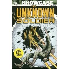
SHOWCASE PRESENTS: THE UNKNOWN SOLDIER
By Joe Kubert, Irv Novick, Doug Wildey, Dan Spiegle, Jack Sparling, Gerry Talaoc (Art) with Joe Kubert, Bob Haney, Robert Kanigher, Archie Goodwin, Frank Robbins and David Michelinie (Words)
(DC Comics, $16.99, 2006)
Art by Joe Kubert
(N.B. All images are taken from original copies of the comics on loan from the Kane Archive. The book under discussion itself is B&W. However the guy who wrote this was unable to satisfactorily wrestle his SHOWCASE onto the scanner and achieve pleasing results. The images in the book are excellent but THEY ARE IN BLACK AND WHITE!)
1. The Twice Born Man: Origin(s) of A Living Legend
It sounds like something Steve Allen might drone as he extended a limp arm in welcome to his next guest; “And now…the man no one knows yet is known by everyone…!” but it isn't rather it’s the tag line for the Immortal G.I. himself - The Unknown Soldier. This SHOWCASE PRESENTS volume collects his first 38 issues in the form a big B&W brick of crisply reproduced pages. The Soldier (as I shall for brevity’s sake refer to him hereafter) was created by Robert Kanigher and Joe Kubert in OUR ARMY AT WAR #168 (June 1966). In 1970 The Soldier took over the lead in STAR SPANGLED WAR STORIES with #151. Judging by the letter columns (not reproduced) it seems the then lead Enemy Ace feature while popular wasn't popular enough, so The Soldier’s appearance was intended to find a lead feature which would engage with enough readers to prevent cancellation. The concept seems to have been an attempt to create a super-hero for WW2 but one with at least some realistic grounding.
In his first appearance The Soldier is presented as the latest in a family in which the males are bred to serve the US in times of war as troubleshooting masters of disguise. They have been doing this since The Revolutionary War. Don’t worry if this is news to you because someone clearly had an attack of sense and this silliness was redacted in #154 with a second origin. According to the second, more popular, and better, origin The Immortal G.I. was originally a (never named) grunt who lost both his brother (Harry) and his face in a Japanese attack. Just before death and disfigurement visit the pair Harry tells the Legend-to-be that “one guy can affect the outcome of a whole war! One guy in the right place…at the right...time…” It’s lucky for comics that Harry didn't choose to that moment regale his sibling with tales of which cheerleaders he wished he’d banged back home or how he was shipping machine gun parts back piece by piece to settle scores when he got Stateside; lucky because it’s these words that lead the defaced survivor to dedicate his life to being that “one guy in the right place…” and in being such a man to become a Legend. The Legend of The Unknown Soldier.
Art by Gerry Talaoc
Following his training the Soldier is a dab hand at creating an accurate mask of a person, impeccable at intuiting their body language and mannerisms and very convincing when it comes to replicating vocal inflections. And he can usually do all that from just a photograph. Look, it’s a ‘70s WW2 war comic dreamt up on the fly about a guy with a bandaged face who can impersonate anyone; a comic largely intended to entertain; a series that ends with The Soldier making Hitler die like a dog in his bunker while on a mission to stop vampiric octopi being unleashed (note: not in this volume as it is a couple of decades later). It’s just one of those series where the dumb and the excessive combine to create a flavour of awesome only some palates will savour. Most of the time.
Sometimes the comic goes off-mission and starts to stray into more realistic areas. And it’s when the realism starts to chafe at the entertainment that I find the series at its most interesting. So, those are the aspects I’ll be concentrating on as I drivel on about a select few issues of STAR SPANGLED WAR STORIES Featuring: THE UNKNOWN SOLDIER.
2. Unrealistic Realism: Joe Kubert
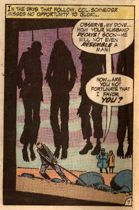
The first phase of The Soldier’s adventures in this book are dominated by Joe Kubert. Kubert’s tales typically place The Soldier in a real event (The Doolittle raid on Tokyo, the July 20th bomb plot against Hitler) or make broad points about heroism and sacrifice in at least marginally realistic scenarios. On the whole the comic booky nature of the hero and Kubert’s obvious brief to entertain work against his more serious intentions and so I've picked an issue which demonstrates this tension between the real and the fantastic more than most:
The Unknown Soldier in TOTENTANZ
By Joe Kubert (a) and Bob Haney (w)
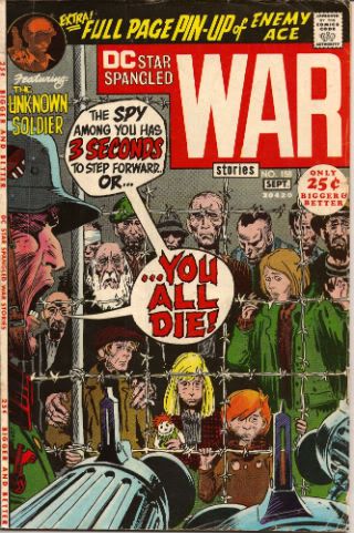
Originally appeared in
STAR SPANGLED WAR STORIES #158
(DC Comics, $0.25, 1971)
Reprinted in black & white in SHOWCASE PRESENTS: THE UNKNOWN SOLDIER
(DC Comics, $16.99, 2006)
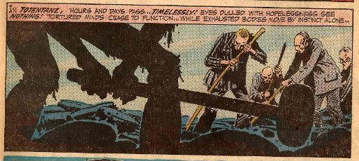
Totentanz is German for “dance of death” and it is used here as the name of the concentration camp setting for the latest mission for The Soldier. Unlike most concentration camp stories it starts with a joke:
Art by Joe Kubert
Threatening the inmates of a Concentration Camp with death may very well be the very definition of black humour. Beyond black even; anthracitic humour. It’s not a nice joke, but it is a joke. Beyond the gallows humour it’s pretty much the usual Joe Kubert war comic cover (which is to say it is a piece of excellence in and of itself, never mind the pages it is stapled to) in form at least. But in content it’s far from usual. There are children staring out from behind the wire. If you think that’s funny, congratulations, you’re really transgressive.
Art by Joe Kubert
Joe Kubert edited and drew this story so I’m going to assume he was the driving force behind the result. Now, given his decades of excellence in and influence upon comics I doubt I have to tell anyone that Joe Kubert is Jewish. He also appears to be quite serious about this Jewishness. ( If the dryly amusing introduction to THE ADVENTURES OF YAAKOV AND JOSEF (2004) is to be believed Kubert only did the series of faith based stories after being browbeaten by a Rabbi.) Also, Kubert hasn't been one to shirk from documenting man’s inhumanity to man as the OGN FAX FROM SARAJEVO (1996) attests. Then there’s the OGN YOSSEL:APRIL 19, 1943 (2003). Basically if you read a decent proportion of Joe Kubert’ work you will soon start to see recurring themes and interests; Jewishness, The Holocaust, man's inhumanity to man and Tor. (Christ, Joe Kubert will never give up on Tor.) There’s all that stuff and more but essentially there’s this: Joe Kubert’s family fled Poland to America to escape the Nazis. At least those of Joe Kubert’s family who survived the Nazis did so.
Art by Joe Kubert
I’ll not lie; Totentanz is as silly a story as most Unknown Soldier tales. The actual plot doesn't even make much sense. It’s very Bob Haney (1926 – 2004); which is to say his brio and level of craft manage to keep you reading despite all the increasing inconsistencies and illogicalities. That’s okay because Joe Kubert just wants a story set in a concentration camp and Bob Haney gives him that. And Joe Kubert wants a story set in a concentration camp so that he can at least suggest some of the inhuman foulness of such a place. And Joe Kubert gives us that. He gives us that right from the off with an opening splash that looks like this:
Art by Joe Kubert
And the whole story is basically an excused to present a series of terrible images of terrible things, a succession of suffering. Sadly for Joe Kubert this comic was made in 1971 and I don’t believe there was a writer working in comics then who could provide a text able to completely vanquish any qualms concerning tastelessness or, perhaps worse to today's audience, obviousness. Haney has a good go though with stuff like “testifying to the awful “fuel” within!” but he’s still effectively hamstrung by the fact that he’s writing what is essentially a children’s comic and his own limitations as a writer. Which is to say; he’s a fine ‘70s comic book writer but this tale’s a bit out of his reach. By their very nature Comics have always lagged in the writing department (and they still do despite what the writers say) but the Kubert's horrifically arresting art here is sufficient to achieve his purpose but it has to do it bluntly; so bluntly it might repel modern sensibilities. Also, maybe a subject like The Holocaust can’t be finessed. Once you get behind the wire things get primitive real fast and maybe intellectualizing this stuff just serves to dilute the impact. If a comic about Concentration camps doesn't leave you feeling sick that’s probably a worse comic about concentration camps than one that’s got a silly plot but does, at least, leave you feeling like someone’s hit you in the face with a shovel a few times. So yeah, like most of these stories in the Kubert part of the book Totentanz is hampered by the limits of mainstream genre comics of its time but is still pretty entertaining due to the strengths such comics had (compression, momentum, clarity of purpose). Unlike the other Kubert tales it aims a bit higher and, alas, fails a bit more but it gets its point across alright which isn't too shabby an achievement.
Art by Joe Kubert
3. Ruddy Good Fun And Race Hate: Archie Goodwin & Frank Robbins
Phew! Industrialised genocide sure puts a damper on things doesn't it? Let’s try and fill that uncomfortable silence and get the party mood going again with some race hate! It’s surprising to find such a subject in the next section of the book which I have designated as being The Goodwin/Robbins Bit. Archie Goodwin (1937-1998) was, of course, possibly the greatest Editor in comics. He’s certainly one of my favourites (along with Andrew Helfer in case anyone gave a toss) and back when Editors did Editing Stuff rather than whatever they do now he was The Best. I suppose you want some kind of supporting evidence because you have mistaken this for some kind of disciplined text instead of the rambling nonsense it so clearly is. Well, do you know how Archie Goodwin edited STARSTRUCK? By doing nothing to it. Clearly Archie Goodwin knew when to hold ‘em and when to fold ‘em. He was also a pretty good writer but his work in the BLAZING COMBAT collection is better evidence of that than anything here. Here Goodwin has clearly been asked to provide espionage capers and he does so. They are okay, they are entertaining but they aren't as good as Frank Robbins’ (1917 – 1994) stories. Or at least one of Frank Robbins’ stories. This one:
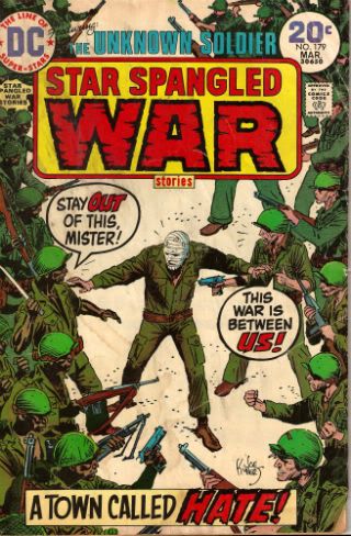
The Unknown Soldier in A TOWN CALLED HATE!
By Jack Sparling(a) and Frank Robbins(w)
Originally appeared in
STAR SPANGLED WAR STORIES #179
(DC Comics, $0.20, 1974)
Reprinted in black & white in SHOWCASE PRESENTS: THE UNKNOWN SOLDIER
(DC Comics, $16.99, 2006)
Art by Joe Kubert
Unlike Totentanz this tale succeeds on the strength of the writing rather than the art. Jack Sparling was, I’m sure, a lovely man and a joy to all he met but his art here is functional; this being no small praise in the days when they had to chuck this stuff out at a rate of knots. But it’s the writing that makes this one worthy of attention. Which is a bit of a shocker I can tell you. Prior to this issue Frank Robbins has seemed content to provide capers in the style of Goodwin bur with the pulp ridiculousness turned up to Purple. Entertainment is the name of the game with these and as a result they haven’t aged too well although I’m sure any 7 year olds were thrilled to bits which, let’s be fair, was pretty much the point of this stuff. Following tales in which shaven headed Nazis torture young Belgian girls while leering over the contents of their straining sweaters and flicking fag ash in their desperate eyes to have Robbins suddenly get all serious is certainly arresting. It’s just not what you expect from someone who has committed “What—What does an apprentice cheese-maker know of…DEATH DEVICES?” to posterity. I mean I’m glad he did because I like a laugh too but I’m more grateful for A Town Called Hate.
Art by Jack Sparling
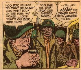
In “a small French town near the Malmedy area” (which probably isn't really called "Hate") an all-black engineers corps are greeted by a white soldier with some racist banter. That night several of them are machine gunned in their bunks. The survivors immediately blame “Those dirty, muther-lovin’ WHITE TRASH...!” and toss a grenade into a bunkhouse of their sleeping Caucasian comrades. The town is now a battleground with sides divided on racial grounds. Enter The Soldier. Except...The Soldier is unavailable so the task falls to his comrade Chat Noir. As is explained by the man himself “..it means “Black Cat!” I AM black …and PROUD of it!” Robbins’ does a nice job in the conversation between Chat and a General of showing how racism exists in less overt forms than the violence we have seen. Chat picks him up on the use of “your people” and seethes over being addressed as “boy”. If the current conflict can be ceased that isn't going to mean the end of racism and the beginning of a bold new dawn but first things first and off Chat trots.
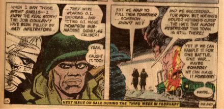
Luckily The Soldier ends up in the same town (it’s a comic!) but he’s posing as a German and then joins some Germans disguised as Americans which makes him an American posing as a German who is posing as an American. This is confusing but accurate what with the Germans actually using such tactics during the Battle of The Bulge. So there are German wandering around disguised as G.I.s and…oh, you've figured it out! Clearly the black soldiers were killed by a German posing as a Yank! And, yes, so the evidence indicates and the plucky G.I.s team back up and start fighting the right war again. How neat and quaint except…it isn't. Robbins has The Soldier and Chat realize that in fact the violence was sparked by a racist G.I. but the obvious, yet wrong, solution was used to get the guys back together and pointing their guns in the right direction. I like that a lot. I like the fact Robbins doesn't take the easy way out, in fact I like it so much I brought it to your attention. Robbins takes a pretty big subject dresses it in genre trappings without losing sight of the fact the subject is bigger than the tale he’s telling. He does a good job. There’s not a lot of nuance, y’know. But again, how much nuance do you really need? Racism isn't right. It’s not open to debate. That’s it. End of.
Art by Jack Sparling
4. Subterfuge And (Sub)Text: Michelenie & Talaoc
I am a great fan of the Michelinie/Talaoc stories. This may be because this is where I came in when I was a kid but it may also be because they are very good. For me Michelinie seems to be the first writer to really nail the concept. Given the evidence in this book his stories take the form of morality plays spliced with espionage thrillers. There’s always a more personal, more human conflict being addressed within the wider conflict of WW2 in which the stories take place. Again, they aren't big on nuance (today's word is: nuance!); there is never any doubt what the stories are supposed to be demonstrating but they are big on characterisation and entertainment. They never forget that they are pulp and this together with a pretty dark sense of humour saves them from becoming preachy. No one likes preachiness! Except preachers, I guess.
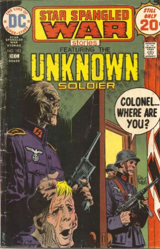
The Unknown Soldier in 8,000 To One
By Gerry Talaoc(a) and David Michelinie(w)
Originally appeared in
STAR SPANGLED WAR STORIES #183
(DC Comics, $0.20, 1974)
Reprinted in black & white in
SHOWCASE PRESENTS: THE UNKNOWN SOLDIER
(DC Comics, $16.99, 2006)
Art by Joe Kubert
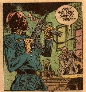
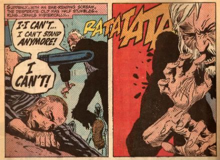
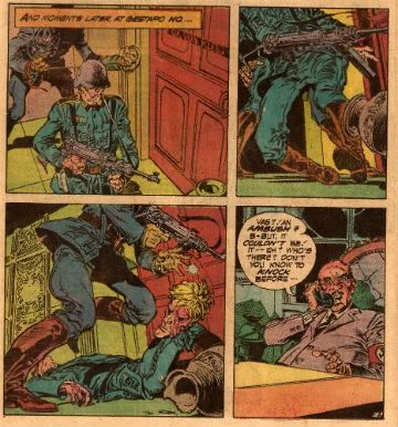
Did you know that Hitler had a “hands off” policy regarding Jews in Denmark? Well in 1943 it appeared Der Fuhrer regretted his largesse and changed his nasty mind. In this tale plans have been made to ship 8,000 Jews to safety , but this plan has been compromised – enter The Soldier! Posing as a Kommando The Soldier hits an early roadblock when upon reporting to his superior the Colonel orders his men to “Kill Him!” Naturally The Soldier goes Mortal Kombat on them and it turns out that this was only “a test!”. This is awesome pulpness but Michelinie slips in the caption, “…no time to think of the lives hanging in the balance. I had only time to – REACT!” A caption which appears redundant but is important later. Shortly thereafter The Soldier meets Inger.
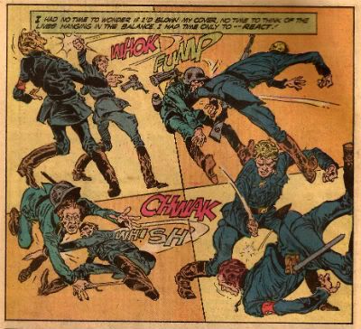
Art by Gerry Talaoc
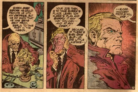
Inger’s a real piece of work. Inger is a Jew working with the Nazis who will do “anything” to stay alive. That’s what Inger’s about – staying alive. Like The Bee Gees. She knows what the Nazis are all about when it comes to The Jews (what the Nazis are all about with The Jews is bad). A failed attempt is made on Inger’s life and she recognises the dead assassin as her brother. She weeps but doesn't recant. This is pretty good stuff. I mean, I don’t want to die and I also don’t want to help Nazis and I know I’d like to make the right choice but…hey, you never know do you? I don’t like Inger but I understand Inger. A couple of pages later in fine pulp tradition Inger has outlived her usefulness and become “expendable!” As a final test of loyalty (the Germans still have suspicions what with The Soldier getting up to all kinds of stuff I haven’t told you about) The Soldier is ordered to shoot her.
Does he:
a) Shoot her.
b) Turn his weapon on the Germans, escape with her and sail off with The 8,000 Jews.
c) Disarm everyone with laughter by doing an impression of a drunk monkey.
The correct answer is:
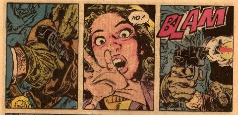
Art by Gerry Talaoc
I mean he isn't happy about it or anything. In fact he even has a caption: “Like the trembling girl before me the War left me no choice…”Remember Soldier, one slip-up…and 8,000 innocent people…will die!”” Hey, maybe this can usefully be juxtaposed with the earlier caption where he didn't have time to think. Here he has time to think, but in the end he still has to do the same thing: kill. One more time in case anyone missed it: “Like the trembling girl before me the war left me no choice…” Because isn't that the point of the whole story? Inger made a choice but in the end she might as well not have done: she still ended up dead. She just betrayed 8,000 people for a couple more weeks of life. It’s pretty sad really. What? Oh, The 8,000 Jews get away but it wasn't really about them it was about one Jew who should have been hateful but ended up being tragic. As ever there’s not a lot of nuance (!) but there is a lot of excitement, action and heart. And I guess that’s why, despite the formidable talent preceding them Michelinie and Talaoc’s Unknown Soldier stories are the best in this book. Or maybe it’s just because I read them when I was a kid. This stuff really did a number on your head as a kid, y’know?
5. Gerry’s Vase
Alright! Stop shuffling about in your seats this is the last bit. I just wanted to draw attention to the work of Gerry Talaoc in this book. Gerry Talaoc was never better than here. Which is a stupid thing to say since I haven’t seen everything Gerry Talaoc’s ever done. But since the stuff here is so freaking awesome it’s hard to believe he did better stuff and everyone’s just keeping quiet about it when I enter the room. People aren't exactly shouting about this stuff after all are they? Talaoc’s art on these Unknown Soldier stories is fantastic. Everything has a really grubby look to it. Absolutely no one looks like a movie star, everyone looks human and by “human” I mean a bit weird, a bit like life’s had a good go at them. He does have a tendency to make his figures gangly but that just works out really well too because when he cracks out the action it has a unique flailing look. Have you ever been in a fight? It isn't like a Bourne film (I’m assuming you’re a normal person not a professional cage fighter or something) it’s like a Gerry Talaoc comic. Lots of flailing, gnarled face pulling, shabby desperation, yeah, Gerry Talaoc’s fighting is pretty convincing. Best of all though is what I’m calling, in an attempt to get in The Comics Journal, Gerry’s Vase. In 8,000 To One there’s this bit of business with a vase. It’s totally inconsequential to the action but its beautiful. Look:
Art by Gerry Talaoc
I bet that vase wasn’t in the script he just did it. Physical objects in the drawn environment reacting to the actions within that environment. Should be standard stuff but it isn’t. After all when was the last time you saw Gerry’s Vase?
Hopefully I’ve managed to give some indication of why SHOWCASE PRESENTS: THE UNKNOWN SOLDIER is VERY GOOD! If I haven’t, well, that’s on me because it is. That’s it. Well done, thanks for coming. Don’t forget to collect your coats.
Have a good weekend everyone!


