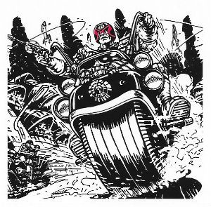
Are you ready to quiver in horripilation at the future terrors accosting Mega-City One’s premiere lawman? No, well come back when you are.
 JUDGE DREDD: THE HAUNTING OF SECTOR HOUSE 9 by Brett Ewins
Anyway, this…
THE JUDGE DREDD MEGA COLLECTION REVIEW INDEX
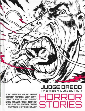
JUDGE DREDD: THE MEGA COLLECTION Vol. 77: HORROR STORIES
Art by Brett Ewins, Ian Gibson, Dave Taylor, Mick McMahon, John Burns, Andrew Currie, Xuasus and Steve Dillon
Written by John Wagner, Alan Grant, Gordon Rennie and John Smith
Lettered by Tom Frame and Annie Parkhouse
Colours by Chris Blythe
Originally serialised in 2000AD Progs 359-363, 511-512, 1523-1528, 1582-1586 & 2005, JUDGE DREDD MEGAZINE 2.27-2.29, JUDGE DREDD ANNUAL 1981, JUDGE DREDD ANNUAL 1982 and 2000AD WINTER SPECIAL 1994
© 1980, 1981, 1984, 1987,1994, 2004, 2007, 2008 & 2016 Rebellion A/S
Hatchette Partworks/Rebellion, £9.99 (2016)
JUDGE DREDD created by Carlos Ezquerra & John Wagner
JUDGE DREDD: THE HAUNTING OF SECTOR HOUSE 9
Art by Brett Ewins
Written by John Wagner & Alan Grant
Lettered by Tom Frame
Originally published in 2000AD Progs 359-363
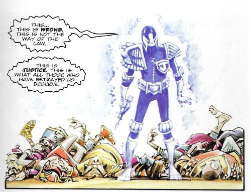
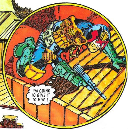
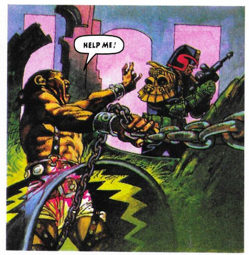
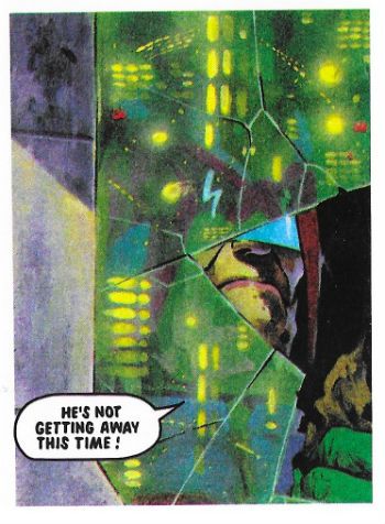
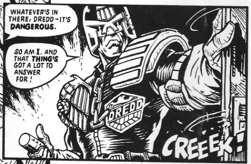 JUDGE DREDD: THE HAUNTING OF SECTOR HOUSE 9 by Ewins, Wagner & Grant and Frame
I know we've all wondered more than once what Shirley Jackson's The Haunting of Hill House would be like if it was set in Mega-City One. Well, The Haunting of Sector House 9 answers that pressing question. Apparently there would be a lot less sublimated sapphism and repressive social mores and a lot more mouths exploding from walls, zombies, disembodied hands and big men in leather shouting. On reflection it might not have that much to do with Shirley Jackson's timeless terror tome after all. It definitely has to do with Judge Dredd stolidly yelling things like "DAMNED if I'll give in to a SPOOK!" and Brett Ewins wonderful ability to draw warped flesh and matter splattered walls. I really dug this one on its first appearance way back when, there was just something unsettling about the sci-fi world of Dredd suddenly morphing into a barnstorming full-on horror flick. Wagner and Grant pace this demon baby just right with each chapter containing something icky and an incremental revelation of the solution to the mystery. And they don't even cheat on the solution, it's not just "Well, I guess we'll never know. There are more things on heaven and earth than are dreamed of in your comportment, Judge Dredd." No, there's a proper (and very "Dredd") reason for all the poltergeisting about.
 JUDGE DREDD: THE HAUNTING OF SECTOR HOUSE 9 by Ewins, Wagner & Grant and Frame
Much of the fun comes from Dredd's refusal to treat the supernatural any differently to a perp with a knife and an Umpty habit. Here he shares the stage with a couple of other Judges, most notably Judge Omar who has a turban so is, I guess, a Sikh. Although Dredd's world appears overwhelmingly secular there are still familiar religions (something Alan Grant would explore in his Judge Anderson strips; we'll get to those volumes. Patience.) Omar is also a PSI Judge. I used to think that a PSI Division was about as likely as a Healing Crystals Division (Judge Credulous, presiding) but over the years the strip has worn down my resistance, also it turns out fascists have a penchant for all that silly shit so, yeah, okay, PSI Division it is. Best used sparingly though, like nutmeg. The Haunting of Sector House 9 is good little thunder through spooky tropes with a satisfying pay off, but a lot of its success is down to the atmosphere and that's wholly down to Bret Ewins' art. Which is unfortunate, because these volumes reprint some very old strips, and I guess occasionally the original materials have gone AWOL. (Or Rebellion/Hatchette haven't bothered to source them.) In this particular case the poor reproduction annihilates the delicacy of Ewins' line. Despite his art being all about blunt impact, a kind of brusque shove to get your eye's attention, there's always a surprising amount of detail in there. Detail that isn't served well by the heavy handed reproduction. You can still see all Ewins's trademarks through the murk; particularly those shiny, shiny Judge helmets. It's just a shame his crisp, clear linework is swamped by blacks for the most part. Despite this The Haunting of Sector House 9 is pulpy sprint of a thing adorned by the art of one of Dredd's more under-rated artists. GOOD!
JUDGE DREDD: JUDGEMENT
Art by Ian Gibson
Written by Gordon Rennie
Lettered by Annie Parkhouse
Originally published in 2000AD Progs 1523-1528
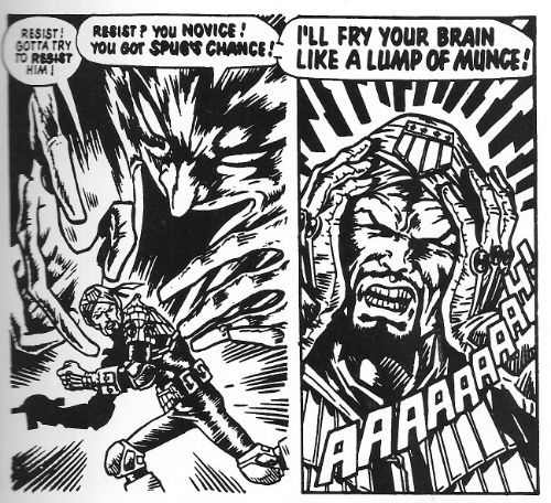
 JUDGE DREDD: JUDGEMENT by Gibson, Rennie and Parkhouse
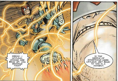
Here Gordon Rennie manfully struggles to give Dredd and Anderson a supernatural mystery to solve, and for the most part he is successful enough. A ghostly Judge is dispensing justice on the streets, which just isn't on, and so Dred investigates along with Anderson and SJS judge Ishmael. Judge Ishmael, er, has a beard, and contributes little to the narrative before just fading into the background. He's the kind of story flab a Wagner or a Grant would have excised completely, but not Rennie, alas. This unnecesary heaviness weighs the strip down, it all seems overly convoluted in order to get to where it's going. The pacing plods, in short. And Rennie is inconsistent in his spookiness. A ghost judge whose shell casings are material enough to be traced? Um, no. I have trouble believing in gravity so if you want me to be all-in on vengeful revenants you can't trip me up with stuff like that.
 JUDGE DREDD: JUDGEMENT by Gibson, Rennie and Parkhouse
But it's not without entertainment and Rennie gets a couple of very good moments in there, such as when the gang boss realises he's just made a biiiiiiiiiiiiig mistake. And the mystery itself is pretty good, there's just the odd leadfooted moment which makes you pause just long enough to irritate. A bit of red pencil would have helped. It's close to good, but what hurls it across the line is Ian Gibson's phenomenal art. Or to be more precise Gibson's phenomenal colouring. Seriously, there's some crackerjack colouring going on here. Done in something resembling ink wash, the colours are a work of art in themselves. The indigo Ghost Judge really pops out from the world it is haunting. For that world Gibson chooses a really chirpy and upbeat palette with warm pinks, deep blues and jolly greens which, draped over his lithely curvaceous lines, create images so ebulliently cartoony they are a joy. In Judgement Rennie does okay, but Gibson raises things up to GOOD!
JUDGE DREDD: ROAD STOP
Art by Dave Taylor
Written by Gordon Rennie
Lettered by Annie Parkhouse
Originally published in 2000AD Progs 1582-1586
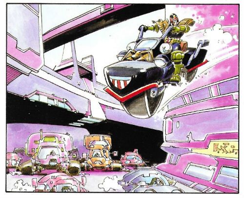
 JUDGE DREDD: ROAD STOP by Taylor, Rennie and Parkhouse
Gordon Rennie again! This time Rennie picks up a bunch of genre cliches, each of which would be insufficient for a story this length and mushes them all together to create a kind of creepy comicbook rumbledethumps. And, I have to say, it's not half bad. Hmmmmm! For a bunch of reasons which can all shelter under the umbrella of Plot Convenience (which is much better than hunching under the bus shelter of Plot Contrivance) Judge Dred is stranded until a storm passes at a decrepit Road Stop with a serial killer, an assassin, a coach trip and several other cits. That's pretty good. But the Road Stop comes under attack from a mutant gang and, yes, and, the owners of the Road Stop have something hungry in the basement. It should be overstuffed but, credit to Rennie, it moves along with quite a bit of zip and not without a few surprises. There's never a dull moment, but then with that lot going on there shouldn't be. (Again, though, Mr. Editor should have pointed out that you don't tell someone who has just revealed themselves as an assassin that you would love to help them but you have to pack all this stolen money..oops, you're dead!) Fun for the most part, writing-wise.
 JUDGE DREDD: ROAD STOP by Taylor, Rennie and Parkhouse
But the art? Grud on a Greenie! Who is this Dave Taylor! He's the Tip-Top Top Cat and no mistake! His art has a wonderfully European inflection and a super robust sense of physical dimension. He doesn't stint one jot on the characters or the locations either. The road house is wonderfully designed, with a real sense of novelty to every room, rather than a jaded sense of yes-I've-seen-Blade-Runner-too-it-was-forty-years-ago-can-we-move-on-now-please. And there's no stinginess with the character designs either. Most folk would have saved the robot with a monkey’s head or the electric-circuit person for their own projects. But here they are just part of a bunch of wild designs which get less page time than Judge Dredd's bike. Dave Taylor goes all-in is what I'm saying. I looked him up on Wikipedia and it turns out he's English so that explains everything. Apparently he also had a double hernia. I doubt that's the secret of his ridiculously good art though. Road Stop is solid stuff so GOOD!
JUDGE DREDD: THE FEAR THAT MADE MILWAUKEE FAMOUS!
Art by Mick McMahon
Written by John Wagner
Lettered by Tom Frame
Originally published in JUDGE DREDD ANNUAL 1981
 JUDGE DREDD: THE FEAR THAT MADE MILWAUKEE FAMOUS! by McMahon, Wagner and Frame
In 1981 Judge Dredd got his own Annual! (Well, I guess in 1980 strictly speaking). This was pretty momentous if you were 11 years old, because that meant that Christmas would bring not only the 2000AD Annual but also a Judge Dredd one! (Family finances permitting; the ‘80s was a hard time for us, we had to let one of the planes go). North American genre comics have annuals too, but these are published too randomly to suggest anyone producing them actually knows what the word means, and are basically just fat comics. A fat comic chucked out intermittently is not an “annual”, North American genre comics! In Britain where we understand the value of routine and the meaning of words, Annuals come out just before Christmas, are magazine sized with hard covers and cater to a range of interests; sports, puzzles, etc and, yes, comics. The 2000AD Annual would bulk itself out with old reprints (one year I’m sure Rick Random Space Detective was in there. Rick Random! I’m sure Rick Random has his charms, but it was a bit like interrupting a kid’s party with a lecture on the Joys of Accounting. Rick Random isn’t exactly FLESH!) but IIRC Judge Dredd’s Annual was all new stuff. Even if it wasn’t, even if I’m wrong, it had an awesome Mike McMahon drawn strip (yes, this strip!) which took advantage of the big pages and extra length to really go Total McMahon.
 JUDGE DREDD: THE FEAR THAT MADE MILWAUKEE FAMOUS! by McMahon, Wagner and Frame
The story isn’t much; Dredd is chasing down a bad mutant hombre but comes unstuck when the Milwaukee dead rise up to exact revenge for their nuclear annihilation. It’s a bit of zippy fluff which gets by on the visual joke of the bad guy and Dredd’s refusal to give an inch in the face of a city of restless spirits. Mostly it's McMahon's show. McMahon’s art here is a summation of his “scabby” style, which he would immediately start moving away from, like the restless genius that he is. You can really see here his technique for making the most of his page count by creating pages within pages; that is, a group of three or four panels which are read together within the larger page on which they nestle. He really covers some ground like that, and it leaves him free to have a big image dominating the layout to boot. He also colours it like a gifted child armed with felt tip pens; if Lynne Varley had done it we'd all be shaking a tail feather over it. His pages here were so scrumdiddlyumptious that even an 11 year old could tell. I spent a lot of 1981 copying Mike McMahon’s art from the Judge Dredd Annual 1981 in biro on some wallpaper offcuts we had lying about (remember wallpaper?). Yes, I should have got out more. The Fear That Made Milwaukee Famous! is not only a pun on an ancient Schlitz beer advertising slogan but, drawn by Mike McMahon, it is thus VERY GOOD!
JUDGE DREDD: THE VAMPIRE EFFECT
Art by Mick McMahon
Written by John Wagner
Lettered by Tom Frame
Originally published in JUDGE DREDD ANNUAL 1982
 JUDGE DREDD: THE VAMPIRE EFFECT by McMahon, Wagner and Frame
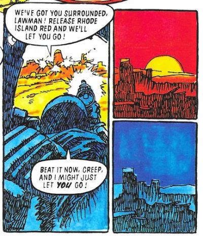
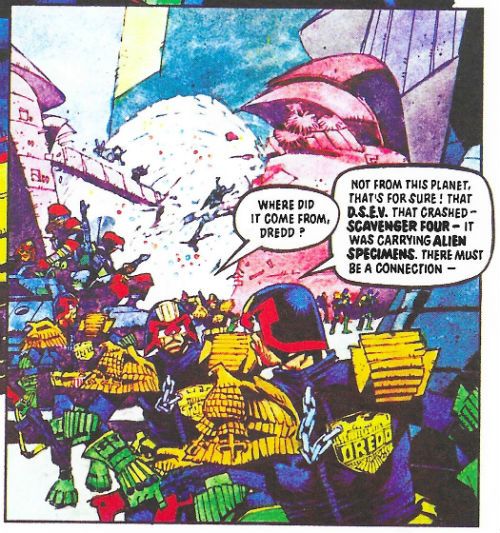
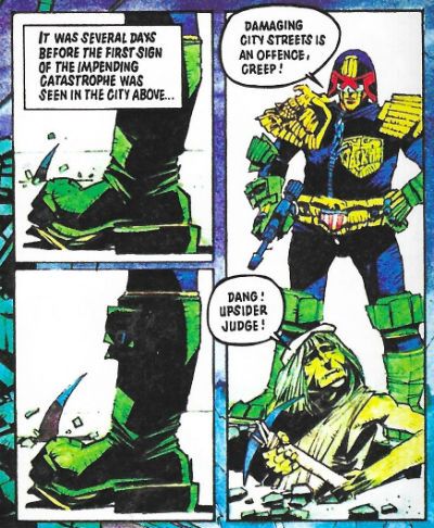
A space ship carrying alien life form samples crashes into Mega City one and an energy vampire is on the loose! The more it eats the bigger it gets and by the time it has eaten a few under-city dwellers it is pretty hefty and ready to chow down on Mega City One. Can Judge Dredd and his fascist pals stop it before it's too late? Yes, obviously. But how? Yeah, smart guy, how? There's not much to this solidly scripted effort other than a steady ratcheting up of the stakes and a pervasive sense of hopelessness, which is quite a lot really; and most of that is probably down to the art by Mike McMahon.
JUDGE DREDD: THE VAMPIRE EFFECT by McMahon, Wagner and Frame
A space ship carrying alien life form samples crashes into Mega City one and an energy vampire is on the loose! The more it eats the bigger it gets and by the time it has eaten a few under-city dwellers it is pretty hefty and ready to chow down on Mega City One. Can Judge Dredd and his fascist pals stop it before it's too late? Yes, obviously. But how? Yeah, smart guy, how? There's not much to this solidly scripted effort other than a steady ratcheting up of the stakes and a pervasive sense of hopelessness, which is quite a lot really; and most of that is probably down to the art by Mike McMahon.
 JUDGE DREDD: THE VAMPIRE EFFECT by McMahon, Wagner and Frame
One year later and we can see just how much hunger McMahon's talent has for fresh artistic conquests. The man gobbles up challenges like the in-story vampire chows down on energy. Ravenously. His art still retains a grubby patina but is far more visually controlled now. There's a discipline in the straightness of lines strong enough for him to perch his more expressionistic tendencies atop them. The flare of Dredd's helmet is starting to reach the point where he'll be forced to enter rooms sideways, but the exaggeration is consistent with the larger landscape of visual hyperbole it inhabits; which makes it Art rather than a goof. Fret not, though, McMahon's art has lost none of its playfulness despite his apparent turn towards the stern. His colours are more subdued here with the odd pop of a green knee pad leavening the dourness, but there's still wit; see the negative colouring on people “bitten” by the vampire, and his refusal to make the vampire anything other than a blob speckled by colour. The reproduction here is a crying shame, tending as it does to the blurry. But The Vampire Effect is still drawn by Mike McMahon and so it is VERY GOOD!
JUDGE DREDD: HORROR HOUSE
Art by John Burns
Written by John Wagner
Lettered by Tom Frame
Originally published in 2000AD WINTER SPECIAL 1994
 JUDGE DREDD: HORROR HOUSE by Burns, Wagner and Frame
A one episode punchline strip in which Dredd has to rescue a kidnapped kid from an animatronic house of horrors. This is from a Winter Specuial which, unlike an Annual, is a fat comic released at seasonal intervals. Used to be we just had Summer Specials which were an awesome part of being a kid. Looks like we now have Winter Specials because profits in the third quarter are down, or whatever. I don't know, but I for one am not sitting on a Blackpool beach in my trunks reading Shiver'n'Shake in November, thanks. Must be getting old. So, yeah, the old lag John Burns (b.1938) has scads of fun with the different dioramas in the Mega-Tussauds’ of Terror, and my eyes enjoyed his lovely tides of colour breaking over the page. Burns’ style is very European, characterised by pin-sharp linework so awesome that he took over Modesty Blaise from Enrique Romano in the ‘70s. Burns was beloved by kids of the ‘70s for his art on the smutty newspaper strip George & Lynne, by the ‘80s he was blazing trails of awesome on the page for 2000AD, where his work embraced colour with a vigour that would make a vicar blush. I like John Burns’ art. Unfortunately while the script’s punchline isn’t bad as such, it landed leadenly as I hadn’t realised there was anything amiss with Dredd’s behaviour. He’s not exactly chatty Cathy at the best of times is he now? Anyway, John Burns drawing Judge Dredd fighting things is always GOOD!
JUDGE DREDD: CHRISTMAS WITH THE BLINTS
Art by Andrew Currie
Written by John Wagner
Coloured by Chris Blythe
Lettered by Tom Frame
Originally published in 2000AD Prog 2005
 JUDGE DREDD: CHRISTMAS WITH THE BLINTS by Currie, Wagner, Blythe and Frame
This is the finale of a long running storyline about Dredd failing to catch Ooola Blint, who is addicted to euthanasia-ing unwilling people, and her useful idiot of a husband, Homer. The problem with this series of mega-books is here we just get the end of the chase. Maybe the other bits are in other books, I don't know. Anyway, although robbed of much of its cumulative impact, the script is the usual drly comic Wagner effort wherein romance and murder become so intertwined it gets hard to distinguish between the two. At heart this is pretty sick stuff but thanks to Wagner's deadpan delivery this very sickness becomes part of the humour.
 JUDGE DREDD: CHRISTMAS WITH THE BLINTS by Currie, Wagner, Blythe and Frame
Christmas With The Blints is more of a characer piece than an action piece so Currie has his work cut out for him. Fortunatley Currie seems to have a yen for caricature, so fun with faces is right up his street, and his “acting” is well up to snuff(heh!) for the duration. He does a particularly sweet Morgan Freeman whose sloping contours suggest the influence of the Master Caricaturist Mort Drucker, which is nice to see in a Dredd strip. It's a wordy episode but Currie keeps it interesting and his crisp, clean style is attractive if never eye boggling. Christmas With The Blints is GOOD!
JUDGE DREDD: THE JIGSAW MURDERS
Art by Xuasas
Written by John Smith
Lettered by Tom Frame
Originally published in JUDGE DREDD MEGAZINE 2.27-2.29
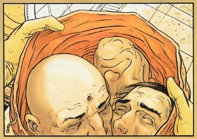
I really like John Smith as a writer, and I really, really like Judge Dredd as a character but I don't think John Smith writes a good Judge Dredd. The Jigsaw Murders doesn't change that opinion. Smith has his very own range of obsessions he rarely deviates from: body horror, fractured stream-of-consciousness inner monologues, creepy malefic beings whose reality can be a bit dubious and a rigid dislike of authority. This latter quality overshadows his more intriguing aspects on Dredd, because he gives the impression he's holding his nose whenever he has to write Dredd himself. I don't know how he gives that impression but he does. So what I do is, I just read it as a John Smith story and that usually works out okay. Here then I ended up reading about a serial killer who dismembers his victims to disguise his less than sane search for a replacement arm. This being a John Smith joint he rides about in an ice cream truck and is haunted by The Giggler, a creepy kid's toy, and is pursued by Judge Dredd, who looks like our Judge Dredd but is an inflexible asshole prone to bad one-liners. He's not as bad as Millar and Morrison's tone-deaf interpretation of Judge Dredd, but then at least here he's in a decent story which is something that pair never managed to conjure up. As John Smith stories go it's pretty good, there's a hilarious bit where the Jigsaw Killer finally gets his arm and it's all kind of icky and nasty like a good John Smith tale should be.
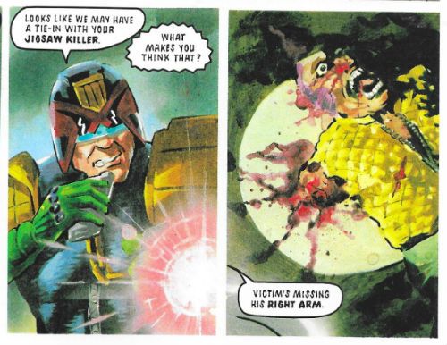 JUDGE DREDD: THE JIGSAW MURDERS by Xuasas, Smith and Frame
It's illustrated by Juan Jesus Garcia, who likes to be called “Xuasus”, in a fully painted style which I like to call “mostly successful”. It's got some real heft to it thanks to Xuasus' penchant for lumpiness and there's a winning ugliness to everything, not least the characters. However, stiffness is an issue when he paints people in motion, and while it didn't entirely convince there was always the odd stand-out like the panel below. Interesting, I guess I'd go for. The Jigsaw Murders is pleasantly odd thanks to Smith's script and Xuasus', uh, heavy approach. So, GOOD!
 JUDGE DREDD: THE JIGSAW MURDERS by Xuasas, Smith and Frame
JUDGE DREDD: THE BEATING HEART
Art by Steve Dillon
Written by John Wagner & Alan Grant
Lettered by Tom Frame
Originally published in 2000AD Progs 511-512
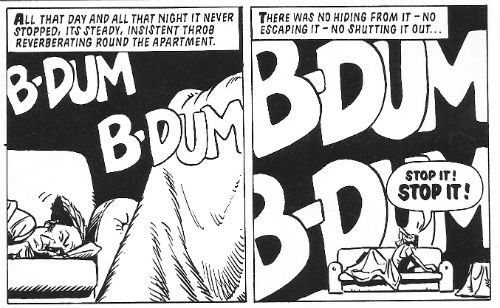 JUDGE DREDD: THE BEATING HEART by Dillon, Wagner & Grant and Frame
This is a little two parter, a playful update of Poe's “Tell-Tale Heart” which is amusing enough in its way, but is of note largely because of Steve Dillon's art. In 2015 comics lost Brett Ewins (see above) and in 2016 Steve Dillon died, which makes this volume a bittersweet read. It does provide a reminder that Dillon's sparky art could lift a trifle like this out of the filler category and up into GOOD! without breaking a sweat. Dillon may only ever have drawn one female face but he put atop it a cascade of Bizarre '80s hairstyles that would give a Studio Style executive a chubby, and while his décor could be minimal his pacing was precise. Best of all Dillon would always remember that it was Judge Dredd's strip and really nail his Dredd bits down hard. Ciao, Steve Dillon! Ciao, Brett Ewins! And thanks for all the Thrill-Power!
And as all the best horror stories end with a hand coming out of the ground…
 JUDGE DREDD: THE FEAR THAT MADE MILWAUKEE FAMOUS! by McMahon, Wagner and Frame
NEXT TIME: I'm not sure but probably Judge Dredd in some - COMICS!!!


![“Azzarello: But there’s always room for a 10th issue. [Laughs]” COMICS! Sometimes The Laughter is Hollow.](https://images.squarespace-cdn.com/content/v1/58c6f8b33a041115fb6baf1d/1504843057606-RW1TGUEKSS8DZDKKCCS2/DKTMRBatB_zpsefjcbpzf.jpg)


