"I Admire Its PURITY." Comics! Sometimes They Are A Bit Like Films (ALIEN)!
/ (Or: Never Put an Englishman called Kane in charge.)
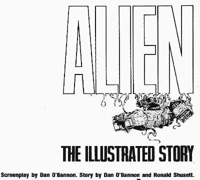 ALIEN: THE ILLUSTRATED STORY
Art by Walter Simonson (b.1946)
Words by Archie Goodwin (1937 - 1998)
Lettered by John Workman (b.1950)
Based on 20th Century Fox's science fiction hit, ALIEN
(Heavy Metal Futura Publications, £2.50, 1979)
1. "It's Not Our Sysyem..." or I Start Talking.
It's only a slim volume this, a hair over 6o pages so the team have it all on to pack in the 117 movie minutes. In fact it's a ridiculously small amount of space but the bizarre thing is that they have any space at all. Why a comic adaptation of a film in 1979 of all years? STAR WARS is why. Just as STAR WARS' mind damaging box-office success is the reason ALIEN was green-lit so was STAR WARS the reason for the existence of a comics adaptation. The comics adaptation of STAR WARS was very, very, very successful (alas, this had nothing to do with the fact that the world had woken up to the magic of Howard Victor Chaykin). Also the people working on ALIEN were pretty comics savvy and were familiar with HEAVY METAL (Ridley Scott has described his storyboards as being very "Moebius"). So that's why a comic and that's why a comic by HEAVY METAL.
ALIEN:THE ILLUSTRATED STORY(A:TIS) was intendended to spearhead a series of movie adaptations that would be serialised in HEAVY METAL and then collected. I don't know how many others were produced but I know there was the Veitch/Bissette 1941 adaptation (way better than the inert film) and Steranko's OUTLAND (like getting Picasso to adapt BEN10). This latter has never been collected in English so I guess the run of adaptations fizzled out pretty quickly. The then Art Director at HEAVY METAL John Workman was tasked with bringing the ALIEN adaptation to term and rang Carmine Infantino with the intention of having Infantino do pencils and Simonson do the inks. Infantino's phone was busy so Workman rang Simonson and by the end of the call Simonson had smooth talked his way into doing the whole job. Simonson had the very bright idea of roping in editor par excellence Archie Goodwin for the non-pictorial tasks. It was one sweet team thus assembled and the results were the first comic to squat on the New York Times bestseller list and, even better, remain there for 7 weeks.
It's important to remember that A:TIS is an adaptation not a replication. Some dialogue you may be familiar with is missing some you might not recognise is present. It's a little hard at this date to actually remember what dialogue is actually in the film what with Scott's incessant tinkering. As regards the 1979 original version there are, I assure you, textual differences. This is because Simonson & Goodwin (S&G) had access to 3 drafts of the script and used these to piece together a narrative they found most satisfying to the comics presentation. From the ground up the piece was built with its format in mind. They had also seen a cut of the film and had access to an abundance of stills so the book's visuals are clearly sourced on the cinematic offering. Not being composed of pure tedium S&G don't do a lumpen shot for shot representation so the familiarity with the settings/costumes etc. allow them to vamp some stuff and use unusual POVs without losing the visual consistency afforded by the production's tip-top designs. S&G don't have to design anything because it's all been done for them by Ron Cobb (ship interiors), Cris Foss (ship exteriors), Moebius (spacesuits) and H.R. Giger (alien stuff). They can just concentrate on designing the comic. And design it they do. Rather than go through the whole thing page by page which would break even the strongest reader's spirit I will now briefly alight on a few instances I find pleasing to mine eye.
2. "Oh, I Feel Dead." or (Slow) Motion.
ALIEN the movie opens with a languorously paced sequence in which a strange transmission is received and the Nostromo's crew are awakened from hyper-sleep. This takes quite a bit of screen time but the comic doesn't have the same luxury in terms of space (using a shorthand of time=pages). What S&G do is pretty neat. They go to the opposite extreme and slow the scene down further. You could call it decompression even but it's a strange kind of decompression. They counterintuitively concentrate on the opening of a single eye to both illustrate the process of waking and set the tempo for the scene they are illustrating. Witness the four panels given over to Kane's eye opening:
This effectively sets the sluggish pace for the happenings depicted on the page and cues us in that the others will be waking equally slowly, because this is a slow process. It's a bold move to use so much of the sparse space available on so few seconds of screen time. Bold but effective as the sequence is emblematic of the waking process as a whole. The visual decompression acts a form of compression with regard to the content.
There then follows a depiction of Kane brewing up for his colleagues. I like this sequence because it shows the intelligence behind S&G's choices, because as in any adaptation choices have to be made. This takes up quite a lot of space, relatively speaking anyway. It is after all just a man brewing up which is precisely the kind of mundane task that you might think could be jettisoned
from the narrative without any loss being felt. But S&G recognise it is important in its very mundanity. When you wake up, you have a coffee. Even in space. It's a recognition of the crucial interplay of the familiar and the unfamiliar which anchor the film and allow for the later excesses to be accommodated without a break in the suspension of disbelief. Also, a lot more is happening in those panels than those of the preceding waking sequence. Note the single panel of the steaming cups indicating the repetition of the task without the need to actually repeat the other panels. The density of the panels indicate the pace is picking up compared to the sleepy start. With Kane's salutation the reader effectively receives a signal that the plot is now in motion.
3. "It Doesn't Look Like An S.O.S." or Sounds Without Sound.
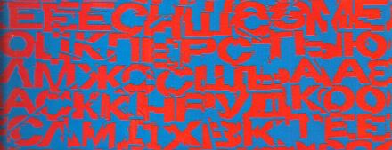
The movie uses sound design beautifully to evoke the otherness of certain occurrences such as the meaty phlop of the egg flaps opening or the screech of the skedadilling chest burster. Naturally the mute medium of comics can do little but suggest these; usually through distortions in the lettering. With A:TIS S&G demonstrate that the power of suggestion can be surprisingly powerful. They attempt to replicate the scouring howl of the howling distress/warning transmission by choosing the most godawful combination of text and background colours known to reading beings. That's no accident. It's supposed to be perturbing. It'd be hard to make text anymore unsettling than engineering it to actually move around in a queasy manner at the slightest variation in your gaze. The fracturing of the letter shapes and the vibrating effect of the colour combination rattle the reader's gaze in a really quite clever manner.
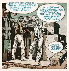
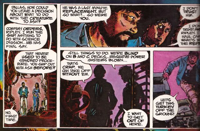
Unable to replicate the staticky crackle and insistent hiss of communication over comm-channels the decision was made to colour such speech blue. This doesn't actually communicate the texture of the noise but it does at least imply a difference in the sound emitted by the characters and the sounds emitted by the technology around them. It would be hard for a non comics-savvy reader to parse the panel below without the visual cue of the colours. But because the rules of the text/colour device have been set up clearly in the earlier pages any reader would know that Brett and Parker were not hallucinating but hearing a comm transmission from someone not pictured in the scene.
4. "Open The Door!" or It's Constraining Men (and Two Women).
A key element in the tension that underscores the movie is the pervasive sense of claustrophobia. The physical environment aids the film makers here with the sets being fixed and the ceilings having been lowered by some four feet to create a physically oppressive reality in which the action unfolds. Archie Goodwin was responsible for the placement of the balloons on the page while Workman lettered within them. Goodwin was an excellent editor and his positioning of the balloons suggests the presence of some considered intention. Now while it's possible to argue that the density of the speech is a result of the space limitations it's also possible to argue that the placement of the balloons is used to hem in the figures to create an additional level of constriction.
The words on the page are read as equally physical and present as the drawn environment in which the action occurs.The characters are doubly restricted by the ship drawn around around them with all its clutter and shadows and the very words they are speaking.
5. "All Other Priorities Rescinded." or Toeing The Company Line.
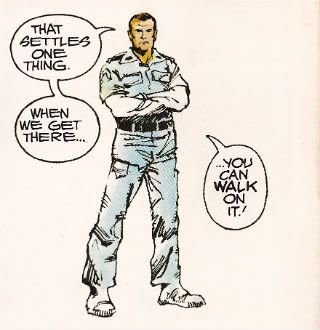
There are very few instances where this atmosphere of restriction are alleviated but there is a particularly jarring one which is used in the service of both characterisation and foreshadowing. There are some things a film can do which it is impossible to reproduce on the page. Crucially these include the incredibly convincing performances of all the actors involved. These are some good performances right there. There's no way via words and pictures to fully convey the shrill flakiness of Lambert (Veronica Cartwright), the passive-aggressive sniping of Brett and Parker (Harry Dean Stanton & Yaphet Kotto), the chafing enthusiasm of Kane (John Hurt), the fake-matiness of Ash (Ian Holm), the eroding confidence of Dallas (Tom Skerritt) and the uncertain certainty of Ripley (Sigourney Weaver). I can't believe even the best comic writer and the best comic artist could do more than approximate the fusion of emotional flavours in Weaver's reading of the simple line, "Micro changes in air density, my ass." I only point out this 'failure' so I can concentrate on the work's successes because Simonson & Goodwin do achieve some fantastic successes here. One of them is this:
During the film Ian Holm is able to subtly suggest Ash's oddness with a series of brief bizaritties that verge on the subliminal; his little standing jog, the intermittent twitchy moues and his inflexibly diagnostic gaze during the 'birth' sequence for example. It's a subtle string of hints and tics that build towards his character's revelatory scene. S&G don't have room for that but they get one good shot in with the above panel. From the stance to the complete nullity of the background they manage to communicate that as far as Ash is concerned only he exists and has any real import. Nothing around him matters, particularly not his crew-mates. He's the perfect Company Man. And like all Company Men he isn't really a man at all. Um, spoiler?
6. "It's Got A Wonderful Defense Mechanism. You Don't Dare Kill It." or (Quick) Motion.
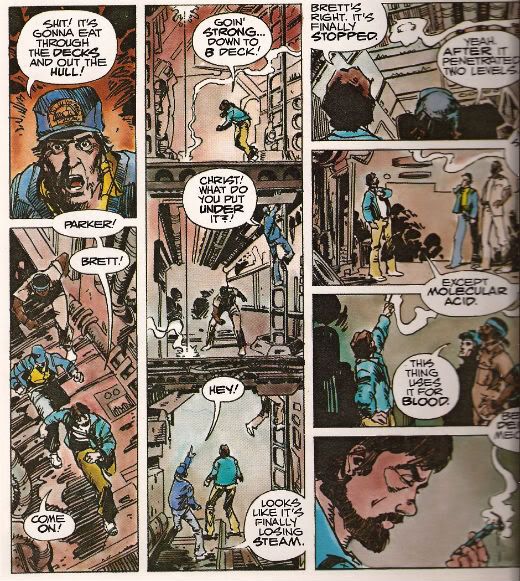
Punctuating the unhurried pacing of the film like a steel toothed phallus piercing a Brit thesp's chest are scenes of abruptly frantic action. One of the earliest of these occurs when the crew discover that the xenomorph sat on Kane's face has a charming defense mechanism in the form of acid for blood. S&G don't have a physical set they can hurtle through with a soundtrack and editing enhancing the action but they have a good go nevertheless.
The page itself is pressed into service as the film set with the panel breaks and gutters providing the editing. The eye has to travel from the top of the first column to the base then in the gutter it moves swiftly to the top of the second vertical which is interrupted by the in-panel floor levels suggesting "soft" breaks in the page which the eye lingers on but less so than "hard" white breaks. The speed of the gaze downwards is thus increased but not actually interrupted before zipping back up via the gutter again to the top of the third vertical where the division into four panels by "hard" breaks cause the gaze to slow before halting on the final panel. Reading the sequence the eye really covers some ground and together with the diminishing pace this adroitly captures the essence of the scene.
7. "Now, This Air-Shaft May Work To Our Advantage." or The Suspense of Uncertainty.
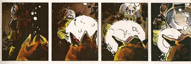
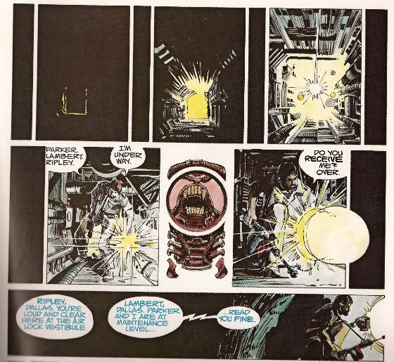
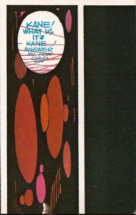
The sequence where Dallas scurries around in the guts of the ship in pursuit of the Alien is also rendered effectively despite the static nature of the form although here the techniques are a little more ambiguous. Purposefully so, I'd say. In the top layer we are adopting the POV of something other than Dallas, its uncertain whether we are seeing things from the Alien viewpoint or just a non specific POV. Then there are the thin vertical panels breaking up the larger images. Are these the Alien's POV? The increasingly illuminated panels interrupting these flat blacks indicate Dallas' imminent arrival. When Dallas reaches our POV the interruption changes from black to a blare of white dominated by a bizarre image. It's clearly related to the Alien but is it the Alien reflected in Dallas' lamp lens? Is it the Alien sheltering in some comfy duct now the light has invaded its previously dark nest? Dallas forges on to the outer edge of the last horizontal panel but behind him there is darkness.
In fact there's an uncomfortable amount of darkness behind him, more than there is light in front; is that to indicate how far he's come or to indicate that now there is something behind him? The whole sequence depicts Dallas nearing our POV on the top layer, arriving at that POV in the middle layer and then moving away again in the final lower panel. There's a definite sense that what he was heading towards is now behind him. Something happened in there, the exact nature of which is imprecise but the implication is it isn't going to be good. There's just something really creepy and suspenseful about the whole thing which is perfectly appropriate and the uncertainty of it all exacerbates this.
8. "I Wanna Go Home And Party" or Hurray, I Shut up!
Yeah, sure, despite all this craft, talent and enthusiasm A:TIS never once manages to replace the audio-visual thrill of the film itself. But this would be an expectation held only by someone possessing an excess of optimism or a shortage of sense. It does however provided a surprisingly innovative comics experience. One that's still fresh and surprising on a technique level some three decades later. As I say I've just highlighted some of my favourite parts. There's plenty of other stuff on the pages such as Simonson's occasional use of organic bio-form borders, the use of splash pages at moments when they are most useful and even one page that is composed entirely of colour elements with no line work. This all sounds positivley innovative and challenging particularly as the modern tendency would surely be to to slap verbatim dialogue on unvaryingly widescreen panels. And, yes, if you break down the techniques on show they are quite complex but this complexity is used entirely in the service of transparency of meaning. While Simonson has claimed that the book was accompanying a hit movie accounts for its unprecedented success it wouldn't be too outlandish to think that the high quality and accessibility of the end product itself might not have helped as well. ALIEN: THE ILLUSTRATED STORY is, after all, VERY GOOD!
Note: ALIEN: THE ILLUSTRATED STORY is due to be reprinted in May 2012.
Acknowledgements: If any facts have made it into this waffle that is due purely to the following sources: MODERN MASTERS: WALTER SIMONSON (TwoMorrows, 2006) THE ALIEN ANTHOLOGY (20th Century Fox, 2010 (Blu-Ray))
 Have a good weekend, all, and remember to read some COMICS!!!
