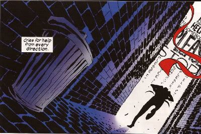
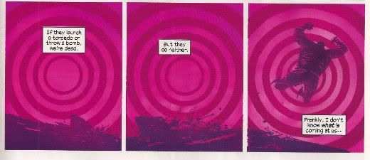
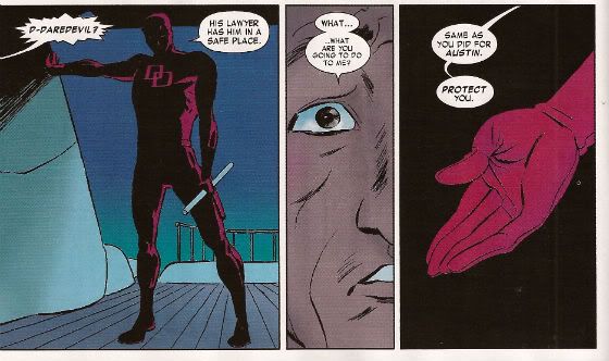
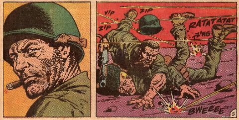
"They Gave Their Lives...Just For THAT?" Comics! Sometimes They "Dare To Be Different"!

Old war comics written about by old man - pictures at Eleven! Photobucket Here's a thing: In MAN OF ROCK by Bill Schelly, a book which is all about Joe Kubert and the things he has spent his time doing, there is no mention of BLITZKRIEG. (Other than that Bill Schelly's book is, however, VERY GOOD!)

It's okay, Bill Schelly, I think I've mentioned BLITZKRIEG enough for everyone!

And now our Feature Presentation:

Photobucket

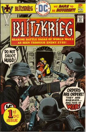
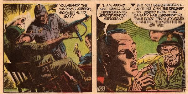
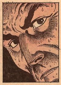
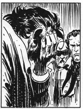
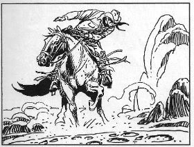
It was 1976 and it was time to see WW2 “through the eyes of the enemy”. This was hardly unprecedented. Joe Kubert (b. 1929)and Robert Kanigher (1915 – 2002)had previously worked up and on Enemy Ace in Star Spangled War Stories. Said series was an innovative look at WW1 (1914-18) through the character of a German air ace modelled upon The Red Baron (Manfred Von Richthofen not Snoopy). These stories are collected in their entirety in SHOWCASE PRESENTS: ENEMY ACE which is a plump lump of B/W brilliance (VERY GOOD!). Giving in to the temptation to gorge on the contents, however, results in an unavoidable recognition of the repetition in their structure. If read in the short bursts as it was initially published it becomes clear that this repetition was entirely intentional. Read any individual Enemy Ace story and you get a complete story with all the information required to understand the context and point of what was on the pages.

Photobucket

Modern readers may also finds some of the contents a bit broad at best and belief defying at worst. That’s understandable but tends to underestimate the fact that these are primarily stories and their intention is principally to entertain and then, typically, to make a point. To get the most out of them it’s probably best to view them as a form or parable rather than an attempt to accurately reflect reality. You probably remember The Parable Of The Killer Skies from Sunday School. The contents of Showcase: Enemy Ace will always be of interest thanks to the astonishing performance of all the artists involved; Joe Kubert, Neal Adams, Frank Thorne, Howard Victor Chaykin and John Severin. There were indeed giants in those days but it’s worth stressing that of these lofty talents Joe Kubert’s scalp was the most sky scraping. I’m a like me some Joe Kubert, I do. But the fact that these stories are still readable is evidence of the rock solid craft brought to the task by Robert Kanigher.

A lot of people liked Enemy Ace but not enough people, sales on the book kept falling and, as Editor, Kubert was forced to drop the series and replace it with The Unknown Soldier. (Don’t worry if I’m going to talk about The Unknown Soldier it will be a time other than this one.) The point here is that the success of Enemy Ace is due to the fact that the techniques involved were as taut as Cher’s face. So Enemy Ace wasn't a total success but it was very popular which is more than can be said for The War To End All Wars (which is a case of false advertising if ever I saw one). Of course after the world got its breath back it decided to produce the more popular sequel WW2. And it was in this setting that Kubert and Kanigher attempted to replicate the success of their “through the eyes of the enemy” approach.

Photobucket

But because you are paying attention you are now thinking why do that? If Enemy Ace couldn't pull in the punters why launch a whole new series with a similar premise? The DC Explosion is why. It’s aptly named because it was about as controlled and disciplined as an explosion. The fact it was almost immediately followed by the DC Implosion should tell you just how successful cramming as much stuff onto the spinner racks turned out to be.Given the urgent need for fresh recruits to be rushed to the Retailing Front many comics were sacrificed on the spinner racks. BLITZKRIEG was amongst the cannon fodder.

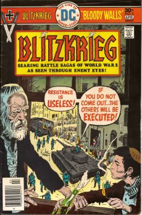
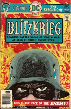
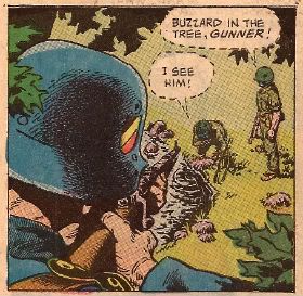
BLITZKRIEG #1 - 5 By Ric Estrada, Sam Glanzman and Lee Elias(a), Joe Kubert & Robert Kanigher(w) (DC Comics, $0.30 ea, 1976)

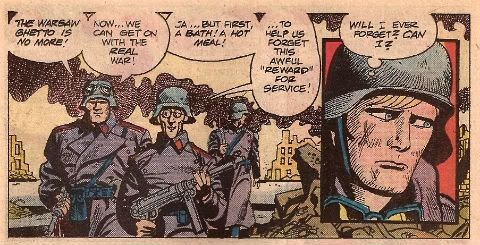
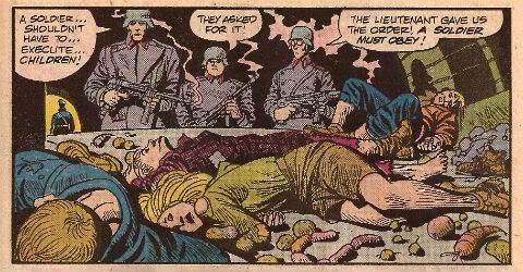
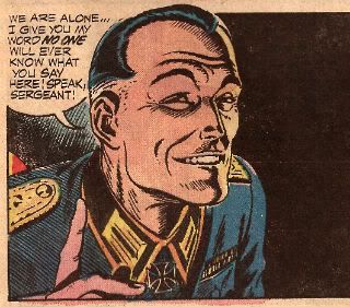
Sadly the big thing about BLITZKRIEG is how half-baked it seems. There's an interesting premise ("Yeah, but how was WW2 for The Bad Guys?") but it just doesn't get any traction. The stories themselves are solid enough to start with but as the series progresses they start to become more hazy, lacking a point around which Kanigher can cohere his scripts.  It's a good framework though; following three German soldiers through the war and having them reflect the mindset of "The Enemy" (who unsurprisingly will be surprisingly like "Us"). The first problem is that Kanigher has too many protagonists. Sgt. Rock and Enemy Ace have a strong central figure around which events can orbit and whose experiences provide the Reader with an "in". BLITZKRIEG has Franz, Ludwig and Hugo. Franz is blond and handsome representing The Intellectual, Ludwig is a meathead always thinking of ladies and Hugo is a speccy bald weasel always thinking about food. It's fairly clear that they are three separate aspects of Man and their very separation is that which blinds them to the fact that if all three were united in one individual more perspective would be available, possibly even enough to grant them the wit to realise that what they are involved in is both inhuman and insane.

Photobucket

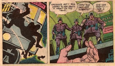
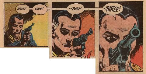
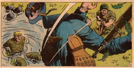
And, to be fair, BLITZKRIEG doesn't stint on the depiction of the horrors perpetrated by these ordinary guys. Throughout the course of this series the "heroes" kill women and children, both armed and unarmed, massacre P.O.W.s and are active in the horror of the pacification of The Warsaw Ghetto. It's unpleasant stuff and there lies BLITZKRIEG's second main difficulty. By focusing on this barbaric string of events it's hard to root for our Three Stooges. The series focuses so hard on these atrocities that there is barely even room for our three chums to pop up and offer their character revealing insights ("I like bread!", "I like ladies!", "I like Butterflies"! Jesus, these guys make Brick Tamland look nuanced.) The Reader never gets to know them because they are hardly present in the narrative and when they are they are always saying the same things. They never change and they never learn no matter how bad things get, no matter how stained their hands.

Photobucket

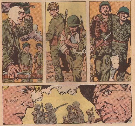
But then maybe that's the point. Maybe that's how these things happen. Franz, Ludwig and Hugo appear totally at the mercy of events, pulled under by the current of History only to resurface briefly to state to themselves (and to us) the only things that keep them functioning; their appetites and their belief that this is necessary, or at least unavoidable. They are trapped in a narrative not of their making and they cling to sanity only by reducing themselves to their most basic, unthinking needs. That would be good, I think. But I only think that, I don't know that. And I think I only think that because that is how I am naturally inclined to think. I don't believe there is much on the actual pages to convince me that the authors (writers and artists; comics is a gestalt thing remember) are moving me by design to these thoughts. But then inspiring thought in a reader isn't such a bad thing. Even if the particular colour of that thinking is an unintended by product. Because, maybe, WW2 is the kind of thing that happens when people stop thinking and let other people do that for them, particularly when those people doing the thinking are the kind of people who should be heavily medicated and monitored for their own safety.

Photobucket

BLITZKRIEG has other problems too. The premise is a deceptively complex one and the truncated nature of the episodes (roughly 11 pages) doesn't allow enough room for the authors to really start working. What a comic like BLITZKRIEG needs to succeed, amongst other things, is room to breathe. In the '70s comics authors were rarely allowed this luxury. Sure, modern comics do get this break but if comics from 2000 to 2011 have shown us anything it's that if you give comics creators room to breathe often that's all they do; breathe. Then there's the nature of the conflict BLITZKRIEG depicts. Enemy Ace not only has a single protagonist but also benefits from being set in a conflict where "Good" and "Bad" are entirely more nebulous labels, and the meaning of these is further diffused by the concepts of honour, duty and tradition. These concepts had pretty much worn out their welcome by the time WW2 rolled around, sure, they lingered and were important but by no means to the same extent and the longer the war rolled on the more denuded of meaning these concepts became. In a War in which people are putting other people in ovens, reduced to cannibalism, arming their children and dropping nukes on civilian targets honour, duty and tradition aren't really going to be able to cut it. Hell, even "Good" is going to have its work cut out for it. Presenting WW2 "through enemy eyes" would require rather more serious thought than BLITZKRIEG can muster.

Given the moral morass of its setting, its uncharismatic leads, fuzzy storytelling and general lack of polish BLITZKRIEG fails to achieve its lofty ambitions but...but...even at its worst BLITZKRIEG is wholly innocent of the most objectionable charge that could be raised at such an endeavour. At no point are the actions of the Germans glamorised or presented as attractive. That would be the worst thing and BLITZKRIEG doesn't do that thing.

Photobucket

Authenticity is usually a concern with war books. Personally I’m rubbish at authenticity as long as Hitler isn't a space-stoat and the Yanks aren't riding gorillas into battle I’m generally okay. Luckily though back when smoking was good for you readers used to send letters in to comics and in issue #4 we have a letter which addresses the accuracy of BLITZKRIEG #1 thus saving me the bother:

"...mistakes are prevalent in this issue. Uniform insignias and ranks were inaccurate.The main characters were portrayed as privates. However, their weapons sub-machine guns were not issued to privates, who were armed withWW1 bolt action rifles throughout the entire war...German panzer represented was not built until 1941. The Molotov Cocktail was not named until 1941...In the Polish campaign Rommel was a Colonel attached to Hitler's bodyguard..." (text edited from Cadet Captain Rudy S. Nelson's letter from BLITZKRIEG#4)

So, not so accurate then but accurate enough if accuracy isn’t too much of a concern. And I don’t want it come across like special pleading but back when steak was a breakfast cereal research was proper work. You had to leave the house and visit these buildings called "libraries" which had "books" in them with "pages" and, yeah, I know it sounds like a madman's dream or something. Luckily, the ever reliable Sam Glanzman leaps into the trench of doubt and picks up the authenticity potato masher and chucks it back in your face with some pics'n'facts spreads about tanks and planes (The Panther Tank, Dornier DO-335A and the F-40 Corsair) before supplying a "3-D table-top diorama" where kids could paste the pictures to cereal boxes and through the judicious use of scissors and imagination recreate their own hellish scene of human suffering to treasure forever ("U.S.S. Buckley Rams The U-66"). Or at least 'til the cat got hold of it.

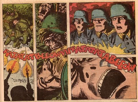
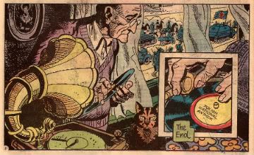
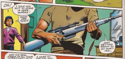
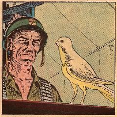
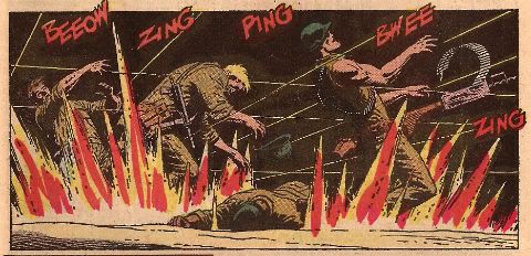
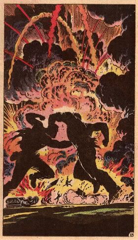
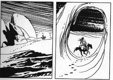
The intentions of all involved are, I’d say, honourable and good but we all know where the road paved with those leads. Except Ernest Hemingway who said that the road to Hell was paved with stuffed donkeys, but that guy liked his pop a bit too much. Obviously this comic isn't Hell on paper but the good intentions of all involved don’t stop it being more interesting than successful. Way more interesting than successful in fact but since I like interesting things I’d ultimately call BLITZKRIEG GOOD!, although as entertainment it’s probably EH! Having said that though there is the odd panel like this one below which brings BLITZKRIEG back up to GOOD!

Photobucket

And like moral certainty - I'm GONE!

Have a nice weekend, everybody!

"Now, Tanned, Rested, Ready And Fully Equipped With Brazilians..." Comics! Sometimes They Are Kind of New(ish)!

A couple of posts down from this rubbish there is a quite extraordinary thing occurring. People are discussing Digital comics and no one has been killed! It's a Christmas miracle, by Jove! Photobucket

Why not go have a looksee, this rot isn't going anywhere. I read these comics. There was no force on earth strong enough to stop me.

BATWOMAN #3 By J.H. Williams III(a), J.H. Williams III/W. Haden Blackman(w),Dave Stewart(c) and Todd Klein(l) (DC Comics, $2.99)

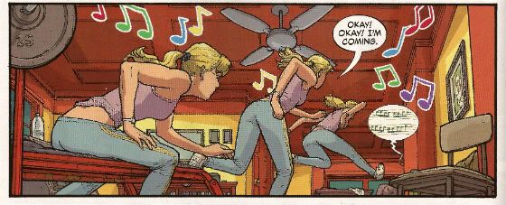
It’s perfectly fine story wise but I can’t lie I probably wouldn't be reading it were it not for J H Williams III’s stellar performance on every page. I guess having art like this on something so meat and taters might seem a little like a bit of a waste, like having Einstein fix your toaster, but there’s two things I bear in mind when I read BATWOMAN: Thing the first is that J H Williams III is co-writing it so it’s not as if he’s been hoodwinked into this and so if he’s happy doing this and it looks this good I’m not going to carp and pule. It’s preferable to him wasting himself illustrating some other guy’s awesome movie-pitch-cum-graphic-novel about an ex-alcoholic shark that goes back in time to try and kill Pia Zadora’s chiropodist. In space. Thing the second is that there’s just something great about seeing someone talented do that talented thing even if you aren't that enamoured of the arena in which they express themselves. Boxing? No. Muhammad Ali? Oh, yes.

Photobucket

Also it’s totally neaty keen-o that the sapphism of the lead just results in exactly the same scenes between partners we used to get when everyone, everywhere was straight.  It’s an important lesson more people should heed: what you choose to do with your genitals doesn't make you any more interesting as a human being. Really, trust me on this. Particularly if you are considering telling me about what you like to do with your genitals. You would be amazed how many people think telling me about what they get up to with their genitals is an acceptable substitute for a personality. Even though it hardly keeps me awake at night with its narrative twists and turns Batwoman certainly amuses my eyes to the extent that I would call it VERY GOOD!

WONDER WOMAN #3 By Cliff Chiang(a), Brian Azzarello(w), Matthew Wilson(c) and Jared K. Fletcher(l) (DC Comics, $2.99)

Photobucket

Well, I guess we can all agree that among all Wonder Woman’s many powers the greatest of these must be her Divine Unflappability. I know if my Mother was standing there in public talking about her needs and how Zeus answered them by breaking upon her shores in  a great salty foam of satisfaction I’d be blushing like my cheeks were slapped and making a high keening noise like a fox with its paw in a trap. Not Wondy, she just goes and belts some husky lass and burns some corpses. I am greatly enjoying Azzarello’s writing here as it’s brisk, eventful and he’s reigning in his word games to good effect. Cliff Chiang is dreamy as well. Truth to tell he makes it such a smooth read I probably don’t actually appreciate the level of skill he’s applying. Also, while I did make mock of Hera’s randy reminiscence it was more in light of the effect on Wondy than the actual scene which is handled with taste and subtlety, which I guess goes to show that mature matters can be depicted without making your brain burn with shame for the people involved, y’know, if approached maturely. Who knew a Wonder Woman comic could be VERY GOOD!?

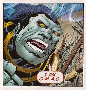
O.M.A.C #3 By Keith Giffen & Dan Didio (a/w), Scott Koblish(i), Hi-Fi(c) and Travis Lanham(l) (DC Comics, $2.99)

Photobucket

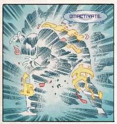
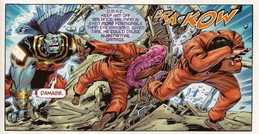
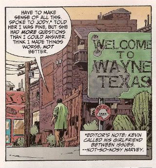
Okay, it’s true that Kevin Cho’s only personality trait is “befuddled”, his girlfriend is as accurate a portrait of 21st Century womanhood as Dame Barbara Cartland (she spent “all morning cooking” in 2011? Really? I rather think not and I’m hardly Franky Feminist), there’s a hell of a lot more momentum than meaning and it feels almost indecent to be complementing Dan Didio on anything except turning a panicked line-wide shell game into a massive (length of term to be decided) success. But having said all that…having said all that…you get to see Keith Giffen enjoying himself in the only legal and publicly permissible manner he still has available, the microwave intensity of Hi-Fi’s colours still burns with the flare of The Future (so much so that I suspect that in 2024 there will be a sudden outbreak of people collapsing with great tumours blossoming from their eyesockets like fatal clouds. Every one of whom will be found to have read OMAC.), Max Lord not only has that Kirby Dapper Dan parting but he also smokes, there’s a character called Little Knipper and there is a man with Mind Powers who appears to have a salmon fillet draped over his head. Bearing all that in mind I think you have little option than to agree that it is game, set and match to OMAC, which by the way is still VERY GOOD!

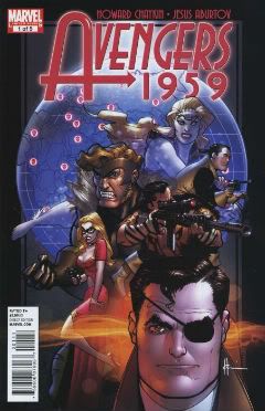
AVENGERS 1959 #3 By Mister Howard Victor Chaykin (w/a), Jesus Arbutov(c) and Jared K. Fletcher(l) (Marvel Comics, $2.99)

Photobucket

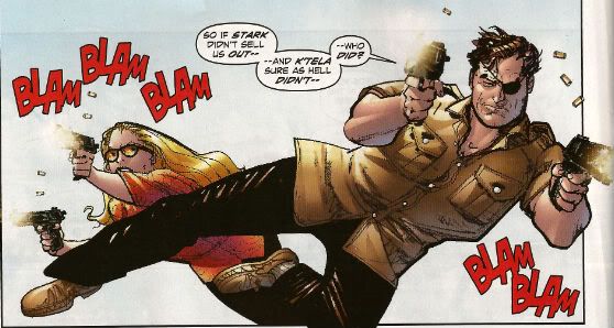
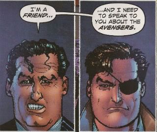
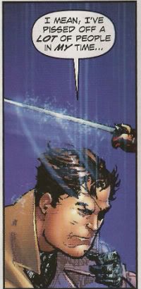
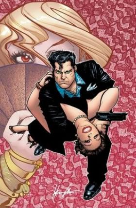
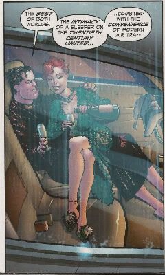
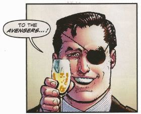
Howard Victor Chaykin must have been told the sales figures for this series when he was halfway through the issue because he suddenly just seems to say "Aw, nertz to youse bums! Allayez!" and starts writing the story he obviously wanted to write in the first place. Since this story is basically Nick Fury in a Dr. No-era Bond Flick with a sly sideways dig at Howard Victor Chaykin's own CHALLENGERS OF THE UNKNOWN SERIES and is peppered with salty humour and ridiculously entertaining action I know I'm okay with that. Yet another issue of intriguing skullduggery set in a convincing simulacra of the '50s and containing all the man-tastic magic of the Master Of The Mai Tai his own bad self, Mister Howard Victor Chaykin. Who else could quote both Papa Hemingway and Dezi Arnaz, from I love Lucy, on the same page? Exactly! No, no one is buying it but that doesn't stop it being VERY GOOD!


MUDMAN #1 By Paul Grist(w/a) and Bill Crabtree(c) (Image Comics, $3.50)

Now this? This is some fine comics. Mister Paul Grist bringing it big style. He’s got a thing he does and he’s doing that thing here which is good because it’s a good thing Mister Paul Grist does. Alex Toth once wrote a blurb commending Paul Grist’s work. Alex Toth. Grist’s clearly influenced by Toth at the very least to the extent that his pages are very design orientated and the contents of said pages contain the minimal amount of ink in order to achieve the maximal amount of information. Grist mixes in a good dose of Kirby chunkiness into his Toth which makes the result a lot lighter and boppier than the sometimes airless Toth and of course the Toth grounds it more in reality than Kirby’s work could manage. That could all be horseshit as I have no idea what I’m on about but I am pretty sure Grist is like Toth in at least one respect: all the thinking’s been done before he puts the first line on the page. And every page here is a joy either as a pure comic experience or as an example of pure comic craft.

Photobucket

Mudman is a new series so anyone intimidated by the continuity of JACK STAFF (which included nods to continuity in old English comics even I’ve barely any acquaintance with. Lion? Victor? You could totally enjoy JACK STAFF without getting any of it BTW, it’s right gradley, tha knows. This interruption is too long to go in brackets but I’m sure no one will notice) should put their fears to one side. It’s a totally new start given the impression of some kind of back-story weight thanks to Grist’s penchant for temporal narrative zig zagging. It’s fun, funny and the execution is funnybooks in excelsis. If you aren’t reading MUDMAN you must be mad, man! (in my imagination we all clubbed together and promised Brian Hibbs that we’d get him a SavCrit cover blurb for Christmas. That’s my attempt. Cheers!) So, yeah, MUDMAN#1 is VERY GOOD!

SCALPED #54 By R.M. Guera(a), Jason Aaron(w), Giulia Brusco(c) and Sal Cipriano(l) (Vertigo/DC Comics, $2.99)

Photobucket

Although this series barely manages to avoid crumpling under the sheer weight of its genre clichés and the author’s ‘70s movie memories it remains a decently entertaining read. Some of this is due to the author who manages to pull the rug out from under you often enough that you’re never entirely complacent. Most of it is the storytelling which, yes, I guess Jason Aaron has a hand in but let’s face facts R.M. Guera’s got his whole arm in it up to his elbow. R. M. Guera is astonishing. I won’t go on about it but let’s just say that, for example, R. M. Guera knows that there’s a difference between visually basing one of your characters on Warren Oates and straight up tracing pictures of Warren Oates. The former is an act of skill and the latter lazy pish. R. M. Guera doesn't do lazy pish. When SCALPED ends with issue 60 I look forward to seeing genre comics take full advantage of Guera’s inventive and invigorating skills by assigning him to a Wolverine comic. SCALPED is VERY GOOD! but R.M. Guera is EXCELLENT! And I don’t tell him that enough so I did it here in front of y’all because I am not ashamed of my love. My love is beautiful!

THE GOON #36 By Eric Powell(w/a) and Dave Stewart(c) (Dark Horse, $3.50)

Photobucket

Hey, I laughed a couple of times, longest and hardest at the vagina joke. Oh, yes that’s the level we’re operating on with this one. And that’s okay. Like I said I laughed a couple of times at the story inside but I laughed most at the interview with Roxi DLite where the bounteous burlesque babe is at great pains to stress that burlesque isn't “just stripping in vintage lingerie”. It certainly isn’t! And those men in the front row with their hands kneading their groins like they’re digging for gold are “applauding”. Hey, whatever you want to tell yourself, people. Whatever it takes. A word of advice to the erotically adventurous: before you go to town on the centrespread of Roxi Dlite – take out the staples first. Casualty Departments are busy enough as it is, guys.

THE INFINITE VACATION #3 By Christian Ward(a/w) and Nick Spencer(w) with design stuff by Kendall Bruns and Tim Daniels (Image, $3.50)

Photobucket

I’m not Sally Scientist but reading the exposition in this I can’t help thinking that somewhere along the way someone confused science with semantics. Still, even on that basis it’s still quite fun, I mean I’m all for messing about with words, so, okay. I’m less keen on the sudden immersion in full on sordid torture of the sensationalistic stripe. I mean, really INFINITE VACATION #3, you spend all that time and skill using words, pictures and even design in a pretty entertaining use of the comics form and then just expect me to be slack jawed with awe because you've seen Hostel. Nope, you could have been something, INFINITE VACATION #3 but you let us all down with your antics, and you let down no one more than yourself. Go to your room and think about how you are just OKAY!

THE MIGHTY THOR #5 By Olivier Coipel/Khoi Pham(a), Matt Fraction(w), Laura Martin(c) and Joe Sabino(l) (Marvel Comics, $3.99)

Photobucket

This comic contains a preview of NEW AVENGERS. This is important because you may wonder why this comic which is usually EH! Is now AWFUL! despite it being exactly the same level of vacuous failure as every previous issue. It’s that NEW AVENGERS effect in full effect! I could go through this comic and tell you why it is so dispiriting an experience but no one cares least of all, for all their tiresome whining, the victimised creators so just take my word for it and save yourself $3.99 because MIGHTY THOR#5 is AWFUL!

Despite being broken and bad MIGHTY THOR did remind me of something on TV. Do you have those Adopt-A-Sad-Donkey commercials over there? Because MIGHTY THOR and NEW AVENGERS seem to be indicating that Comics are headed in that direction. So about March or so next year you can expect your episode of Chowder  to be interrupted by footage of some guy in a fluffy jumper strolling soulfully around a Mall while John Hurt’s smoky tones cough up the following:

Photobucket

“This is “Dave”. “Dave” wants nice things but tragically the world won’t just throw them at him. Times are hard for everyone and “Dave” has to earn a living. “Dave used to be able to write. You may fondly remember some of the things he wrote. “Dave” is quite happy to trade on this nostalgic fondness if you’ll just send him some money. Sadly “Dave” is old now, in his thirties, and his best days are behind him. If enough of you pledge just $3.99 a month “Dave” will receive the sales figures he so desperately needs in order to feel validated, sales figures that will result in a contract enabling him to eat brand name burgers and fart around flea markets with other needy creators looking for Female Prison films on Betamax while taking pictures of each other on Hi-tech gadgets. For just $3.99 a month “Dave” will send you a Tweet at least once a week. When he has a new comic out “Dave” will Tweet you hourly. When “Dave’s” comic gets optioned it may even require the intervention of a Law Enforcement Agency in order to stop “Dave” Tweeting you. If you pledge $5.99 a month “Dave” will reveal unfortunate intimate facts about himself and which Sham 69 b-side he was listening to when he wrote his grocery list. The comic? Oh, you don’t need to read the comic. The comic will be awful. This isn't the ‘70s, granddad, the actual comic isn't important. What is important is that “Dave” mentions all your favourite TV Shows in interviews and explains things really s-l-ow-l-y to you in the form of references to children's fantasy films from the '70s and so he must Love you and, if you send him $3.99 a month, “Dave” will ensure it will be like having the Best Friend in the World and all his successes will be your successes and all his money will be your money. So this Christmas give “Dave” the gift he needs most – money. And also unquestioning loyalty.”

And like the concept of “modesty” – I’m GONE!

Have a dandy weekend, all!


Hibbs & The Single 11/30 (part 2)

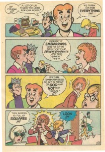
OK, so not "Wednesday or Thursday", but here's the balance of the week... ARCHIE #627: Archie meets Kiss, huh? Can I say that Archie has changed quite a bit since the days of this...


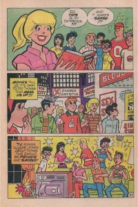
or this one....


The plot in this issue has the Archie Gang hanging out with Sabrina, The Teenage Witch (who has disturbingly off-Archie-Girl-model eyes and nose!), and they decide to cast a spell in order to protect the town from Monsters (this is a Very Legitimate Concern that many of today's teenagers face!). I mean, they literally sit in a circle and cast a spell! Man, I hope for Archie's sake that the Fundies don't get word of this -- I'm a godless liberal from San Francisco, and even I was pretty shocked that the Gang was personally involved in witchcraft. For very poorly motivated reasons, however, Veronica and Reggie instead decide that THEY should be the one to cast the spell, but instead of a "Protection" spell, she reads a "Projection" spell, instead (oh, that Ronnie! How scampish!), leading to Riverdales being infested by Archie-d versions of Universal monsters. Then Kiss shows up to stop the monsters, but you'll have to wait until next issue to see if they do that without inadvertently killed Principal Weatherbee.

Y'know, like how Kevin Keller proved so popular as to spin out from his initial appearance in VERONICA? I'd be oddly pleased if Archie Comics launched an ongoing Kiss comic. I wouldn't buy it (this was pretty AWFUL, and lacking in story logic, even for an Archie comic), but it would still make me laugh.

BOMB QUEEN VII #1: Alternate future story where like a League of Shadowhawks protect the world? And then a gender-bending projection of Bomb Queen's personality takes over some dude? I personally would expect that the usual audience for the pro-camel toe comic is going to seriously dislike this comic. I didn't like it either, but it wasn't for the dramatic drop in the cleavage-on-display ratio -- it's because anything this series had to say was probably said back before the third series concluded. Dramatically EH.

FABLES #111: I haven't read an issue of FABLES in some time (I got really dramatically burned out during that Mary Sue-d War plotline, and this isn't the start of a storyline, so I was fairly lost. But Buckingham can sure draw, can't he? Willingham and Buckingham have to be pretty close to matching Stan & Jack's run on FF, don't they? Despite not being sure what exactly was going on, I still liked this passably: it seemed OK to me, and I was especially pleased to see that it even had a letter's page. Why can't the mainline DC books pull that trick properly?

FUTURAMA COMICS #58: Nice dense issue, with lots of stuff happening. I laughed! low GOOD.

GREEN LANTERN THE ANIMATED SERIES #0: I was fully prepared to hate the cartoon, with it's low-rent CGI animation (I dislike cartoons that inherently look like toy commercials), but Ben and I were both generally amused by the pilot. But it's got a weird-ass setup -- instead of being Hal-specific and doing his rogue gallery on Earth; or being Corps-specific and using all of THAT mythology, instead they decided to essentially do GREEN LANTERN: VOYAGER, sending Hal and Kilowog as the only two lanterns out on the far fringe of the universe away from any support, in a talking ship, while they fight Species 8742 (Or whatever it was called), er, I mean the Red Lantern Corps. Strange premise. This comic is even weirder as it takes that premise, but renders it with a non-CGI look, effectively gutting its value as a tie-in. It was serviceable, but hardly exciting. EH.

LEGION SECRET ORIGIN #2: I don't need to read most of this. It isn't bad, really, but I just don't see the wisdom of having three distinct Legion-based series running at once. The property simply isn't that strong. A low OK

PILOT SEASON THEORY OF EVERYTHING #1: I'm starting to get sick of these, as a reader, because if I like it, there won't be any more; and if I hate it, I just wasted my time. Why do all of the work in building a premise and a world, that there won't be any follow up upon? This one is more in the latter camp, anyway. EH.

SPACEMAN #2: Super terrific work, all around -- Risso draws like a dream. VERY GOOD.

SUPER DINOSAUR #6: Ben loves this book, and I like it solidly, and I have nothing else meaningful to say! Strongly OK.

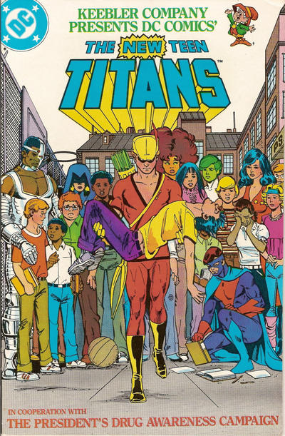
TINY TITANS #46: I know it's a kid's book, but I boggle when I see that this comics is effectively an inside joke based on this comic:

If you had a newborn the year this was released, that child would be twenty-eight today. Wow, long way to go for a joke! This comic also features the REAL identity of the "Mysterious Purple Lady" from the New52 comics, and, y'know what? I like this explanation Best of All! This is a slight slight comic, but I kinda liked it a lot -- a solid GOOD.


That's it for me for the week.  What did YOU think?


-B

Larkin About With The King (i.e. Stephen not Jack Kirby)

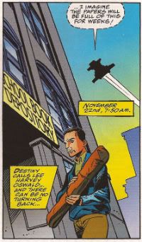
Sorry, I've been a bit light on the old comics reading front this week. I did read some books without pictures (they still make ‘em!) so rather than have everyone think I’d fallen off the face of the earth I thought I’d write about them instead. One of the books features this poor doomed b*stard who briefly starred in the John Byrne/Roger Stern 12 issue series MARVEL: THE LOST GENERATION in either #4 or #9 (it’s complicated):

Photobucket

After all if I can’t give you bad reviews of comics I can at least give you bad reviews of books.

Okay, it’s a little bit cheeky and I’ll try not to do it again. Anyway…

 11.22.63 By Stephen King (Hodder & Stoughton, £19.99)

In King’s latest pound cake of a novel Jake Epping, an English teacher and King Everyman, gets the chance to go back and stop the Kennedy assassination. Not exactly a groundbreaking premise there as I’m sure you've noticed. Still,  King manages to make it sit up and dance by concentrating on his usual strengths and investing it with duelling undercurrents of anger and forgiveness. He paints a pretty picture of The Past but doesn't neglect the shabby unsettling bits that eat away at the picture postcard perfection like surreptitious silverfish. Sure, cars and root beer were better but if you weren't an educated white male life sure had its drawbacks. Heck, even if you were an educated white male Life still had its drawbacks because, after all, it was still Life. And that’s what the book, I’d say, is really about; life and the living of it. Bad things happen and maybe they happen for a reason and maybe they don’t; the important thing is to accept they have happened and keep on moving forward. Because moving forward is the only kind of time travel we have and this is the only life we have. Yes, I am aware of how trite that sounds thanks for asking but I reckon it’s true and it’s the first thing to be forgotten when the machine full of whirling teeth snags your sleeve and pulls you in.

Photobucket

It’s a big book and like all King’s big books it has flaws but it’s surprisingly easy to forgive them here. The sometimes wearying repetition is, after all, built into the thing by design and the surprising ease of Jake’s eventual flight could be interpreted as The Past trying to eject him like the troublesome foreign body he is (weirdly this isn't made overt despite King being way too explicit about many of the other “rules” of time travel) and I’m never too pleased by King’s tendency to demonise the mentally ill but that’s one of his pets and its served him well so it would be unlikely for him to have it put down now. The prose is largely functional (and whoever edited it missed at least one sentence caught in a word search transition from the third to the first person) but when you transmute prose into poetry as deftly as King does on more than one occasion (most memorably with “Dancing is life.”) that’s more than enough.

Although 11.22.63 sags a little at times it is a surprisingly tense and moving affair that is far more rewarding than the unpromising premise might lead you to believe. It’s a big book but it’s got a big heart and so I’d go ahead and say it is VERY GOOD!


PHILIP LARKIN POEMS: Selected by Martin Amis By Philip Larkin (Faber and Faber, £14.99)

Photobucket

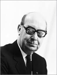
Such a blunt title. And why not? It tells you all you need to know. As long as you are familiar with Larkin and Amis and don’t hop like scalded cat away from any mention of poetry it does anyway. Philip Larkin (1922-1985) is one of England’s most widely regarded and best loved poets. Sure, there has been some attempt since his death to topple him with accusations of racism and misogyny fuelled mostly by “evidence” in his letters. This attempt at usurpation seems largely to have been initiated by the kind of Literary Sorts who continue to regard Martin Amis as an “enfant terrible” despite the biological fact of his being some sixty-odd years old. Happily after a brief wobble his reputation has stabilised for as Amis says in his (worth the price of admission alone) introduction: “writer’s private lives don’t matter; only the work matters.”(p.xix) And this work? While I’m certain it was work for the author (he was hardly banging this stuff out at a rate of knots) it’s certainly anything but for the reader.

Photobucket

Amis is ideally placed to offer up a retrospective such as this and it has little to do with the fact that Larkin was a friend of Martin Amis’ father (Sir Kingsley Amis). That certainly makes his introduction sparkle and throb with life but the success of his selection depends wholly on the fact that Martin Amis knows words. Yes, Martin Amis knows words. When it comes to words Martin Amis has form. He knows what he’s on about. It helps that he unsentimentally believes that as Larkin went on he got better. So there’s a smattering of the early stuff but the bulk of the book is the later stuff. All the smash hits are here:“They fuck you up, your Mum and Dad” (This Be The Verse), “Groping back to bed after a piss” (Sad Steps) and, the eternal Christmas Number One, “Sexual intercourse began/In nineteen sixty-three/(Which was rather late for me)” (Annus Mirabilis).

Stuff it, they are all preposterously good  it’s just that some work a quieter number on the head than the more immediate stuff. He’s got Life's number alright, that Philip Larkin. From the quiet despair we hope no one ever suspects us of, through the tedium of the toad work and the eternal magic of being strapped for cash right up and out to the joy of music and Love. Can there ever be a better testament to the effect of a piece of music on a person than “On me your voice falls as they say love should,/Like an enormous yes…”(For Sidney Bechet) Look, quoting Larkin is the act of a berk, better to just give someone the whole bloody book. And can there be any higher recommendation for a book? I doubt it because PHILIP LARKIN POEMS: Selected by Martin Amis is EXCELLENT!


Once again, I apologise for the Non-Comisy-ness of this and its general poor quality. Can I wish you all a nice weekend and we can call it quits?

If I do get chance I’ll stick something up about comics but it’s unlikely because Christmas is a coming and it ain't stopping for no one!

Now, like Stephen King’s belief in brevity – I’m GONE!

Abhay: HOMELAND DIRECTIVE

THE HOMELAND DIRECTIVE by Robert Venditti, Mike Huddleston, Sean Konot, Chris Staros, and Jim Titus, published by Top Shelf Productions in 2011, copyright Robert Venditti but not Mike Huddleston.

"Even with its plot deficiencies for this reviewer, however, the book is still strongly recommended over the majority of recycled, superhero punch fests."

-- The Comics Journal

I.

REVIEW #1: A NEGATIVE REVIEW.

THE HOMELAND DIRECTIVE is a wafer-thin conspiracy "thriller" that feels more focused on pitching a lukewarm Sandra Bullock movie, than on anything I might care about-- stupid things like characters, theme or story.

Is there a high concept premise, stated on the last page of the first issue?

Oh, I see you've read an independent comic in the last 10 years. Congratulations to you! In this case, the last page of the first issue ends with a man saying to a woman, "You're here because the United States Government may be trying to kill you." Then Rip Taylor runs through the door and yells "HIGH CONCEPT!" and throws confetti everywhere. Can't miss the high concept in modern independent comics-- there's always a high concept; just turn to the last page of the first issue, and there it is, next to the photograph of Rip Taylor.

The high concept appears to be What if the government were trying to kill you, and the only thing stopping them were a team of government employees rebelling against their masters.

There you go.

Let's all just sit and admire it.

That's all there is to this comic, so the least we can do is just sit and admire it for a little while.

Just breathe it in.

Soak it up.

Hoo-boy, I'll tell you what-- these are our awesome years.

It's got everything: what if's; governments; stopping; rebelling--everybody likes to think they rebel against things; that's the premise of every Nike commercial ever made. It's got a team of something. Do the hipsters know about teams? Probably; I'm betting everybody likes teams. The letter I isn't in the word "Team"; neither is Q or F; the word "DILDONICS" is not hidden anywhere in the word "Team", in case you were worried. Legitimately worried about technologically advanced dildos ganging up against you.

Yep.

Yep yep yep.

That is certainly a high concept.

That'd have been $15 well spent, if i was a person who enjoyed purchasing high concepts instead of stories about characters.

PSEUDO-FOOTNOTE:  instead of making comics, why don't people just write their high concepts onto postcard and sell the postcards, instead? It'd save time, certainly. Not having to fuss with pretending to like comics, that would have to free up a couple hours in a day.   "Here is a postcard with the word 'vampire' on it. Please give me all of the money!" You can hire screenwriters later to figure out the characters and the story.

If it worked for RED (2010), it can work for a postcard.

How is the HOMELAND DIRECTIVE paced?

The book noticeably feels like a miniseries that was jammed into a graphic novel after a vote of no confidence. Maybe in the material; probably in the marketplace. "Boo-hoo, comic fans are too busy reading recycled superhero punch fests to read movie pitches"-- that noise. Anyways, every 20-to-30 pages there's a cliffhanger and a new "chapter" starts.

A graphic novel written like movie except paced like a serialized comic book-- the best of no worlds.

Here's how movies are paced: usually, 9 times out of 10, Ryan Reynolds (playing either an architect or a guy who works at a magazine about architecture) is given a microchip, and has to go on the run from a villain (Jeremy Irons, Charles Dance, Miranda Hart, anyone British will do). Katherine Heigl (playing either a dessert chef or the owner of an independent bookstore dedicated to cookbooks for desserts) trips and accidentally fellates a penguin, so that the audiences in Flyover States will root for her adorkable klutz character. Katherine Hiegel fellating a penguin usually marks the end of Act One. Thereafter, the stakes are supposed to constantly escalate-- e.g., the only way for Ryan Reynolds to save the United States of America is to take a shit on the Lincoln Memorial and wipe his ass with Ben Franklin's Secret Map of America's Most Noble Whorehouses. Katherine Heigl has to either sabotage a wedding, or in the alternative, sabotage a wedding. One scene leads logically to the next. Finally, when times are at their very darkest, our heroes find a way to outthink the bad guys and save the day. Ryan Reynolds wears a wire and tape records the bad guys talking the shit, Katherine Heigl gets over herself and attends the wedding, the penguin ejaculates onto Ryan Reynold's abs, credits roll, everyone goes home happy, $60 on 3-d glasses well spent.

Here's how a serial comic book is paced: there's a page of nothing much interesting happening so that the reader can settle in. Usually, there will be a monologue about someone's pappy over a bunch of establishing shots of a road leading to a small town in Texas, the kind that only exist in comics where everyone spits and works at the spittin' factory and carefully mentions Hank Williams (Senior!) in their conversations in order to prove their small town Texas credentials. There will be a caption in one of the first four panels telling you that this scene takes place "Yesterday" or "13 minutes from Tuesday." Then, there are 18 pages of tedium, 10 of which will usually be double-page splash pages of government buildings, something exciting like that. (PSEUDO-FOOTNOTE: Creators used to get 20 pages of tedium, but there've been cutbacks which creators are quick to tell you has drastically changed how they go about creating tedium.) Finally, the 20th page is a CLIFFHANGER. Maybe, theoretically, it might be something exciting happening, but 9 times out of 10, the cliffhanger will just be a splash page of some dude sitting with his thumb in the ass saying something like "American farts come out red, white and blue," promising to the reader that maybe next issue someone will fart and it will be colored red by some underpaid colorist. But the next issue won't open with the red fart coming out of someone's ass, though, like you'd hoped-- instead, the whole cycle will start over again, and it'll be another page of nothing much happening in small town Texas. Except it'll be six months later and someone will just be narrating after the fact about what they were thinking when the red fart came out of their ass, and you'll think, "Oh, I guess you had to be there, like that person was." But oh well, that's how comic books work.

A movie and a serial comic book are intrinsically paced differently. You notice when serial comics try to imitate movies-- you're watching a movie that's lurching, a movie that starts and stops and starts and stops and starts and stops. A graphic novel written like movie except paced like a serialized comic book seems a gorgon structurally unlikely to satisfy fans of any of those three things.

Who are the Characters in THE HOMELAND DIRECTIVE?

The main character is a diabetic female microbiologist who has no other distinguishing features, like a personality or goals or non-expository dialogue. It turns out the government is doing something nasty with microbiology, so her being a microbiologist lets her deliver expository dialogue setting forth the government's nefarious plan. And that's it. That's all you get. If she has a single line of dialogue that reveals anything about her other than "diabetic female microbiologist," I don't fucking remember it and can't find it flipping through the book now. Maybe there's one buried in there somewhere; but it didn't stick.

As for her team of rebels, there's a black character. He's the one who uses guns. There's a nondescript blonde man. I had a hard time remembering who he was WHILE I was reading the comic, let alone now. I honestly have no idea why he's in this comic, what he contributes to anything. And there's the guy who is good with computers. He's fat, wears glasses, and is a momma's boy-- you know, a guy who likes computers; you've seen Revenge of the Nerds or Head of the Class, that's what all those guys are like.

There's nothing rebellious about any of these characters or any indication why any of them would be the types who would rebel against their government. There's no back story. None of them seem to believe in anything in particular.  They're politically motivated characters in a political thriller without any politics.

Do you like exposition? Then, you're sure going to be rooting for word balloons to point at these drawings of no-dimensional men in suits! Yessiree!

Oh, and the bad guys. The bad guys include (1) a guy with a red nose-- no other distinguishing characteristics, (2) a woman with red hair-- no other distinguishing characteristics, and (3) the most "fleshed out" character in the entire comic-- a serious government guy who complains about how politicians don't get how important the mission is. Welcome to The Rock!

http://youtu.be/FxKtZmQgxrI


PSEUDO-FOOTNOTE: As a superior example of what I'm trying to describe here, the Red Letter Media review of the Phantom Menace might be helpful, for your reference. At about 8 minutes into their 90 minute review, Red Letter Media asks a group of people to describe the characters in the original Star War Films. To describe Han Solo, they use words like "arrogant," "rogue-ish," "dashing," "scoundrel," and "pig-headed." To describe Natalie Portman's Queen Amidala character, they use words like "Natalie Portman," "Queen," "normal," "makeup," "monotone," and "that's impossible to do."  Do you want to attempt this experiment with comics?  I don't!

What is the Theme of THE HOMELAND DIRECTIVE?

The plot of a typical political conspiracy thriller is that a character learns that their faith in an institution has been misplaced. Robert Redford works for the CIA but then he learns that, oh say hey, maybe the CIA and the Government and the Press aren't on his side; bummer, dude; the end. Themes of institutional distrust should obviously resonate right now-- churches are okay with kids getting raped; universities are okay with kids getting raped; at this point, if there was a scandal about MADD or a PTA letting kids get raped, I'm not sure I'd even blink.

Here's how THE HOMELAND DIRECTIVE deals with these powerful themes:

The bad guys turn out to be a rogue faction of the government comprised of roughly two evil characters, but as soon as the proper authorities learn what they're up to-- why, they just put a stop to that kind of nonsense, lickety-split, and make sure our heroes get the finest medical treatment this country can muster, right away. You don't have to worry about your institutions, at all-- the President's on the side of the good guys. Nothing to worry about; the two bad guys are easy to spot-- they're the two people muttering about the mission; just avoid bad guys, of whom there are two, and life will be hunky-dory.

That's comforting. And that's what you want from a political thriller-- to be comforted that the decrepit status quo of our failing empire is acceptable, endless, and eternal. As some of you may remember, my favorite political thriller was that movie BRIDE WARS because at the end, you realize, hey, friendship really does matter more than having the perfect wedding, especially if the cost of a perfect wedding is a brutal sub-Saharan BRIDE WAR.

http://youtu.be/k0SJ-mTHmQg

Here's how THE HOMELAND DIRECTIVE's inside cover-flap describes what the book has to say about our "Orwellian present":

"In an era when technology can either doom or save us, is it possible for personal privacy and national security to coexist?"

Translation: the government owns computers, you guys. Just like Orwell predicted! Also, just like anyone who saw that movie Enemy of the State can predict after about 5 pages of this comic-- about 99.999% of this comic comes from Enemy of the State. Do you remember Enemy of the State? Seth Green uses a computer to try to hunt Will Smith; there's a weird, unnecessary subplot about the Mob; Will Smith punches Seth Green and the Mob and yells, "Welcome to Earth"; the end. Directed by Tony Scott, though, so the camera goes all whippity-whoo...? Have you seen it? Then, congratulations-- you've just read THE HOMELAND DIRECTIVE using the power of your MEMORIES. (Including THE HOMELAND DIRECTIVE's lame, in-no-way-believable Mob subplot!)

Does the comic illustrate that theme of "privacy vs. security" in any way other than having computers track the heroes? Does it attempt to answer the question whether privacy and security can coexist? Does it take a stand on anything? Does the arrangement of the story's plot elements suggest anything resembling a meaning or a point to any of the proceedings? Is anything being expressed about the world, life, the cycle of suffering and misery we're all reincarnated into endlessly, other than "it has computers and cameras and nerds in it"? Is it fun just being asked questions? Did you know the human head weighs 8 pounds? Did you know bees and dogs can smell fear? Did you know that my next door neighbor has three rabbits? Did you know the kid from JERRY MAGUIRE is 21 years old now?

What is THE HOMELAND DIRECTIVE's Story?

There was a writer named Lester Dent-- his claim to fame is having written the Doc Savage novels. Tens of millions of them, all about Doc Savage and his incredibly boring man-companions-- Fats the Lawyer, Slappy the Cab Driver, the guy with the moustache who says "Whiskey on my Moustache!", and Joe the guy who argues with Slappy which is never, ever, ever not hilarious. And Lester Dent explained how he wrote all those novels in a very simple how-to manual called the The Lester Dent Pulp Paper Master Fiction Plot, a "formula, a master plot, for any 6000 word pulp story."  A document that reflects how people understood stories worked more than 50 years ago, in a far less story-saturated age.

Here are two excerpts therefrom from the final section of that formula-- how Lester Dent thought a story should end: "FOURTH 1500 WORDS ... The hero extricates himself using HIS OWN SKILL, training or brawn. The mysteries remaining--one big one held over to this point will help grip interest--are cleared up in course of final conflict as hero takes the situation in hand." The final line of the formula is a questions for the Writer to ask themself: "Did God kill the villain? Or the hero?"

In the subsequent 50-plus years, these basic guidelines are still considered pretty good ideas. Consider Hollywood screenwriters Terry Rossio & Ted Elliott's Wordplayer website: "I referred to a checklist of basic 'rules' provided by a small production company ...#58. Characters must change. What is the character's arc? #60. Is the lead involved with the story throughout? Does he control the outcome of the story?"

Dan Harmon (COMMUNITY, WATER & POWER) has his take on story-- the thing he describes as "Super Basic Shit" in his Channel 101 tutorials-- "A character is in a zone of comfort, But they want something, they enter an unfamiliar situation, adapt to it, get what they wanted, pay a heavy price for it, then return to their familiar situation, having changed."

How about THE HOMELAND DIRECTIVE?

Plot Summary: Female Microbiologist is kidnapped by rebellious government employees who tell her that the government is trying to kill her. She asks to be let go but then when they say no, we don't want to let you go, she says fine and sticks with them. They take her to a computer and she finds out the government's evil plans, on google or gmail or whatever. She figures it out, oh, not through any investigative effort on her part or utilization of her skills as a microbiologist-- that might accidentally involve a character taking actions and making decisions, and those actions/decisions having consequences. Who'd want to see any of those things happen in a comic book? Instead, she's just reminded, "Oh yeah, I saw this five years ago before this comic even started" (or words to that effect). Victory through expository dialogue! Then she and her friends tell the government that she knows about what they're up to, and the government IMMEDIATELY stops all evil activity and removes the wrongdoers from power. The main characters never face down the bad guys, but it's okay because their lives go back completely to normal. The comic ends with her telling the other rebellious employees that she's not going to help them in the future, and she's going to go back to her old life of being a microbiologist, having failed to change in any way.

The end.

  • Under the Harmon formulation, HOMELAND DIRECTIVE is about a character in a zone of comfort enters an unfamiliar situation, fails to adapt to it, fails to pay a price for any of her actions, and then returns to her status quo, completely having failed to change.
  • Under the Rossio-Elliot formulation, the main character (who has no arc) does not control the outcome of the story-- the outcome of the story is always in the hand of the government.
  • Under the Dent formulation, the bad guys are not vanquished by the hero-- God (or the President of the United States or whoever) defeats the villains.

Nothing is learned; no one changes; the status quo endlessly reasserts itself, see you in the sequel, par for the course for a Comics that worships at the altar of "icons," "modern mythologies," a willful and deliberate blindness towards the concept of mortality.

But!

Maybe you'll say that there's other ways to evaluate a story, and I'm overfocusing on whether the hero triumphs rather than asking other questions. Okay, fine, fuck-it: let's ask other questions. Do the the events of the story logically motivates what happens from scene to scene? Does suspense build from scene to scene? Is what the audience is told in earlier scenes pay off in later scenes? Do characters behave in logical ways based upon the events of the story?

Let me give you three examples of why I personally think the answer to those questions might be no and/or "Hellz No."

Example #1:

The bad government guys are about to murder Female Microbiologist, when she is kidnapped by the rogue team. Female Microbiologist has no reason to trust the rogue team who has abducted her... until Female Microbiologist sees that the government has released a false news story claiming that she is being sought for questioning in a murder, and realizes she has to trust the rogue team if she wants to survive the government's plainly evil plans.

So, does that "track?" In order for you to believe that scene, you have to accept that the government would immediately-- no hesitation-- attempt to FRAME A WOMAN IT SAW BEING KIDNAPPED FOR MURRRRRRDER, at the drop of a hat, if it wanted to find her. How else can the government find anyone? Remember when that little JonBenet Ramsey went missing, and the government was all "We think she killed Colonel Mustard in the library with a lead pipe." OH WAIT NO THE GOVERNMENT DECLARED HER MISSING AND TRIED TO FIND HER FIRST. But that doesn't happen here because...

Because... ?

The government saw her be kidnapped. It has NO reason to think that she's the enemy, or to make an enemy of her. Anyone: why doesn't the government issue a news story with "White Lady Got Herself Kidnapped" instead? Have you ever seen what happens when a white lady gets herself kidnapped? There wouldn't be a soul alive who wouldn't know what Female Microbiologist looked like.

http://youtu.be/TeCMCJc5-jg

PSEUDO-FOOTNOTE: I refer you now to the late Patrice O'Neal for further elaboration upon this point.

Example #2:

We are told the government is looking for Female Microbiologist, and that she has only one weakness-- she needs diabetes medicine. The government will try to catch her through her diabetes medicine! They will post look-outs at all of the pharmacies! She will not get her insulin! She will die! How will she ever get out of this predicament?

Answer: she has one of her friends go and get diabetes medicine for her.

Oh, okay. Problem solved. The diabetes problem is solved by SOMEONE ELSE buying diabetes medication. Exciting. Exciting stuff. Fuck you, Rubiks-- the world is my oyster, now.

Anyways, so Black Gun Guy walks into a pharmacy, and puts BRIBE MONEY and his GUN on the counter and says "Give me diabetes medicine." Now, I don't know if you know how bribes work, but-- a gun is not actually required to bribe someone. Bribery fun-fact: very often guns help a person avoid the necessity of bribing another person. If you have a gun, you don't actually have to bribe a person-- you can just wave your gun at them. Or conversely, people will sometimes accept bribes even when they're not at gunpoint.

But. You know. Most people in the U.S. have never bribed anyone so I can see how they might get confused as to how it works. "I am here to bribe you. Here is the money I will bribe you with. And here is a grenade. I will now take out the pin and put the grenade into my pants." No, no: you can stop after "here's the money." The money is all you need for a bribe! The money is quite sufficient!

Example #3:

The comic is about a team of slick, knowledgeable government operatives who have to somehow, against all odds find a way to hide from the government's advanced surveillance technology, right? And so, in order to get help hiding from the government's advanced surveillance technology, they go and visit a MOBSTER. Because when you're trying to hide from the government, probably the very best place to hide is hanging out at a mobster's house. The government never watches the mob. It's not like there's an entire federal agency that's spent decades famously watching mobsters, after all.

http://youtu.be/ugwmaeURj1Q

Most private place on earth.

How is the--?

Not for me.  It's not for me!  What part don't you get?  How are you still asking questions?

***

"THE HOMELAND DIRECTIVE mixes the conspiracy theory of "Enemy of the State" with the tense, against-the-clock action of "24," then throws in a dash of "Contagion" for terrifying, ripped-from-headlines danger.

In many ways, THE HOMELAND DIRECTIVE is actually superior to The Surrogates in that [the author] was clearly able to pay more attention paid to pacing and character development this time around, and it's as easy to see the story playing out on a movie screen as it is to see it unfold on the page."

-- The Independent Film Channel

II.

REVIEW #2: THE POSITIVE REVIEW

Back up: here's the thing about ENEMY OF THE STATE, though-- I didn't like the story or characters there either. Fuck a Will Smith. But if it were on TV right now, I'd leave it on. Simple reason: I'll watch a Tony Scott movie. Shit, I'll watch a Tony Scott movie.  I saw his movie where Denzel time-travelled; I saw his movie where Denzel was all on fire; I saw his movie where Denzel drove a train the size of the fucking Chrysler building all up Captain Kirk's ass. I saw those in the theatre;  you know I will watch a Tony Scott movie.

http://youtu.be/BKc8m0apNh4

Oh, he has his themes-- he's made "the man who had been spurned by his society is the only man who can save it," way more than once; but my shallow interests are less in his themes than his surfaces.

Which brings us the reason I bought HOMELAND DIRECTIVE, to begin with: Mike Huddleston.

In THE HOMELAND DIRECTIVE, Huddleston seems to shares Tony Scott's basic game plan: distracting the reader by blasting them with style to process, in order to avoid them spending over-long thinking or caring about the story. Hey, if Denzel's riding a train, I want to be distracted; otherwise, I'm just watching Denzel riding a fuckin' train. Distractions are not only welcome, but requested. On one page of THE HOMELAND DIRECTIVE, page 41, over the course of six panels, Huddleston has seemingly six different color schemes: colors careen from representational to non-representational, three-color to two, to near black-and-white with spot colors, zipatone effects to their total absence to an inbetween place-- a sort of zipatone smear on top of a silhouetted figure, panels with white as a color, panels without, panels where the line drawings are in traditional black ink and panels where there's no line-art at all and the art is in a solid burst of color.

Fuck the story; a speech at a science conference drips with day-glo psychedelic colors, reasons unknown. Have you ever been to a conference where scientists spoke? I have; went to engineering conferences when I was a kid; neither day-glo nor psychedelic. Who cares? Maybe that's not something a person does when they're confident in the story they're telling. But sometimes Hollywood's going to go and make themselves a DEJA VU, and that's not when you send in Ridley. That's when you want Tony Scott on that wall.

http://youtu.be/khFEdsBEVU0

It should be noted, however, that Huddleston doesn't go full-on DOMINO here. The art doesn't spin off into the stratosphere with every page, but usually stays tethered to some recognizable gravity: a scene of computer nerds, in front of graph paper; a drive on a sunny day, rendered in burnt oranges; a scene in a dirty hotel room, drawn over a painting suggesting stains, discoloration, grime; a scene of fully painted characters exposed in public becoming empty line-drawings as they go back into hiding (hiding depicted as a scrawl of black chaos at the edge of a panel). There are many more examples, but I think we're actually getting into the realm of legitimate SPOILERS where Homeland Directive is concerned, far more than any of the plot details I've mentioned so far.

Granted, my distaste for the story content make some of his choices seem desperate to me. A page of random strangers dying is in as close to spectacular full color as the book ever gets, as if to impose upon the reader an importance to story events that are plainly meaningless-- people we've never met, suffering imaginary fates we couldn't possibly care about. Action scenes in pure red-ish hues-- okay, sure, I get it; it's still two pages of drawings of people pointing guns at one another, where the story doesn't have the bullets hit into anything meaningfully; action scenes in American comics are still basically drawings of little boys posing and voguing at one another. A black-and-white talking head scene with a girl's hair in bright red ain't going to save two pages of "Our man was able to obtain the number for a cell phone in their possession and BOCA is monitoring its location." The only thing that can save that is a certain Mr. Jesus Christ, J.D.

Goddamn, Huddleston made drawing comics look FUN. Which is an underestimated thing, the importance of that for readers. I never cared about anatomy when I was a teenager-- the Image artists made drawing comics look like the most exciting job there was. Most comics don't look fun at all: they look like chores. Who wants to take all those photos? Who wants to spend all that time on Google Image? Have you ever seen a perspective grid? It looks like fucking homework; anything where there's a "right answer" just sounds like a grind. But HOMELAND DIRECTIVE doesn't look like algebra; shit, he's failing as often as he's succeeding. Some of the attempts to collages in photos, I think he pretty much eats the pavement (e.g. about half the times a car turns up-- OOFA!). But all the same, I think to feel anything but affection for that would be a Grinch move.

http://youtu.be/5gGZAIFteAg

There's one panel I liked more than any other though.

The bottom of page 91. Huddleston does these establishing shots, where it's photos of buildings and clip art of trees, pasted together-- as if these different items were still snapping into place when the panel was printed onto paper. There's another on page 104, but the bottom of 91 is the best in the book. One of those fast-zoom establishing shots you'd see in a Tony Scott movie (or the Coen Brothers' Burn After Reading, where they were trying to channel Tony Scott). A van driving into a city that's still being pasted down onto the page. The establishing shot on page 91 tells the story that the inside flap promises, in a way the story never matches-- characters in a van hoping to drive faster than a Google map can load around them.

http://youtu.be/8PedtPtjP2w

If THE HOMELAND DIRECTIVE makes a persuasive argument about anything, it's an argument on behalf of BUTCHER BAKER. Tony Scott doing respectable SPY GAMES, with helicopter shots circling Redford and Pitt... he did it, and it wasn't his worst movie, but ... let Ridley direct the highbrow Oscar-bait shit. For Tony Scott, I want to see trains splattered with graffiti, teddy bears exploding in gunfire, Bronson Pinchot covered in cocaine, Denzel channeling Tarantino ranting about Kirby and Moebius, BOM means fuck you in Polish, C4 up a man's ass, every second of Gary Oldman in True Romance, sleaze, perfectly-lit sleaze, edited faster than a person can comprehend.

So, yeah: Huddleston + Joe Casey as a team suddenly makes a thousand times more sense than anything and everything else in comics has ever made sense. I get it now.

***

"I'll concede that Ridley has perhaps too high an opinion of himself, but Tony's Scott's movies go too far in the other direction. They are unnervingly proud of their skankiness. They seem to be shot with a special camera system, Skankvision 9000, that amps up the skank factor. I think that accounts for the haze in every frame of a Tony Scott film; it's not a smoke machine, it's the skank floating in the air."

--Matt Zoller Seitz 

III.

LONG WAY DOWN (ONE LAST THING)

Here's the part I get confused by; here's the part that made me want to write all this to begin with; here's the part where I'm genuinely confused and lost and need you to hold me.

How do I conclude this?

I have two reactions to the book-- a strongly negative reaction to the story; a strongly positive reaction to the art.

What's the proper way to end this? What did I ultimately think about THE HOMELAND DIRECTIVE? Is it "good?"

Consider:

THE "NEGATIVE" CONCLUSION

The different parts of a comic can be evaluated separately, story and art. If either of those things should fail, then the reader is perfectly capable of saying that the work has been reduced in their eyes accordingly; or conversely, if either of those things should succeed beyond the norm, then the reader is equally capable of saying the work has been elevated in their eyes accordingly. It is commonplace, after all, for writer or artist to dominate a work-- for a famous writer to be the "Star attraction," and the artist merely their servant, or visa versa. And after all, this is how most comics are instinctually discussed and reviewed-- paragraphs that focus on story, paragraphs that focus on art, and a pithy conclusion.  "The story was good but the art was bad" (or visa versa) is obviously a natural, normal and instinctive thing to say about a comic.

THE "POSITIVE" CONCLUSION

A comic inherently is more than the sum of its parts-- a comic is a gestalt between story and art, and what matters is not how some butterfly collector would dissect each sub-element, but the greater synergy between those two parts. What matters most is the overall experience of the comic! Breaking it down into sub-components is just a cowardly way of hiding from the question of "Is it good or not," by trying to turn "good" into math.  To pretend that one can discuss the story without reference to the art, or the art without reference to the story is to be oblivious to what makes comics truly great. It's the music critic who treats writing about songs like book reports on their lyrics; it's the film critic who compares movies to novels. The way most comics are reviewed is irrelevant if that way is ultimately false.

THE "SCOOBY-DOO" CONCLUSION

HOMELAND DIRECTIVE would have gotten away with it if it weren't for you pesky kids noticing I stole this joke from WAYNE'S WORLD.

ZANG!

Most of the reviews I've seen of THE HOMELAND DIRECTIVE have been wildly positive, positive not only towards art but the story as well-- I should note here that I'd have to guess this is one of the better reviewed comics of the year. "Better than superhero punch fests!"  Life doesn't get much better than that! And my suspicion-- perhaps unfair suspicion, but my suspicion is that it's because those readers so enjoyed the art that they enjoyed the story more; that they found good things to say about the story as a result of Huddleston's performance.

Are those people "wrong"? 

Are those people wrong to describe a story as entertaining if the "real reason" they were  entertained by it was a reason other than the story itself?

On the one hand, part of me says YES because they're FUCKING WRONG AND NOT PAYING ATTENTION TO WHAT THEY'RE REACTING TO AND THE WHOLE JOB, THE WHOLE POINT IS TO *PAY ATTENTION* AND IT'S A FUCKING TERRIBLE STORY GODDAMN HOW EASILY IMPRESSED ARE YOU CHIMPS.

On the other hand, part of me says NO because THAT'S EXACTLY HOW COMICS ARE SUPPOSED TO WORK AND HOMELAND DIRECTIVE IS THEREFORE ACTUALLY AN EXAMPLE OF SOMETHING WEIRDLY GREAT ABOUT COMICS! COMMMICCSS! COMMMMMMMMIC BOOOOOOOOKS!  I STAND UP NEXT TO A MOUNTAIN AND I CHOP IT DOWN WITH THE EDGE OF MY HAND!

And I'm not sure if I know what the right answer is.

I'm honestly not sure.

THE OBVIOUS BEST CONCLUSION:

WELCOME TO EARTH!
Hibbs and the Single 11/30 (part one)

Haven't finished reading everything yet for the week, so this is just part one... but I'll be pretty close to Old School Savage Critting, here...

ANGEL & FAITH #4: I'm kind of loving this book. I suspect that's because both the premise, as well as the motivation of the protagonists is significantly more focused than over in BUFFY SEASON 9. The art's fab, too. I honestly think this is VERY GOOD stuff. BATMAN ODYSSEY VOL 2 #2: What. The. Fuck? I didn't read #1 (and stopped reading v1 at #4, I think?), but whoa this has taken a serious turn towards the inexplicable with Caveman Batman and Robin, and dinosaur riding and man oh man Neal Adam's style is kind of inherently "serious", y'know, and completely works against what I think is meant to be a Silver Age Pastiche. Or tribute, maybe? Hard to actually tell. His Batman is zooming all around here, at one point really even sounding like a teenage girl (with an "I hate this. I hate this. I hate this." as he starts to ride a giant flying bat, followed by a big ol' "I love this!", yowsers!) I m just utterly baffled at what Adams is going for, and it is ultimately stiff and awkward and weird. So much "Work For Completionists Only", and kind of crazily AWFUL, sorry. DAREDEVIL #6: The idea of a villain with sponsorship patches, like an anti-Booster Gold, is sort of amusing, but that was a bloodier end to the fight than maybe was needed. The McGuffin of the patch was likewise interesting, but I guess I just don't see what the stakes are for DD. The art as is nice as always, but I just couldn't wrap my head around how this was a Daredevil story, and not a Spidey story. still, even with that, it's still a low GOOD. FF #12: I didn't say last week, but I thought FANTASTIC FOUR #600 was pretty terrific, but no I didn't like this. Maybe it's because in a FF book, I want to see one of a quartet of individuals specifically driving the action; or maybe it's because Bobillo's art (dunno for certain if it's a change in base-style, or the inker's work) went from sweet cartoony (like in his run of SHE HULK, man, those are great) to like harder edge euro-styled art. Like, dunno, Alex Nino, and that whole school of Philippine artists that was most prolific at Warren in the 70s? Either way, not a change I liked personally. So, yeah, while I can appreciate the intricacy of FF, this left me feeling pretty distant, so best I can must is a weak OK.
FLASH GORDON ZEITGEIST #1: Back to the top start again on this venerable property, and it is done with adequate style -- more enjoyable than the BUCK ROGERS reboot from last year, say. I'm just kind of loath to recommend any Dynamite book to people because I know if it show the slightest chance of catching on, Nickie will commission three different spin-off series, and we'll lose all of our readers for it, and have to stop ordering it. But, anyway, that's too meta! There was also an interesting choice at the end to have the rebel aliens come to Earth before ever encountering Flash, which would seem to me to be extremely likely to dramatically shear the central appeal of Flash which would be "Rugged American Individual goes to weird (and primitive, except for the spaceships) alien planets, shows them how incredible fucking awesome Rugged American Individuals are". Tell me you can't picture TEAM AMERICA's "America: Fuck Yeah!" playing behind any filmed Flash Gordon to date, right? Well, we'll see how that thread plays out, but I'm not optimistic on that. The rest of it I quite liked, though -- and that is a pretty awesome Ming, so, sure, I'll say this comic is a strong OK.

GAME OF THRONES #3: A lot of good choices in this adaptation, but the art's a little cutsie to work, I think. EH.

HAUNT #19: New Direction! Jump On Now! I thought the Kirkman/Capullo run was just too much trying to evoke a Spawny/Venomy kind of 90s feeling, but Joe Casey and Nathan Fox really change it up well here. I'm going to put the bulk of that on Fox, I think, as this looks pretty much the opposite of a Capullo comic. Solidly GOOD, though I can't say I would rush to buy another issue, necessarily.

STAR TREK ONGOING #3: Loving this, as well. Really, it's kind of a brilliant idea to adapt the old episodes with the new cast, they've got 150+ issues of material on tap, without having to generate a new story idea, yet they seem fresh because of the new dynamics among the characters. Solidly GOOD.

THUNDER AGENTS VOL 2 #1: A much better first issue than the last one -- action, AND plot movement, AND mysteries for the future AND soap opera is really the format that each issue of a super hero comic should deliver, and the first run had issues with only half or less of those in any average issue. Still, dang, in any incarnation of these characters, I'd have to say I think the appeal tended to be the artists drawing them (from Wood to Kane to Perez), and this is a writer-driven run, I think, from Nick Spencer. That's not to say that CAFU isn't fine (he [?] is), but not really in that same kind of weight class as many of the others. Ultimately, I kind of don't care about these guys outside of that art nostalgia, so you'd have to be exceptionally exceptional for me to say anything better than an OK on this. And while this is competently done, that's about it. If you have a jones for these guys, you'll probably rate this much higher than I.

THUNDERBOLTS #166: I'm going to kind of recycle the last few lines of the previous review for this -- this is competently done, but I have nothing emotionally invested in these characters, and this issue doesn't do anything to change that, so, sure, it is therefore kind of EH.

ULTIMATE COMICS ULTIMATES #4: First issue of the 4 that I liked on its own merits. I think this miscalculated on scale -- millions more dead, and this after the earlier devastation of New York... these things would dramatically change a world and how it operates, and it's exhausting as a reader to boot.  THIS issue seemed a lot more personally driven, and so worked for me much better. It's a low GOOD.

UNCANNY X-MEN #2: That's all weird, and not really very X-Men-y (though, yes yes, I get "new premise" and all; whatever, I stand by that assessment), and it doesn't suck, but it sure ain't for me. OK

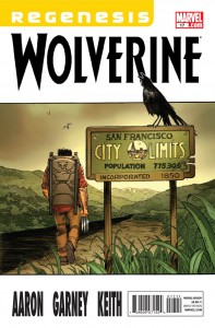
WOLVERINE #19: I like Funny Jason Aaron, I think, better than All Serious one. Very enjoyable, low GOOD

X-MEN LEGACY #259: I feel like I can see the sets, and someone left the script pages in the shot, and no no no no, you're supposed to emote, dear! and it's just little stick figures being moved around, and it's no different than the rest of Carey's run, mostly, and I think its unfortunately pretty AWFUL. I almost upgraded that just so we wouldn't end this session on a down note, but ugh, can't do it.

Right, more tomorrow (I think!), what did YOU think?

-B

Checking to make sure those muscles still work

Just a little warm up on some older stuff, as I test my posting muscles again -- I *think* I'm going to attempt an Old-School write-about-every-comic-that-came-out-this-week thing on Wed or Thurs, since it's such a small week of comics... First some NotComics:


THE WITCHER: I've had this game (got for super cheap through some mechanism I can't remember now) for at least 18 months, sitting there uninstalled. I changed that this week.

It is weird.

As I understand it, this is a project from a small Polish studio, that somehow against all odds caught on and got American distribution (We're the center of everything, aren't we? At least, that's what it said on my Membership card...) -- and one can easily see why: the engine is beautiful, the gameplay is smooth, and I'm having a reasonable amount of fun. The only problem is that the game is kind of a standard RPG (with lots of "go here, kill that" and "FedEx the MacGuffin to that guy" and all of the standard tropes). This wouldn't be so bad, but the game was originally in Polish, and it was translated.

Now, here's the weird thing (to me): they sprung for full and complete (and, actually, very good) voice acting (in American, even!), but, as near as I can tell, the translation was done by running the text through Google Translate or something... there wasn't any attempt to... well, I was going to type "polish" in the sense of  "shine up", but maybe that's confusing, given the national origin?

I'm sure the script is beautiful and lyrical in it's native tongue, but, man, in mangled English, it is really really hard to follow what is going on -- especially since the game is VERY wordy, with lots (and LOTS and LOTS!) of characters telling-telling-telling you what's going on. In the second "chapter", you need to figure out a Murder Mystery, and, can I tell you? That's pretty damn hard to do with a badly translated script. Ultimately, I kind of was clicking answers more or less randomly ("Well, that one seems kind of confrontational? Let's try this one instead!") and got through it.
Still, I liked it, mostly because the protagonist almost literally is willing to fuck anything that moves (I hadn't been playing for 10 minutes when the first sex scene happened, and one of the things you do in the game is collect "sex cards" to document your conquests), and it's got some heavily violent Conan-level combat. I don't know that I'll ever FINISH playing it, mind you, but the 4-5 nights I've been dicking with it so far has been at least amusing. It is highly OK.


THE SHADE #2:  This is a hard one to me -- this really is "vintage" James Robinson, with sharp funny dialogue, crisp plotting, basically everything we ever wanted from a STARMAN spinoff... but it's sort of 10 years too late, and it's hidden in the shadow of 52, and I think that a LOT of people swore of JR after the JLA stuff, and, anyway, this is a perfect example of a "wait for the trade" book.... except that maybe it won't even make the full 12 issues?

Also, well, I dunno if I really care? I really liked Jack and Opal and all of that... but I only really liked Shade in small doses, and in reaction to Jack, at that. He's a rich character, yes, but he's no protagonist.

And, I have to tell you, the continuity thing actually kind of pisses me off -- they opted to have the "DCnu" Deathstroke as the villain at the climax of #1, but clearly STARMAN/Opal couldn't have possibly have happened in the DCnu, as the JSA is so incredibly integral to the story, and there was no JSA is DCnu. They should have kept this squarely "old" DCU or, maybe, early Earth-2, or something... *sigh* So needlessly complicated.

Anyway, gang, yeah, if you don't support the serialization, then no one WILL collect the work. I know sales on both #1 & 2 were roughly half of what I expected, and I'm slashing orders as fast as I can....

Too bad, despite my conflict, this is very GOOD work.


That's it for today, the B&T order just arrived, and I have to get those boxes checked in... what do YOU think?


-B


"RA-409966!" Comics! Sometimes They Have Russ Heath Art!

Couldn't find a turkey, but I got a canary.  Careful of the bones! Photobucket

Hey, let's give thanks for an old DC war comic with the emphasis on Russ Heath.

Prompted by reading that OUR FIGHTING FORCES issue t'other week I was thinking about Russ Heath,  no, not because I have a kink for elderly comics artists. He’s old so I thought maybe I should do something about him. Y’know before he pops off and we all find out that he’s spent the last decade living in a badgers set and eating his own nose hair and we all feel bad before being distracted by the new AVENGERS movie. The first thing I think of when I think of Russ Heath is that time he squatted in the Playboy Mansion before he was asked to leave, probably with his pockets stuffed with canapés and ladies’ pants. The second thing I think of is this:

Photobucket

"Truth In Advertising!"

I know the child I was spent a ridiculous amount of time fantasising about those products, luckily though being a foreigner I never got the chance to purchase them and find out how much of a chasm existed between Heath’s marvelously evocative illustrations and the cheap plastic bas-relief reality. Alas, the murdered dreams of a generation of greedy children must be laid at the feet of Russ Heath. I guess no man gets to decide how History will remember him but I think it is important to at least mitigate the sins of Russ Heath by recalling the excellence of his work, particularly his work in this ‘70s DC war comic that I just happened to have read this week.

OUR ARMY AT WAR Featuring SGT. ROCK #245 By Russ Heath, Mort Drucker(?), Joe Kubert, Sam Glanzman(a) and Robert Kanigher, Sam Glanzman(w) and some other people who aren't credited because back then that's how comics rolled. (DC Comics, $0.25, 1972)

Sgt. Rock in The Prisoner by Heath & Kubert The nights in North Africa are cold but things heat up when Sgt. Rock is held behind enemy lines! It's a tale that could have been called "Rock, Paper, Scissors - NAZI!!" or "Now I Know Why The Uncaged Bird Doesn't Sing!" but wasn't!

Photobucket

This one’s called “The Prisoner” but rather than involving Sgt. Rock waking up in a natty blazer and being chased by balloons on a Welsh beach it involves Sgt. Rock being captured and interrogated by a nasty Nazi. Kanigher only has a few pages to play with so it’s to his credit that so much is packed in here. Following Rock’s nighttime abduction and the apparent death of the Combat Happy Joes of Easy Co. when they pursue him (it’s okay they are fit as fiddles when he rejoins them at the end, they just are because this is a Robert Kanigher War comic and he ain't got room for the niceties!) we get to the meat of the matter. Rock in a chair while a Nazi tries to break him.

Photobucket

"Fret not. The deaths of Easy Co. would be retconned faster than even a Marvel Event could manage."

What I wanted to do here was look at Russ Heath's work and try to at least ameliorate his rep as being strong on hardware but weak on the other stuff. So here we have Rock out of his element and Heath out of his element as the bulk of this tale involves one man interrogating another. Given the restricted arena for it to work it’s going to be all about catching moments; catching the right moments and not fluffing the catch. How’s Russ Heath’s catching?

Kanigher sets up a couple of ambitious bits of business here. There’s clearly supposed to be some kind of contrast between the methods of the effete interrogator and his more hands on second in command. Here’s two panels that set that right up without any dilly dallying:

Photobucket

"When it came to circus acts Sgt. Rock was always more of a clown man."

In the first panel Heath powerfully illustrates the large amount of violence that is contained in such a small act as pushing someone forcefully into a chair. The amount of movement in the Nazi’s body is minimal in comparison to the effect on rock and his seat. It’s cause and effect and here the cause is slight but the effect is great. Rock's inadvertent flailing perfectly captures a his instinctive need for a solid footing. Even the chair manages to suggest the shock of an inanimate object briefly become animate. Maybe?

The second panel not only contrasts the two approaches of the Nazis but also provides a vivid symbolic enaction of the approach of Kapitan Smooth. After all, if nothing else, I think we can all agree that a canary eating bird seed of the tongue of a Nazi is vivid. Going from brute force to sedate sadism is a pretty neat trick and I think we're going to have to say Heath gets that one bang on.

Temporarily divorced from his usual hardware Heath transfers his energies and has some fun with the Nazi, not only giving him a cigarette holder but also a creepily lax wrist action. C'mon the guy looks sculpted from smarm. Sure it’s shorthand and reliant on clichés but this character only lives for a handful of panels so it’s important to get it across quickly. In this guy’s case, contrary to what your Mum told you, it’s important to make the wrong impression. Have to keep that balance though, let the visual clichés serve the narrative and not overwhelm it.

Photobucket

"Trust me, I'm a NAZI!"

Oh, the canary's nice too, well done Russ Heath. The poor thing has been broken to the extent that it won’t even occur to it to fly off even though it has every opportunity. This is the sly power of persuasion but can a man as bluff and artless as The Rock resist? ( Spoiler: Yes.) He does this by just blaring his serial number in response to every question. This is the recommended technique and the repetition works well. The scene isn't as tense as it could be due to its enforced brevity. In a modern comic they could argue about their favourite Charlie Chaplin films or the best Hero sandwich they ever ate with lots of nine-panel grids with each panel containing the same image of a person face-on except in the last panel where the mouth has moved slightly and there’s a balloon saying “I know!” Regrettably Kanigher and Heath don’t have access to such sophistication. Actually they just don't have a lot of pages and their primary goal is to entertain in the space they have. They do actually have craft in spades. Which might be the point I'm struggling to make? I don't know, I got distracted.

Sorry, where was I? Rock's belligerent obstinacy is tiresome to our Nazi friend and so he has little recourse but to point his Luger in Rock’s face. Rock persists with his recalcitrant repetition so the Nazi straight up shoots him in the face. The series ends and no more Sgt. Rock comics were ever published.  No, I have fooled you with the magic of my words; it was a blank! What a trickster! What with unsettling canary feeding tricks and poor taste in physical humour it’s no surprise that following the War very few fleeing Nazis chose to hide under the guise of children’s entertainers. But he’s overplayed his Hunnish hand as Rock now knows he isn't bluffing. Next time is for keeps – how will the Rock escape!

Photobucket

I love the effect not having the tail on the first balloon has. It creates a disconnect between the text and image that nicely suggests the disorientating sensory impact of stress. Rock’s vision is lagging behind his hearing as his mind works overtime to process everything. As the moment of truth arrives Rock's hearing and vision synch up and the zoom replicates the focusing of his attention. That's some nice craft there.

In a weak attempt at suspense I may have forgotten to mention that Rock’s hands aren't tied. So he just slaps that sucker back as it fires and our teutonic torturer gives himself a lead lobotomy! The contrast between force and finagling doesn't really go anywhere but Kanigher does get to demonstrate that neither can break The Rock.

Photobucket

"Despite dying before they were formed Rock was a big Manhattan Transfer fan (Each time I hear RATTA-TATTA-RATTA, chanson d'amour!)"

Having left the tent (Kanigher's been a good boy until now but can't resist here: "CATCH THIS, BUSTER!”) and blown the whole base up by driving through it in a Kubelwagen while firing a mounted Spandau one-handedly (Because he’s THE ROCK!) Sgt. Rock faces off mano a mano with the thuggish one with the unpleasant method of seating guests. I mention the brand names of the hardware just to show that Heath gets to do his signature hardware thang even in such a restricted arena. You can clearly tell the items have been referenced even if I have got the names wrong, after all I've less familiarity with WW2 German hardware than The Pope so errors may occur. Heath gets one panel for this confrontation. And I think we can safely say he uses this panel wisely:

Photobucket

Man. That panel is so sturm und drang it’s actually turned the page yellow with the heat from the boiling background fires! Or maybe that’s because I don’t keep my comics nice. Anyway, I think we can agree that that single panel puts most capes’n’tights bust ‘em ups to shame. It’s the kind of thing that’s given at least a double page splash these days. Maybe with some deathless dialogue along the lines of “Hnn!” or “Ack!” Well, Russ Heath spits on such page wasting ostentation! Heck, he doesn't even need dialogue. Actions speak louder than words after all and that panel is full of A!C!T!I!O!N! You could stick that panel on the cover with “And Worlds Will…DIE!” as the strap line and it would still barely communicate the oomph and bang it blasts into your eye-holes. Russ Heath got one panel and he gave you one panel. One great panel. And I’m sure he doesn't really spit because it's dirty.

Photobucket

"The Many Emotions Of  Sgt. Rock #1: Sweaty"

I have of course cherry picked moments to illustrate the versatility of Russ Heath. There are some dead panels on these pages and his faces are often less than emotive. Kanigher's script also reaches for more than it can deliver but both of them were working with limited pages and purely to the end of entertaining bored G.I.s, kids and people waiting for video to be invented. Oh, and Kanigher gets a good joke in at the last. Rock gets back to Easy Co. and it turns out he couldn't answer the Nazi’s question because he didn't know the answer! I don't know but I think that's pretty suave and makes Kanigher's script GOOD! but Russ Heath, largely out of his element remember brings it up to VERY GOOD!

And me? Like The Thousand Year Reich – I’m GONE!

"...I'm Taking The Case." Comics! Sometimes They Aren't Older Than Your Grandad!

Here's an image from DAREDEVIL #4; a comic that isn't talked about within. But I just really, really wanted it up there so I indulged myself. I do go on about #5 of DAREDEVIL though. Is that alright? Are you sure? Because it matters to me! Photobucket

Well, I can't promise to help but I did write some words about some comics that were actually published this Century. Yay me!

Oh yeah, one of the images may be NSFW, depends where you work, I guess?

DAREDEVIL #5 By Mighty Marcos Martin(a), Marvellous Mark Waid (w), Jaunty Javier Rodriguez(c) and Venerable VC's Joe Caramagna(l) (Marvel Comics, $2.99 (YES! TWO DOLLARS AND NINETY NINE CENTS NOT THREE DOLLARS AND NINETY NINE CENTS!)

Photobucket

"...but it's bee-yoo-ti-ful!"

If I said that this was probably the best book Marvel are belching out that probably wouldn't mean much since I don’t subject myself to much of their gassy blather. But the fact that everyone else who has ever picked the book up has said roughly the same might be an indication that it’s worth a look if you aren't already looking. Because it’s sure as sure can be that it’s worth looking at. Sockamagee, the art, oh the art, art as this there should be in comics all the time! Every page has something delightful on it and those are the lesser pages. It’s just excellent stuff that revels in all the possibilities that words and pictures reveal when used in concert. Rivera plainly loves comics and consequently his art rolls around in the medium like a dog in a cow pat. But there’s no shortage of people piling on the praise for the pictures so I thought I might at least extol the work of Mark Waid on writing. Because this is good stuff and, I feel, it gets overshadowed by the glories of the art.

Photobucket

"A hero acting heroically? Get outta town!"

It’s just super-solid all round and there’s a real danger of underrating that. Strong enough stuff to just shrug off that lame drivel about DD’s identity and turn it into a running gag. Better yet, for me at least, Mark Waid remembers the inherent awesome of fights’n’tights comics. There’s a bit in #5 where Waid solves the conundrum of how Daredevil would know he was being targeted by snipers so smartly, so gracefully, so obviously that I did, I admit, smile in admiration. By the time Waid topped it with the light switch gag I was full out snorting like a frisky pig. Corporate North American Mainstream Superhero comics don’t get any better than Daredevil by Mark Waid, Paolo Rivera and Marcos Martin because it is EXCELLENT!


CAPTAIN AMERICA AND BUCKY #620 By Cracking Chris Samnee (a), Everpresent Ed Brubaker and Middling Mark Andreyko(w), Bouncing Bettie Breitweiser (c), Victorious VC's Joe Caramagna(l) (Marvel Comics, $2.99)

Y’know I bet sometimes Bucky feels like a motherless child. Oh. He is. And Dad pegs it as well. Then his sister gets taken into care and he gets brutalised by the military until he is a killing machine That’s quite a lot of misfortune for one kid, personally I’m just glad he didn't have a dog. By which I mean I’m glad for the dog. Now I’m going to spoil the rest of this series for you because I reckon I can see where it’s going based on how things have gone so far.

Photobucket

"The laughs never start."

Crucially we never actually see Ma Bucky and Pa Bucky die and Little Sister Bucky’s fate is uncertain. This is comics, better yet this is Marvel Comics, so the clock is ticking until they return from “the dead”! Not only that but they too will have been turned into killing machines with bionic bits and bobs. Will the Winter Soldier survive against the most dangerous enemy of all – his own family?!? Yes. But they will all be reset to being nice (i.e. American not Russian, obviously) and together they will go “off the grid” and cross America finding warehouses in which they can talk in front of bits of machinery before narrating sad thoughts over some Steranko influenced action. Hey, Captain America can turn up every now and again and whine about how much paperwork he has to do while looking out of a window with his back to everyone. Even better each one will have their own series: Winter Soldier, Spring Soldier, Summer Soldier and Fall Soldier as well as the “core” book: The Four Deadly Seasons! Call me, Marvel! I can LOSE you money too! Oh, this comic has got technique but no life and is a total waste of Chris Samnee's excellence because it is EH!

(This book was pre-ordered before my delusional and smug decision not to give Marvel money for books featuring Jack Kirby characters until such time as they just acted decently towards The King's memory. This also applies to THE MIGHTY THOR. The point was not to spend less at my LCS and thus drive the elfin owner into the nightmarish world of working for someone else but to fulfill my obligations viz a viz pre-ordered comics and then spend the same amount on different stuff. No, I don't know why I'm explaining this to you. And now back to our regular programme...)

OMAC #2 By Kracking Keith Giffen and Dandy Dan Didio (w&a), Saucy Scott Koblish (a), Hunky Hi-Fi (c) and Tasty Travis Lanham (l) (DC Comics, $2.99)

I enjoyed the first issue of OMAC a great deal. In fact I enjoyed it so much that had I my druthers each successive issue would consist of OMAC appearing in the Cadmus complex and then running through it smashing stuff up until he got to the end and then disappearing. Yes, every issue would open with him reappearing and then running through the Cadmus complex smashing stuff up until he got to the end before disappearing. Every issue. Same page layouts, same panels, same characters in the panels. But! With every issue and every re-appearance the scenery would be more battered and the people more bruised. Over the course of the series the dialogue would degenerate from shocked exclamations to weary acceptance and right down to futile grunts. This would continue for about, say, 12 issues until OMAC was just running through an ever deepening trench littered with bones and metal. (Hey DC, Call me! I can lose YOU money!)

Photobucket "Really? You look more like a "Larry" to me."

With issue 2 they don’t do that so what do they do? Well, it isn't Kirby let’s get that right “out there”!!! By the time Kirby birthed OMAC he had evolved beyond the merely mortal, having ascended to a plane whereby he could produce comics suffused with complexity and subtext that the man himself would have had trouble articulating. Reportedly not the most articulate of men Kirby was at his most articulate when he communicated via the medium of pencil and paper. With OMAC he was telling us of The Future. And the news from The Future wasn't good. The news from The Future is never good because in The Future you will be dead. Sorry about that. Worse than that Kirby’s OMAC told us that in The Future people would still be sh*theads and technology would simply give them exciting new ways to be such. But as long as there was someone willing to stand up and punch stuff until it stopped moving we’d be okay. The new OMAC isn't about The Future it’s about Now. Since stuff that’s about The Future is about Now anyway I guess that makes the new OMAC about The Past. And that’s clearest in the storytelling.

Photobucket

"Kids! How many storytelling techniques can you spot in this one panel!"

What we have here is pretty much any Hulk comic from the Bronze Age. By which I really mean how you remember any Hulk comic from the Bronze Age being. There’s a big old slobberknocker of a fight in which outlandish property damage is inflicted and much expositionary dialogue is spouted. Now, you may say there’s no place for such old-timey stuff in the brave new world of comics and I’d kind of see your point but I cannot deny the simple pleasure that this issue delivered. I don’t want to sound like some luddite berk living in the desert with locusts stuck in his beard but the fact remains that this style works. It delivers. And it isn't all Old School; the technicolour japescape of a colour job by Hi Fi looks like it was sourced from the still wet skins of alien jellyfish. It’s pretty good stuff, amiable entertainment that leaves you feeling entertained and amiable. I think the whole “I” for an “Eye” thing is bit too cute but I really liked “Omactivate!” so, you know, each to their own. There is some odd English in it too. Which is a bit rich coming from me but then I don’t have an Editor do I? But then, in a very real sense, does anyone in comics these days. Minor hiccups then and maybe not even that just a touch of reflux maybe? OMAC #2 is VERY GOOD! in any case.


PUNISHERMAX#18 By Swanky Steve Dillon(a), Jumpy Jason Aaron(w)and Matt Hollingsworth(c) (Marvel Comics, $3.99)

What a frustrating book this is. There have been some great moments as Frank’s monstrous nature is revealed in all its dark blankness but there’s some serious flaws. Just having Frank pop in or out of places like a magic fairy of death is jarring. It seems he can just waltz into the correctional facility hospital and pop his nut in Bullseye’s face. (Or a cap, I’m not strong on youth slang.) It undermines the good stuff when there’s such little attention paid to the plot. “And then I escaped…” isn't really a satisfactory way to end a prison arc, y’know. It’s all a bit odd because Aaron’s had plenty of room to tell his story (oh, look another three panels of someone leaving a room!) but it’s all a bit nebulous aside from the bits where Frank does something psychologically foul. These may be the more interesting parts to read simply because Aaron finds these the most interesting parts to write, all the other stuff gets a bit out of focus and vague. Unmemorable people in unmemorable rooms filling pages until Frank does something unforgivable isn't really convincing me that’s there’s much going on here. I mean there’s The Kingpin but he seems to be currently re-enacting some scenario from the letters pages of a psychopathic Razzle simply because he’s a bit bored. Oh, I know it’s the old thing about selling your soul to get what you want but then finding out it’s not; but it just looks like the Kingpin hasn't the wit to think of anything to do but drug and shag in his free time. Try cracking a book, man.

Photobucket

"Dammit, Kingpin baby, I (nnnhh!) almost (unnnh!) got there that time but you keep (uhhhh!) throwing me off (uhhh!) by callin me "Alan"!)

I don’t think matters are helped by Steve Dillon. Look, I like Steve Dillon, he’s a good artist but his action is too static, his backgrounds too vacant and his faces too caricatured to convince when applied to a serious story. Well, as serious a story as a story with The Punisher in can be. We’re not talking Ingmar Bergman here, folks, probably more Larry Cohen at best. At its worst it just seems like crude fan fiction involving the supporting cast of Frank Miller’s Daredevil run. I’m sure seeing Kingpin’s tubby bum as he slaps it to Elektra made someone’s day but it wasn't me and it wasn't today. At its best though it does seem to be saying something about fathers and men and stuff (oh, don’t worry, it’s nothing good. It’s never anything good.). Like I say it’s frustrating because if there was a bit more substance and a lot less sensationalism this would be better than OKAY!


SWAMP THING #2 By Yomping Yanick Paquette (a), Salty Scott Snyder(w), Naughty Nathan Fairburn(c) and Jesty John J. Hill(l) (DC Comics, $2.99)

Scott Snyder isn't the first person to tell us everything we know about Swamp Thing is wrong, but I doubt if anyone has ever done it as hamfistedley as this. The Parliament of Trees straight up send some mossy messenger to Alec Holland and he just plain tells Alec that everything he knows about Swamp Thing is wrong! Considering that the swampsters no longer talk in slow motion this takes him an incredibly long time. He uses a lot of words. So many words that he basically just wears Alec Holland down into believing him rather than actually says anything convincing. Holland clearly decides to believe Swamp Thing because life’s too short to listen any longer. Oh, and there’s also the biggest threat ever, ever, ever that has been around for ever, ever, ever but no one’s ever mentioned it before because. Just because. The woody courier then drops dead which is the price of his mission. I’m thinking the Parliament of trees want to maybe look into more effective means of communication. Then mad badness involving backwards headed people wakes the reader up, gainfully employs Paquette and dares to entertain for the latter part of the issue. This is slightly undercut when Abby turns up - but now she’s a bad-ass girl on a motorcycle! I hope the series isn't just going to end up with characters turning up but different! It’s Anton Arcane! But he’s a shoe salesman from Hoboken with a penchant for playing Toploader songs on the paper comb! It’s Chester but he has big ears! Nice art and some effective last-act nastiness but, really, the second issue seems a bit soon to fall into EH!


MIGHTY THOR#4 By Oval Olivier Coipel/Messianic Mark Morales(a), Melancholoy Matt Fraction(a), Lively Laura Martin(c) and Vitamin-enriched VC's Joe Sabino(l) (Marvel Comics, $3.99)

Ah, oh, it’s the usual bad cover version of a Thor comic. A hint of tit, a couple of “bastards” and some blood (when apparently some wolves get into Odin’s freezer. It isn't very clear what’s going on really.) seek to convince that this is  in some way more mature than those old Thor comics children (Haw! Children!) liked. Basically Thor hits The Silver Surfer in space. There’s some other stuff but it all seems mechanical and unconnected. Yes, predictably enough it’s another addition to the dismaying number of comics that probably sounded aces in interviews but, in reality, are staggeringly inadequate reading experiences. This seems to be working out okay for everyone though. (After all it’s only healthy to ignore reality and just stay positive about everything all the time.) I guess in the future there won’t actually be any comics, just interviews.

Photobucket

Interviews describing the most awesome comics ever; comics so awesome that to make them a reality would be just plain vulgar. There’ll be some personal stuff in there as well so that you feel connected to the interviewee with the uncomfortably shrill emotional content distracting from the cynical calculation underlying it all. After all what’s your USP? You, baby! You beautiful snowflake, you! They’ll have to be careful though, these writers of the future, it’s a fine line between being compared to Dave Eggers and being compared to Dave Pelzer. I don’t mind as they are the writers and being writers they are The Shining Ones and those that dare to raise a voice in criticism (burn them!) are nothing but Haters fuelled by resentment and jealousy. And it’s true. Christ, sometimes I wake up with my face wet with tears because I didn’t end up writing Thor comics. I wasn't hungry enough.  I failed the world. I am the filth of the earth. And all that’s fine, I mean it isn't like this pallid thing cost $3.99 is it? It did? Oh, those writers can get stuffed then. I’m sure everyone involved in this was a truly special human being but that doesn't stop it being EH!


AVENGERS 1959 #2 By Hirsute Howard Chaykin (w/a), Jolly Jesus Arbutov(c) and Jingoistic Jared K. Fletcher(l) (Marvel Comics, $2.99)

(Yes, I am aware Nick Fury was created by Jack Kirby but Howard Victor Chaykin needs his Mai Tai mix and who am I to deny him?)

Kind of typed myself into a corner haven’t I? In trying to course correct the critical conversation concerning Howard Victor Chaykin I may have erred a little on the enthusiastic side. (“Ya think, you limey asshat, huh, ya think?”) Now I imagine no one will believe me when I say that this second issue is even better than the first issue and the first issue was nice stuff to start with. Any rational human being would be forgiven for dismissing me as the kind of guy who had Howard Victor Chaykin pooped in a brown paper bag I’d pay for the privilege of a peek. I wouldn't though and I think that kind of nasty talk tells us more than enough about where your mind goes when no-one’s watching. For most of the issue the art is really, really sweet. The colouring is greatly improved and makes everything more visually coherent and there are some strong holding lines going on which I like. I was particularly enamoured of The Blonde Phantom’s hair.

Photobucket

"Oh, Howard Victor Chaykin! Don't you ever change!"

The last few pages get a bit choppy but by this point the events are getting pleasingly goofy so it’s not a dealbreaker. Baron Blood and Brain Drain? From Rascally Roy and Frisky Frank Robbins’ sweat drenched INVADERS run? By Howard Victor Chaykin? Man, that’s some daft stuff I’m liking. And on the last page when Howard Victor Chaykin basically introduces John Steed into the Marvel Universe I’m kind of starting to warm to the idea of looking in that bag. I guess you could say it’s Howard Victor Chaykin by numbers but I've run the numbers and Howard Victor Chaykin’s numbers look pretty good. AVENGERS 1959 #2 is witty, smart, saucy, fast-moving entertainment and it’s my fault but your loss that you won’t believe me when I say it’s VERY GOOD!

Remember, Kids, if you only buy one of these - buy DAREDEVIL because it is pure COMICS!!!

EXTRA BONUS DAREDEVIL PICTURE FROM ISSUE 4:

Photobucket

Criminy, just buy it already! Now go have a nice weekend!

"Watch Yer Noggin!" Comics! Sometimes They Are About Losers!

I read an old ‘70s DC war comic and I liked what I saw. Because what I saw was drawn by Joe Kubert, Alex Toth, Sam Glanzman and John Severin. I am good to my eyes. It cost 25 cents. Well, in 1971 it did. Photobucket

OUR FIGHTING FORCES # 134 By John Severin, Alex Toth, Joe Kubert & Sam Glanzman (a) with Robert Kanigher (w), lettering (probably) by the artists and colours by U.N. Known. The colourist no one knows but is known to everyone! Ho! DC Comics, Nov-Dec 1971, 25 cents (7½ pence)

Photobucket

"Joe Kubert edited this so if he wants Japanese soldiers on the cover when there are none inside, By God, there will be Japanese soldiers on the cover!"

It’s probably untrue to say that OUR FIGHTING FORCES (OFF) isn't anyone’s favourite comic but you could probably fit all the people who’d choose OFF before all other comics into the snug of a small pub. Personally I chanced upon this issue due to a weakness I have for smelly, yellowing non-tights’n’fights ‘70s mainstream genre comics. Sure, some men have a weakness for dangerous women or the thrill of the hunt but that’s their loss. I wasn't expecting much is what I’m saying. But what I got was Toth, Kubert, Glanzman and Severin. And I also learned some exciting facts about dogs.

Photobucket

"An awesome pause and then  - mad shit busts loose - it's SEVERIN!"

Robert Kanigher writes all the tales between these two tatty covers and if any one man personified DC’s war comics it is Joe Kubert. But after Joe Kubert it is definitely Robert Kanigher. Now while on a purely human level it seems Kanigher was certainly “difficult” on a professional level he was certainly, well, professional. Unlikely to be critically lauded anytime soon Kanigher could not only fill pages but, even better, he could fill lots of pages and better still he could do it without surcease. Robert Kanigher was a writer when a comic writer’s job was to write and no one can deny the fact he did that. When Joe Kubert replaced Kanigher as DC’s war books editor Kubert kept Kanigher on as writer. Whatever ill feeling there was Kubert did what it took to deal with it in order to keep the man he felt was best suited to the job. That’s a pretty solid tribute to the man’s talents. Either man. Anyway, Kanigher could churn this stuff out and like anyone who ends up as a churner the results were mostly mediocre with the odd brush with greatness and far more belly-flops into incoherence. Given the rate at which he pumped this stuff out it’s also easy to spot his style so although the last story here (“Number One”) is not credited to a writer I’m pretty sure it’s Robert Kanigher.

Photobucket

"Wait 'til he sees her teeth. (British people's teeth - comedy GOLD!)"

If it isn't Robert Kanigher my gast will be flabbered because the story is very, very Robert Kanigher. It’s a variation on his old standby of someone repeating a phrase embodying something they want to do while the events of the story conspire to prevent them and usually leading up to an ironic ending. Where “ironic” usually means “coincidental” rather than “ironic". It also has another signature Kanigher move – the lone soldier who pretty much unfeasibly kills his way to the end while the threats ascend in scale and danger; here our plucky dogface bests a plane, a gunboat, a U-boat and finally a pill box with three ’88 guns. That’s not bad for one grunt. I’d guess this one isn't writer-credited because it’s a reprint (the page filling banner across the top clues you in) but Joe Kubert has stuck his name on the art. This is lucky because it looks a bit like he was in a rush and so it resembles the work of someone who has just left The Kubert School rather than someone who will soon open the Kubert School. It’s OKAY!

Photobucket

"There's practically nothing there but everything essential is there - it's TOTH!"

Preceding Number One there is “Soldier’s Grave” by Robert Kanigher and Alex Toth. Yeah. Alex Toth. Not much to say really as it’s Alex Toth so the page designs and layouts are wonderful, the brevity with which he visually communicates the necessary information is borne of skill rather than sloth and, look, it’s Alex Toth. Kanigher’s tale tells of an aged Egyptian who joins the Pharaoh's armies so that the pay he will receive on fighting will take care of his family. Now, I’m a Dad and a Partner while also having, shall we say, a certain Autumnal mental aspect so that kind of stuff gets in me and hurts. The poor sucker can’t make it into the fight (so his family won’t get any moolah) but luckily he lucks into holding up the Persians while his forces retreat. This costs him his life but the Eygptian leader promises to see his family right by giving them the valuable dagger that slew their paterfamilias. Again, I think Kanigher is reaching for irony here but ends up kind of edging more into the area where the dagger is a symbol for a kind of old timey Death In Service payment. It’s not a terribly convincing ending but there is an effective playing up of the disgusting waste of the Pharaoh and the parlous state in which his subjects live. It’s kind of clever really. With the exception of one panel the story shows just desert, pyramids, rocks and soldiers; it’s barren and harsh and then there’s the single panel showing the Pharaoh's tomb filled with food and loot. It would of course be cleverer without the big word balloon spelling it out for us but back then over-egging the pudding was par for the course. So, Kanigher’s script is okay but Toth’s art lifts it up to VERY GOOD!

Photobucket

"It's okay all that'll end up in a British museum - because we are stealers!"

Sam Glanzman’s U.S.S. Stevens’ tale “In Tsingtao” takes us almost to the front of the book and, like all it’s author’s work, it has a lot of heart that makes up for most of the rough edges. Glanzman actually served aboard the U.S.S. Stevens during 1941 – 45 and I believe (although you may correct me) that these stories certainly draw upon his experiences if not actually document said experiences. It’s knowing this that lends a certain generosity to my reception of the strip. While I might otherwise be unimpressed by what appears a muddled attempt to contrast the comic book mythology of Superman’s invulnerability with the very real vulnerability of four sailors slain on shore leave; knowing it is probably based on a real event means that I can be more impressed by it as an attempt to embody the sadness and waste of such an event and that reading more into the panel where the sailors watch a Superman serial than the fact that sailors used to watch Superman serials is entirely my fault. Which is a long and tedious way of saying In Tsingtao is short and affecting and GOOD!

Photobucket

"Man, I bet the guys who created Superman died rich!"

Luckily any reader will have been prepared for Glanzman’s depressing tale by the feel-good fun facts of “Canine Corner”! This is two pages of dog facts and pictures which are linked to the military theme of the book by the fact that some dogs were used by the Army as they could “giving warning of enemy infiltration at night”. i.e. they barked.

Photobucket

"For Mr. Graeme 'The Dog Botherer' McMillan"

Which brings us to the tale at the front of the book - “The Real Losers!” I have worked my way backwards because like the immortal Vanessa Williams song I like to leave the best ‘til last. This isn't the best story because of Robert Kanigher’s script but because of John Severin’s art. The script is basically an excuse to build to a scene where Gunner (the young blonde Loser) rediscovers his will to fight the good fight. Like all Kanigher’s war scripts the plot has little to do with reality but for it to work it has to at least appear to be grounded in reality. Given Kanigher’s shortcomings as a writer this is a task the art has to shoulder. John Severin’s performance on these pages is more than suited to the task. I like to group Severin amongst my personal roster of Quiet Giants of Comic Art. He rarely appears on anyone’s best of list but he certainly deserves to. It’s probable that working with the inestimable Harvey Kurtzman on EC’s war stories cemented in Severin a certainty that research and authenticity were essential to successful verisimilitude. See this panel from pg.8:

Photobucket

Now I've read a lot of war comics so I've probably seen more bullet riddled German soldiers fall out of trees than is strictly healthy but what strikes me about that panel is the level of detail. The insignia on the helmet is clearly visible, attention has been paid to the studs on the soles of the boots and, best of all, Severin has drawn the lining in the helmet. Now I’m not a WW2 obsessive so I can’t vouch for the veracity of these elements but the wealth of them convinces me of the reality of the image and makes me shake my head in admiration at the effort that could have been so easily avoided but wasn't. Later (pg.13) Severin draws a bunch of howling Wehrmacht bursting from a landing craft. According to a WW2 obsessive and pedant (how often the two are paired!) I once worked with it seems holding a Schmeisser by the ammo clip wouldn't work due to its instability when firing. So, I’m not unaware that Severin gets things wrong but the things he gets wrong are the things everyone gets wrong and the things he gets right are things most artists wouldn't even bother about.

But Severin isn't just about the detail, which in isolation would make his work err towards the clinical, but also about body language and expressions and it’s these that give his work heart. By pg.11 Gunner and Sarge are on a beach with a bunch of walking wounded when they are made aware of an impending German attack. At this point Gunner still won’t pick up his gun to fight but at the OIC’s command of “Walking wounded!—Grab your weapons and form a line at the water’s edge!” Kanigher steps back and lets Severin’s lines speak with dignity and sureness:

Photobucket Of course Kanigher has to spoil it on the next page with some customarily hilarious over-egging (“Who needs FEET to SQUEEZE a TRIGGER!”) but look at that last horizontal panel. Look at Sarge’s face; his expression. That’s a complex piece of “acting” right there. It’s class and John Severin is a class act all the way. It’s a sad thing that such excellent work has to be stumbled upon in back issue bins by accident. But it’s a good thing I did because I got to tell you about it. Assuming you’re still here. John Severin’s excellent work lifts The Real Losers! up to VERY GOOD!

So there’s an old DC war comic I wasn't expecting anything from but got a Hell of a blast out of. And me? Like The Pharoahs I'm history!

Have a nice weekend all a youse stumblebums!

39 years later, and does anyone care?

What do C.C. Beck, Vaughn Bode, William S. Burroughs, Eisner, Fellini, Moebius, Kirby, Barry Smith, Tom Wolfe, and Frank Zappa have in common? THE SOMEDAY FUNNIES

Really, you need to read Bob Levin's exhausting account of the book in THE COMICS JOURNAL #299 -- a fine fine piece of reporting -- for why this book, tabloid sized, on glossy paper, purporting to be an examination of the 60s by many of the era's greatest thinkers, in comics form, was never printed in the 1970s.

That tale telling was so compelling, it got Abrams to finally pull the work together (why Abrams, and not FBI? Surely Fanta was given a crack at it?), and, boom, here it is, "the El Dorado of comics"

Sadly, however, it's kind of not that good.

Part of it, I think, is the format: Tabloid size hardcover, on super-archival paper, and a fiddy-five dollar price tag gives the work a huge weight of expectations upon it. This isn't helped by the history of the work, either, but I found far too many of the pieces to be self-indulgent, nearly tossed off, or otherwise inconsequential tellings that can't support the expectations upon them.

But packaging defines some of one's reaction to a work, and I think if this had been mag sized, on white, but not archival paper, it might have come off much better. Part of the problem is that most/many of the American artists appeared to be working with the idea that their art would be sized down -- look at that Kirby piece for example -- it really would look better in comics dimensions; same with the BWS pages.

If it had been priced at half the asking price, I could see a lot of people being super-curious and wanting to have a copy of their bookshelf.

I also found the Michael Choquette drawings on most pages to be extremely arrogant and mostly out of place.

The thing is, there's quite a few terrific pieces in the book -- I didn't know Tom Wolfe cartooned, for example -- but when you juxtapose those against, say, Asterix or Spirit pages the latter seems incredibly... man, I don't know, I sort of want to say "self-serving", but that's not it... maybe I can't do worse than "unambitious"

One thing the book is good for is to remind me of how much I love some of what I've always thought of as the "National Lampoon Stable of Cartoonists" (Shary Flenniken, Bobby London, Ed Subitzky, and Charles Rodrigues especially), and how much I wish there were some in print collections of NatLamp comics. I bet most of it doesn't really hold up that well either, but there is a passion in that stuff which was very appealing to me.

There are pleasurable suprises, as well -- Steve Englehart writing AND drawing (basically) "What If Captain America was really defrosted today?" -- Englehart has a surprisingly strong Golden-age-style style, or a nice little four-panel strip from Louise Simonson. Fellini's cartooning chops are actually pretty crazy strong, too.

There really is a lot of lovely art that's fun to look at in the book, and if the book were presented as "Look at this crazy mishmash of cartoonists -- it's nothing important, but you're never going to see this pile of people together again", then maybe I'd be raving about the book, but the format of the book itself argues against treating it like ephemeral frippery -- it instead screams "Look! Important People saying Important Things about an Important Era!", but you know, most of them actually don't have anything all that interesting to say.

And, I'll give them this: it probably IS a fairly Important Work, but it just isn't all that compelling or wise with what to do with its format. Sadly, this is largely a failure of editorial stewardship, because people were clearly being told to do whatever they wanted (except leave space for the editor to make his own [physical!] mark on each page). At half price this might be a great curiosity to have on your shelf, but at over $50? (ESPECIALLY when the text is explicit that each contributor got a flat $100? And, it's clearly implied that Abrams got the book without any really significant editorial costs?) Yowchies!

There's some EXCELLENT work in here, as well as some purely AWFUL stuff, but the "Anthology Problem" rears it's ugly head here, and the book as a whole doesn't feel, to me, like anything better than an EH.


What did YOU think?


-B

Hibbsing into the first week of November!

I lost last week to GTA: San Andreas. It was on crazy sale on Steam (under $5), and I let myself get tempted and sucked in, and read very very little last week. But I'm back now!

GTA: SA is a fascinating game -- I certainly feel coarser for playing it (still playing it, actually -- I'm not even out of LA proper yet!), but I also think there's something insanely artful about the freedom of the entire experience. The voice acting is stellar, the motion capture is amazingly subtle, then it has those big meaty meshes that just slaughter the illusion. It's insanely hard in places, and some of that might be standard controllers -- like the rail shooting portions would be a lot more fun if you were standing in an arcade, for example -- and I get endlessly frustrated by it's arcade/console roots... I am used to having a LOT finer control of when I get to save, for example, in PC games. Anyway, VERY GOOD game if you're OK with playing dark.  So.... comics!

ACTION COMICS #3: I'm really really really enjoying Morrison's Year One take here. I'm still not convinced this guy has actually appeared in any other comic book, however. This really is a Superman I've wanted to read nearly forever, and I'm sorta kind of crazy sad that we've been told the book is going to switch to "contemporary", because I wish this WAS. Ah well. If there's a problem (and there is) it's the ridiculous $4 for 20 story pages and a bunch of absolutely mis-thought fluff at the back. It's horrific to expect people to PAY to BE ADVERTISED TO. Ugh! If the "backmatter" doesn't get a WHOLE lot better really really fast, I really can see a lot of people deciding to just skip out and wait for the trade.

While I'm on this topic, can I address the crossline fluff pages? I get that in issue #1 you can't have a letter's page (though individualized author intros and "here's what we're thinking" text pieces would have been the right foot to get off on), and, sure in #2 as well, but you're on #3 now, and I can not believe that we are still seeing these softball interview questions at this point. "DC All Access" needs to be rethought as well -- especially when you're overtly trying to sell 52 titles to people, having *dull* repeating content each week is awful. It needs more Stan Lee, more cowbell, and less "laundry list of projects" perfunctorily typed out.


Anyway, ACTION #3's comics pages are VERY GOOD, and everything else about the package is AWFUL.


ANIMAL MAN #3: Whoa. Artistic tour-de-force, with only-in-comics concepts. This is so different in tone than any of the other 52, and I'm really enjoying it almost as much for that as anything else. An easy VERY GOOD, though I didn't like the hand-waving away of the origin aliens.


INFINITE VACATION #3: I really like the ideas on display in this comic (though the "Evil Mark" scene went on two pages too long!), but the art looked rushed out to my eye... which is something given it's been SEVEN MONTHS since the last issue! Christ! This book was solicited as a MONTHLY comic. Hell, the back page ad still has the original shipping date for #4, if you look -- 4/27. That's just of 2011, not 2012. Further, issue #2 was the book that shipped back in April, not the #4 it was *supposed* to be. This kind of behavior is exactly and precisely why so many retailers give up on trying to stock innovative small press titles in general, and IMAGE COMICS in particular -- this kind of crazy irresponsible publishing behavior. That's asshat level shit right there. The comic was GOOD, but who is going to care if you can't release it in a reasonable manner?


AVENGERS ACADEMY #21: Or, as the cover puts it: 1st Issue (of a new era). Hmph, cheap. I do like this book, however -- it's got an interesting premise (training future Avengers... who would have otherwise grown to be villains ), and it's style and pacing is kind of "old school Marvel" (in every positive sense of that phrase).  There's a realllllly awkward transition on page 12 (and again on 13) which doesn't work at all on the printed page, making it look like one of the characters is stripping in front of a room full of people, but it has a decent little cliffhanger there on the last page, so that's nice. Overall, I think this is a GOOD issue of a solid comic book.


FEAR ITSELF 7.1: CAPTAIN AMERICA: Ugh. that's even worse than the first time through!I might have been fine with the idea here if it had been an actual decision all of the characters made, but I can not see the Caps going along with the lie, whatsoever. Plus, the stated reasons for Nick and Natasha don't make a lot of sense -- if he's just going to go back to his old identity, won't the Russians know about that almost immediately? This does nothing but engender negative feelings in the superhero community, for no gain.  No wonder so few of us could tell Bucky was dead in the first place.... very disappointed. And only sheer craft prevents me from going below EH.


x-23 #16: once, a very very long time ago, I kind of collected "Captain Universe ('The Hero Who Could Be YOU!')" appearances, because the conceit of the idea was fun, if a bit shallow. So, when I saw the cover, I decided to read through this issue. Mistake. I couldn't follow it at all (Probably mostly because it is chapter 4 of a 4 part arc, I would imagine!), and I haven't got the foggiest idea why the FF are involved with x-23, or why it's no longer "Captain Universe", but rather "the enigma force" (wait, tied in with Micronauts, then? Really? Since when? and...Why?), or why... well, really anything. I kind of hated it, but rather than saying "AWFUL", I should be more fair, and liken it to walking into the last 15 minutes of a movie -- good, OR bad, you're probably not going to get it -- INCOMPLETE.


NEW MUTANTS #33: Have I said how much it drives me nuts when people get simple enough San Francisco-based stuff completely wrong? I mean would ANY Marvel editor anywhere have a character standing in Harlem look west and see the Statue of Liberty? But the equivalent of that happens ALL THE TIME in SF-based stories. (general Protip? there are exceedingly few places in town where you'll have a cable car in the background) So, when the New Mutants (heh) move into a house that's, I think, meant to invoke memories of THE REAL WORLD, and the text specifically says "1128 Mission", but the house is A VICTORIAN, yikes, no. 1100 block is down near the Civic Center, and that's full-on industrial buildings. Seriously, go Google street view it! You can have them in a Vic on Mission st, but it's pretty much got to be on the other side of Division. "2128 Mission" wouldn't have had me blink even for a second.

(Yeah, yeah, I know, sorry!)

Either way, I really don't understand the premise of this book -- it isn't clear why THESE characters are together, or why, or, even, what they're going to do. Pretty much all of them are cyphers at this point, with any real plot thread that could come from their own backgrounds played out. I can't muster more than an OK.


SWAMP THINGG #3: I keep trying to like it, but I think it is missing something in some I-can't-explain-what way. Maybe that it feels like it is trying to live off the Moore run, yet try to contradict it at every turn? Maybe it is that "Swamp Thing" isn't IN the comic, at all? Maybe it is "The Rot" is very very lazy? I dunno. I like the art, I even think the writing is fine, but the entire thing fails for me in some essential way.  EH.


UNCANNY X-MEN #1: There is absolutely positive 100% no reason this shouldn't just be #544. they gained NOTHING from a story-telling perspective from the renumber, and even, in marketing, I don't think it's going to work, because that particular well is pretty dry right now at Marvel.

(plus? You can NOT see downtown SF from Ocean Beach. (Just like you wouldn't be able to see Utopia from downtown) It isn't possible, unless you're in a helicopter, but not from a worm's-eye view like the camera there. Also, they BETTER rebuild the damn windmill, Keiron, ON PANEL, I love that thing! And? On that last page? That's not GG Park it's standing in -- that's the Presidio, a mile or so away...)

This is not really how I would have resolved the whole Celestial thing (I find Mr. Sinister to be, perhaps, the worst of Claremont's creations), but, sure, whatever, if you want to make UNCANNY more of a "superhero book", then I guess this is the way to do it. Except that I thought that that was the purpose of (adjectiveless)? This was OK, but, again, I simply don't understand the renumber.


Well, that's enough from me -- time to help customers!

What did YOU think?


-B

"Okay, Let's Go." Comics! Sometimes They Contain Cowboys!

I hear tell there's no call for Western comics no more. I reckon folks don't know diddly squat. One's I read made me more than partial to 'em. Photobucket

Hunker down a spell why doncha and hear me jaw about a couple of Western comics. WESTERN By Grzegorz Rosiński (a) and Jean Van Hamme (w) Cinebook, 2011, $15.95/£7.99

In the year 1868 Ambrosius Van Deer’s reunion with his long lost nephew goes badly wrong. Blood is spilled, secrets are revealed and Destiny sets a course for tragedy that will be years in the shaping.

Photobucket

WESTERN is a tale of love, revenge, identity and destiny that spans the period of 1868-1922 over its 64 pages of densely packed story. It is the product of the w/a team behind the Belgian comic series THORGAL which is a series I have not read but is apparently one of the most popular French language comics there is. Look, I can’t read everything and since I am mono-lingual (if that) I’ll just have to take Wikipedia’s word. Also, if WESTERN is any indication then the popularity of THORGAL is understandable; for this is a very good comic indeed.

Photobucket

To my uneducated eyes European comics seem primarily artist driven (Rosinski is credited first on the book cover) as opposed to the current state of American affairs where the writer is king (or if not king then architect). Certainly this book is noteworthy primarily for the art. As is no doubt obvious this book is my first exposure to Rosinski’s work but I have to say that Rosinski work is pretty stellar. Characters are easily identifiable, settings are convincing, staging is clear, actions are active and all these things are to be applauded rather than taken for granted. Rosinski knows what he is doing and he does it very well indeed. Over the top of all this understated excellence Rosinski applies a lovely faded wash of colour, sometimes even dropping lines out entirely leaving only the soft hues to carry the image. Rosinski is obviously talented with colour and that’s most in evidence in the full-colour paintings that punctuate the episodic narrative. These are things of greatness. If I could scan one in I would but I can’t so take my word if you do pick the book up it’s worth the cover price for these evocative and enduring images alone.

Photobucket

Of course if you do buy it you’ll probably read it so it’s fortunate that Van Hamme doesn't let the side down on writing duties. Given the chronological scope, episodic nature and the limited page count Van Hamme has it all on to keep his narrative successful. Wisely Van Hamme maximises the information provided to the reader by tripling up on the dialogue (effective but blunt as is common with translations) and visual information (gorgeous and invaluable) with the third device of narration. Clearly at home with words beyond dialogue (it’s called writing) Van Hamme doesn't use his narrative voice to merely utilitarian ends. In fact Van Hamme bookends the tale with two nice pieces of misdirection. The first is clever but the second and final occasion is cleverer as it defies expectations in a way which is truly surprising and emotionally affecting. That’s real writing and, yes, it is hard. The actual story doesn't lack for incident, excitement or drama provided you can stand a healthy dose of coincidence and the accept the fact that a one-armed man can be such a crack shot. But coincidence is ever melodrama’s companion and a Western without a crack-shot protagonist would be a very short comic indeed. The melodramatic momentum together with the eventful occurrences keep the thing moving towards its fateful end quite smoothly and the artful efficiency of the storytelling combined with the sepia washed beauty of the art results in WESTERN being VERY GOOD!


TEX: The Lonesome Rider By Joe Kubert (a) and Claudio Nizzi (w) SAF Comics, 2005, $15.95/£9.50

Tex visits some old friends only to find them slaughtered by a gang of “rascals”. Saddling up and heading out Tex vows to bring them to justice Texas Marshal style!

 TEX: The Lonesome Rider is an attempt to introduce the long running (since 1948!) Italian comics series to the nation in which it is set; that’s you, America. To do so they chose the immaculate Joe Kubert to do the art chores. This process together with the history of Tex is detailed in introductory front matter in the volume. The best part of this is an interview with Joe Kubert in which he gives new dimensions to the word “concise”. A man of few words our Joe Kubert is, prefers to speak with his brush, I guess. A bit like old timey cowboy heroes who were tight lipped and let action speak louder than words. (Yes, my segues do require more work, thanks for noticing). And TEX is certainly nothing if not old-timey.

Photobucket

While WESTERN is clearly, and convincingly, set in a realistic approximation of the Old West the action in TEX is set in a kind of shared popular memory of the West. It’s a world of white hats and black hats (literally), bad men, good men and weak men that find the strength to be good, the hidden nobility of the savage, saloon brawls and stage coach hijacks. Rather than some clever post modern device I’d imagine this is merely the result of basing a series on popular culture and the changeover from Tex’s “papa” Giovanni Luigi Bonelli to other hands. It’s probable that since TEX worked there seemed little reason to change it so the revisionism of the Western since The Searchers (maybe? The Wild Bunch? you choose.) has had little impact on this book. Which isn't to say it is bad but is to warn you that it is all quite familiar and not terribly concerned with realism. It’s a yarn really and it does what yarns are supposed to do; it entertains. Actually it does more than entertain it delights but it only delights because of the presence of Joe Kubert.

Photobucket

Joe Kubert. There’s a name to conjure with and with TEX that name conjures up 240 pages of Black & White magic. Seriously, 240 B&W pages of Joe Kubert art and you aren't already haranguing your LCS to get you a copy? I have to say more? Okay then. Joe Kubert’s work on these pages elevates the whole thing not just one level, but maybe two or three. Which is fortunate as the dialogue is bland (it’s translated) and the plot is solid but perfunctory. There are just so many Joe Kubert joys on these pages it’s almost indecent.

Photobucket

The big thing about Joe Kubert is he’s a pen and ink prestidigitator par excellence. He fools your eye into thinking you are witnessing perfection; into thinking that line is in the only place it could be. Whereas a Toth would fuss and worry over actually finding the right line Joe Kubert can approximate that line with such confidence that he doesn't have to actually find that line. That’s not a back handed compliment there’s more art and skill in such suggestion than I can verbalise. He does practically nothing with the landscapes in this book but he does everything needed to make them practically a character unto themselves. The best panels in this book are the panels where Joe Kubert’s art is free of words and there are many such panels in this book.  Comics may be a marriage of words and images but the greatest artists can make those images speak with words finer than the finest writer. Joe Kubert is one such artist and his presence makes TEX VERY GOOD!

Both these books are worth your eye-time, both these books are Westerns I’d suggest you don’t let the latter blind you to the former. But that’s just me. And me? I’m gone like the American West.

"'Fear Itself'? More like 'Fuck Yourself'!" (wokka-wokka-wokka)

Hey, look, reviews!  

STAR TREK/LSH #1: Awwwwww.... I really really wanted to like this more than I actually did. The idea of a "Mirror/Mirror"-ed LSH 31st century is a cute one, but at the end of issue #1, the two groups aren't even together yet! I'd have preferred that the cause of things was much clearer than it was -- like an episode of the show. Ah well, I still have incredibly high hopes for the next one. EH.


WALKING DEAD: THE RISE OF THE GOVERNOR HC: Sadly, as a piece of prose, I thought this kind of stank -- it's told in an odd voice (my English classes are decades behind me, is "They do this, they do that".... third person, present, is it? Awful awful choice in any case), and it relies way way too much on a last-minute twist that really doesn't make a lot of sense for what we see in the comic. It spends far too much of its length in stuff I really didn't care about (maybe the last 30 pages are in Woodsbury, making this kinda more "the road to the rise of the Governor", and, again, that "twist", ugh, cheaty-mccheaterpants.

As a marketing exercise, I understand this even less, as it is a tie-in to the COMIC BOOK (The TV show can't have the Governor until at least season 3, if that), yet the cover design just screams "TV show" in aesthetic. Yet anyone watching the show would likely be baffled by this novel, since there's not a single character they know in it. At the least, you'd expect that maybe there'd be a page of "now read the comics for more" or something. But, there's not -- Ugh!

Also: I couldn't really hear Kirkman's voice anywhere here. I rather get the feeling that he just plotted it, or something.

Sorry to say, this was pretty AWFUL.


FEAR ITSELF #7: Um, wow. this has not exactly been a stellar comic all the way along, but I think this issue is a special kind of low. Virtually nothing made sense to me (like WHY is Thor dead? I don't get it?), and it suffers greatly from the Lord of the Rings movie problem, where there's just epilogue after epilogue after epilogue, all designed to funnel you into other comic books. It also doesn't help there also was a brand new 12-issue (!) mini (the Fearless) spinning out the same day, nor that there also seems to be a new branding trade dress ("Shattered Heroes"), or, that they seemingly forgot about a few characters along the way (please see Graeme's AMAZING missing scene from the issue), or that they have the temerity to extend the mini by three more "issues" (7.1, 7.2, and 7.3? OY!), or that we're already ramping up for the next set of events and crossovers ("point one" ships in like 3 weeks), and it's all just too much.

It's a big giant "fuck you" to all of Marvel's readers.

The biggest sin, of course, is that it is just plain dull -- but the calculatedness on top of that? Fuck Marvel here, is what I say -- this was AWFUL.


WOLVERINE #17: I thought the "Schism" stuff was all kind of mediocre, generally, but at least it had a point and a purpose.

I go kind of crazy sometimes, when I read comics set in San Francisco, that gets basic stuff about The City 100% completely wrong. Like look at this cover:

There's no possible place in San Francisco this should could be from (remember, SF is surrounded on three sides by water -- the only place it isn't is SOUTH, so, no, you can't "walk off into the sunset"), and even putting that aside, well, I can find 8 different "no, not in SF things" here -- seriously, gang, I'm available cheap as a San Francisco fact checker!

This story here is fairly throw away, but I have to give it one big ups -- it has my new favorite line of dialogue of 2011.

So there's like a bunch of reporters standing around a crime scene, shouting questions at the harried detectives, just like what you've seen in a hundred movies, but has never happened in real life, and one shouts out something very close to:

"Captain, Captain, can you confirm that this murder puts kung-fu related deaths up by 200%?"

HAHAHAHAHAHAHAHA!

The only rational response to a question like that would probably be "Yes, they're now at 200% of ZERO, dumbass", but this is comics, so that actually rules, and I'm going to give it a capricious-ass GOOD just for that line that made me giggle like a little school girl.


And, with that, I bid you anon, until next week...


As always, what did YOU think?


-B


"He's Not Human, Jim...I Swear!" Comics! Sometimes They Knife You In The Back!

Gonna talk about a cow puncher who punches hard. And shoots. Yeah, sure is partial to some shooting this fella. Daggnabit, someone's gonna get hurt you don't quit that! Photobucket

Came The Millennium came the reprints! DC celebrated the year 2000 by re-printing one old comic a month for a year (I think). These were, according to the intro by Paul Levitz, “the best and most vital examples of our art form”. And W.I.L.D. CATS.

I bought some of them and what with the appearance of an all new All-STAR WESTERN#1 I thought I’d cast a boggly eye back at Jonah Hex’s first appearance. And also because I’d just read it.

(Jonah Hex’s first appearance in) ALL-STAR WESTERN #10 By Tony DeZuniga (a), John Albano (w) (Reprinted in Millennium Edition: ALL-STAR WESTERN 10, $2.95, DC Comics)

When Hex was first introduced in ALL-STAR WESTERN #10 (1972) he was a quite exciting breath of fresh air. Instead of the customarily clean cut Marshal driven by a wholesome hankering for Justice John Albano and Tony DeZuniga delivered an ornery bounty hunter with a face as scarred as his psyche and driven by earthy lusts. By today’s standards I guess its tame stuff but back then I can imagine it was quite a bracing change.

Photobucket

The very clever thing about Hex’s first appearance is that Albano and DeZuniga set this atypical character in a story built from the most typical of Western elements. Cliches, if you will. Hex is hired by the usual sweaty businessmen in waist-coats and stove pipe hats to track down the usual sweaty gang of varmints; complications ensue and a young but not sweaty widder woman and her tow headed child are involved. The story around Hex tries to stick to the agreed and expected shape but Hex himself keeps resisting it, pushing the clichés into new shapes through sheer force of his sour temperament. Sure, he gets the gang but, shockingly for the time, kills Big Jim (clearly modeled by DeZuniga on Lee Marvin) by knifing him in the back and this after Jonah has sadistically chased his quarry and haplessly ensured that the widder woman is needlessly endangered. The widder’s wee moppet takes a shining to Hex and Hex clearly figures on settling down with the widder, after all he saved her life, and her boy in the town whose safety he has just ensured.

Which is what would usually happen. It's certainly what Jonah Hex expects to happen. Alas, throughout the course of the tale Jonah Hex has been so unlikeable that by the end of the tale…no one likes him. Except the kid. The widder woman runs him off and the sweaty businessmen block his plans to buy a home and so Jonah Hex hoists up his bag of woe and his sack of trouble and heads off out into the territories. Just time for one last tearful scene with the youngster then:

Photobucket

Mebbe not. Because Jonah Hex is an @sshole.

As comic writing goes it’s good stuff. The whole thing has an easy familiarity due to the use of clichés and the playful undermining of these very cliches lends it an arresting quality. It’s only 16 pages long but by the end you’re pretty clear who Jonah Hex is (an @sshole) and more likely than not wanting to see what he gets up to next. Crucially you have no idea why Hex's face looks like a bison's chewed it which is a smart move. Piques the interest, doncha know. DeZuniga does some smart art here but not as smart as the art he would go on to do. There’s some really stiff staging and his photo referencing (back when that was quite hard to do) works against him at times but it’s atmospheric stuff with a couple of really swell panels. For me the most impressive part of the whole thing is the fact that Hex’s scarred visage isn't revealed until page 7 and rarely thereafter. C'mon, that's pretty great.

Hex soiled the pages of ALL-STAR WESTERN through its name change to WEIRD WESTERN TALES (#18) and up to #38 when he starred in his own series for 92 issues. Which ain't bad for an old cowpuncher but even better is the fact that he’s still knocking about to this day. While the character may not embody that which is best and most noble in us he does embody at least one undying element which burns in each and every one of us to varying degrees. Jonah Hex is an @sshole but aren't we all. Sometimes.

Jonah Hex’s first appearance in ALL-STAR WESTERN #1 (1972) is very old but that doesn't stop it being VERY GOOD!

Photobucket

"Oh, Come ON." Comics! Sometimes They Are Set in 1959!

Yeah, sorry about this. What can I say?  I will take your patience and shatter it like the dry bones of your childhood dreams! Photobucket

Next Time: A Howard Victor Chaykin free zone. Promise! My Other Half said, "There's no pony like a one-trick pony." That certainly set my mind at ease. Ah, well...

AVENGERS 1959 #1 By Howard Victor Chaykin (w/a), Jesus Arbutov (c) and Jared K. Fletcher (l) (Marvel Comics, $2.99)

Spinning off and out of that NEW AVENGERS arc where in the present the Avengers took 6 issues to ring an ambulance while in the past Howard Victor Chaykin earned that month’s alimony payments comes this 5 issue series! Nick Fury and his rag tag ensemble of D-Listers (Bloodstone, Kraven, Namora, Sabre Tooth, Silver Sable and Dominic Fortune) celebrate the successful end of their mission with a swanky meal before disbanding. Immediately a new threat targets our heroic band, well, those members Howard Victor Chaykin is interested in writing about (Silver Sable and Bloodstone are dispatched from the narrative as soon as possible) and The Blonde Phantom is introduced in order to fulfil Howard Victor Chaykin’s stringent lingerie quota.

Consequently the issue has a rock solid structure consisting of an introduction of the team and then a succession of scenes in which each member evades an attempt upon their life by the mysterious new foe. A mysterious new foe that could well be an embryonic Hydra. It’s efficiently delivered tongue-in-cheek stuff that entertains and retains momentum despite the fundamentally episodic composition. Howard Victor Chaykin isn't breaking any new ground here but what he is doing is bringing his considerable talents to bear with the aim of providing a nice slice of pulp pie. And in that he succeeds.

Photobucket

"Ooooh! Meta!"

AVENGERS 1959 #1 is probably a pretty good point to examine The State of The Chaykin in the year of 2011. The current mode of Chaykin criticism is to bemoan the downward trajectory of his work while also bleating about how he draws “fat faces”. This latter criticism first appeared with his work illustrating Marc Guggenheim’s 2006 BLADE series. This prompted me to make the hilarious joke that Guggenheim had told Chaykin that Blade was “phat”. Since I am a repellent human being no one else was in the room and the joke fell to the floor and expired for want of appreciation. But I have held it in reserve for 5 years knowing that its time would come. Like a quality butcher I waste not; I use everything but the scream. So Howard Victor Chaykin? Degenerate degenerating or innovator innovating? Let’s warm up the thermometer, get AVENGERS 1959 #1 to drop its strides and see what Doctor John can diagnose.

The cover to AVENGERS 1959 #1 is great. Real swell stuff but that’s no big shocker. If there’s one thing Howard Victor Chaykin excels at its, allegedly, lady baiting if there are two then we’d have to admit to page design; cover design in particular. Now as rabid and immune to sense a fan as I am I have never had the financial wherewithal merely to buy a comic because it had a Howard Victor Chaykin cover. Actually on one occasion I did. The 2009 Vertigo series BANG TANGO. Look at this:

Photobucket

Howard Victor Chaykin’s covers were some hip shit, pals o’mine. Alas, the series itself was like wading through hip deep shit. (No offense to all the talented individuals involved.) So I learned my lesson. And the lesson I learned was that Howard Victor Chaykin does covers like a cover artist should. Google image AMERICAN FLAGG! And tell me that those covers aren't like comic cover Heaven. Working in the field of advertising and paperback cover design sure didn't do him no harm. Just ask the Louisiana State University. So yeah, Howard Victor Chaykin knows how to do covers and with AVENGERS 1959 #1 he belts out another winner:

Photobucket

There’s nothing amiss with the storytelling on these pages either. The Howard Victor Chaykin Method is here in full effect. I guess you could call it a formula but then we’d have to argue out the negative connotations before I’d smile at you again. Life’s too short to sweat the small stuff so let’s call it The Howard Victor Chaykin Method and say it can be summarised thusly: long panels for scene setting and context, vertical panels for action within said scene and inset panels for reaction shots and moments of notable action. It varies a bit but that’s pretty much what we have here and it works just fine. It’s not experimental or visionary just solid and effective borne of decades of being experimental and visionary. It’s unobtrusive but it works and that’s pretty much what AVENGERS 1959 #1 demands.

And the stuff in the panels, well, I guess we’ll call that draughtsmanship and that’s pretty…variable. This is kind of where the shakiness starts to set in. Now, as you all remember from previous soliloquies Howard Victor Chaykin doesn't give his draughtsmanship much props. Together with his frequent claim that it’s the design aspects that make his brow feverish rather than the finishing I think we can start to see where the problem may lie. Now, Howard Victor Chaykin’s work is, I understand, the result of his own mighty self and assistant(s). This is super peachy in terms of fulfilling his page quotas as the primary benefit is one of speed. In fact it’s a peachy arrangement all round depending on, well, the assistants. If long before the finished article Howard Victor Chaykin’s sloped off down the bingo to charm a blue rinse then a lot of weight rests on the poor assistant. I don’t know who Howard Victor Chaykin’s assistants currently are but they aren't of the calibre of, say, Don Cameron or Rick Burchett. They aren't terrible and in fact the book does seem to get better as it goes on. There’s a lot less wonkiness by the final page and more precision. Things are looking good on the old assistants front!

Photobucket

"Howard Victor Chaykin: yesterday."

Maybe it isn't the assistants after all maybe it’s the technical methodology involved. When I potter about The Internet sometimes I look at original Howard Victor Chaykin art (and pictures of those wrinkly dogs) and I can say that as recently as the 2009 DOMINIC FORTUNE series the original art looks a whole heap better than the printed version. Come to that his art as whole seemed a far tighter and attractive affair right up until the bulk of his output started flooding out of Marvel. His work on CITY OF TOMORROW, CHALLENGERS OF THE UNKNOWN and, yes, even the much vilified HAWKGIRL had a level of precision and sureness that seems lacking in much of his Marvel stuff.

Judging from my on-line scourings Howard Victor Chaykin has also taken to drawing figures in isolation and then placing them on backgrounds via 21st Century technology. He’s not alone in this but to me, being old, it brings to mind those Letrasets from by gone days. You’d get a background sheet and a sheet of characters and objects. The latter would be applied to the former by firm application of pencil rubbing. I liked the KOJAK one best. Who knew the future of comic book art would take its direction from things given away in ‘7os packets of cereal! It’s a perfectly fine method but the results do tend to suggest that maybe all these artists should watch that scene where Father Ted explains to Father Dougal the difference between “far away” and “small”. Maybe it’s the increased output, maybe it’s the assistants or maybe, maybe it’s the colouring.

Now I tend not to notice the colouring on comics too much but, by Tatjana Wood’s eyes!, I notice the colouring in recent Howard Victor Chaykin’s comics. Regrettably this is largely not because of its excellence. There were times when reading RAWHIDE KID: SENSATIONAL SEVEN when I didn't even know what I was looking at. It was like being a character at the end of a H.P. Lovecraft story. My mind could simply not process that which it perceived.  Now it’s a Howard Victor Chaykin Fact that he’s colour blind but that’s no reason to take advantage! There seems to have been a real effort in the Marvel stuff, particularly on the part of Edgar Delgado, to colour Howard Victor Chaykin’s work in the manner of animation cels. That’s okay, that’s an approach but it’s an approach that only works, I think, when the art is built to accommodate that. I don’t think Howard Victor Chaykin’s art is built that way. Thankfully for my ocular orbs Jesus Arbutov, the colourist here, seems to agree and I’d have to say the colouring in AVENGERS 1959 #1 is, yeah, its okay. It’s obviously done with computers and science so it has that weird unnatural vibrancy that makes each page look like it’s been lacquered like lacquers’ going out of fashion. Crucially though it doesn't make me re-enact Rod Steiger’s stand out scene of restrained (cough!) horror in THE AMITYVILLE HORROR (1979). Small mercies, eh.

Photobucket

"Testify!"

Of course Howard Victor Chaykin wrote as well as drew AVENGERS 1959 #1 and it's pretty much boiler plate Howard Victor Chaykin writing. The patter has fizz and spark, the exposition is delivered economically and painlessly and the whole thing has a patina of self deprecating humour that makes it a jolly appealing read. When the comics scene was blessed by the return of Howard Victor Chaykin following his adventures in the financially lucrative field of Television it turned out he'd added writing tool to his arsenal; the omniscient narrator. I like this innovation in his work as it lends extra value to each enterprise and also because I like words. Ideally I like to "hear" the narration in my head as the voice of a 61 year old mensch whose tonsils have been gargling musk. The kind of guy who declares loudly "I'm a sexagenarian, but, hey, who was in doubt? Am I right ladies!" before firing his finger like a pistol at every female in the room. I also like this narrative technique because it displays a confidence in language and provides evidence of research that is sorely lacking in other writer's work. It also allows for neat touches like the realisation that the opening narration isn't about the characters we see on the page but rather about the situation that is developing independently of them as they sit toasting and bantering; a situation that will soon enfold each of them and so propel the plot. Words are useful tools for writers, even in a primarily visual medium, and it's laudable that Howard Victor Chaykin remains not only aware of this fact but fully able to press it to his advantage.

Photobucket

"That's the word!"

So, wait what was the question again? Degenerate degenerating or innovator innovating? On the whole, taking everything into account, with all the facts in hand, after due consideration I'd have to say; degenerate innovating! (Legal note: Howard Victor Chaykin is not a degenerate. It's a joke.)  It's not as smooth as previous Howard Victor Chaykin stuff, no. But the bumps seem to tend from attempts to embrace new methods and technologies and the fact that these experiments rest upon a solid foundation of tried and true achievements means that AVENGERS 1959 #1 is an example of a comics master embracing modern technology with variable results. On the whole the results are VERY GOOD!

Photobucket

"Well, Avengers 1959, yes. Now, that other AVENGERS stuff..."

"Beverly Grove was a STAR!" Comics! Sometimes they are mucky.

On 7th October 1950 Howard Victor Chaykin was born. Belated Happy Birthday wishes to Howard Victor Chaykin! On 8th October 2011 I wrote this about a book he did in 1988. On...look will somebody answer that dingdanged phone! Photobucket This time I decided to talk about one of his books that's in print, after all those Mai Tais don't buy themeselves, people!

Black Kiss Story and Art By Howard Victor Chaykin Lettering by Ken Bruzenak Dynamite Entertainment B&W Hardback, 136pp, £14.99/$24.99

Newly paroled jazz aficionado Cass Pollack (a Chaykin everyschmuck par excellence) lets his little head do the thinking and just may not live to regret it as the Hell beneath the veneer of Los Angeles licks its lips and prepares to give him a very black kiss indeed.

BLACK KISS was originally published as a 12 issue series by Vortex Comics in 1988. In 1988 Howard Victor Chaykin's mighty 4 year run of comics awesome (AMERICAN FLAGG! (1984), THE SHADOW (1986), TIME (SQUARED) (1987), BLACKHAWK (1987))had allowed his career to build to escape velocity. The magical world of Television beckoned but before Howard Victor Chaykin left comics to produce shows about stuff like a man with a special car and a crime solving coroner chimp he had time for one last fond farewell to the medium that had made him the man he was. And by "fond farewell" I mean "kick in the nuts".

The series was a pricey affair with high production values, a low page count and, clearly, complete creative freedom for the author. Given this freedom, even rarer back then than it is now, it is interesting to note that Howard Victor Chaykin chose to produce what is commonly perceived as a smut comic. Several issues came not only bagged but also with a black board protecting the quailing eyes of consumers from the artfully designed and stylishly executed erotica of the covers. There was much talk of censorship and ratings in the air at the time and it seems Howard Victor Chaykin’s response was to do all the things you weren't supposed to do and see how they liked them apples.

Photobucket

"Well, nobody's perfect..."

Howard Victor Chaykin is on record as saying that he has made more money from BLACK KISS than any other project. I guess people liked those apples just fine because, hey, forbidden fruit is always the sweetest. Another reason Howard Victor Chaykin produced a work full of people sticking bits of themselves into other people is probably because that’s the way Howard Victor Chaykin rolls. This is the kind of guy who would, around that time, spend a good portion of an interview opining about what was wrong with porn films and how that could be corrected. I’d take that as indication that Howard Victor Chaykin has high standards even where his lower entertainment is concerned. Other interpretations are possible. Given all that it is less surprising that he produced BLACK KISS and that the result is so superbly executed.

And superbly executed it is. PredictablyHoward Victor Chaykin doesn't stint on the craft one iota; everything that made the previous 4 years of his work so innovative and damned enjoyable is present and correct. Examples? I have examples. I came prepared. Right from the off we have a page consisting of repeated panels of a phone/answerphone on a tabletop. There’s some action involving a cat running through the panels and some hilariously dirrrty OTT chat action. That’s all misdirection though. The real information is in the static elements of the panel. Because Howard Victor Chaykin understands that if its on the page it should fulfill a function. You’ll see that panel a lot through the book but it isn't until you close the book that you’ll realize how much of what you read was contained in it. I love that panel.

Photobucket

Then there’s the dialogue. This is pretty much dialogue-driven but unlike today’s dialogue-drunk drivers Howard Victor Chaykin understands and respects dialogue with regard to the work he’s producing. Through the use of well-honed and finely buffed wordplay information is conveyed effectively and concisely. Yes, the big thing about Howard Victor Chaykin's dialogue is its efficiency and polish. The things people say are important whether in revealing their character or crucial plot points yet they are also often important in how they disguise the same information. As with the phone panels the words are on the page because they fulfill a function. If it’s there whether in word, image or a combination thereof it’s because it needs to be. There’s no fat on these bones. Or on Howard Victor Chaykin's. Have you seen that guy, he's 61 and he hasn't stopped dancing yet!

Photobucket

"You've got some mouth on you, lady."

As usual the plot is a sliver of a thing but as usual Howard Victor Chaykin uses elision, obfuscation, brisk pacing and sheer overload to keep you disorientated and guessing until all comes clear precisely and exactly when he wants it to. Basically he replaces complication with confusion but he does it so well and in such a way that the mental pleasure when all parts unite is quite delightful. It helps that while the plot is straightforward his treatment is not. Sure, BLACK KISS is a smut comic but it is many other things beside. It's a musky mélange of smut, crime, horror, conspiracy thriller and screwball comedy. There’s a certain level of artistry alone in simply keeping such disparate elements from working against each other but there’s another level of artistry involved in finding the common ground that retains each genre’s individuality so that there is never a moment of jarring transition. Until the end when he purposely allows the various genres to collapse into a gang-bang al a the end of the porn he is so effectively imitating.

Oh, don't put your pants back on, it's fiesta of filth alright it's just lots of other things too. There's something for everybody's inner freak here except maybe scat fans. They'll just have to make do with their Cleo Laine and Johnny Dankworth albums I guess. Structurally it lures you in innocuously enough with some naughty role-play then proceeds to progressively up the ante until by the end while sex is involved, well, if this is the kind of situation you flick and tickle your mind with late at night then might I suggest the number of a trained mental health professional? Up until then it’ll probably make the old bald man cry more surely than an honest review of NEW AVENGERS.

Photobucket

"That point one issue was a real return to fo-RaaarRRLpphhh!"

Also I may be forcing this one in but I think BLACK KISS is About Stuff. You all know I have a weakness for stuff being About Stuff and her it is again raising it's ugly head. During the book Pollack’s path is clearly one of expanding awfulness. Like the common perception of the addicts fall. A bit like starting out with the innocuous airbrushed ladies of MAXIM and before you know it waking up one morning to find your PC full of scat videos and the FBI outside your house in a white van. I think there’s a reason Cass Pollack is a recovering substance abuser is all I’m saying. I'm certain I'm not driving too hard or deep when I say that the relationship between Beverly and Dagmar is a scabrously witty attack on those who let their influences overpower their individuality. Y'know, like those fans who lack any kind of self awareness and are constantly banging on about their object of adoration. Hey, don't look at me, there's no way I'm having surgery to look like HVC, it'd require having my shins removed at least and I hear that smarts like chili paste on your woo-woo.

Photobucket

"Everyone's a critic!"

Its not a one man show though. Ken Bruzenak is also here on these pages and Ken Bruzenak is at it again, leaving most other comics letterers in the dust. His usual delightful design sense is present but more sparsely than usual. As though in compensation Howard Victor Chaykin gives him two moments that depend on the lettering to succeed. Well, depend on the lettering and the fact that you aren't too concerned with what’s happening in your pants to be paying attention. The lesser of these involves a character, a cat and a cigarette providing a neat summation of said characters less appealing qualities. The other involves a character and a fly. This latter scene occurs early in the book and  is an important indicator of a character's true nature as well as being a homage to a certain novel about a certain count. No, not Monte Cristo. I'm trying to avoid spoilers, okay!

Photobucket

"Was it "on" or "off"?"

Ultimately talking about BLACK KISS without revealing too much is pretty trying. In fact almost as trying as I'm sure you found reading this far but I hope I've succeeded in at least suggesting that its far more than a jazz rag and the pleasures of craft contained within are more lasting and rewarding than those resulting from a quick hand shandy. BLACK KISS judged as comics is VERY GOOD! don't let the schlongs and profanity put you off.

Howard Victor Chaykin, eh? Happy Birthday!  Here's to the next 61 years!

nu52: wk 4: The Finaleing!

Running low on time, and I didn't have "clever" subcategories to go with it this week, so, here's the final 13 books in a single post.


ALL-STAR WESTERN #1: What a terrific comic! I thought there was a lot of thought and density in this book, and the art was scrumptious. VERY GOOD.


AQUAMAN #1: A solid debut, though it's really hard to judge what the series will actually be like -- this was mostly a bunch of "Aquaman is lame" jokes, and, clearly THAT's not a sustainable direction, month-after-month. I'll go, for the moment, with a solid GOOD, because the monsters seemed interesting.


BATMAN: THE DARK KNIGHT #1: Hey, look, ANOTHER breakout from Arkham! Hey, look, we end with a wrongly named character! This just seems like "the unnecessary Batman comic" to me. It wasn't terrible, or anything, but I don't see the reason for this to exist other than "showcase for Finch"... and does anyone expect him to be monthly on this book for 2-3 years? I don't. So: OK.


BLACKHAWKS #1: I mean, for what it is, it is absolutely competently done, but I don't really like GI Joe in the first place, and a DCU version doesn't fill my black heart with joy. I think, after reading all 52 now, this is probably the first one that will be cancelled because there's just nothing to draw me in (though, honestly, it might work fine as a TV show) when compared to "proper" superhero comics in the same universe. EH.


THE FURY OF FIRESTORM #1: Oh, god, ow. Wow, that was miserable. First, Jason and Ronnie as contemporaries kind of sucks. Second, having "Firestorm" without a disembodied co-pilot kind of misses the entire point of the premise. Third, the "Fury" idea is kinda sorta amusing, but way way too much of being Firestorm in the first place was just skipped over to get to that last page beat. Fourth, scientists in the DCU are now just handing out "superpower bombs" to high school students now? Fifth, really? THAT'S the origin? "he presses a button" Really? Sixth, um what's with the other girl who was there, why didn't she get powers too? I thought this was pretty lousy overall -- AWFUL.


By the way, I guess this means that the whole "Firestorm is, like, a bomb that's going to explode" or whatever that plotline was... that will never been resolved, eh? I'm super curious to what the intended resolution of that one was. If you knew it, drop me a line, eh? I KNOW someone from DC is reading these....


THE FLASH #1: Nice art, nice page layout, solid enough story -- more enjoyable than the Flash has been in a long while -- GOOD.


GREEN LANTERNS: NEW GUARDIANS #1: Interesting choice to start with the origin of Kyle, which made this easy enough to follow, but then it leads into the Rainbow Corps stuff, and I'm all meh about that -- no real plot here yet, or notion of what the book is ABOUT. So... OK?


I, VAMPIRE #1: Beautiful moody expressive art... but I had a really hard time following the who and the what and the when of it all. That's probably because I read thirteen comics in one sitting!  OK


JUSTICE LEAGUE DARK #1: Going in with extremely low expectations helps, yes it does -- I thought this was solid, if unspectacular. A low GOOD?


SAVAGE HAWKMAN #1: Textbook of how NOT to do a reboot -- it's predicated on (at least I think) wanting to break the curse of Hawkman (which I take to mean the through-the-years romance dealie?), but you have to KNOW that to understand the who and what at all. And then when he tries to burn the suit, it somehow bonds to him or something equally incomprehensible. The art was vaguely nice, but there's nothing sympathetic on display, and I felt like I walked into the middle of someone else's D&D campaign where they has a bunch of poorly explained house rules. Pretty AWFUL.


SUPERMAN #1: It MIGHT be in relationship to ACTION, but I sort of think this was a bad comic all on its own. You know what it felt like to me? A comics by and for old people, but who were really really trying to be "hip" or modern, but not at all seeing what and why and how they were entirely missing was IS modern. Also, a special double-ugh to Clark's new hairstyle, which almost sorta worked in ACTION, but looks beyond shitty here. This book smells covered with group-think, and I thought it was sadly AWFUL. (Yet, it was ironically the best-seller this week of the 13)


TEEN TITANS #1: Not enough happened for me to judge the tone or direction of this series, but it sorta worked for me anyway... at least as long as I tell myself "this is the only Titans, ever" OK, I thought.


VOODOO #1: Late night cable in comics form. It started off like some sort of cheesy Skinamax soft-core, then, boom! rubber monster at the end of it. I don't think you can do a book that's nothing but antagonists, and find an audience, but I guess we'll see? At least it was pretty, but oh so very EH.


Sheesh, finished! I never want to do that ever again!!


I have a notion for a "what did I learn?" piece, but it might be better suited after we've got most (or all) of a month of #2s behind us.


Still, as always, what did YOU think?


-B

"When do I EVER have an alibi?..." Comics! Sometimes they are really good!

Oh, God! He’s back again! Hopefully he won’t be chittering on about WILL EISNER’S THE SPIRIT (DC Comics, 2010 – 2011)! Um, don’t really know how to break this to you…

Photobucket

WILL EISNER’s THE SPIRT (2010 – 2011)

It’s cancelled now, of course. Living in LCS discount boxes across the globe waiting for eager hands and enquiring minds to alight upon the lovely Ladronn covers and pluck them out for a good hard reading. Doing so would certainly be something I’d recommend. For 17 straight issues Mark Shultz, David Hine and Matthew Sturges delivered the scripting goods. Solid, enjoyable writing all the way only occasionally undercut by decompression, but even when the pages seemed a little unnecessary they were made necessary by the delightful stylings of Moritat, for the most part, but also subs such as Victor Ibanez. Moritat was a revelation in this series; to me a new discovery whose art was a sheer pleasure on every page it graced. If I weren't already signed up for ALL-STAR WESTERN his presence would have ensured it. But it’s cancelled now of course, yet there’s still time for one last look before the final issues slip off the shelf to make way for another tie-in, yet another re-boot, yet another thing that matters less but will sell more. If there’s a lesson to be learned from the demise of WILL EISNER’S THE SPIRIT it’s probably that in today’s wacky world of funnybooks VERY GOOD! will only get you so far but hype will get you further. This series was always the former but had little of the latter and so now it’s cancelled of course. Time for that one last look back then…


WILL EISNER’S THE SPIRIT#16 By John Paul Leon (a), David Hine (w), Daniel Vozzo (c) and Rob Leigh (l) Cover by Ladronn (DC Comics, $2.99)

Consisting as this does of a story told via splash pages this corker is pretty much definitive proof that splash pages can be more than lazy page filling; that the derision and heart-sink I feel when presented with one more big image is more a learned response to their implementation over the past years by wastrels and hacks. It’s an exercise in artistic constraint, the kind Alan Moore (ssshhh! Now, Internet. Shhhh!) regularly delights in tasking himself with. Here the brief is clearly to tell the tale in splashes but each splash has to carry the story forward, include all the relevant visual information, convey mood and, just for yucks, also to include THE SPIRIT logo worked into it unobtrusively. Tell the story basically. In lesser hands it would be a stunt, in even lesser hands a pitiful waste but in hands as nimble and facile as these it becomes a joy. A delightful reminder that those rich in imagination and craft can achieve more when restricted than those who are not so blessed can achieve when given complete freedom.

Photobucket

There are 19 more pages as good as this! I shit thee not!

Clearly the star of the show here is John Paul Leon who carries the major weight of the enterprise. John Paul Leon is known to me from the WINTER MEN series he illustrated Brett Lewis’ words for. The fact that I consider WINTER MEN to be the nearest thing to AMERICAN FLAGG! since AMERICAN FLAGG! probably gives you some idea of the regard with which I already hold his work. A regard that this issue does nothing to diminish. It’s one of those artistic performances you really have to see for yourself. I’m not really one to tell people to buy things sight unseen due to all that nasty subjectivity floating about, but, hey, here I am saying buy this one sight unseen. Your eyes will owe you a pint for it because John Paul Leon’s work here elevates a solid script to EXCELLENT!


WILL EISNER’S THE SPIRIT#17 By Brian Bolland, Jose Luis Garcia Lopez and Brian Bolland (a), Howard Victor Chaykin, Paul Levitz and Will Pfeiffer (w), Rob Leigh and Galen Showman (l) Cover by Ladronn (DC Comics, $2.99)

This final issue of the series contains three short and sharp B/W strips. Such strips formed the back-up of the regular comic until DC cut pages and kept prices down (as opposed to Marvel who cut pages and kept prices up). I guess these were in the can when the axe came down but they make a fine fare thee well for the series.

First up is a strip drawn by Brian Bolland. If I have to tell you about Brian Bolland I can only surmise you have arrived here due your abiding love of bad prose styling rather than your love of comics. For to know comics is to know Brian Bolland and to love one is to love the other. It’s Brian Bolland! and although there’s a stiffness evident that was absent from his hey day he’s still Brian freaking Bolland and that makes him well worth the eye time. Here he’s illuminating a strip scripted by one Howard Victor Chaykin. You’d know that even if you didn't read the credits because it’s got all his little, um, interests in abundance (ladies, infidelity, murder, female, ladies, body builders, snappy patter, you know the deal with this guy and it’s a sweet deal indeed). Also, either he scripted this tighter than a gnat’s chuff including breakdowns or Bolland and Rob Leigh went out of their way to make it look exactly like a Howard Victor Chaykin production right down to the signature layering of sound FX. It’s Brian Bolland and Howard Victor Chaykin and so it could never be less than EXCELLENT!

Photobucket

If this panel was any more "Howard Victor Chaykin" it would have had a bah mitzvah!

Next up Jose Luis Garcia Lopez is freed from his merchandising illustration duties to bring vitality and elegance to a tale by Paul Levitz in which The Spirit versus Illegal Lottery Lad and Newspaper Kiosk Kid. Not really, but it does revolve around illegal lottery tickets and an old man in a kiosk who gets dealt with surprisingly harshly at story’s end. There’s a washed out quality to the art that is entirely at home with the snowy setting and, really, as usual Jose Luis Garcia Lopez is worth the ticket price on his own. DC should really collect TWILIGHT by Jose Luis Garcia Lopez and Howard Victor Chaykin before I die, just saying. Mostly because of the art, as the story lacks a certain clarity, this was VERY GOOD!

Photobucket

"FIGHT!"

Finally Will Pfeiffer and P Craig Russell take us on an entertaining whistle-stop tour of art history which runs parallel to The Spirit chasing a hood with many irreplaceable works of art meeting a slapstick end. It’s fizzy, informative and fun stuff that reminds me of how good Will Pfeiffer is and then makes me wonder why he doesn't write more. Being centred on Art it’s pretty much P Craig Russell’s show all the way and this being P Craig Russell it’s a barnstormer, and I can only genuflect at the wonder of his execution. Mind you, I do love me some P Craig Russell. I love him for his graceful and delicate art but I also love him because when he’s allowed to do what he wants he doesn't just illustrate a new and exciting (i.e. stale and uninteresting) take on teens with superpowers intended for other media, no, he adapts Oscar Wilde fairy tales or operas like The Ring Of The Nibelung. Then he does stuff like talk about how his pacing is intended to mimic the movements of the music and it’s right about then that I realise that although I can never appreciate his work to the level it deserves I can at least love it. So I do and this makes the final story in this issue VERY GOOD!

Photobucket

Let there be P Craig Russell...

So there you go - WILL EISNER’S THE SPIRIT published by DC Comics from 2010 to 2011 is cancelled now but it was VERY GOOD! And time won’t change that. Take a look in the dollar bins and prove me wrong, why doncha!

Pah, enough! I must go tend to the roses in the garden of my Life! Have a nice weekend and remember every weekend is better with COMICS!

"But first, call your girlfriend..." Comics! Sometimes they are Nu!

Um, no show without Punch, right? Photobucket Well, how to follow all that, eh? All the Nu-DC reviewed and rated by some of the finest minds to have been damaged by comics at an early age! How about by saying exactly the same things about less comics but more leadenly, with more words and a smattering of shit jokes. Those being bad jokes as opposed to jokes about shit. Business as usual then!


WONDER WOMAN #1 By Cliff Chiang (a), Brian Azzarello (w), Matthew Wilson (c) and Jared K. Fletcher (l) (DC Comics, $2.99)

For someone as pickled in cape comics as I am I sure do have a deficiency in the area of Wonder Woman comics. In fact I think I only own those Wonder Woman issues John Byrne did. I own them but I haven’t read them. I think I was drunk on E-Bay or something. Anyway I don’t really have a clear idea of Wonder Woman but luckily neither does DC by all accounts (ho ho ho) so this blank slate beginning was perfect for me. After reading it I still have no idea about Wonder Woman because it’s not really about Wonder Woman after all or it is but it’s also about everybody else in it, kind of an ensemble piece.

Photobucket

I certainly wouldn't have gone for Azzarello’s idea of sticking Wonder Woman into GREEK STREET as my first choice but it turns out I’d be wrong because I really, really enjoyed this one. It’s creepy, eventful and surprisingly unsettling all in all and Cliff Chiang’s art is just the dreamiest. Cliff Chiang – reach out and touch him! I look forward to this characterisation of Wonder Woman being carried across to the JL where she will just straight gut Darkseid while he’s bloviating leading to a big Super-sigh from Supes and 21 pages of the JL trying not catch Wonder Woman’s eye while she stands there daring any of them to say anything. Because consistency of characterisation across the line is certainly what I expect from the Big 2! In this comic WONDER WOMAN was VERY GOOD!


MEN OF WAR #1 Tom Derenick, Phil Winslade (a),  Ivan Brandon, Jonathan Vankin (w), Matt Wilson, Thomas Ch (c) and Rob Leigh (l) (DC Comics, $3.99) I didn't ask for this one. I guess my LCS sent it because I chunter on about old war comics all the time. Watch: What’s this Men of War starring Frank Rock’s grandson business? What’s all that about? Rock stories appear in Our Army At War or Sgt Rock comics! Men of War is Gravedigger’s book! Why didn't they go with Gravedigger? He’s African-American so they could have picked up some of that sweet media heat.

This one looks like one of the rush-jobs because it isn't very interesting at all despite the revelation that apparently in the US Armed Forces on occasion you will be taken into a room where you will be told how much everyone you have ever met really likes you and then they will ask after your Mother. If you are a Captain you get a back rub and ice cream. There was a terrible moment when the issue opened with “Something warm on my face…wet…” but I checked and Judd Winick hadn't written it so I carried on. There’s some weird business with super heroes that lacks clarity, I’m guessing nu-Rock will have a chip on his shoulder about capes. I’m guessing this since the mission goes big-time number ten SNAFU as soon as the cape turns up. I’m thinking someone wants to plan their Ops a bit more thoroughly than sending in the ground boys and then just have a cape jizz about blowing stuff up and crashing into everything willy nilly. I’m no Patton but a bit of planning might help.

Photobucket  "Exciting stuff, there!"

There’s quite a lot of action in this but it isn’t terribly interestingly delivered, which is a shame because that means most of the issue isn’t terribly interesting. C’mon, Tom Derenick, I know it can’t be easy making this stuff look exciting but, I don’t know if you've heard, there ain’t nothing easy in Easy Company! There’s a back-up that is exactly like some early ‘60s Robert Kanigher/Irv Novick short about fighting men and how they are men who are fighting. Which was okay back then but I checked with a passing young person and apparently it is now 2011, so that’s not so good. There’s the usual lovely gangly scratchiness from Phil Winslade on this bit so that’s nice. But his presence suggests someone put this comic together in a rush because although Phil Winslade deserves better he appears to be DC’s first choice for pinch-hitting on non-cape comics. Overall then MEN OF WAR #1 is kind of like stumbling into a pit of confusion laced with punji sticks carved from clichés. Proving once again that War is EH!


ACTION COMICS #1 By Rags Morales/Rick Bryant (a), Grant Morrison (w), Brad Anderson (c) and Patrick Brosseau (l) (DC Comics, $3.99)

Beginning a bold new era in Superman comics! An era of Superman comics I actually want to read! That’s an exciting notion right there, DC Comics; Superman comics people might enjoy. Judging from this issue this bold experiment is working out okay. This is pretty much the kind of capey first issue Grant Morrison can probably spuff out in his sleep by now. It starts at full pelt and just keeps barrelling along with the odd handful of exposition and foreshadowing thrown at the eager reader’s face as it whistles past. Nicely done. Rags Morales was obviously a bit time constrained but for the most part his art is pretty lovely. Other parts are just jarring, like when I was enjoying Lex Luthor’s regal new nose only to turn the page to find he had somehow turned into a beatific bald child, later on his nu-nose was back, but, c’mon. let’s try and keep on-model here, guys.  I really enjoyed Lex Luthor in this, he was given some kind of reasonable motivation for his Super-hate and did that suave thing where he basically does what they paid him for without even breaking a sweat (or registering the colossal property damage and human injuries involved) and then just saunters off. Stylish!

Photobucket "Hey, anyone seen a berk? Superman needs to talk to a berk!"

Superman intimidating that there fellow into a confession? Have to say it didn't bother me that much. The dude he drops is clearly (almost comically so) established to have done Wrong. So, it’s not even a Left/Right wing thing either. He’s a Bad, Bad Man!  Of course what Superman does isn't super-nice but then he is basically a power fantasy after all. And, yeah, big old woolly minded Liberals like me have them too. But a part of the power fantasy of Superman is: He’s Right So It’s Okay. Anyway wasn't all this sorted around 1986 with that book WHATCHAMAFLIP where it showed if capes existed then they’d be co-opted by The Man, hunted as criminals, retire quietly or be big, blue men who liked to feel it swing in the wind? As another book that year said “We have always been criminals, Clark.” It’s just one of those things you agree not to notice when you pick up a cape book, I think. C’mon, I noted at least two people had had their head pushed through a wall/table by Superman. I’m pretty sure that’s likely to be fatal. But I bet it wasn't, because, y’know, it’s…Superman! Suspension of disbelief, people, have some on you at all times! And so Superman, and thus, ACTION COMICS #1, is VERY GOOD!


DEMON KNIGHTS #1 By Diogenes Neves/Oclair Albert (a), Paul Cornell (w), Marcelo Maiolo (c) and Jared K. Fletcher (l). The Demon created by JACK KIRBY. (See Marvel, who did that hurt? Eh?!) (DC Comics. $2.99)

I don’t know about this one, I’d guess it was slapped together for the Nu-push at short notice. It’s got concepts and ideas but it all just seems a bit bunged out, a bit “Table Four are getting up to leave! Soup now, Chef!” While it just never really gelled for me it did have appealing elements such as the mix of characters and a working sense of humour. Sadly Cornell drops a bollock by making Merlin practically characterless. As anyone who has seen EXCALIBUR will attest Merlin must always evoke Nicol Williamson’s fantastic I-have-decided-I-am-in-a-different-film-to-everyone-else performance, otherwise your Merlin just ain't happening, pal. Ignoring that but given the very real problems I had with the comic I can’t in all conscience give it better than EH! But since I sense some potential I’m hoping it’ll at least get to GOOD! But try to remember that not everyone is as patient and lovely as me, DC!

Photobucket

"It is the DOOM of Marvel that they refuse to credit Jack Kirby. Hmmm!"

SWAMP THING #1 By Yanick Paquette (a), Scott Snyder (w), Nathan Fairbairn (c) and John J. Hill (l) (DC Comics, $2.99)

It’s lucky I’m not in a Scott Snyder comic or I’d be discomforting Superman with that time my Dad said unfortunate things about immigrants or how this whole dead birds and fish thing is a bit like my Dad saying how people park in front of your house and, yeah, you don’t own the bit outside your front window but, really now, is it too much to ask for just a little common decency here, Superman? But I’m not in it, Alec Holland is. Interestingly despite having returned magically from the dead after a period of some years Alec Holland is still way more employable than me. He’s on his second job since he just popped up a few weeks ago and he’s made the transition from botanical boffin to horny handed builder without missing a step. Versatility is the key in times of recession, jobseekers! Having been dead and then kind-of-maybe-not-sure-been Swamp Thing has left him with the super power of being able to tell which planks are spoiled by rot via touching and staring; I guess that swung the interview despite the Death Gap Years on his C.V. and total lack of experience. I liked that bit, the bit where we get a crash course on rot and also the bit about the anti-inflammatory properties of cabbage leaves. I hear they saved the bit about the effects of coriander on erectile dysfunction for another comic.

Photobucket "Oh hush now and dance with me you fool!" I also enjoyed the bit about the slow-motion savagery of The Green. Mind you, that sounded familiar; is that from He Who Cannot Be Named’s run? Speaking of  which there are cute shout outs to previous Swamp Thing comics (the logo on the diggers, Holland’s pass code, the name of the motel, etc) but the most obvious throwback is the style, which is very like The Nameless One’s early issues. Not as good, mind you, but similar. The art’s nice as well. I don’t envy Paquette having to draw all that…real stuff but he does it well displaying a commendable range. I heard that he had to redraw some of it as well to incorporate Superman’s new, um, look so kudos for the extra effort there. Hopefully it’ll get a bit smoother now the set-up is over, maybe Swamp Thing will be on more than one page and we’ll hear less Dad wisdom but, yeah, it’s a little bit talky and it’s a little bit creepy (like me, huh! Well, that's nice.) I…guess…it…was…OKAY!


FRANKENSTEIN AGENT OF S.H.A.D.E #1 By Albert Ponticelli (a), Jeff Lemire (w), Jose Villarrubia (c) and Pat Brosseau (l) (DC Comics, $2.99)

I’m okay about Jeff Lemire, I enjoyed that book he did about the sad kid and the grumpy ex hockey player and then that series he does about the sad kid with antlers and the grumpy ex-hockey player after the apocalypse. I thought I’d try this one to see if he could maybe expand his range a bit. Because apparently it’s really laudatory for creators to “go outside their comfort zones”. Which, yeah, it is but only if they avoid moving all their old baggage and furniture in so that in no time at all the place pretty much looks like their old comfort zone. (I’m not talking about Jeff Lemire here, SWEET TOOTH and ESSEX COUNTY are very different, that was a cheap gag earlier so I could cram this next bit in.) Some of these guys who get a rep for “going outside their comfort zone” remind me of a certain tendency we Brits have. This being a tendency to go somewhere exotic and then find the nearest English theme pub and sit in it for two weeks eating Yorkshire puddings and drinking binge while looking at a foreign sky out of the window. Anyway this one’s about a sad monster kid and his team of undead ex-hockey players. No, not really it was just punchline time!

Photobucket

 "Keats was a pussy, Palmer! Larkin, dude! Larkin!"

It is, as has been stated by better people, quite similar to Xombi. You remember Xombi; the fresh and fizzy breakneck ride packed with invention and incident that didn't stint on characterisation and was illustrated by someone who clearly gave a shit about what he was doing. The one that got cancelled after 6 issues. This is a bit like Xombi but, I don’t want to be mean (after all I (spoiler!) liked it just fine), but a bit more pedestrian, a bit more stale. A bit more likely to survive, I guess. Of course it’s got a bit of a hand up since it’s riding the crest of the nu-wave. Did this one sell out? Six months ago would this have sold out? Questions there - show your workings. So there’s an immediate benefit the relaunch has had. Stuff that’s a bit quirky, a bit off-beat has a far likelier chance to survive. That can’t be a bad thing can it? I guess once Lemire gets rid of the stock crazy ideas that float on top of his mind things should get more interesting and the series might actually have a chance to last that long. At the moment though it’s OKAY!


ANIMAL MAN #1 By Travel Foreman/Dan Green (a), Jeff Lemire (w), Lovern Kinzierski (c) and Jared K. Fletcher (l) (DC Comics, $2.99)

This one seems to have been pretty clearly in the can before the call to arms came. I think the tell is just how polished it is. It’s a really tidy little first issue which tells you who everyone is in relation to each other, how Animal Man’s powers work, how he is in a crisis, where he stands in the wider world and demonstrates that whoever’s inking it should really sort that out pronto, because some of it was real gloopy. In fact the execution is almost kind of a bit too efficient for me, almost a bit too TV for me.

Photobucket "They're...they're in your face!"

Luckily there were some appealing rough spots such as Buddy and Ellen’s interaction (I thought it was pretty “realistic” couple chat action myself. Unless that reflects badly on me in which case it was terrible! Terrible!, I say!) and Travel Foreman’s quirky art which had quite a lot of space in it which worked to make things a bit not unpleasingly discombobulating for this reader at least. I’ll stick around for a bit anyway as it was, on the whole, GOOD! However, if Buddy’s kids start being sad and Buddy turns out to have a past playing hockey, I’m gone, bubba!


OMAC#1 By Keith Giffen/Scott Koblish (a), Dan Didio/Keith Giffen (w), Hi-Fi (c) and Travis Lanham (l) (DC Comics, $2.99)

Step back! It’s an OMAC attack! The Buddha of Budda!budda!budda! is back! OMAC! Created by JACK! Bubblegum bellicosity Kirby style! I believe it only right that there should be a corner of comics that is forever Kirby so this was VERY GOOD! If they actually credit Jack Kirby next time I might see fit to say it’s even better. Naughty, DC.!

Photobucket

And on that bombshell! Have a great weekend, everyone!