"Pop...EVERYTHIN' I Want Costs MONEY!" COMICS! Sometimes I Slap Leather!

Sorry, that garage clearing was a beast. Still, look what I found:  photo TomSunB_zpsq5hew5i6.jpg

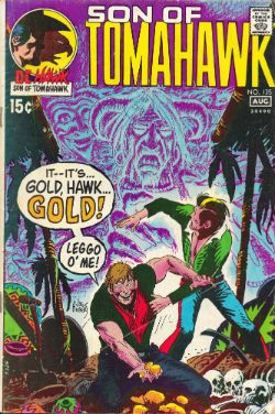
Hawk, Son of Tomahawk by Thorne & Kanigher Anyway, this... TOMAHAWK# 135 Art by Frank Thorne, John Severin Written by Robert Kanigher, Jerry DeFuccio DC Comics, $0.15 (1971) Tomahawk created by Fred Ray & Ed Frances Herron Hawk, Son of Tomahawk created by Mr & Mrs Tomahawk

 photo TomCovB_zpsec1brpnc.jpg

Here's a DC Western book I'd never heard of and didn't realise I owned. It's got a Joe Kubert cover that looks like an “Egg-timer Special” but still has time for a sweet charcoal effect background, and slips its lack of detail past by walloping you with a fistful of impact. Yeah, Joe Kubert could do you a cover like no other. Joe Kubert was also the Editor here, which explains the presence of Robert Kanigher on typewriter hammerin'. Back then Editors had a favoured stable (Western wordplay, cheers.) of talent whose most valued attributes were timeliness and dependability rather than flash, pizzaz or having performing hair. Kanigher was a sturdy workhouse who Kubert was always happy to employ because he knew that he could ask Kanigher for a 12 page oater by lunchtime tomorrow and Kanigher would deliver - like it was his job or something. Basically, books edited by Joe Kubert tend to have a lot of Robert Kanigher in them because Robert Kanigher got it done. And I tend to have a lot of Joe Kubert edited books because I like the weird genres they put him in charge of (War, Westerns, Apemen and Tor (always Tor)). Just in case you were thinking I was engaged on some stealth rehabilitation of Robert Kanigher or something.

 photo TomSkullB_zpsp6nwjojs.jpg

Hawk, Son of Tomahawk by Thorne & Kanigher

The book is called SON OF TOMAHAWK but the indicia reveals it is actually TOMAHAWK, this discrepancy is due to the recent replacement of Tomahawk in the main strip by his son Hawk, Son of Tomahawk. The repercussions of this are documented in the letters page where the level of bewilderment, guarded optimism and plain dislike show comic fans' embrace of change is timeless in its consistency. Unfortunately, I lack any kind of context for this comic so I had to look up Tomahawk and it turns out his adventures were originally set during in the Revolutionary War where he fought on the wrong side (I'm British, natch). In this book he wanders about in his vest puffing on a corncob pipe while his son has all the fun. His son, Hawk, Son of Tomahawk, is a design classic in the same way as a Plymouth Fury. A Plymouth Fury that some crackjob's driven into a wall. Because Frank “Every Rose Has Its” Thorne's art here is characteristically light on detail it's hard to pin down Hawk, son of Tomahawk's look too specifically, as Thorne's work becomes more nebulous the harder you look at it. Basically though Hawk, son of Tomahawk, with his skunk streaked DA, tasselled jacket with tribal decals, and drainpipe jeans would make even Vegas Elvis do a double take. But then this is a new kind of Western hero.

 photo TomFamilyB_zpsaxlfgib3.jpg

Hawk, Son of Tomahawk by Thorne & Kanigher

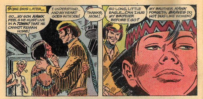
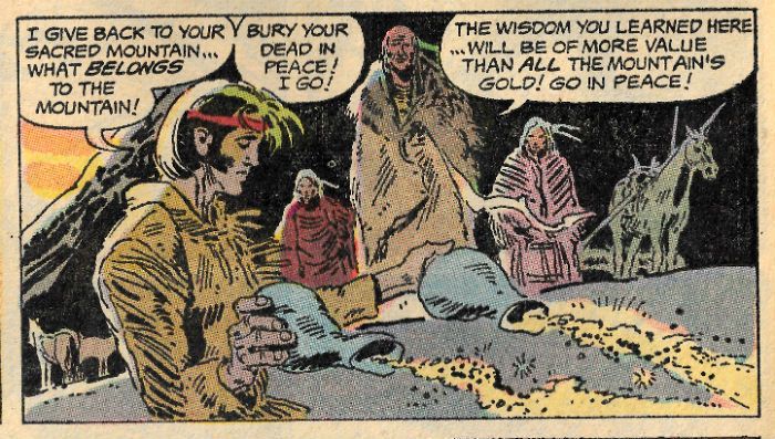
Or at least I think it is; this is the only issue I own so it might just be an outlier in what is otherwise a run as salty and plain ornery as SCALPHUNTER or JONAH HEX. Here though it looks like every effort is being made to avoid offence, even to the extent of having a pacifist hero. Hawk, Son of Tomahawk's mum is a Native American and he has a toddler brother decked out in tribal duds. Which is nice, but they are pretty generic and later when some other Native Americans show up they are all stoic and dignified. Which is fine, very respectful and that but it's hardly the stuff of high drama. Luckily, there's always the White Man. I don't know why the White Man gets such a raw deal (reads a history book; cries. Okay, **** the White Man.) The story starts by some bad white guys harassing a peddlar who gives Hawk, Son of Tomahawk a catalogue as a reward. Now, remember the Old West was like a giant open air lunatic asylum where the only recreational activities were murder, rutting, trains and drinking until blindness set in. So a catalogue in the Old West would have been like the Internet but with less naked people involved in wallpaper paste accidents and less pictures of cats hating us. Seriously, Hawk is enraptured and decides immediately to set out to gain enough riches to buy some scented candles, Sea-Bison or a life-size cardboard glow-in-the-dark Abe Lincoln. Whatever; I don't know what they had in those things; vittals and gingham or something. Anyway, he bumps into his big pal who is just setting out with a treasure map. That's quite a coincidence to you, but if you had 12 pages you'd tend to think of it as expedient. There's a nice bit where they find the Ghost Mountain inside another mountain, but the gold turns out to be in a Native American burial ground. (Joke about America being one big Native American burial ground removed on grounds of taste.)

 photo TomGoldB_zpsleefkrib.jpg

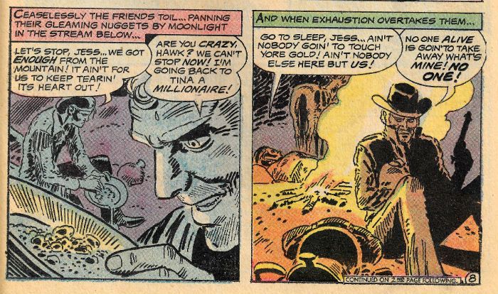
Hawk, Son of Tomahawk by Thorne & Kanigher Up until exhaustion and gold fever set in Hawk, son of Hawk's pal is pretty okay but then he gets all racist and violent like a Farcry game on legs. That's not because he's white though, let's be clear here; gold turns the guy's head, at which point he becomes a big murderous racist. This is good because if someone had more time they could “read” this story about the corrupting effect of the capitalist system and how its emphasis on reward sets people against one another. Or something. Mind you, I don't know if Kanigher accidentally stumbles on this, I've just had a brain fart, or it's actually built-in. It's not every comic that has the brass balls to declare that even The White Man isn't the villain, it's the system of exploitation in which he exists which is the true villain! Socialist Pacifist Western Comics for The Win! Anyway, the whole trapped underground with a violent racist thing is pretty unfortunate for Hawk, Son of Tomahawk, what with his Mum being a Native American. Even worse, he's in a 1970s comic where it seems they are actively trying to get away from the usual Western thing of plugging varmints and owlhoots at the drop of a stetson. Luckily, he's in a 1970s comic where it's still entirely okay for the greed addled white dude to get speared by a toppling corpse because this makes it both no one's fault and karmically just.

 photo TomDustB_zpsdny4pahy.jpg

Hawk, Son of Tomahawk by Thorne & Kanigher

Basically, and admirably, Kanigher attempts to deliver a message via a tale without villains, heroes or excessive violence. Since all those things are the reasons comics are entertaining its no surprise their lack makes the result a little dull. But I do have to admire how Kanigher leaps out of his own trap built of good intentions. I was entertained after all, just in a different way than usual. It's efficiently and pleasantly drawn by Frank Thorne, whose art has a fluid grace not entirely unlike that of Joe Kubert. Thorne would later become famous for drawing Red Sonja and spend many happy years producing his own comics featuring ladies in a state of undress, and judging Red Sonja-a-like contests while dressed as a wizard. In many ways, I think we can all agree, Frank Thorne won.

 photo SAMspreadB_zpsxmaaflee.jpg

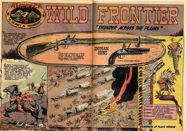
AMERICA: "A Glance at Yesterday" by Sam Glanzman

After the lead feature Sam Glanzman gets roped in to do one of his typically informative double page spreads. I’m used to seeing these pop up in war comics so it’s interesting to note he was versatile enough to do The Old West too. Here kids get to thrill to a picture of a wagon train being burned, which is surrounded by informative illustrations of weapons the native Americans would have used to slaughter the same kids' ancestors and some of the headdresses they might have sported to do so. It's nice, dusty looking stuff and it's even nicer to be reminded that space fillers could be quality gear.

 photo SevPanelB_zpshroigmvg.jpg

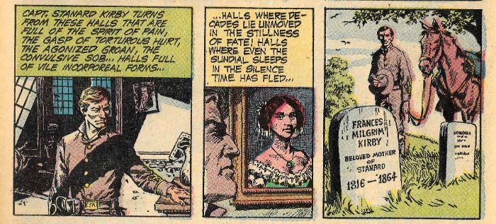
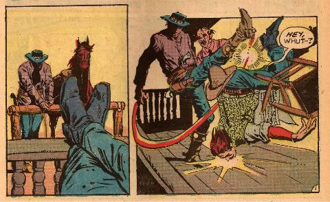
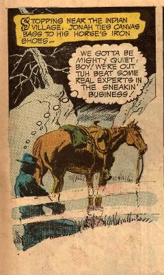
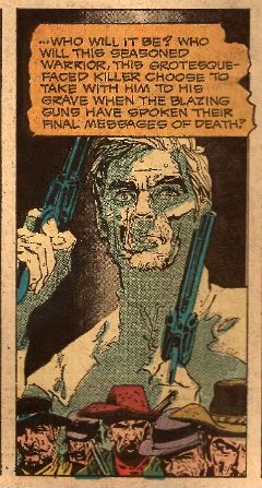
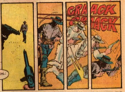
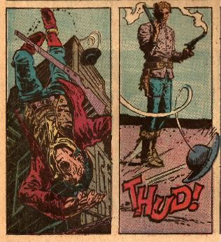
"SPOILERS" by Severin & DeFuccio The final 8 pages are a (probably reprinted) story called “Spoilers” by Jerry DeFuccio and illustrated by John Severin. This is a really dense tale with an attention to detail in the text which suggests it is an attempt to adapt a true story into comics. Maybe not though, because during a quick spin around the Internet I found no mention of “Kirby's Raiders” circa 1865. I did, however, find some really interesting pictures of naked people who had been involved in wallpaper paste accidents, and also of cats hating us. It's a nice yarn about a Confederate who goes back home to one of those mansions apparently everybody in the South seems to have lived in (well, everybody white). You know the ones with the big pillars and a big pile of fixings for them thar mint juleps out back. Unfortunately those Northern bastards have been at it and left it not unlike when a burglar breaks in and dumps one out on your bed (apparently it’s from the adrenalin; it makes you loose). As revenge Kirby forms his Rangers and they go around stealing gold from that darned gubbermint. Kirby takes a break, disperse his gang, hides the cash and takes up on a farm where he helps out with his honest toil until a bunch of locusts turn up. Basically, Kirby sees he has become a spoiler like the darn Yankees and the locusts. It ends with a hilariously underplayed final panel where he muses on the lesson he has learned and we are informed that the money he hid earlier had also fallen victim to the locusts. It’s left unsaid, but if I know my westerns then that guy’s life was short and punctuated by violent inquiries as to the location of the loot from his former colleagues. John Severin draws the holy Hell out of it all in his characteristic style - sharp as a craft knife and loaded with detail. Two decent strips and an informative space filler makes TOMAHAWK #135 a comic which is GOOD!

In 1971 for fifteen slim cents you could get Joe Kubert, Frank Thorne, Sam Glanzman and John Severin. Now that's – COMICS!!!
"Wal, Ah'll Be Danged." Comics! Sometimes Creators Are Hurting!

I don’t know if you’ve heard but comic book artist Tony DeZuniga is in a really bad way. The details are here. Photobucket

So, I thought I'd jaw a little about some of his work.

And then Brian "Call Me Mr." Hibbs dropped his MASSIVE ANNOUNCEMENT that I've just stepped over with my big cow patty boots. Er, sorry, but time seemed an issue here, so REMEMBER below this post Brian "Future Town" Hibbs has a MASSIVE ANNOUNCEMENT. Below the break I just have some words.

Photobucket

Now, I don’t know about you but I’m pretty tired of reading about all these guys’n’gals who created the magical characters that made my childhood almost pleasant only when their foetally curled carcasses are chipped off the bottom of a skip every winter. (Perhaps even a skip in an alley outside a cinema showing the latest billion dollar grossing motion picture extravaganza featuring their creations. In the foyer – soda pop with ice made from Jack Kirby’s ghostly tears! Or Don Heck’s! Or…etc) So, here’s this guy, Tony DeZuniga, having a bad time medically and financially and, I don’t know, I’m not asking you to give anything except maybe a little attention; a little consideration to his work maybe. It won’t help him any but it might count for something.

Photobucket

Mr. DeZuniga was born in the Philippines and got his start in American comics working at DC around 1969/70. In 1973 he created Black Orchid with Sheldon Mayer. So I imagine the BLACK ORCHID DELUXE EDITION by Gaiman/McKean which has been released this week, according to "Pappy" Hibbs' Shipping List, will see DC Comics sending Mr. DeZuniga some money at this most unfortunate time. I’ve never read any of the original Black Orchid but I have read a lot of comics featuring the character Mr. DeZuniga created with the writer John Albano in 1971 - Jonah Woodson Hex. Yeah, me and Mr DeZuniga go way back. Not personally, I’ve never met the man, but in a comic book way. When I was a kid, man, I used to love me some of that DeZuniga Jonah Hex. And, hey now, since Jonah Hex was created by Tony DeZuniga and John Albano what could be more appropriate than to look at some of his work there.

(Okay, I also really liked Mr. DeZuniga’s work on Roy Thomas and Ernie Colon’s creation ARAK but I don’t have any ARAK since the Great Purging my parents conducted while I was off failing to be educated. So that would have been a pretty short post. (Hey, I heard that!))

Photobucket

I guess somewhere along the way I became a 'fanboy' for the character. Yeah, I've got a whole heap of mouldering paper with his image on and I'm always ready to read another issue of Jonah messing up, likkering up, riding about a bit, riding a whore a bit and just generally making everyone around him's life just that bit more unpleasant even if he  does save their lives. Which he doesn't always do. But having said that I think this 'fanboyishness' is due to the fact that the character has had strong creative teams behind him for the most part. Sure I like the character but I think I like the character due to the many talented people behind his comics. Because, while I do love me some comic characters, I never forget that the folk what made 'em up are just that wee bit more important. What with them being real live human beings and all. Creators like Tony DeZuniga, who is currently demonstrating just how human he is and without whom I would not have had the pleasure of making the acquaintance of Jonah Hex.

Photobucket

So, Jonah Hex then. Now the character design for Jonah is pretty striking, yes? There aren't a lot of ways to make a cowboy as visually striking as the comic book medium likes. It’s easy to slip over into camp given the sexual connotations of the breed in the popular imagination. John Voight wasn't in Midnight Accountant was he? No. DeZuniga (and Albano) give Jonah a striking presence on the page with his blue trousers and Confederate grey tunic before you even get to his famous face. And wearing that tunic in post Civil War times pretty much encapsulates the self hating suicidal swagger of the surly sonovagun right there. Clever stuff and then we get to the face. Striking is surely the word there for the flesh fondue frozen mid slide. It’s pretty simple but that’s why it’s so smart. There’s not a lot to get wrong. That's important in mainstream genre comics where other hands will be at the character more than likely. There are teething troubles as Mr. DeZuniga does initially demonstrate some indecision as to Jonah’s hat, soon ditching the practically ostentatious stripey hat band after a couple of issues and there he is pretty much as he remains to this day: Jonah Hex.

Photobucket

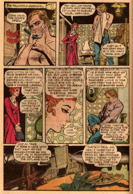
Even though the art reproduced here is from books created in the ‘7os I hope I've succeeded in making it evident that the page by page art is also rewarding and possessed of a surprising sophistication. Mr. DeZuniga’s early training in commercial art and work in advertising is evident in all kinds of pleasing ways. Admittedly this does mean his ladies seem a little too modern for the setting but otherwise all I can see are gains. Look on the bright side, his ladies certainly seem worth the courting. Here, let’s you and me look at the attention paid in this scene to the environment; the fixtures and fittings and particularly the wallpaper:

Photobucket

While the actions of the people are hardly thrilling the busy pattern keeps the eye occupied and alert as the mind digests the heavy load in the word balloons. Then at the end there’s a DeZuniga scene setting special. It’s a little overloaded with objects and a tad intrusive in the angling but this was still only 1973. He’d get smoother and subtler (but not that subtle; there’ll always be a broken wheel, a cattle skull or a twisted stump not far off.).  When he was professionally active Mr. DeZuniga worked on plenty of books besides Jonah Hex; Romance, Mystery, Barbarian and, yes, super-heroes.  The guy's work had range but it also had depth.

Photobucket

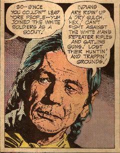
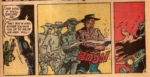
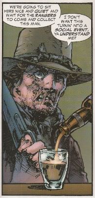
I haven't read every comic Tony DeZuniga ever drew but of the many I have read I can fairly say he always entertained. Even better there was always at least one part of the book where DeZuniga was clearly loving it. He'd crack out the Zip-a-tone or depict an action sequence in time-slices or exaggerate the physicality of violence to dull it with comedy or have Charles Bronson turn up as an Ind..Native American or... You get the drift, for someone working at the unforgiving pace of mainstream genre comics DeZuniga's work always excelled at melding his disparate influences and approaches into an attractive and  experimental package. Tony DeZuniga did good comics is what I'm saying. And in 2006 Tony DeZuniga returned to JONAH HEX and proved he still did good comics:

Photobucket

Tony DeZuniga may not be one of The Greats but he was still pretty great. Force my hand and I'll say Tony Dezuniga was VERY GOOD! because Tony DeZuniga is one of the reasons I never grew out of loving COMICS!!!
All images reproduced from WEIRD WESTERN TALES #16,18 and 20 (1973) and JONAH HEX #5 (2006) published by DC COMICS.

"Okay, Let's Go." Comics! Sometimes They Contain Cowboys!

I hear tell there's no call for Western comics no more. I reckon folks don't know diddly squat. One's I read made me more than partial to 'em. Photobucket

Hunker down a spell why doncha and hear me jaw about a couple of Western comics. WESTERN By Grzegorz Rosiński (a) and Jean Van Hamme (w) Cinebook, 2011, $15.95/£7.99

In the year 1868 Ambrosius Van Deer’s reunion with his long lost nephew goes badly wrong. Blood is spilled, secrets are revealed and Destiny sets a course for tragedy that will be years in the shaping.

Photobucket

WESTERN is a tale of love, revenge, identity and destiny that spans the period of 1868-1922 over its 64 pages of densely packed story. It is the product of the w/a team behind the Belgian comic series THORGAL which is a series I have not read but is apparently one of the most popular French language comics there is. Look, I can’t read everything and since I am mono-lingual (if that) I’ll just have to take Wikipedia’s word. Also, if WESTERN is any indication then the popularity of THORGAL is understandable; for this is a very good comic indeed.

Photobucket

To my uneducated eyes European comics seem primarily artist driven (Rosinski is credited first on the book cover) as opposed to the current state of American affairs where the writer is king (or if not king then architect). Certainly this book is noteworthy primarily for the art. As is no doubt obvious this book is my first exposure to Rosinski’s work but I have to say that Rosinski work is pretty stellar. Characters are easily identifiable, settings are convincing, staging is clear, actions are active and all these things are to be applauded rather than taken for granted. Rosinski knows what he is doing and he does it very well indeed. Over the top of all this understated excellence Rosinski applies a lovely faded wash of colour, sometimes even dropping lines out entirely leaving only the soft hues to carry the image. Rosinski is obviously talented with colour and that’s most in evidence in the full-colour paintings that punctuate the episodic narrative. These are things of greatness. If I could scan one in I would but I can’t so take my word if you do pick the book up it’s worth the cover price for these evocative and enduring images alone.

Photobucket

Of course if you do buy it you’ll probably read it so it’s fortunate that Van Hamme doesn't let the side down on writing duties. Given the chronological scope, episodic nature and the limited page count Van Hamme has it all on to keep his narrative successful. Wisely Van Hamme maximises the information provided to the reader by tripling up on the dialogue (effective but blunt as is common with translations) and visual information (gorgeous and invaluable) with the third device of narration. Clearly at home with words beyond dialogue (it’s called writing) Van Hamme doesn't use his narrative voice to merely utilitarian ends. In fact Van Hamme bookends the tale with two nice pieces of misdirection. The first is clever but the second and final occasion is cleverer as it defies expectations in a way which is truly surprising and emotionally affecting. That’s real writing and, yes, it is hard. The actual story doesn't lack for incident, excitement or drama provided you can stand a healthy dose of coincidence and the accept the fact that a one-armed man can be such a crack shot. But coincidence is ever melodrama’s companion and a Western without a crack-shot protagonist would be a very short comic indeed. The melodramatic momentum together with the eventful occurrences keep the thing moving towards its fateful end quite smoothly and the artful efficiency of the storytelling combined with the sepia washed beauty of the art results in WESTERN being VERY GOOD!


TEX: The Lonesome Rider By Joe Kubert (a) and Claudio Nizzi (w) SAF Comics, 2005, $15.95/£9.50

Tex visits some old friends only to find them slaughtered by a gang of “rascals”. Saddling up and heading out Tex vows to bring them to justice Texas Marshal style!

 TEX: The Lonesome Rider is an attempt to introduce the long running (since 1948!) Italian comics series to the nation in which it is set; that’s you, America. To do so they chose the immaculate Joe Kubert to do the art chores. This process together with the history of Tex is detailed in introductory front matter in the volume. The best part of this is an interview with Joe Kubert in which he gives new dimensions to the word “concise”. A man of few words our Joe Kubert is, prefers to speak with his brush, I guess. A bit like old timey cowboy heroes who were tight lipped and let action speak louder than words. (Yes, my segues do require more work, thanks for noticing). And TEX is certainly nothing if not old-timey.

Photobucket

While WESTERN is clearly, and convincingly, set in a realistic approximation of the Old West the action in TEX is set in a kind of shared popular memory of the West. It’s a world of white hats and black hats (literally), bad men, good men and weak men that find the strength to be good, the hidden nobility of the savage, saloon brawls and stage coach hijacks. Rather than some clever post modern device I’d imagine this is merely the result of basing a series on popular culture and the changeover from Tex’s “papa” Giovanni Luigi Bonelli to other hands. It’s probable that since TEX worked there seemed little reason to change it so the revisionism of the Western since The Searchers (maybe? The Wild Bunch? you choose.) has had little impact on this book. Which isn't to say it is bad but is to warn you that it is all quite familiar and not terribly concerned with realism. It’s a yarn really and it does what yarns are supposed to do; it entertains. Actually it does more than entertain it delights but it only delights because of the presence of Joe Kubert.

Photobucket

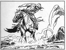
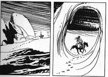
Joe Kubert. There’s a name to conjure with and with TEX that name conjures up 240 pages of Black & White magic. Seriously, 240 B&W pages of Joe Kubert art and you aren't already haranguing your LCS to get you a copy? I have to say more? Okay then. Joe Kubert’s work on these pages elevates the whole thing not just one level, but maybe two or three. Which is fortunate as the dialogue is bland (it’s translated) and the plot is solid but perfunctory. There are just so many Joe Kubert joys on these pages it’s almost indecent.

Photobucket

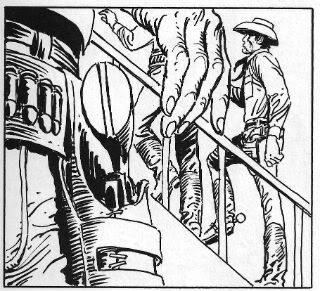
The big thing about Joe Kubert is he’s a pen and ink prestidigitator par excellence. He fools your eye into thinking you are witnessing perfection; into thinking that line is in the only place it could be. Whereas a Toth would fuss and worry over actually finding the right line Joe Kubert can approximate that line with such confidence that he doesn't have to actually find that line. That’s not a back handed compliment there’s more art and skill in such suggestion than I can verbalise. He does practically nothing with the landscapes in this book but he does everything needed to make them practically a character unto themselves. The best panels in this book are the panels where Joe Kubert’s art is free of words and there are many such panels in this book.  Comics may be a marriage of words and images but the greatest artists can make those images speak with words finer than the finest writer. Joe Kubert is one such artist and his presence makes TEX VERY GOOD!

Both these books are worth your eye-time, both these books are Westerns I’d suggest you don’t let the latter blind you to the former. But that’s just me. And me? I’m gone like the American West.