"Or Is There ANOTHER Way?" COMICS! Sometimes The Carny Winds Up In The Fridge!

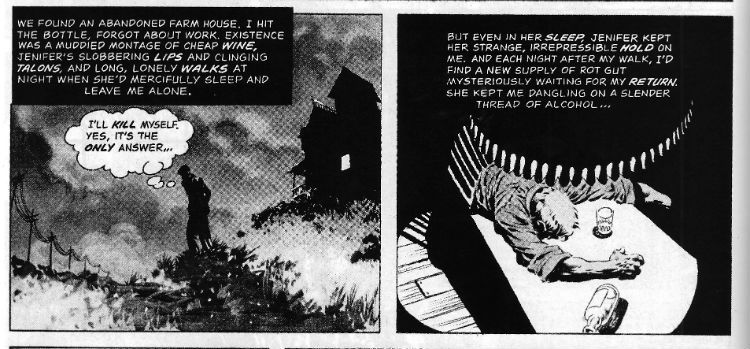
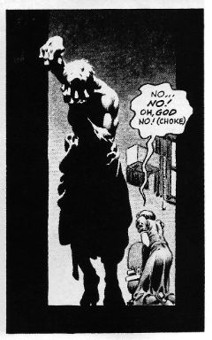
Sorry about that interruption in the weekly magic of me but I'm back now! What's that? Photobucket Art by Bernie Wrightson with words by Bruce Jones.
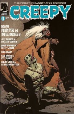
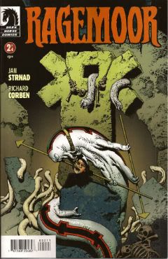
Man, you people are brutal. Talking about a horror comic after the break... CREEPY #8 Art by Colleen Coover, Kelley Jones, Rick Geary, Kyle Baker and Bernie Wrightson Written by Jeff Parker, Doug Moench, Rick Geary, Dan Braun and Bruce Jones Lettered by Colleen Coover, Nate Piekos of Blambot® and Rick Geary Frontispiece by Darick Robertson Cover by Richard Corben Dark Horse, $4.99 (2012)

Photobucket Art by Richard Corben.

Because I like telling you what you already know I'll start by saying this is the revival of CREEPY, a horror anthology that was originally published from 1964 to 1983 by Warren publishing. Dark Horse are currently reprinting those original issues in the form of expensive hardbacks and at least one story in each of the current incarnation’s issues acts as an advert for such. In this issue that story is Jenifer. Ah, Jenifer. But before we get to Jenifer first we must disinter the new contents provided by the creepy crew named and shamed above.

NINETEEN Drawn by Colleen Coover and written by Jeff  Parker

Photobucket

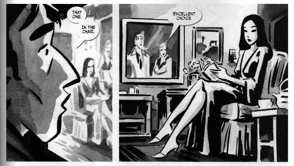
Art by Colleen Coover with words by Jeff Parker.

Jeff Parker and Colleen Coover are both smart and talented artists. Parker having a deceptively simple style and Coover being less than shy about sexuality in her work on X-MEN: FIRST CLASS, sorry, her work for Eros. It’s hardly a twist ending then that the story they produce is a short, smart shocker which updates a psychosexual myth while also neatly exploiting the links between sex and guilt. It isn't remotely scary but it is cerebrally unsettling and rewards reflection. Given the themes and the nature of the mythical concept in question Nineteen is in roughly the same plot of the graveyard as Jenifer but the approach is less lurid and, thus, less striking. Ah, Jenifer. You’ll soon see how striking Jenifer is.

THE LURKING FATE THAT CAME TO LOVECRAFT PART 1 Drawn by Kelley Jones and written by Doug Moench

Photobucket

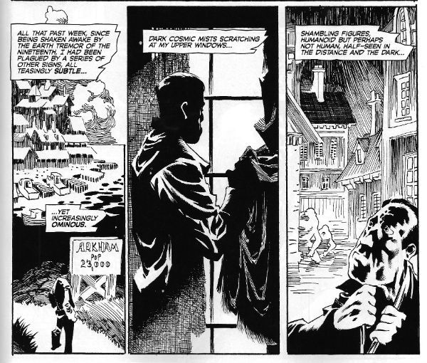
Art by Kelley Jones with words by Doug Moench.

Here Moench cunningly casts the spade faced master of prolix perversity and possibly racist undertones as his main character and thus, witting or un, provides himself with an opportunity for prose of the most Tyrian hues. An opportunity he doesn't so much seize as throttle until its eyes bug out and its bowels void. Which, as I say, is pretty fitting. Anyway, the man notable for lacking in the craft of love, so I hear, himself is finding his mind falling apart at an appalling rate as reality seems to be confusing itself with his own fictions. If you enjoyed Carpenter’s In The Mouth Of Madness as much as I did (Did you? Really? Really.) you’ll enjoy the premise here. Moench’s long time collaborator Kelley Jones is just the right fit for this stuff as well, with his contortions of physique, viewpoint and architecture. Since we don’t have “gibbous” as a rating I’ll call this one GOOD! If I were to say that Jones’ art contains a lot of Wrightson then that wouldn't be a criticism, not considering the work Wrightson does on Jenifer. Ah, Jenifer. But we have yet to meet Jenifer.

THE MAUSOLEUM Drawn and written by Rick Geary

Photobucket

Art and words by Rick Geary.

By way of a continuing series of original graphic novels (A Treasury of Victorian Murder..., A Treasury of XXth century Murder…) Mr. Rick Geary has documented some of the lesser and greater known incidences of horror human beings have visited upon each other. Murders, I’m on about murders. Along the way he has developed a style which is seemingly non judgemental but through the implacable accumulation of facts becomes unmistakable in its moral disgust. Also, no one works straight lines harder than Rick Geary. Seriously, he’s murder on them. Sigh. Anyway all of the remarkable craft he applies to historical atrocity is here applied to a bitterly sweet tale of life and death and love and loss. It’s Rick Geary so it’s GOOD! Wait, can you hear her tread upon the step, her shadow through the glass; she's almost here. Jenifer approaches.


LOATHSOME LORE Art by Kyle Baker and written by Dan Braun

Kyle Baker draws over some photographs to good effect here, showing that drawing over photographs isn't intrinsically evil after all. As to the contents, if Dan Braun seriously expects me to believe Siouxsie And The Banshees ever horrified anyone except people allergic to large quantities of cosmetics on a confined face, he’s going to have to personally introduce me to them. This was CRAP! And now a rap-rap-rappin' at the door and we throw it wide to reveal...


JENIFER Drawn by Bernie Wrightson and written by Bruce Jones

Photobucket

Art by Bernie Wrightson with words by Bruce Jones.

Jenifer is written by Bruce Jo…wait, come back! I know, I know, Bruce Jones did the unforgivable; Bruce Jones wrote some bad super hero comics. Actually judging by the output of today’s superstars Bruce Jones’ real mistake was to write some bad super hero comics without first inveigling himself into the brain matter of fandom like some wayward tape worm. Before that though, before Bruce Jones (<choke!>, <gasp!>) wrote some bad super hero comics, Bruce Jones wrote some really, really good horror comics. Of which Jenifer is but one.
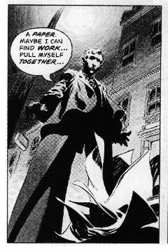
Photobucket Art by Bernie Wrightson with words by Bruce Jones.

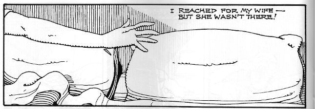
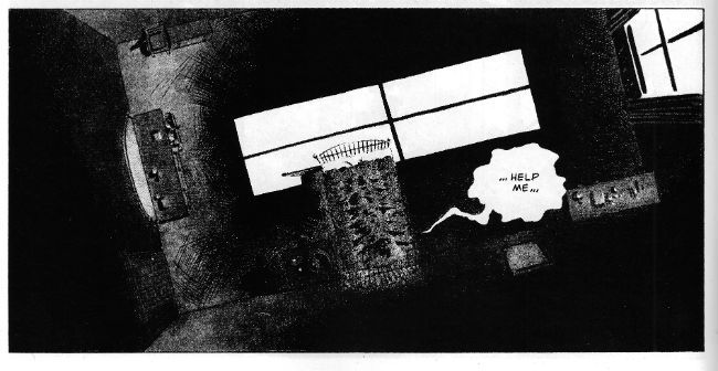
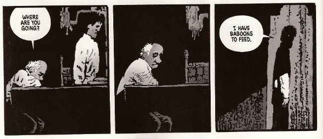
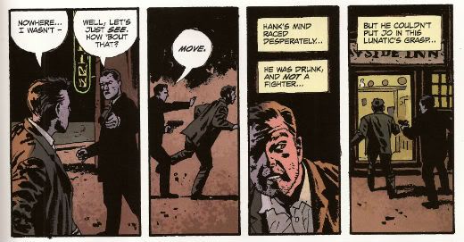
The big thing about Jenifer is that it is horrible. Bruce Jones doesn't shy away here he just goes for it. Bruce Jones goes there. Bruce Jones goes to that place where you start to doubt the sanity, or at least the decency and good taste of the author. And if decency and good taste have much to do with horror they don’t have to anything to do with this kind of horror. This horror is both visceral and cerebral. Oh, there’s gore galore here alright, but it’s the thoughts that count. Sometimes horror needs context and without that context you won’t understand why the next image is the one that sticks, why this simple panel is the one that tunnels in and nests:

Photobucket

Art by Bernie Wrightson with words by Bruce Jones.

Of course Jones isn't working alone here, he’s got an accomplice, better yet he’s got Bernie Wrightson. Wrightson’s art is essential to Jenifer’s success. All the things you think of when you think of Wrightson's overwrought art are here. So much so that it should be overwhelming. The figures are gnarled, tortured, hunched, looming doomed things inhabiting rooms lit like noir’s paying the bills and existing in a world of forced perspective and perplexing forces. It’s too rich, too much and it is overwhelming, it’s supposed to be overwhelming. Jones’ nervily helpless narration and Wrightson’s muddily grey washed series of tableaux (separated by the almost subliminal white flare of the gutters, the flare of a flash as he records photos of Hell and presses them into your eyes) punch a series of moments which roil with a lunatic heat right into your brain. Where they will probably remain until your body cools and sets with rigour. Oh yes, Jenifer is a very bad girl but Jenifer is VERY GOOD!

Overall this issue of CREEPY was VERY GOOD! This isn't always the case, previous issues have been somewhat, ahem, variable in quality. This one's worth picking up for Jenifer alone but the quality of the other stories should ensure you get your blood money's worth. Oh, and it's by no means a slight on the modern contents than Jenifer ranks highest, that's because when it comes to horror Jenifer is pretty rank stuff indeed. Heh. Heh. Heh. Enjoy, kiddies.

Until next week then, don't have nightmares; read about them in COMICS!!!
Skyhigh -- Hibbs on 6/6/12

Hello from 30k feet!

Well, no, not exactly -- I'm writing this on a plane, coming back from Chicago, where I went to my cousin Ian's wedding (Ben was the ringbearer, and looked crazy awesome in a suit), but I won't post this until I hit the ground again. I only took a handful of comics with me, and only have something to say about maybe half of those, but I've been trying hard to have reviews every week, and I won't let something as small as "not being in town" stop me!

Nice town, Chicago -- last time I was here I was maybe 12 or so? Also for a wedding, for that matter, between my dad and stepmom, and I'd love to come back, so someone get married, and invite me! I had a chance to visit Chicago Comics, and see Eric Kirsammer and his kids, and that is a swell store, one of the better I've seen; and one I'd certainly shop at if I lived locally. I wanted to see several other stores (including Challengers, which I've heard nothing but swell things about), but, y'know, family obligations and all that.

Anyway, I don't want to write a travelogue, and I promised myself I'd tear through these books before I landed, so on with the show...!

ACTION COMICS #10: Wait... when is this taking place? It has to be just after the last storyline, I think, not in modern times, as the Justice League portion is a flashback. But why does he bounce back and forth between the t-shirts and armor, with no real mention of what's going on? I was a little excited, actually, about the notion of the death of Kent, and a new secret ID, because if anyone could actually make that happen (yeah, yeah, I'm a sucker), it would have to be Grant, but if this is still in flashback mode, obviously that's all garbage. Bah, for a time when I was less bitter and jaded, and when we'd just accept a premise straight-forwardly. I'm *liking* this, still, but I desperately want to be *loving* this, and 10 issues in and I'm not. 'sfine, but I want better than just GOOD, y'know?

AVENGERS VS X-MEN #5: that's a fun little plot twist, "the phoenix five" and all that, and while I'm totally willing to wait and see what they actually DO with it, it's hard to see in my head how characters used to/used by vast otherworldly power, like Peter and Illyana will work in this context. Or will they just ignore, wossname, cyttorak, is that the Juggernaut's mentoring power? I'm still deeply disliking the art, but the story is sorta kinda growing on me as act one closes. GOOD.

FUCK ALAN MOORE BEFORE WATCHMEN MINUTEMEN #1: As I said, I've not be in SF all week, so I haven't the foggiest notion as to how this is selling, but, after reading issue #1, if I was "just" a reader, I'd definitely not be coming back for issue #2. Not because it's badly crafted -- because it is very well-illustrated and written, indeed -- but because it didn't tell me anything I already didn't know, and, as a first issue, it was PAINFULLY "recappy". Absolutely nothing "happened", it just assembled everything we already knew from WATCHMEN into a chronological order. What the hell is the point of that? Darwyn Cooke was the one BW creator that I thought might actually make something I want to read (on this project, I mean), and was the one who, potentially, had the biggest canvas to play with, since the Minutemen characters aren't exactly character, but world-buildy background, but there's just nothing here at all. 17% of the page count gone, for shit-all purpose, foo. That's bad enough with "normal" comics, but on something as divisive as this? Ugh, no way. This was perfectly OK, but if you're going to take a big shit on Alan Moore, you've got to do a whole fucking better than this.

I ganked this picture from here

CREATOR OWNED HEROES #1: Really? Man, so first, that's a fucking AWFUL title for a comic, as it says just nothing about content. (Seriously, find me 50 people in the entire nation who inherently cares about the ownership of a work, rather than "is it any good?" I'll wait -- I had a "self published" section in the store until I got sick of answering people what that MEANT, so trust me, I KNOW) And second, the content is more padded than a twelve year old's bra. If what you want to do is "A magazine nowhere near as good or relevant as fucking HERO ILLUSTRATED, with a bunch of mediocre comics", that's cool, but shit, you could have told us that's what you were delivering. I Just don't give a damn about your convention snapshots (that's what Facebook is for, not something you're charging me $4 for!!), or features on cos-players, or, and this is the one that really got me, creator interviews that aren't ABOUT creator-owned work! I mean, the VERY FIRST LINE of the Gaiman piece is "I love his work on SANDMAN", which, y'know, is a notoriously creator-owned comic book, right? What a mis-thought project from ship to stern. AWFUL.

DARK AVENGERS #175: I'm mostly writing this bit for anyone writing up sales chart analyses: Marvel kept the NUMBERING of THUNDERBOLTS here, but did a really really weird thing after that -- it had Diamond assign the book a new SERIES code. A series code is an invisible-to-consumers code that allows retailers to sign up customers, well, to a series. Like (say) 123456 is the code for CAPTAIN FANCYPANTS, and it allows the computer to know that CAPTAIN FANCYPANTS #1 and CP #2 are *the same thing*. It also allows me to, say, take the various BPRD series, and assign it to a custom series code (like CUST123), so that every BPRD series gets pulled (even though Dark Horse treats them as *entirely separate* things, go figure)  In the past, when Marvel changed, say, INCREDIBLE HULK to INCREDIBLE HERCULES they kept the series code the SAME, which meant that all of the preorders AUTOMATICALLY transferred, here they consciously did NOT do that, in other words: eliminating 98% of the marketing-driven reason to carry over the numbering. What's even weirder, is that it really IS TBOLTS #175, and it's a bit hard to follow if you haven't read those previous issues (well, or the last year or so at least), while at the same time kicking off all of the people  who WERE buying it. I don't get it. The comic itself was perfectly OK.

EARTH 2 #2: Normally I despair against "decompressed" comics, but I have to say that I find the very slow world-building on display here to be very fine. I'll probably want it to move a whole lot faster once all of the players are on stage, but for now? I'm loving the hell out of this. VERY GOOD, and easily the best comic I read this week.

Right, almost time to turn off electronics, so ending it there. What did YOU think?

-B

"Don't Retcon me, Bro!" -- Hibbs on 5/29

What I think of things, below the cut...

ANGEL & FAITH #10 : Oooh, ooh, nice Chris Samnee artwork inside. Yes, very pretty, and Christos Gage continues to nail the voices and characters of this Buffy spin-off. I continue to feel that this is a far stronger book than "Season 9", and this stand-alone issue is a great example of same. VERY GOOD.

ANIMAL MAN ANNUAL #1: I remember, once upon a time, when DC Annuals would be indispensable objects -- wrapping up "The Judas Quest" or important Swamp Thing plotlines, or even changing the status quo of a series entirely, like with the Firestorm one. Ah, those were the days! Despite being billed as a tie in the the Animal Man / Swamp Thing shared plot thingy, this doesn't feel consequential even a little bit. Maybe I'm wrong, maybe this will be, in hindsight, a key chapter, but it sure didn't seem like one as I was reading it on Wednesday. I also don't especially like the changes to Moore's elemental cosmology, or the retroactive "red elemental" changes that this story balances upon. I thought it was nice looking, but ultimately very EH.

BATMAN ANNUAL #1: And this one I just hated. Hated hated hated. Mr. Freeze's Batman-Animated origin was a perfect blend of tragedy and misunderstanding, and villains who don't especially think they're villains (and CONVINCE THE AUDIENCE OF SAME) are, for me at least, the strongest kind of antagonist. So, to remove that tragic underpinning, and to make Freeze just another looney reduces the character dramatically. Now, I will stipulate that the Nora plotline could only go so far, and that, in many ways, it rendered Freeze with a strong "Sell by" date: either he cures her disease, or he doesn't, but you've got, what, maybe 10-12 stories, MAX, to do that with? BUt I still wouldn't have wiped the issue out in this manner, where you're effectively saying "we've been lying to the audience", rather than adding some new detail or knowledge. This is the first Bat-failure for me, from Snyder, and it tastes oily in my mouth. AWFUL.

GRIM LEAPER #1: Expectations are a weird thing. I thought the plot description of this book sounded intriguing, so I picked it up with a "I'm going to very much like this", and then I really didn't like it, and about at the 3/4 point I thought "I really DISlike this", and then we got to the love story and suddenly I started liking it, partly because I told myself I didn't. So yeah, Deadman meets Quantum Leap, maybe? But that's the uninterestingly executed portion, and it doesn't become interesting until you meet the second leaper The two halves washed out for an OK, for me.

STAR TREK TNG DOCTOR WHO ASSIMILATION #1: IDW needs editors who can help shape the pace of a story a whole lot better -- much like the Trek/LSH comic the story doesn't really start in this issue (or, at least, until the last page) -- there's a lot of blah blah about a federation colony... but who care about them except as a plot device? Why are 8 pages being wasted on them. then we effectively watch the end of a Doctor Who episode (and it looks like a fun one), before we get to a meeting that is just bound to be the first entire half of the next issue of "wacky misunderstanding", and by the time everyone is on the same page, and the antagonism actually starts, as it relates to the protagonists, the series is going to be halfway over. *sigh* I generally like JK Woodward's art, but it seems far too insubstantial for this story. Shame, I really wanted to see this one work. OK

SUPERMAN FAMILY ADVENTURES #1: That's just crazy cute, and any sub 9-year old should love this comic to utter pieces. I know Ben did. I say GOOD and Ben says "EXCELLENT!!!" (yes, with those exclamation points)

WOLVERINE AND X-MEN #11 AVX: I really really like Nick Bradshaw's art. So much so that I almost don't even care that this isn't so much a story as "what happened between panels x & y in AVX #n". Hell, I'm even wiling to overlook Hope mimicking Logan's powers and popping out METAL CLAWS. Urf. Hm, maybe not that last one, since that doesn't make no sense. Anyway, doesn't matter -- pretty pretty pretty stuff, and the art lover in me says that makes this GOOD.


That's it from me, what did YOU think?


-B


(Oh, and new digital on the store this week:

AMERICAS GOT POWERS #2 (OF 6) BETTY & VERONICA FRIENDS DOUBLE DIGEST #225 BLOODSTRIKE #28 BOMB QUEEN VII #4 GHOSTBUSTERS ONGOING #9 GI JOE SNAKE EYES ONGOING #13 GRIM LEAPER #1 (OF 4) HAWKEN #4 (OF 6) LIL DEPRESSED BOY #11 MONOCYTE #4 (OF 4) NEXT MEN AFTERMATH #43 PETER PANZERFAUST #4 ROGER LANGRIDGES SNARKED #8 STAR TREK ONGOING #9 STAR TREK TNG DOCTOR WHO ASSIMILATION #1 STEPHEN KING JOE HILL ROAD RAGE #4 (OF 4) TRANSFORMERS ROBOTS IN DISGUISE #5 WALKING DEAD #98 ZOMBIES VS ROBOTS ANNUAL 2012

"No! It's ANGRY!" COMICS! Sometimes They Bow Before The King (Of R'n'R).

Good Day! Jolly Good Day! Over here we are shortly to be having a Jubilee shindig! You don't get one so I gave you this instead. It's all over the bally shop but some of it is about comics. You have been warned and so my hands are clean but look at the state of your fingernails! Photobucket

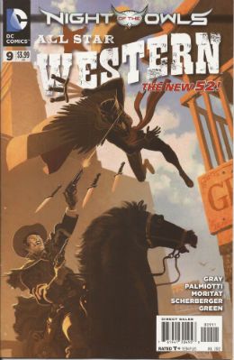
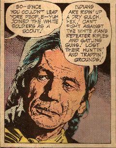
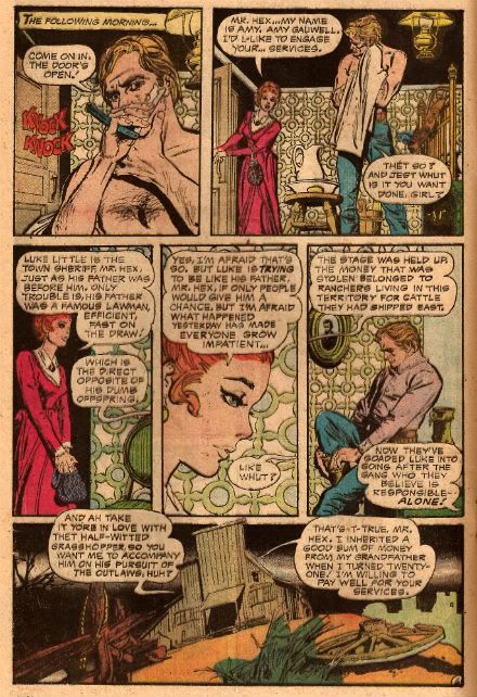
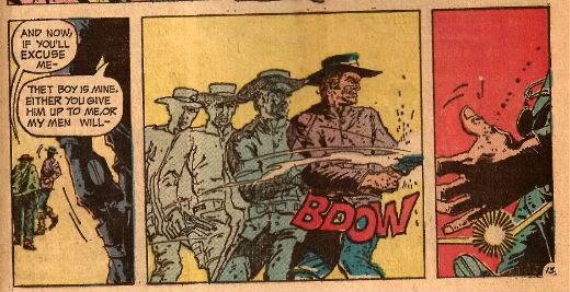
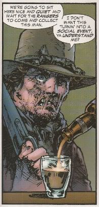
ALL STAR WESTERN #9 Art by Moritat, Patrick Sherberger and Dan Green Written by Justin Gray & Jimmy Palmiotti Coloured by Gabriel Bautista and Mike Atiyeh Lettered by Rob Leigh DC Comics, $3.99 (2012) Jonah Hex created by John Albano and Tony DeZuniga Nighthawk created by Robert Kanigher and Charles Paris Cinnamon created by Roger McKenzie and Dick Ayers

Photobucket

I have my concerns about this book. These concerns have nothing to do with the art what with Moritat and Bautista delivering the usually fine performance; said performance being so fine that it hardly matters that the backgrounds are a smidge perfunctory. And despite the plots being a bit woolly what with all this editorially mandated crossover bullhockey (Ooo! The lady in the cape! Some owls!) at least here they contain the always entertaining idiocy of Caucasian Americans worrying about immigrants lowering the tone of the place and generally letting the side down. It's not even that on a page turn it's "three weeks later" and we're in Gotham instead of N'Orleans, because I understand they want to get on with this interminable owl shite. And yet, part of me, the beautiful, dreaming part no doubt, misses the days when Jonah wouldn't be able to go from one town to another without ending up nailed to a cactus. And I miss El Papagayo turning up to taunt him. I miss El Papagayo he'd be all like, "Senor, Hex! Why must you always make life so hard for yourself, my friend! Come out from behind that rock and embrace me and my gang of toothless well armed vermin! Do you no longer trust your good friend, El Papagayo, Senor Hex! You hurt my heart, my friend! Why, Paco here has brought some smelly badgers! tell him, Senor Hex, tell him we don't need no steenkin' badgers!" Actually, it probably isn't the absence of El Papagayo either.

Photobucket

No, it’s more that Jonah’s becoming a guest star in his own book; it’s just too crowded and in order to stand out from the crowd I fear Jonah’s going to become more of a caricature than a character. The book's focus has shifted from the lovable asshole with the melty face to being more of an attempt to reposition DC’s mouldy old oaters in more viable iterations. I’m all about that because I have a fatal fondness for DC’s western heroes. I have no idea why but there it is. Some people are like that about The Batman; my way is cheaper, I win. I’m also quite okay with the view that there are no bad characters just bad writing. But I’m not quite convinced that the way to go is to give these characters aspects more suited to superheroes. So I’m not convinced that the missing ingredient for Nighthawk and Cinammon’s success is their possession of a pair of lucky charms which stop them dying and make them strong, super strong in fact.

Photobucket

But I just hamstrung my own qualms by saying there aren't any bad characters, so I guess the problem is the writing. In which case I'll bounce back and say it’s just too workmanlike. If you’re selling something to an audience - put your back into it, get some enthusiasm going! Well, it’s workmanlike when it isn't hat stampingly poor; as when Bruce Wayne’s bat-ancestor mentions there is poison ivy someplace. Wait, poison ivy! Do you see?!? DO you see?!? Next issue we’ll hear some joker released some penguins from Gotham Zoo but he keeps denying it because he’s two faced! This is what Jonah Hex needs! Next issue it’s Bat Lash; let’s hope he hasn't got a steam powered skidoo or some such daft shit. At the moment ALL STAR WESTERN is GOOD! but it's on thin ice, muchachos!

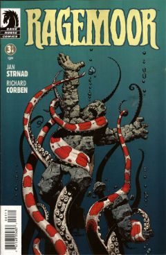
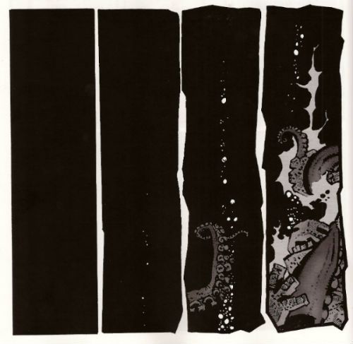
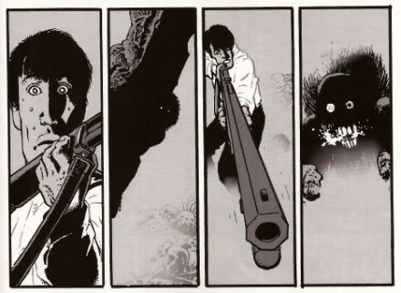
RAGEMOOR #3 Art by Richard Corben Written by Jan Strnad Lettered by Nate Piekos of Blambot® Dark Horse Comics, $3.50 (2012) Ragemoor created by Richard Corben and Jan Strnad

Photobucket

This one’s the third issue of four so you might, given modern trends, expect it to basically sit there picking its nose and inspecting the results until the next issue. After all, you’re this far in so why bother trying. But this is Corben & Strnad and they’ve been doing this a while which, I guess, means they are old or some weak and totally lame shit like that. In comics folk always underestimate the old guys don’t they? News just in: Steve Ditko’s still doing good comics. Youth will never understand that you only get old by surviving. This is largely because Youth is an abstract noun and is therefore unlikely to have cognitive functions.

Photobucket

Humourless pedantry aside, let’s face it; put Matt Fraction and Richard Corben adrift in a lifeboat and three weeks later the copters are going to be picking up one fat comic artist. Fraction’ll just turn his back to sneak a look at his reflection in the water and Corben’ll be on him like a liver spotted threshing machine. Wait, I was on about a comic, I think. So, yeah, this comic doesn't just piss complacently about, no, this comic sets back on its haunches, tenses its muscles until they thrum with the collective kinetic energy of the previous issues and prepares to, next issue, hurl itself straight at your throat. Despite the fact that the creators involved probably get twinges in their knuckles when the weather turns cold RAGEMOOR remains VERY GOOD!

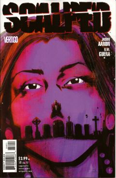
SCALPED#58 Art by R.M. Guera Written by Jason Aaron Coloured by Giulia Brusco Lettered by Sal Cipriano Vertigo/DC Comics, £2.99 (2012) Scalped created by R.M. Guera and Jason Aaron

Photobucket

In two issues this series will end. In two issues the fix will be in. In two issues people will refer to this series as Jason Aaron's SCALPED. I have but a brief window of opportunity to attempt to correct the course of the critical conversation as it puts the pedal to the metal and hurtles straight into The Cult of The Writer. Only a soulless canker of a man would deny that Jason Aaron's writing has been solid and decent throughout. It's probably more impressive the less knowledge you have of the '7os cinema he has mined so well the series. But, alas, homage is everywhere now and I know I for one require more to ensure I see out sixty issues. SCALPED gave me more in spades, and it gave it to me in the form of the art of R.M. Guera.

Photobucket

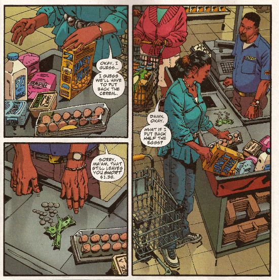
R.M Guera is the star of the show here. It's the attention to detail, I think, that is Guera's true strength. That's quite a strength considering the fantastic way his faces veer into and out of controlled caricature, his body language ranges from subtle to hysterical and his environments from the grubbily realistic to those of opulent excess and all of this, all the while, strengthening rather than destroying the suspension of disbelief; drawing the reader in rather than pushing the reader away. Christ, it's the stuff of wonder. Christ, I write about comics like old people trampoline. Look, here's R.M. Guera drawing a scene in a supermarket. It's just a scene in a supermarket but, but, look:

Photobucket

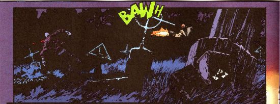
And how about those colours, ey? Brusco's colours are a special kind of magic as well throughout the book. Check out the night scene I lifted above. Be soothed by the smooth blues and then startled by the pop of the lime green FX! Giulia Brusco gets a cheek chuch for coloring cojones and no mistake. What a wonderful, wonderful book SCALPED has been on a visual level. It's a bloody shame that the aspect that lifts SCALPED up to VERY GOOD! is, I'm guessing, the aspect that'll receive least play once it ends, and the artists who worked such wonders will reap the least of any future benefits; career and reputation-wise. But before that happens, before the fix kicks, in I'm going to point out that R.M. Guera is EXCELLENT!

Those of you who read this and were not insensate from drugs or currently being attacked by a maniac will have picked up on the subtle fact that I'm a little distracted. That's because this weekend is Jubilee weekend! We get an extra Bank Holiday on Tuesday to celebrate Good Queen Bess. I'm no Royalist but I do recognise that the tourist industry is pretty much the only industry we have anymore, so she's okay on that score, and also I'm anyone's for a free day off work. Fickle? You have no idea, pal. You have no idea. So I am eager to join my fellow countrymen in the heat of the streets, swigging binge and watching as the middle aged men with their Celtic tattoos blistering in the heat bellow at their shrink wrapped wives about how Sandra in accounts understands and how he never wanted this, never wanted any of this and the discarded children weep beneath the Union Jack bunting. England, my England!

Oh please, despite all your protestations to the contrary you're all quite keen on the whole Royalty business, aren't you. my American friends. Oh, you claim otherwise, you do:

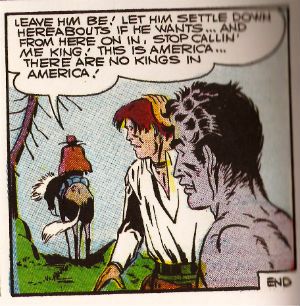
Photobucket Image from The Steve Ditko Archives Vol.2 (Ed. Blake Bell, Fantagraphics Books). Art by Harry Belafonte Jnr. No, it's Steve Ditko for Goodness Sakes! Keep up, no lollygagging at the back!

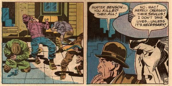
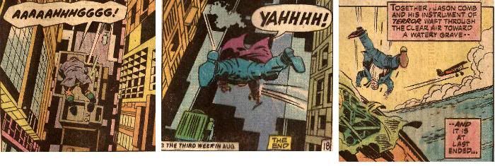
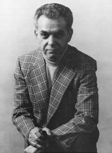
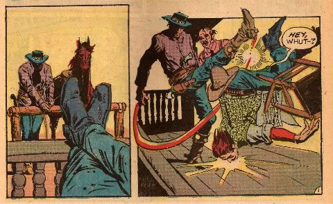
But you're just fooling yourselves. You protest too much, methinks. Look, you've had at least two Kings: The King of Comics (one Jack Kirby by  name) and this raunchy dude:

Photobucket

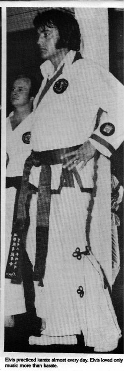
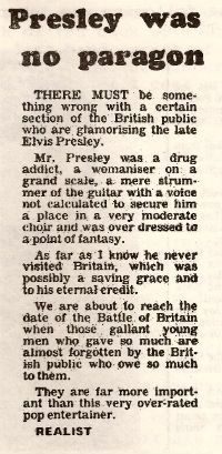
The King and American Royalty were on my mind because when I am not reading comics I am looking at enthusiastically typed and photocopied documents held together with staples produced by fans of things. Probably while they waited for The Internet. Documents such as THE ELVIS COLLECTOR #1 (edited by Major I.R. Bailye). This fragment of forgotten fandom was brought home to me courtesy of my very own Priscilla, who knows only too well that when it comes to The King there's no fool such as I.

Reading the photocopied love letter to The King my eyes settled on this:

Photobucket

From The Leicester Mercury; date unknown, author pseudonymous.

Sadly "The Realist", despite his fantastic English language skills ("overdressed to a point of fantasy"!!), is incorrect as Elvis Aaron Presley touched down briefly on British soil. However, I still think his points remain valid despite this factual inaccuracy. Yet, it did make me realise that sometimes people can be blinded to the essential truth of an article if the author undermines himself with inaccuracies. A bit like an article on comics in The Wall Street Journal perhaps. The one where he's wrong about why comics aren't popular anymore (the world's just moved on and the price has risen in line with the Greed Index; that's really why) but is right about Avengers comics being less like something you'd use to attract new readers and more like something you'd scrape off your shoes before going indoors. Poo, I'm talking about poo there. Usually animal  but, given the state of Cameron's Big Society, there's a queasy possibility it could be human. Um.

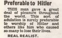
In closing let me just say that, being all crepey of skin and feeble of mind, I am only too well aware that at any moment my stinking and aged frame could just drop dead, and sometimes I wonder how I would like to be remembered. It turns out that I would like to be remembered like Elvis. No, not as a mother fixated, voyeuristic pill popper with strange ideas about chimp management. (People tend to forget the Divine Voice these days, which is their loss.) Rather:

Photobucket

From The Leicester Mercury; date unknown, author pseudonymous.

Yes, "preferable to Hitler". I think the "Real Realist" is right in that that's all any man would want in the end. So, have a smashing weekend and if you think of me, think of me, at least as being "preferable to Hitler". Like Elvis. Like The King. God Save The King! God Save The Queen!

Farewell for now, my foreign chums, and remember: if you can't have a Jubilee then have some COMICS!!!
"A Moi La Légion!" COMICS! Sometimes I Have Too Much Sun!

Greetings! It has been sunny in England for more than three consecutive days. This means that the entire nation is required by Law to sit outside until their skins glow like pink suns and crack like dry riverbeds in Texan heat. So I have been doing that. This means I didn't read many comics and when I wrote about them the fact that my brain had been lightly boiled in its own juices didn't seem to have a beneficial effect on my thought processes or judgement. But, hey, I made my deadline! I made it, Ma! I'm a hack! Photobucket

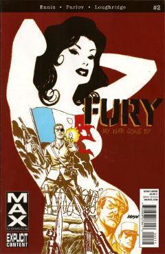
FURYMAX #2 Art by Goran Parlov Written by Garth Ennis Coloured by Lee Loughridge Lettered by Rob Steen Marvel, $3.99 (2012) Nick Fury created by Jack Kirby AND Stan Lee

Photobucket

Imagine my delight upon opening the latest issue of this fine comic to find an act of recreational physical pleasure being performed by Nick Fury and Ms. DeFabio. No, not because I have always wanted to see Kirby/Lee characters nut deep in the fun patch, no. (Well, Lockjaw maybe but that’s a personal thing.) No, it’s the fact that the act is presented so matter of factly. Almost as though it is just a part of life; one of those things adults do from time to time, these days mostly when they lose their broadband service and the TV is simultaneously on the fritz. In fact I can assure you I am not idly boasting when I say that even I , the misanthrope's misanthrope, have in fact personally heard of people in real life who have encountered a real life lady in such close quarters; which is to say even closer quarters than Nick & Co. encounter the ‘Cong in this comic. For one moment I thought mainstream genre comics had, in actual fact as opposed to the popular fiction entertained by most fans, grown up. A bit. Then I remembered it was a MAX comic and so that was okay as the regular line of comics would continue to be as ridiculous in their depiction of recreational procreation as ever.

Photobucket

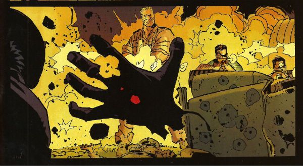
Seriously, how bizarre must the depiction of something in regular life be if  its depiction in a Garth Ennis war comic is actually a healthier alternative. Focusing on that aspect, as for some inexplicable reason I have, does Ennis' work on this comic a disservice as it is so well realised by all the involved personnel that its level of focus brings to mind a close up of a sniper's eye as the unseen finger exerts the required pressure to do the necessary. It's one well honed machine is what I'm saying. This week, because this book appears to be weekly for some arbitrary reason, Goran Parlov knocks my socks off on the several occasions when he draws the Nazi bastard’s head as just a collection of lines held together by Lee Loughridge’s ever-excellent colours. Giving us a glimpse into a horrific world where Pig Pen grew up and joined The Hitler Youth. To speak plainly then, I thought FURYMAX#2 was VERY GOOD!

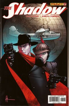
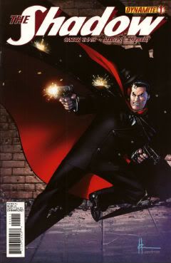
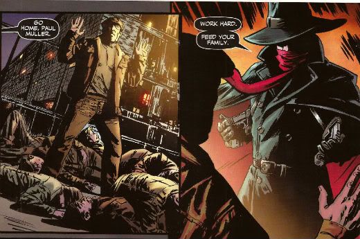
THE SHADOW #2 Art by Aaron Campbell Written by Garth Ennis Coloured by Carlos Lopez Lettered by Rob Steen Dynamite, $3.99 (2012) The Shadow created by Walter B. Gibson

Photobucket

As is customary, and contrary to my therapist’s advice, I shall now devote more time to the cover by Howard Victor Chaykin than the book it adorns. It’s a pretty swell cover, yes it is. The elegant simplicity of its design elements is foremost amongst its pleasures but only because the cheekiness of anchoring it all on The Shadow’s torso (which is little more than an oblong) is, let’s face it, the kind of thing only people who should really stop harassing aged Jewish comics creators when they go for a jog on the beach are going to give a gefilte fish about. I’d plump for Arbutov on colours rather than Delgado because it’s less an attack on visual sense and more of an attempt to attractively enhance the base image. But, this being Dynamite the colour of your cover is not a fixed thing! You can have a “Bloody Red” Retailer Incentive Cover (red and white!) or the Dynamic Forces Exclusive Howard Chaykin cover (black and white!). I hope these are all in the TPB because I would actually have an interest in seeing the image without colour, but that’s because I am a Chaykinmaniac. Otherwise I am just totally flummoxed by the need for all these covers. There are another 7 of them! The Ryan Sook one looks lovely by the way.

Photobucket

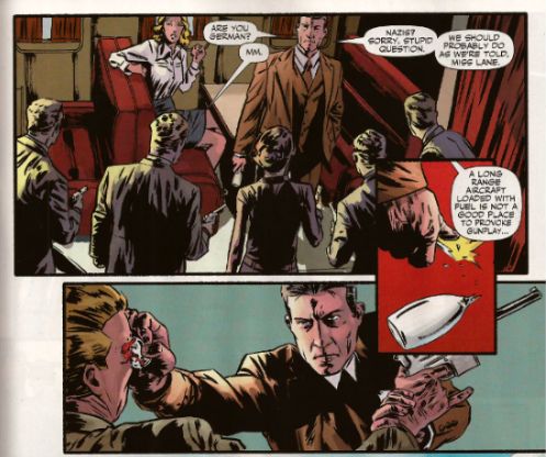
Eventually, sated, I looked at the actual comic. Ennis’ script this time out is pretty great. It’s basically an extended action sequence inventively choreographed within the confines of a Pan Am clipper intercut with exposition largely designed to demonstrate the evil of the opposition (kiddy fiddler ahoy!). I can’t fault the writer's execution of the script or the savagery of the violence (injury to eye is just the hors d’ouvres, darling!) but it impresses only despite some serious fumbling of the ball on Campbell’s part. I’ll not dwell on it too much as, after all, the art turns up and does the job; albeit with all the fiery invention of a Council employee during the week before his pension finally kicks in. Also, Megalophobics are hereby duly warned to stay away from the hilariously outsize hat which dominates the last panel. Still, Ennis’ script is so solid the comic remains GOOD!

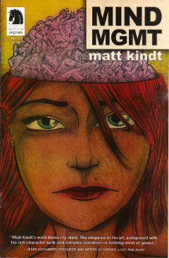
MIND MGMT #1 By Matt Kindt Dark Horse, $3.99 (2012)

Photobucket

In this comic's after-piece Matt Kindt runs the old I Want This Periodical To Work As A Periodical schtick. Y’know the one; the one about extras unique to the pamphlet (or FLOPPY!(cue Brian Hibbs rearing back like Christopher Lee before Pter Cushing's crossed candlesticks. Hsssss!)) which will enhance and entertain, yes, that one. I think he’s actually serious about it, too. That's on the evidence of the first issue of what future generations will call “that book Matt Kindt did no one bought” (but we will call MIND MGMT). I mean, only time will tell but I doubt this is going to take the form of backmatter telling us how his movie deals are progressing (Matt Kindt hasn't got any. Yet.), how hard life is for the talented and beautiful (my heart; it bleeds), a telephone book size list of all the awful comics he has in print (because Matt Kindt doesn't do awful comics. Ever. Fact.). Not that anyone else does that, but I severely doubt Matt Kindt will. The clue is in the comic itself.

Photobucket

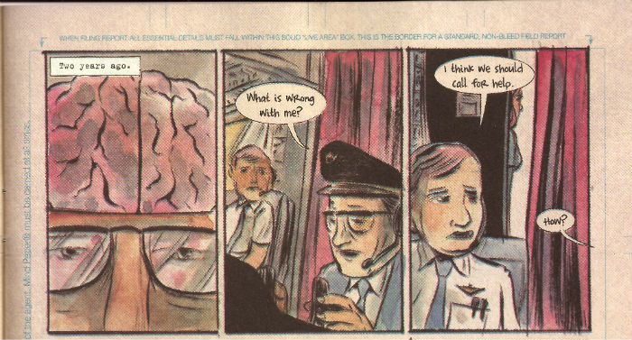
Every page of this comic is the comic. The inside front and back covers are a short prologue to the book itself, the back cover is an advertisement that is in fact not an advertisement, text crawls up the side and across the page margins (a la ADVENTURE TIME) adding colour and background to the concept in a dryly humourous faux-bureaucratic way, there’s a short backup piece not intended for the TPB which ends with a six panel sequence so awesome that you know right then and there that MIND MGMT is the one. MIND MGMT is the one. MIND MGMT is the one where Matt Kindt arrives. This is Matt Kindt’s AMERICAN FLAGG! moment. This is where Matt Kindt turns up says, hey, this is what I do and this is the way I do it and you, well, you just deal with it! Matt Kindt just slapped his big talented balls on the table and now you either walk away or you just deal with it. MIND MGMT is odd but EXCELLENT! Deal with it!

And then I saw sense and decided my time, and yours would be better utilised if I wandered off to flick lima beans at next door's koi carp.

Hope you had a good weekend with some COMICS!!!
NEXT TIME: Something else!

Here comes Crankypants!: Hibbs' 5/23

Here I am, here I am!

(Yeah, I skipped a week, sorry)


AQUAMAN #9: Here we are at issue number NINE of this comic, and I've realized that I still really don't know who Aquaman is, or what motivates him (other than "being pissed off", I guess, generically?). I mean, I like the character just fine, but there's not any "there" there, is there? Pretty much just a collection of cool powers and a costume. And this "Aquaman's other team" storyline is just as bad at this, introducing several new characters, again, who don't seem to have clear personalities or motivations. And yet, and yet.... and yet, I kinda still like it, because Ivan Reis is a very good artist, and Johns knows how to write compelling action and dialogue, but it still feel like less than the sum of its parts to me.

I didn't like the cliffhanger either. Besides the tarnishment it implies, I'm kinda getting sick of John's Daddy Issues as being the only kind of motivation that anyone ever has.

I enjoyed this more than the rating as I was reading it, but here two days later I can't say this is anything other than OK.


BATMAN INCORPORATED #1: I liked the issue just fine as chapter #81 (or something like that? He's coming close on 100 Batman comics, isn't he?) of Grant Morrison's Batman run -- especially because Chris Burnham is one hell of an artist -- in fact, as issue #81, this was pretty crazy awesomely good, but I'm this weird old fashioned kind of a guy who thinks that a first issue of a series should contain it's premise. I thought this was largely unreadable as a FIRST ISSUE, and it's hard to see where the "incorporated" comes from here. So that's going to knock this down at least an entire grade to only a GOOD. You can tell me I am a crankypants. But it won't stick, because I'm also pushing for a Bat-Cow mini-series. So there.


FANTASTIC FOUR #606: It's nice to see Hickman doing a "traditional" FF story for once -- where they are heroically exploring. And then there's a fun little "twist" at the end that makes it even better. A nearly perfect little "done in one" issue that I thought was VERY GOOD.


FLASH #9: Pretty pretty comic, every month without fail, but can I say that I've yet to find the "new" Speed Force to be compelling, and Barry Allen personally even less so? I think tying in the "origin" of Gorilla City to Flash is incredibly wrong-headed, and I don't like the new Grodd's relationship to his fellow residents. But it is pretty, and therefore, at least OK.


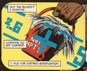
IRREDEEMABLE #37: As impossibly powerful as Waid has made his title character, there was largely only way this could end, and Waid did almost exactly what I thought he was going to do. Exxxxxcept, I was thinking that "energy" would moebius-loop somehow (like the Supremium Man in Alan Moore's Supreme), and I didn't expect that Waid would then make his evil analogue responsible for the creation of the original from Siegel and Shuster. That's kind of ballsy. Or douchey, I don't know. For leaving a bad taste in my mouth, I sadly have to go with AWFUL, when it's not nearly that bad -- hell, I'm sure Mark didn't consciously realize that's how it would be taken; but there it is.


JUSTICE LEAGUE DARK #9: Jeff Lemire's first issue, and the book takes a decided turn towards "traditional super team" with a guest appearance by Steve Trevor, an explicit naming of the team, tie ins to the "black room" plot points in JL, and so on. And it strikes me that in a way this is a larger betrayal of anything the creator envisioned, or the character was built to be, or, hell, of their sister imprint for that matter, than "Before Watchmen" is going to be. It also seems like it undoes Gaiman's Sandman kind of explicitly.  Which is weird. I kind of don't understand what this book is meant to be, and the nuDCU has way too many superteams-without-a-clear-function titles already. More than anything, I'd guess this book is aimed at formal Marvel editors who sneered a lot about Vertigo when it launched -- "Sandman done right" and all that. That's not a very large audience, though; and I don't see how this book doesn't just keep freefalling from issue to issue like it has been. Extremely EH.


MIND MGMT #1: It has been a terrific year for amazing first issues from new independent ongoing series, and this one spreads the love over to Dark Horse for possibly the strongest debut issue yet this year (which is a crowded field, I think, with things like SAGA and MANHATTAN PROJECTS and PROPHET, etc. etc). There's this wonderful wonderful density to this title, which sets up a wide-ranging conspiracy theory-ish story like, say, "Lost" or "Fringe", and does so under the incredibly assured layouts of Matt Kindt. I absolutely admire Kindt's storytelling and energy on the page, though I constantly think that he'd be incredibly aided by having a solid and professional finisher to ink him -- there are pieces of this that really look like layouts more than anything else, and I think that stylistic choice is going to turn a lot of the widest potential audience off.  Try to overlook it, though, or you're missing something really special.  Kindt colors the book himself, and his color choices are really strong and striking.

Either way, this is comics by someone who "gets" comics just perfectly, and this absolutely deserves to be on your reserve list -- I've just placed a reorder at 100% of my initial, and will be hand-selling this with some large amount of joy. I thought this was a truly EXCELLENT debut.


PROPHET #25: This was the first issue where I was NOT enjoying what was happening until we got well past the halfway point and the "real" Prophet showed up. Then I totally fell back in love all at once. This is such a VERY GOOD comic, and I'm totally at awe of the world-building that gets built and tossed around each and every issue.


SUPERMAN #9: Basically, see what I said about AQUAMAN above -- I have no idea who or what the "modern" Superman is about, really, other than "it's Superman", but all of the changes to the supporting cast and mythos, so far, seem to be arbitrary to me, rather than organic. All of the stuff in this comic about how the media behaves? Beyond terrible. This is terribly EH material, and I doubt I'll read another issue until they change creative teams (again!) YOUNGBLOOD #71: Y'know what? I was digging on John McLaughlin's script here -- kind of the most AUTHORITY-like comic that we've seen in a while, but dear god, the art by Jon Malin and Rob Liefeld (Rob's inking?) is really wretched and uninspiring. I know a lot of people used to really really like Liefeld, but, honestly folks, most of those people stopped actually purchasing comics at least a decade back, leaving this a commercial trainwreck. Too bad, I really dug the script, but the final product is a muddled EH of a comic.


That's me... what did YOU think?


-B


"RAK TAC TAC TAC TAC." COMICS! Sometimes They Do It All Over Again!

So I went to the library and got this here book out. As is customary on my planet I read it and , as is inadvisable in my experience, I wrote this. Evasions, justifications, terrible writing, pointless digressions and probably unintended offence are probably in the offing. Why not join me as we look again at Marvel's first superhero team! Photobucket

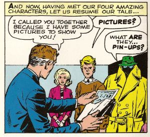
Reed Was beginning To Suspect His Friends Would Never Share His Pleasure In His Colonoscopy Results.

Readers ripe for a rucking will have noticed that once again I am discussing a Marvel book featuring characters created by Stan Lee and Jack Kirby, despite the fact that I said I wouldn't do so until they were credited on such works. That’s okay because what I find I really enjoy in my declining years is explaining myself to you. So I’m in the library (no, the Tories haven’t turned them all into Pay And Display Car Parks yet) and the first thing I do is head for the Kids section; not because I am a predatory sex criminal but because I am accompanied by my 6 year old son, okay? The second thing I do is spot BATMAN: THE KILLING JOKE in-between TERRY THE TOASTER WHO FLEW and DEAD DOGS IN HAPPYLAND.

Photobucket "I'll send you a love letter straight from my heart, f*****."

So, the third thing I do is move B:TKJ to the Graphic Novel shelf because we don’t want an unfortunate court case involving Alan Moore, particularly as his Defence will have to call Dan Didio, and, as we have all seen this weekend, Dan Didio is the kind of man who writes Alan Moore the kind of ‘love letters’ called in evidence after the recipient has been dredged up from a canal with hearts carved into his face. While I am there single-handedly, with no thought of thanks or monetary recompense, averting another comics crisis my son strongly suggests I read FANTASTIC FOUR: SEASON ONE because he recognizes the characters from his aged and decrepit father’s bedside reading table. Yes, I find bringing a kid into the mix makes judgemental people back off real quick, I'm not proud of it but anyway...

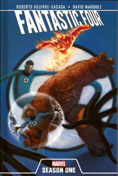
FANTASTIC FOUR: SEASON ONE Artist David Marquez Writer Roberto Aguirre-Sacasa Colour Artist Guru E-FX Letterer VC’s Clayton Cowles Marvel, $24.99 (2011) The Fantastic Four created by Jack Kirby and Stan Lee

Photobucket

Not on this cover, "Created by Jack Kirby And Stan Lee" (See comments below which have prompted me to come back and insert this:) And by the above I do NOT mean that it SHOULD be on the cover I am just taking the rise out of the fact that the "Created By" credit appears nowhere in the book including the cover. I would just like "Created By Jack Kirby and Stan Lee" to appear IN the book and, yes, the CREDITS page would be just peachy. Apologies for any miscommunication. Nice to see people are thinking about the issue though!

I guess the origins of this book can be traced to Marvel wanting Original Graphic Novels so new readers can just pick them up and get the relevant skinny on the main MARVEL characters before running back to the LCS to buy all those Marvel comics no one is currently reading. It's a noble aim and one not entirely dissimilar to the origins of the original FANTASTIC FOUR (FF). According to published interviews with both creators neither Stan Lee nor Jack Kirby could agree on who came up with the FF, which is a real shocker right there. What is certain is that come up with the concept they did. It's pretty clear that the reason was the need for sales, a change of direction was required and DC/National seemed to be doing okay with those superfolks comics so maybe Marvel should follow suit toot suite? It was worth a pop.

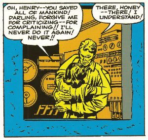
Marvel's product pre-FF was getting pretty stale comprising as it did of  tales of such mind frying creations as “Taramasilata - The Mop That Frittered Its Youth Away like A Man!” (originally presented in Tales Of Shameful Evasion #630, Atlas Comics (1960)) These would usually involve a devastating rampage of destruction by said creature before a man who smoked a pipe stumbled on the fact that the creature was allergic to grass and then his girlfriend apologised on behalf of all womankind for being a nag. Sometimes a man who smoked grass would discover it was allergic to pipes, but he would be shot like the deadbeat he was by a cop and the world would die because it was weak. Steve Ditko usually drew those. Before anyone starts roasting my chestnuts over an open fire let me just point out that while the preceding is factually inaccurate I think it is accurate in spirit. These stories were formulaic and any fun was in the monster design and Kirby’s work seems sporting but hardly inspired. So formulaic in fact that these things could easily be believed to be self-replicating.

Photobucket AMAZING ADVENTURES #6 (Nov,1961) by Jack Kirby & Stan Lee

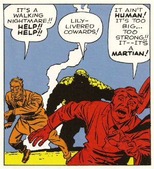
In 1960/61 Kirby would be allowed to be as inspired as he liked when it looked like the doors of Atlas would close forever and Stan Lee importuned him for his aid in the creation of concepts which would revive interest in the company’s products.  Jack Kirby did not disappoint. Or Stan Lee would not disappoint when he came up with the concept of THE FANTASTIC FOUR and asked Jack Kirby to draw it.  Depends, really doesn't it? Anyway, FF #1 is clearly a transitional comic. It’s more monstercentric than superheroic. In fact the four themselves seem to have become monsters rather than heroes. The public react with fear and loathing at their appearance until the FF prove themselves by killing even bigger monsters than they are perceived to be. And those even bigger monsters look suspiciously like the very monsters the FF are intended to replace. Yes, it would be easy to get all post-modern about FF#1 here, but I'll spare you.

Photobucket FANTASTIC FOUR #1 (Nov, 1961) by Jack Kirby & Stan Lee

Marvel's comics of this era are often applauded for having a greater sense of realism than the opposition's comics, and while this is because it wouldn't be that hard to do FF is actually quite daring in its characterisation. None of the four are particularly likable and after the crash they just get positively junk yard dog on each other. It is quite a stressful situation though, I’d probably react badly too.  The rawness of the emotions on display and the attendant unpleasant characterisations don't last long though. The four soon settle down in subsequent issues to become the reassuringly pleasant people we all spent so much money following in comics. The whole thing has an edgy, jarring quality and is all obviously a bit slapped together from the cover on in (Roy Thomas probably still wakes up sweating wondering where that rope binding Reed on the cover came from). But it worked enough for the seeds of greatness it contained to bloom fruit sweet enough to keep uncreative corporate employees drawing a salary for lo these many decades.

Photobucket

You'd think retelling this origin story (and also #4) some several decades on would result in a far superior experience but that isn't the case. There's nothing wrong with this book I guess, none of it is actively awful or offensive. But, again, none of it is inspired or amazing. It's innocuous, inoffensive stuff. It's there to be read but beyond that it doesn't inspire any strong feelings either way. Which is a bit of a problem when the whole purpose of the thing is to inspire you to buy more of these things, these comics. Aguirre Sacasa is a decent writer but here he appears hampered by the editorial dictates the book seems to embody. Now, I am not privy to the inner workings of Marvel editorial policy (I kept laughing so they threw me out) but I can reverse engineer the intentions behind this book, I think. Firstly it's called "SEASON ONE" which has obviously been borrowed from the world of TV without any thought. This book isn't a season, it's more of a pilot; the length tells you that. The contents also don't want you to have to think too hard, they are also all too happy to flatter the audience by referencing Proust but also to console them that there's no elitism here by chucking in J J Abrams and Zack Snyder as well.  As it is now 2012 the book goes out of its way to avoid some of the dumber elements of early FF (hence skipping #2 and #3) but can't avoid the core daftness of the concept. After all, it will probably never be possible to adequately explain why an intelligent man would crew his experimental space craft with his fiancé, her narcissistic brother and a school chum noted for his football skills. (Actually it is possible: it was a comic from 1961!) The characters get a TV update too, most notably Sue and Johnny. Overall the characters are blander than their initial appearance, but in an exciting reversal of gender stereotyping Sue Storm is actually presented as the most capable and effective member of the team. However, she is still a lady so she still has to spend a lot of time worrying about whether Reed will marry her or not. You can't fight genetics! Johnny, however, is just played as a straight-up man-slut so I guess Reed will have his extendable hands full finding cures for all the STDs fizzing inside his future brother-in-law.

Photobucket

Art-wise the whole thing is pretty tepid. There are some scenes of action which are less memorable than , um, that thing, er, I forgot and the talky scenes aren't electrifying either. Judging by the scant sketches in the back of the book Marquez is a talented artist but there's a difference between that and a talented comic book artist. Mostly Marquez struggles to be Steve McNiven but sometimes stumbles into the Liefeld-ian. There’s really nothing interesting about the storytelling, I'm afraid. It’s pretty basic, which means it works fine but doesn't play to the strengths of the medium. Which it should. You're trying to hook people on comics here, Marvel; so it might be an idea to show them what comics can do rather than attempt to replicate the readily available and cheaper experience of watching a TV show. Just a thought. On the whole, yes, it's just too TV for me. As the case of most TV while I am forced to recognise I am not the target demographic I also have to recognise that it is all competently done; I don't feel the need to seek out any more of it but neither do I feel inclined to harm things smaller than myself as a result of having experienced it. I guess that makes it OKAY!

Photobucket

FANTASTIC FOUR ANNUAL #1 (1963) by Jack Kirby & Stan Lee

The totally okay OGN portion is followed by a reprint of the first issue of Jonathan Hickman’s run on the regular FANTASTIC FOUR title. This particular issue is okay as well; packed with ideas and possibilities. But that’s usually the case with first issues of modern day runs called things like “stellar”, “landmark”,"pipe cladding” and “skirt raising” by people who are professional reviewers.  It is hilariously concerned that you get that it's about Fathers And Sons, really hilariously so. So much so in fact that it becomes the comic book equivalent of visiting a Fun Pub on a Saturday afternoon; watching all the workaholic Dads wondering what to do with the freedom sapping alien which shares their face as it sullenly sips on stale Fanta next to them. Oh, calm down, I’m just having some fun, I’m sure Jonathan Hickman’s “bum tickling” run on FANTASTIC FOUR is fine. What isn't fine is that Jonathan Hickman’s name is the only name that appears on this reprinted issue.  I’m not a Jonathan Hickman follower but I’m pretty sure that he doesn't write, pencil, ink, colour, letter and edit every issue of his “cat hazing” run on FANTASTIC FOUR.  Really, Marvel, you’re like a recalcitrant child and it's unbecoming in one so old. Sort it out, eh?

And then I was off to pick up some milk'n'bread before the shops shut. Those Sunday hours!

Hope you all had a good weekend with some COMICS!!!
Late, but still here, Hibbs sorta is in 5/9

Staggeringly, I've still barely read any comics this week, due to a confluence of many things, but maybe fewer means more in depth? Let's see below the jump!

Part of it, for me is being hit by crossover burnout hard this week -- 3 different "Night of the Owls" tie-ins, which, basically, all have the exact same story, three from AvX (more on that later, I suspect), and two parts of "The Culling", which, surprisingly, isn't leaving the involved books cancelled. Ugh.

(I think I've mentioned before that I kind of have to get through the shittier books first each week, before I "let" myself read the presumed good ones, because otherwise I'd never read much of the superhero books, and, then, wouldn't be able to do my job as effectively.)

There's only two things I read that I feel like saying anything about this week.... but first, a late-ish movie review!

AVENGERS:  because we're in the last week's of elementary school right now in San Francisco, things are crazy hectic with performances and other end-of-the-year stuff, so I didn't get to see this until this weekend. On the upside, I got to see it with two eight-year-old boys, which was kind of awesome in and of itself.

I don't think it's any real surprise after the film has made One. Billion. Dollars!....but, jeez, what a terrific film! I walked out thinking "Oooh, I want to see that again", and I've already had one customer in the store tell me he's seen it six times so far. Yikes!

What I think I like the most about it is just how strong the script was, giving every character plausible character arcs, a place to drive the greater plot, and a moment to shine with how awesome the characters are. That's a crazy hard trick.

It also worked remarkably well as a Classic Marvel Comic Book -- it's absolutely a continuation of various threads from other movies, but if you never saw those movies, everything you might need to know is clearly spelled out in both dialogue and action -- worked better, in fact, most current Marvel comics do in that regard!

Honestly, most big budget blockbuster movies are usually ultimately shallow affairs more about spectacle, but Avengers very nicely ties all of it's set pieces to individual character's arcs.

The action is big and crazy and maybe even, post 9/11, a bit disturbing, but it's also very well shot and staged, and things are almost always clear as a bell of what is happening. It also showed just how terrifying super-humans can be as engines of utter destruction.

I really think this might just be the most perfect super-hero film ever made -- it has as much brains as brawn, and it juggled a gargantuan cast of characters with the utmost of aplomb.

There were a few things I didn't really like -- I thought Scarlett Johanson was really kind of one-note/look through the whole thing. And I don't believe her as a Russian even one bit. I also thought the new Cap mask looked pretty bad. I thought Hawkeye's arc was weakest (though it tried really hard to find a way to make "real" Hawkeye's "reformed villain" origins work in movie continuity), and took him off the board for too much of the film. I thought the death in the movie was kind of uneeded, and the "hey, we got blood all over your nostalgia!" was a bit off-note for the rest of the film. But, hell, those are all just quibbles really. None of that could possibly take away from my consensus that this was an EXCELLENT movie!

Joss Whedon should now be allowed to do whatever he wants, however he wants (though that's been true for years), for doing such a loving job in bringing to the screen such a remarkable version of Stan Lee & Jack Kirby's (among many others) creations.


Just two comics I want to talk about, as I noted, so here we go:

TRIO #1: Here's one of those weird riddles of comics and ownership and all of that. John Byrne is well beloved for his run on FANTASTIC FOUR, a run which certainly couldn't have been without Lee & Kirby before him. Byrne doesn't/can't work at Marvel any more, but many people seem to want nostalgia from their superhero works, and they're sad he can't draw FF any longer. Ah ah, but what if Byrne instead came up with something that was remarkably LIKE FF, but wasn't legally-actionably the same, huh? There's a brute made out of stone, and a character that both stretches and turns invisible, and they're fighting some sort of a sea ruler and... well it hits every note just right, but it's just enough different. I'd almost say it's like "What if Paul McCartney, rather than Neil Innes, formed The Rutles?"

So if you want to read Byrne doing the almost-FF (and, if you like action adventure "classic" Marvel-style comics, yeah you probably do), then this is certainly the thing for you. I thought it was pretty GOOD.


WALKING DEAD #97: I'm not afraid to say that I think TWD has been a smidge off its game the last few months, with the super-crazy-hyper competent ambassador from the big settlement really feeling kind of out of place, but now that we're starting to think about starting to work through a "Big Bad" again in the form of Negan, I've lost most of my hesitation. This arc is looking as strong as the book has ever been, which is great because this is the first issue that will come after the second compendium ends (and/or v16), and is a great place to jump on to the monthly reading experience. This was VERY GOOD.


OK, time to go get ready for the NEXT week's worth of comics...

What did YOU think?

-B

"It Is Not The FIRST TIME This Has Happened." COMICS! Sometimes They Are Hot Off The Griddle!

Hey old people, remember Sunday evening when you were a kid?: Photobucket

Urrrrrhhhh! Let's take the Sunday Blues away with some piffle about our four colour floppy friends! COMICS!!!
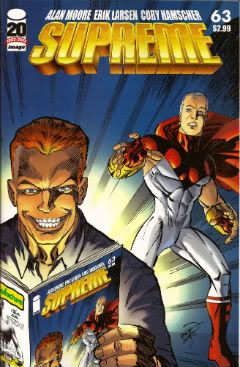
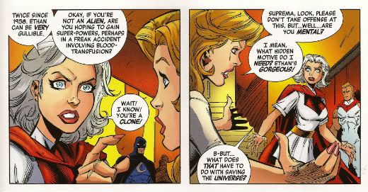
SUPREME #64 Art by Erik Larsen & Cory Hamscher Written by Erik Larsen Coloured by Steve Oliff Lettered by Chris Eliopoulos Image Comics, $2.99 (2012) Supreme created by Rob Liefeld

Photobucket

Hu-ooFF! Well, that was horrible. As a comic, I mean. Look, I don't have a problem with a change in direction and it's a little soon to tell if I have a problem with this particular change in direction, but I have a problem with a bad comic which this was. Just page after page of people dying, things falling over, plenty of, as my son would say, "'splodin'!!!". I hate to break thi sto everyone but that's not actually a story as such. Sigh. I don't have much familiarity with Erik Larsen's work (the '90s? Not really my best time for comics)  so I'm not counting him out yet. Yeah, maybe Erik Larsen can swing this one around. I'll give him a couple more issues to do so. Turns out I'm that close to generous but this issue was pretty EH!

Photobucket

Reckon them's fightin' words and wanna show me just how wrong I am? Well, you can buy this exact comic from  HERE!

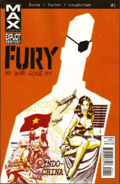
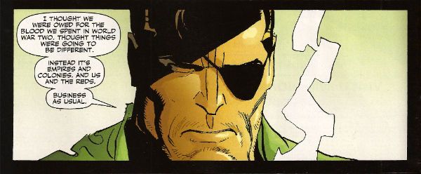
FURY MAX #1 Art by Goran Parlov Written by Garth Ennis Coloured by Lee Loughridge Lettering by Rob Steen Marvel,$3.99 (2012) Nick Fury created by Jack Kirby with Stan Lee

Photobucket

I don't know what they are feeding Garth Ennis on these days but the comics he's producing would be Type 3 or 4 on The Bristol Stool Scale; this being as we all know optimal. In a worrying state of affairs Ennis has now produced two comics (see last week's THE SHADOW) which are set in  convincing historical settings, peopled by satisfyingly sketched characters and which succeed in being both informative and entertaining. Which is why I had to bring my own shit joke to the party lest his regular, heh, audience feel at at a loss. Taking the first chapter's title from TheThe softened my hardened heart but going on to deliver an intelligent, amusing and diverting comic  is what really sealed the deal here.

Photobucket

Ennis is helped no end by the astonishing art of Goran Parlov. Goran Parlov is the kind of artistic wonder who can limit himself, largely, to the most banal of page layouts without inspiring new lows of tedium in my mind. He can do this because everything he puts in those panels is just right. It doesn't hurt that his present day Fury looks  so gnarled and battered he resembles 19th Century armoire smoking a cigar while clad in plaid slippers and a fluffy robe. Yeah, this was VERY GOOD!

(Yes, I am aware Nick Fury was created by Jack Kirby with Stan Lee and that I said I wasn't going to purchase any more Marvel products which failed to acknowledge the contributions of The King.  Either my LCS forgot or decided that my professed liking for Garth Ennis' non puerile work and Goran Parlov's anything superceded this. Okay? Either way I got a good comic and I still think it could have had the words "created by Jack Kirby and Stan Lee" on it without upsetting the balance of Life itself.)

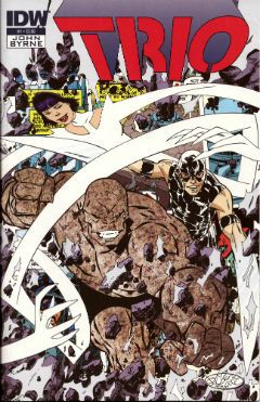
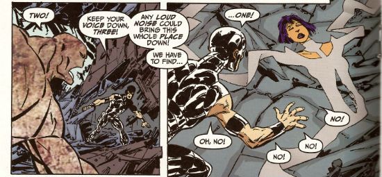
TRIO#1 Written and Drawn by John Byrne Coloured by Ronda Pattison Lettered by Robbie Robbins IDW, $3.99 (2012) Trio created by John Byrne

Photobucket

Mark the time. The super-hero funnybook is dead. I'm surprised to find John Byrne's DNA on the corpse but then it's always the ones that love hardest that end up hating enough to kill. I'm a bit sore because I lost my shirt on this one; my money was on one of the TV Breed. One of those guys who just keep parping it out until the comics cognoscenti just give in and allow quantity to supercede quality. Yeah, I figured the smoking gun would be in the clammy hands of  one of those guys with all the imagination of an empty cardboard box, one of the dialogue guys, one of the post-it notes and flow-chart guys, y'know, the sophisticated guys. But like the most surprising game of Comics Cluedo ever, in the end it was John Byrne in the LCS with The Fantastic Faux. A super team of characters called "One", "Two" and "Three" could only mean one thing; the death of imagination.

Photobucket

But look, in his defence, no one loved the super-hero funny book as much as John Byrne. He loved it so much he hid it away and protected it from reality. Up there in the big house with the pool. Pretending nothing had changed and if it had, well, it wouldn't last. See, John Byrne knows super hero comics are still big it's just the audience that got small. You just have to give 'em comics like back when they loved them. Back in the '80s. The magical hey-day of ALPHA FLIGHT! This isn't a comeback it's a return, it's the return of cape comics, the return of the way they should be done, the return of the way they were done when they were done rightIt's the return of an '80s issue of ALPHA FLIGHT. Sure, it's the best issue of '80s ALPHA FLIGHT ever published but it's still just an '80s issue of ALPHA FLIGHT. It's now 2012. Here's the corpse of super-hero comics now, caked in make-up, going on eighty trying to pass for eighteen. Nothing sadder. Sure, it may be EH! but they'll love it in Pomona.

You can prove the audience for this comic didn't leave twenty years ago by buying it from HERE!!!

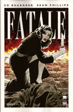
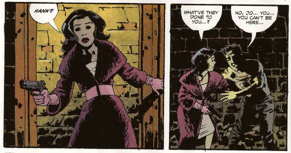
FATALE #5 Art by Sean Phillips Written by Ed Brubaker Coloured by Dave Stewart Image Comics, $3.50 (2012) Fatale created by Ed Brubaker and Sean Phillips

Photobucket

Well, I gave it 5 issues and I was hoping this one would turn it around. It didn't. A spooky rinser, people in hats swearing and a demon who can come back from the dead but can't bring back his eyes. I guess you could say it was a bit like James Ellroy meets H.P. Lovecraft, y'know, if they'd both had flu at the time, or you'd only seen the covers of their books, or you had in fact never actually read them just read about them. In the end FATALE pretty much ended up being the John Byrne's TRIO of independent creator-owned comics. Familiar stuff delivered familiarly; that's not going to make me run about like my underpants are on fire no matter who is involved. Sure, I'm all for Team Independent but not if they are as bland as the alternative. Being creator owned is a magical thing but for a reader comics still have to be better than EH!

Photobucket

Possibly not the most popular opinion regarding this comic book! Why not make up your own mind by purchasing if from HERE!

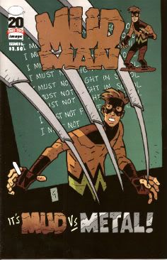
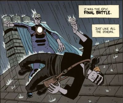
MUDMAN #3 Written and Drawn by Paul Grist Coloured by Bill Crabtree Image Comics, $3.50 (2012) Mudman created by Paul Grist

Photobucket

Wait! I'm getting a pulse! turns out the cape comic isn't dead after all, it just has to keep up with the times is all. This one's about a normal kid in a timelessly sleepy English seaside town who is, through events and stuff ,suddenly not normal in a way that involves mud and being a man made thereof. It's got a breezy lightness of tone that might work against it; sometimes it seems not a lot has happened but really quite a lot has. As Owen Craig (Mud Man when he's not Mud Man) finds his powers have opened up new possibilities for him physically the environment around him seems to change in concert. Using the fixed point of Owen's discoveries as the present Grist fills in the Past and hints at the Future while parts of each encroach on Owen's life and, as is generally the way of things, threaten it.

Photobucket

Grist is really good at keeping the tone light while at the same time giving the threats real weight.  He also excels at teasing about future developments; so much so that the next issue just can't get here quick enough. But what Grist is best at is storytelling; in the words and pictures sense, natch, this being a comical periodical and all. He may be a bit too good at it because reading the comic is so effortless, practically intuitive, that it's quite likely the reader might forget to credit the incredible talents and the deft wielding of same that made it so. From soup to nuts, from top to tail, from mud to man MUD MAN is VERY GOOD!

Or is it? Find out by buying it from HERE!!!


And we're done. If you're going to hang about don't forget to lock up and put the key back through the letterbox.

Have a good weekend and always remember COMICS!!!
"Let Him Be A Child A Little Longer." COMICS! Sometimes They Are Diverse!

Hey, the postman finally turned up. Photobucket

I guess the hostiles must have been restless out there in the Badlands or something. Anyway, he may not have rung twice but he did drop off a box of comics. Here's me going on about some of them after the break: A NOTE FOR OUR AUDIENCE: According to Brian "Link-Hider General" Hibbs you can now purchase some of these comics direct from The Savage Critics!

There is a link under both Comix Experience Links and Industry Links which says "Digital Comics From The SavCrit Store!". It's that one.

I have of course followed the rigorous journalistic code of the 21st Century and given all the comics available from that link a rating of EXCELLENT! No, not really, because as a salesman I am a bit lacking.

As ever, here's some comics and what I thought! Buy 'em! Don't buy 'em! Leave them at the scenes of violent crimes to throw off the Feds! I don't know, don't look at me for help. Because I'll just look down and whisper "No."

And Now Our Feature Presentation- SOME COMICS WHAT I DID READ:

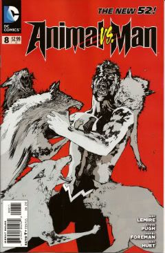
ANIMAL MAN #8 Art by Steve Pugh, Travel Foreman & Jeff Huet Written by Jeff Lemire Coloured by Lovern Kindzierski Lettered by Jared K. Fletcher DC Comics, $2.99 (2012) Animal Man created by Dave Wood and Carmine Infantino

Photobucket

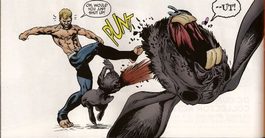
Since he literally throws his daughter to the wolves I’m afraid I have to say Buddy Baker is the worst father in the DCU and he’s a pretty craptastic superhero to boot. You’re going to have to think of something better than beating an army of undead animals to death one by one, Buddy Baker! This guy is such a dumbnuts I’m getting tired of reading about him. The best thing about ANIMAL MAN is that it reminds me how wonderful Steve Pugh’s art is.

Photobucket

I love the solidity he gives everything and the way his art allows the realistic and the insane to exist frictionlessly together. If he’s too radical for the DC masses, and it doesn't take much to be that, maybe Dynamite could get him on some books? Oh, I’m getting ahead of myself; I haven’t got to THE SHADOW yet. Anyway, ANIMAL MAN was OKAY! But really his wife would have left him about 6 issues ago and in about 3 issues I expect Social Services to be having a firm word in his shell-like. Buddy Baker is a danger to himself and everyone around him, and not in a good way.

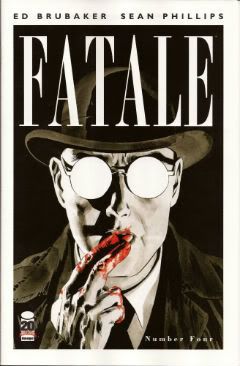
FATALE #4 Art by Sean Phillips Written by Ed Brubaker Coloured by Dave Stewart Image Comics, $3.50 (2012) Fatale created by Ed Brubaker and Sean Phillips

Photobucket

Um, I don’t want to be the party pooper but I’m not really feeling this one. Where others would see complexity I see only confusion and the horror and crime aspects don’t mix well at all; blanding each other out if anything. I’m not convinced at all that Brubaker & Phillips are as deft with horror as they are with crime. There’s one sequence in particular which is meant to suggest the soiled undersheet of reality flickering on the edges of the protagonist’s vision, but it takes up a whole page. Which is a bit like the secret supernatural underpinnings of the world putting on a straw boater and doing back flips in front of you while belting out showtunes. Subtly unsettling it’s not. Mind you this series seems to not be a lot of things. Coherent and inventive being amongst the things it isn't. So far the whole thing seems a stolid muddle which barely fends off the blunt teeth of cliché. The police scenes are about the width of a gnat’s dick from busting out the old “This is straight from The Fifth Floor, you've got 24 hours to clear this case or you’re back handing out parking tickets! Capiche, you maverick bastard!”  And then there are the narrative captions and, boy howdy, are they bad. But then I think there’s a difference between understated and lifeless. These things are like “I saw a cat. It was big.” bad. It’s like Dan Brown bad. But then Dan Brown’s very successful isn't he?

Photobucket

After all, in a shocking real-life terror twist, it turns out that FATALE is the most successful thing Brubaker & Phillips have produced. Previously this was true of INCOGNITO which I thought was pretty bad. So, it looks like success beckons the Brubaker & Phillips team, but what appears to bring them success isn't what brings me reading pleasure. Mind you, they are professional enough to produce a comic that despite my tinny whinging still comes off as OKAY! While I found the front matter lacking, Stephen Blackmoore provides a compelling backmatter piece concerning a real life gumshoe called Harry Raymond. That bit was VERY GOOD!

You can buy FATALE from HERE.

RAGEMOOR #2 Art by Richard Corben Written by Jan Strnad Lettered by Nate Piekos of Blambot® Dark Horse Comics, $3.50 (2012) Ragemoor created by Richard Corben and Jan Strnad

Photobucket

Corben’s art looks a bit odd in this issue, as though he’s got some settings wrong on his software or something. It looks a lot less crisp than last issue. It’s still great because it’s still Richard Corben but…still. Fortunately Strnad’s scripting is really strong so that helps soothe any misgivings. I didn't really know where the series could go after the first issue’s seemingly complete unto itself set-up.

Photobucket

I certainly didn't expect it to make the previously understated humour blossom so broadly; so broadly that at times it verges on farce. I certainly wouldn't have expected it to work so well either. There’s horror here but humour too and in an impressive feat of facility each complements the other leading to a comic that is a really satisfying read indeed. I don’t want to give too much away but hopefully the fact I thought it was VERY GOOD! will be enough to tempt the unwary!

THE SHADOW #1 Art by Aaron Campbell Written by Garth Ennis Coloured by Carlos Lopez Lettered by Rob Steen Dynamite, $3.99 (2012) The Shadow created by Walter B. Gibson

Photobucket

I know you've all been on tenterhooks so let me assure you that I did indeed receive a copy of this comic with the Howard Victor Chaykin cover. I thank you all for thinking of me during this period of uncertainty. It was always a bit of a gamble though wasn't it? What with Dynamite’s penchant for plural covers. Mostly they get some decent names doing some good stuff. Howard Victor Chaykin, for instance, obviously did this one well before it struck Gin O’Clock at Chaykin Towers. He’s even used a different face shape; nice job Howard Victor Chaykin!  The art on the inside of Dynamite’s books tends to be a bit more problematic. Problematic in the Early Anglo Saxon sense of “bloody awful”. Aaron Campbell manages to buck this trend by being decent for most of the book, except when The Shadow erupts into murderous action at which point Aaron Campbell impresses the Heck out of me. Really, jolly good work on those parts! I’m still not a massive fan of the old drawing over the top of photographs business so the rest of the book was just okay art wise.

Photobucket

Ennis is behaving himself too, there's none of that aggressively puerile "funny" stuff or lashing out at easy targets with a nuclear bomb strapped to a machete. He seems to actually be having a good time too. He certainly gives The Shadow a clear personality, one that's all the more entertaining for being composed primarily of arrogant bastardry. But he's not without empathy either, which is a nice trick to pull off. The whole shebang is set in one of Ennis' well researched eras of upheaval, or at least imminent upheaval. Because, and it's to his credit this, Garth Ennis is one of the few writers in comics who shows evidence of reading books other than How To Bland Out And Find Big Bucks In TV And Movies. Books that demonstrate an interest on his part in the world around him rather than a monomaniacal need to write THE MENTALIST.  If you like Ennis' war books you'll like this. If you like The Shadow you'll like this. Blimey, if you just like decent comics you'll like this. Because it's actually VERY GOOD!

SUPREME #63 Art by Erik Larsen & Cory Hamscher Written by Alan Moore Coloured by Steve Oliff Lettered by Chris Eliopoulos Image Comics, $2.99 (2012) Supreme created by Rob Liefeld

Photobucket

SUPREME is an Alan Moore genre comic. I miss Alan Moore’s genre comics. Alan Moore’s genre comics were packed with invention and humour. Alan Moore’s genre comics had more ideas on the page than most of today’s self proclaimed genii have in a lifetime. Alan Moore’s genre comics played with the form in a way that was charming and cheeky. Alan Moore’s genre comics had characters with character, but their character was never static and if it changed it would do so coherently. Alan Moore’s genre comics had craft. Alan Moore’s genre comics had joy. Alan Moore’s genre comics were VERY GOOD! Yeah, genre comics are much better off without Alan Moore. Yeah, F***k you, Alan Moore! Don't let the door hit you on the way out, Alan Moore! We don't need you, Alan Moore! We never needed you! We've got AVENGERS Vs X-MEN and BEFORE WATCHMEN now!

Photobucket

Oh God, what have we done. COME BACK, ALAN MOORE!

...please...

You can buy SUPREME from HERE.

And that's your lot!  Yes, even I have other stuff to do!

Hope you had a good weekend, everyone!

Blah blah blah COMICS!!!
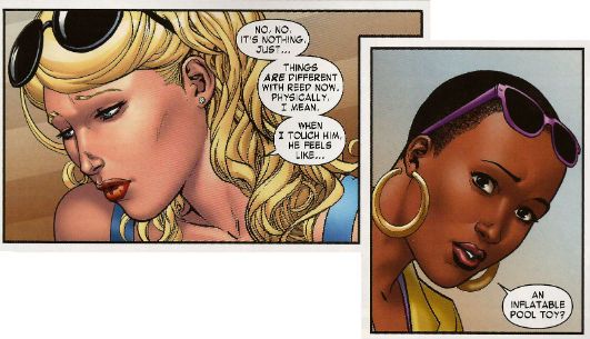
"You Owe Me A Father." COMICS! Sometimes They Define "Ramage!".

In 1987 DC Comics published a 12-issue "Maxi-series" by British (apparently I forgot one of them is of American origin)  Creators. It did not change the world of comics forever but since it featured a robot dog in a fez and shades, a living head in a bucket and stupid jokes by the pound while still being "about" something I thought we'd take a look. Me and my notions!

Photobucket

OUTCASTS Art by Cam Kennedy & Steve Montano Written by John Wagner & Alan Grant Coloured by Tom Ziuko & Nansi Hoolahan Lettered by Bill Oakley, John Constanza & Augustin Mas Published by DC Comics 12 issues, $1.75ea (1987/88) Outcasts created by John Wagner, Alan Grant & Cam Kennedy

It is The Future and in Big City while the rich live in enclaves the poor are mutated and damned to shanty towns. It is The Future and the police are not your friends. It is The Future and The Mutant Clearances have begun. It is The Future and the TV is shit. It is The Future and Kaine Salinger wants revenge for her father's death and answers to her questions. What is happening to the mutants? Who is murdering the city's ruling elite? Can a 104 year old man get an erection? Who are The Satan Brothers? Why Aren't They Funnier? Why is that dog wearing a fez and shades? All these questions and more will be answered but it'll take THE OUTCASTS to do it!

Photobucket

Since OUTCASTS has never been collected the reader will have no option but to read them in pamphlet format, doing so means they will soon find that around the edges of OUTCASTS floats the ghost of Alan Moore Past. His sublime presence can be felt in the form of a house ad for his and Brian Bolland & John Higgins’ THE KILLING JOKE; now here he is rearing magnificently up in an Advertorial with David Lloyd talking about their V FOR VENDETTA series. I understand that Alan Moore would go on to great success and pretty much redefine American genre comics as well as, with his and Dave Gibbons & John Higgins’ WATCHMEN, laying the foundations of the Great Internet Civil War of 2012. (Thanks, Alan!)

Photobucket

However, OUTCASTS would see print and then fade from the collective memory; Alan Grant would find some success writing decent Batman comics and John Wagner would join him there for a time before they both pretty much confined themselves to 2000AD and creator owned properties like THE BOGIE MAN and SHIT THE DOG. Now, while Alan Moore, like Alan Grant (but not, Andrew Hickey reminds me below, John Wagner), is British (I bring you only the freshest (and wrongest) facts!) he was, at this point anyway, filtering it through a very American form of comics. Wagner &Grant (W&G), however, seem to have made little attempt to adapt to American comics. Other than the length of each episode OUTCASTS reads very much like a strip from 2000AD.

Photobucket

Very, very much like a strip from 2000AD in fact. So familiar in fact that it seems likely that W&G were attempting to directly port across the sensibility that had worked so well over the pond in the hopes that American audiences would react equally enthusiastically. Or DC Comics were hoping for that reaction. The Big City setting is very reminiscent of Mega City One in Pat Mills John Wagner and Carlos Ezquerra's creation Judge Dredd as are the designs of the police officers, the fact that mutants are an important presence, the familiar contrast between the squalor of the masses and the empty plenty of the rich and the writers’ signature love of parodying the tranquilising distractions of mass media. The very presence of the talented Cam Kennedy is another echo of Judge Dredd. Since I'm about to chunter on about W&G I should take this opportunity to praise Cam Kennedy. DC Comics appear to have employed Steve Montano to tidy up Kennedy's work,  so much so that on occasion it appears practically Gibbons-esque (now, why would that be?!?). Yet Kennedy's slightly off-kilter art is so idiosyncratic that it retains its pleasingly lolloping figures and chunkily eroded environments and, thus, its personality. As with your partner in life, personality's important in comic art and Cam Kennedy's art has stacks of it.

Photobucket

OUTCASTS could very likely have occurred in Judge Dredd’s world had Old Stoney Face been off (slowly) learning not to be a fascistic sh*thead off-planet. Any fan of Judge Dredd would find plenty to enjoy in OUTCASTS but the flavour of 2000AD is even more pervasive than that. The character B.D. Rickenbacker may obviously be a variation on W&G’s Dredd foe Mean Machine Angel but he is also an ex-Slaughterbowl player, as are the later characters “Killer” Kowalski” and “The Prof.” A key fixture in early 2000AD was the regular appearance of a strip about a fantastically violent sport (e.g. HARLEM HEROES, INFERNO, MEAN ARENA). Mutants were also all over the shop in 2000AD, not least in Wagner and Carlos Ezquerra’s excellent bounty hunting mutie strip STRONTIUM DOG. One of the Outcasts, Dag Skinnard, has blue skin and white hair which brings to mind Gerry-Finley Day and Dave Gibbons’ ROGUE TROOPER.  W&G also seem to have written it exactly as they would have a strip for The Galaxy's Greatest Comic.

Photobucket

OUTCASTS may be 12 issues in total but it seems W&G split the writing duties with Grant doing the initial 6 issues and Wagner taking on the home stretch. I don’t know because England is, contrary to popular belief, actually big enough to ensure that I have never met them. But there’s a clear change in the series’ tone and direction with issue 6. Initially the series has a bleakly dour cast spiced up with touches of absurdism to prevent it all getting a bit too humourless. You can also tell, roughly where it’s going and how, probably, it’s going to get there. It isn't that it’s predictable as such it’s just that conventions, while being toyed with, are being upheld. With issue 6 that changes.

Now, I’m going to explain why I don’t really go in for plot synopses. I’ll usually put some bare bones of a thing at the top in an attempt to give a flavour of the contents, or sprinkle bits through the piece where it can’t be avoided, but mostly the hope is that if someone sourced the books I talk about they’d still have a few surprises in store. It seemed like a good idea at the time. OUTCASTS is a case in point. While it is hardly the cases that you’re going to soil yourself with surprise, the events in #6 and #7 should wrongfoot you enough to make the series a lot more enjoyable than you thought. That’s all. It isn't “Oh God, they’re all ghosts!” or “His bum was The Devil all along!”, no, but it’ll ensure you keep reading. After that the series becomes more absurd with touches of gravity to prevent it all getting a bit too silly. So there’s a certain disparity of tone that readers might want to be prepared for.

Photobucket

Another thing today's reader may not warm to is the political aspect of the series. Now, this isn't really political as such but it does involve pointing out that those who have will do whatever they can get away with to those who have-not, until those who have-not have not even life. Worse, the series has the temerity to point out that perhaps that’s a not entirely nice thing to do and when it all gets a bit out of hand maybe someone should do something about it. Which sounds reasonable enough to me, but I’ve been paying attention and I see times have changed, so someone somewhere will undoubtedly find all that violently objectionable and lily livered, verging perhaps on daydreamy pinko-liberalism. We just used to call such stuff basic human decency but, hey, it’s your future now. Just be kind to my son.

Photobucket

This kind of decency is a hallmark of W&G’s work and I say that having been  reading their work since the ‘70s. Back then, since I am a traditionalist and have lived my life in a temporally linear fashion, I was a kid. When you’re a kid you learn things from the entertainment you consume and when I was a kid I consumed a lot of comics. Oh, there was TV, sure, but the kid’s stuff was only on for about 2 hours at tea time and mostly consisted of creepy puppets fixing things and Star Trek. So, while I can’t deny that a lot of my moral instruction came courtesy of Captain James T. Kirk and pals it would be more honest to accept that a lot more of it came from the pictures and words printed on paper one rung above bog roll in quality. There were proper books, yes, but this is a comics blog so I’ll concentrate on comics. After we've done talking about me, anyway.

Photobucket

Well, the “me” who is standing in for an entire generation of 1970s male children anyway. Now, if a parent had bothered to actually look at what their little rascal was poring over with all the unsettling intensity of a serial killer choosing a knife, they would certainly have got all Wertham about it stuck him in the Scouts and probably given him a good hammering to boot. Yes, you could thump your kids back then; it’s true The Past is always better! Underneath the surface thrills of seeing malarial and insane Tommies slaughtering people from Japan (“Aieeee!!”) or a dinosaur chewing on time travelling cowboys like they were screaming mince (“My legs! Oh, God! It’s eating my legs!”) there was a strong moral component. Not in a preachy way, just in a foundational way; these creators were fundamentally decent people and no matter how outré and savage their output that decency would always seep through. Okay, not all of them as that's a bit sweeping, but certainly in the case of W&G this is true. Oh, don't worry W&G are never afraid to deflate the mood by having a bunch of cybernetically enhanced brain damage cases break into a rap while someone is mourning the dead.

Photobucket

OUTCASTS is pretty much your basic Wagner & Grant comic what with its real life concerns almost apologetically presented alongside the drolly absurd and delivered with understatedly anthracitic humour. Cam Kennedy's art is perfectly suited to the tone of the book with its collision of grittines and goofiness. If you see the series in the back issue bins I think you'd not regret plucking it out. Because as comics go OUTCASTS is GOOD! Oh yeah, you'll be wanting to see the dog in fez'n'shades:

Photobucket

And like the mutants after the clearances - I'm GONE!

Have a nice weekend everyone! Go read some COMICS!!!
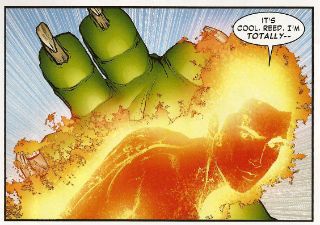
All this and Earth, too? Hibbs starts on 5/2

Everybody loves comics!

ACTION COMICS #9: This is a lot more like what I was hoping for from Grant Morrison on a regular ongoing Superman comic -- focusing on President Superman from Earth-23. last seen in FINAL CRISIS -- but I was a bit surprised to not find the "real" Superman anywhere in the story. Still, Silver Age-y without feeling dated, and lots of fun things happen. Gene Ha's art was as awesome as always. I thought this was VERY GOOD. AVENGERS VS X-MEN #3 (OF 12) AVX: Brubaker's got the writing spot this week, so maybe that's why I felt this issue had a bunch more plot? I can't even imagine how this is going to read in trade, with it's crazy tonal shifts every issue? I thought this one was strongly OK.


DIAL H #1: China Mieville's comic debut, and it's pretty decent. There are a few mechanical problems with the set up (most namely: how do you dial four digits 0n a *rotary dial* phone by accident when trying to call for help in the middle of witnessing a horrible beating?), and I have to admit that I'm not sure that I at all like the notion that the H-dial is in a static location, but putting that aside, I very much liked this issue. (On the other hand, I always liked the Robbie Reed version as well) (Sockamagee!)

I liked the schlubbiness of the protagonist, I very much liked the dialed up heroes (Captain Lachrymose needs an ongoing series, stat!), and I just liked the general weird vibe on display here -- this comic could be perfectly at home at pre-Vertigo Vertigo, and whatcha know, it's Karen Berger editing her first superhero comic in 20-something years.

The art by Mateus Santolouco sort of veers back and forth between some Ted McKeever-looking wonderfulness to "Ugh, you need more fundamentals", but it certainly works with the book just fine. Overall: VERY GOOD


EARTH 2 #1: Having read this, I really really can't even begin to understand all of the faffing about in the pre-print interviews of "well, we really can't describe this to you", because, unless there's a dramatic change from what's on display in this first issue (which would then, arguably be a not-so-good FIRST issue), this seems easy to shorthand: it's the formation of a NEW e2-based Justice Society (though maybe they'll never be called that, who knows), where the set-up is in contemporary times, rather than ww2.

I'm a pretty big ("real") JSA fan, and I didn't really like any of the new costumes we've seen so far, so I was suspicious of this at first, but yeah, I very much liked the setup and world building, and slow roll-out of characters.

James Robinson's script was solid -- I felt a real emotional tingle in that scene between Bruce & Helena -- and Nicola Scott's art is as strong as always. I don't know if I will like the new JSA, really (there's really only 7-8 pages of those characters, the rest of the oversized space is dedicated to setting up the world), but as a "Yes, I would like to see more, please" first issue, I thought this was VERY GOOD.


EPIC KILL #1:  If you want to see teenage hotties do acrobatics like River Tam in Firefly, with lots of slaughter, then this is surely the comic for you. Largely reading like a pitch for a movie, it at least has fairly pretty art by Raffaele Ienco that kind of reminds me of John Ridgeway, I think -- detailed, but with straight lines not noodly curvy ones, yet just ever so slightly stiff because of that. Anyway, since the base idea feels so "Seen that a dozen times", the joy of this kind of work is all in the *execution* of the idea, and there's just enough "hey, cool" scenes to have me say that this is GOOD.


GI COMBAT #1: Half the book is about soldiers fighting dinosaurs, so there's that, and as a plus the art is by Ariel Olivetti, and it really fits here; the other half is yet another new take on "Unknown Soldier", who is getting close to becoming DC's equivalent in the if-we-keep-relaunching-him-someone-will-like-it-eventually-right? sweepstakes to Moon Knight. I think they need to try again, as I was really entirely uninterested in this version, sorry. I think this may be a concept that just can't work in the 21st century, maybe because of the "unknown" part, and that doesn't work in our database-driven world (esp with regards to soldiers, I'd have to say). Anyway, like the first half, disliked the second, which means I can't say better then EH.


MIND THE GAP #1 :Another book that reads a little more like a pitch then a comic, but I thought this pitch was fairly terrific. The set-up is for a whodunnit kind of mystery, with the victim's spirit interacting on the, dunno, astral plane, maybe is what to call it, with what looks like a little touch of Deadman-meets-Quantum Leap, maybe?  Jim McCann's script is very strong, and the characters vivid, while the art by Rodin Esquejo and Sonia Oback is realistic, without being creepy and off-putting, like some in that style become. As a bonus, this first issue is oversized @ 48 pages, and just a mere $2.99, making it a helluva deal. No doubt this was a VERY GOOD comic!


STAR TREK ONGOING #8: Given that the premise of the first six issues of this series was adapting/converting classic Trek episodes with the movie characters, you might have missed that they followed that with a two-parter (starting in issue #7), that followed up on the film, with the Romulans and the last drop of "Red Matter" -- I know I sure did until I grabbed this issue to read, and went, "Wait... that's not TOS!" (from the "next issue" pic, it looks like they're going back to that and "The Return of the Archons"). I don't know that I exactly care about the tattooed Romulan faction, or Red Matter, but it was nice to see something wholly new set in this universe (and, in theory, "official"). I thought it was highly OK, and if you miss the TOS characters, recast or not, this was a fun little follow-up.


SUPREME #64: Wow. this should be taught as a masterclass in how to utter destroy a previous set-up in 22 pages, and replace it with the exact opposite. I really loved the clever way that Moore set up his "all versions are true" love letter to Superman, and it's own set up gave all of the ability to complete rewrite the rules as new creators came onboard, but instead Erik Larsen rips it all to shreds and chucks it out the window for the ugliest possible of all iterations of Supreme. That takes mad skills, yo. The craziest part to me is actually the letter's page to the issue (which I suspect won't be in a digital version, sorry) where Larsen defends his actions by comparing this to following Todd on Spider-Man, or whoever followed Miller & Mazuchelli after "Born Again" in Daredevil. the difference, of course, being that there's a 15-or-so year gap here between issues, and while the argument is at least understandable when related to regular ongoing production of corporately owned icons (the trains, in fact, have to keep running), it's utterly bizarre in this case, especially after they went out of their way to try and show "respect" to Alan Moore by illustrating his final "lost" script.

Obviously, the difference between, say, WATCHMEN and this situation is that the creator of the property is the owner and can do whatever they want on work-for-hire material, but there's a dissonance here that my brain is ringing from.

Erik is a talented creator, and this work has a lot of energy, but I really liked the Moore version of Supreme (and pretty much hated the grim'n'gritty take that preceded it), so I thought this comic was pretty AWFUL


WORLDS FINEST #1: I have to say that if I were DC marketing, I wouldn't have scheduled the two Earth-2 related comics in the same week, but I just sell the things, what do I know? But, I also have to say that I really really liked this one, as well. Paul Levitz turns in the first script in months that I genuinely liked from start to finish, and the twin artist (George Perez in the modern sequences, Kevin Maguire on the flashbacks) really worked much better than I thought it would. Yeah, I really thought this was strong, VERY GOOD stuff.

The one problem? That logo. Jesus, that's a horrible horrible disaster -- it looks cluttered and terrible using the "across the room" test (if you can't pick a logo/design element/whatever from across the room, it fails), and it's not at all clear what the name of the comic IS, with "Huntress" being over "World's Finest". Yow.


X-O MANOWAR (ONGOING) #1: If you read the original in the 90s, you've pretty much read this first issue, as it really alters very little of the original setup, just with a little more depth, maybe. It reads well, it's pretty enough, but I didn't feel like "OMG! I need to read the next one right now!" Maybe I'll check back in a few issues to see if they're doing new stories and not just retelling things I already know. Or, maybe I won't. OK.


Right, that's me -- what did YOU think?


-B

"Our Mission Is To Destroy Crime...ALL Crime!" COMICS! Sometimes Justice Has A Big Dead Face!

Yes, it's Sunday Afternoon Kirby Deification Theatre!More after these messages from our sponsors!

Photobucket

Nah, not really. I know you're all expecting me to link The Avenger, Jack Kirby and Justice and do some frothing rant about how Marvel Comics should just give The King his due so we can all just get on with our lives. But I didn't. I just wrote about an odd little '70s comic The King did on his way out of the door at DC Comics. I don't even go on about The King that much. Okay? I like to keep you guessing!

JUSTICE INC #1 - 4 Art by Al "Mysterious" McWilliams and Jack "KING!!!" Kirby Inks and letters by Mike "Royalty" Royer Words by Denny "No Heel!" O'Neil (Assisted by Paul "I Am Legion!" Levitz) Characters created by Walter Gibson and Lester Dent Issues 1,2 based on the "novels" by Paul Ernst ("Kenneth Robeson" was a pen name covering the work of the above three men.) (DC Comics, 1975, $0.25ea)

Photobucket

The Avenger first appeared in his self-titled magazine in 1939 and by 1942 he was gone. So, it's probably fair to say that "Lester Dent"'s attempt to replicate the success and appeal of Doc Savage failed. It's also probably fair to say that The Avenger's failure was due to the public just not wanting another pulp hero rather than the character being bad or anything. There must be something to him because he keeps popping up in The River of Time like a badly weighted corpse. After all, The Avenger was part of DC Comics' 2009 FIRST WAVE pulp sales disaster and had an (uncollected) 2 part prestige series in 1989 by Helfer/Baker. And in 1974 he butchly brooded on the pages of this series. So, yeah, who is The Avenger and how did his face gets so dead? Glad you asked.

Photobucket

Since this series lasts only four issues there isn't much room to expand on the basics of the character much,  but luckily Editor Allan Asherman provides a comprehensive run down on the character in the back of #1. So, I can just steal all that and look right clever and if Jess Nevins wants to question any of it he can just go get all up in Allan Asherman's face instead. Anyway, Dick Benson is a family man, ah, but he is a family man of the '30s! Hence it is quite believable that he was previously an adventurer and treasure hunter because, apparently, career choices in the '30s were a lot more fun. (What Allan Asherman omits but Wikipedia (hey, I'm not proud!) does not is the fact that Dick Benson also lead "native armies in Java". Which I guess makes him a mercenary. Yeah, they've dropped that by the '70s.) It doesn't really matter what unlikely employment Benson's had all that matters is that he's really wealthy and astonishingly well trained at violence. Because if an average Joe gets has his family killed by sinister criminals he tends to just have a breakdown, never find who did it and end his life living with a woman who really likes cats and is too deaf to hear him weeping in the night. That's not really very pulp though whereas a man who is master of Karate, Kung-Fu and Savate (which is not apparently a male fragrance), possesses a photographic memory, has knowledge of the sciences, and has spent an entire YEAR (Asherman's emphasis) learning to use a gun and a knife is very Pulp. He's also probably someone with very poor hand-eye coordination (a YEAR!!! (my emphasis)). Fortunately his family die and he gets to put all these mad skillz to good use attempting to destroy ALL crime!
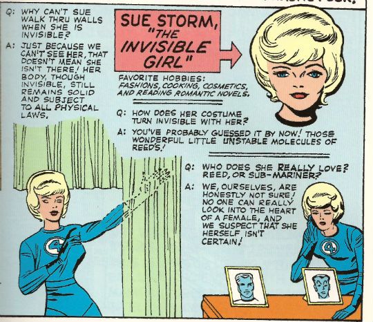
Photobucket

Unfortunately the shock of Benson's family's death results in total facial paralysis and his face, hair and eyes all turning as white as Jesus' conscience. Really quite white, that is. The best bit is that although Benson's facial muscles are paralysed the face itself is infinitely malleable. With a few deft cheek chuches and finger digs he can replicate the features of anyone! Sure, medical professionals may be tutting and shaking their heads at this but I'm sure the rest of us find this scenario only too plausible. Oh, and he's right handy at makeup which he keeps in a "small" make-up kit, which comprises make-up, every colour of contact lens, shoes with lifts of different heights, padded shirts and wigs in every style and colour. That's an interesting use of the word "small" there I'm sure you'll agree. Come on now, if you are expecting the adventures of a man with a malleable face who has trained as a one man army in a fight to destroy all crime to be sensible, well, you've probably misread the signals even worse than tha time that chick just upped and glassed you in the face. It's absurd is what it is. And I like absurd things and these comics are pretty absurd.

Photobucket

As you've probably noticed Al McWilliams draws the first issue not Jack Kirby. I don't know anything about Al McWilliams and for all I know he could be a pseudonym for Al Williamson or something. There were a lot of artists working for more than one company under different names (e.g. cheeky Gil Kane) around this time so it's possible. More likely Al McWilliams just never took to being exploited like an unloved drayhorse as is comics' wont and is a real human being who I've just insulted by positing his imaginary nature. He draws in a heavily realistic and illustrative style which is pretty good. There's not a lot of sense of motion but that's par for the illustrative approach, however, the realism does help the absurdity on display go down smoothly. That's one way to go but it's not the way Jack Kirby chooses.

(In the comments below J. Kevin Carrier points out that "Al McWilliams drew a bunch of comics from the ’40s to the ’80s, mostly for Dell, Gold Key, and Whitman. He also drew the newspaper strip “Twin Earths”." so there you go. Apologies to Al McWilliams and thanks to J. Kevin Carrier!)

He chooses to pump up the preposterousness to such a level that absurdity looks tame indeed. Actually that's not a choice he's made, as by 1974 that was Kirby's style. And it's a great fit for something as lovably daft as this. The book is set in the '30s and Kirby's '30s look like Kirby's '70s or Kirby's '80s rather than the real world '30s. The buildings look like a gifted child's been at the building blocks again, everything is ornately chunky even the people. By 1974 as far as his art was concerned every town was Kirbytown! It's not his best work but it is his work and so it has pleasures and rewards on every page. I guess it wouldn't have been his best work because Kirby's work here is probably among the last pages he worked on at DC Comics before Marvel got to kick him around one more time.

By the end of his time at DC Comics Kirby was just being given up work to make up his agreed page rate as all his own books were cancelled. It must have been quite a shock for him working off someone else's scripts. Sure, he'd worked with Joe Simon but that seems to have been a properly collaborative relationship with both of them mucking in on different aspects as and when. Prior to Kirby's '7os DC work he would have been used to the Marvel Method. Allegedly this could be seen as involving Jack Kirby coming up with ideas and drawings which some other guy would reword the dialogue for with snake oil slickery before claiming complete credit. Some people might say that anyway. So, Kirby was probably befuddled by the fact that Denny O'Neil had provided him with a full script with a structure and dialogue and everything with only the expectation that Kirby draw it.  So he does because he was The King and that's what The King did.

Photobucket

There's a repetitive aspect to O'Neill's scripts that's worth addressing. In every issue several things will always occur. There will always be a scene where the two black characters (Josh and Rosabel) act in a Minstrelly way. The first time you see this your heart just sinks and you immediately imagine that bit of text they have to put in certain reprints now about how "Bits of this comic are a tad racist but look, it was a long time ago, and people didn't hide it as well as they do now. So don't be writing us angry letters about Billy Batson using burnt cork on his face as a disguise, please." It's okay though because immediately afterwards the two characters will have been revealed to have been acting dumb and are in fact "extremely intelligent college graduates." The book is set in the '30s after all so I think O'Neill does as good a job as can be expected of acknowledging and undercutting the racism of the time in a book produced in the '70s and aimed primarily at children.

Photobucket

There will always be a scene where The Avenger shoots someone only to have to explain that he never takes life and the shot has just "grazed" their scalp. This is interesting because although Benson is intimate enough with his weapons to have named them Ike (the knife) and Mike (the gun) all his training has been towards the end of being so proficient in their use that he can use them and not take life. Today a character would train in order to be able to take the most life as possible in any situation. So, yes, Benson may be creepy enough to give his weapons names but he's still better than that sad twat The Punisher. Also, Benson doesn't fight alone he has a bunch of chums who accompany him in the relentless quest to kill ALL Crime! The weird thing is all of them are spectacularly intelligent but talk in a way which belies this intelligence. Except for Smitty who talks daft in the books but doesn't in the comics. That's Algernon Heathcote Smith not regular commentator J_Smitty, because as intelligent as the former is at no point does the comic book Smitty mention donuts. Or Kickstarter.

Photobucket

Now all this repetition, together with the customary every issue regular recap of Benson's origin and skills, isn't the result of O'Neill's lack of writerly skills. No, it's a product of the time.  The emphasis in the '70s was on single issue stories as there was no expectation that readers would be able to find the next issue and so in two separate letter columns Asherman has to defend his book's choices along these lines:

"We wouldn't have minded devoting two issues to the origin either. But we also like to give our reader's their money's worth, and personally, would YOU like to buy a first issue and find "to be continued" at the end of the story?" (from issue3)

Interesting, n'est pas?

Some of the other repetition is a little harder to explain. With the exception of the first issue the three other issues end with the villain falling to his death. Seriously. Look, I faffed about in Photoshop and everything to prove it:

Photobucket

I don't know what that's about! Although it should be noted that it is partially explained in that issue 2 and issue 4 have exactly the same plot with only details and names changed. I guess this is because they knew they had one more issue but that was it so, hey, here's issue 2 again, who wants to go out and hold doors open for ladies!?! It's still a lot of death plunges, I feel.

So, JUSTICE INC then? Not the world's greatest comic coming across as it does as being cancelled before finding its flow and thus making its flaws all the more obvious. But in its favour it does have '70s Jack Kirby art which, for me, is the best kind of art. And maybe even more than that JUSTICE INC has plots like the one in #4 which involve the villain releasing seagulls loaded with explosives from his zeppelin and guiding the fatal flock by radio at his own airplanes in order to collect on the insurance. I mean, what could go wrong? Any comic drawn by Jack Kirby with a plot that absurd could never be less than GOOD! Me, I'm neither fierce nor noble but, like The Avenger, I am gone!

Jack kIrby A.K.A. King Kirby

Hope you had a nice weekend and read some COMICS!!!

And, lo, there shall come a sell-out! Hibbsing 4/25
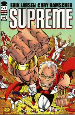
I have reviews, yes, under the jump.

ARCHIE #632: In the "just because I can sell you one digitally" category, let's start off with this one. This is the third in the "Archie Gets Married" comics -- this time it's to... Valerie of Josie & The Pussycats? Uhm, OK? I must be horrible backwards on my Archie-ana lore, but I didn't even have the slightest idea that they'd ever even dated before? Did they? Oh, huh, wikipedia says that they first dated in ARCHIE #608 (2010) ("making her Archie's first black girlfriend; previously, Archie Comics has been very hesitant to depict interracial romantic relationships.") which sounds about par for the course for the modern Archie.

The thing of it is, in 2012 (or even 2010), the idea of a mixed race couple isn't much of a big deal... well, at least here it isn't; I'd say at least 20% of the families at Ben's school are mixed in one fashion or another... and if you opened that up to religions as well, it might be as much as half -- so it is really hard to find a dramatic hook in this; though that's clearly why Archie tried this as another "stunt" book.

What I found somewhat interesting here is that Archie's path in all of these "memory lane" stories is largely dictated by Archie's choices before he proposes -- for example in the "....marries Veronica" story, he's working for Mr. Lodge, while here he's a full-time musician with "The Archies" band. Implying that his choice of romance is dictated by his job.

I also find it a little weird that there's a little subplot about the paparazzi are very interested in this marriage, but most of it focuses on the Pussycats side. Why is that weird? Well, I don't know, it's kind of because Valerie is the "...& the Pussycats" portion, and the real world would seem to suggest that only the "front man" is considered famous -- what portion of the world could name a single member of "....& the New Bohemians" or "...& the Blackhearts"? Unless, in earth-Archie, the Pussycats are on par with the E. Street Band?  Yet, conversely, Mr. Andrews band is *called* "The Archies" (which is actually weird, when you think about it, it's almost like, say, The Talking Heads being called "The Davids"), but it really doesn't read in the comic that he's the "star" of the band. Weird.

There's also this really weird 3 panel interlude where some chick with a white streak in her hair schemes to take Val's place in the Pussycats, but I have absolutely no clue whatsoever who she is supposed to be, since she's not named, and I don't have a degree in Pussycat-ology.

So, yah, cute, if house-style art, sloppy writing (both by Dan Parent), and low-stakes drama... yeah, it's an Archie comic, and it's certainly no worse than many I've read, and better than a few (like the Kiss crossover) -- it's perfectly competent and OK.

AVX VS #1: I'll say that the "this has no plot!" introduction page removed much of the weight that might follow here, and, yup, just punching. I pretty much disagree with the results of BOTH of the fights, as shown, especially since they were both X-Men losers, AND they were "worthy antagonists for an entire team of characters" characters, but it was still fun enough for the brainlessness of the work (I also liked the running "fun fact"s), but CHRIST ON A BIKE, $4? Are you nuts? Damn, that's just crazy brutal, takes it down at least two grades, relative to the depth of the content, and means all I can say is EH.

Also? I think it's kind of insane that the Parent book, titled "Avengers Vs. X-Men" looks like it's called "AvX" on the rack, while this one, which IS called "AvX" looks like it's actual title is "Avengers Vs X-Men" -- I don't think we can quite call that "bait and switch", but it's some dumb planning, if you ask me.

BATTLE SCARS #6: Seriously?

I mean, it's stupid enough that they're trying to align Marvel comics continuity with movie continuity (seriously, anytime the answer to "wait, who is that?" has to be answered with a paragraph long description, you've just fucked up your continuity), but to have a nearly last page reveal that "Marcus Johnson's" name WAS ALWAYS "Nick Fury", so that's what everyone is calling him now, is just kind of insanely dumb. There's also nothing in the text of the comic that would suggest that this kid is even vaguely competent enough to be made head of S.H.I.E.L.D., and, in fact, since his pal "Cheese"... er, I mean "Agent Coulson" (Gr!) bugged him in order to have the Avengers rescue his ass, I'd say the text suggest quite the contrary. At the least, the OLD Nick shoulda died... but he's still bouncing around in the background, so it's probably just a year or three before this gets reversed.

This might not suck if people actually cared, or bought it, but I've sold ZERO rack copies of #4 & 5 of this series, and #6 survived Wednesday without anyone showing any interest whatsoever. What if you threw an origin and nobody came?

Really the only positive thing I can say is that, as a $2.99 book, which Marvel has made self-cover, and removed 4 pages of ads, there's a significantly better reading experience by not having those ads. On the negative side, with the reduced cover stock and the one less signature, these $2.99 books have AWFUL "hand" -- they feel flimsy and cheap and terrible. I'd strongly recommend they pump the cover stock back up to compensate.

This was a badly told comic, for an unreasonable and unwanted goal, and that really makes it AWFUL.

MOON KNIGHT #12: I didn't write them up, but I really liked the twists of the last two issues, and of how Moonie's mental illness was being expressed, and I thought the book was finally actually going somewhere, but this issue just has the Avengers come in all Ex Machin-y, and makes the whole thing kind of pointless. Can Marvel now admit that Moon Knight can't carry a solo book? Even with Bendis and Maleev? Sadly, this last issue was very EH.

POPEYE #1: Another we'll-sell-it-to-you digitally book, and this one at least, I can thoroughly and unreservedly recommend. No, it isn't E.C. Segar, but it's done with so much respect for that original work, that it wouldn't feel out of place with Thimble Theatre. Roger Landgridge's script has the voices Just So, and the art by Bruce Ozella is astonishing -- absolutely in line with Segar, but it doesn't feel "old fashioned" or slavish for that. You couldn't really ask for a better first issue, though I was surprised to not see a single can of spinach on display. I thought it was VERY GOOD.

RICH JOHNSTONS CAPTAIN AMERICAN IDOL #1 RICH JOHNSTONS SCIENTHORLOGY #1: I think I can review this as a pair?  Honestly, if Rich's name wasn't on these, I wouldn't have ordered a single copy; and even with is name on it, it's really only down to the audience that reads Bleeding Cool. These kind of look hacked out to my eye, or cashed-in, your choice, and while each has an amusing moment or two in them (Thor punching someone in a Guy Fawkes mask, saying "thou art Anonymous!" is the height of the wit here), the best thing they have going for them is David Hasslehoff cast as Curtis Joh... er, I mean, Nick Fury. If you're looking for CRACKED-level parody, without the Severin art, as you build up to Avengers, then this might be the comics for you! Me, I thought they were both EH (with Thor being marginally better, mostly due to Michael Netzer's art)

Yeah, so that's me; as always, what did YOU think?

-B

"Wal, Ah'll Be Danged." Comics! Sometimes Creators Are Hurting!

I don’t know if you’ve heard but comic book artist Tony DeZuniga is in a really bad way. The details are here. Photobucket

So, I thought I'd jaw a little about some of his work.

And then Brian "Call Me Mr." Hibbs dropped his MASSIVE ANNOUNCEMENT that I've just stepped over with my big cow patty boots. Er, sorry, but time seemed an issue here, so REMEMBER below this post Brian "Future Town" Hibbs has a MASSIVE ANNOUNCEMENT. Below the break I just have some words.

Photobucket

Now, I don’t know about you but I’m pretty tired of reading about all these guys’n’gals who created the magical characters that made my childhood almost pleasant only when their foetally curled carcasses are chipped off the bottom of a skip every winter. (Perhaps even a skip in an alley outside a cinema showing the latest billion dollar grossing motion picture extravaganza featuring their creations. In the foyer – soda pop with ice made from Jack Kirby’s ghostly tears! Or Don Heck’s! Or…etc) So, here’s this guy, Tony DeZuniga, having a bad time medically and financially and, I don’t know, I’m not asking you to give anything except maybe a little attention; a little consideration to his work maybe. It won’t help him any but it might count for something.

Photobucket

Mr. DeZuniga was born in the Philippines and got his start in American comics working at DC around 1969/70. In 1973 he created Black Orchid with Sheldon Mayer. So I imagine the BLACK ORCHID DELUXE EDITION by Gaiman/McKean which has been released this week, according to "Pappy" Hibbs' Shipping List, will see DC Comics sending Mr. DeZuniga some money at this most unfortunate time. I’ve never read any of the original Black Orchid but I have read a lot of comics featuring the character Mr. DeZuniga created with the writer John Albano in 1971 - Jonah Woodson Hex. Yeah, me and Mr DeZuniga go way back. Not personally, I’ve never met the man, but in a comic book way. When I was a kid, man, I used to love me some of that DeZuniga Jonah Hex. And, hey now, since Jonah Hex was created by Tony DeZuniga and John Albano what could be more appropriate than to look at some of his work there.

(Okay, I also really liked Mr. DeZuniga’s work on Roy Thomas and Ernie Colon’s creation ARAK but I don’t have any ARAK since the Great Purging my parents conducted while I was off failing to be educated. So that would have been a pretty short post. (Hey, I heard that!))

Photobucket

I guess somewhere along the way I became a 'fanboy' for the character. Yeah, I've got a whole heap of mouldering paper with his image on and I'm always ready to read another issue of Jonah messing up, likkering up, riding about a bit, riding a whore a bit and just generally making everyone around him's life just that bit more unpleasant even if he  does save their lives. Which he doesn't always do. But having said that I think this 'fanboyishness' is due to the fact that the character has had strong creative teams behind him for the most part. Sure I like the character but I think I like the character due to the many talented people behind his comics. Because, while I do love me some comic characters, I never forget that the folk what made 'em up are just that wee bit more important. What with them being real live human beings and all. Creators like Tony DeZuniga, who is currently demonstrating just how human he is and without whom I would not have had the pleasure of making the acquaintance of Jonah Hex.

Photobucket

So, Jonah Hex then. Now the character design for Jonah is pretty striking, yes? There aren't a lot of ways to make a cowboy as visually striking as the comic book medium likes. It’s easy to slip over into camp given the sexual connotations of the breed in the popular imagination. John Voight wasn't in Midnight Accountant was he? No. DeZuniga (and Albano) give Jonah a striking presence on the page with his blue trousers and Confederate grey tunic before you even get to his famous face. And wearing that tunic in post Civil War times pretty much encapsulates the self hating suicidal swagger of the surly sonovagun right there. Clever stuff and then we get to the face. Striking is surely the word there for the flesh fondue frozen mid slide. It’s pretty simple but that’s why it’s so smart. There’s not a lot to get wrong. That's important in mainstream genre comics where other hands will be at the character more than likely. There are teething troubles as Mr. DeZuniga does initially demonstrate some indecision as to Jonah’s hat, soon ditching the practically ostentatious stripey hat band after a couple of issues and there he is pretty much as he remains to this day: Jonah Hex.

Photobucket

Even though the art reproduced here is from books created in the ‘7os I hope I've succeeded in making it evident that the page by page art is also rewarding and possessed of a surprising sophistication. Mr. DeZuniga’s early training in commercial art and work in advertising is evident in all kinds of pleasing ways. Admittedly this does mean his ladies seem a little too modern for the setting but otherwise all I can see are gains. Look on the bright side, his ladies certainly seem worth the courting. Here, let’s you and me look at the attention paid in this scene to the environment; the fixtures and fittings and particularly the wallpaper:

Photobucket

While the actions of the people are hardly thrilling the busy pattern keeps the eye occupied and alert as the mind digests the heavy load in the word balloons. Then at the end there’s a DeZuniga scene setting special. It’s a little overloaded with objects and a tad intrusive in the angling but this was still only 1973. He’d get smoother and subtler (but not that subtle; there’ll always be a broken wheel, a cattle skull or a twisted stump not far off.).  When he was professionally active Mr. DeZuniga worked on plenty of books besides Jonah Hex; Romance, Mystery, Barbarian and, yes, super-heroes.  The guy's work had range but it also had depth.

Photobucket

I haven't read every comic Tony DeZuniga ever drew but of the many I have read I can fairly say he always entertained. Even better there was always at least one part of the book where DeZuniga was clearly loving it. He'd crack out the Zip-a-tone or depict an action sequence in time-slices or exaggerate the physicality of violence to dull it with comedy or have Charles Bronson turn up as an Ind..Native American or... You get the drift, for someone working at the unforgiving pace of mainstream genre comics DeZuniga's work always excelled at melding his disparate influences and approaches into an attractive and  experimental package. Tony DeZuniga did good comics is what I'm saying. And in 2006 Tony DeZuniga returned to JONAH HEX and proved he still did good comics:

Photobucket

Tony DeZuniga may not be one of The Greats but he was still pretty great. Force my hand and I'll say Tony Dezuniga was VERY GOOD! because Tony DeZuniga is one of the reasons I never grew out of loving COMICS!!!
All images reproduced from WEIRD WESTERN TALES #16,18 and 20 (1973) and JONAH HEX #5 (2006) published by DC COMICS.

Hibbs catches up, sort of -- 4/18's books

Happy 4/20! OK, getting much closer to being "on time", right there under the jump!

AVENGERS VS X-MEN #2: A jarring tonal shift comes this issue as Jason Aaron handles the scripting. It's sort of on par with the change of George Perez to Ron Lim on Infinity Gauntlet, because the voices couldn't be more different. I *liked* what Aaron's got on the page here, but man that's three issues in a row now with no consistency whatsoever between them, and the round robin of writers continues through the series (and art changes with #5, as well) I'm finding this jarring.

I'm also not following a specific plot point, and that's how is Phoenix "coming" in outer space, but also already possessing Hope?

Again, this book isn't for me, really, but I thought this issue was at least OK

BATMAN #8: This here is the first $3.99 issue, and I was a little concerned it would cause a jump off, but people seem to be enjoying the Owls storyline enough to keep supporting it. Again, we'll see what happens when the first Bat-line crossover happens next month -- it seems to me that most of the tie-ins are going to read very similarly, though: owls attack, fight owls. This arc has had a bunch of bizarre "power fluctuation", though -- you'll remember how it opened with Bats kicking the ass of dozens of traditional bat villains, at once. THEN, a single Owl curbstomped Bats about as hard as he's ever been hit. And NOW, Bruce is fighting off dozens of Owls at once, showing again how butch he is. I'd finding this awkward, at best.

The backup story was largely the epitome of "unneeded back up", as it just showed and elongated a moment that we'd seen just minutes before. Boo!

I'm liking the book, overall, but there's something a little off about this whole thing that I'm not figuring out yet. I still thought it was a very low GOOD.

PROPHET #24: Ugh, now THIS is comics! Man, I don't even know what this bit has to do with anything in the first three issues (same character, wholly different scenario), but I also don't care, because it's such fun science fiction, AND we get some wonderful artwork from Farel Dalrymple. I think I've said this before, but this reminds me of nothing less than HEAVY METAL from the 1970s, amazingly inventive and lavishly illustrated science fiction that may or may not make a ton of sense, but who cares because the passion just drips off it. I think this is truly EXCELLENT work.

RESET #1: Peter Bagge returns with something new, and while his cartooning is as good as ever, I had two kind of overwhelming problems with this. First is that the setup is just too thin -- we understand the protagonist is someone who is at least somewhat famous, who did some unspecified awful thing, but there are no details about any of that given here, and so it makes relating to the underlying science fiction premise (that there's a machine that can allow you to relive your life, and make different decisions, but it has to always start from one specific point) just too difficult. We neither know where the protagonist came from, nor where he is trying to go, so taking any kind of suspense or anticipation is rendered virtually impossible.

My second problem is that I think that Bagge has grown into an increasingly "safe" cartoonist as the years have gone by -- not from his underlying style, but from the range and direction of his work. There's nothing "edgy" about his work any longer, it feels predictable and almost staid. Safe.

This work is OK, at best.

SHADOW #1: I was a little surprised how much I liked this. Well, maybe not, because it's Garth -- but there's almost no Ennis-isms here (other than whatever is naturally baked into the character and supporting cast), just a great straight-forward, historically-appropriate period-piece version of the best of the character. If I had one "problem" its that Dynamite really could do itself a favor and instead of spending the coin to get four different unique comics stylists doing covers, they should spend at least that much attention on the interior art. Aaron Campbell is in no way a poor artist, but it's hard to not suffer in comparison to Alex Ross, Chaykin, Jae Lee and John Cassaday. Despite that, I thought this was swell comics, indeed, and thought it was VERY GOOD.

SUPERGIRL #8: I'm only pointing this out because George Perez is suddenly drawing a pair of issues of this book, and I thought this was a very solid little comic that your eye might have wandered away from. Here's a place to wander back for an issue or two -- I thought this was GOOD.

WONDER WOMAN #8: I've said before, ad infinitum, I so don't care for mythological supporting casts, and, so, overall while I've been liking this arc OK, it's really not for me. I still largely feel that way about this issue, but I'd be a big ol' meanie if I didn't observe just how much I liked Cliff Chiang's "redesign" of Hades and the afterlife -- that's some genuinely creepy and affecting stuff. GOOD.

That's it for me for today, as always: what did YOU think?

-B

The train keeps rolling: Hibbs' 4/11

Christ the truck with the NEXT batch of comics will be here in just an hour or two, I best get started writing....

AMERICA'S GOT POWERS #1: It's RISING STARS meets THE HUNGER GAMES!

Though, actually, like the latter example, I had some real problems with the set-up as presented: COULD a society evolve the way they posited?

Here's a factoid for you: there are more dog owners in San Francisco, then families with school age children -- and SF proper doesn't have a high birth rate (I think it is one of the lower in California), with what looks like just about 8k kids born annually in SF county. Since the book posits every child in any state of in utero in SF being born "instantly" and overnight, and with superpowers, we might assume this being 9/12ths of that annual number, or something along the lines of SIX THOUSAND super powered children, all the same age.

So, how do you convince parents and/or the kids to do this for what feels like a few years in the story? Since they were 13 maybe? I don't think it spells it out exactly? Certainly long enough to build a giant stadium that appears to connect to Alcatraz island (!) -- though, really how they do that and not devastate shipping into Oakland, I'm not entirely sure...

I don't know, I think if I'm 13 years old, I'm not so inclined to use my awesome superpowers to fight my peers, actually -- I think we (since what 13 year old doesn't think they know better) use it to set ourselves up for something better. Sure, SOME kids go along with it... but anywhere near the majority?

And even those? When they start using robots with live fire against us?

Jonathan Ross' writing is crisp, and Bryan Hitch's art is as nice as ever, but it would seem to need to be some other check or balance going on here to have even the slightest chance of this working as posited. Ultimately, that breaks my Suspension of Disbelief, and made me think this was merely OK.


SAGA #2:  Well, I liked the second issue here even better than the first one, so that's a good sign. I really liked Alana's willingness to sacrifice her child, rather than giving it over to the freaky topless spider-chick. Yeah, this is VERY GOOD comics, I think.


SECRET SERVICE #1:  Mark Millar is hardly subtle, but I thought the neat class juxtapositions here, coupled with the thinking about government austerity programs and the "super spy" was actually a fairly trenchant piece of social commentary. Doesn't hurt to have Dave Gibbons drawing it, either. VERY GOOD.


Ugh. three books? That's all I have time for, and two of them are only semi-reviews? Sorry... but I need to check in this Baker & Taylor box before the truck arrives with the new Diamond books... more on (I hope) Thursday, getting me more recent...

What did YOU think?

-B

"Choke! Gasp!" Not A Podcast! Not Comics! Nothing To See Here. Move Along Now, Please.

If I recall correctly then this Tuesday the lovable light entertainers Mr. Jeff Lester and Mr. Graeme McMillan will not be with us this evening. Now I know you've all travelled a long way tonight and so, in an effort to avoid rioting, their part tonight will be played by me. Photobucket

Mr. Jeff Lester And Graeme McMillan In Happier Times.

Not available on iTunes! Uninteresting and self-indulgent free content available only at The Savage Critics!

THE COMPLETE POEMS OF PHILIP LARKIN By Philip Larkin Edited by Professor Archie Burnett 768 pages, Faber and Faber, £40.00 (2012)

Photobucket

As the delightfully demure Mr. Brian Hibbs has pointed out in his past comments comics and poetry share many qualities. He was speaking from a primarily retail perspective because, and I don’t know if he’s ever told anyone this but, that’s what he DOES! I’m no retailer, just a reader but from a reader’s perspective I can tell you that poetry and comics are also like comics. In fact I will tell you.

For starters this particular volume illustrates that poetry, like comics, is always being repackaged and resold. Only last year I bought a Larkin collection and here I am buying another. And the one I bought last time wasn't the first one I’d bought either. Hopefully this will be the last time as, unless the title is a big fat lie, this is a complete collection of verse from the most gifted librarian to be employed by The University of Hull. It should be the last time because the dour genius’ papers have been gone over by academics so thoroughly you’d think they were looking for clues to Lord Lucan’s whereabouts. It should definitely be the last time since Larkin died in 1985 and his output has slackened off somewhat since then.

A fair indication of the completeness of the contents is given by the contents page which lists: The (previously collected)Poems, Other Poems Published In The Poet’s Lifetime, Poem’s Not Published In The Poet’s Lifetime and Updated or Approximately Dated Poems. Unless we’re going to start employing mediums to bring back Poems The Poet Thought About Doing But Didn't then, yes, this should be as complete as it gets. It’s probably going to be as comprehensive as it gets as well since the poems end on p.329 and the rest of the book is composed of Commentary and Appendices where Professor Archie Burnett gets to strut his funky stuff.

Now to fit all that nutritious Knowledge in there and not have the book become even bigger and even pricier one interesting change has been made to the poems. Throughout the book the poems follow directly on from each other. Directly. Now, again like comics, it is quite important how the poem looks on the page. It’s not as important as the content of the poem of course but still the cluttered effect of these pages is a bit unfortunate if necessary. Yes, all across the globe poetry fans will be reading this book and then clustering together to politely but insistently engage in what is basically exactly the same process as comics fans getting aerated over the colouring changes in the new FLEX MENTALLO collection.

So, while the poems are as accessible in their wonderfully disheartening and exhilarating glory as ever the rest of the book is a bit elbow patches and chalk dust. This is just a pissy way of me intimating that I haven’t actually finished the book while at the same time needlessly denigrating the sterling work of Professor Archie Burnett for the sake of a cheap laugh. Sometimes my lack of class appals even me.

It’s The Complete Poems of Philip Larkin so how could it be less than EXCELLENT!

THE BALLAD OF BALLARD AND SANDRINE By Peter Straub 92 pages, Subterranean Press, £15.00 (2012)

Photobucket

From what I can gather for the last few years Straub has been troubled by ill-health and that certainly explains the variable quality in his recent novels and a seeming shift towards the shorter forms of fiction. Which is what this is an example of and that’s just fine because the short form seems to suit Straub best at this stage of the game. Throughout his long career Straub’s early poetic ambitions have informed his fiction via a truly remarkable talent for using the most seemingly innocuous of language to achieve the most devastating of effects. Reading this one was like chatting to a well-groomed scholarly looking type only for him to lean in at the last and whisper something you only barely comprehend but the foulness of which is so evident that it sticks to your brain like shit to a straw mat. Since I’m a bit of an odd bod that made this VERY GOOD!

TARZAN: THE LOST ADVENTURE By Edgar Rice Burroughs and Joe R. Lansdale Illustrations by Studley O. Burroughs, Gary Gianni, Michael Kaluta, Monty Sheldon, Charles Vess and Thomas Yeates Preface by George T. McWhorter 211 pages, Dark Horse Books, £14.99, (1995)

Photobucket

I don’t know about you (I really don’t, sometimes it’s like I don’t even know you) but if I picked up a book in which Joe R. Lansdale completed an unfinished Tarzan fragment left behind by Edgar Rice Burroughs when he died I’d expect one of those prefaces. You know the ones? The ones that are pretty much composed of oleaginous bullshit and make you angry at the waste of your time and the lack of respect shown for the reader’s intelligence. This preface isn't like that. Oh, it wants to be and it tries so hard to be but, seriously, George T. McWhorter is the curator of the Burroughs Memorial Collection and although he tries to hide it it’s clear he clearly don’t cotton none too much to this Joe R Lansdale fella. It’s pretty funny. I mean Mr. McWhorter is trying to be a real sport but, damn, he just can’t hide it. Look at this,

Mr. Lansdale…met the challenge head on and conquered…the prose reads fluently and the story now has a beginning, a middle, and an end that hold’s the readers attention.”

The switch from “conquered” to a list of quite mundane accomplishments is pretty revealing isn't it? Possibly more so than the bit where he chunters on about Lansdale’s incorrect usage of “pole vault”. Look, he might not have been entirely pleased by the enterprise but Mr. McWhorter’s honesty pleased me. Alas, Mr. McWhorter is clearly no comic fan as he describes luminaries such as Kaluta, Gianni and Yeates who provide illustrations as "competent artists".They are far more than that and the spot illos. and chapter headings they provide are, as ever with these men, things of joy.

Photobucket

As for the story, well, I’m not really up on my Burroughs but I am up on my Lansdale and I can safely say that any Lansdale fan will be pleased as punch with the results. It’s got all the deadpan humour, savage violence and bizarre creatures one could want from the master of modern pulp. I particularly enjoyed the part where Tarzan senses danger and spins round to snatch an arrow out of the air and, without halting his momentum a jot, spins to release it and sends it straight back. It’s a totally implausible moment lent total plausibility by Lansdale’s earthy approach. On the whole though I’d guess Burroughs’ Tarzan wasn't this sarcastic and less people in the original books commented on the fact that he walked about in just his ‘pants’. But it is Tarzan in the jungle doing his jungly thing so I guess, on balance, fans would be pleased, if not entirely satisfied, by the final outing for the vine swinging one. A bit like George T. McWhorter in fact. Me, I like The Lansdale, I like the artists and I like The Pulp so I thought it was GOOD!

Because this is a comics blog I thought what could be more natural than to talk about three Sean Connery films made before most of your parents were even born. This is what you want!

ZARDOZ (1974) Directed by John Boorman Written by John Boorman Starring Sean Connery, Charlotte Rampling, Sara Kestleman and John Alderton

Photobucket

"The Penis is evil!" (Zardoz speaks Truth in the motion picture presentation ZARDOZ.)

The best way to watch ZARDOZ is just to watch ZARDOZ. If at all possible you should have a friend or loved one purchase the film and load it into your player without you even seeing the box. Going in cold will really pay off for the first-time viewer. Messrs Lester and McMillan have already sung this film’s praises on podcasts past so you know it is worth a look. Well, they may not have sung its praises exactly but they pretty much described it as what would happen if Jack Kirby’s NEW GODS was produced by a traumatised adolescent. Actually the best way to watch ZARDOZ is when you are fourteen and your Mum and Dad are asleep and it’s just you, the TV, a box of tissues and a hunting knife. Some people think ZARDOZ is EXCELLENT! Some people think ZARDOZ is CRAP! In the end though it can only be that which it is and it is ZARDOZ!

THE OFFENCE (1972) Directed by Sidney Lumet Screenplay by John Hopkins based on his stage play This Story of Yours Starring Sean Connery, Trevor Howard, Vivien Merchant and Ian Bannen

Photobucket

In 1965 Lumet, Connery, Bannen and Howard delivered the powerfully unsettling film THE HILL. Set in a British army prison in WW2 it’s a B/W masterpiece that drags you in and on to an ending you’ll want, like the camera itself, to look away from. You might want to watch that before this one because as harsh as that one is this one bites. THE OFFENCE is set in the’7os of my frolicsome youth and Lumet’s quietly innovative film accurately depicts that land of vicious banality, sheepskin coats and hastily scoffed fish suppers troughed in newsprint wilting in perpetual drizzle. Connery plays a copper whose soul is so eroded and his self so stained that in his struggle to function he’s become something he can’t even acknowledge from the corners of his thuggish mind. When a child goes missing and a suspect is found an unbearable man will face truths he cannot bear. And outside the rain persists regardless. It’s probably the performance Connery should be remembered for but won’t be because remembering it is painful. If you ‘enjoyed’ David Peace’s knock-a-bout Red Riding Trilogy books then this film is right up your cobbled and un-lit alley. THE OFFENCE is the kind of film that rightly attracts words like blistering, powerful, unforgettable, upsetting and miserable and because I am a regular laughing boy that makes it EXCELLENT!

Hopefully next week Mr. Jeff Lester will have finished scourging his body with a diet consisting solely of bird seed and motor oil and Mr. Graeme McMillan will have stopped hiding from his Mother-in-Law. Or whatever it is they are doing.

Me, I’m done. Time to read some COMICS!!!

"I Was Never THAT Dark." Comics! Sometimes An Event Is Not An Event!

Holy macaroni, what if all the superfolk got together to face an unimaginable threat and I liked it! What kind of crazy world would we be living in then? The world of TERRA OBSCURA that's where, old chum! Photobucket

Don't turn your back on us, Bob Benton, we need you now more than ever before! Sockamagee, do we ever!

TERRA OBSCURA Vol.1 & Vol.2 Pencils by Yanick Paquette Inks by Karl Story (with Dell, Palmiotti, Friend, Snyder and La Pointe) Plot by Alan Moore & Peter Hogan Script by Peter Hogan Colours by Carrie Strachan Letters by Todd Klein (America’s Best Comics/DC Comics, $14.95 and $14.99)

Photobucket

These two books revisit the denizens of Terra Obscura featured in issues 11 and 12 of the TOM STRONG series created by Alan Moore and Chris Sprouse. That wasn't the first time the heroes of S.M.A.S.H and their plucky pals had appeared. Some of these characters may look familiar to you if you are Alex Ross or one of the other three people who read Dynamite’s 2008 Project Superpowers books. That’s because all of the S.M.A.S.H. characters here are also revivals of characters from the Standard/Bettor/Nedor line of comics which ceased in 1959. There are other, fresh characters involved though because if you take something it's always nice to give something back, eh?

Alan Moore is credited with plots here and we all know that Moore’s not exactly overly concerned with plots in and of themselves so it shouldn't be surprising to learn that the plots are a little light and the endings are a little undercooked. And yet the plot in each of the two volumes nicely distract from the real plot that’s bubbling under them both and which only breaks the surface in time to have its conclusion intertwine with the ending of the second volume’s plot. While it’s hardy intricate to put one thing on top of another it does give the tales more structural integrity. Bricklayers might not take a break from drinking strong tea to admire the intricacy of their latest wall but they can be sure it isn't going to fall down. An architect might draw up a dreamlike structure rivaling the Taj Mahal in space for example but if you ask them to actually build it...well, ambition is a great thing but so is ability. I suppose I’m trying to say that TERRA OBSCURA is an example of ability being more important than ambition; solid execution trumping extravagant intentions. Both working together would be exceptional and indeed in genre comics both together are exceptional in at least two senses of the word.

Photobucket

That’s not really giving the series its due though as it isn't without ambition. Entertainment-wise there’s plenty to enjoy what with the characters, situations and events all being just as delightfully loopy as the series' ‘40s capes’n’fight genre origins suggest. There’s a chatty chimp, time travel, alternate realities, derring do, gung-ho and a ghostly dad dressed like Paul Revere to name but a few delights. Luckily the authors are aware it isn’t 1946 and that boat won’t float unaided anymore, Grandad! We’re all sophisticated now. Most of the self congratulatory sophistication of modern capes comics is, of course, the result of the prior work of Alan Moore (back before everyone decided to hunt and kill him because he stood up for himself) so that’s present to an extent. What is also present is an awareness, and thus a tacit acknowledgment, that the ultimate appeal of these characters is their charming daffiness. Post WATCHMEN/KILLING JOKE Moore’s capes genre work since has been busy trying to revitalise this original appeal and get it up on its feet again while most others are busy attempting to suffocate it with the pillow of mediocrity in an attempt to get their hands on their unearned inheritance. To that end the primary ambition here seems more concerned with finding a happy medium between silly and realistic; an attempt to find a place where the two superficially opposed qualities can happily co-habit.

Photobucket

A lot of time is spent giving the characters some dimensions numbering more than one. These folk have a lot of feelings, do a lot of connecting and talking and all that stuff. In Vol.1 this mainly concerns Ms. Masque eventually embracing both her own sexual orientation and Carol Carter’s body. It’s nicely, even sweetly, done and only a little undercut by the ridiculously pneumatic physiques of those involved. In Vol. 2 the focus shifts to Tom Strange and Pantha finding a way past the deaths of those they loved to find that love again in each other. Again, it’s nicely, even sweetly, done and only a little undercut by the ridiculously pneumatic physiques of those involved. Because Paquette sure likes gifting his lasses with large lungs and no mistake. He likes that almost as much as he likes Jennifer Connelly. So keen is he on giving Pantha said actor’s face that should the charming young lady in question disappear the police might first want to check with her neighbours to see if Mr. Paquette was spotted in the vicinity loading a sofa into a white van while wearing a cast on his arm.

Photobucket

Ah, Alan Moore and sex. I guess I should at least pretend to engage on this one although that never ends well for me.  While I don’t think Moore is accidentally dropping this stuff on the page unawares, revealing his true inner sexpest and should thus be kept in cage on the moon neither would I hope to be mistaken for an apologist who accepts all his faults without question. Although, I probably am. Self awareness is hard work, people. While there is some creepiness evident here it's probably worth noting in the work’s defence that the creepiness largely results from the romantic attentions of the severely repressed villain. It is not as though the creepiness is presented as the correct way to woo a lady or that she deserves it or anything. Unfortunately the villain is quite forceful in his attentions and while it never goes so far as to present actual sexual violence the young lady in question does end up trussed and vulnerable for an uncomfortable length of time. Uncomfortable for both her and the reader.

Photobucket

Since Hogan was working from Moore’s plots it might have been advisable to dial this bit back a touch. Presumably Moore was off being magnificent and random elsewhere and not crouched behind Hogan alternately pulling flags of all Nations from the author’s ear and looking for ways to take undying umbrage should his work be messed about. So, yes, that bit could probably have done with a lighter touch. Having said that…having said all that, ultimately scenes of erotic peril are characteristic of pulp and if you’re paddling in those waters you’re at least going to get your ankles wet. At least it doesn't dive in and splash about like a happy dog. It’s easy to get distracted by that one scene (like I just did) and to forget the other scenes in both volumes of healthy people having healthy relationships. It would be nice if people remembered the scene between Tom and Pantha where they just straight up talk about it (y’know, it) and Tom gets all vulnerable and shy, the big silly lump!

Throughout the whole series Peter Hogan does a really good job of channeling Moore. He’s particularly good at the trademark Moore finishing move of bringing in a strong shot of pathos in at the kill. And, yes, I do actually mean pathos. I looked it up and everything. Hogan and Moore together with Paquette and Klein et al. do a better job of using the comics form than most more ballyhoo-ed capes series. In both volumes there are flashbacks presented in the stilted art and primitively coloured style of the Golden Age originals, people burst through one page onto the next and exposition is sometimes supported by actually interesting visuals. It isn't a concerted effort to innovate or anything it’s just playful stuff but it demonstrates at least some thought went into it. Todd Klein does some neat stuff with his lettering, particularly in his use of distinctive fonts for selected characters while managing to avoid clutter and confusion on the page. But then Todd Klein is as much of an artist as any comic book artist he just does it with letters. Hats off for Todd Klein! I’m not a massive fan of Paquette’s art but he keeps it all clear, clean and attractive throughout. Thanks to the efforts of all parties TERRA OBSCURA is a thoroughly well done thing indeed. A bit of a team effort, if you will.

Photobucket

In case you were wondering how ABC and Dynamite could use the same characters (and how could you not wonder such a thing?!?), well, 28 years following the creation of these properties Capitalism slept in and no one renewed the copyright. People who become sexually aroused at the term “downsizing” may have just experienced reflux as they will recognise that said properties were now sucked out into the vile environs of the public domain. Some people don’t like the fact that things enter the public domain. Some people spend a lot of time, influence and money ensuring the Law is changed to prevent this, allegedly. And by people I mean Corporations, which aren't people (ask one for a piggyback. See?) Did you know that the English Language (The language of Shakespeare! The language of Dan Brown!)is in the public domain? Imagine if things never entered the public domain! We’d all have to communicate through mime and bird-like chirrups unless we paid a premium-rate fee to EngLangCorp™©. Mind you, if Disney et al. have their way we‘ll probably end up doing just that eventually. And if we all carry on like we are we’ll probably be only too glad to do so, Heck, we may even thank them for it. Hey, TERRA OBSCURA even has a bit about just that kind of thing:

Photobucket

Nope, TERRA OBSCURA ain't as dumb as it looks. It is, however, straight up super-heroics done with a measure of maturity and a great deal of style. Unlike the last 12 issue series Moore was involved in which involved re-imaginings of defunct superheroes who found heir greatest enemy in the last place they expected TERRA OBSCURA won’t change the world of comics. It will, however, entertain a reader of comics and that is always GOOD!

And like The Terror’s virginity I’m gone!

Have a good weekend everyone and make it better by spending it with COMICS!!!
Big and Bad: Hibbs 4/4's

I know you'd never know it from my Industry-driven posting (seriously? It's what I DO), but I've actually been sick as a dog the last week, and have barely read any comics at all. But I said "I'm back on the horse", and, barring the two weeks where I couldn't log on TO post here, I am , I am! So, here's 3 (or maybe 4) books, below the cut.

AVENGERS VS X-MEN #1: Rich Johnston was right, I think, when he said this book is review proof. No one is going to buy or not buy this comic based upon anything I (or anyone else) says about it, and, because it's purely an exercise in smashing the action figures together, I doubt anyone is really looking at this for an exceptional example of sequential storytelling, or anything.

Which is terrific, because it kind of sucked.

Sort of even to the point that I'm not even really sure where exactly to begin.

Well, let's start with the talent. I like JR JR, I really do... but I like him on things that are gritty and "street" and dark -- KICK ASS he's suited for, shiny-Avengers-heroes? Not so much. Scott Hanna's inks help a little, but overall, the effect here is of the absolutely wrong artist for the book.

Then you have the "Story" credit going to FIVE different people. Really? Reallly? I mean, I have to assume that something really change-up different is going to happen at some point here, because "The Avengers and the X-Men fight" hardly needs FIVE plotters. Damn, it don't need one -- even my eight year old can plot this. In fact, I asked him to tell me why they might fight, and he said, and I shall quote: "they're superheroes, they just do"

Smart kid.

And, oh, oh, oh, the scripting. I don't know if it's that Bendis is just getting too frayed from working on too many comics, or that I've just "learned" his ear too well from reading too many of them, but his dialogue has descended into self-parody at this point. "What's going on? Never Mind. Don't care. Are we having an Avengers meeting or--?" "Guys -- we got a thing here."  Damn, they all have the same frickin' voice. Even the single normal human being in the entire comic, who has a line after flying through the sky with the rubble of the Chrysler building, then is webbed safely by Spider-Man (wait, what? How?!?! 3/4 of those people should be corpses!) says "Wow. That's It. I'm moving. I'm done."

Gawd.

(Plus, like, destroying the Chrysler building? This is your signifier of "yeah, the stakes are real!"? Ugh)

(See, even *I* am doing the bendis voice! Man!)

I also really like that "scorecard" thing at the top of the issue that has like 20+ Avengers, including a bunch not even cameoing in the issue (War Machine?), while the X-Men side is all of 6 people.

I don't, AT ALL, get Cyclops' motivations here. I could maybe possibly understand him if it was "We don't have enough power, we need more, we can't let the humans have this", but all of that bullshit he was spouting about rebirth and shit? Are you nuts? Scott should hate the Phoenix force more than almost any other human in the universe, given that it destroyed his first love, his child, his school, and now it is going after his grand daughter, who is "the future of the mutant race". Given what happened to Jean, how could he POSSIBLY be ok with Hope getting anywhere near the force?

Also: Where the fuck is Rachel, anyway? Why would the thing WANT Hope in the first place? We've always always seen the Phoenix force go after TELEKINETIC TELEPATHS -- what does it want with a girl whose powerset is *copying* other powers, and who, afaik, is utterly powerless without other mutants around?

Hell, maybe that's what we need five plotters to explain?

So, nope, didn't like it, not a bit... but it's going to make a big pile of money regardless. I thought it was pretty AWFUL.


INFINITE COMICS #1: Free with the digital download of AvX #1 was the first of Marvel's "Infinite Comics", by Mark Waid and Stuart Immonen. I read this as well.

I have to say that I thought it was... adequate. Waid's script is filled with some fun things about moving faster than the speed of light, but there's not a single thing about the PERSON behind the suit (other than his liking hot dogs or whatever it was, but that was so generic, it literally could have been interchangeable between Spider-Man, the Human Torch, Speedball, or fifty other characters).

The art was fairly pretty (duh), but when it came to major, important things like, dunno, SMASHING THROUGH THE CHRYSLER BUILDING, it's staged in such a way you can barely tell what's going on.

As a "What happened between panels 5 & 6 on page 4" (or whatever), it was perfectly adequate... maybe even fairly decent.

But as a technical achievement? Wow wow what a dog!

Maybe, I don't know, but maybe possibly this is because I read it on an iPad 1 -- but this, rather than the "Luther" proof-of-concept where elements fairly seamlessly "floated" into place, here each new element was on a seperate page of it's own that I could LITERALLY *see* being served to me.

What this meant was that.

(tap)

What this meant was that as each page would come up on the screen.

(tap)

What this meant was that as each page would come up on the screen my eye automatically started to read.

(tap)

What this meant was that as each page would come up on the screen my eye automatically started to read from the left again.

(tap)

What this meant was that as each page would come up on the screen my eye automatically started to read from the left again until eventually the.

(LENS FLARE!)

What this meant was that as each page would come up on the screen my eye automatically started to read from the left again until eventually the whole page was finally rendered.

Oh. My. God! COMPLETELY unreadable.

I thought "Well, maybe it's just the first iPad?" so I went to try and read it in-browser on my computer, which Marvel SAYS you can do. I followed the link PROVIDED ON THE "redeem" page. No. That takes you to a page full of press releases about previous free digital downloads. Then I spent at least 20 minutes reading through help pages on Marvel.com, and finally found a different link that the help pages insisted was direct to "all of your free-with-print digital downloads", but THAT page redirected me instead to a four page preview of AVENGING SPIDER-MAN #1 that the only way it would let me escape was if I signed in to Marvel Digital Unlimited... which is not even close to the same thing, so I closed my browser in disgust and said "fuck it".

I probably wouldn't be so disgustipated if it wasn't for the THREE (!!) pages that IC #1 had to serve me to proclaim that this was the "FUTURE OF COMICSSSSSSSSS!!!!!"

Seriously?

If that's the "future" of comics, comics can go fuck themselves. As much as I didn't like the "hey we're showing off by taking control of your reading experience for you!" that "Luther" did, it was a BILLION times worse in the one-page-at-a-time slideshow on the iPad. It made me want to choke to death on someone else's vomit.

The CONTENT of INFINITE COMICS #1? EH. The EXECUTION?: Pure, stinking ASS.


THE BOYS #65:  While there are 3 (4? 5?) more issues left of the series, this is really the big moment everything has been pointing to since that first issue, and there's a clear Ennis-ian Nelson-style "Haw haw!" in here as everything everyone thinks is going on is flipped on it's side before the gory gory gory gory climax of it all. I liked the twist, I thought it was "fair", but this issue really REALLY suffered, I thought by being drawn by two artists, neither of whom is Darick Robertson. Russ Brown and John McCrea are just fine, but neither is the co-creator of the series, and I kept recasting every page if DR had drawn it. The version in my head is better. Still? Solidly GOOD.


SUPREME #63:  It's been like ten years since the last chapter, has it? I guess that explains why I sold less than a third of what I thought I might of this unseen Alan Moore Script? What's weird is that, as a silver age pastiche, it really kind of read as if I had just read the previous issue last month. I miss the hell out of this book. I can't believe this really was to be Moore's LAST script, though, because there's clearly 1 or 2 more issues to go along this whole thought.

I quite liked Erik Larsen's art here, though -- made me think he was channeling Kev O'Neill, especially on those Suprema pages. The blurbs seem to indicate that the next issue is abandoning the silver age stuff and going back to 90s-style Rob Liefeld Supreme, and while they're earned one more issue from me for that, my instincts say I'd rather be forced to read INFINITE COMICS again.

Anyway, does this mean we can hope for a proper reprint book of Moore's runs that isn't scanned at the wrong resolution or whatever the hell the problem was with those Checker editions?


Right, that's it for me this week, see you in a day or two with the next batch of reviews!!
 

As always: what did YOU think?


-B