“I'll TILT-A-WHIRL You…!” Sometimes The Louder You Scream The Faster It Goes!

Just one comic, and not too many words. Oh, happy 4th of July, I guess. This one’s for all of my American buddies. (It’s got nothing whatsoever to do with the 4th of July, if I’m being quite honest.)  photo SOTGRunB_zpskl3qhd3d.jpg SHADOWS ON THE GRAVE: "The Clown" by Corben

Anyway, this...

SHADOWS ON THE GRAVE #4 Art by Richard Corben Written by Richard Corben, Jan Strnad Dark Horse Comics, $3.99 (2017)

 photo SOTGCOvB_zpspxybsfwg.jpg

Shadows on the Grave (SotG) is a monthly B/W anthology comic featuring a spatter of short terror tales and a thoroughly muscular episode of a comedic barbarian serial. It could have just consisted of short stories revolving around the life cycle of  the Scarabaeus sacer and pin-ups of Brian Bendis in a variety of revealing swim suits, as long as Richard Corben was on the job. Because SotG is very much all about Richard Corben. Or his art at least. The thing is, look, the thing about the traditional draw of a comic, the stories, the thing about them in SotG is…well, they often aren’t really stories as such. I mean, they are technically stories, I guess, but they can kind of peter out a bit sometimes. In that sense they are a lot like the old DC “Mystery” books in that all the signifiers of horror are there but the narrative thread comes a poor second. Atmosphere is paramount where shadows drape the grave. Which is okay for me, but maybe not you? I mean, I bought this because it’s Richard Corben doing whatever he wants. And I am all about the Colossi of Comics doing whatever they want. Which is why Carla Speed McNeil’s Finder is an auto-buy wherever it appears; why Walter Simonson’s Ragnarök is the only $4.99 comic I buy without grinding my teeth; why Howard Victor Chaykin’s Divided States of Hysteria is…oops, moving swiftly on…  In essence, in much the same way that a Daily Mail reader comes for the sideboob and stays for the archaic right wing frothing which paints every monied white person over 50 as a besieged minority in their own country, I come to SotG for the stories but I stay for the craft.

 photo SOTGFairB_zpsvgyakmyc.jpg SHADOWS ON THE GRAVE: "The Clown" by Corben

Stories which are, as I say, mostly exercises in style; attempts at inducing an atmosphere of creeping unease. The opener in this particular pamphlet of pulsating dread, “The Clown”, involves a bloke who does a bad thing at the circus and is gotten by a creepy clown doll. There’s no overt connection between his act of murderous larceny and his fate via macabre marionette. It’s just your stringently judgmental mind at work, Gidget. He could as well been singled out for smoking, or  calling the dancing lady a rude word, or just for wearing a roll neck jumper with a jacket. All of which he does, because he’s a proper bad apple. But it’s not really important. What’s really important is seeing how Corben does it. How Corben draws the lady dancer’s boobs floppaloppaling about, managing in just one static panel to suggest  more about the interconnectedness of mass and motion via the slightly down-market device of her go-go mammaries than the entire career of, say, Jim Lee ever has. How Corben draws a circus so tattily alive you can practically smell the cheap pot pourri of fried onions, exhaust fumes and cotton candy, almost hear the sharp cry of a freshly slapped child. How Corben captures the shabby glamour of the travelling fair, in short. All that’s the real pleasure.

 photo SOTGBeefB_zpsb5idfm3h.jpg SHADOWS ON THE GRAVE: “Flex!” by Corben and Strnad

Next up is “Flex!” which has far more structural integrity story-wise. Which it should well have, since Corben calls on his frequent partner in grime, Jan Strnad. Now Jan Strnad’s name may not be up in lights on the Broadway of your mind but he is an extraordinarily capable writer. Which may sound like faint praise but it’s more praise that I’d give most fan-favourite hawt hold-the-phone-! writers. More comic writers should deserve praise so faint, in short. I enjoyed Strnad’s horror novel Risen (written as J. Knight, Warner Books, 2001, ISBN 978-0759550384, GOOD!) quite a bit. It’s one of those small-town-steamrollered-by-evil things, so comparisons with Gravity’s Rainbow might not be entirely fair. More of a beach read, really; but that’s no great slur. Risen’s prose is efficient and it’s speedily paced but, you know, several times I admit the thought crossed my largely empty mind that it would work really well as a comic drawn by…Richard Corben!. Choke! And, Corben’s art is the star on “Flex”, but Strnad’s script lends the hokey wish-that-is-obviously-going-to-backfire premise enough of a casually raised eyebrow to bring everyone in on the fun. Most of that fun is seeing the outrageous contortions Corben puts human physiology through in the toe curling pay off to this cautionary tale of body builders. Ouch, fair made my eyes water so it did. OOF!

 photo SOTGFightB_zpsrwxszkpc.jpg SHADOWS ON THE GRAVE: “Denaeus: The Black Quest” by Corben

Appropriately enough the hyperbolic muscularity, one of Corben’s key visual motifs, of “Flex” also saturates the episode of “Denaeus” which ends the issue. It’s appropriate because Denaeus is one of Corben’s hyper-muscular barbarian characters a la Den (the two are related in some fashion I’ve forgotten; it’s not important). It’s familiar territory for Corben, as familiar as his horror stuff but, because he is Corben (i.e. because he is awesome), it’s all as fresh as the meat on a newly felled steer. It’s the usual stuff about prophecies, heroes, mysterious mages, maidens and violence, but all enlivened and undercut by Corben’s typically modern approach to the dialogue. That and the fact Corben can’t even make a sand dune look dull. So you can imagine the artistic delights he throws like so much visual tinsel all over the pages during the violent slapstick of the Denaeus vs cyclops centrepiece. There aren’t many comic artists who can bring to the page a giddy blend of creatine, egg whites, Ray Harryhausen movies, Michael Bentine’s Pottytime, Johnson’s baby oil and John Milius’ Conan The Barbarian. In fact there’s only one, Richard Corben. Further, there’s only one Richard Corben. And Shadows on the Grave is what he’s doing right now, and that’s VERY GOOD!

NEXT TIME: Queersploitation, Canadian superheroics, Howard Victor Chaykin’s bizarre foray into Hanna Barbera territory, a crappy slasher movie franchise goes paper, Judge Dredd or, uh, something completely different? Whatever it is, it’s bound to be – COMICS!!! (If you have a preference let me know below the line. I’ll probably ignore it, but you could get lucky!)

“This World is Jam-Packed With Dark Nature Spirits!” COMICS! Sometimes I Have No Option But To Take Refuge In Fictional Horrors.

こんにちは! Konnichiwa, culture vultures! This time out we spread our black, black wings and set our beady, dead eyes on the delightful island nation of Japan! Yes, Japan! Home of almost 200 volcanoes, a literacy rate of near 100%, the British car industry(*) and…MANGA! Japan! A tectonically unstable but most artistic archipelago indeed! Japan! Contra all those Jô Shishido (宍戸 錠) Yakuza movies Japan is one of the safest and least violent countries in the world, with as few as two gun-related homicides a year (Yes, America: two). Sometimes, though, such a haven of civility is fertile ground for horror. (SOCIOLOGICAL SPOILER: it’s probably the repression.) Hai! It’s Junji Ito (伊藤 潤二)! It’s Horror (帽子掛け)! It’s MANGA!!! It’s COMICS!!! (*) N.B. intended as timely BREXIT based satire not #CASUALRACISM.

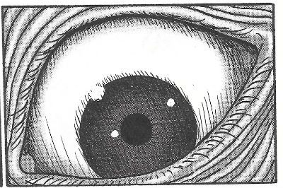
 photo frageyeB_zpsrfbo05ro.jpg FRAGMENTS OF HORROR by Junji Ito

Anyway, this...

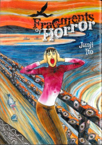
FRAGMENTS OF HORROR Story & Art By Junji Ito Translation & Adaptation by Jocelyn Allen Touch-up Art & Lettering by Eric Erbes Cover & Graphic Design by Sam Elzway Edited by Masumi Washington & Nick Mamatas (he writes real books too!) Fragments of Horror © Junji Ito 2014 Viz Media, $17.99(US), $21.00(CAN), £10.99(UK) (2015)
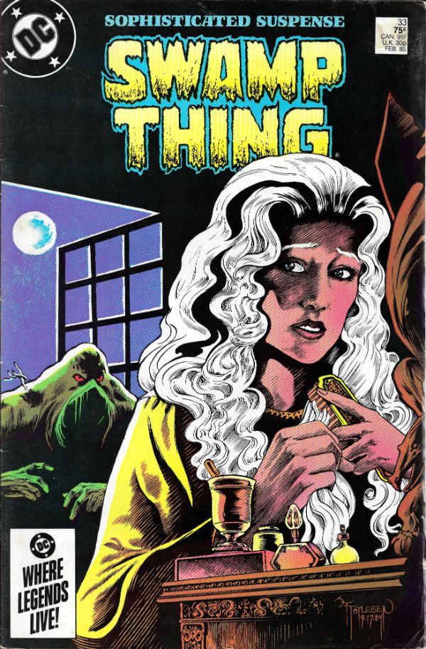
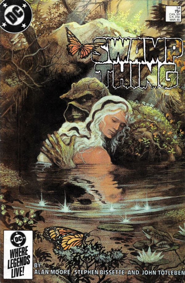
 photo fragcovB_zpskrp3ulik.jpg

Yes, Manga! Better yet, Manga by Junji Ito (or 伊藤 潤二 or Itō Junji)! Recap: I don’t know anything about Manga. Which on one hand is good; I’m coming at it without preconceptions and my like or dislike is as pure as unicorn poop. On the other hand it isn’t so good, because there are a lot of Manga Experts out there, so I might find myself squealing delightedly over what is commonly considered by the cognoscenti to be the Manga equivalent of Rob Liefeld. Hypothetical elitist disdain be damned, I like Junji Ito (I’m sticking with that permutation of his name as it’s the one on the book). I liked GYO and UZUMAKI (both of which are currently available in one volume hardback editions from Viz. Plug! Plug! John sez, “Buy ‘em from Brian!”) and since Junji Ito was the one what did them, my picking up FRAGMENTS OF HORROR was as inevitable as death itself. But, y’know, a bit more fun.

 photo fragfanB_zpsbxwwgvrd.jpg FRAGMENTS OF HORROR by Junji Ito

Physically FRAGMENTS OF HORROR is a sturdy medium sized hardback, sporting a thoughtfully designed dustjacket and cover combo (firm stock, silver ink, bas relief; suh-weet). As an object it feels like someone was, you know, bothered; which is nice. Oh, yeah, it reads right to left as is the habit of our Japanese chums, but don’t worry, you’ll soon crack the habit. And it’s worth the minuscule adjustment of optical tracking required because within are eight tales of fetid fun; ranging from the eerily affecting to the utterly repugnant, with the odd stop at Black Humourville along the way, just so it doesn’t all get a bit too much, a bit too one note. Junji Ito knows pacing isn’t just what you do in The Delivery Suite and Junji Ito also knows tone isn’t just short for Tony when you’re shouting across the pub. Which is more than can be said for most North American genre comics creators. As all those drunks in dated melodramas who put their boozy fists through accusatory mirrors can attest, fragments of anything which has shattered vary in size and sharpness. And so it is with these fragments of horror.

 photo fragdissectB_zps5krpsiqd.jpg FRAGMENTS OF HORROR by Junji Ito

Ayup, it’s a horror anthology, so the tales are less than lengthy, thus I’ll have to skirt around too much detail while, hopefully, managing to give you a pungent enough tang of the pleasingly acrid taste of the ghastly goods on offer. And so in the order in which I happened to remember them:

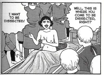
Dissection-Chan: I don’t even know what this one is, well, except it’s horrible. Which is kind of the point of horror so: win. Playing doctors and nurses as kids isn't creepy enough for Junji Ito so the pair of tiny terrors herein go further and play coroners and corpse. But then they grow up and playtime turns into..well, precisley. It’s probably the kind of bilious bon-bon people pigeonhole as Ito-esque, being a kind of diseased shaggy dog story (a Cujo?) leading up to imagery Ito’s clearly built the whole thing around, and has obviously taken a quite excessive, if not unseemly, pleasure in delineating. I bet his talented little tongue was stuck out and he had his face about an inch from the paper; like when you used to do an ornately cross-hatched “Bub” from Day of The Dead (1985) on your rough book, while far away a voice droned interminably on about The Corn Laws and their perpetual Repeal.

Futon: The natural indolence of the typical young male is taken to horrific extremes in a story no doubt used by Japanese HR Departments to prevent the Western “duvet day” phenomenon gaining traction in their fine land.

Tomio/Red Turtleneck: Bizarrely this features the same young couple who were in ‘Futon’; weirder yet the bloke, Tomio, again taps off with a randy witch while the doughty lass, Madoka, has to cope with the malefic consequences. Psst! If you are called Tomio and are shacked up with a Madoka, and you know Junji Ito, uh, I don’t want to read too much into this but it probably couldn’t hurt if you scarpered sharpish because ol’ Junji’s got a Wagyu beef (和牛) with you. If you knicked his girlfriend and then cheated on her with a randy witch, well, I’d definitely consider going to ground under a fake name.  Maybe put a continent or two between you. Open a bait and tackle shop and learn to enjoy solitude and sunrises. Better than waking up with scissors in your eyes. Anyway, Junji Ito’s vengeful fixations (legal note: I jest) aside this one is a darkly amusing tale of a shagabout whose big head suffers when he puts his little head where it shouldn’t have been. Namely, in a randy witch. Or is it all a manifestation of a castration complex brought on by guilt at dipping his wick in the randy witch? I don’t know and it doesn’t matter, because it definitely features a bit where a live cockroach is crammed into an open wound. Something for everyone in this 'un!

Wooden Spirit: The vast property porn audience of such UK televisual verrucae as Grand Designs (rich couple build unfeasibly expensive house shaped like an abstract philosophical concept) and Property Ladder (a pair of profoundly un-endearing estate agent “characters” help indecisive couples to buy a house, because apparently that’s entertainment) is catered to in a tale which combines erotica, architecture and the fairy tale trope of the evil stepmother. It’s a queasily eerie tale which is both timely and timeless, and one not recommended for people with a thing about eyes. Yes, EYES!

 photo fragbirdB_zpsyl6qltaj.jpg FRAGMENTS OF HORROR by Junji Ito

Blackbird: Survival at any price? is the question ‘Blackbird’ asks you, and it won’t stop staring at you accusingly until you answer in the affirmative, at which point it cackles so unnervingly you inadvertently let a bit of poop slip out.  ‘Blackbird’ features the phantasmagorical sight of a bird with the face of Pete Burns (the recently deceased frontman of the band ‘Dead or Alive’. Or is that just ‘Dead’ now? Too soon, huh?) and then it gets seriously foul, before finally twisting your mind into strange new shapes so you can accommodate the thoughts it births.

Gentle Goodbye: Melancholy ghost story for anyone whose emotions are still functioning after the flaming shit pit that has been the year 2016. Beautifully and subtly done stuff. Not at all what people expect from Junji Ito, even though he’s as good at inducing quiet heart ache as he is at gooshy upchuckery.

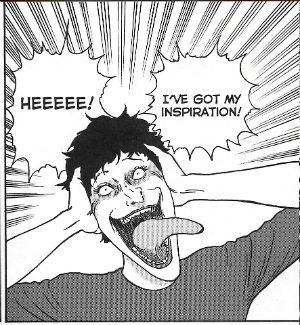
Magami Nanakuse: Bizarre physical comedy ensues when a young fangirl meets her favourite author, only to discover s/he is a bit of a nutter. Which is unusual because writers are usually so well adjusted aren’t they? Probably works best if you know which author Ito is ripping the piss out of. Knowing his humility it's probably himself, but it doesn't seem like it. Let's pretend it's Neil Gaiman. See, now it's hilarious!

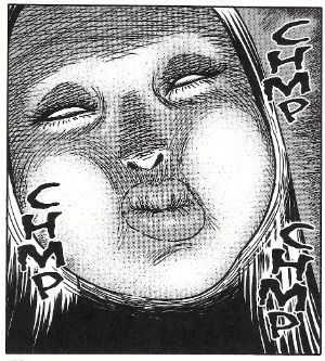
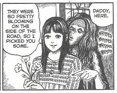
Whispering Woman: This is for all those middle class parents who palm the tricky business of bringing up their kid onto a paid stranger. Or maybe it’s about getting too involved in your work. It’s definitely about how people use kids to get back at other people, but here it’s in a savagely literal way. Kids always make horror worse don’t they? Unless you’re a sociopath. In which case, congratulations, 2016 is certainly your year!

 photo fraginspB_zpsn2z47ppv.jpg FRAGMENTS OF HORROR by Junji Ito

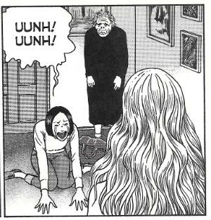
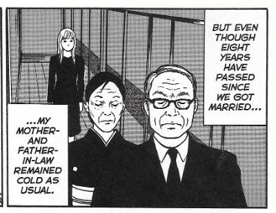
Aside from the ostensible subject matter part of the appeal of MANGA! for me is seeing tentacle rape, oops, no, wait, it’s seeing how people in Japan live (or lived if its LONE WOLF). All the little things the creators take for granted but strike me, some five thousand miles and change away, as odd. But not odd in a racist way, I hasten to add so swiftly I risk doing myself a mischief. Things like a young couple living in one room, a father and daughter living in a house so unchanged the government accord it “A Registerd Tangible Cultural Property” (like Howard Victor Chaykin!), the shape of the buses, the food on the plates (no chips?!), the boxy architecture, the fact that Louise Brooks’ bob rightly remains cross-cultural visual shorthand for sultry, the sense of family which is both impressive and oppressive, the sudden swathes of wild nature beyond the boxy cities with their chip deficient Louise Brookses riding differently-shaped buses to visit sour faced in-laws. Just, you know, the stuff of life; beige days. And it’s important not to underestimate the importance and skill of Junji Ito in creating a convincingly mundane environment. That way when the bad stuff turns up to tear it all up it resonates just that bit deeper, and just that shade darker. Sure, it takes some serious horror chops to get cosmic horror out of some idle arse staying in bed all day. But throw in a psychotropic fungus and a passing randy witch and you need to have a sturdy hook of reality from which to suspend your disbelief. Junji Ito’s hook is robust enough for even my handy-man dad to curtly nod in appreciation.

 photo fraginlawsB_zpsebg9hjes.jpg FRAGMENTS OF HORROR by Junji Ito

According to the ridiculously self-effacing note in the “back”, FRAGMENTS OF HORROR is Junji Ito’s return to the horror trenches after several years drawing cats and, uh, stuff. As diffident as the Japanese are reputed to be(#CASUALRACISM? Or #SWEEPINGGENERALISATION?) it seems ridiculous that someone at Junji Ito’s artistic level should be so, and so sincerely so at that. This isn’t a pose; the dude’s really unsure whether he provided satisfaction. He even thanks his editor for rejecting his first attempt at one strip and making him start from scratch. Can you imagine a Red Hot North American Genre Comics Creator doing that? They’d pitch a shit fit and it’d all end in tears and no mistake. Someone would be collecting their P45 and it wouldn't be the Red Hot North American Genre Comics Creator. Listen to an editor! Chance'd be a fine thing! While I found Junji Ito’s humility refreshing, I think I should just take this opportunity on the behalf of every man, woman and child in the West to say, don’t sweat it, Junji Ito, FRAGMENTS OF HORROR was VERY GOOD! Welcome back and don't be a stranger!

 photo fragdaddyB_zpsr70v9mzi.jpg FRAGMENTS OF HORROR by Junji Ito

NEXT TIME: If we are all still above ground, some more reality avoidance via the medium of - COMICS!!!

“Selena Has Already Decided Not To Buy The Lawn Furniture.” COMICS! Sometimes I Look at Saga - The Saga Of The Swamp Thing!

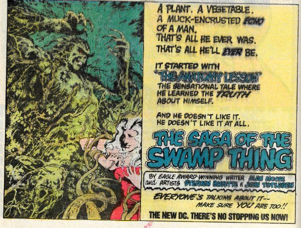
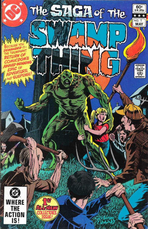
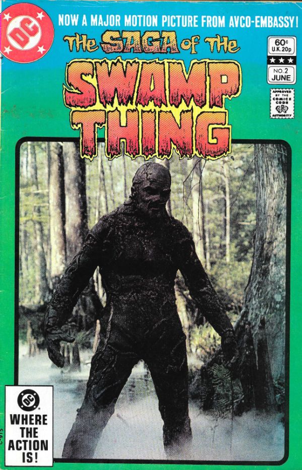
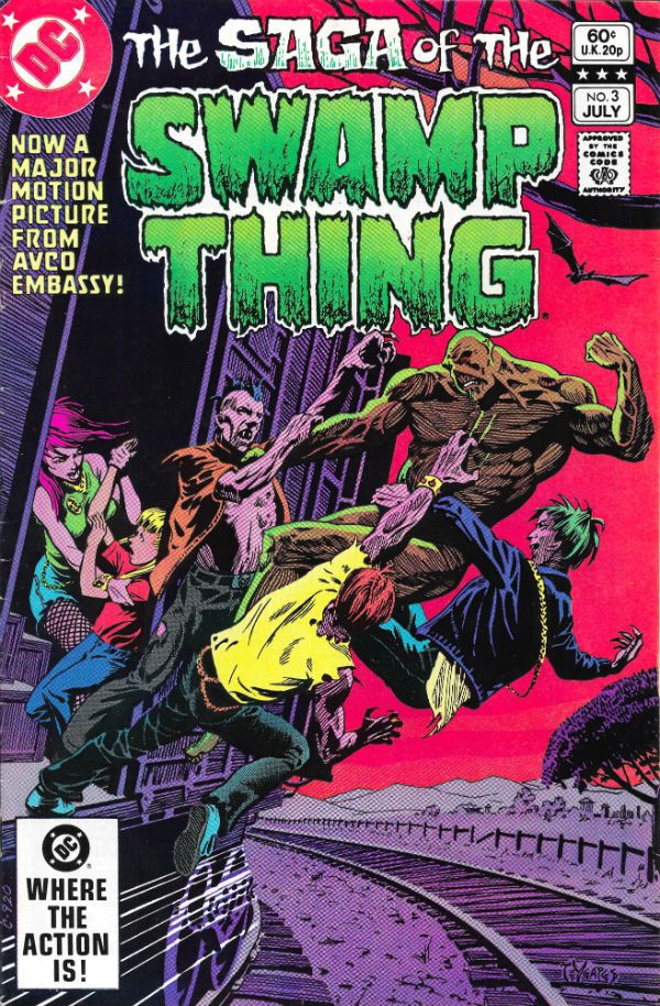
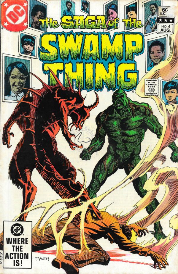
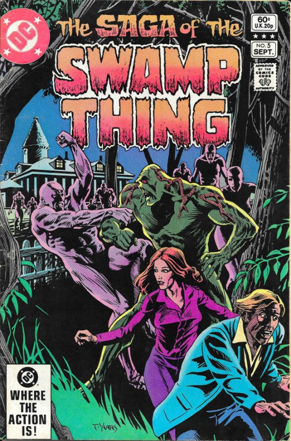
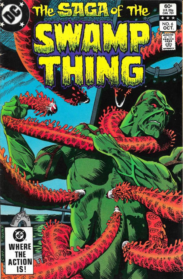
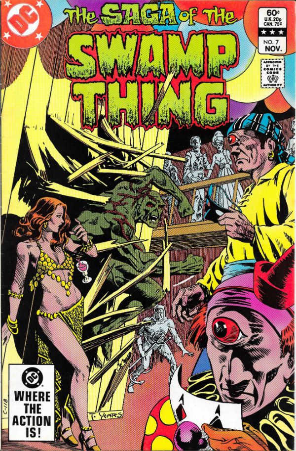
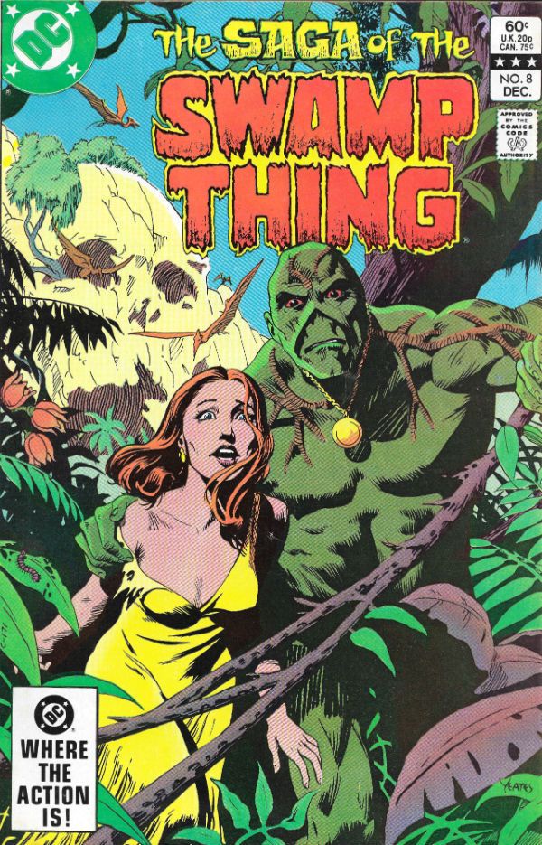
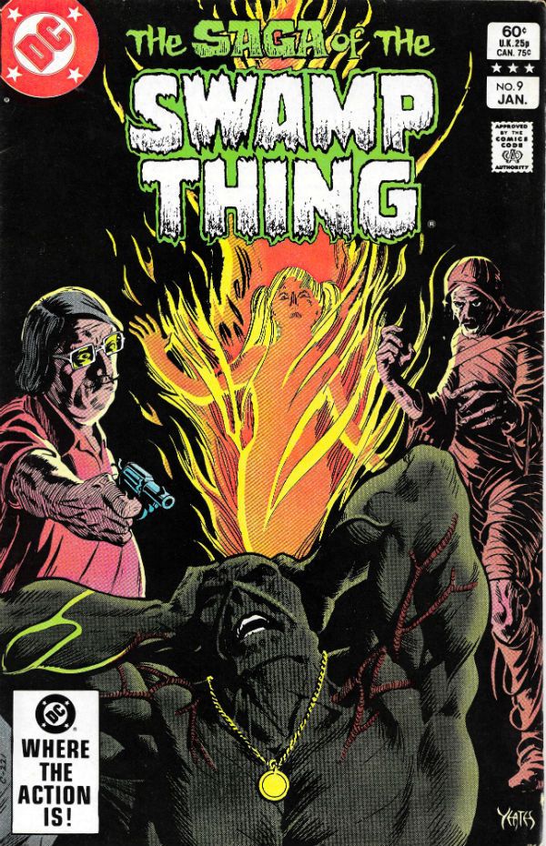
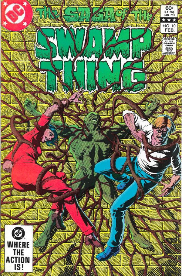
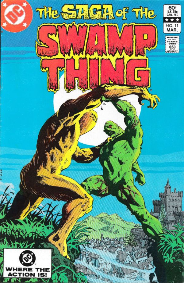
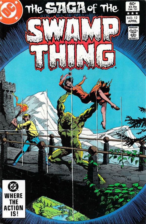
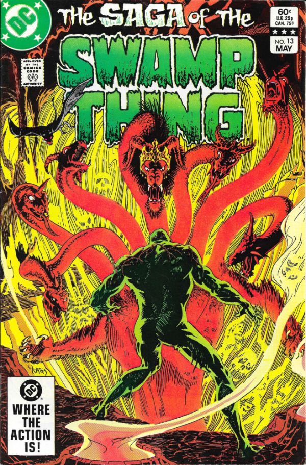
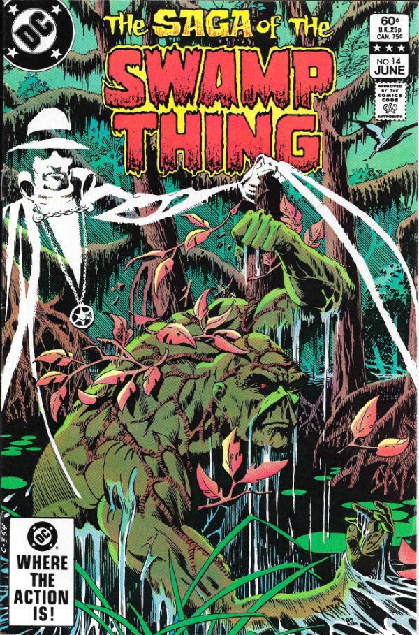
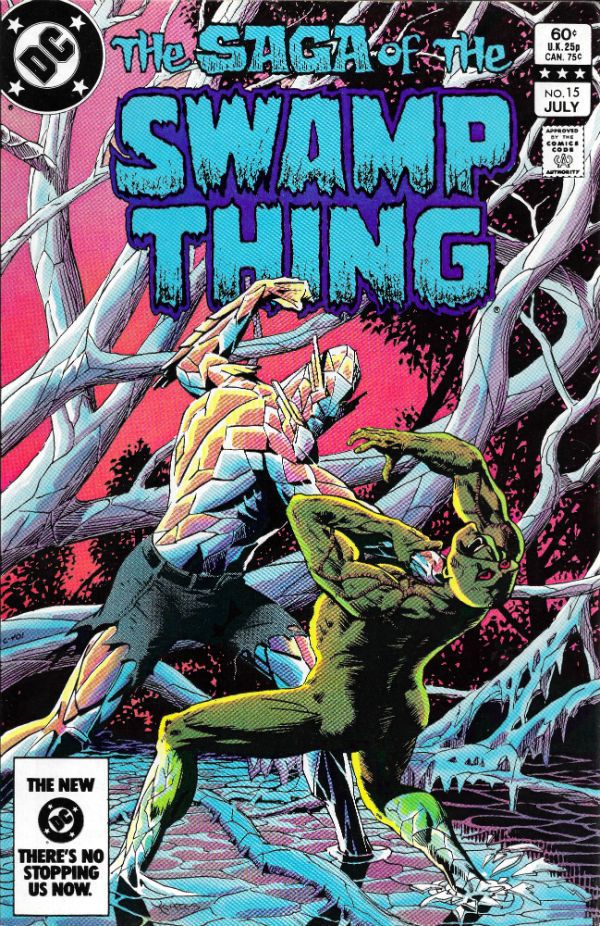
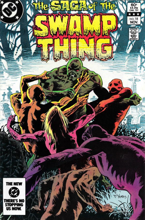
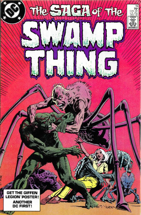
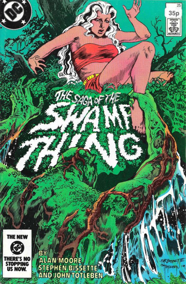
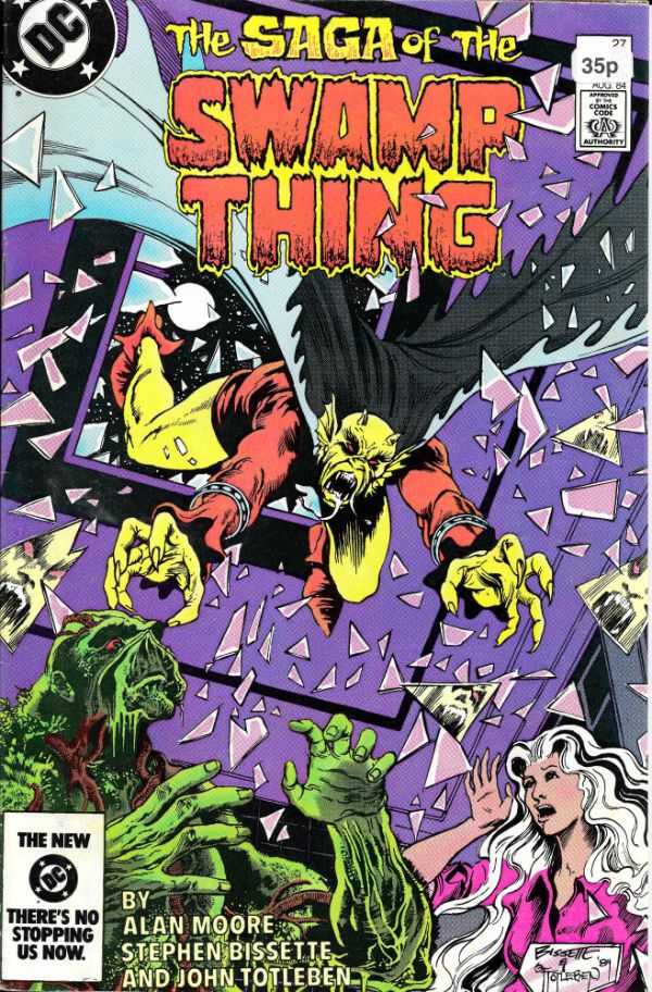
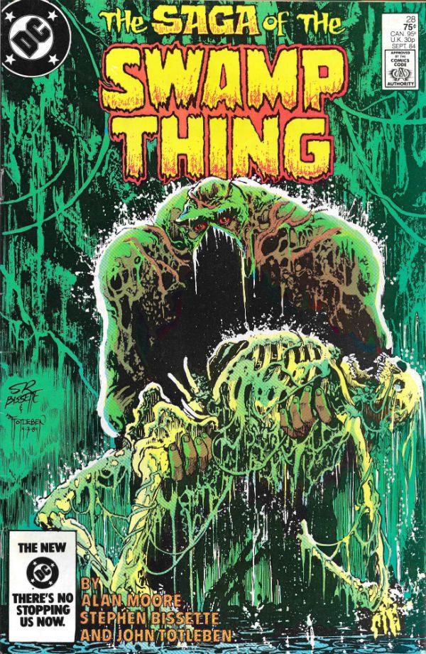
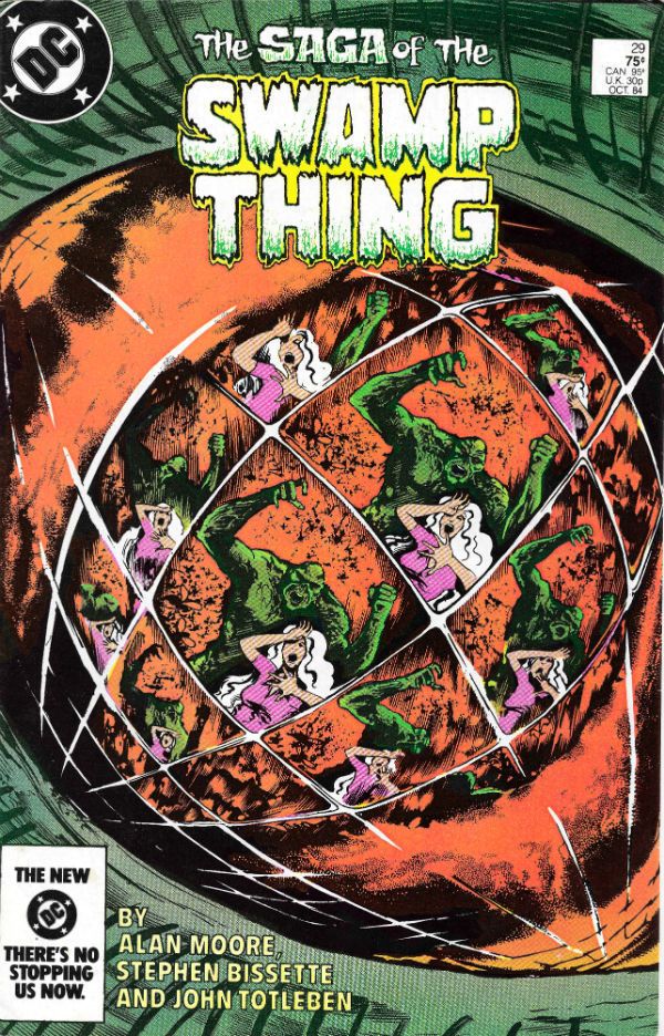
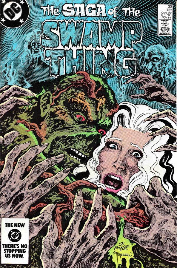
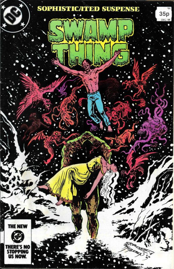
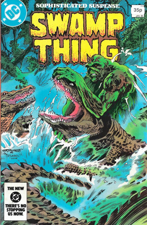
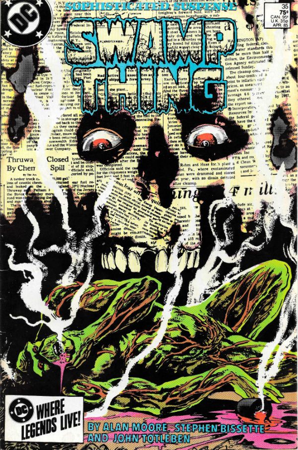
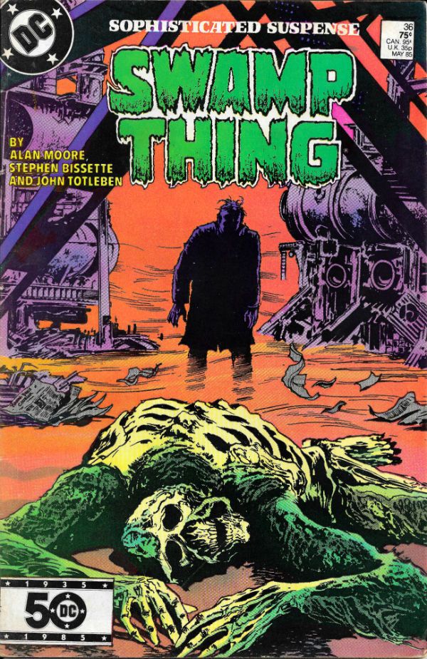
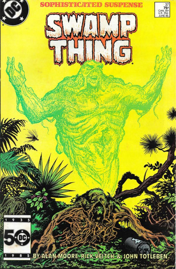
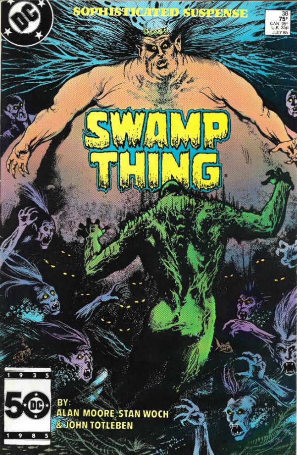
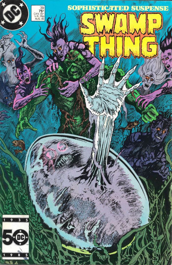
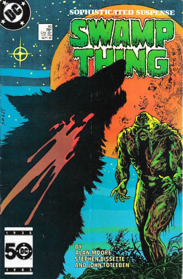
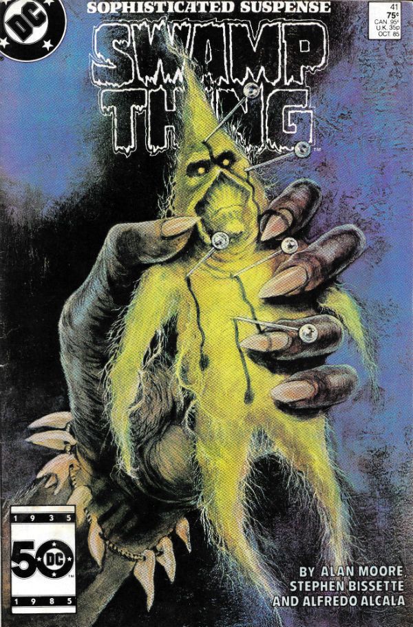
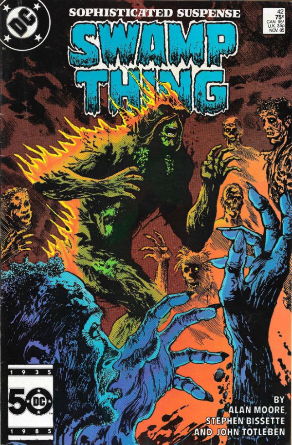
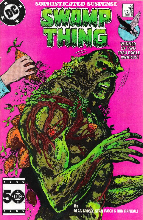
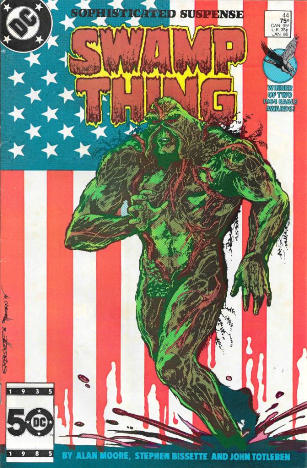
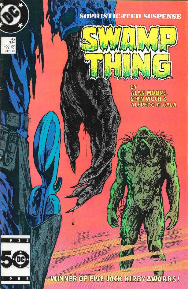
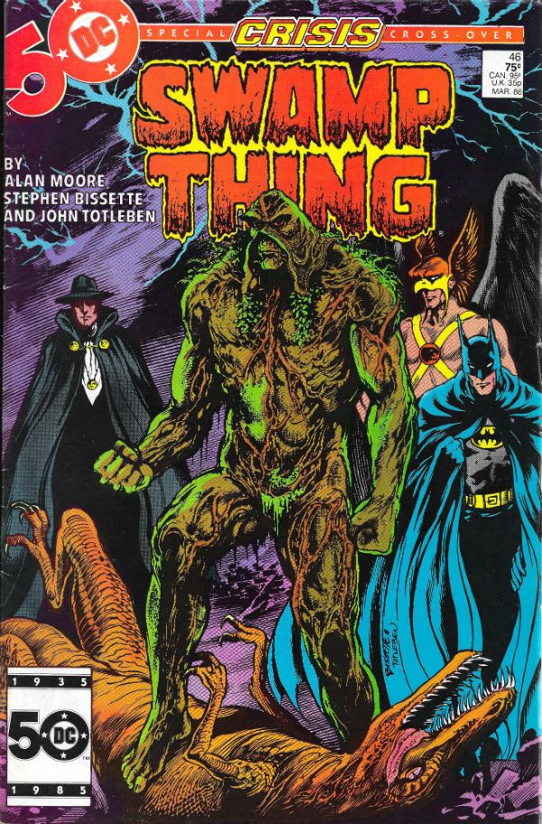
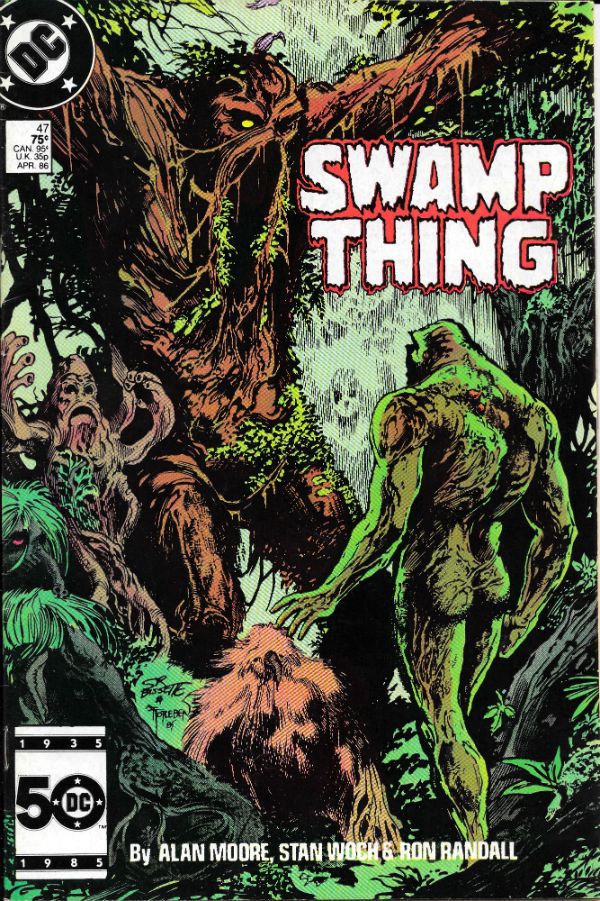
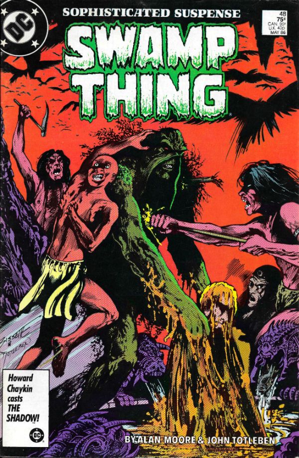
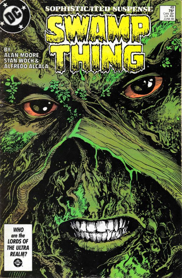
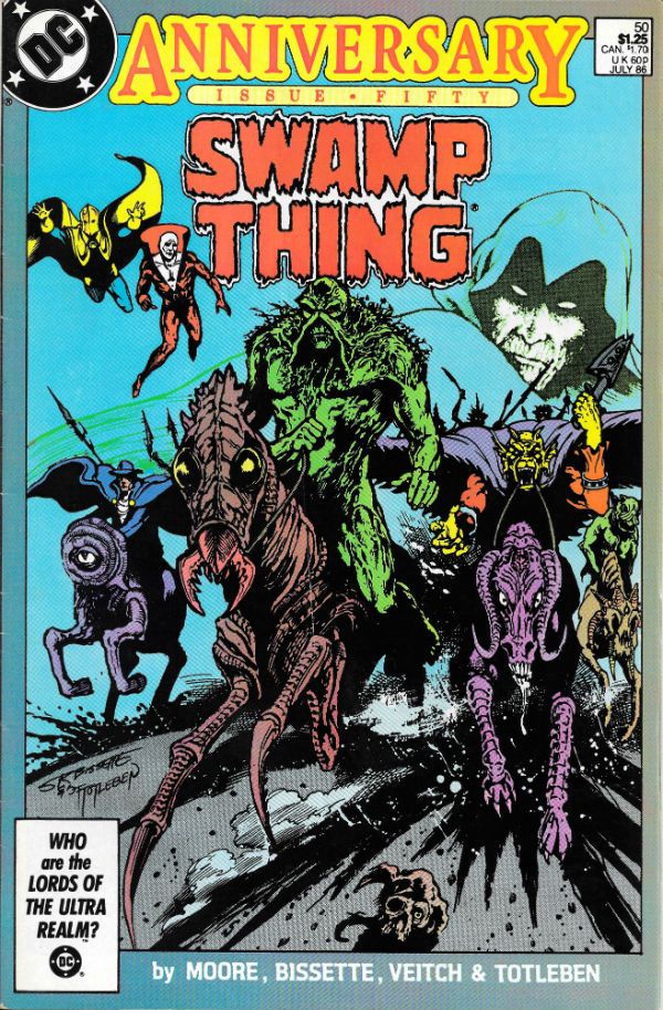
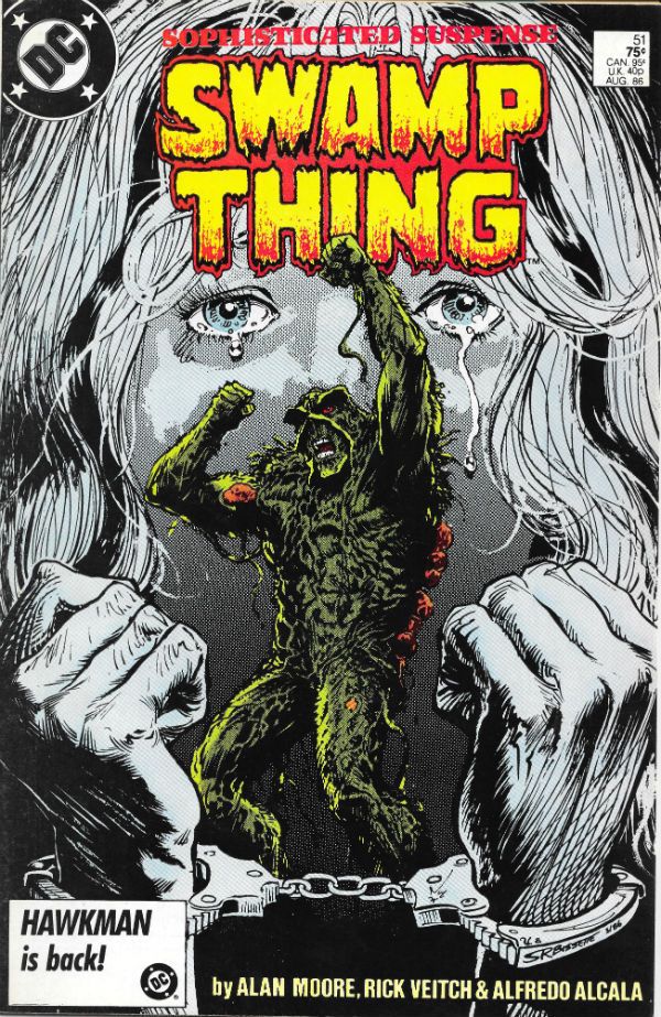
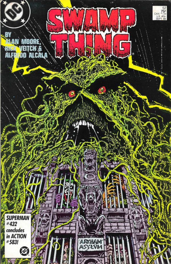
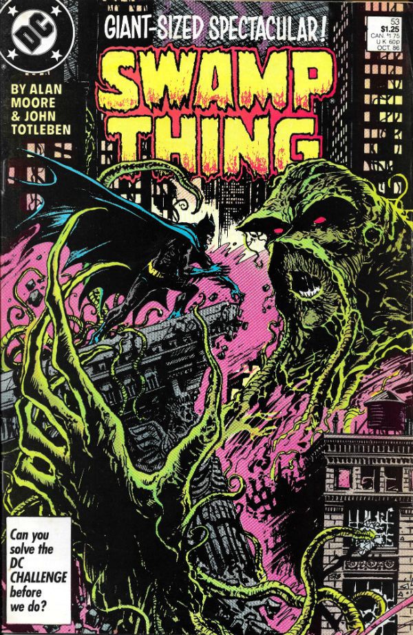
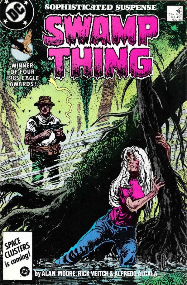
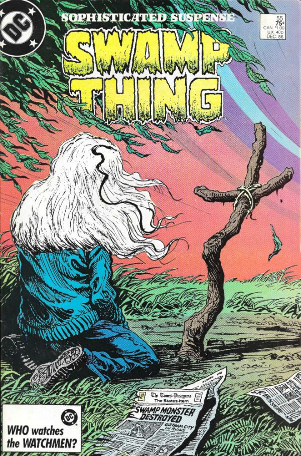
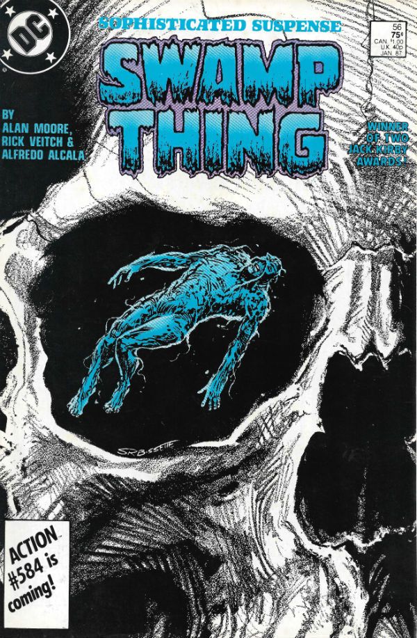
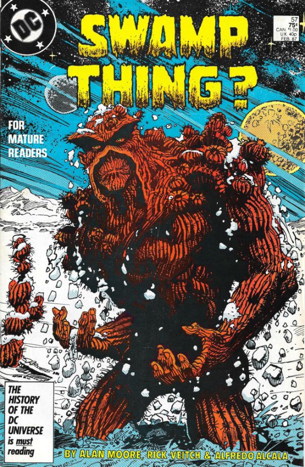
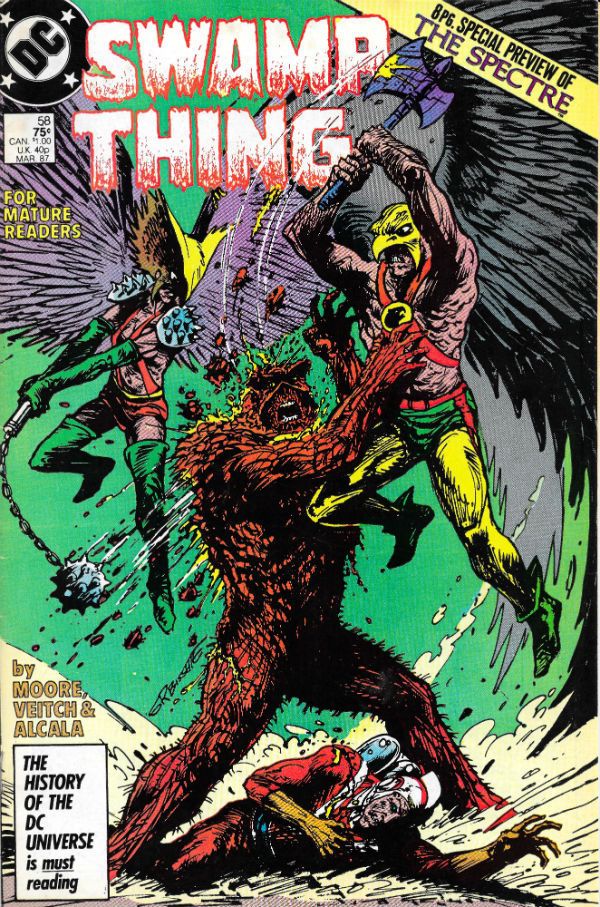
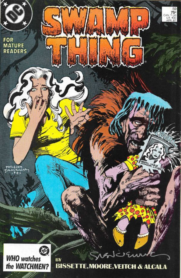
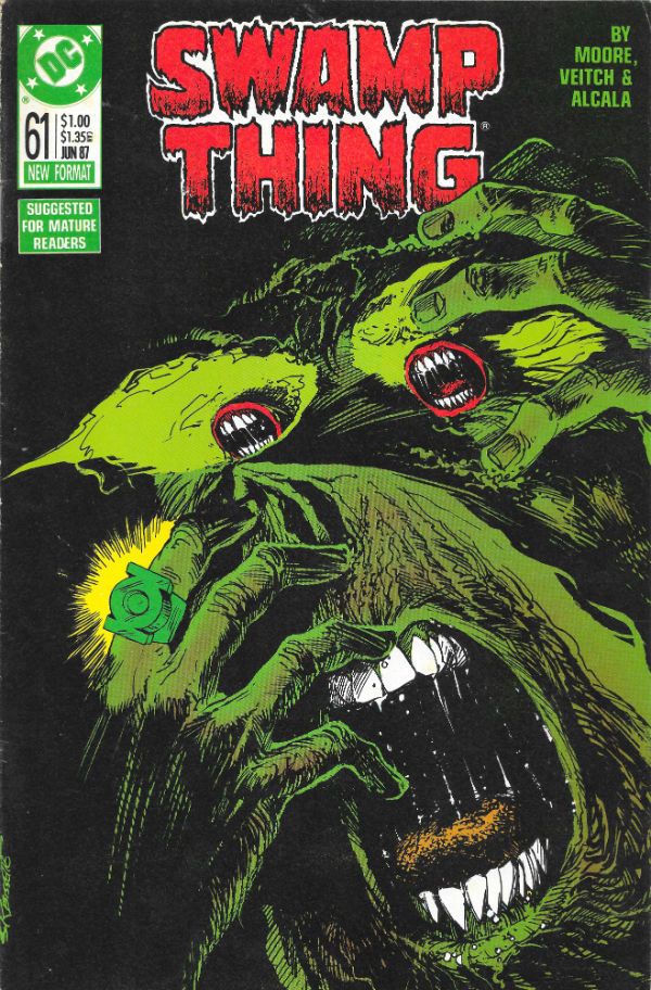
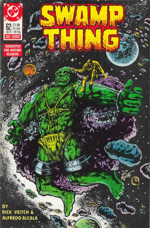
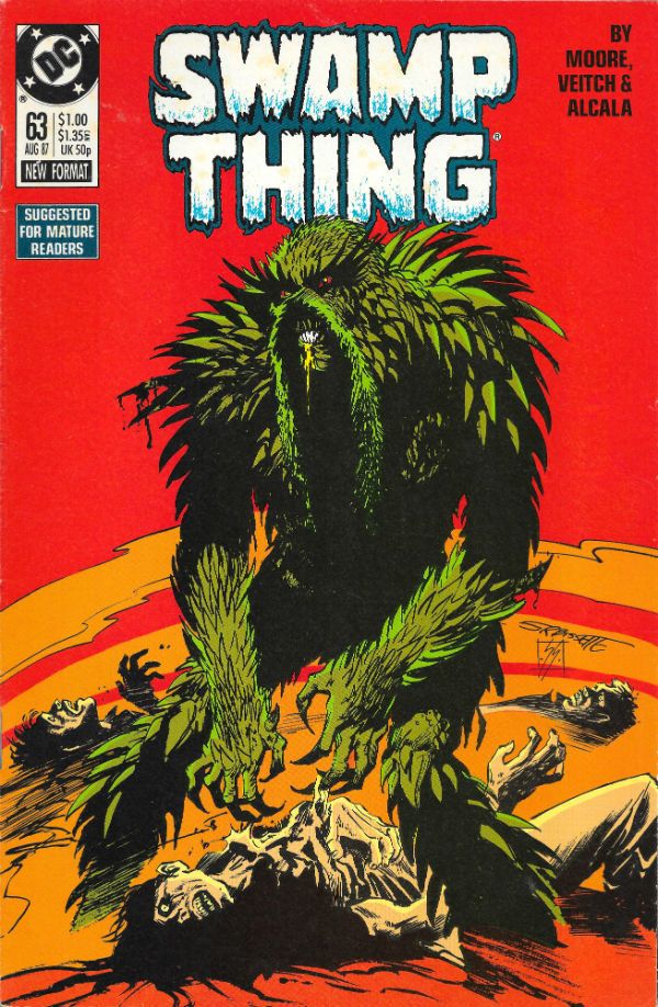
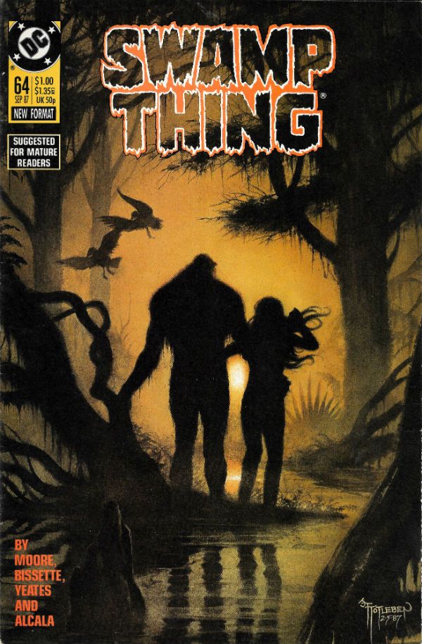
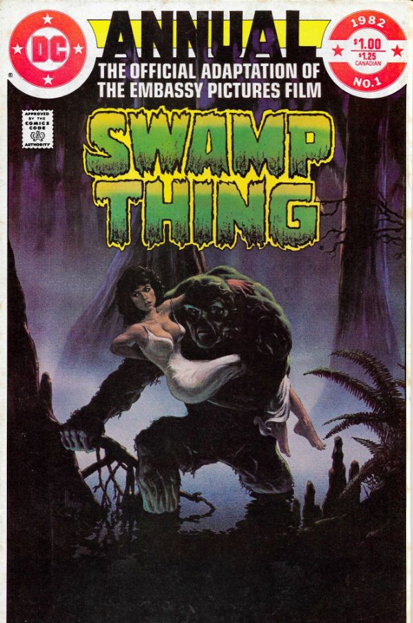
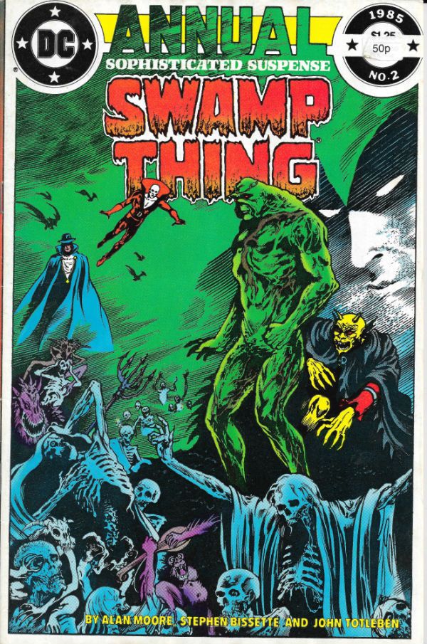
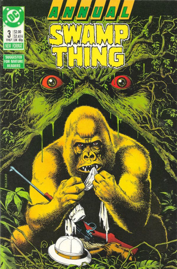
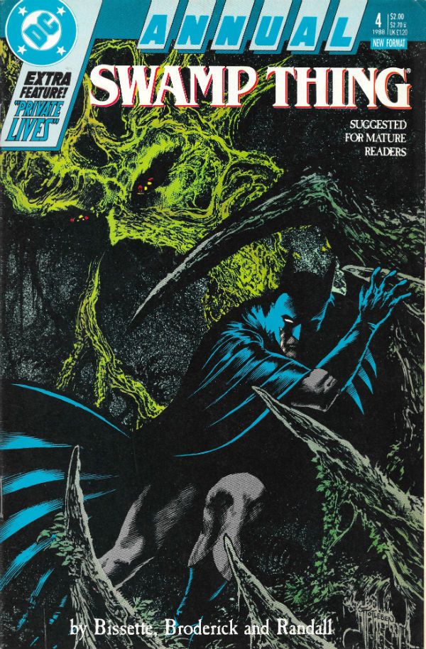
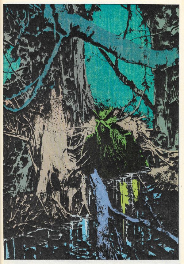
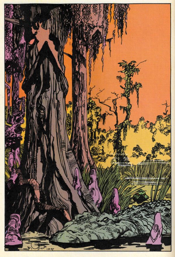
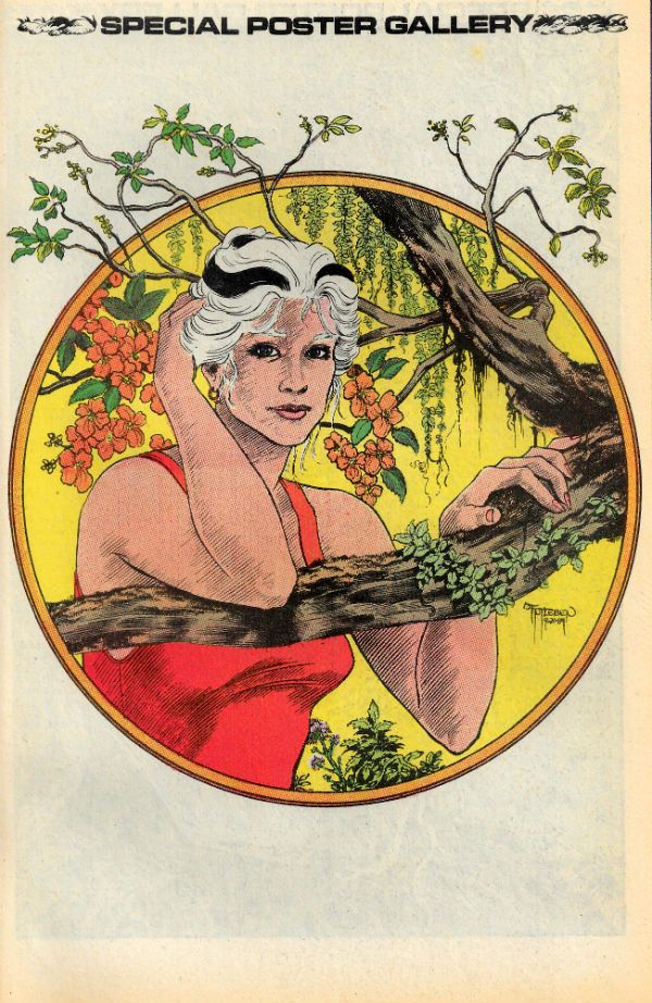
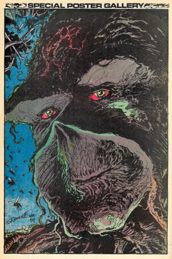
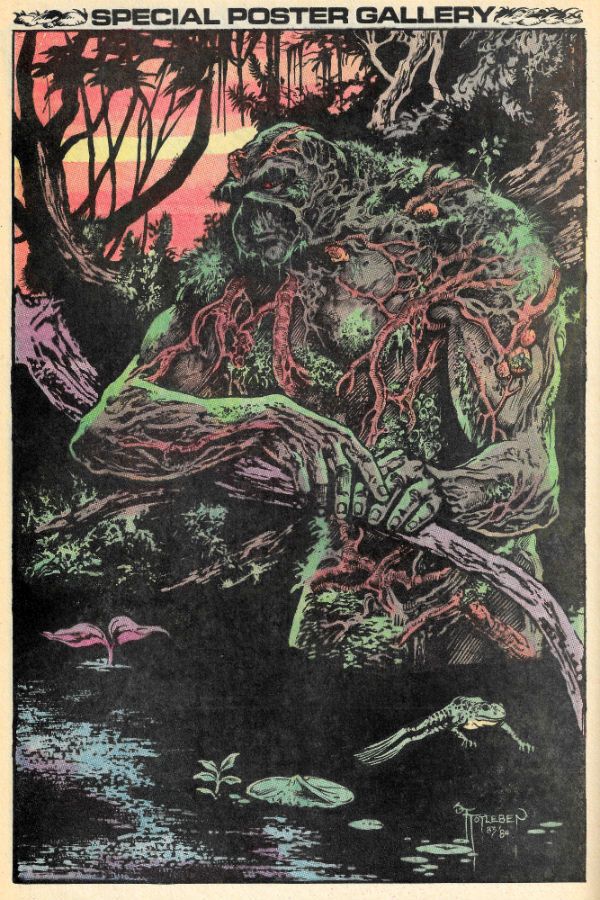
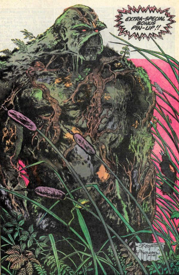
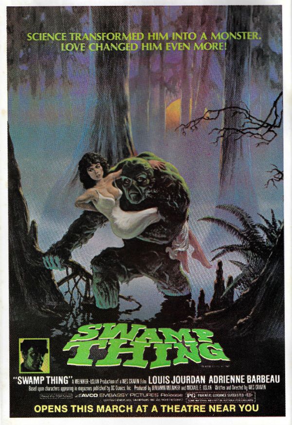
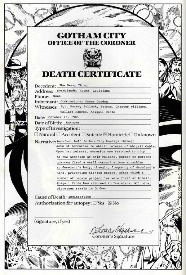
It's Halloween! Gather round, gather round! O, you lucky children! Feast your tiny dead fly sized eyes on a ghoulish gallery fit to chill even the hardiest of souls! Halloween! Sil-VER SHAMROCK! Oh alright, I just scanned in my incomplete Saga of the Swamp Thing comics run. No tricks here, m'dears; only treats! It's mostly covers but also some pin-ups and even Swamp Thing's death certificate. Morbidly apropos eh, what? I hope you enjoy looking at them while I creep up behind you. HOO-HA! Gonna wear your face like knickers!  photo S0tST27bB_zpsiwfempwk.jpg SWAMP THING by Stephen Bissette, John Totleben, Alan Moore, Tatjana Wood & John Constanza

SWAMP THING Created by Berni Wrightson & Len Wein

I started reading Saga of the Swamp Thing (SotST) with # 2 because I was 12 and a morbid little thing. Oh yes, Horror was my jam. I spread it liberally on my toast of terror. I was there, so let me tell you that the 1980s were a pretty awesome time all around for horror in movies, prose and comics. Probably even jam; horror was everywhere. Probably because the 1980s was a pretty awesome time for horror in real life: Thatcher, AIDS, Clause28, The Cold War, Reaganomics, The Miners Strike, Phil Collins; sometimes you just wanted to pull the covers over your head. But then you ran the risk of missing some fab Horror jam. Like SotSW. I stopped reading SotSW with #6. Not because it was rubbish, but because it stopped appearing at my local market cum newstand. Those early issues by Tom Yeates and Martin Pasko aren't the ones people remember but they were pretty decent. Issue 3 with the vampires was nice (nice enough for Moore to call back later in #38 & #39) and #4 had a children's entertainer who entertained himself with children in a bad way. It was far from rote and just about worthy of note. I restarted reading SotSW with #35 when it suddenly reappeared back on my stands. That fella from Warrior and 2000AD whose stuff I liked only turned out to be writing it, didn't he! (It would turn out he'd been writing it for a while.) My surprise and delight at the chillingly efficient tales this Moore fellow was producing was rather upended when Swamp Thing promptly died at the end of #36. Well, fuck a duck, I thought (I was a potty mouthed child).

 photo S0tST25bB_zpsfk00uihl.jpg

But then he brought him back. Later on he'd kill Swampy again, but I'd got the knack by then and just hung on til he was back. With #64 Moore moved on and even brought back Tom Yeates for a fitting finale. But Moore didn't push off before he'd written a pile of the most entertaining comics it's ever been my pleasure to read. (And re-read. And re-re-read. Etc.) So much so that I went back and filled as many gaps as I could, before TPBs were a thing at which point I, as they say, completed the set. It took time and it took money but it was worth it. From the early issues which recast old horror tropes in fresh robes of relevance, through the inevitable team up with Batman (one which actually had weight and consequences for once) through the tail end whistle stop tour of the DCU, Alan Moore brought the words. And plenty of them. But that's okay because they were good words. I have a weakness for writers who love language; I'm odd like that. And as ever with any long comics run you could tell he stayed too long, but rather than phone it in he simply concentrated on keeping himself entertained, and in so doing kept me entertained.

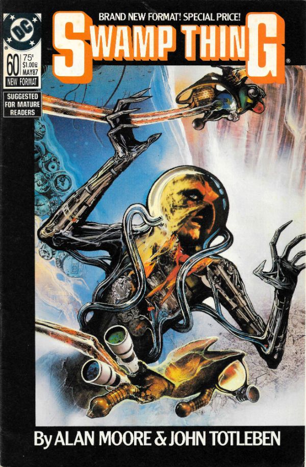
But there are more than words in a comic; otherwise it would be prose. There are pictures. And the pictures in SotST are the equal of Moore's words, mostly. From the titanic trio of Bissette, Totleben & Veitch whose jagged, fractured pages seemed to stab the horrors displayed right into your mind, to the stalwarts called in at short notice: Alfredo Alcala, Stan Woch, Ron Randall et al. And of course, Shawn McManus. Shawn McManus who gave Moore's script for POG (#32) a heartwrecking cartoony beauty. Everyone on the book seemed to be having a blast and so I had a blast. John Totleben certainly had fun, fun which culminated in, with #60, his flamboyantly futuristic issue-long recasting of Kirby Collage technique. John Totleben's eyes are tired, so they say, but he can hear well enough, so let's all say that, you, John Totleben rocked, and you rocked never harder than on #60 of The Saga of the Swamp Thing (unless it was that issue of Miracleman (yeah, that one). SotST is often spoken of as being Alan Moore's but that's just convenient shorthand. SotST and its many, many successes belong to everyone on its pages. Most notably those already spoken of, and particularly Steve Bissette's dark swathes of ink. SotSW is a remarkable run of comics; remarkable in its consistency, intelligence and heart. Yes, heart. Because for a horror book it was surprisingly keen to remind us of what it meant to be human; how that can be the worst thing in the world, but also how it can be the best thing in the world. That's not bad for a comic book about a plant that dreamt it was a man.Sage of the Swamp Thing was EXCELLENT!

You've all been very patient so here's the gallery:

 photo S0tST01aB_zps7h5hwgue.jpg

 photo S0tST02B_zpszdyqnst2.jpg

 photo S0tST03B_zpslf6q2xbc.jpg

 photo S0tST04B_zpscy2qs815.jpg

 photo S0tST05B_zpskrjm0ere.jpg

 photo S0tST06B_zpswdwuunik.jpg

 photo S0tST07B_zpsqte67v9r.jpg

 photo S0tST08B_zpshvofaavx.jpg

 photo S0tST09B_zpsjxa1lezp.jpg

 photo S0tST10B_zpse1uoltfq.jpg

 photo S0tST11B_zpswqlv7wtw.jpg

 photo S0tST12B_zpssfjcaq0d.jpg

 photo S0tST13B_zps8bo3fv9p.jpg

 photo S0tST14B_zpsvivzjzif.jpg

 photo S0tST15B_zps1xedww1b.jpg

 photo S0tST18B_zpsnuiygvpv.jpg

 photo S0tST19B_zpsuwutnp5z.jpg

 photo S0tST25aB_zps3tysl1sc.jpg

 photo S0tST27aB_zps0loq4qxu.jpg

 photo S0tST28B_zpsmiw1obak.jpg

 photo S0tST29aB_zpsskphvrjv.jpg

 photo S0tST30B_zpsx0la6u2u.jpg

 photo S0tST31B_zpsgot7zuvm.jpg

 photo S0tST32B_zpsm9qy66hq.jpg

 photo S0tST33aB_zpsx7wua3vy.jpg

 photo S0tST34B_zpsownvcs1j.jpg

 photo S0tST35B_zpsznnknjca.jpg

 photo S0tST36B_zpso2qu0eif.jpg

 photo S0tST37B_zpsxeynkefc.jpg

 photo S0tST38B_zpsopoygf1k.jpg

 photo S0tST39B_zpslth7i3mr.jpg

 photo S0tST40B_zpsd26tl5tm.jpg

 photo S0tST41B_zpsdrvixr4q.jpg

 photo S0tST42B_zpsljwtrkr1.jpg

 photo S0tST43B_zpsoxrfstyp.jpg

 photo S0tST44B_zps3gfhl8ay.jpg

 photo S0tST45B_zpshvdm3nft.jpg

 photo S0tST46B_zpsd8obz8fi.jpg

 photo S0tST47B_zpsifwgyksx.jpg

 photo S0tST48B_zpseqezckgg.jpg

 photo S0tST49B_zpsbneswwwa.jpg

 photo S0tST50B_zpsyvf3mam3.jpg

 photo S0tST51B_zpsyn0w08ri.jpg

 photo S0tST52B_zpsmwnmvi12.jpg

 photo S0tST53B_zps9frna7qi.jpg

 photo S0tST54B_zps0xhxnwkt.jpg

 photo S0tST55B_zpslesguhzq.jpg

 photo S0tST56aB_zpsohaunsiz.jpg

 photo S0tST57B_zpsiaqpadgq.jpg

 photo S0tST58B_zpsmgd1rlzp.jpg

 photo S0tST59B_zpsjwh2z4gt.jpg

 photo S0tST60B_zpsdmfcyt1r.jpg

 photo S0tST61aB_zpslhdmkxta.jpg

 photo S0tST62B_zpsdnn3rhx3.jpg

 photo S0tST63B_zpshyv41wqh.jpg

 photo S0tST64B_zpsw5xfgw3o.jpg

 photo S0tSTan01B_zpslomwyqhd.jpg

 photo S0tSTan02B_zpsrwbdlrgt.jpg

 photo S0tSTan03B_zpsuxr6xmxd.jpg

 photo S0tSTan04B_zpsti69jov9.jpg

 photo S0tST61bB_zpsrydsqhs8.jpg

 photo S0tST61cB_zpsg9bys5c0.jpg

 photo S0tST33cB_zpsgb1fcy2r.jpg

 photo S0tST33dB_zpsd62wuaoc.jpg

 photo S0tST33bB_zpsvt2qopaw.jpg

 photo S0tST29bB_zps6xqtt53s.jpg

 photo S0tST01bB_zpsllbs3gih.jpg

 photo S0tST56bB_zps77ya6esz.jpg

Sometimes...I am almost...frightened...by my own – COMICS!!!

“Eat The OTHER ONE!” Sometimes I Love The Craft Of Those Who Make Comics About Lovecraft!

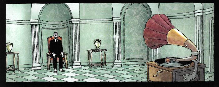
My patience having finally reached its end with regards the odd susurrations which emanated nightly from the fireplace in the south library, I tasked the scrofulous fool who tends to my needs with the dismantling of said edifice. Within seconds the lumpen oaf had caused to be dislodged a stone possessed of enough heft to crack his simple-minded foot in twain.  Ignoring his repellent and startlingly blasphemous utterances I knelt to seize a now-revealed sheaf of papers adorned with runes and symbols which resisted my understanding even as the lower orders resist cleanliness. Shooing the shambling, nay, hopping, cretin of a manservant from the room I set about the package. And it is those contents which, together with their effects upon my quite febrile mind, I shall now proceed to relate.  photo RatTopB_zpsln44idr5.jpg RAT GOD by Corben, Corben, Corben, Corben-Reed & Piekos

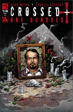
Anyway, this… CROSSED PLUS ONE HUNDRED #5 Art by Gabriel Andrade Written by Alan Moore Coloured by Digikore Studios Lettered by Jaymes Reed Avatar, $3.99 (2015) Crossed created by Jacen Burrows and  Garth Ennis

 photo CPHCovB_zpsiqvmi78r.jpg

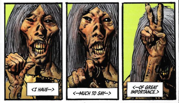
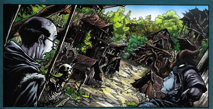
CROSSED PLUS ONE HUNDRED is a comic by Gabriel Andrade and Alan Moore which is notable for the effectiveness with which the pair of storytellers have, over these five issues, ratcheted up the tension, even though the ultimate result was never in doubt. If there ever was any doubt then issue 5 scrapes it all away with a sadistic thoroughness by leading us by the hand and simply and directly pointing out just how badly everyone has misjudged the situation thus far. I liked the thing with the ostrich rustling, that was sneaky. Sure, everyone knew the terrain we were in, everyone knew that things were going to turn to shit; the only question was the precise consistency and extent of that shit. Well, now we know. Now. We . Know. Shit! The only question remaining is the same as that on the old Chainsaw Massacre poster: “Who Will Survive? And What Will Be Left of Them?”

 photo CPHPicB_zpsx5voltgb.jpg CROSSED PLUS ONE HUNDRED by Andrade, Moore, Digikore & Reed

The other thing CROSSED PLUS ONE HUNDRED is is possibly the only comic which has the balls to treat Islam as a part of Western society like all the other parts of Western society; that is as a part just as likely to survive a catastrophic upheaval as, say, Christianity, ostriches or people’s libidos. But you know, don’t worry about it, let’s keep holding that golliwog thing against him, eh? (On second thoughts, since most comic book writers base their portrayals of Christians on John Lithgow in Footloose (CUT LOOSE!) maybe Islam’s better off as is). My only reservation with CROSSED PLUS ONE HUNDRED (besides how long it takes to type) is the nature of the threat; if the Crossed are just us (well, you; I’m beyond reproach) without the social brakes on then conditioning those brakes back in will just make them, er, us again. Or maybe that’ll be Moore and Andrade’s point. In the meantime CROSSED PLUS ONE HUNDRED is an intelligent and really quite frightening demonstration of the fatal consequences of complacency. VERY GOOD!
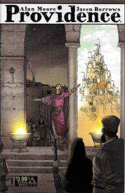
PROVIDENCE #1 Art by Jacen Burrows Written by Alan Moore Coloured by Juan Rodriguez Lettered by Kurt Hathaway Avatar, $3.99 (2015) Providence created by Jacen Burrows and Alan Moore

 photo ProvCovB_zpskvnyeh3p.jpg

If CROSSED PLUS ONE HUNDRED is a tip-top exercise in feral terror then PROVIDENCE, er, isn’t. Yet. Fairness is my curse (it’s true!) and so it’s hard to judge one issue in; PROVIDENCE is paced for the long haul (12 issues) and the slow burn’s part of the deal and also part of the terrain. The terrain of CROSSED PLUS ONE HUNDRED is scorched earth and brazen violence, while PROVIDENCE is set squarely in the more sedate and stately terrain of H P Lovecraft’s oeuvre. That is , a terrain which appears stolid and mundane but soon crumples under the weight of the Hell which exists without. Of course before all Hell cuts loose (FOOTLOOSE!) Moore and Burrows have to spend time convincing us of the stultifying and repressed normality shortly to be torn apart. And maybe, juuuuuuust maybe, they do too good a job of that.

 photo ProvSitB_zpskmniueet.jpg PROVIDENCE by Burrows, Moore, Rodriguez & Hathaway

Mind you, some of it is just super –enjoyable, particularly Moore’s insouciant use of decompression to pump up the suspense about the guy in the park and the tasty contrast between those spicily enticing parts with the dense pudding of exposition surrounding them. Look, there’s nothing wrong with decompression but using it for everything is like putting ketchup on every meal (Tip: don’t). So it’s nice to be reminded that when used well decompression can, uh, work well. Also of note is the classy way the book concealed the exact nature of the chink in our protagonist’s armour until the precise point at which it wanted it to strike home, and sent me spinning back to reconsider much of what went before. Burrows’ stiff and largely neutral art aids this particular appearances-can-be-deceptive reveal well, and while the mannered distance of the visuals may be quite in line with Lovecraft’s signature icy disdain I like a bit more life in my lines. The only really dud bit was the text at the end where Moore doesn’t seem willing to trust his readers and so flenses any uncertainty out of the preceding pages in a way which is both exhaustive and exhausting. Also, it’s clear the book is extraordinarily well disposed towards persons whose sexuality is other than the commonly accepted norm. Hey, I’m just saying, is all.  There's still everything to play for but, yeah, PROVIDENCE was GOOD!

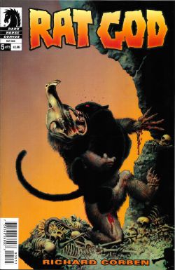
RAT GOD #5 Art by Richard Corben Written by by Richard Corben Coloured by Richard Corben with Beth Corben Reed Lettered by Nate Piekos of Blambot Tingit Translations by Lance A. Twitchell Dark Horse, $3.99 (2015)

 photo RatCovB_zpsub7nkikg.jpg

Serendipity strikes like a panther (there’s one in the book; good words there, eh? Seriously, this is Patreon level shit, people) as Richard Corben also splashes gaily about in the eldritch and gibbous influences of the Great Dour One, H P Lovecraft (with a pinch of Poe to boot). Of course the unapologetically pulpy Corben does so to blatantly different effect than Moore and Burrows’ cool exercise in control. RAT GOD is far more playful than PROVIDENCE, and all the better for it because instead of merely playing at Lovecraft Corben plays off Lovecraft.

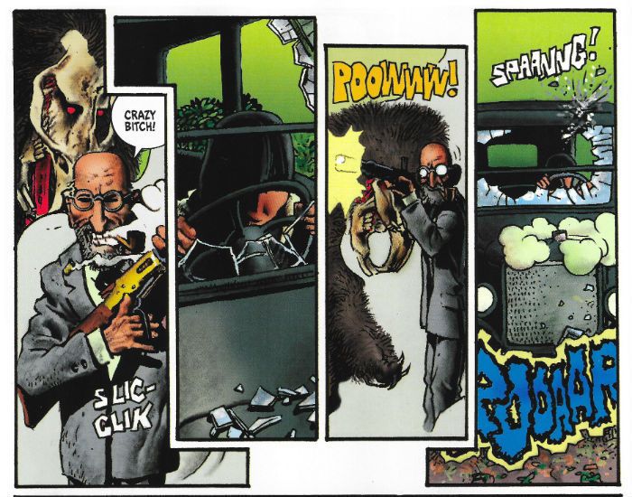
 photo RatPicB_zpsmspfi1sg.jpg RAT GOD by Corben, Corben, Corben, Corben-Reed & Piekos

In RAT GOD Corben has, over five feisty issues, brought the full plumminess of his fleshy and fecund style to bear on a tale of backwoods mutations, diseased family trees, pendulous breasts, Bombay Mix vegetation and splattery action. Corben’s approach to Lovecraftian lore is a far more red blooded and lusty one than the haughty reserve on display in PROVIDENCE. The collars are still starched but the necks within have a meaty quality suggesting the essential frailty their manners seek to mask. And the typically Lovecraftian catastrophic impact of dark forces on unsuspecting lives is hilariously played out in miniature every time violence sends our stiff protagonist into a burst of rag-doll-ish frenzy. As ever with Corben there’s a slapstick quality to the action which comically underlines the desperation of true violence. Sure, technically speaking writing wise Corben’s no Alan Moore, but as haphazard as his proceedings may sometimes appear, the irrepressibly antic tone of his approach can’t help but get him, and us, closer to the thing that truly scared Lovecraft - the animal in humanity. VERY GOOD!

In his house at R’lyeh dead Cthulhu waits reading – COMICS!!!

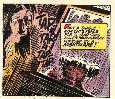
"You Can't...Put A BULLET...In A NIGHTMARE!" COMICS! Sometimes Pleasures Can Be Dark Indeed!

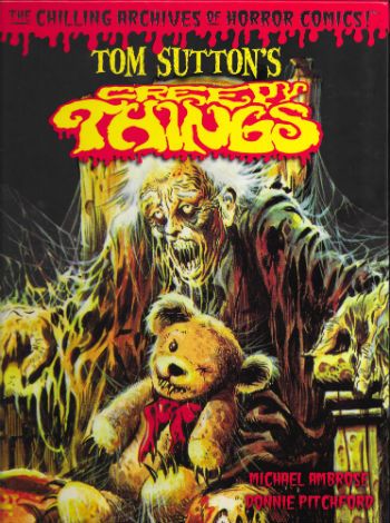
Thanks to the snow and the UK's inability to ever cope with it I got a bit of extra time (but not your...kisss!). I'll have to make that time up mind you, but don't you worry about that, because here's a pitiful splatter of words about a collection of Tom Sutton's work on Charlton's "ghost" line of comics. I should probably tell you upfront that I liked 'em, because I know I can be a bit equivocal about this stuff.  photo TSCTTeddyB_zp sa3cbbc52.jpg

Anyway, this... TOM SUTTON'S CREEPY THINGS (The Chilling Archives of Horror Comics #9) Art by Tom Sutton Written by Tom Sutton, Nicola Cuti & Joe Gill Edited & Produced by Michael Ambrose & Donnie Pitchford Yoe Books/IDW, $24.99 (2014)

 photo TSCTCovB_zps51444402.jpg

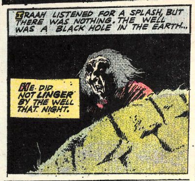
Oh, I loved this book. I loved this book so very, very much. This book is chock-a-block full of stuff I thought I’d never see, but stuff I always wanted to. And here it is and I’m seeing it! Oops, sorry. (Dignity in all things, John!) So, ahem, this splendid tome, from the hands of Michael Ambrose & Donnie Pitchford, contains reprints of a selection of strips and covers Tom Sutton drew (and many of the stories he also wrote) for the comics publisher Charlton's "ghost" line during the 1970s. I don’t think they’ve been reprinted since they first appeared, certainly not in bulk; I know they were all fresh sights to my eyes.  Which isn’t surprising as even though, like all good 1970s children, I was gluttonous in my hunger for four colour papery entertainment, Charlton rarely formed part of that eye diet.

 photo TSCTSerumB_zps82b9c42d.jpg

Mostly this was down to Charlton comics being a sporadic sight in obscure North of England market towns like the one in which I festered. The other thing about Charlton comics was that when they did turn up they were so aesthetically displeasing even the least picky child was deterred. Charlton’s poor reproduction and unpleasantly tactile paper are the stuff of legend, but it’s a legend based in fact; they were poorly printed on weird material. When it comes to the company itself fact and legend get all mushed up so, although it sounds like a myth, it is a fact that the company was formed over a handshake in jail. Yet the stuff which sounds plausible, the stuff about how their comics were the result of penny pinching efficiency because the presses had to keep rolling 24/7, might be a legend (it depends whose “facts” you read). Mind you, on reflection “The presses must never stop! They hunger.” is all a tad Oliver Onions, non? Delightfully so. Then there was the flood which submerged the company under 18 feet of water in 1958 and I’ve even heard that the nightwatchman had a hook for a hand and strange lights came from the gents on Wednesdays. From this physical and temporal distance relying on other people’s accounts Charlton sounds not so much like a comics publisher than a haunted house. Or a cursed one at least. Where better for the work of an artist whose art is as sinister as that of Tom Sutton to infest?

 photo TSCTSwirlB_zpsd1f95e57.jpg

Obviously that creaky and laborious conceit all rather crumbles to dust in light of all the other comics Charlton produced but I’m trying to keep a creepy theme going and you’re making that hard with your insistence on facts. So, yes, okay, Charlton didn’t just produce horror comics they produced western comics, war comics, romance comics, super-hero comics (Blue Beetle, Captain Atom, E-Man), licenced comics; remember, the spice must flow; the presses must never stop. And Tom Sutton probably drew some of those, but they aren’t in this book. This book is all about his Charlton horror comics (For pedants: yes, there's one S-F and one "barbarian" but they all appeared in the "ghost" line of books). Sutton worked at Charlton for the same reason as Steve Ditko - they paid pennies but they left you alone. As long as pages were coming in they were happy, which meant what was on those pages was at the mercy of the artist. Artistic freedom, I believe they call it. The results can vary depending on the artist (O God, can it vary; truly, it varies) but in Tom Sutton's (and Steve Ditko's) case the results were wonderful.

 photo TSCTFiligreeB_zpsbc3a18cb.jpg

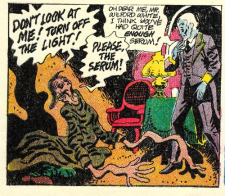
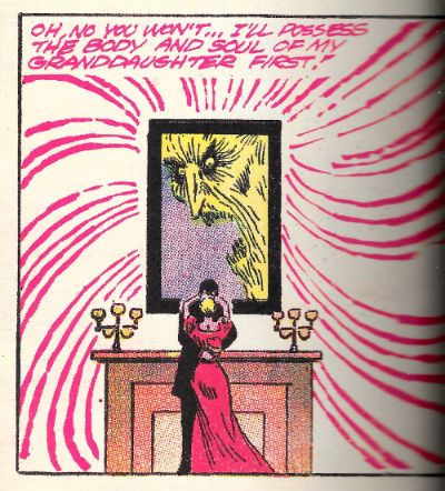
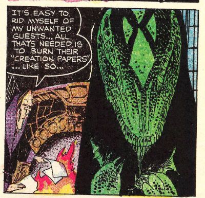
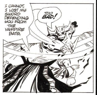
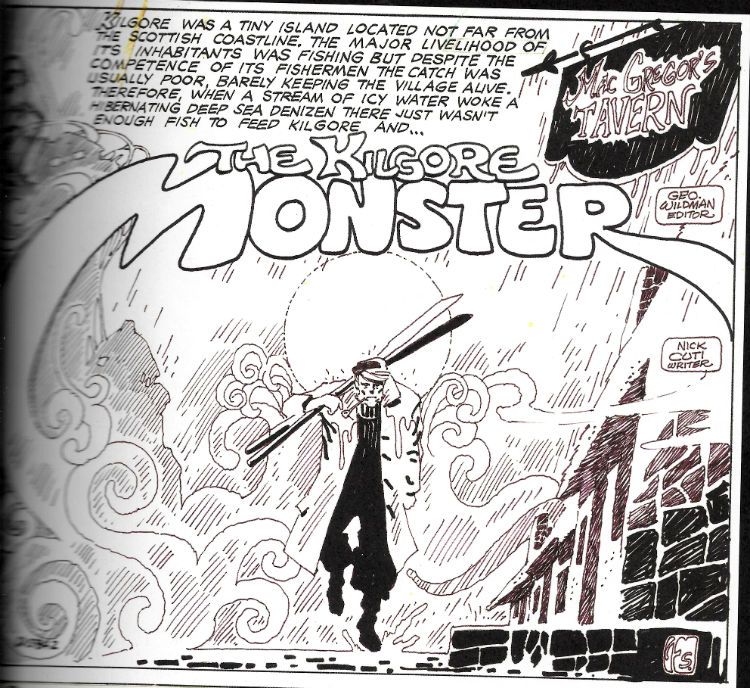
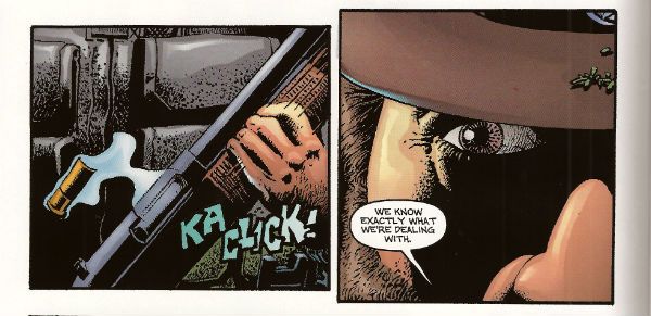
Not so much because of the plots, which sound daft when torn from their visual context. These artfully mottled pages contain a vengeful stuffed toy, a drunk and lonely ghost, an unfortunate marriage or two, a sea monster; basically a bubbling broth of all the rote , but fun, genre markers of horror of the 1970s. Yet Sutton’s art brutally lashes these mostly slender, and derivative (but sometimes original, to wit - a love story told from the POV of a grave) concepts to the end of their allotted pages and the results may leave your higher brain unruffled but your lizard brain will be skittering about like it sat on a hot rock. These strips leave hazy emotions lightly roiling in their wake as though something disturbed is moving around down there in the mud of your mind. Something angry;something hungry.

 photo TSCTwellB_zpsa5250df5.jpg

I guess it is style over content, but in that good way Comics can carry off; the style is sometimes also the content. Mostly, the content fills while the style kills. So, no, it isn’t the killer teddy bear which unnerves; it’s the world of razor sharp lines and blooms of stygian black you inhabit while reading which goes quietly about its terrible work of suspending your disbelief by its ankles. Sutton’s work can sell the silliest or most pointless stories because the seriousness is in the art. So, yeah, it's a story about a blob in love with a robot but when Sutton draws it, you can tell he's all in. They are stories but sometimes only just; sometimes it's better to see them as wells of mood into which Sutton’s art pitches you. The unfathomable depths of Sutton’s blacks in which he couches his sudden lurches into intricately filigreed detail are not only how the tale is told, sometimes they are the tale itself. "Unscheduled Stop" doesn’t even make any narrative sense but for the duration I was rapt as Sutton starts with one of the most depressing grid pages I’ve ever seen, and by the second page he’s messily riffing on Krigstein’s "Master Race", and then it’s page layout blow-out time as the ghost of Poe directs the Universal creatures in a fantasmagoric dream melt. I had no idea what I'd just read but I knew it was great COMICS!!!

 photo TSCTorigArtB_zpsb51b41c4.jpg

On an aesthetic note, the reproduction of these Comics (and covers) throughout is pretty good. They are presented as was though, so be warned that they do look like old comics. There's no re-colouring or re-mastering or re-anything except re-sizing and reprinting going on here (as far as I can see). Where there is the occasional descent into addled muddiness it’s still within acceptable parameters, I think,  for the privilege of seeing this work. For the most part, sized-up to magazine size as they are here, these pages have (probably) never looked so good. (They still essentially look like old Charlton comics though; I'm just making that crystal clear.) Better yet, there is a smattering of pages that also have never been seen (by the wider reading audience; obviously, someone saw them.) These pages take the form of the original art (from the collection of Michael Ambrose; cheers, Michael Ambrose!) and where possible these B&W reproductions have been used in place of the printed pages. Sutton’s often overlooked precision hits you immediately on these pages.

 photo TSCTFishermanB_zps5d59ac72.jpg

The shittines of the above image is due entirely to my scanning ineptitude. In the book this is (as are all other such B&W pages) crisp and clear. So, anyway, often Sutton's precision is lost in the blurry printing and the sheer reckless momentum of his art, but not here. Consider the half page panel of a sailorman stumping forth from a fog. It could have been drawn any one of the current carriers of Sutton's strain of dark genius; it could have slid from the brush of Michael T Gilbert, Steve Bissette or Kevin O'Neil only yesterday. But it didn't, it was drawn by Tom Sutton in 1974. In 2015 I am still impressed with the apparent ease with which Sutton makes the background elements creepily cohere into a shape of Cthulloid menace. It's just one of Tom Sutton's Creepy Things and this book's bloated with 'em. VERY GOOD!

"There's A Hairy Man Running At...!" COMICS! Sometimes It Takes A Corben To Catch A Monster!

Blah-blah more days to Hallowe’en! Sil-VER Sham-ROCK! (AKA Season of The Jeff!) Here’s some stuff about a monster comic. I was going to put it up on Hallowe’en but I’ll be busy going from door to door with my son begging from strangers. That being pretty much the only growth industry there is over here, so best to prepare him early! Life skillz! Anyway, this...Photobucket

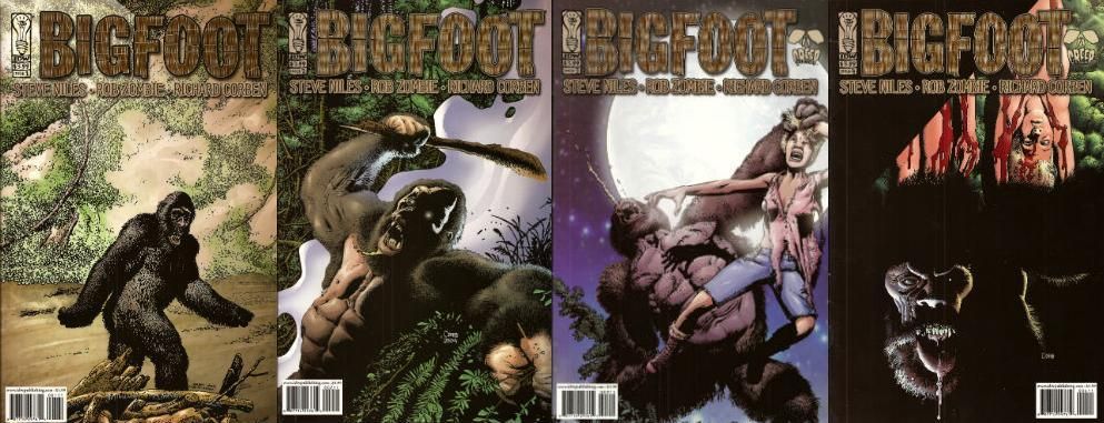
BIGFOOT #1 to #4 Art by Richard Corben Written by Steve Niles & Rob Zombie Colours by Martin Breccia & Nestor Pereyra Lettered by Robbie Robbins BIGFOOT is TM & © Steve Nile, Rob Zombie & Idea + Design Works. But not Richard Corben. IDW, $3.99ea (2005)

Photobucket

This is a comic from 2005, although as is usual with Steve Niles it’s really more of a come on to Hollywood. Yes, another pitch-comic I ‘m afraid. But this one is better than most as it is actually a pretty decent comic. This has little to do with the two writers (and copyright holders) and rather more to do with the guy they brought aboard as a hired flunky. The seasoned vet who’s brought on for his experience and ends up providing the most entertainment for the audience before being sacrificed at the end. Yes, tonight Richard Corben is Quint!

Photobucket

The main thing I know about Steve Niles is that like my Mum he believes that “If you can’t say anything nice then don’t say anything at all.” She said that thirty years ago and has remained mute as Michael Myers ever since. Hoist by her own petard there. (I’d just like to point out that creative people who wish to remove critically dissenting voices have no ulterior motive or vested interest in this happening. None at all. Perish the thought. Everything's just fucking dandy.) Now, unlike my Mother, Steve Niles has continued to be unquiet. Most of his output seems to consist of taking two things and putting them together in the hope that the result will be a third thing, a thing which will contain all the attractive qualities of the two separate things but also a new feature notable for its attraction to Hollywood. Oh, that’s unfair isn’t it, just plain rude in fact. Look, Steve Niles latest project is about vampires and robots...I'll continue then. And then there’s Rob Zombie. Who, basically, is an adult called Rob Zombie.

Photobucket

I don’t know if this indicates someone who does not take horror seriously enough or who takes horror too seriously. It isn’t that he has a daft name either it’s that it’s not a very good daft name. Lux Interior is a fine daft name for e.g.  but Rob Zombie is a bit on the nose for a Schlock Rocker, horror Director and celebrity fan-dancer, no? Like a comedian being called Clowny McSlapstick. And yet you may say; John, I feel you are still being a bit of a prick perhaps both Niles and McSlapstick felt that only comics could provide the unique storytelling tools their vision required, perhaps a movie deal would be naturally welcome but hardly the impetus for this artistic enterprise. I would then regretfully point out that BIGFOOT was published under the CREEP imprint, CREEP being a joint venture production company involving the two authors. Okay? I am probably being a bit of a prick though, you can still have that. My point though is that despite this BIGFOOT is right smart comic indeed.

Photobucket

The only real reason to rescue BIGFOOT from the back issue bins where it has holed up is the fact that on every page Corben works a series of wonders with what is quite frankly uninspiring material. From the title down there’s something altogether unpromising about the enterprise. BIGFOOT isn't exactly a name to conjure with is it? I hear BIGFOOT and I picture…well, a big foot. If I work at it I could maybe get some terror going. Maybe visualize the big foot launching itself sole first out of the foliage to rub its coarse underside all over the faces of its startled victims until they are riddled with verrucas the size of their own screaming mouths! You’re already swimming against the current by having that name up top. SASQUATCH! would have been better, it’s got the air of an authentic legend older than the white man but younger than the land whereas BIGFOOT sounds like a jackass in a bad costume.

Photobucket

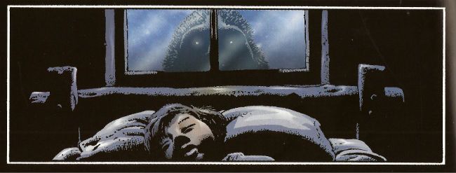
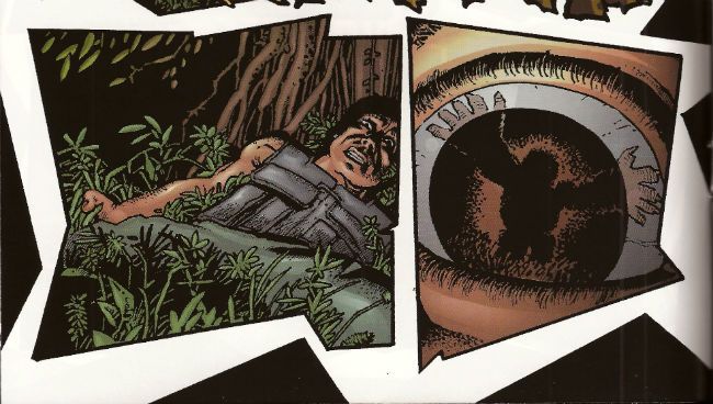
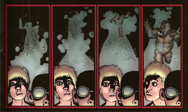
Corben does in fact start with a picture of a jackass in a costume with the cover to #1 and initially teases with stolen glimpses that this is what we’re going with. But when ‘Foot crashes through the wall (and through the page into the comic, which is a nice touch) his size alone means there’s no mistaking this sucker for a dude in a suit. From then on Corben uses his mighty roster of distortions of scale, inelegant angles, impossible shadows and queasy goofiness to bring the strange. Corben can suggest the essentially remorselessly savage and animalistically other nature of ‘Foot through just a single glassy eye and a lolloping bottom lip. He manages to remove the humanity from it using its most recognizably human features. He gives it a face but it is not a face you recognize yourself in. (Unless you are way more interesting than I am giving you credit for.) Corben also has night scenes on black pages and day scenes on white pages which is a simple trick but when the action busts loose he he has jagged panels combining both (non-) colours and (ta-da!) disorientates the established schema. Then there's the action itself. This has the usually Corben flourishes of drawn SFX and motion lines which give the whole thing an inappropriately goofy aspect. And it's this very inappropriateness that gives the horror its edge. That trick runs through all Corben's work as does the treat of his sheer professionalism which is on display in every page on which he outshines the script. Which is to say, on every page.

Photobucket

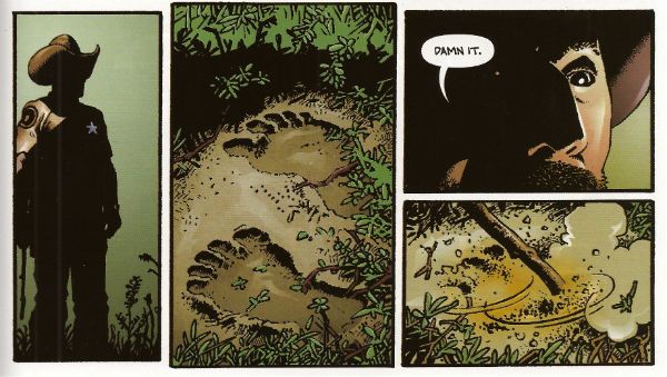
It’s to the credit of the writers that they recognized Corben’s talents would elevate their work. It would be more to their credit if they had provided a script which deserved him. You see the sin here is two fold. Niles and Zombie not only treat the comic medium with little respect (inconsistent use of thought balloons is a dead giveaway), as merely a step on the journey to the true destination (the movie!) but they also short change the monster movie genre. No, the monster movie isn't the hardest template to follow but they don’t even do that, and the reason they don’t do that isn't because they are going beyond the template, forging new paths of invention and terror, hell no, it’s because they just need this to read enough like a script to catch someone’s eye. Later on all the rewrites can do the tricky stuff. Because people in Hollywood are busy they've front loaded the pitch, with the first issue being the best and most fully realized but then they just seem to give up and fall back on the basics of monster movies. And I really do mean basics. It’s like they don’t think they have to try. Some of this stuff is just a step above the “SCENE MISSING” placeholders or scribbled in notes of “emphasise parallels!” a first pass script would require. There’s a scene in a gun shop which is kinda-sort-maybe edging towards making joke or a statement about the availability of automatic weapons in a sensible society but then wanders out to the parking lot without bothering. There’s no real reason given for the increased ‘Foot activity; there’s not a sudden influx of campers for Earth Day or Secretary’s Day, no one’s building a home for disabled orphans/luxury shopping centre near the ‘Foot family’s residence. I mean I’m assuming this is increased activity because in a very short period ‘Foot has polished off quite a number of people. If it isn't increased activity folks must be pretty damned blasé about missing campers in the States. The Sheriff finally nuts up but his reasons for covering up the ‘Foot attacks are beyond stupid. There is the slightest possible effort exerted to suggest that the ‘Foot attacks are advantageous to the area because of the economic benefits of tourists but this bears the same relation to a coherent satirical argument as a fart does to a turd. It's just there because that kind of thing should be there, look, we'll work it out later when Tom Arnold's signed up for The Sheriff. Speaking of which there aren't even any good roles! Where's the Quint?! Talk about not trying!

Photobucket

I'm not an unreasonable man. No one expects a Jaws, and no one wants a humourless exercise like Orca, but there’s a happy medium where intelligence, humour and horror meet that isn't all that rare (despite what snooty cineastes may maintain) in the monster movie. Is it too much to ask for an Alligator, a Piranha or a Lake Placid? BIGFOOT thinks it’s too classy to get down and roll around in the schlock like Blood Beach but the authors aren't even willing to put enough effort in to give us Grizzly. It’s aiming for Tremors but that had a good script so they end up with Razorback which people only remember because of the visuals. And the visuals here are only so tip-top top-notch because they at least had the sense to get Corben on it. And Corben? He’s on it like vomit. I…could perhaps have put that better. In effect he’s just(!) bringing The Corben but that’s what this inert, rote, half-formed stuff needs, it needs all the flying spittle, rictus grins, creepy textures and gummy blood pools Corben can provide. If there’s any atmosphere, tension, humour or horror here it’s because of Corben. And because it’s Corben there’s plenty of all those things. So BIGFOOT is VERY GOOD! because while BIGFOOT is a movie pitch rather than a comic Corben is, and ever will be,  COMICS!!!

I'm off now to carve living heads into the shapes of pumpkins and if I don't see you before then do have a a Happy Hallowe'en!

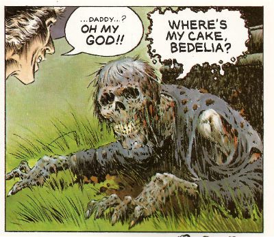
"Where's My CAKE?!" COMICS! Sometimes They Are A Bit Like Films (CREEPSHOW)!

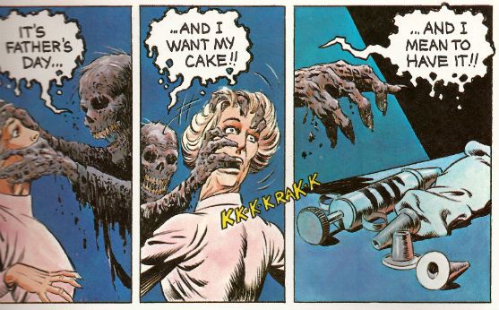
There came a day pretty much like any other day, except sales of Godawful Tony Parsons books went up. The Day of The Father! Photobucket

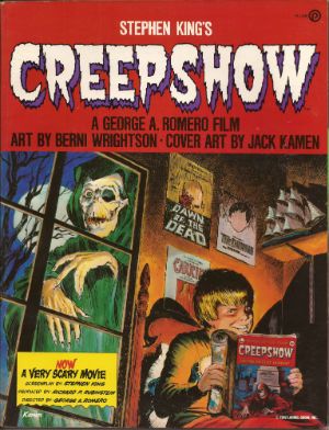
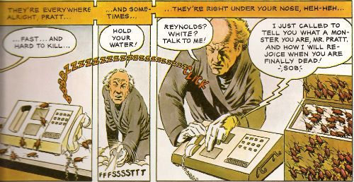
I hope you got yours a cake, kiddies! We Dads can hold a grudge for a long, long time! Heh. Heh. Heh. CREEPSHOW Art by Bernie Wrightson with Michele Wrightson Based on the motion Picture presentation CREEPSHOW directed by George Romero and written by Stephen King Plume/New American Library, $6.95 (1982)

Photobucket

A big old "COVER BY JACK KAMEN" - now that's treating creator's right!

Were I to open the nicotine stained and age crisped pages of my 1985 copy of Danse Macabre by Stephen King to page 36 I would find this:

"As a kid, I cut my teeth on William B. Gaines’s horror comics – Weird Science, Tales From The Crypt, Tales From The Vault – plus all the Gaines imitators…These horror comics of the fifties still sum up for me the epitome of horror…"

If I had time to continue reading I would find that King then goes on to describe, detail and analyse these fetid throwbacks up to page 39 of his illuminating non-fiction survey of horror. He may even go on about them later on in the book, but I wouldn't have time to check that. Hypothetically speaking, of course. Fact is, Stephen King loves him some old-timey EC horror schlockers. Hardly a bone jolter then to find that CREEPSHOW is a celluloid homage par excellence to such tales. Particularly as George A. Romero is behind the camera and, although I’m not as familiar with the man behind the ever enlarging glasses I’m pretty sure his genre work points to a familiarity with the same foul floppies.

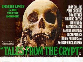
CREEPSHOW, then, is an EC comic made film. This hardly makes it notable as in 1972 there was Tales From The Crypt and, in 1973, The Vault of Horror. These were Amicus productions, although they are often mistaken for Hammer films as, to be honest, for a viewer there isn't much between the two studios. Amicus were a bit tattier, perhaps. Amicus produced a few such anthology films although the trend for horror anthologies was popularised in 1945 by Dead of Night.

Photobucket

Tales From The Crypt poster Image taken from britposters.com.

These films are often referred to as portmanteau films. “Portmanteau” is French and thus makes everyone feel that bit classier about watching a film where, say, Roy Castle and Kenny Lynch face off against a Voodoo demon in a chilly British back lot passing for the West Indies, or a film where a scientist removes his pipe and gravely intones, “Why, a plant like that could take over the world!” Basically such films consist of a framing sequence, although that bit can be optional, with some connection to the handful of short, sharp shocks which then follow. They were pretty camp stuff, I’ll be bound. Sadly, at this remove it’s hard to tell if the campness is intentional. The sight of Tom Baker screaming in beige flares might once have been chilling for reasons far removed from his fashion choices or the damage he’s inflicting upon the concept of “acting”. The final stake through the heart of this enjoyably daft stuff came in 1980 with The Monster Club, a film that fails so badly as horror that the scariest part is a musical performance by B.A. Robertson. By 1980 then all that remained was the camp and that wasn't enough.

Photobucket

Art by Berni(e) Wrightson and words by Stephen King

In 1982 Romero and King inflicted CREEPSHOW upon the world. CREEPSHOW, while being a bit camp, is so technically adept and innovative as a film that the fact it came only 2 years after The Monster Club is pretty startling. I’d love to talk about all that but, since I haven’t seen it for about 20 years I can’t. That’s right, the clock has just struck amateur hour! Still, as unprofessional as I am I’m willing to bet a toffee wrapper and some lint that technically it’s still impressive. Impressive as a homage to the comics themselves and the films inspired by those comics, but this is a comics blog so how does the adaptation fare?

It does a pretty great job, thanks for asking. In terms of form it’s a step back for Berni Wrightson. Wrightson (who at this point isn't putting an “e” on the end of his name so I've had to do two tags, thanks Berni(e)!) had of course been a keen and active participant in the Warren magazines Creepy and Eerie. Those brought the EC formula bang up to date for the stinking Seventies and the emaciated (early) Eighties. Which mostly meant being (slightly) more horrible and having less narrative text, because the EC stuff was already pretty awesome, thanks very much. The worst elements of the originals were their overwritten nature, where a text box would describe what the artist was illustrating. Since the artist was probably someone awesome like Jack Davis or Graham Ingels, the largely redundant words would be putting a serious crimp in how much they could fit in one of the cramped panels. This was less than ideal for fans of fantastic art. CREEPSHOW the comic dials back a bit on this narration but the amount of speech still overwhelms the images at times. So, it’s a kind of compromise, I guess, and it does work for the most part. It certainly reads like an EC Comic; slightly better in fact due to the narrative nips and tucks.

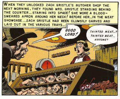
Photobucket From "'Taint The Meat...It's The Humanity!" in Tales From The Crypt #32 (EC Comics, 1952). Art by Jack Davis and written by Al Feldstein. My All Time Favourite Bad Pun Title!

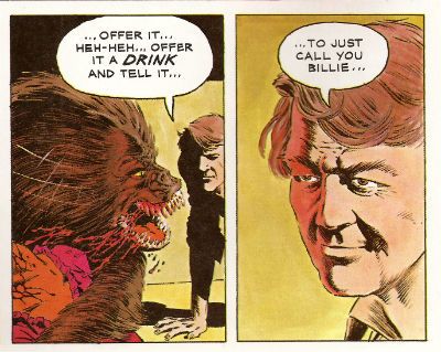
Where it doesn't quite catch the EC essence is in the horror. It just isn't horrible enough. I haven’t read a lot of EC Comics but what I have read has quite often been really quite foul. That’s okay, it’s a horror comic so that kind of comes with the territory. The five stories by King presented here have horrific elements but the campness is turned up just that bit too loud and dulls the impact of the atrocities on display. Strangely, it comes across as a nostalgic view of the material. One that surprises by flinching away from the tasteless stuff that defined it in the minds of its readers, such as Stephen King, in the first place.

Photobucket Art by Berni(e) Wrightson and words by Stephen King

Oddly the adaptation drops the movie’s framing device, I guess page limits acted as a kind of budgetary constraint here. It does mean Joe Hill doesn't get to see himself in a comic by Berni(e) Wrightson, but he is on the Jack Kamen cover. And how loudly does the fact that Jack Kamen’s credit is so large speak to the love of the creators for the source material? Loudly indeed. Speaking of the thespian Kings, possibly the best thing about the comic is you don’t actually have to experience Stephen King’s performance as Jordy Verrill, which is a bit like having to watch Kenneth from 30Rock do a 20 minute experimental play. Sometimes I wonder why CREEPSHOW is never on TV, and part of me can’t help but wonder if Stephen King’s family haven’t got something to do with that. The likeness of Jordy suggests Berni(e) Wrightson had never seen Stephen King as do many of the other depictions of folk such as Ed Harris, Ted Danson and E.G. Marshall. He does a cracking Hal Holbrook though. Maybe Berni(e) Wrightson just really dug drawing Hal Holbrook? Each to their own. Although the adaptation benefits from the lack of Stephen King, er, acting it does suffer from the lack of, say, E.G. Marshall’s horribly convincing performance as a massive sh*t bag. But then adaptations always suffer from the lack of the human element that brings so much life to the material on the big screen. For me, that’s where the artist comes in. His, or her, performance is going to make or break an adaptation. And when it comes to Berni(e) Wrightson, for me, the guy’s a maker not a breaker. Nice work, Berni(e) Wrightson!

Photobucket Art by Berni(e) Wrightson and words by Stephen King

So, while it isn't the first EC type comic to stain the cinema screen CREEPSHOW is the first(?) to actually attempt to create the experience of reading a comic through the medium of film. And the comic CREEPSHOW is an attempt to replicate the experience of watching the film based on those comics but mostly the comics themselves. It’s all a bit confusing really, but it remains GOOD!

So, yeah, I spent Father’s Day with some COMICS!!!

How about you?

"Or Is There ANOTHER Way?" COMICS! Sometimes The Carny Winds Up In The Fridge!

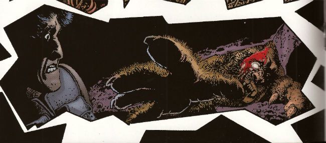
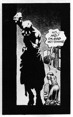
Sorry about that interruption in the weekly magic of me but I'm back now! What's that? Photobucket Art by Bernie Wrightson with words by Bruce Jones.

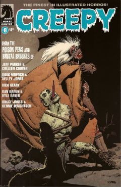
Man, you people are brutal. Talking about a horror comic after the break... CREEPY #8 Art by Colleen Coover, Kelley Jones, Rick Geary, Kyle Baker and Bernie Wrightson Written by Jeff Parker, Doug Moench, Rick Geary, Dan Braun and Bruce Jones Lettered by Colleen Coover, Nate Piekos of Blambot® and Rick Geary Frontispiece by Darick Robertson Cover by Richard Corben Dark Horse, $4.99 (2012)

Photobucket Art by Richard Corben.

Because I like telling you what you already know I'll start by saying this is the revival of CREEPY, a horror anthology that was originally published from 1964 to 1983 by Warren publishing. Dark Horse are currently reprinting those original issues in the form of expensive hardbacks and at least one story in each of the current incarnation’s issues acts as an advert for such. In this issue that story is Jenifer. Ah, Jenifer. But before we get to Jenifer first we must disinter the new contents provided by the creepy crew named and shamed above.

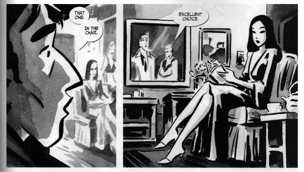
NINETEEN Drawn by Colleen Coover and written by Jeff  Parker

Photobucket

Art by Colleen Coover with words by Jeff Parker.

Jeff Parker and Colleen Coover are both smart and talented artists. Parker having a deceptively simple style and Coover being less than shy about sexuality in her work on X-MEN: FIRST CLASS, sorry, her work for Eros. It’s hardly a twist ending then that the story they produce is a short, smart shocker which updates a psychosexual myth while also neatly exploiting the links between sex and guilt. It isn't remotely scary but it is cerebrally unsettling and rewards reflection. Given the themes and the nature of the mythical concept in question Nineteen is in roughly the same plot of the graveyard as Jenifer but the approach is less lurid and, thus, less striking. Ah, Jenifer. You’ll soon see how striking Jenifer is.

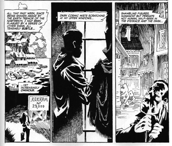
THE LURKING FATE THAT CAME TO LOVECRAFT PART 1 Drawn by Kelley Jones and written by Doug Moench

Photobucket

Art by Kelley Jones with words by Doug Moench.

Here Moench cunningly casts the spade faced master of prolix perversity and possibly racist undertones as his main character and thus, witting or un, provides himself with an opportunity for prose of the most Tyrian hues. An opportunity he doesn't so much seize as throttle until its eyes bug out and its bowels void. Which, as I say, is pretty fitting. Anyway, the man notable for lacking in the craft of love, so I hear, himself is finding his mind falling apart at an appalling rate as reality seems to be confusing itself with his own fictions. If you enjoyed Carpenter’s In The Mouth Of Madness as much as I did (Did you? Really? Really.) you’ll enjoy the premise here. Moench’s long time collaborator Kelley Jones is just the right fit for this stuff as well, with his contortions of physique, viewpoint and architecture. Since we don’t have “gibbous” as a rating I’ll call this one GOOD! If I were to say that Jones’ art contains a lot of Wrightson then that wouldn't be a criticism, not considering the work Wrightson does on Jenifer. Ah, Jenifer. But we have yet to meet Jenifer.

THE MAUSOLEUM Drawn and written by Rick Geary

Photobucket

Art and words by Rick Geary.

By way of a continuing series of original graphic novels (A Treasury of Victorian Murder..., A Treasury of XXth century Murder…) Mr. Rick Geary has documented some of the lesser and greater known incidences of horror human beings have visited upon each other. Murders, I’m on about murders. Along the way he has developed a style which is seemingly non judgemental but through the implacable accumulation of facts becomes unmistakable in its moral disgust. Also, no one works straight lines harder than Rick Geary. Seriously, he’s murder on them. Sigh. Anyway all of the remarkable craft he applies to historical atrocity is here applied to a bitterly sweet tale of life and death and love and loss. It’s Rick Geary so it’s GOOD! Wait, can you hear her tread upon the step, her shadow through the glass; she's almost here. Jenifer approaches.


LOATHSOME LORE Art by Kyle Baker and written by Dan Braun

Kyle Baker draws over some photographs to good effect here, showing that drawing over photographs isn't intrinsically evil after all. As to the contents, if Dan Braun seriously expects me to believe Siouxsie And The Banshees ever horrified anyone except people allergic to large quantities of cosmetics on a confined face, he’s going to have to personally introduce me to them. This was CRAP! And now a rap-rap-rappin' at the door and we throw it wide to reveal...


JENIFER Drawn by Bernie Wrightson and written by Bruce Jones

Photobucket

Art by Bernie Wrightson with words by Bruce Jones.

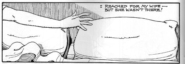
Jenifer is written by Bruce Jo…wait, come back! I know, I know, Bruce Jones did the unforgivable; Bruce Jones wrote some bad super hero comics. Actually judging by the output of today’s superstars Bruce Jones’ real mistake was to write some bad super hero comics without first inveigling himself into the brain matter of fandom like some wayward tape worm. Before that though, before Bruce Jones (<choke!>, <gasp!>) wrote some bad super hero comics, Bruce Jones wrote some really, really good horror comics. Of which Jenifer is but one.

Photobucket Art by Bernie Wrightson with words by Bruce Jones.

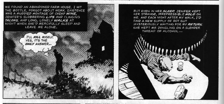
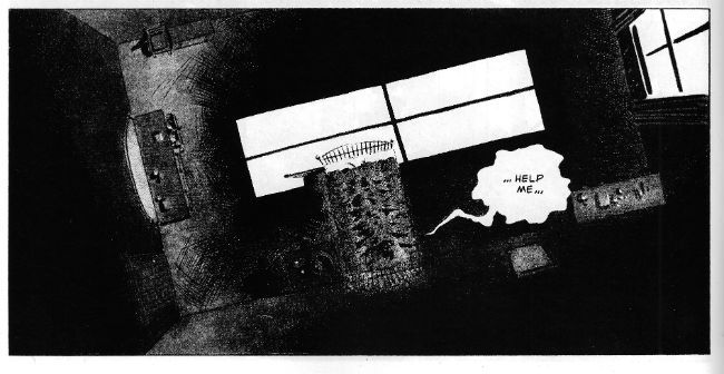
The big thing about Jenifer is that it is horrible. Bruce Jones doesn't shy away here he just goes for it. Bruce Jones goes there. Bruce Jones goes to that place where you start to doubt the sanity, or at least the decency and good taste of the author. And if decency and good taste have much to do with horror they don’t have to anything to do with this kind of horror. This horror is both visceral and cerebral. Oh, there’s gore galore here alright, but it’s the thoughts that count. Sometimes horror needs context and without that context you won’t understand why the next image is the one that sticks, why this simple panel is the one that tunnels in and nests:

Photobucket

Art by Bernie Wrightson with words by Bruce Jones.

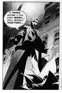
Of course Jones isn't working alone here, he’s got an accomplice, better yet he’s got Bernie Wrightson. Wrightson’s art is essential to Jenifer’s success. All the things you think of when you think of Wrightson's overwrought art are here. So much so that it should be overwhelming. The figures are gnarled, tortured, hunched, looming doomed things inhabiting rooms lit like noir’s paying the bills and existing in a world of forced perspective and perplexing forces. It’s too rich, too much and it is overwhelming, it’s supposed to be overwhelming. Jones’ nervily helpless narration and Wrightson’s muddily grey washed series of tableaux (separated by the almost subliminal white flare of the gutters, the flare of a flash as he records photos of Hell and presses them into your eyes) punch a series of moments which roil with a lunatic heat right into your brain. Where they will probably remain until your body cools and sets with rigour. Oh yes, Jenifer is a very bad girl but Jenifer is VERY GOOD!

Overall this issue of CREEPY was VERY GOOD! This isn't always the case, previous issues have been somewhat, ahem, variable in quality. This one's worth picking up for Jenifer alone but the quality of the other stories should ensure you get your blood money's worth. Oh, and it's by no means a slight on the modern contents than Jenifer ranks highest, that's because when it comes to horror Jenifer is pretty rank stuff indeed. Heh. Heh. Heh. Enjoy, kiddies.

Until next week then, don't have nightmares; read about them in COMICS!!!