Abhay: Quickly on Two Recent Superhero Comics

(Work on getting back to this year's Inquisition series is proceeding slowly.  Sorry for the delays.  I just woke up and started to write a little brief thing about two superhero comics that I'd read the other night, to get my fingers moving for work-- I thought I'd write one or two paragraphs. Anyways, it started running long, so I'll just put it here rather.  Just a quick pointless little note:)

tumblr_nl7rjyGtr41qabyxlo1_400

Read Mastermen and the last issue of Supreme: Blue Rose — both by dudes who made their names (less so with Ellis) in a mode of superhero comics that seem to have fallen out of fashion.  The "superhero genre interrogation" comic.

Mastermen’s part of Morrison’s Multiversity project of DC one-shots.  I have a hard time with those, how little the stories in the issues seem to add up to anything, all the cliffhangers.  I like the part where it all feels like watching a guy happily rolling around in filth, you know?  The good bits, at least for me, have been where it's felt like he's trying to create one definitive catalog of all the images in that genre that he likes.  But my least favorite thing about superhero comics is that unresolved nature of them, and I guess Morison doesn't feel the same way, probably sees that as a cornerstone of their appeal.  I understand the necessity of the cliffhangers, the logic of them--  I just don't find it particularly entertaining, the way this project just stutters.

Plus: I just don’t think he’s going to stick the landing; he didn’t on Final Crisis; he didn’t on Seven Soldiers; the Invisibles was a long time ago.  Being pleasantly surprised would be nice, but.

This Mastermen thing was probably my least favorite of the project so far in that it’s him playing with my least favorite type of that story, the “dark everything went wrong alternate universe” story.  First off, it’s almost always the same exact story— “what if there was a dar—” “all of the superheros would kill each other single tear rolls down cheek. NEXT!”  Why can’t anyone just cook a nice dinner in a dark alternate universe?  I made meatballs last night -- they came out pretty good; our actual universe is extraordinarily dark; we actually exist within a really bleak horseshit universe, all the time, but the meatballs are still tasty; I think that's got to mean something, right?

Second, I grew up a Marvel kid where there was a continuity and things were set in this analogue of our world, for the most part.  So even though they had their dark alternate universes, the Sentinels or what have you, anytime that kind of superhero story would pop up, I remember greeting them with an enormous impatience, being irritated about having to wait around to get back to the "real" story, the "real" universe where what happened mattered.  The stuff with consequences, dammit!

Even though I'm old enough to see the illogic of that... I think I still have that a little.  I don't think I've shaken that.  Which is pathetic, but hopefully in a slightly adorable way, at least.  Makes me laugh, at least.

Third, I didn't find it a very good instance of that type of story in that it felt like it tried to have its cake and eat it too.  "What if the Nazis found Superman?"  "Oh, he'd still be a nice guy-- the entirety of the Holocaust would've happened in the three months he was away from Germany.  But he'd still be a super-great guy."

I don't know if this Mastermen universe is a homage to a specific DC comic -- with Morrison lately, there's always some annotation out there ready to assure me that it is, I suppose.  But setting aside how "Nazi Superman" might've been portrayed in some 1967 comic, that just seems like a fucking dumb idea.  (I've heard of that comic where Superman gets raised by commies but skipped that one, too, for the same reason.)  Super-baby only becomes Superman because he was raised by cool Smallville middle-American people with Midwestern bourgeois small-town provincial values -- to me, that's part of the core schtick of that character, and it's one of the better features of that character, I would even say.

Having other folks raise a super-baby and he stills ends up as Superman...?  Maybe I'm nuts, but I don't think the math quite works there.

Also: the Freedom Fighters?  Really?  No.  Nope.  No no.

In addition, boy, Jim Lee sure seemed especially uninspired.  He had to draw a splash page of a rocketship at one point, and the most interesting thing in the splash wasn't the rocketship -- it was the detail on the girders in the warehouse that the Nazis kept the rocketship in.  Like, I'm looking at this splash of the most amazing thing I'd ever see in my life, if I were in that room, and instead saying to myself, "that's some nice detail work on those girders."

The rocketship's just this dildo shape with speed lines on it for no reason.  Alien rocketship made of extraterrestrial metals hurtled from an exploded planet  ... yawn...?

I’d actually been enjoying that Supreme Blue Rose comic more, even though its title was "Blue Rose", which sounds like the name of an album by an earnest young singer-songwriter, crooning about blind dates she went on in the pouring rain, stuff like that.

Even if the investigation frame or specific moments didn't feel entirely fresh (e.g., the "weird priest" scene), I did like that it was built on a concept that felt a little fresher -- watching characters flail around in a deformed aborted-reboot universe.  (I wonder a little if it'd have been better or worse if I hadn't have read the Alan Moore run).  Sure, it was another “dark everything went wrong alternate universe” story, but I like that it didn't stop at defining "everything went wrong" as just being that "Superhero fiction never happened."  I like that it was instead "Superhero fiction never happened ... but the broken fragments of that fiction are trying to reemerge into the fringes of this deformed reality anyways."

I'm sure there are superhero comics that've played a similar card, but I like how this one was executed as almost a horror thing (though the horror quality never felt fully realized). Actually, I'm not sure if any quality of that comic ever felt fully realized, though I might chalk that up as part of the appeal, the indeterminate state this comic existed in.  Not so much a full-on ghost story as a sort of barely-there exorcism of the genre.

I guess I liked that Supreme book overall more, though, of the two projects,though it's certainly the less ambitious.  I just felt like it was more committed to at least pretend to investing some novelty into the genre.

A bland ending, though.  Or more time spent on the Dax-Ethan meeting just would’ve been nice at least.  I felt like that meeting was the promise that had been made to the reader, at the outset, and that just never paid off.  Seven issues build to a two-page scene...?  Look: based on other Ellis work, I went in not expecting much character work, not expecting any drama or emotion.  So I can't pretend to be too upset -- I was never that invested.  But seven issues is a lot of road to travel for two pages of nothing-but-plot.

I understand the logic of the underwhelming ending to the deformed, aborted reboot universe; I don't entirely understand the "entertainment" part.

I just especially like Tula Lotay's work -- she was very much the star of that Supreme comic, more than anything else about it.  I liked how Lotay always made every panel feel very liminal, without going for obvious tricks.  Plus, the character designs always just seemed really fashionable and stylish without losing a certain superhero-adjacent appeal; really swell fashion choices in this comic. Sure, Multiversity had Quitely and Cameron Stewart, at the top of their games.  But even if both drew better, had better storytelling, made fewer "bad choices" (there's a sound effect "No" in #7 that's really pretty ghastly), neither felt as entertainingly alien; as new; I'd seen their moves before.

What was most striking about the two comics, though, was just how out of step they both feel now.  Besides Astro City (which has been around since the 90's), I don't think "the clever superhero comic that questions how the superhero comic works in some way" is a very populated genre at the moment.

I grew up with folks playing around with superhero comics in weird, interesting ways.  For a long time, that was 100% the kind of comic I constantly wanted to read.  Heck, I still like the idea of that kind of comic.  It's just such a weird genre, superheros, the most comics-y genres that the idea of watching someone take a scalpel to it in any way has such an appeal for me.  I like that genre because it’s the imagination’s trash heap— every dumb fantasy idea anyone’s ever had could fit into a superhero comic somewhere, if you just slap a mask on it, which makes stuff that’s more in an analytic mode fun to me, going back to Watchmen or The Enigma or what have you, that so much geography of the imagination could potentially be interrogated in some way.

But boy, it doesn’t feel like a very “hip move” in 2015. Which is kind of interesting.  Because superhero stories have only become more ubiquitous in the overall culture, and yet "statements about the superhero genre" just seem more unnecessary than ever within comics. Both of these comics felt like relics.  Supreme Blue Rose still had some wriggle to it, but Multiversity very much feels like an "old folks play their hits" act.  There's a disconnect there, maybe, though I don't think I can explain it.

It feels exhausted.  It all feels like such exhausted, fallow terrain, at the moment, notwithstanding their cultural ascendancy, notwithstanding being at the peak of this rather massive fad.  Even setting aside my own exhaustion of hearing about dumb casting announcements and dumb projected schedules and dumb spinoffs of spinoffs of TV projects, even setting aside my own feelings of being very tired and wanting a nap, just look at the stands and those comics aren't really there, except Astro City, still plugging along, after all these years.  (And maybe some people might count Powers, though reasonable minds could differ as to that book's intentions).

Why did people have more interesting things to say about superhero comics in their dead-est years?  Wouldn't you expect the opposite?  Or is there some quality of a thing being culturally ascendant that makes people who would be inclined to think about those things just throw their arms up and surrender?  Maybe, it just feels more imperative for creative people to find something, anything else to do with their time, just to distinguish themselves if nothing else.

I don't think it's a bad thing-- if Multiversity is any indication, I wouldn't enjoy reading those kinds of comics very much at the moment; it's not the part of the store I really go to first.

It just seemed like a curious thing, maybe worth a brief note.

"If I'm Reading Those Erect Nipples Right, YOU'RE Having A Good Time." COMICS! Sometimes They Might Be A Wee Bit Too Hard-Boiled.

Hey, I wrote some words about a comic. They're under the break, somewhere. I think that's how it works. Mostly this one is about how people will still be awful in the future and how Rick Burchett is The Balls. Sorry, still shaking the rust off.  photo PFWorthB_zpsde7q1vob.jpg PULP FANTASTIC by Burchett, Chaykin & Tischman, Bruzenak & Loughridge Anyway, this... PULP FANTASTIC #1-3 Art by Rick Burchett Written by Howard Victor Chaykin & David Tischman Lettered by Ken Bruzenak Coloured byand Seperated by Lee Loughridge Covers by Rick Burchett & Howard Victor Chaykin Logo by 52MM DC Comics/Vertigo, $2.50 each Pulp Fantastic created by Howard Victor Chaykin

 photo PFCoversB_zpsi1xni5na.jpg

Pulp Fantastic was published in 2000 as part of DC Comics’ fifth week wave of millennially themed/inspired mini-series. Older folk will recall that everyone expected the world to die screaming on the millennial stroke of midnight as toasters exploded, shoes refused to work and milk demanded equal rights. By continuing to publish comics in the face of this certain (certain, I say!) Apocalypse DC/Vertigo showed a touching faith in the survival of the human race. A faith that was well founded since we can all agree the world is still here. (Unless you are particularly philosophically minded, in which case; who knows?) What isn’t here in 2015 is a TPB collecting Pulp Fantastic, so it’s to the back-issue bins if you want to experience a beautifully illustrated but markedly mean spirited exercise in genre repurposing. Because while the series is draped in sci-fi schmutter so it can fulfil its future themed remit, it is quite clearly an exercise in the hard-boiled PI genre.

 photo PFchairB_zpsa1ifzyq8.jpg

PULP FANTASTIC by Burchett, Chaykin & Tischman, Bruzenak & Loughridge

Pulp Fantastic is set on a future world far way to which the members of a (presumably very large) cult ascended on New Year’s Eve thanks to the benevolence of some passing aliens. The aliens have gone AWOL and the cultists have developed a society not entirely unlike a ‘50s noir world crossed with a Roman Catholic mall. It’s an utterly bizarre set-up that doesn’t seem to have much purpose as anything other than set dressing until the many, many, plot threads Chaykin & Tischman have been waving gaily in your face knit together to make an utterly bizarre pullover, I mean ending, in the third and final issue. Our narrator for the course of the series is one Vector Pope; a foul-mouthed cynic with the sex life of an alleycat who is drawn by the incredibly talented Rick Burchett as resembling a Peter Gunn/Howard Victor Chaykin hybrid. Pope is an ex-cop PI hired to find some shmuck’s frail but what looks like a cakewalk is complicated by the fact that the cake, it soon transpires, was baked with sinister motivations and fateful ramifications. And eggs, probably. Also, cakes don’t have legs, so I don’t know what that expression means but it sounded old-timey. And Pulp Fantastic is an old timey throwback with a vicious modern streak on top. I guess that's the cherry on the cake. (N.B. Writing is hard.)

 photo PFDinerB_zpsq5pl7kib.jpg

PULP FANTASTIC by Burchett, Chaykin & Tischman, Bruzenak & Loughridge

Just as Robert Altman and Leigh Brackett famously updated Chandlers’ Marlowe to excellently sour effect in The Long Good-bye (“…it happens everyday…” Cheers, John Williams and Jonny Mercer. ) so Chaykin & Tischman, maybe, (possibly) try a similar trick with Hammett’s Sam Spade. Altman & Brackett recast Marlowe as comfortably inert (“It’s all right with me.”) until the accumulated effects of his inertia actually affects him personally. Beautifully played by Elliot Gould, he’s an affable prick; it just takes a while for the prick to kick in. Spade was already scrappier, blunter and, well, prickier, than Marlowe in the source books so Chaykin & Tischman’s trick doesn’t work so well. Also, Pope starts off as a turbo-charged prick so his pitiless pursuit of prickishness over the three issues means that when he performs an actual act of kindness at the end it’s as unexpected and shocking as someone shooting their best friend like a dog. If (if!) it is an update of Hammett’s Spade for a more cynical age it works a bleak trick indeed. In at the kill of the fin de siècle Pulp Fantastic suggests kindness is the surprise and cruelty the norm. Maybe they aren’t even doing that, how the good fuck would I know, I’m just spitballing here.

 photo PFActionB_zpsnhivoemd.jpg

PULP FANTASTIC by Burchett, Chaykin & Tischman, Bruzenak & Loughridge

Anyway, it’s rapidly apparent that Hammett’s The Maltese Falcon is (really) being playfully, and primarily, bludgeoned throughout Pulp Fantastic but there are also nods to the usual commonplaces of crime fiction. Regular head traumas resulting in unconsciousness at narratively opportune moments for our protagonist? Check. Ladies who are like trouble: they’re easier to get into than they are to get out of? Check? Ladies who just like trouble. Check. Troubled ladies who like The Who? No, don't get smart. A client and a case neither of which are what they first appear? Check. A duplicitous dame who plays men like the spoons. Check. A maguffin. Check. A fool, a foil and a frail? Sordid secrets of the rich and powerful? Check. Check. Check. And Checkity-Check. Waiter! Check! As countless comics can bear tedious witness this kind of thing can quickly descend into lifeless homage, but whatever Pulp Fantastic’s faults (and there’s a few of ‘em) it’s certainly lively. A lot of this life comes from Chaykin & Tischman’s choice to be almost provocatively vulgar but this does have its drawbacks. The most successful spark is in the art, and the only drawback there is that there’s only three issues of it.

 photo PFshipB_zps4w7nmxv4.jpg

PULP FANTASTIC by Burchett, Chaykin & Tischman, Bruzenak & Loughridge

The cleanest thing about the book by far is Rick Burchett’s line which lends the world of Pulp Fantastic a hygienic aspect which the nasty narrative can bounce loutishly off to nauseous effect. Burchett’s future is an idealised one; a future informed primarily by ‘50s/’60s art-deco. It is in this sanitary and regular environment Chaykin & Tischman’s grubbily ‘70s inflected characters brutalise, intimidate and kill each other. And all those awful, awful characters are expertly designed by Burchett. I particularly liked the fact that Pope’s legs are clad in trousers so tight that his legs suggest those of a satyr. And Burchett’s got storytelling down pat. Guy’s got range, is what I’m saying. He can give you dynamic splash pages as with the opener of Pope hurtling through a stained glass window. Or if it’s a talky scene why not have Rick Burchett sprinkle some well-judged expressions to soften the exposition? Fancy a cat’n’mouse scene but don’t want the reader to notice it’s happening until afterwards? Call Rick Burchett on 0800 DOESITALL. Ma Burchett's boy - your one-stop shop for all your storytelling needs. Overall I get the sense Rick Burchett had a sweet time drawing these pages; I know for a fact that I had a sweet time looking at what Rick Burchett had drawn. Burchett’s often remembered for his work on the Batman animated comics but his work on Blackhawk in Action Comics Weekly and then, later, in the short lived Blackhawk series is well worth whatever pitiful sum your comic vendor will charge you. As is Pulp Fantastic.

 photo PFPopB_zpswhxjybxw.jpg

PULP FANTASTIC by Burchett, Chaykin & Tischman, Bruzenak & Loughridge

So, Pulp Fantastic has a lot going for it. It’s got Rick Burchett. It’s got Ken Bruzenak too. The extraordinary Ken Bruzenak spatters the whole thing with his typographic magic. The world of Pulp Fantastic is lent an extra level of conviction through his wonderful skill with visual onomatopoeia, which proves valuable beyond the wealth of man in world building and character definition (some characters speak in different fonts). Ken Bruzenak’s lettering forms another layer of art, but one which works with Burchett’s, avoiding clutter and achieving a dreamy seamlessness of purpose and effect. It’s got those Chaykin names that crackle with fanciful implausibility to such an extent that you suspect they might actually turn out to be filthy anagrams. It's got a plot that just won't stop. It's got Lee Loughridge's colours which are super good but I lack the knowledge to pinpoint why (I liked the greens in the church scenes, they contrasted nicely with the purples. But I don't know why purple or green, see?) According to the credits Loughridge's colours are having such a good time that had to be separated like randy dogs.

 photo PFChurchB_zpskxs0k8il.jpg

PULP FANTASTIC by Burchett, Chaykin & Tischman, Bruzenak & Loughridge

Unfortunately, there are some editorial aspects which suggest something rushed about the series. The first issue says it’s “1 of 4” but by the second issue this is truncated to 3. Misprint or something else? My money’s on something else. But then I have no money, so the joke’s on you! Chaykin usually works at his best in a three act structure; four or five and some padding slips in; six issues and he gets a bit wheel spinney, but three issues is usually pretty golden. Yet Pulp Fantastic is three issues and things are clearly a bit awry. Only the thundering pace of the thing distracts from the fact that often events and people are linked without explanation, or that characters leap to conclusions with their eyes shut, and there are some linguistic infelicities which suggest one more polish wouldn’t have gone amiss. Also, I suspect Chaykin’s usual smut is set a little too high for most palates. We’re barely into the book and we hear of a man having an affair with the 15 year old clone of his wife, there’s a scene reeking with same salt-beefy stench as ‘that’ scene in Friedkin’s Cruisin’ and, well, I checked with the most rigorous thinker I know when it comes to offensive content and, yeah, my Mum said it was all a bit much too. To be fair some of this blue pays off later down the line, but there is a definite sense that Chaykin and Tischman are trying to push somebody’s buttons. They certainly overstep the mark at the last, I think, by having Vector Pope punish the mentally ill gender bending villain with a little bit of cheeky bum rape. I can only imagine te hullabaloo if this were published today. (Burn him! Ugh!) Ultimately, it’s only the strength of the entertainment provided which prevents Pulp Fantastic from being a mess. Well, that and Rick Burchett’s magnificent performance of smooth cartooning with an underlying noir bite. Sure, I’m all about the Howard Victor Chaykin comics, but they can’t all be winners, and the fact that Pulp Fantastic does (just) win is down to Rick Burchett. I like Pulp Fantastic, and I've liked work by all involved, but I think it’s Rick Burchett mostly who raises this one to VERY GOOD!

Let's have big round of applause for Mr. Rick Burchett there - or as he's known down the boozer - Mr. COMICS!!!

The new DC Costumes

Not that anyone really needs to hear what I think, but several of the new costume designs for the DC icons look like pure sales death for those characters. I'm not so worried about the Batman Robot look because Snyder and Capullo have been SLAUGHTERING it on BATMAN, and I'm more than willing to give them the benefit of the doubt as a result; and the Green Lantern with a hoodie look is terrible, but GL sales have already dropped to their lowest point in a decade or more, so there's not a lot of bottom to find there any longer.


But these two?

AC_Cv411


Here's the thing: to me, Superman should visually be a character that you would want to run TO, not run FROM.  Whether or not that's his ripped cape on his hands, and not blood, he does absolutely have splatters of blood all over his pants and boots.

I'm OK with the T-shirt look, but it's a signifier, to this reader, of looking back, not forward, which I think is a mistake.  The other real mistake is losing the spit curl in front (which, maybe you're dumb like I was for the longest time, but it, too, was an "S")

But, yeah, the main thing to me is that THIS guy looks angry and horrible, and not some one who is inspiring and heroic.  Grant Morrison once said his most fervent aim was to literally have the DC universe come to life.  I once thought that would be awesome, but I'd be petrified if TODAY's DCU were to do that.

WW_Cv41


Wonder Woman's costume is kind of more appalling.  I'm perfectly fine with "losing the skin" (though why oh why would they keep the "cheescake" artist on the book, if that's the direction?), but y'know, I think it would be better to not then give her a GIANT SCARLET "V" on her crotch with WHITE ARROWS POINTING TOWARDS IT.

The claws are pretty awful, and the pauldrons are pretty pointless -- the reason one HAS pauldrons is to protect the joints of your plate mail armor -- there are no joints involved here.  I also question those stars, because they look like such an after thought rather than a real design choice.

I just wish the entire costume didn't "read" so dark -- and that's, I think, the impact of replacing the skin with a dark navy blue.  That and, how on earth would would get into boots like that, and/or fight in them?

But, yeah, giant white arrows pointing at the scarlet V of her crotch. Ugh.


-B

Arriving 3/11/15

Ales Kot and Langdon Foss's SURFACE and Becky Cloonan and Andy Belanger's SOUTHERN CROSS both debut this week, which is enough reason to show up. But if you need more convincing to give the week a shot, also be looking out for SPIDER-GWEN, ASTRO CITY, CASANOVA, EAST OF WEST, THOR and the new HOWARD THE DUCK from Chip Zdarsky and Joe Quinones. Check the cut for more exciting comics!

ABE SAPIEN #21 ACTION COMICS #40 ADVENTURE TIME MARCELINE GONE ADRIFT #3 ALL NEW X-MEN #37 ALTERED STATES RED SONJA ONE SHOT AMAZING SPIDER-MAN #16 AMAZING SPIDER-MAN SPECIAL #1 ANT-MAN #3 ARCHIE #665 ARCHIE COMICS DIGEST #259 ASTRO CITY #21 BATMAN ETERNAL #49 BIG TROUBLE IN LITTLE CHINA #9 BILL & TED MOST TRIUMPHANT RETURN #1 (OF 6) BRAVEST WARRIORS #30 CAPTAIN MARVEL #13 CASANOVA ACEDIA #2 COFFIN HILL #16 CONSTANTINE #23 DEAD LETTERS #8 DEADPOOL #43 DETECTIVE COMICS ENDGAME #1 EARTH 2 WORLDS END #23 EAST OF WEST #18 ESCAPE FROM NEW YORK #4 FABLES THE WOLF AMONG US #3 FANTASTIC FOUR #644 FBP FEDERAL BUREAU OF PHYSICS #19 GHOSTED #18 GREEN LANTERN CORPS #40 GUARDIANS TEAM-UP #2 HELLBREAK #1 HELP US GREAT WARRIOR #2 HEXED #8 HOWARD THE DUCK #1 JUSTICE LEAGUE UNITED #10 KING FLASH GORDON #2 (OF 4) KLARION #6 MEANWHILE #1 MILES MORALES ULTIMATE SPIDER-MAN #11 MOUSE GUARD LEGENDS OF GUARD VOL 03 #1 (OF 4) MS MARVEL #13 NEW 52 FUTURES END #45 (WEEKLY) NEW AVENGERS #31 TRO NEW SUICIDE SQUAD #8 NEW VAMPIRELLA #10 NINJAK #1 NOVA ANNUAL #1 PATHFINDER ORIGINS #2 (OF 6) POSTAL #2 RACHEL RISING #32 RAGNAROK #4 SCOOBY DOO WHERE ARE YOU #55 SHAFT #4 SHELTERED #15 SHUTTER #10 SIDEKICK #10 SILVER SURFER #10 SIXTH GUN DUST TO DUST #1 SONIC BOOM #5 SONIC THE HEDGEHOG #270 SOUTHERN CROSS #1 SPAWN RESURRECTION #1 SPIDER-GWEN #2 SPIDER-MAN 2099 #10 SPIDER-MAN AND X-MEN #4 SPONGEBOB COMICS #42 STAR TREK ONGOING #43 STAR WARS #3 SUPERIOR IRON MAN #6 SURFACE #1 TEEN DOG #7 THOR #6 UNITY #16 WALKING DEAD #138 WAR STORIES #6 WOLVERINES #10 WORLDS FINEST #32 X #23

Books/Mags/Things ASTRO CITY PRIVATE LIVES HC ASTRO CITY VICTORY TP COPPERHEAD TP VOL 01 A NEW SHERIFF IN TOWN DEADPOOL TP VOL 07 AXIS FINAL INCAL HC GOD IS DEAD TP VOL 04 GODZILLA CATACLYSM TP HUMANS TP VOL 01 HUMANS FOR LIFE ILLUSTRATORS MAGAZINE #9 JUDGE DREDD COMP CASE FILES TP VOL 24 JUDGE DREDD MEGAZINE #357 JUSTICE LEAGUE TP VOL 05 FOREVER HEROES (N52) METABARONS GENESIS CASTAKA HC MILLENNIUM HC ODDLY NORMAL TP VOL 01 TINY TITANS RETURN TO THE TREEHOUSE TP


As always, what do YOU think?

"Welcome To Wednesday" episode 1

New low-tech web series from Comix Experience Outpost -- Watch it!  Like it!  Subscribe! It is the first one, and no one had the slightest idea of what we're doing, but I think it has a certain rough charm. In the next month or so we're also planning to add a companion show with the staff from the main store.

Embedded below, too, if I am doing this internet stuff right.


[embed]http://youtu.be/UzcTnYA_pf8[/embed]

Arriving 3/4/15

It is a new month and that brings with it a fresh week of exciting new comics! In addition to the always hotly anticipated SAGA we have the new issue of Grant Morrison and Chris Burnham's NAMELESS and a pair of launches from Jeff Lemire, DESCENDER at Image and ALL NEW HAWKEYE over with Marvel.  

Check the rest of the new comic hotness under the cut!

ALL NEW HAWKEYE #1 AMAZING WORLD OF GUMBALL #8 ANGEL AND FAITH SEASON 10 #12 ANGELA ASGARDS ASSASSIN #4 AQUAMAN AND THE OTHERS #11 AVENGERS #42 TRO AVENGERS WORLD #18 TRO BATMAN ETERNAL #48 BIG MAN PLANS #1 (OF 4) BLACK SCIENCE #12 CLUSTER #2 CROSSED BADLANDS #73 CROSSED PLUS 100 #3 DARK ENGINE #5 DAY MEN #6 DESCENDER #1 DETECTIVE COMICS #40 DOCTOR WHO 10TH #8 DOCTOR WHO 11TH #9 EARTH 2 #32 EARTH 2 WORLDS END #22 EGOS #6 FEATHERS #3 FICTION SQUAD #6 (OF 6) GARFIELD #35 NINE LIVES PT 3 GOD HATES ASTRONAUTS #6 GOD IS DEAD #30 GRAYSON #8 GREEN ARROW #40 GREEN LANTERN #40 GUARDIANS TEAM-UP #1 HALOGEN #1 (OF 4) HARLEY QUINN #15 HELLBOY AND THE BPRD #4 (OF 5) 1952 HINTERKIND #16 HULK #12 IMPERIUM #2 INFINITY MAN AND THE FOREVER PEOPLE #8 IRON FIST LIVING WEAPON #10 JUSTICE LEAGUE 3000 #15 LADY KILLER #3 LOBO #6 MARVELS ANT-MAN PRELUDE #2 (OF 2) MIRACLEMAN #16 MY LITTLE PONY FRIENDS FOREVER #14 NAILBITER HACK SLASH HACK SLASH NAILBITER ONE SHOT NAMELESS #2 NAMES #7 (OF 9) NEVERBOY #1 NEW 52 FUTURES END #44 (WEEKLY) OPERATION SIN #3 (OF 5) PALMIOTTI BRADY BIG CON JOB #1 (OF 4) POWERPUFF GIRLS SUPER SMASH-UP #2 (OF 6) PRINCESS LEIA #1 (OF 5) PS BLACKCROSS #1 (OF 6) RAT GOD #2 (OF 5) RAT QUEENS #9 RETURN OF LIVING DEADPOOL #2 (OF 4) REVIVAL #28 ROBERT HEINLEINS CITIZEN OF THE GALAXY #1 (OF 3) ROBOCOP 2014 #9 ROCKET RACCOON #9 SAGA #26 SCOOBY DOO TEAM UP #9 SHADOW SHOW #4 (OF 5) SPIDER-WOMAN #5 STAR TREK PLANET OF THE APES #3 (OF 5) STEVEN UNIVERSE #8 SUPREME BLUE ROSE #7 SWAMP THING #40 TRANSFORMERS #38 DAYS OF DECEPTION TRANSFORMERS MORE THAN MEETS EYE #38 DAYS OF DECEPTION UBER #23 WINTERWORLD #0 WOLF MOON #4 (OF 6) WOLVERINES #9 WOODS #11 X-MEN #25 X-O MANOWAR #34

Books/Mags/Things ADVENTURE TIME TP VOL 06 ALEX + ADA TP VOL 02 AVENGERS TP VOL 05 ADAPT OR DIE BIRTHRIGHT TP VOL 01 HOMECOMING CONAN HC VOL 17 SHADOWS OVER KUSH DEAD BOY DETECTIVES TP VOL 02 GHOST SNOW DEAD RIDER TP DEATH OF WOLVERINE TP WEAPON X PROGRAM EMILY AND THE STRANGERS HC VOL 02 BREAKING RECORD HAWKEYE VS DEADPOOL TP HEAVY METAL #273 INNER CITY ROMANCE TP NAILBITER TP VOL 02 BLOODY HANDS NARUTO GN VOL 69 NEW LONE WOLF AND CUB TP VOL 04 POKEMON ADVENTURES GN VOL 27 POKEMON XY GN VOL 02 SHAME GN VOL 03 (OF 3) REDEMPTION SHAOLIN COWBOY HC THE SHEMP BUFFET TEEN TITANS GO TP VOL 01 PARTY PARTY TOMARTS ACTION FIGURE DIGEST #206 Y THE LAST MAN TP BOOK 02

As always, what do YOU think?

Arriving 2/25/15

The last week of February is ready show you what the shortest month of the year is all about. Brubaker and Phillips have a slight return to their seminal creation, CRIMINAL, plus new WICKED + DIVINE and LOW. Squarely in "BECAUSE YOU DEMANDED IT" territory we have Latour and Rodriguez's SPIDER-GWEN as the big launch this week. Plus new collections of SEX CRIMINALS, FADE OUT and ZERO!

Click the cut to see more comic action than you can possibly stomach!

ABIGAIL AND THE SNOWMAN #3 ADVENTURE TIME #37 ALL NEW CAPTAIN AMERICA FEAR HIM #4 (OF 4) ALL NEW INVADERS #15 ALL NEW X-MEN #38 BV AMAZING SPIDER-MAN #15 SV AMAZING X-MEN #17 AQUAMAN #39 ARKHAM MANOR #5 BATMAN #39 BATMAN 66 #20 BATMAN ETERNAL #47 BEE AND PUPPYCAT #7 BLACK HOOD #1 BODIES #8 (OF 8) CATWOMAN #39 CHEW #46 CLIVE BARKERS NIGHTBREED #10 COLDER BAD SEED #5 CONAN THE AVENGER #11 CRIMINAL SPECIAL ED ONE SHOT CURB STOMP #1 D4VE #1 (OF 5) DANGER CLUB #7 DAREDEVIL #13 DARTH VADER #2 DAWN OF PLANET OF APES #4 DEADPOOL #42 DEATHSTROKE #5 DJANGO ZORRO #4 (OF 6) DOCTOR WHO 12TH #5 EARTH 2 WORLDS END #21 EFFIGY #2 EVIL EMPIRE #11 FANTASTIC FOUR #643 FIGHT LIKE A GIRL #4 (OF 4) FLASH #39 FUTURAMA COMICS #74 GARBAGE PAIL KIDS LOVE STINKS (ONE SHOT) GEORGE PEREZ SIRENS #3 GOTHAM ACADEMY #5 GOTHAM BY MIDNIGHT #4 GRAVEYARD SHIFT #3 (OF 4) HAUNTED HORROR #15 HE MAN THE ETERNITY WAR #3 INHUMAN #12 INTERSECT #4 JUSTICE LEAGUE DARK #39 KING PRINCE VALIANT #1 (OF 4) LIFE AFTER #7 LOW #6 MARVEL UNIVERSE ULT SPIDER-MAN WEB WARRIORS #4 MEN OF WRATH BY AARON AND GARNEY #5 (OF 5) MISTER X RAZED #1 (OF 4) MUNCHKIN #2 NEW 52 FUTURES END #43 (WEEKLY) NEW AVENGERS #30 TRO ODYC #3 ORPHAN BLACK #1 PHANTOM #2 (OF 6) PRINCELESS PIRATE PRINCESS #2 (OF 4) RASPUTIN #5 RED LANTERNS #39 ROCHE LIMIT #5 SANDMAN OVERTURE #4 SPECIAL EDITION SECRET AVENGERS #13 SECRET ORIGINS #10 SEX #20 SHIELD #3 SINESTRO #10 SONIC UNIVERSE #73 SPIDER-GWEN #1 SPIDER-MAN 2099 #9 SPIDER-MAN AND X-MEN #3 STAR SPANGLED WAR STORIES GI ZOMBIE #7 STAR TREK ONGOING #42 SUICIDERS #1 SUPERANNUATED MAN #6 (OF 6) SUPERIOR IRON MAN #5 THEYRE NOT LIKE US #3 THIEF OF THIEVES #26 THOR ANNUAL #1 TMNT MUTANIMALS #1 (OF 4) TMNT ONGOING #43 TOMB RAIDER #13 TRANSFORMERS DRIFT EMPIRE OF STONE #4 (OF 4) TWILIGHT ZONE S&S #2 UNCANNY AVENGERS #2 WICKED & DIVINE #8 WOLVERINES #8 ZOMBIES VS ROBOTS #2

Books/Mags/Things 566 FRAMES GN ADVENTURE TIME MATHEMATICAL ED HC VOL 05 ALTER EGO #131 AVENGERS AND X-MEN AXIS HC BLACK PANTHER TP WHO IS BLACK PANTHER NEW PTG BLEEDING COOL MAGAZINE #15 CHEW TP VOL 09 CHICKEN TENDERS DARK TOWER TP DRAWING OF THREE PRISONER DEATH OF WOLVERINE TP LOGAN LEGACY FADE OUT TP VOL 01 HINGES TP BOOK 01 CLOCKWORK CITY HOWTOONS REIGNITION TP VOL 01 JOJOS BIZARRE ADV PHANTOM BLOOD HC VOL 01 JUDGE DREDD ANDERSON PSI DIVISION TP JUSTICE LEAGUE DARK TP VOL 05 PARADISE LOST (N52) KICK-ASS 3 TP LOVE HC VOL 01 THE TIGER MAD MAGAZINE #532 MANARA LIBRARY HC VOL 06 ESCAPE PIRANESI MARIA THE VIRGIN WITCH GN VOL 01 METABARONS HC MY LITTLE PONY ADVENTURES IN FRIENDSHIP HC VOL 02 NEW AVENGERS TP VOL 03 OTHER WORLDS PREVIEWS #318 MARCH 2015 RETURNING TP RISING STARS COMPENDIUM TP NEW PTG SCOOBY DOO TEAM UP TP SCULPTOR HC GN PX MCCLOUD SGN BOOKPLATE ED SERAPHIM 266613336 WINGS TP SEX CRIMINALS TP VOL 02 TWO WORLDS ONE COP THOR EPIC COLLECTION TP TO WAKE MANGOG WALKING DEAD HC VOL 11 ZERO TP VOL 03 TENDERNESS OF WOLVES ZOMBRE GN


As always, what do YOU think?

Arriving 2/18/15

This is a smaller week than the past few, likely the eye of the storm. We have some big contenders though, with BITCH PLANET, BATGIRL, DEADLY CLASS and MULTIVERSITY all landing on the racks. Check under the cut for the rest of the books this week!

13 COINS #5 (OF 6) ALL NEW CAPTAIN AMERICA #4 ALL NEW CAPTAIN AMERICA FEAR HIM #3 (OF 4) AUTUMNLANDS TOOTH & CLAW #4 AVENGERS WORLD #17 TRO BATGIRL #39 BATMAN AND ROBIN #39 BATMAN ETERNAL #46 BATMAN SUPERMAN #19 BATWOMAN #39 BITCH PLANET #3 BLACK WIDOW #15 BPRD HELL ON EARTH #128 BTVS SEASON 10 #12 BURNING FIELDS #2 CAPTAIN AMERICA AND MIGHTY AVENGERS #5 CAPTAIN STONE #3 (OF 6) CREEPY COMICS #19 CROSSED BADLANDS #72 DARK HORSE PRESENTS 2014 #7 DAWN VAMPIRELLA #3 (OF 6) DEADLY CLASS #11 DEATHLOK #5 DOCTOR WHO 10TH #7 DRIFTER #4 EARTH 2 WORLDS END #20 EI8HT #1 (OF 5) OUTCAST ETERNAL #2 EVIL ERNIE #4 FABLES #149 FIGHT LIKE A GIRL #3 (OF 4) FUSE #10 GOD IS DEAD #29 GONERS #5 GREEN LANTERN NEW GUARDIANS #39 GROO FRIENDS AND FOES #2 INVINCIBLE #117 IRON FIST LIVING WEAPON #9 IVAR TIMEWALKER #2 JUSTICE LEAGUE #39 KING MANDRAKE MAGICIAN #1 (OF 4) KITCHEN #4 (OF 8) LADY MECHANIKA #4 (OF 5) LAZARUS #15 LEGENDARY STAR LORD #9 BV LETTER 44 #14 LOKI AGENT OF ASGARD #11 LUMBERJANES #11 MAGNETO #15 MANIFEST DESTINY #13 MARVEL UNIVERSE GUARDIANS OF GALAXY #1 (OF 4) MEGA MAN #46 MILES MORALES ULTIMATE SPIDER-MAN #10 MONO #3 (OF 4) MOON KNIGHT #12 MPH #5 (OF 5) MS MARVEL #12 MULTIVERSITY MASTERMEN #1 NEW 52 FUTURES END #42 (WEEKLY) NOVA #27 PATHFINDER ORIGINS #1 (OF 6) PEANUTS VOL 2 #25 PETER PANZERFAUST #23 PLUNDER #1 RED HOOD AND THE OUTLAWS #39 RED SONJA #100 REGULAR SHOW #20 REYN #2 ROCKET RACCOON #8 ROCKET SALVAGE #3 RUMBLE #3 SAVAGE DRAGON #202 SECRET IDENTITIES #1 SENSATION COMICS FEATURING WONDER WOMAN #7 SHE-HULK #12 SILK #1 SILVER SURFER #9 SIMPSONS COMICS #218 SONS OF ANARCHY #18 SPARKS NEVADA MARSHAL ON MARS #1 (OF 4) STORM #8 SUICIDE RISK #22 SUPERGIRL #39 SUPERMAN WONDER WOMAN #16 TEEN TITANS #7 TEEN TITANS GO #8 TERMINAL HERO #6 (OF 6) THE VALIANT #3 (OF 4) TRINITY OF SIN #5 TWILIGHT ZONE #12 UNCANNY X-MEN #31 UNITY #15 WOLVERINES #7 WONDER WOMAN #39

Books/Mags/Things ATOMIC ROBO TP VOL 09 KNIGHTS OF GOLDEN CIRCLE BARBARELLA WRATH OF THE MINUTE EATER HC BATMAN BLINK TP CIVIL WAR PRELUDE TP NEW WARRIORS CLIVE BARKERS NEXT TESTAMENT TP VOL 02 CONSTANTINE TP VOL 03 THE VOICE IN THE FIRE (N52) CRIMINAL TP VOL 02 LAWLESS DAMIAN SON OF BATMAN TP DAREDEVIL TP VOL 02 WEST CASE SCENARIO JIM HENSONS DARK CRYSTAL TP VOL 01 CREATION MYTHS SCALPED HC BOOK 01 DELUXE EDITION SHADOW YEAR ONE OMNIBUS HC DM EXC SGN WAGNER STORM TP VOL 01 MAKE IT RAIN UBER TP VOL 03 ULTIMATE X-MEN ULTIMATE COLLECTION TP VOL 05 UMBRAL TP VOL 02 THE DARK PATH

As always, what do YOU think?

"...But The Truth Is Probably Just This..." COMICS! Sometimes We Weren't Worthy!

Okay, okay. So I can’t keep that pace up. Back to the old as and when, I’m afraid. Stop cheering, already. Show a little class, huh.  photo GardenB_zps8d4539e4.jpg

Sergio Ponchione. Steve Ditko. Jack Kirby. Wallace Wood.

Anyway, this… DKW: DITKO KIRBY WOOD Written, illustrated and designed by Sergio Ponchione Translated from the Italian by Diego ceresa, with Sergio Ponchione, Eric Reynolds and Kristy Valenti Fantagraphics, $4.99 (2014)

 photo DKWCovB_zps17ffa5fa.jpg

Well, this is an odd beast of a thing. It’s a comic, but it’s a comic about comic creators rather than their creations. It’s about them in the sense that it seeks to provide an enticing introduction to their work and convey some sense of the importance of their art. Rather than, you know, being a comic where Steve Ditko, Jack Kirby and Wallace Wood drive around in a van with a comedy dog solving eerie mysteries. Hmmm, or, wait, Steve Ditko could be a mysteriously commanding voice over the intercom like Charlie, and Woody and The King could be his Angels. There could be kidnapping, hairspray, glamour and fantastic jump suited action sequences suddenly halted by the two artistic giants crouching stiffly due to their smokers lungs concertina-ing with the effort of motion. Get my people to call Image’s people, people! STAT! No, thankfully, Sergio Ponchione has neglected such glibly hip kitsch nonsense and chosen instead to celebrate work of three men he clearly venerates.

 photo SergioB_zps6495fbc5.jpg

The comic (and it is just a comic rather than a book; it’s glossy, well designed and, odd stumbles in translation aside, really rather fine, but it’s still a comic) devotes an episode to each artist with a linking structure. Basically, then, it’s a portmanteau set-up but instead of Peter Cushing selling Ian Ogilvy a mirror haunted by David Warner we have a young cartoonist (gelled hair, earring) seeking the wisdom of the humble master of the comic arts, Sergio Ponchione (low maintenance ruggage, no ornamentation). This wisdom largely consists of Ponchione telling the youth (a bit off-puttingly schoolmarmish in tone, actually) to study the masters of the past – Ditko, Kirby and Wood. Ponchione is clearly all about those guys and he delivers tribute to them not by replication but via evocation. He pulls off the nifty trick of presenting each artist’s stylistic hallmarks wrapped in his own soft and warming style.

 photo DitkoDoorB_zps59724423.jpg

There’s nothing particularly Ditko about the Ditko sequence until the last splash, but that last splash is particularly Ditko, yet in a very Ponchione way. Dude knows his Ditko, as you can tell by his inclusion in the splash of not only Spider-Man, Mr. A., Doctor Strange etc. but also by his giving pride of place to Ditko’s iconic big sweaty-threatened-hobo-face. It’s a sudden and busy burst of groovy fluidity which follows a sedate first person stroll up to Ditko’s door. Whereupon the door opens, Ditko speaks the only words any artist really ever needs to speak and shuts it in our face again. It’s a strip I think Ditko wouldn’t mind as it reveals nothing that isn’t already know. Ponchione can’t resist billing him as mysterious but then that’s something that’s unlikely to change anytime soon. Look, I know this battle is lost but being private isn’t being mysterious. Steve Ditko’s dignified and resolute belief in his personal privacy is all the more beguiling surrounded as it is by the virtual babble of people I have no interest in practically herniating, in their multi-media social platform rush, to tell me about how they rode the dragon, danced through the fire, saddled the donkey, wattled the turkey and on and on and on. Should it be that refreshing in a field of artistic endeavour to find someone who is content to let their work speak for them? I don’t know, but I know if it turns out he’s been up to no good holed up in there for the last forty years I never said any of that. In the meantime we’ll all sit in a comics world that would rather bang on about how one corporation is lending another corporation the rights to use Spider-Man in a movie than tell me what the co-creator of Spider-Man is doing right now. (He’s still making comics but now funded via Kickstarter. You're very welcome.)

 photo KirbySplitB_zps39d35160.jpg

Ponchione delivers the nearest thing to a story with the Kirby section. This is appropriate enough because of the three men Kirby was certainly the most narratively driven. Ditko was/is often driven by pure mood/propagandistic fervour with little concern for the niceties of narrative. After a certain point I don’t know what Wallace Wood was all about but, uh, let’s just call it a lust for life. Of the three Kirby was The Storyteller Supreme, so he gets a story. All of this strip is delivered in a Kirby via Ponchione style and again you can tell who Ponchione’s doing but you can also tell it’s Ponchione doing it. Ponchione avoids the lifelessness of imitation by avoiding the easy route; he doesn’t fall back on the Kingly signifiers such as the pair of eyes diagonally bisecting the panel or someone leaping fist first and gravity last right out of the page. Instead every image seems to contain something from every Age of Kirby, yet also something of Ponchione. I think he misses a step by having Kirby find pleasure in his work and isolation. While Kirby would no doubt have bust his truss with joy if left to his own artistic devices he’d still want his family around, I think. Kirby’s different from Ditko and Wood in the very real, very genuine love of live which suffuses even his darkest work. As nuts as any family can drive you it’s probably due to Kirby’s refusal to commit entirely to his art at the expense of his that means his work always had Hope built in.

 photo WallaceB_zps58a74bdb.jpg

Wallace Wood could have done with some of that Hope but instead he possessed a surfeit of anger, or it possessed him. Howard Victor Chaykin once described Wallace Wood as an “engine of rage”, and Howard Victor Chaykin knew the man and also, I imagine, whereof he spoke. Wood gets the illustrated essay treatment and thus far more factual information is delivered about him and his work here than either Kirby or Ditko. Being an artist Ponchione is good at telling us how good Wood was, but Ponchione is even better at teasing out the genius of Wood’s EC Mad work. This stuff is often underrated but Ponchione clearly and swiftly describes how its reliance on the visual as opposed to the “straight” EC stuff’s text heavy approach honed Wood’s work into a miraculous joy of chiaroscuro and visual onomatopoeia. A miraculous joy which reached its arguable and early peak with his work on The Spirit. Being an artist Ponchione dwells on Wood’s achievements while lightly acknowledging the torments and addictions which eventually undid him. Wallace Wood didn’t walk through the fire, instead it consumed him from within at its own deadly pace. Ponchione seems to want to cast Wood’s fall as due to his immersion in his work to the detriment of all else. Ponchione implies, I think, that after Wood’s early peak he burned out. Maybe, maybe that was the spur to the habits that killed him. Hmmm, such conjecture feels unseemly from such as I, so let’s just say that there are no answers here. But let us also note that there aren’t supposed to be. What there is here is a tribute to a wonderfully talented man. One which, understandably, concentrates on the talent rather than the man. Wallace Wood; he was so, so very good.

 photo KirbyShipB_zpsaed7b427.jpg

I like Ditko, Kirby and Wood and it turns out I like Ponchione’s art too so I enjoyed this comic just fine. But because I am a withered, loveless thing I do have a couple of beefs. Blake Bell’s introduction is a little too vinegar lipped for me and quickly falls into the trap of praising the Past by denigrating The Present. I know because it’s a trap I fall into so often myself that I’ve put a mattress and some bookshelves in down there. So I also know how easily done it is. Then there’s the product placement. Usually when it comes to product placement I’m with David Lynch, so I found it jarring here when in the strip Ponchione (or “Ponchione” if we must) has a panel in each strip hawking a book on each artist. In this instance I know it is sincerely and honestly intended as a spur to further reading, but I can already see where we’ll be in 5 years if someone (legal note: I'm not thinking of Mark Millar here) picks up on this possible financial revenue stream. Ugh. Ugh. And thrice ugh. But I believe Ponchione's intentions are honourable so I will say I have read the Blake Bell book on Ditko (Strange and Stranger: The World of Steve Ditko) and the Evanier book on Kirby (Kirby: King of Comics) and I can recommend them both. I particularly enjoyed the way Bell portrayed Ditko as not a mysterious, unfathomable freak but a human being; one who when young had a love of ping-pong and who made hand-made Christmas cards for his colleagues. Mark Evanier, predictably enough, continues to be the Boswell Kirby deserves. No faint praise that. I haven’t read the Bhob Stewart book on Wood (Against The Grain) but I understand Fantagraphics is reissuing it in a rejigged form this year (2015) so I will then. I haven’t read it yet because at the time I couldn’t afford it and plumped for a cheaper unillustrated option (Wally's World by Starger & Spurlock). It was okay, but it suffered unduly in that it was the first time I’d read a book about a comics creator. I just suddenly had a yen to know about the people who made all this wonderful stuff. I thought I’d start with Wallace Wood because whenever I saw the level of genius in his art I couldn’t help thinking, “Boy, I bet that guy died rich and happy!” Yeah, hoo, I was surprised. Hilariously I soldiered on and my next foray into the chucklesome real world of Comic Creators was Art Spigelman’s book on Jack Cole (Plastic Man & Jack Cole: Forms Stretched To Their Limits). “Surely”, I thought having learned nothing, “Surely, this guy died rich and happy!” Yeah. Oof. When Jack Kirby famously said that comics would break your heart, I didn’t realise he was being upbeat. No wonder Steve Ditko prefers to keep schtumm. Those guys were/are Great but DKW was GOOD!

 photo DitkoLivesB_zpsfb0cc58b.jpg

One died badly, one died battling for recognition and one turned his back on us - Hey, Kids! COMICS!!!

Arriving 2/11/2015

Less flashy than last week, this one has some of the best and most reliable work being published currently. ASTRO CITY, THOR, SOUTHERN BASTARDS, the launch of the Marvel DARTH VADER book, new Lucy Knisley with DISPLACEMENT and the big one being the latest LOVE AND ROCKETS. Check under the cut for the rest of the books though!

ABE SAPIEN #20 ADVENTURE TIME MARCELINE GONE ADRIFT #2 ALL NEW CAPTAIN AMERICA FEAR HIM #2 (OF 4) ALL NEW GHOST RIDER #11 ALL NEW X-MEN #36 AMAZING SPIDER-MAN #14 SV ARCHIE #664 REG CVR ARCHIE COMICS DIGEST #258 ASTRO CITY #20 BATMAN ETERNAL #45 BRAVEST WARRIORS #29 BRIDES OF HELHEIM #4 BUCKY BARNES WINTER SOLDIER #5 CAPT VICTORY & GALACTIC RANGERS #5 (OF 6) CAPTAIN MARVEL #12 COFFIN HILL #15 CONAN RED SONJA #2 CONSTANTINE #22 CRITICAL HIT #4 CYCLOPS #10 DARTH VADER #1 DEEP STATE #4 DISNEY FROZEN ADAPTATION #1 DIVINITY #1 (OF 4) DOCTOR WHO 11TH #8 EARTH 2 WORLDS END #19 EDWARD SCISSORHANDS #4 (OF 5) ELEPHANTMEN #62 EMPTY #1 FABLES THE WOLF AMONG US #2 (MR) FBP FEDERAL BUREAU OF PHYSICS #18 FIVE GHOSTS #15 GHOSTED #17 GREEN LANTERN CORPS #39 GUARDIANS 3000 #5 GUARDIANS OF GALAXY #24 BV HARLEY QUINN VALENTINES DAY SPECIAL #1 HELP US GREAT WARRIOR #1 HEXED #7 JUSTICE LEAGUE 3000 #14 JUSTICE LEAGUE UNITED #9 KLARION #5 LADY MECHANIKA #2 & #3 COLLECTED ED LEGENDERRY RED SONJA #1 (OF 5) MARVEL UNIVERSE AVENGERS ASSEMBLE SEASON TWO #4 MORNING GLORIES #43 NEW 52 FUTURES END #41 (WEEKLY) NEW SUICIDE SQUAD #7 NIGHTCRAWLER #11 PRINCELESS PIRATE PRINCESS #1 (OF 4) PROMETHEUS FIRE & STONE OMEGA ONE SHOT Q2 RTN QUANTUM & WOODY #5 (OF 5) RACHEL RISING #31 RAI #7 ROGUES THE BURNING HEART #2 (OF 5) SATELLITE SAM #11 SCOOBY DOO WHERE ARE YOU #54 SECRET SIX #2 SHUTTER #9 SIXTH GUN #46 SONIC THE HEDGEHOG #269 SOUTHERN BASTARDS #7 SPIDER-WOMAN #4 SV SPONGEBOB COMICS #41 STAR TREK ONGOING #41 TECH JACKET #8 TEEN DOG #6 THANOS VS HULK #3 (OF 4) THOR #5 TOE TAG RIOT #3 (OF 4) TRANSFORMERS VS GI JOE #5 UBER #22 WALKING DEAD #137 WAR STORIES #5 WILDS END #6 WITCHBLADE #180 WOLVERINES #6 WORLDS FINEST #31 X #22 X-FORCE #15 X-MEN #24

Books/Mags/Things 2000 AD PACK JAN 2015 AND THEN EMILY WAS GONE GN VOL 01 AVATAR LAST AIRBENDER RIFT LIBRARY ED HC BANG TANGO TP BATMAN DARK NIGHT DARK CITY TP CALIBAN TP COFFIN HILL TP VOL 02 DARK ENDEAVORS DC THE NEW FRONTIER DELUXE ED HC DEXTER TP DISPLACEMENT GN FABLES COMPLETE COVERS BY JAMES JEAN HC HELLBLAZER TP VOL 10 IN THE LINE OF FIRE JUDGE DREDD MEGAZINE #356 LOVE AND ROCKETS NEW STORIES TP VOL 07 OZ TP EMERALD CITY OF OZ PIX ONE WEIRDEST WEEKEND GN PRINCE VALIANT HC VOL 10 1955-1956 ROCKET RACCOON PREM HC VOL 01 CHASING TALE SAMURAI EXECUTIONER OMNIBUS TP VOL 04 SAY I LOVE YOU GN VOL 06 SCRIBBLENAUTS UNMASKED A DC COMICS ADVENTURE TP SECRET ORIGINS TP VOL 01 SECRET SIX TP VOL 01 VILLAINS UNITED STARLIGHT TP VOL 01 SWEATSHOP TP PETER BAGGE TEN GRAND TP VOL 02 TREES TP VOL 01 WALLY WOOD TORRID ROMANCES SC

As always, what do YOU think?

"Seems Like Even The GODS Have Their ACCIDENTS!" COMICS! Sometimes The King Is Still Dead!

“Tarru!” to you, too!! Just look at the creators on this thing! It’s like the comic book equivalent of one of those Irwin Allen films where Steve McQueen and Paul Newman jockey for top billing, Fred Astaire tumbles burning out of a lift, Michael Caine shouts about bloody, bloody bees and Gene Hackman tells God off with his steam blistered fists raised. It isn't a movie, but is it a disaster?  photo JPLeonB_zpsb5f63aca.jpg TALES OF THE NEW GODS by John Paul Leon, Kevin McCarthy, John Workman & Tatjana Wood

Anyway this… TALES OF THE NEW GODS Pencilled by Steve Rude, John Byrne, Walter Simonson, Ron Wagner, Frank Miller, Dave Gibbons, Erik Larsen, Howard Victor Chaykin, Rob Liefeld, Art Adams, Jim Lee, John Paul Leon, Allen Milgrom, Eddie Campbell & Steve Ditko Inked by Mike Royer, John Byrne, Walter Simonson, Ray Kryssing, Frnk Miller, Dave Gibbons, Al Gordon, Howard Chaykin, Norm Rapmund, Art Adams, Scott Williams, John Paul Leon, Klaus Janson, Eddie Campbell & Mick Gray Written by Mark Evanier, John Byrne, Walter Simonson, Eric Stephenson, Walter Simonson with Howard Victor Chaykin, Jeph Loeb, Kevin McCarthy & Mark Millar Lettered by Todd Klein, John Byrne, John Workman, Clem Robins, Ken Bruzenak & Richard Starkings Coloured by Anthony Tollin, Lee Loughridge, Noelle Giddings, Sherilyn Van Valkenburgh, Tatjana Wood, Buzz Setzer & Drew Moore Collecting stories from Mister Miracle Special, Jack Kirby's Fourth World #2-11,13-20, and Orion #3-4, #6-8, #10, #12, #15, #18-19. Plus, a never-before-published short story by The Socialist Mark Millar with art by Steve Ditko and Mick Gray DC COMICS, $19.99 (2008) The Fourth World created by Jack Kirby Superman created by Jerry Siegel & Joe Shuster

 photo TotNGCovB_zps24dc3ac7.jpg

In 1970 Jack Kirby, finally tiring of Marvel’s inability accord him decent treatment, chose to go to DC Comics. It was there that he began the greatest phase of his many great phases of work, a phase I have taken the liberty of dubbing with fierce precision “1970s Jack Kirby”. While at DC this phase encompassed his majestically epic work on The Demon, Omac, The Sandman, Kamandi, First Issue Special, The Losers and of course, and most pertinently, Jack Kirby’s Fourth World books. Jack Kirby’s Fourth World concept took the form of an interlocking suite of books (Jimmy Olsen, New Gods, Mister Miracle and Forever People) which were intended to be collected in a series of bound volumes for bookstores and, thus, a wider audience. In 2015 this is common practice for any old trex but in 1970 this kind of thing never happened. And it didn’t happen with Jack Kirby’s Fourth World either.

 photo MillerB_zpsd119c243.jpg TALES OF THE NEW GODS by Frank Miller, John Workman & Sherilyn Van Valkenburgh

Controversy still smoulders regarding whether these books were successful or not but it’s all a bit moot as the last of them was cancelled in 1973. Short lived but much loved, Jack Kirby’s original Fourth World work is currently available in a series of four TPs from DC Comics. Sometimes they are even seen in bookshops as Jack Kirby originally envisaged. Post-Kirby DC has attempted periodically to revive the various Fourth World IPs with, to be kind, varying levels of success. Remember that time Jim Starlin inflated the New Gods’ thighs and killed them all? No, me neither. But, you know, that’s what comics companies do; no harm, no foul. And if they make good comics while doing so, then everyone wins. Tales of The New Gods reprints, somewhat haphazardly, some of the best illustrated attempts at being Jack Kirby. The results are variable, but as awful as a couple of them are they are all better than my attempt at being Jack Kirby, an attempt which starts and ends with not being able to drive.

 photo ChaykinB_zpsd1857224.jpg TALES OF THE NEW GODS by Howard Victor Chaykin, Walter Simonson, Ken Bruzenak & Sherilyn Van Valkenburgh

MISTER MIRACLE SPECIAL (Pages 3 -42)

 photo RudeB_zps6ced5e7b.jpg Mister Miracle Special by Steve Rude, Mike Royer, Mark Evanier, Todd Klein & Anthony Tollin

Given it’s written by Mark Evanier this volume opener is, as you might, expect, an exercise in respect. It doesn’t do anything new but then it doesn’t want to. It’s kind of a primer on Mister Miracle, as though the whole run were truncated to one book. It could work as a self-contained summation of that whole Mister Miracle deal or as a scene setter for a new series. Either way it’s a hectic romp filled with knowingly cornball humour, tinges of darkness, flamboyantly ridiculous death traps and inexplicable escapes from certain death. Mostly though, it’s all about Steve Rude’s art which here is as much of a politely inflamed (sometimes even a tentatively frenetic) collision of Kirby and Toth as it ever has been. It’s wild and wacky stuff adroitly sold. But Rude’s art, like Evanier’s script, as madcap as it all gets remains too tethered to reality to ever risk lifting both feet clear of solid ground and floating “out there!!!” like the King. It’s still wonderful stuff, just different. It lacks the irreverent insanity Kirby would suddenly plunge into without warning. Basically there’s nothing like that bad guy called “Merkin” but then to be honest I’m entirely comfortable with the idea that Jack Kirby knew what a pubic wig was. Rude & Evanier’s strip is happy enough to be a tribute and homage to Mister Miracle and I’m happy enough to have it be such. GOOD!

JACK KIRBY’s FOURTH WORLD #2-20 (pages 43 - 147)

 photo ByrneSeidB_zps7bf81b8c.jpg TALES OF THE NEW GODS by John Byrne & lee Loughridge

In 1997 John Byrne started vigorously emitting issues of a series entitled Jack Kirby’s Fourth World. This was a dream come true; for John Byrne anyway. I’m not saying John Byrne seems to have an unhealthy fixation with bettering Jack Kirby but it wouldn’t surprise me if he was often mistaken in the street for a 1975 John Huston movie adapted from the works of Rudyard Kipling and starring Sean Connery, Michael Caine and Christopher Plummer. Phew! While John Byrne’s no Jack Kirby (who is? No one.) he’s very definitely John Byrne, and John Byrne is a talented man in his own right. So there’s a certain level of fascination in watching him get stuck into Kirby’s mythology. And then fascination turns to dismay as you realise he is actually stuck in Kirby’s mythos. While (I assume) the main stories in his series progressed Kirby’s mythos what we have here are the back-ups and these are more concerned with regressing and filling in the background to The Fourth World. John Byrne, sadly, suffers from Roy Thomas Disease and so that goes someway to explaining why he backfills the backstory of Scott Free, Metron and The Forever People for example, but only a truly unnerving level of hubris can explain the fact that John Byrne gave Darkseid an origin.

 photo ByrneTalkB_zps15dbc2bd.jpg TALES OF THE NEW GODS by John Byrne & Noelle Giddings

As origins for Darkseid go it’s not bad; there’s even a surprise - it turns out to be someone else’s origin too. Unfortunately, and fundamentally, I don’t think Darkseid needed an origin. I think Darkseid works better as a granite faced mini-skirted embodiment of the fascistic darkness ready to pounce when civilisation becomes complacent. Which, to be fair, none of which Byrne has changed, but after reading his origin the looming brute is forever after diminished by the thought of the henpecked sneak he came from. What’s important is (simply) that Darkseid IS not (convolutedly) who Darkseid was. Whether by design, sheer forward momentum, or a fortuitous combination of the two, Kirby left loads of spaces both within and around the Fourth World; spaces for the imagination of his readers to fill. Kirby’s creations invited reader participation because Kirby believed indiscriminately in imagination. John Byrne also believes in imagination, but only in his. Again and again, with a fixity of purpose that stifles any imaginative flex Byrne returns to the spaces within Kirby’s stories and starts filling them in, like graves.

 photo CollageB_zps49764de1.jpg TALES OF THE NEW GODS by John Byrne & Noelle Giddings

Of course Kirby would also go back, when able, to show what was past. But when he did it we got The Pact; when he did it they were revelations not explanations. Kirby’s additions opened up his narrative, Byrne’s additions all feel like a door has been slammed shut somewhere. As Byrne’s pages pass there’s a sense of narrative claustrophobia as the characters, characters who more than most characters should have access to the infinite, run out of room, they risk becoming entombed in their own narrative. Visually this impression is also, unfortunately, true; great wodges of stilted and circumlocutious dialogue hem his figures into his badly planned panels with dismaying frequency. Which is a shame because I like John Byrne’s art here, when I can see it. It has an appealingly loose and impromptu aspect which invests it with more energy than can be entirely stifled by the narrative slog it inhabits. Sometimes Byrne will surprise, with the early Apokolips scenes being visually lively, or by drawing more birds in the sky during the old timey scenes, which feels right (I don’t know, I wasn’t there). Then he’ll dismay with a character called Francine Goodbody, and the sudden threat of John Byrne penning some period sauce about dirty earls and bosomy maids turns your ears scarlet with dismay. Byrne's fatal miscalculation is to let Walter Simonson provide one of the backups, whereupon Simonson shows how it should be done. Thanks to a lightness of touch and his usual impeccable storytelling wizardry Simonson explains how Kanto came to dress like a Borgia in tale which is both hilariously obvious and melodramatically arresting. It’s a bit of a shame really as Byrne’s clearly into this stuff. He even goes so far as to update the Kirby collage technique with a couple of images combining his drawn figures with CGI of the time. By the end of this section though we have found a talent capable of invigorating Kirby’s mythos anew. Unfortunately it wasn’t John Byrne. OKAY!

 photo SimonsonB_zps8dc11d13.jpg TALES OF THE NEW GODS by Walter Simonson, John Workman & Noelle Giddings

Orion #3-4, #6-8, #10, #12, #15, #18-19. (Pages 148 - 207)

No, in a bitter twist worthy of The Source itself , it was Walter Simonson! In 2000 Walter Simonson began his Orion series. This focused on the angry pup of Darkseid while also flopping happily about in the wider Fourth World concepts. As is usual in Comics quality had nothing to do with sales and it ended in 2002. Taking his cue from Byrne’s series there was a main strip and then a backup. I guess Walter Simonson is a lot more amenable than John Byrne because a cavalcade of comics creators muck in to help him out on them. I know because I typed all their names in up there. That’s my free time that is; you’re very welcome. Rather than the main strips then it is these backups which are presented here. Unfortunately while Simonson made the more sensible decision to have his backups inform and augment events in the main strip rather than compete directly with the King, that does mean that reading them here, divorced from their original context can be less than satisfying.

 photo CampbellB_zps7740a955.jpg TALES OF THE NEW GODS by Eddie Campbell, Walter Simonson, Pete Mullins, John Workman & Tatjana Wood

Some stand alone and read well such as Frank Miller’s typically, and appropriately, brutally drawn birth of Orion which, again opens up rather than closes off story possibilities. The John Paul Leon strip is his usual wonderful balancing act between extremities of light and dark with a script by Kevin McCarthy which is a nice bit of business about fathers, sons, and the place of art under Darkseid (beneath his boot). Mostly though they are just a bit of fun where you enjoy the performance as much as the story. Howard Victor Chaykin characteristically provides pages involving a blue skinned sexy lady which involve domination, badinage and a messy ending. Of most interest there is the crucial part Ken Bruzenak’s letters play in deciphering the climax and the way the printing serves Chaykin so poorly that the climax has to be deciphered. Otherwise Eddie Campbell draws Darkseid, Arthur Adams channels Jean Giraud and, well, it’s just nice seeing most of these folk having fun. There’s a whole two duffers which isn’t bad by any stretch. Liefeld & Loeb remain inept and as much love as I have for the work of Steve Ditko either he isn’t really trying here or the thick inks by Mick Gray destroy any of his signature fluidity. In fact the best bit of this final (previously unpublished!) strip is that Ditko is teamed up with Mark Millar. Pairing someone as ideologically resolute as Steve Ditko with, well, Mark Millar is a black joke worthy of Darkseid his bad self.  Overall this section Is VERY GOOD! which by my calculations makes the whole book - GOOD!

(NOTE: But the whole Simonson Orion run is shortly to be released by DC as an Omnibus. Knowhumsayin’? Because that thing will be fat with - COMICS!!!)

Arriving 2/4/15

It is SAGA week, so show up for that and stick around for the penultimate HAWKEYE, the new volume of STRAY BULLETS, SQUIRREL GIRL and EAST OF WEST. There are so many more comics just under the cut though!

ACTION COMICS #39 ALL NEW CAPTAIN AMERICA FEAR HIM #1 (OF 4) AMERICAN VAMPIRE SECOND CYCLE #6 ANGEL AND FAITH SEASON 10 #11 ANGELA ASGARDS ASSASSIN #3 ANNIHILATOR #5 (OF 6) ANT-MAN #2 AQUAMAN AND THE OTHERS #10 AVENGERS #41 TRO BATMAN 66 #19 BATMAN ETERNAL #44 BIRTHRIGHT #5 BUNKER #9 CLUSTER #1 COWL #8 CROSSED BADLANDS #71 DAWN OF PLANET OF APES #3 DETECTIVE COMICS #39 DJANGO ZORRO #3 (OF 6) EARTH 2 #31 EARTH 2 WORLDS END #18 EAST OF WEST #17 EGOS #5 ESCAPE FROM NEW YORK #3 FEATHERS #2 FICTION SQUAD #5 (OF 6) GAME OF THRONES #24 GARFIELD #34 NINE LIVES PT 2 GHOST #12 GOD IS DEAD #28 GOON ONCE UPON A HARD TIME #1 GOTG AND X-MEN BLACK VORTEX ALPHA #1 BV GRAYSON #7 GREEN ARROW #39 GREEN LANTERN #39 HAWKEYE #21 HELLBOY AND THE BPRD #3 (OF 5) 1952 HINTERKIND #15 HULK #11 HUMANS #4 IMPERIUM #1 KING JUNGLE JIM #1 (OF 4) KNIGHTS OF THE DINNER TABLE #217 LADY KILLER #2 LADY MECHANIKA #0 & #1 COLLECTED ED LOBO #5 LOONEY TUNES #223 MARVELS ANT-MAN PRELUDE #1 (OF 2) MEGA MAN #45 MIRACLEMAN #15 MR. NATURAL #3 (OF 3) MS MARVEL #11 NAILBITER #10 NAMELESS #1 NAMES #6 (OF 9) NEW 52 FUTURES END #40 (WEEKLY) NEW VAMPIRELLA #9 ODDLY NORMAL #5 OPERATION SIN #2 (OF 5) POSTAL #1 PUNISHER #15 RAT GOD #1 (OF 5) RED SONJA VULTURES CIRCLE #2 RETURN OF LIVING DEADPOOL #1 (OF 4) ROBOCOP 2014 #8 SAGA #25 SHAFT #3 SHELTERED #14 SIMPSONS ILLUSTRATED #15 SIXTH GUN DAYS OF THE DEAD #5 (OF 5) SKYLANDERS #6 SONIC UNIVERSE #72 SPAWN #250 STAR WARS #2 STEVEN UNIVERSE #7 STRAY BULLETS SUNSHINE & ROSES #1 SUPERMAN #38 SWAMP THING #39 TOWER CHRONICLES DREADSTALKER #7 TOWN CALLED DRAGON #5 (OF 5) TRANSFORMERS MORE THAN MEETS EYE #37 DAYS OF DECEPTION UNBEATABLE SQUIRREL GIRL #2 UNITED STATES OF MURDER INC #6 VELVET #9 WOLF MOON #3 (OF 6) WOLVERINES #5 WOODS #10 WYTCHES #4 X-O MANOWAR #33

Books/Mags/Things ARCHIE COMICS FAVORITES FROM THE VAULT TP ASSASSINATION CLASSROOM GN VOL 02 BACK ISSUE #78 COMPLETE ELFQUEST TP VOL 02 CONAN TP VOL 16 THE SONG OF BELIT DISNEY PIXAR TREASURY VOL 01 DISNEY PRINCESS TREASURY VOL 01 FAMOUS MONSTERS OF FILMLAND #278 GOD HATES ASTRONAUTS TP VOL 02 A STAR IS BORN INHUMANITY TP INVISIBLES HC BOOK 03 DELUXE EDITION SPIDER-MAN 2099 CLASSIC TP VOL 03 FALL OF HAMMER SPIDER-MAN 2099 TP VOL 01 OUT OF TIME STAR TREK CITY ON THE EDGE OF FOREVER HC SUPERMAN EARTH ONE HC VOL 03 WORLD TRIGGER GN VOL 04

As always, what do YOU think?

Things that make me sad: the bookstore division

http://borderlands-books.blogspot.com/2015/02/borderlands-books-to-close-in-march.html Aw, lame.  Borderlands is a swell store.

What gets me the most is they're planning to shut down as a result of the new $15 minimum wage law, but they would otherwise be a going concern -- I, too, am super concerned about this law, as it radically scales up our cost of doing business is a way that really does little for us. Like Borderlands, we sell products with a SRP printed right on the cover and we can't "raise prices" in any significant way to cover increased expenses. Going from $10.74/hr in 2013 to $15/hr in 2018 is a massive increase in a very short time!

The thing is, a higher minimum wage is unlikely to sell any more comics (comics are kind of a luxury item, really!), and I'm not even sure that it's going to help the people it is intended to help anyway -- certainly neither of my managers live in the City any longer because they can't afford rents here, but they're STILL not going to be able to afford it with the new rates.  They're competing with Tech Boomers, who all get paid far more, and there aren't good City policies in place to build more affordable housing stock. And so the price of McDonalds will just go up, which is likely to hurt the person earning minimum wage more anyway.

I've used to be proud for years that we paid more than MW (and for my Managers, we still do), but thanks to the voters of San Francisco, that state of affairs is pretty likely to end before 2018, and that sucks.

San Francisco went chain bookstore-free a few years back, so it's even worse to see surviving indies get pushed out

-B

"..When You're Digging For Artifacts...Don't Bury Your Reputation!" COMICS! Sometimes I Guess You Can't Trust An Orangutan!

In which I continue to drag you along on my cheerless trudge through all the 1970s Marvel UK issues of Planet of the Apes Weekly a man at work lent me that time. Doesn’t it just make everything in your life seem radiant with an inner light by comparison? Suit yourself.  photo PotAExcitmentB_zps7e195ca8.jpg

Planet of the Apes by George Tuska, Mike Esposito & Doug Moench

Anyway, this... PLANET OF THE APES WEEKLY #3 (Week Ending November 9th 1974) Edited by Matt Softley Planet of The Apes Chapter Three: In The Compound! Art by George Tuska & Mike Esposito Written by Doug Moench Based on the 20th Century Fox Motion Picture Planet of The Apes (1968) Based on the novel by Pierre Boulle Gullivar Jones, Warrior of Mars: River of the Dead! Art by Gil Kane & Bill Everett Written by Roy Thomas Lettered by John Costa Freely adapted from the novel Lt. Gullivar Jones  by Edwin L. Arnold Ka-Zar: Frenzy on the Fortieth Floor! Art by Jack Kirby & Stan Grainger Written by Roy Thomas Lettered by Sam Rosen Ka-Zar created by Jack Kirby & Stan Lee Marvel UK, £0.08 (1974)  photo PotA003CB_zps75537661.jpg

A quick note about the covers: Since Planet of the Apes Weekly appeared more frequently than its monthly US parent mag it required more covers. In this issue there's a note about who did what. So fair play to Marvel in this instance. And so let the record show:

 photo CovCreditsB_zpsa22feafe.jpg

Planet of The Apes Chapter Three: In The Compound! Art by George Tuska & Mike Esposito Written by Doug Moench Based on the 20th Century Fox Motion Picture Planet of The Apes (1968) Based on the novel by Pierre Boulle

Being the third chunk of Doug Moench & George Tuska’s faithful replication of the 20th Century Fox motion picture presentation Planet of the Apes. Just to recap for those joining us late (yeah, right) or anyone who enjoyed their twenties a tad too much – it’s a very respectful adaptation which, in a sense, is nice. But then again it’s a bit too respectful. You’d think Planet of The Apes stormed the beaches of Normandy, invented the iPad or died for our sins. Heck (not Don; just the expletive), I like Planet of the Apes but, c’mon. Mind you, as we’ve also covered (and it will be on the Mid-Terms) there were probably reasons for that (you couldn’t watch the movie in the comfort of your own home, never mind on a tiny phone screen propped up on your dashboard while you drove, like some dangerous jackass.) But, forty years on I get a bit restless reading even these small chunks and my mind wanders and I find myself wasting time and energy making very poor jokes like this:

 photo PotATaylorB_zpsdc1a16b9.jpg

Planet of the Apes by George Tuska, Mike Esposito & Doug Moench

I think Zira’s Little Rascals’ face seals that particular deal. But, no, it’s weak comedic tea indeed and I’m not proud of having done that, but it’s pretty clearly Doug Moench and George Tuska’s fault. So, um, Moench is mostly just aping the script and it’s up to Tuska to impress. And he does, really, in bits. In one smashing panel Tuska catches the body language of Doctor Zaius ("Doctor Zaius! Doctor Zaius!") just so. That’s no mean feat as the apes in the old movies walk in a kind of ambling shuffle which encompasses a kind of see-saw effect in the shoulders. Obviously Tuska is denied movement but the figure he draws is clearly frozen at a point in that process.

 photo PotAApeWalkB_zps63c9e78e.jpg

Planet of the Apes by George Tuska, Mike Esposito & Doug Moench

Also, and crucially, Moench senses when to shut up and Tuska knows how to sell the pivotal moment when Dr Zaius’ stitched slippers sweeps Taylors words away. It’s not exactly a visual gift that scene, but it works on the page and it’s important that it works. As an entertainment Planet of the Apes keeps its momentum up by serving up a succession of uppercuts to expectations and this one is one of my favourites; when Dr Zaius reveals himself as a big furry shit.

 photo PotAFootB_zpsd65a8b97.jpg

Planet of the Apes by George Tuska, Mike Esposito & Doug Moench

But it also, also, it puts a little bit of spin on the events. It’s a bit of a shocker isn’t it, really? So Zaius knows? What exactly does he know? How does he know it? Eh? And why doesn’t he have those funny big cheeks like the orangutan in that modern Apes movie? Not the new new one with Commissioner Gordon, no, the old new one. The old new one where Jess Franco, the world’s stupidest genius, ignores every single health and safety protocol (put there for your own safety, people) to save his Dad, who can’t remember how to play the piano anymore (not everyone else; just his Dad because his Dad’s special; fuck everyone else whose Dad can’t remember how to play the piano, or the tuba or whatever. And if your Dad wasn’t musically inclined in the first place, well, he’s just wasted everybody’s time and should lie down in a ditch and scrape the earth over his (rightly) weeping face.)  but instead ruins National Parks for ever. Or something. I don’t know, I had to stop watching when the ape went to stay at Brian (the stocky actor not the baby-faced physicist) Cox’s and it was all David Pelzer Time but, y'know, for motion capture fake animals. I can’t watch animals being sad anymore. Not even pretend ones. I don’t know what happened. I just can’t do that anymore. This is what age does to you; you can't even take pleasure in the suffering of fake animals. Enjoy your youth. But, yeah, the bit on the bridge was good (I came sashaying back in for that bit) and old floppy cheeks was in that bit. So, yeah, Dr Zaius  - did he evolve out of his floppy cheeks? Maybe there’s more than one kind of orangutan? There was “Right turn, Clyde!” Y'know, Clint and that. American Orangutan. Like An Orangutan Lining Up Its Shot. Oscars, yeah. America, I feel you. Sweet. So , yeah, January - not the month to ask a lot of me, I'm guessing.

 photo PotAFightB_zpsc08d474d.jpg

Planet of the Apes by George Tuska, Mike Esposito & Doug Moench

It’s kind of freaky that Tuska handles such a quiet (but momentous) moment so well because when action erupts Tuska’s super-heroic Marvel House Style reflexes kick in to ill effect. Muscles become swollen like boulders and a generic air descends on the combat. Super-hero comics (back then anyway) dealt in action rather than violence. (Yes, I’m archaic enough to think there’s a difference between a bit o’ colourful wrasslin’ and some guy in a domino mask dismembering some other dude and feeding him, piece by piece, into his own arse. Call me old fashioned. Call me Pappy!) But PotA isn’t about super heroes; it’s about animals and man and how the two are (SPOILER!) quite similar if you think about it (I hate that presumptuous phrase so much). Yeah, so, action is how humanity domesticates its violence and Tuska undercuts this point by portraying action when he should, I think, be upping the ante to violence. He does good monkey faces though. Sorry, ape faces. See fig. 1 above; that there’s as close to a jowl wobblin’ Elvis Double-Take (see Gigolo Rigmarole! or Clamgasm! for more face shakin’ Presley action!) as comics can come, I believe. In fact the expressions on Tuska’s apes are much better than those on his people. Yeah, Tuska’s Taylor (some might spy) is well served at the emotional extremes but in-between he looks like someone’s switched him off. Don’t get me wrong, with all this talk of lack of effect and lifelessness George Tuska’s art is still a far more amenable sight than , say, that of Greg Land. Tuska’s Nature may well be beige in tooth and claw but at least it isn’t shit. OKAY!


Gullivar Jones, Warrior of Mars: River of the Dead! Art by Gil Kane & Bill Everett Written by Roy Thomas Lettered by John Costa Freely adapted from the novel Lt. Gullivar Jones by Edwin L. Arnold

In this second episode of the adaptation of the original (cough) inspiration for John Carter our old mucker Gullivar Jones gets a bad case of worms. More pertinently the writing bloats with all the bad habits of Bronze Age writing. Which is a massive shame because it makes me look bad. After all, last time out, I made great play about how Roy Thomas’ writing was as verbose and purple as a Peter Ustinov made of plums. And yet, and yet, I maintained mulishly,  that approach suited the material perfectly. Obviously, I’m not saying I was wrong (what a terrible thing to say; wash your mouth out) I’m just saying I can’t say that this time out. What I was saying a lot while reading it was sub-vocal and largely consisted of instructions for Roy Thomas to get out of Gil Kane’s way. Quite forceful instructions, if you know what I mean.

 photo GullSplatB_zps80f6529c.jpg

Gullivar Jones, Warrior of Mars by Gil Kane, Sam Grainger & Roy Thomas

Because, be still my beatin’ heart, Gil’s away again. He’s off at a proper canter all right with Gullivar hacking at big worms, then slicing up ape headed spiders (or spider bodied apes) before being crucified and fed to a giant Gil(a) monster. It’s all cavorting and chopping, nasal flare and sweeping hair. It’s Gil Kane with his ridiculously anatomical  antics on great form. The mere brow muscles of Gil Kane’s Gullivar Jones could crack walnuts. The stuff here’s a hair closer to violence than action with the odd gout of blood (ichor?) splashing up from a wounded worm. I remember that being a bit of a shock when I was little; the rarity of such signifiers of the effects of violence lending them weight and, yes, horror. But startling spurts aside, throughout the strip Gil Kane’s spectacular gymnastics have their energy stifled by the physical presence of Thomas’ clotted prose. Because that’s the thing about comics, the writing is there; like a fedora, it’s part of the image.

 photo GullDiveB_zpsa76b1b32.jpg

Gullivar Jones, Warrior of Mars by Gil Kane, Sam Grainger & Roy Thomas

Now, I like writing. A good turn of phrase or a mot which is bon turns me on; I like words. But this is Comics so when they bog down the art I’m all rearing back like a horse at a cliff face and Unh-UH! Words that do that better be some special words indeed. Unfortunately the words here aren’t terribly special. I’ve not read the original Arnold novel so maybe Thomas is just adhering  to the source, and the source isn’t very good. Or it’s just not working this time out; it can happen to the best of us. In 1970’s Roy Thomas’ defence there are still, in 2015, plenty of writers who can’t find that golden balance twixt art’n’words. And there’s always the art, which is Gil Kane. Word. GOOD!

Ka-Zar: Frenzy on the Fortieth Floor! Art by Jack Kirby & Stan Grainger Written by Roy Thomas Lettered by Sam Rosen Ka-Zar created by Jack Kirby & Stan Lee

Ka-Zar tracks Kraven The Hunter to his swanky NYC hotel lair and battle commences  for the freedom of Zabu. I know what you’re thinking (ugh!) but, no, Ka-Zar doesn’t just barge in like some savage. Instead, like a latter day loin cloth clad Sun Tzu Ka-Zar stands in the lobby of the hotel and bellows…and then barges in like some savage. Kirby’s prime concern here is A!C!T!I!O!N! and he’s set his slobberknocker in the environs of the urban “jungle” to see how that shakes out visually. And visually it works a treat with swinging from balconies instead of branches and commuters hurriedly dispersing like startled rodents. Like an old timey wrasslin' match in the first episode Ka-Zar and Kraven wrassled on Ka-Zar’s home turf and Ka-Zar lost (because Kraven cheated, natch. Boo!) Here we get the rematch where, despite Kraven’s habitual cheating (boo!) and the unfamiliar environs, Ka-Zar is victorious.

 photo KZReTouchB_zps3c67d96b.jpg

Ka-Zar by Jack Kirby, Sam Grainger, Roy Thomas & Sam Rosen

All Rascally Roy's Stan-tastic dialogue can do is cling on and hope to  convince via its relentless presence that it’s an integral part of the whole thing. Which it isn’t, so you get some dandy Faux-Stan Lee moments of Stan Lee’s patented (not really, legal eagles) “I knew you were going to do that, so I let you, so I can do THIS!” Manoeuvre. Which is a smarter move on his (Stan or Roy's) part than he’s generally given credit for. Such impromptu one-upmanship is, after all, a staple of the schoolyard play of the 1970s target audience.  Children, I’m talking about children there. Remember, children? They used to read comics. Or maybe they still do. Someone bought those 250 giga-billion copies of the first issue of that comic based on the children’s entertainment Star Wars. Children, obviously. Oh, or Retailers.

 photo KZPlaygroundB_zps1da1ab09.jpg

Ka-Zar by Jack Kirby, Sam Grainger, Roy Thomas & Sam Rosen

This Ka-Zar strip here is a mess, but it’s fun, it’s daft too; it’s basically men in tights, but these are the kind of tights stretched out of shape by the girth of such 70s giants of the ring as Big Daddy, Kendo Nagasaki and Giant Haystacks rather than those that snugly cosset the somewhat more svelte Superman. Next time they want to make a Wallace Beery "B" they should nix that Barton Fink fella and go for that “Jack Kirby feeling”. It is preposterous stuff  that retains the attention thanks to its rowdy visual energy. Mind you, these visuals are strangely marred by touch-ups. It’s not even subtly done so I know it’s a fact that there’s definitely the hand of a Severin (Marie?)  in the mix here, which makes you wonder what strange set of circumstances must have arisen to occasion Jack Kirby’s art being footled with. I’m not saying Jack Kirby’s mind was on other things but I will say that this strip originally appeared in Astonishing Tales #2 circa 1970, which is when Kirby disappeared from Marvel and took a chance on DC. I’m just sayin’ is all! OKAY!

 photo PotAMarcusB_zps255bdcde.jpg

This issue of PotA-W is rounded out by a pulse-pounding pin-up. So, I leave you, gentle reader, with this thought: some under-tens didn't put aspirational pictures of sportsmen and women on their wood-chipped walls, but plumped instead for “MARCUS, Gorilla Head of Security Police specialising in violence and torture. Look out for him!” Look for that kid, I say!

NEXT TIME: Hopefully the snow will have melted enough to let the Royal Mail drop off my first comics parcel of the new Year. Then I can stop entertaining myself at your expense and get stuck into some modern – COMICS!!!

"You Can't...Put A BULLET...In A NIGHTMARE!" COMICS! Sometimes Pleasures Can Be Dark Indeed!

Thanks to the snow and the UK's inability to ever cope with it I got a bit of extra time (but not your...kisss!). I'll have to make that time up mind you, but don't you worry about that, because here's a pitiful splatter of words about a collection of Tom Sutton's work on Charlton's "ghost" line of comics. I should probably tell you upfront that I liked 'em, because I know I can be a bit equivocal about this stuff.  photo TSCTTeddyB_zp sa3cbbc52.jpg

Anyway, this... TOM SUTTON'S CREEPY THINGS (The Chilling Archives of Horror Comics #9) Art by Tom Sutton Written by Tom Sutton, Nicola Cuti & Joe Gill Edited & Produced by Michael Ambrose & Donnie Pitchford Yoe Books/IDW, $24.99 (2014)

 photo TSCTCovB_zps51444402.jpg

Oh, I loved this book. I loved this book so very, very much. This book is chock-a-block full of stuff I thought I’d never see, but stuff I always wanted to. And here it is and I’m seeing it! Oops, sorry. (Dignity in all things, John!) So, ahem, this splendid tome, from the hands of Michael Ambrose & Donnie Pitchford, contains reprints of a selection of strips and covers Tom Sutton drew (and many of the stories he also wrote) for the comics publisher Charlton's "ghost" line during the 1970s. I don’t think they’ve been reprinted since they first appeared, certainly not in bulk; I know they were all fresh sights to my eyes.  Which isn’t surprising as even though, like all good 1970s children, I was gluttonous in my hunger for four colour papery entertainment, Charlton rarely formed part of that eye diet.

 photo TSCTSerumB_zps82b9c42d.jpg

Mostly this was down to Charlton comics being a sporadic sight in obscure North of England market towns like the one in which I festered. The other thing about Charlton comics was that when they did turn up they were so aesthetically displeasing even the least picky child was deterred. Charlton’s poor reproduction and unpleasantly tactile paper are the stuff of legend, but it’s a legend based in fact; they were poorly printed on weird material. When it comes to the company itself fact and legend get all mushed up so, although it sounds like a myth, it is a fact that the company was formed over a handshake in jail. Yet the stuff which sounds plausible, the stuff about how their comics were the result of penny pinching efficiency because the presses had to keep rolling 24/7, might be a legend (it depends whose “facts” you read). Mind you, on reflection “The presses must never stop! They hunger.” is all a tad Oliver Onions, non? Delightfully so. Then there was the flood which submerged the company under 18 feet of water in 1958 and I’ve even heard that the nightwatchman had a hook for a hand and strange lights came from the gents on Wednesdays. From this physical and temporal distance relying on other people’s accounts Charlton sounds not so much like a comics publisher than a haunted house. Or a cursed one at least. Where better for the work of an artist whose art is as sinister as that of Tom Sutton to infest?

 photo TSCTSwirlB_zpsd1f95e57.jpg

Obviously that creaky and laborious conceit all rather crumbles to dust in light of all the other comics Charlton produced but I’m trying to keep a creepy theme going and you’re making that hard with your insistence on facts. So, yes, okay, Charlton didn’t just produce horror comics they produced western comics, war comics, romance comics, super-hero comics (Blue Beetle, Captain Atom, E-Man), licenced comics; remember, the spice must flow; the presses must never stop. And Tom Sutton probably drew some of those, but they aren’t in this book. This book is all about his Charlton horror comics (For pedants: yes, there's one S-F and one "barbarian" but they all appeared in the "ghost" line of books). Sutton worked at Charlton for the same reason as Steve Ditko - they paid pennies but they left you alone. As long as pages were coming in they were happy, which meant what was on those pages was at the mercy of the artist. Artistic freedom, I believe they call it. The results can vary depending on the artist (O God, can it vary; truly, it varies) but in Tom Sutton's (and Steve Ditko's) case the results were wonderful.

 photo TSCTFiligreeB_zpsbc3a18cb.jpg

Not so much because of the plots, which sound daft when torn from their visual context. These artfully mottled pages contain a vengeful stuffed toy, a drunk and lonely ghost, an unfortunate marriage or two, a sea monster; basically a bubbling broth of all the rote , but fun, genre markers of horror of the 1970s. Yet Sutton’s art brutally lashes these mostly slender, and derivative (but sometimes original, to wit - a love story told from the POV of a grave) concepts to the end of their allotted pages and the results may leave your higher brain unruffled but your lizard brain will be skittering about like it sat on a hot rock. These strips leave hazy emotions lightly roiling in their wake as though something disturbed is moving around down there in the mud of your mind. Something angry;something hungry.

 photo TSCTwellB_zpsa5250df5.jpg

I guess it is style over content, but in that good way Comics can carry off; the style is sometimes also the content. Mostly, the content fills while the style kills. So, no, it isn’t the killer teddy bear which unnerves; it’s the world of razor sharp lines and blooms of stygian black you inhabit while reading which goes quietly about its terrible work of suspending your disbelief by its ankles. Sutton’s work can sell the silliest or most pointless stories because the seriousness is in the art. So, yeah, it's a story about a blob in love with a robot but when Sutton draws it, you can tell he's all in. They are stories but sometimes only just; sometimes it's better to see them as wells of mood into which Sutton’s art pitches you. The unfathomable depths of Sutton’s blacks in which he couches his sudden lurches into intricately filigreed detail are not only how the tale is told, sometimes they are the tale itself. "Unscheduled Stop" doesn’t even make any narrative sense but for the duration I was rapt as Sutton starts with one of the most depressing grid pages I’ve ever seen, and by the second page he’s messily riffing on Krigstein’s "Master Race", and then it’s page layout blow-out time as the ghost of Poe directs the Universal creatures in a fantasmagoric dream melt. I had no idea what I'd just read but I knew it was great COMICS!!!

 photo TSCTorigArtB_zpsb51b41c4.jpg

On an aesthetic note, the reproduction of these Comics (and covers) throughout is pretty good. They are presented as was though, so be warned that they do look like old comics. There's no re-colouring or re-mastering or re-anything except re-sizing and reprinting going on here (as far as I can see). Where there is the occasional descent into addled muddiness it’s still within acceptable parameters, I think,  for the privilege of seeing this work. For the most part, sized-up to magazine size as they are here, these pages have (probably) never looked so good. (They still essentially look like old Charlton comics though; I'm just making that crystal clear.) Better yet, there is a smattering of pages that also have never been seen (by the wider reading audience; obviously, someone saw them.) These pages take the form of the original art (from the collection of Michael Ambrose; cheers, Michael Ambrose!) and where possible these B&W reproductions have been used in place of the printed pages. Sutton’s often overlooked precision hits you immediately on these pages.

 photo TSCTFishermanB_zps5d59ac72.jpg

The shittines of the above image is due entirely to my scanning ineptitude. In the book this is (as are all other such B&W pages) crisp and clear. So, anyway, often Sutton's precision is lost in the blurry printing and the sheer reckless momentum of his art, but not here. Consider the half page panel of a sailorman stumping forth from a fog. It could have been drawn any one of the current carriers of Sutton's strain of dark genius; it could have slid from the brush of Michael T Gilbert, Steve Bissette or Kevin O'Neil only yesterday. But it didn't, it was drawn by Tom Sutton in 1974. In 2015 I am still impressed with the apparent ease with which Sutton makes the background elements creepily cohere into a shape of Cthulloid menace. It's just one of Tom Sutton's Creepy Things and this book's bloated with 'em. VERY GOOD!

Abhay: Inquisition- Detective Comics #35 & #36

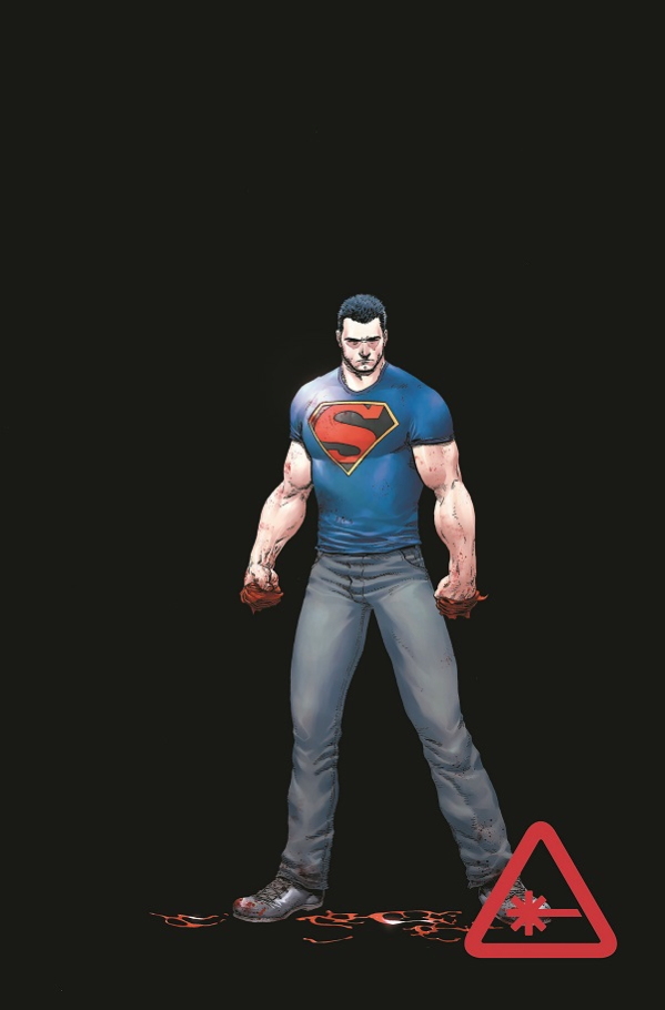
Intro text!  I love it! This is the 5th in a series of question-and-answer sessions about recent comics.  The same 10 questions get asked in each installment of this series; the answers are sometimes different, except when I get sleepy, then I just copy-paste and hope no one notices.

Past installments have been about The Valiant #1, Bitch Planet #1, Rumble #1, and The Names #1.  This week breaks from the all #1 issue motif that had been going before, so that I could try out a complete two-part story.  How exciting!  INTRO TEXT!

10 Questions about DETECTIVE COMICS #35 & #36 by Benjamin Percy, John Paul Leon, Dave Stewart, Jared K. Fletcher, Dave Wielgosz, Rachel Gluckstern, and associates.

A basic description of this comic, so that everyone's on the same page.

Writer Benjamin Percy describes his fiction as typically concerning "bigfoot and bearded ladies, horse ranches, marijuana colonies and elk-hunting resorts." This two-part story features none of these things -- instead, Batman tries to survive a disease outbreak that erupts at an airport after a mysterious plane crash.

The Batman fights a cold. With his bat-fists.

I couldn't find an interview about these comics, so here's Percy taking to Guernica about his work as a journalist:

"One of my assignments was to check out 'what was really happening' in the nightlife of this city. So I went to an S&M club where people were dancing in cages and there was this giant medieval-looking wheel you could get strapped on for a whipping. I hit a lot of locations like this, one of which was an underground thrash metal club. It was full of dudes with shaved heads that revealed the tats on their scalps. When I walked in, the band was raging and the mosh pit extended across the entire dance floor. The ceiling was low with exposed pipes and timbers—one guy with a massive mohawk was hanging upside down and punching people while they punched and kicked him."

QUESTION 1.

Is this comic about anything besides its plot?

The first part is a spectacle-driven set of reveals, all plot hooks. But in the second issue, there's some small divergences from that plot:  a little essay about airports as metaphors for life; a (extremely ill-timed24-style War on Terror torture bit; a little sentimental essay about death, near the end; arguably, an extended detour to a S&M club (which has a plot function, but is so wedged-in and amusingly out-of-nowhere that it seems almost churlish not to mention here).

It doesn't quite cohere into being a whole piece.  It doesn't quite manage to have a point. The writing definitely face-plants when it tries to pretend that the story was about something, a badly misfired attempt to tack on a gooey Hallmark ending onto a story about bioterrorism.

sigfriedbatman

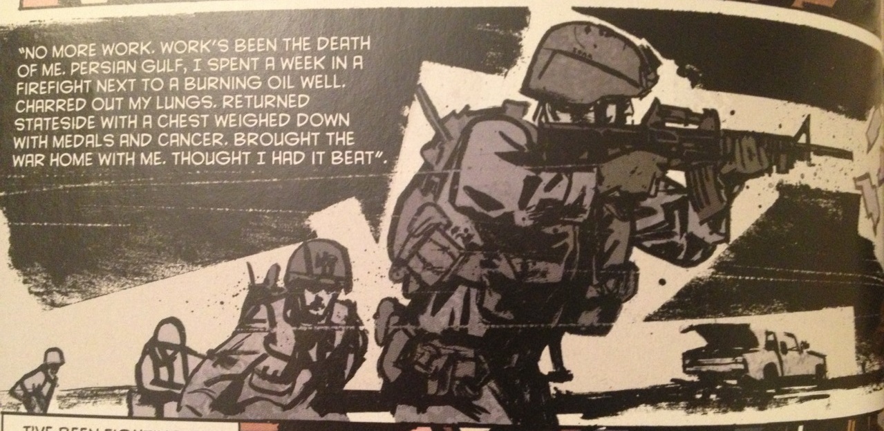
 Tangent: Speaking of Batman, the ones I grew up on and remember most fondly that weren't by Frank Miller, they were all by Alan Grant and Norm Breyfogle, so I should probably mention here the fundraising efforts that are underway for Mr. Breyfogle who's suffered health issues recently, in case news of that got by you and you have similarly warm feelings towards that run.  I especially like the issue where Batman pointlessly fights a white tiger for no reason, and it very nearly ties into my next point, sort of.

It succeeds more when it's an empty exercise in style. That's probably true of all of the Batman comics I bother remembering. Style is that character's greatest virtue -- that character has invited a range of styles that just isn't true of other characters in industrial comics; that isn't true of all that many characters outside of such comics, either.  It doesn't make me want to read comics regularly about that character any more because holy shit am I ever bored of hearing about the Batman.  But when it's a creator whose work I enjoy enough to not even care what they're working on, just to see them work (here, John Paul Leon), when they want to get paid, and put out a Batman comic?  I can least ask myself "what will they bring to that character" in a way that I don't think is true of any of the other paycheck characters in comics (e.g., Wolverine, Spider-man; who else?  Hellboy?).

Anyways, Simonson-Goodwin Manhunter is a style exercise, but it's a stone-cold killer, as good as it gets. Who even remembers the plot to Manhunter? There'd be no point to -- I remember that fight at the cathedral, instead.  There's worse things to be in the world than stylish.  This comic, when it tries in its last page to convince the reader it told them some sappy story about a grizzled war-vet Airport Cop, it's not so hot.  But that out-of-nowhere bit set at a S&M club? It wasn't enough, but I thought that was a nice try, at least.  I wish they'd gone further in that direction.  (For example: spanking and blindfolds...? #notmyChristian)

QUESTION 2.

Did the creative team make any interesting choices in the visual presentation of the story?

(The bit where I gush about John Paul Leon: Let me just get this bit out of the way, but man, That Fucking Guy. He understand light; he gets a lot of ink on a page without pages being drowned in the blacks, without it becoming murky, without the action ever becoming unclear. He can draw with a thin line and detail the hell out of a moment, then in the next panel go full-blown noir and tell the story in only slices of light. But his lighting choices, there's usually a storytelling reason-- he's not just showboating. His stuff is detailed without feeling like any linework is there for no reason. There's always a feeling of a human hand with his work, some other person in the world who put ink on paper just for you. In these comics in particular, he goes from massive early-00's-comics spectacle to more classical the-Batman-lurks-in-the-shadows moments, and it's still all somehow a consistent experience. I mean, shitShit, I just think that dude's good at his job.)

Quarantine

A design-heavy page from the second of the two issues.

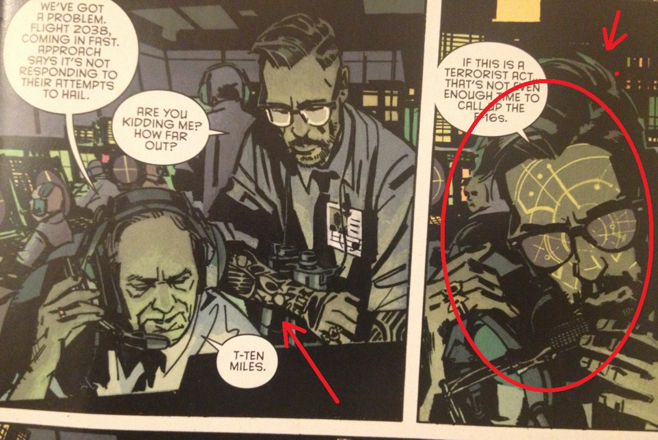
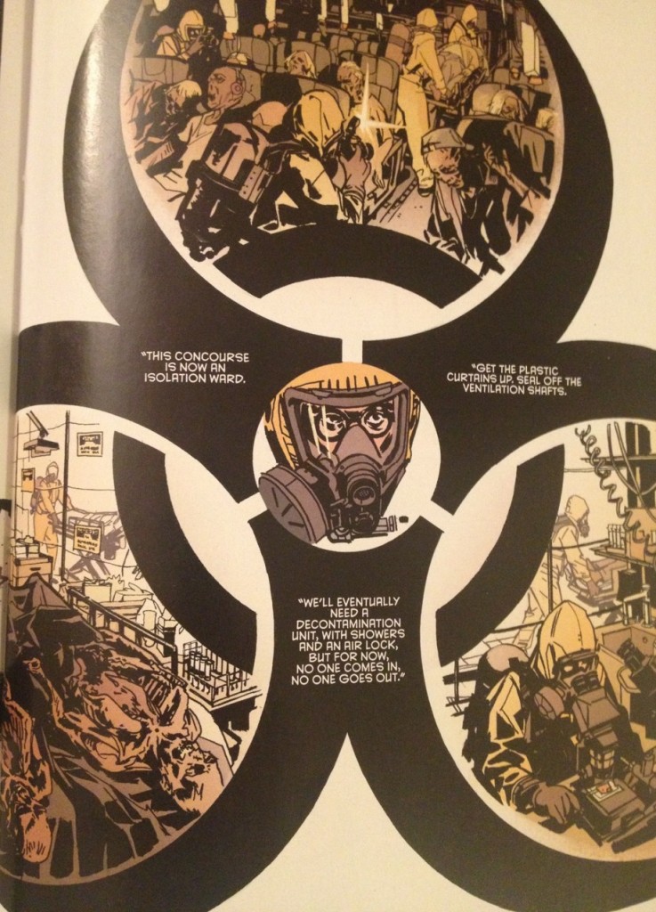
Here, while many of the pages are dominated by standard Batman adventures, the comic still gives the authors plenty of opportunity to show off visually: a page where the panels are set within the negative space of a biohazard symbol (with the head of the character who has imposed that quarantine superimposed above the symbol's center, with the panels showing the results of his action orbiting him, conveying the hierarchy of the situation both through narrative panels and through a recognized symbol); an early page with a "procedural" quality, depicting airport security locking the doors for a quarantine; a page of Nightwing stalking through a fenced-splash page of the S&M club (particularly, the momentum that they create by placing a tiny figure of Nightwing at the bottom of each of the three panels of the fenced-splash).

veterans

A one-panel flashback to Airport Cop's war experience. For only this panel, Leon breaks from the visual style of the rest of the comic, and gets closer to something like a Daniel Zezelj panel. I like how you can feel that texture of Leon drawing a razor blade across the ink for those small white lines (wild guess).  What's most notable are those black abstract shapes that suggest chaos, violence, ruined buildings, but are just abstract black shapes on which narration can be stated without the clunkiness of word baloons. It's a shame they only pull that move out for the one panel.

Environments are somewhat color-coded to help the reader locate themselves: the airport is bathed in a dull yellow-grey-brown mix; Gotham outside of the airport, just after sunset, in oranges and purples; that S&M club in red and purple; air-traffic control and a diseased airplane, in green. Basically, out-of-the-airport? Vivid colors. In the airport? Institutional colors. I imagine the colors help readers want to get out of that airport, just like the Batman.

AirTrafficGuy

Use of color as detail, in this bit -- air traffic control displays lighting a face. Note the arm tattoos: this isn't even a major character in the comic, but he is nevertheless visually interesting.

QUESTION 3.

How is the comic structured?

One story over two issues. If you wanted to break it up into a three-act structure, I'd figure issue one is Act One (a diseased plane infects an airport), while the second issue is Acts Two (things get worse as an uncaring bureacracy takes over), and Act Three (the Batman beats the shit out of somebody, Batman-style).

I don't know that's how I think of the story, though, as there's no noticeable character arc or theme at play here, no catharsis either aimed for or really expected.  I just think of a comic like this more as being structured like a joke, setup-&-punchline.  Setup: Batman gets sick because of a bad guy (issue one).  Punchline: Batman hurts the bad guy until Batman feels better about himself (issue two).

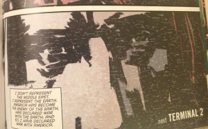
Not much of a cliffhanger inbetween issues: the story break upon the reveal that there is a villain responsible for the virus attack, some white guy with a beard.  This information is conveyed by a television broadcast.  Usually people will ground their last page cliffhangers on a character the reader cares about reacting to information, either verbally or through a reaction shot or both; Naoki Urasawa is particularly fond of throwing in reaction shots on his cliffhanger pages, say; Brian Vaughan likes a "Shit just got worse" final splash page; there's the often-ripped-off Mark Millar splash on a line promising a future issue filled with Big Action.  Here, the issue break dialogue is just a television broadcast of Mumford & Sons speaking in an undisclosed location saying "I don't represent the Middle East. I represent the Earth.  America has become the enemy of the Earth, has declared war with the Earth, and so I have declared war with America."

Cliffclavin

A little underwhelming.

It's a question how much Batman actually motivates the story or its conclusion.  Batman doesn't really do anything in issue one other than just provide exposition.  In issue two, the Batman just calls up Nightwing, and Nightwing runs around beating / kissing information out of people.  The bad guys aren't uncovered by Batman -- after hearing the Batman's around, they just decide to reveal themselves, at which point, the Batman magically appears and damages them.

If you picked up the Batman comic in order to see the Batman be cool or effective, I don't know that you actually got that from this story.

Another choice the authors make is that the story doesn't stick to the point of view of those in the airport. Rather than attempt to be a claustrophobic story about Batman trapped in a quarantined airport, a sizable chunk of part two instead takes place in Belarus...? Batman calls up a torture-happy post-911 post-24 version of Nightwing (really??), and several pages are from his perspective.  For a survival horror comic (which is the kind of comic a story about a bioterror-attack calls to mind), it seems unusual to break point of view so drastically.

Since it's two issues, counting pages doesn't make much sense and isn't worth the time, probably. That said, issue one has noticeably longer scenes: most prominently, a plane crash sequence that lasts about 6 pages (and really seems to have been this comic's true raison d'etre, more than anything else). Issue two is much more to the point, broken up mostly into 1 page units, with a couple bits lasting 2 pages. I think the longest chunk of issue 2 is the three-page chunk of Nightwing infiltrating the S&M club...

QUESTION 4.

Is there anything noteworthy about the cover, logo, lettering, or design?

We'd noted above how the narration for the war flashback was put on top of abstract shapes that served a storytelling function. With Leon, the letterers often lay down narration in negative space. When they do use caption boxes, the caption boxes seem more planned than is often the case -- they keep the caption boxes taught against the panel border. I really wish people would do that more, if they could: there's less the sense of the caption box being the writer intruding upon the comic, more of a sense of the writer being invited into the comic by the artist.

Also noteworthy: the cover to the second issue spoils the ending of the comic...? Say whaaaaaaaat?

Crashpage

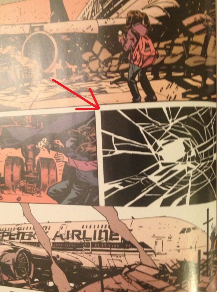
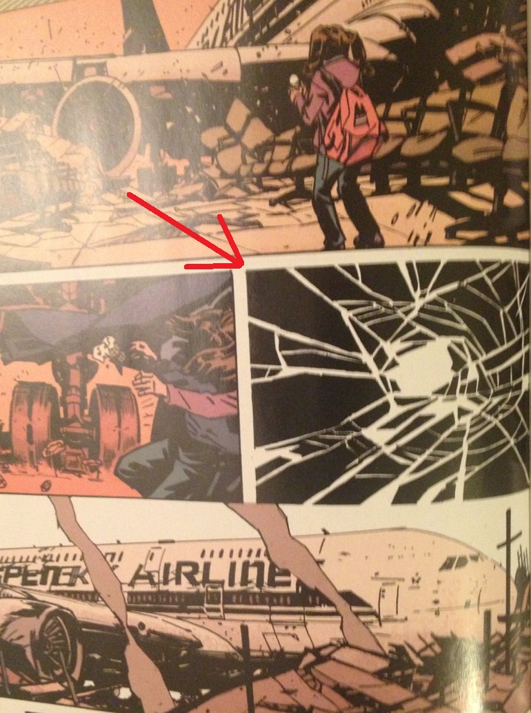
From the lengthy plane crash sequence in the first of the two issues.

There's few sound effects in this comic, but I especially liked this panel where Leon diverges from the cinematic mode of the rest of the airplane crash sequence and just draws a more abstract image of glass shattering, presented in black and white.  I like how that panel acts as a sort of sound effect for the sequence -- it's almost like a cymbal crash.  It's a drawing purely of the sensation of the moment, rather than the moment itself. Very effective.

QUESTION 5.

Is anything about this comic interesting politically, socially, or from some other frame of reference?

The torture-as-entertainment bit, but I can't pretend to be too angry about it.  That kind of shit was just past its expiration date before that CIA torture-report came out.  It wasn't upsetting -- it's just dull now.  Which is probably the more upsetting thing, having something so awful become so normalized.

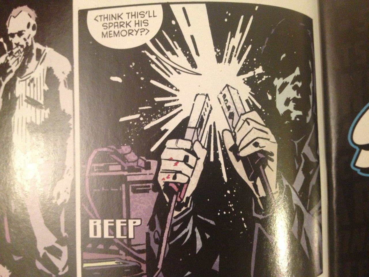
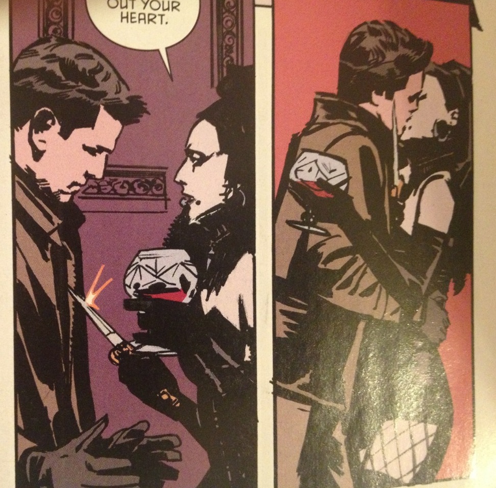
I was more struck by that scene of Nightwing having to seduce information out of a dominatrix.  

sex

Nightwing having ladies force themselves on him -- wasn't that a thing...?  Also: uhhhh, why was that a thing?

It's a pretty cornball scene -- I grew up with Chris Claremont X-Men comics so S&M in a superhero comic was old news to me when I was 12. Deviant sexuality in a DC Comic -- that's all DC Comics do anymore; I'd be more shocked if Superman talked about liking the plain-old missionary position, at this point. If you told me that the New 52 version of Superman asks whoever he dates to wear a strap on and force him to fellate it, I'd still be more upset that he's dating Wonder Woman instead of Lois Lane.  (Because that's just gross. #notmyChristian.)

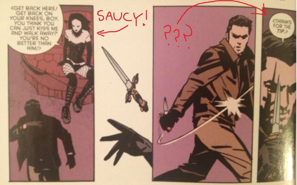
But anyways, Nightwing has to get information out of a dominatrix; she makes him kiss it out of her; he reluctantly agrees, but as soon as he gets the information, he's like "fuck you, lady" and leaves.  So, she throws a knife at him because she's so worked up by her lady hormones, and he laughs at her because she's a silly girl and he's a heroic man.

sexysex2

Romance Comic.

Nightwing then runs away from a girl who likes kissing so he can go back to inflicting pain onto the testicles and nipples of other men, which is completely not sexual, nope, not sexual at all, get your mind out of the gutter.

nipple-torture

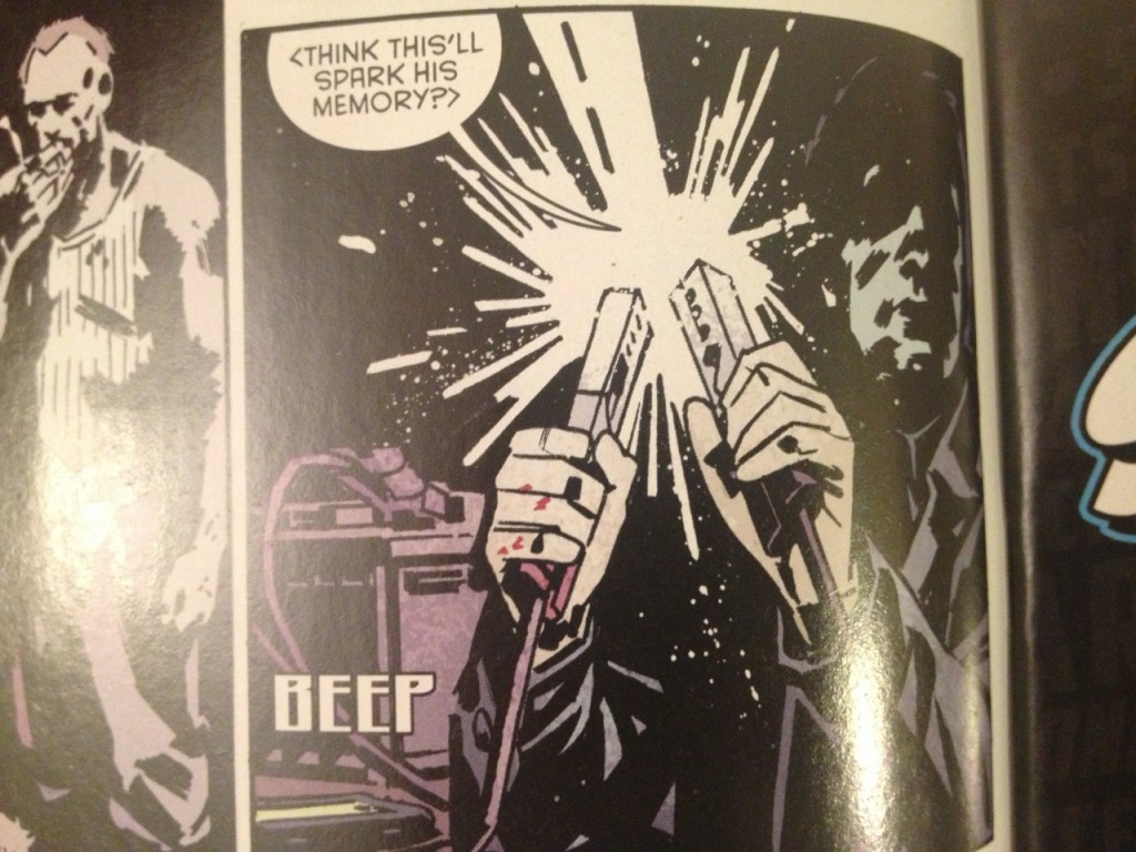
BEEP = Sound effect of Nightwing getting a CBT-boner.

What's striking about this scene isn't that it's unusual for a Batman comic. What's striking is that this is pure, classic Batman. That scene I just described? That's every Batman-Catwoman scene ever.  That's their entire relationship, as depicted in roughly 12 billion comics.

"Silly woman, trying to give me an erection. The ejaculation of violence is the only release I need." -- All Batman Comics Ever Made.

Why the hell is that such a Batman thing?  Do you know why people like that stuff?  I have no earthly idea, but you know:  I'm kind of weird in that I kind of like kissing...?  I like the part where you're all kissing a lady, and she says, "You don't know what you're doing, do you?" and I say, "Actually, I do:  I'm pleasuring you."  I find those moments in life very erotic, like Max After Dark erotic, and I don't know why the Nightwing character can't get on my level.

I think that I understand that people like Batman for the same reasons I like James Bond movies: getting to jerk off to a cartoon of male hyper-competence. But James Bond, that hyper-competence manifests in the fact he regularly sexes up ladies...? James Bond will kiss a girl and not act all shitty about it.  If you're a spy lady named Candy MadeOfDogshit, there's a 100% chance that James Bond will walk right up to your face and be like, "You've got a weird last name-- check out my boner.  Take a photo of my boner with your spy camera." James Bond creates a hostile work environment based on gender for his female colleagues in the spy industry, and we love him for it.

But not Batman. Why is the ultimate definition of male hyper-competence where comic books are concerned so ... not just incompatible with sexual desire, but so weirdly dismissive or hostile to it? And why is that such a big part of the appeal of these comics? It's a more enduring quality of a Batman comic than the fucking Utility Belt, at this point!

(Granted, there's Iron Man, but Iron Man is a guy who basically fights evil in a technologically advanced body-condom, if you think about it, so it's not like we're out of the woods there, either)(haha, "wood").

The comic is also sort of suffused with... you know, if you subscribe to the idea that masculinity is a basically ridiculous performance, just this kabuki we're all trying to pull off... Well, I think that I'd place a small wager that the people who made these issues don't really subscribe to that idea...? There's this fog of fake-ish machismo hanging over everything, though that may just be in my head. All that stuff with a war vet telling Batman How to Be a Real Man, though. But two issues isn't a lot to go on, maybe too few to judge that way.

QUESTION 6.

Where did I put my car keys?

Your "car keys" are Man.  In the morning, you can not find your keys, just as you can not find a baby that is hiding.  So then, great, you're late to work -- just like an insolent teenager is "late" to school.  When you find your keys, you think "I'm going to buy a bowl and keep these in a bowl".  But then you don't ever buy a bowl because you have other things on your mind -- that's adulthood.  And finally, you shove your keys into a metal slot.  That's just like being an elderly person, the part where you get buried in a metal coffin by your ungrateful children -- but used to start the "engine", the engine on the Next Generation.

Your "car keys" are a fucking Man, dude!  Riddle solved!  Pay me!

QUESTION 7.

What was the best bit of dialogue in the comic?

 The Batman: "What's happened?"

Alfred: "At least finish your coffee, first."

Fuckyoualfred

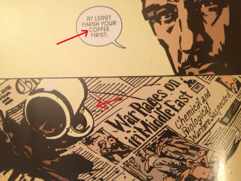
"Fuck you and fuck your coffee, Alfred!!!"  -- signed, The Batman.

QUESTION 8.

What is the most interesting page in the comic and how does it work?

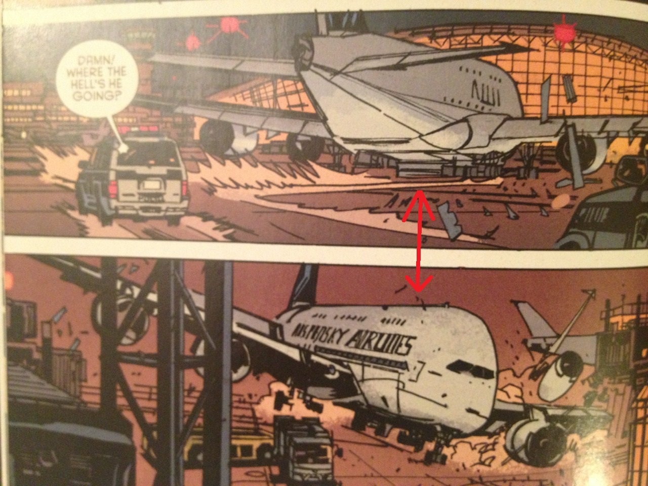
The plane crash in the first issue includes a double-page splash of a plane crashing into an airport, with three inset panels.  But before we consider that double-page splash, we should briefly note the two panels that take place beforehand.

Planes

In the first panel, "Where the hell's he going?" is stated in the foreground, the plane is drawn in the mid-ground, and the airport is in the background. The panel's composition answers the question posed by the dialogue in the panel.

In the second panel, the viewpoint then changes as the situation has worsened.  At least, we know it's worsened because the creative team has exchanged the foreground and the background. Now, the reader's POV is the airport and the airplane is coming towards it.

Even though the plane is located in the dead center of both panels, that shift in POV makes the plane feels "closer".  The plane feels fast even though the plane hasn't actually moved on the page. (P.S. comics are magic).

But then, the double page splash.
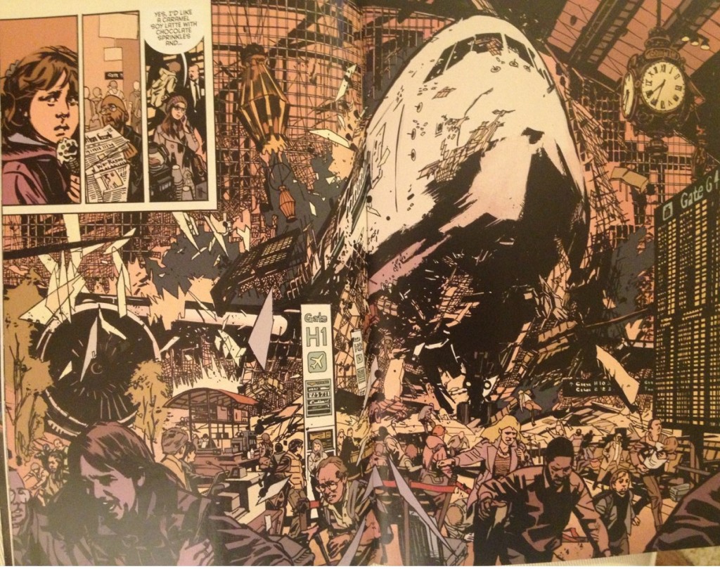
Splash

Spoiler.

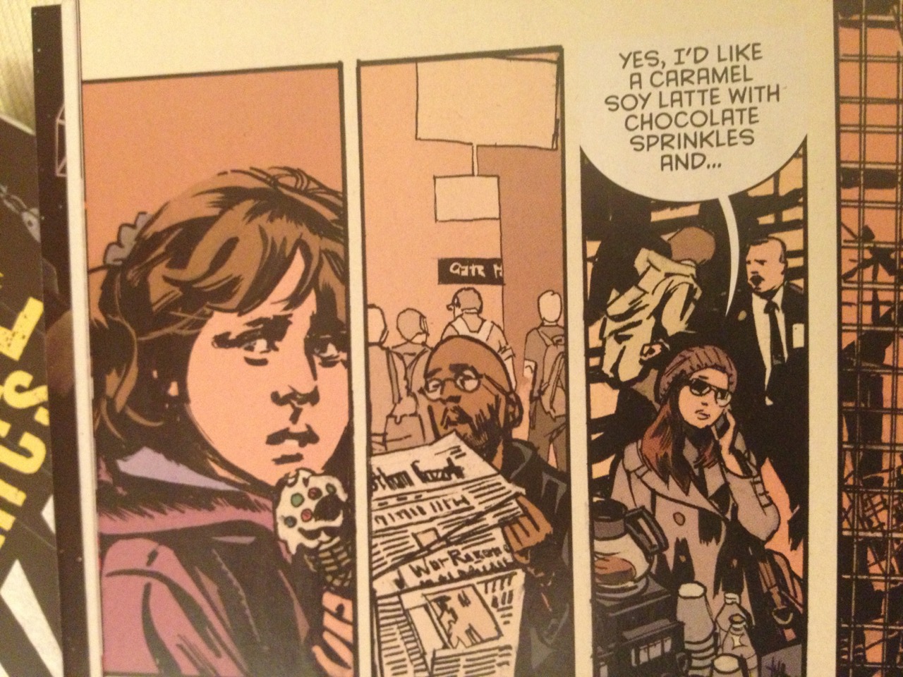
It's not just the spectacle of the plane crash but that the creative team does not rely on that spectacle. The authors create small mini-dramas within it, using the three inset panels.

Insets

A kid eating an ice cream cone?

That kid's got to run.

A nameless lady getting a latte?

That lady is in harm's way.

(We even continue her story on the next page even though once again, she is not a "character" in any other respect in this comic).

Little Kid

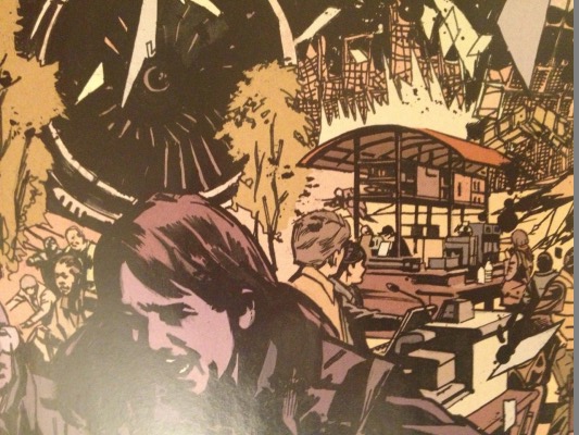
The little kid.  Plus, the lady behind him, over by the coffee kiosk.  Uhhhh, the black guy probably just dies first -- I don't see him again. Sucks to be you, Black Guy Featured in Any Story Ever.

The point is the action isn't just happening -- it's happening to people, and the creative team makes the minimal effort to care about those people. So when the Batman is trying to save the airport later, we know he's trying to save human beings -- not just objects or architecture.

As for the splash itself, the Rule of Thirds perhaps bears mentioning.  Wikipedia:

The rule of thirds is a "rule of thumb" or guideline which applies to the process of composing visual images such as designs, films, paintings, and photographs. The guideline proposes that an image should be imagined as divided into nine equal parts by two equally spaced horizontal lines and two equally spaced vertical lines, and that important compositional elements should be placed along these lines or their intersections. Proponents of the technique claim that aligning a subject with these points creates more tension, energy and interest in the composition than simply centering the subject.

Splash - Copy

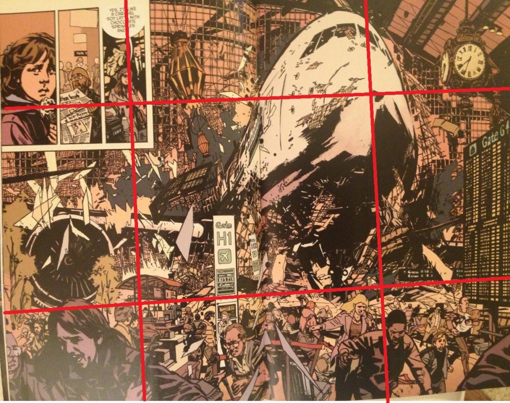
Not an exact measurement, but.  Just go along.  For your poor father.

Here, the plane crash is roughly at the top-right intersection of Rule of Thirds guidelines.  Note that the woman ordering a latte is roughly both at the top-left and bottom-left intersections, i.e. the reader's eyes are in some small way guided to these two locations, and this progression not just a pure game of playing Where's Waldo.

Usually, I want to complain about double-page splashes.  Usually, they're just empty spectacles, and I have a very "am I supposed to be impressed by this" jaded and bored reaction to them.  This splash, it's spectacle, but it doesn't achieve its spectacle by wholly sacrificing the power of comics.  The authors could've just relied on an illustration -- it could've just been the airplane crash and no reader would have ever asked for more --  but they did more than that, went further than that; these are still comic pages. Plus, it's the climax of action and momentum created in prior pages -- it's not just a splash as a cheap way to create excitement that wouldn't have been there otherwise; it's a splash to payoff on excitement that's been built, like the fulfillment of a promise.

(There's a second double-page splash later in the issue that's not half as interesting, a more gratuitous splash that comes without much build-up.  So you can see what distinguishes this splash in my mind within the issue itself, if you're, like, some kind of weirdo).

QUESTION 9.

Did you experience any noteworthy emotion reading the comic?

Not so much.  Percy's new to the medium (I'm guessing?) and there are kinks to work out, but he supposedly has a reputation as a promising writer.  And John Paul Leon is certainly no slouch -- I'm always happy to look at his work, especially in collaboration with a strong colorist like Dave Stewart.

It just didn't seem like either really had their heart in it on The Batman Part.

Leon's best pages involve men in containment suits, airplane's crashing, quarantines being imposed, biohazard symbols; most of the detective work is done by Nightwing; most of the philosophizing is done by Airport Cop; as mentioned before, the bad guy doesn't even get caught by some move made by the Batman -- Mumford & Sons just decides to fight Batman, and it quite predictably goes very badly for him.

But do I find myself wishing Percy/Leon had gotten a chance to do a longer and more considered version of a comic about a grizzled old Airport Cop fighting a terrorist attack, without the Batman...?  Well, no. Because I've seen that -- it's called Die Hard 2.  (And it sucks.)

They needed to publish issues 35 and 36 of Detective Comics in whichever months these issues were released.  So, here are issues 35 and 36.  Because that's how it works; that's the business. That's it.

QUESTION 10.

What do we hope that younger cartoonists learn from this comic?

So, what am I saying this week?  "If you throw enough pyrotechnics and craft and visual doo-dads at the reader, you don't have to care as much about story or character or theme or having a point!"

[Single balloon falls from ceiling]

Craft has its pleasure.  Style has its pleasure.  Maybe smart doesn't come along every month, and you still have to eat.  "If you don't have a good personality, you might as well at least dress well." -- Your Shallow Grandma (Who Then Also Says Something Racist Probably).

Anyways, a Batman comic is a Batman comic is a Batman comic; if folks wanted story or character or theme or whatever, they probably wouldn't be reading Batman comics.  There's no harm to comics like these.  Folks get paid while being creative; folks who wants to read more Batman get more Batman; everybody wins, at least from a practical perspective.

But what do we want for younger cartoonists?  If you're still young, while you still have some fire in your belly, while you've still got some Awesome Years left in you, maybe try for a little more substance.  Probably you'll fail and dishonor your ancestors.  But a whole world of Cold Practical Shit's not going anywhere; they're going to need to publish an issue of Detective Comics, that month you give up; there's no hurry. So you might as well give doing something a little more meaningful to you a shot, while/if you can.

NEXT:  

Taking a few weeks off, to plan the next round of these and work on some other things.  I think the next batch should only be 4 installments -- five in a round feels like too many.  I had an idea for the next four, that they'll all be in the exact same genre (I've read at least 4 comics recently that all happened to be in the same genre).  If that same genre thing works out, then the round after the next one will hopefully be more of a mix of things -- there's been one suggestion for a Lady Thor comic, so if this goes to a third round, that's coming up.  But plans are fluid and we'll see.

Thanks for the kind words on these last five.  And Happy Valentine's Day.  Be Mine.

Arriving 1/26/2015

This week is the week to be waiting for. Lots of great things! ZERO, SEX CRIMINALS, BITCH PLANET, New CASANOVA and the launch of Bodenheim and Hickman's DYING AND THE DEAD! Click the cut to find out what else is happening this week!

ABIGAIL AND THE SNOWMAN #2 ADVENTURE TIME #36 ALEX + ADA #12 ALL NEW INVADERS #14 AMAZING WORLD OF GUMBALL 2014 SPECIAL #1 AMAZING X-MEN #16 ANGRY BIRDS #8 ANGRY BIRDS TRANSFORMERS #3 (OF 4) AQUAMAN #38 ARKHAM MANOR #4 BART SIMPSON COMICS #94 BATMAN #38 BATMAN ETERNAL #43 BIG TROUBLE IN LITTLE CHINA #8 MAIN CVRS BITCH PLANET #2 BODIES #7 (OF 8) CASANOVA ACEDIA #1 CATWOMAN #38 CLIVE BARKERS NIGHTBREED #9 COLDER BAD SEED #4 CONAN THE AVENGER #10 DANGER CLUB #6 DEADPOOL #41 DEATH VIGIL #6 (OF 8) DEATHSTROKE #4 DOBERMAN #5 DYING AND THE DEAD #1 EARTH 2 WORLDS END #17 EFFIGY #1 ELFQUEST FINAL QUEST #7 EVIL EMPIRE #10 FIND #1 ONE SHOT FLASH #38 FLASH GORDON #8 FUTURE PROOF #3 GOTHAM ACADEMY #4 GOTHAM BY MIDNIGHT #3 GRAVEYARD SHIFT #2 (OF 4) HARLEY QUINN #14 HE MAN THE ETERNITY WAR #2 INFINITY MAN AND THE FOREVER PEOPLE #7 INHUMAN #11 JUDGE DREDD #27 JUDGE DREDD CLASSICS DARK JUDGES #2 (OF 5) JUSTICE INC #6 (OF 6) JUSTICE LEAGUE DARK #38 KING FLASH GORDON #1 (OF 4) KING THE PHANTOM #1 (OF 4) LIFE AFTER #6 MARVEL UNIVERSE ULT SPIDER-MAN WEB WARRIORS #3 MAXX MAXXIMIZED #16 MIND MGMT #30 MULTIVERSITY GUIDEBOOK #1 MUNCHKIN #1 MAIN CVRS MY LITTLE PONY FRIENDSHIP IS MAGIC #27 NEW 52 FUTURES END #39 (WEEKLY) NEW AVENGERS #29 TRO NOVA #26 POWERPUFF GIRLS SUPER SMASH-UP #1 (OF 6) PREDATOR FIRE AND STONE #4 (OF 4) PRINCESS UGG #7 PUNKS THE COMIC #4 RASPUTIN #4 RED LANTERNS #38 REVIVAL #27 ROT & RUIN #5 SECRET AVENGERS #12 SECRET ORIGINS #9 SEX #19 SEX CRIMINALS #10 SINESTRO #9 SKYLANDERS #5 SLEEPY HOLLOW #4 (OF 4) SONIC BOOM #4 SPIDER-MAN 2099 #8 SV SPIDER-MAN AND X-MEN #2 STAR SPANGLED WAR STORIES GI ZOMBIE #6 TAROT WITCH OF THE BLACK ROSE #90 THEYRE NOT LIKE US #2 THOR #4 TMNT GHOSTBUSTERS #4 (OF 4) TOMB RAIDER #12 TOWER CHRONICLES DREADSTALKER #6 TRANSFORMERS DRIFT EMPIRE OF STONE #3 (OF 4) UMBRAL #12 UNCANNY AVENGERS #1 UNCANNY X-MEN #30 UNITY #14 CVR A LAROSA UNWRITTEN VOL 2 APOCALYPSE #12 VERTIGO QUARTERLY #1 BLACK V-WARS #10 WINTERWORLD #7 WOLVERINES #4 X-FILES SEASON 10 #20 X-O MANOWAR #32 ZERO #14

Books/Mags/Things BLACK SCIENCE TP VOL 02 WELCOME NOWHERE CALCULUS CAT TP CRIMINAL TP VOL 01 COWARD DEADPOOL TP ONES WITH DEADPOOL EYE OF NEWT HC GOTG ALL NEW X-MEN TP TRIAL OF JEAN GREY GREAT PACIFIC TP VOL 03 BIG GAME HUNTERS GREEN LANTERN BY GEOFF JOHNS OMNIBUS HC VOL 01 KATABASIS I TP LIFE AFTER TP VOL 01 LIFE EATERS TP LOU CALE SNAPPING BIG APPLES BAD SEEDS HC MAXX MAXXIMIZED HC VOL 03 MEGA MAN TP VOL 08 REDEMPTION OUTCAST BY KIRKMAN & AZACETA TP VOL 01 PREVIEWS #317 FEBRUARY 2015 SAINT COLE GN SAVAGE SWORD OF CONAN TP VOL 18 SHOWCASE PRESENTS BLUE BEETLE TP SLAINE BRUTANIA CHRONICLES HC SQUIDDER TP STRONTIUM DOG LIFE & DEATH OF JOHNNY ALPHA TP SUPER DINOSAUR TP VOL 04 SUPERIOR FOES OF SPIDER-MAN TP VOL 03 GAME OVER TMNT ONGOING TP VOL 10 NEW MUTANT ORDER WORLD TRIGGER GN VOL 03


As always, what do YOU think?

“Run Scared And You End Up Running From Yourself." COMICS! Sometimes A Sunday Morning Is The Last Thing You’d Think To Compare Him to!

Carlos Ezquerra. Alan Hebden. Major Eazy.  photo EazyTankB_zps07156304.jpg Major Eazy by Carlos Ezquerra

Anyway, this… MAJOR EAZY: HEART OF IRON Art by Carlos Ezquerra Written by Alan Hebden Major Eazy created by Carlos Ezquerra & Alan Hebden Titan, 128 pages, B&W, £14.99 (2012)

 photo EazyCovB_zpsfd31c6ac.jpg

This is a collection of comic strips from Battle Picture Weekly featuring the fondly recalled (by me and probably many other emotionally stunted middle-aged men) fictional character Major Eazy. The strips within detail his adventures in North Africa during the very real 2nd World War. Launched in 1976 Major Eazy, the creation of Alan Hebden & Carlos Ezquerra, quickly became a popular strip in an already popular comic. It featured a character who was visually James Coburn in Cross of Iron from the neck up and behaviourally beholden to Clint Eastwood’s character in Sergio Leone’s Man With No Name oaters. Eazy was a maverick (hence his suicidally inappropriate headgear and his Bentley) whose apparent lackadaisical style belied his killing efficiency. As a foil for expressions of awe at his antics Eazy was provided with Sergeant Daly; clearly, and amusingly, modelled on the 1970s sit-com mainstay Arthur Mullard. Since starting to sully this site I have thought about British comics harder and longer than ever before, and I am coming to the conclusion that Carlos Ezquerra, a Spaniard no less, was the single most important artist in 1970s British comics. He isn’t important because of Major Eazy, but Major Eazy is a part of that importance. Ezquerra’s fast and nasty style was a perfect fit with the fast and nasty Brit comics of the 1970s and he was in the best of all of them (Action, Battle, 2000AD) and, ultimately, he co-created the most enduring strip of all of them (Judge Dredd). And because the Comics crowd is now so huge so many get lost in the crush no one will be a rush to pin any Comics medals on Alan Hebden, his work here is certainly sturdy enough to remain entertaining decades later. No mean feat, that.

 photo EazyHollywoodB_zpsac817dd6.jpg

Major Eazy by Carlos Ezquerra & Alan Hebden

It’s mostly Hebden’s show as, despite his undoubted genius, Ezquerra’s visuals aren’t able to carry this book unaided due to, entirely reasonable given the material’s age, I guess, deficiencies in reproduction. While the book does present the strips at the right size (i.e. magazine size), unfortunately it necessarily reprints them at a remove of some decades. And, much like the UK public transport infrastructure since the 1970s, there’s been some degeneration. The worst affected are the once-colour pages which are now mushy looking and blurred, but even the regular originally B&W pages vary in quality. Some pages display Ezquerra’s evolving method of contrast (panels which almost glare via delicate hatching then hemmed in by grubbily dense panels) to fine effect, while other pages present an exciting challenge to the reader’s perceptual abilities. It's a mixed bag with the earlier pages faring worst, the majority of it reads just fine. But if you are used to the almost hallucinatory precision of modern comics reproduction this might not be the book for you.

 photo EazySniperB_zps6597423e.jpg

Major Eazy by Carlos Ezquerra & Alan Hebden

But then these were comics intended for the moment, not comics intended for the ages; it’s testament to the strength of Hebden’s writing that these strips still entertain despite the frequently difficult to decipher visuals. These were also comics aimed straight at the brains of children and it’s totally to Hebden’s credit again that he not only introduces adult themes but that he handles them so nimbly. Kids’ comics they may well be, but they don’t shy too far away from war’s inhumanity. This is a children’s comic where the light and larky Kelly’s Heroes vibe (Eazy happily plays cards with the Germans between bombardments – until they cheat!) is regularly pierced by dark moments that flirt strongly with honest depictions of the depths war contains - a priest previously seen rescuing smiling children is found strung up from a tree, British troops are mistakenly shot down by an American plane, Eazy shoots a young woman in the back, a steam scalded German is allowed to suicide under Eazy’s eye, wounded troops die due to black market profiteering of essential medical supplies, and on, and on, and more besides.

 photo EazyLinesB_zps82860d0c.jpg

Major Eazy by Carlos Ezquerra & Alan Hebden

Hebden doesn’t get away with everything though and there’s some fun to be had spotting the occasional comical editorial intervention. In the friendly fire episode the yank flier is clearly machine gunned to death by Eazy, yet the next panel finds Sgt Daly pointing with a hastily drawn arm to a yet more hastily drawn figure parachuting to safety in the distance. And then you get a story so harsh it’s staggering that editorial waved it past. There’s one particular cavalcade of chuckles featuring a Polish officer who, unhinged by the treatment of himself and his country at the hands of the German Army, embarks on a series of retaliatory atrocities. In one unpleasantly memorable scene Eazy surprises him in a barn going at a trussed up German with a straight razor and shortly thereafter everything ends admirably badly for everyone. Sure, these strips may be a bit rickety but there’s still power in their pages. And that power is all the more impressive for the brevity of each episode (3-pagers, done in ones; mostly). Intermittent visual shortcomings aside I enjoyed revisiting these strips; they are a lot darker and harder than I thought they were. (That probably goes for the 1970s too.) GOOD!

 photo EazyAnimalsB_zpsa299c42b.jpg Major Eazy by Carlos Ezquerra & Alan Hebden

Of course the real horror is that during wartime they ration paper and that means no - COMICS!!!

"Man HAS No Understanding, Dr. Zira! He Can Be Taught A Few Simple TRICKS Nothing More!" COMICS! Sometimes I'm Just Glad I Don't Have Ka-Zar's Vet Bills!

In which I continue to fly in the face of popular opinion, medical advice, and common sense to continue my languorous amble through Marvel UK’s Planet of the Apes Weekly.  photo SeeDoB_zps620cfde7.jpg Planet of the Apes by Tuska, Esposito & Moench

Anyway, this… PLANET OF THE APES WEEKLY #2 (Week Ending November 2nd 1974) Edited by Matt Softley Planet of The Apes Chapter Two: World of Captive Humans Art by George Tuska & Mike Esposito Written by Doug Moench Based on the 20th Century Fox Motion Picture Planet of The Apes (1968) Based on the novel by Pierre Boulle Gullivar Jones: Warrior of Mars Art by Gil Kane & Bill Everett Written by Roy Thomas Lettered by John Costa Freely adapted from the novel Lt. Gullivar Jones  by Edwin L. Arnold Ka-Zar: The Power of Ka-Zar! Art by Jack Kirby & Stan Grainger Written by Stan Lee Lettered by Sam Rosen Ka-Zar created by Jack Kirby & Stan Lee Marvel UK, £0.08 (1974)

 photo PotA002CB_zps3a2b4757.jpg

Planet of The Apes Chapter Two: World of Captive Humans Art by George Tuska & Mike Esposito Written by Doug Moench Based on the 20th Century Fox Motion Picture Planet of The Apes (1968) Based on the novel by Pierre Boulle

In which Doug Moench and George Tuska continue to place scenes from the 20th Century Fox motion picture Planet of the Apes in front of you with all the vigour and drama of a tired vice cop at the end of his shift showing you mugshots while preoccupied with remembering where he stashed that fifth of Old Grandad. (No one's judging you; we’ve all been there.) Once again then, it’s Yeoman’s work all the way, with such little spark on the part of the art that at times Tuska’s people are so drained of emotion and animation they resemble big, stiff dolls. Still, George Tuska does wrench himself out of his torpor for a couple of panels where Taylor reacts badly to talk of brain surgery and experimentation but that’s the last page. To be fair, George Tuska had his moments. But few of them are on these pages. I know I said that’d be in the last one; I’m just keeping you on your toes. While faithful replication remains the paramount concern of the adaptation overall, there's still quite a bit of chicken fat about this thing.

 photo BigDollsB_zps736e8643.jpg Planet of the Apes by Tuska, Esposito & Moench

Everything feels dragged out as though the problem isn’t the allotted space but the filling of it. I guess this is why Moench expands on the movie dialogue to ensure every point is made at such ambiguity trepanning length that the movie seems subtle in comparison. (And it’s very much not a subtle movie; it isn’t supposed to be.) Turn that CAPS LOCK off, Moench fans, because I might seem to be giving Moench a hard time but, luckily, he does most of the Marvel Apes material and I’ll be saying far nicer things further down the line. Sure, this is just a weird isolated chunk of a story transformed into an episode by the weekly nature of UK comics production but there’s still a good bit or two. Certainly the bits where the chimpanzees are arguing about tenure, office supplies and quota systems was funnier after several decades sitting at a desk praying for my pension to kick in than it was at age four. While there are bits to like here, they were already in the movie. There’s nothing yet about the adaptation as a comic to cause anyone to start bouncing up and down, teeth bared, while slapping the top of their head. So far even the action scenes have been consistently spuffed down the comic’s leg. This issue's section is mostly talk, and it's all so enervating you pine for the inactive action of last issue. Tuska’s art is just too tentative here to engage for long when limited to talking heads. Heck, they are talking ape heads and still my mind wandered off and…well, I hope it gets back soon, I kind of need it. Meat‘n’taters this strip remains then. OKAY!

Gullivar Jones: Warrior of Mars Art by Gil Kane & Bill Everett Written by Roy Thomas Lettered by John Costa Freely adapted from the novel Lt. Gullivar Jones  by Edwin L. Arnold

The personal highlight of issue 2 is Gullivar Jones, Warrior of Mars by Gentleman Gil Kane and Rascally Roy Thomas. Now y’all know by now I’m a bit of a one for a GilRoy© Joint, but what y’all don’t know is this particular GilRoy© Joint is the exact and precise one to blame. But before we get to that we have the bit where I prove I can look stuff up on the Internet - this strip originally appeared in issues 16 to 21 of Creatures on The Loose in a series of 10 page instalments with the rest of the comic bulked out by reprints. The perfect size for its slot in PotA-W. This is the one about a Confederate yanked off to Mars where he meets a steel bikini clad princess and kills the stuffing out of a load of bad dudes. It is not to be confused with John Carter of Mars which is the one about a Confederate yanked off to Mars where he meets a naked princess and kills the stuffing out of a load of bad dudes. The two are not to be confused largely because Edwin Lester Arnold’s Gullivar Jones: His Vacation was published in 1905 and Burrough’s (Edgar Rice not William) first John Carter book arrived in 1912. I think, I was kind of losing the will to live reading about all that so feel free to correct me if I'm wrong. Anyway, I'm sure they are totally different because the last thing we want is lawyers developing time travel so they can go back and get dead people suing each other as well. Because they will. They will. Hasslein knew. The similarities between the two properties are certainly, um, arresting but then I don’t know how faithful GilRoy©’s adaptation is; there’s always the possibility they blended the two.

 photo WhiteTopB_zpsaa022b3a.jpg Gullivar Jones by Kane, Everett, Thomas & Costa

It can’t be all that faithful to the source because here Gullivar is a ‘Nam Vet (no, not an Indo-Chinese animal doctor; the other kind.) and instead of a magic carpet he is Mars borne on a sort of cloud composed of Gil Kane’s ™ and © cosmic amoebas. Gullivar also has a sweep of ice creamy hair atop his chiselled head not unlike Gentleman Gil’s artic topping. Gully’s hair turns white during his transportation from Earth to Mars; when Gil Kane’s hair turned white is anyone’s guess. (Probably thirty seconds after he started working in comics. Only kidding! It’s just one big fun club-house of magic!) Keen Kane Watcher’s will note quite a lot of Gil Kane’s heroes spurn Just For Men. I don’t know if GilRoy© threw that bit in nor if they gave Gullivar enhanced muscle powers like ERB’s Jon Carter because…I haven’t done my due diligence. Anyway, Gullivar lands on Mars and without checking much out immediately wades in and starts killing things while immediately pairing up with the swellest gal round, Heru by name. It’s a ridiculously propulsive chunk of bounding, swashbuckling, romance, leaping, jumping, violence, buckswashling, torn shirts, and heterosexual male wish fulfilment. It is fantastic stuff if you are partial to GilRoy© Joints, barbaric tomfoolery or, um, John Carter (Shhh!)

 photo PositionB_zpsf50d9993.jpg Gullivar Jones by Kane, Everett, Thomas & Costa

Gil Kane’s on top form here despite the muting effect of the B& W art’s none too precise reproduction. I think some of it’s been redrawn to make it pop out of the monochrome slurry the colour has become, and I’d suggest there looks to be some redrawing around the cups area of Heru's bikini as well if that didn’t make me seem like a creepy weirdo. ( I am a creepy weirdo, of course, but apparently lot of adult life is spent hiding what really you are so no one burns you in public.) Mostly though, I’d say Gil Kane was into this one, which I certainly was. So much so that I know this strip here is where Gil and I struck up an immediate bond; one whereby I would forever after be willing to pay him for his services. Hmm, that sounded a lot less seedy in my head. Because I remember (and I do remember this) reading this exact strip in this issue and feeling Kane’s hit me like Larkin's “enormous yes". Seriously, somewhere in pages 4 and 5 I was lost; Gil and I were in bonded by the chains of art/commerce for life after that. So, you know, if I can just address every comics publisher everywhere, I find the lack of Gil Kane reprints pretty ridiculous. Sort it out, please. Pronto, if you would.

 photo WhenDoThisB_zpsb9f994ed.jpg Gullivar Jones by Kane, Everett, Thomas & Costa

We’ll take about Gil Kane more later no doubt, no doubt. But what about Roy? Roy Thomas plays a big part in making this strip work as well as it does, and I think it works pretty well. I like Roy Thomas; Roy’s okay by me. He likes order to excess and can probably find his apple peeler in the dark but he can write. He can write pulp, anyway. There are plenty of words on these pages; perhaps too many for today’s prose averse readers, but I like ‘em and I think they’re needed. It’s written in a really butch pulp style - this prose stops off in a bar after a hard day riveting to catch the game and sink some brews; this prose buys its shoes by mail because no way is another man touching its feet; this prose wonders why Walter Hill never won an Oscar; this prose totally tucks hard packs of cigarettes under its rolled up sleeve; this prose is macho stuff all told. Which is great, it keys you in, it cues you up - this is beefy pulp action soaked in bourbon, and apologies and poetry aren’t happening tonight, baby! And that’s intentional, “With a cording of throat muscles” is no one’s first choice of wording. We all know what he means but how he says it means something too. Writing there; it’s not just putting one word after another. Gullivar isn't like Roy, Gullivar doesn’t work with words, he works with his hands and his hands are killing hands. Thomas' lurid insight into the mind of the protagonist makes it a much richer and more immersive experience. It's still pulp nonsense but you're paying attention. Here the clumsy carnality of Thomas’ prose couples with the sensual elegance of Kane’s practically throbbing visuals to make a heated experience indeed. Captions aren’t always necessary but also captions aren’t always redundant; captions are a tool - one of many. You choose the right tool for the job. And Gullivar Jones is a right tool. Or something. Someone should reprint this stuff, it's VERY GOOD!

Ka-Zar: The Power of Ka-Zar! Art by Jack Kirby & Stan Grainger Written by Stan Lee Lettered by Sam Rosen Ka-Zar created by Jack Kirby & Stan Lee

This starts off with one of those great full page panels which make no sense whatsoever if you think about it for a second - Kraven is thrusting a newspaper at the reader and bellowing about something that’s really getting his balls in an uproar. But, and trust me on this, we aren’t actually there so I don’t know what that all’s about. It’s like we aren’t meant to take it literally or something! Turns out Kraven is on his own in his Kirby-esque study built of, as so many Kirby studies are, antique Lego. Kraven’s plan is to talk out loud about everything he knows concerning Ka-Zar into a “recording device” and when he’s done that, having kick started his little grey cells into unconscious ratiocination, I guess, he will know where Ka-Zar and Zabu are. As plans go this seems pretty flimsy, but it works so, hey, what do I know. Surprisingly, despite being dressed like an Earth-2 Liberace Kraven doesn't want to adopt Lord Peter Whimsy (aka Ka-Zar); Zabu is his real target because, well, Kraven has issues - check out his name! He’s gonna find that sabre-toothed tiger and give it a good wrasslin’!

 photo GoZabuGoB_zpsb4338e0e.jpg Ka-Zar by Kirby, Grainger, Lee & Rosen Preventing you from registering how none of what you read so far makes a lick of sense the story suddenly hurls images of Ka-Zar and Zabu saving some dinosaurs from their own stupidity at you. At this stage (quite early; "Ka-Zar first showed up in the now legendary X-Men#10 (1965). Joltin'John.") in his career Ka-Zar is still talking like he’s got something lodged in his brain. Ka-Zar is basically a blonde Tarzan who lives in the pocket of prehistoric throwbackery known as The Savage Land, and is accompanied by a sabre-toothed tiger rather than a cheeky chimp. I don’t know about you, but by the time I finished that sentence we seemed to be a long way from Tarzan, and yet the jungly musk of Edgar Rice Burroughs’ creation still permeates everything about Ka-Zar. Go figure. Kraven’s a wrasslin’ man with wrasslin’ on his mind so there’s a whole lot o’ wrassling in this one with some characteristically dynamic Kirby panels. I am always particularly taken by the one where bodies explode away from a figure at the epicentre of a panel and the one where someone cranes their neck to look back out of the panel with a big old “Oh Shit!” expression on their strangely blocky face. Both of which are here but my favourite was a trio of tusslin’ panels which brought to mind a famous Harvey Kurtzman sequence:

 photo FightB_zpsca7eb603.jpg

Ka-Zar by Kirby, Grainger, Lee & Rosen

 photo ImjinB_zps489ffd91.jpg

Cover Detail from "Corpse On The Imjin" And Other Stories by Harvey Kurtzman (Fantagraphics, 2012)

Just a fun collision of images in my head with no deeper meaning or import, I’m sure. But I think we can all agree that Kirby’s use of the foot there is pretty funny. There’s no way this strip wasn’t driven by Kirby’s art and the proof is in the patter Lee provides. Patter which is almost puce in the face as it struggles to both keep up and pretend something sensible is happening. Nothing sensible is happening here but who gives a cheesy toupee when there’s a whole lotta Kirby goin’ on ! GOOD!

BONUS: Rejected visual pitch for Just Imagine...Stan Lee Creating V For Vendetta!

 photo JImagineB_zps574206e3.jpg

NEXT TIME: George Tuska starts livening up! Jack Kirby clearly has other things on his mind! And Gil Kane's work forces me to don flame retardent pants! All this and a whole lot less in Part 3 of Planet of the COMICS!!!