Abhay: Inquisition - The Names #1
/This is a series of reviews, answering (too many!) questions about recent comics. Previous installments have been about The Valiant #1, Bitch Planet #1, and Rumble #1. This week is about The Names #1, from DC Vertigo.
Spoiler Opportunity: Have I ever spoiled a comic for you? Now's your chance to get me back because I have only read the first issue of this comic so far, but a bunch have come out since. If you've read this comic (and statistically-speaking, you haven't), now is your time for revenge. "Now is our time for revenge" -- I think that was a line from the Phantom Menace. Oh wait, did I just spoil the Phantom Menace for you?? If so, revenge can be yours for, like... well, a lot of money; comics aren't cheap; nobody said life would be easy. "Nobody said life's going to be all easy, bro" -- the Theme Song to that show Friends. Ha, spoiled you again!!! <lights sparklers; drives off into sunset>
10 Questions about THE NAMES #1 by Peter Milligan, Leandro Fernandez, Cris Peter, Carlos M. Mangual, Celia Calle, Greg Lockard, and Will Dennis.
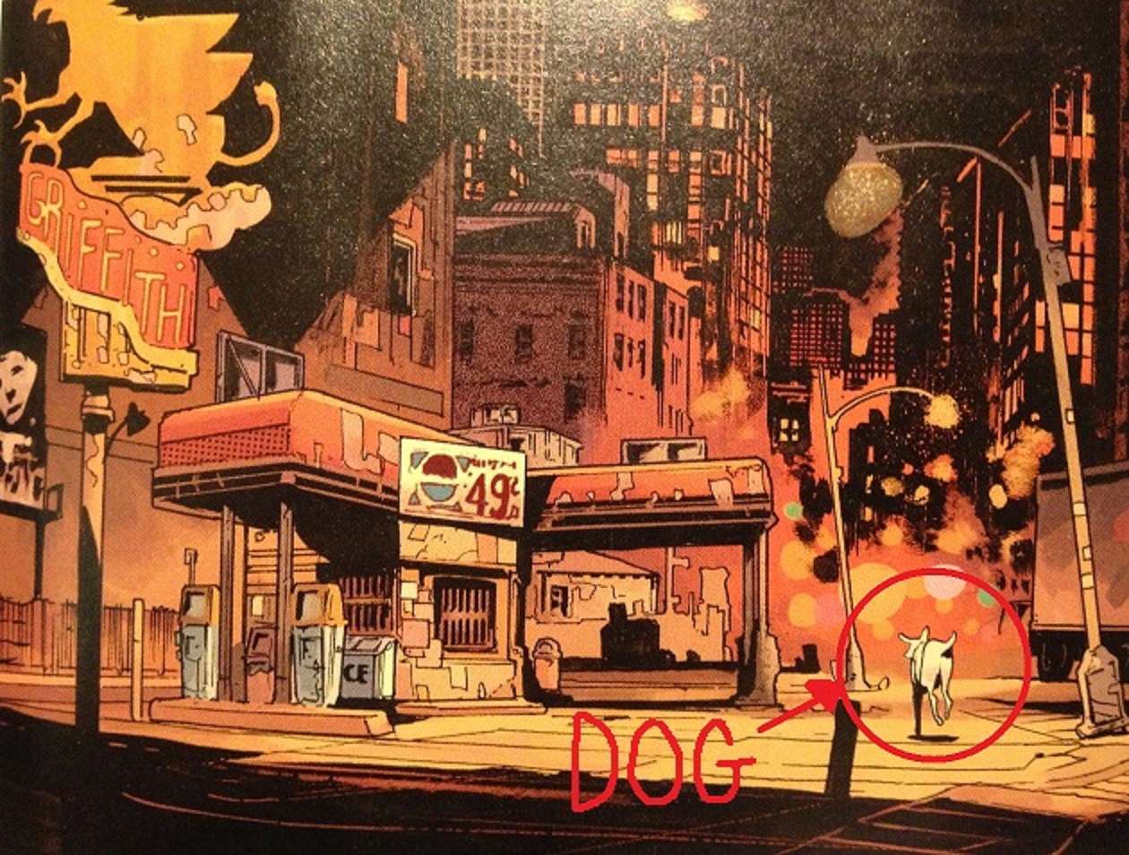
A basic description of this comic, so that everyone's on the same page.
The powerful global 1% types who "control the world"? They murder a rich guy, and his trophy wife swears revenge. Whoops. A standard-format Vertigo miniseries ensues. Double whoops.
Co-author Peter Milligan, talking to Comics Alliance:
"But the more I read and talked to people about the reality of the high-finance world, the more it became apparent that it’s a pretty dull place to witness: long gone are the days of Alpha Males with erections reading ticker tape. Now it’s all cyber space and flash buys. Fascinating, scary, possibly insane, possibly destined to be our downfall, but less dramatic. So I’ve used some of the settings, and some of the reality of how I see the financial world to be, to create a system that’s powerful, creating uncontrollable Frankenstein’s monsters, full of internecine trouble, and dominated by psychopaths. In other worlds, probably not unlike the financial system that rules our world."
QUESTION 1.
Is this comic about anything besides its plot?
The first issue primarily sets up the book as an exploitation revenge piece, just one where the heroine battles financial villains rather than gangsters or drug dealers or horny vice-principals. It feels like it's in a genre of television show I don't watch: I don't watch Revenge or Scandal, but this is what I imagine those shows feel like.
In the book's brief glimpse of the baddies, the super-rich cabal "really in charge", there's some timely bits: a splash page of riot police charging towards protestors; references to currency implosions and high-frequency trading software (which the book seems to present in a science-fictional mode, i.e. what if finance software became self-aware instead of Skynet?).
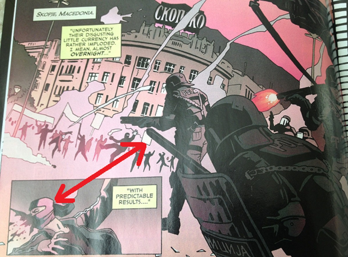
It doesn't take a lot to make a book feels of the times, I guess: just draw cops in riot gear.
But nothing in the first issue rises to the level of "thoughtful" or "critique." Nothing in the first issue is any deeper than the enormously silly splash pages of superheros frowning at banks or religious people from the terrible mainstream crossovers published earlier in this decade. But it's a comic from a corporate publisher aimed at an audience of television executives -- so, how much can one reasonably expect? The Names has at least some recognizable observation of the world intersecting with the story, and even that can be sometimes a rare thing. But in the first issue, the world's seemingly-increasing quantity of chaos is only background music, comic book muzak.
(An Aside: There is the question whether stories about "the evil 1%" are a helpful fiction in understanding how money or power works. I'm not sure whether that's true, especially as this comic's descriptions of the 1%'s decadence all feel so tired. Example dialogue: "I must rush. I'm supposed to be screwing the Mayor of London tonight." Oooooooh saucy.
Tales of the oh so sexually decadent rich were sold by the dime by Vanity Fair magazine to middle-aged house-fraus since before I was born, and the income inequality gap has only gone in one direction that entire time. The Great Gatsby was published in '25, but get-rich-quick huckster websites on the internet still overflow with admiration for Bill Gates or Whoever Invented Some Dumb App. It just seems like a go-nowhere fiction, especially if the mythology that's being sold constantly is that income inequality is bad because the rich are "undeserving" on account of their sexual decadence. That just becomes less believable now with the internet, now that we can see, you know, everybody everywhere is pretty darn sexually decadent, if they can be, given half a chance. (Shout-out to my bonobo monkeys, out there! What up, bonobos?) I'm not saying "let rich people off the hook cause Hannity says they're job-creators AMERICA!" or anything. Just: if rich people were really worried about these kinds of stories, they probably wouldn't let us tell them...)
QUESTION 2.
Did the creative team make any interesting choices in the visual presentation of the story?
It's been a while since I've seen Leo Fernandez's art, as he's spent a while drawing comics not really aimed at me as a reader. But he seems to be pushing his figure drawings to a more stylized place on this book than at least his recent work...? (See, for comparison). The characters seem more elemental, more shape-driven and angular.
Also: Fernandez often lets extremes in the lighting render out details, rather than risk unnecessary linework. While that may just be a hallmark of his style / school generally, it seems like he's pushing further in that direction here than in his mainstream work.

One notable weak-point: the two villains are extremely similar in dress and shape. It's difficult to tell them apart. But they're only in the comic for two pages, so it's not a big deal.
An abundance of the color brown in the second half, but it's a Vertigo comic-- what did you expect? Expect brown!

A quick note to Vertigo colorists: If you are working for Vertigo, there is a belief that both Vertigo and you get a gross, throbbing weiner-boner everytime you get to make a page all brown. People believe that because it's 100% true, and the only possible explanation for why all Vertigo comics ever published have been so drenched in the color brown. Nothing else makes sense; no other solution to that equation. Please consider defying your brown-obsessed masters. Look into your hearts. You know what you see? If you see the color brown, something has gone horribly wrong. I'm not a doctor, but that probably means someone has shit into your heart and you have feces pumping through your arteries. At the very least, it just sounds unhealthy from a cardiac-perspective.
QUESTION 3.
How is the comic structured?
Comic begins in media res. First scene is a two page inciting event, namely the murder that the main character will want revenge for.
Three pages then introduce the main character.
Three pages then introduce the villains.
Three pages then introduce the duteragonist -- the dead man's son. Some hint at Oedipal themes here which may be of interest considering that Milligan's recent Vertigo work was about processing an obsession with Greek dramas.
Three pages then setup the book's central mystery.
Three pages then set-up a mini-mission that the main character has to go on.
Three page action sequence.
Then two one-pagers conclude the comic-- (1) one page of the heroine after the action sequence declaring the mission that will presumably motivate her for the remainder of the series (sort of a classic bit of comic book business-- I think that's how the first X-Men or Doom Patrol ended, too, no?); and (2) a one-page tag for the issue overall that just reiterates the mystery of the book overall for the reader.
Does Milligan do the Three-page thing in all of his books? Never really noticed before if that's the case.
There's math why you might want to write a comic that way, though, at least if you're looking for a roadmap for structure: Three-page sequences give you at least 7 scenes and a one-page splash on a 22 page comic, say. Plus, it gives you a little helpful hint for how those sequences should be organized if you want to maximize the value of your page-turn moments. (Milligan's not entirely consistent with the Three-page units, but on the other hand, he's got the Vertigo house-ads to work around, so maybe that's on purpose).
So here, it's nine scenes: 2-3-3-3-3-3-3-1-1. (Some people, argumentative people, they might argue that it actually ends 4-1, but that second-to-last page sure seems like a different beat to me).
- The only other Peter Milligan comic I have handy is 1993's The Enigma. The first issue of that goes 13 scenes: 2-2-1-1-1-2-2-1-1-6-1-3-1. So maybe this Three-page thing was just all a fun little coincidence -- it's hard to say without a bigger sample size, which includes more recent work from Milligan.
QUESTION 4.
Is there anything noteworthy about the cover, logo, lettering, or design?
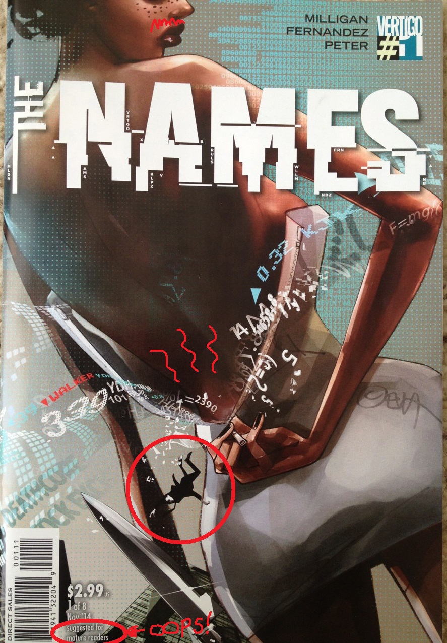
It's taken me four weeks to figure out to show the cover for this question. FOUR WEEKS!
The cover features the African-American heroine taking off her dress, and stock information flooding out from her ass-crack. Presumably, earlier that day, she had farted into a skin-tight dress, after eating some stock ticker tape, and this is that fart's chance to finally be free.
The dead husband Walker, who plunges to his death from a skyscraper, is referenced on the cover both by his name being featured in red letters next to a securities industry down-arrow and a little Mad Men doodle. Here, Don Draper's falling to death next to a Big Ass. Jealous, Matthew Weiner? The last season hasn't started yet -- not too late to make some changes.
The logo -- I think the idea is that the bottom half of the logo is being interfered with by a mechanical process. Which is a decent idea. But putting the names of the creative team (and the publishing imprint) in a redacted stock-exchange symbolic code...? I don't know if that really works. Just seems busy. The cover overall-- just seems very busy.
Which may be intentional, to be fair: if the idea was to convey signal being drowned in noise, well, they pulled that off, at least. But... seeing as "signal drowned in noise" is how a comic shop rack operates on a good day, I just don't know if that's really the most advisable design goal for a comic cover.
QUESTION 5.
Is anything about this comic interesting politically, socially, or from some other frame of reference?
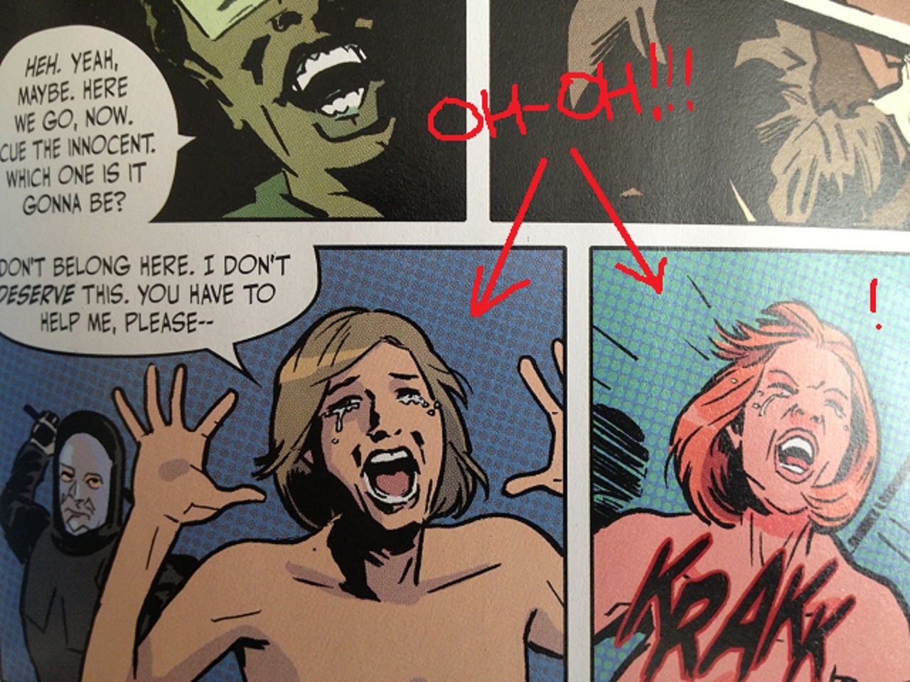
The lead character being a black lady may be of some interest to readers, I guess. Another "tough no-nonsense" type character, which is a cliche, but there's at least some hint at her having an inner life in the comic, which is the essential thing. She's not presented as Just One Thing.
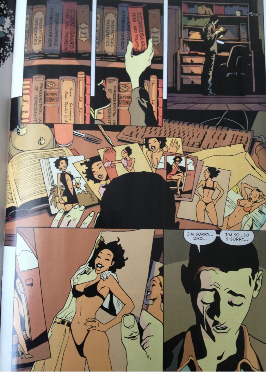
Except the comic has her topless by the end of the issue.
They saved the labia majora for issue two.
Whuh...?
Does my gut tell me that's what the target audience of an ABC Drama is really looking for...? It does not.
And I don't want to be a prude because there might be all sorts of ladies who might want her to be topless by the end of the issue: girls who like girls; heterosexual girls who are just into titty; Girl Scouts trying to collect some secret merit badge they don't tell square society about; I don't even know who; I don't know all the different kinds of girls out there.
But my gut would say it's undermining the power of that character to reduce her in that way at the moment of her victory over the man attacking her: the heroine might be able to defeat the power of an Evil Man, but can never defeat the Male Gaze! Put it another way: maybe it's a "have your cake and eat it too" problem to make the heroine a sexual object for the reader even while standing over the dying body of the bad guy who tried to treat her like a sexual object.
Also: because the scene follows her trying to seduce information out of the man attacking her, the nudity underlines that the heroine's power comes exclusively from her sexuality, and not from, like, competence or, uh, knowing things...?
And race being some tricky shit, my gut says that complicates it, too, in all kinds of messy ways that I don't even think I'm the right dude to try to articulate.
Your gut might say otherwise. But my gut says there's something pretty skeezy about that choice. That'd be my gut feeling. It's certainly a choice, anyways.
QUESTION 6.
Riddle me this: What is the creature that walks on four legs in the morning, two legs at noon and three in the evening?
The solution could be "an adorable puppy that is being physically abused" -- riddles aren't so fun anymore, now, are they? Read the papers, though: a psychopath who tortures puppies would be pretty much unbeatable at solving riddles in creative and unexpected ways. "Riddles were all a breeze after I tortured a puppy and ignored its howls of pain. It's called thinking outside the box, specifically the box I shove a puppy into after I'm tired of it trying to lick my face. AMERICA." -- Dick Cheney, actual quotation.
QUESTION 7.
What was the best bit of dialogue in the comic?
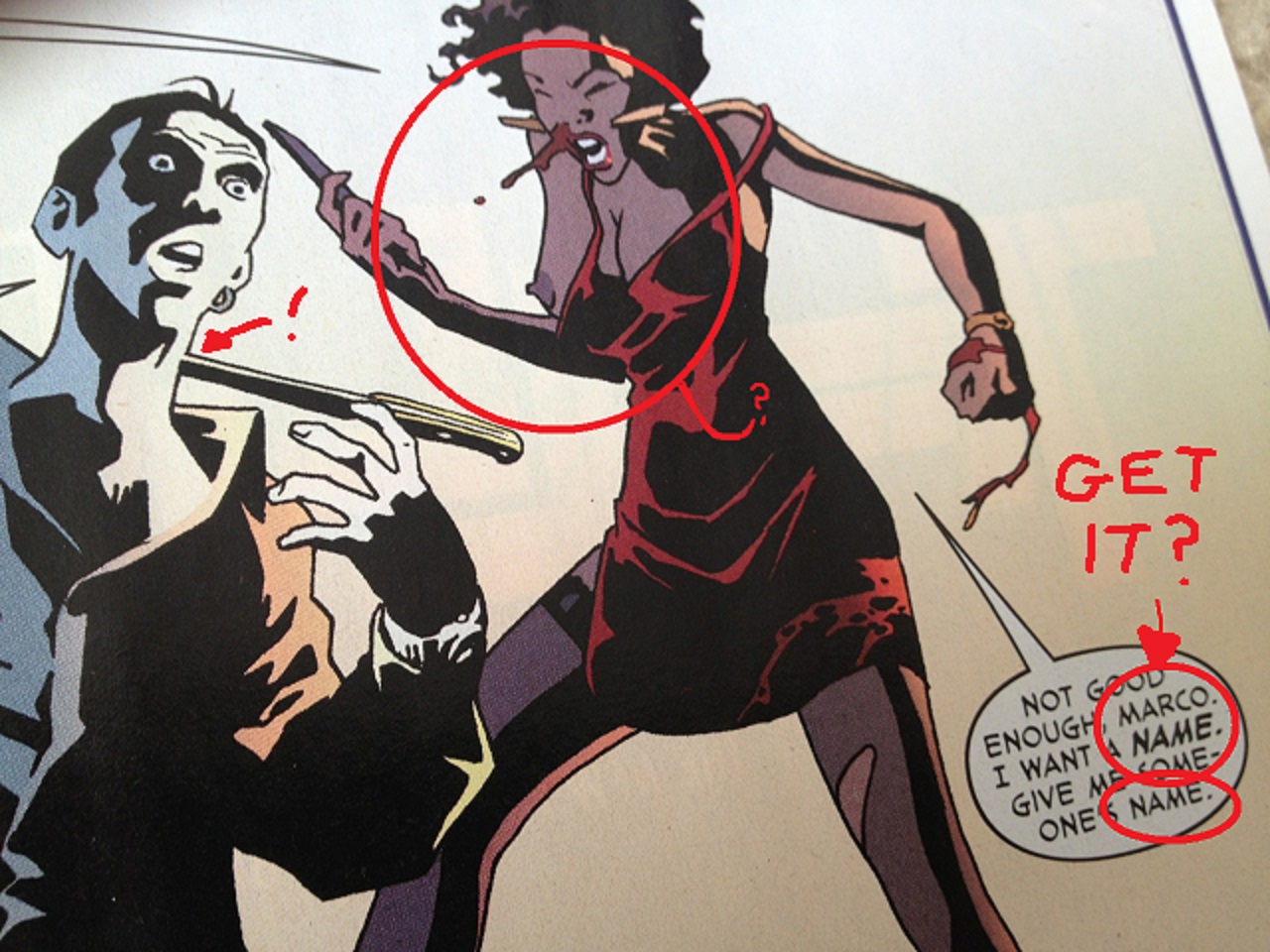
Cop A (Guzman): "Your husband fell fifty-one floors. The bones around the impact area will be shattered. His organs will have hemorrhaged and leaked from every cavity. If he fell on his head, he'll likely be unrecognizable."
Cop B: "Why don't you just tell it like it is, Guzman?"
QUESTION 8.
What is the most interesting page in the comic and how does it work?

The Names, Issue 1, Page 14.
This page takes place immediately after the Mystery has been presented to the main character, who is as the scene opens, now struggling to understand the clues she has been given.
I think it's a notable page just because of how the comic shifts to a subjective mode, more than the execution of the drawings themselves.
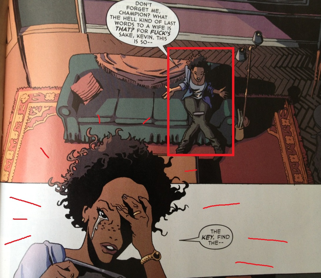
Top Half.
Panel 1 presents the main character in a down-shot, small and isolated in a panel filled with murky shadows, as she is overwhelmed by the mystery she's been presented.
But being the heroine of the piece, by Panel 2, she is beginning to focus on the mystery -- focus so much that the background has now dropped away completely. Blank space of the "no panel borders" variety, that can mean a lot of different things in comics -- I think Will Eisner in one of his books talks explicitly about how he liked to use that kind of blank space to convey that scenes are taking place outside, for example. Here, a far more common application of that bit of language: nothing else in the world matters to her as much as her reaction to the clues, as much as what she's thinking about.
Indeed, her head is breaking apart even from panel borders themselves as some understanding is beginning to dawn upon her.

Bottom half. You into the bottom half, bro? Yeah, you are.
However, the backgrounds return as her spell is broken in Panels 3 and 4: she is sucked back to reality by some (crappy) sound-effects, someone at the door named Marco. Note: she received a cryptic warning about Marco earlier in the comic.
In Panel 5, upon hearing Marco's name, emotions flood the main character, such that her face now fills the panel, such that she can now only barely be contained within the boundaries of the panel. Put another way, the panel borders struggle to contain her, just as she struggles to control her emotions.
In Panel 6, we see a flashback to the warning the heroine had been given earlier. This flashback panel slightly overlaps panel 5 -- it's on top of her face, on top of her concerns, this flashback, suggesting that it is being seen not only by the reader but in the mind's eye of the heroine herself.
Just basic storytelling, this page, of the "you can remove the dialogue and still understand what's going on" variety.
Sure, not a particularly interesting page on a technical level, and certainly one with room for improvement (the body language in panels 3 and 4 isn't so hot; panel 1 doesn't really lay out the geography as much as it could; panel 3's not fun to look at; a brown blanket on a couch sitting next to brown walls???).
But it's one of the few pages that really achieve a unity between the character's emotions and the visual storytelling.
Some people get off on rigid panel grids (the 9 panel grid of Watchmen, the 8 panel grid of Stray Bullets, the 6 panel grid of Louis Riel). Grids tend to be catnip to younger comic writers, especially, flailing around for rules. But I tend to like a page where the size and shapes of panels derive in some way from the emotions of their contents, authors who see that as another way of relaying information to the reader and a really direct way of connecting with them, at that. Grids aren't uninteresting -- if you're fascinated with the subject matter of time, Watchmen and Stray Bullets both suggest a grid might be handy in exploring that theme, in particular. But the way that the size and shape of a panel can reflect the emotional heft of the panel is just a more interesting thing to see in action to me...
There's an old Paul Pope quote that I always go back to, about manga (where I think what we're talking about is most often true). From Pulp magazine:
"When I was working for Kodansha, the joke was always, "A bad comic is where you have a panel where Superman jumps through a window, and the caption says "Superman jumps through a window," and he's saying, "I'm jumping through the window," and there's a sound effect that says, "JUMP." Or you can imagine three panels: 1.) he's jumping through the window, 2.) he's landing on the ground, 3.) he says, "I've done it"--or something like that. I really have a sense from what I learned from manga, is that, rather than try to tell and directly tell the story where Superman is jumping through the window, that the best manga will try to give you the experience of jumping through the window--the tactile sensations, the speed of it, the rush of it--catch all the different moments in-between the three panels that an American comic might use to tell the story."
Of possible interest is that the only other page in the comic with a subjective quality, page 11, is the page featuring the deuteragonist. One could perhaps argue that this is grammatically significant, I suppose, a way of linking the two characters, but for me, that would be pretty, pretty high-falooting talk for this comic.
QUESTION 9.
Did you experience any noteworthy emotion reading the comic?
Once the main character and the dead character's son emerge more as characters, there's a certain pulpiness to the first issue that's enjoyable. It's mediocre, but at least not unpleasant.
But I started the comic thinking more about the how's and why's that Vertigo keeps backing Peter Milligan, after a pretty good number of duds-- Greek Street? The Minx? (Not Vertigo, but:) The Programme? I wouldn't fuck with any of those comics with your mom's dick. This is a miniseries though so the more apt comparison is, what, Girl? Pop: London? Who could forget Pop: London? Answer: nobody because probably nobody besides me read that one, to begin with.
Milligan's a pretty erratic creator-- some great work obvously for many years, but also lots of misses. I made a decent effort to try nearly all of those books at some point, I think he's usually an interesting writer, so I'm glad they keep putting them out. And I had an okay time with some of this first issue. Still, it just seemed interesting to me that there's still space for him at Vertigo, given their announced focus on "big hits." Dan Didio (who really should be fired and we should all mention that more) talking to the New York Times about Vertigo:
"Mr. DiDio said it would be “myopic” to believe 'that servicing a very small slice of our audience is the way to go ahead. [..] That’s not what we’re in the business for . 'We have to shoot for the stars with whatever we’re doing. Because what we’re trying to do is reach the biggest audience and be as successful as possible.'."
So, a Peter Milligan comic about a topless black woman stabbing finance executives in the throat, while they talk about HFT software...? Keep reaching for those stars!
It's like the color brown though -- some things about Vertigo are just part of the culture now, no matter how much business-speak bullshit cliches you toss at it, I guess.
There's also the fact this comic is plainly designed to pitch a television show. I think I've written about the "comic as movie or television show pitch" and the many negative feelings that those engender before many, many times, as that has been the case with so many, many comics. It's nothing I want to type out again, and bore everybody with, especially if some people are somehow able to ignore that kind of thing. This comic? It wouldn't be a TV show I'd watch, or that I'd even guess would last a full season. But Fernandez's work is at least stylized enough and occasionally subjective enough where there's some cause to not be entirely dismissive.
QUESTION 10.
What do we hope that younger cartoonists learn to do and not to do from this comic?
Jesus, I don't know. There's probably all kinds of lessons to learn from Milligan about career longevity but I'm not really sure what those lessons are, let alone how to receive them. Guy's danced around a pretty bureaucratic company for many years now -- kept a presence with the audience for a long time, in a way many of his contemporaries haven't. This comic? No way this comic was ever going to be a hit, but he sure fucking talked them into it anyways, somehow
How did that happen? Beats me. That's probably the thing to learn here, but I'm no help to anyone there. Your sexy guess is as good as mine, beautiful.
Sometimes you see comic creators, when they get asked questions by young folks, they play a "We're all Princes of fucking New England" card, and spin some shit that's like... "I don't even experience your frail human feelings of competition or envy anymore. I'm only encouraged by the success of others, no matter how undeserving that success is because encouragement is the only emotion I allow myself. I've grown beyond all negative emotions -- get on my level!!"
And it's ... this is probably a good-enough kind of thing to say to young folks, in that it's mostly harmless, plus a nice way of avoiding the whole "you probably don't have shit to say that's worth hearing anyways -- to a grown adult, you're pretty much an adorable talking fetus" conversation. (That conversation probably won't get as many Likes on social media.)
But a comic like this ... I know when I read this comic, there was a moment I stepped outside myself, and imagined a young snot-nosed kid in their 20's assessing the situation, saying to themselves... "It's a comic that they could afford someone as good as Leo Fernandez to draw it; it got a big publisher behind it for sales and reviews, who paid for a decent print run in full color; all the creators involved will have a presence on comic shelves and in front of comic audiences for the next eight months; the publisher has historically not cared especially about losing money on comics publishing; everyone got a page rate; and all of those opportunities are being used on a writer / concept / whatever that, best case scenario, is just commercially going to be More Mixed Results, and you're telling me I'm not supposed to feel any kind of fucking envy about any of that??" I don't know. I think some things in comics actually are a competition, and, uh, Peter Milligan just kinda won that shit. So. Keep your head up...?
I think the good news, though, and maybe the bigger take away is ... If you're a younger person, however inexplicable you might find Vertigo putting these books out, year after year, forgotten comic after forgotten comic (did you even notice I forgot to mention that comic Egypt?), it's something you should actually be encouraged by. You want comics to be a place you can age with, and have a whole career with. And if you stick around a even a little while, not even long, you see plenty of evidence the opposite way -- a lot of names that are on a dozen books one year, and on pretty much no book of any significance a year later. Comics has a rough turnover, so you want there to be guys who are just sticking in there. Otherwise what the hell are you even signing up for? The Carrousel ritual from Logan's Run???
The characters in Logan's Run all seemed psyched about Carrousel, sure, but I think the message of that movie was don't be psyched about the Carrousel. And that's really the note I want to end this one on: just say no to Carrousel, kids, even if that means you'll be labeled a Runner. (This is a metaphor.)(A metaphor for me not knowing what to put here this week, and just vamping). (Vamps was also the name of a Vertigo comic that lots of people remember probably! A lot of American Virgins, though, am I right? Sandman).
NEXT WEEK: DETECTIVE COMICS #35-36 from DC Comics.