Abhay: Inquisition - Bitch Planet #1
/This is part of a series of write-em-ups answering a series of questions about recent comics. As an initial matter, please be advised that this will likely discuss details of the plot in the comic being discussed, and so here is a spoiler warning. Also, sponge warning: be careful of sponges that you use to wash your dishes. According to no less scientific a news source than the Daily Mail, a "kitchen sponge is 200,000 times dirtier than a toilet seat - and could even lead to PARALYSIS."
10 Questions about BITCH PLANET #1 by Kelly Sue DeConnick, Valentine De Landro, Cris Peter, Clayton Cowles, Rian Hughes, Laurenn McCubbin, and Lauren Sankovitch.
A basic description of this comic, so that everyone's on the same page.
The first issue of a new series about women trapped in a science-fiction prison run by an oppressive male-dominated society.
The first issue focuses on the arrival of a small group of women to a prison located on what we're told is another planet, and the immediate violence that ensues upon their arrival, some of which is caused by a bit of intrigue involving an older woman sent to this prison and her ex-husband back on Earth.
Co-author Kelly Sue DeConnick, talking to the LA Times:
"This is born of a deep and abiding love for exploitation and women in prison movies of the ’60s and ’70s. I like this stuff so much, and it’s so terrible, it’s so deeply awful and delicious, like those candies that are bad for you. So I wanted to see if there was a way that I could play with the things about it that I love and also the things about it that make me wildly uncomfortable."
QUESTION 1.
Is this comic about anything besides its plot?
This is a first issue but the book's themes seem baked-in from the get-go. Women are put in prison for the crime of being "non-compliant" with a male society that, in brief background glimpses, we can see is fascistically obsessed with controlling women's bodies. The prison and society are run by a violent patriarchy termed the "Council of Fathers".
This is all kind of a big, chunky metaphor that feels really ideal for a comic book: easy to grasp, angsty in a sort of adolescent way that serial comics seem to benefit by (I mean that in a complimentary way), a little goofy, lots of possible visual hooks.
But beyond establishing the premise, the first issue also works in a small plot about a husband discarding his first wife into this Prison of Misogyny because he found a "more compliant" younger woman. What makes this such an effective first issue, I think, isn't that it just presents this big chunky metaphor, but that it then immediately has a little example that fits entirely within the first issue, a little exemplar of hetero-lady anxiety / anger that's more bite-sized. It's not just relying on the big metaphor to win the day.
First issues are monsters. So many choices to make, so many obligations to service, so many ways things can go wrong for a creative team trying to sell readers on whatever the appeal of their comic is supposed to be. In the first issue of Bitch Planet, you can see comic authors trying to address those challenges by minimally setting up the series premise, but instead focusing moreso on providing a complete, discreet unit of thematic and emotional content for readers.
QUESTION 2.
Did the creative team make any interesting choices in the visual presentation of the story?
The way the color green is used jumps out.
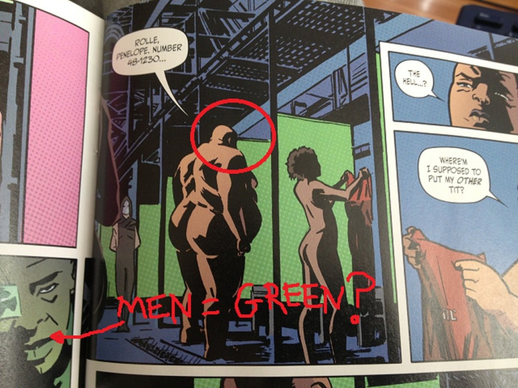
The authors color-code the first issue. Red/pink is established quickly as the color of women in the early pages: the introduction to the women is bathed in pink light, the prison jumpers are red, etc. Green is the color of men: green-lit wardens, the patriarchy's representatives back on planet Earth working in a green office, etc.
48-1230 is the combination I have on my luggage.
Once they're in prison, the women have to put on clothes in front of green stalls. As soon as one of these women insects with the color green, however, there are disastrous consequences, and a riot ensues.
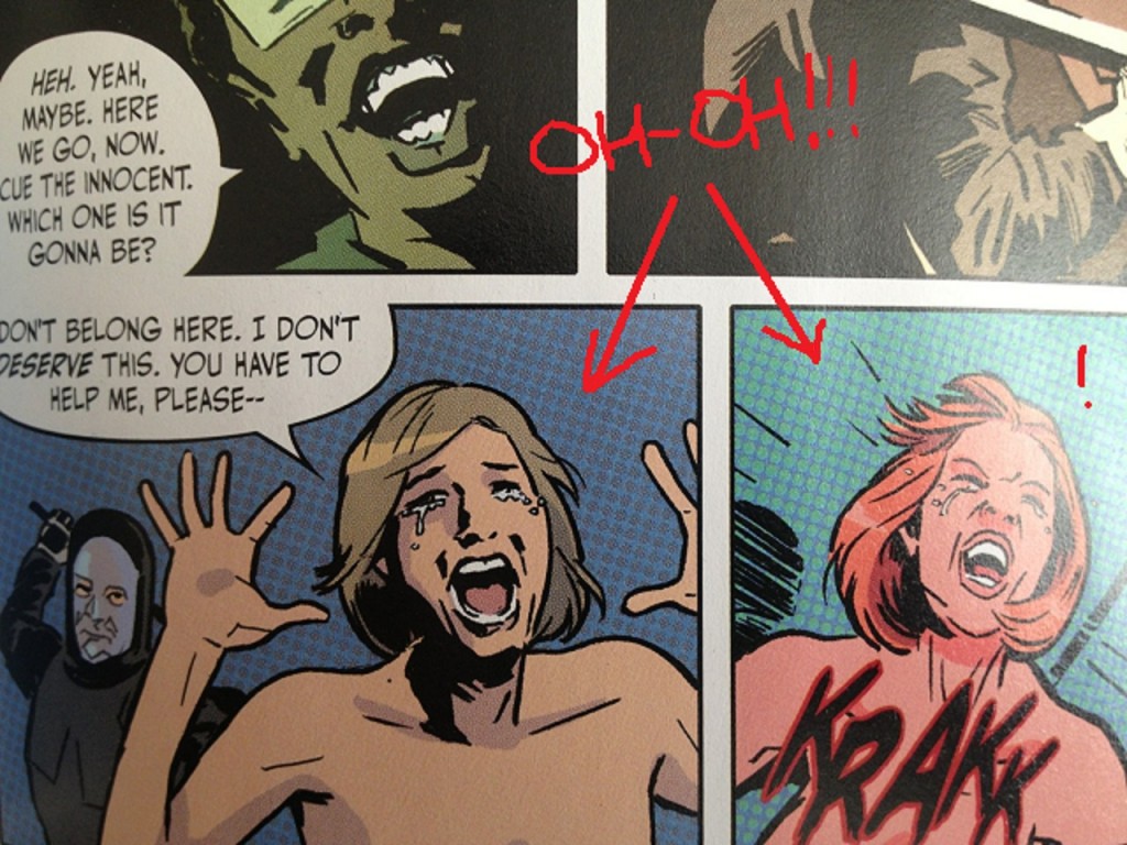
Krakk is whack.
In that riot, two panels feature women being struck from behind. In both panels where we see women being harmed, the background colors of those panels go green. Violence in this comic is depicted as the women characters being engulfed by the green color of men.
It's a small bit of narrative-through-color, but one that at least reflects a creative team engaged with the visual primacy of comics.
- (Wild Guess Dept.: The color-coding may also be a spoiler to the mystery set-up by the cliffhanger, if you check the color-coding on the characters in play (?), but we'll see on that point in future issues).
QUESTION 3.
How is the comic structured?
A high-tempo opening page (discussed further below in detail) sets-up a dueling dialogue scene in the next two pages, where (a) information presented visually comments on dialogue taking place at a different time/location, while (b) other characters are presented simultaneously, themselves commenting upon the visual information, i.e. three layers of information are conveyed to the reader and those layers all meaningfully comment upon at least one of the other layers. (This is easier to understand when seen, than it is to describe in prose, which I again mean as a compliment).
The first issue does this a couple times-- intercutting between moments in different places (and times?), leaving it to a reader to follow color-cues and page layouts to fully process the space-time "geography" of various moments.
Anyways: first scene's about five pages, including a two-page title credit splash.
The double-page splash is a bit of a weak point here. The comic presumably takes place on another planet (?) but nothing about the planet depicted in the splash seems particularly alien (presuming the "it's all another planet" bit isn't just a fake-out). If anything, the double-page splash seems to depict a space station in the foreground, which at least for a moment, lead me to believe the prison was on a space station. (I guess the tip-off for me should've been the comic being called Bitch PLANET but I'm not so smart sometimes...?). The creative team seemed interested in the wallop of a big double-page splash with their logo, but I don't know if that splash really carries its water narratively.
Next scene is four pages set in the prison. This is followed by two pages set back on Earth, setting up the issue's mini-story, and then again, a four page scene at the prison.
In the next two pages, the comic intercuts between the prison and Earth. The intercutting is on almost a panel-by-panel basis for the first page, but on a more interesting "space to the left, Earth to the right" configuration on the second page which relies on color and page-geography for clarity.
There then ensues two more pages on the prison, one page wrapping up the Earth storyline, and then four pages in space-- three of which rap up the issue's mini-storyline in space, one of which is a cliffhanger page. (Thankfully, not a splash page cliffhanger! I do not dig those much at all-- way too played out, especially with first issues).
Eight scenes total: 5, 4, 2, 4, 2, 2, 1, 4.
Put another way, the comic goes Earth, Prison, Earth, prison, Earth and prison simultaneously, Prison, Earth, Prison. If you squint at that, I think you vaguely see a symmetry to the issue. But maybe that's just me squinting.
QUESTION 4.
Is there anything noteworthy about the cover, logo, lettering, or design?
Rian Hughes logo. He makes the letter C in the word BITCH into the planet Saturn, using a little bit of shading. The logo looks better in the comic than on the cover-- on the cover, he uses a undefined blocky drop-shadow-y thing, like on the old X-Men logo. (I don't know what the terminology is-- I don't know logo lingo). It just looks a little more cornball on the cover.
On the cover, it seems in service of an overall aesthetic that I don't quite know that I understand.
The cover and the book itself seem intent on asserting to the reader that it's a pop culture artifact, via "this sure is a comic!"-type moves that I'm not sure I dig. Besides the blocky drop-shadow-y thing, the book's colors often have a Photoshop texture, a faux Benday-dot effect, i.e. "lots of little dots". The cover aims more for an exploitation movie poster, with exploitation-trailer style text blurbs on the cover, an insincere "Rated M Mature" logo in the corner that's almost smaller than Rian Hughes's signature.
I don't know. I think those moves are supposed to be fun, but I think there's a little insecurity to them which doesn't really make much sense to me, given the strengths of the content otherwise. It seems a little weirdly defensive, for a book that doesn't need to be defensive -- trying to preempt arguments that aren't worth entertaining to begin with (e.g., "you can't dismiss this in any way as not being a comic! Look how much of a comic I'm being with these benday-dots"...?).
Or even setting that aside, aesthetically, it's just not very fully-formed. The faux Benday dots in particular don't really add a lot. I'm just not really into those dots, generally, so maybe that's just me. Photoshop-created dot-textures just never look right to me. (See, for comparison, Hip Hop Famly Tree pages from Ed Piskor, who actually took the time to scan in old comic pages, to a noticeably different and, I think, superior effect). I have "Annoying Music Fan Talking about Vinyl" type opinions that there's a warmth to actual old coloring and the mechanical processes and mishaps that created old coloring that you just can't recreate by slapping a computerized dot texture on top of some colors. Photoshop-dots, it just looks like a schtick to me: it's not recreating a thing, it's signifying a thing, which is just less interesting; it makes the colors intrude into the experience; for me at least, it's just too schtick-y.
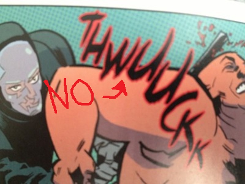
I thought that word had three U's.
The single worst part about the comic overall is the sound-effect lettering. The THWUUCKK font should be erased from human existence. But not many people will care about that, and that's a little kink they can smooth out as the book proceeds.
QUESTION 5.
Is anything about this comic interesting politically, socially, or from some other frame of reference?
Ha-- well, this one is an easy yes.
Let's be more honest than is probably advisable, and let me cop to something I noticed about myself reading this issue:
For starters, let's establish that I'm a big old piece-of-shit guy, with a lot of dumb-ass-guy opinions. (I think it's a little unavoidable. You know, you live in a weird crappy society, some weird crappy stuff can't help but rub off on you. The question becomes whether you admit it or or you lie and pretend like you're some special-y special exception. Me, I got nothing telling me I'm any kind of exception in life, and a whole lot going on telling me the opposite, so.)
And so... And so, the issues raised by the issue's mini-story, in particular, is really designed around pushing emotional buttons that while I imagine I might have if I were a woman, and while I can understand them intellectually (I think), I just don't have those buttons. I can appreciate on an intellectual level, at least, that the mini-story about the discarded first wife would be appealing, for example, to a woman angry about her value being defined exclusively by a short window of male sexual attention, and being discarded after that window closes.
But I'm a Shitty Guy so my immediate gut-level reaction was more, you know, "I sure wouldn't want to be trapped in a loveless (and definitely sexless) marriage, and don't blame anybody who gets out of one of those #notallmen. P.S. some science stuff about bonobo monkeys I heard once third-hand."
Then I caught myself and realized the more Horrible and Pressing Truth: I live in my head with the piece of crap who starts creating excuses for fictional men...! Haha, oh nooooooo.
So, I think I had an interesting experience with this issue just in that... I imagine if I was a lady, I'd have to constantly identify with male protagonists because they'd be given to me so ridiculously often. And so it turned out to be a little bummer (though an interesting one) knowing that as a Shitty Guy, the comparative muscles for me are so atrophied from non-use. Little bit of a bummer!
In my limited defense, they haven't assigned me a reddit account yet (they assign you a reddit account and it's just all over for you; all over). I don't know. In my limited defense, I can at least spot the issue with my Default Settings. I don't know how much control we have over our Default Settings, but probably no control at all if we're not even aware of them...?
(Also: bonobo monkeys really are actually pretty interesting creatures, if you look into them!! Blame me; don't blame the bonobos!)
Besides gender, there's also race. Race is just some tricky shit. It's more fun than not to see black female lead characters, and the book seems to promise those will be more prominent in future issues. On the other hand, the tricky bit is that those characters not all be tough fight-y fighters (which is all the first issue seems to promise), as that would kinda make them into the Other or be in a way capitalizing on cultural baggage that's uncool...? It'd make race into, like, a signifier, which is ... kinda not so great. I've known pretty tough black ladies, sure. But I've also known black ladies who are made pretty much out of expensive cupcakes. You know?
The cast hasn't really been fleshed out yet so too early to say whether that should be a concern. Still, the first issue has black ladies beating folks up, but the characters with emotion-driven back stories, whose inner lives are of interest, those are all white-- the black characters are just engines of cool violence in issue one.
(But look, it's pretty unlikely to think that's going to be what this comic is like by the end of issue 4...? It just doesn't seem very likely that the creative team's going to have a blind spot that glaring past the jump-off.)
QUESTION 6.
Take away my first letter; take away my second letter; take away all my letters, and I would remain the same. What am I?
You're a fucking weakling. Why don't you learn how to fight, you spineless bag of cotton candy? A couple weeks of Krav Maga and no one's taking anything from you. Someone takes your first letter, you just yell "Krav Maga!" at the top of your lungs and then kick them in their fun-parts as hard as you can. Nobody's going to take a second letter after that. Unless they have a gun. Okay, actually, be careful, in case they have a gun. Nowadays, the way this country's going, they're probably packing some heat, the letter bandits. Damn. Well, I mean, if you don't need all those letters, and you're the same without them, then you should just give that shit away before some jabroni with a gun shows up and it even becomes an issue! What are you keeping the letters for anyways? What, you want to end up on that Hoarders show?
Gun, no gun, just get your life together!
QUESTION 7.
What was the best bit of dialogue in the comic?
One of the Bitch-Planeteers (yelling): "Where'm I s'posed to put my tits?!"
The first prison fight featured in the comic is caused by men's failure to manufacture adequate bras or to appreciate the variety in the shapes of women's bodies...? Sponge warning: it's not a very subtle comic. Not so subtle with its themes. No one's going to criticize the comic called BITCH PLANET for being TOO subtle, as it turns out-- surprise!
QUESTION 8.
What is the most interesting page in the comic and how does it work?
Bitch Planet, page one.
The first page was the one that struck me as most noteworthy.
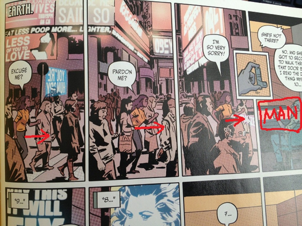
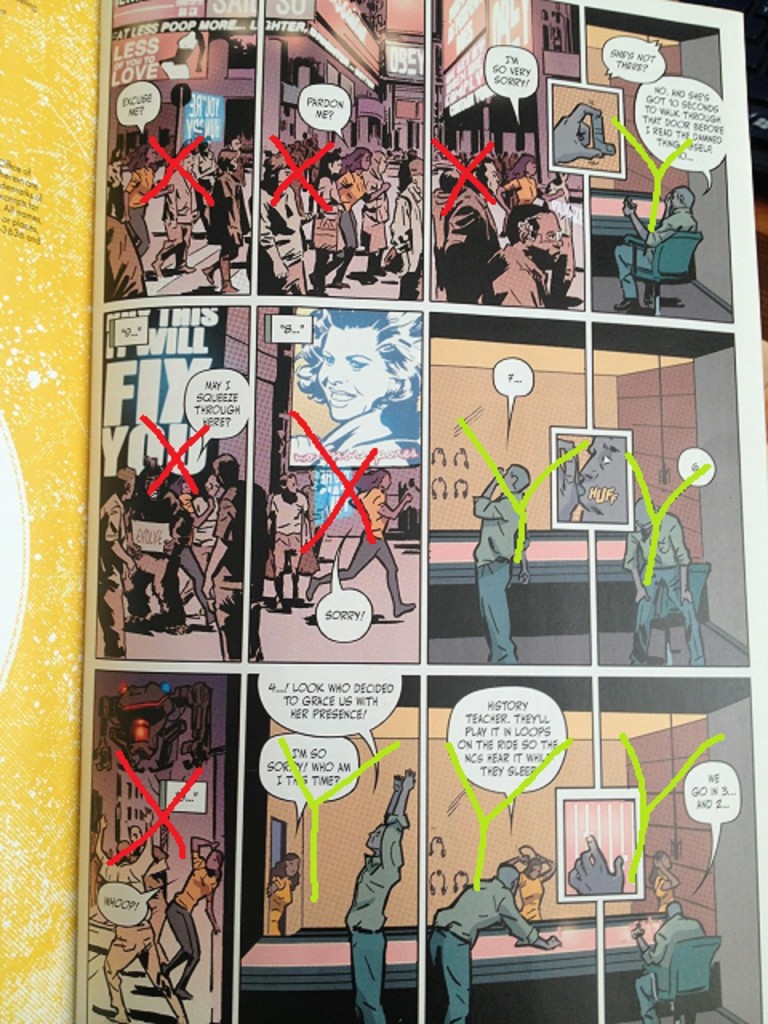
As you can see, Page one is a 12-panel grid, 4x3, with three interstitial panels cutting into the right-most two panels of each tier.
Tier 1 of Bitch Planet #1, Page 1. "Eat less poop more."
The top tier is a Woman advancing geographically across three panels. The panel borders establish an urgent staccato "musical beat" from the get-go, with the three interstitial panels acting as grace notes.
The Woman is racing towards panel 4-- a drawing of a Man sitting in a chair, complaining about her.
Tier 2 of Bitch Planet #1, Page 1. Really wish that sign said "No more posers." So that the posers would finally know how we felt about them.
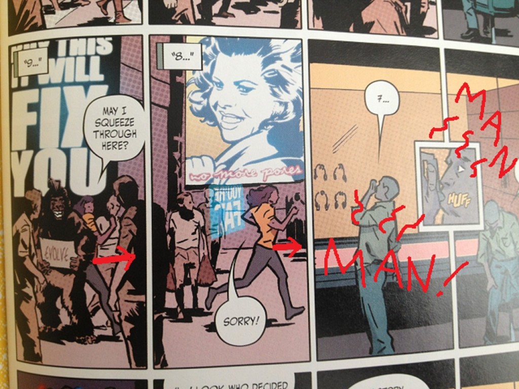
Tier two, the Woman is again depicted as racing to her right, but now only in two panels. Where the Man once took up a single panel, he now takes up two panels.
While the first tier featured a generic science-fiction city-scape in the background, with John Carpenter They Live headlines like "OBEY" blaring in the distant background on various neon signs, the second tier becomes more whimsical. The Woman has to squeeze through a crowd of three men surrounding an ape holding an "Evolve" sign. We can see that her progression through her world is becoming more surreal and the propaganda only more oppressive, closer, unavoidable to notice. The space she has to move in more cramped. Meanwhile, the Man's world is expanding and stable-- he has plenty of space to work.
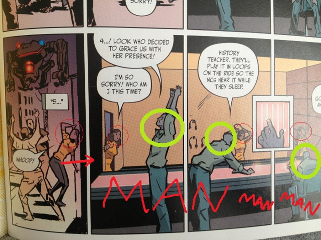
In his two panels, the Man begins a countdown, like the kind that would be sung out before a song starts properly. This further adds to the high-tempo musical quality of this first page.
Tier 3 of Bitch Planet #1, Page 1. Into that "Whoop!" but couldn't tell you why. People who talk about comics being like music usually sound like self-satisfied windbags but I guess they wouldn't be wrong saying there's a musicality to this page, to that "Whoop!"
Tier three, final tier, the Woman is now stumbling to the right, with only one panel dedicated to her-- any confidence in her body language is now gone. The cityscape now seems violent and threatening, with some kind of police robots hovering above her, and her journey now pushing her past what we would presume are violent men breaking the law.
The remaining three panels are now dominated by the Man, who is prominent in the foreground while the Woman enters, small and diminished into his background.
What's interesting about this page is that as early as page 1 of issue one, there is a narrative visually presented to the reader: a competent woman has to struggle through a ever-more-hostile world, but her story, that progression? It is increasingly diminished and subjugated to the story of a comparatively more dull male character. It is his background, separated from him by a plane of safety glass. And that male character is dismissive of her struggles despite having none of his own.
I think you're too lazy to scroll up and look at the page again. I think that about you, and I'm not sorry.
Without resorting to dialogue, within a page, the comic is making a thematic statement, establishing everything we need to know about the world without exposition, with minimal clunkiness, and within a grid structure that immediately starts the comic at a brisk and exciting tempo.
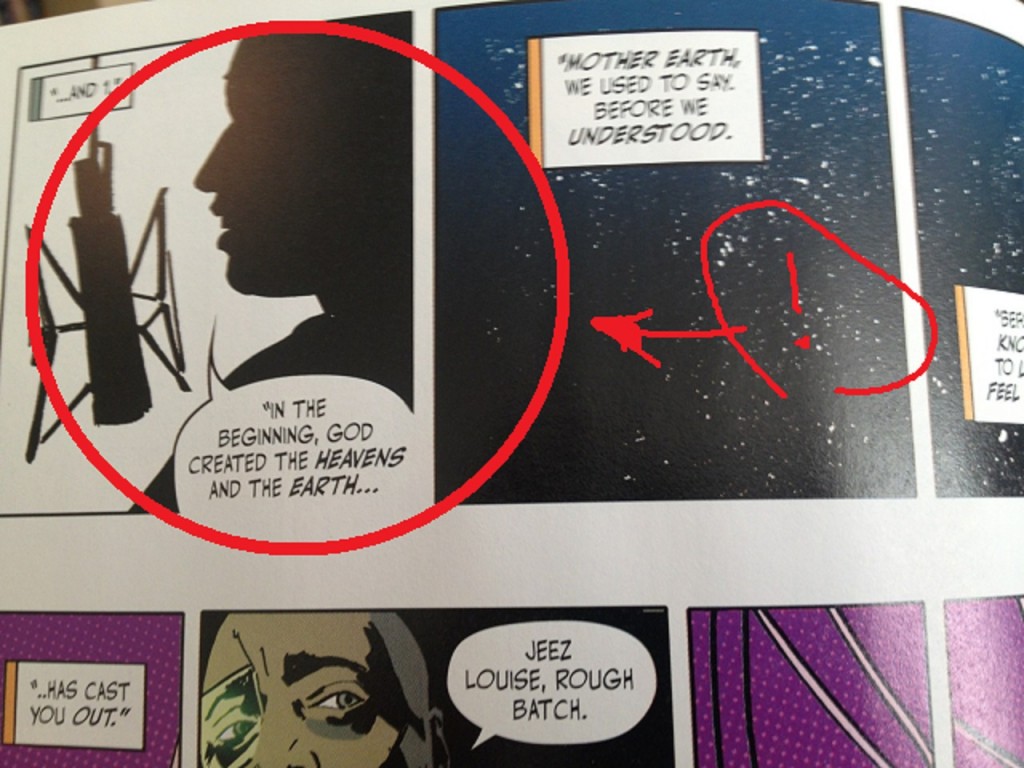
Further bit of possible interest: in the first panel of page 2, we have a close-up of the Woman finally, as she begins her job for the Man character. The creative team presents her purely in silhouette. She had been drawn with some minimal detail before working for the Man. But now, working for the Man, her very identity has been visually obliterated.
QUESTION 9.
Did you experience any noteworthy emotion reading the comic?
I'm not a big fan of women in prison movies particularly. As exploitation genres go, that one never really did anything for me; those movies are pretty sleazy, and not really the kinds of reprehensible gross sleaze I'm super-super-into, boner-style. So, my reactions to the comic were more analytic than emotional or gut-level. As mentioned above, I was just more struck by what I think I was supposed to have an emotional reaction to, but didn't. For me, that was the most noteworthy experience with the comic, beyond an appreciation of craft.
QUESTION 10.
What do we hope that younger cartoonists learn to do and not to do from this comic?
Not to do:
Maaaan, be careful of that Ben-Day schtick. Not a lot of comics I can think of where a Photoshop filter has really plus-ed a comic. It's the kind of choice that once you make, it's a tough one to back away from.
The iconography of comics is fun but may not fit every project.
To do:
Layout is storytelling. Color is storytelling. Everything within a comic's four corners can be storytelling, if you want it to be. A comic doesn't just have to be a vehicle for telling a story. A comic can be the manifestation of the story.
Comics. Try to think comics.
NEXT WEEK: RUMBLE #1 from Image Comics.
