"Oh, Jumping Joe!" COMICS! Sometimes They Appeared Daily In Newspapers While The World Burned!

Hello again! What could be more alluring than a look at some old timey newspaper strips from the days when World War Two was still in full swing, strips by a man who has been dead since 1994! I shall capture that Youth Market, yet. Anyway, this...  photo HazrheadsB_zpsbb7b6ee6.jpg

FRANK ROBBINS' JOHNNY HAZARD VOLUME ONE: The Newspaper Dailies 1944-1946 By Frank Robbins Introduction by Daniel Herman Hermes Press, $49.99 (2011) Johnny Hazard created by Frank Robbins

 photo HazCoverB_zpsc98b2ac8.jpg

When it comes to comics posterity can be a bit of an ass. Case in point: Mr. Frank Robbins esq. (1917 – 1994). Now, Frank Robbins was an artist, sorry, an Artist. And this might be difficult to believe if you think of the things we usually think of when we think of Frank Robbins. Because what do we think about when we think about Frank Robbins? Some of us might think of his work on DC’s The Shadow or maybe the fact that he is credited as starting Batman comics on the long, dark road to gritdom, but mostly let’s face it, effendi, most of us remember him for The Invaders and stuff like this:

 photo HazinvB_zps95d39a90.jpg

Which is where I, in a younger incarnation, first saw Frank Robbins’ art and fell for it hard. No, not so much the issues where Vince Colleta’s horrific inking dehydrated Robbins’ art to the point of dusty incoherence, rather the issues where Frank Springer put the, er, spring back in Frank’s step with lovely slabs of black and a wholly sympathetic feel for the effects Frank Robbins was after. And the effect he was after was “aliveness”. Robbins’ art was primarily concerned with imbuing a sense of life within his static images. And on the pages of Johnny Hazard the reader gets to see Frank Robbins achieve this effect in every panel. Because on the pages of Johnny Hazard Frank Robbins is flying solo. Uncompromised by the penciller/inker division of The Big Two the reader is allowed to appreciate Robbins’ art fully.

The sense of life is most apparent in Robbins’ humans. Very few of his figures stand stock still as though they have a stick holding them up, instead they are usually portrayed in a way which seeks to fix their existence in that particular moment caught in his particular panel, and to further imply that before that panel and after that panel they will continue existing even if we never see them again. Arms are folded, shoulders cocked, hands gesticulate, faces crinkle and open appropriately and that’s just when they are at rest. When in motion Robbins’ figures really move. But Robbins’ genius here is in his ability to convey the sense of life via the inanimate objects. Everything from the clothes characters sport to the environment around them and the machines which seek to destroy both contain bold yet elegant cues to their texture. With a style as heavy as Frank Robbins’ style these anchors to reality enable even the most casual of readers to enjoy the content.

 photo HazactionB_zpsa2be1660.jpg

And the most casual of comics readers did enjoy Johnny Hazard. Robbins began the strip in 1944 and it folded in 1977, a hardly negligible run. The strips in this book cover 1944 – 1946 and so Johnny Hazard is firmly set in World War 2. It isn’t a war strip though, it is an action/adventure strip set in war time. Nonetheless Robbins’ does on occasion briefly acknowledge the horrors of his setting with the death of a mother, the exhaustion of the pilots and the reactions of survivors to losses incurred. Mostly though Johnny Hazard is entertainment set in war time. This may be a tough sell for some but the war was still underway for the majority of the time Robbins produced these strips and it’s not usual for the Home Front to desire a conflict’s complexities and true horrors to be presented while they are still up to their necks in it. I thought the material did a decent job of being entertaining without ever slipping into gung-ho jingoism. The war in Johnny Hazard is a hard war and while the essentially screwball nature of Johnny’s antics might distract from this it is still apparent.

 photo HazromanceB_zps5351057e.jpg

But the war was a long time ago and so were these comics and much has changed in the meantime. Consequently old comic strips have the added burden of being read by potentially revisionist eyes. Racism, we’re heading into racist territory here. Great. And I’d say Johnny Hazard comes off pretty well. Which is more than the Japanese Armed Forces does, but then, and it really is very important to note this, they were the enemy at that particular point in time. And still, and still, despite the garbled syntax, period appropriate slurs and occasional buffoonery on display Robbins’ is really just emphasising the villainous nature of Johnny’s opponents in a typically melodramatic style suited to his genre. Individuals are singled out for this treatment so as to allow the audience to boo and hiss but the wider context of the strip still conveys a sense that the Japanese are a formidable enemy. Any Chinese characters encountered are resourceful and brave indicating that it isn’t not being Caucasian that’s the problem; rather it’s being the enemy. Although the Chinese do have that silly syntax too. Mind you so do one of the Yanks and a French lady. I guess Frank Robbins hated everyone! No, I don’t know, racism? There’s a bit. You're young and strong, you'll cope.

And what of the ladies how do the ladies fare in Johnny Hazard? The ladies fare surprisingly well in Johnny Hazard. They are all capable, feisty, determined and other such characteristics which are generally positive. Woman wise here Robbins’ art seems erotically imprinted by fever dreams of Veronica Lake and is less heated and torrid than it would later become when Joan Crawford apparently became Robbins’ epitome of eroticism. Sure, there’s a woman who uses her feminine wiles but then again there’s another woman who is a hard as nails resistance fighter who could care less about romance. One stops tanks by flashing her gams while the other gets the most startling scene of violence in the book; upending a bowl of hot coals onto the head of her nemesis and just flat staring down at him as he dies screaming. Yeah I reckon Frank Robbins has plenty of range when it comes to the ladies.

 photo HazgamsB_zpsd9dcbc87.jpg

The stories are okay, too. They are though adventure serial yarns with a sense of humour some might see as verging on the cornball. One pivotal plot point revolves around someone’s name being phonetically similar to the word “marijuana”. Which is okay by me. Still, for every pilot who thinks he’s in the navy and speaks and acts accordingly to not entirely hilarious effect there’s a masterpiece of visual comic staging like this:

 photo HaztimingB_zps01426171.jpg

Which is apt because on every page of this book the visuals trump everything. The real appeal of this book is the art by Frank Robbins. All else is just a vehicle for the delivery of Robbins’ art. Which is appropriate because Frank Robbins was an artist. Sorry, an Artist. This is made clear in the sparse but dense blurb adorning the book about the man himself. This tells us that amongst other achievements at the age of nine Frank Robbins was awarded a scholarship to the Boston Museum of Fine Arts, he later illustrated for Life and The Saturday Evening Post and his paintings were exhibited at The Metropolitan Museum of Art amongst other such tony venues. So, it would be a bit of a shame if we remembered Frank Robbins primarily for this:

 photo HazinvB_zps95d39a90.jpg

Frank Robbins' Johnny Hazard Volume One: 1944 – 1946 is not only cumbersomely titled but is also pure Frank Robbins and is thus a much better way to remember him. Although I bet the ‘70s volumes when his Sweat’n’Shadows style was at its apex are well worth waiting for. And wait I shall. In the meantime Johnny Hazard, despite the meat’n’taters nature of the packaging and maybe a smidgen of racism, is VERY GOOD!

Who knew Newspapers don't just contain fish'n'chips, sometimes they contain - COMICS!!!


"This is Worser Than Washin' An Elephink!" COMICS! Sometimes It's Like I'm Shouting This At You While I Run Past!

Borag Thung, Earthlets! I have been quiet of late but I rested easy in the knowledge that the delightful Messrs Khosla, McMillan, Lester and Hibbs had been satisfying all your comicy needs to the highest of standards as ever. Not that I was resting you understand. So, practically writing this one as I move towards the door...Anyway, this...  photo DHPLaphamB_zps0a5669a1.jpg David Lapham from The Strain in DARK HORSE PRESENTS  #28

POPEYE:CLASSICS #14 Written and drawn by Bud Sagendorf IDW/Yoe Books, $3.99 (2013) Popeye created by E.C. Segar

Some issues of POPEYE: CLASSICS are available from the Savage Critics Store (which you have all quite patently forgotten about. Sniff!) HERE.

 photo PopeyeCovB_zpsc97449dd.jpg

Month in month out the nautically attired freak faced grammar mangler continues to pleasantly baffle me with the weirdly logical escalation of the ludicrous incidents which comprise his preposterous adventures. Since Popeye, for all his charms, is in fact a fictional construct I’m going to place the credit for this consistently entertaining package at the door of Bud Sagendorf, a real life man (now deceased) who went done drew and writed it all. Fans of the magic old men do can marvel at Sagendorf’s use of long shot silhouettes to prevent a total nervous breakdown from having to repeatedly draw a train in what are quite small panels indeed. As a special bonus Sagendorf serves up some right nice visual gaggery, the best of which are the parts where sound FX have a physical effect on the drawn environment they inhabit. Basically they hit people on the chin is what I’m saying there.

 photo PopeyeCrashB_zps5874c470.jpg Bud Sagendorf from POPEYE CLASSICS #14

In this issue the main tale involves Popeye buying a railroad, Olive Oyl’s demanding customer, an attempted hijack and a visual stereotype of a re..native American (altho’ in the world of Popeye this might actually be a vacationing accountant in racially insensitive fancy dress). Then there’s a story where Popeye buys the world’s cheapest and laziest race horse, another story where Popeye and Olive simultaneously seek to teach Sweetpea a lesson and demonstrate their poor parenting skills by scaring the shit out of the wee tyke in an abandoned mine, and a short with Wimpy being out foxed by a cow (“a lady of the meadow”), there’s a text story as well but I skipped that. Bud Sagendorf wasn’t writing for the &*^%ing omnibus is what I’m getting at here. Popeye is printed on weirdly bloated pages, haphazardly coloured and always, always a welcome arrival in my field of vision so I’m going to say it’s VERY GOOD!

THE SHADOW ANNUAL 2013 Art by Bilquis Evely Written by Andre Parks Coloured by Daniela Miwa The Shadow created by Walter B. Gibson Dynamite, $4.99 (2013)

 photo ShadCovB_zps5952fe00.jpg

Man, I’m not exactly Sammy Stable at the best of times (“No shit, John!”) but the temporal shenanigans in this thing almost gave me a panic attack. It’s five minutes ago! Now it’s three hours later! No, hang on, it’s five years earlier. No, it’s been seven hours and fifteen days. And nothing compares. Nothing compares. To yaaaooooooooowwwww. Clearly the comparison being begged here is that this comic is like Brief Encounter but starring two psychopaths and set in Vegas before Elvis conquered it.

 photo ShadTimeB_zps5522896f.jpg

Bilquis Evely from THE SHADOW ANNUAL 2013

Even more clearly it’s not like that at all but instead is very much like having to find your train in a busy station where all the clocks show the wrong time, people keep getting stabbed and shot and you’ve found yourself in the company of some boring jabberjaw who won’t shut up about his first love. Shadow, dude, move on. This is unseemly in a man of your standing. Fucking chin up, old son. As for the art, well, it’s okay, it’s alright, but there’s a tendency for noses to look like the owner has a heavy cold. That’s Sean Murphy’s influence (influenza!) in action there. So, a nice idea, not terribly well executed at a price point I want to hit with a stick makes this EH!

DARK HORSE PRESENTS #28 Art by David Lapham, Neal Adams, Richard Corben, Steve Lieber, Patrick Alexander, Ron Randall, Menton3, Michael T. Gilbert, Aaron Conley and Geoff Darrow Written/plotted by David Lapham, Edgar Allan Poe, Richard Corben, Neal Adams, Caitlin R. Kiernan, Ron Randall, Steve Niles, Michael T. Gilbert, Janet Gilbert and Damon Gentry Coloured by Lee Loughridge, Moose Baumann, Rachelle Rosenberg, Jeremy Colwell, Michael T. Gilbert, Sloane Leong Lettered by Clem Robbins, Nate Piekos of Blambot, Ken Bruzenak, Steve Lieber and Damon Gentry

 photo DHPCovB_zps02ecf8a5.jpg

Dark Horse Presents is an anthology so, you know, it’s a bit all over the shop. Mostly though it keeps its footing on the shiny tiles and rarely sends the display of stacked tins (Pork and beans! For the poor!) spinning madly about. First up, David Lapham reminds me how good he is at comics with his The Strain chapter. Even though I have no particular interest in this property and there's a bit of cultural shorthand verging on the cliched Lapham quietly did the business on every page to ensure that the final panel came as a punch to the guts and I actually wanted to read what happened next. Later in the ish Lapham resurfaces with the conclusion to his introductory Juice Squeezers tale which, with its teen focused Cronenbergyness, proves to be the kind of nuts that comics would benefit from more of and yet truculently resists embracing.

 photo DHPMonsterB_zps01cc1c30.jpg

Michael T. Gilbert, Janet Gilbert and Ken Bruzenak from Mr. Monster Geoff Darrow’s spot illustrations continue to amaze with the visual conviction with which they deliver scenes at once grotesque, impossible and droll. In a similar fashion to the comics Darrow produces elsewhere, comics which chafe some SavCrits so (but, strangley, not this eminently chafeable one), Sabretooth Swordsman with its surprising Savage Pencil influences is an optically delirious but narratively slight piece.

 photo DHPTigerB_zpsba5c3891.jpg Aaron Conley, Damon Gentry and Sloane Leong from Sabertooth Swordsman

Richard Corben chucks out another Poe adaptation which is notable primarily for the truly scintillating colour work executed therein. I am absolutely horrible at appreciating the colour in comics but even here, even I, had to stop and marvel at more than one point. Ken “The Chameleon” Bruzenak is here in several different stories and in each case serves up lettering apposite to the pieces in question; in the very traditional Trekker his work is attractive but modest while in Mr. Monster he provides an ostentatious display of madcap fonts.

 photo DHPCorbB_zps6e657e2e.jpg

Richard Corben and Nate Piekos from Edgar Allan Poe's The Assignation

As a whole Mr Monster, additionally armed as it is with Michael T Gilbert’s invigoratingly loose art, continues to cock a scruffy snook at seriousness; which I like. Mrs. Plopsworht's Kitchen by Patrick Alexander succeeds in making physical and emotional abuse funny which is an interesting type of victory. Oh, and there’s some other stuff here; Steve Niles producing his trademark pound shop horror; Alabaster continuing to not be anything I want while not actually being terrible and Blood by Neal Adams continuing to be Blood by Neal Adams. Overall though I had a good time so DHP was GOOD!

JUDGE DREDD CLASSICS#3 Art by Carlos Ezquerra Written by John Wagner & Alan Grant (as T.B. Grover) Coloured by Tom Mullin Lettered by Steve Potter Judge Dredd created by John Wagner & Carlos Ezquerra IDW, $3.99 (2013)

 photo JDCCovB_zps5bc7dd9e.jpg

Look, before I start acting like a pissy arse let’s get this one thing straight: these are great comics. I know this because it isn’t the first time I’ve bought them and it certainly isn’t the last time I’ll read them. When I first read them they blew my school socks off (not a kink; I was at school). The Apocalypse War was where Carlos Ezquerra returned to the character he (co) created after an absence occasioned by unfortunate editorial decisions. Carlos Ezquerra was back and Carlos Ezquerra meant it. Carlos Ezquerra drew the cremola out of The Apocalypse War even as The Apocalypse War blew the world of Dredd to grud and back. Because The Apocalypse War was where Wagner & Grant (AKA T.B. Grover) took all the pages of world building that had gone before them and applied a match. After The Apocalypse War the world of Dredd would never be the same again. Really. In The Apocalypse War Dredd made a decision no man should ever have to make, a decision only a man who was not a man could make, and the following decades of the strip have shown the consequences and ramifications of that decision fashion Judge Joseph Dredd into a man at last. With The Apocalypse War Wagner & Grant’s breathlessly hi-octane narrative pace in tandem with Ezquerra’s consistently brutal style created an epic that looked like the end of everything but was instead the birth of the strip’s future. These are great comics.

 photo JDCPeepsB_zps79926a17.jpg Ezauerra, Wagner, Grant, Potter and Mullin from The Apocalypse War

Alas, when I talk about greatness I’m talking purely about the pages of comics in here. The actual physical pamphlet comic is a bit lacking. You know, these are great comics. Do I repeat myself? I repeat myself. Great comics, so how’s about a bit of care and attention; a bit of respect. That’ll have to remain purely theoretical because, oh, he’s off now…The cover’s a bit lacking for starters; look, I’m all about negative space and clear, crisp design but that looks a bit, well, I don’t think it achieved its aim. Imagine if they’d rejigged an original 2000AD cover featuring The Apocalypse War. Trust me when I say the new cover would be a poor second. Then, oh dear, the inside front cover seems to think this story is called Block Mania but it isn’t; Block Mania finished last issue. This story in this issue, (which is all reprints and cost $3.99) is called The Apocalypse War which is why I’ve called it that through all the preceding verbiage. Then between each chapter there’s a perfunctory full page graphic. Grud on a Greenie! I realise the space has to be filled due to the page counts of each episode but could you not have had a bit of fun, IDW? Got a bit creative? Maybe stuck the original covers on there instead, or blown up a portion of a panel pop art style like on those DC Kirby/Ditko/etc Omnibooks? You’ll notice, IDW, that I’m not even daring to suggest you commission some, choke, original content. I mean I realise reprinting decades old comics and charging $3.99 a pop might not allow for such largesse. Sarcasm there.

 photo JDCTotalB_zps142c6b28.jpg Ezauerra, Wagner, Grant, Potter and Mullin from The Apocalypse War

Then there’s that weird waste of space at the bottom of the page. Again, I appreciate you don’t want to mess with the size ratios but, drokk it all, that’s some token stuff there, IDW. And there's a page out of sequence. A page out of sequence in a comic of reprints selling for $3.99! However, I am okay with the colouring. Obviously, I’d rather they hadn’t bothered because the art was drawn for B&W (except for the opening spreads) but I understand Americans are fond of their colours. There they are America: enjoy your Colonial colours! Moan, moan, moan except this is all basic stuff. I'm hardly asking for Cher to sing live in my living room here just some vague pass at professionalism, if you please.

 photo JDCShapeB_zps97a70a9e.jpg Ezauerra, Wagner, Grant, Potter and Mullin from The Apocalypse War

So, a confounding miscalculation on the part of IDW here; this material is readily available in a number of other formats and has been for decades so making a new iteration stand out from the crowd would, I’d think, be imperative. Making your books expensive and ill-designed is certainly a novel approach. Luckily, these are great comics so even though the crime is Fail the sentence is GOOD!

Anyway, I'm off now. With any luck I'll bump into some COMICS!!!!

Abhay: LAZARUS-- The Worst, Just The Worst

LAZARUS, a comic by Greg Rucka, Michael Lark, Santi Arcas, and Eric Trautmann, published in 2013 by Image Comics:

I.

As Mr. John Kane has already discussed more efficiently and with more of a sense of humor, LAZARUS is a talking head comic told in the faux-cinema vernacular of modern comics, which is to say it fails to offer any inspiration as a comic itself.   Michael Lark's art is yolked to rendering nothing more than a televisually-limited depiction of Rucka's script.

Though Lark's style can be pleasant within the proper genre (e.g. Lark arguably "fit" with the detective comic Scene of the Crime), here, he's drawing a science fiction comic, a genre where, at least in comics, an artist's visual imagination tends to be a deciding factor.  Lark's studious if not photo-referenced style doesn't offer any pleasure on its own terms, not to the degree an attentive reader can find from other science fiction comics (see, e.g. the late Paul Gillon's Les Naufrages du Temps, to pick a random example), especially in the brief action scenes which are disjointed,  and, in disregarding the 180-degree rule from panel to panel, don't flow much at all.  While the 180-degree rule's applicability to comics is admittedly extremely questionable, even for action scenes, LAZARUS disregards it in the context of a comic that otherwise is attempting to recreate the visual experience of watching a 10 pm NBC television drama.

Consider this action sequence from page 7 of the first issue, which given the lackadasical nature of "modern" comics pacing means that we're still in the opening scene, the "hook":

Lazarus Issue One Page 7 or So

And so the reader begins viewing this sequence from in front of the girl, with a man holding a sword to the reader's left.  Then, the reader is pulled behind her with the man now holding a sword to the reader's right; then, the reader is again jolted in the other direction and the man is again holding the sword on the reader's left.  Any attempt to define the geography of the action terrain in the first panel is undone by the latter two panels.  No flow.

(This is not an isolated instance of this in the opening action sequence: the camera has an even worse shift in orientation on the page before, and a similar shift on the subsequent page.)

Again, one might find similar "problems" in a good action comic; after all, comics are comics, arguably a very lawless medium, and the 180-degree rule is a movie rule, not a comic rule.  But with its "widescreen" panels, unexaggerated "un-cartoony" plain-jane figure drawings, and "grass is green, sky is blue" color palette, the comic tries relentlessly otherwise to suggest the visual storytelling of movies (or perhaps mid-budget television, in the goodly Mr. Kane's estimation).  Therefore, unlike other comics where that might not be the case, the violation of the movie rules here sub-communicates within the first 8 pages of the comic (exclamation mark) that we are not only watching a movie but a bad movie, photographed by an inattentive cinematographer.

Of course, the rest of the comic is talking, dialogue scenes, more "Widescreen" panels of course, panels of small heads making that narrow range of expressions that's possible with the faux-reality style Lark has selected, adjacent to word balloons and caption boxes and, of course, nothing more.  Make no mistake that this is all rendered very pleasantly-- Michael Lark is a skilled and experienced artist, and consequently, every panel shows an attentiveness to detail and effort and especially an attention to the texture of objects, the texture of locations, the subtle differences between tile and mud, etc.  Within the parameters of the choices he's made, Lark perhaps excels, at least.

II.

The moment where LAZARUS most crosses over from dreary to yuck is in issue 2.  Consider this chunk of uninterrupted dialogue from the middle of that issue, set Family Ties-style in a kitchen:

Jonah:  "How LONG is she going to be there with him?

Another character:  "Jealous?"

Jonah:  "This is FAMILY business.  She shouldn't even BE there!  She's not even his REAL daughter, she's just--

Beth:  "You shut your FUCKING MOUTH, Jonah.  You don't SAY it, you don't even THINK it, ANYwhere she could POSSIBLY hear.  Do you know what happens if she learns what she REALLY is?  The QUESTIONS she'll start to ASK?"

Jonah:  "So she LEARNS the truth and she goes BUGFUCK CRAZY, big deal.  We put her DOWN... And then you and James play hide-the-pipette for a while and make us ANOTHER one."

Beth: "I'll fucking KILL you-- You miserable little ABORTION, you MALIGNANT piece of SHIT--"

Jonah:  "aah!  AHHH!!!  Crazy BITCH let GO--"

Beth:  "-- I will flay you open, I will--"

Jonah:  "Let me UP let--"

Beth:  "-- DRAIN every worthless DROP of your BLOOD--"

These are the characters whom the reader is paying to spend time with.

Besides the fascistic amount of bold-facing (and the weird comedy created by its ill-advised attempt at Altman-ish overlapping dialogue, at least when Beth says "I will flay you open, I will" like a crazed Dick-Van-Dyke in-Mary-Poppins), what's striking about the scene is its relentless inauthenticity.  A character driven to rage using a three-syllable word like "Malignant" while waving a knife around?  Of course, lengthy Shakespearean monologues during fight scenes have been a mainstay of comics since time immemorial; three-syllable words never hurt Stan Lee's career as a "writer with an asterix next to the word writer" any. No what rankles is that in its "ooooh, edgy" invocations of abortions, its relentlessly over-the-top references to malignancies and Bobby "flaying", how this dialogue seems to spring not from any observation of people but from an observation of internet flamewars.  This is internet flamewar dialogue, thrust into people's mouths.

The internet creates this illusion now that any user can be a voyeur; Jimmy Stewart in Rear Window could've spent all that time on the Something Awful forums, end of movie.  And with "geek culture ascendant," more and more, perhaps people believe this alternate MMORPG reality their twitter accounts and tumblr dashboards feed them resembles reality, rather than the funhouse mirror it actually is.  A reality where it's acceptable to ever use the word "amazeballs", or certain bad, tedious special-effects films are somehow "original" and deserve championing over other equally bad equally tedious special-effects films, or every viewpoint that differs from our own must, must, must be a result of "privilege".

But in LAZARUS, the reader can see the consequences of that at least to our art, a comic filled with carefully drawn, walking-talking Youtube comments.

III.

What annoys with LAZARUS isn't merely the moment-to-moment writing of it; other comics suffer in that respect far, far worse, after all.  Again, Rucka is an experienced professional so while LAZARUS is moment-to-moment dull, so dull, it rarely is as moment-to-moment dumb as many other comics now on sale.

(One might quibble how much that is the result of the very, very low numbers of chances Rucka took with the material, i.e. people who make the good old "we're fine looking dumb because we tried something special here, man" argument might be irked to any undue praise to the relatively generic pleasures of LAZARUS.  Not sure really who "wins" in that argument-- probably not readers.)

But LAZARUS pretends to more than its mere story, as it pretends to offer the reader a "critique" of late-stage capitalism.  The concept of LAZARUS is as follows:  the super-rich (or "the 1%", if you must) have become feudal "families" who have divided a near-future world into geographical swaths; those who work for them are considered "serfs" while the remaining population of the super-poor are considered "waste."  The comic, however, does not focus on the serfs nor the waste, but on Forever Carlyle, a highly-specialized, technologically-enhanced, high-ranking member of a particular Family (owners of the Monsanto empire who now control Los Angeles and its surroundings, apparently).  Every super-rich Family includes someone like Carlyle apparently, a "Lazarus" who handles the Family's violent business for them and has to face-off against the ... Lazari (?) of other family.

The comic hints that the story of LAZARUS will be the "strong female character" of Forever questioning her sociopolitical surroundings and ultimately opposing the income inequality posed by the Family's very existence.

And so, once again, a slight variation on the Batman Fantasy.  In the Batman, the reader is presented a fantasy that in a broken-down society, a rich person will lead a war to repair that society, which war will involve the rich person waging a brutal war of violence upon the filthy lower-class.  At no time is it questioned that the rich person is inherently and unavoidably the beneficiary of the broken-down society, or that the under-class on whom he wages violence are reacting to the very inequalities that created him.

While the variation that LAZARUS presents is a main character who wages war on the "filthy upper-class" instead, the underlying deficiency to this fantasy is the same:  the fantasy posits that the only true "Solution" to late-capitalism must unquestionably come from the victors of that same capitalism.  And so, the reader is comforted that they are nothing more than a victim of late-capitalism, with no agency in their own impoverishment and no agency to end that impoverishment.  Most importantly, the reader is given no tools to question the structure of late-capitalism or hint that any such tools even exist, other than to hope, hope, hope for a Redeemer to arise, to save them.  In making the Redeemer a member of the upper-class, it is thus inherently sub-communicated to the reader that the current social order is in some way correct, and that the class structure they are imprisoned in is as a result of the heroics of these "rugged entrepreneurs" who bestride the world of late-capitalism, who are contained within the upper class.  What is left for the lower classes but to marvel upon the spectacle of these figures whether they are robber barons, the fairy tale "benevolent multi-conglomerate" Wayne Industries, or now Forever Carlyle?  What is the reader truly told but to stay asleep?

In previous feudal systems, the Redeemer superhero in question was at least Christ, who say what you will about beard-rock, offered a more comprehensive lesson-plan for the lower classes than the lone-wolf warriors advanced by late-capitalism, whether that be "criminals are cowardly" with Batman or whatever thin "eat the rich" sentiment LAZARUS ultimately evolves.

The business of comforting the reader is not the business of critique, and thus LAZARUS fails at its very core in that mission.

IV.

What makes the LAZARUS critique especially obnoxious is the possible autobiographical aspect of it. Namely, to the extent that LAZARUS is the 'dutiful servant' who learns that her masters do not have her best interests at heart, to what extent is that an attempt by Greg Rucka to rewrite his own history in comics, to reposition himself as the victim of that history, and to posit the existence of LAZARUS itself self-flatteringly as a redemptive act?

Consider the year 2005.  According to Wikipedia, Dan Didio had been named Vice President -Executive Editor, DC Universe in 2004, and so in 2005 we see him before the series of events that would make him the Co-Publisher of that company.  And 2005 also marked the great legacy of Greg Rucka to mainstream comics, in the publication of Countdown to Infinite Crisis, a comic which he co-wrote and far and away, the most important comic he ever wrote to the history of mainstream comics.  As its title portends, Countdown commenced a wave of DC crossovers, with those crossovers then culminating in the Infinite Crisis mega-crossover, soon to be followed by a host of other crossovers, including Final Crisis, Flashpoint, Blackest Night and so forth.  This in turn triggered Marvel Comics to shift away from their previous strategies to a similar strategy of crossovers, endless crossovers, with Marvel presently publishing about two-to-three mega-crossovers right this second, eight years later.

Critically, this is not the first time this happened in comics; this all happened before in the 1990's.  Every single thing about it had happened before.  And so, unless they are canaries or simple creatures of limited memory unable to remember 5 years earlier, it should have been well known to comics professionals that a crossover-driven environment is inherently one in which editors become supreme, editors become bullies, and the creative personnel suffer accordingly. The current situation in comics, which now sees freelancers write coded "I heard from a birdie that someone somewhere is getting bullied maybe" hints out of fear, and sees even that little lauded as "courage," can all be tracked to that ascendancy of Dan Didio, an ascendancy to which Rucka is inextricably intertwined at its roots.  Rucka contributed to Countdown, 52, a myriad of Final Crisis tie-ins, whatever was asked of him...

... Until he woke up to "discover" that despite being a "good soldier," Didio somehow did not respect his contributions to the horrible edifice to which he had willingly contributed, that in late capitalism, there is no "loyalty" to the employee and any such concepts are just advertising for commodities.  Oh, the shock of it all...

And so, LAZARUS, the comic where it turns out that the good soldier was just being lied to all along, you guys, was a decent person who was mislead, wasn't wasn't wasn't an oblivious clown who got clowned and deserved to get clowned for their sins, and certainly didn't have their head in their sand as to the mistreatment of others or their own responsibility for the state of things because they were at all times guided by their own sense of honor and code.

How fucking convenient...

Thus, both within and without, LAZARUS suggests over and over again that the only way to receive late-capitalism is with a victim mentality.  Greg Rucka's attempts to rewrite his own history accordingly simply lack credibility.

This might be tolerable if LAZARUS had the decency of being entertaining.  Whether this comic is entertaining will differ reader by reader, but for those who think the job of being entertaining eludes Rucka and Lark, LAZARUS offers a uniquely obnoxious comic experience.

V.

Never Not enough hentai.

"...Workers Killing Each Other In The Name Of Some Plutocrat's Lies." COMICS! Sometimes They Come Back!

My Internet is back up! Got no time for smalltalk. Who knows how long this window of technical opportunity will stay open? So, hello, my name's John and I wrote too many words about two comics and I hope you have fun. A boy can hope, right? So, let the merrymaking commence! photo BuckMastersB_zps819ef194.jpg

Anyway, this...

Here are two comics predicated on the fact that in the future things will be worse. It’s a pretty reasonable assumption since in the future there will still be people. And we all know what they are like, right? Jackasses. Except for you, you dreamy fool. And except for that one person who can make a difference, obviously. Thank God up in the big blue sky for that person! Is it you? It could be you (it won’t be you)! Both of these books also concern themselves with this special person. Anyway, I though the books’ premises had enough in common and their implementation had enough differences to justify another bunch of sense repelling words from yours truly, John The Ripper. And so without any further ado let’s get our papery candidates drunk and see who boils John’s eggs properly!

 photo LazTraumaB_zpsabe43806.jpg

 photo BuckCovB_zpsa4f9a490.jpg BUCK ROGERS #1 Art and Story by Howard Victor Chaykin Colours by Jesus Arbuto Letters by (Ken Bruzenak?) $3.99, Hermes Press (2013) Buck Rogers created by Philip Francis Nowlan

 photo LazCovB_zpsfe0cfe9b.jpg LAZARUS #1 Written by Greg Rucka Art and Letters by Michael Lark Colour by Santi Arcas Cover art and colour by Michael Lark $2.99, Image Comics (2013) Lazarus created by Greg Rucka & Michael Lark

Hell, I’m feeling saucy so let’s give this shameful shit a basic veneer of professionalism and crack out some titles:

Judging Without Reading or First Impressions and the Unreliability Thereof

 photo BuckForgotB_zpsefc29904.jpg

One of these books, LAZARUS, is a creator owned comic from a creator owned friendly publisher. The accepted wisdom would be that by rights this should be the one fizzing with invention, reckless with innovation and altogether so comicstastic that it would be the nearest you could get to a good time without emitting liquids while pulling a stupid face. The other one, BUCK ROGERS, is work for hire intended to raise the profile of a 9000 year old Intellectual Property in a clear attempt to shift some of the meat’n’taters reprints of newspaper strips (or continuities if you are a TCJ reader) the publisher is primarily noted for. Some folk get all florid faced, spittle flecked and bug eyed when an old property is dusted off because new things should be created, always! Insipidly, I reckon it depends on whether the actual comic is any good though. So here comes Buck Rogers (yet) again! But in 20 years will anyone be bringing LAZARUS back from the dead? DO YOU SEE WHAT I DID THERE! NO…DO YOU SEE WHAT THEY DID!!!

LAZARUS is new and the new is good! BUCK ROGERS is old and the old is bad!

BUCK ROGERS: 0 LAZARUS: 1

Titles Or The Naming Of The Animals (and some puerile humour)

LAZARUS is called LAZARUS which is an immediately recognisable Biblical reference to anyone brought up in the Judaeo-Christian tradition, or anyone familiar with said tradition. Or just familiar with pop culture. This is actually quite a lot of people, particularly in America which is the book’s primary marketplace. The first scene involves the heroine coming back from the dead just like…my penis on a Saturday night! Oh, okay just like…LAZARUS! Although titling the book MY PENIS ON A SATURDAY NIGHT would certainly get tongues wagging. I used to be quite good on The Bible but that was a long time ago, so other than the fact that every word on its pages is super-true I’m a bit hazy. However, I don’t think Lazarus rose from the dead and proceeded to heal the world with violence. Unlike…my penis on a Saturday night! I know, don’t milk it. Like…my penis on a Saturday night! I can do this all night, you know. Like…my penis on a Saturday night! Anyway, as titles go it is pretty bad. Pretty Television. It is dismaying in its obviousness and empty in its promises of depth. Just like…all together now!

The Hermes Press comic BUCK ROGERS is called that because it is about a man called Buck Rogers. Truth in advertising there. It is written and drawn by the divinity made flesh Howard Victor Chaykin. (Bias ahoy!) Since his last book was filthier and funnier than my penis on a Saturday night (This? This is what pride feels like.) I half expected a Flesh Gordon approach but since he hasn’t called it FUCK RODGERS it looks like he’s keeping his pants on and his hands to himself this time. I feel compelled to note the lack of …IN THE 25TH CENTURY. This means that Hermes Press aren’t wishing to trade on nostalgia for the cheerfully shit TV Series which I enjoyed when a child; the one with Gil Gerard and Twiki. Anyway, Hermes Press (or HVC) have gone back to the source for this one; buck to basics! (You liked that.)

Title wise then BUCK ROGERS wins despite the fact it is a dully literal title because it is at least honest while LAZARUS goes for a veneer of sophistication about as convincing as a politician’s choice of favourite authors.

BUCK ROGERS: 1 LAZARUS: 0

INTERVAL: It’s Ladies Night! A Brief Digression Guaranteed To Backfire Right In My Face Like Nobody’s Business, So Thank God I’m Drunk.  photo SirenB_zps324a379e.jpg Ladies! Why won’t you read comics, ladies! It’s okay, ladies! Because we here at The Comics have the answer! The answer to the question which is always phrased to imply that ladies will read comics but only if they are for ladies! Comics by Lentheric! This question about why ladies don’t read comics is Trojan horseshit. Ladies do read comics they just have better things to do than go on the Internet and get upset about Marvel or DC. That doesn’t mean ladies don’t read comics it means ladies have priorities. Anyway, so much concern about ladies and comics lately, so much, so very much. But as John Vernon said, don’t piss down my back and tell me it’s raining, Senator; all this concern about ladies and comics is really about how can they get ladies to like formularised pap and give them their money just like they did with the daft men folk? Nobody gives a shit about ladies reading comics except the people who make comics, and they don’t give a shit about ladies reading comics but they sure give a shit about those ladies’ money. Spending power as spur to equality! Well done, comics! Capitalism hasn’t been around long you’ll soon catch up! There’s clearly a popular conception that ladies will only read comics with ladies in them. But only comic book ladies who are violent because violence is strength! Also, violence means the men will read them too. And ladies, your time is nigh! Coming soon from Image is a new series about a lady spy. She’s a Spy! But she’s a Lady! She’s soft! But she’s strong! She’s…Silky! From Image! Also, a retelling of Homer’s Odyssey but in the future and…with a lady! When she went on an odyssey it was an…Ody-SHE! From Image! The home of comics for women written by men who can’t master a safety razor! I can see their logic here about ladies only reading about ladies and it is sound. Personally I only read comics about embittered old men who can only build themselves up by dragging other, better people down. And POPEYE; I like those Sagendorf Popeye comics. As boring as it is I fear that the answer to the question of Ladies and Comics is: just make good comics. Maybe ladies will read those. Maybe they already are. Lead Character or Lead(en) Character  photo BuckDeeringB_zps651d0bf1.jpg

Of course, ladies and comics? I don’t write comics (which, really, I am all eaten up inside about) and I’m not a lady (but I have brushed up against a few in crowds, purely for research) so I know bupkis. I don’t even know what bupkis is. Is it when you burp while kissing? Greg Rucka isn’t a lady but he writes comics for a living and so he knows what to do. What Greg Rucka usually does is give us a troubled woman in a sweaty vest kicking nasty men in the face in a series of mundane locations. When tasked with reimagining Steve Ditko’s ideologically charged and visually iconic character The Question Greg Rucka gave us a troubled woman in a sweaty vest kicking nasty men in a pay-n-stay car park…but wearing a hat! In a bold move Rucka here gives us a troubled woman in a sweaty vest kicking nasty men in the face in a series of mundane locations…but in the future! Form an orderly queue, ladies! She is a strong female character in the thuddingly literal sense that she is physically strong. She is also called Forever Whatsit like a bathroom suite in a catalogue. This leads to some inadvertently cringey dialogue when people say things like “We were attacked, Forever.” and “I was in the toilet, Forever.” Any such amusement occurring is probably inadvertent because humour isn’t high on the agenda for LAZARUS. Naturally Forever Amber is pretty. Despite being a killing machine she remains unmarred by scars, her nose is unbroken and her teeth unsoiled by tea or coffee stains. Although she is a killing machine she feels sad about all this killing; it is important that she feels sad about killing all these plebs because otherwise she would be a mass murdering monster with nice hair. Forever Amber is vulnerable though. Forever Amber’s vulnerability (despite her being a killing machine) is stressed by her being surrounded by people who are using her, lying to her and just downright being a bunch of two faced meanies. Forever Amber also comes across as not a little feckless and more than a bit stupid. I mean these people around her are practically twirling their moustaches and tying her to railroad tracks. She’s no Keatinge and Campbell's GLORY, is what I’m saying there. For all its surface sophistication LAZARUS is oddly unsophisticated in many very basic ways. Subtlety’s not even in this race, it’s Cliché all the way! So much so that I was hoping the ultimate signifier of Monied Evil would appear; the sweater draped over the shoulders with the sleeves fastened over the chest. Not yet but give it time, though.

Over in Buck Rogers we find Howard Victor Chaykin’s Wilma Deering outranks Buck Rogers and is busy getting on with her job and sassing him back. Like Forever Amber Wilma kills people but everybody in BUCK ROGERS is killing people. But it's in that sort of pulpy weightless way. Okay, Colonel Deering doesn’t exactly look like a bag of spanners but other than that she’s treated as a capable individual in her own right. It’s hard to find fault in that, really. Mind you, Howard Victor Chaykin’s female characters have always skewed towards the independent, intelligent and individual. If they weren’t also so keen on lingerie more people might have noticed. It’s okay though, he’s only been doing this for forty years. The real star of BUCK ROGERS is, naturally, Buck Rogers whose voluminous and lively quiff sets my mind at rest on at least one score; in the future there will be pomade. Buck Rogers is portrayed as an adult human being who has had a number of experiences before the book opens and is written as being capable of rational thought and informed decision making. He is also purposefully written as a bit irritating. He can however quote Eugene Debs in support of his acceptance of his sexually equal future.

I have now become tired of summarising.

BUCK ROGERS: 1 LAZARUS: 0 Setting The Scene Or Budgetary Restrictions Of The Mind’s Eye  photo LazdioramaB_zps3cb7b9b4.jpg

The worlds visualised in these books are quite different. The world of LAZARUS is oddly dull. There’s a tepid quality to the storytelling by Rucka & Lark, a sense that nothing should be too exciting, too challenging. A sense of imposed limitations. I don’t know what they are and they might not even exist outside my mad head, but reading LAZARUS the storytelling felt constricted. There’s a sense that everything on these pages wouldn’t be beyond the reach of a mid-level Television budget. Coincidence, I’m sure. I don’t find Lark’s art to be exactly to my palate, he’s far too parsimonious with ink for my tastes. He can draw well though and he draws everything he’s asked and while nothing really stood out as amazing, nothing stood out as awful. A measured and professional performance from Lark, I guess.

Meanwhile, Greg Rucka’s done his research and Greg Rucka lets us know he’s done his research. The tepid world of LAZARUS is based on fact, okay, it’s based on prediction based on fact. Facts like the statistics Rucka quotes to prove that the gap between the rich and the poor is growing wider despite the fact that no one believes the opposite is ever the case. Except rich people. And  in the book there is science, but the science is based on real things that might happen based on real things happening now. Or at least things Warren Ellis told him might happen when Greg Rucka e-mailed him. Apparently Warren Ellis can see the future! Can he see the future where he finished that NewUniversal series? Future cloudy, ask later! Maybe warren Ellis just has a subscription to New Scientist. There’s even some maths to prove the elite control the majority. A great deal of work has been put in to make the world of LAZARUS convincing. It’s admirable really the work Greg Rucka and Michael Lark have put in conceptually and visually delineating the world of LAZARUS. Sadly, they appear to have built a living breathing world and populated it with papier-mâché people.  When I was young and shone with fear of the world I used to build dioramas using TAMIYA kits. Mine were a bit shit but other people could work wonders making the hardware and the scenery as realistic as could be. But the figures would always be stiff and there would never be any life in their faces. That's what LAZARUS reminded me of. People in LAZARUS say things like, "She's asking questions.", "AGAIN?" and "We can't have her getting IDEAS." It's very Television dialogue. But wait, run those numbers about the Elite and the oppressed past me again. Hmmmm, I think I see a way out!

 photo LazIdeasB_zpsb4c4acae.jpg

 photo BuckInfernalB_zpsc6f93e24.jpg

And so does Buck Rogers! And it’s the same way out because for all its differences the world of Buck Rogers has the same central problem as the world of LAZARUS: an elite few are mucking the many about. Buck Rogers has figured out that if all the oppressed band together instead of fighting amongst each other, maybe…just maybe! Oh, sorry, no, it's okay, settle down, my American friends, that’s not Socialism, it’s just common sense. Common sense which, and I’m going out on a limb here, it will take Forever Amber many issues (seasons maybe (uch!)) to reach but HVC’s not interested in the long haul (the DVD box set) so Buck’s already figured this out by the time he arrives in the 25th Century. In fact there’s a truly super page of storytelling where, reading down the page via a series of repeated set ups with different specifics to suggest the passage of time, we see Buck’s ideology evolve. Great page of comics. It is also preceded by another great page of comics where HVC’s modern technique of cut’n’paste and vivid texturing gels so well I had to genuflect and concede that when HVC’s modern approach works it really fucking works. Of course not every page works that well but they all work at least well enough for the story’s requirements. Well…okay, he does really chuff up the origin bit. I had no idea what happened there. It’s like some text or some pages were missing or something. Seriously, that whole how Buck got to the future bit was seriously muffed. Otherwise I liked the storytelling and art just fine. Even the fact that a scene seemed to take place in an apartment from BLACK KISS 2 but with different textures was okay; it just made it seem even more like a cheapy pulp serial where you’d recognise bits of scenery from other stuff. A fun side effect that.

BUCK ROGERS: 1 LAZARUS: 0

Colours or Colors(sic)

LAZARUS' world is coloured in a way that further study might prompt me to use the word subtle, but as it is I just read the thing and afterwards I thought: brown. Actually I didn’t think about the colouring much at all. That may be the point. Colouring can be purposefully unobtrusive after all. The palette did appear to be one chosen to suggest seriousness, and also to be easily replicable on a mid-level TV budget. Coincidence, I’m sure.

Jesus Arbuto vividly and vibrantly colours BUCK ROGERS’ world and over it all hang great slabs of sky in unnaturally cheerful hues. These bring to mind nothing less than the vivid and arrestingly swirling skies of Mike Hodges’ majestic Flash Gordon (1980). Here even the colourist is in on the pulp sensibility action and the colourist goes Big and Bold and it is lovely and it is apt.

BUCK ROGERS: 1 LAZARUS: 0

Lettering or The Strange Case of The Invisible Bruise  photo BuckBruiseB_zps7cdbe95d.jpg

I didn’t like the lettering in LAZARUS. The text is oddly placed in the balloons in just such a fashion that before I’d read the contents I mentally went NnnnH! Then I’d read the contents and I’d go NnnnH! verbally. Basically, the lettering seems to have been tasked with being as unobtrusive as possible. This is the default setting for genre comics and so no great demerit. But. But it does indicate a disinterest in exploiting the visual possibilities of comics as a medium. Which would make it easier for people to visualise it in another medium. A mid-level budget TV series perhaps. Just a guess.

BUCK ROGERS has fun lettering bouncing about all over the shop. The ray guns make silly noises in an overwrought retro font, an explosion FX is shaped and there’s just a real sense that the letterer, like the colourist, is contributing to the whole lurid pulp aesthetic. There’s also a strong suspicion the letterer is Ken “The Bruise” Bruzenak. It’s only a suspicion as I couldn’t find any letterer credit so I don’t know. I hope that this was an oversight that will be corrected by Hermes Press in future. It’s okay bringing back old IPs but we don’t want to bring back the bad habits of not crediting creators with them.

BUCK ROGERS: 1 LAZARUS: 0

Back Matter Or Ingratiation Really Grates  photo LazEatsB_zpse6b12530.jpg

The back matter of LAZARUS is a slick mix of interesting yammering about process and clammy glad handing. Some will find this fascinating and feel privileged to receive such a peek into the world of the creators. For those people I am happy. But I am a bitter man, slow to trust and quick to flinch from unsought intimacy. Basically, I’m British. Look they’ve got a hard row to hoe here because by this point I’ve read the comic and I’m not sure I believe the unchallenging lukewarm TV friendly content of the comic is really such a passion project for the creators. That sounds shitty but it’s actually a compliment to the creators. Shitty compliments; that's me all over. As usual with creator owned comics’ back matter it’s a bit like someone hugging you while clumsily going through your pockets. The worst bit is when Greg Rucka recounts a conversation he had with a financier friend of his. The financier friend tells Greg Rucka that because he was on The Inside he can tell Greg Rucka that during the recent financial crisis we were seconds away from it All Going To Hell. Greg Rucka stresses that this person is intelligent and so implies that this fear mongering talk should be taken as a clear indication that the world of LAZARUS is just another bunch of inadequately regulated arrogant greedy c*nts away. Greg Rucka tends to forget that people talk nonsense, even intelligent people, particularly when talking to writers. Anyway, we can tell things were sixty seconds from shit city because this totally blameless financier dude was on the cusp of buying shotguns and actually stocking up on pork and beans. Christ, reduced to pork and beans! Pork and beans yet, like an animal! My heart went out to him here, it burst from my chest and travelled across the Atlantic to shatter his window whereupon he shot it with a shotgun (“for hunting purposes, Officer”) because he thought it was after his precious pork and beans. What I took away from this bit was comfort knowing that when it all goes down the financiers will be armed. Armed financiers. Great. Maybe LAZARUS would have been a better comic if Greg Rucka had talked to more of the people more directly affected by the crisis. You know, the people who would have been on the other end of his financier pal’s shotguns. He could even have bought them dinner. After all, pork and beans are cheap.

 photo LazTrustB_zpsda31fc47.jpg

Actually, most annoyingly, the backmatter in LAZARUS comes across mostly as an attempt to kneecap any criticism. Rucka pre-empts queries why he chose a lady lead with, er, because it had to be so. He shows his data to reinforce the possibility of the future he presents and provides his liberal bona fides with Occupy memories and stresses he and Lark have waited ten years to tell this story, and only this story and only in this way could it be told and...such and so forth. All this pre-emptive defensiveness does is convince me of a lack of confidence in the material. Read the comic and ignore the back matter and what do you have? A not very good comic. Factor in the back matter and only an animal wouldn't feel bad about pointing that out. The backmatter almost worked, I admit; I almost spiked this because I felt bad. And also because it is too long, the jokes are weak and posting stuff always makes my nerves sing like cats with stepped on tails. Sure, the intentions are good and the creators are talented but this comic just sits there, failing to engage. I don't like writing negative reviews. I put the humour (if humour it is) in to soften blow but maybe it just sharpens the knife, I don't know. I really don't sit here touching myself at my perceived superiority as I bring my foot down again and again on the newly hatched chick of independent creativity. But it is what it is and LAZARUS isn't very good, to my mind, and no amount of back matter can change that.

Howard Victor Chaykin requires no caveats. Howard Victor Chaykin remains brazen. His back matter blather consists of him outlining his basic approach to the series; he read some old continuities thought about it a bit and kept what worked and updated the rest. Then there’s a quick bit of comics criticism in which he maligns the reprint books advertised a page or so later but makes me hungry for some Russell Keaton Buck Rogers Sundays. Then there’s all the variant covers and a promo poster reproduced in colour and black and white which is just spoiling little old me really. Now I can scan the B&W ones in and play at being Jesus Arbuto (Arbutov? Make your mind up, son.) for a day! Basically beneath all HVC’s usual loveable grumpalumpagus schtick there’s the usual humble air of “I did what I did and I did it as best I could. I hope you like it. Now pound leather, foetus. Did I mention I live by the beach?” It’s quite short words wise and there’s a couple of typos giving it a hurried air as though HVC had somewhere else to be. Maybe he had a dinner appointment? Christ, maybe HVC stayed in and ate pork and beans that evening even though there was no State of Emergency. Pork and beans, like an animal! Or worse, a poor person! I hope he ate with his Colt Python near at hand. For as Jesus said, the poor will always be with us. And apparently they will always be after our pork and beans. Arm yourself, Jesus!

BUCK ROGERS: 1 LAZARUS: Pork and Beans!

The Verdict or Who’s Better, Who’s Better, Who’s Best?

BUCK ROGERS is messy and vivid and altogether lively. It is fast, funny intelligent and far from flawless but it has a genuine sense of pulpy fun shining out of it on every page and so it is GOOD!

LAZARUS is cold and calculating; it affects to address real human concerns but instead it's like someone returned from the dead but with something crucial missing. Something intangible, something like a soul perhaps. That's why LAZARUS is EH!

The Intellectual Properties may be old or they may be new but as long as there are good ones, in the future there will be - COMICS!!!

Comic Reviews... for the Internet. OR "I've Got a Ticket to Snide!" So, hey, guy, how long do you think these subject lines can be? Here's the first paragraph of Dickens's David Copperfield-- let's find out: Whether I shall turn out to be the hero of my own life, or whether that station will be held by anybody else, these pages must show. To begin my life with the beginning of my life, I record that I was born (as I have been informed and believe) on a Friday, at twelve o'clock at night. It was remarked that the clock began to strike, and I began to cry, simultaneously.

I went to a shop yesterday and did my impulse buying.  Now, because I've had a long day, I will write sloppily about those impulse buys, from the back of my motorcycle, which I have ridden to a cliff, one of those cliffs that you see in Tom Cruise movies.  Look at this view!  Oh no, my motorcycle is on fire!  Damn, sometimes my lifestyle is almost TOO dangerous.  COMIC BOOKS!

SEX CRIMINALS #1:  I had thought this comic was going to be a comedy, and I guess it is one, but.  The first issue starts with the main character's dad dying in a shooting rampage and then her screaming impotently at her alcoholic, emotionally walled-off mother from a place the mother can't hear her wails.  So... you know: comedy.

I like comedies more than anything else because comedies can be anything and can go anywhere, as long as a thing is funny.  Comedies can be Hunderby or they can be Bad Education; This is the End or In a World(...), Celeste & Jesse Forever or Eagleheart. There's a zillion different ways for something to be funny, and they're all great if they make you laugh.  (And if they don't-- well, I always thought it was hard to get too upset about a person trying to make you laugh, but I guess the internet proved me wrong on that one, lately).    So, I wouldn't say digging a hole like "dad murdered in shooting rampage" on page 1 issue #1 is a "mistake", necessarily, or insurmountable.

But boy, that's a pretty, pretty deep hole.  The underlying math seems sounds: "sex as escape from family dysfunction" seems like an honest, relatable thing, and I think honest, relatable things are a good foundation to build comedies on... But the bummer seriousness of "child screams helplessly at mother" plus a needlessly fractured timeline plus a joke deficit plus a lengthy quotation of Nabokov plus... (I quite like the art and so don't interpret anything I say here to mean that I don't; one panel of a guy in the dark, taking the main character's virginity, from the main character's POV, in particular, is worth seeking out and being horrified by) but plus art where all of the panels seem to have been labored over in Photoshop (a lot of panels that were shrunk down?), everything seems to have this level of detail that (this is why I don't write about art, "why don't people write about art more??" people!  BECAUSE I'M BLOWING IT!  This is you watch me blow it in real time!)...

It just all adds up to a very anxious comic.  There's bits around it that aren't-- the back cover's got a loose gag to it; the dedication's got a gag that feels loose; but the comic itself just seems... anxious that you be impressed with it. I say that knowing that was always the rap people would lay on Casanova and I remember thinking it was unfair there, so maybe I'm being unfair here, maybe there's a Comics Alliance reviewer out there somewhere about to drop a "This comic is the greatest thing that will ever be made so I'm going to blow my brains out because everything is downhill from here, goodbye cruel world" essay that'll school me but good, but... but... But I'm just not entirely sure that the flop-sweat anxiety is the best soil for laughs, necessarily...?

Maybe it's not a comedy though and I misunderstood and I'm actually reading a serous comic about people who stop time when they orgasm...?  I don't think I'd be reading that long. That'd make for a pretty unpleasant one-two punch with Satellite Sam (a.k.a. "who knew a comic about a lady getting eaten out could be so boring?").

PARASITE #1 Or Some Ridiculous Decimal Point I Didn't Really Understand What Was Going On:  This is a DC Comic about a Superman villain.  I was curious what this whole Forever in Blue Jeans DC stunt-event was even supposed to be, once you got past the 3d Cover Incompetence Hooplah Spectacular.  Plus, I was in the mood to read a Superman comic after reading this story about a screenwriter guy, one of the guys who wrote that new movie where Superman is all killing people while System of the Down music plays (didn't see it; wild guess based on how people talk about that movie).  In the article, that screenwriter guy said, "Yeah, Superman would totally kill all sorts of people while listening to System of the Down.  That's the logical way people should perceive a character named Superman."  Put me in the mood to see what the comics were like...

Anyways,  I went with this one because it had a writer/artist on it (Aaron Kuder?), and I have a kneejerk belief in the inherent superiority of writer/artists that isn't really intellectually defensible, but what can you do. It was just an origin story, though.  In the Didioverse, Parasite is now an irritable bike messenger who got evil-Parasite-man powers from having electrocuted a monstrous squid-octopus-monster thing...?  I guess.  That's basically the whole comic.  I just told you the whole comic.

Some people say that superhero comics are made for older fans now, but when I look at these comics "as an old person", as a card carrying old ... With Marvel comics, I don't recognize half the characters in crowd shots anymore (that big yellow guy with the horns and a gaping asshole on his forehead?  who is that guy?), whereas with DC ... Why would I want to see a new origin for a character I already thought I knew...?  What would the "fun part" of that be, exactly?  So, I don't think superhero comics are made for old fans because I usually don't even know what the fuck I'm looking at.  I just think they're made for hyper-obsessive goon squads. (But I love you!  I love every one of you).

This comic though, being from a writer/artist-- you get that thing of seeing a guy trying to liven up stuff that's just structurally DOA.  It's an origin story of a character no one anywhere cares about!  The best case scenario for that comic is still a pretty shitty comic.  But poor guy tries!  He tries to "fun" it up with playful layouts, a lot of playing around with sound effects, interesting panel borders, all that shit.  He really, really tries.  (You can see a page of what I mean over here).  I admire the effort of it at least, even if it all seems dishonest, like he's dressing up this pointless boring thing to make it seem "fun," draping same-old same-old with the "signifiers" of a "fun comic" to try to falsely mislead the reader that they've seen something fun...?  Was any of that English?  I think he's created a facsimile of a fun comic instead of a fun comic, basically.  There's kind of something admirable about that, even if there's something sad about it...? That's basically the job.

It's almost interesting being an older person reading DC right now because when I was a younger fella, the dudes who were like... not over Crisis of Infinite Earths?  Not over the fact that series had happened?  Those people always seemed kinda sad / C-R-A-Z-Y to me, to be honest.  But I get it a little more now, I guess.  What's the point of any of these comics?  What's the point of finding out Parasite's new origin?  They're trying to tell some epic crossover story, I guess, but in a completely weightless space.  What could possibly have weight when every character in your "universe" is now two years old?  But ... But:  I sound like one of those Crisis cats!  I know that's what I sound like.  (Up to and including the "ignoring DC can't build a business on people like me who don't even care, don't even show up to a show up to a shop every week", etc.).

I mean, even now-- I see dudes sometimes online going, "Reverse the New 52 and get back to what it was."  But What it Was?  That was POST-CRISIS.  That's what you're trying to get back to.  So ultimately the thing that makes a DC Comic feel most like a real DC comic now (besides being dull) is that feeling of "everything would be better if my time machine could take us back in time" which is the most DC thing there is left, now, for me.  So, so DC, that.  I know it's been said before by other people, but:  they didn't just create a new universe; they created a new old-universe-that-it-was-a-mistake-to-throw-away.  You know?  I kinda find the poetry of it all interesting, if not the reading the DC comics part. (I tried to read the new Levitz-Giffen LEGION so... I bought that one issue...)

Also: Dan Didio and Bob Harras should be fired and driven out of comics.  That doesn't really have anything to do with this comic.  We should all just say that more often, generally.  Also, we should all live in teepees because in a lot of ways, that'd be better.

PROPHET # Man, I don't know what number it is because they re-started this bullshit with some arbitrary number which is still tripping me up on the regular and ... like, I'm convinced I missed some issues but which ones??  I have no idea because what am I, sitting around remembering double-digit numbers in my spare time? Is that really what's expected of me?  Go fuck yourself, numbers!  I don't have enough stress in my life??:  Oh, this one was really great.  The issue about Die Hard (the Rob Liefeld character, not the movie)?  You should track that one down, issue # whatever.  There's a whole bunch of artists, jamming out a millenia-spanning biography for this shitty old Rob Liefeld character.

I think I've missed some issues-- I'm not sure which or how many, for reasons set forth above, but it highlights how what I think I appreciate most with this comic is how much the pleasures of it are the pleasures of the moment.  A page, a panel, a drawing...?  Do you know what I mean?  Like, by comparison, I still enjoy that comic SAGA, I think that's going along pretty swell (I especially like how he's set-up The Will's shadow-family). Still, SAGA is a more traditional comic in that ... each issue is fun but there's a sense (maybe illusory or "wrong") that each issue is a small part of some greater story, and so ultimately the real "fun" of it is to come, when the thing is complete and we possess the whole of it.  Whereas PROPHET... I could give a shit about the whole of it, because ... it's about Rob Liefeld characters in outer space...?  It's a nice way to mark time waiting for MULTIPLE WARHEADS to start back up again...?  But it doesn't matter because the actual sitting down and reading of it is such a pleasant thing.

ASTRO CITY #4: I quite liked this one.  At least, on the "I'd read another story about that character" level, that one worked out pretty good, I thought.  But the ending was a little too NICE again...?  Same issue I had with #3.  In my hazy recollection of the Astro City issues that I've liked the most, in years past, as a younger fella, I remember the comic being a little more willing to have rougher edges to its characters, things they were unhappy about, endings that weren't perfect happy endings.

This flirted with that, with the main character's guilt about not having lived up to her potential.  There's a darkness to that idea-- my skin crawls when I hear the "living up to his potential" phrase anyways.  That's just Anxiety Juice to me, that phrase.  But the ending seems to veer away from that at the end; the end is again, like #3, "the main character reassured." Maybe it's a failing of me as a reader, but I'm not sure why that felt necessary.  Maybe that's the right choice for the book's audience, though-- maybe that's how other people who read Astro City want to see that story end...?  Maybe bolder, clearer emotions are a smart choice commercially, after years away, reentering this market.  It'd be a stingy thing not to be willing to give it that time.  Anyways, I liked it besides.

Gundam Origin Volume 2:  Oh, I read this a while back.  It was just a fun action manga thing, some nonsense with robots.  That's all.  I just remembered this while I was sitting here typing.  I wanted to read super-fast action shit, and this had a quote from Jog on it saying this was good, so.  What more do you need than that?  Seconded.  (Volume 1 sold out at the store I went to, though.  It didn't seem to matter any).  Oh, though why did they decide that manga about robots should have the shittiest, whiniest twerp main characters possible?  Why is that a staple for that genre?  I can't really figure the math on that.

That Marvel Crossover #2:  The one with Thanos?  I forgot the name.  Which-- I think there's two other crossovers going on right now so sorry about that; "the marvel one" doesn't really narrow it down!  Anyways, I picked it up, the Thanos one. I'd impulse bought #1 before, too, even though, at least for me, as a reader, just for me, maybe not for you, but for me, Jonathan Hickman has never met a zzzzzzzzzzzzzzzzzz he couldn't snoooooooooooreeeee.

I tried to give that Jonathan Hickman a chance this year; tried to read a run from the guy, and it... I didn't make it too far.  I've tried his independent stuff.  I've tried his mainstream stuff.  We're just not meant to be.  He seems like he's aggressively pursuing his vision, and I admire that; good for him; keep at it.  Uhm.  It's not a vision I'd want to ever share in or be aware of or know about.

I'm not sure if I can articulate it past that, though. I mean... are they my least favorite comics I've read this year, or anything like that?  I wouldn't say that because I feel so emotionally detached from the work I saw.  (Plus: I just get really, really irritated by that Greg Rucka / Michael Lark comic LAZARUS, for reasons I maybe don't even myself know and certainly can't even articulate, so that's the clear winner of 2013 so far).  Like... if we were to sit down, and I had to describe Hickman work, I'd say it's schematic and inauthenetic and emotionally autistic and all that stuff; I'd make hand gestures like a bird that's flying but then crashing into a helicopter blades and falling to the ground; then, I'd take off my pants and warm my hands between my buttocks (that last bit wouldn't have anything to do with Jonathan Hickman comics; that's just how I live my life, one quarter-mile at a time, one quarter-mile of buttock).

But if we were to sit here and try to anatomize the whole thing, what would make... What should he put in there that'd make it not feel schematic? What's the missing ingredient?  I don't really know. I saw some of those Fantastic Four comics and there were scenes that were like, "Here are the characters having human emotions."   I just didn't buy those scenes.  So I'm not sure what the "missing bit" is...

ANYWAYS, this comic-- uhhhhh, It's that thing where... like, for a while, if you were to randomly pick up X-Men comics, the X-Men cared a lot about a Marvel universe version of Hamsterdam-- you know, Hamsterdam from that show The Wire-- from the because the people who made X-Men comics obviously had just bought The Wire on DVD.  Or there were those Captain America comics where Captain America ran around yelling "Grawr, I watch the TV Show LOST!"  Do you remember those?  Or there was that crossover where they'd just bought the Battlestar Galactica DVDs, and suddenly Iron Man was like, "Cyclons have a plan!"

The news here is they got Game of Thrones on DVD so this is just all Game of Thrones-y, it's gamey, except without Dinklage.  Suddenly, the Marvel Universe cares a lot about KINGS and SONS and TRIBUTE and NAKED WHORES.  (Well, okay, not that last one)(Yet).  It's all pretty silly and inorganic; these crossovers always seem to work when they focus on the characters people care about interacting with one another-- that seems like it's been the obvious winning strategy since Secret Wars (though I didn't read Avengers v. X-Men); these Massive War / Invasion-based crossovers always seem like a misfire...

Every couple pages in this story they advertise spinoffs.  There's a chunk of this comic that's just a recap of spinoffs (I think), plus it ends with ads for more spinoffs.  The message is very clear, that you only get the whole story by purchasing the spin-offs.  Which is just what Marvel and its people do in these comics.  I find that disgusting incidentally, just no-joke disgusting behavior.  If you really delve into the fandoms of these characters, if you ever sit on the internet and do that.. Man, the fans of these comics love those characters so goddamn much.  It-- it can be moving.  And to imagine writers looking at those people, seeing them at conventions, talking to them on twitter, to imagine the writers turning around and selling those people advertising instead of stories...?  I just think it's all so gross.  I don't think crossovers have to be that way; it's gross that's how they are.

Blah blah blah-- what happened in this one?  Uhm, Thanos wants Inhuman babies or something? Oh, there's a scene where aliens destroy a planet but the only way to find out that happened is by reading the narration captions. (Have you ever skipped all the captions in a comic as an experiment, to see how it reads when you skip those?  It's fun; I recommend trying it sometime). Uhm.  There were spaceships; there was a part with spaceships...?  I read it last night-- it didn't stick.  The guy who draws these, Something Cheung?  Jim?  John?, he does a good job of making it all look like a Star War-- it's certainly very, very slick looking.  Maybe too much so-- it looks like one of the prequels, you know?  Past a certain amount of slick, it's hard to see a human heart beating anywhere.  (oooooh look at me with the human heart... the hell am I talking about??  THIS IS WHY I DON'T WRITE ABOUT ART!)

I don't know who the big yellow guy with the asshole-forehead is though.  What is going on with that?

Powers -- Volume Something? # I'm not sure -- I'm too surprised it's still coming out on time to know the number: I know that there's not a comic info-tainment fan-press that "takes requests," and I know no one gives real interviews... but boy, I'd really love to read an interview with Mike Oeming about the art in Powers lately.

It seems... I've seen some of the pages he's done for his day job for Valve (does he still have that Valve gig?), and they've been detailed and careful "proper comic pages".  While with Powers he's gotten-- everything feels really rough and straight from the drawing board.  I'm guessing a lot of these pages... no-pencil, no thumbnail, straight to ink?  Like, there are these silhouette panels-- characters standing in silhouette where... I can't even properly call them "silhouette panels" because the figures are just these blobs of blank ink.  There's a panel in this new one where it looks like a breakdown that never got fully drawn in.  A certain level of surface detail that you used to see in POWERS, he's not bothering with anymore and it's sort of like he's focusing more on composition and seeing how much he can do with blacks and...

It all seems deliberate.  I find it interesting, at least. And... I mean, as I think I've mentioned before, it's not a comic whose plotting has ever seemed very careful i.e. I can't follow the plot anymore, so if anything Oeming's art becoming more improvisational maybe feels truer to the spirit of how messy this comic has become.

I'd just really like to read that interview.

"You Can Only Get In So Many Fights." COMICS! Sometimes They Are Sublime!

So, I got a chunk of time and I devoted it to this comic. I hope you enjoy reading this but even more I hope you enjoy the comic in question.  photo reading_zpsc9680899.jpg

Anyway, this...

MIND MGMT Issues 8 - 12 (The Futurist parts 2 - 6) Story, Art and Cover by MATT KINDT Digital Production CLAY JANES Design MATT KINDT with ADAM GRANO Assistant editor IAN TUCKER Editor BRENDAN WRIGHT Publisher MIKE RICHARDSON MIND MGMTTM © 2013 MATT KINDT Dark Horse Comics Inc., $3.99 each

 photo covers1_zps446dc67d.jpg

MIND MGMT is a monthly periodical comic book published by Dark Horse. It is my favourite regular arrival in any care package I receive from my LCS. And yet I have been largely silent about it after an initial burst of typically irritating hyperbolic and grammatically challenged enthusiasm. This is because it literally just stopped arriving. (Literally because literally means literally; literally does not mean figuratively. Literally.) Despite all the horror stories one hears about postmen, quarries and pension cheques it seemed unlikely that my erstwhile deliverer of pizza menus, demands for money and paper based parental chiding had been losing them in transit. (Losing rather than loosing, because it seemed unlikely he had been setting them free like tagged owls) Now, because I have a pretty laissez-faire attitude to my LCS it took me a while to cotton on. Also, at some point in any interaction with my LCS we usually fall out because I say unkind things about Brian Bendis or Mark Millar both of whom are dear to the heart of my comic procuring Billy Batson look-a-like. Displaying an enormous amount of restraint I remained civil and so following an exchange between myself and my LCS the logjam has been cleared and I ended up with a big lump of MIND MGMT to pore over. (I did not pour over it because I am not a sentient liquid.)

As I said before I dazzled you with an outburst of pedantic fireworks MIND MGMT is my favourite regular comical periodical. This statement should not be confused with any claims that MIND MGMT is the best periodical comic currently being produced. Part of maturity is realising that because you like something doesn’t mean it is good. I like lots of awful things but I don’t pretend they are good; I just like them, er, because. MIND MGMT isn’t awful MIND MGMT is...but that bit's at the end. Suspense there, I'm going for suspense. It is entirely possible that I like MIND MGMT and MIND MGMT is also good. Let's see...

 photo covers2_zps1632cce0.jpg

I won't go on about the story MIND MGMT is telling (it is a good story; a conspiracy story) but I will go on about how MIND MGMT is telling that story. Because what MIND MGMT is really about, the real pleasure of MIND MGMT, is a man who is using the medium of comics to its fullest. Or at least the fullest that I am currently exposing myself to. Like a Millhaven butcher Matt Kindt uses every part of the animal. At the heart of every conspiracy story lurks a dependency on the revelation of the connectedness of previously thought unconnected things. The formal thematic fun starts with the very covers of each issue of MIND MGMT. Indeed each of the covers of these six (and also issue 7, the first part of The Futurist arc, which arrived so long ago it has become part of the papery lining of my garage and was thus unavailable) contain the cover of the previous issue in a a kind of Matryoshka doll effect. The cover of 7 is a poster which appears on a lamppost on 8; the cover of 8 appears as an album cover on 9; the cover of 9 appears as a TV image on 10; the cover of 10 appears on a pile of magazines on 11; the cover of 11 appears in a flurry of incriminatingly revelatory papers on 12. None of these appear forced; they all appear organic; they all make sense. Which is the key to conviction in any conspiracy story.

 photo Inner_zps32fe0758.jpg

The inside front cover isn’t an advert (there are no adverts for MIND MGMT except for fake adverts; later. Suspense there again.) it is a single page piece introducing an outlandish character or concept. There are many outlandish characters and concepts in MIND MGMT and the more Matt Kindt throws at the reader the more the reader’s natural resistance to outlandishness is eroded. Like the application of a pleasant pumice stone to the horny warts of the reader’s disbelief. Be forewarned, be forearmed, these may appear fun things of fluff to add to the patchwork but this may not be the case. They may also foreshadow concepts or characters which may rise to later prominence in the series. This is a distinct possibility. It has happened before, it may happen again. At the very least they are a fun bit of world building and probably more honest than that Seamonkeys advert.

The next 22 pages form the bulk of the issue; the narrative guts if you will. The pages of MIND MGMT are not like the pages of other comics. Every page taking place in the narrative present is presented as a page of comic art. Art complete with the editorial blue lines which mandate the format of such submissions. As though the events we are witnessing are a report submitted after the fact to an organisation which requires all reports to be submitted in the form of a sequential graphic narrative; a comic. For the first part of this sequence of issues the left hand margin of these pages is torn away and replaced by a second narrative. This second narrative is Premeditated: A True Crime Novel. In the world of MIND MGMT the word true should be distrusted at all turns. It is written by one of the characters about events involving other characters. In this way it again builds the MIND MGMT world’s past even as the reader witnesses the MIND MGMT present. Although the MIND MGMT present is also the MIND MGMT past, as we witness events retroactively. Later issues return us to the form established in the initial MIND MGMT issues with the left hand side restored to the conceit of the blue line guidance in the form of MIND MGMT FIELD GUIDE extracts. Both novel extracts and guidance function in the same way: at times these literal marginalia appear to comment upon, reinforce or undermine the events on the page which they border. This may be intentional, it may also be the result of the human mind’s natural inclination to seek patterns in chaos and its remarkable facility to do so where none exist. It is not unlikely that MIND MGMT knows this. Where there is clarity there is also confusion; this also is the hallmark of successful conspiracy stories. In issue 12 the margin text becomes a warning pink transforming into DISBANDING PROTOCOL. Shit is kicking off big time story wise at this point and the comic itself seems to respond in kind. MIND MGMT is self-aware.

 photo Page_zps416e2b2d.jpg

I will not dwell on the actual contents of the story pages as they are where the bulk of your initial pleasure will be focused upon reading these issues. Suffice it to say that they are event packed, intelligent and move with a fierce propulsion. In fact so fierce is the propulsion that Kindt’s art, art so sketchy and rushed looking in comparison to the static lifelessness of much on the stands, is a totally appropriate form for this content. The water colouring effects are a bold and evocative move and like all Kindt’s artistic hallmarks allow for speed of production with no loss of communicative efficacy. It is a very heavy style and if it isn’t to the reader’s taste then that’s that. But what initially appears rough and imprecise does reveal itself to be suggestive of a great number of emotional subtleties. It’s here that I realise I’m making MIND MGMT appear a bit dry and perhaps more of a slog than a pleasure. This failure is mine. MIND MGMT has an enormous sense of fun despite the bleak and serious surface of its happenings. One of the great attractions of MIND MGMT is its very playfulness. Playfulness of form (which is what I’m mostly getting at with this piece) but also playfulness of content. Jokes, I’m talking about jokes there. Horror, pain, loss, unresponsive genitals all these things are part of the human condition but so is humour. MIND MGMT doesn’t do quips as such, but it does do jokes. God save me from quips. My favourite joke was page 9 of issue 11. Here in one panel Kindt effectively summarises and good-naturedly parodies the Oni series THE SIXTH GUN. Also of note is the mind expansion sequence on page 2 of issue 12 where what seems to be a reference to Campbell & Moore’s comics masterpiece FROM HELL appears. There may well be references and connections I missed. I don’t doubt it. That’s what re-reading is for. MIND MGMT invites re-reading like notions that Jack Kirby was just a work-for-hire stooge at 1960s Marvel invite scorn. MIND MGMT is a comic which appears to be conscious of other comics. Playful, like I said.

Initially pages 23 and 24 appear to be a more fulsome return to the inside front cover concept. Here a deeper look at a tangential character is occasioned. It is a character who has appeared before but the backups are a neat sleight of hand. They do build the character and inform previous events with greater significance but, well, the biggest development in the series thus far seemed to me to occur here. It’s in this sequence that the true nature of a main character is revealed and the fact that Kindt used the simplest visual trick in the book to misdirect me so successfully gave me a warm feeling. When someone tricks you and you ares o impressed you want to thank them it isn’t just a trick. It’s magic. MIND MGMT is comics magic.

The back cover of MIND MGMT is always an advert but the back cover of MIND MGMT is never an advert. It is an advert which is not an advert. The advert will be connected to the contents of the issue you have read and functions as a final bit of playful worldbuilding. It is an advert for itself. Even at the last, right up to the last page MIND MGMT is revelling in what it is – a comic.

 photo Advert_zpsf2cb1397.jpg

I enjoy the story MIND MGMT is telling but more than that I enjoy the way MIND MGMT is telling me that story. I am not unaware that Matt Kindt’s periodical pleasure has successfully attracted attention from the televisiual media. That’s nice, I hope that works out for him but MIND MGMT started out as a comic and it’s as a comic I’m concerned with it. And, having read it and having thought about it I have to give MIND MGMT my highest accolade. MIND MGMT innovates on every page and it makes those innovations look obvious in retrospect. That’s genius. The innovations are integral to the story rather than empty tricks laid atop bland doggerel in order to create an impression of substance where none exists. I have not enjoyed a monthly periodical comic, I have not admired a mothly periodical comic, as much as MIND MGMT since AMERICAN FLAGG! I am in awe of MIND MGMT. I am in awe of Matt Kindt. MIND MGMT is EXCELLENT!

MIND MGMT is many things and it will be many more but first and foremost MIND MGMT is – COMICS!!!

Lumpy Misshapen Capsules: Comic Books Described with Words, Apathy: I Hope You Enjoy the Word *Like* as Much as I Do: I Hope You Enjoy Whiskers on Kittens: When the Pawn Breaks and Hits the Bar the Body Hits the Floor Because Your Hand is a Shim-Sham Something Something You Know You're Right Ellipses.

Hello.  Here is a description of a bunch of comics books which I purchased in the last few months, and things they made me think about and/or feel. I guess I have to say at the outset-- I have not been in the mood much to read comics lately.  There are a few I've dug-- Copra or Hellboy in Hell, say. Cyborg 009-- that's actually pretty good stuff, that Cyborg 009. But beyond those few things, whatever it is that gets people super-excited by comics, or at least mentally "engaged" by them?  I haven't really felt it lately.  When I've sat down to read comics, most of them have just been white noise, good ones and bad ones alike.  (One manifestation of that is when I read issue #3 of something, I will usually have forgotten most if not all of issues #1 and #2. Another manifestation are sores I have all along the insides of my lips.  I'm pretty sure those sores were caused by that comic LAZARUS, or as I prefer to call it, "uggggcchh, Lazarus").

I'm writing from Burnout City.  Honesty compels me to warn you of that at the outset-- that seems like an especially unhelpful place to be writing from.  But I've just missed sitting down and writing about comics, more than I've missed the comics themselves.  Maybe that's weird.  Let's get to it, anyways.

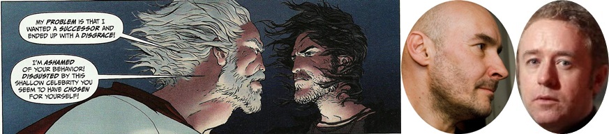
BPRD Vampire #5 (of 5) by Mike Mignola, Gabriel Ba, Fabio Moon, Dave Stewart, and Clem Robins:  This was a miniseries sequel to an earlier BPRD period-piece by Mignola and co., which I think was itself a sequel to a Mignola / Paul Azaceta joint...?  Four earlier issues featured some blonde guy as the main character.  The reader was following that character's journey; the blonde guy was irritated by vampires or evil pixies or something, and he was going to do someting about it, by gum.

But then, this issue, the fifth issue, it's all about some brunette guy and his journey to go to talk to the blonde guy...?  So, the point-of-view of the four earlier issues is just discarded in this final issue of the miniseries, in order to start up an entirely different story at the very last minute, Tale of the Brunette Guy.  As you likely have guessed, that story doesn't end in this issue.  Nothing is resolved.

One of the last pages are evil pixies saying "I guess we should be worried about that blonde guy, huh?"  When is the story going to pick back up again?  Nobody knows-- here's text from the letter page:  "What comes next for Simon Anders?" (I think that's the blonde guy's name; I think.)  "It may be a while-- he won't be back until we're ready to do another one as good as this."  Oh.  Okay.  Well, nevermind then.

There's a pleasant stretch where Mignola, Ba, Moon, etc. do what I think is THE signature Mignola move:  cutting away from the present action to some sinister drawing meant to invoke the horror of the moment.  One panel I especially liked: a thin verticle rectangle of a silhouetted lizard-y head, pointing downwards, blood dripping from its fangs, with the word "more" coming from a solid-blue word balloon situated in the darkest parts of the skull-silhouette instead of out of its mouth.  This terrible thing seems to be slicing into our reality, trying to show us something too horrible for us to even be allowed to see all of its details, that our brains have to keep in silhouette for our own sanity, and the words it's saying to us aren't coming from its mouth.  Mignola and the other BPRD creators have done shit like that before, but it's a neat trick anyways; hasn't gotten old for me, at least.

If the point of comics for you is admiring the craft of them, then this is as lovely a comic as any to do that with, I suppose.  But once craft is set aside, this leaves a number of questions unanswered.  What in the hell was the point of any of this?  Why was the main character corrupted over the course of the story?  What was his fatal character flaw?  Was there some hubris, some fatal mistake that damned him?  Or is it better for you without that, the horror finding someone who'd done nothing wrong rather than some "the teenagers fucked on top of the wrong pentagram in that cabin" gimmick?  Still: why would I suddenly care about this brunette guy in issue 5 of 5, after four issues with the blonde guy?  And okay, say a later miniseries came along and wrapped up this story-- would that somehow retroactively make this miniseries "better," by virtue of it then becoming part of some larger mosaic?

The admirable thing with Mignola is how he has a very specific vision of what is a "good comic" that he's stuck to and pursued somewhat relentlessly-- Monsters! A degree of opacity!  Fight scenes!  Horrors from the past unavoidably tainting the present!  What have you.  Regardless of the sometimes dodgy results (at least rumor has it that the BPRD quality's taken a dip, of late), there's something almost heroic about the FOCUS of his enterprise if we step back and survey it all at once, his life's work.  A Mignola comic, of whatever stripe, seems interesting to me as a ticket to his values more than to his "stories" or "characters," say.

But perhaps when he's collaborating with Moon & Ba, cartoonists whose definition of a good comic seems remarkably different, at least considering the work they've done when left to their own devices (as compared to, say, Guy Davis whose work as a writer on The Marquis, suggested values not so dissimilar to the work Davis would do with Arcudi-Mignola), maybe with Moon/Ba the "oh wait, shit, my definition of a good comic is different than the Mignola definition, too" of it all gets harder not to notice.

THE WAKE #1-3 by Scott Snyder, Sean Murphy, Matt Hollingsworth, Jared K. Fletcher, Sara Miller and Mark Doyle:  This is another boring monster comic, but this one is set in the Michael Crichton "hey look at me use Google you guys" universe.  None of the characters are interesting, unless you count the first time you saw them, in the hit motion picture Jurassic Park, directed by Steven Spielberg; here they are again-- weee!

It tries to spice up the affair by including flashbacks and flash-forwards to events zillions of years before/after the boring monster story in the present, but anytime that's not happening, you're watching a mid-90's monster movie like the Relic or Deep Rising, only not as fun, no Treat Williams.  Ten issues of this??  I have to figure it gets weirder, to fill that kind of space, but we haven't gotten to weird yet.

One nice thing: Alien spits hallucinogens at Ripley instead of acid, so Sean Murphy gets to draw some pleasant fantasy sequences in the middle of the tedium, creating at least a variety to the visuals throughout (not just cornering Murphy's talents to the flashback/flash-forward scenes where he is allowed to play with scale).  Also, shit, Matt Hollingsworth is probably the best colorist there ever was, so this boring-ass comic looks pretty sweet, at least.

THE FLASH #20, 22 and 23 by Francis Manapul, Brian Buccellato, Ian Herring, Carlos M. Mangual, Harvey Richards, Wil Moss, and Brian Cunningham:  Oh, I guess I missed #21.  Anyways, the Flash fights Reverse Flash.  I don't know-- I can't say the Reverse Flash is my favorite villain.  Spiderman's greatest villain isn't Opposite Spiderman-- it's an octopus guy or a goblin guy or some other bullshit.  Batman's greatest villain isn't Mr. Not-Batman; it's King Tut or Egghead.  In the movie Boogie Nights, Mark Wahlberg didn't have to face off against the diabolical Dr. Micropenis.  "PT Anderson is saving that for the sequel," you say.  Untrue-- that's just a vicious rumor.  While I don't know that THE FLASH is quite as fun as when it first started, it's still a likable, straightforward comic.  Manapul et al build all their stories around the Flash Solving Mysteries, rather than just being some asshole, which grounds the storylines; that move at least seems to avoid the "now there are 5 million DC superheros on each page, one of them is probably your favorite so now you will buy this comic" hero-cram that every other DC comic on the shelves seem to invariably feature.  I just don't know about this Reverse Flash asshole.  Reverse Flash isn't my dude.

POWERS #6 by Brian Michael Bendis, Michael Avon Oeming, Nick Filardi, Chris Eliopoulos, and Jennifer Grunwald (with some dots over the U):  As I think I've mentioned before, I'm pretty ride or die with Powers-- I plan to stick this comic out until the bitter end.  And it's actually coming out now, which is new and a surprising change from the whole "not coming out" thing they'd been doing for the last few years.

The only thing being-- and I think I've mentioned this before... I have NO IDEA what's happening in this comic anymore.  I've been reading it since issue 1, but it's just been so many years and ...

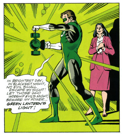
At one point, the federal government was evil or, at least I remember there being a famous Black superteam who was muttering "The government has secrets!" before getting killed.  Then, the Pope died.  Then, superheros became illegal or something?  Or... Or was there a flood?  Or wait, now they're all federal agents, including Deena Pilgrim who was an evil junkie at one point, but that's because there was-- I think there was a virus...?  And wait, Walker is an immortal sex-monkey who is/was Green Lantern, except then he was dating a stand-up comedian who...?

Remember when that TV show LOST would have Special Recap Shows where they'd show clips of previous episodes while Serious Man would say things on top of the arbitrary nonsense, and pretend as though that show's arbitrary nonsense made some kind of sense?  "On THE ISLAND, some learned to dream, but others explored their mysteriously hairless genitals."   (ABC did one for that TV show Nashville, too-- for people who couldn't follow a show about Nashville, city of mystery).  I need a Serious Man recap for POWERS (a) because I am completely lost as to what happened before, and (b) I suspect it'd be fucking hilarious.

To Youtube, nerds!  To Youtube!

STATION TO STATION ONE SHOT, by Corinna Bechko, Gabriel Hardman, Kat Larson, Shantel Larocque, Scott Allie, and Daniel Chabon: I picked this one up because it looked like a one-shot, and I always wished there were more of those.  In the Ideal Comics that Only Lives in My Head (well, lived), there would have been a lot of one-shots-- it just always seemed as though that could be really cool.  Some people tried to make "graphic novella" a thing, but you know, who wants to smell that fart?  Anyways, this turned out to just be a collection of comics that already ran in Dark Horse Presents.

Whoops.

Basically, there's a guy and he-- I don't even know, something about science gone wrong.  And so there's these Lovecraft blobs floating around...?  The guy has no discernable characteristics, none at all, none whatsoever, and the Lovecraft blobs don't really do all that much-- just hang out and be blobs.  There are some dinosaurs because I guess those are fun to draw.  Anyways, then it ends.  Text in the back matter mentions this is all a "preview of things to come in the Station to Station universe."  I don't know what the fuck a "universe" is, though; I just want to read a story.

Here, there's no character-- the main character is "A Drawing of a Guy", so I don't really recognize anything that happens as being a "story."  I'd just call this a situation.  It doesn't even really rise to the level of anecdote because it's all fakey-fake monster stuff.  Which, even there-- this all probably would have been too thin even for a 1930's pulp story;  there's been 80 years of science fiction since then.  The New Wave happened; the cyberpunks happened; ALF-- hey man, he liked to eat cats; that's one memorable character detail, which is one more than this story tried.

Is this the part where I'm supposed to say "writing schmiting", drop my pants and just start jerking off to the art?  That's come up a few times this year, that we're all supposed to say "writing schmiting", drop our pants, and then hand-crank our carnival-areas while waxing fucking eloquent about fucking comic book art.  That's how a "critic should be" or some shit, lately.  "Comic reviewers don't get it, man-- you can't treat art and writing in comics separately; that's the job of comic editors, not comic reviewers," tweets someone grotesquely overestimating the influence of "comic reviewers" (I'm a big jerk so my kneejerk reaction is always "People are angry they only get 3-and-1/2 stars at CBR instead of 4 stars").

I don't know.  I wouldn't say those people are "wrong," is the thing.  At least, I agree with the basic idea that there's something greater than the sum of the parts with comics, with a Bernie Krigstein comic, say, or heck, with whoever.  The problem I hit into though is ... Gabriel Hardman draws swell; just swell.  (I don't know about some of his lettering choices, but...).  He draws in a lush style that I've enjoyed for many years now, going back to some comics he'd made with Jeff Parker back when; I've only heard good things about his and Bechko's Planet of the Apes work.  But the fact I enjoy looking at Hardman's art didn't make this a "visually successful comic."  I think for some people, there would seem to be something inherently contradictory about that statement, something off, which means I'm smacking into the problem of... like... of coherently atomizing comic book storytelling.  Or something.

There's a gorgeous Paul Pope quote, about manga-- you've heard this one before but let me see if I can find it, anyways.  Here we go: "When I was working for Kodansha, the joke was always, 'A bad comic is where you have a panel where Superman jumps through a window, and the caption says ''Superman jumps through a window,'' and he's saying, ''I'm jumping through the window,'' and there's a sound effect that says, JUMP. [LAUGH] Or you can imagine three panels: 1.) he's jumping through the window, 2.) he's landing on the ground, 3.) he says, 'I've done it'--or something like that. I really have a sense from what I learned from manga, is that, rather than try to tell and directly tell the story where Superman is jumping through the window, that the best manga will try to give you the experience of jumping through the window--the tactile sensations, the speed of it, the rush of it--catch all the different moments in-between the three panels that an American comic might use to tell the story."

So, if I really want to address this, I have to sit here and talk about... about how Gabriel Hardman draws well but nothing in this comic is tactile enough to make this non-character into a character, to make this undramatic premise somehow seem dramatic.  But what the hell does TACTILE mean, let alone Tactile ENOUGH?  What would have made this thing "more" tactile let alone "sufficiently" tactile?  Is "insufficient tactility" a valid complaint about a story told in 8 page installments in some boring-ass Dark Horse Presents comic?  Dude: what the fuck are we even talking about???  The simple phrasing is when stuff happens to Guy with Glasses In Comic-- there's nothing about the storytelling that puts the reader there with him, that makes his concern theirs.  But how do you say that not in vague generalities and poetic meaningless blather, but in actual identifiable specifics?

And here's the thing-- say I manage to answer any of those questions; would you then have learned anything about whether this was a "fun comic" that you wouldn't have already known when I was just all like, "character sucked; this thing blew"?  At which point, haven't I just wasted your time with incoherent nonsense...? I don't know.  I'm not sure.  I just feel bad for the kid writing that 3-and-a-1/2 star review at CBR being held to account for something that's actually not very straightforward much at all, basically for not sounding like some kind of dork-lunatic. (Especially living in Burnout City, where the City Motto is that most comics deserve fewer reviews, less attention, our utter disregard and callous apathy).

YOUNG AVENGERS #009 by Kieron Gillen, Jamie McKelvie with Mike Norton, Matthew Wilson, VC's Clayton Cowles, and Jon ... I think that's Moisan but it could be Mioisan; I don't know-- some wacky font:  Impulse buy, this issue.  I kept hearing that "Tumblr likes this comic"-- Tumblr used to be three or four dozen people in Silverlake and Brooklyn and I still think of it in those terms even though it's not been that for a long time. I'm waiting for an endorsement from any of the Mollys, basically.

Anywho, I guess "Tumblr likes it" turned out to be code language for all the characters being pretty gay or something...?  Is that the secret knock code-language nudge nudge wink wink going on?

It's nice that there's a Marvel comic that's this gay, for people for whom that's important.  I guess I liked that being the case-- on an Everyone Deserves Equal Time level, it's nice that's true.  I don't know that I liked the "now this comic is about boys kissing" parts of this comic for the execution particularly, which was the usual comic book "let's explicitly state our motivations at great length!" song & dance.  But I suppose I find it nice that this exists, in the abstract.  I mean, maybe it'd be nice if any of the gay characters were at all cool, too...?  Is that not a thing anyone cares about?  One is a gay Hulk, but he seems like Peter David-era talk-a-lot Hulk instead of "out in the desert destroying tanks" Hulk.  There's Mon El with an earring-- I'm going to go naaaaw to that.  And then there's a bisexual Urkel wearing swim-goggles who gives off a Cypher in the New Mutants vibe...?  I guess.  These are sorta the Twink Avengers.  But maybe that's just what Tumblr is into...?  Ask your privilege!  Is your privilege in your couch cushions?  Check!  Check your couch cushions for your privilege.

But still-- it's a step in the right direction, I suppose.  The "what else is there to it" question went unanswered on this one, though.  I don't know anything about any of these characters, or what the hell is going on in this comic-- there's a recap page but the recap page is pretty much incomprehensible, in the Mighty Marvel tradition.  The parts of the comic that aren't about kissing-- it's a bunch of characters running around in front of an all-white background after talking and talking; they're running away from a scene of something happening towards a scene of more talking.The villain is a woman wearing Ann Taylor or some shit, i.e. the very worst thing in the Marvel universe continues to be some variety of assertive lady, which... o-kay; very progressive comic, I guess...?  (Something clever I'm missing there that mitigates how gross that is, I'm guessing, Tumblr...?).  Uhm.  I hope all the running and talking was a satisfactory ending to the Story of Whatever the Hell Was Going On...?  I can't guess.

One of the major scenes ends with a character doing a sad pose in front of a sign that says "Happy Noodle"-- I thought that was kinda funny, I guess; hopefully, that was on purpose.

"Let's keep the endless talking, but have them talk about a different set of things" is a curious solve on the whole "Marvel comics are crazy fucking boring" thing.  Probably I impulse-bought the exact wrong issue, though.

***

Anyways, there's a couple more comic on this pile, but that feels like a nice stopping point for now.  Sorry to go on and on, or if this was really boring-- feel out of shape!

PEOPLE! Sometimes He's Not Here To Blow Out His 96 Candles But We Lit 'em Anyway!

Ninety six years ago on this date Jacob Kurtzberg (1917 - 1994) was born. Life may harry me and life may hurry me but I will always find time to celebrate the birth of the man who became Jack Kirby; the man who became a King! The King of COMICS!!!  photo Kbirth002PIPE_zps79235240.jpg Anyway, this...

So, today I will be celebrating Jack Kirby's 96th birthday by reading a Jack Kirby comic. Hardly an unusual occurrence there. Unusually though, I will also be donating $9.60 to The Kirby Family endorsed charity The Hero Initiative. It is a worthwhile and fine charity which aids members of the comic community who are in need. Howard Victor Chaykin is on the Disbursement Committe, and that's just one awesome thing about The Hero Iniative.

So, on this day, Jack Kirby's birthday, I will send them something in remembrance and celebration of Jack Kirby. You may wish to do so also. You may not wish to do so. I'm just throwing that out there. I'm not expecting anyone to do anything because I'm not asking anyone to do anything. I thank Tom Spurgeon of The Comics Reporter for bringing this notion to my attention.

I do hope, however, that you take this day to particularly relish the medium to which Jack Kirby contributed so very, very much. The medium of - COMICS!!!

And now, at the risk of transforming from The Count Arthur Strong of bloggers to The Greg Land of bloggers, may I humbly present a visual (and typically sedate, low key and altogether dignified) tribute to Jack Kirby? Well, I'm going to:

(All images repurposed from SILVER STAR (2007, £25.99,VERY GOOD!) published by Image Comics. Except for photographs which I swooped in and stole like a magnificently amoral bird of prey.)

 photo KIRBYBIRTH1b_zps5356e514.jpg

Happy Birthday, Jack Kirby!

Happy Birthday to The King of COMICS!!!

(Unprofessional Behaviour Continuation Notice: Circumstances once more dictate that I shall be unable to post for a short while. After that I shall endeavour to regain some semblance of regularity and aim for more diverse content. I'm talking about my posts not, you know, something else there. I know, sorry. Until then; be well and be happy!)

"spilf!" Comics! Sometimes They Are Probably Not Everybody's Cup of Tea!

And now, as demanded by literally nobody at all, I look at BLACK KISS 2 by Howard Victor Chaykin. No, no need to thank me. Your smiles are reward enough. Of course you’ll only be clicking on MORE! if you are Over 18 years of age. I can trust you, can't I? photo Yes001B_zps1e3a2904.jpg Anyway, this...  photo Cover001B_zps08054f40.jpg

BLACK KISS 2 Story & Art Howard Victor Chaykin Lettering & Logo Ken Bruzenak Editor Thomas K (No relation) Special Effects Jed Dougherty Design Drew Gill Image Comics, Inc. $14.99USD (2013) Rated M+/Mature Plus

This book came in a modesty bag and, gentle reader, ten minutes after cracking the covers so did I. Hee-haw, hee-haw, heeeee-haw! No, but see how once you’ve got a distasteful image (wrinkly old me crouched and tugging like I’m trying to create fire with an empty sock) in your head it’s hard for you to focus and you are certainly inclined to view what follows as erring on the trivial. BLACK KISS 2 is far more than the sordid trappings might lead you to think, is what I’m saying there. It is true that the book came in a modesty bag because, and I don’t know if you heard about this, there was some kerfuffle over whether it would drive the populations of Canada and Great Britain doolally tap due to its mere presence on our shores. Why, to expose the simple child-like natives of Britain or Canada to this filth would be to risk priapic rampages turning our quiet high streets into open air abattoirs cum knocking shops. But I have a copy so clearly sanity prevailed. No, of course not, sanity’s having a hard time these days. No, in the end I don’t think it was actually banned. Rather than HM Customs rejecting the book, I believe, it just wasn’t submitted for their consideration after the first issue. So, the control of illicit materials is a lot like the Oscar selection process then. I could be wrong and maybe possession is actually illegal in this magical land. In which case I stood on the UK side of the US/UK border while someone in America held it up and turned the pages. Maybe I was in a boat; depends where the border is. Geography isn’t my strongpoint; that’s fan dancing. Look, whatever saves me from a lengthy period of imprisonment, prison would be hard on my piles. What I’m getting at is it took some time and it took some doing getting this book. And knock me down with a feathered sheath because it was worth it. Ayup, BLACK KISS 2 is VERY GOOD!

 photo Long001B_zps4cb94bcd.jpg

Yeah, I know, shocker! But, honestly, if Howard Victor Chaykin had laid a big brown egg I’d tell you. I don’t know much about porn comics as I don’t have many. That isn’t because I’m a buckle hatted Puritan, no, it’s the same reason I don’t have a roulette wheel in my living room, a bar next to the bed and the only crack in my sugarbowl is from when I dropped it pissed on my winnings. But I know my Howard Victor Chaykin comics and BLACK KISS 2 is VERY GOOD!

As well as being VERY GOOD! BLACK KISS 2 is, fittingly, a form of literary hermaphrodite; being both a prequel and a sequel to HVC’s 1988 black comedy BLACK KISS. The original slides neatly between chapters 9 and 10 to create comics’ first great sleaze epic. BLACK KISS 2’s a pretty explicit book. It is a book which contains scenes of violence, sexual violence, debauchery, debasement, casual racism, casual homophobia, casual saxophony, dressy sexism, profanity, jeans worn with a suit jacket and just a hint of scat for flavour. There might also be some interspecies romance but that depends on the lady having taken the horse out for a nice dinner beforehand. Otherwise it’s just plain old vanilla bestiality. All this is presented in the patented Prolific Period Howard Victor Chaykin style. Except he’s clearly had a bit more lead time on it, or maybe it’s just the fact that it’s his, either way his focused application has nipped and tucked his art nicely to produce a far tighter style than you might expect. The faces in the page anchoring insets are a particular high point, but I really don’t want to be saying Howard Victor Chaykin gives good face. When Howard Victor Chaykin straight up replicates his original BLACK KISS style for chapter 8 its position surrounded by the newer style stuff reveals that in the meantime, while barely altering his signature page routines, Howard Victor Chaykin’s managed to develop a rather good perceptual trick. Rather than the impression that each panel is like looking through a camera at a fixed set there’s an assured shift towards the impression of looking through eyes at a world. A damned and dirty world, but a world.

 photo Public001B_zps6d22eb75.jpg

Sure, sure all the problems I have with HVC’s current work are here but far less so and sometimes they work to the book’s advantage. The biggest advantage the art has is that it’s in B&W. This means that the visual noise of all Chaykin’s textures is kept down to a muted hum. The lack of his modern toffee-apple glare colouring enhances the visual coherence of the art no end. Sometimes the application of textures is a bit skew-if but here this, together with the tendency of the pasted elements to contain too much visual information or sometimes seemingly spookily float creates a nicely off-kilter effect. Needless to say, his figure work and attention to period detail remains stirring. But I appear to have said it anyway. However, I remain unconvinced by Howard Victor Chaykin’s pasting of the same image further along successive panels to show movement. However, this is small beer indeed. This stuff doesn't need to be perfect it needs to work. And here Howard Victor Chaykin's art works like a (wet) dream. In BLACK KISS 2 Chaykin’s art is far stronger than in his work for hire stuff and Ken Bruzenak’s period specific text boxes and enduring mastery of the art of the letterer brings it up another level. As ever. Ken Bruzenak. Ken fucking Bruzenak. The Bruise!

 photo OhDear001B_zps2110ab9f.jpg

Sadly, living in the real world (which isn’t where BLACK KISS 2 is set) I have been unable to find the time to go full LitCrit on BK2 but I can certainly say it is about something. Things, some of them, yes, that’s what it’s about. This is because Howard Victor Chaykin is sometimes quite explicit about his meaning but then he gets all coy and retracts before you get the full brunt of his point. As ever, draped like lacey underthings over every page, we have the dryly delivered Howard Victor Chaykin Revisionist History of These United States (“Some people say we stole the land from the Indians, well, fuck them in the neck with a rusty spoon…” You know the drill). When he isn’t riding his hobbyhorse about how America’s insecurities have led it to neglect its own rich cultural products he’s telling us how America was built by assholes. Honey to mine ears as ever. And all this is punctuated by his usual clipped and caustic dialogue. It’s good reading is what I’m saying there. Because it’s good writing. Funny as fuck, too.

 photo Eyes001B_zpsedbeccde.jpg

Anyway, as far as I can tell it’s about fame, or the peculiarly democratized form of fame ushered in by the movie business. With the invention of movies even a Cotswolds boy could be a cowboy. It’s about fame and success and how they attract and how they devour. But in BLACK KISS 2 it’s a sick and shabby kind of success Chaykin's concerned with. An illusion, a reflection. Famous people crop up in BLACK KISS 2, but they are people whose fame is tainted by violence, from Lee Harvey Oswald to Andy Warhol; epoch defining events are brushed past (Aids,9/11) as the solipsistic cast wallow in their own base natures. Faces so deep in each other’s asses that their world (the world of BLACK KISS) becomes truncated and defined by their appetites to the exclusion of all else. Because BLACK KISS 2 doesn’t show us the world, it only shows a portion of the world. For all the glossy cars, spacious houses, natty clothes and cheeky bondage gear to exist there must be a world beyond that presented on these pages. A world where people are just getting on with their business; the regular world. BLACK KISS 2’s world ignores the mundane and is set squarely in a world of excess. A world where want is confused with need. A world populated by people who can’t control their appetites. Or rather, are unwilling to control their appetites. And it’s to these people the succubus, the vampire, the whatever the hell it is gravitates when the need to feed descends. And it seems wholly appropriate that this is so.

 photo Run001B_zps9144825e.jpg

Timely, too. There’s a modern vogue for phrasing failure/success in terms of appetite. Repellently judgmental phrases are now part of the vocab of the vainglorious, “You weren’t hungry enough”, “You didn’t want it enough”. Such generosity of spirit is always expressed by those who were and, naturally, did of course. Such depths of empathy. Yes, fame costs as someone in leg warmers once said and when Beverley shows up is where you start paying. And at the last, in the final chapters, in a voice so resigned and heavy with a history of experience (so heavy, so resigned it must, it just must, sound just like William Holden’s in Sunset Blvd.) Cass Pollack (AKA HVC) lays it all out. Like a body on a slab. Because, you know what? BLACK KISS 2’s about the same thing all HVC’s stuff is about. It's about defining your worth by your work and not by anyone else's opinion of same. It's about having some self re-cocking-spect. It’s about learning to accommodate your appetites before they destroy you. He’s just changed the focus from the usual Chaykin avatar (Cass) to the villain. A new twist on an old theme. An old theme with a new twist. No wonder Chaykin loves jazz. Jazzzzzzzzzzzz, babies. Jazzzzzzzzzzzz. This time out then, in a startlingly optimistic (that’s optimistic for BLACK KISS) climax both “Chaykin” and the bad gal/guy have experienced moments of clarity which entitle them to a happy ending. They aren’t exactly going to save each other but at least everybody else will be safe from them. And that’s about as happy an ending as there ever could be in the world of BLACK KISS 2. Which is VERY GOOD!

And like HVC’s VHS copy of Raiders Of The Lost Ass – I’m gone!

This week your safe word was – COMICS!!!

Last Issues, First / Last Issues, Second Issues (that could be first issues) and so on...

Get after it, Pope.  

Grand Champion of the Kumite Brian Hibbs is going all Howard Beale above and below this post.  Go check 'em out and get smart.  Or, read me going on about comic books.  Win / win, right?

Disclaimer: This is not to say that Hibbs will follow down the awful rabbit hole Beale goes in Network.  He's just mad as hell and he's out the window telling you about it.  You're human beings, damn it!  Your lives have value!

Capsules of the last weeks after the jump!


Dial H # 15

Mieville / Ponticelli

At $4.99 and stuffed with 38 pages of story Dial H #15 doesn’t disappoint in the “crazy be crazy” department.  My interest in the series had waned after the initial arc but I kept on with it and now at the abbreviated end I’m glad that I did.  Ponticelli’s rough madness grew on me throughout and Mieville introduced some elements I’d never thought of let alone seen in a Dial H comic.  These radical takes on existing property seem to get shorter and shorter runs at relevancy and I’m left wondering what a juggernaut like DC is doing trying to have main line (52) contributions from books like these on a sales level.  One hopes that Vertigo provides a lifeline with realistic expectations.  Oh, also, does anyone give a rip about those Channel 52 things?  Seems an indulgent house ad with no discernible value when “costs keep going up!” (by the by – 7 pages of ads in this one – mostly house and house adjacent)

Though…this is pretty funny.

Holding the line at...stupid!


Prophet #38

Graham / Milonogiannis / Roy

$3.99


First, I got the Jim Rugg cover and it’s pretty great.  I highly recommend seeking out SuperMag #1 by the man himself.  Stylistically and in all different types of delivery Rugg is really and truly a virtuoso talent.  Stunningly flexible. Check it out.  Amazing. (Additional superlatives needed)

Anywho, Prophet is lean and mean as a comic book.  The gang throws us 29 pages of story content with nary an ad.  Even the inside front and back covers are dedicated to story.  It’s a generous gesture and almost certainly costs someone money.  I can’t stress enough how immediately – by breaking the opening page monotony – Prophet slams you into the narrative.  By changing the pace you change the experience.  Not cookie cutter comics.

Also worth mentioning is the continuing and “as the wind blows” back-up selection.  This month, Kate Craig brings us a precious story about the emotional and psychological benefits of not always trying to annihilate anything that has the temerity to exist outside our immediate scope of meticulous plans and schemes.  Being decent, essentially, is its own reward.  The whole thing is enjoyably paced with a nice, emotive style.  Kate also draws amazing and weird hands / paws.  Cool.

Be Decent


Catalyst Comix #2

Casey / McDaid / Maybury / Farinas

$2.99 

Art = NICE.  Each brings an identifiable tone – sense of place – and individual style.  I gushed over each of these in my original review and talked through the motifs they’re employing but I have to say – AGAIN – that the super…SUPER…SUPER star of this thing so far is Brad Simpson.  The color palette for each of these chapters is individual – unique and simply gorgeous.  Colorists just don’t get enough love and this guy is on another level.  A true secret weapon who deserves all the credit in the world for giving this book something to simultaneously help hold it together and break it up.  Get paid, Brad Simpson.  Get paid!

On the other hand your enjoyment of the story is going to be largely dependent on how much you enjoy winking asides.  If, like myself, you generally respond with atrocious and socially unacceptable amounts of sighing and eye-rolling you may want to read this one in the isolation chamber.

At points Casey goes full frontal assault, totally aping Dr. Strangelove, using Vandelay Industries as the company responsible for rebuilding the trashed city (when everyone knows they deal exclusively in latex), and having the group therapy session centerpiece of Change Agents not only fall prey to every, single, boring satirical stereotype trope of such an encounter but also take place in the gymnasium of the Jean M Giraud Fighting Arzachs.

That is to say...it's kind of what you expect from a Joe Casey comic and that's not what I was sold as a "bold re-invention of the super-hero comic experience."

Anywho, all 3 segments here could actually be part of an extended #1 comic.  We’re re-introduced, the supporting cast fleshes out a bit, a new wrinkle is revealed.  I think it’s not a bad strategy early on to give people late to the party a bit of breathing room so, from me at least, the feel of the pace is not too bad.

Still, does this line make any f’ing sense?  I must have read this three times and I was afraid it was going to give me a Lewis Black aneurysm.  Maybe Casey is trying to say the guy talking is just coming right out of his ass with this stuff but…I kinda doubt it.

That comparison is...not apt.

Brain…hemorrhaging….

http://www.youtube.com/watch?v=sJ0s0KUUpxo

"If it weren't for my horse..."


Save me…Paul!


The Invincible Haggard West #101

Paul Pope

$2.99

32 pages – No ads

All this goes without saying and to prattle about it would really belabor the point but it’s really and truly quite striking as an artistic statement.  From the hand-drawn sound effects to the visual choices made for each character this thing is a note perfect juggernaut.

Quickly

Each sound effect is perfectly and I mean fucking perfectly suited and delivered.

Contrast a well placed “Klop, Klop, Klop” or “TCHOOF!!” with some digitally inserted garbage in Batman / Superman and that tells you there is a difference between art and product.

The design work is so elegant and beautiful it engenders hyperbole.  In action or at rest Haggard’s “flight frame” is a thing of wonder.  His guns are neon tube death machines with impossible innards.  Hell, the man himself is so pulpy when his scarf gets shot you feel him take things to the next level.  (I pulled two vertical panels out of sequence just to show you the elements)

Put it all together and VOILA!


The supporting characters are well rendered in a minimum of space.  Haggard’s daughter, Aurora, is on for all of three pages and she’s already got a backbone to envy and a multifaceted personality.

In control


This is A work and EXCELLENT.  Battling Boy can’t come soon enough.

Happy reading, everyone!

“Choke!”, “Gasp!” Not A Podcast! BOOKS! Read 'Em On The Beach, Read 'Em On The Pot!

Despite the fact that I am sat in the middle of a thunderstorm I understand Summer, as it is commonly understood, is still on. I also, understand that the Podcast Magic Gentle Jeff Lester and Graeme McMillion$ provide is delayed due to things. Maybe even rain. So, here are some more potential beach reads for you to stain with sugary drinks, crisp salt, tanning lotion and tears of rejection. But who are the Arthur Haileys, the Wilbur Smiths of this, the sparkliest generation? Probably not this 'orrible lot. This is just a bunch of books an old man read. I wasn't even on a beach. My whole life is a lie. If I tried hard I could probably find it within myself to care. Anyway, this...  photo CoversB_zpsc81fa130.jpg

THE FLAME ALPHABET By Ben Marcus Granta Hardcover (2012),£16.99 Paperback (2013), £8.99 Kindle £4.63

 photo FlameB_zpsc9a2f281.jpg

It’s a nice cover,right? I know we shouldn’t do that, shouldn’t judge a book by its cover (so why do they have them?) but judging a cover by itself is permissible, right? It’s such a nice cover that My Lady Of Infinite Patience plucked the book from my feeble grip and started complimenting it on its general loveliness. Then she asked me what the book was about, because usually I (so the popular perception chez K(UK) has it) read only dour, depressing, mentally exhausting exercises in nastiness which curdle my world view for at least as long as it takes my unerring internal radar to locate another such book. Confounding no one’s expectations then, I was able to tell her the book concerned a universal plague whereby language becomes toxic and the source is children. Laughter, ahoy! There are a lot of fantastic tricks played with language here but the biggest trick is that it enables the wholly insane premise and developments to, after a brief period of immersion, appear sinisterly plausible. The Flame Alphabet starts out as a coffee dregs dark satire of how parents with teenagers feel like they are victims of some senseless and fatally draining force for which there is no defence. Then it swings out into a post-apocalyptic narrative which rivals J G Ballard for its presentation of insanity accepted as sanity. Finally the book’s scope shrinks backwards and inwards and you realise that it was about love all along. I don’t want to spoil this book any more than I have; it is terrifying in its terrible beauty as are the talents of the author. This is a magnificent fucker of a book and if you are a parent it will fuck you up, and you will thank it for it. I can’t deny it was VERY GOOD!

ORWELL'S REVENGE: THE "1984" PALIMPSET By Peter Huber Simon and Schuster Hardcover (1995),£OOP (OOP = Out Of Print)

 photo OrwellB_zps85f7d171.jpg

This is a truly bizarre book; unique maybe? Because what Peter Huber did here was write a refutation of Orwell’s Nineteen Eighty-Four using Orwell’s own words against him. Literally. Huber loaded most of Orwell’s writings into his PC and used (with mid-90’s tech!) only Orwell’s language, phrases, similes etc to write a sequel to Nineteen Eighty-Four. A sequel which seeks to unwrite its predecessor. Because Huber’s contention is that Orwell’s book failed to predict the future and since he, Huber is living in Orwell’s future he can go back and correct the book. And so we read about Blair (Eric?) who discovers Winston Smith’s Diary and eventually faces O’Brien revealing to him, and us, the fatal flaw in Big Brother’s society. A flaw, it turns out, which was there all the time, in plain sight, but Orwell missed it; the fact that I have written this and you are able to read it is a clue. But it isn’t so much the what but the how.  And interleaved with the fiction is a non-fiction analysis of Orwell, his works, Nineteen Eighty-Four and how and why the central conceit was flawed from the start.

Initially I thought Huber was just being picky but thankfully what is of greater interest to Huber is why Orwell missed the things he did. No one can deny that Orwell was sharp as a tack, yet with Nineteen Eighty-Four he’s in error because of two convictions so ingrained in his otherwise elastic mind that they veer on the obsessional. Huber isn’t unsympathetic, despite his final chapter illustrating that the evidence of Orwell’s faulty thinking was all around him in his own time. He isn't unsympathetic because he can see where Orwell’s biases originated and how the ideas became fixed. And he can see that because it is in practically everything Orwell wrote. And he can do that because he is actually using practically everything Orwell wrote. The revelation of these two mistaken convictions is enlightening and not a little surprising and wittily illustrated in example revolving around gramophones and a Ministry for washing up. There’s a slight stumble at the end with a final chapter so dryly academic I swear I heard a dying fly spinning uselessly on the windowsill of the classroom of my mind. Perhaps that’s because Huber has left Orwell’s words behind by that point making it plain that if there were things wrong with Orwell’s wiring there was nothing wrong with his writing. Orwell’s Revenge is an engaging and entertaining mash up of fiction, meta-textuality, economics, psychology and literary innovation. You’ll probably argue with it while you read it but a little bit of cerebral stimulation is always GOOD!

HAWTHORNE AND CHILD By Keith Ridgway Granta Hardcover (2012),£16.99 Paperback (2013), £7.99 Kindle £4.12

 photo HawthornB_zpsff03e297.jpg

I have no real inkling why I picked this up. Probably the cover (don’t judge me!, it pleads. But we do. We always do. Good cover.) A précis of the premise is just the kind of trite shite I’d chuck across the room at a Dan Brown fan. Two mismatched cops (it’s in the UK so ‘coppers’ or ‘bobbies’ we’re talking about here)! One’s black! One’s white! One’s gay! One’s straight! One’s Troubled! One’s Not really all that fussed to be honest! Together they fight crime! Sounds like one of those brick thick things with the wide line spacing and broad margins about them there cops with their troubles, with their burdens. Those burdened, troubled coppers that despite the alcoholism, debts, broken marriages, estranged children, dodgy tickers, gammy ears, undescended testicles, in-growing toe nails and burdens, those ever present burdens, manage to catch the cleverest criminal minds of all time. Again and again. Annually at least. But not at no cost, because, burdens. More burdens for the next book. Burdens. But…So, yeah, anyway, Hawthorn and Child! together they fight crime! Except they don’t. Or they do, but the book isn’t interested in that. Yes, there’s a crime but that’s soon left behind and the book wanders off looking in on minor characters, veering into tangential magical realism, slapping you with a short sharp hostage situation, drawing pornographic parallels between kettling and salty bath house frolics, wherever it wants basically. Which is alright by me. Please don't worry about the homosexual intercourse depicted within as none of them are married so no bigots should be offended in the reading of this book. Any offence whatsoever should be dulled by the evidence that Ridgway is a sensationally fine writer. You know what language is to him? No, me neither but I know what it isn’t. A burden. Given the nature of its structure some may question whether Hawthorn and Child is a novel or a suite of short stories linked by themes and recurring characters, or maybe both. Sure as eggs is eggs, as soon as people start discussing what a novel is then it’s just a matter of time before some smart arse brings up that (anecdotally at least) Hemingway’s shortest novel ever “For sale: Baby shoes. Never worn.”, and then steps back radiating an almost unholy satisfaction. Fine, now go and charge someone £16.99 for that and see how you get on, buggerlugs. Hawthorn and Child might be a novel or it might not but it is certainly worth the £16.99 and more besides. Because it is VERY GOOD! I think that’s what matters most, but then I’m a simple man. Without burdens.

Next time - COMICS!!!

"...Sweet Innocence Defiled By The Breath Of Foulness..." COMICS! Sometimes The Undead Are Impeccably Dressed!

"Four hundred years ago my vampiric kiss transformed the woman I loved into a soulless thing called Mary, Queen of Blood! Today an unholy order follows her evil designs, and the blood they spill is on my hands!..." But enough about me. What about Andrew Bennett? What about "I...Vampire!"

Anyway, this...  photo IVamp_BlimeyB_zpsa521d809.jpg I…VAMPIRE! Art by Tom Sutton, Ernie Colon, Adrian Gonzales, Paris Cullins, Dan Day and Jim Aparo Written by J M De Matteis, Bruce jones, Dan Mishkin, Gary Cohn and Mike W Barr Lettered by John Constanza, Gaspar, A Kawecki, Andrews, Ben Oda, Todd Klein, Jun Roy Talactac Coloured by Adrienne Roy I...Vampire! created by Tom Sutton & J M De Matteis (Contents Originally appeared in House of Mystery #290, 291, 292, 293, 295, 297, 299, 302, 304-319 & The Brave And The Bold #195 (1981-1983)) DC Comics, $29.99 (2011)

 photo IVamp_CovB_zpse830746c.jpg

The younger, far more agreeable, me used to buy House of Mystery off the spinner rack in the UK so I didn’t always get to see every issue. The issues I did see I usually bought because they had such damn fine covers. It’s a truism that the covers of DC’s “mystery” line of anthologies were usually the best bit, mostly because it’s true. Oh, they had nice art inside but the stories were mostly pointless things that stopped rather than ended and banked on the fact that some supernatural trappings would distract you from all the other failings. They looked like Twist-In-The-Tale tales but the Twist was usually that there was barely a Tale. I still bought ‘em because they looked good and had werewolves and skeletons in. Look, here’s the big thing about kids and entertainment; they aren’t that picky. Anyway, things picked up content wise for HoM when, in 1981, it started running "I…Vampire!” This was a, rare for these books, continuing series which lasted until 1983.  Of course the downside to continuing episodic serial fiction for filthy foreigners  such as my self was, as I said, that the younger, far more agreeable, me used to buy House of Mystery off the spinner rack in the UK so I didn’t always get to see every issue. But that’s okay because here, in this volume, there is every one of the 24 original chapters of "I…Vampire!” And also, an issue of Brave And The Bold in which "I…Vampire!" teams up with Smilin' Batman! Remember when Batman smiled? Good times.

 photo IVamp_BatmanB_zps2ceaf234.jpg

Upholding the “mystery” line tradition the covers are the best bit here, but in a welcome break from tradition the actual comics are pretty neat too. It’s just that the covers are by Joe Kubert and Michael William Kaluta. I mean, come on now. Mind the carpet; I believe your cup just did runneth over! Both artists provide fantastically atmospheric and alluring covers despite their conspicuously different styles. Kubert’s usual superficially wild lashings of ink retain their timeless impulsive energy and his signature imprecision creates a sense of instability, of flux; one wholly apt for the gaudy transformative horror of the strip. Kaluta, naturally, is far more precise with a far lighter line producing a far more ethereal and desiccated effect which, unlike Kubert, serves to underscore the melodramatic pathos at the heart of the lead character. Because "I…Vampire!" one Andrew Bennett by name, is a right whining  mimsy and no mistake.

 photo IVamp_CoversB_zpsc0746c9d.jpg

Mind you, he’s every reason to be moody what with his wedding preparations being interrupted by his sudden initiation into vampirism via a passing manky monk. Even in 1591 I imagine weddings were fraught enough affairs, as the mobile disco had yet to be invented, without being turned into an undead leech on humanity. A vampire I’m talking about there, not a lobbyist. Somewhat rashly Bennett shares his curse with his betrothed, Mary, only to find that she takes to it with somewhat more alacrity. Rebranding herself as Mary, Queen of Blood she organises her fellow nosferatu into The Blood Red Moon and embarks on a crusade to enslave humanity. When we first join him in 1981 Bennett is busy trying to kill the woman he loves and foil her evil schemes. Hobbies are important to men, after all. Luckily he isn’t alone. There’s Dmitri Mishkin who throughout the series will provide creepy oedipal fun aplenty as he tries to kill his vampiric mother. Sadly Dmitri probably isn’t related to Dan Mishkin one of the series’ later writers as that would be really weird and suggest a serious reappraisal of all our realities. Now as alluring as matricidal elderly Russian men are DeMatteis chooses to provide Bennett with a more traditional love interest in the form of Deborah Dancer. Yes, her name was Deborah. Deborah. But whether she had woodchip on the wall or, indeed, her house was very small remains unrecorded. That’s the basic set up then for the series with a bit of an alcoholism subtext as Andrew struggles to survive without taking a human life. This setup takes a whole ten pages, and stands De Matteis in good stead freeing him up to dash off in a number of unfeasible but entertaining directions. After five issues he runs out of puff and passes the baton to Bruce Jones.

 photo IVamp_QuakeB_zpsc01ac6e1.jpg

Jones barges right on in and starts marking his territory in no uncertain times. Initially he resets the series to the TV Hulk template. Now Bennett will be meandering down the lonely road to intersect episodically with different people with terrible consequences. Mostly for them. There’s an absolute cracker of an episode where Bennett takes up with the wife and child of a man whose death he has caused. Now, obviously lessons will be learned, closure achieved and there’ll be a sad departure leaving everyone wiser and richer. I don’t want to spoil anything but let’s just say that Bruce Jones sets about your expectations with a ball peen hammer and doesn’t let up until they are unrecognisable. Bruce Jones’ is really good at undercutting expectations is what I’m saying there.  This is aided and abetted by this disdain for logic, but I’m guessing entertainment is  a greater consideration for Bruce Jones than sense. I say that with some confidence because quicker than Threshold got cancelled he remembers he likes time travel and things get entertainingly insane fast as the series becomes a chronally unstable race between Bennett and Mary to save/kill the ancestors of the inventor of the cancer cure which is, in the 1980s, killing all the vampires. You hardly need the gift of Second Sight to know that Jack The Ripper turns up, Gaw Blimey! He’s near sawed ‘er head clean orf!

 photo IVamp_UBoatB_zps9ab74304.jpg

In comparison to Jones' satisfyingly eventful irrationality Mishkin and Cohn serve up altogether more sedate fare which favours the adventure elements largely to the detriment of the horror and occasionally steps straight into the puddle of preachiness. Don't mistake me, they aren't terrible, but it just takes them time to fling off their inhibitions and skinny dip in the straight faced silliness the strip requires.  Also, in "By The Time We Got To Woodstock..." a vampiric threat is destroyed by a combination of Jimi Hendrix playing live and the combined Love emanating from a field full of self obsessed drug addled Hippies. Which is terrible on an almost cellular level. But it is still amazing; I’ll give them that much. By the time the strip climaxes they have, fair’s fair, rallied their talents enough to provide Andrew Bennett with a finale as fittingly inventive, daft, moving, horrific and optimistic as he deserves. And then there's Tom Sutton. Tom Sutton who provides the bulk of the art on these pages and proves himself a showstopper and no mistake.  photo IVamp_DreamB_zpse422ffd9.jpg

TOM SUTTON (d.2002)! If this book is worth a place on anyone's shelf (and it is. Mine!) it is because of Tom Sutton. Tom Sutton makes this series work. It’s difficult to believe that Sutton's art ever found a more suitable vehicle than "I...Vampire!" Maybe it did, let me know. I assure you, I'm all ears. Look, Tom Sutton is a maniac on these pages. Forever throwing in one nifty bit of business after another; if it's not innovatively having the contents of a panel bleed across the gutters into another, it's a series of panels showing motion or physical transformation in a manner reminiscent of psychedelic wig out movies. Tom Sutton is clearly enjoying himself here and his enthusiasm is as infectious as the vampirism he’s called upon to illustrate.

 photo IVamp_BoozeB_zpsb4394d3d.jpg

Sutton's stuff isn't pretty, elegant or, in panel to panel continuity terms, particularly consistent but it doesn't need to be. In fact I'd say it spits on such stuff. Because while energy isn't unusual (although it could do with being more usual) in comic art, Sutton's energy has a definite edge of anger to it. Fitting the strip to a tee there's a sense of dissolution permeating every one of Sutton's panels. An unsettlingly organic feel, as of fruit past its best and sliding into sweet rot. Sutton's work lifts the series out of melodrama into debauched melodrama, spectacularly flamboyantly debauched melodrama at that. Sutton's art looks like it actually has an odour. And it looks like you should thank your luck stars you can't smell it, as it would be a rank and vinegary one I'm guessing. It’s not all bug eyed hell for leather ostentation though.  Sutton’s smart enough to vary the intensity of his art so that although the whole thing looks like you're viewing it through eyes hot and misted with fever, at times it goes beyond even that; Sutton’s images become deliriously inflamed and pass seamlessly into the realm of the rawly hallucinatory.

 photo IVamp_AwesomeB_zpse0d33cea.jpg

I single Tom Sutton out because while everyone else here does good work they all did better work elsewhere, but I'm not Sure Tom Sutton did. His garish, visually mushy sensibility lines up with "I...Vampire!" so well he effectively makes it what it is. And thanks, primarily, to Tom Sutton "I...Vampire!" is like Liberace wrote Interview With A Vampire but in COMICS!!!!

Now, how can that not be GOOD!


"I'm Regarding This As My First Major Adult Work. Period." COMICS! Sometimes We All Salute The Same Flagg!

In 1983 Howard Victor Chaykin unleashed American Flagg! on the world. For the first 30 issues it was pretty much the best genre comic I was reading. VERY GOOD! it was. Then Howard Victor Chaykin wandered off and...well, er, the second volume was pretty entertaining. Here's a visual celebration of the magic of the man known only as Howard Victor Chaykin.  This one's all about the visuals. The quicker studies amongst you will note that there's a couple of issues missing. Hey, I'm 3,000 miles away! I did my best! Anyway, this... photo Raul001B_zpsf3160bdd.jpg

AMERICAN FLAGG! (1983 - 1988) I have provided credits for the AF! strips inside each issue, since  as a rule of thumb the more HVC there is in 'em the more pleasure they deliver! There are acouple of backups but the only one of note is by The Alan Moore. This is quite a lewd and smutty back up strip which starts in issue 21 and, er, climaxes in issue 27. I know people love it when Amorous Alan Moore gets the horn! So, if you were gonna scour the bargain boxes for 'em...well, there you go. I can only hold your hand so far and then you must fly alone!

 photo AFV1_001_B_zps35e1cd84.jpg AMERICAN FLAGG! #1 (1983) Story & Art by Howard Victor Chaykin Lettering by Ken Bruzenak Colouring by Lynn Varley First Comics, Inc. American Flagg! created by Howard Victor Chaykin


 photo AFV1_002_B_zps7bfb5206.jpg AMERICAN FLAGG! #2 (1983) Story & Art by Howard Victor Chaykin Lettering by Ken Bruzenak Colouring by Lynn Varley First Comics, Inc. American Flagg! created by Howard Victor Chaykin

 photo AFV1_004_B_zpsa8818ab0.jpg AMERICAN FLAGG! #4 (1984) Story & Art by Howard Victor Chaykin Lettering by Ken Bruzenak Colouring by Leslie Zahler First Comics, Inc. American Flagg! created by Howard Victor Chaykin

 photo AFV1_005_B_zpsb5c4d37e.jpg AMERICAN FLAGG! #5 (1984) Story & Art by Howard Victor Chaykin Lettering by Ken Bruzenak Colouring by Leslie Zahler First Comics, Inc. American Flagg! created by Howard Victor Chaykin

 photo AFV1_007_B_zps54460b40.jpg AMERICAN FLAGG! #7 (1984) Story & Art by Howard Victor Chaykin Lettering by Ken Bruzenak Colouring by Leslie Zahler First Comics, Inc. American Flagg! created by Howard Victor Chaykin

 photo AFV1_008_B_zpsb62f3405.jpg AMERICAN FLAGG! #8 (1984) Story & Art by Howard Victor Chaykin Lettering by Ken Bruzenak Colouring by Leslie Zahler First Comics, Inc. American Flagg! created by Howard Victor Chaykin

 photo AFV1_009_B_zps9a565a14.jpg AMERICAN FLAGG! #9 (1984) Story & Art by Howard Victor Chaykin Lettering by Ken Bruzenak Colouring by Leslie Zahler First Comics, Inc. American Flagg! created by Howard Victor Chaykin

 photo AFV1_010_B_zps8e3f664f.jpg AMERICAN FLAGG! #10 (1984) Story & Art by Howard Victor Chaykin Lettering by Ken Bruzenak Colouring by Leslie Zahler First Comics, Inc. American Flagg! created by Howard Victor Chaykin

 photo AFV1_011_B_zpsbf8d5aa5.jpg AMERICAN FLAGG! #11 (1984) Story & Art by Howard Victor Chaykin Lettering by Ken Bruzenak Colouring by Leslie Zahler First Comics, Inc. American Flagg! created by Howard Victor Chaykin

 photo AFV1_012_B_zpse5ec7921.jpg AMERICAN FLAGG! #12 (1984) Story & Art by Howard Victor Chaykin Lettering by Ken Bruzenak Colouring by Leslie Zahler First Comics, Inc. American Flagg! created by Howard Victor Chaykin

 photo AFV1_013_B_zps8e79abb3.jpg AMERICAN FLAGG! #13 (1984) Art by James Sherman & Rick Burchett Written by Howard Victor Chaykin Lettering by Ken Bruzenak Colouring by Leslie Zahler First Comics, Inc. American Flagg! created by Howard Victor Chaykin

 photo AFV1_014_B_zps204705af.jpg AMERICAN FLAGG! #14 (1984) Art by Pat Broderick & Rick Burchett Written by Howard Victor Chaykin Lettering by Ken Bruzenak Colouring by Leslie Zahler First Comics, Inc. American Flagg! created by Howard Victor Chaykin

 photo AFV1_015_B_zpsf7ae5304.jpg AMERICAN FLAGG! #15 (1984) Story & Art by Howard Victor Chaykin Lettering by Ken Bruzenak Colouring by Leslie Zahler First Comics, Inc. American Flagg! created by Howard Victor Chaykin

 photo AFV1_016_B_zpsebb3f859.jpg AMERICAN FLAGG! #16 (1985) Story & Art by Howard Victor Chaykin Lettering by Ken Bruzenak Colouring by Leslie Zahler First Comics, Inc. American Flagg! created by Howard Victor Chaykin

 photo AFV1_017_B_zpsecbba189.jpg AMERICAN FLAGG! #17 (1985) Story & Art by Howard Victor Chaykin Lettering by Ken Bruzenak Colouring by Leslie Zahler First Comics, Inc. American Flagg! created by Howard Victor Chaykin

 photo AFV1_018_B_zps86dff0b0.jpg AMERICAN FLAGG! #18 (1985) Story & Art by Howard Victor Chaykin Lettering by Ken Bruzenak Colouring by Leslie Zahler First Comics, Inc. American Flagg! created by Howard Victor Chaykin

 photo AFV1_020_B_zps343bae70.jpg AMERICAN FLAGG! #20 (1985) Story & Art by Howard Victor Chaykin Lettering by Ken Bruzenak Colouring by Leslie Zahler First Comics, Inc. American Flagg! created by Howard Victor Chaykin

 photo AFV1_021_B_zps0a83fe1a.jpg AMERICAN FLAGG! #21 (1985) Story & Art by Howard Victor Chaykin Lettering by Ken Bruzenak Colouring by Leslie Zahler First Comics, Inc. American Flagg! created by Howard Victor Chaykin

 photo AFV1_022_B_zps26d9ff78.jpg AMERICAN FLAGG! #22 (1985) Story & Art by Howard Victor Chaykin Lettering by Ken Bruzenak Colouring by Leslie Zahler First Comics, Inc. American Flagg! created by Howard Victor Chaykin

 photo AFV1_023_B_zps2854ecf4.jpg AMERICAN FLAGG! #23 (1985) Story & Art by Howard Victor Chaykin Lettering by Ken Bruzenak Colouring by Alex Wald First Comics, Inc. American Flagg! created by Howard Victor Chaykin

 photo AFV1_024_B_zpsf20e2c17.jpg AMERICAN FLAGG! #24 (1985) Story & Art by Howard Victor Chaykin Lettering by Ken Bruzenak Colouring by Alex Wald First Comics, Inc. American Flagg! created by Howard Victor Chaykin

 photo AFV1_025_B_zpsf972a3de.jpg AMERICAN FLAGG! #25 (1985) Story & Art by Howard Victor Chaykin Lettering by Ken Bruzenak Colouring by Alex Wald First Comics, Inc.


 photo AFV1_026_B_zps81462011.jpg AMERICAN FLAGG! #26 (1985) Story & Art by Howard Victor Chaykin Lettering by Ken Bruzenak Colouring by Alex Wald First Comics, Inc. American Flagg! created by Howard Victor Chaykin

 photo AFV1_027_B_zps5529f6e1.jpg AMERICAN FLAGG! #27 (1985) Art by Don Lomax Written by Alan Moore Lettering by Ken Bruzenak Colouring by Les Dorscheid First Comics, Inc. American Flagg! created by Howard Victor Chaykin

 photo AFV1_028_B_zps9d408c7d.jpg AMERICAN FLAGG! #28 (1985) Art by Joe Staton & Hilary Barta Written by Howard Victor Chaykin Lettering by Ken Bruzenak Colouring by Linda Lessman First Comics, Inc. American Flagg! created by Howard Victor Chaykin


 photo AFV1_029_B_zps7d144df6.jpg AMERICAN FLAGG! #29 (1986) Art by Joe Staton & Hilary Barta Written by Howard Victor Chaykin Lettering by Ken Bruzenak Colouring by Linda Lessman First Comics, Inc. American Flagg! created by Howard Victor Chaykin


 photo AFV1_030_B_zps21fe5826.jpg AMERICAN FLAGG! #30 (1986) Art by Joe Staton & Hilary Barta Written by Howard Victor Chaykin Lettering by Ken Bruzenak Colouring by Linda Lessman First Comics, Inc. American Flagg! created by Howard Victor Chaykin

 photo AFV1_031B_zpsfa45ef9b.jpg AMERICAN FLAGG! #31 (1986) Art by Mark Badger & Randy Emberlin Written by Howard Victor Chaykin & Steven Grant Lettering by Ken Bruzenak Colouring by Linda Lessman First Comics, Inc. American Flagg! created by Howard Victor Chaykin

 photo AFV1_032B_zps2e054577.jpg AMERICAN FLAGG! #32 (1986) Art by Mark Badger & Randy Emberlin Written by Howard Victor Chaykin & Steven Grant Lettering by Ken Bruzenak Colouring by Linda Lessman First Comics, Inc. American Flagg! created by Howard Victor Chaykin

 photo AFV1_033B_zps13887f85.jpg AMERICAN FLAGG! #33 (1986) Art by Mark Badger & Randy Emberlin Written by Steven Grant Lettering by Ken Bruzenak Colouring by Linda Lessman First Comics, Inc.


 photo AFV1_034B_zpsddc138b1.jpg AMERICAN FLAGG! #34 (1986) Art by Mark Badger & Randy Emberlin Written by Steven Grant Lettering by Ken Bruzenak Colouring by Linda Lessman First Comics, Inc. American Flagg! created by Howard Victor Chaykin

 photo AFV1_035B_zpsa52f9e44.jpg AMERICAN FLAGG! #35 (1986) Art by Mark Badger & Randy Emberlin Written by Steven Grant Lettering by Willie Schubert Colouring by Linda Lessman First Comics, Inc. American Flagg! created by Howard Victor Chaykin

 photo AFV1_036B_zpsfaf6d96e.jpg AMERICAN FLAGG! #36 (1986) Art by Mark Badger & Randy Emberlin Written by Steven Grant Lettering by Ken Bruzenak Colouring by Ken Feduniewicz First Comics, Inc. American Flagg! created by Howard Victor Chaykin


 photo AFV1_037B_zpsb9eb6ad0.jpg AMERICAN FLAGG! #37 (1986) Art by Mark Badger & Randy Emberlin Written by Steven Grant Lettering by L Lois Buhalis Colouring by Ken Feduniewicz First Comics, Inc. American Flagg! created by Howard Victor Chaykin

 photo AFV1_038_B_zps80aa0b0e.jpg AMERICAN FLAGG! #38 (1987) Art by Mark Badger & Randy Emberlin Written by J M De Matteis Lettering by Ken Holewczynski Colouring by Linda Lessman First Comics, Inc. American Flagg! created by Howard Victor Chaykin

 photo AFV1_039_B_zpsbee3d340.jpg AMERICAN FLAGG! #39 (1987) Art by Mark Badger & Randy Emberlin Written by J M De Matteis Lettering by Willie Schubert Colouring by Linda Lessman First Comics, Inc. American Flagg! created by Howard Victor Chaykin

 photo AFV1_040_B_zps47f251be.jpg AMERICAN FLAGG! #40 (1987) Art by Mark Badger & Randy Emberlin Written by J M De Matteis Lettering by Willie Schubert Colouring by Ken Feduniewicz First Comics, Inc. American Flagg! created by Howard Victor Chaykin


 photo AFV1_041_B_zps2b98c071.jpg AMERICAN FLAGG! #41 (1987) Art by Mark Badger & Randy Emberlin Written by J M De Matteis Lettering by Willie Schubert Colouring by Janice Cohen First Comics, Inc. American Flagg! created by Howard Victor Chaykin

 photo AFV1_042_B_zps3bccda22.jpg AMERICAN FLAGG! #42 (1987) Art by Mark Badger & Randy Emberlin Written by J M De Matteis Lettering by Willie Schubert Colouring by Janice Cohen First Comics, Inc. American Flagg! created by Howard Victor Chaykin

 photo AFV1_043_B_zps45a52fd0.jpg AMERICAN FLAGG! #43 (1987) Art by Mark Badger & Randy Emberlin Written by J M De Matteis Lettering by L Lois Buhalis & Clif Jackson Colouring by Janice Cohen First Comics, Inc. American Flagg! created by Howard Victor Chaykin

 photo AFV1_044_B_zps1a15cb17.jpg AMERICAN FLAGG! #44 (1987) Art by Mark Badger & Randy Emberlin Written by J M De Matteis Lettering by Ken Holewczynski Colouring by Janice Cohen First Comics, Inc. American Flagg! created by Howard Victor Chaykin

 photo AFV1_045_B_zps1dabc6a5.jpg AMERICAN FLAGG! #45 (1987) Art by Mark Badger & Randy Emberlin Written by J M De Matteis Lettering by Ken Holewczynski Colouring by Janice Cohen First Comics, Inc. American Flagg! created by Howard Victor Chaykin

 photo AFV1_046_B_zps23d9659e.jpg AMERICAN FLAGG! #46 (1987) Art from the series thus far repurposed to provide a recap while First decided how to salvage a flailing title. Written by Mike Gold? I don't know. It's a weirdy this one. Nice cover though. First Comics, Inc.

 photo AFV1_048_B_zps84b97454.jpg AMERICAN FLAGG! #48 (1988) Art by Paul Smith Written by Howard Victor Chaykin & Mindy Newell Lettering by Ken Holewczynski Colouring by John Moore First Comics, Inc. American Flagg! created by Howard Victor Chaykin


 photo AFV1_049_B_zps60bc4cb8.jpg AMERICAN FLAGG! #49 (1988) Art by Mike Vosburg Written by Howard Victor Chaykin & Mindy Newell Lettering by Ken Holewczynski Colouring by John Moore First Comics, Inc. American Flagg! created by Howard Victor Chaykin

 photo AFV1_050_B_zps2538ece2.jpg AMERICAN FLAGG! #50 (1988) Art by Mike Vosburg Written by Howard Victor Chaykin Lettering by Ken Bruzenak Colouring by John Moore First Comics, Inc. American Flagg! created by Howard Victor Chaykin


HOWARD VICTOR CHAYKIN'S AMERICAN FLAGG!

 photo AFV2_001B_zpsd7fadde2.jpg HOWARD CHAYKIN'S AMERICAN FLAGG! #1 (1988) Art by Mike Vosburg & Richard Ory Written by Mindy Newell Lettering by Ken Bruzenak Colouring by Tony Van de Walle & John Moore Story, editing and art direction by Howard Victor Chaykin First Comics, Inc.


 photo AFV2_002B_zpsccf875f8.jpg HOWARD CHAYKIN'S AMERICAN FLAGG! #2 (1988) Art by Mike Vosburg & Richard Ory Written by John Moore Lettering by Ken Bruzenak Colouring by Tony Van de Walle & John Moore Story, editing and art direction by Howard Victor Chaykin


 photo AFV2_003B_zpsf165b103.jpg HOWARD CHAYKIN'S AMERICAN FLAGG! #3 (1988) Art by Mike Vosburg & Richard Ory Written by John Moore Lettering by Ken Bruzenak Colouring by Tony Van de Walle & John Moore Story, editing and art direction by Howard Victor Chaykin


 photo AFV2_004B_zps38e97c43.jpg HOWARD CHAYKIN'S AMERICAN FLAGG! #4 (1988) Art by Mike Vosburg & Richard Ory Written by John Moore Lettering by Ken Bruzenak Colouring by Tony Van de Walle & John Moore Story, editing and art direction by Howard Victor Chaykin


 photo AFV2_005B_zps7ef1fd93.jpg HOWARD CHAYKIN'S AMERICAN FLAGG! #5 (1988) Art by Mike Vosburg & Richard Ory Written by John Moore Lettering by Ken Bruzenak Colouring by Tony Van de Walle & John Moore Story, editing and art direction by Howard Victor Chaykin


 photo AFV2_006B_zps64ba53ba.jpg HOWARD CHAYKIN'S AMERICAN FLAGG! #6 (1988) Art by Mike Vosburg & Richard Ory Written by John Moore Lettering by Ken Bruzenak Colouring by Tony Van de Walle & John Moore Story, editing and art direction by Howard Victor Chaykin


 photo AFV2_007B_zpsc8445367.jpg HOWARD CHAYKIN'S AMERICAN FLAGG! #7 (1988) Art by Mike Vosburg & Richard Ory Written by John Moore Lettering by Ken Bruzenak Colouring by Tony Van de Walle & John Moore Story, editing and art direction by Howard Victor Chaykin


 photo AFV2_008B_zps9261b181.jpg HOWARD CHAYKIN'S AMERICAN FLAGG! #8 (1988) Art by Mike Vosburg & Richard Ory Written by John Moore Lettering by Ken Bruzenak Colouring by Tony Van de Walle & John Moore Story, editing and art direction by Howard Victor Chaykin


 photo AFV2_009B_zpsf549b77e.jpg HOWARD CHAYKIN'S AMERICAN FLAGG! #9 (1989) Art by Mike Vosburg & Richard Ory Written by John Moore Lettering by Ken Bruzenak Colouring by Tony Van de Walle Story, editing and art direction by Howard Victor Chaykin


 photo AFV2_010B_zps7e2be67a.jpg HOWARD CHAYKIN'S AMERICAN FLAGG! #10 (1989) Art by Mike Vosburg & Richard Ory Written by John Moore Lettering by Ken Bruzenak Colouring by Tony Van de Walle Story, editing and art direction by Howard Victor Chaykin


 photo AFV2_011B_zpsf2936882.jpg HOWARD CHAYKIN'S AMERICAN FLAGG! #11 (1989) Art by Mike Vosburg & Richard Ory Written by John Moore Lettering by Ken Bruzenak Colouring by Tony Van de Walle Story, editing and art direction by Howard Victor Chaykin


 photo AFV2_012B_zpsc7ed9131.jpg HOWARD CHAYKIN'S AMERICAN FLAGG! #12 (1989) Art by Mike Vosburg & Richard Ory Written by John Moore Lettering by Ken Bruzenak Colouring by Tony Van de Walle Story, editing and art direction by Howard Victor Chaykin

COLLECTIONS AND MISCELLANEOUS

 photo ADV_001_B_zps3b90eed2.jpg

 photo HTLE_001_B_zps574c4e31.jpg

 photo HTLE_002_B_zps1db74ad4.jpg

 photo SCLE_002_B_zps9c4fc13c.jpg

 photo SCLE_001_B_zps0ac290de.jpg

 photo SNLE_001_B_zps0cf9baae.jpg

 photo SNLE_002_B_zpsb1f0bca1.jpg

 photo AmazH_001_B_zps7a7fab0d.jpg

 photo Write_001_B_zpse0c0eec9.jpg

 photo AFSP_001_B_zpsbcb809ff.jpg Writer/Artist/Creator - Howard Victor Chaykin Lettered by Ken Bruzenak Coloured by Linda Lessman

Yeah, those were COMICS!!!

"...FLYING Bicycles Don't LEAVE Treadmarks!" COMICS! Sometimes Justice Wears A Unitard!

Look, I'll level with you. Here in the UK it's far  too hot to write intros. It's so hot I just stepped in my own face. So this is your lot.GL_Optimist_001B Ho! Ho! It am Bizarro Gary Groth! Or is it? Read on to find out as we explore the magical world of old super hero comics!

GREEN LANTERN: SECTOR 2814 Volume One Art By Dave Gibbons Inked by Dick Giordano and Mike DeCarlo Written by Len Wein Coloured by Anthony Tollin Letterd by Dave Gibbons and Ben Oda Collection and series covers by Dave Gibbons Collects Green Lantern #172-176,178 - 181 (1984) Green Lantern created by Gil Kane and John Broome DC Comics, $16.99 (2012)

GL_Cov_001B

For me, and never forget it’s me that matters the mostest, the most successful Green Lantern comics are those which don’t stray too far from the original concept. That of a none too bright man clad in a domino mask and a swim suit who, armed with a magic wishing ring, polices space on the behalf of some blue dudes whose lack of vertical stature is compensated for by the girth of their craniums. These issues I’m telling you about hew pretty closely to that but have a definite Earth based bent. Which is fair enough, so did the old stuff. Particularly when Hal Jordan became an insurance investigator which is the kind of sexy shit kids love. What we have here is that strange pre-Watchmen style where the old timey thrills are wrassling with new wavey soap operatics to queasy but not unentertaining effect.

GL_OhYeah_002B

Carol looks really, er, into that doesn't she? In a "private moments" kind of way?

Most of the soapy suds are provided by Hal Jordan splashing about in a big bath of ultimatums pouring ceaselessly out of the fleshy faucet of Carol Ferris’ face. Herein Ms Ferris is enjoyably portrayed as capable and independent and yet psychotically needy and emotionally demanding. It’s an endearing mix; one unlikely to cause ructions in the gender politicised readers of today. Look, Len Wein’s , and indeed that of contemporaneous Comics, portrayal of women is excusable, or at least understandable, since at this point in history men and women were ruthlessly segregated on separate landmasses, replicating by binary fission. Or maybe, and I’m just throwing this out there, characterisation in genre comics has always been a bit weird with plot tending to dictate the personality of a character at any given moment. Which tendency unfortunately flares bright with an unpleasant light in the case of ladies because there isn’t usually much more to them than the surface. The blokes have all the powers and action for the most part and as a consequence the behavioural inconsistencies pass mostly unnoticed in the case of the testicularly endowed. Men, I’m talking about men there. Of course I will say that characterisation is much better in modern genre comics because I should never underestimate the appeal of wishful thinking.

GL_Idiot_001B But sometimes a mere newspaper can tip the balance of WAR!

Fret not, capes and scrapes fans! There’s plenty of goofy nonsense going on when people aren’t talking about their feelings or shouting in boardrooms. Everything in the book feels like it takes part in the context of the wider DCU. There's even a touching sequence where Hal seeks advice from all of his super hero pals about whether to remain an emerald avenger or to chuck it in for the sake of his love, Carol. Naturally Superman offers to solve his chum’s problem by snapping Carol’s neck like a dry twig.  The pivot around which a lot of this more colourful stuff spins turns out to be The Monitor. Isn’t he the guy from Crisis On Infinite Earths? Shockingly I have never read COIE, so was under the impression that The Monitor was some Darkseid level dude, but here he’s just floating about space in his satellite HQ facilitating meetings between criminals, by telephone! Just a glorified switchboard operator with a knack for obscuring his features behind scenery. (Why? Would I recognise him? “OMG! It’s Terry from two doors down!”) Despite his reduced circumstances Monny has, apparently, the sense to equip his satellite lair with Sybil Danning in a pink pantsuit.

Other villains include The Javelin, who is hilariously bad, his one saving grace being that his presence causes the Worst Pun In The World to be unleashed on a cover. It’s “Beware The Javelin, My Son!” Give it a second…Oh, he’s also German with an accent so he is intendink to be havink der last laff. Bad accents I’m talking about there. But the bad accents get better, or worse, because there’s also a russet maned lassie whose cadences are pure County Claremount, so they are, to be sure, to be sure, BEJABBERS! And then there’s The Demolition Team who are just brazenly daft in concept. Others crop up but ,you know ,you might want some surprises suffice to say they are all outlandishly entertaining and absurd. Now, I don’t mind that myself as all this is the kind of ludicrous stuff I class as “fun” (Eeew!), but I am aware that certain sectors of today’s readership demand rather more seriousness and maturity which is why Geoff Johns exists. That’s sarcasm there. Cheap, but effective I find.

GL_Flash_001B What does Dave Gibbons never do? Short change ya! Look at all that hectic business going on!

But what of the reason I bought this book in the first place? What of dashing Dave Gibbons? Well, he’s Dave Gibbons so that’s pretty much perfect for the needs of my eyes. He’s got that lovely Wallace wood by way of C C Beck thing going on. He discretely balances realism and cartooning basically, and you may think his work errs toward s the generic. Then you may realise just how many blonde Caucasian men in their early thirties he has to draw here and you may reconsider and instead may marvel at the fact that he makes each one distinct. Sure, Gibbons’ ladies can be a bit frumpy tending towards the matronly both in width of hip and wadrobe choice, but they do look like people rather than tit support systems. There’s plenty of slobberknockery in here and Gibbons' action is never unclear and his storytelling is efficient and engaging even when confined to the boardroom; the charnel house of my attention. However, reading this book it becomes apparent that grace isn’t really in Gibbons’ artistic arsenal. Usually this is not really an issue but any Green Lantern artist is up against The Gil Kane. Which is probably a bit unfair, because anyone suffers against that. Kane could make a man straining at stool appear elegant and lithe never mind a masked idiot soaring through the air like it were water. Nevertheless there is always something stilted about the body language in Gibbons’ characters . There isn’t so much a sense of motion occurring but of motion being captured. But it’s catching that motion, or seeming to, that makes you Gil Kane. Dave Gibbons may not be Gil Kane but he is Dave Gibbons and that’s a whole lot more than most other artists.

I enjoyed this book but then I have a high tolerance for daft action hi-jinks layered in with endearingly clumsy interpersonal conflicts. Particularly if they are illustrated by a well-honed machine like Dave Gibbons. Which is why I thought this was GOOD! I'll fight any man jack who denies that Green Lantern by Dave Gibbons is - COMICS!!!

Them's Fightin' Words, Joe Casey.

In the absence of the dulcet tones of Mssrs. Jeff and Graeme... It should go without saying that all that follows is my opinion.

So, quietly and without much advance hullabaloo Dark Horse Comics made its entry…or rather its re-entry…into the world of Superheroics with Catalyst Comix #1


titlebumper


There’s a lot to recommend this book.  There’s a lot to recommend this series, really.   But, as with all things...a caveat.


First, if you’re a fan of offbeat capes and unique delivery systems this book may be for you.  The story starts by spinning out the various circumstances of the principal characters at the time of a major crisis.  It’s a cool set-up.

Second, if you’re in the mood for that trademark Casey dialogue (Snappy, knowing, and biting all the right brassy reference points) this book may be to your taste.

Third, all the art here makes some really bold style choices.  The list of influences is long enough to go up one arm and down the other.  Scioli / Kirby is all over Frank Wells.  Er, FRANK WELLS!  I see a fair amount Ross Campbell waiting in the wings of Amazing Grace.  The Change Agents benefit from an odd marriage of Sylvan Migdal’s Curvy and Geoff Darrow of all things.  Also, it should be noted there may be many - MANY - more influences here.  I am a stupid neophyte, not Frank Santoro.

frankwells

amazing grace


warmaker

A quick aside:  As all contributors are given credits as ART it’s hard to tell whether Brad Simpson colors the whole thing.  He is the sole credited colorist and could be the standout player for bringing such a diverse sensibility and individuality to all three chapters.  But, since it’s a little unclear, I hesitate to take credit for the color choices away from the individual artists.  It’s a really nice component of the book.  Especially worthy of note is the Change Agents chapter.  The colors there really set that section apart.

But then…there’s this.  And, from this point, for me, what was a nice exercise in genre bending becomes something else.


CatalystMission


Whoa.  As the title says, Them’s Fightin’ Words.

So, by this, you’re led to believe that Casey’s taking some bold stance.  Some US VS. THEM classic bully wrestling storyline.  DAMN THE MAN and all that shit.

Except he’s using existing IP.

http://en.wikipedia.org/wiki/Comics%27_Greatest_World


And, really, the US VS THEM manifesto should be retired.  If I could give this venture one bit of advice it would be to ditch the shrill “NO!  WE’RE DIFFERENT!  WE’RE RUSHING THE GATES!” mentality.  It’s passé in 2013.  We’ve played that game out.  Walking Dead, The Image re-emergence, SAGA, Vaughn and Martin’s Private Eye…

That game’s over.

There is no US VS THEM.

There’s only US.  Start pitching this series as what “WE” do at Dark Horse.  This is how “WE” chart the course.  As long as you’re hung up on showing “The Mainstream” they’re outdated you’re playing by their rules.

But, therein lies the problem.  You’re using THEIR methods.

This comic is riding generic names like Titan and Amazing Grace because it’s easier to do that than create your own thing.  DH Publisher Mike Richardson said yes to this because Dark Horse OWNS THE COPYRIGHTS.  He was one of the original creators!  So, you know, go ahead and show me how not mainstream you are by doing the ONE THING mainstream comics are reviled for more than any other ONE THING amongst the comics going Secret Society.   Don’t blame me when I ask if Barbara Kesel, Randy Stradley, Jerry Prosser, and Chris Warner are getting their royalty checks off of this “bold new line in the sand.”  When people ask Brandon Graham what he’s doing working on Prophet when he doesn’t own it he smiles because he’s in on the joke.  He’s taking money for work and not trying to pass it off as anything more than that.  It’s a check and he’s never pretended anything different.  NEVER.

Dark Horse and Joe Casey in particular are pretending to kick down the door of Superhero books but decades on from the ownership disasters of Miracleman and Zenith no lessons have been learned.  Kirby, who Casey so openly apes in the Frank Wells chapter, might SPIN knowing that this is being put forward as CHANGE and DIFFERENT.

A talented car crash of artists is pouring their work into a corporate funnel and this is the new version of “line drawing?”  This is the bold new stance?

It’s a good comic with lots to recommend it but please…don’t tell me it’s one thing – pretend to me it’s new ground – when it’s plainly more of the same.  Let it be what it actually is, the Dark Horse Corporate Super Hero Line.

Don’t tell me you’re re-inventing the wheel when it's the same old grist stone that's made a fine powder out of creators for the length, breadth, and depth of the industry.

Armageddon 2001 - A Story So Good They Had To Screw It Up

Woulda, Coulda, Shoulda... Preposterously and against long odds I am an unabashed fan of the DC Comics event ARMAGEDDON 2001.  Way, way, back in the halcyon days of 90-91 Archie Goodwin wrote, what I believe to be, a very clean, direct, and fantastic single issue.  That I think it stands shoulder to shoulder on the myth-making stage with some of the classics is my cross to bear.


Armageddon 2001 #1 sets up a great sci-fi tale. A great superhero story.  A fantastic what-if.  A solid mystery within a mystery.  A believable protagonist.  A tragic, yet menacing antagonist.  What’s more, depending on your perspective, this series even laid out a tolerable and enjoyable format for event comics that might have saved us all a crap load of money and at the same time continued to help retailers sell a ton of books.

Therefore, it is a special tragedy of note that all this fine work would later be undermined and driven into a shallow grave for no less a sin than being a story well told.

Yep, that’s a real problem.  Tell your story too well.

Let me ask, when you set out to tell the story of the fall of a hero what’s the harm in the reader figuring it out slightly before the final reveal?  Doesn’t that point to a story that “makes sense” and “comes together rationally?”

Well, Instead of sticking to that plan and turning a B list (at best) hero into a fantastic modern villain operating from an untouchable fortress in the future DC decided to deliver a useless and complete anticlimax in the hopes that it might “surprise” readers.  So, for those keeping track, instead of giving readers a nice pat on the hind parts for figuring it out and telling the story you set out to tell DC flipped out – changed the ending to a HUGE story – and sabotaged all their plans for the future.


DERP


DERP


DERP


But, through the miracle of the internet and my stupid obsession I’m going to throw up a bunch of content on it and see if you think my radical views have merit.  Why?  Hell, why not?

First, Goodwin’s script is amazing.  This kind of 12 words a page stuff coupled with wide, almost epic panel choices, really only works when you’ve got the annual format to show off with.  The problem with a lot of this stuff is that they try this kind of end run around – I don’t know – WRITING with less than half that page count.  Heroes that behave like it - challenges - choices.  He really knew his way around the format.

Second, The annual format would persist through the entire crossover in giving the 56 page treatment to the bookend issues and the selected characters (those who had annuals – sometimes multiples).  I can’t stress this enough.  EACH issue gave creators the time and space to tell satisfying and full stories.  Because of the unique device of WAVERIDER  each annual was a self-contained exploration of a possible future. Meaning the story could wrap up but the ongoing mystery narrative could proceed unabated.

Third, Jurgens art was at its peak.  This was the pinnacle of late 80’s house style.  Clean, direct, representative of a very specific look and feel.  His renderings had the authority of precision and defined boundaries.  He also had tricks and combined with Goodwin's script delivered on many panel plays (repeating threes, widescreen a decade before The Authority would swoop in and claim credit, descending grids to show focus, etc...)

But, let me show you a little of what I mean...

(Page 1)

THOUGHTS.

TAKES SO LONG FOR THEM TO COME TOGETHER.

ETERNITIES.

BUT THEN…

…I HAVE TIME.


(2)

EVEN AS I THINK IT, I SENSE I’M WRONG

I DON’T HAVE TIME.

TIME HAS ME.

DON’T WORRY, SON.

THOUGHTS.

I’M A LITTLE BOY AGAIN…TRAPPED IN DARKNESS. BURIED BEYOND SAVING.

THEN SUDDENLY…

…BLINDED BY LIGHT

DON’T WORRY –

--IT’S GOING TO BE ALL RIGHT.

BEYOND SAVING BY ANY ORDINARY MEANS.


(3)


A Strong Hand


PAINED EYES TEARING, I CAN ONLY IMAGINE AS I’M LIFTED UP.

IT WAS AN EARTHQUAKE, WASN’T IT? THE BUILDING…THE WHOLE BUILDING FELL!  I THOUGHT NOTHING COULD HELP…!

SOMETIMES IT SEEMS THAT WAY –

WHICH IS WHY SOMEONE SHOULD BE THERE TO TRY.

STILL BLINDED BY THE LIGHT, I FIT ENDLESS POSSIBILITIES TO THAT VOICE…

BUT THE MOMENT NEVER CHANGES.


(4)

NOT EVEN HERE.

TRAPPED.

WITH TIME.

TIME AND…

THOUGHTS.

IN MY MIND, THEY ARE GIANTS.

AND WHOEVER SAVED ME THAT DAY…

…WAS ONE OF THEM.


(5)

GIANTS.  THEY GREW THAT WAY IN MY THOUGHTS…

…EVEN WHEN IT WAS SAFER THEY NOT BE THERE AT ALL.

NOT THAT THEY WERE PERFECT.

THEY HAD THEIR FAILINGS.  THEY HAD THEIR DIFFERENCES.

I LEARNED THAT.


(6)

Human Weakness

LIKE US, THEIR EMOTIONS COULD RUN WILD…

…SEEMINGLY BEYOND CONTROL.

AND YET…


(7)

…SELDOM BEYOND REASON.

howeverdeeply

…THE NEED TO SERVE A GREATER CAUSE RAN DEEPER.

THIS MADE THEM GIANTS.

THIS UNITED THEM.

IN SPITE OF ALL RISKS…


(8)

darkseid

HEROES.

PART OF MY CONSCIOUSNESS STILL STIRS UNEASILY AT THINKING THE WORD…


(9)

…BUT THAT IS THE NAME FOR THEM.

WHATEVER THEIR OWN FEARS OR INNER FURIES…

…THEY ROSE TO THE TEST.

THEY DID WHAT HAD TO BE DONE.

AND ULTIMATELY, DESPITE OBSTACLES AND SETBACKS…

THEY DID IT IN TRIUMPH.

theday


(10)

IN THE END, WHAT REALLY HAPPENED MAY NEVER BE KNOWN.  EXCEPT…

intheend

IN THE END, IT WAS ONE OF THEIR OWN.

WHAT TRIGGERED IT?

MADNESS? OR COLD CALCULATION?

YEARS OF DECEPTION?

ONE SUDDEN DARK URGE?


(11)

HOWEVER IT HAPPENED, HOWEVER I PLAY IT IN MY MIND…

…THEY WERE TAKEN BY SURPRISE, CAUGHT UNPREPARED.

HOW ELSE TO EXPLAIN…

…ITS SUCCEEDING SO WELL?


(12)

theyear2001

ONE THAT WOULD STRETCH OUT…

…TO GRIP A WORLD.

MY WORLD.

MY TIME.


DARKTIME


WRITER – ARCHIE GOODWIN

PENCILLER - DAN JURGENS

INKER – DICK GIORDANO

LETTERER – ALBERT DE GUZMAN

COLORIST – ANTHONY TOLLIN

ASST. EDITOR – KELLEY PUCKETT

EDITOR – DENNIS O’NEIL


So, that’s the first 12 pages of Armageddon 2001 #1

The whole series, neatly laid out.  Who is the mysterious point of view character?  Who saved him?  Who is the devastating Monarch?  What prompts this awful change and does this new figure have a chance of stopping this from happening?  What follows in the remaining 44 pages will be fodder for next time.  I hope you’ll come along, share your memories and feelings on the series – good and bad, of course – and throw in some suggestions on modern stories that deliver the vibe for yourselves that this series delivered for me.

"Choke!", "Gasp!" Not A Podcast! BOOKS! Y'Know, Like In The Long, Long Ago!

This is you, right:From "The Whipping" by Wallace Wood & Al Feldstein/Jack Oleck from "CAME THE DAWN and other stories illustrated by Wallace Wood" (Fantagraphics, 2012)

From "The Whipping" by Wallace Wood & Al Feldstein/Jack Oleck from "CAME THE DAWN and other stories illustrated by Wallace Wood" (Fantagraphics, 2012)

And good luck with that because it's a SKIP WEEK! So I have thrown some words into the path of your thwarted desires and curdled expectations. Words about books because it is summer (or so rumour has it) and people like to be told what to read on the beach. Then they ignore it and buy that Dan Brown shit.  I've seen you. I've seen all of you!

Also, it transpires Boisterous Brian Hibbs has done his sales charts for the year thus far and posted them just below this. You are now content rich. Enjoy! Anyway, this...

DIRTY WEEKEND By Helen Zahavi Flamingo (1991) Kindle Edition - £1.99 Dirty Weekend (E-Book) by Helen Zahavi

This was Helen Zahavi’s debut novel and it is VERY GOOD! It’s written in raunchily rhythmic prose delivered by a swaggeringly sarcastic omniscient narrator who takes a sadistic pleasure in every blow our heroine takes, but savours even more every crack she gives back.  Because this is a book about Bella and how Bella woke up one morning to find, as she makes plain, she’d had enough. Had enough of the shit that men give that women are expected to take. Bella works her way through a menagerie of misogyny leaving no doubt as to her feelings on the matter at hand. You could say they asked for it, and Bella thought it rude to refuse. Murder, I’m talking about there. She kills ‘em. You may be thinking that it sounds quite a lot like a female Death Wish. Well, it sounded enough like a female Death Wish for it to be filmed in 1993 by one Michael Winner the director of, yes, Death Wish. 

For those blissfully unaware, Winner is a tireless self-publicist who has had occasional cinematic success with films that ,while derivative, do , at their best, possess an entertainingly  grubby energy  and disarming absence of taste. At their worst, which is most of the time, they are just puzzlingly shit. Basically, Michael Winner is the cinematic equivalent of Mark Millar. Although Millar probably won’t end up trading on his status as national laughing stock and appear in daytime TV Insurance adverts. More’s the pity. Anyway, the movie is precisely as good as you would imagine a feminist fable of retributive violence would be if it were filmed by a man who titled his restaurant review column Winner’s Dinners. Stick with the book is what I’m saying there. Also, be nice to ladies.

THE LAST WEREWOLF By Glen Duncan Canongate (2011) Print - £7.99 (p/b) Kindle Edition - £1.99 The Last Werewolf by Glen Duncan

The title helpfully cues you into the fact that this is, ostensibly, about the last werewolf. And some vampires with whom he fails to get along with quite violently. Oh, and the human organisation which hunts them both while you doze, sedated by light ale, in front of Mad Men, wishing you too dressed like an adult. Because, as you have known in your bones since birth, there is a supernatural world hidden behind the net curtains of the mundane. It is of course a sexier and more exciting world too. There’s little doubt about this as our narrator takes great pleasure in regaling us at tedious length about the arousing and, yes, rousing existence he has suffered, lo, these two centuries past. And is it all about to end? Is the world to suffer not only the loss of his self-centred self but his very species itself? After a pretty gripping start I soon failed to care, alas.

Duncan’s primarily hobbled himself in presenting the story in the form of a journal written after the fact. This means he’s (mostly; no spoilers!) limited to one POV and all the most interesting shenanigans occur offstage. This does mean the exposition is smoothly delivered but it also means there’s a lot of exposition required, as all manner of shit has a tendency to just suddenly happen out of nowhere. This latter is okay in moderation but it’s taken to excess here. Tension and suspense aren't exactly engendered when a helicopter spraying garlic napalm could burst through the wall at any second to save our lycanthropic lead. Speaking of whom, he sure soon wore out his welcome. Yammer, yammer, yammer, that’s this guy. And it’s all about him, and how hard it is to be a sexy, dangerous and dangerously sexy manly wolf. Wotta maroon, this fella is. The guy’s had two hundred years to get used to the fact that he kills and eats someone once a month. After two centuries of failing to psychologically adapt he comes off as narcissistic nincompoop. People have got used to far worse thing in far less time, like being a Tory.

Oh, it’s OKAY! Duncan can write, and he writes well at that. He’s got an interesting premise and I was, I really was, really into bits of it, but the combination of overly facile plot machinations and self-pitying narration just rubbed me up the wrong way. Seemed to me that the biggest danger of being the last werewolf is you spend far too long sniffing your own arse.

THE UN-DIVIDED SELF By Will Self Bloomsbury (2010) Print - $30.00(h/b) The Undivided Self by Will Self

This is an overseas only selection of Self’s shorter fiction culled from each of his collections existent at the date of publication, together with a brief new piece. As such it’s a VERY GOOD! overview of his work from the early stylistically ostentatious stuff concerned primarily with effect to the more disciplined and, thus, more emotionally affecting later work. Here you can read Self gravitate from the impressively deadpan evocations of drab horror (“Grey Area”) to a tale which quietly allows you a peep at the singular level of Hell which can flare open in a moment of parental inattention (“The Five Swing Walk”). Some of it is quite funny too. Honest.

Um, that's it...Next time - COMICS!!!


You wouldn't like Smitty when he's...grossly disappointed (Reviews 6/26 comics)

Subtext, like a hammer to the face. So, anybody "reading" this?

Follow me into the largely NEGATIVE zone after the jump...

Subtext, like a hammer to the face.

So Nice I posted it twice.  Take that, free version of F0toshap!

JUPITER'S LEGACY #2

$2.99 IMAGE COMICS

MILLAR / QUITELY

Well, the above image really says it all for me.  Millar continues to prove himself the world's most accomplished checkers player when it comes to comic scripting.  The sole positive here is that he's playing this game with a really sweet set of pieces courtesy of Quitely.  If you don't know where this is going after the end of issue #2 by all means, keep plowing away.  The subtle master that is Millar is sure to keep you "guessing."  This would probably get my standard - "Professionals doing professional work, art is nice, $2.99 price point, blah blah" but when you put on the back of your crap comic that it's the "GREATEST SUPERHERO EPIC OF THIS GENERATION" you are inviting a more critical eye.  It pains me...literally PAINS me to give anything drawn by Quitely this much scorn but...AWFUL.

PROPHET #36

$3.99 IMAGE COMICS

GRAHAM / ROY / MILONOGIANNIS / BERGIN III

Whatever we think of– if we think of a floating proto Zoidberg head, Zoidberg will appear and destroy us, okay?"


Still a complete serving of FULL GUT VISUALS but I can't help but notice we're starting to drift into a referencing wasteland.  Characters and imagery from 90's Liefeld comics is coming to dominate the course charting for this series and I think it's a little lesser for it.  When we were adrift in the "post everything" world Prophet initially set out for us I was much more at ease with the feel of the series.  Now Graham is racing us towards a conflict that has everything to do with the past and nothing to do with the future.  I could really see this current arc being wrapped up with nice bit of anti-climax and then moving on to more open fields of conquest.  This world is just sooooo rich and cultivated.  I hate to see it dominated by the flat 2d reproductions in the "IMAGE CRYSTALLINE BALL"  Still as with almost all issues in this run I'm opening it up again and again.  Flip.  Flip.  Flip.  GOOD.


BATMAN SUPERMAN #1

$3.99 DC ENTERTAINMENT

PAK / LEE / OLIVER

First, Batman Superman?  Not cool.  Anyhow, check it out everybody.  Jae Lee got a case of JH Williams and he got it BAD.

So...many..pointless lines

The storytelling in this is rough.  Rough, rough.  Colin Smith once pointed out to me that he enjoyed Jae Lee's figures but was bothered by his lack of backgrounds.  Boy, I wish I could get some of that "lack of background."   Here they are so over the top they wind up being the foreground if you know what I mean.  Sure, there's a scene early where Clark confronts an in disguise Bruce on a park bench and we more than get the gist that Gotham is an eery place.  What we also get is the idea that Gotham's parks administrators are diseased maniacs.  There's setting the emotional context of the scene via place details and then there's fever dream.   As the show goes on we're treated to so many tight panels I was reasonably sure I was watching the new version of Les Miserables.  TONSILS!

"Closer, closer, closer...perfect."

KANEDAaaaa!  TETSUOOOOOOO!

There are way too many of this form of composition used to be effective.  What is supposed to be a kinetic and over the top brawl between an out of control / disoriented Superman and (future? alternate?) Batman is depicted as "FACES IN DISTRESS."  Also, figures in action are frequently cut off by panel borders to a laughable degree.  Call me old school but that is annoying and looks crappy as hell.

Another YMMV choice is the big, splashy computer graphic sound FX move.  It just seems like a wrong / terrible choice tonally speaking for this style of line work.  It took me out of almost every scene it appeared in but what do I know?  I'm no comics pro.

Finally, for the coup de grace, Clark calls Pa Kent "Dad" on the last page.  BLASPHEMY!  C'mon Greg Pak!  Don't do me like that!

Do better at your job, comics.  Jae Lee you did some amazing work with Morrison on Fantastic Four and you draw my second favorite version of the Inhumans but let's get it going here, ok?  (Yes, I know the second half of the book is not drawn by Lee.)  ((Yes, that's its own damning statement.)) (((Three?  No, not three.))) (((())))

I'll stick for a couple more but this was pretty damn close to another AWFUL and a disappointing EH at best for a much heralded opener.

LAZARUS #1

$2.99 IMAGE COMICS

RUCKA / LARK / ARCAS

So, it's DALLAS with souped up engineered killing machines and higher stakes.  I haven't figured out who plays Larry Hagman yet but we're getting there.

The world has proceeded to fall to shit, as it tends to do, and warring families of incredible wealth are all that remains of genteel society.  Each family has one - and apparently only one - NEO-esque hyper killing machine to do it's most glamorous dirty work.  The one we meet here, Forever Carlyle (Oy...) is the avatar for House Carlyle.  Eh, I'll take the Lannisters.  Anyway, the back matter does an excellent job of explaining what got Rucka's gears turning on making this story and - if I'm honest - was as good or better than the comic that preceded it.

Oderint dum metuant - Let them hate so long as they fear

I mean, light switches you guys.  LIGHT SWITCHES!  AWESOME!

Still, it means that they care and that...that is important.  In a world scary enough to contain Jupiter's Legacy that is VERY important.

GOOD

J_Smitty Gets it Together (6/19 Reviews!)

Still stinging with shame over his balky pull list J_Smitty gets it together, remembers his password and partially rights the ship.  

B.P.R.D. ruins my day...


Wonder Woman #21

Azzarello / Chiang / Wilson

DC Comics $2.99

This issue heralds the return of Cliff Chiang and it’s not a moment too soon. Or, maybe it is too soon. Chiang will undoubtedly keep me on this read where I would have otherwise fallen off by now. Still, it’s not all doom and gloom. Azzarello feels to me as though he’s embracing a new supporting cast; largely leaving the gods (both G and demi) behind - or at least fallow – and moving in the direction of Kirby’s Fourth World “modern” pantheon. Orion seems to be a semi regular at this point and we get our first glimpse of New Genesis so we’re definitely trafficking in that vein.

Chiang is a lush stylist and among other gems here really lays on some impressive boom tube effects (though that may be a collaboration between himself and colorist Matt Wilson) and – as usual with Cliff – the EYES have it! Ah, see what I…anyway to the pretty!

My Tiara!

Lost


That's something you don't see every day.


Also of note, one character dies while defiantly chanting the lyrics to Millwall FC’s ode to hooliganism.

http://en.wikipedia.org/wiki/Millwall_F.C.#Supporters_and_hooliganism

Good job this year, Millwall, you lost to Wigan in the FA semis. Maybe (snicker) next year.


Conan the Barbarian #17

Wood / Gianfelice / Stewart

Dark Horse Comics $3.50

Conan’s bad acid trip continues in part two of three in The Nightmare of Shallows arc. A LOT happens in this so allow me to jump off a bit here.

After doing a brief run through of a fantasy version of his earlier imprisonment (Hint: It could be titled “How to Kill with Loose Masonry,”) Conan and Belit soldier on through their shared Yellow Lotus induced dream state.

Relaxing on a sedan chair in an air pocket of a sunken Khitai treasure ship (how cool is that, by the way?) Conan and Belit espouse their world views in a single exchange of dialogue:


If there's even a chance...


Wood is at his best (for me) working through interpersonal dynamics. He has an ability to populate his characters with consistent viewpoints that don't just sound one note or as an echo of an overall writer’s voice. Belit’s presence throughout the series has put Conan on backfoot in an exploration of young love and how the immediacy, ferocity and depth of passion can be a simultaneously thrilling and blinding experience. Sure, it’s Romeo and Juliet dynamics but consider this:

In Conan’s savage history you get the sense that Belit was either the right woman at the wrong time (tragic, to be sure) or perhaps even more painfully the right woman at the right time. Wood is willing to travel that awkward road of hopes, weaknesses, fears and confusion in the midst of killing giant snakes and dropping acid.

For that brave dare alone, for allowing Conan’s new iteration a modicum of psychological flexibility, he should be lauded.

Davide Gianfelice works in the bold, minimal line style I enjoy for its representational flexibility (meaning it is recognizable and clear at any depth of scale) and despite the occasional tendency to oversexualize Belit (I preferred Cloonan’s weird Banshee) he is a VERY capable artist that works at a high level in what Dark Horse would do well to make their default “house style.”

Lastly, it would be CRIMINAL to undersell Dave Stewart’s coloring work. It delivers so much of the mood, sense of place and emotional context. The slightest bloom of a cheek as Conan and Belit embrace is a detail that is neither over or underplayed. Note perfect.

He is truly a super power in his world and a driving force of the Dark Horse look. If you need further evidence…


B.P.R.D. Hell on Earth # 108

Mignola & Arcudi / Campbell / Stewart

Dark Horse Comics $3.50


They say when you become a parent your whole life changes.


This…F#$%ing…Comic.


I’ve enjoyed the weird super spooky creepshow that has been B.P.R.D. and I will continue to buy it but this one finally put me over my comfort line for what horror really is and illuminated why I’ve always had such a difficult time processing it. It’s the destruction of innocence that really gets me. The awful fall of the unprotected and the gentle that makes me rage and have a fit.

All of this is done capably and horribly. It is a wrenching experience and all the determined semi-photo linework and deep, blazing color do their job very well indeed. You pained me this month, B.P.R.D. and you showed me something scary. Thank you and damn you. Also, Johann is well hard.


Invincible #103

Kirkman / Ottley / Rathburn / Rauch

Image Comics $2.99

Look, can we talk for a second? You need to start buying this book. It’s Spider-Man, all right? Great Cast, Great Action, Great Narrative. Kirkman goes to great pains to make sure each issue is accessible and comprehensible as a unit and as a whole. Ottley never met or imagined a thing he couldn’t draw free hand. Just do it as a favor to me. Ok? I don’t have much to say on it except it has held my attention for over a hundred issues and that’s not an accident.

Also, Twitter rec’d by Rob Liefeld! Err…


Batman Beyond Unlimited #17

Beechen

Archer

Fridolfs

Caldwell

Krul

Porter

Livesay

DC Comics $3.99


Whoa, that’s a lot of people.


In Brief:

JT Krul, not bad on the Superman peace pitch. Truth!

Howard Porter, your line has thinned somewhat! A positive change.

Adam Archer, you have a wonderful – WONDERFUL manga-esque Darwyn Cookery about you, sir. Also, you learned how to make that Batman “Oh sh!t” face from Norm Breyfogle. I know it. Good on you.


Guh?!


You uncredited guys at the back outdid the Geoff Johns version of the Shazam / Captain Marvel yearlong thing by about a million miles in two panels. That deserves a donut! Let me know where to mail it.

What a great idea!  Also, that little Green Lantern has a crush on the Mary portion of Shazam.  Awesome!

That’s the great thing about charting the world of the future in comics. No one gives a damn about it. Isn’t that weird?

Till next time when I make my case that ARMAGEDDON 2001 WAS THIIIIIIIIIS CLOSE TO BEING THE GREATEST EVENT CROSSOVER EVER CREATED.

Signing off in the Signature Savage Style:

BYYYYYYYYYYYYYYYYYYYYYYYYYE!


"Aimed Like A Spear-Head At Your VITALS!!" COMICS! Sometimes They Beggar Belief!!

Did the Pharaohs crave eggnog? The riddle of children and adults – could “aging” hold the answer? Revealed – The Treasure Map of The Cosbys!!! Disease – Could it be caused by creatures too small to see!!! Are “facts” just very popular lies?!? Did YOU man the concessionary stand at Ford’s theatre that fateful April Friday in 1865?!? The Bermuda Triangle – what if you did look at it from Barry Manilow’s angle? Even on its best day Science will be helpless to explain how in 1971 Jack Kirby predicted Jeff Lester's beard of 2013:  photo SP_JEFF_001_B_zps61800595.jpg

Who's laughing now, Science! WHO IS "LAUGHING" NOW?!? Anyway, this...

SPIRIT WORLD Art by JACK KIRBY with Mike Royer & Sergio Aragones Inked by Vince Colletta & Mike Royer Written by Jack Kirby, Mark Evanier, Steve Sherman and Sergio Aragones Cover by Neal Adams Originally published in Spirit World, Forbidden Tales of Dark Mansion #6 and Weird Mystery Tales #1-3 (1971,1972) DC Comics, $39.99 (2012)

 photo SP_COV_001_B_zps9e7d2212.jpg

"AND LIKE SOME UNNAMED PSYCHIC ANIMAL WHICH HAS BEEN LURKING JUST BEYOND SIGHT- -"

In Comics Publishing the greatest spur to innovation is, it seems, low sales, and by innovation I mean running around throwing faeces at walls and seeing if you have captured that lucrative Brown Dollar ( See: The NU52.) Low sales in the early ‘70s led to DC actually implementing some of Jack Kirby’s ideas for more mature magazine format product. (Jack Kirby was a visionary in content and format. He was The King). There were to be three initial titles; IN THE DAYS OF THE MOB (soon to be collected), SOUL ROMANCES (too awesome to ever be seen by human eyes) and SPIRIT WORLD (here in my hands). According to the informative text piece by Mark Evanier (a living witness; a gentleman) the SPIRIT WORLD magazine was intended to be a bold new approach to newsstand bedazzlement in the brash and bombastic 1970s Kirby style.

"COULD THAT BE THE FANTASTIC ANSWER??"

By the time it saw print though the process of whittling and denuding the initial concept endured resulted in a much diluted product. This slim, costly volume reprints the single published instance of SPIRIT WORLD magazine, together with content intended for the second issue which later appeared in other places. You don’t physically get a lot for your money but creatively you get something wonderful. Because most of what’s on these pages is by 1970s Jack Kirby. What isn't by 1970s Jack Kirby is - the cover by Neal Adams, a page of Aragones funnies, one story with Royer working over Kirby backgrounds and a fumetti by Evanier & Sherman.

 photo SP_JFK_001_B_zps00920542.jpg "The President Must Die!" by Kirby & Colletta

The level of DC’s faith in The King can be seen in the fact that they got Adams to redo Kirby’s cover, dropped the intended colour and went with a weird blue wash effect and, best of all, cancelled the book before sales on the first issue were in, not that they had adequately distributed the issue in the first place. As bold new thrusts into the heart of the marketplace go it was a bit feeble and lacked conviction. The premise of SPIRIT WORLD is basically a magazine version of THIS. Now a lot of people have a lot of time for the supernatural, and I think one of the reasons for this is they have all my time, because I haven’t any time for it so it must have gone somewhere. So, for me, this book is basically a load of preposterous balderdash. It is, however, EXCELLENT! Because, well, because 1970s Jack Kirby. If you aren't keen on 1970s Jack Kirby then take it down to OKAY! because of the price gouge.

"YOU'RE IN POSSESSION OF MEMORIES THAT YOU COULDN'T POSSIBLY OWN!"

Yes, it’s 1970s Jack Kirby! Hawt Cawfee and Bagels!!! I don’t know if you’ve picked up on this yet but I’m quite partial to 1970s Jack Kirby. Like anyone sane I like all the Jack Kirbys but 1970s Jack Kirby is the Jack Kirby I like da mostest! Obviously, all the Jack Kirbys have something going for them and I don’t wish to denigrate any of the Jack Kirbys by my personal bias. Some folks go for 1940s Jack Kirby. Who, after all, worked with Joe Simon creating (or at least promulgating) the Child Endangerment genre of comics exemplified by The Boy Commandos and The Newsboy Legion and, also, a certain Captain America. He did a lot more of course, in fact he did so much more that he was able to stockpile enough pages that he could go off and give that paper hanger in Berlin a shiner without Comics noticing he’d even left.

 photo SP_Hippie_001_B_zps2ed7e6d9.jpg

"Children Of The Flaming Wheel" by Evanier & Sherman

People still argue about whether the Allies were justified in dropping Jack Kirby on the Axis. Ha, ha, ha! Just joking! It’s okay, don’t worry, he had a terrible time, nearly losing his extremities to frostbite and generally seeing enough of War’s horrors that some of the starch got knocked right out of him. 1950s Jack Kirby dusted himself down split from Joe Simon and headed out solo for pastures new. These being, unusually for pastures, located in the offices of DC Comics where he seemed (judging bythe JACK KIRBY OMNIBUS Vol.1)  a bit lost really with his most significant creation being, with Dave Wood, The Challengers of The Unknown.

 photo SP_FIRE_001_B_zpse6fab134.jpg "The Lorca File" by Kirby & Colletta

Then 1950s Jack Kirby jumped to Marvel. Initially, he seems to have been roped in to draw mostly tales in which ludicrous monsters were defeated by pipe smoking men with unconvincing science. It’s possible that this entertaining but basically repetitive fare primed ‘50s Jack Kirby for his transformation into 1960s Jack Kirby who… unleashed a colossal quantity of creative energy and unprecedented innovation resulting in the co-creation (with Stan Lee, Steve Ditko, Bill Everett. Larry Lieber et al and etc) of the keystones of the Marvel universe. Keystones which continue to provide employment for thousands and earn hundreds of billions of dollars across a wide range of media platforms…did some Work-For-Hire for Marvel. Having (apparently) given his imagination the 1960s off to act as the facilitator for Stan Lee’s singular creative visions Jack Kirby’s mind was wide open and fresh as a baby wipe, ready for new challenges. Certainly after his treatment by Marvel 1970s Jack Kirby was willing to entertain any notion, no matter how outlandish. But then again he always had been. This natural enthusiasm for the offbeat came in handy when The King produced SPIRIT WORLD, which contains some world class baloney. Hokum for the ages!

"THE DEAD ARE EVERYWHERE! THE BLOOD IS NOT YET DRY!"

Kirby envisioned it as a colour magazine rather than the blue wash on the pages reprinted here. Perhaps that’s why the best stuff here is from the aborted second issue, printed at the back in B&W. Kirby’s ‘70s artistic apex is on full show in “Toxl” and “Horoscope Phenomenon or Witch Queen of Ancient Sumeria”. It’s on these pages, of all the pages in the book, that the bizarre glamour of ‘70s Jack Kirby shines most clearly. In comparison the previously published Kirby pages are (dis) graced by the inking of Vince Colletta.  Kirby’s dynamism is sapped softly by the apathy Colletta’s powdery finishes always evoke. Even allowing for that there’s something subdued about the layouts, as though Kirby is restraining himself; more intimidated by the maturity of the intended audience than invigorated by the immaturity of the subject matter. It’s wonky stuff but it mostly works, and it mostly works because of the dynamism of the delivery.

 photo SP_TOXL_001_B_zps15791379.jpg "Toxl" by Kirby, Royer & Evanier

In the ‘70s even calmer Kirby work moved like a beast in heat. In a strange act of balance the text takes up the unaccustomed artistic slack in impact. I understand people have been prone to mock the words of Jack Kirby, I believe such people to be in error. Some sophisticated individuals have been known to criticise Jack Kirby in that his work was a bit too on the nose sometimes. Perhaps, but then a pivotal figure in the life of Jack Kirby was a man called Goodman who didn't behave like one. Sometimes life can be a little on the nose too, is what I’m saying there. I think perhaps the accessibility of Kirby’s work post '60s Marvel is more of an assumption than a fact. Because most comic readers are so familiar, so early with Kirby there’s a tendency for his work to be taken as the norm; a tendency to be inoculated to the very eccentric complexity of his work. Take KAMANDI; why, land sakes, that’s just the hi-energy adventures of a cute lil cut-up in cute lil cut-offs in a wacky anthropomorphic world of stirring adventure. Okay, but it is also at one and the same time savagely violent and bleak; as much Hanna Barbaric as it is Hanna Barbera. By the 1970s Jack Kirby had found his definitive voice. It was a very strange voice but it was very definitely a LOUD voice. A BIG voice because 1970s Jack Kirby was telling BIG stories.

"YET IN SOME UNCANNY WAY - - THEY FIT!!"

 photo SW_SHOUTING_B_zps20890937.jpg From JACK KIRBY'S FOURTH WORLD OMNIBUS Vol.3

In SPIRIT WORLD Kirby takes this operatic bombast and turns it down a notch, but not by much. And it works like GANGBUSTERS!!! Here Kirby’s dealing with Joe Soap rather than Gods but all the same these pieces posit that people are at the mercy of forces beyond anyone's comprehension; forces which at any moment could pick them up and throw them around like mad dog with a rag doll. The clinical detachment of the paranormalist Alden Mass who presents each episode is just a feint; swamping both he and his rational accoutrements of pipe and beard is a tsunami of tintinnabulation; beyond his elbow patches a tone of almost hysterical mania practically punches you in the face on nearly every page turn. Kirby blares these tales at your slack face in the manner of Coney Island barker! Inducing the screaming meemies in all but the most inert of minds!! And why not! A woman who knows the President will die but NONE WILL BELIEVE!?! A woman re-visiting a past life, in a time before bras, where she is BURNT AS A WITCH!!! People who combust SPONTANEOUSLY!?! Ordinary people in extraordinary circumstances!?! Science become LIES!?!? Nonsense become SENSE?!? OF COURSE HE’S SHOUTING!!!

We hear him still.

If you like 1970s Jack Kirby you’ll like this, is what I’m saying. Otherwise it's very expensive and you're best off getting it from the library. But I'm glad I got it because, for me, 1970s Jack Kirby is – COMICS!!!

And, yes, there are Kirby collages:

 photo SP_Collage_001_B_zps3529e562.jpg