"...A Cascade Of Wasps Attacked the Furry Monster!" COMICS! Sometimes You Worry About The Men Who Made Them!

That's right I read some comics. Some of them were old and some of them were new and one of them wasn't really a comic at all. But only one of them made me think it was a miracle anyone was actually conceived in the '50s. Photobucket

Yes, paging Dr. Subtext! Outbreak of '50s gynophobia! But then to nostalgic old fools like me '50s gynophobia is arguably the finest gynophobia of all! Anyway, this... THE SHAOLIN COWBOY ADVENTURE MAGAZINE #1 The Shaolin Cowboy in "The Way of No Way!" by Andrew Vachss and Geoff Darrow Time Factor by Michael A. Black Illustrations by Geoff Darrow and Gary Gianni Designed by Peter Doherty Cover by Scott Gustafson Dark Horse Books, $15.99 (2012) Shaolin Cowboy created by Geoff Darrow

Photobucket

This isn't a comic book, best get that straight right from the off. What it is is a loving evocation of the pulp magazines of the past. Peter Doherty has designed the book, and every page within it, to wilfully evoke those deceased progenitors of the super hero comic. He draws short at leaving the page edges untrimmed but other than that it's a splendid piece of design work. The contents are very reminiscent of the old pulps too. I haven't read a lot of those but what I have read of them they were largely shaggy dog stories told in very wordy way with the main draw being the charisma of the central character and the outlandish inventions deployed by the (often uncredited) authors to delay the ending.  Pulps were largely exercises in covering as much ground with as little material as possible (very much like certain comics from The Big Two. Ha ha! You Crazy!) but fought hard to be entertaining while doing so (unlike certain...Ha ha! Me passive aggressive!).

Photobucket

So what you get here consists of pages of words punctuated by  a plenitude of Darrow's hypnotically precise spot illustrations and a smattering of full page "Helpful Hints" where Shaolin Cowboy helpfully shows you how to switch on a toaster before e.g. tearing off someone's nutsack with it. That's the joke there and it's the same joke every time but as with certain jokes the accumulative repetition somehow keeps it funny. Because that's the thing about Shaolin Cowboy isn't it? There aren't a lot of jokes but what there are are good jokes. The best joke in the comics is appreciating the density of illustration used to enliven such meagre plots. The trick here is that Vachss and Darrow make the language serve the illustrative function but the joke remains, in essence because whole pages dense with text  are spent describing a scene only to have the scene change suddenly. More space is spent describing how the people Shaolin Cowboy is about to dispatch look than there is spent describing how they are dispatched. As with the comic the emphasis is on appearance rather than action. You will have to like words to like this one.

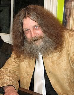
Darrow and Vachss have worked together before (Darrow did the covers for Vachss' 1995 CROSS series at Dark Horse and worked on the 1993 ANOTHER CHANCE TO GET THINGS RIGHT g/n along with many other artists) but it's surprising how well it works here given that change of emphasis from art to text. Vachss is a perfect choice for a pulp project like this. He's an accomplished writer of fiction whose work tends to read like nothing so much as pulp filtered through a dark adapted eye. His Burke novels are pretty much What If  Doc Savage and his crew had all had terrible childhoods and now hunted sexual predators with absolutely no intention of rehabilitating them. Vachss is an imposing figure what with his designer suits, eye-patch and general stance that seems to declare that he has just dealt with something and it will never hurt anyone else again. He isn't a dilettante either, just paddling in the waters of human atrocity for profit. This is from his bio in the back:

"Andrew Vachss has been a federal investigator in sexually transmitted diseases, a social-services caseworker, and a labour organiser, and has directed a maximum-security prison for "aggressive-violent youth". Now a lawyer in private practice, he represents children and youth exclusively."

This explains the references to the organisation PROTECT which crop up in the book and the no-nonsense message about kids and violence. Andrew Vachss makes Steve Ditko look indecisive is what I'm saying. I'm glad there is someone out there like Andrew Vachss, almost as glad as I am sorry that there is a need for people like him. But I can assure you that my rating is based entirely on the fact that I really enjoyed the book. It certainly isn't fear of having my legs broken that makes me say it was VERY GOOD! Also, the Michael A. Black time travelling/dinosaurs short that brings up the rear of the book is pretty neat and will take you back to Sundays reading Ray Bradbury on the rug in front of the fire before you even knew the world contained kids less fortunate than you who needed things like PROTECT.


ALL STAR WESTERN#13 Jonah Hex: Art by Moritat, written by Justin Gray and Jimmy Palmiotti, coloured by Mike Atiyeh and lettered by Rob Leigh. Tomahawk!: Art and colour by Phil Winslade, written by Justin Gray and Jimmy Palmiotti and lettered by Rob Leigh. DC Comics, $3.99 (2012) Jonah Hex created by Tony DeZuniga and John Albano Tomahawk created by Edmund Good and Joe Samachson

Photobucket

This book gets worse and worse and it still sells more than it did when it was called JONAH HEX. But then it isn't about Jonah Hex anymore is it? No,  it's more like Jonah Hex And His Amazing Friends. Except they are far from amazing and, as he's Jonah, they aren't really his friends, so it's more Jonah Hex And Some People Tolerating Each Other. Whatever I say about this book (and I'll be saying some stuff alright) all that needs be done to refute me is to chuck back its sales figures in my angry biased jealous fan boy face. The guy doing the most work here is clearly Moritat and he does a far better job than the material requires. Look, this isn't about Jonah Hex being "my" character and how I don't like what they've done to him. It's about bad comics. This one starts off with a clown killing a priest. He is killing the priest because he does not like priests because they fiddled with him when he was a kid. Jonah and his crew show up and notice the dead priest has had his face painted like a clown and someone says there's a circus in town and, oh God, oh Jesus....it's not exactly a fucking "two pipe problem" is it, Watson?

Photobucket

And I've gone Holmes on you there because what this comic is also doing is bringing in fictional literary characters from the period the book is set in (at the minute we have Edward Hyde, y'know, from Little Dorrit.) I can only guess they are doing this because the constant shout-outs to DC super hero continuity aren't stupid enough. I've got no beef with either man (I'm certainly not jealous(!)) but Palmiotti and Gray's work comes down heavily on the commercial rather than the creative end of the see-saw. It beggars my mind why on earth they would seek to go toe to toe in the shared-world arena with Kim Newman, Philip Jose Farmer and that elderly Englishman we've all decided we hate (because although less than he was he still makes everyone else look bad).  In comparison this is just pantomime and Palmiotti and Gray look like they'be both not only turned up as the horse, but they've miscalculated further and they both came as the horses' ass.  C'mon, the clock is ticking until Spring Heeled Jack shows up. After all some claim the murders ended because he sailed to The New World, how can they resist. Look forward to "It's Saucy Jack, sir! He's struck agin! Right under our very noses!" That should show FROM HELL up good and proper. Yeah, I know; but it sells more than ever - so I lose. I looOOooooOOOOOOooOOse! Look, something can be successful but still CRAP! It isn't a critic's job to tell you what's selling - it's their task to tell you whether something is any good or not and why. Sometimes elliptically. Sometimes irritatingly.


UNTOLD TALES OF THE PUNISHER MAX#5 Art by Mirko Colak (p) and Norman Lee & Rick Ketcham (i) Written by Skottie Young Coloured by Michele Rosenberg Lettered by VC's Cory Petit Marvel, $3.99 (2012) The Punisher created by John romita Snr, Ross Andru and Gerry Conway

Photobucket

There are many audacious things aout this comic written by the man who will, on this evidence, remain better known for his art on Marvel's wonderful Oz books. First up is the fact that Young attempts to position FrankMax as some kind of homicidal homilist dispensing murder and maxims. That would be okay(ish) if this were FrankNorm but in the MAX (So uncompromising! So complex! (i.e. violent and cruel)) world it seems a bit...off. Like FrankMax's taken one too many blows to the head and suddenly become simple minded or something. Don't get me wrong it's a good moral but I don't know if the guy who (spoiler!) killed your Dad is the guy you're going to listen to. No, put the phone down! Not your Dad; the Dad in the book. The Punisher didn't kill your Dad! He isn't real! No, The Punisher isn't real, your Dad is. Look, you're just doing it on purpose now.

Photobucket

The other bold move is to have the issue basically centre around a high-stakes cat and mouse game revolving entirely around the making of cheese macaroni and, specifically, whether there is some cheese in the fridge! I won't spoil it for you. No, not the cheese that's okay it's in the fridge. Or! Is! It!? I kind of liked that actually; it amused me. Young really stretches my credence to cracking point though when he suggests someone's favourite movie could be Appollo 13. Hey, it's a decent movie and it documents a thoroughly remarkable instance of insanely laudable human bravery and ingenuity no doubt, no doubt. But...favourite movie? Ever? Of all the movies you have ever seen? Okay, it might be crew members Lovell and Hise's favourite movie (Swigert died before it was made but he'd probably have been mad keen on it too.) but this comic isn't about them. I know all kids think their Dad's taste in movies suck but c'mon. Even my Dad likes Reservoir Dogs (altho', "There's no real need for all that language, John.", so spaketh he.) All this together with the unspectacular art makes the comic EH! And in the end the brassiest thing about the comic is that Marvel charged $3.99 for it. (You don't even get a Free Digital Code!)

HAUNTED HORROR #1 Art by C.A. Winter, Bernard Baily, Mike Sekowsky & Bill Walton (attrib.), Jack Kirby & Joe Simon, Jack Cole and Jay Disbrow. Reprints tales from WEIRD TERROR#1 (1952), THIS MAGAZINE IS HAUNTED#4 (1952), BAFFLING MYSTERIES#6 (1952), BLACK MAGIC#31 (1954), INTRIGUE #1 (1955) and CRIME DETECTOR #5 (1954) Cover by Warren Kramer and Lee Elias IDW/YOE Comics, $3.99 (2012)

Photobucket

If you don't think that that fine as wine cover is some kind of awesome then you best look away now because that's the smoothest thing in this package. And what a package this is! A splatter of pre-Code horror comics from various sources and various artists that shores up the case for art being the decisive factor in a comic's appeal. Because these sure ain't some well written comics. Apart from the Simon & Kirby (S&K) tale none of the other contents even get a writer credit. I'm not really surprised either. These things are entertaining allright but probably not in the way the authors intended. If the authors even intended anything because back then people just wrote this stuff to eat and they had to write a lot of it and they had to write it fast. Intentions are a very modern affectation for comics writers, tha ken. The more sedate of these tales are written like the writer’s got his cock in a mangle and he’s just learned he's late for a plane.They aren't exactly coherent is what I'm saying there. But the best one is "Black Magic In A Slinky Gown" because it has an almost palpable revulsion for women and the dirty, dirty things they make men do with them. The author of this one is only saved from almost certain Sectioning by the addled and unfocused nature of the storytelling. Or maybe it makes it seem worse than it is; either way it's hilarious. The kind of story you imagine being written by the kind of man who silently props up the bar surrounded by a circle of silence and goes home and the next time you hear about him it's in the paper and it isn't for winning the lottery.

Photobucket

In a more commonly accepted sense of "best" it's "Slaughter-House" which takes the prize. This is by S&K and is a real shocker. It's f-in' brutal!  A couple of battered Joes resist after the Earth has been conquered by '50s style aliens and it's all really unsettling. It's as though limited as to what they could depict visually S&K snuck through the real horror in the text. Seriously, it's basically got humanity being herded into killing pens and "...SLAUGHTERED like beef on the hoof!" With the wire and the guards and the mechanised death and the resistance and the Quislings and...you don't need letters after your name to know what S&K are on about (World War 2, darlings. World War 2). It also contains the word "noggin" which automatically makes my day. The ending is uncharacteristically downbeat for Kirby (maybe it's more Simon) but it's weird to reflect that The King's work appears more pessimistic before Marvel fucked him over than it does after. Because while this story apparently refutes it Jack Kirby, and I may have mentioned this before, never gave up on us.

Photobucket

This is a VERY GOOD! package overall. Not just for nostalgia (because don't you have to have experienced them first time round for that?) but also out of interest in what comics used to be like. Turns out they were the kind of thing that, had it been produced yesterday by people under thirty, would tickle the 'nads of VICE readers as much as the sight of a pretty girl reading Infinite Jest opposite them on the subway. (Honestly, there's some real Charles Burns/Dan Clowes look-a-likey stuff in here.) Also, for people who like their reprints just the way they were this book is for you, Brian Hibbs! It looks like someone just scanned the comics in and adjusted the contrast and so all you need is a Police Action in Korea, a corn dog and a cop on every corner for it be just like the good old days again!

Make Brian Hibbs smile like a child again by buying HAUNTED HORROR #1 from HERE.

And like the good old days - I'm gone!

Hope y'all had a good Thanksgiving and remembered to give thanks for COMICS!!!

"Walter-bout An Audition?" COMICS! Sometimes It's That Company That Doesn't Respect Jack Kirby!

Then I read some Marvel comics! I wouldn't want anyone to accuse me of being in DC's pocket now would I? I should bloody cocoa, chum! So yeah, the same one-note entitled whining will now follow but with different pictures posted in between the words! Photobucket Bountiful Brian Hibbs' Shipping List is under this linguistic lard!

MUPPETS #3 (of 4) Written and Drawn by Roger Langridge Colours by Kawaii Creative Studio Lettered by Litomilano S.r.l Marvel Comics, $2.99 (2012) The Muppets created by Jim Henson

Photobucket

This is an all-ages comic written and drawn by Roger Langridge. For those who balk at the very mention of “all-ages” let me just clarify that Roger Langridge is a consummate cartoonist and a craftsman of no little sophistication. He’s been banging about for a while but quite a lot of people still seem surprised he exists. No, THOR THE MIGHTY AVENGER with Chris Samnee wasn't his first work. This probably won’t be the last time I mention Roger Langridge is what I’m saying. This Muppets comic was his last work for Marvel before he went off and embarked on the Eisner award winning SNARKED.

Photobucket

Anyway, here he creates a comic which not only recreates the madcap bustle of the original Muppets Show without losing any of the distinctive personalities in the joyfully rambunctious chaos, but also chucks in a plot and jokes which all revolve around the slightly melancholy themes Autumn suggests without descending into mawkish sentimentality. He’s helped in no small part by his wonderfully expressive art, with its bounciness of line and emphasis on clarity and characterisation. I originally bought this for JKUKv.2.0 but it turns out the violent pig woman scares him so I guess I’ll just have to read it myself. Or stop doing the voices, maybe. That’s okay because being a parent is all about sacrifice and just like Roger Langridge, this comic is VERY GOOD!

In the back of THE MUPPETS is a preview of the way Marvel will produce comics in the future. This excremental extra bills itself as ULTIMATE SPIDER-MAN: GREAT POWER Digest but it is in fact Satan's balls rubbed right up in your face. Creatively speaking. It is apparently a whole wee book of screen grabs taken from the TV show arranged on the page with all the finesse and care you would expect of a dead robot. It is a thing. A thing of Evil.

Photobucket

Buying this for your child is exactly like stamping on the neck of Comics. It is the artistic equivalent of wearing your own bum as a hat. I am so livid I have stopped making sense. It is CRAP! Shun it as you would shun The Devil himself! Or, you know, have a look and make your own mind up.

UNTOLD TALES OF THE PUNISHERMAX#4 Art by Fernando Blanco Written by Nathan Edmondson Coloured by James Campbell Lettered by VC's Cory Petit Marvel Comics, $3.99 (2012) The Punisher created by Gerry Conway, John Romita Snr and Ross Andru

Photobucket

In this awe inspiring exercise in unoriginality if you have a problem and no one else can help you can simply roll on up to Frank’s local Chinese where he’ll be tucking into some dim sum, flash a few photos of your dead daughter and he’s off. His first stop is a boat where a Bad man is touching two ladies. In crime stories Bad men always have more than one lady in bed at a time and Bad men also have a penchant for flash boats. This is because Bad men enjoy a good hard fishing and are too cheap to buy hot water bottles. Frank then tortures the bad man by hanging him over the water and cutting him until a shark obligingly shows up. This doesn't take long because, just as in London you are never more than 5 feet away from a rat, if you are a Bad man hung upside down being tortured on your own boat you are never more than 30 seconds from a shark. There is a quip! No, not “sharks to be you!” or “tooth bad!” or “you look a bit down in the mouth!” no they went with “over your head!” Clever word play there. Frank says this more than once in the issue and, like the dialogue of Michael Bendis, it doesn't work any better with repetition. Then there’s some violence which is unpredictable only to the extent that it is so predictable. Frank finds Mr. Big but to be frank(!) finding Mr. Big doesn't turn out to be that difficult. I've had more trouble finding someone who can lay flagstones that don’t wobble after the first hard frost than Frank has following the breadcrumbs of crime here. Obviously in my case there was less standing on car roofs and shooting unerringly down into the tops of people’s heads, but overall tracking a competent builder to his lair was a lot more work than finding the head of a white slavery ring is in this comic. Then: more violence. Holy shit! Frank just got shot!

Photobucket

Jesus fucking Christ, Frank’s dead! Holy Coconut Balls! Hold onto your hats here - the guy who shot Frank was the guy who hired him! TWISTAMATAZZ! He was using Frank to get rid of the competition! This is some Byzantine labyrinthine shit going on here! Hold on while I pull out the whiteboard and diagram this one so I can follow it properly! TWISTGASM! Frank’s alive! To the surprise of precisely no one except the chowderhead who shot him it turns out Frank was wearing a vest! Not a string one either because they are a bit creepy, no, nor a thermal one despite the fact it’s so chilly even rich criminals are having to sleep three-in-a-bed to keep the chill off, no, a bulletproof one! Frank kills everyone and that makes everything okay. The end. Previous issues of this series have avoided the charge of being an unnecessary cash-grab by at least having artwork which justified the price of purchase alone. The art in this issue does not do that, I’m leaving it at that. (Also, issue 3 was dire on a words and pictures level too, but it dodges a bullet because I’m trying to appear timely so I've gone straight to kicking this one around.) If this thing reached publication without anyone involved once noticing it was CRAP! then your system is broken, Marvel. The only original thought here is to put so much unoriginality in one place and charge three monkey-humping dollars and ninety nine cents for it. Christ.

DAREDEVIL#18 Art by Chris Samnee Written by Mark Waid Coloured by Javier Rodriguez Lettered by VC's Joe Caramagna Marvel, $2.99 (2012) Daredevil created by Stan Lee and Bill Everett

Photobucket

Ah, Milla’s back. I was hoping this run was going to shun the inexplicably popular Marvel Knights run. Said run being primarily just a reminder of the bad old days when I didn't trust my own judgement. That was then but now, for me, none of that bullshit happened. Wait! I don’t think I've alienated enough of you so let’s just briefly run the MK years down: Kevin Smith! I know it’s hard for some of the youngsters out there to countenance but there was actually a time when people took Kevin Smith’s writing seriously. Maybe because with so many words on each page it was statistically likely that some of them would be worthwhile? So much for statistics! Michael Bendis and Alex Maleev provided a run that managed to eke out the premise of a Harmony Hairspray advert for five horribly chatty photo-sourced years (“What happened to you?” “I got shot.” “You got shot?” “I got shot.” “Wait, you got shot? With a bullet?” “I got shot with a bullet, yes.” “Oh. This is just verbal chaff isn't it?” “Shhh! How’s that nervous breakdown?” “Fine. I had a bit of a lie down and it’s gone away.” “DEMON BABY!) then Ed Brubaker wrote Murdock increasingly as a Man Without Sense (“I gamble everything on the fact that my mentally ill ex-foe who is being mind controlled won’t throw my wife off the ro…oh, snap!” ). And now Milla’s back. Great.

Photobucket

It wouldn't usually be too bad because there’s often lots of other stuff going on but this issue seems a bit…lighter in the density department. It doesn't seem to cover as much ground as it used to does it? I mean, these are some big ass panels we've got going on here. Luckily they are big asses saturated with the fat of Chris Samnee’s fantastic art, art which is currently exploring a beautiful obsession with Alex Toth via his animation storyboards. Lovely to look at but a bit light on content is how the “in” in indispensable starts slipping off. I’m holding my breath but this is going to have to get back to being better than just GOOD!

Did you know that "monkey humping is in Word Press' spell check? I don't know what that means but it scares me.

NEXT TIME: Some other companies who make COMICS!!!

"Let 'Em Loose, Bobo!" COMICS! Sometimes They May Arouse The Proles!

How goes the day! I guess after that Olympics Opening Ceremony I should just assure all our American friends, particularly your President, that the National Health Service doesn't actually mean that you have a socialist nation 3,000 miles off the coast of America. And, no, if you let this stand all of Europe isn't going to go next in a kind of domino effect. You guys are so ansty!

Photobucket Connor Willumson/Jason Latour (art/words)

I read some comics and then did the words thing. You can do the reading bit if you like, if there's nowt on the box.

UNTOLD TALES OF THE PUNISHERMAX #2 Art by Connor Willumson Written by Jason Latour Coloured by James Campbell Lettered by VC's Cory Petit Marvel, $3.99 (2012) THE PUNISHER created by Gerry Conway, John Romita Snr and Ross Andru Photobucket Cover by Kaare Andrews

This VERY GOOD! book is about Punisher Max. Unlike the Regular Punisher he does not have a beard, and his stories have swears, gore and dead kids in ‘em! Because, yes, Regular Punisher now has a beard. That’s the only thing that caught my attention in that recent irritating crossover with Daredevil. Not wishing to impugn the, no doubt, exhaustive research by Greg Rucka into face foliage, but I don’t think it’s a good look for Frank. He should be clean shaven do you not think? Shaving’s about discipline, shaving’s very military. But a beard? A beard’s not about discipline, a beard’s about vanity. Vanity’s not really something I associate with psychotic vigilantes. I have a hard time believing Frank Castle puts his War on Crime on hold while he just trims his tidy beard. Yes, I can believe a man can fly, but apparently a vengeful killing machine that has a face care regime is a step too far for me. No offence intended there to any bearded people. Particularly any bearded people built like brick shit houses who control this site. The Punisher's beard is important, yes?

Photobucket Connor Willumson/Jason Latour (art/words)

Anyway, this book is about the other Punisher, the one who can eat soup without upsetting people at the next table. It’s called Untold Tales and yet here they are. It’s the second issue and like the first issue the real reason for paying three dollars and ninety nine cents is the art. Last issue’s art was pretty good but this issue’s art by Willumson is preposterously good. I’m not well versed in anything too freaky but even I can tell there’s a real ComiX vibe to the art. It’s got a wild-eyed and feral vibe to it which makes the contents of every deceptively traditionally shaped panel thrum with an animal heat and press against the page with an almost physical weight. The youngsters will appreciate that the sound FX are even drawn in as though they are giant inflatable physical presences, like Frank Quitely did in that Batman comic that time. Admittedly this senses shattering artistic performance is yoked to a fundamentally meat’n’taters tale; one which seems inspired by that old Jerry Lee song (“Come on over, baby, we got Castle in the barn!”) and has a big chunky gold shout-out to the King. No, not Jack Kirby. Elvis. Jack Kirby’s dead, stop going on about it. Stan Lee did everything! C’mon, Stan Lee probably stood behind Jack Kirby’s chair and moved his simple little hands for him. Why not, eh?

MIND MGMT #2 Story, art and cover by Matt Kindt Dark Horse, $3.99 (2012) MIND MGMT created by Matt Kindt Photobucket Cover by Matt Kindt Did you notice the stitches on the guy's face? Ahuh, Matt Kindt is still EXCELLENT!

THE SHADOW #4 Art by Aaron Campbell Written by Garth Ennis Colours by Carlos Lopez Lettered by Rob Steen Cover by Howard Victor Chaykin Dynamite, $3.99, (2012) THE SHADOW created by Walter B. Gibson Photobucket Cover by Howard Victor Chaykin

It’s a shame Campbell isn't just that bit better because this issue he does a pretty good job; there's a real sense of time and place, a sense that someone has done their homework, that materials of an archival nature have been attended to but, due to certain core failings, he can't help but  fluff the big emotional bit somewhat, which has the unfortunate effect of my authorially intended species-shame at Ennis’ intentional homage to The Searchers being trumped by the fact that I find myself thinking, man, hats sure are hard to do. And they are, ask Lou Fine, so this was still GOOD!

BLACK KISS 2 #1 By Howard Victor Chaykin Image Comics, $3.99 (2012) BLACK KISS created by Howard Victor Chaykin Photobucket

"That's a Pez Dispenser, right?" Cover by Howard Victor Chaykin

Ban This Sick Filth!” blared the Daily Mail headline that Wednesday morning. Of course “Ban This Sick Filth!” is the Daily Mail’s headline every morning and had nothing to do with Howard Victor Chaykin’s new exercise in saucy muck being held by The Customs. Oooer! Held by The Customs! Fnarr! Fnarr! The true extent of the upset was only revealed when the owner of my LCS commented, “No one cares, John.” Before adding, “And when are you going to pay for all these comics.” Leaving him to his quips I realised something had to be done, so I poked my head over the wall and saw Her Madge was pegging her washing out. I mentioned the whole thing to her, and she said she remembered meeting Howard Victor Chaykin when she guest starred in Viper and he had "sad eyes, like a child with a grazed knee" and agreed to get The Head Boy over to sort the whole HVC BK2 UK situation out.

Photobucket "I can see the beach from my window. That's how much I give a s***." He didn't say when he wasn't contacted.

So Cammers turns up, and he's a bit out of sorts because we’d interrupted him holding the back door of the NHS open so the Private Sector could run in and strip the place bare, wires and all, before anyone cottoned on. He’d got a copy of the moral soiling rag in question and he held it up to his face, his statesman’s face, his face with all the statesmanlike integrity of a lard sculpture of a single bum cheek, but with eyes, and commenced to read with those eyes. And he goes, he says,  “Yes, but is it a book you would wish your wife or servants to read?" And Her Madge points out it isn't 1960 and tells him to his face that the book will be available next week, or she'll be reminding everyone about that time he left his own child behind in the pub. "Did he thank you, then?" said my LCS owner when I told him of the entirely imaginary lengths I had gone to for HVC. "No", I said, "And he’ll never have to.

THE SIXTH GUN #23 Art by Tyler Crook Written by Cullen Bunn Coloured by Bill Crabtree Lettered by Douglas E. Sherwood Oni Press, $3.99 (2012) THE SIXTH GUN created by Cullen Bunn & Brian Hurtt Photobucket Cover by Brian Hurtt

Yeah, I miss Bat Lash too, so this was GOOD!


ADVENTURE TIME: MARCELINE AND THE SCREAM QUEENS #1 Written & illustrated by Meredith Gran, Jen Wang Coloured by Lisa Moore Lettered by Steve Wands KaBoom!, $3.99 (2012) ADVENTURE TIME created by Pendleton Ward Photobucket

Much like Blessed Brian Hibbs I asked an 8 year old boy what he made of this comic. There must have been some kind of miscommunication because quite quickly there was a lot of shouting and after a bit of tussling a police presence was required. Anyway my court date is next month so if anyone can put me in touch with a good lawyer that’d be great. Otherwise, this comic aimed at 8-year old children contains a reference to the popular children’s entertainer Iggy Pop(!) and revolves around the fantasy of having a super-awesome musical career; that’s really more a teen and mid twenties thing, I think. Although these days I guess that dream can be dragged all the way into your forties. Mind you, it will probably weather the ravages of time about as well as the skin on the back of Cher's knees.

Photobucket

Meredith Gran (w/a)

People may mock, but you only need to do one song that plays over the end credits of the latest Jenifer Aniston flick (one where workaholic Jen learns the value of things via a series of laugh-out-loud hi-jinks stemming from her upsetting a genie and being cursed with a set of talking balls on her chin) and you’ll never have to hit up your Mom for cash again! I dunno, if you’re doing a kids comic I’d say get the stuff kids like right first, and then put all the hip stuff aimed at your mates in. Otherwise you’ll end up with something that’s really nice looking but essentially EH!


FATIMA: THE BLOOD SPINNERS #1 and #2 Story & Art by Gilbert Hernandez Dark Horse, $3.99 (2012) FATIMA: THE BLOOD SPINNERS created by Gilbert Hernandez Photobucket

Covers by Gilbert Hernandez

Now this, this, is a comic an 8 year old boy would like! In fact it’s a bit like a comic an 8 year old boy would create. An 8 year old whose pets keep disappearing. It’s a disturbingly affectless presentation of a gorily deadpan comedy parody/celebration of genre trash. Maybe it has something serious to say about the human condition. We’ll probably never know as rational thought quickly gets tickled into insensibility by the women in bikinis shooting zombies, cleverly stupid names like “bittermeat”, laughably terrible jokes and the rewarding central conceit of beautiful people with beige minds seriously making a mess of the whole saving the world thing.

Photobucket

Gilbert Hernandez (a/w)

Look, the people in this awesome comic wear devices that look like metal Y-fronts to make them invisible for the delightfully childish and arbitrary time of 3 minutes. That should clue any slowcoaches in that this is no Walking Dead. And that's just peachy by me.  I also liked the letter in the back of #2 that said Fatima had a “manly” face. It’s comics by Gilbert Hernandez! Don't be getting all prissy, John Sayles wrote Alligator. I hear Beto's (I call him Beto because we are so close we were practically separated at birth.)  now been doing this stuff for 30 years, man and boy, and he remains VERY GOOD!

THE INFERNAL MAN-THING #1 and #2 Art by Kevin Nowlan Written by Steve Gerber Lettered by Todd Klein Marvel, $3.99 ea (2012) MAN-THING created by Stan Lee, Roy Thomas, Gerry Conway and Gray Morrow Photobucket Covers by Art Adams

This doesn’t read too well as individual issues as (as I am sure we are all aware) it is an OGN cut up and shoved out in three easy, and pricey, pieces. It’s taken this long because Kevin Nowlan has taken this long. According to the text piece in #1 he was doing a page a week. At the Marvel page rates I have made up in my head, he would have starved to death before getting to page 10. So, rather than produce a half-assed product or die, Nowlan took his time and did other stuff. And I do have to say that the art here is very, very impressive. He’s got a ‘80s Kyle Baker thing going on, but with the additional, and considerable, oomph a foundation of fully painted colour provides. It’s a purposefully limited palette which gives everything a humid and lurid look. Like a swamp, see. Also, Nowlan’s also given Man-Thing a bit of a make-over and it’s kinda nice too, particularly the way Manny’s head seems to have slipped down to rest on his chest. Nice, that. Causes your gaze to stumble every time, good effect there. The words are very Steve Gerber, which is to say it’s very satirical in that endearingly adolescently blunt style Steve Gerber had. And when I say “adolescent” I don’t mean it as a put-down I just mean that in the sense of being energetic and all-encompassing. I always think of Steve Gerber as being an American version of Pat Mills, writing wise anyway. Although Gerber's more willing to accept his own portion of blame for the way things suck, I think. Maybe that’s why people respond more warmly to the work of Gerber than that of Mills.If you like Steve Gerber you'll like this, if you've never read Steve Gerber it's a good start as it is very Gerber-y. If you don't like Steve Gerber we won't be spending Christmas together. Because he and this are both VERY GOOD!

Photobucket

Kevin Nowlan/Steve Gerber (a/w)

According to #1 there's a lot of respect in this project. And yes, there probably is but this is Marvel. And so, as respectful as it was of your Uncle Nate to turn up to Pappy's funeral, it would have been better if he hadn't crammed his pockets with canapés, winked at the widow and blocked the bog with a boozy poo before drunkenly falling through a window. It’s a sloppy package what with the reprint of “Song-Cry of The Living Dead Man” looking kind of cheap and, in the second issue, having a double page spread printed on the front and back of the same page. This comic cost me two pounds and ninety nine pence Sterling, and yet I've had menus from the local pizza place pushed through my letterbox that had more thought, care and consideration in their design. But, I’m sure somewhere in there is a very real respect for Steve Gerber. At least Uncle Nate turned up, y'know. Ultimately, as Marvel as it is, it’s done out of respect for Steve Gerber, who is dead. And of course even Marvel respect the dead. Except for Jack Kirby. Who, it seems, can still just go f*** himself.

I hope you all had a smashing wekend and read some smashing COMICS!!!