"...Eerie Friend Of The Needy..." COMICS! Sometimes Gil Did 'em With Roy!

What? Oh, yes. I was on about Gil Kane wasn't I? Thought I'd forgotten didn't you? Or hoped. Probably the latter. Springs eternal, so I hear, much like my chuntering. Where were we...ah, 1980s Gil Kane...  photo Midnight003_B_zpsf7a2c60d.jpg

...and no, nobody does answer that question. But then who cares - it's 1980's Gil Kane! Anyway, this...

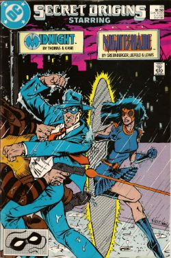
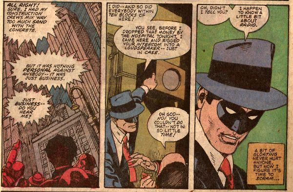
SECRET ORIGINS #28 Starring: Midnight Art by Gil Kane Written by Roy Thomas Lettered by Jean Simek Coloured by Tom Ziuko (Also Nightshade by Rob Liefeld, Robert Greenberger et al.) DC Comics, $1.50 (1988) Midnight created by Jack Cole

Photobucket

I found this a few years ago, it was wedged in the back of a bargain box and only eyes trained in Shamballa to spot the word "Kane" on a comic book flickering past in a four colour blur allowed  me to halt my fingers long enough to pull it towards me; like a tiny child rescued from a rushing river. A rushing river whose waters were Time! A child who was not a child but a comic! It's not a comic people talk about a lot but, by Mishima's slippers, it is an astonishing piece of work by Mr. Gil Kane. It starts like this...

 photo Midnight001_B_zps283d5e1c.jpg

In order to impose some sense of order and consistency on the post CRISIS DC Universe SECRET ORIGINS delivered 50 issues during the years 1986-1990, with each issue being dedicated to presenting the newly established origin of one or more DC characters. That's right, in 1986 -1990 DC Comics actually gave enough of a chuff about continuity to have given it a bit of thought so it all worked out nicely. I think we can all agree that the Nu52 has had none of that. Although DC's total banjaxing of their own continuity does still give us the joy of seeing Baleful Brian Hibbs going all puce every single time he realises that Batman now hasn't been Batman long enough to have had all those Robins. Yes, there was a time when DC Comics didn't just pretend everything made sense they actually made it make sense. Obviously Rascally Roy Thomas was all over this series like a rash. So much so that he wrote this comic. And Gil Kane's only gone and drawn it!

 photo Midnight005_B_zps5fb2076e.jpg

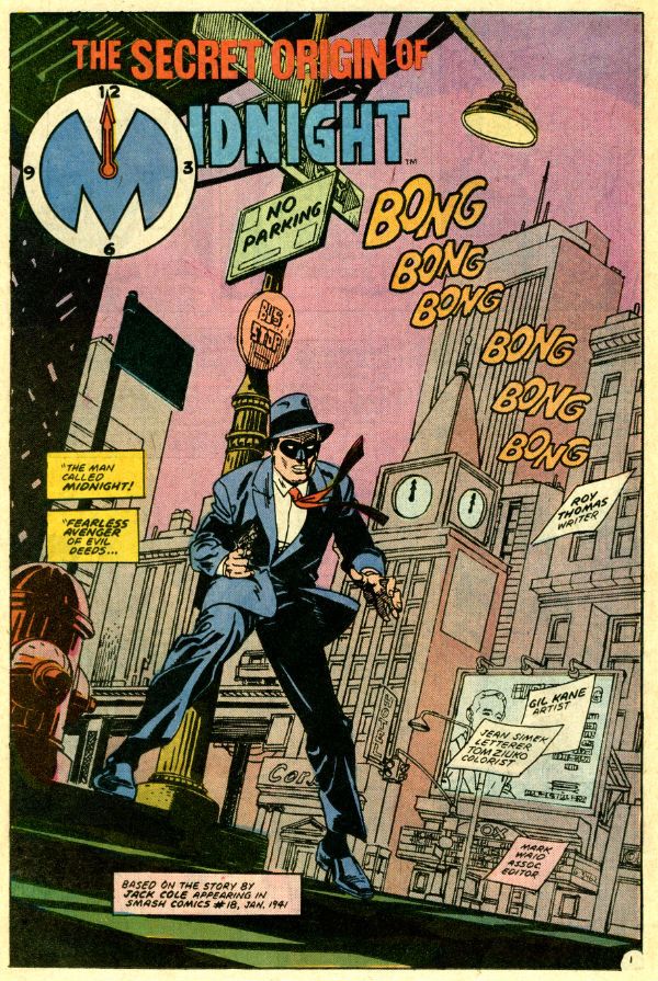
GilRoy worked together on many magnificent series/characters all of which are better remembered today than this. Which is a shame. Mind you, I'm not even sure this character has ever appeared again.  Feel free to correct me, as ever. Midnight first appeared in the Quality published Smash Comics #18 (Jan 1941). The strip was certainly drawn, and probably written by, Jack "Plastic Man" Cole hence the little credit box in the splash above. Just as The Death Patrol were a copy of The Blackhawks so was Midnight essentially The Spirit. Yes, there is a text feature by the Rascally one I have cribbed from. Midnight then is a man in suit and a domino mask who decides, inspired by the character whose adventures he narrates on old timey radio, to right wrongs and smack bad guys about. His name comes from the fact that he confronts his enemies at...midnight! This is clearly a very poor gimmick that the bad guys would soon twig to ending in a dead man in a suit with a domino mask. Inspired, I have submitted to Dan Didio a treatment for a Nu52 treatment of the character which is basically the same except he attacks his foes when they are mid shite. Take my word, people have a really hard time defending themselves when they are on the pot. Anyway, I think it has the requisite level of class modern DC Comics requires and I breathlessly await their response.

 photo Midnight002_B_zpsb434061f.jpg

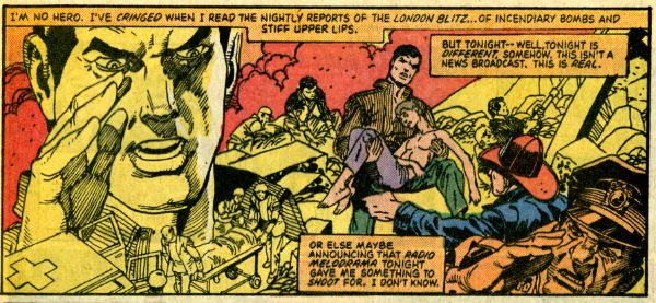
As much as I treasure Roy Thomas, and his work here is entertaining and sprightly as befits the pulpy period set material, I am actually here to talk about Gil Kane. Because 1980s Gil Kane is what I'm all about. Sadly I wasn't invited to personally watch Kane create the art on these pages but to me it looks like he's using markers. That's the sign of a confident man right there. Of course, so I hear, he would have broken down each page into rough layouts down to the panel level. Usually then some tightening up would transform the layouts to pencils and then, naturally, the final inking. But Kane, so I've read, would skip the pencils and just bang! ink over his layouts. With markers. That's...confidence. That's Gil Kane. Worship at your convenience.

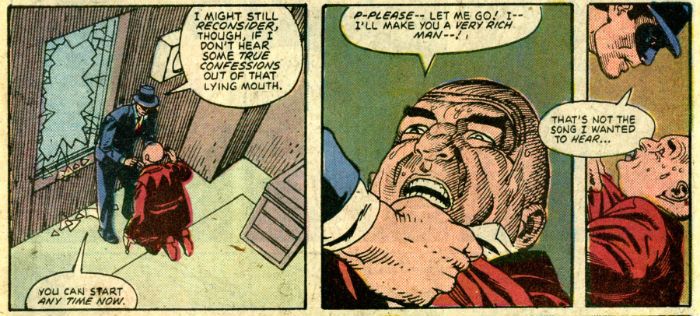
Of course the markers may be a mundane reason for the obvious lightness of detail in Kane's work. Certainly in "The Secret Origin Of Midnight" Kane continually veers away from heavy detail.  So much so that his hatching is very rarely even crossed. Cross hatching and heavy detail were the mark of illustrators and, for Kane, there was a clear delineation between artists who favoured continuity and those who had an illustrative bias. Kane was a continuity first guy. To clarify this Kane would often cast it in terms of his work versus that of the Filipino school. Hence his documented dissatisfaction with Rudy Nebres inking of his pencils on the Marvel John Carter series. The reader's eye was meant to flow through Kane's pages obeying the visual rhythm set by the artist himself. When detail occurs it occurs in controlled quantities and its purpose is specific. Here city scenes seem detail rich but on closer inspection the illusion of detail is the result of an accumulation of what turn out to be visual generalisations. Kane saves the more honest detail for when he shows a face in close up. On these occasions he uses his hatching to cue in the mood of the subject regardless of light sources as with the noir movies of his youth. Basically for Kane illustration is used to convey intensity. Here it's usually the intensity of the villainy of a bald fat man but my point remains.

 photo Midnight004_B_zpseab1c12e.jpg

Also present on these pages is Kane's constant attempts to differentiate between the flesh and the forms of the world it inhabits. It might be argued that there is a concerted and clear divide between the living and the inert in Kane's art. This is a city based tale packed with artfully implied period detail, including suits that make natty look tatty. At no point is there any confusion on the part of the reader between the person and their clothing. This is due to Kane's skill at drapery but also to the fact that he varies the level of detail and line-weight between the clothes and the flesh that they drape. Noticeably so.  A striving for seperation, and yet also some balance, between the natural and the manufactured line was an important part of Kane's artistic ambition. He would always be quick to praise Lou Fine, an artist who Kane felt had achieved excellence in both the geometric and organic line. However, in all fairness I should note that Gil Kane could draw men in hats better than Lou Fine.

 photo MidHat1B-1_zps897695b5.jpg

Oh, don't worry this comic contains all the explosive movement, bombastic gymnastics, panel breaking, in-panel montages, punched people back flipping and chisel chinned cavorting that the most frenetically entertaining and irresistibly enjoyable work of Gil Kane always contains. I just thought I'd highlight a couple of things I wouldn't usually mention. If I came off sounding like someone having a dry drunk please don't let it put you off this comic should you see it. After all, it's 1980s Gil Kane and that's VERY GOOD!

After all, if 1980s Gil Kane is anything he's certainly - COMICS!!!

 

"...A Cascade Of Wasps Attacked the Furry Monster!" COMICS! Sometimes You Worry About The Men Who Made Them!

That's right I read some comics. Some of them were old and some of them were new and one of them wasn't really a comic at all. But only one of them made me think it was a miracle anyone was actually conceived in the '50s. Photobucket

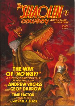
Yes, paging Dr. Subtext! Outbreak of '50s gynophobia! But then to nostalgic old fools like me '50s gynophobia is arguably the finest gynophobia of all! Anyway, this... THE SHAOLIN COWBOY ADVENTURE MAGAZINE #1 The Shaolin Cowboy in "The Way of No Way!" by Andrew Vachss and Geoff Darrow Time Factor by Michael A. Black Illustrations by Geoff Darrow and Gary Gianni Designed by Peter Doherty Cover by Scott Gustafson Dark Horse Books, $15.99 (2012) Shaolin Cowboy created by Geoff Darrow

Photobucket

This isn't a comic book, best get that straight right from the off. What it is is a loving evocation of the pulp magazines of the past. Peter Doherty has designed the book, and every page within it, to wilfully evoke those deceased progenitors of the super hero comic. He draws short at leaving the page edges untrimmed but other than that it's a splendid piece of design work. The contents are very reminiscent of the old pulps too. I haven't read a lot of those but what I have read of them they were largely shaggy dog stories told in very wordy way with the main draw being the charisma of the central character and the outlandish inventions deployed by the (often uncredited) authors to delay the ending.  Pulps were largely exercises in covering as much ground with as little material as possible (very much like certain comics from The Big Two. Ha ha! You Crazy!) but fought hard to be entertaining while doing so (unlike certain...Ha ha! Me passive aggressive!).

Photobucket

So what you get here consists of pages of words punctuated by  a plenitude of Darrow's hypnotically precise spot illustrations and a smattering of full page "Helpful Hints" where Shaolin Cowboy helpfully shows you how to switch on a toaster before e.g. tearing off someone's nutsack with it. That's the joke there and it's the same joke every time but as with certain jokes the accumulative repetition somehow keeps it funny. Because that's the thing about Shaolin Cowboy isn't it? There aren't a lot of jokes but what there are are good jokes. The best joke in the comics is appreciating the density of illustration used to enliven such meagre plots. The trick here is that Vachss and Darrow make the language serve the illustrative function but the joke remains, in essence because whole pages dense with text  are spent describing a scene only to have the scene change suddenly. More space is spent describing how the people Shaolin Cowboy is about to dispatch look than there is spent describing how they are dispatched. As with the comic the emphasis is on appearance rather than action. You will have to like words to like this one.

Darrow and Vachss have worked together before (Darrow did the covers for Vachss' 1995 CROSS series at Dark Horse and worked on the 1993 ANOTHER CHANCE TO GET THINGS RIGHT g/n along with many other artists) but it's surprising how well it works here given that change of emphasis from art to text. Vachss is a perfect choice for a pulp project like this. He's an accomplished writer of fiction whose work tends to read like nothing so much as pulp filtered through a dark adapted eye. His Burke novels are pretty much What If  Doc Savage and his crew had all had terrible childhoods and now hunted sexual predators with absolutely no intention of rehabilitating them. Vachss is an imposing figure what with his designer suits, eye-patch and general stance that seems to declare that he has just dealt with something and it will never hurt anyone else again. He isn't a dilettante either, just paddling in the waters of human atrocity for profit. This is from his bio in the back:

"Andrew Vachss has been a federal investigator in sexually transmitted diseases, a social-services caseworker, and a labour organiser, and has directed a maximum-security prison for "aggressive-violent youth". Now a lawyer in private practice, he represents children and youth exclusively."

This explains the references to the organisation PROTECT which crop up in the book and the no-nonsense message about kids and violence. Andrew Vachss makes Steve Ditko look indecisive is what I'm saying. I'm glad there is someone out there like Andrew Vachss, almost as glad as I am sorry that there is a need for people like him. But I can assure you that my rating is based entirely on the fact that I really enjoyed the book. It certainly isn't fear of having my legs broken that makes me say it was VERY GOOD! Also, the Michael A. Black time travelling/dinosaurs short that brings up the rear of the book is pretty neat and will take you back to Sundays reading Ray Bradbury on the rug in front of the fire before you even knew the world contained kids less fortunate than you who needed things like PROTECT.


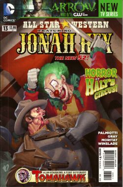
ALL STAR WESTERN#13 Jonah Hex: Art by Moritat, written by Justin Gray and Jimmy Palmiotti, coloured by Mike Atiyeh and lettered by Rob Leigh. Tomahawk!: Art and colour by Phil Winslade, written by Justin Gray and Jimmy Palmiotti and lettered by Rob Leigh. DC Comics, $3.99 (2012) Jonah Hex created by Tony DeZuniga and John Albano Tomahawk created by Edmund Good and Joe Samachson

Photobucket

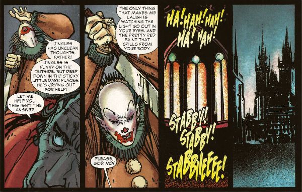
This book gets worse and worse and it still sells more than it did when it was called JONAH HEX. But then it isn't about Jonah Hex anymore is it? No,  it's more like Jonah Hex And His Amazing Friends. Except they are far from amazing and, as he's Jonah, they aren't really his friends, so it's more Jonah Hex And Some People Tolerating Each Other. Whatever I say about this book (and I'll be saying some stuff alright) all that needs be done to refute me is to chuck back its sales figures in my angry biased jealous fan boy face. The guy doing the most work here is clearly Moritat and he does a far better job than the material requires. Look, this isn't about Jonah Hex being "my" character and how I don't like what they've done to him. It's about bad comics. This one starts off with a clown killing a priest. He is killing the priest because he does not like priests because they fiddled with him when he was a kid. Jonah and his crew show up and notice the dead priest has had his face painted like a clown and someone says there's a circus in town and, oh God, oh Jesus....it's not exactly a fucking "two pipe problem" is it, Watson?

Photobucket

And I've gone Holmes on you there because what this comic is also doing is bringing in fictional literary characters from the period the book is set in (at the minute we have Edward Hyde, y'know, from Little Dorrit.) I can only guess they are doing this because the constant shout-outs to DC super hero continuity aren't stupid enough. I've got no beef with either man (I'm certainly not jealous(!)) but Palmiotti and Gray's work comes down heavily on the commercial rather than the creative end of the see-saw. It beggars my mind why on earth they would seek to go toe to toe in the shared-world arena with Kim Newman, Philip Jose Farmer and that elderly Englishman we've all decided we hate (because although less than he was he still makes everyone else look bad).  In comparison this is just pantomime and Palmiotti and Gray look like they'be both not only turned up as the horse, but they've miscalculated further and they both came as the horses' ass.  C'mon, the clock is ticking until Spring Heeled Jack shows up. After all some claim the murders ended because he sailed to The New World, how can they resist. Look forward to "It's Saucy Jack, sir! He's struck agin! Right under our very noses!" That should show FROM HELL up good and proper. Yeah, I know; but it sells more than ever - so I lose. I looOOooooOOOOOOooOOse! Look, something can be successful but still CRAP! It isn't a critic's job to tell you what's selling - it's their task to tell you whether something is any good or not and why. Sometimes elliptically. Sometimes irritatingly.


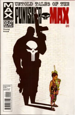
UNTOLD TALES OF THE PUNISHER MAX#5 Art by Mirko Colak (p) and Norman Lee & Rick Ketcham (i) Written by Skottie Young Coloured by Michele Rosenberg Lettered by VC's Cory Petit Marvel, $3.99 (2012) The Punisher created by John romita Snr, Ross Andru and Gerry Conway

Photobucket

There are many audacious things aout this comic written by the man who will, on this evidence, remain better known for his art on Marvel's wonderful Oz books. First up is the fact that Young attempts to position FrankMax as some kind of homicidal homilist dispensing murder and maxims. That would be okay(ish) if this were FrankNorm but in the MAX (So uncompromising! So complex! (i.e. violent and cruel)) world it seems a bit...off. Like FrankMax's taken one too many blows to the head and suddenly become simple minded or something. Don't get me wrong it's a good moral but I don't know if the guy who (spoiler!) killed your Dad is the guy you're going to listen to. No, put the phone down! Not your Dad; the Dad in the book. The Punisher didn't kill your Dad! He isn't real! No, The Punisher isn't real, your Dad is. Look, you're just doing it on purpose now.

Photobucket

The other bold move is to have the issue basically centre around a high-stakes cat and mouse game revolving entirely around the making of cheese macaroni and, specifically, whether there is some cheese in the fridge! I won't spoil it for you. No, not the cheese that's okay it's in the fridge. Or! Is! It!? I kind of liked that actually; it amused me. Young really stretches my credence to cracking point though when he suggests someone's favourite movie could be Appollo 13. Hey, it's a decent movie and it documents a thoroughly remarkable instance of insanely laudable human bravery and ingenuity no doubt, no doubt. But...favourite movie? Ever? Of all the movies you have ever seen? Okay, it might be crew members Lovell and Hise's favourite movie (Swigert died before it was made but he'd probably have been mad keen on it too.) but this comic isn't about them. I know all kids think their Dad's taste in movies suck but c'mon. Even my Dad likes Reservoir Dogs (altho', "There's no real need for all that language, John.", so spaketh he.) All this together with the unspectacular art makes the comic EH! And in the end the brassiest thing about the comic is that Marvel charged $3.99 for it. (You don't even get a Free Digital Code!)

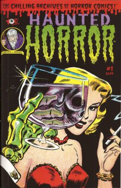
HAUNTED HORROR #1 Art by C.A. Winter, Bernard Baily, Mike Sekowsky & Bill Walton (attrib.), Jack Kirby & Joe Simon, Jack Cole and Jay Disbrow. Reprints tales from WEIRD TERROR#1 (1952), THIS MAGAZINE IS HAUNTED#4 (1952), BAFFLING MYSTERIES#6 (1952), BLACK MAGIC#31 (1954), INTRIGUE #1 (1955) and CRIME DETECTOR #5 (1954) Cover by Warren Kramer and Lee Elias IDW/YOE Comics, $3.99 (2012)

Photobucket

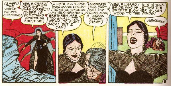
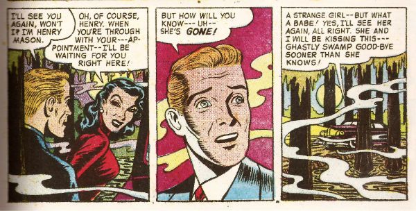
If you don't think that that fine as wine cover is some kind of awesome then you best look away now because that's the smoothest thing in this package. And what a package this is! A splatter of pre-Code horror comics from various sources and various artists that shores up the case for art being the decisive factor in a comic's appeal. Because these sure ain't some well written comics. Apart from the Simon & Kirby (S&K) tale none of the other contents even get a writer credit. I'm not really surprised either. These things are entertaining allright but probably not in the way the authors intended. If the authors even intended anything because back then people just wrote this stuff to eat and they had to write a lot of it and they had to write it fast. Intentions are a very modern affectation for comics writers, tha ken. The more sedate of these tales are written like the writer’s got his cock in a mangle and he’s just learned he's late for a plane.They aren't exactly coherent is what I'm saying there. But the best one is "Black Magic In A Slinky Gown" because it has an almost palpable revulsion for women and the dirty, dirty things they make men do with them. The author of this one is only saved from almost certain Sectioning by the addled and unfocused nature of the storytelling. Or maybe it makes it seem worse than it is; either way it's hilarious. The kind of story you imagine being written by the kind of man who silently props up the bar surrounded by a circle of silence and goes home and the next time you hear about him it's in the paper and it isn't for winning the lottery.

Photobucket

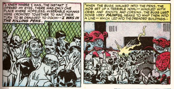
In a more commonly accepted sense of "best" it's "Slaughter-House" which takes the prize. This is by S&K and is a real shocker. It's f-in' brutal!  A couple of battered Joes resist after the Earth has been conquered by '50s style aliens and it's all really unsettling. It's as though limited as to what they could depict visually S&K snuck through the real horror in the text. Seriously, it's basically got humanity being herded into killing pens and "...SLAUGHTERED like beef on the hoof!" With the wire and the guards and the mechanised death and the resistance and the Quislings and...you don't need letters after your name to know what S&K are on about (World War 2, darlings. World War 2). It also contains the word "noggin" which automatically makes my day. The ending is uncharacteristically downbeat for Kirby (maybe it's more Simon) but it's weird to reflect that The King's work appears more pessimistic before Marvel fucked him over than it does after. Because while this story apparently refutes it Jack Kirby, and I may have mentioned this before, never gave up on us.

Photobucket

This is a VERY GOOD! package overall. Not just for nostalgia (because don't you have to have experienced them first time round for that?) but also out of interest in what comics used to be like. Turns out they were the kind of thing that, had it been produced yesterday by people under thirty, would tickle the 'nads of VICE readers as much as the sight of a pretty girl reading Infinite Jest opposite them on the subway. (Honestly, there's some real Charles Burns/Dan Clowes look-a-likey stuff in here.) Also, for people who like their reprints just the way they were this book is for you, Brian Hibbs! It looks like someone just scanned the comics in and adjusted the contrast and so all you need is a Police Action in Korea, a corn dog and a cop on every corner for it be just like the good old days again!

Make Brian Hibbs smile like a child again by buying HAUNTED HORROR #1 from HERE.

And like the good old days - I'm gone!

Hope y'all had a good Thanksgiving and remembered to give thanks for COMICS!!!

More Cowbell: Jeff on Things and Stuff.

At first, I was just going to write about Paul Tobin and Colleen Coover's Gingerbread Girl, but I'm still trying to figure out what I'm going to say about it.  (Uh, things?  And, uh, stuff?) So, after the jump, Gingerbread Girl, X-Men: First Class (the movie), Star Wars Omnibus (Vol. 3), and more...things and stuff.

(oh, and don't forget to scroll down for the shipping list...and John's reviews...and Graeme's reviews?!  Holy shit. We need to learn how to pace ourselves.)

GINGERBREAD GIRL GN:  In an age where comics are taking their cue from movie and cinema, it's delightful to read Paul Tobin and Colleen Coover's Gingerbread Girl, a graphic novel about a mysterious twenty-something in Portland, OR and her odd affliction:  it's comics shot through with a big ol' dose of live theater, as every character breaks the fourth wall to address the reader about what they know about Annah Billips.  (I'm not much of a live theater guy at all, but more than once I was reminded of Thornton Wilder's The Matchmaker (basis for Hello, Dolly?  I did not know that.  Thanks, Wikipedia!).)  Tobin's speeches are shot through with high-end whimsy -- "But of course that's all we really we want from someone," Annah's reluctantly smitten date says at one point, "Destroy a lover's mystery and they're less glimmering.  Throw breadcrumbs at pigeons and they'll flock to you in droves.  Throw a bread loaf at them and they'll scatter.  Crumbs of a mystique are just right. A loaf of explanation is too much." -- but they've still got nothing on Coover's delicious art, able to invest seemingly anyone and anything with charm and clarity.

Gingerbread Girl is a mystery of sorts, with the lead character believing she has a twin created from her own stripped away Penfield Homunculus, and everyone else trying to figure out if she's crazy or not.  As the above speech suggests, the graphic novel decides not to solve that mystery, but rather leave us tantalized on the edge of realization.  It's a fun choice, but one that left me feeling more than a little cheated.  I'm sure the idea is to make me look from the book's plot to its possible theme -- I'll take "narratives about narrative strategies" for $500, Alex! -- but I can't help but feel we could've gotten that and a more traditional nod toward conventional narrative climax.  One of the things this gorgeous looking book repeatedly reminds us about its main  character is that she's a tease.  It's a reminder the reader would do well to take to heart about Gingerbread Girl itself. Being teased is much more fun when there's little to lose, and $12.95 doesn't exactly grow on trees these days.  GOOD stuff,  I think?  Or maybe just at the very highest end of OK?  I still can't decide.

X-MEN: FIRST CLASS:  The last thing I expected from this movie was to be reminded of Mario Bava, and yet as the film hit hour 35 of lovely visuals, paper-thin characters and a boredom that teetered on the edge of hypnotic, it was the reference point I came back to.  Of course, I expected a movie about a young Charles Xavier (James McAvoy) and Erik Something-Or-Other-Because He's-Still-Magneto-To-Me (Michael Fassbender) recruiting mutants to fight Sebastian Shaw's Hellfire Club to have more than a dash of Brian Singeresque touches to it, so I figured there would be the usual queer subtext (tearful speeches by young teenagers about how they wish they could be like everyone else, young men with full lips and big eyes rubbing their bare arms).  But Matthew Vaughn turns X-Men: First Class into a sensual free-for-all, with ladies walking about in excessively cumbersome lingerie, diamond girls being tied to beds by the rails of the bed itself, excessively nude exploding female mannequins, and I'm not even getting into the whole Xavier/Magneto/Mystique triangle.

More than that, though, Vaughn's tremendous sense of visual flair and attention to detail makes the movie just visually sensuous: it sounds goofy, but there's a scene where Magneto plucks a submarine out of the water, and the way the droplets spun off the propellers had me transfixed. There were at least a dozen more moments like that and I savored each one of them.

Unfortunately, the movie has just too much fucking stuff in it -- it's sodden, is what it is -- showing us not just the opening of the first X-Men movie where a young Erik pries at the gates of Auschwitz, but also the scene that comes after that, as well as what Charles Xavier was doing at that point.  We not only get their meeting in mid-action scene, but the CIA's decision to help them recruit mutants, a long recruitment sequence, Hank McCoy as both versions of the Beast, a long sequence introducing the Hellfire Club...none of it is bad, exactly (except for January Jones, who in her inability to smile, talk, drink or even walk convincingly I now believe to be the genuine embodiment of  the Martian Spy Girl from Tim Burton's Mars Attacks!) but there's just no fucking room for anything to breathe.  It's three good movies jammed into one exasperatingly long and dull one, with every dramatic conflict boiled down so much they might as well been bullet points on a Powerpoint presentation.

I think if I'd seen this movie while hopped up on prescription pain medication, I would've loved its horny languor. (If it turns out that Vaughn knocked up January Jones as the rumors have it, it won't be surprising at all.  In fact, what would be surprising would be if he didn't also impregnate the script girl, Zoe Kravitz, Rose Byrne's slip, and that kid who played The Beast.) But it was a slog and a chore to make it to the end of this movie and it really didn't have to be.  Somewhere between EH and AWFUL.

STAR WARS OMNIBUS, VOL. 3:  At Graeme's suggestion, I picked up a copy of this from the library way-too-long ago and have been poking through it at the rate of a few stories a week.  These are the Marvel comics from the early '80s reprinted, covering the period immediately following The Empire Strikes Back.  As I told Graeme on the podcast, the ESB is exactly where I jumped off the Star Wars comic wagon, in no small part because it became obvious that none of it really mattered:  nothing says "we've told the creators of our licensed product nothing" like a romance between Han Solo and Princess Leia and the infamous "Luke, I am your father" speech.

Did I say "nothing"?  That is a lie, I admit it -- what really says "we've told the creators of our licensed product nothing" is reading this volume in light of the events of Return of the Jedi.  The subtitle for this volume is "A Long Time Ago..." but it really should've been "George Lucas' Galactic Twincest Follies." There are no less than half-a-dozen disquieting scenes where Luke and Leia almost kiss or spend quiet moments pondering their unspoken, but strongly felt feelings for one another.  If only V.C. Andrews could've written that "Splinter of the Mind's Eye" sequel!

But Graeme is right in a lot of ways -- these stories, the majority of them by David Michelinie and Walt Simonson, with Simonson plotting and doing layouts with Tom Palmer doing heavy finishes, are a lot like watching the original trilogy over and over again.  Curiously, even though this takes place after Empire, the only real bits the talent take from that movie are Lando and the idea of a rebellion always on the run from a seemingly all-powerful Empire. Otherwise, it's a lot of impervious imperial bases that need exploding, blasters that need blasting, feelings that need trusting, and possible romantic triangles where two of the participants are siblings.  There's probably a good reason why Marvel's creative teams continued to treat Luke Skywalker as the untarnishable focal point -- my guess is Luke, young and orphaned and full of questions and potential, was much closer to the '70s Marvel hero archetype than awesome, dashing (kinda assholey) Han Solo -- even as Lucas threw a whole bunch of cold water on the idea of Luke as hero in Empire.

Ultimately, the story I enjoyed the best was the weirdest one -- the two-parter by Chris Claremont, Simonson and Carmine Infantino where an inventoried John Carter of Mars story is shoehorned into a Star Wars story.  I've always enjoyed Claremont's infrequent work on Star Wars (pre-teen Jeff would've told you that his favorite Marvel Star Wars issues were #17, co-plotted by Claremont, Star Wars Annual #1 with art by Mike Vosburg...and also Star Wars #38 with that awesome Michael Golden art, Claremont be damned) and here he gets a chance to let his ham actor instincts dig into a story in which Princess Leia crash-lands on a world suspiciously like Barsoom, and the swashbuckling hero suspiciously like John Carter gets something suspiciously like a space boner for her.  Strong, courageous, and the survivor of brutal torture, Princess Leia is Chris Claremont's idea of a hot chick and he makes the most of the first person narration by the Carter pastiche to talk about her brave resourcefulness and sad eyes.  In its way, the story is a better acknowledgment of Star Wars' roots than what Lucas went on to do in The Phantom Menace, though the airships here show a marked similarity to what is done there.  However, because these stories were written in simpler, far less ambitious times, there's not the thorough airing out of influences there could be, where we can really get the sense of just how much Star Wars owes to Burroughs' desert landscapes, exotic princesses, alien pals and low-gravity swashbuckling.  There's just a repurposing of art, a light feeling out of topics that will later become fetish (for Claremont, anyway) and then it's on to the next.

I thought this stuff was highly OK, and in some places quite GOOD, but I guess I prefer more Cosmic Twincest Follies far more intentional and far less accidental.  It was fun revisiting what so many of us thought Star Wars was, instead of what it actually turned out to be.

FLASHPOINT: LEGION OF DOOM #1:  "My name's Heatwave.  I've got a hunger... burning in my gut.  The only way to stop it... is to satisfy my appetite."

So begins the dumbest, most inept comic I've read in a while.  It's so bad I'm shocked Hibbs passed it over for his ever-increasing number of "I Have Read The Worst Comic I Have Ever Read" columns.  Here, Adam Glass and Rodney Buchemi treat us to a tale of  non-starter supervillain Heat Wave, who starts off the book incinerating one-half of Firestorm's secret identity because he wants to fight a guy whose head is on fire.  Then Cyborg shows up and awesome dialogue like "Didn't your mommy ever tell you not to play with matches, Heatwave?" "Sure did! So I burned her to death."  Then Heat Wave makes a train run out of control by...shooting it with flames?  Then Heat Wave ends up in prison where he proves himself to be a bad-ass by breaking the leg of a dude who must have shins made out of breadsticks.  Then Heat Wave gets manhandled by prison guard Amazo, which totally makes sense because Amazo is a robot with all the powers of the Justice League in an alternate universe where there never was a Justice League.  Then there's a Hostess cupcake ad, just like we had back in the '70s, except it's eight pages long and it's about Subway.  Then the awesome Legion of  Doom headquarters shows up but here in the Flashpoint universe it's a prison for super-tough criminals but for some reason Heat Wave is put in there, too.  Then Zsasz threatens Heat Wave. Then Clue Master turns up.  Then Heat Wave kicks a dude in the nuts.  Then, later in their cell, Clue Master clutches his stomach, coughs up blood, and then Plastic Man pulls himself out of Clue Master's mouth.  Yes, Clue Master was a mule used to smuggle in Plastic Man who on the last page is standing there grinning evilly, saying "Okay, you ready to blow this popsicle stand?" as one bloody arm still juts from Clue Master's mouth.  The next issue caption helpfully says, "NEXT ISSUE:  PLASTIC MAN!"

(Finally, I know why Jack Cole killed himself. Poor precognitive bastard.)

If you're the fan of the noise that's made when someone scrapes the very bottom of the barrel, this is the book for you. I actually hope this book has 100% sell-through for retailers, because I worry it will otherwise end up being donated to a hospital somewhere and make ill and injured children lose the will to live.  This book gets the seldom-used ASS rating which is actually overrating it by just a tad.  Please don't tell me you bought it and enjoyed it.