Arriving 3/20/17

This is another big week as we enter spring! With new DOOM PATROL and MOTHER PANIC, plus just in time for the television series, Marvel debuts IRON FIST! Check the cut for the rest of this weeks fresh book!

ACTION COMICS #976 ALTERS #5 AMAZING SPIDER-MAN RENEW YOUR VOWS #5 ANNO DRACULA #1 (OF 5) BATGIRL #9 BATMAN 66 MEETS WONDER WOMAN 77 #3 (OF 6) BATMAN BEYOND #6 BATMAN TMNT ADVENTURES #5 (OF 6) BEAUTY #13 BIRTHRIGHT #23 BLACK HAMMER #7 BLACK PANTHER #12 BLACK ROAD #8 BLUE BEETLE #7 BRUTAL NATURE CONCRETE FURY #1 (OF 5) BTVS SEASON 11 #5 CAPTAIN AMERICA STEVE ROGERS #14 CURSE WORDS #3 DEATHSTROKE #15 DEPT H #12 DESCENDER #20 DETECTIVE COMICS #953 DIRK GENTLY SALMON OF DOUBT #6 DISNEY FROZEN #6 DISNEY PIXAR CARS #2 DISNEY PRINCESS #9 DOCTOR STRANGE PUNISHER MAGIC BULLETS #4 (OF 4) DOCTOR WHO 12TH YEAR TWO #15 DOOM PATROL #5 ELEKTRA #2 EMPOWERED SOLDIER OF LOVE #2 EXTRAORDINARY X-MEN #20 FEW #3 FLASH #19 FUTURE QUEST #11 GAMORA #4 HAL JORDAN AND THE GREEN LANTERN CORPS #17 HELENA CRASH #1 (OF 5) HELLBLAZER #8 HULK #4 INVINCIBLE IRON MAN #5 IRON FIST #1 JEM THE MISFITS #3 JUDGE DREDD CRY OF THE WEREWOLF JUDGE DREDD DEVIATIONS LETTER 44 #31 LOONEY TUNES #236 LOOSE ENDS #3 (OF 4) LUMBERJANES #36 MOON GIRL AND DEVIL DINOSAUR #17 MOTHER PANIC #5 MY LITTLE PONY FRIENDSHIP IS MAGIC #52 NO MERCY #14 OPTIMUS PRIME #5 PROWLER #6 REBELS THESE FREE & INDEPENDENT STATES #1 REBORN #5 REICH #4 (OF 12) RINGSIDE #9 ROCKET RACCOON #4 SCOOBY DOO TEAM UP #24 SHE WOLF #7 SHUTTER #28 SIMPSONS COMICS #238 SPIDER-GWEN #18 SPREAD #20 STAR TREK GREEN LANTERN VOL 2 #4 STAR WARS DARTH MAUL #2 (OF 5) STEVEN UNIVERSE ONGOING #2 STRAY BULLETS SUNSHINE & ROSES #22 SUICIDE SQUAD #14 TALES FROM THE CRYPT #2 TEEN TITANS #6 TMNT ONGOING #68 TRANSFORMERS VS GI JOE MOVIE ADAPTATION ULTIMATES 2 #5 UNCANNY INHUMANS #20 IVX UNDERWINTER #1 UNWORTHY THOR #5 (OF 5) VIOLENT LOVE #5 WILL EISNER SPIRIT CORPSE MAKERS #2 (OF 5) WONDER WOMAN #19 WWE #3 MAIN CVR WYNONNA EARP LEGENDS EARP SISTERS #3 (OF 4) X-O MANOWAR (2017) #1

Books/Mags/Things ARCLIGHT TP BATGIRL TP VOL 01 BEYOND BURNSIDE (REBIRTH) BATMAN BY BRIAN K VAUGHAN TP CYBORG TP VOL 01 THE IMITATION OF LIFE (REBIRTH) DEADPOOL TOO SOON TP DMZ TP BOOK 03 DONALD & MICKEY PERSISTENCE OF MICKEY TP EAST OF WEST THE APOCALYPSE YEAR TWO HC FLINTSTONES TP VOL 01 GOODNIGHT PUNPUN GN VOL 05 HEAVY METAL #285 JUSTICE LEAGUE OF AMERICA BRONZE AGE OMNIBUS HC VOL 01 LIFE AFTER TP VOL 01 10 DOLLAR ED MASTER KEATON GN VOL 10 URASAWA NIGHT RAVEN FROM MARVEL UK VAULTS TP OVER GARDEN WALL ONGOING TP VOL 01 UNBEATABLE SQUIRREL GIRL TP VOL 05 ONLY SQUIRREL IN WORLD WOLVERINE VS PUNISHER TP X-FORCE EPIC COLLECTION TP UNDER GUN

As always, what do YOU think?

Arriving 3/15/2017

The big one this week is the adaptation of AMERICAN GODS from Neil Gaiman and P. Craig Russel! Plus new ISLAND, ALL STAR BATMAN, KILL OR BE KILLED and so much more in what looks like an AMAZING week! Look below the cut!


ADVENTURE TIME COMICS #9 ALL STAR BATMAN #8 AMAZING SPIDER-MAN #25 ANGEL CITY #6 (OF 6) ANGEL SEASON 11 #3 AQUAMAN #19 ARCHIE #18 BATMAN #19 BATMAN #19 VAR ED BATWOMAN #1 BLACK PANTHER WORLD OF WAKANDA #5 BLADE BUNNY VOL 2 #4 (OF 3) CADMUS #1 CAPTAIN AMERICA SAM WILSON #20 CASANOVA ACEDIA #8 CAVE CARSON HAS A CYBERNETIC EYE #6 COADY & THE CREEPIES #1 DAREDEVIL #18 DARK HORSE PRESENTS #32 DARKNESS VISIBLE #2 DC COMICS BOMBSHELLS #24 DEAD INSIDE #4 (OF 5) DEADPOOL THE DUCK #5 (OF 5) DEATH BE DAMNED #2 DEATH IN OAXACA #3 DEEP #3 DOCTOR WHO 10TH YEAR THREE #3 EAST OF WEST #32 ECLIPSE #5 ETHER #5 FISH EYE #2 FOREVER WAR #2 (OF 6) GIRRION #5 GOD COUNTRY #3 GOLD DIGGER #240 GRANT MORRISONS AVATAREX #3 GREAT LAKES AVENGERS #6 GREEN ARROW #19 GREEN LANTERNS #19 GUARDIANS OF GALAXY #18 HARLEY QUINN #16 HE MAN THUNDERCATS #6 (OF 6) HEAD LOPPER #5 HIGHLANDER AMERICAN DREAM #2 HORIZON #9 I HATE FAIRYLAND #11 INJECTION #11 INJUSTICE GROUND ZERO #8 INVINCIBLE #134 ISLAND #15 JAMES BOND FELIX LEITER #3 (OF 6) JEFF STEINBERG CHAMPION OF EARTH #6 JUSTICE LEAGUE #17 KILL OR BE KILLED #7 KNIGHTS OF THE DINNER TABLE #241 LITTLE GUARDIANS #0 LUCIFER #16 MANIFEST DESTINY #27 MEANWHILE #5 MIGHTY MORPHIN POWER RANGERS #13 MIGHTY THOR #17 MIRROR #6 MONSTERS UNLEASHED #5 (OF 5) MS MARVEL #16 NEIL GAIMAN AMERICAN GODS SHADOWS #1 NIGHTWING #17 ODYSSEY OF THE AMAZONS #3 (OF 6) PATSY WALKER AKA HELLCAT #16 PUNISHER #10 RED SONJA #3 REICH #4 (OF 12) SEX CRIMINALS #17 SPAWN #271 SPIDER-MAN #14 SPOOKHOUSE #3 STAR TREK DEVIATIONS STAR WARS POE DAMERON #12 STAR-LORD #4 STARSTRUCK OLD PROLDIERS NEVER DIE #2 (OF 6) SUPER SONS #2 SUPERMAN #19 TOTALLY AWESOME HULK #17 TRINITY #7 UNCANNY AVENGERS #21 UNCANNY X-MEN #19 UNCLE SCROOGE #24 US AVENGERS #4 VENOM #5 WILD STORM #2 WONDER WOMAN 77 BIONIC WOMAN #3 (OF 6) ZOMBIE TRAMP ONGOING #33

Books/Mags/Things 2000 AD PACK JAN 2017 AVENGERS INITIATIVE COMPLETE COLLECTION TP VOL 01 BAD MACHINERY GN VOL 01 POCKET ED BART SIMPSON GN SUCKERPUNCH BATMAN & SUPERMAN IN WORLDS FINEST TP VOL 01 THE SILVER AGE BATMAN EGO AND OTHER TAILS DLX ED HC BOUNTY TP VOL 01 CHRONICLES OF CONAN TP VOL 34 BETRAYAL IN ZAMORA CONTROL TP DC COMICS BOMBSHELLS TP VOL 03 UPRISING DEADLY CLASS TP VOL 05 CAROUSEL EXCALIBUR EPIC COLLECTION TP SWORD IS DRAWN HARLEY QUINN TP VOL 01 DIE LAUGHING (REBIRTH) HAUNTED LOVE HC VOL 01 JSA THE GOLDEN AGE DELUXE ED HC JUDGE DREDD MEGAZINE #381 LEGEND OF ZELDA LEGENDARY ED GN VOL 03 LEGEND OF ZELDA TWILIGHT PRINCESS GN VOL 01 METABARON HC BOOK 02 TECHNO CARDINAL AND TRANSHUMAN RANMA 1/2 2IN1 TP VOL 19 RUE MORGUE MAGAZINE #175 SECRET DEVIL-CHAN GN VOL 01 THE DAMNED GN VOL 01 UNBELIEVABLE GWENPOOL TP VOL 02 HEAD OF MODOK WOLVERINE VS MARVEL UNIVERSE TP


What looks good to YOU?

“#i!” COMICS! Sometimes Tenderness Is A Weakness.

There now follows a change to our scheduled programme. Settle back as our Argentinian chums Eduardo Risso and the late Carlos Trillo take us on a trip to the near future where everything is awful; simply awful. Just dreadful, darlings. Ugh. (Oh, And I realise Argentina isn't in Europe but the book was originally published in Italy(?), which is in Europe so check and mate!)  photo BgunC_zpsyncjb0oc.jpg BORDERLINE by Risso & Trillo and Brandon

BORDERLINE Vol. 1 Art by Eduardo Risso Written by Carlos Trillo Translated by Ivan Brandon Dynamite, $19.99 (1995/2007)

 photo BCovB_zpsgf2njdux.jpg

BORDERLINE is set in a future dystopia and involves a sexy lady assassin and a troubled gruff male loner facing off in a world lit by the klieg lights of glaring subtext…oh no. OHO! Fret not, Euro-fan, it’s not as bad as it sounds. In fact it’s pretty neat. Usually that would be wholly down to the art, but the writing’s not half bad either; although it took me a bit to twig to that. But we’re getting ahead of ourselves.  I mean, “sexy lady assassin”! Not my favourite genre; the bulk of it being composed of any number of trite shite titles in the North American Mainstream. The whole “Men damaged her but now she’s damaging back! But not at the expense of her femininity! You can still be strong in a thong!” gets creepy pretty quick, particularly when it’s written by some dude you just know is rubbing himself against the underside of the desk as he writes, because, damn, this is some progressive shit. Whoooo, man writes Strong! Female! Protagonist! damn, gonna be statues of him in the streets! With every scissor kick and poisoned kiss sexism dies another death! But people obviously buy lots of “sexy lady kill” books; because if they didn’t they wouldn’t make them. So as genres go someone likes it.

 photo BgymB_zpsorzvsi5h.jpg BORDERLINE by Risso & Trillo and Brandon

Which is fine. I mean, I’m not a big fan of the whole “nurse passive aggressively hounds doctor in a borderline psychotic manner until he marries her” genre, but I hear Mills & Boon are still going.  Spoiler: I’m not a woman so you know maybe I don’t have the right to react to this stuff. Or maybe I’m not reacting in the right way? I don’t know. I mean, I get that these sexy killin’ ladies have to be toned and limber; you can’t be lugging a load of excess weight about if you’re a top assassin. I like the occasional pie, and the odds of me rolling across any car bonnets with twin pistols flaring without there being a lot of ungainly sprawling and sliding, and not a few hefty grunts, are kind of on the poor side. And I’m not being sizeist there; I’m just trying to save you some grief on Careers Day.  These are tricky times; lots of toes to be trodden on. Should I just say it’s the creepy way the whole “sisters with pistols!” thing slyly panders to men under the femme friendly surface? Because it is. But that’s okay, because BORDERLINE knows that too.

 photo BcarB_zps6qtajp2x.jpg BORDERLINE by Risso & Trillo and Brandon

BORDERLINE shows that Risso and Trilllo know the genre and, better, they know how to toy with it. Games are very definitely being played here. First, and most obviously, you need a sexy lady assassin. Accordingly Risso’s heroine, Lisa, is a combination of sinew and pulchritude, topped by a black flare of Goth hair. The Sisters of Mercy, despite this sister having little of said quality, spring to mind and !bang! the viscous tang of “snakebite and black” springs to the throat as a Proustian moment flings you back to Bradford and a billion gigs of collapsed hair and sweat streaked eyeshadow. (Ask your parents.) Anyway, think an inhumanly aerobicized ‘80s era Beatrice Dalle draped in a leather rhino-shouldered jacket and sporting sprayed on jeans and you’d be in the right (erogenous) zone. Risso’s art has always been able to sell sex like the First Prize is a Cadillac El Dorado, Second Prize is a set of steak knives and Third Prize is you’re fired! But he never sells it cheap. Lisa is supposed to look ridiculously stimulating, so that she contrasts sharply with everything around her, because BORDERLINE is all about sharp contrasts. (It’s not an accident the book is in B&W.)

 photo BstrutB_zps0vhgb8g2.jpg BORDERLINE by Risso & Trillo and Brandon

In keeping with the whole contrasts thing there is what Lisa looks like and what Lisa is. What she is is a piece of lethal meat exploited by everyone around her. Usually deadly ladies are all about their agency (for everyone born prior to 1990: this is their capacity to make choices, not who handles their bookings and headshots) and how they still have it goin’ on. Not Lisa. The only choice she has is not to pull the trigger, and that choice is fraught with the dangers of repercussion. Tradition dictates Lisa be damaged and tradition is fulfilled to a parodic degree here. Amongst other things (see below) Lisa is deaf. Since a deaf assassin would last about as long as a Raspberry Mivvi on a log fire I think we can safely identify some satirical intent here. She has so little agency that BORDERLINE makes the usual subtext text. Not only are her skills exploited, but so is her hawt body. During her down-time she is either being peeped on or pawed by Jack (or Mike) one of a pair of identical men (or women) whose race is as unfixed as their gender.

 photo BhopeB_zps0lyhvooa.jpg BORDERLINE by Risso & Trillo and Brandon

Usually this sexually predatory role would be filled by a fat sweaty, Caucasian male but BORDERLINE opens it up and recasts that character as both racially and sexually ambiguous; one who is also in a  loving relationship, just to really mix it up . Now the defining aspect of the abuse has shifted; it is authority. Which is correct. Abuse is a consequence of the possession of power over another, not the possession of a penis. This is usually muddied by the fact most of the powerful people have penises (usually just one each) and false conclusions are then drawn. But it’s power that corrupts not the penis. (Except in ZARDOZ (1974) where “the penis is”, indeed, “evil.”) There’s a reason that no one says, “Penis corrupts and absolute penis corrupts absolutely.”  Well, except for the occasional tipsy feminist in any Polytechnic Biko Bar circa 1990.

 photo BbodyB_zpsvcej4goo.jpg BORDERLINE by Risso & Trillo and Brandon

Speaking of penises, Lisa’s opposite number, the stubbled, moody male loner, Blue(!), is slightly less interesting because stubbled, moody male loners are mostly uninteresting; with the exception of me, because I am intrinsically fascinating. Also, it’s an overdone trope. Luckily for your reading pleasure Trillo and Risso kick the legs out from under this tedious trope pretty swiftly. It’s okay him mooning about (i.e. being “blue”; geddit!) after Lisa and spray-painting her face on walls (not a euphemism) and being all sad inside because, sure,  all that’s super dreamy and romantic, but he’s still six feet of shit stuffed in distressed denim. (SPOILER: Turns out he turned out his chick for a hit. Pretty hard to walk back from that one, no matter how sexy you find troubled loners. Before we rush to judgement, ladies and gents, let’s not forget troubled loners like raunchy Richard Speck and dreamy David Berkowitz. Whoo! Is it hot in here, or is it just me?)

 photo BGraffB_zpsyvavzt1e.jpg BORDERLINE by Risso & Trillo and Brandon

Look, the dude Blue didn’t just miss her birthday or have someone else’s knickers in his pocket, he traded her for a fix and, even better (i.e. even worse), Lisa was then harvested for organs before being rescued and having her organs replaced so she could be trained as an attractive assassin. So she’s traumatised beyond comprehension and deaf to boot. This pair of lovelorn killers dance the dance of death around each other, while their orbits threaten to collide with all the dramatic inevitability of any decent pulp fiction. Whereupon he looks at her with puppy eyes and then she forgives him and they get married and live in Mytholmroyd, where she looks after the house while he has a succession of joyless affairs at the Estate Agents where he works. No, not really because this isn’t real - it’s fiction! So you’ll just have to see what happens. On the understanding that a lot of it will happen in later volumes, since this is volume 1 of 6.

 photo BBlueB_zpsmqiugz6a.jpg BORDERLINE by Risso & Trillo and Brandon

It being the first volume there’s a lot of world building but it’s a very simple world; there are two sides: one side controls its people by telling them there’s a reward after death, the other side is more materialistic. Both sides are ruled by bumbling chucklefucks boiling with psychological buboes, but society persists in functioning after a fashion, nevertheless. There are cities and subways and a civilisation of sorts. (Visually all this involves a lot of Besson’ing about; the tuxedoed thugs in the subway seem like a doff of the cap to SUBWAY (1985) and the refuse laden outlands strongly suggest  LE DERNIER COMBAT (1983). Thankfully, there are no underage girls dancing to Madonna in their scanties.) People with money live in the cities and the people without money don’t. If you don’t live in the city you have to scavenge in the ruins of a world crumpled by an (as yet) undefined Event. The poor are twisted, crippled things with a tendency to throw themselves off high things such is the horror of life without Wi-Fi. Practically enough the poor are kept around so the monied can live off them; literally - by harvesting their organs, because fuck the poor, right? Damn straight. And everyone is controlled by drugs, particularly a drug called Hope which instils in the user a belief that everything will turn out okay. That’s right, there’s the key; it’s not really a world but a joke. The punchline being us.

 photo BcrashB_zpsq8hscklf.jpg BORDERLINE by Risso & Trillo and Brandon

It’s a good joke; a smart joke and Trillo’s writing here is a lot cleverer than I first thought. Narration and dialogue is sparse and this being comics Risso takes the brunt of the weight. But then why waste Eduardo Risso? What’s important is the writing you do is good not that you do a lot of it. And here Trillo pulls off an exceptionally nice trick. His narration addresses the reader directly, giving proceedings a nicely informal, chatty, air, and occasionally it shrugs past things or draws your attention to things. It’s the kind of device North American comic creators get all giggly about doing ,and think Grant Morrison invented. This is because they have no sense of history and mistake it for modern. But then if your highest ambition in writing is to end up as a fucking TV show then you are unlikely to use a mode customary in the 19th Century novel (e.g. Victor Hugo’s Les Misérables (1862)) and if you did, you’d probably think it was first used on BJ AND THE BEAR (1979-81). Yeah, shit musical adaptations be damned, class lasts. Not content with being a classy bastard, Trillo occasionally, and whimsically, allows his “voice” to interact with the characters. It took me two reads to notice, because he doesn’t start waving his hands about and going “OOO! Look at me!” and thus critically kneecapping the suspension of disbelief along the way. No, he just smoothly  slides it past you. And lest we forget, the fact that any of this good stuff strikes home is in part due to the translation skills of Ivan Brandon, who retains a tone at once formal and chatty in equal measure. Which can’t have been an easy gig. Via Brandon, Trillo’s done his job and done it well, the rest is up to you; if you notice, you notice…

 photo BtubeB_zpseauxtnyq.jpg BORDERLINE by Risso & Trillo and Brandon

What you can’t help but notice is the phenomenal art of Eduardo Risso, unless some rich sod has made off with your eyes. Risso builds a world of desolation punctured by clusters of degradation. In keeping with the almost comical overtness of its themes the book is, I remind you, drawn in black and white; stunningly so, natch. Robbed of the crutch of colour Risso’s art soars rather than falls. Which comes as no shock to keen Risso readers, since both his (originally coloured) work on LOGAN for Marvel©™® and Batman for DC Comics©™® were made available in B&W editions. Colour might enhance Risso’s work but it isn’t essential. That’s a sure sign of art soaked with structural integrity. The key of course is Risso’s high contrast approach, which here leaves great swathes of pages untouched; colour can be accommodated but so can its absence. Outside everything seems lit by a merciless sun, while inside it’s the unflinching glare of neon, and everywhere shadows as black as a banker’s heart anchor it all. It’s not without precedent of course; the cowboy boots embellished with swastikas are as much a giveaway as the detail bleaching; someone’s been studying their Frank Miller circa Sin City. Actually, lots of people have been studying their Frank Miller circa Sin City, but no one has managed to subsume it into their style as flawlessly as Risso. As dumbly fun as the stories were, the real story in Sin City was Frank Miller’s courageous shearing of detail right up to the brink of sense. The lessons Miller’s pages contained were not lost on Eduardo Risso. He isn’t copying, he’s picking up the baton and haring off in his own direction; which is no way to win a race, but I’m not very good with sports metaphors; I’m sure you know what I meant. There is so much absent from the pages of BORDERLINE another, lesser artist would have some serious explaining to do. But Risso is a better, greater artist and so his art explains everything. Less may well be more but only because Risso works the balls off what little there is.

BORDERLINE is VERY GOOD!

NEXT TIME: Maybe get back on schedule with a bit of Dredd, or maybe something random again. I don’t know about you but I’m getting that Chaykin feeling. Anyway, something, sometime from the wacky world of – COMICS!!!

Arriving 3/6/17

This week we have new WICKED + DIVINE, SQUIRREL GIRL, JESSICA JONES and IVX plus the debut of MAN-THING from R.L. Stine! Check the cut for the rest of this weeks comics

ACTION COMICS #975 ALL NEW WOLVERINE #18 ASSIGNMENT #3 (OF 3) ASTRO CITY #42 BATGIRL AND THE BIRDS OF PREY #8 CAPTAIN AMERICA STEVE ROGERS #13 COMIC BOOK HISTORY OF COMICS #4 (OF 6) COPPERHEAD #11 D4VEOCRACY #2 DEATHSTROKE #14 DETECTIVE COMICS #952 DOCTOR STRANGE SORCERERS SUPREME #6 EARTH 2 SOCIETY #22 ELEPHANTMEN #75 FLASH #18 GIRRION #4 GOTHAM ACADEMY SECOND SEMESTER #7 GRANT MORRISONS 18 DAYS #21 GRASS KINGS #1 GREEN VALLEY #6 (OF 9) GUARDIANS OF GALAXY #1.MU GWENPOOL #13 HAL JORDAN AND THE GREEN LANTERN CORPS #16 HARROW COUNTY #21 HELLBOY AND BPRD 1954 GHOST MOON #1 IT SECRET WORLD OF MODERN BANKING #1 (OF 5) IVX #6 (OF 6) JESSICA JONES #6 JIM HENSON STORYTELLER GIANTS #4 JONESY #11 JOSIE & THE PUSSYCATS #5 JUSTICE LEAGUE OF AMERICA #2 JUSTICE LEAGUE POWER RANGERS #3 (OF 6) KINGPIN #2 LADY KILLER 2 #4 LOW #16 MAN-THING #1 (OF 5) MOSAIC #6 MOTHER PANIC #4 MOTOR CRUSH #4 MY LITTLE PONY DEVIATIONS NANCY DREW HARDY BOYS #1 CVR A DALTON NEW SUPER MAN #9 NOVA #4 OLD MAN LOGAN #19 PLANET OF APES GREEN LANTERN #2 PLANETOID PRAXIS #2 (OF 6) POWER MAN AND IRON FIST #14 RED HOOD AND THE OUTLAWS #8 REDLINE #1 (MR) REGGIE AND ME #3 (OF 5) ROM #7 SCOOBY APOCALYPSE #11 SHADOWS ON THE GRAVE #3 SILVER SURFER #9 NOW SKYDOLL SUDRA #1 (OF 2) SPIDER-MAN DEADPOOL #15 SPONGEBOB COMICS #66 STAR TREK WAYPOINT #4 (OF 6) STAR WARS DOCTOR APHRA #5 SUICIDE SQUAD #13 SUPERGIRL #7 SUPERWOMAN #8 TITANS #9 TMNT UNIVERSE #8 UBER INVASION #4 UNBEATABLE SQUIRREL GIRL #18 WICKED & DIVINE #27 WONDER WOMAN #18

Books/Mags/Things ADVENTURE TIME TP VOL 11 ANONYMOUS NOISE GN VOL 01 ASTRO CITY HONOR GUARD TP ASTRO CITY REFLECTIONS HC AVENGERS AND X-MEN TP AXIS CANNIBAL TP VOL 01 CLOAK AND DAGGER TP LOST AND FOUND DC COMICS DARK HORSE COMICS JUSTICE LEAGUE TP VOL 02 DEATHSTROKE TP VOL 01 THE PROFESSIONAL (REBIRTH) GIANT DAYS TP VOL 04 MANARA LIBRARY TP VOL 01 INDIAN SUMMER MIGHTY MORPHIN POWER RANGERS TP VOL 02 NEW MUTANTS EPIC COLLECTION TP RENEWAL ONE PUNCH MAN GN VOL 11 PLATINUM END GN VOL 02 POWER MAN AND IRON FIST TP VOL 02 CIVIL WAR II SANCTUM GN SIMPLY SAMUEL HC SIZZLE #72 STAR WARS LEGENDS EPIC COLLECTION TP VOL 02 OLD REPUBLIC

As always, what do YOU think?

SUNDAY BARBECUE: Abhay x Civil War II - The Conclusion

The final part in a short series of write-em-ups written in a panicked rush, for no discernible reason.

By the end, the air really goes out of this balloon.  Look at the colors on this page-- this is a scene taking place outdoors.  The beautiful solid gray outdoors.

I kinda get why they didn't repeat the "curvy line with a gradient fill underneath" move from panels 1 and 3 in panel 2.  Maybe it'd look off if they all had the same color background (?).  But why pick that bland gray?  If you're not going to have any effort on the backgrounds, why not go hot pink or a bright yellow or ... a color that's just purely an emotional color, or that pops more? Would that not have worked? Or is that solid gray an emotional gray for you....?

You know: not every panel needs to have a background. But I really have to think they might want to have turned into the skid a little more than they did here...

The story fades away with a fart, too.  After the Big Status Quo change, a character that was on Carol Danvers's side all along told her that she was right all along ... okay... and then, Carol Danvers says "thanks-- here are some ads for upcoming Marvel comics"; then goes and tells Obama that she wants to talk to him about the future, for some reason.

We live in the future -- Obama ain't around-- American life is A+.  So whatever they talked about -- I guess it wasn't anything all that helpful...

I should probably try some kind of plot synopsis in case you haven't read this thing:

The inhumans find Scott Stapp, a magical douchebag who can kinda tell the future except shitty.  Iron Man keeps going "hey, his future-telling is shitty" but Carol Danvers says no it isn't-- even though she's never proven right anywhere within this series, we're meant to believe she is as equally good as Tony Stark, whose opinions are based on science and experience with alternate futures.  Okay. A bunch of plotlines start but go exactly nowhere-- e.g., She Hulk is angry about something and yells the word "And?" a lot but And Nothing, end of storyline.  The superheros fight because Carol Danvers is depriving a woman of her civil rights (another abandoned storyline).  During the fight, the superheros see a vision of the future where Black Spiderman has killed Captain America.  Black Spiderman and Captain America go to the place where they'll murder each other, but instead of murdering each other, Carol Danvers beats Tony Stark into a coma.  Hawkeye comes to her and tells her that very important things are about to happen, in other comics, sold separately, at some future date, presumably.  Obama tells her he's proud of her.  She says thanks.  The end.  

So.  I guess that's a story you could tell...?

I mean, is it worse than other crossovers?  Not really. But maybe people are harder to satisfy now.  I mean, if you don't like the big Marvel crossover, you can go get your superhero fix from EVERY OTHER PART OF OUR CULTURE now.  So.  What Marvel sells is worth less and costs more.

I wonder what that feels like.

I always get this "We did it-- we won" vibe from comics, but... what does anyone need a Marvel comic book for anymore???  I don't watch Supergirl but I read the young people on that tumblr, Harold, which means I basically end up watching the sexy parts of Supergirl in gif format every week, and... Seems like that means something to people that the comics aren't built to provide.  But maybe it's all translating to fans and new audiences and all that stuff in some way I'm too narrow-minded to appreciate.  I don't know.  It's none of my business, I guess, at the end of the day.

If I walked into Civil War 2 with that as one of my questions-- "What does anyone need a Marvel comic book for anymore?"-- well, I know that question I don't have an answer for after this experience.  But that's a tough one...

Too tough for me!

Cue My Adolescent Sniggering Theme Music.

[embed]https://www.youtube.com/watch?v=auUPqxI1vqg[/embed]

...I mean, is there a better choice?

There probably isn't.

There's only so many songs.

Best part of Civil War 2:  when the superheros stop and realize that maybe they can have a superhero fuck-fest on the steps of the Capitol.  Maybe they can have a superhero fuck-fest all day, every day.  What's the downside of the superhero fuck-fest?  The dry-cleaning bill...?

Civil War 3: Superhero Fuck-Fest.  Coming to a BBS near you in 2018.

Annnnnd that was the Adolescent Sniggering part of our evening.

I found it kind of interesting that the Obama era political comic ended with a "we have to worry because of the guy after you" speech.  Thanks, Glenn Greenwald, wherever you are, I guess.

We had to worry about all of them, though.  The idea that there are these Responsible People in the world who are Very Serious and deserve our deference... Well, that just seems like its own fantasy, one that lets people keep sleeping through some Same Old Shit, and tell themselves that crap was okay because Their Guy was doing it.  But eh-- it's at least some kind of  tolerable message there, at the end, at least.

Though the comic then ends with a triumphant hug to the Deep State and a celebration of public apathy towards war crimes, et cetera.

So.  I mean, I have three minutes so the contradictions of modern liberalism are probably beyond the scope of discussion here, but there is a sort of weird fog of dysfunction over the ending.  At least for me, just since when I look back over recent history, the "what did people believe" of it all gets a little perplexing.

Not a terribly fun comic. Poor storytelling.  Some occasional cute dialogue bits, but just as many that were just... very strange.  (At one point, Tony Stark yells that young people don't know that hair salons used to be called barbershops, which... how old is Bendis??  He wasn't that old the last I checked.  Did he drink from the wrong Grail cup?  What's going on over there???).

And it's 6.  So, that was me trying to do this Sunday Barbecue thing.  I don't know how it all turned out-- I'll do an edit to fix the images now, but.  Thanks for tuning in if you did.  Hope you have a good rest of the weekend.


SUNDAY BARBECUE: Abhay x Civil War II - Issues Five and Six

There's a lot here to point at and snicker about.  Let me try to have at least one of these be a little more coherent... Let's see how that goes!

Issues 5 and 6 definitely don't work.

The basic storytelling is not involving or exciting.

Check out this bit-- the guy in the top left corner getting hit into the sky (Luke Cage) is being snatched up at the bottom right panel by a giant random Sasquatch...?  It took me a long time to figure that out because the camera is as far from the character in peril as possible for both panels-- you have no sense of Cage ever being at risk, especially because in between are characters rocketing off to outer damn space, making Cage's earth-bound difficulties seem pretty inconsequential by comparison.

The comic wants to utilize Michael Bay/MTV style edits to make the action scenes chaotic (I suppose a person could argue that the Bourne films are a likely point of reference, but this reminds me more of Bay).  Now, I happen to like Michael Bay-- I know, I know--  but his kind of editing (Bayhem, or what have you) works because a pummeling visual assault just bullies you as a viewer into a peculiar kind of submission-- and you might like that, or I know a lot of people don't.  But comics doing that... Comics is never anything but an active experience.  So I don't know that type of technique could possibly work, even under ideal circumstances.

That said, there've been action scenes that have been chaotic in comics.  Certainly manga; some Paul Pope comics come to mind.

But I think a critical difference is the lack of subjectivity to the camera, maybe.  Who is the camera in this fight scene?  The "camera" (for lack of a better term; the reader's POV, point of view) is just ... wherever.  Are we supposed to be worried for Luke Cage?  Which character's experience are we rooted in?  The comic is so committed to this "Which side will you choose" marketing idea, that it can't commit to anything or else half the audience will be alienated; choices haven't been made.

If I think of a fight manga, I usually think there's a clarity in who the reader's identification character is, that doesn't get lost even if the artist might use speed lines, or weird blur smudges to convey speed or confusion...

The bigger problem may be my lack of imagination that... I just seriously can't imagine there were people saying "I'm rooting for Carol Danvers in this comic." Even among people who might support profiling because.. she's just not being presented as a legitimate point of view.

If there were pro-Danvers people, I'd think it was because of work done outside the comic, on Danvers's own series by other creators -- a pre-existing affection that this book relied on to its detriment.  Because the scenes of her arguing her point are so unpersuasive-- it's just her rolling her eyes while other characters make their point.

When given a moment to engender audience sympathy, Danvers is presented as experiencing PTSD-like flashback symptoms, suggesting that even Danvers's ideology is not caused by legitimate beliefs but trauma.  How can you root for trauma symptoms?

There are people who believe that profiling immigrants or others is warranted in order to deter crime and terrorism.  Those people are in charge now, shit-- plenty of people support that ideology. I'm just not sure this comic is ever really making their case, is the thing.  But it'd be hard to present that case without being like, "yeah, the future kid is right-- that black superhero's up to no good."  That'd be a tricky place to go!

There could have been scenes early on where Carol won some arguments -- by actually preventing horrible things.  But I feel like all the early scenes were Carol preventing Maybe Things while Tony Stark stood next to her yelling about how his liberal ideologies were going to be proven right by later events in this comic series.

Taking a step back... in the 4 minutes I have remaining, I think the interesting thing to ask is what were their choices?

They want to feature Carol Danvers as an interesting character.  Does that to some extent require them to break the character?  You know: to put her in a dramatically alive position?

It may not make her "likable" -- having not read any of the Kelly Sue work or whatever, the appeal of this character is totally lost on me right now.  (She just seems like a cop-- who roots for cops??) But you know, they want to make her dramatically interesting enough that she can shoulder her half of a Civil War.  How do you do that without sacrificing likability?

You know, I thought they had a hard time with Tony Stark after Civil War, but at the same time... That character got way more popular after that series, too.

They have this desire to be an exciting company for this new audience of women or whoever they're targeting -- how do you satisfy that while still putting your characters in new places, treating them like characters and not just super-fucking-boring "exemplars of goodness", not treating them like DC characters?  Tricky spot to be in...

* * * 

And it's 5.  One last one and we wrap this up.


SUNDAY BARBECUE: Abhay x Civil War II - Issues Three and Four

Whoever finishes a revolution only halfway, digs his own grave.

-- Georg Buchner

So when we last left off, the Civil War characters were going to go talk to Hulk because Scott Stapp had a vision of Hulk being real mean-like.  So then: it cuts ahead to a Trial of the Century for Hawkeye -- because Hawkeye decided to murder Hulk from a nearby tree, rather than let Hulk get mean-like.  Trials Of the Century usually take (a) months to start and (b) months to finish, but this all took about 24 hours in Marvel time.

(Daredevil is either prosecuting the case or the defense attorney on the case-- it's hard to tell because he's aggressively examining everyone, without any of that fuddy duddy "advocacy" business getting in the way.)

Anyways, the jury lets Hawkeye go because they're like "oh Hawkeye killing the Hulk-- well, that was more like assisted suicide than murder."  Uhm: but assisted suicide last I checked was still illegal.  So.

Anyways: then there's a lenghty part where everyone in the comic turns to Carol Danvers and is like "Carol Danvers, you are a horrible woman who no decent person could ever feel any affection towards."  (But it's okay because Marvel is feminist now).  And then Carol Danvers rolls her eyes, flies through somebody's ceiling, and threatens to rob a woman of her civil rights until finally-- FINALLY-- a bunch of superheros show up to start the Civil War.

Four months seem like a long time to wait for a Civil War to start in a comic book called Civil War 2.  But it's not like I'm in a hurry.  Where do I have to be today?  Well, I have some laundry to do.  My shirts don't smell right.  People are starting to notice.  I can feel their stares.

Let's shift over and do a lame joke... 

Cue my Lame Joke Theme Music!

[embed]https://www.youtube.com/watch?v=auUPqxI1vqg[/embed]

...

Goddamn, I need better lame joke theme music.

I'm out of practice!

I DON'T HAVE WHAT IT TAKES ANYMORE.

I remember when I got caught experimenting on myself.  There's no shame to it!

AND THAT'S BEEN OUR LAME JOKE DEPARTMENT.    

On the "why wasn't this a big crowdpleaser" level... I don't know that the story's especially un-engaging.  It's moving from big moment to big moment. Well, unless you like the Captain Marvel character-- if you like that character, I'd have to think  this would be dismaying because that character's not been presented as a valid character in this, very much.

You can say the same is true of Iron Man in the first Civil War except... Iron Man was kind of in a shambles after Civil War.  Didn't they have to reboot Iron Man's brain a year after Civil War, erase his memories, etc.?  It would seem the "let's make one character a total villain" thing would be something you'd want to course-correct about that first Civil War, but if anything, this seems more extreme because all of the good characters like Tony Stark and none like Danvers.

But besides that... I don't think the art's that exciting.  The rendering is nice but look at this page-- it's a page where Tony's talking about all these exciting things that got prevented thanks to Scott Stapp, but ... It's a drawing of Modok, a drawing of some guys rappelling towards a building (presumably a building where something exciting happened?), and a pinup of some superheros posing.

There's no storytelling going on here, really.

How exciting would that be for fans?

The art has to tell a story-- otherwise, it's not comics.  It's just pin-ups.

Do you think that contributed to fans not getting excited?  Or are modern comic fans so divorced from the art-appreciation part that it doesn't even make a difference anymore?  I couldn't even guess.

Like, what emotions am I supposed to be looking at here?

I don't really quite know...

Determination?  Anger?  Curiosity?

I'm kind of at a loss.

Oh wait, Sasquatch and five characters I can't name are siding with Carol Danvers -- nevermind.

Anyways, politically, this comic continues to be deeply weird, though I can see from the clock I'm running out of time.

But the comic seems to be engaged in an argument that racial profiling is bad even though it's right a lot of the time...?  Which.  That's a weird way of phrasing that argument.  It's sort of reminds me of Zootopia, where that movie was like "we all should want more harmony with minorities, who are fundamentally predators but maybe have the ability to control their predatorial natures."  Uh, that would be a lot cooler without that second half of that sentence!

Isn't the better argument that racial profiling is bad because an evaluation of something's morality sometimes goes beyond statistics and numerical results?  I don't know.  We'll see where this goes.

Favorite dialogue in this stretch:  "And?"  "And?"  "And?"  "And?"  

...He's getting paid by the "And?"  Baby needs that "And?" money.

And it's 4pm.

SUNDAY BARBECUE: Abhay x Civil War II - Issues One and Two

The mental fog after reading this is not clearing up as quickly as I'd like.  Was the premise of this that I'd have interesting things to say?  Oh god.  Oh god no.  Oh god what have I done.

The thing that struck me was how quickly and without hesitation the series announced what it was about.  "Here is the moral dilemma that will be the premise of this series, kids."  I imagine that's sweet relief for people who buy the comics religious-like on a Wednesday, your True Believers, not having to wait for the story to reach the same point as the marketing materials.

But:  it's weird reading all at once after the fact because within 30 seconds of finding out that there's an Inhuman who can see the future, Tony Stark and Captain Marvel are like "well, I guess we have no choice but to have an all-out superhero civil war because of this moral dilemma that each of us is able to carefully articulate."  I can't tie my shoelaces in the morning if I don't have a cup of coffee.  And I can't tie my shoelaces after I have a cup of coffee either.  My point is I never learned how to tie my shoelaces-- all I do is fall down.

I think I also immediately figured out why people hate this crossover though:

It's about the Marvel superheros fighting over which of them loves Scott Stapp from the band Creed more.

Was that what happened?  Did people buy these comics and just go, "Wait, is that Scott Stapp from Creed?  Creed sucks!"  For a multi-zillion dollar publishing outfit, they sure gambled a lot on Marvel Comics fans loving With Arms Wide Open.

Why am I reading about this douchebag??

There's some other music person he looks like more but I can't put my finger on it.  But he looks like he should be singing about how Jesus is going to high-five him for not having sex before he's married, not mixing it up with Spidermen.  That is not really an endearing character design, but maybe I'm just not in touch with the youth of today, their Christian rock, their Dude Perfect youtube videos, etc.

If there's some tremendous political message here, yet, I'm not picking up on it.  So far it's just "what if Minority Report had blackrifice in it?"  I don't ... I don't know what the answer to that is but I'm going to spend four hours today to find out!  Whee!

Well, actually, there is...

I mostly missed the whole Woke Era of Comics at Marvel-- I skipped Thor being a girl, or Captain America being a minority Nazi, or all that stuff.  Judging from these two issues, that stuff is really awkwardly done.

Not just in the dialogue which has some ... odd dialogue choices.  The dialogue I had to stop and scribble down in my notes: "Carol. Just in time for parcheesi." "That line was parcheesi." "True. But I'm in mourning."  ... I don't know what parcheesi is because I'm only a middle-aged man, not Methuselah.  What the hell is being said here???

But there's a scene where Tony Stark is torturing Scott Stapp from Creed-- you know, the sort of "the power to inflict violence = awesome" kinda thing that I'd associate with Marvel comics, but then mid-way through this torture scene, Iron Man (Marvel's #1 hero celebrating the military industrial complex) starts lecturing Scott Stapp about implicit bias...?  And how implicit bias means we all have received racist ideas whether or not we want to cop to them???

It's fucking weird.

Is the Marvel version of being woke just, like, "there are people out there that don't realize gender is a fluid spectrum -- so we're going to shoot rayguns out of our eyes at them until their skin melts off their flesh"?  Like, I don't know how progressive you can be when your entire genre is rooted in a fetishizing an ability to inflict mass violence.

It's nice these people are trying.  The results seem very awkward though.

What else do I have in my notes... "Stan Lee's biggest sin was that everybody after him wants to write wisecracks."  And that's it for my notes.

Let's go to the mailbag!

Well, I haven't read it but I'd hope March...?

Oh wait, that's not a superhero comic.

But isn't it though?

ISN'T IT?

I'd love to edit this but it's 3pm so I have to hit post and get back to ...

Chills!

Spills!

Something about the Hulk...

SUNDAY BARBECUE: Abhay x Civil War II -- Prelims

"Sometimes I won. Mostly I lost. But you put the show on speed... I chew all they asses up. All them Grand Masters and them Europeans... with they government subsidies and whatnot to sit on they asses and play all day... they ain't livin'in the world. Put the clock on 'em, put the heat on they backs, they break down. Put 'em in the park fishin' for dollars, and they break. That's Bobby Fisher-- some say he's the greatest player to ever play the game. I never played him. All them patzers sittin' around the park... waitin' for him to go back there, like Jesus. Me, I don't give a shit. Put the clock on that motherfucker... I'll chew his ass up just like the rest of'em. Chew it right up."

-- Samuel L. Jackson in FRESH, written by Boaz Yakin

* * *

CIVIL WAR II, by Brian Michael Bendis, David Marquez, Justin Ponsor, Virtual Calligraphy, Clayton Cowles, Axel Alonso, Tom Brevoort, the great Wil Moss, Alanna Smith, and Marko Djurdjevic.

Hi. This is a thing I wanted to try this year:

I'm going to read Civil War II, and after every two issues write something, with the plan being I post up some kind of something every hour. Half hour to read two issues; half hour to write something-- more or less.

I didn't read Civil War II while it was being published-- I am reading the collected edition courtesy of Comixology. I had read issues #0 and #00 -- I thought either #0 or #00 (or FCBD #1) was actually the first issue of the series, but that turned out to be an elaborate ruse. And at the time, I just figured "I can't figure out how to buy the first issue of your comic book" was as good an omen as a person could ask for to avoid a thing.

But I wanted to put the clock on and see how I'd do. I haven't done this in a while-- I feel super-rusty-- and I wanted to see if I'd bite the dust if I tried to think up anything interesting to say in a short window of time. I've felt a little drained of good humor lately-- a little low on the vim and vigor.

Thus and therefore: let's put the clock on. Let's get the heat on the back. Let's fish for some dollars.

(Plus, who hasn't seen that website Twitch and thought, "Hey, what would Twitch look like except for writing angry, inappropriate nonsense overreacting to comic books?"  I know I'm not alone.  The future is mine).

I'll be drinking some white wine that I got as a Christmas gift. I'll also at some point be ordering some fried chicken from Postmates for lunch.  It's Sunday, I got the day from work, and I got a big hit comic book to relax with.

What could go wrong?

* * *

What's interesting about Civil War II besides the fact that it's the Cadillac of comic books?

Well, one, I thought it'd be an easy thing to try this whole idea out on. I'm old and extremely tired of hearing about these characters, but having opinions about Marvel comics is a pretty easy thing for a person to pull off, as tasks go.  The audience "having opinions" is something that has sustained these comics for many years, I would think.

And there were a few other questions that struck me as being ones a person who read Civil War II would want to be asking themselves while they read it (besides "What went wrong with my life?" or "Is this why no one will ever love me?") ... I can't say I'll be answering any of these, on account of time-- this might just be a total car crash-- I'm feeling pretty rusty-- but here's a bunch of questions I thought a person might want to try to ask themselves, while reading Civil War II:

1) What's going on with the characters? What do they want, what are they afraid of, and what is the reader learning about them from the story?

So, for starters: basic meat & potato questions that a person wants to ask themselves when experiencing any kind of story.

Especially for a Brian Michael Bendis (hereinafter referred to as "Bendis") comic-- his orientation is usually more on character than on plot. He doesn't really write "mysteries" a person can solve at home, at least not that I've ever been around for.  Based on every other Bendis comic I've read, I don't think it'll be fun trying to guess the ending of this comic, say.

Todd Alcott (who has shown up at the Beat in the past) has a saying, something like what a character wants is the reason the movie is happening. (When he talks about Jaws, he phrases it as "the path of the protagonist is the meaning of the movie"). I don't know if that's true or not-- but it sounds like a workable enough theory that maybe these are good questions to keep in mind.

I don't really care if someone's being written "in character" though.  At this point, I don't really know who the characters are anymore, probably. They stopped being written any way I understood them a long time ago, I would guess, and status quos have changed enough, that maybe that's nothing a reasonable person can expect.

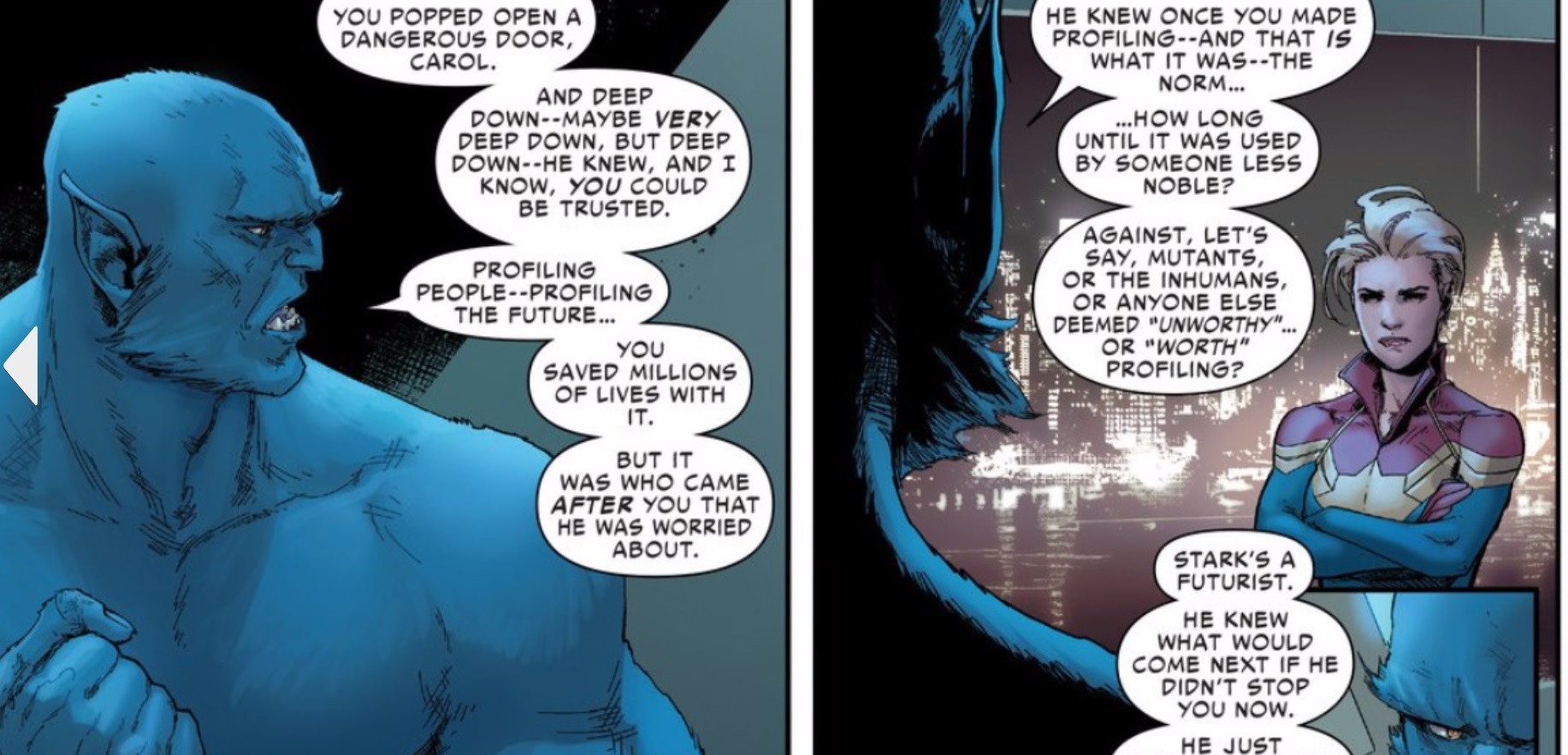
In the 00 and 0 issues that I read, I remember being confused that Thanos robs banks now. That's what I remember happening in the two issues that I read:  there's an Inhuman who can tell the future named Ulysses or Samson or something like that; Marvel's trying to make the Inhumans happen (which will *never* happen) for business reasons; Thanos showed up to rob a bank or something, carrying machine guns, which is not how I remember that character ever acting, I thought he was more a Space Dictator, but I guess...???; there was a fight; and then a couple weeks later, I was talking with a friend, and they said "oh, James Rhodes got black-rificed in that fight because one of the squiggles in the 00 issue was the minority dying so that the white characters could experience emotions" and I went "I didn't even realize that had happened when I read it-- are you being for serious?", and apparently he was.  So, that's all I remember about those two issues, but I think it's enough where I don't have to revisit them for this re-read.

Also worth noting: for that first Civil War series, the Marvel superheros being written out of character turned out to be a feature, not a bug.

2) Is this fun?  Are the fights cool?  Am I seeing cool shit go down?

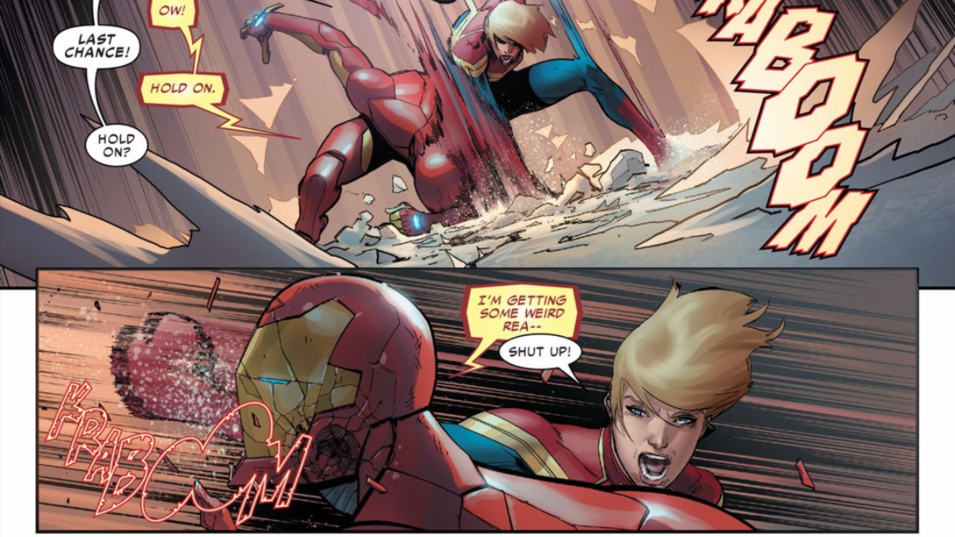
It's a superhero civil war-- somebody's probably going to get punched, I'd figure.

Though, once your eyes get old, and you get weary of this world...

For me, most mainstream fight scenes just started to look like ... drawings of characters in "classic fight poses", but with the poses placed close enough to other characters in "Classic fight poses" so as to resemble characters fighting. As opposed to drawings of two characters actually engaged in a struggle, where the artist seems cognizant of both characters having their own weight, gravity, momentum, impact, etc.

Set aside manga.

The fights I remember in mainstream comics, the fun part was watching how characters would use their superpowers against one another -- Riptide spins his body and flings out shurikens, but Colossus uses his metal skin to withstand that long enough to break his neck.

Or if not that, then there'd be a scale to the proceedings-- Wonder Man and Hyperion punching each other into the sun, while an army of dead superheros fights the living to keep the galaxy from exploding.

But cut to modern comics, cut to me being gross and old, without vim or vigor, and I felt like I was just seeing characters drawn with their arms out in punching gestures near other characters drawn in slightly different punching gestures.  

That had become "enough", if there were just enough of those characters drawn onto a page.

But look, is this the only criteria to judge fun?  Of course not.  Other things can make a series like this fun: cliffhangers; character turns; "Everything is different now" status quo changes.

So, let's see what we got!  Shoe money tonight!

3) Is this purely an editorial product or are Bendis's themes discernible in the mix?

At this point, the question of whether or not Bendis has written a "good comic" is especially meaningless. They made a Netflix show of one of his comics that won a fucking Peabody, and he got to go to the Peabody's (!). This life's a game, and that dude's played the game well, man. (And I think he's deserved his success-- he worked very hard for it, anyways.)

So now that he's had this whole career, whether one comic is good or not doesn't seem all that Life-or-Death.  But what strikes me as interesting is you can now see this entire career of him exploring and reexploring particular themes and go "oh how does this fit into that"...

More specifically, Bendis's career-long obsession is characters negotiating situations where the Old Systems don't work anymore-- characters either choosing to redefine themselves because of their exhaustion with the old status quo, or having new status quos thrust upon them.

And from the beginning of his career (Kingpin getting stabbed by his underlings; Ultimate Spiderman confessing his identity to Mary Jane, etc.), that's been his focus, moreso than on plots or fight scenes or anything traditionally "of comics".  He has always made dominant the experience of watching character try to think their way through shifting status quos, usually out loud.

He has a total interest in the chaos and creative possibility of a certain kind of instability (though significantly less interest in the moments after that initial liminal moment, in resolving his changed status quos, which can create a certain frustration with his work).

So, yeah: how does Civil War II fit in that?

Civil War II would seem ideally suited to be in keeping with that theme. "Here's a new status quo, some characters like it, some don't." But we know he has to answer in this same comic to editors, marketing, line-wide publishing plans, machinations perhaps greater and more ridiculous than we are meant to know.

So: who won? Who won the Civilest War of them all?

4) What went wrong? Why is this the "Bad Crossover?"

Spoiler warning:  "Here at ICV2, we've certainly been hearing about significant pull box abandonment by comic store customers over the past few months[.]"

I haven't been following the "Comics News" too closely but the impression I've gotten is this crossover was particularly badly received. This was the "Bad crossover" -- so bad that people started wringing their hands about the future again.

Why?

What made this worse than Siege? Fear Itself? The Lanterns of Arbitrary Character Death (I forget what that one was called)? Those were all fucking terrible. All crossovers to an extent stink because of how often the story gets smeared out across multiple books, rather than a team creating a strong dominant title that creates a possibility space for spin-offs (which I thought was the obvious strength of that first Civil War).

I think crossovers and the "creative environment" they result in is noxious and tends towards ripping off fans, plus more troublingly, stunting the growth of other creators. But I've thought that for years and years, and that didn't stop dumb-sounding shit like Avengers vs Xmen from selling.

So, what happened here?? What changed? Why is the bad one?

I'm pretty excited about finding out!

5) What's going on with this comic politically? Intentional messages? Unintentional messages?

The history of these crossovers is pretty fucking gnarly.

Well, the first Civil War at least ended with fascism triumphant because progressivism decided that opening up a meaningful dialogue with Nazis was better than punching them the fuck out. Liberal readers got to enjoy the fantasy of having an unearned smug sense of superiority while avoiding engaging with the world with anything more than empty talk; right wing readers got the fantasy of wielding unchecked power to control their world, even though the brazen stupidity of their ideas should've given them at least some pause; everybody got what they wanted...? Oh, this was all horribly cynical, but "Mark Millar Comic Discovered to be Cynical" -- that's too edgy an insight for a lowly comic critic like me; I haven't earned those stripes yet, not yet.

My memories of Secret Invasion are a little more tinged with anger, one that hasn't gone away. Not so much because of how that comic was about how righteous it'd be to violently suppress an evil religious minority who've infiltrated your society, or how the only downside of doing something as completely warranted as that would be that it could lead to a fascist demagogue seizing control at the end of that conflict. That's not ... not really great stuff, but I get what happened there --  they assumed who their reader was, what the Default Human Experience was, and proceeded accordingly.  I was a brown person reading comics before comics started pretending it wanted brown people to read comics; so, that's just not some surprising thing to me.

No, the part that's never stopped bugging me, all these years later, is there was a one or two page scene of the comic lecturing protesters for being naive, for naively supporting the civil rights of religious minorities. I think protesters are fucking heroic, and responsible for great social achievements (the end of child labor, women having the right to vote, the 40 hour work week, civil rights, etc.), so found it very unsettling for a fiction purportedly about heroism to attack actual heroism.  And that whole scene has really magnified in my mind given the way the world has gone in the last year. Now that the chips are down, superheros ain't coming to save anyone-- Hillary Clinton's too busy cough-fainting in the woods. All you see saving people is each other, massive groups of people responding to calls for help, coming out of their homes, standing with one another because they know nothing changes for the better without them.

So I'm especially uncharitable to the memory of that comic, at the moment, as it has only become more goddamn contrary to the thing keeping me sane anymore, as the years have gone by.

But look, years have certainly gone by: those two crossovers were a while ago-- nearly 10 years ago on Secret Invasion (!). Those were long before Marvel decided to sell itself as a company that panders to woke youths instead of pandering to charisma-free loners. Sales strategies evolve. Maybe people's philosophies evolve, too, maybe-- it'd be awfully nice to think so.

Civil War II should be interesting because it was created on the cusp of a whole mess of shit, changes that I don't think anybody can really lay claim to having their head wrapped all the way around; created by people who at the time were at least selling themselves as liberals since it was advantageous for them to do so -- but at a time when I think a certain kind of liberal was plainly telling themselves fairy tales.

So: I'm curious what all seeps in. If anything!

6) Is there anything-- anything!-- interesting at all about the presentation?

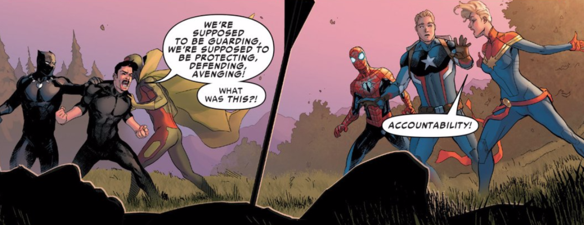
I'm just going to tell you my pet peeve, before we read this thing. It's a thing I noticed and once you notice, you can't stop noticing it. But when comic-drawing dudes and dudettes don't really have chops in laying out pages, they all pull the same move to avoid having their comics be extra-fuck-boring to look at.

They do widesceen panels-- which are the most boring fucking things on earth; how someone with zero imagination whatsoever draws comics-- but then in order to spice up the proceedings, they just have one character vertically take up two widescreen panels.

Here, I'll do a little drawing to show the kind of layout I mean:

I. Hate. This. Kind. of. Layout.

Because once you start noticing people doing it, you can't stop noticing it. Because some people, this is their ONLY MOVE.

I mean, it's a cute move-- I get that it "works." I don't know if Wally Wood put it in 22 Panels that Always Work, but sure, fine, it works, fine. I just hate it anyways. I hate it. I hate it so much. Irrationally? Very well-- irrationally.

But it's become the thing I look for now when I look at comics from this sector of the business-- "do they draw pretty but then hide their lack of storytelling chops behind this one whole move?" I say that out loud. In a comic shop. Scaring children.

I hate it so much.  Have more than one move!

So, I want to see a fun layout.

BARBECUE!

But we'll see. We'll get what we get!  I got a clock on me, so what gets said is what gets said.  If you got two cents about the issues we're going to be reading, you can toss 'em out.  And let's circle back at 3pm, for ...

Excitement!

Thrills!

Issues 1 and 2 of Civil War 2!

Sunday Barbecue!

"I Guess You Could Call It An EYEFUL SORE!" COMICS! Sometimes That Joke Isn't Punny Anymore!

Bit of a hybrid this time out. It’s a little bit European and a little bit American. Something for everyone! Also, Batman! Everyone loves Batman! Unfortunately it’s kind of terrible. But, wait! I’m getting ahead of myself…  photo BMEbossB_zpsloq7avqs.jpg BATMAN: EUROPA by Parel, Camuncoli, Casali, Azzarello and Brosseau

Anyway, this…

BATMAN:EUROPA #1-4 Art by Jim Lee, Giuseppe Camuncoli, Diego Latorre and Gerald Parel Layouts by Giuseppe Camuncoli Written by Brian Azzarello and Matteo Cassali Coloured by Alex Sinclair Lettered by Pat Brosseau BATMAN created by Bill Finger with Bob Kane DC COMICS,$3.99 each (2015-2016)

 photo BMEcoversB_zpsc5sy1vpu.jpg

Tellingly the most interesting thing about BATMAN: EUROPA is its appearance some ten years and change late. Announced in 2004, the series finally slouched out in 2015. What? Yes, Jim Lee is involved. However did you guess, Holmes! I guess Jim Lee struggled to find the time to draw an actual comic in between his high level corporate gig of wearing baseball caps and smiling his sunshiney smile. Maybe it’s unfair to blame Jim Lee though, maybe it was Brian Azzarello who was busy earning more money than I’ll ever see, vigorously, and ill-fatedly, palping the withered dugs of Frank Miller and Alan Moore in an attempt to express one last squirt of milky, milky cash; all for a company so bereft of ideas they mistake having Batman fight Rorschach for creativity. Or maybe it was one of the other folk involved that we’re not interested in because they sound a bit foreign and haven’t made awesome comics like, uh, that one that’s only any good because Eduardo Risso drew it, or whatever comic it is that makes people like Jim Lee’s scratchy tedium. (If you really need to like an artist who works at the pace of tectonic shift then I still think Barry “Windsor” Smith’s your best bet.) I don’t really know Matteo Casali but I hear Matteo Casali has written some Dylan Dog comics I’ve never read, so maybe he’s a byword for tardiness; maybe our continental chums are all like, “Dylan Dog would be a good comic if only it ever came out. Damn Matteo Casali’s eyes! That Mateo Casali makes Jim Lee look like a Japanese Rocket Train. Mateo Casali! Pah!” Ah, but do you want it now or do you want it right, someone who thinks I don’t know a diversionary tactic when I hear one is saying. Look, the Sistine Chapel ceiling took Michelangelo four years. Four years. Therefore it took DC Comics six years longer  than it took Michelangelo to paint the Sistine chapel ceiling to produce a comic about Batman in Europe. I don’t know about you, but I’m thinking that a Batman in Europe comic that takes 10 years had better be some brand new high in Batman comics, if not a fresh peak for the very medium of comics itself. It isn’t.

 photo BMEmime_zpsbbrd5z15.jpg BATMAN: EUROPA by Camuncoli, Casali, Azzarello and Brosseau

Unsurprisingly BATMAN: EUROPA is mostly set in Europe. And so it’s called EUROPA, which sounds a bit like Europe. But I don’t know why it’s specifically called “EUROPA”, since that’s the website for the European Union (which we aren’t to speak of lest we be hung, drawn and quartered for Treason against Brexit Britain. TAKING BACK CONTROL!!!!) Or maybe Brian Azzarello thinks people in Europe all put ‘a’ on the end of words; like Italians in an old Chris Claremont comic (“I-a welcome-a you-a to-a Europe-a, Bat-a man-a! Bella! Bella!”) Anyway, whatever, as the kids are wont to spout. Or maybe it’s one of Brian Azzarello’s “amazing” puns (e.g. it’s Brian Azzarello on Batman, he probably got paid a shitload so EUROPA it’s good. Geddit! EUROPA it’s good! Diamonds, baby! Diamonds.) I should probably move on now, since I don’t get to be ten years and then some late; you know, like professionals do. BATMAN: EUROPA  is  four issues, each set in a different European city (Chisinau, Podgorica, Heidelberg and Chichester; no not really, it’s Berlin, Prague, Paris and Rome), each has a different European artist and, uh, that’s it. Well, except for the first issue which starts in Gotham, which is in America, which is not part of Europe, (also, it's not real) and so has Jim Lee tepidly involved before the series flings itself across the Atlantic to Berlin where Camuncoli picks up his pen. The premise, or the (inch) high-concept if you must, is: The Batman and The Joker are both infected by a deadly virus and have to team up and travel round Europe for a cure. And so EUROPA starts off with Batman and The Joker rolling about on the floor all bloody and kind of weightlessly sketched in that way Jim Lee will continue to do for the rest of his stint on the book. Hey, Jim Lee fans, does Jim Lee have some kind of clinical aversion to suggesting weight in his art? I’m just asking; he’s clearly talented, but everything looks too samey, and this together with the failure to allot weight to any of his visual elements just leaves his work looking like half-hearted sketches. I don’t mind Jim Lee’s art, but I’m not all that excited by it, basically. I see a picture of Jim Lee smiling in his latest baseball cap and I don’t begrudge him, you know. Equally though, I don’t get all tingly round the prepuce when I see his name.  Despite Lee’s signature dreariness Azzarello/Casali try to create a mood of finality about this opener as though this time Batman will have to do the ultimate and…smash cut to splash page flashback! Ooh! What could it be? Four very disappointingly written issues will have to pass before you find out. And it’s not a bad punchline, but really four issues of set up require a punchline with a lot more, uh, punch.

 photo BMEcroc_zpsisrzrw84.jpg BATMAN: EUROPA by Lee, Camuncoli, Casali, Azzarello, Sinclair and Brosseau

You heard me right, pilgrim, four issues! Four issues this bumptious thing is! Four whole issues! Back when you could hate women openly in the street, this whole Batman and The Joker in Europe device would be the kind of throwaway gimmick Bob Haney would do in 22 poorly coloured pages of The Brave And The Bold, probably with some Jim Aparo goodness to boot. You know the kind of goofy borderline racist awesome that would result, but let’s go through it anyway because I’m fighting off sleep just thinking about this Mogadon® of a comic. In a better world, in a Haney world, in Paris they would face stripy jumpered, beret sporting thugs armed with onion bolas ; in Rome they would be homicidally wooed by stiletto armed lotharios; in Berlin they would attend an Einstürzende Neubauten concert (Blixa would be felled by a rogue blow and The Joker would have to chip in on “Keine Schönheit (ohne Gefahr)” to thunderous applause) and foil the cloning of Hitler’s dog, Blondi; in London they would discover it had all been a plot by Oliver Cromwell’s great, great, great, great, grandson, Barry; and it would all end with Buckingham Palace being attacked by bowler hat helicopters, the narrow averting of the assassination of King Henry XXIV and the escape of Barry Cromwell into a sudden pea-souper, only for him to be killed in a bitterly ironic last panel by a passing Jack the Ripper. The antidote would turn out to be a nice cup of tea and a biscuit, and all the while the Joker would go “Hoo! Hoo!” a lot. It would in short be very silly, not a little casually racist, and a ton of fun. Because Bob Haney comics were very silly and a lot of fun. Bob Haney not only survived the battle of Okinawa (01 April 1945), he also wrote the best Batman: Brave And The Bold comics ever; talk about The Greatest Generation! But Bob Haney was Then and this is Now, and North American genre comics are nothing if not needlessly po-faced, drab and kind of, well, insipidly joyless these days. Say, I bet Bob Haney wished he’d been 10 years late to Okinawa, but he didn’t get that option. Not everyone gets to be 10 years late. Hey, don’t get me wrong, I’m not saying today’s comics writers would benefit from passing through the fiery hell of Okinawa. Mind you, I’m not exactly ruling it out either.

 photo BMEbrute_zpsjkma6dr6.jpg BATMAN: EUROPA by Latorre, Camuncoli, Casali, Azzarello and Brosseau

We’re all busy people so let’s not beat about the bush here; the writing is just bloody poor. The plot is a mere wisp of a thing and the actual events clinging weakly to it are so deeply unthrilling that they barely register. At one point there’s a giant robot for not much of a reason, and all it makes you think is, I wish Bob Haney was writing this. I love me some Bob Haney but I shouldn’t be missing him so hard in 2017. I mean, I won’t lie, I can’t even remember what happened in this comic it’s so relentlessly leaden. I remember a human plot shortcut in the form of a lady hacker. She hasn’t got any character as such but I remember her because at one point she is wounded and Batman leaves the Joker to tend to her. Guess how that works out. I guess they never bill him as “Batman – The World’s Greatest Judge of Character”  with good reason. Ooh, there’s a mystery villain behind it all! Yeah, that reveal had all the dramatic weight of a meringue in space. I thought it was KGBeast, but I just checked (professionalism!) and it wasn’t. That’s how exciting it was. I’ve forgotten who it was again. As for motivation, well, I don’t know. Sure, killing Batman is kind of on any decent Bat-villains to-do list, but The Joker? You’d hand feed Cujo before you got that looney tune involved. And why such a needlessly protracted and highly unlikely method? I think the idea is the virus gives them a reason to follow a trail of, cough, clues so that by the end that are all tuckered out and the Guest Villain can best them. It’s a Bob Haney plan in its unlikely roundaboutness but it’s played like it’s Shakespeare. Bob Haney’s Macbeth, now there’s a thought to conjure with. Probably about a jillion times more entertaining than Azzarello/Casali’s Batman. But it’s not just Batman, it’s Batman and The Joker! “Hoo!” and indeed “Hoo!” Yes! Batman and The Joker together! Like Bing and Bob in on The Road To Europa! What a gift to a writer. Think of the cracklin’ dialogue and sinister mind games you could fill the pages with. Having to trust your life to a man who can’t even trust himself! It’s the very stuff isn’t it? The premise practically comes with a bow tied round it. Time to get your Shane Black on. More like bloody Shane Ritchie. Predictably enough nothing memorable occurs and it’s all largely page wasting, occasionally enlivened by a coughed up furball of facts about whichever city the undynamic duo are in. Basically the interaction is about as vibrant and electric as that of a long-married couple on a lengthy coach trip. Odd, isn’t it what with all these master dialogists in comics that there’s very little masterful dialogue around. Some people have an ear for dialogue, but most people in comics seem to have an arse for it; and more than one of those people are called Brian. But I digress.  Frequently and with great vigour.

 photo BMEgravesB_zpssjqvrzrh.jpg BATMAN: EUROPA by Camuncoli, Casali, Azzarello and Brosseau

The art’s okay, sometimes it’s even really, really good; these guys are all Eurotalents after all; and I don’t want to upset anyone in North American genre comics, but the bar for art seems a bit higher abroad. True, I don’t want to upset anyone, but since it’s true I don’t actually mind upsetting anyone. Giuseppe Camuncoli is a known known since he drew much of Peter Milligan’s underrated run on Hellblazer. As ever his art here has a pinched and repressed air which I enjoy, and everyone looks hungry on a really deeply unpleasant level that goes way beyond the appetite for food. Creepy, in sum. His colours are a bit heavy and rob his images of energy but as individual images they are certainly pretty. But comics is all about the sequential image and he dips a bit there with a lack of flow. Diego Latorre is, sadly, not the Argentinian footballer known as the “New Maradonna”, but is still impressive in a murky way. Maybe too murky. He makes up for the murk with an experimental brio that makes it look like he's running a sizeable charge of electricity through his panels. Alas, I was more impressed than seduced by the effect. If you've ever had a migraine (no not a headache, a migraine!) then you'll probably agree that Latorre has successfully represented that visually here. Arresting stuff but maybe a bit too much so. Gerald Parel is less than fresh to me as he also illustrated the original Iron Man graphic novel I looked at HERE. He’s gone for a really lush and soft edged look. It’s a kind of accumulation of colours blossoming across the page without the hindrance of holding lines. I liked this smeary expressionism just fine, but I can’t shake the suspicion that this is what sight is like when cataracts start to kick in. He gets some real beauty going though, I'll give him that. And then there’s stolid old Jim Lee, cap at a jaunty angle and smiles for miles. His art’s boring though. Yet what does it matter how good any of these artists are when the writing’s as weak as a politician’s excuses. Your eyes feast on an image only to be brought up short by the Joker alluding to pissing on a woman (my, how edgey!) or a pun as poor as it is predictable (“Vaud-Villain.” Yeah, really). Here's the big secret about puns: they should be used sparingly, otherwise it's like reading a lushly illustrated Christmas cracker joke.

 photo BMEmlisa_zpsvwffvsvu.jpg BATMAN: EUROPA by Latorre, Camuncoli, Casali, Azzarello and Brosseau

BATMAN: EUROPA is not a good comic. The first three post-splash pages (or whatever; I’m not checking) consist entirely of Batman smacking Killer Croc about. This is excellent stuff, but only if the script directions asked for as unengaging a depiction of violence as possible, and the artist was asked also to ensure that the location was never identified beyond some rudimentary lines suggesting bricks, maybe a wall if needs must, a trash can if absolutely necessary. I think they are fighting in an alley in this scene, but if so, it’s an alley with remarkably elastic dimensions. Azzarello/Casali seem to think alleys are odd in a city based on a grid, and they draw special attention to this in the reliably problematic narration. However, alleys are only odd in a grid based city if the city in question is New York; a city notable for its scarcity of alleys due to the Commissioner’s Plan of 1811 omitting rear service alleys. Gotham is often taken as a stand in for New York sooooooooooo, okay, but I’m not sure many people have any clue about the distinctive absence of alleys in New York City, and this is Gotham so it could have loads of alleys, you know, what with it not being real and people making up its geography on the fly; so I don’t know why it needs special mention, particularly as by way of contrast no mention whatsoever is made of why Batman is smacking Croc about. What I’m getting at is, the storytelling priorities here are all skew-iff, basically. Sure, there’s mention, as Croc is loaded into an ambulance, of “victims” but of what? Usually Azzarello has Croc eating people because – EDGY! And sometimes crocodiles eat people or something. Christ alone knows what Croc’s been up to this time because Azzarello/Casali don’t deign to tell us, despite having had three pages to do so. Instead they keep telling us the same thing: Batman is off his game. It’s a good job they tell us, mind you, because there’s no particular visual indication of this fight being any tougher than any other Killer Croc and Batman fight. It’s not good comics, in essence. Unusually for comics where the art often picks up the writer’s/writers' slack all parties are at fault here; it’s  a failure on two fronts. I don't know exactly what's happening and I have no idea why it is happening. It's like being at work! Presented with a visual spectacle as tedious as this a writer might attempt to punch things up with captions; maybe give it some context, some stakes, at a bare minimum some reason for the scene to be occurring. I guess that’s beneath Azzarello/Casali as what they supply instead is a load of sub-Miller tough-guy guff, which takes a whole lot of space to say very little indeed. It’s difficult not to imagine that the Azzarello/Casali team isn’t itself undermined by Azzarello’s compulsive need to avoid crafting a clear sentence, so much so here that it occasionally makes you think it’s a particularly poor translation from another language (any other language). That’s the first few pages, I’m not going on through the rest of the comic but, be warned, I could do because it’s not very good.

 photo BMEreally_zpsnioiysik.jpg BATMAN: EUROPA by Lee, Camuncoli, Casali, Azzarello, Sinclair and Brosseau

BATMAN: EUROPA, then. Bit like that time you went inter-railing round Europe with your mate, but you both got the trots and fell out just past Rouen after someone (naming no names, Terry Blesdoe) was sick on your copy of Camus’ The Outsider (US: The Stranger), and you had to suffer each other’s sulky presence for the remainder of the trip because you’d booked everything in advance. And your train was ten years late. Yeah, a bit like that, but BATMAN: EUROPA is, quite possibly, if anything even less thrilling. I’ve read some of them there European comics and, while there is a variety, mostly I think I’m safe in generalising wildly and saying that European comics can tend towards the grandiose, with large pictures and outsized ideas which kind of sweep past in a lustrous rush, one you have to plumb for meaning at a later date. It’s this kind of Euro comic BATMAN: EUROPA seems to seek to emulate. But Batman isn’t The Metabaron. And Brian Azzarello/Casali aren’t Jodorowsky. And Moebius is dead, baby. Moebius is dead. Four issues of big pictures and tiny ideas is what you get. Um, but some of the pictures are nice. I’m uttering a very Continental – “EH!”

 photo BMEnotB_zpssfxnl4pr.jpg BATMAN: EUROPA by Parel, Camuncoli, Casali, Azzarello and Brosseau

NEXT TIME: We talk about the elephant in the…road? Ah, it must be the how you say – COMICS!!!

Arriving 3/1/17

The first shipping week of March is also the first! How serendipitous! And what a way to start a month! Jeff Lemire launches his new book, ROYAL CITY, plus Marvel unleashes the oft demanded America Chavez solo title, AMERICA! Check the cut for the rest of the new books this week!

ADVENTURE TIME #62 AGENTS OF PACT #1 ALL TIME COMICS CRIME DESTROYER #1 AMERICA #1 ANIMAL NOIR #1 AQUAMAN #18 AVENGERS #5 BALTIMORE THE RED KINGDOM #2 BATMAN #18 BIG TROUBLE LITTLE CHINA ESCAPE NEW YORK #6 BRAVE CHEF BRIANNA #1 BULLSEYE #2 (OF 5) CEREBUS IN HELL #2 CHAMPIONS #6 CINEMA PURGATORIO #8 CLONE CONSPIRACY OMEGA COSMIC SCOUNDRELS #1 (OF 5) CYBORG #10 DC COMICS BOMBSHELLS #23 DEADPOOL #28 DEATH OF HAWKMAN #6 (OF 6) DOCTOR STRANGE #18 DOCTOR WHO 9TH #10 DREGS #2 EVERAFTER FROM THE PAGES OF FABLES #7 EXTREMITY #1 FAITH (ONGOING) #9 FALL AND RISE OF CAPTAIN ATOM #3 (OF 6) FLINTSTONES #9 FOURTH PLANET #4 GIANT DAYS #24 GOLD DIGGER #239 GOLDIE VANCE #10 GREEN ARROW #18 GREEN LANTERNS #18 HARLEY QUINN #15 HAWKEYE #4 INJUSTICE GROUND ZERO #7 INVISIBLE REPUBLIC #15 JAMES BOND #1 JUDGE DREDD ANNUAL #1 JUSTICE LEAGUE #16 KINGSWAY WEST #4 MIDNIGHTER AND APOLLO #6 (OF 6) MONSTERS UNLEASHED #4 (OF 5) MOON KNIGHT #12 MOTOR GIRL #4 MY LITTLE PONY ANNUAL 2017 #1 NAILBITER #30 NIGHTWING #16 ONCE AND FUTURE QUEEN #1 PAPER GIRLS #12 RAT QUEENS #1 RIVERDALE ONE SHOT ROYAL CITY #1 SAVAGE THINGS #1 (OF 8) SHADE THE CHANGING GIRL #6 SILK #18 SMOKETOWN #1 SPIDER-MAN 2099 #21 SPIDER-MAN HOMECOMING PRELUDE #1 (OF 2) STAR WARS #29 SUPER POWERS #5 (OF 6) SUPERMAN #18 UNSTOPPABLE WASP #3 WALKING DEAD #165 WOODS #30 X-FILES (2016) #11 X-FILES DEVIATIONS 2017

Books/Mags/Things ANIMOSITY TP VOL 01 CORTO MALTESE GN IN SIBERIA DEATH OF X TP FAITH HC VOL 01 HOLLYWOOD & VINE GLITTERBOMB TP VOL 01 RED CARPET IMAGE PLUS #11 (WALKING DEAD HERES NEGAN PT 11) KARNAK TP FLAW IN ALL THINGS LUCIFER TP VOL 02 FATHER LUCIFER LUMBERJANES GOTHAM ACADEMY TP NEIL GAIMANS MR HERO HC VOL 02 NEW AVENGERS BY BENDIS COMPLETE COLLECTION TP VOL 03 PREVIEWS #342 MARCH 2017 SHANG-CHI MASTER OF KUNG FU OMNIBUS HC VOL 03 SUICIDE SQUAD TP VOL 01 THE BLACK VAULT (REBIRTH) TALES FROM THE DARKSIDE HC TITANS TP VOL 01 THE RETURN OF WALLY WEST (REBIRTH) WALKING DEAD TP VOL 27 WHISPERER WAR WAYWARD TP VOL 04 THREADS & PORTENTS X-FACTOR EPIC COLLECTION TP GENESIS AND APOCALYPSE ZATANNA BY PAUL DINI TP

As always, what do YOU think?

"...Do Not Adjust Your Brains!" COMICS! Sometimes "M-O-O-N" Spells “Moon”, Despite What Tom Cullen Thinks.

Judge Dredd on the moon. That's it.  photo JDTMC80backB_zpsjqtgpmfb.jpg JUDGE DREDD: DARKSIDE by Marshall

Anyway, this…

THE JUDGE DREDD MEGA COLLECTION REVIEW INDEX

JUDGE DREDD: THE MEGA COLLECTION Vol. 80: DARK SIDE OF THE MOON Art by Paul Marshall, Peter Doherty, Laurence Campbell, Lee Townsend, Brian Bolland, Mick McMahon and Ian Gibson Written by John Smith, Rob Williams, John Wagner and Gordon Rennie Lettered by Tom Frame, Ellie De Ville, Tony Jacob and Simon Bowland Colours by Alan Craddock, Peter Doherty and John-Paul Bove Originally serialised in 2000AD Progs 47, 50-52, 57, 1017-1028 & 1468, JUDGE DREDD MEGAZINE 328-331 © 1978, 1996,2005, 2012 & 2016 Rebellion A/S Hatchette Partworks/Rebellion, £9.99 (2016) JUDGE DREDD created by Carlos Ezquerra & John Wagner

 photo JDTMC80CovB_zpsnc81obbr.jpg

JUDGE DREDD: DARKSIDE Art by Paul Marshall Written by John Smith Coloured by Alan Craddock Lettered by Tom Frame Originally published in 2000AD Progs 1017-1028

 photo JDTMC80RideB_zps23nzxosu.jpg JUDGE DREDD: DARKSIDE by Marshall, Smith, Craddock and Frame

The order of these stories are all to cock chronology wise. The earliest Luna-1 stories are later in the book. I'm not sure why that is but we start with another disappointing John Smith Dredd outing. All the more disappointing because there are some pretty nifty elements here, but it all fails to gel. Someone is murdering people on the Luna-1 colony, someone with Judge Dredd's DNA! Worse, old Stony Face is actually on the moon pursuing a perp while also accompanying Psi Judge Hassad who has had “premonitions of a premonition”, so it could actually be Dredd. In fact who else could it be? It's a really promising set-up, but Smith fails to capitalise on it and plays his hand far too soon. What you end up with instead of a murder-mystery is a lot of running about bumping into call-backs to older, better stories.

 photo JDTMC80HereB_zpsxdh6aw1o.jpg JUDGE DREDD: DARK SIDE by Marshall, Smith, Craddock and Frame

He's aided and abetted by Marshall's clean line and chunky directness, which in turn is lent pizzazz by Craddock's vivid colours, which include photographic elements. The colours give it an otherworldly touch and the art successfully casts everything in a serio-comic mode. But it's all for naught as the tale is torpedoed by Smith's failure to balance his disparate elements. Usually his blend of comedy and horror is jarring, but intentionally so. Here his hands are too heavy on the horror and the humour both; resulting in a tonal roller-coaster of brutal murders which keeps ploughing into the candyfloss stand of the overly broad comedy, because for some reason it's on the track instead of down below next to the boating pond. Some of this sense of humour failure stems from Smith's distaste for the Judicial System; having Dredd interrogated by a Teutonic sadist complete with monocle and duelling scars is slapstick rather than satire. Some of the sense of humour failure is...well, inexplicable really; Psi Judge Hassad's a step too close to the old “Dearie Dearie me!” stereotype for comfort, never mind comedy. (Later we'll see some more unfortunate stereotypes; being white, male and totes privileged I'm willing to give stuff from the '70s a grudging pass, but not from the '90s.) I get the impression John Smith doesn't enjoy writing Dredd much, which is fine, each to their own but unfortunately more often than not it ends up with the reader not enjoying reading Judge Dredd. That’s less than ideal. EH!


BREATHING SPACE Art by Peter Doherty,Laurence Campbell and Lee Townsend Written by Rob Williams Coloured by Peter Doherty Lettered by Ellie De Ville Originally published in 2000AD Progs 1451-1459

 photo JDTMC80DontB_zpsjybd90am.jpg BREATHING SPACE by Doherty, Campbell, Townsend, Williams and De Ville

Regular Squaxx dex Kano will know that in the comments we've been having a bit of a think about who “gets” Judge Dredd; it being a bit of a notable failure on the part of some Dredd scribes. Turns out it's a matter of opinion! Anyway, here we have a good way of avoiding that problem; Judge Dredd isn't in Breathing Space. It's a space-noir which uses the enclosed environment of Luna 1 to excellent advantage. The newly appointed Chief Marshal of Luna 1, Judge King, steps onto the lunar surface and straight into a mess of corrupt Judges, corporate backstabbing and...MURDER! In a nice tip of the space-fedora to SUNSET BOULEVARD the story starts with a dead man, and then we go back and see how he ended up there. It's not so much whodunnit as a whydidhedowhathedunnit. Any greater detail risks an eruption of the Thrill Suckers' ambrosia – SPOILERS!

 photo JDTMC80HelpB_zpsr7keu9ba.jpg BREATHING SPACE by Doherty, Campbell, Townsend, Williams and De Ville

For such a sweet read it's odd to find in the text at the back that Breathing Space had a troubled gestation. Due to illness Doherty (he got better; don't send cards) draws only the initial episodes but Campbell & Townsend pick up from him so delicately that you barely sense a switch in style. Although episodes appeared regularly, apparently it was written over three years (by which I mean there was a ruddy great hiatus in there, not that Williams' was honing it over a three year period like some kind of Joycean perfectionist; as good as it is it's still space-noir not ULYSSES, people), but you'd not guess as the pared down style reads smooth as a successful getaway. The consistency is helped no end by Doherty's continued presence as colourist; his use of a strictly limited and thoroughly muted palette sets a suitably sombre tone for the dour proceedings. The whole thing zips glumly along and Williams' intelligent plot is peppered with characters just the right side of caricature, there's some nifty misdirection and the vital plot point is rooted firmly in the “Dredd” universe. Placed as it is after Smith & Marshall's misfire of dayglo clowning the success of Breathing Space's restrained doom-mongering seems all the greater. There's no Dredd in it but it's still VERY GOOD!


Thus starts a brief run of the original Luna 1 stories. It's not all of them; just those with art by Brian Bolland, because everyone likes to remember when you would get weekly doses of Bolland Thrill-Power. Fat chance of that now. I'll burn through these, because they are from that period when Dredd was finding its feet as a strip. Any elements that have survived into the Dredd canon (NOT cannon; that's a thing that fires projectiles. Make a note of that.) are sparse, since even for a strip which delights in exaggeration as Dredd does, Wagner is so far over the top here he risks clipping the moon itself.

JUDGE DREDD: LAND RACE Art by Brian Bolland Written by John Wagner Lettered by Tony Jacob Originally published in 2000AD Prog 47

 photo JDTMC80LandB_zpsoymwcbqz.jpg JUDGE DREDD: LAND RACE by Bolland, Wagner and Jacob

The Land Race is a riff on the American West tradition of the first person to stake a claim on a piece of land getting to own it. (And by “people” I mean European immigrants; the native Americans were not consulted. I always like it when the Americans descended from European immigrants get all pinch-arsed about immigrants. Dunces.) Bolland has fun designing the vehicles driven by the prospectors, but the mayhem soon gives way to a protracted scene involving an old woman being mind controlled into signing her land away. Amusingly the bad guys are from Interstellar Psionics Corporation, i.e. IPC (the then publishers of 2000AD). There's also a panel of Judge Dredd's head in the corner of which is an X-Wing from the children's entertainment STAR WARS. I think this was to do with a Competition at the time; where you had to find these scattered through the comic to win...er...something to do with STAR WARS. George Lucas' bum fluff? I don't remember that bit; the prize. Unfortunately, we also see here the two Mexican Judges who are, uh, a bit stereotypical what with the sombrero, 'taches and the “Thees” and the “heem”s. Weird in that way only kids '70s could be Walter The Robot gets a girlfriend in the form of Rowena The Robot. Best of all though we discover that Judge Dredd's palate is so disciplined that he can tell the difference between man-made cookies and those made by a robot. Personally I think more should have been made of this and Judge Dredd hereafter is a lesser character without his cookie tasting skills. Trains not taken, eh? All these things are more interesting than the story which is just a lively entertainment, wonderfully drawn by Bolland. But there are worse things to be than entertaining and drawn by Brian Bolland so OKAY!


JUDGE DREDD: THE FIRST LUNA OLYMPICS Art by Brian Bolland Written by John Wagner Lettered by Tony Jacob Originally published in 2000AD Prog 50

 photo JDTMC80OlympicsB_zpseaq7mw8h.jpg JUDGE DREDD: THE FIRST LUNA OLYMPICS by Bolland, Wagner and Jacob

Not much to this one beyond Bolland's reliably exemplary art and a horrifically un-Dredd moment. Most of it is a lot of simple jokes about The Olympics. The Sov competitors are full of drugs, and the bits that aren’t full of drugs are mechanical; the high jump is very high because of the low gravity; etc etc. Wagner nails the commentators' voices, and the jokes are mildly amusing jokes, but to his credit it's all a feint because at strip's end Dredd starts a war with the Sovs by accidentally shooting a Sov Judge. It's clearly an accident and the Sovs are over reacting, but Judge Dredd? An accident? Get outta town. I think this is the first appearance of the Sov Judges and Bolland totally nails their appearance; so much so that they have barely changed over the ensuing decades. I particularly like the way their helmets echo those odd toppings on the Kremlin. I thought I might have to do a quick run down of The Cold War and how America and Russia's nuclear cockfencing endangered the whole world. Luckily I don't have to because Putin and Trump have brought it all back. Personally I'd have preferred the return of the Rubik's Cube but there you go, they didn't ask me. Some okay jokes and a super unexpected cliff-hanger, with Bolland's comical realism on top like a tasty Kremlin Onion, is OKAY!


JUDGE DREDD: LUNA-1 WAR Art by Brian Bolland Written by John Wagner Lettered by Tony Jacob Originally published in 2000AD Prog 51

 photo JDTMC80WarB_zpsm7vpwexh.jpg JUDGE DREDD: LUNA-1 WAR by Bolland, Wagner and Jacob

WAR! HUH! Oh, you know that song! In the future Luna 1 War tells us, “Wars today are NO LONGER FOUGHT BETWEEN VAST ARMIES, But by Combat units consisting of FOUR SOLDIERS and one reserve!” This idea doesn't last any longer as the duration of this strip (The Apocalypse War certainly seemed more substantial than a ruck in a pub car park.) but it is a good idea nevertheless. Dredd watches from the side-lines saying awesome things like “We're no better than The Sovs. They use war as an excuse to grab land – we treat it as a GAME!” I'm a-okay with eight year olds reading that despite how it may sound to sophisticated twenty year olds and up. So you can stop rolling your eyes, pal. Anyway, the Sovs are a bad lot so they spike the M-C1 reserve with a “Hypo-Dart”. Big Mistake. Judge Dredd dons a suspiciously Dan Dare-esque helmet and gives those unsporting Sovs' hides a good tanning. For two issues now we've had to “listen” to Wagner's excellently aggravating sports caster (Bolland makes him look like a certain Daily Planet stringer. Heh.) so on our behalf Dredd chokes him with his own mike, turns to the audience and spits, “War is POINTLESS. War is EVIL. WAR IS HELL!”. Hey, sometimes the truth doesn't need nuance. GOOD!


JUDGE DREDD: THE FACE-CHANGE CRIMES Art by Brian Bolland Written by John Wagner Lettered by Tom Frame Originally published in 2000AD Prog 52

 photo JDTMC80FaceB_zpsfhplo9lg.jpg JUDGE DREDD: THE FACE-CHANGE CRIMES by Bolland, Wagner and Frame

Unlike the concept of war as a 10 man sporting event, the idea introduced here would persist for the duration of the Dredd strip, causing no end of bedevilment for our future Lawman. It does what it says on the tin, this face-change technology. So here we start with a bank robbery by Laurel and Hardy with Charlie Chaplin, where the robbers evade capture after a bit of !presto-changeo! by being evacuated with the faces of the (3) Marx Brothers. Needless to say Bolland's art is every bit the perfect fit for the bizarre sight of dead 20th century comedians robbing a future bank on the moon. Luckily Judge Dredd has a somewhat unlikely knowledge of deceased 20th Century Comedians and quickly zeroes in on his suspects. Freed by their lawyer, who is a dead ringer for the famous actor and acromegaly sufferer Rondo Hatton, Dredd is left kicking his heels but..."TWO CAN PLAY A DIRTY GAME…!", and he doesn't mean nude Twister. This is a fast and fun one, with Bolland's realism coming to the fore to underscore the visual lunacy of what's going on. You know, VERY GOOD! Personally I feel more could have been made of Dredd's credulity stretching knowledge of 20th Century trivia; it could perhaps have been combined with his amazing ability to tell who cooked what he's eating in order to solve future crimes. On second thoughts we're just a touch of smug irony away from a Matt Fraction Image comic, so forget I said anything. The world doesn't need any more of those.

JUDGE DREDD: THE OXYGEN BOARD Art by Brian Bolland Written by John Wagner Lettered by Tom Frame Originally published in 2000AD Prog 57

 photo JDTMC80BoardB_zpsla2dvtbt.jpg JUDGE DREDD: THE OXYGEN BOARD by Bolland, Wagner and Frame

This strip is where the young John K(UK) was infused with a life-long detestation of the Free Market philosophy so beloved of soulless cankers who walk like humans. Regulation isn't the enemy, greedy psychopaths are. Sure, I know, I know, if we just leave the provision of services to find its own level no end of good will result. After all, human behaviour is improved no end by the possibility of earning ridiculous amounts of money without obstruction. And if you believe that fairy story/self justificatory pile of horse apples you probably think you can eat the moon on crackers. Anyone who has ever ridden a train in England or received a utility bill know that The Oxygen Board isn't just a possibility; it's inevitable. You also know that Free Market philosophy makes about as much sense as wearing hats made of shit. And if they could charge you for it they'd tell you that was a good idea too. And some of you would do it too. So, uh, yeah, on the moon, oxygen is piped in and billed and if you don't pay your bill...well, that's on you! It's a wicked and powerful punchline most writers would make much hay out of, but Wagner slaps it at the end of a tale of thieves who have robbed the very Oxygen Board itself. Their ironic comeuppance turns the whole thing into a darkly prescient parable. It's drawn by Brian Bolland too, and if that's the only thing that gets people looking at what is a tiny masterpiece then all the better. VERY GOOD!


JUDGE DREDD: FULL EARTH CRIMES Art by Mike McMahon and Brian Bolland Written by John Wagner Lettered by Tom Frame Originally published in 2000AD Prog 58

 photo JDTMC80TwuthB_zps2nlopliw.jpg JUDGE DREDD: FULL EARTH CRIMES by McMahon, Wagner and Frame

This one is better than its simple premise might indicate. On the moon people go loco at Full Earth like people are purported to do on Earth when the moon is full. We then get a conveyor belt of crimes punchily slapped down by the living genius Mike McMahon. It's a succession of funny future crime set-ups each followed by a Dredd-is-a-hard-bastard punchline. E.g Dredd saves a leaper but then gives him 90 days Penal Servitude for public nuisance. Wagner doubles down by having a lady bystander tell Dredd off, because the guy is clearly not the full shilling, only for Dredd to fine her 2,000 Creds for obstructing Justice. Then, with a poker face like iron, Wagner TRIPLES down and when she complains Dredd ups the fine to 4,000 credits. Actually, it is quite funny now I think about it. There’s a bunch of that kind of thing before Dredd goes home exhausted. It's just a string of jokes really, with the double page opening by Bolland and the actual meat of the story by Mike McMahon. Call me unstable but I will always have room in my mind for the final panel where Walter faithfully tucks a blanket around “Dear Judge Dwedd...” OKAY!


JUDGE DREDD: GLOBAL PSYCHO Art by Ian Gibson Written by Gordon Rennie Lettered by Tom Frame Originally published in JUDGE DREDD MEGAZINE #328-331

 photo JDTMC80GlobalB_zps9elxr4h8.jpg JUDGE DREDD: GLOBAL PSYCHO by Gibson, Rennie and Frame

Oh, thank Grud. We’re nearly at the end! Oh, you're all feeling the fatigue, what about me? I went to C**********d and back halfway through writing this (round about the Luna-1 War bit) because people think I have to contribute to the social life of the family or something! It was cold and windy enough to require my big coat too! Straight back with “school shoes” and here I have to go on about Gordon Rennie, while fielding black looks from the person cooking the tea. Anyhoo, Judge Dredd is outfoxed by a serial killer in a oner which sets up the somewhat chunkier one which follows on below. Ian Gibson draws in his kind of diseased kid's illustrator style and once again his colours are a delight of polished inkwashes. The most interesting thing for me with Global Psycho is the fact it shows a bum and a bit of tit on a killer's strung up victim. We didn't need a bit of bum and tit in my day! Not in Judge Dredd anyway. What we did our own homes was another matter. It's just a setting up strip so it's OKAY!


JUDGE DREDD: KILLER ELITE Art by Paul Marshall Written by Gordon Rennie Greytones by Jean-Paul Bove Lettered by Tom Frame Originally published in JUDGE DREDD MEGAZINE #328-331

 photo JDTMC80SltchB_zps4pyywvob.jpg JUDGE DREDD: KILLER ELITE by Marshall, Rennie, Bove and Frame

Gordon Rennie acquits himself quite well here; it helps he's given himself a strong premise. The psycho from Global Psycho is dying, but before she pops off she collects the galaxy's greatest murderers and has them all face off on the moon. The prize is the seat aboard an escape pod. It doesn't sound like much of a prize, but the complex will explode in sixty minutes and there is only one seat on the escape pod. Dredd's in there because he is after all “the greatest mass murderer in human history”; which by this point in his history is probably understating the matter. It's nice to be reminded how much blood is on Joe's hands every now and again. Particularly if you've recently watched him get tucked up snug by a fawning robot. A whole lot of mayhem ensues but to avoid it all getting a bit one-note Rennie builds the trap around Dredd so tightly that by the time he reaches the pod with another survivor you really don't know how he's going to get out of it. It's fast and fun, and if not quite as fast or fun as Rennie might think, it's fast and fun enough. The only let down is the art. While there's nothing wrong with Marshall's typically sturdy work, someone has made the (cost cutting?) decision to go for gray tones instead of colour. This makes it all a bit visually drab, so much so it starts to undermine the art. The swathes of gray don't allow anything to pop, even when you know what you are looking at should be popping like Space Dust on a pre-teen's tongue. But Dredd's convincingly Dredd, and Rennies' Most Dangerous Game is dangerous enough so GOOD!

DARK SIDE OF THE MOON shows that Luna-1 is whatever any particular writer requires of it; empty and forbidding in Breathing Space, noisy and garish in Darkside, bustling and crazed in the original strips and the moon is just, well, there as a deadly backdrop in Killer Elite. It doesn't really matter as the freedom allows all these different approaches; and while some work (Breathing Space) and some don't (Darkside) none of that's down to the setting. As a volume it's GOOD!

NEXT TIME:  Manners maketh the Judge, so says Judge Mum and - COMICS!!!

"NOBODY Calls Me CHICKEN HEAD!" COMICS! Sometimes I Hope You Brought A Clean Pair Of Pants.

Are you ready to quiver in horripilation at the future terrors accosting Mega-City One’s premiere lawman? No, well come back when you are.  photo JDTMC77backB_zpsqzvxsfzk.jpg JUDGE DREDD: THE HAUNTING OF SECTOR HOUSE 9 by Brett Ewins

Anyway, this…

THE JUDGE DREDD MEGA COLLECTION REVIEW INDEX

JUDGE DREDD: THE MEGA COLLECTION Vol. 77: HORROR STORIES Art by Brett Ewins, Ian Gibson, Dave Taylor, Mick McMahon, John Burns, Andrew Currie, Xuasus and Steve Dillon Written by John Wagner, Alan Grant, Gordon Rennie and John Smith Lettered by Tom Frame and Annie Parkhouse Colours by Chris Blythe Originally serialised in 2000AD Progs 359-363, 511-512, 1523-1528, 1582-1586 & 2005, JUDGE DREDD MEGAZINE 2.27-2.29, JUDGE DREDD ANNUAL 1981, JUDGE DREDD ANNUAL 1982 and 2000AD WINTER SPECIAL 1994 © 1980, 1981, 1984, 1987,1994, 2004, 2007, 2008 & 2016 Rebellion A/S Hatchette Partworks/Rebellion, £9.99 (2016) JUDGE DREDD created by Carlos Ezquerra & John Wagner

 photo JDTMC77CovB_zps2ifahwyf.jpg

JUDGE DREDD: THE HAUNTING OF SECTOR HOUSE 9 Art by Brett Ewins Written by John Wagner & Alan Grant Lettered by Tom Frame Originally published in 2000AD Progs 359-363

 photo JDTMC77CreeekB_zpsmntrb2po.jpg JUDGE DREDD: THE HAUNTING OF SECTOR HOUSE 9 by Ewins, Wagner & Grant and Frame

I know we've all wondered more than once what Shirley Jackson's The Haunting of Hill House would be like if it was set in Mega-City One. Well, The Haunting of Sector House 9 answers that pressing question. Apparently there would be a lot less sublimated sapphism and repressive social mores and a lot more mouths exploding from walls, zombies, disembodied hands and big men in leather shouting. On reflection it might not have that much to do with Shirley Jackson's timeless terror tome after all. It definitely has to do with Judge Dredd stolidly yelling things like "DAMNED if I'll give in to a SPOOK!" and Brett Ewins wonderful ability to draw warped flesh and matter splattered walls. I really dug this one on its first appearance way back when, there was just something unsettling about the sci-fi world of Dredd suddenly morphing into a barnstorming full-on horror flick. Wagner and Grant pace this demon baby just right with each chapter containing something icky and an incremental revelation of the solution to the mystery.  And they don't even cheat on the solution, it's not just "Well, I guess we'll never know. There are more things on heaven and earth than are dreamed of in your comportment, Judge Dredd." No, there's a proper (and very "Dredd") reason for all the poltergeisting about.

 photo JDTMC77MunceB_zpsayn5bnzn.jpg JUDGE DREDD: THE HAUNTING OF SECTOR HOUSE 9 by Ewins, Wagner & Grant and Frame

Much of the fun comes from Dredd's refusal to treat the supernatural any differently to a perp with a knife and an Umpty habit. Here he shares the stage with a couple of other Judges, most notably Judge Omar who has a turban so is, I guess, a Sikh. Although Dredd's world appears overwhelmingly secular there are still familiar religions (something Alan Grant would explore in his Judge Anderson strips; we'll get to those volumes. Patience.) Omar is also a PSI Judge. I used to think that a PSI Division was about as likely as a Healing Crystals Division (Judge Credulous, presiding) but over the years the strip has worn down my resistance, also it turns out fascists have a penchant for all that silly shit so, yeah, okay, PSI Division it is. Best used sparingly though, like nutmeg. The Haunting of Sector House 9 is good little thunder through spooky tropes with a satisfying pay off, but a lot of its success is down to the atmosphere and that's wholly down to Bret Ewins' art. Which is unfortunate, because these volumes reprint some very old strips, and I guess occasionally the original materials have gone AWOL. (Or Rebellion/Hatchette haven't bothered to source them.) In this  particular case the poor reproduction annihilates the delicacy of Ewins' line. Despite his art being all about blunt impact, a kind of brusque shove to get your eye's attention, there's always a surprising amount of detail in there.  Detail  that isn't served well by the heavy handed reproduction. You can still see all Ewins's trademarks through the murk; particularly those shiny, shiny Judge helmets. It's just a shame his crisp, clear linework is swamped by blacks for the most part. Despite this The Haunting of Sector House 9 is pulpy sprint of a thing adorned by the art of one of Dredd's more under-rated artists. GOOD!


JUDGE DREDD: JUDGEMENT Art by Ian Gibson Written by Gordon Rennie Lettered by Annie Parkhouse Originally published in 2000AD Progs 1523-1528

 photo JDTMC77WrongB_zpsn86warl6.jpg JUDGE DREDD: JUDGEMENT by Gibson, Rennie and Parkhouse

Here Gordon Rennie manfully struggles to give Dredd and Anderson a supernatural mystery to solve, and for the most part he is successful enough. A ghostly Judge is dispensing justice on the streets, which just isn't on, and so Dred investigates along with Anderson and SJS judge Ishmael. Judge Ishmael, er, has a beard, and contributes little to the narrative before just fading into the background. He's the kind of story flab a Wagner or a Grant would have excised completely, but not Rennie, alas. This unnecesary heaviness weighs the strip down, it all seems overly convoluted in order to get to where it's going. The pacing plods, in short. And Rennie is inconsistent in his spookiness. A ghost judge whose shell casings are material enough to be traced? Um, no. I have trouble believing in gravity so if you want me to be all-in on vengeful revenants you can't trip me up with stuff like that.

 photo JDTMC77BikeB_zpss7cf2b1q.jpg JUDGE DREDD: JUDGEMENT by Gibson, Rennie and Parkhouse

But it's not without entertainment and Rennie gets a couple of very good moments in there, such as when the gang boss realises he's just made a biiiiiiiiiiiiig mistake. And the mystery itself is pretty good, there's just the odd leadfooted moment which makes you pause just long enough to irritate. A bit of red pencil would have helped. It's close to good, but what hurls it across the line is Ian Gibson's phenomenal art. Or to be more precise Gibson's phenomenal colouring. Seriously, there's some crackerjack colouring going on here. Done in something resembling ink wash, the colours are a work of art in themselves. The indigo Ghost Judge really pops out from the world it is haunting. For that world Gibson chooses a really chirpy and upbeat palette with warm pinks, deep blues and jolly greens which, draped over his lithely curvaceous lines, create images so ebulliently cartoony they are a joy. In Judgement Rennie does okay, but Gibson raises things up to GOOD!


JUDGE DREDD: ROAD STOP Art by Dave Taylor Written by Gordon Rennie Lettered by Annie Parkhouse Originally published in 2000AD Progs 1582-1586

 photo JDTMC77HeadsB_zps2mbk3qna.jpg JUDGE DREDD: ROAD STOP by Taylor, Rennie and Parkhouse

Gordon Rennie again! This time Rennie picks up a bunch of genre cliches, each of which would be insufficient for a story this length and mushes them all together to create a kind of creepy comicbook rumbledethumps. And, I have to say, it's not half bad. Hmmmmm! For a bunch of reasons which can all shelter under the umbrella of Plot Convenience (which is much better than hunching under the bus shelter of Plot Contrivance) Judge Dred is stranded until a storm passes at a decrepit Road Stop with a serial killer, an assassin, a coach trip and several other cits. That's pretty good. But the Road Stop comes under attack from a mutant gang and, yes, and, the owners of the Road Stop have something hungry in the basement. It should be overstuffed but, credit to Rennie, it moves along with quite a bit of zip and not without a few surprises. There's never a dull moment, but then with that lot going on there shouldn't be. (Again, though, Mr. Editor should have pointed out that you don't tell someone who has just revealed themselves as an assassin that you would love to help them but you have to pack all this stolen money..oops, you're dead!) Fun for the most part, writing-wise.

 photo JDTMC77CommsB_zps8inzbrap.jpg JUDGE DREDD: ROAD STOP by Taylor, Rennie and Parkhouse

But the art? Grud on a Greenie! Who is this Dave Taylor! He's the Tip-Top Top Cat and no mistake! His art has a wonderfully European inflection and a super robust sense of physical dimension. He doesn't stint one jot on the characters or the locations either. The road house is wonderfully designed, with a real sense of novelty to every room, rather than a jaded sense of yes-I've-seen-Blade-Runner-too-it-was-forty-years-ago-can-we-move-on-now-please. And there's no stinginess with the character designs either. Most folk would have saved the robot with a monkey’s head or the electric-circuit person for their own projects. But here they are just part of a bunch of wild designs which get less page time than Judge Dredd's bike. Dave Taylor goes all-in is what I'm saying. I looked him up on Wikipedia and it turns out he's English so that explains everything. Apparently he also had a double hernia. I doubt that's the secret of his ridiculously good art though. Road Stop is solid stuff so GOOD!


JUDGE DREDD: THE FEAR THAT MADE MILWAUKEE FAMOUS! Art by Mick McMahon Written by John Wagner Lettered by Tom Frame Originally published in JUDGE DREDD ANNUAL 1981

 photo JDTMC77GiveB_zpsgxsw64rd.jpg JUDGE DREDD: THE FEAR THAT MADE MILWAUKEE FAMOUS! by McMahon, Wagner and Frame

In 1981 Judge Dredd got his own Annual! (Well, I guess in 1980 strictly speaking). This was pretty momentous if you were 11 years old, because that meant that Christmas would bring not only the 2000AD Annual but also a Judge Dredd one! (Family finances permitting; the ‘80s was a hard time for us, we had to let one of the planes go). North American genre comics have annuals too, but these are published too randomly to suggest anyone producing them actually knows what the word means, and are basically just fat comics. A fat comic chucked out intermittently is not an “annual”, North American genre comics! In Britain where we understand the value of routine and the meaning of words, Annuals come out just before Christmas, are magazine sized with hard covers and cater to a range of interests; sports, puzzles, etc and, yes, comics. The 2000AD Annual would bulk itself out with old reprints (one year I’m sure Rick Random Space Detective was in there. Rick Random! I’m sure Rick Random has his charms, but it was a bit like interrupting a kid’s party with a lecture on the Joys of Accounting. Rick Random isn’t exactly FLESH!) but IIRC Judge Dredd’s Annual was all new stuff. Even if it wasn’t, even if I’m wrong, it had an awesome Mike McMahon drawn strip (yes, this strip!) which took advantage of the big pages and extra length to really go Total McMahon.

 photo JDTMC77TimeB_zps1wqobnqa.jpg JUDGE DREDD: THE FEAR THAT MADE MILWAUKEE FAMOUS! by McMahon, Wagner and Frame

The story isn’t much; Dredd is chasing down a bad mutant hombre but comes unstuck when the Milwaukee dead rise up to exact revenge for their nuclear annihilation. It’s a bit of zippy fluff which gets by on the visual joke of the bad guy and Dredd’s refusal to give an inch in the face of a city of restless spirits. Mostly it's McMahon's show. McMahon’s art here is a summation of his “scabby” style, which he would immediately start moving away from, like the restless genius that he is. You can really see here his technique for making the most of his page count by creating pages within pages; that is, a group of three or four panels which are read together within the larger page on which they nestle. He really covers some ground like that, and it leaves him free to have a big image dominating the layout to boot. He also colours it like a gifted child armed with felt tip pens; if Lynne Varley had done it we'd all be shaking a tail feather over it. His pages here were so scrumdiddlyumptious that even an 11 year old could tell. I spent a lot of 1981 copying Mike McMahon’s art from the Judge Dredd Annual 1981 in biro on some wallpaper offcuts we had lying about (remember wallpaper?). Yes, I should have got out more. The Fear That Made Milwaukee Famous! is not only a pun on an ancient Schlitz beer advertising slogan but, drawn by Mike McMahon, it is thus VERY GOOD!


JUDGE DREDD: THE VAMPIRE EFFECT Art by Mick McMahon Written by John Wagner Lettered by Tom Frame Originally published in JUDGE DREDD ANNUAL 1982

 photo JDTMC77AlienB_zpsmec1cqul.jpg JUDGE DREDD: THE VAMPIRE EFFECT by McMahon, Wagner and Frame A space ship carrying alien life form samples crashes into Mega City one and an energy vampire is on the loose! The more it eats the bigger it gets and by the time it has eaten a few under-city dwellers it is pretty hefty and ready to chow down on Mega City One. Can Judge Dredd and his fascist pals stop it before it's too late? Yes, obviously. But how? Yeah, smart guy, how? There's not much to this solidly scripted effort other than a steady ratcheting up of the stakes and a pervasive sense of hopelessness, which is quite a lot really; and most of that is probably down to the art by Mike McMahon.

 photo JDTMC77DangB_zps7zripuxi.jpg JUDGE DREDD: THE VAMPIRE EFFECT by McMahon, Wagner and Frame

One year later and we can see just how much hunger McMahon's talent has for fresh artistic conquests. The man gobbles up challenges like the in-story vampire chows down on energy. Ravenously. His art still retains a grubby patina but is far more visually controlled now. There's a discipline in the straightness of lines strong enough for him to perch his more expressionistic tendencies atop them. The flare of Dredd's helmet is starting to reach the point where he'll be forced to enter rooms sideways, but the exaggeration is consistent with the larger landscape of visual hyperbole it inhabits; which makes it Art rather than a goof. Fret not, though, McMahon's art has lost none of its playfulness despite his apparent turn towards the stern. His colours are more subdued here with the odd pop of a green knee pad leavening the dourness, but there's still wit; see the negative colouring on people “bitten” by the vampire, and his refusal to make the vampire anything other than a blob speckled by colour. The reproduction here is a crying shame, tending as it does to the blurry. But The Vampire Effect is still drawn by Mike McMahon and so it is VERY GOOD!


JUDGE DREDD: HORROR HOUSE Art by John Burns Written by John Wagner Lettered by Tom Frame Originally published in 2000AD WINTER SPECIAL 1994

 photo JDTMC77HelpB_zps6lfd3mel.jpg JUDGE DREDD: HORROR HOUSE by Burns, Wagner and Frame

A one episode punchline strip in which Dredd has to rescue a kidnapped kid from an animatronic house of horrors. This is from a Winter Specuial which, unlike an Annual, is a fat comic released at seasonal intervals. Used to be we just had Summer Specials which were an awesome part of being a kid. Looks like we now have Winter Specials because profits in the third quarter are down, or whatever. I don't know, but I for one am not sitting on a Blackpool beach in my trunks reading Shiver'n'Shake in November, thanks. Must be getting old. So, yeah, the old lag John Burns (b.1938) has scads of fun with the different dioramas in the Mega-Tussauds’ of Terror, and my eyes enjoyed his lovely tides of colour breaking over the page. Burns’ style is very European, characterised by pin-sharp linework so awesome that he took over Modesty Blaise from Enrique Romano in the ‘70s. Burns was beloved by kids of the ‘70s for his art on the smutty newspaper strip George & Lynne, by the ‘80s he was blazing trails of awesome on the page for 2000AD, where his work embraced colour with a vigour that would make a vicar blush. I like John Burns’ art.  Unfortunately while the script’s punchline isn’t bad as such, it landed leadenly as I hadn’t realised there was anything amiss with Dredd’s behaviour. He’s not exactly chatty Cathy at the best of times is he now? Anyway, John Burns drawing Judge Dredd fighting things is always GOOD!

JUDGE DREDD: CHRISTMAS WITH THE BLINTS Art by Andrew Currie Written by John Wagner Coloured by Chris Blythe Lettered by Tom Frame Originally published in 2000AD Prog 2005

 photo JDTMC77SuggsB_zps6vg3lcrn.jpg JUDGE DREDD: CHRISTMAS WITH THE BLINTS by Currie, Wagner, Blythe and Frame

This is the finale of a long running storyline about Dredd failing to catch Ooola Blint, who is addicted to euthanasia-ing unwilling people, and her useful idiot of a husband, Homer. The problem with this series of mega-books is here we just get the end of the chase. Maybe the other bits are in other books, I don't know. Anyway, although robbed of much of its cumulative impact, the script is the usual drly comic Wagner effort wherein romance and murder become so intertwined it gets hard to distinguish between the two. At heart this is pretty sick stuff but thanks to Wagner's deadpan delivery this very sickness becomes part of the humour.

 photo JDTMC77MorganB_zpsmf6yanhi.jpg JUDGE DREDD: CHRISTMAS WITH THE BLINTS by Currie, Wagner, Blythe and Frame

Christmas With The Blints is more of a characer piece than an action piece so Currie has his work cut out for him. Fortunatley Currie seems to have a yen for caricature, so fun with faces is right up his street, and his “acting” is well up to snuff(heh!) for the duration. He does a particularly sweet Morgan Freeman whose sloping contours suggest the influence of the Master Caricaturist Mort Drucker, which is nice to see in a Dredd strip. It's a wordy episode but Currie keeps it interesting and his crisp, clean style is attractive if never eye boggling. Christmas With The Blints is GOOD!


JUDGE DREDD: THE JIGSAW MURDERS Art by Xuasas Written by John Smith Lettered by Tom Frame Originally published in JUDGE DREDD MEGAZINE 2.27-2.29

I really like John Smith as a writer, and I really, really like Judge Dredd as a character but I don't think John Smith writes a good Judge Dredd. The Jigsaw Murders doesn't change that opinion. Smith has his very own range of obsessions he rarely deviates from: body horror, fractured stream-of-consciousness inner monologues, creepy malefic beings whose reality can be a bit dubious and a rigid dislike of authority. This latter quality overshadows his more intriguing aspects on Dredd, because he gives the impression he's holding his nose whenever he has to write Dredd himself. I don't know how he gives that impression but he does. So what I do is, I just read it as a John Smith story and that usually works out okay. Here then I ended up reading about a serial killer who dismembers his victims to disguise his less than sane search for a replacement arm. This being a John Smith joint he rides about in an ice cream truck and is haunted by The Giggler, a creepy kid's toy, and is pursued by Judge Dredd, who looks like our Judge Dredd but is an inflexible asshole prone to bad one-liners. He's not as bad as Millar and Morrison's tone-deaf interpretation of Judge Dredd, but then at least here he's in a decent story which is something that pair never managed to conjure up. As John Smith stories go it's pretty good, there's a hilarious bit where the Jigsaw Killer finally gets his arm and it's all kind of icky and nasty like a good John Smith tale should be.

 photo JDTMC77ArmB_zps0zcrid7n.jpg JUDGE DREDD: THE JIGSAW MURDERS by Xuasas, Smith and Frame

It's illustrated by Juan Jesus Garcia, who likes to be called “Xuasus”, in a fully painted style which I like to call “mostly successful”. It's got some real heft to it thanks to Xuasus' penchant for lumpiness and there's a winning ugliness to everything, not least the characters. However, stiffness is an issue when he paints people in motion, and while it didn't entirely convince there was always the odd stand-out like the panel below. Interesting, I guess I'd go for. The Jigsaw Murders is pleasantly odd thanks to Smith's script and Xuasus', uh, heavy approach. So, GOOD!

 photo JDTMC77PeekB_zpstnrhq9fw.jpg JUDGE DREDD: THE JIGSAW MURDERS by Xuasas, Smith and Frame


JUDGE DREDD: THE BEATING HEART Art by Steve Dillon Written by John Wagner & Alan Grant Lettered by Tom Frame Originally published in 2000AD Progs 511-512

 photo JDTMC77BDumB_zpsdq88bw6d.jpg JUDGE DREDD: THE BEATING HEART by Dillon, Wagner & Grant and Frame

This is a little two parter, a playful update of Poe's “Tell-Tale Heart” which is amusing enough in its way, but is of note largely because of Steve Dillon's art. In 2015 comics lost Brett Ewins (see above) and in 2016 Steve Dillon died, which makes this volume a bittersweet read. It does provide a reminder that Dillon's sparky art could lift a trifle like this out of the filler category and up into GOOD! without breaking a sweat. Dillon may only ever have drawn one female face but he put atop it a cascade of Bizarre '80s hairstyles that would give a Studio Style executive a chubby, and while his décor could be minimal his pacing was precise. Best of all Dillon would always remember that it was Judge Dredd's strip and really nail his Dredd bits down hard. Ciao, Steve Dillon! Ciao, Brett Ewins! And thanks for all the Thrill-Power!

And as all the best horror stories end with a hand coming out of the ground…

 photo JDTMC77YouB_zpsxqt5nkxv.jpg JUDGE DREDD: THE FEAR THAT MADE MILWAUKEE FAMOUS! by McMahon, Wagner and Frame

NEXT TIME:  I'm not sure but probably Judge Dredd in some - COMICS!!!

Arriving 2/22/17

Final week of February is a BIG one! New DESCENDER, MONSTRESS, HULK, KAMANDI CHALLENGE and the debut of OLD GUARD from Greg Rucka and POWER OF THE DARK CRYSTAL from Si Spurrier! Plus the first collection of SNOTGIRL from Bryan Lee O'Malley and Leslie Hung! Check the cut for all the other fresh comics this week!

ACTION COMICS #974 ALIENS VS PREDATOR LIFE AND DEATH #3 AMAZING SPIDER-MAN #24 CC ASTRO CITY #41 AVENGERS #4.1 BACK TO THE FUTURE #17 BACKSTAGERS #7 (OF 8) BATGIRL #8 BATMAN 66 MEETS WONDER WOMAN 77 #2 (OF 6) BATMAN BEYOND #5 BEAUTY #12 BELFRY (ONE-SHOT) BLACK HOOD SEASON 2 #3 BLACK PANTHER #11 BLACK ROAD #7 BLUE BEETLE #6 CAPTAIN AMERICA STEVE ROGERS #12 CHAMPIONS #1.MU CLEAN ROOM #16 CURSE WORDS #2 DARKNESS VISIBLE #1 DEADPOOL THE DUCK #4 (OF 5) DEATHSTROKE #13 DESCENDER #19 DETECTIVE COMICS #951 DIRK GENTLY SALMON OF DOUBT #5 DISNEY PIXAR CARS #1 DIVINITY III STALINVERSE #3 DOCTOR STRANGE #17 DRIFTER #17 ELEKTRA #1 EXTRAORDINARY X-MEN #19 IVX FEW #2 FIX #8 FLASH #17 FOGGY NOTIONS FROSTBITE #6 (OF 6) FUTURE QUEST #10 GHOST RIDER #4 GREAT LAKES AVENGERS #5 HAL JORDAN AND THE GREEN LANTERN CORPS #15 HARBINGER RENEGADE #4 HELLBLAZER #7 HIGHLANDER AMERICAN DREAM #1 HOOKJAW #3 (OF 5) HULK #3 HULK #3 MORA VAR INFAMOUS IRON MAN #5 IVX #5 (OF 6) JIM HENSON POWER OF DARK CRYSTAL #1 (OF 12) JOYRIDE #10 JUGHEAD #13 JUSTICE LEAGUE OF AMERICA #1 KAMANDI CHALLENGE #2 (OF 12) LETTER 44 #30 LOOSE ENDS #2 (OF 4) MAYDAY #4 (OF 5) MEGA PRINCESS #4 MIGHTY CAPTAIN MARVEL #2 MONSTRESS #10 MOON GIRL AND DEVIL DINOSAUR #16 MOSAIC #5 MOTRO #4 (OF 10) MY LITTLE PONY FRIENDSHIP IS MAGIC #51 OCCUPY AVENGERS #4 OLD GUARD #1 OPTIMUS PRIME #4 OUTCAST BY KIRKMAN & AZACETA #25 OVER GARDEN WALL ONGOING #11 PATHFINDER WORLDSCAPE #5 (OF 6) PINK PANTHER SNOW DAY MAIN CVR PROWLER #5 CC QUANTUM TEENS ARE GO #1 REICH #1 (OF 12) REVIVAL #47 RICK & MORTY #23 ROCKET RACCOON #3 SCARLET WITCH #15 SCOOBY DOO TEAM UP #23 SERENITY NO POWER IN THE VERSE #5 (OF 6) SHE WOLF #6 SHUTTER #27 SKEPTICS #4 SLAM #4 SPIDER-GWEN #17 SPIDER-MAN DEADPOOL #14 SPIDER-WOMAN #16 STAR TREK GREEN LANTERN VOL 2 #3 STARSTRUCK OLD PROLDIERS NEVER DIE #1 (OF 6) STRAY BULLETS SUNSHINE & ROSES #21 SUICIDE SQUAD #12 SUN BAKERY #1 SUPERGIRL BEING SUPER #2 (OF 4) SURGEON X #6 TANK GIRL GOLD #4 (OF 4) TEEN TITANS #5 THANOS #4 THUNDERBOLTS #10 TMNT UNIVERSE #7 UNCANNY AVENGERS #20 VISITOR HOW AND WHY HE STAYED #1 (OF 5) WONDER WOMAN #17

Books/Mags/Things ADVENTURE TIME COMICS TP VOL 01 AUTUMNLANDS TP VOL 02 WOODLAND CREATURES BRITANNIA TP CADET ANDERSON TEENAGE KYX TP COSMIC ODYSSEY DELUXE EDITION HC CROSSED PLUS 100 TP VOL 03 DOCTOR STRANGE PREM HC VOL 03 BLOOD IN AETHER EC ARCHIVES VALOR HC ELEKTRA BY MILLIGAN HAMA AND DEODATO JR COMP COLLECT TP JAMES BOND HC VOL 02 EIDOLON JUGHEAD TP VOL 02 LAKE OF FIRE TP LEGEND OF ZELDA ART & ARTIFACTS HC MAD MAGAZINE #544 MISTRY PI TP VOL 01 OUTCAST BY KIRKMAN & AZACETA TP VOL 04 PIX TP VOL 01 ONE WEIRDEST WEEKEND RICK & MORTY LIL POOPY SUPERSTAR TP VOL 01 SERPIERI COLLECTION HC VOL 04 (OF 4) SNOTGIRL TP VOL 01 GREEN HAIR DONT CARE SUPERMAN BATMAN TP VOL 05 WOLVERINE VS DEADPOOL TP WONDER WOMAN TP VOL 01 THE LIES (REBIRTH)

As always, what do YOU think?

“My Diabetes Prevents Me.” COMICS! Sometimes It's A Theatre of Blood!

Hey kids! Who’s up for a heroically opaque fable about a vengeful castrato, illustrated in a darkly twisted melange of Gustav Klimt and José Muñoz! Okay, howabout if I describe it as CH Greenblatt’s Chowder via E.T.A. Hoffman? Ooooh, your little ears perked right up! Yes! It’s Euro-comic time! Everybody loves The Eurocomics!  photo FolCastB_zpsjuxgskav.jpg FOLIGATTO by Nicolas de Crécy and Alexios Tjoyas

Anyway, this…

FOLIGATTO Art by Nicolas de Crécy Written by Alexios Tjoyas Translated by Quinn and Katia Donoghue HUMANOIDS, $24.99 (2013)

 photo FolCoverB_zpsvicpo49h.jpg

I think it’s only fair to state at the outset of the clueless drivel which follows that Foligatto, illustrated by Nicolas de Crécy and written by Alexios Tjoyas, is way out of my intellectual weight-class. It’s one thing to be able to dance nimbly around some tawdry work-for-hire featuring a character invented by men seemingly high on cough syrup, laying on the odd low blow and pretending something of worth has been achieved, but quite another thing to unwrap this gleefully fetid bon-bon. See the critic quail before the might of actual Art! See him run behind the skirts of Batman!  Ah, not quite, or at least not quite yet. Because while I may come off like Tom Waits in Francis Ford Coppola’s Bram Stokers’ Dracula (phew!), all unctuously hunched and servilely importuning as regards the imminent arrival of the masssster (de Crécy, not Dracula) while in fact only hastening my own ignominious end, it’s worth the risk if someone picks up this masterpiece, this Foligatto. Hopefully everyone will buy Foligatto, because only when De Crecy and Tjoyas are choking on gold can this world have the slightest claim to being Just.

 photo FolCarB_zps0e8byz7s.jpg FOLIGATTO by Nicolas de Crécy and Alexios Tjoyas

I’m not propelling a visible suspension of carbon or other particles in air (typically one emitted from a combusting substance) up your posterior when I claim Foligatto is a masterpiece. Seeing may be deceiving, but not today! Your eyes don’t lie! You can tell just by looking at Foligatto that it’s a different class of comic altogether. It’s the artwork that hits you first and hardest, pummelling your fragile skull with the capital “A” of Art. It is classy stuff, you might want to comb your hair and polish your shoes for this one. It’s the art you’ll hold hardest to your heart but, hopefully, not at the expense of the script. Tjoyas’ script is undeniably erudite and imbued with a cultural intelligence lacking from the average Spider-man comic, which is a shame as I’m more intellectually equipped for Spider-Man comics. Still, failure is my sweetheart so I’ll press on.  Spiritually Foligatto’s art and story are saturated with German Romanticism. Alas, this does not mean there are crowds of Teutonic men proffering flowers and holding doors open for ladies in big hats, it refers instead to the European Romanticism which developed in the late 18th/early 19th Centuries in opposition to the typically dourer English Romanticism and the Enlightenment as a whole. The Enlightenment being known to close personal friends as “The Age of Reason”, German Romanticism naturally  pushed back with an emphasis on the unnatural, the fantastic. Ernst Theodor Amadeus Hoffmann (E. T. A. Hoffmann) is the go-to-guy for examples of the fantastic as a burgeoning genre, and his work fits right into the Foligatto attitude.

 photo FolKidB_zpsfsdrt27i.jpg FOLIGATTO by Nicolas de Crécy and Alexios Tjoyas

I’ll not fib, being a low class act I am primarily familiar with E.T.A. Hoffman via Michael Powell and Emeric Pressburger’s 1951 cinematic adaptation of Jacques Offenbach's opera, Tales of Hoffmann (1879/1881). The handy link is that Offenbach’s opera is based three Hoffman tales: Der Sandmanon (The, er, Sandman), Rath Krespel (Councillor Krespel/The Cremona Violin) and Die Abenteuer der Silvester-Nacht (A New Year's Eve Adventure). At the risk of spoiling your next trip to the opera, the uncanny shenanigans include a man falling in love with a female automaton, a woman who risks death if she sings too much and the attempted theft of a reflection from a mirror. Fun stuff, kind of thing we all like to read about, because opera (“A bunch of fat people who got dressed in the dark, shouting.” said my Dad) might make most of us scarper sharpish but it turns out we’re just talking about the fantasy genre after all. Basically, Opera is just comics for fops. Who knew? Probably Nicolas de Crécy and Alexios Tjoyas. They mayhap overtly reference the Offenbach influence by having Foligatto be a castrato Opera singer, and the Hoffmann influence by, well, having a world where absurdity and surrealism are the norm. The astonishing trick Tjoyas and De Crecy pull is they make the multitude of nonsensical aberrations on show credible. While reading Foligatto you will accept the fact that a man can pick up his severed head and trot off with it as easily as you do the fact of  gravity. In fact gravity seems much less convincing on reflection because it isn’t drawn by Nicolas de Crécy.

 photo FolSongB_zpsoaa5y2hd.jpg FOLIGATTO by Nicolas de Crécy and Alexios Tjoyas

On the showing of Foligatto alone de Crécy’s art seems capable of anything. This is incredible stuff. Fully painted with maybe a touch of mixed media, this is art worthy of display to the public in one of those places. You know, one of those places Angie Dickinson sits looking at pictures in while being sex stalked in Dressed to Kill (1980). Gallery! Gallery, that’s what I’m getting at! Thanks, Brian De Palma. As it is the Art World is a closed shop, so every panel will have to settle for hanging in the gallery of your mind. They’ll hang Gustav Klimt but not de Crécy! Bah, their loss. De Crécy is clearly working in an allegorical mode with a hefty undercurrent of symbolism, but just as Klimt did he’s bringing his own themes and preoccupations. Whatever they are.  Klimt was blessed with an audience cultivated and educated enough to decode his work. De Crécy isn’t that lucky; I have no idea what he’s on about, beyond the delightfully twisted surface narrative. However, I may lack cultivation and education but I do have WiFi, so who’s laughing now? Don’t worry though, unlike Klimt there’s not a sniff of the pornographic. The only way Foligatto will make the bald man cry is if you hit Brian Bendis on the head with it. (Legal Note: I’m in no way condoning this course of action.)

 photo FolCityB_zpsutx4eguj.jpg FOLIGATTO by Nicolas de Crécy and Alexios Tjoyas

I jest there, but I jest not about the quality of the art; every panel is a little miracle, a joyful tweak of the possible, where the sheer delight of the artistry on show is the only threat to the ceaselessly downbeat tone of the work as a whole. This is bleak stuff, m’dears. The city setting of Eccenihilo resembles a nightmare vision of 19th Century Italy. Grand, arresting buildings of dense stone loom over a warren of snaking streets populated by hunched, skittering, grotesques. Characters have faces so deeply quarried by life they resemble hangdog golems, except for Foligatto whose tautly rounded face is gravid with malevolence, a boil on the cusp of explosion. Life in the world of Foligatto is miserable and confounding even before the portly nightmare starts throwing people out of windows like perplexed puppets. The sky is a bleakly toned miasma and everything beneath it has the air of a fairy tale, but one spoiled and corrupted. Like a tale once told filled with gold and innocence has grown up along with us, and become as venal, baffled and lost as our adult selves. Think Andre Maurois’ Fattypuffs and Thinifers (1930) with illustrations by a depressive Raymond Briggs working largely in shades of faeces. That’s a comparison and as such short-changes the work, this Foligatto; the actuality is purely and wholly original, and purely and wholly the result of the ridiculously skilled pair, de Crécy and Tjoyas.

tl;dr: Foligatto is EXCELLENT!

 photo FolCrowdB_zpscnejbocj.jpg FOLIGATTO by Nicolas de Crécy and Alexios Tjoyas

NEXT TIME:  I scamper back to my Comfort Zone of English – COMICS!!!

“My HEAD is on FIRE!” COMICS! Sometimes It Makes A weird Clanky Noise When You Go Over 60mph!

In which I look at a comic featuring a man whose head is on fire. It’s by Clayton Crain and Garth Ennis; so no soft lads past this point. BRAAAAAAAAAAAS!  photo GRlightB_zpsdlibpo3o.jpg GHOST RIDER: ROAD TO DAMNATION by Crain, Ennis & Eliopoulos

Anyway, this…

GHOST RIDER: ROAD TO DAMNATION #1-6 Art by Clayton Crain Written by Garth Ennis Lettered by Chris Eliopoulos Marvel Comics, $2.99 each (2005-2006) GHOST RIDER created by Mike Ploog, Gary Friedrich & Roy Thomas

 photo GRCoversB_zpsibgufamj.jpg

I’m probably not the audience for this one, as the only exposure I’ve had to motor-biking is when my dad used to go arse over tit every Friday after the pub, sending our fish suppers skidding across the drive’s tarmacadam. Being a small child at the time, the experience didn’t really endear the manly art of riding about very fast indeed to me. But, being a large child at this time, I do quite like the idea of a man whose head is perpetually aflame, which is very much what this comic is about. In fact the book itself mentions the ceaseless flickering of our undead chum’s combustible noggin on more than one occasion. Either because he profoundly underestimates his audience’s ability to retain information or because he profoundly overestimates the humour of doing so, Ennis repeatedly goes out of his way to remind us, in case we had forgotten, that the man with the head on fire we are looking at, is in fact a man with his head on fire. He also has a good beery laugh at the expense of names like Johnny Blaze and Richard Rider because they sound a bit, well, unmanly.  Dick Rider! Hurrr! It’s okay having a pop at the camp names from old comics, but if you wrote one of the most hilariously repressed comics ever (Preacher, obviously) you might want to think about motes, beams, eyes and the removal of such. See Matthew 7:3 -7:5, as Garth could no doubt tell you, him being such a keen Biblical scholar.

 photo GRBikeB_zpsikkfqrxa.png GHOST RIDER: ROAD TO DAMNATION by Crain, Ennis & Eliopoulos

Or maybe not a scholar as such. There’s his usual guff about angels and devils and Heaven and Hell, which suggests wee Garth Ennis wasn’t listening too hard when old Sister Clodagh was giving it the old Scripture business. The angels are as bad as the devils, seems to be the thing he’s going for here (#EDGEYSTUFF) but it’s all undone by the fact he’s clearly having more fun with the Hellish emissary, Hoss. Hoss is a big fat cowboy type, who is all down homey and grits, and all that big belt buckle stuff; he’s probably a real hoot if you are, uh, well, Garth Ennis. Or Jason Aaron. (Ironically, Jason Aaron AKA "the house-trained Garth Ennis", would later have a really quite decent run on GHOST RIDER.)   And get this (it’s awesome) he has a biker (get ready for awesome town) stick his own head up (buckle up! Awesome City limits up ahead) his own anus (HOO! HOO!) and that’s how the guy remains for the rest of these series. Classic, Garth. Just classic. Better yet he’s called “Buttview.” Because he has his head stuck up his butt. Oh, my aching ribs. Yeah, Buttview’s up there with Garth Ennis’ other nuanced creations Arseface and, uh, Shithead. Excuse me while I crush this beercan on my forehead. BOO-YA!

 photo GRDoneB_zpsfmtogsaw.jpg GHOST RIDER: ROAD TO DAMNATION by Crain, Ennis & Eliopoulos

All of which is just Garth Ennis’ usual cheeky playground humour schtick. But his schtick comes unstuck this time out. While it is really super edgey to declaim there is no difference between Heaven and Hell, it is a bit confusing. I’m not sure which creed Ennis is addressing here; which is kind of important if you’re wanting to believe he’s making any points at all; besides how bloody proper bloody hard he bloody is.  It doesn’t work, basically. The angels in the book are a couple of effete berks who cause a woman to miscarry because she can see them, and Ruth, a lady angel in a white pantsuit, who makes a kid stick a pencil in his own eye because he can see her wings. Which is the big problem of wearing white pants suits. HA! See I did a joke about pantie pads just for all the manly fellas out there! Hurr! Who’s up for an Indian? Now, as the sages say, the world don’t move to the beat of just one drum so it is possible that miscarriages and self-blinding children might be real thighslappers somewhere, but it’s doubtful. It just doesn’t work and the book knows it. The giveaway is that the kid’s traumatic eye injury occurs off panel but we get to see the biker put his head up his butt on panel. The shift from the harmlessly crass humour beloved of booger-eaters the world over, to the sadistically nasty is too sharp. They don’t sit right together. Sure they are both violence but the mix is off.  You don’t put pepper in your Angel Delight do ya? Call me picky but I’m not sure miscarriages and blinded children sit so well with, say, Miss Catmint, the mousey downtrodden assistant with the 1970s comedy name. “Oooh, can I just look in your drawers, Miss Catmint!”, no one says but you bet Garth though hard before deleting it. That's right he even thinks hard! What? Yes, I get it: they're all the same, they're all bastards. Great. That's useful. As observations go, it's fit only for funnybooks. And while I have some sympathy for what some inclined towards academia might view as a pointed erosion of the traditional hero (Johnny is basically a clueless f-wit all too eager to think the best of people, even demons), let's not forget it's a book about a man who's head is on fire.

 photo GReyeB_zpsby0qv5nr.jpg GHOST RIDER: ROAD TO DAMNATION by Crain, Ennis & Eliopoulos

The plot doesn’t make a lot of sense, but is basically a kind of cut down Wacky Races with Hell, Ghosty and Heaven all competing to stop Squiddlybipbopbop the Demon from bringing Hell to earth. Ennis makes such a hash of explaining things that I’m a little unclear really about why anyone is doing anything. Particularly as it all seems to revolve around keeping schtum about some kind of spiritual insider trading so that God doesn’t catch on. Now it’s been a few decades since Sunday School but I’m pretty sure one of the big things about God is that whole omniscient thing so, uh, I guess omniscience isn’t all it’s cracked up to be or someone’s been overselling The Big Yin for the last few thousand years. Or, uh, muhwuhmuhmu, look his head’s on fire! Did we mention his head's on fire! Basically, when it comes to specifics this plot has a strong air of oh, is that the time, must dash! Which is fair enough since this is a comic featuring (and it’s important to bear this is mind) a man whose head is permanently aflame, so no one’s expecting intellectual rigour.  Worse though is the brevity of the race. There’s all of one fight scene involving a bus full of hapless chumps being wielded like a mallet, and then the various racers are where they need to get to. Why they couldn’t appear right where they needed to get to in the first place, what with them all being supernatural and that, is a question only someone who doesn’t know how hard it is to fill six issues would ask.

 photo GRTotalB_zps1d3eu8za.jpg GHOST RIDER: ROAD TO DAMNATION by Crain, Ennis & Eliopoulos

On the upside Clayton Crain’s art is…difficult to judge, honestly. Mainly because it’s really dark for the most part, not in a “Ooh! Kind dark! Kinda edgey! That won’t play in Peoria!” way, but in a “Hey, Who forgot to pay the light bill!” way.  Squinting through the gloom though, he seems to have an ambitious array of grotesquerie on display. His Hell is a kind of smouldering meatscape, with Ghost-ado being pursued over what looks like barbecue holocaust by escapees from a demon butchers.  He has a lot of fun visualising the demons, especially Shabbadoowaaa who is all spinal cord and wheels, like some kind of roaring, sentient, apocalyptic car accident; definitely Hellish looking. The normal scenes obviously interest Crain less, but they are okay; he has a lot of fun with the bloated paraplegic businessman, but the more normal folk get short shrift. But no one is reading a Ghost Rider comic to see thrilling evocations of the mundanity of day to day life. No, they are here to see nauseating physical monstrosities and a man with his head on fire. And there is where Clayton Crain delivers. In spades. The ace of spades!  I loved the liquid quality of the flames crowning Ghostarino's dome in particular.  In fact Crain’s art is probably better than it looked to me, because he’s obviously using them there computers, and back in 2006 that was a pretty avant garde.  Also, In the interests of not being a total jerkwad I went and looked at the preview pages on Comixology and I have to say that his art pops a lot more in digital. A lot of the FX such as the butane-blue flames  are so blurry in print as to not be worth the bother. So I binned all my dark unto uselessness scans and skanked all the panels off Comixology. It seemed like the only way to give Crain a fair shake. No, it's okay, I'm made of time. There's nothing I'd rather be doing with my swiftly disappearing lifespan. Anyway, Digital did the art some favours, but it didn’t improve the script. Funny that. It's a good book to look at, but not so hot to read.

 photo GRTruthB_zpskw1gtvmb.jpg GHOST RIDER: ROAD TO DAMNATION by Crain, Ennis & Eliopoulos

Fair’s fair though, the art makes GHOST RIDER: ROAD TO DAMNATION a step up from autopilot Ennis (oh, throw a stick you’ll hit one), sure and it’s not a big step. The book struggles to be more than a six issue round of Garth Ennis Bingo (1st Prize: a big auld steak and a six pack o’stout. 2nd Prize: A dog-eared Sven Hassel novel. 3rd Prize: That ‘70s poster of the tennis player scratching her bare arse). And don't worry he manages to get in the old maudlin whinny of  "Noo Yawk! As pretty as a fair Collen passed out in her own sick with her drawers round her ankles! Oh, New Yawk! Let me paw your arse!" Christ, show some decorum, man. What is it with the Irish and New York? Whatever it is, give it a rest. Mainstream North American genre comics being what they are It’s not uncommon for Ennis (or anyone) to do work-for-hire about a central character he clearly has little interest in, but unfortunately here he seemingly struggles to find anything he does have an interest in. But, you know, it’s w-f-h so maybe he had an editorial remit to fulfil rather than this being a personal work of searing truth; The Ghost Rider Story He Had To Tell.  You know, all that waffle falafel they come out with. (“After I handed in the final draft of SPIDER-MAN: BOOMBOX BOONDOGGLE I wept, for there were no more worlds to conquer.”) It reads like someone rang him and said, “That Preacher you did? The kids like that, Garth, so do six issues of that stuff. Just remember to stick a bloke whose head is on fire in there. ” And he saw the cheque and went, “Konichi wa! Fair dinkum, boyo!” and got stuck in. And why not? We’ve all got bills to pay. This was EH!


NEXT TIME: More GHOST RIDER by Garth Ennis? JUDGE DREDD mayhap? Or a Euro-Comic? I don’t know, I’m trapped in a Hell of – COMICS!!!

“Not Unless He Had Three Legs.” COMICS! Sometimes It's Nice To Have A Change Of Scenery!

In which Judge Dredd is a right gadabout and doesn’t even have the decency to send a postcard.!!BONUS MAP OF THE MEGA-TERRITORIES!!  photo JDTMC56RedB_zps2c6ktymy.jpg JUDGE DREDD: GULAG by Charlie Adlard

Anyway, this…

THE JUDGE DREDD MEGA COLLECTION REVIEW INDEX

JUDGE DREDD: THE MEGA COLLECTION Vol. 56: BEYOND MEGA-CITY ONE Art by Brendan McCarthy, Steve Dillon, Dermot Power, Charlie Adlard and Inaki Miranda Written by John Wagner, Alan Grant, Garth Ennis, Mark Millar & Grant Morrison and Gordon Rennie Lettered by Tom Frame, Mark King, John Aldrich, Annie Parkhouse and Simon Bowland Colours by Wendy Simpson, Chris Blythe Eu de la Cruz Originally serialised in 2000AD Progs 485-488, 727-732, 859-866, 1382-1386 & JUDGE DREDD MEGAZINE 246-249 © 1986, 1991, 1993, 2004, 2006 & 2016 Rebellion A/S Hatchette Partworks/Rebellion, £9.99 (2016) JUDGE DREDD created by Carlos Ezquerra & John Wagner

 photo JDTMC56CovB_zps0etjedgi.jpg

ATLANTIS Art by Brendan McCarthy Written by John Wagner & Alan Grant Lettered by Tom Frame & Mark King

 photo JDTMC56BritB_zps1xz9evh1.jpg JUDGE DREDD: ATLANTIS by McCarthy, Wagner & Grant and Frame

Have you ever seen a British Bobby’s helmet? Ooooh, don’t! Get you! Stop it! OoooOOOOooooOOOOOOh! No, really, back when they walked the beat tipping the wink to the ladies, dispensing directions  and gruffly moving on the ruffians and all that, before they became  swaddled in bullet proof jackets and started cradling matt black engines of death while licking their chapped lips, back before that, did you ever seen a British bobby’s helmet? We used to call them “tit heads”, because kids have no respect and, also, they were a pretty ridiculous bit of gear. And yet thoroughly British in their ridiculousness, due to their air of wonky pomp.  Brendan McCarthy’s design for the Brit Judge embraces this tradition and carries it into the future like a sheikh carrying a blonde lady on the cover of a Mills & Boon romance. Smoothly, that is. It also suggests he is the only person in existence who ever looked at Calos Ezquerra’s original Judge design and thought, “Hmmm, pretty impractical, but not impractical enough!” Pity the poor sap who has to patrol the mean streets of Future Little Tidworth in this get-up.

 photo JDTMC56PoorB_zpsw2ns6alv.jpg JUDGE DREDD: ATLANTIS by McCarthy, Wagner & Grant and Frame

It works on the page though because Brendan McCarthy is  a design genius, and part of that genius must be due to his total refutation of physical practicalities.  Not only is the Brit Judge get-up visually delightful  it is also very British, what with its lion(s) rampant and multiple Union Jacks (The Royal Union Flag, to any Canucks out there).  All the kind of garish tat in fact which symbolises the overcompensation this nation makes for its reduced circumstances and present global irrelevance. I wouldn’t be surprised if the kneepads alternated playing the national anthem and Churchill’s speeches, and the belt pouches contained the fixings for a nice cup o’ char. Preposterously impractical and ostentatiously nationalistic, like fascism filtered through buffoonery Brendan McCarthy’s design captures the British character to a tee. I like it. Other than that though we learn little as Brit-Judges just act like Judges and the strip isn’t set in Brit-Cit but instead in Atlantis, which is not a mythical sunken city but a way station on the sea bed. The strip is a shaggy mutie story that earns its length by introducing Atlantis and Brit-Cit judges, and by being drawn by Brendan McCarthy; it’s worth reading just to see McCarthy’s giant manta rays alone. Throw in the bumptious bobby design to boot and it’s GOOD! Stuff.

EMERALD ISLE Art by Steve Dillon Written by Garth Ennis Coloured by Wendy Simpson Lettered by Tom Frame

 photo JDTMC56EireB_zpsy07v92cp.jpg JUDGE DREDD: EMERALD ISLE by Dillon, Ennis, Simpson and Frame

Bejabbers! If and it isn’t the quare man hissownself now, Garth Ennis! To be sure, and there’s been many a pot o’ gold at the end o’ his rainbow o’writing! To be sure, to be sure! Oho, oho, oho! But this’ll no be one of ‘em! See and if he’s not brought his sense of humour with him!  Ah now, ‘tis a turrible, turrible ting his sense o’ humour is.  Aye now, ‘tis a sorry tale indeed. In the immortal words of Alan Partridge, “Der’s more to Oirland dan DIS!” What? Oh, it’s racist when I do it is it? I see. I better stop then. When Garth Ennis does it it’s satire. Except it isn’t. Unless you are a lot less demanding than me. You know that particularly poor satire that’s so bad it is actually indistinguishable from what it purports to satirise? Well, after reading Emerald Isle you will. I guess it’s a satire of people’s ideas about Ireland but it’s kind of painful. Mind you, me and Garth Ennis’ sense of humour will always at odds. Mostly because I have an outdated belief that humour should be funny. A little bird tells me though that  different people find different things funny, so if you think having a Guinness harp© on a Judge’s helmet and potato guns that you can set to “chips” are funny, then you tuck in!

 photo JDTMC56BlamB_zpskqjqjxx7.jpg JUDGE DREDD: EMERALD ISLE by Dillon, Ennis, Simpson and Frame

Unconvincingly mixed into this hilarious stuff is a more grounded tale of a M-C1 hitman who hides out with a bunch of terrorists. Terrorism is apparently just a bit of a jape until the proper crook turns up, then things get heavy. The insouciant  Emerald Isle Judges are unprepared for the sudden explosion of pitilessly thuggish activity. Luckily Judge Dredd lends a hand. Personally I’m a bit unconvinced that terrorism in Ireland and organised crime were not inextricably linked but I’m not going to argue that point with anyone from Ireland. Say, has anyone else seen that crackin’ John Boorman movie THE GENERAL (1998)? Brendan Gleeson’s in it and it’s well good. Based on Dublin Crime Lord, Martin Cahill, it probably soft soaps the harsher reality but still, Brendan Gleeson. Lovely, lovely Brendan Gleeson. ORDINARY DECENT CRIMINAL (2000) stars Kevin Spacey and apparently covers the same ground. I’ve not watched that one so I’d not know. Meanwhile, back at the point, the late, great Steve Dillon draws “Emerald Isle” in his usual sturdy fashion whereby he avoids drawing anything too demanding but his stylistic charisma prevents it all getting too bland. He’s also wise enough to know that Dredd’s the star, so he’ll ensure at least one really great image of Dredd being Zarjaz! He’s a right good choice for such a whipsaw mix of comedy larks and brutal violence given his style can accommodate both at the expense of neither. It may not be the craic it thinks it is but “Emerald Isle” is GOOD!


BOOK OF THE DEAD Art by Dermot Power Written by Mark Millar & Grant Morrison Lettered by Tom Frame & John Aldrich

 photo JDTMC56LuxorB_zpsmk7l9tqq.jpg JUDGE DREDD: BOOK OF THE DEAD by Power, Millar & Morrison and Frame

I’m stretching charity to its limits when I say that Mark Millar and Grant Morrison’s Judge Dredd work is the high point of neither of their careers. Considering how little I rate anything by Mark Millar this should be warning enough. At this stage of their careers (the crazysexyfuntime ‘90s!) Millar & Morrison had teamed up and were giving interviews like they were pop stars in the vein of Pepsi and Shirley or something; they seemed pretty committed to the novel artistic approach of just telling people they were awesome without actually making any decent comics to back that up. A right self-promoting pair of capering  mountebanks  they were. Preening narcissists, some might say, because people can be very cruel. Morrison and Millar were all mouth and no trousers, as we say over here. Morrison would eventually snap out of it and lower himself to write some decent comics, which very clever people would read a great deal more into than was actually present. I don’t know what happened to him after, because the last thing I read by him was something odious about Siegel and Shuster’s treatment by DC which, while I can’t remember the specifics, certainly sounded like “Goodbye, John” to me. Apparently, because I ceased paying attention long ago, Millar would just defiantly plod on regardless, cultivating his lucrative furrow of thundering chicanery and creative impoverishment to spectacularly rewarding effect. Financially, not creatively rewarding, obviously. Before that though, the team were steadfast in their belief that if they reduced Judge Dredd to the level of a shit ‘80s straight to video action twat, this would be a good thing. At no point in their complacently leaden tenure on the strip would their approach bear any fruit other than arse grapes.

 photo JDTMC56FightB_zpsprazvd8a.jpg JUDGE DREDD: BOOK OF THE DEAD by Power, Millar & Morrison and Frame

“Book of the Dead” is a pretty representative bunch of those very arse grapes. Here the legends in their own minds send Dredd to the city of Luxor in Egypt, where they can’t be bothered to invent a future society, because they are busy modelling Speedos© for Deadline, or taking about being punk while actually being about as punk as Barry Manilow, or whatever and who cares, so they just make it a really superficial idea of how Ancient Egypt was, you know, pyramids, pharaohs, mummies, etc. but with hover cars, energy staffs and Resyk. Given the amount of thought involved we’re lucky the Judges don’t ride about on robot camels and Dredd doesn’t come home with a rug from a mega-bazaar. Whenever Dredd’s abroad some folk’s antennae start twitching in case any casual racism slips in, but I think the mental sloth on show here is damning enough. It’s just a multi-part punch-up and a piss poor use of Dermot Power’s not inconsiderable talents. Power fully paints the strip with a level of skill and artistry better suited to a script where someone was, you know, actually trying.  There’s some lovely muscle work on show reminiscent of the master of muscle magic, Mr Glenn Fabry, and at no point does Power succumb to the twin pitfalls of fully painted 2000AD art: drab colours and visual inertia. His work here is so lovely for seconds at a time I forgot how insultingly contemptuous the writing was of its audience. It’s only because of Dermot Power that this gets OKAY! rather than CRAP!

GULAG Art by Charlie Adlard Written by Gordon Rennie Coloured by Chris Blythe Lettered by Tom Frame

 photo JDTMC56BoomB_zpsjxrecenm.jpg JUDGE DREDD: GULAG by Adlard, Rennie, Blythe & Frame

Charlie Adlard draws this one. Charlie Adlard is famous for drawing The Walking Dead, which is itself famous for being successful and unerringly mediocre. You knew that, but did you know that Charlie Adlard is now the UK Comics Laureate. Disappointingly, unlike the Poet Laureate, this does not mean that he has to produce comics on the Queen’s birthday or royal births and marriages, and public occasions, such as coronations and military victories. Her Madge’s Royal God-appointed face as she opened up her birthday card to find a picture of a rotting corpse tottering around a valiantly nondescript America would be quite the thing! No, it seems it’s more of a charitable position whereby the noble art of The Comic is promoted with the hope that one day it will be as popular as poetry. (<--- joke!) If you didn’t know that, then it probably evaded your attention that Dave Gibbons was the last UK Comics Laureate. As part of his promotional efforts I like to think The Gibbons used to squeeze himself into his Big E leotard from his Tornado days and leap into libraries scattering comics like startled gulls into the receptive faces of the next generation of comics’ readers. And old people sheltering from the cold. That probably didn’t happen but I think we all feel a bit better having imagined Dave Gibbons dressed as Big E. Take your pleasure where you find it doesn’t just apply to Wilson Pickett fans.

 photo bigeB_zpsrknllnbh.jpg DAVE GIBBONS: BIG E stolen from thefifthbranch.com

The story? Oh, “Gulag” is about Judge Dredd getting a bunch of stubbornly unmemorable Judges together to rescue some POWS from a Siberian Gulag. Yeah, by the way, in case it hasn’t become obvious these reviews aren’t the kind which tell you significant character appearances (e.g. here: Psi Judge Karyn), who created them (Dean Ormston and Alan Grant), which story they first appeared in (Raptaur), where that story first appeared (Judge Dredd Megazine #1.11-1.17) and when (1991). No, these are just what an old man of questionable lucidity manages to crank out in the time allotted by circumstance. Reviews, but not as we know them. There’s little rigour or design to them. It’s less Douglas Wolk and more a shaky old gent muttering to himself in a library (Dredd…zarjaz!...Rico…BAD! Pat Mills…lovely teeth! Space Spinner…Big news for readers inside! Etc etc), before Dave Gibbons unwisely clad in the rags of yesteryear, bursts in and causes me to vapor lock in shock. Prone to divergence at no notice, yeah? Particularly when dealing with Gordon Rennie, who here writes about Judge Dredd and chums in Siberia. In “Gulag” Sibera is less than rewarding as a locale as it is just full of snow and bits of barbed wire, and the differences in the Sov Judges’ uniforms is minimal. It’s not worth the trip really. Rennie huffs and puffs about the stakes at, er, stake but I could never rid myself of the impression that it was all just a big fight over an empty shed in a snowy field. Charlie Adlard fails to ignite events, but everything he draws looks like what it’s supposed to be. I mean, it certainly wasn’t worth a butt of sack but it was OKAY!  

REGIME CHANGE Art by Inaki Miranda Written by Gordon Rennie Coloured by Eua de la Cruz Lettered by Tom Frame, Annie Parkhouse & Simon Bowland

 photo JDTMC56BarranB_zpsm4juxvb3.jpg JUDGE DREDD: REGIME CHANGE by Miranda, Rennie, del la Cruz, Frame, Parkhouse & Bowland

“Regime Change” is the second Rennie penned tale and had an equal impact on my memory as that one in the snow, what’s it called? The one with, uh, the snow and, uh...Anyway, Dredd goes to Ciudad Barranquilla (AKA Banana City) which spawls over most of Central America like a gaily coloured, city shaped metaphorical sombrero. Pretending to give a shit about missing cits Dredd and a multi-national  “peace keeping force” show up and nose about. Turns out though, in a twist that could only surprise a Daily Mail reader, that they are actually just there to depose the Judge Supremo and install someone more to M-C1’s liking. When the corpses of fourteen M-C1 citizens are found in a mass grave they have all the excuse they need. What shocking cynicism! The sheer gall of Gordon Rennie to even suggest to imply such a thing! It’s fine. It’s drawn by Inaki Miranda whose art I don’t like because everyone is drawn with a tiny wee head like Thrud The Barbarian, and it’s all just a bit too busy for me. One of the problems with comics is that you can come up against a style you just don’t like. It doesn’t mean it’s “bad”, it’s just not to your taste. Guess what? That’s right. So, “Regime Change” is OKAY!

 photo JDTMC56CuteB_zpsanh36kbo.jpg JUDGE DREDD: REGIME CHANGE by Miranda, Rennie, del la Cruz, Frame, Parkhouse & Bowland

It was a bit dull that wasn’t it, a bit normal. Sometimes I’ll do that, sometimes I’ll just start on a craven apology for not having done these sooner. Because, yeah, I started writing up these Dredd partworks in 2015 and then…I stopped. A lot of that was down to apparently I like to make promises I can’t keep. That way I think I get to keep the guilt up. I’m still feeding off the guilt of not carrying on with the Planet of the Apes Weekly, but that was a lot of work to be fair, I kind of aimed to high on that one. Not doing the Dredds as well was too much guilt though. It was getting oppressive. Mind you, about two write-ups in, when I first started, it was pointed out to me that Douglas Wolk had written up every Judge Dredd strip ever so…I felt a bit like a spare prick at a wedding. If Gus van Sant had been halfway through making PSYCHO when someone told him this guy Fred Hitchcock had already had a go, I like to think he would have had the sense to stop. It’s about knowing your place, innit. Alas, that didn’t stop me feeling bad; yes, I felt bad, and I still feel bad because “Drac” in the comments was all gung-ho about following along from his Australian location. And I just pisseded off and left him or her hanging. That’s shabby behaviour. So, too late to make up for it, I’ve started again. I’m banging them out now but that won’t always be possible (because, life), but as slow as the flow may become I’ll carry on. Sometimes I’ll try and do a proper job and sometimes I’ll just amuse myself, depends. Personally I find it difficult to say much about Gordon Rennie, so it’s unfortunate that we have two of his storylines in this book. Bit of a mixed bag this book, to be fair the Rennie ones are part of a longer uberplot involving the machinations of an embittered Sov, so they lose out by being isolated here. BEYOND MEGA CITY ONE is a GOOD! Read overall, I guess.

NEXT TIME: I haven’t thought that far ahead. So surprises in store for us all!

BONUS: A NO DOUBT OUTDATED MAP OF THE WORLD OF JUDGE DREDD!

 photo JDTMC56MapB_zpsor9naqso.jpg

“EASY THE FERG!” COMICS! Sometimes It's Not The Fall That Kills You!

It's Valentine's Day! This Valentine's Day Judge Dredd's first and only love, The Law, sends a Valentine...straight...to...his...HEART!  photo JDTMmurderB_zpsuj5zcjb8.jpg JUDGE DREDD: THE DAY THE LAW DIED by Bolland, Wagner & Frame

Anyway, this… JUDGE DREDD: THE MEGA COLLECTION Vol. 33: THE DAY THE LAW DIED Art by Mick McMahon, Brian Bolland (Dave Gibbons inks one episode), Brett Ewins, Brendan McCarthy, Garry Leach, Ron Smith, Carlos Ezquerra and Henry Flint Written by John Wagner and Garth Ennis Lettered by Tom Frame, Dave Gibbons, Tom Knight and Jack Potter Colours by Chris Blythe Originally serialised in 2000AD Progs86-108 & 1250-1261 © 1978, 1979, 2001 & 2016 Rebellion A/S Hatchette Partworks/Rebellion, £9.99 (2016) JUDGE DREDD created by Carlos Ezquerra & John Wagner

 photo JDTMC33CovB_zps0gz5vjru.jpg

It’s now established tradition that Dredd mega-epics are usually separated by the best part of a year so as to allow everyone to get their breath back, including the readers; but back in 1978 John Wagner must have been full of beans and youthful pep because Old Stoney Face would barely have time to wash his smalls after “The Cursed Earth” before being unwittingly embroiled in “The Day The Law Died”. This one would be purely John Wagner’s creature and as such it trades heavily in his trademark satire via absurdism, rather than the more in-yer-FACE!!! style favoured by Pat Mills. While “The Cursed Earth” had been an energetic and eye popping exercise in world building “The Day The Law Died” turned its gaze inward and set about consolidating the world of Mega-City One, with particular emphasis on The Judge system. Back in Mega City One Dredd is immediately framed for murder, dispatched to Titan, shot in the head and left in no doubt that the new Chief Judge, the flagrantly insane Cal, is up to no good. Heading a rag-tag resistance Dredd has to free his city from the autocratic maniac, his own Judges and Cal’s Praetorian guard of Klegg alien mercenaries. Slicey-dicey! Oncey-twicey! Personally, my money’s on Dredd.

 photo JDTMBowlB_zpsxeyzt3fr.jpg JUDGE DREDD: THE DAY THE LAW DIED by Bolland, Wagner & Frame

Previously Judges had been shown as an elite police force with traffic cops and more routine police being glimpsed around and about the strips. The very name, “Judge” suggested they were high up some nebulous law enforcement hierarchy. It was now made explicit that the Judges were the police, the whole police and nothing but the police. They were The Law. Hmmm. That’s catchy. However, there was still an elite police force, the Special Judicial Squad (SJS). These being an armed version of Internal Affairs, or the gimlet eyed automata known within most organisations as “Audit”. Tellingly these salty looking SJS dudes sport a uniform even more fascistic than that of Dredd, and since Dredd’s helmet has the twin lightning bolt emblem of the Schutzstaffel instead of eyes, that’s pretty darn fascistic. Keeping these little charmers under control comes under the purview of the Deputy Chief Judge, second in command to The Chief Judge, the prime panjandrum of the Justice System. Both these sit on the Council of Five, with three other seasoned vets.

 photo JDTMScrapB_zpssgwujxs4.jpg JUDGE DREDD: THE DAY THE LAW DIED by Ewins/McCarthy, Wagner & Frame

More seasoned vets are on show when the Judge Tutors appear to help Dredd. Back in the ‘70s the old saying was “Those that can’t, teach. (And those that can’t teach, teach P.E.)” Accordingly Judges who are no longer street fit end up teaching in The Academy of Law. Dredd has a bunch of these dudes with missing bits on his side. They are pretty funny; one guy calculates their chances of survival while they are falling to their probable doom, another is called Judge Schmaltz so…you can fill in the blanks there, I guess. Oh, Judge Giant turns up again reminding me that his presence links Judge Dredd to HARLEM HEROES. Alas, JUDGE DREDD was slow to incorporate black characters and Giant only appears intermittently hereafter. Since he uses the word “baby” and refers to his “pappy” this might have been for the best. He is, however, resourceful and instrumental in saving Dredd’s bacon, so there’s that. Apparently Mike McMahon started drawing Judge Dredd under the impression the character was black (mostly because his name was a garbled leftover from Pat Mills’ pitch for JUDGE DREAD, a voodoo horror strip which didn’t happen.) Imagine if they’d stuck with that!  You’ll have to imagine it, because they didn’t; Judge Dredd is white, baby. White like Pappy’s bedclothes! Baby! Things look bleak for Dredd and Mega City One until he and his team of maimed trainers smash through to the undercity and land in the Big Smelly. Oh, yeah, turns out the undercity is the polluted husk of the American Eastern seaboard. Seems it was easier just to concrete over it and build Mega-City One (some landmarks were relocated above ground for the tourists e.g. Empire State building), the Big Smelly is the Ohio River. On impact, most of them die as a result, but they do meet Fergee who is a big lovable doofus with a penchant for ultra-violence.  Fergee’s lack of smarts, specifically his failure to realise he is dead, will be instrumental in foiling Cal’s plan to nerve gas the whole city.

 photo JDTMFishB_zpswxexsxfo.jpg JUDGE DREDD: THE DAY THE LAW DIED by McMahon and Wagner

Don’t be deceived by those leaden paragraphs from my stilted hamd because Wagner is a talented writer, so he knows how to leaven the strip with exposition without sapping any of the demented drive of his tale. A tale which is an answer to an interesting question. What if someone with only the most tenuous grasp on sanity achieved the most powerful office in the land? Apparently he would build a big wall, institute a whole slew of authoritarian and often preposterous laws, throw a hissy fit when the public failed to display the requisite adoration, surround himself with pusillanimous yes-men and, basically, just abuse the office he holds and stain the system he represents like a crack addled Little Lord Fauntleroy. But enough about the 45th President of the United States! (Cue: sad trombone.) Weirdly enough that’s also what Judge Cal does after he has connived his way into The Chief Judge’s chair. “It is the doom of Man that he forgets!” squawks Nicol Williamson’s skull capped Merlin in EXCALIBUR (1981) and he’s not wrong. See, Wagner doesn’t base Cal on the Roman Emperor Gaius Julius Caesar Augustus Germanicus (AKA Caligula) merely because he’d recently watched  the 1976 BBC production of “I, Claudius”. I don’t doubt that it helped, particularly as the late John Hurt’s performance of “the little boot” was probably reliably arresting. (Wagner almost certainly hadn’t seen Tinto Brass’s porno-chic “cult” movie CALIGULA (1979), for which we can only be thankful.) No, he probably picked Caligula mostly because, well, “It happened before, it will happen again, it's just a question of when.” as Charlton Heston narrates in ARMAGEDDON (1998). It’s called learning from history, and when we don’t this is where we end up. Also with Wagner picking the much maligned Roman Emperor the opportunities for absurdism knocked harder than a drunk whose forgotten his keys. Suetonius says Caligula made his horse (Incitatus) a Senator? Wagner can have his Cal appoint a fish Deputy Chief Judge. Yes, Judge Fish is the spectacular character find of 1978! Who can ever forget his sage advice, “Bloop!” or his heartbreaking “Bloop! Bloop!” Gets me every time. Wagner has a ton of fun with Cal’s credulity straining antics so we’ll not spoil it for anyone. But, y’know, Judge Fish!

 photo JDTMFergB_zpsruj5iqwp.jpg JUDGE DREDD: THE DAY THE LAW DIED by Bolland, Wagner & Frame

Artistically “The Cursed Earth” was a two-hander between McMahon and Bolland, with McMahon’s hand being comically large like that of a cartoon mouse and Bolland’s being more refined and smaller like that of a lady of means. “The Day The Law Died” is more of a scrum; there’s a real pout pourri of art styles on display for the length of the epic. In a North American mainstream genre comic this would lead to a right buggers’ muddle and generally not work terribly well. Here it works out surprisingly well. Regular 2000AD readers (and Brit comic readers in general) were conditioned to understand that a strip’s artist could change at the drop of a hat. Being too young to be anything other than positive it was viewed as more of an opportunity to see a different style, rather than an indication that Terry Blesdoe had had to step in because Barry Teagarden had started shouting at buses due to the punishing demands of drawing 8 pages of Space Urchins every week for wages that would shame Sports Direct. It helps also that there’s a definite visual through line. Say Mike McMahon ends his strip with Dredd’s gun arm stuck deep in a Klegghound’s gullet, next Prog Brian Bolland will start his strip with…Judge Dredd’s gun arm stuck deep in a Klegghound’s gullet. And although every artist tends to draw MC-1 and the Judges with their own slightly quirky way, you are still clearly reading a strip about a future cop in a future city.

 photo JDTMHoundB_zpstzn6clgl.jpg JUDGE DREDD: THE DAY THE LAW DIED by McMahon, Wagner & Frame

Big Brian Bolland leads us in with his reliable clarity of line and subtle undermining of his hyper realism via restrained caricature. As ever his episodes are few and far between but always a tight delight. Mike McMahon gets stuck in, his work here being a bit airier than on “The Cursed Earth” but no less manic or delightfully inventive. By now Mike McMahon is able to bend reality to his scrappy whim and can populate his strip with what look like maltreated Muppets lolloping about a claustrophobic jumble of a city without once endangering the reader’s suspension of disbelief. There are also strong hints of McMahon’s next evolution in style peeking through, but right here  right now Mike McMahon’s work is sweet indeed! Gary/Garry Leach looks like he’s got too much ink on his brush and that spoils his usual majestic delicacy of line this time out. Brett Ewins and Brendan McCarthy team up and their combination of rigidity and fluidity creates an interesting effect each couldn’t achieve alone. Picking up the baton for the last stretch is Ron Smith. I understand Ron Smith is a divisive artist for a lot of Dredd fans, due primarily to his cavalier attitude to continuity of the series’ designs. Despite being in the top ten in terms of Dredd output (probably, I can’t be arsed to check) there’s not likely to be a “Dredd by Ron Smith” volume any time soon. Which is a shame, because I think Ron rocks. Like McMahon he can lard a page with a so much detail and information it’s staggering. His page layouts are always striking, with at least one dominant image to grab the eye, and sometimes more, so the eye bounces about the page, but always in the right direction. He shows a remarkable agility with regards to shifting scale between panels without jarring the eye, and the amount of detail he crams in is ridiculous. I’m a particular fan of his hyperbolic body language, shown off here to best effect by Cal’s contortions as his mania grips him. Look, Ron Smith is the man who drew “Sob Story”, “The Man Who Drank The Blood of Satanus”, “The Black Plague”, “The Hot Dog Run”, “Shanty Town”, “Tight Boots” and co-created not only Chopper but also Dave, the orang-utan mayor. John says Ron’s The One!

 photo JDTMCalB_zpslnigqwtl.jpg JUDGE DREDD: THE DAY THE LAW DIED by Smith, Wagner & Frame

“The Day The Law Died is an artistic mish mash held together by the strength of the various styles on show and John Wagner’s elegant and understated blend of absurdity, drama and action. It’s VERY GOOD!

 photo JDTMFiendsB_zpsglvxduad.jpg JUDGE DREDD: HELTER SKELTER by Ezquerra, Ennis, Blythe & Frame

This volume of JUDGE DREDD: THE MEGA COLLECTION also includes “Helter Skelter” a 12-parter from the year 2001 which marked Garth Ennis’ return to the character of Dredd. In comparison to the “Day The Law Died” it’s a slight effort indeed, but not without its charms. An experiment in dimension mapping comes unstuck when a probe returns with what looks remarkably like the Geeks from the old 2000AD strip THE V.C.S. Further incursions of the familiar occur, and it all turns out to be a plot by Judge Cal from another dimension to kill Dredd, since he can’t stand the idea that there’s a dimension where Dredd won. Cal is accompanied by an army of Judges, a bunch of Dredd’s old enemies (dead in this dimension: Fink, Rico, Murd The Oppressor, Cap’n Skank, etc) equally upset at the thought of a live Dredd and a bunch of dimensional flotsam and jetsam  familiar to elderly Squaxx Dec Thargo, or keen readers of reprints.

 photo JDTMFlintB_zpspjtmoyuh.jpg JUDGE DREDD: HELTER SKELTER by Flint, Ennis, Blythe & Frame

It’s all done with a sense of fun (there are roughly “two thousand” dimensions already mapped. Ho ho!)  and while it trades unashamedly in nostalgia there’s enough of a plot and some decent jokes to leave you with a smile (and maybe a little tear as you recall Ace Garp’s sign off floating through the air). Carlos Ezquerra draws the bulk of it and is as reliably Carlos Ezquerra as ever. Most notable are his computer manipulated backgrounds which are interesting reminders that he was a swift adopter of new tech. Henry Flint does a bit of it and he’s as inkily delightful as ever, managing to evoke early McMahon while also being clearly his own man. “Helter Skelter” has some good scenes and makes a valid point about the Judges (they don’t do it for their benefit but for the citizens’ benefit) but is never really more than a bit of a nicely illustrated lark. GOOD!

NEXT TIME: Uh, maybe look at some other bits of Dredd’s world? People seem interested in that judging from the, uh, two comments. So pack your swimsuit and your sun oil! Factor 2000!

INDEX TO JUDGE DREDD: THE MEGA COLLECTION REVIEWS

Arriving 2/15/17

This week we get to see the return of Warren Ellis to the Wildstorm universe with... THE WILD STORM. Plus WALKING DEAD, DOCTOR STRANGE, KILL OR BE KILLED and the rebirthed BATWOMAN! Check the cut for the rest!

ADVENTURE TIME COMICS #8 ANGEL SEASON 11 #2 ANIMOSITY #5 AQUAMAN #17 ARCHIE #17 BATMAN #17 BATMAN TMNT ADVENTURES #4 (OF 6) BATWOMAN REBIRTH #1 BLACK PANTHER WORLD OF WAKANDA #4 BTVS SEASON 11 #4 CAPTAIN AMERICA SAM WILSON #19 CAPTAIN AMERICA STEVE ROGERS #11 CAVE CARSON HAS A CYBERNETIC EYE #5 CEREBUS IN HELL #1 CLONE CONSPIRACY #5 (OF 5) CC DAREDEVIL #17 DARK HORSE PRESENTS #31 DEAD INSIDE #3 (OF 5) DEADPOOL #27 DEEP #2 DEPT H #11 DOCTOR STRANGE #1.MU DOCTOR STRANGE #17 DOCTOR WHO 10TH YEAR THREE #2 ETHER #4 FOREVER WAR #1 (OF 6) GAMORA #3 GOD COUNTRY #2 GREEN ARROW #17 GREEN LANTERNS #17 GWENPOOL #12 HARD CASE CRIME PEEPLAND #4 (OF 5) HARLEY QUINN #14 HE MAN THUNDERCATS #5 (OF 6) HORIZON #8 INJUSTICE GROUND ZERO #6 INVADER ZIM #17 INVINCIBLE #133 INVINCIBLE IRON MAN #4 JAMES BOND HAMMERHEAD #5 (OF 6) JUSTICE LEAGUE #15 KILL OR BE KILLED #6 KNIGHTS OF THE DINNER TABLE #240 LUCIFER #15 LUMBERJANES #35 MAGICAL CHARACTER RABBIT ONE SHOT MANIFEST DESTINY #26 MIGHTY MORPHIN POWER RANGERS #12 MIGHTY THOR #16 MONSTERS UNLEASHED #3 (OF 5) MOTHER PANIC #3 MY LITTLE PONY FRIENDS FOREVER #37 MYCROFT #5 (OF 5) NIGHTS DOMINION #6 NIGHTWING #15 ODYSSEY OF THE AMAZONS #2 (OF 6) OLD MAN LOGAN #18 PATSY WALKER AKA HELLCAT #15 POSTAL #18 PUNISHER #9 RAVEN #6 (OF 6) REICH #2 (OF 12) REICH #3 (OF 12) RIFT #2 (OF 4) ROCKSTARS #3 SEX CRIMINALS #16 SILK #17 CC SIMPSONS COMICS #237 SPELL ON WHEELS #5 (OF 5) SPIDER-MAN #13 SPREAD #19 STAR TREK BOLDLY GO #5 STAR WARS POE DAMERON #11 STAR-LORD #3 SUPER SONS #1 SUPERMAN #17 TEEN TITANS GO #20 THE FOREVERS #3 THEYRE NOT LIKE US #14 TMNT ONGOING #67 TRINITY #6 UBER INVASION #3 ULTIMATES 2 #4 UNCANNY INHUMANS #19 IVX UNCANNY X-MEN #18 IVX UNFOLLOW #16 US AVENGERS #3 VENOM #4 VIOLENT LOVE #4 WALKING DEAD #164 WILD STORM #1 WWE #2 ZOMBIE TRAMP ONGOING #32

Books/Mags/Things ALTER EGO #145 ANGEL CATBIRD HC VOL 02 CASTLE CATULA ANOTHER CASTLE GRIMOIRE TP VOL 01 BATMAN & THE OUTSIDERS HC VOL 01 BATMAN THE GOLDEN AGE TP VOL 02 DEADPOOL AND MERCS FOR MONEY TP VOL 01 MO MERCS MO MONKEY ECLIPSE TP VOL 01 EIGHTBALL CARICATURE NINE STORIES TP EXCAVATION HC FARMER NEDS COMICS BARN GN JABLONSKI COLLECTION FIRES & MURMUR GN FLIGHT OF THE RAVEN TP FUTURE QUEST TP VOL 01 HADDON HALL WHEN DAVID INVENTED BOWIE HC GN HOW TRAIN YOUR DRAGON TP VOL 01 SERPENTS HEIR KILLER HC VOL 05 LOCKE & KEY SMALL WORLD DLX HC ED MAD MAGAZINE #544 MY FAVORITE THING IS MONSTERS GN NEW AVENGERS BY BENDIS COMPLETE COLLECTION TP VOL 02 NOT WAVING BUT DRAWING GN CUNEO COLLECTION ONCE OUR LAND TP POORCRAFT GN VOL 02 WISH YOU WERE HERE RED THORN TP VOL 02 MAD GODS AND SCOTSMEN RICK & MORTY TP VOL 04 RUNAWAYS TP VOL 02 TEENAGE WASTELAND NEW PTG SABERTOOTH SWORDSMAN HC VOL 01 SCOOTER GIRL TP SEVEN TO ETERNITY TP VOL 01 SMUT PEDDLER PRESENTS MY MONSTER BOYFRIEND GN SNOW DAY GN STARSEEDS HC SUPERMAN ACTION COMICS TP VOL 01 PATH OF DOOM (REBIRTH) UMBRA COMPLETE TP WONDER WOMAN 77 TP VOL 02

As always, what do YOU think?