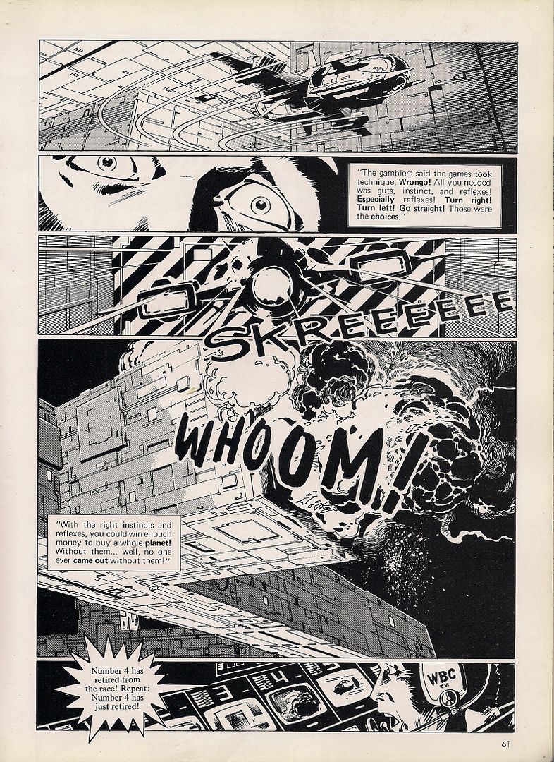
Superhero comics worth your time today

I haven't done a quick-hits look at the week's front-of-Previews-type comics in literally years now. Here's a look at some books that came out today that I enjoyed. Perhaps you will too. See you after the jump...

DARK REIGN: THE LIST—X-MEN While Alan Davis isn't my cup of tea, I fully support comics in which the Green Goblin unleashes a bioengineered sea monster as a doomsday weapon against the people of Atlantis to get back at Namor (who used to be married to the sea monster), and then Namor and the X-Men beat the sea monster (who used to be married to Namor) to death and toss its giant decapitated head through the Green Goblin's window. I hope the Green Goblin unleashes more monsters as the Dark Reign storyline draws to a close. If President Obama made Charles Manson the head of the CIA and he used his new security clearance to gain access to a bunch of monsters, you know he'd unleash the living shit out of those things.

DETECTIVE COMICS #857 I think this is the first time I've really been able to sit back and enjoy an issue of the Rucka/Williams run, because the "a plane takes off filled with chemical weapons and Batwoman has to stop it" structure is immediate and easy to understand and thereby overwhelms my reticence regarding Rucka's long-running Religion of Crime mega-plot, which to me needlessly complicates "rich woman dresses up like a bat and fights crime." That premise actually gets more complicated by the end of the issue, now that I think of it, but it's an excitingly paced chase/fight scene up until that point, very much in tune with the Morrison & Quitely Batman & Robin material, to the point where you feel like the characters in either could look up for a second and see the others running past them before getting back to business. Batwoman's K.O. of Alice's bodyguard was memorably colored by the incomparable Dave Stewart--so is the whole thing, really, especially Alice and Batwoman; pretty in pale!

IMMORTAL WEAPONS #3 This miniseries, or whatever you'd call it, has been very good so far; fans of the Frubaker run who jumped ship with the last Fraction/Aja issue, you might even see it as "a return to form" (although I've enjoyed Swierczynski's run just fine). This issue features a very strong, emotionally bracing origin story for Dog Brother #1, with vivid, wiry, convincing art from Timothy Green. The Iron Fist back-up can't help but feel a little short and slight in comparison, but I love how new artist Hatuey Diaz draws Danny Rand's mask a little too big for his head. Humanizing details like that seem to me to be what makes the Iron Fist different from your usual serious-business martial-arts hero--the other Immortal Weapons, for instance. I hope this franchise continues.

INCREDIBLE HERCULES #135 I really wonder how this decision to make Incredible Herc more or less biweekly as the story switches back and forth between Hercules and Amadeus Cho is affecting sales. I wonder, but I don't care—I like it! As for this Amadeus-centric issue in particular, it's not very often that you get lengthy sequences depicted through a role-playing game framework, and man is this book in love with ideas, whether Amadeus's Morrisonian pseudoscience or Hercules's modernized mythology riffs. I'm rooting for this series, too. (And I have a kick-ass idea for a storyline, something that almost NEVER happens with me, so I'm hoping it sticks around until the current crew gets sick of it and hands it to me.)

INVINCIBLE #66 I always love the big "secret Viltrumite history" issues of Invincible. Kirkman smartly injected what could be a tedious regularly-scheduled infodump with welcome humor by presenting each new revelation as a twist off of the set-up and imagery of the previous one, resulting in an "Ohhhh, so THAT'S what really happened! Ha, clever!" feeling each time. Original artist Cory Walker returns here, his art a little softer around the edges, a little warmer in the eyes. It works well, particularly as colorist Dave McCaig's pastels mesh seamlessly with the unique, pivotally important palette established across Bill Crabtree and FCO Plascensia's runs. Invincible can always be counted upon to serve up a holy-crap moment each issue--here it's enough dead Viltrumites floating in orbit around their homeworld to make up a Saturn-style ring. Still the most unpredictable superhero comic on the stands.

SUPERGIRL #45 The common complaint against the Superman line right now, or at least the common observation about its sales, is that it was an obvious mistake to remove Superman from the Superman books. But there's a very similar situation going on across town: Neither Hulk nor Incredible Hulk/Incredible Hercules nor Son of Hulk have been about the actual Hulk in a couple years, either, and they too are telling intertwining stories illuminating one corner of their universe (though not as tightly intertwining, I suppose), and you don't really hear that complaint much over there. You shouldn't hear it here either, because, and I share this opinion with virtually everyone I know who's actually reading the Superman line, it's really entertaining right now. Robinson, Rucka, and Gates are quite ably manning the fort in Johns's absence, creating a compelling little 52-style soap-actioner about a bunch of Superman-style heroes (Superman himself up on New Krypton, Supergirl, Mon-El, Nightwing, Flamebird, Steel, the Guardian) and the evil militaristic assholes who are out to get them all (Zod and his thugs, Metallo, Reactron, General Lane, Codename Assassin, Atlas, a pair of Kryptonian serial killers, cameo appearances from Lex Luthor and Brainiac). It's rewarding serialized superhero storytelling that's carving out reasons for the previously schizophrenically written Supergirl or the ultimate second banana Mon-El for doing what they do. The art ranges from spectacular (Renato Guedes) to perfectly fine (most everyone else), the intrigue is actually intriguing, and I really want to find out what the heck is going to happen here. I know this is more of a review of the whole shebang than of this issue, but that's sort of the point, isn't it?

SUPERMAN: SECRET ORIGIN #1 I know that a lot of people have a problem with Gary Frank's Christopher Reeve-model Superman, particularly now that he's de-aging him when drawing young Clark Kent. But that last part is the key! This isn't just the usual "hey I took a picture of a celebrity and drew it/photoshopped into my superhero comic, haha, look, it's Edward James Olmos as MODOK!" Frank's Reeve-Superman doesn't look lightboxed, it looks cartooned--particularly since the guy already draws the most personality-filled, and often funniest, facial expressions and poses in superhero comics this side of Frank Quitely. I could look at his stuff all day.

Interesting, and smart, decision on Geoff Johns's part to take some of the earliest material from Superman's backstory—scenes on Krypton, Ma and Pa Kent discovering the ship, li'l Clark first accidentally manifesting his powers—as read, or at the very least just showing them in passing in flashbacks. Instead of wasting time putting his stamp on stuff we've seen a million times he cuts forward a bit, to Clark in his early teens as his parents reveal his origin to him. (The "secret" was kept from him! Hey, that's clever.)

He also meets Lex Luthor for the first time here, Lex being a slightly older teen resident of Smallville with a full head of red hair. God how I hope they bring back the idea that Lex dedicated himself to Superman's destruction because he blames the Man of Steel for his hair loss. There has never ever ever been a better villain origin story than that, and moreover, it actually works better now that we've had years and years of "Lex believes Superman holds humanity back, not to mention obscures his own superhuman genius." Now, beneath his big philosophical justification, beneath even his pissing-contest aspect, there'd be this glowing nugget of sheer stupid pettiness. Fingers crossed!

I suppose there's still something of a redundancy issue given how many times this story has been told, but we've never been told it by Johns and Frank, both of whom I like a lot, and so of course I want to read their take on Superman's origin, particularly because other than the four-panel thing in All Star Superman #1 I'm not sure I ever sat and read one of those origin stories. Cute business with the heat vision, too. This is very good, and like all of Johns's Superman stuff back to Up, Up and Away! with Busiek, I look forward to having it as a part of a big series of trades I can hand to my comics-interested friends and say "Here you go--Superman 101."


My Life is Choked with Comics #19a: Manga

(Being part 1 of 2 in a series; part 2 is here)

***

What is manga?

(from Even a Monkey Can Draw Manga; art by Koji Aihara & Kentaro Takekuma)

Japanese comics, right? Maybe a collection of recognizable icons - big eyes, speed lines, etc. Flowers in the background, cartoony art. Except when it's not.

How about format? It's dozens of little books on the shelves of Borders. Naruto. Nana. Death Note. Pluto. A Drifting Life. A different world, an alternate reality - a foreign industry where comics are more popular and more prolific, escapism of an extra-narrative type. More comics for women, more comics for kids, more comics, beholden to their own traditions and biases, maybe intimidating, maybe interesting. Maybe a precognition, if you're feeling irrational: a new funnybook behavior, an example for America or insert-your-nation-here to follow. Or at least a steady-promised stream of comics of a type becoming cozy. Manga has fit right in for a while now, looking broadly at books.

But that's the present and the future. What about the past? What about manga the way it used to be taken in North America, the answer to the very same question if asked a quarter of a century ago. What is manga?

Well, there's one easy response:

Yeah, that's it! Says so right up top! Manga, objectively, is a robot woman vamping in the sunrise while casually failing to grit her teeth. A red cocktail dress is hiked up over her hips so as to model the stainless steel panties that are apparently welded to her loins. An arrow has been discreetly cast onto her left leg, so as to assist the confused or inexperienced viewer. Her upper body is an official selection of the Venice Film Festival, and her thin visor evokes an even hotter iteration of Robocop. She was there first, though. She's why law enforcement needed a future. Vice law, for a sexy future. There's an arrow.

As is sometimes his way, the artist -- famed illustrator Hajime Sorayama -- appears to be joking around. A pin-up model's body is matched with a distinctly inhuman face, almost bemused with how the viewer must be eyeing her. This isn't his flesh-and-steel Gynoid work, it's all gloss and chill; pin-ups can be son unrealistic, and this one makes it obvious. There's no lock on that chastity belt - that's why she's showing it off, as a joke. The punchline is: "you cannot access the robo-booty, hu-man."

Er, manga!

This is on the back cover. Manga, you see, is a book: a perfect bound, magazine-sized softcover. Its one-word title is the first part of its explanation for itself, and the above image is literally all the rest; no cover price is provided. It's 88 pages, in b&w and color. Ten artists are showcased, with absolutely no further explanation provided. Just their names. There isn't even a date of publication; in the Jason Thompson-edited Manga: The Complete Guide, veteran editor Carl Gustav Horn narrows the possibilities to anywhere from late 1980 to 1982, though I've seen sources online placing it as late as '84. Horn also provides the ISBN for easier searching -- 4-946427-01-5 -- and cites one of his sources as Mike Friedrich, editor & publisher of the famed "ground level" comics anthology Star*Reach, one of the noteworthy bridge works between the old underground funnies and the 'mainstream' of the mid-to-late-'70s.

Friedrich also served as Manga's consulting editor, even though it was a Japanese-published book, from "Metro Scope Co., Ltd." of Tokyo. There was a Japanese editor, of whom more will be said later. It was still intended for American readers (despite a Japanese release that charmingly played peek-a-boo with the cover art), however, and I suspect Friedrich's participation might have been due to his yet earlier role in bringing Japanese comics to North American readers, which I'll get into later. Comics writers such as Larry Hama and Steven Grant were brought on board as "adapters" to work the scripts into fit English. Connections in the rapidly-growing Direct Market were presumably sought, although I don't have the slightest idea who carried the damned thing. "Damned" is a most appropriate word.

And, crucially, though it has nothing to do with the book directly, though it seems to fly in the very face of that back cover statement of Executive Managing Director Tadashi Ookawara (of whom I can locate no record whatsoever of subsequent involvement in manga in North America) that this hand-selected "reflection of Japanese society" was purposed "to give the non-Japanese reading public a visual taste of Japan and the creative talents that exist here" and maybe even "boost the cultural understand [sic] in the west about Japan" - in spite of all that, cover artist Sorayama provided a rather famous image for that very important 'bridge' comic, Heavy Metal, in late 1980.

The timing couldn't have been more perfect. The implications will soon become clear. Manga isn't what it used to be, but that old, obscure place, that 1980-84 says a lot about Japan and America, and Japan's view of America, and which particular aspects of Japan should best be reflected in America's direction through these crazy mirror things called comics.

So let me modify our first question. ***

What Was Manga?

***

I. THEY SAY HE GOT JEDI FROM JIDAIGEKI

The very first story in Manga-the-anthology is by probably the most experienced and acclaimed of the artists roped in with the project: Hiroshi Hirata.

Sure: there's worse ways to start an anthology. I think this is how Kramers Ergot 1 kicked off. Ben Jones, how you've changed.

And it makes perfect sense to get those swords swingin' and helmets clashing as fast as bloody (and bloodily) possible in a book of this type, because Japanese period pieces have proven so frequently successful in the West, and also as unusually fertile ground for cultural influence. The Magnificent Seven from Seven Samurai; bits of Star Wars from The Hidden Fortress. From Le Samouraï to Ghost Dog: The Way of the Samurai. Comics would be no different; around the arrival of Manga, one of the most popular artists in the field was already flaunting his Japanese influence in an extremely prominent manner.

(from Ronin; drawings by Frank Miller, color by Lynn Varley)

In 1983, Frank Miller began serialization of his miniseries Ronin at DC; the influence of the aforementioned films of Akira Kurosawa and the samurai comics art of Goseki Kojima was noted, though Kojima's and writer Kazuo Koike's seminal Lone Wolf and Cub wouldn't see release in North America until 1987, in pamphlet form despite its 28-volume length. Miller provided cover art, an introduction and miscellaneous seals of approval as if to cement the work's value for the skeptics. That was a big year, '87 - the same month that served up First Comics' release of the Koike/Kojima manga saw the publishing debut of the mighty VIZ, then in association with Eclipse Comics, armed with their own damn swordfight manga, The Legend of Kamui, from genre godhead Sanpei Shirato.

It's easier now to appreciate the place of these artists in the greater history of manga. Both Kojima and Shirato were noteworthy practitioners of gekiga, the "dramatic pictures" cooked up by artists who wanted the postwar "whimsical pictures" of Osamu Tezuka to grow up with them. Shirato in particular proved to be a major figure, his popular Marxism-informed ninja sagas providing a valuable popular hook (and even the title) for the famous 'alternative' manga anthology Garo. Kojima likewise became known for intense period work, the 'jidaigeki' of cinema, novels and theater perhaps becoming jidaigekiga, which might not be a real word, I admit. But back then, artists made it up as they went along, like Lone Wolf writer Koike, who advocated creating complex characters as paramount to comics writing, enough so that stories could often just happen.

(from Samurai Executioner; art by Goseki Kojima)

It's ironic, then, that Hirata arrived in North America first. On first glance his work might seem more appealing than Kojima's, with muscular, detailed figures ripping across mighty panels hosed with testosterone and whisked with manly tears. Even the MAD Magazine-style "we're not a comic oh no sir, those are for babies" robot typeset lettering can't detract much from the rippling power of Hirata's compositions, professionally engineered to drive a reader wild with appreciation for these impossible deeds of awesome he-man samurai gods.

That Ralph Steadman-ish lettering above is there to approximate a specific flourish of Hirata's: rendering the most crucial of his characters' titanic exclamations and/or blood oaths in rich, classical calligraphy. When Dark Horse set about translating Hirata's Satsuma Gishiden (1977-82) in 2006, it opted for the unique option of subtitling those whopping images, so vital to Hirata's style. So firm in the historical period. Same thing.

(from Satsuma Gishiden; art by Hiroshi Hirata) Yet that five-book series remains the only other 'pure' Hirata work released in English -- he also provided the art for a 1987 (that year again!) East-West project Samurai, Son of Death (Eclipse Graphic Novel No. 14), written by Sharman DiVono and lettered by Stan Sakai -- and it sold poorly enough that Dark Horse pulled the plug after vol. 3.

Part of that failure, I expect, is due to Hirata's writing. Very little of Shirato's work has been made available in English-speaking environs environs either -- VIZ has two out-of-print volumes of The Legend of Kamui floating around, although the old Eclipse pamphlets go a bit further along than those collections -- but what's available belies an instinct for tucking the political/philosophical content into a sugar cube of rip-snortin' ninja action. And Kojima, for his many North American-released work, always had Koike, who's never encountered a crackpot digression or sensational plot twist or perverse character wrinkle he wouldn't embrace.

Hirata, in comparison, and admittedly going by what's available, is a truly ponderous writer, offsetting the over-the-top fury of his combat scenes with long historical explanations and almost compulsively detailed depictions of political intrigue. Following their introductions his characters rarely waver from their place on his most-to-least scale of masculine honor, positions set by electric words and blood drawn for ritual or warfare, the lifeforce of Old Times.

His contribution to Manga is self-contained and quintessential (as far as that goes, given how little of his work is available), focusing on two friends ordered to duel to the death at the pleasure of a warlord; the act will both reveal the greater fighter and seal his devotion to unquestioning obedience. Yet one of the men hesitates, and the other slices off his arm, after which the warlord allows both of them to serve as his personal guard.

But alas, years later an arrow plunges into the warlord's eye. In shame, the one-armed man jabs his own eye out, yet the warlord is unmoved, ordering the man's still-whole friend to kill him. It is only then that the unmolested man reveals that, in sorrow for never hesitating in that terrible duel, he urged the warlord to allow his maimed compatriot to serve. Incensed, the proud one-armed, one-eyed fighter declares that friendship is alien to the warrior's creed, and that they must duel again, beyond hesitation or pity! In a sickly whirlwind of skin and steel, the samurai collide in a for-the-books bonanza of dismemberment that oh, dear readers, leaves them literally torn to pieces, each man killed by the other's hand!!

And if you're thinking, "hmm, those wives don't look all that upset over the carnage up in panel #1, notwithstanding the caption to their immediate right," know that such things are really the point of Hirata's manga. The violence of those times was terrible, and modern society has its perks, yes, but boy - all that bleeding man honor was goddamned amazing, you've gotta give it up. The fans, revered author and code of honor devotee Yukio Mishima among them - they knew. And it traveled. Except when it didn't.

II. ARCHIE GOODWIN IS A SUGAR MERCHANT OF LICORICE LIES

It likely wasn't just Hirata's intent immersion in Sengoku overload that did in his American prospects, however, ironic as it might be to witness a body of art spoiled in its crossover potential as a historical work for being too steeped in history. No, there's also the simpler fact that 'manga' in 2006 was very different from the exotic and pliable concept of the early '80s. Kojima & Koike continued to sell, having been established for years, but the wildcard macho art of Hirata didn't look a damn thing like One Piece or Fruits Basket, and it didn't have a scrap of the art comics cache necessary to survive outside the 21st century manga bubble. For the older, harsher works, the Satsuma Gishidens drawn in the late '70s, there is little hope.

Ah, but with Manga, anything was possible! A "reflection of Japanese society," remember! Why, I don't see any language promising coverage for all of society, do you? It could be anything anyone wanted, a whole visual culture shifted just a step or two to one side, for the purposes of landing the work on foreign soil. Samurai would work then; everyone knows about them, and Hirata has a good, strong visual style. Appealing. Realist, and thereby less likely to seem weird or confusing to the untapped readership.

There were a few alternative perspectives around, mind you. The Winter 1980 issue of Epic Illustrated -- issue #4, the last quarterly edition -- featured an illustrated profile of the great Shotaro Ishinomori, written by Gene Pelc and the magazine's editorial director, Archie Goodwin. Ishimori was a great figure in boys' manga history, creating the famed Cyborg 009 series in 1963 and designing the beloved tokusatsu television hero Kamen Rider in 1971. His art beamed with all the popular style of the time.

(from Epic Illustrated #4; art by Shotaro Ishinomori)

Which is to say, you can draw a rather short, straight line from Ishinomori to Osamu Tezuka; the former even assisted on the latter's Astro Boy. Such work is closer to the source of postwar manga, the status quo that gekiga developed to answer.

And it wasn't just fun frolics for boys that were drawn in the manner - Keiji Nakazawa's semi-autobiographical Barefoot Gen, a saga of a young survivor of the Hiroshima bombing, can be startling in how firmly it's planted in the male youth tradition of shōnen manga, loud and bright and cartooned. A few volumes were nonetheless published in the early '80s, clearly in regard for its weighty subject matter, and an excerpt appeared in Frederik L. Schodt's landmark 1983 study Manga! Manga! The World of Japanese Comics.

(from Barefoot Gen, as excerpted in Manga! Manga! The Art of Japanese comics; art by Keiji Nakazawa)

Schodt made note of Manga-the-anthology in his book as "carefully edited," which might carry a double meaning depending on how you take 'editing.' In his 1996 follow-up, Dreamland Japan: Writings on Modern Manga, he makes reference to the early '80s manga-in-English mini-proliferation of, among short stories, English-learning aids and anime tie-ins, "vanity press" books "by Japanese artists hungry for international attention." One is reminded of Lead Publishing's ill-fated 1986-87 attempt to break Takao Saito's Golgo 13 into the North American market by sheer force of will and glossy production values, but Schodt might as well be referring to Manga.

But for a vanity tome, they did have some keen presentational ideas. Remember that Heavy Metal cover above? Same guy that did the cover for Manga? The years just about match up so that the connection might not be a coincidence. Indeed, Carl Horn mentions in the Thompson book that Manga gives off an impression not unlike that of Heavy Metal; I agree, and would actually go farther to speculate that the book -- while not a magazine, just sized like one -- might have been planned as the first of a series of Japanese answers to Heavy Metal's solidly French line-up. Or at least they saw success in action and opted to look like it.

Hell, they even threw in an illustrator's profile section, spotlighting one Noriyoshi Olai, a painter of book and magazine covers who'd just completed some poster artwork for The Empire Strikes Back. In the proper Heavy Metal tradition, special emphasis is lavished on his brooding images of horror/sci-fi stuff or lavish depictions of women wearing little-to-nothing above their waists. It's universal: French, Japanese, American - we all like stuff like this:

Oh don't deny it.

It'd be a mistake, incidentally, to pretend that no French-Japanese exchange had happened around the time of Manga. The artist Moebius hadn't just taken off in North America; his inspirational reach in Japan would eventually inspire the visual approach of Hayao Miyazaki's fantasy manga Nausicaä of the Valley of the Wind when it started up in 1982. That's probably a bit late for Manga, but the scent was in the air earlier.

A French influence can be picked up in this, a no-panels three-page story by Yousuki Tamori, who had recently (in 1979) begun work on his most popular creation, the fantastical PoPoLoCrois, later to be adapted to various anime series and role-playing video games (the first of which to see release in North America was the 2005 edition for the PSP). The very title of that work reflects Tamori's international flair, with "popolo" being Italian for "people" and "crois" being French for "crossing." People crossing, cross-culturally. Very neat, but I know of no other manga by the artist to see translation for English reading.

Likewise, it'd also be wrong to invoke Tezuka without acknowledging the obvious impact of vintage American animation on his own artistic development, the Disney features and Fleischer Brothers. And for the occasional shit Miyazaki has slung at Tezuka for damning Japanese anime to the limited animation cellar of sweatshop television schedules, a peek at Tezuka's short animation work -- recently collected on R1 dvd by Kino -- reveals several works that don't look a damn thing like anime at all.

There's a small batch of animation-informed strips in Manga, wordless pieces by Masayuki Wako, about whom I know nothing, under the banner title of Cat in Animation. They're cute little jokes about the comics form, icons taken literally and stuff; sometimes they're not all that clear in delivery. But they do sort of touch on this formative Western influence that seeded 'modern' manga, reliant on Tezuka's application of cinematographic principles to the comics page, not to mention his adoption of the Disney big eyes. Wako, for his effort, was not to my knowledge seen in American comics again.

Picking up a pattern? Several? It's true that many of the artists showcased in Manga would not become well-known later on. In fact, all of them -- even one particular former white-hot superstar whom I'll be addressing soon enough -- are either unknown or diminished in today's North American manga-in-English scene. That could well be related to another pattern: Manga-the-anthology's cherry-picking of certain artists influenced by certain phenomena (or just working in a salable genre) that made them seem Western.

"Although solidly adapted into English, what strikes the contemporary reader is how little the pieces of Manga resemble popular notions of manga itself," remarks Horn, but it's not just that - it's how much the pieces of Manga seem tuned to look like comics a newsstand Metalhead or a patron of the still-sparkling Direct Market might regularly encounter, only more polished, just a little bit different. Friendly. Unless it's something really obviously Japanese in the exotic sense, like samurai. Cutting each other to pieces over HONOR! The length of the magnificent manga series doesn't strike me as a factor; this was mostly new, commissioned short work, and a great amount of Japanese editorial control over the collection's look and feel can be presumed.

Again, if you're looking to present an appealing comic to a foreign market, it seems to make economic sense to erase the Tezuka aspect, the weird underground stuff and frankly most of the popular youth looks from the cultural landscape, as you're presenting it. Moreover, the early '80s also saw a genuine wave of Western influence in manga art, spearheaded by Katsuhiro Otomo and likeminded semi-realists. It wasn't the whole story, but it could form a whole story, with only 88 pages to fill.

Just look at this. It's from a 12-page contribution by Noboru Miyama, who died very recently, in 2007. His story, The Great Ten, is filled with images just like this: detailed machines and steely environments, with humans reduced mainly to faces beholding the wonder of setting. That's good, since Miyama's human figure work isn't so strong; this was among his earliest published stories, unless it actually is his first published solo work, since most sources cite 1981 as the year of his pro debut. Prior to that he'd worked as an assistant to Satoshi Ikezawa, creator of a mid-to-late '70s racing manga titled Circuit no Ohkami.

This story too is a racing manga, boiled down to its essence. Carlin is the greatest jockey ever to race in the deadly 3-D Derby, a cube maze that kills. His shocking series of wins delights the betting public, until they tire of how his excellence prevents big payouts and thrilling death lunges for 1st. He's too good, and thus hated; and while the kindly fellow in the pace car tries to warn him that he's playing with fire, Carlin can't help but go for a big 10th win, unaware in his ambition that the game is now fixed against him.

Lots of well-drawn tech, some fine action. And a message about pushing yourself as hard as you can go - not an unfamiliar sentiment for the youth manga that Manga didn't show. But there were other things, revolutionary things the book didn't show, that would broker no great similarity to this boyish activity, that nobody could have believed would have flown with Manga's laser-honed American target audience. Something was hidden.

***

(Forward to part 2)

Claremont's X-Men 3: It's All Downhill From Here, Maybe.

The Phoenix Saga ruined the X-Men for a few years.

I know Jeff Lester disagrees with me on this, but he's wrong; as exciting and classic comics as it may be, the whole Dark Phoenix thing derailed UNCANNY X-MEN all the way through #175, and I'm blaming it all on Jim Shooter and John Byrne.

Okay, that's maybe not entirely fair - especially Byrne left the book within six months of the end of the storyline, and Shooter probably bears less responsibility than Claremont, who was, y'know, writing the book and all - but while everything from #125 through #137 has become Official Comic Landmark material because Claremont and Byrne are working in such sync and with such success that even introducing Dazzler can't slow them down, the following year is a pretty great example of watching a writer thrown entirely off his game.

That year between #125 and #137, though, is a great read; Claremont and Byrne are on fire, introducing the Hellfire Club, Emma Frost and Kitty Pryde as well as Dazzler, and keeping the main characters evolving (Colossus has to kill! Cyclops stands up to Professor Xavier because he knows the X-Men better!) even before the big cosmic showdown that sees a character turn, essentially, outright evil and then pay the price for it. The year seems like the fulfillment of basic Marvel ideals, mixing soap opera and superhero, showing the need for responsibility that comes with power and ending with a tragic self-sacrifice that "This Man, This Monster" would've been proud of. It's really good stuff, and a peak (the peak?) of the series as a whole, one of the few times that everything comes together with such intensity and sincerity that it actually works... and then everything falls apart.

It's actually understandable that it did, and surprising that it didn't happen more obviously or more horrifically; Claremont and Byrne were forced to redo #137 after it'd been completed, because the original plan of leaving Jean alive with depowered wasn't thought to be enough after she'd destroyed a planet as Phoenix (FWIW, I think it was a change for the better), but even if they hadn't been, where do you go after a story so cosmic and... well, big? It's no wonder that the majority of the next year (all the way up to the subplots starting in #147, even if the A-plots remained weak until #150) seemed so generic and pedestrian in comparison: After saving the universe from one of their own gone bad, visiting Alpha Flight in Canada to go after a Hulk villain (Even one with Wolverine history) or taking on Doctor Doom and Arcade just doesn't really seem as interesting.

(There's a two-issue exception, of course, the "Days Of Future Past"/" Mind Out Of Time" story in #141-142 that would, once Claremont had exorcized his Phoenix demons, come to define the X-Men franchise with its dystopian, never-smile-because-you're-hated-and-by-the-way-your-future-duplicate-is-more-depressed-than-you-about-it vision. In the context of what followed its initial publication, though, it just seemed like a two-part story without a lot of impact. It'd take a few years to get full-on-depressathon.)

(The ghost of Phoenix haunted the book in more ways than one; she makes a hallucination-appearance in #144, and then the cover of #147 shows an out-of-control Storm with the tagline "We did it before -- Dare we do it again?" It's hard to know whether Scott Summers or Chris Claremont was most affected by Jean Grey's death.)

The loss of Byrne hits the book hard, too; looking back, I still think he and Austen lacked a lot of the personality of Cockrum's earlier issues, but the Cockrum that returns to replace him is a different artist, one who's more conservative and lacking the verve and invention that Byrne papered over with glamor (He's not helped by Joe Rubenstein's inks, either; Rubenstein tends to flatten out a lot of the pencilers he works with, giving everything a kind of generic quality that makes him perfect for a multi-artist project like The Official Handbook Of The Marvel Universe, but not something where you want someone to follow Byrne and Austen.

As the series approached #150, it seemed to have flamed out. With the big villain hinted at for the anniversary issue Magneto yet again, capping off a year of familiar (and non-traditionally-X-Men) villains, it'd wouldn't have been too surprising if fans following the series then were wondering if the series' best days were behind it. Oh, how right/wrong they were.

Tucker Really Hopes You Like His Reviews Of Comics So Much You Guys

Looks like there's been enough meat-y think posts on here since the last time I checked in. Too bad that they all keep being on comics you cats have all read, right? I thought I'd take a look at some of the 2009 small press stuff, and I totally started on that, and then I got distracted by the fact that a ball of aluminum foil can reflect light. I keep batting it around, but since it's not really round, I never know what direction it's going to go in. Here's three though. They're all in the Upper Echelon of the Ratings Scale, if you've got your computer turned on its side.

Jan's Atomic Heart JAH_cover They're calling this one a graphic novel--it's got a spine, sure, but it's pretty short. Guy who did it is 20/21 years old? Name's Simon Roy.

It's GOOD.

One of the things I've enjoyed most in the last year or so was the opportunity to spend some serious time reading a bunch of Future Shocks stories from 2000 AD--it's a fountain of ideas, a place where guys like Moore, Morrison, Milligan and other dudes without M-names did all kinds of "get out the comics" work. While it doesn't share any visual sensibilities with the old EC Comics stuff, there's this sense of work that comes about when you're catching up on them en masse as opposed to the weekly installments, and that sense is one of the things I like about EC. 2000 AD and its sister-titles, that original EC stuff--that whiny part of my brain starts to shut down when I read them, because I can't stop thinking about how consistent they were/are with their content. It just kept coming, and in my estimation, EC had a pretty incredible Hit-To-Shit ratio.

Jan's Atomic Heart has nothing to do with EC, but it reminded me of 2000AD, Bilal's Memories, all those kinds of random one-shot tales of dirty, rusty futures. It's a science fiction story about a guy who ends up in a temporary robot body while he's waiting on his flesh-y one to recover from a car wreck. It has a great ending, which I'm not going to ruin, because it earns its great ending.

This is the first page. It's like Gipi drawing Otomo. jah_1 According to Roy's comments at CBR, he started the project as an "exercise in environment-building", and ended up turning out a story while in the midst of drawing stuff. I'd like to say it shows, because that's sort of what you want to read on a site with "Critics" in the name, correct?

Not really that dude, broseph. I hear tell that you can buy Ng Suat Tong's attentions with a box of Thin Mints, so look into that. I just liked this comic--I liked it before I found out it was a comic birthed out of screwing around with drawings of buildings and robots, and I liked it even more after that. In its fashion, it's an old school sort of story--a guy is coming out of the shock of a car wreck, upset because he can't fit his robot frame into any clothes but sweatpants, and he's starting to realize that things May Not Be As They Seem. There's a little of the old Lack of Faith on the part of Roy when it's time to draw the robot being surprised--he draws a halo of white to indicate "Hey!"--but it's made up for in the little throwaway panel where the character involuntarily rubs his eye, which, as a robot, he would have no reason to do. It's a clever, subtle reminder that the body is merely a temporary home, one that Jan wants only to understand, not be assimilated into. By the close, he's gotten all his answers, and I've got one of my own. I want to read more of this guy's comics. Hope college doesn't fuck his brain up.

Papercutter # 9 pc9web_lg There's three comics here. The first one is by Aron Nels Steinke, who also gets cover detail. From what I've read of Steinke's work, this is more of that. I don't care for it, although I think that's probably just because I find a bit too much of myself in the lazy protagonist. He gets up late and calls his significant other and promises to start going to bed earlier, since she's already gone off to work like a regular person with values. Then he starts telling her about the dream he has last night, ignores her sweet reprimand to maybe stop, since she doesn't care. And then, she firmly says "Wait! Stop. I don't want to hear about this dream anymore." And he says "Oh I know...but you have to listen. Please." After he gets off the phone, he gets scared because he thinks there might be a ghost in the house.

Like--I sort of want to kill myself now? And sure, it's a comic, and you want to know if it looks good...hell, I don't know. There's some nice looking pages, but this is one of those small press comics where they draw dots on bare legs to indicate hair. Not my thing. Go ask Alice.

The second comic is a one pager made up of four gag strips, each of which are four panels in length. It's by Elijah Brubaker, who I quite like. I'd first come across his stuff when I was trying to find a copy of Monkey Wrench, an old anthology comic that featured Ed Brubaker. See, Elijah also has a comic called Monkey Wrench, so when you buy a comic book online sight-unseen called MONKEY WRENCH BRUBAKER, you might end up with the Ed one--which also features Richard Sala & Jason Lutes doing some of those Mega-Genius Comics you hear shut-ins talk about all the time--or you might end up with the Elijah one. Either way, you're a winner, although you shouldn't mention that to any of the people involved with the Brubaker/Sala/Lutes comic, because somebody somewhere said the contributors got kinda fucked over by the publisher.

Digressions? You know it. They keep my teeth yellow.

Elijah Brubaker's contribution to Papercutter, the gag strips: it would be real Iconoclastic and Shitty Critics to say that they're the best part of the issue. It'd also be a lie, because while they're quite good, there's a real Top Dawg Draw here. That little slice of heaven would be Diamond Heights: A True Story, by Hellen Jo. It's a short, beautifully illustrated piece, ten pages long. A couple of drunk kids--does Hellen Jo draw adults?--get accosted by a couple of barefoot Asian girls in the middle of the night. That's it, really. You'll see what's coming as soon as the girls arrive on the scene, it's made abundantly clear when a gasp turns into vomiting--and then it goes down, Streets of Gotham style. (You see that recent issue? Paul Dini's putting kids in cages and pulling the trigger on-panel. I ain't crying, but jesus man. Can't Batman punch somebody that doesn't put babies blood in their milkshake?)

Diamond Heights is similar to Steinke's ghost story--it's regular people encountering weird shit--but everything about the delivery system is completely different. There's no backgrounding to who these people are, and the fact that they're both drunk puts to question whether the two girls that descend upon them are supposed to be real people or not. It's brevity makes it that much more potent a story, the sort of anthology installment that is better served by being surrounded by items it doesn't share an author with--when (and it's hard for me not to dissociate myself from thinking of this, apologies for that) Hellen's work achieves "we can make a big hardcover of this" status, Diamond Heights will probably get passed by as a solid, but brief, idea. Here, it's a fucking story, and it's a VERY GOOD one. You know how they keep saying Blackest Night is supposed to be a Horror Comic? Man, that shit ain't scary. It's dark. It's violent. But being freaked out by freaky people when you're alone, just trying to make it home after getting stupid? That's scary. That shit happens all the time.

Reich # 6 reich6coverlarge Hey, I used to date this really gorgeous cokehead that was raised in this wacky Wilhelm Reich-ian commune! I don't know that her coke/cheating-on-me problems stemmed directly from being raised there, but the participants did have a tendency towards being naked around six year olds before the local government sent the cops out to shut 'em down, so here's a stolen Abhay colon: Highly Likely? But she was a real fox, one of those kind of ladyfriends that made it fun to go to bars, because everything turned into a sarcastic beer commercial with all the bartenders doing a fist-pump and mouthing "You da man, nine-year-old!"

The first time we broke up, it was due to my insistence that she kowtow to my definition of "girlfriend", which meant someone who had at least as much sex with me as they were having with strangers, be they men/women/drug connections. That commitment was at cross purposes with her Willingness To Maintain Porous Emotional Reich-ian Body Armor, so we parted ways. When she showed up the next morning at my place, she was covered in bruises and openly weeping. Apparently, despondent over the collapse of our terrible relationship, she had gotten drunk with her father the night before--he had directed a Woody Harrelson movie and never fully recovered--and then she'd gone out into the street to drink more, only stopping to lose her purse and get in a fistfight with a cab driver. That kind of romance--it's the stuff they used to write poems about, you know, back when poets could actually get some ass by being, well, poets. While she couldn't promise to lay off the cocaine or other people, she did promise to change absolutely nothing, but remain physically attractive and crazy. Although I have no defense for the choice I made, I'll own up to being really jazzed about the fact that somebody had gone to such lengths for a relationship that neither party seemed to care that much about. Look, I'm a semi-tolerable cocksman, but when it comes down to it, my physical appearance isn't far removed from what my mother looked like when she was 14. But that's math, relationships ain't math. Somebody gets tore up and fights a cabbie after you ask them to stop jumping into bed with strangers? That's worth working on, especially when you don't work on it all. 

Oh, Reich the comic? It's GOOD. Elijah Brubaker did it, clearly he has fonder associations with Wilhelm Reich than I do.


And Here Are Some Things I Read Recently...

Look! I done read some new comics for a change, and here I am talking about them. It's just like old times, under the jump. ADVENTURE COMICS #2: How to sap a new series of almost all of its excitement, part 23: As soon as #2 comes out, announce that the creative team is being taken off the book before the seventh issue - while pointing out that two of the issues before then are crossovers with the latest event, by a fill-in artist - and then tell everyone that the lead strip is being also being removed so that the new writer can expand the back-up to fill the entire book. On the plus side, I'm as excited about new Levitz Legion as the next man, but on the minus, Geoff Johns' and Francis Manipaul's GOOD Superboy deserved more of a chance, especially considering the (enjoyably) slow, sentimental route it was taking.

BATMAN AND ROBIN #4: Aaaaaaahhhh, my eyes! After three issues of clear, creative playful Frank Quitely art, Philip Tan arrives and demonstrates just how not to tell a story. The art overpowers the writing entirely, and is confusing, over-rendered and just plain ugly. Good thing Cameron Stewart and Frazer Irving are taking over after the next couple of issues, because I'll need their lusciousness as an antidote to this AWFUL mess.

BEASTS OF BURDEN #1: To the lack of surprise of anyone, probably the best book of the week. Maybe it's because I'm a sap for animals - that's what living in a two dog, one cat household will do to you - but I was completely in love with this by the third page, and it just got better from there. Evan Dorkin's funny-without-being-snarky script and Jill Thompson's art (full of nice little background touches in the group shots) were ideal, and my only problem, genuinely, was that I wanted to read more immediately. EXCELLENT.

BLACKEST NIGHT #3: Oh, so that's what's going on with the Indigo Tribe. Kudos to everyone who called out the Hal As White Lantern idea that'd entirely avoided my brain originally, as Johns seems to be pointing fairly obviously in that direction here (So much so that it seems like it might be a dodge, to be honest), but at least there's some forward motion here, unlike the second issue (In particular, I liked the surprising "they're not zombies, they're recreations of the dead" angle raised here). A high GOOD, I think. And, DC? When this is done, Johns and Reis should really take over Justice League of America already, don't you think?

BLACKEST NiGHT: BATMAN #2: While I don't think Peter Tomasi necessarily has the strongest grip on the new Batman/Robin dynamic, by the time Commissioner Gordon was using a pump-action shotgun and Batman a flamethrower to take care of the Black Lanterns, I was digging this as the ridiculous superhero zombie flick it's clearly meant to be. GOOD.

CAPTAIN AMERICA REBORN #3: Am I the only one who shares Steve Rogers' sense of deja vu with this book? Cap travels through well-known moments of his history while monologing, while in the future, villains plot and superheroes fight them. This felt really like the last issue to me, and in general, the series feels slower and less... impressive, I guess, than I'd hoped it would be. OKAY, but here's hoping something new happens next issue.

GALACTICA 1980 #1: Color me surprised; for all that I've been snarkily making fun of this revival of the second Battlestar Galactica series on io9, I actually really enjoyed this first issue, particularly the cynicism/realism of the impact of the Galactica trying to make friends with humanity by appearing above the White House only (Spoiler warning!) to get nuked because the President thinks they're invading. Having a suicidal Lorne Greene-Adama was a nice touch, too. A tentative GOOD, for now.

THE LONE RANGER #18: Sticking with Dynamite, I'm again declaring my love for the slow burn of Brett Matthews and Sergio Cariello's take on the pulp Western hero; despite having issues like this - where it's much more about the foreboding hint of things to come than that much actually, y'know, happening - it's just done so stylishly that I can't resist. VERY GOOD.

MARVEL ADVENTURES SPIDER-MAN #54: I don't know where my recent rebirth of Spider-Man love has come from, but I'm glad that it's coincided with Paul Tobin and Matteo Lolli's relaunch of the "all ages" Spider-book, which mixes the high school soap opera/comedy with just enough superhero moments to come up with the perfect mix of everything I liked about Spider-Man Loves Mary-Jane and Ultimate Spider-Man. Add in Skottie Young covers that are wonderfully eye-catching, and you're one good logo away from my ideal Spidey. VERY GOOD.

ULTIMATE ARMOR WARS #1: Well, that felt slight. I don't know, maybe I've read too much Ellis/Morrison/everyotherBritishwriterwhodoesthis, but introducing new characters by having another new character say something like "The Ghost. I don't believe it. It's actually The Ghost..." just feels lazy and a sad signpost for this book that seemed a well-done collection of cliches and old ideas as much as anything worth reading. The very definition of EH.

X-MEN FOREVER #7: In which fill-in artist Steve Scott works off the new models and costumes for the characters, even though they haven't been introduced yet, leading to a "Wait, that's supposed to be Gambit?" moment, as well as a "Why has everyone switched costumes between issues?" one. Aside from that, this issue is pretty OKAY; the last couple of issues have seemed particularly directionless and jarringly so, especially considering all of the loose plot threads of the first five issues.

X-MEN LEGACY ANNUAL #1: Remember when annuals were stand-alone stories that had some kind of major event in them? Mike Carey doesn't; this is just the opening of the next Legacy storyline (and theoretically something to establish the new status quo, except that it doesn't, really), and if you've not been keeping up with the X-Books recently, you'll be completely lost here. The highpoint is definitely Daniel Acuna's art, which always makes me wonder why he's not so much more loved than he is; it's gorgeous, gorgeous stuff. There's also a Gambit back-up, which is beyond generic filler. EH, at best.

And for those awaiting Claremont's X-Men part 3: This week. Really, honestly.

Hibbs quick hits 9/16

Just a quick in and out to hit a few books from this week... after the jump!

ARCHIE #601: Wow, that's seriously weird for an Archie comic -- there's a shout-out reference to Kurtzman/Elder "Starchie" story (!); there's a titty joke ("Oh, you must be Juggie!") (!!); and there's even a hint of pre-marital sex (!!!). Don't get me wrong, it is all extremely mild, and a 8 year old girl isn't going to read it the same way I did, but still, none of that's what I would have expected in an Archie comic.

Other than that, I enjoyed this just fine -- but I thought the resolution of the Betty story was a bit... mm, shoehorned, maybe? It's extremely sweet that Archie "proposed" "Best Friendship" to Ms. Cooper, but it really should have sent her off crying even harder, IMO. All in all, though: GOOD.

ACTION COMICS #881: Man, that's one busy ass-cover "World against [superman symbol]" anchoring the top. "Second Feature: Captain Action" anchoring the bottom (which is as useful as tits on a bull, I have to say -- the bottom is "dead space" from a display perspective). And "The Hunt For Reactron: part one" also basically on the bottom. PLUS you've got the normal trade dress AND the "triangle numbering" Yeesh!

I'm generally bored with the superman books right now -- this New Krypton storyline isn't especially compelling, I'm missing the lead characters, and turning the super-characters into the X-Men ("Sworn to protect a world that hates and fears them") just doesn't work at all, even a little bit. EH.

BATMAN & ROBIN #4: While I liked the story better than #3, on each and every page I was thinking "Man, I wish Quitely was drawing this!" OK

M.O.D.O.K. DARK REIGN: Is this not the Marvel Age of M.O.D.O.K.? This book had me laughing really really hard. Funny stuff! VERY GOOD

ULTIMATE ARMOR WARS: Marvel has got to work out the color effects behind the "Ultimate" logo -- it's nearly invisible on this one. It's also probably a mistake to publish this at the same time as the kids-oriented "IRON MAN ARMOR WARS", but hey I'm not a publisher, so what do I know? If you want drunken playboy superheroes, this is probably exactly the book for you. I thought it was a pretty high OK.

What did YOU think?

-B

Some Indie Shit and Manga David Done Read

Yeah, so I haven't written about superhero comics for a while largely because - not to go all David Brothers in this piece - while I've been enjoying a lot of stuff coming out, I haven't been driven to write much about a lot of it. So instead, I've been dipping my uncultured, pervert-suit-loving self into the world of INDEPENDENT SMALL PRESS COMICS, not to mention the dangerous and exotic Orient of sequential art they call "man-ga."

Joking aside, here's some pretty great shit I read recently, and what I thought about it. (Obviously, there is more after the jump.)

Asterios Polyp by David Mazzucchelli, Pantheon Press

Yeah, I'm hardly the first person to come out and say that this is a pretty stunning artistic achievement. I've been putting off writing about it basically for that reason - after guys like Wolk and Mautner weighed in, what good is there in a schlub like me throwing his opinion horseshoe onto the post?

The thing is, I think it's easy to get lost in Polyp's shadow. The book is unmistakably a formalist masterpiece on first skim-through; Mazzucchelli's virtuosity with almost every aspect of sequential art is immediately evident. It's easy to get lost in symbolism and allusion with this book, since every single image seems weighted down with meaning, but there's a reason all of this symbolism and allusion is captivating in the first place: it's a good story, told astonishingly well. Yeah, Mazzucchelli's providing some incredibly stunning images and sometimes forcing you to read a comic in a way you're not used to, but it's all stunningly intuitive - Polyp somehow manages to be incredibly deep without being overwhelmingly challenging. It's not just this big stylistic monolith; it's also an engaging, emotional and entertaining story about two fully realized characters with dialogue that makes them easy to care about.

It's remarkable the balance Mazzucchelli was able to achieve here. It rewards each successive reading without requiring it; it can be a breezy, entertaining read if you want it to be and an annotator's dream if that's your thing too. It really is the kind of book you could hand to pretty much anybody. I've seen the comparisons to Ulysses thrown around, and considering the experimental storytelling on display combined with the penchant for alluding to Greek mythology, I can see where it comes from. But Ulysses is commonly seen as an undertaking or even a chore, while this is just a pure joy. Needless to say, utterly EXCELLENT.

I Killed Adolf Hitler by Jason, Fantagraphics Books

I grabbed this one largely due to the strength of Jason's fantastic contribution to Marvel's Strange Tales, which is probably the least hip reason ever to pick up an indie cartoonist, but hey, whatever. The result: I really enjoyed it! I'd read strong reviews of this around earlier, and I was expecting something offbeat and madcap (and certainly wasn't disappointed in that regard), but I was also surprised by just how emotional Jason was able to make a story about an Anthro-dog murder society and time travelling hitmen. Yeah, the entire thing is patently absurd on every level - self-consciously and humorously so - but it's also a story about the impermanence of rage and the importance of forgiveness, alongside what a goddamn twat Adolf Hitler can be when all you want to do is shoot the bastard. The description on the back describes the book as "deadpan," and that pretty much nails almost every aspect of its execution, from the anthropomorphic characters' frequently emotionless expressions to the unexclamatory dialogue to, well, the entire concept of the book. It's a quick read and very rewarding, and something I imagine I'll come back to from time to time for a while. Smart, funny and surprisingly poignant, this was VERY GOOD.

Pluto v.1-5 by Naoki Urasawa with Takashi Nagasaki, Viz Signature

Yeah, so I really lied when I said no superhero comics, because Pluto is basically a far more talented creative mind attempting the "maturation" of traditionally kids' comics characters exemplified by the spandex rape celebration known colloquially as Identity Crisis. What separates the two? As far as I can tell, where half of the American comics industry and Naoki Urasawa split up is the topic of sensationalism. When something terrible happens in a Brad Meltzer comic, the record stops, everyone stands around and the buckets come out for ten pages of superhero weeping. When something awful happens in a Naoki Urasawa comic, the characters react in various ways and the plot moves on without fetishized close-up spreads of a dead body or rape victim.

On top of that, Urasawa is essentially - like Grant Morrison or Alan Moore - a humanist at heart, and his stories are all about the necessity of holding the high road and respecting the sanctity of life, even when shit gets tough. They're also about the idea that redemption's always out there, and the virtue of forgiveness. It's difficult to find a pure villain in an Urasawa story; even in Monster, where he most explicitly dealt with the concept of pure, unmitigated, unexplainable evil, there was always stress placed on the importance of believing in change. This absolutely extends to Pluto, a gorgeously drawn and masterfully paced murder mystery that reinterprets "children's entertainment" through the lens of adulthood and nostalgia to create a sci-fi whodunnit bereft of moral judgments, just people (and robots) pushed to emotional extremes by unexpected events.

Every character in an Urasawa story is fully fleshed out, and Pluto is no different; seeming bit characters always have considerable background, and every action a character makes is placed into context by the life experiences that drove him or her towards it. Urasawa might be one of the tightest plotters in comics today, with a supernatural skill for creating a fully-realized character even through the broadest of strokes, without resorting to base sentimentality.

In short, everybody working on Big Two shared-universe superhero comics should have this as required reading. This is how you fucking do it. EXCELLENT.

Yotsuba&! Vol. 1 by Kiyohiko Azuma, Yen Press

I got this at the recommendation of David Brothers, and it did not disappoint: this book is basically an elaborate creation developed by research scientists to make even the most cynical person smile. The titular Yotsuba, whose exploits form the book's content, manages to be the rarest of fictional children: precocious without being obnoxious. It functions more like an episodic sitcom than any sort of continuous narrative, although the episodes (at least in this first volume) definitely follow a loose thread - a girl who behaves very strangely has moved into a new town and house with her long-suffering father, and now each episode features her "tackling" a certain subject (hence the title - Yotsuba&Moving, Yotsuba&Global Warming, etc.), usually by taking something symbolic literally or misinterpreting a piece of advice. Her antics are always amusing because they're not random; there's always a piece of logic, no matter how twisted, that justifies her behavior, so the laughs, while considerable, never seem cheap. The end result is a comic that makes me smile every time I read a chapter, no matter what kind of mood I'm in, and that's assuredly VERY GOOD.

Casanova Vol. 1 by Matt Fraction and Gabriel Ba, Image Comics

Man, I feel like a moron for not getting into this earlier, since it has pretty much everything I enjoy in a comic: parallel universes, time travel, hilarious use of the word "fuck", and the absence of the overwhelming distaste for humanity that seems to, for me, infect all the Warren Ellis stories that meet the first three criteria. Casanova manages to channel the far-out wackiness of a Nextwave and combine it with real characterization and something resembling a point, and as one of the five people on the Internet who didn't like Nextwave I'm incredibly grateful for that. Other than that: incredibly imaginative, gorgeously drawn, took me a second read to grab a lot of the basic plot structure (it's QUITE complex) but that second read was rewarding enough I can't complain too hard. I've heard that as good as this is, volume 2 is a significant improvement, and I would greatly appreciate it if Image Comics and Mr. Fraction could see to the publication of a hardcover of those issues so that I can read them without rooting through back issue bins. Is there somewhere between GOOD and VERY GOOD? Because that's where this is.

Abhay Re: Crime Novels.

COMICS: All blow. Instead, I've been reading CRIME NOVELS.

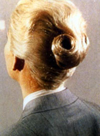
I turned my attention to the girl beside me. She was a reasonably sized, well-proportioned, dark-haired, basically sound specimen of human female, but she was doing her best to hide the fact, at least the female fact. She had a boy’s haircut, or what used to be a boy’s haircut before they all started letting it grow. She also had a boy’s pants on, complete with fly—pretty soon nothing will be safe from women’s lib, not even our jock-straps. -- from MATT HELM: THE INTRIGUERS, by Donald Hamilton.

SEVERANCE PACKAGE by Duane Swiercynski:

The back cover promised action: a group of office drones show up for a meeting at corporate headquarters, and their boss tells them (1) they’ve been working for a front organization for the CIA, (2) the CIA’s shutting down the operation, (3) they all know too much, and (4) they either immediately agree to take poison or they will be shot to death.

Except the back cover’s a bit of a bait-n-switch. That entire elaborate premise is pretty much resolved in the first 50 pages. The next 200 pages devolve rapidly into a one-joke slasher movie. It’s not BATTLE ROYALE in an office, like I hoped; it’s more JASON TAKES MANHATTAN, just set in the Nakatomi Plaza.

The SEVERANCE PACKAGE characters are all obnoxious slasher-movie characters, just an office variety instead of a teen variety: boss, secretary, dragon lady, a completely random “heroic writer” character for no reason, etc. There’s the slightest hint of a gender-based critique of corporate life, but that mostly gets drowned out in explosions.

Swiercynski almost gets by on style: single-page illustrations, text messages, layout hijinks. Simple sentences; fast-pace; everything fast, fast, fast. He almost makes up for story with verve. The giddiness is likable. If it’s not quite a book, you know, it’s at least not the worst popcorn movie. Sometimes, being able to turn pages rapidly is enough for me. Sometimes, I’m on airplane.

I suppose I wasn’t a very receptive audience because this book had the misfortune of following Will Beall’s L.A. REX. Beall’s a LAPD Homicide detective stationed in South Central; maybe I gave his splattergore more credit for that reason. Here’s a sample: They’d also jammed a tin funnel into the man’s right ear and poured drain cleaner down his ear canal. The open bottle of Draino stood on the counter next to the sink. Blood and yellowish matter had leaked from that ear down the side of his face. Packed into the guy’s eye sockets, nose and slack mouth, thousands of pale maggots, each no larger than a grain of rice, wriggled and moiled.

SEVERANCE PACKAGE was wire fu, by comparison. More action than violence.

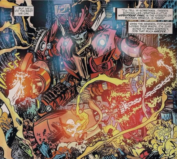
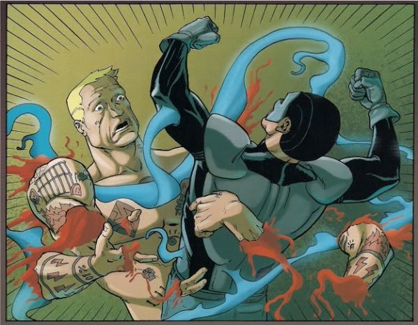
Swiercynski writes comics, too: IRON FIST and CABLE for Marvel. That’s been a thing with Marvel lately— collecting crime novelists. Hurwitz and Gishler and Huston and whoever else. I hadn’t read any of Swiercynski’s comic work, so I looked at a random issue of CABLE after I read his novel. If I’m remembering this right: Cable was on a farm in the future, wearing overalls; he fought bugs. If you want a comic about cyborgs fighting bugs on a farm—that happened. Ariel Olivetti drew it, so if you want the farmer to have muscles painted top of his other muscles, that issue may have just gone from an A-plus to an A-plus-plus for you.

They got themselves a novelist to write that comic, though. There’s a sort of inherent perversity to hiring suspense writers to write mainstream comics; is anything less suspenseful on this Earth than a mainstream comic book?

1) The main characters all live.

2) The dead characters come back to life.

3) Every plot is announced ahead of time.

4) The plots are thoroughly debated online prior to the book being offered for sale—people argue whether or not something SHOULD be the plot of a comic they haven’t read yet.

Swiercynski the novelist tries to find graphic ways to spice up the action, to distinguish his paperback action thriller from other paperback action thrillers: Let’s put a single sentence on a page. Let’s use a page to show a piece of evidence directly to the reader rather than describe it. Let’s put speed lines in a novel. Here’s one sentence from the book, formatted as it is in the book:

“She felt like she would be falling forever.”

Not a spectacular innovation, nothing craaaaazy. But: Swiercynski the novelist came to play. Swiercynski the comic book writer? He just wrote a paper movie, same as everyone else at Marvel writes right now. (And again, I haven’t read his IRON FIST; maybe I’m wrong). Marvel’s hired novelists, independent comic writers, screenwriters, playwrights, whoever, and all to them are writing comics that look and feel identical. Can you tell a Marvel comic written by an independent comic creator apart from a Marvel comic written by a cook-book author from a Marvel comic written by a jingle writer? I don’t think I can tell the difference. Is that sad? Well, maybe that’s just the commercially best way to write comics, the best way to write comics for a mass audience. Is that sad? I don’t know; what do I care. If it weren’t like that, I’d just find something else about Marvel to complain about; I’m a guy on the internet—complaining about Marvel is how we do. Is that sad?

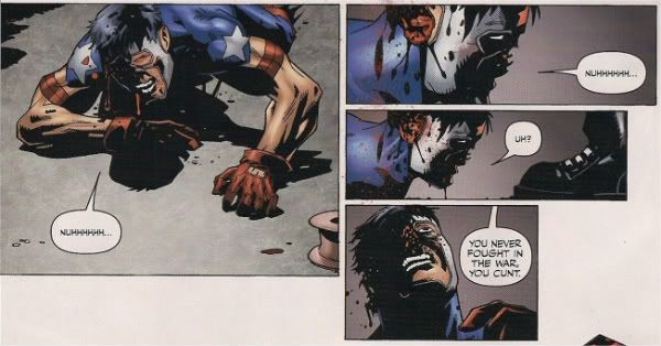
(I figured it’d be unfair not to read a more recent issue so I went with issue #18 of CABLE. Cable is in prison in outer space, and the X-Men character Bishop is trying to kill him for some reason. Here are two panels in sequence:

That’s two different people talking. The caption boxes in panel 1 is dialogue being spoken out loud, but the caption boxes in panel 2 is narration depicting a character’s internal monologue. And then check out this panel later in the issue:

So: caption boxes used where there’s “off-screen” dialogue, caption boxes with first-person internal-monologue, and then caption boxes with third-person exposition. In just 22 pages of comics? Really? On the other hand: people sometimes call Bishop the Archbishop and that’s pretty funny, maybe intentionally).

I made a face. “God, aren’t we mysterious! Lorna. She’s a tough one, I’ve heard. Won’t take orders from any man. Except Mac.”

“Why should she? Why should a woman have to work under a man if she’s as good as a man?”

I said, “Well, it’s the customary reproductive position, but I understand there are others.”

-- from MATT HELM: THE INTRIGUERS, by Donald Hamilton.

THE OUTFIT by DONALD WESTALKE:

I’d read Donald Westlake books when I was young, probably too young to understand his books. My favorite was his comedic murder mystery set in the world of tabloids, TRUST ME ON THIS. But: I’d never read Parker. I obviously knew about Parker, but I knew Parker had inspired some pretty terrible imitators: I’ve had the misfortune of sitting through an Andy Vachss book, say. Vachss alone was enough to scare me away from ever reading Parker.

Then, Westlake passed away. So: THE OUTFIT.

THE OUTFIT doesn’t waste your time; the first sentence is “When the woman screamed, Parker awoke and rolled off the bed.” It’s a nice sign you’re in good hands. This is the third of the Parker novels, re-released in 2008. I’ll try not to spoil the plot, but: bad guys screw with Parker; they find out that’s a bad idea. (Okay, actually, I think I just spoiled the plot. Sorry.)

Anyways, the bad guys lose because they’re soft, and Parker wins because he’s hard. And getting harder—it appears that a regular part of Parker’s schtick, I think maybe left out of the movies, is that Parker’s violent adventures sexually arouse Parker. You know those video games where the more you hit people, the more your character’s “rage meter” fills up? It’s like that. Except instead of an empty rage meter, imagine Lee Marvin’s flaccid penis.

What I liked about the OUTFIT was it felt like just the good parts: Parker murders someone, Parker solves a logistical problem of living outside of the law, there are a series of heists, and then Parker murders some more, and the end; go home. Just the good parts-- Donald Westlake’s Boner-Jamz, if you will. It’s not entirely perfect: one of the book’s subplots is left to a later book to resolve. Plus, if you like heists like I do, the book basically peaks in the middle with the heists; the book’s final action scene isn’t much fun by comparison.

But I probably prefer Westlake to “Richard Stark”; Westlake had wit. The “tough loners in suits” genre—at a certain point, it just seems like schtick. I don’t think I read crime novels for the cartoon characters—the knight errant detective, the femme fatale, the corpulent mobsters, any of that. Oh, it’s fun. But it sort of makes crime and greed and vice seem distant and remote, the sport of a different breed of cat, instead of pervasive, constant, a force of nature, a foundation stone. Parker seems apart from the world because the rest of the world is slow and dim and bovine; which has a truth to it, certainly at the time the OUTFIT was written. But: characters who are “apart from the world” are basically romantic fantasies, whether it’s Parker or Phillip Marlowe or what have you. They’re entertaining, but a more honest diagnosis would probably be grimmer.

Other nerds are likely to be flocking to this book in coming days—it’s the next book Darwyn Cooke intends to adapt as part of the 4-book adaptation series he’s created, published by IDW. The OUTFIT promises that we’ll get to see Cooke facing an interesting challenge—Parker disappears entirely for at least half of the book, the book’s best half. All of the heists? Parker ain’t there; he’s not the one pulling the heists in the OUTFIT. How will Cooke approach those heists?

There might be differing opinions how to answer that question after THE HUNTER, which has gotten a wide range of reactions. There’s bound to be—the underlying fantasy of this type of loner character is of total detachment from the world, being able to dispense with violence and sex without the messy business of the soul being involved. That sort of theme’s no problem for prose. Comics, though? “Here’s a character who doesn’t care about anything in the world except for his money and his women. I spent 5 hours drawing him by carefully dipping a Windsor-Newton brush into a well of India ink and moving the brush along a sheet of Bristol Board.” There’s a disconnect there.

Cooke’s solution seems to have rankled, though it’s actually what I liked about his adaptation more than anything: some panels are lavishly executed, but for the most part, the pages don’t feel too careful. Some of the long-shots especially nears stick-figure theatre. The line weights are inconsistent. He’s given critics plenty of ammunition.

But I think that’s what I liked about it: with Cooke laying on the book’s blue-color by hand, the pages just seem still... wet. Fresh from his drawing board. Many artists complain that some energy or power gets lost moving from thumbnails to finished pages—the HUNTER pages feel like they’re focused on retaining that thumbnail energy. Cooke doesn’t try to just adapt the surface story, but to match Westlake’s spare prose. To me, that was fun. Can I imagine a prettier comic? Sure. Would a prettier comic have better served the material? I don’t know if I necessarily agree with that.

Which isn’t to say Cooke doesn’t make some terrible choices along the way: He blows the revenge pages—the gestures hardly have any violence to them, at all. His character designs for women are deadly dull, pretty-girls from animation, Sketchbook Session jerk-off girls. Bruce Wayne: Parker isn’t too thrilling to watch. And if ever a book didn’t need Blam Krak Pow sound effects…

(I can’t say I was too persuaded by the argument that Cooke’s vision of the past was too focused on “cool” iconography. The movie POINT BLANK has a 10-minute long bongo-jam in it; there’s at least 10 minutes of a guy on the bongos with another guy going “YEAH” periodically, at least 10 minutes. Cool seems like kind of the point of the entire exercise for everyone who’s ever touched this material. You can have Dortmunder with Robert Redford in the 70’s, or you can have Dortmunder with Martin Lawrence, you know? But maybe I misunderstood the argument.).

If I had a problem with the HUNTER, though: I think any adaptation invites the question of Why this, why now? Parker’s about the lone, rugged individual facing down the organization. But: I guess I associate “rugged individualism” as the theme of, well, douche-bags. Rugged individualism sounds cute when Glen Beck’s crying about it, crying his crazy little eyes out, but you put enough rugged individualism into your coffee, next thing you know: you’re the crazy-fuck hick screaming that the President’s a liar in the middle of a speech to Congress. The rugged individual out for his own greedy advantage destroying the work of many people organized for their mutual good? We have that: it’s called Wall Street; how’s that working out for everybody? Yeah, the HUNTER is anti-corporate, but Parker’s hardly a hippie WTO-protestor; he’s just a different breed of capitalist.

So: I couldn’t really tell you why this adaptation exists other than for Cooke to wallow in that aesthetic universe. Is that enough? Is that anything?

I grinned. “There you sit, wearing a man’s zip-up-the-front pants and a man’s hairdo, giving me that poor-downtrodden-women line. Just what do you think would happen to me if I started wandering around the countryside in a woman’s skirt with my hair clear down my back? What would happen to any man who tried it? You know damn well we’d be locked up as transvestite perverts so fast it would make your head swim. Hell, we poor men can’t let our hair grow even a little without half the cops in the country trying to bash in our heads, but you ladies can cut it all off and nobody bats an eye. Which sex was it you said was being discriminated against?” She gave me another scorching look, obviously unimpressed by my argument. Well, maybe it wasn’t much of an argument.

-- from MATT HELM: THE INTRIGUERS, by Donald Hamilton.

The final book was Ian Rankin’s HIDE AND SEEK. Which…

There’s one kind of crime novel I avoid, the most common type: the recurring detective series. I think it’s all the jazz music. The serial detective novel will invariably have some detective in it that’s way into jazz. There’ll always be a scene of them, feeling lonely, putting on Miles Davis because, hey, man, they’re not modern guys, they don’t listen to rock-n-roll. Detectives in lonely-man detective novels don’t listen to Jay-Z.

Rankin from HIDE AND SEEK: “John Rebus’s flat was his castle. Once through the door, he would pull up the drawbridge and let his mind go blank, emptying himself of the world for as long as he could. He would pour himself a drink, put some tenor sax music on the cassette machine, and pick up a book.”

Tenor sax music. Because the alto sax is for communists and panty-sniffers! To be fair, the book was published in 1990. In 1990, I thought Color Me Badd was the best band of all time. And by “1990”, I mean last year. But the whole “lonely man” theme—you know, going from superhero comics to that kind of crime book, is it just exchanging one kind of No Girlz Allowed club for another? I don’t know.

This is probably the most like a “real novel” than any of the three. The characters are vivid and their actions are unpredictable; the details of subplots have themes that resonate with the main plotline’s themes; moments seem dictated by character more than plot. The mystery isn’t the focus; the mystery is an excuse to spend time exploring procedure and characters and setting. The mystery is a window into Edinburgh in the 1990’s, grappling with the early days of gentrification.

(From the perspective of a severe recession, though, the whole gentrification thing sort of loses its teeth. People used to get mad that their neighborhoods were getting TOO RICH. Oh noes! Good thing we don’t have to worry about that anymore.)

The biggest problem being: the mystery, once solved, is nothing much at all. The solution to the mystery, the dark secret that threatens to topple polite Edinburgh society? You can buy it now legally; you can find it for free on the internet. What might have become shocking in 1990 has become a consumer product by 2009. It’s 272 pages, but it builds towards nothing that sticks. Subplots, character, prose, themes—that’s all nice, but a mystery novel that doesn’t have much of a solution? Can you still call that a success? I loved the story in that porn movie.

Rankin’s mystery is “who killed a junkie”, the pathos supposedly being no one cares. Except: I don’t know that I cared either. Does that make me a bad person? Probably.

DC’s published Ian Rankin’s name across 4/5ths of the cover of DARK ENTRIES, one of the launch titles of their new Vertigo Anal-Sex line. Strike that, supposedly DARK ENTRIES is launching the Vertigo Crime line.

Funny thing: the launch book for Vertigo Crime? NOT A CRIME NOVEL. It’s a horror comic. There’s hardly any crime in it even. It’s a haunted house story, starring John Constantine. They launched Vertigo Crime with a Vertigo horror comic! Exclamation mark!

So: a year from now, if we’re unlucky and Vertigo Crime no longer exists, and some so-and-so is screeching that “None of youse fools on the internet people could have done better because we are geniuses who thought of EVERYTHING” … I would suggest that maybe one thing they could have done differently is launched their crime line with crime fiction…? Just a silly thought.

I mean, I’m rooting for Vertigo Crime because—I’m the audience for crime comics, 100%; the editors and creators announced for this line are all people I usually expect to always at least be interesting, if not always successful. And launching with DARK ENTRIES is not the worst idea: Rankin’s a name in crime fiction, so launching with the biggest name they could get makes a certain sense, even if he didn’t actually in point of fact write anything resembling a crime novel. There’s even a quote from Brian Vaughan on the back that mentions “haunted house” story, if you’re especially attentive. There’s also crime on the cover, and not in the book, though, so…

Is the book any good as a horror comic? Not really. I enjoyed Werther Dell’edra’s art, truly I did—lots of blacks, very much my kind of style. Except: he’s drawing a haunted house comic, so setting it in a very definite place with very definite background drawings has an increased importance. Dell’edra seems better with mood and suggestion than drawing definite surroundings. The geography of the house is just never precisely delineated enough to be scary.

Rankin’s story is a one-gag story about reality television. The gag didn’t make me laugh; might do something for you. Reality television is shit, but: who cares? Caring about how shitty reality television is, that’s nearly as boring as reality television. There are some fun details; the “solution” to the book’s “mystery” is at least a little clever. The ending works; the ending is a good, classic John Constantine ending (as far as I know, having not read much Constantine).

But: Rankin probably hasn’t read much Junji Ito. The DARK ENTRIES team tries to do monsters-popping-out-of-the-dark scares. Those are movie-scares, not comic-scares. The “Oh, I’m surprised and I will jump out of my movie seat because I’m surprised” scares. Those don’t work. It’s obvious those don’t work. They don’t work in books; god knows why a novelist would think they’d work in comics.

Junji Ito’s comics are scary. NIJIGAHARA HOLOGRAPH was scary. Scary because they’re comics. Comics take fucking forever to make. A comic where you’re forced to imagine a person spending fucking forever to create something where the images don't add up, something that’s wrong, that's diseased, something that doesn’t satisfy the “rules”? That can be scary. But: that’s not DARK ENTRIES. DARK ENTRIES is just another installment in the commercially successful adventures of John Constantine. What’s supposed to be scary about that?

I got angry after I read DARK ENTRIES. (I was happy how angry I got, that a comic could still get me angry, that I’m not completely apathetic about them. Ooh: I got so angry.) Monsters, spooky-creatures, everything DARK ENTRIES trucks in is bullshit. Rankin, as a crime novelist, seems to know that; as a novelist. HIDE AND SEEK doesn’t have monsters; it doesn’t need them—it has people. HIDE AND SEEK, if it has a theme—no, if crime fiction has a theme, it’s that there are no demons or devils out there causing the evils of the world, that blaming the wrongs of life on monsters from religious myths is what children do, that the evils of the world are the result of people, people being greedy, needy, evil, or, hell, just bored.

There’s a book I read a few years ago, Bernard Lefkowitz’s OUR GUYS-- it got made into an Eric Stoltz Movie of the Week. The book is about how a suburban high school football team gang-raped a retarded girl with a broom handle, and how they basically got away with it. But that’s not the bad part. Here’s the bad part: there’s a classmate of the football team named Mari, and when the football team gets charged with raping a retarded girl with a broom handle, Mari gets an idea. She befriends the retarded girl—she becomes maybe the first friend that retarded girl ever has. And she wears a wire and tape records their conversations and convinces the retarded girl to talk about how much she enjoyed having sex with the broom handle, so she can help the football team avoid prosecution.

Satan is bullshit. Satan doesn’t need to exist; Mari already does.


STRANGEly fascinating

Wow, I really loved Marvel's STRANGE TALES #1.

If this was an attempt to "counter-program" DC's WEDNESDAY COMICS, it's a pretty solid drubbing -- there's a tremendous amount of energy and passion on display on most of the strips here that I'm finding lacking from WC (which is beautiful, and all, but I found myself suddenly stopping reading WC at around week 3, saying I'll read again when the whole thing is complete, which I guess will get me there around 9/23)

Like with most anthologies, there's not a lot here of real lasting and permanent value, but even the slightest pieces are inventive and fun -- for example, Paul Pope's "Inhumans" story is nearly an episode of Seinfeld on the nothing-happens scale; it is eight pages about trying to open a can of dog food... but what a glorius eight pages it is!

There's some seriously mental work on here: who would have ever (EVER!) thought you'd see a Junko Mizuno or Jason "Spider-Man" story? Or Dash Shaw doing "Dr. Strange"? Man, pure beauty!

There were a few bits that didn't work for me: I thought the Johnny Ryan pages weren't "Johnny Ryan enough" -- I wanted to see more feces and blood and cursing! And I was oddly cold from the Peter Bagge "Hulk" story, especially for something that was so famously "drawered" for being... too something or another. While his "Megalomaniacal Spider-Man" was pretty on-the-nose, this first third of "Hulk" almost felt too sit-com-y for my taste.

The real winner for me, however, was Nick Bertozzi's "M.O.D.O.K." story, which got me dangerously close to a tear. It was a real winner. IN fact, between that and the Pope story, it seems to me that these cartoonists are probably better off to not do the "big" Marvel characters, as there is more to be mined from the c-listers.

I don't know really how to rack this book -- it doesn't belong in the Marvel section of the store at all. Marvel's standard readership isn't going to know how to react to this book, whatsoever, and I don't think it will be all that great to "lead" Marvel readers to a wider set of styles.

Its also a book that seems to REQUIRE hand-selling -- at least three quarters of the people I pointed to it had no idea it was out (even staring them in the face), but each of them was "Holy Shit! I want!!"

Am I the only person who finds it deeply ironic that this came out the same week as the announcement of the Disney deal? I wouldn't count a lot on projects like this coming too much in the New World Order, but maybe I'll be surprised?

Overall, I thought this was an EXCELLENT comic book. What did YOU think?

-B

Abhay: "3 Jacks" by Ann Nocenti, David Aja, Matt Hollingsworth, and Chris Eliopoulos

So, “3 Jacks”—pretty much the best Marvel comic of the year so far, right? Tim O’Neil agrees; I agree; I don’t know who else has weighed in. “3 Jacks” is a 13-page back-up feature in DAREDEVIL #500, created by Ann Nocenti, David Aja, Matt Hollingsworth and Chris Eliopoulos. The rest of the comic is inert; not worth anyone’s time. But: “3 Jacks,” everybody! Where do we start? Well, let’s start with the first page.

d21y The opening panel: buildings in silhouette, with the Coney Island Parachute Jump tower above the skyline. I don’t know much about the Parachute Jump tower, but: at the angle chosen, the way Aja draws it, does it resembles a cross to you?

Our metal-crucifix is located dead center on the page, not off to the side, not one detail of many—dead center. Flanking it, we have two panels: one, a woman praying in silhouette; the other, a man yelling “Keep ‘Im Close, Damn It” to the heavens. Both characters point in direct lines towards the cross; both are talking to God in their own way.

(Maybe that's something representative of Nocenti’s run on DAREDEVIL in general-- an absurdly straight-faced religious image on one end of a teeter-totter, with an almost-corny image straight out of Will Eisner keeping it in balance? Maybe; not for me to say: a handful of issues of her DAREDEVIL run made an impression on me, but I don’t think I’ve ever read that entire run tip-to-toe. I have no claims to being an expert on the Nocenti run, and this essay will unfortunately be limited as such).

The other panels? A small set of visual jokes: (i) a panel of a bullseye but with no way of telling if it's from the villain's mask or the poster with “Live Human Target” scrawled on it; (ii) a poster for the “Human Blockhead” a panel away from Daredevil being struck in the head; (iii) my favorite is the word “Clone” cut off from the window of what we’re later told is the “Cyclone Bar”—I don’t know if that’s a joke by David Aja & Chris Eliopoulos on Aja’s appropriation of Dave Mazzucchelli’s style circa 1980-whatever, but I’d like to think Aja & Eliopoulos were being self-deprecating.

* * *

So we open with a distant steel God towering over moments solemn, and silly, and empty, and violent, with a man in a devil costume as far from God on the page as can be (his arms also akimbo though). Fine; that’s nice. How does the comic end? Does Daredevil win the spiritual battle the first page sets out? Well: let’s skip to the end! Here’s the last panel:

d22o Again, we see the Parachute Tower but the angle is different. The skyline is higher—and the man in the devil costume is now at the center of page, the city on one end of him, the crucifix on the other, restored to equilibrium, in balance with his environment … though there’s still a gap between him and that crucifix, still that gap. He’s almost a silhouette like the rest of his environment, but no, not quite—colorist Matt Hollingsworth makes sure there’s still just that tiniest hint of red. A little taint of sin that’s not washing off, a little bit of the devil costume peeking through.

Is that last panel a spoiler? No: because that panel in fact is shown on the page immediately preceding the story.

The story of 3 Jacks is there’s a fight between Bullseye and Daredevil at the Coney Island amusement park, and then that fight ends and Daredevil runs off into the night. The end.

But the way that story is structured is this: we start with the end of the fight, the story goes beyond the end of the fight as we watch Daredevil recover from the fight with two people who have witnessed the fight, Larry and Gina. Larry, Gina and Daredevil then talk about the middle of the fight which we see in flashback (we never see the beginning of the fight; the beginning of the fight doesn’t matter—Daredevil and Bullseye will always be fighting).

When we finally reach the ending? We wind up back where we started from-- like I said: the last image of the story is the same image as on the page literally preceding the story itself. It’s like a spiral.

hitch

The comic is about a character trapped in a spiral of violence, not explicitly but in the form the story is presented. Daredevil has no way out of that spiral-- the only thing his story can ever be about is the process of Daredevil picking himself up and running into battle again. Not just a spiral of violence: maybe one way to look at the story is it's about how Daredevil is in a loop of constantly being knocked out of spiritual alignment and struggling to restore his relationship with his faith.

So, wait: I'm making "3 Jacks" sound like a totally boring bummer about, like, Jesus or something, aren't I? It's not that. You get to see Daredevil use his radar powers and his lie-detecting powers. Daredevil kicks Bullseye in the face. Daredevil fights Bullseye throughout the comic. The Marvel comics goods are delivered in those 13 pages, besides everything else that’s going on. And by David Aja, Matt Hollingsworth and Chris Eliopoulos, no less. Silent pages, silhouette flashbacks, heartbeat scrawls, graphic shapes, extreme close-ups on big-wide-open eyes, etc. Aaah, comics, everybody…

Plus: I just like Larry and Gina, the two witnesss I mentioned before, the praying girl and the yelling guy from the first page. They represent aspects of Daredevil’s father and mother. But besides that? They’re just funny characters in their own right. There’s comic business with a hammer; the 10 Commandments are re-written; Larry and Gina have interesting things to say for themselves. It’s not an extraordinary amount of characterization. It’s a Daredevil comic, and Larry & Gina are stock comic book characters—“precocious schoolgirl” and “washed-up boxer” don't exactly break new ground. But, you know: they’re really not the worst company you could ask for from a Marvel comic. The lead story of the issue is about ninjas screaming at each other; I’m happy to stick with Larry and Gina instead.

* * *

The heart of the comic is Bullseye has thrown three photos into Daredevil’s chest, saying “Dead Center! You just don’t’ know it yet” as he did so.

d23a The three photos turn out to be meaningful to Daredevil—to the reader, too, if they knows their Daredevil “lore.” If they can put images into context.

Which: I mean, that’s kind of writing comics right there, isn’t it? You pick out still images, little bits of the past frozen in time, and you throw them into another person, hope they stick…? If Ann Nocenti is a character in this story, she’s not the old yelling-guy or the praying girl or the distant steel God; she’s Bullseye. She can’t kill Daredevil—all she can do is hurt him as much as she can. “Dead Center! You just don’t know it yet.” She’s sort of bragging about how good a job she’s doing in the story itself, man. Shit, I kind of dig that.

* * *

There’s more: Daredevil, Larry and Gina are all dealing with their relationships with their parents (which I’m thinking might possibly be metaphorical); Daredevil is "saved" by the prayers of a girl who “hates God” and Larry pleading to a cross to "Keep 'Im Close"; that fantastic page of Gina lying to Daredevil (if I understood the concept of grace, let alone cared, maybe I’d have something to say there); the final images of Larry with a hammer in his hands, which… carpentry? Isn’t that something? You know: from the Bible or Jesus or one of those? Or wait: maybe I’m thinking of that show HOME IMPROVEMENT? Maybe "3 JACKS" is actually a metaphor for how men are pigs HARF HARF HARF (am I right, ladies?). It’s 13 pages, but I'll be damned if it isn't a dense fucker.

Tim O'Neil concluded his review by stating "If Marvel publishes a better story this year I'll eat my hat." I'll go one better: if Marvel publishes a better story this year, Tim O'Neil will eat every article of clothing in my closet, at gunpoint. It's your move, MARVEL DIVAS. Winner takes O'Neil.

* * *

MISCELLANEOUS NOTES ABOUT THE REST OF THE ISSUE:

** Some crap about ninjas, again...?

** What’s the story with Billy Tan’s pages here? They're not professional-quality comic pages. If I had to guess, I’d guess they’d lined up a real talent for this List comic, but the real talent blew it, something came up, Ashton Kutcher's next movie needed a hovercraft designed, whatever; yaddah yaddah yaddah, some editor goes to Tan at the last minute and asked him to rush out pages. That would be my guess what happened, if I had to make a guess. That would be as nice a thing as I could say about Billy Tan's work here: maybe an editor forced him to do that. Or an alternate theory: maybe someone lost a bet. You know, like one of those TRADING PLACES bets. Maybe someone bet Don Ameche $1 that if they gave Billy Tan a real comic book artist's job, he would start to draw like a real comic book artist. Don Ameche won that one; Don Ameche's the big winner. Except... except for the being dead part. Don Ameche: no longer with us. Great in HEAVEN CAN WAIT. But very, very dead. But dead and one U.S. dollar richer, so who's laughing? Well, not Don Ameche. He's dead. I mean, it's kind of a bummer if you think about it, Don Ameche being dead, or just death in general. That's nothing to laugh about. That's sad, really. He was really great in HEAVEN CAN WAIT. It's all just so temporary. We'll never know how Don Ameche would have spent his Billy Tan dollar. You know, this all seemed like a very simple joke at first, but fucker sort of got away from me, I don't know what to tell you...

** The Brubaker DAREDEVIL run ended in the issue. For me, and this is completely unfair, but: that run was like watching air rush out of a balloon. It started so well with that prison arc, but—and this is the unfair part: Mr. Fear…? NO, THANK YOU. As soon as Mr. Fear showed up, I split. How unfair is that? I’ll read all manners of crap, just the crappiest crap that ever crapped, without complaint, happy as can be, but: “Mr. Fear? No, no: fuck you. Daredevil was better back when he fought the guy who was like an Owl, but I am not putting up with this Mr. Fear horse-shit. Fuck you, God!” What a terrible job it is to write mainstream comics. How could Ed Brubaker or anyone conceivably see that I’d draw the line super-arbitrarily at Mr. Fear? There’s no earthly way Ed Brubaker could ever guess that in a million years. And yet: I blame him anyways.

** The last Ed Brubaker comic I read was that new Captain America thing where it was all “Hey, Captain America—we have to get you back to the island using the Constant Sawyer Hurley.” Which was a nice comic, but I remember thinking, “Hey, maybe Ed Brubaker watches that show LOST.” And then Daredevil #500—was it just me or did his story have an identical flashback structure to the season finale of LOST? It was probably written before the finale—or maybe, but…? Am I just seeing things? It's probably just a coincidence. I’m probably just seeing things. Still: I hope the next issue of CRIMINAL explains what that crazy smoke monster is. Smoke monster is my favorite character.

** Or here’s a theory: maybe the night before his pages were due, Billy Tan was walking down a street when he saw a psychotic clown trying to rape a little kid. And he was like, “Get off that kid, Bozo! I’ll make you a sad clown. WITH MY BILLY TAN FISTS.” And then they fought, like bare-knuckles, all night long, man versus clown, and yeah, Billy Tan named his fists after himself, but I think that’s manly, why not. (The clown in this story symbolizes the Buddha on the road; I learned it from reading you, Ann Nocenti). And he wins in the end, Billy Tan wins and saves the kid from being clown-molested, but the price is DARK LIST pages you can look at without feeling sadness in your eyeballs. But that’s a small price to pay. Maybe we all owe Billy Tan an apology. He very well might be a hero to children everywhere, including the child inside all of us. The child inside all of us that is deathly afraid of a clown touching our peener without consent.

** Wait, wait: if Disney owns ABC, and ABC has LOST on it, does that mean Marvel comics kind of does own the Smoke Monster? Smoke Monster's my favorite character.

** Why did Lynn Varley’s colors get destroyed in the reprint? What happened there? The issue I remember seeing had these dark, moody colors. The colors in the reprint—what a bright, shiny, happy comic about Russian Roulette. “It’s the feel good Russian Roulette comic book of the year.” Is that how it looked when it was originally printed? Maybe I'm so used to seeing the old, worn-out, grey, torn-up copies that I never imagined what it looked like when it was brand new. Same exact thing happens when I look at your mom, naked. When she's having sex with Don Ameche's ghost. Dammit. Goddammit. Oh, I shouldn't have even tried; couldn't let it go. Goddammit, I really thought I could save the whole Don Ameche thing, in the eleventh hour, and it's just-- where's the goddamn Cocoon when you need it? Don Ameche Joke Cocoon, you have failed me for the last time!! This started out so earnestly, with the crucifix and the Jesus and the spirals, and ... What happened, Internet? If only keyboards came with delete keys...

Claremont's X-Men 2: How John Byrne Changed The World

More Claremont retrospective! This time, the first two years of the Byrne run, wherein everything comes together remarkably quickly, and I compare John Byrne to Joe Sinnott. Or something.

Ignoring the fill-in in UNCANNY X-MEN #106 (Although: Chris Claremont and Bill Mantlo together! There should've been much more of this), #107 starts off Claremont's third year on the title with an important milestone: The last issue before it truly becomes the X-Men we recognize. Oh, so many things are almost there, but it's as if Dave Cockrum was holding Claremont back from achieving full Claremont or something; as soon as John Byrne and Terry Austen appear in #108, everything clicks into place: The characters' speech patterns, the "giving your life force to save existence" soon-to-be-cliche makes its first appearance (including Storm saying "It is my life to give, my friend" by way of explanation), the overly elaborate soap opera - space pirate and furry Corsair is Cyclops' dad?!? - the book just suddenly becomes the X-Men through some unexplainable magic, much in the same way that Lee and Kirby's Fantastic Four suddenly makes sense when Joe Sinnott starts inking Kirby in the late #40s. By the end of that third year, Claremont has already worked in his first psychic mind-rape.

(It's possible that one of the reasons that the early Claremont/Byrne issues seems like the book makes this leap into a more pure X-Men-ness is because that run has become the touchstone for most fans, and subsequent creators, as the "best" X-Men run ever, but it's more than that; Claremont's writing suddenly becomes much clearer and more focused when Byrne appears. I don't know if there was an obvious reason behind the scenes - The editor's still Archie Goodwin throughout, so it's not that...? - but the shift is noticable and somewhat odd, when reading the issues in quick succession.)

By the book's fourth year, it's made it to monthly status in time to really start working out the kinks; oddly enough, the fourth year feels very much like the first two, in that Claremont revisits old X-Men villains and stories (Magneto, Sauron, the Savage Land, Sunfire), but at the same time, you can tell that he's also more in control of the characters and the plot than he was previously - Magneto's appearance pays off months of foreshadowing by showing Cyclops' fears about the new team "not being ready" and getting their asses handed to them, for example, leading to the first period (of many, it becomes a favored Claremont trick when he wants to switch things up) where the world believes they're dead, which allows him to show Scott and Jean outside of their relationship for pretty much the first time in their history. Unlike before, where it felt as if Claremont was using old characters and ideas because he didn't know what else to do, this time it feels as if he's comfortable and knows what he's up to.

The confidence is matched by Byrne and Austen's incredibly slick visuals. I mean that as much as an insult as a compliment, I have to admit; as revered as the art in these issues is - and as good as it is, as well - it really is very much eye candy, and at times overly glossy and soulless. Byrne's women, in particular, are almost distractingly... I don't know what the word is... vapid? glamorous, in a bad way? generic? They lack personality, despite what Claremont puts in their mouths (Now, that doesn't sound right), and occasionally the art feels so... professional, and impersonal, and "perfect," that it pulls me out of the experience and leaves me cold. Am I alone in that?

The comfort and confidence - and newfound success and acclaim - were making Claremont and Byrne more bold, though; by the end of the fourth year of Claremont's run on the book, he'd put the team back together with one exception... and that's because he was already at work laying the groundwork for the Dark Phoenix storyline, which would change superhero comics - and Uncanny X-Men in particular - in ways that he couldn't even have imagined.

Malthusian Superheroics: Chris reviews JUSTICE SOCIETY OF AMERICA

Fellow Savage David Uzumeri is at the Toronto Fan Expo and he's liveblogging Marvel and DC's panels. Friday's DC panel featured a discussion of recap pages, with Len Wein positing that "we used to work under the theory, which I don't think is true anymore, that every issue is somebody's first issue" and Didio affirming his anti-recap-page position. Earlier this year Didio said he thought "the writers should be able to introduce readers to the ongoing story within the issue itself."

Let's take a look at that then, shall we?

Bill Willingham, Matthew Sturges and Jesus Merino started a run last month in JUSTICE SOCIETY OF AMERICA #29. JSA is a book with a sprawling cast of legacy heroes a concept Willingham and Sturges embrace, keeping nearly all of former writer Geoff Johns's bloated team around for their first issue. There are thirteen Society members on the cover, fifteen on the opening page, and by the end of the first sequence twenty one members total, including two introduced in this issue. Soon, the team follows a distress beacon and are ambushed by a mysterious team of twenty one villains, who appear to be part of the "Global Ultra Society of Dread" and have "trained themselves to take on specific members of the JSA."

Fortunately, no JSAer attempts to fight someone not specifically trained for them, and the GUSoD correctly guessed which of the Society's two dozen members would show up for the fight. Meanwhile, one of the new members sneaks up on Mr. Terrific, stabbing him repeatedly in the back for some reason.

Taken as the twenty ninth (or really, the one hundred and somethingteenth, given the previous JSA series and recent annuals and Kingdom Come one-shots) issue, this book borders on coherent. A less charitable person would question why Willingham and Sturges open their run by apparently killing the Society's most prominent black member while writing out Jakeem Thunder and Amazing Man. One might also question why they turned Obsidian, the team's only LGBT member, into an inanimate black egg. But that isn't my primary concern.

Where this book utterly fails is accessiblity to that fabled reader for whom this is their first issue. Sturges and Willingham have a sizable following from their work on Vertigo's Fables family of titles, and this issue was heralded as a "New Era." It stands to follow that JSA #29 is designed to be a jumping-on point for Fables fans and curious readers alike. And yet, the first issue is crammed full of forty characters, over half of which are never identified by name.

It's one thing not to name cannon fodder villains, though by implying each one was handpicked to counteract a Society member should make them more significant. Even as a dedicated superhero nerd, I can't identify many of them, and my list of characters in this comic includes such luminaries as "Metal Dude from Flash(?)", "Luchador Guy" and "Extreme Legolas".

Even more crucially, half of the Society members aren't identified. Stargirl, one of the only characters with a plot throughline besides "stand around then get ambushed" is repeatedly addressed by friend and foe alike, but "Stargirl" -- or even "Courtney", her government name -- appear nowhere in JSA #29. Power Girl, Society chairperson and star of a new ongoing series, isn't named either. She gets two lines: "What's wrong, Alan?" and "Bring it, cupcake!"

This week's JSA #30 somewhat addresses this issue by having people refer to Stargirl by name, and someone appeals to "Pee Gee" as their leader, though the context of the panels makes it so that it appears as if "Pee Gee" is a pet name for Alan Scott. If DC's comments about being concerned about things reading better in the trade, it's possible by the end of these six issues, every JSA member will be named, and perhaps even given a distinguishing characteristic.

In this week's issue, the Global Ultra Society of Dread is dispatched with the help of Doctor Fate, who one can infer is a new Dr. Fate, I guess? I either missed or blocked out the story that introduced this new Fate, but I can only assume there's a good reason Willingham and Sturges introduced a twenty-second member to the team in this issue.

I know that this sort of questioning can be intellectually dishonest, and I don't know how much a recap page crammed with dozens of headshots and names could've helped. But at least it would allow people to Google the names of the characters. Even as a longtime DCU follower, this book is AWFUL to try and follow.

I can only imagine what some poor soul brought in by Willingham and Sturges's names must be going through.


Wedding Belles

ARCHIE #600: It has been a really long time since I've last read an issue of ARCHIE. Well, a proper one, at least -- I glanced through one of those "new look" issues, but threw it across the room in disgust.

So I was a little surprised as to just how much I enjoyed this first part of "Archie Marries Veronica"

Some people, I guess, might object to this being an "Elseworlds" (Archie walks one night along "Memory Lane", but decides to walk UP the path), but it seems to me that the Archie line depends on being essentially changeless (If slightly out of tune with what teems are really like), but, at the same time, moving away from that eternal formula can seemingly yield fairly alright stories.

So, yeah, it's a little strange to see Archie Andrews as a drifting post-collegial young man who makes the decision to change the way he's done thing all of these years and to make a commitment to Ronnie, but it also worked in a very strange way.

I mean, I'm certainly a "Betty Man", and that makes a lot more sense to me than Veronica, but Mike Uslan's script here is remarkably crisp, as well as filled with real drama and pathos.

I have a slightly bigger problem with the art -- I guess my eye just has a hard time with any drawing that's NOT Dan DeCarlo, but Stan Goldberg has been drawing Archie for years (Decades?), so it isn't like this looks "off model" or something. BUT...

... they made a really strange choice to not actually render most of the female character's noses in most panels.

It just looks wrong, especially on Veronica.

In fact there are several panels that, if I looked at them out of context, without a picture of Archie or Jughead, I don't know that I would necessarily have guessed it was from an Archie comic.

Not a major deal, either way, but it has knocked down my grade just a little. What's surprising to me is even with that knock, I'm still going to say this issue was VERY GOOD. Wow! Whudathunkit?

What did YOU think?

-B

Claremont's X-Men 1: Before They Wuz Fab

The first couple of years of Chris Claremont's UNCANNY X-MEN (#94-105 - the book was bi-monthly back then) are really weird to look back on, knowing what came later: Len Wein had introduced the All-New, All-Different team in Giant Size X-Men without Claremont's involvement, and so the first couple of years feels like the writer trying to work out what to do with the characters.

There's no real singular voice to the series, at this early point, probably because Claremont himself hadn't really worked out what we'd later come to recognize as his voice; instead, everything reads pretty much like the generic late '70s Marvel comic book that is was - Free of the expectations of what an X-Men comic should be, Claremont and Dave Cockrum pursue their own interests (space opera!), bring in characters from other books (And when you're bringing in supporting characters from The Hulk, you've got to know that you're desperate) and pick at tidbits from the original incarnation of the book, just to keep that sense of continuity going.

It's enjoyably free of the oppressive angst that the books went on to develop, the consistent sense of persecution and fear and loss that defined the franchise after the Phoenix arc, but it's also... pretty bland stuff, really. If the characters hadn't gone on to bigger and better things, there'd be nothing to really differentiate this from Marvel Team-Up or The Defenders or whatever. As it is, it's mostly worthwhile to see Claremont slowly realizing who each character was, in fits and starts (Storm's sudden claustrophobia which affects her when she's in a castle in #102, but not when she's in a sealed military base within a mountain in #95, because he hadn't thought of it, back then; or Wolverine's claws being revealed to be part of him in #98 and the way it seems to crystalize the character so that he finally feels like the Wolverine we know by #100), and also what kind of story worked for them.

There's a free-wheeling, unrestrained feeling to the series here that it lost somewhere in the mid #100s and never regained, sadly enough, but one of the side-effects of that is that there's also no real sense of weight or importance to anything, either; the closest you get is Jean Grey's transformation into Phoenix, but even that has a familiar, never-ending Mighty Marvel Soap Opera feel to it that doesn't turn into what we know it as now until much later. For now, though, these issues are Okay, but nothing more, unless you know what comes later.

This Isn't The End, Beautiful Friend...

I realized, while reading the most recent issue of THE UNWRITTEN, what it is I miss about Y: The Last Man: Endings. I'm not talking about Brian K. Vaughan's almost unparalleled skill at managing to close each issue with a cliffhanger that was guaranteed to bring you back next month - although, really, that was something to see, and be jealous of - but instead, the idea that each trade collection would have some kind of ending, even as it continued the over-arcing story.

(For those who get concerned, yes, this continues after the jump.)

I've been enjoying The Unwritten in my own quiet way these past few months. Yes, it's not as smart as it thinks it is or really wants to be, and yes, the Harry Potter analogs are a little too unsubtle perhaps, but it's a fun book and there's something interesting to me in the greater story that it admittedly seems a little too content to hint at instead of actually, you know, explore (If I was reviewing it properly, I'd probably go with Okay; it's not wowed me at any point, but it's an entertaining, if occasionally frustratingly slow, ride so far). But the latest issue, #4, ended on such a sour note for me that I found myself thinking the kind of meta- thoughts that never go anywhere good.

What bothered me so much was that the last page of the story identifies itself as "Tommy Taylor and the Bogus Identity - Conclusion" despite the fact that nothing in the story had actually come to any conclusion. It's not even as if the story had come to a clear act close or anything, either; there was nothing particularly final about the issue, or anything to differentiate it from any other issue (Other than a sudden lurch toward slasher movie-dom, but that's not necessarily a good thing)... It clearly just meant that this would be the end of the first trade paperback, an arbitrary breaking point without much meaning.

And, thinking about it, I realized that Unwritten wasn't the only series that suffered from this problem. As much as I like it - and I really do - Matt Sturges' House of Mystery doesn't do story-arcs as much as just continuing on with the same uber-plot surrounding each issue's one-off, and in that title, too, the titles of story-arcs denote future collections instead of any sense of beginning, middle, end. Air, too, tells one larger story without break, leading to an ending to the first collection that seems as much like they ran out of paper as a planned break point.

I'm not sure how I feel about this, or who to blame (If there's blame to be given); I like stories with long-term goals, after all, and there's something to be said for being able to tell one, massive, story over a number of years. But there's also something to be said for being more aware of, and writing towards, the formats your story is appearing in, and part of that (I feel) is making the collections of individual issues have more... consequence? point? shape? than these series currently have. Vertigo as a line has gained a lot from trade collections, and it's been commented more than once that the TP format is the stories' true home. If that's true, it'd be nice if the books themselves reflected that thinking, and treated their collections with more respect every now and again.

We're #1!

ULTIMATE COMICS AVENGERS #1: Well, not that you'd know that was the title by looking AT the title, which, can I say? drives me bucking fonkers. Indicia really should match title, sigh.

(And, they're not really "Avengers", either -- that word doesn't appear to be uttered within the comic whatsoever, but whatever!)

For action and sardonic wit, this picks up smoothly from Millar's last ULTIMATES run, though I'd've been happier if it appeared that either Millar or Bendis even READ "Ultimatum", because Millar has it here as "New York flooded", which is a smidge different than "millions dead as New York is decimated by a tsunami", but, again, whatever...

As a retailer, I'm dismayed that both this and UCSM #1 shipped the same week (And in one of the single biggest ship weeks of the year, at that) -- and first week sales seem to match that dismay. Both are well under the sell-through for U3 #5, or USM #133 in their first week, which leads me to perhaps rashly conclude that this reboot has chased away more of the audience than it has drawn in.

Either way, I thought this first issue was perfectly OK

ULTIMATE COMICS SPIDER-MAN #1: I have to say that I find the notion that within six months New York City is COMPLETELY RESTORED to be far more "comic booky" than if, say, Wolverine had already returned from the (what appeared to be pretty final) Dead. I mean, fuck, here we are EIGHT YEARS after 9/11, and we still don't have anything at Ground Zero, and that was TWO buildings. Between that and the "Hey, maybe Spidey is dead, too? HA! PSYCHE!" bullshit, my interest in this comic has nearly completely cratered.

USM used to be one of the "top read" comics in my weekly pile -- I'd want to get to it ASAP, but now I'm not sure if I really care to read another page.

Part of this, I think, stems from the dissonance of "Oh, look, Peter's a loser, he's working at BK", then a few pages later he's being praised by the police (what? Peter never read the Bugle?) and making out with a hot chick. I don't know, this feels like a moment that passed, and the fact that this is a relaunched #1, instead of being #134 only increases that feeling for me.

I could barely muster a half-hearted, EH, sorry.

ADVENTURE COMICS #1 (or #504, depending): Hurm, I dunno -- I don't find Conner to be that compelling of a character in the first place, though I guess that maybe that last panel reveal might go somewhere halfway interesting. But I kind of doubt it. The art was pretty, however. A mild OK for the lead story.

I disliked the back-up, though -- I'm of the camp that says that the Legion isn't even remotely interesting out of their future milieu; and this Starman story line really needed to end about a year ago. And the "coming up in.." section that Geoff used so well previously falls utterly flat here -- none of those six "pre-hangers" particularly interest me. I'm going to go with AWFUL for the back half. Averaging out as an EH on the issue.

THE MARVELS PROJECT #1: Brubaker and Epting are a great team, who know how to make great comics, but this whole thing felt a bit weightless to me. I guess it is noce to have some of the back story of the 1940s Marvel U fleshed out, but I can't say convincingly that I actually cared about any of the revelations. Strongly OK, but nothing more than that...

What did YOU think?

-B

My brother the ape: Douglas reads some 8/11 periodicals

MARVEL ADVENTURES SUPER HEROES #14: No grade on this one--I feel a little hinky about grading comics written by my neighbors (Paul Tobin, in this case)--but I will say that I enjoyed this issue immensely and wanted to call it to people's attention. It's a Hawkeye/Blonde Phantom team-up (what are the odds of two Blonde Phantom stories coming out in the same month?), a done-in-one detective story with a couple of action set-pieces and a lot of lively banter. It earns its "all ages" stamp: it's a very 10-year-old-friendly funnybook, but it's got a bunch of Easter eggs for people who've read a billion Marvel comics already, including a cute "Civil War" riff and, actually, the fact that it's got the Blonde Phantom in it in the first place. It's also driven by the longstanding friendship of two characters who may not even have appeared on panel together before, and it's pretty convincing on that front. DOMINIC FORTUNE #1: Yeah, it's a Howard Chaykin comic, all right: aerial dogfight on page 1, Jews in tuxes on page 5, anti-Semites in tuxes on page 6, blowjob on page 9. GOOD.

RED HERRING #1: First issue of a David Tischman/Philip Bond/David Hahn miniseries for which I've seen virtually no advance press; that may have something to do with the fact that I've read the first issue a few times and still couldn't tell you quite what it's about. It's overloaded with ideas, some of them pretty good, but none of them given enough room to breathe. There's a bunch of X-Files pastiche (particularly an alien-corpse-in-1951 flashback that leads nowhere in particular), a little cheesecake, some ridiculous name-based gags (the protagonists are Red Herring and Maggie MacGuffin, and other characters include Meyer Weiner and--this is a bad one--Afi Komen), some nasty violence, etc. There's iffy second-person narration for a lot of the story that disappears, then gets awkwardly replaced by third-person omniscient narration. Bond's art is really effective, as always: his characters usually have a sort of bobblehead look, with slightly oversized heads, but that gives him & Hahn more real estate for the facial expressions that are their strongest point as a team. OKAY.

WEDNESDAY COMICS #6: Halfway through the series, and I'm surprised by what's working and what isn't. The most welcome surprise is Karl Kerschl and Brenden Fletcher's Flash, which is taking advantage of the Sunday-page format in increasingly clever ways; the most unexpected misfire is Gaiman and Allred's Metamorpho, whose formal play not only doesn't serve its story very well but is keeping the story from happening much at all. In any case, I find myself looking repeatedly and with delight at almost every page of this series--I have to adjust my gaze for Ben Caldwell's crammed Wonder Woman (the vertical layout this week slowed me down even more), but so what? I would buy a $4 Sunday newspaper whose only comic strip was Ryan Sook's Kamandi. VERY GOOD.

Three Bloody Ones: This week in superhero decadence.

Dark Reign: Zodiac #2 (of 3):

Superhero decadence! I love it! You love it! Do you love it? Do you love me? I love you! Even though I disappear for weeks at a time doesn't mean you aren't always in my heart! I've gotta follow my bliss, babe! Gimme a kiss. Right up to the monitor. Your boss isn't watching. Or your spouse, housemate. Whatever! Where was I? Right: superhero decadence. Some say all the shared-universe cape comics are decadent, in that they're made self-absorbed, genre-absorbed from the rigors of the shared universe, the frequent crossovers. Others identify it as superhero comics with a lot of bloody violence, and often some gross sex but never with much nudity, because that's dirty. Or maybe it's more of a designation of an era than a type of genre work - these are the days of decadence, like a society primed to collapse from its idle care and disparity. It's not 'decadence' in the proper literary sense, but then superhero comics have rarely been considered proper literature.

(mosaic provided in-comic, true believer!)

Maybe we just need a GOOD comic to poke through as a handy aid. And you can hardly get more acutely self-referential than a three-issue Dark Reign series dedicated to reviving a supervillain team that Wikipedia tells me has undergone four prior incarnations since 1970, the most recent hailing from 2007. Writer Joe Casey does the honors, and, on first blush, it doesn't seem like a very deep concept results. A callow young man calls himself Zodiac, dresses in a suit and puts a bag over his head, and goes around recruiting D-list or relatives-of-supervillain allies, basically for the purposes of killing the shit out of loads of people and beating up the Human Torch.

But that's not all that's happening. Casey isn't just indulging his affection for wayward super-concepts -- Whirlwind! The Circus of Crime! -- but providing a platform on which marginal bad guys can be defined philosphically. Really! The 'plot' of this book is thin so as to become secondary; what's more important is the purpose of Zodiac's mission, to establish forgotten supervillains as agents of the irrational in face of the muted villainy and conspiratorial motives of the Norman Osborn as Director of National Security concept. Indeed, the series isn't so much part of a larger story as a pocket of resistance in which seemingly inapplicable characters take on necessarily reactionary roles.

And if Zodiac's take on life seems reminiscent of a certain grinning agent of chaos as depicted in a certain recent not-from-Marvel blockbuster superhero movie, it's nonetheless interesting as directly applicable to the 'real world problems, kinda' stance of so many Marvel events. Why so serious?

Mayhem ensues, crucially as drawn by Nathan Fox in a style that may seem heavily reminiscent of Paul Pope's -- and the presence of frequent Pope colorist José Villarrubia helps that right along -- but works just as well to marry wrinkled, stylized human figures to some old-fashioned Marvel kick. I can't say the storytelling is always as clean as it could be, but the feeling is always visceral, and that's necessary to keep Casey's story from seeming academic. The words might tell us about why Zodiac is faking a new arrival of Galactus -- for the hell of it, to cause trouble, to force the institutional villains to lose their shit coping with something as irrational as a purple guy from space that eats planets -- but the pictures carry the enjoyment, the sick thrills of being horrible.

They blow up a hospital at one point. It's mostly superheroes that survive. "Well, that's all part of the dance, isn't it?" replies Zodiac. He knows superheroes aren't going to die (or stay dead if they do). He knows the contours of the world. But in his headquarters, decorated with the mounted heads of all prior Zodiac members -- that's decadence! -- he still plans a means of taking on the status quo, which itself is a challenge against the favored ways of writing supervillain characters in the crowded universe. Old ideas, new contexts. Call it an essay story, as much as Warren Ellis' & Marek Oleksicki's Frankenstein's Womb from Avatar this week, a walking tour of modernity's precognition.

This, on the other hand, is an imagining of super-stories. Aren't they all?

The Boys #33:

Yet superhero decadence needn't be restricted to shared-universe stuff. Now, you might be thinking this particular series is a satire, I know, but really it's as on-the-ground as your typical genre piece. That's where it functions best.

The Boys, you see, takes place in a world where all superhero metaphors are made literal. So, when a patriotic superhero appears, ostensibly to remind us of the appeal of martial-themed characters, he's literally presented as having fought in a war on behalf of the United States. Except, he hasn't, since superheroes are typically full of shit in this Garth Ennis-written place. And indeed, superheroes didn't really fight in WWII, the obvious point of reference -- they're not real, after all -- so the bloody punishment handed down to the character gets that extra whiff of righteousness.

And taken on its face, this is very shallow commentary, ignoring, say, the appeal of superhero characters to servicemen in WWII, possibly the all-time high of superhero popularity, to say nothing of the subversion of the patriotic trope in god knows how many prior, less mouthy superhero comics from decades back. All the shading, then, is added by the comment's positioning in the comic's 'world,' where the whole idea of heroism has been essentially co-opted by corporate-political interests, in the form of corporate superheroes. From that angle, we can see that the contemporary idea of the throwback patriot superhero is presented as inherently propagandist, divorced from a genuine wartime conflict and thereby toxic in its nostaliga for killing. It also helps to know that the primary two fighters of the superhero-slappin' cast of the Boys have different opinions on 'supes,' which form an internal conflict on Ennis' part in regards to the subject matter.

Oh, and it's way funnier if you're reading this stuff right now, in the pamphlets, with all of these unfortunately placed Project Superpowers house ads chock-full of glowing Alex Ross images of the greatest generation of superhumans. Yikes!

Anyway, it's also worth mentioning that this commentary is only part of the issue, which mainly builds up to next issue's finale of the current 'superheroes fight back' storyline, while nudging the various subplots forward a bit. Those vary a lot in quality: the bits with lead supe the Homelander growing tired of corporate constraints are pretty good, particularly if you're reading the series in conjunction with its current spin-off miniseries, Herogasm - the effect is basically having the series go bi-weekly, with the stories jumping back and forth in time; it's clearly been planned to work out this way, since events in one title seem to correspond with what's going on in the other without giving away too much information. Meanwhile, the continuing exploitation of good girl superheroine Starlight leans weakly on routines about skimpy costumes and superhero storytelling attitudes toward rape (conclusion: they're gross).

More immediately, you'll notice the fill-in artists now have fill-ins of their own, with Herogasm's John McCrea & Keith Burns flown in to replace Carlos Ezquerra, himself filling in for cover-credited co-creator Darick Robertson. Ironically, this makes the series seem all the more like a real superhero comic of today, planting it in the nitty-gritty of ongoing genre work. I actually like the McCrea/Burns work this issue; Ezquerra (who just did fine work with Ennis in The Tankies) didn't seem to mesh well with the series' disposition, while these artists are with it enough to draw anti-hero Butcher exactly like Frank Castle in certain panels (see above), preserving a little of the old all-Ennis concordance. OKAY, as it tends to be.

Absolution #1 (of 6):

On the other hand, some comics just don't warrant a lot of attention. Writer Christos Gage, while previously experienced in film and television scripting -- I've only seen director Larry Clark's 2002 made-for-cable Teenage Caveman, which I remember liking -- first came to the attention of a lot of comics readers through his 2007 revival of an old Wildstorm property, Stormwatch: P.H.D. This is an original work, published by Avatar, but it still feels like a revival, specifically that of a Marvel MAX-type work from 2003 or thereabouts. I'm talking straight-shot hard 'R' superhero stuff, directly crossed with some other genre that might withstand spandex trappings.

Here that other genre gets especially specific: the cop drama wherein some particular cop has crossed the line and started doling out justice outside the system. Superheroes are usually outside the system, granted, so Gage posits a world where superheroes are essentially a special police division, possessed of fantasy powers yet restricted by many of the same basic rules of conduct and procedure; it's almost a one-for-one swap of 'cops' for 'superheroes' in the plot, with gory throwdowns in place of shootouts. All the while, our John Dusk is haunted by visions of the many atrocities he's seen men commit, a bit like Rorschach's cracking up as stretched to scenario-length.

It's all played out exactly as you'd expect so far -- Dusk even has a non-super detective girlfriend who just might be catching on to his killings -- with almost no distinguishing characteristics. In fact, almost nothing even happens in this issue that wasn't already established in the 11-page issue #0 from a while back, save for the introduction of a few nondescript superhero teammates and the suggestion that Dusk's oozing, quick-hardening blue mist abilities might be starting to lash out as much from his subconscious desires as anything else.

The art is by Roberto Viacava, whose character designs fall somewhere in between Paul Duffield and Jacen Burrows in the Avatar cartoon continuum; colorist Andres Mossa gives some of it a decent sun-faded candy coat, but he can't help the stiffness of a lot of the action or the cast's general inexpression when not confronted with imminent violence. As a whole it fits in that it's as bland as everything else, down to Our Man stumbling into a blood-spattered rape chamber in which the monster in charge was nonetheless thoughtful enough to drape a blanket over the breasts of the victim in the immediate foreground. Now there's superhero decadence like we all can recognize. AWFUL.

Favorites: Squadron Supreme

Squadron Supreme Mark Gruenwald, writer Bob Hall, Paul Ryan, John Buscema, Paul Neary, artists Marvel, 1985-1986 (my collected edition is dated 2003) 352 pages $29.99

I don't know what it is about Squadron Supreme, but I seem to read it only during times of great personal trauma. I first read the book in 2003, during my wife's hospitalization at a residential treatment facility for eating disorders. I have vivid memories of sitting at a nearby Panera Bread between visiting hours, slowly turning the pages. And as I reread the book over the past couple of weeks, an 11-month period during which my wife suffered two miscarriages was capped off by the news that one of my cats has a chronic immune-system disease, complications from which prevented him from eating; our other cat had a cancer scare; both of our cats required major surgery; and one of my wife's best friends lost her sister-in-law, her niece, and all three of her very young children in a catastrophic car accident that left three other people dead as well.

(More, and less TMI, below the jump.)

So it's entirely possible that as effective and affecting as I find Mark Gruenwald's magnum opus, my real life is doing a lot of the heavy lifting. Certainly there are a couple of very different ways to read this, arguably the first revisionist superhero comic available to the North American mainstream. For some people, no matter how interesting Gruenwald's ideas are in terms of laying out the effects of a Justice League of America-type group's decision to really make the world a better place by transforming society into a superhero-administered utopia, the execution--art, dialogue, and melodramatic plotting all firmly in the mainstream-superhero house style--cuts it off at the knees. For others, it's precisely that contrast between the traditional stylistics of the superhero and a methodical chronicling of superheroes' disastrous moral and physical shortcomings that makes the book work.

Count me in the latter category. Squadron Supreme may have more in common with later pseudo-revisionist works like Kingdom Come than it does with Watchmen in that it obviously stems from a place of great affection for the genre rather than dissatisfaction with it. Heck, even The Dark Knight Returns, which is really a celebration of the superheroic ideal, earns its revisionist rep for a thorough dismantling of the superheroes-as-usual style, something Squadron Supreme couldn't care less about. No, by all accounts (certainly by the testimonials from Mark Waid, Alex Ross, Kurt Busiek, Mike Carlin, Tom DeFalco, Ralph Macchio, and Catherine Gruenwald printed as supplemental materials here) Mark Gruenwald seems to be working in Squadron as a person who loves superheroes so much that he can't help but try to find out just how far he can take them. That what he comes up with is so bleak and ugly--nearly half of his main characters end up dead, for pete's sake--is fascinating and sad. It's like watching Jack Webb do another season of Dragnet consisting of plotlines from The Wire Season Four: Against America's broken inner-city school system and grinding cycle of poverty, violence, corruption, and abuse, even Sgt. Joe Friday would be powerless.

Of course, in Squadron Supreme the heroes generally do prove able to conquer humankind's intractable problems. A combination of the kind of supergenius technology that under normal circumstances only gets used to create battle armor or gateways to Dimension X and the tremendous sheer physical power of the big-gun characters proves enough to end war, crime, and poverty, and even put a hold on death. (The book's vision of giant "Hibernaculums" in which thousands of frozen corpses are interred until such time as medical science discovers a cure for their condition is one of the book's great, haunting moments of disconnect between cheerful presentation and radical society-transforming idea.) Gruenwald and his collaborators seem to have no doubt that should Superman, Wonder Woman, Green Lantern, the Flash, and the rest of the JLA (through their obvious Squadron analogues) be given the reins of the world, they really could solve all our problems for us.

It's the methods they'd use to get us there that Gruenwald has doubts about. A Clockwork Orange-style brainwashing for criminals; a Second Amendment-busting program of total disarmament for military, law enforcement, and civlians alike; a takeover of many of the key functions of America's democratically elected government--despite placing his beloved heroes at the center of these plots, it's no secret where Gruenwald's sympathy lies. (To return to the Hibernaculums again, a brief sequence involving "right to die" protestors features some of the book's most provocative ideas just painted on their placards, eg. "WITHOUT DEATH, LIFE IS MEANINGLESS!!!" Yes, there were three exclamation points on the sign.) Still, Gruenwald backpedals from condemning his heroes for their excesses outright: During the book's climactic confrontation, as bobo Batman Nighthawk wages a war of words with Superman stand-in Hyperion, the rebel leader reveals his biggest problem with the Squadron's "Utopia Program" to be his fears over what will happen to it when the golden-hearted Squadron members are gone and someone less worthy takes over their apparatus of complete control. (It's worth noting that the Squadron gets the idea for the Utopia Project as a solution for the damage they themselves did to the planet while under mind control by an alien tyrant.)

But parallel to the big political-philosophical "What If?" ramifications runs another, more affecting revisionist track. This one focuses on the individual problems and perils of the Squadron members. Some of these flow from the underlying Utopia Project scenario, and about those more in a minute, but other times--a Hyperion clone succesfully impersonating him and seducing the Wonder Woman character, Power Princess, in his place; little-person supergenius Tom Thumb (just barely an Atom analog) dying of cancer he's not smart enough to cure--Gruenwald simply takes a familiar superhero trope or power set and plays the line out as far as it'll go. In some cases, such as setting up a fundamental Batman/Superman conflict, making Superman and Wonder Woman an item, explicitly depicting the Aquaman character Amphibian as an odd man out, and dancing up to the edge of Larry Niven's "Man of Steel, Woman of Kleenex" essay on the dangers of superhero sex, I would guess Gruenwald was for the first time giving in-continuity voice to the stuff of fanboy bull sessions that had taken place in dorm rooms and convention bars for years.

While that's a lot of fun, it's the unique touches brought to the material by Gruenwald, shaped into disconcerting images by his rotating cast of collaborators (mostly Bob Hall and Paul Ryan), that get under your skin. Nuke discharging so much power inside Doctor Spectrum's force bubble that he suffocates himself. The vocally-powered Lady Lark breaking up with her boyfriend the Golden Archer under a suppressive cloud of giant, verbiage-filled word balloons. A comatose character's extradimentional goop leaking out of him because his brain isn't active enough to stop it, threatening to consume the entire world until Hyperion literally pulls the plug on his life support system. Power Princess tending to her septuagenarian husband, who she met when she first made the scene in World War II. Hyperion detonating an atomic-vision explosion in his semi-evil doppelganger's face, then beating him to death. Tom Thumb's death announced in a panel consisting of nothing but block text, unlike anything else in the series. Amid the blocky, Buscema-indebted pantomime figurework and declamatory dialogue, these moments stand out, strangely rancid and difficult to shake.

Perhaps no other aspect of the book gives Gruenwald more to work with than the behavior modification machine. There are all the ethical debates you'd expect--free will, the forfeiture of rights, the greater good. There's the slippery slope of mindwiping you saw superheroes slide down decades later, and far less interestingly, in Identity Crisis. But again, the personal trumps the political. The standout among the series' early, episodic issues is the one in which Green Arrow knockoff the Golden Archer (who has the second-funniest name in the series, after Flash figure the Whizzer) uses the b-mod machine on Black Canary stand-in Lady Lark to make her love him after she rebuffs his marriage proposal. She ends up unable to bear being away from him, her fawning driving him mad with guilt, and even after he comes clean about his deception and is expelled from the team, the modification prevents her from not loving him. Later, the device's use on some of the Squadron's supervillain enemies turns them into obsequious allies-cum-servants whose inability to question the Squadron, and moreover to feel anything but thrilled about this, does more to turn your sympathies against the SS than all the gun-confiscation scenes in the world.

Late in the book, another pair of behavior modification-related incidents ups the pathos to genuinely disturbing levels. When b-modded ex-villain Ape X spies a new Squadron recruit secretly betraying the team, her technologically mandated inability to betray the Squadron member by telling on her or betray the rest of the team by not telling on her overwhelms Ape X's modified brain and turns her into a vegetable. And when Nighthawk's rebel forces kidnap the mentally retarded ex-villain the Shape in order to undo his programming, his childlike pleas for mercy are absolutely heartbreaking, as is the cruel way in which the rebels repeatedly deceive him in order to advance their aims. The look of panic on his face as he shouts "Don't hurt Shape please!" is tough to stomach.

What it reminds me of more than anything is taking an adorable stuffed animal that you love and throwing it in the garbage. Do you know that feeling? This is not a sentient creature, it does not and cannot interact with you in any real way--and yet you love it. It never did anything to hurt you. Why would you want to throw the poor guy away? No, don't! By the time you get to the end of Squadron Supreme, a love-letter to the Justice League of America that ends with an issue-long fight that leaves half the participants brutally slaughtered, that's the feeling I get from the whole book. These superheroes never did anything but bring Mark Gruenwald great joy, he wanted to repay that by doing something unprecedented with them, but as it turns out the unprecedented thing to do was to throw them away.

Five Weeks Of Wednesdays

We're five weeks in, and I think I'm finally beginning to get my head around WEDNESDAY COMICS. And, when I say "get my head around," I really mean "Write lots of random, scattered thoughts that may or may not constitute a review of what we've seen so far. And so, for those who are prepared to slog through them all: 25 (SEMI-)RANDOM THOUGHTS ABOUT WEDNESDAY COMICS.

1. It's definitely not what I expected. I remember, when I saw the first issue, being surprised at the paper quality, and that there were less strips like Ben Caldwell's Wonder Woman, which seems determined to pack in as much information - and as many panels - on the oversized page as possible. Something like Sgt. Rock feels, in a way, as if it could easily be printed on a regular sized page without losing anything, and that always seems like a bit of a let down.

2. That said, Wonder Woman, more than any other strip, falls prey to the printing process, which makes the colors too muddy and dark, and the size of each panel and size of the lettering makes it harder to read than it should be. You really have to work your way through it, which is a shame; I love the tone, and Caldwell's art is beautiful.

3. Wonder Woman and, to a lesser extent, Supergirl both show ways in which DC don't take enough advantage of the versatility of their characters. Anyone who doesn't think that DC should get Caldwell or someone similarly inclined to work on a series (or, better yet, a series of OGNs, Minx-style) featuring the young Diana having magical adventures aimed at a non-superhero-reading audience needs their head checked. Similarly, Palmiotti and Conner's Supergirl - surely one of the best strips in the series - is cute, charming and just plain fun. I really like the Gates/Igle series right now, but why can't we have another series like this instead of the spiky, off-putting Supergirl: Cosmic Adventures In The Eight Grade?

4. The fact that Supergirl is one of my favorite strips in the series points out something that surprises me every week - that my preconceptions about who'd knock it out've the park (Using baseball metaphors without irony? Apparently, I've taken it to US citizenship more than I'd suspected) and who'd disappoint were completely wrong. Well, almost completely; Eddie Berganza's writing on Teen Titans is pretty much as okay as I expected it to be.

5. To wit, though: Kyle Baker's Hawkman? It makes me sad. I'm not talking about the overly-computer-generated art (which works in some places, but seems very... sterile and posed, in others), but the writing, which just reeks of disdain for the subject, or for the readers, or both. I don't know whether it's because I've come to expect more of a sense of personality (and of humor) from Baker's writing, but I can't help but read this and think that it's mean, somehow. Like he's writing down to the audience, in a sense of "You want this kind of thing, do you? Fine."

6. Along similar lines, Neil Gaiman and Mike Allred's Metamorpho is, at best, uneven. The attempts at knowing fun (The meta "Hey, Kids!" strip at the bottom of the the second and third episodes) came off as throwaway and tired, and because they appeared twice in a row - and on two consecutive splash page episodes, too - before disappearing for the next two (or forever?), seemed more like repetition than a recurring feature. Also, for Gaiman, even with all his faults, the writing seems amazingly slight... or is it just me?

7. I still love that there is a high-profile series from DC where the subjects include Metamorpho, the Metal Men and Sgt. Rock, however.

8. That said, all three fall into Wednesday Comics' biggest trap: They look nice, but have no substance. See also Teen Titans and, depressingly, The Demon and Catwoman (And I say that as a massive fan of Walt Simonson's writing).

9. Man, I feel like I'm really dumping on Teen Titans, for some reason. I don't mean to; I think there's just such a disconnect from the quality of the wonderful Sean Galloway art and Berganza's meandering, weightless writing; the images make me want to read it, and the words make me wonder who all these people are and why I should care.

10. My problem with The Demon and Catwoman, however, is that I feel like Simonson is squandering what is a great idea - Selina Kyle tries to steal from Jason Blood, with hilarious, horrific and magical results - with a rushed execution. I get that there's only 12 pages to tell the story in, but it consistently feels like we're missing chunks of story in order to hit necessary beats. What makes Simonson's writing work for me is the humanity of his characters as much as the scale of his imagination, but I feel as if we're not seeing that here. Plus, Brian Stelfreeze doesn't draw as cute a Selina as I'd want (Being of the Cameron Stewart/Darwyn Cooke school of Selina Kyle).

11. Talking of Cooke: If there's a Wednesday Comics 2, as many have been discussing recently, I'd love to see what he could do with the format, especially after his Solo issue.

12. Other artists I'd want to see tackle Wednesday Comics, if there're more? Frank Quitely, JH Williams III, Brendan McCarthy and Bruce Timm (on OMAC - You know you want to, Bruce). Writers would include Grant Morrison, Greg Rucka, Jeff Parker and Paul Tobin.

13. It surprises me that only two strips have gone for directly referencing classic Sunday comics, to be honest. I'm sad that no-one has tried to ape the puzzles and multiple strips variety format (beyond Karl Kerschl's two-stories-in-one Flash Comics page).

14. Flash Comics is one of the biggest winners of the series for me. Even without the formal experiments - The dot-color in the Iris West strip, the crossover of the two strips, the homage/parody of the writing styles - Kerschl's art would've made me a happy man, but there's something extra-engaging about the quiet ambition of the page.

15. However, I'm still quietly mad that Kerschl didn't take Carmine Infantino's very particular iconography from the silver age Flash comics and go mad with it, given the size of the page. If there's a second Wednesday Comics, give me and Rian Hughes the character and I'll show you what I mean.

16. I admire the hell out've Dave Gibbons and Ryan Sook's Kamandi, but would be lying if I said I actually enjoyed it. I always wonder if I'm alone in that.

17. Batman is pretty much tone-perfect so far, which amazes me, given how little I actually enjoyed 100 Bullets by the same people. But Azzarello has a nice pulpy punch that works with the short episodes, and Risso can draw the shit out've it.

18. I loved the lettering mistake in #4's Batman episode, where it looks like Bruce is trying to seduce Luna in the name of crimefighting. People, she's inviting him to her hotel room. Not the other way around. I mean, Batman doesn't care about sex.

19. I'm running out of points, and I have so much more to say. So, quickly: Deadman is something that I remain convinced I should be enjoying more. I love Deadman as a character, I love Bullock's art and there's nothing incredibly wrong with the writing, but it's just... there. I can't quite shift the feeling that Bullock's art works better smaller, either.

20. John Arcudi and Lee Bermejo's Superman is, sadly, a story that creators always seem to fall into when doing high-profile Superman stories: the "Why he is so important and deep and wonderful and inspirational" one. By the time it's completed, I may feel more warmly towards it, but for now, it's as if every week is ticking off a cliche one-by-one: Here's the bit where we see that Batman is colder than he is! And here's where he loves his friends, but feels disconnected from them because he's an alien! And here're his folks, who love him unconditionally, like the simple farm folks they are! But, look - Here's Jor-El and Lara, and they loved him so much they sent him into space! and so on. Bermejo's art is luscious, but at least half the credit for that goes to Barbara Ciardo's colors, which really humanize and soften his occasionally sterile harshness.

21. Metal Men? Another one for the "Eh, it's okay, I guess" pile; Jose Luis Garcia-Lopez and Kevin Nowlan, unsurprisingly, make a wonderful - if dated - mix (Seriously, look at the civilians), and Dan Didio's writing is better than Eddie Berganza's. Is that damning with faint praise?

22. The writing, overall, is the anthology's failing; I'm tempted to generalize and say that so many shortform anthologies from Marvel and DC show how poorly that their creators can handle the short format, but that's more childhood scars from things like Action Comics Weekly and Marvel Comics Presents than any real critical judgment talking. The strips in Wednesday are, if nothing else, better serializations than those earlier attempts, but very few manage to offer the right amount of story each episode. The most successful, to my mind, as Kamandi, Strange Adventures, Supergirl and Batman.

23. Talking of Strange Adventures, am I the only one who's ended up wondering how Adam Strange went this long without being a Paul Pope character? The intoxicating mix of Heavy Metal, John Carter of Mars and, well, Pope himself that each episode brings is always one of the highlights of each issue. I'm a massive Pope fanboy, so that's not really surprising, but I kind of hope that he'll end this series by agreeing to take on a full Strange Adventures series.

24. Someone else that I hope I'll see more of from this: Joe Quinones, whose Green Lantern art makes me think of Pixar every single issue, for reasons I can't quite put my finger on. But his retro GL, given suitable square charm to match his square jaw by Kurt Busiek's fun script, has stayed as a fun surprise each and every issue so far.

25. It's hard to decide if Wednesday Comics is a success or not; the format kind of overrules the content in a lot of ways, and I'm tempted to just say "Well, it's beautiful and it's ambitious" and announce Good and leave it at that. But it's uneven and it's frustrating when you come to read it, and I'm not sure whether a great concept and good intent wins in the rock-paper-disappointing comic game these days. It sounds like I'm damning it by saying that it's Okay, and maybe I am, but... I can't help but feel as if Okay is a pretty good grade to give an anthology of such disparate material. If nothing else, it's never boring, and that's got to count for something, right...?