"He Didn't Ask For Me To Read It - - But I Did Anyway": Graeme on X-Men Forever

This is the kind of thing that you're supposed to admit in a darkened room, sitting in a circle on uncomfortable seats with people who are in the same position as you, and who won't judge you for what you're about to say, but somehow I'm telling everyone in the internet and hoping for the best.

My name is Graeme and I love X-MEN FOREVER.

I know, I know; you think less of me now. I'm sorry. What can I say to explain...? Does it help that, when the project - which, for the faint of heart and fortunate of reading, sees Chris Claremont pick up from where he left the X-Men franchise originally, back with 1991's X-Men #1-3, pretending as if nothing had happened in between then and now, accompanied by Tom Grummett, who seems to have become Claremont's old-school partner in crime following their Exiles run together - was announced, I was just like all of you, snarking that it was unnecessary and a cheap cash-grab for the wallets and adoration of those fans who feel like the X-Men haven't been the same since they were kids? Probably not, because I still picked up the first issue, and then found myself picking up the second, then the third, and by the time the fourth came out last week, realizing that it'd become the first thing I'd read off the reading stack everytime it was released. But how did this happen? What has gone wrong with me?

It's not even as if I have genuine nostalgia for the era. I'd stopped reading X-men by 1991 (I dropped off around the time Jim Lee came onto Uncanny, confused and tired by what seemed like months if not years of directionless storytelling and characters coming and going with no rhyme nor reason; I think #250 was my last straw, when Polaris reappeared and suddenly had a sister and new powers, and with no explanation), so it's not like I'm all "This is my era!" And yet, there's something comfortingly familiar to see all the stereotyped Claremontisms in place in this series, all the characters "sounding like themselves" in the way that the 15 year old me remembers, and incidental characters spouting awkward expositionary dialogue to give Chris the feeling that he's staying in touch with the common man (All we need now are a couple of NPR shout-outs, and I'll be in retroheaven).

But it's not just nostalgia that makes me unable to stop reading the series, because there's something oddly... intense about the nostalgia. The plot is too fast, too frantic to truly feel like the occasionally-glacial Claremont of old, and it's too scattered to feel like anything other than the Image Comics that the X-artists who replaced Claremont went on to abandon the series to produce. It's as if Claremont half-remembers what he wanted to do with the series - certainly, parts of what have happened tie in with interviews he's given about where he would've taken Uncanny, given the chance; Wolverine's "death," for one - but not how he wanted to do it, and so he's working in some strange parody of how he remembers the comics of the era being while trying to stay true to himself. Everything keeps happening in these comics, to paraphrase the line on the back of that Scott Pilgrim book: In four issues alone, Wolverine has died, Jean has become Phoenix again, admitted that she loved Wolverine, Nick Fury has become official government liason to the X-Men, Sabretooth has been blinded by Storm, who turns out to be (a) evil, and (b) not actually Storm, because there's another Storm running around, who's a kid - and there's a shout-out to an Uncanny subplot of years past - Rogue's powers have potentially been altered or maybe not, and Shadowcat has one of Wolverine's claws in her arm thanks to a phasing incident gone wrong. Oh, and there's a secret society plotting against the X-Men, of course. All of that in four issues, people. That's some packed, and nonsensical, storytelling.

Add to this conflicted writing Tom Grummett offering up art that takes his own (somewhat dated, but that may just be me) style and adds some 1990s papercut-rendering, covers that don't match the interiors (As in, characters have entirely different costumes, which seems like an odd mistake to make considering Grummett is doing the covers as well; I'm guessing that the costumes on the covers are part of a redesign that we'll see at some point) and you have a book that's very much its own, completely addictive, thing. I almost want to describe it as car-crash reading, but that'd be unfair; it's not that any of it is bad, or even that you're expecting disaster at any given point... It's just that there's a continuing feeling of "It's got to go wrong at any moment. It just has to," that keeps you from looking away. But, God help me, I also genuinely enjoy it.

It's a series that I know, objectively, should be Eh at best, but I'd be lying if I didn't admit that I find it Good, and secretly think that anyone who read Uncanny X-Men back in the day should at least try it.

I'm sorry.

Musing on Miracles

I've been thinking a lot about the news that Mirac...er, I mean MARVELman has been bought by Marvel comics.

As I think I mentioned here in passing, Marvel has a couple of really big problems they're going to have to overcome in bringing this work to market -- and I don't just mean the lingering legal/creator issues.

My read of the internet's reaction to this was a significant amount of "Huh?...Who?". Which kind of makes sense -- it has been something like 15 years since an issue of MIRACLEMAN has been released. For all of the talk of the "aging" readership, and whatever, I bet if you took a poll, less than half of today's readership has ever read a printed copy of MIRACLEMAN -- MM is more known for it's not being available than from something that the majority of the readership has any personal knowledge of, or affection for.

At this instant in time the only thing we can really be sure that Marvel has firm rights to is the 1950s/60s Mick Angelo material -- basically a direct Captain (Shazam!) Marvel ripoff. I've not read a ton of these, but the bits I've read were pretty uninspired and formulaic work. The market is unlikely to have a great deal of affinity for this material -- any more than it is falling over itself for ACTUAL Captain Marvel reprints. I mean, DC's semi-recent GREATEST SHAZAM STORIES EVER TOLD sold like 2400 copies into the Direct Market. I have a hard time seeing MARVELMAN reprints doing any better than that.

(Except MAYBE in the UK? Maybe? I dunno, we have any UK retailers/readers who have an opinion there?)

There's also the interesting question if DC would object to reprinting THAT material in the first place -- they possibly need to protect their Shazam! trademarks? I really don't know. The MIRACLEMAN material would seem to me to being sufficiently different from Shazam! but who can say if they want a direct, and well-acknowledged, rip-off of Shazam! to see print in the first place? *I* wouldn't, if I were DC/Time-Warner, especially if I had hope that a Shazam! movie or TV show could someday be made...

Maybe more importantly, I think RELAUNCHING "Marvelman" with musty reprints is nearly a sure way to kill market-interest in the Moore/Gaiman material before it even gets there. I wouldn't think it would be wise to reprint that old stuff until AFTER the Moore/Gaiman material is well into its reprint cycle. And, even then, it would still be pretty financially risky in my considered opinion.

I've been rereading the Moore material the last few days, and I have to say it, too, is somewhat problematic. Even putting aside some of the technical details (wow, those all have to be COMPLETELY re-lettered!!), the first few chapters are... well "weak" might be too strong a phrasing, but the material certainly isn't as strong as it's reputation.

The first few chapters are written in, like, 6 page chunks, and it very much reads that way. The first chapters are also Moore-before-his-prime, and read that way as well. They're certainly CLEVER, but they aren't GREAT. By 2010 standards of comics writing, the first book of MIRACLEMAN feels a little quaint and creaky and antiquated. I got a real sense of "Hm, I've read THAT before" (and not, smart-ass, from me literally reading it before!) because we've had 20 years of people reusing Moore's tricks and tropes since then.

Book two is really sadly choppy. There's part of me that thinks that maybe they even want to go so far as to redraw the Chuck Austen issues -- it isn't that it is BAD, but sandwiched between (early) Alan Davis and Rick Veitch, there's a definite "huh" factor that I don't think is going to hold up great in serialized reprinting (And they're be dumb NOT to serialize the reprint before they go to the inevitable hardcover and TP collections)

There's also, in book two, the vaguely racist Evelyn Cream, and his musings on "the White God" and all of that. It reads really weirdly in the 21st century. Plus, like, what the fuck was up with his sapphire teeth anyway?

Now book three... well, book three I'd hold up there with nearly anything else published in the last twenty years, or even anything else that Moore has written since. These are AMAZINGLY good comics: thoughtful, thrilling, and utterly game-changing. But is the modern audience willing to sit through somewhere between 9 and 11 not-as-good comics to get to that point?

On the Savage Critic scale, I think I might call book one OK, book two bouncing around a (low) GOOD, and book three absolutely EXCELLENT. But is the audience willing to wait? That's an open question, I very much think.

What do YOU think?

-B

Johns and Johns

FINAL CRISIS: LEGION OF THREE WORLDS #5: Well, I liked it a little better than Douglas did, maybe possibly because I have a greater affinity for the "real" Legion (ie Levitz/Giffen, and all that came before that), so I'm real glad to have them back after all of these years, but I have to admit that I'm befuddled by some of the gyrations of the multiple-worlds stuff in this.

Maybe it is because I just don't understand how one can have "52" parallel worlds AND also have "infinite" ones on top of that. As a general concept, I prefer the idea of endless ones that some artificial limitation -- but it isn't at all clear to me that DC or the writers working there really understand their own "rules", which makes things fairly confusing.

As I recall the theory, "Earth Prime" was OUR world -- the world where there weren't any superheroes, and we only read about them as comic book characters. This world was, theoretically, destroyed during "Crisis on Infinite Earths", which, of course, doesn't actually make any sense whatsoever from the POV of DC's cosmology.

(I always had this theory about COIE that went something like this: the multiple earths were never actually destroyed, just that "earth-1" decided to wall itself off from the rest of the multiverse. From THEIR perception, it might seem like everything else was "destroyed", but they just couldn't perceive it any longer.)

Anyway, I always liked the IDEA of Earth-Prime -- where you could have the adventures of Julie Schwartz and Cary Bates or whatever. They made a pretty big hash of it, however, when they decided to introduce... um, what the hell was his name? Was it "Ultraa"? Yeah, I think that's right -- a name with that extra, unnecessary "a" at the end. Would anyone ever know that was his name if he just SAID it? "Uh, no, it has an extra 'a' at the end, it's silent!" "Wow, that's really dumb"

Then, of course, we got Superboy-Prime from that issue of DC COMICS PRESENTS. Though I don't remember any of the details of that DCCP, I vaguely remember the idea was that he was in like "day one" of his career then he went directly into COIE seconds later, so maybe, just maybe, Earth-Prime could still be "our" world.

Now, here in FCLOTW #5 there's a little throwaway line about how Earth-Prime was reborn during "the second crisis", though it seems a smidge weird to me that Sboy-Prime wouldn't have known that since that was everything he wanted in that story, but whatever.

Either way, sboy-Prime is sent back to "his" (our) earth, and then really becomes the explicit metaphor of fanboy entitlement -- living in his parent's basement, posting on the DC Comics message boards (ha ha!)

But what marred this for me is the implication that he then murdered Lori, AND he still has his super-powers. That kind of guts the metaphor, doesn't it? No, it would have been much better to leave those two points out of it; to have had his parents been terrified by him not because of the suggestion of powers, but rather than because of his nutjobbery. I mean, it isn't like they could have him committed because they read in a comic book that he was a genocidal fuck, right? That would get THEM committed.

Take out those two bits, and this would have been a note-perfect ending; but instead it smacks too much of wanting to have one's cake and eat it as well -- Johns just can't seem to put the toy back in the toy box and lock it away forever. Bah!

I hope it WILL be forever, too -- I never ever want to read a comic book ever again that has Prime as the antagonist!

Either way, I still thought this was a decently GOOD ending to the series - one that would have had more punch had it actually came out on time...

BLACKEST NIGHT #1, GL #43 & 44: Y;know, even though this plays to the worst of Johns' instincts (Dirk Deppey's "Superhero Decadence", yes), I really enjoyed the heck out of these. IF you're going to have super-powered zombies coming around, then this is the way to do it, and I like the scope and scale of the story.

BUT, man, do you HAVE to have on-panel violence that is as extreme as Black Hand blowing his head off in GL #43? Or the gory ending of BN #1?

I'm really really REALLY hoping that Johns has a solid endgame mapped for this which puts all of the toys back in the box, properly -- hopefully this will all conclude with all of the dead characters (or at least the ones we LIKE -- Aquaman, J'onn, etc.), coming "properly" back to life, because, in the end, shitting on these characters legacies the other way will really really suck, and will essentially ruin the characters and their legacies "forever". (God, now I'm starting to sound like Prime, aren't I?)

I wonder, too, about at least one of the choices made here -- we've seen it established that Ralph and Sue have a "proper" afterlife, solving crimes as the DC version of Nick-&-Nora-Charles-meets-the Kerby's-From-TOPPER, so what's the, mm, "animating force" in the undead versions of the two? They talk to the Hawks like they ARE Ralph and Sue, but they can't really "BE" them, can they? I mean cosmologically-speaking, and all.

As for GL #44, well it has the hard trick of trying to have content, when that content kinda HAS to be in BN itself -- so, you get "round one" of MM vs Flash & GL, but since that was introed in BN#1, the main bit of it has to happen there. Still, I wanted to make a point that J'onn IS (nearly) "as strong as Superman", PLUS he can shapechange, and read minds and turn invisible... and Barry and Hall should really have no chance whatsoever against him. Not really.

Anyway, for now, I'm "liking" all of this -- I'd rather not, all things considered, have rivers of gore, but if you're doing "zombies", that kind of comes with the territory. ASSUMING that this gets an ending that restores heroism and hope (I know, I'm a fool), then I'm down with this little detour, and I'll give it a solid GOOD.

What's weird to me is that it's selling pretty poorly, compared to my expectations -- we sold more copies of WEDNESDAY COMICS #1 so far than we have of BN #1... and that's even with us giving out the BN ring with purchase. I expected BN #1 to sell like FINAL CRISIS, but it seems to me that the "DC fans" have lost a lot of thier faith in these kinds of events...

Anyway, as always, what did YOU think?

-B

Tucker And Some Comics That Actually Came Out This Week

Every week, I go to a comic book store and pick out some comics that I want to read and then I read them and then I think about them and then sometimes I write about them. Sometimes I just read stuff because people on the internet say they are totally awesome and full of win.

Sometimes those people on the internet are dirty liars with bad taste. Dark Reign: Hawkeye # 4

Some of the Dark Reign books have been pretty entertaining, and that's not really surprising--Marvel's got a lot of writers who would clearly prefer writing espionage/crime thrillers, and doing a bunch of short mini-series focusing on shlocky villain characters and hardcore action allows them to ignore the whole "good guy wins, makes speech about values" shit that morons find necessary. Of course, none of these books are going to fight with Asterios Polyp for a seat at the "I took a French class" card table, but fuck it, that doesn't make them bad comics.

No, what makes them bad is shit like this:

hawkeye_0002_NEW

Oh, I see what you did there! Like we're inside Bullseye's head! Like that guy Solo--he's a real character from Spider-Man, but it's pre-marriage done gone Spider-Man, and all those people have abandoned comics from what I've heard--he's...wait a second. What's that guy doing? Is he supposed to be hitting you in the face, Bullseye? Because if he's hitting you in the face, why did the perspective change all of a sudden? Shouldn't the fist be going directly into your face, or directly towards the reader, since this is a POV shot? Oh, maybe he's just showing you his fist, like when they burned Gary Busey's arm in Lethal Weapon, like "Don't play the blues with us, Gary Busey's crazy." Hey pal, I don't need you to burn Gary Busey's arm, I already know Gary Busey's crazy. I watched the second season of Celebrity Rehab, that dude makes up acronyms all the time. "Freedom: Facing Real Exciting Energy Developing Out Of Miracles". Burning flesh don't mean shit, that guy eats bricks and shits victory.

Okay, bad panel, no big deal.

hawkeye_0001_NEW

Are there any super-hero comics where the villain doesn't have an extensive security system that includes 8 to 10 video cameras in one room? They haven't shown a Joker hideout in a while, I bet he doesn't have video cameras. I realize it's standard practice for villainous characters to be hardcore snuff & torture film enthusiasts, so it makes sense that they'd want to videotape their exploits, but why, if you were in the process of explaining how you've been lying to some erstwhile wanna-be hero, wouldn't you turn off the cameras attached to the Room Of Explanation? Because the guy just left the room. And the room he just left is within walking distance of a room where he can go and watch you talk about betraying him from at least 8 camera angles.

And yeah, let me get this out of the way: "It's just a comic! Fuck you, it's just a comic! Fuck me, I liked this comic! Walls of televisions are cool to look at! They've been cool to look at ever since Sliver hit Showtime!" Yes, of course, it is just a comic, and fuck, like away: but the constant slide rule that gets whipped out is hard to keep up with. I could give a rats ass, a tight, sweet rats ass, about Peter Parker's dumbass wedding to dumbass Mary Jane Watson, but the irritation makes sense: because one day Marvel is saying "Need you to get on board with this idea, it's about the Devil at a swap meet, weddings on the table" and the next day saying "hey, just let it go man, It's Just A Comic, who cares about all the cameras that are in Bullseye's dads torture room". I can keep up without a recap page. I'd trade that for a checklist of which of the retarded devices I'm supposed to "suspend my disbelief" on that make it through whatever they call the editing process over at Goof Shoes Headquarters.

Stuff of Legend # 1

Ah, finally these fucking comics people have listened and given readers what they really want: a serious version of Toy Story. If there's one thing that was really missing in those art house Pixar flicks, it was solemnity. Thankfully, the creators knew a hardcore Indian In The Cupboard might not be enough, so they've gilded the lilly and thrown in an absent father who is off fighting in World War 2. I know what you're asking: did the guy storm Normandy or did he walk into a concentration camp and take off his helmet with a look of shock on his face?

hawkeye_0003_NEW

There's more issues to come, I'm sure we'll get in a reference to the concentration camps soon enough: God forbid somebody be stuck reading a WW2 story that doesn't mention Normandy or Buchenwald.

This comic is supposed to be the new Mouseguard, or the new Chew, and if you're wondering what that means...well, good for you. Seriously, good for you. Because it means something shitty, and it means something sour, and it doesn't have anything to do with whether or not this comic is any good or not. It just means that it's been picked at random to become fodder for more attention than its derivative story deserves because there's potential for trashbag people to make thirteen bucks extra selling it the day after it comes out. Now, sure: this comic is rare and hard to find, but only if you have trouble remembering the part of the alphabet that starts after the letter R. Otherwise, you can find it under S, next to Sinister Spider-Man, which has a page where Venom eats a bunch of panels, a squirrel, all while alluding to raping an ex-girlfriend. That's where I found it, and now I know my community college degree was worth the dick I sucked to pay for it. I can spell.

Unknown Soldier # 10

The latest Unknown Soldier storyline started as a graphic expletive at celebrities visiting Third World troublespots, and it proposed the sort of late-night macabre "solution" that appeals to college students who stay up late at night coming up with macabre solutions to political problems while putting Jolly Ranchers in bottles of Zima. Due to the propensity Vertigo has for some seriously pat excursions into allegory barely hidden behind juvenile bloodsport, it was a pleasant surprise to see the main character decide not to murder his Angelina/Madonna hybrid. (Although the reasoning for it is the same kind of last-minute fictional luck nonsense that they used at the end of Training Day, where that Maori actor who plays both Iraqi revolutionaries and Latino ganglords finds out that Ethan Hawke had previously rescued his cousin from a rape, thereafter deciding not to shoot him in the mouth.) If Unknown Soldier had just ended there, it wouldn't have been much more than an interesting reverse-twist, where a Vertigo polit-comic decided not to go all cynical and mean--but then it had a solid little back-and-forth argument where the character spits out five solid directions in which to help the country, and the point of the comic kind of shone through. That's the thing about Unknown Soldier--the art seems mostly interested in making the lead character look cool to the detriment of all else, the situations said character end up in are rife with sentimentalized, predictable turns of fate, a huge chunk of the plot seems derived directly from The Manchurian Candidate--but the intent behind it is written on every page. This is a comic that wants to look at something more important than a super-hero comic does, it has another goal besides "sell well enough to make more". And shit, you can't really make fun of that: who doesn't sort of hate their job, and their life, when they realize that nothing they do will ever help all the suffering people in the world? Joshua Dysart did a lot of research, he fucking WENT to East Africa--and instead of using that information to just publish a bloodsport horror show comic, with page after page of Real World Atrocities as entertainment, he's shooting to make something that's got actual substance, and he's trying to do it in a marketplace that's proven, over and over again, that it likes its politics as Black Hat/White Hat as possible. If somebody says they like The Photographer, and they want more comics like that...well, what do you offer if they've already read Persepolis and everything Joe Sacco does? God forbid if they're interested in the New Release buckets.

Of course, intent doesn't mean that people should buy something, and it also doesn't excuse Unknown Soldier for being a kind of boring comic most of the time. But unlike most of the author-as-mouthpiece stories, Dysart's voice is the best part of the comic. If he was willing to give himself over to that sincerity--which he was doing for a good while at the Unknown Soldier blog--this comic wouldn't need any mulligans.

Then again, it's Vertigo. It also might help if there was more titty.


The mortgage on the cow: Douglas looks at some things from last week and earlier

FINAL CRISIS: LEGION OF 3 WORLDS #5: I get the feeling that this OKAY conclusion changed direction somewhere between its conception and its execution--there are a bunch of subplots set up in the earlier installments that either go nowhere at all or get resolved very quickly and for no particular reason (hey, Sun Boy feels good again! There we go). Various new statuses quo are hammered into place (the White Witch has turned into Morpheus or something, the one remaining Triplicate Girl has turned into Madrox or something), Blok gets to say "But at what cost?" twice (there's also a "But for how long?"), Kid Flash and Superboy strike some heroic poses, and you'd think given half a year of lead time Geoff Johns and George Pérez would've bothered to make their ending dovetail with Final Crisis proper. I sometimes wish Pérez would let his interiors breathe as much as his covers, but complaining that there's no blank space in a team-up of three gigantic teams would be missing the point. We do, however, get an absolutely spot-on coda--the punch line to the years Johns has spent setting up Superboy-Prime as the ultimate bitter, entitled fanboy who wants everything to be like it was in the comics he grew up with. Having already punched the universe, Prime does get to break whatever walls he wants, including the fourth one. AMAZING SPIDER-MAN #600: Dan Slott's lead story here actually reads a lot like some of Stan Lee's Marvel annuals from the '60s, for good and ill: it never stops moving, but a lot of that motion seems like wasted effort. There are a lot of Lee-like touches: gratuitous cameos by the Avengers and Fantastic Four and Daredevil, heaps of expository dialogue, Spider-Man running his mouth to add some text to sequences where John Romita Jr. and Klaus Janson's artwork is already providing all the necessary information (that's also a credit to the sturdiness of Romita's storytelling), and a big wedding at the end. It doesn't have any particular resonance beyond "Spider-Man and Doctor Octopus have a big fight," but it's a perfectly GOOD piece of very light entertainment. As for the backups, Lee's own contribution is pretty negligible: at this point, honestly, he scores whatever points he's going to score just by showing up. The rest of the rotating Spider-Man writers toss in short pieces that are awfully filler-y. (Joe Kelly's portentously foreshadows the big "Gauntlet" storyline that's already been advertised; Mark Guggenheim's sort of duplicates and sort of contradicts a plot point in Slott's story.) But 100+ pages of new material for five dollars? I can get behind that.

WILL EISNER'S THE SPIRIT ARCHIVES VOL. 26: The final volume of DC's Spirit reprints collects most of the Eisner-drawn (or at least Eisner-overseen) Spirit material from after the end of the Spirit section in 1952. It includes a handful of stuff I'd never seen, particularly a short, silly piece drawn for the New York Herald-Tribune and a set of splendid portfolio plates from the early '70s, as well as some pieces from the same era where Eisner is trying way too hard to be underground-y. There's a lot of ephemera, too, like the incomplete Spirit stories that were in process when the weekly Spirit section was cancelled, and some cute but negligible crossovers with The Escapist and Cerebus. Most of what's here, in fact, is Spirit art (covers, pin-ups, incidental pieces) rather than Spirit stories--although the 50-page "last Spirit story" that Denis Kitchen rejected for publication isn't included, which is fine. (Another omission: there's a page of a Spirit story Eisner drew for the never-released Someday Funnies anthology that appears as part of Bob Levin's fascinating article in The Comics Journal #299.) All the covers from Kitchen Sink's Spirit magazines are here (including some fantastic wraparound paintings), mostly reproduced from the magazines themselves (with fold marks and a few visible staples), but the Warren magazine covers Eisner drew are excluded; we get the three Eisner pages of the 30-page Spirit Jam, but not the rest. It's a GOOD collection, but not quite satisfying as either a reading experience or a comprehensive wrap-up.

A polyp in my heart

We've had a really good summer for graphic novels, haven't we? There's universally well received work like THE HUNTER by Darwyn Cooke, and stuff that doesn't seem to be on anyone's radar, like THE IMPOSTOR'S DAUGHTER from Laurie Sandell (I thought it was a terrific little book!), but without a doubt, the biggest winner of the summer is ASTERIOS POLYP by David Mazzucchelli.

I'm not that great of a critic, really -- not like Douglas Wolk, whose review can be found over here -- but there's not another book this year that has lingered in my brain like POLYP. I've already re-read it twice, each time picking up new little nuances in color and form.

Above all else, this is a masterpiece of cartooning -- Mazzucchelli's line is confident and bold and absolutely assured and in control of his medium. It's funny, but as I try to hand-sell this book to people, a lot of people have said "who?" when I mention Mazzucchelli's name (I suspect some of these people are the same folks who say "Uh, so what?" when they read the non internet-cracking news about Marvel(Miracle)Man's return -- for a guy like me who has been doing this forever and a day, it is easy to forget that when material or a creator is "off the market" for so long, people forget all about them. Man, has it really been 16 years since RUBBER BLANKET was last released (in '93!)? 15 years since his adaptation of CITY OF GLASS?

Even then, outside of a few dozen stores, RUBBER BLANKET didn't really have all that wide circulation, I don't think -- no, I have to mention BATMAN YEAR ONE to people to get that "Oh, yeah, that guy!" reaction. Which is kind of funny, considering the extreme difference in craft and construction between the two. Er, that's not to say that BATMAN YEAR ONE doesn't have craft and construction, more that it's kind of amazing to put the two side by side and realize that they're the same artist. It is rare to see that kind of growth, so starkly.

POLYP is a work that rewards re-reading -- in fact there's a scene at the very beginning that has a COMPLETELY different tone once you know what is in the middle of the book, and there's a lot of smart things happening through-out the work that you're not going to glom onto on your first reading.

One of the most amazing bits is the coloring -- on a "flip test" the book looks a bit limited and too pastel, but on the actual reading the color choices absolutely support and underline virtually every scene nearly perfectly. Good coloring, like good lettering, shouldn't draw one's attention to it, but should support the work itself. But I suspect that if you photocopied POLYP into gray tones, it would lose a tremendous amount of its power and readability.

In the same way, the lettering is amazing as well -- each character has a distinct "voice" conveyed through the lettering, yet the presentation of that lettering is never overwhelming or distracting whatsoever.

Basically, what I'm saying here is that if you appreciate craft whatsoever -- and I don't mean in terms of formalistic tricks like those first chapters of, say, LOST GIRLS (the chapter told all in a mirror, or whatever) -- I mean the actual craft of creating comics work, then this is most certainly the best book of the year so far, and, probably, is the best book of the decade so far; and, best of all, it shows all of that craft without a lot of "hey, hey, look at me!". Every choice that is made is in the service of the work, and it all works and flows seamlessly.

If POLYP doesn't absolutely sweep next year's Eisner Awards I will be shocked and disappointed -- and, if it doesn't, it will only be because it came out so "early in the year" (relative to the judging process, I mean)

I've three criticisms I can make here, but only one is about the work itself.

To start with, and here I am speaking as a retailer, the cover kind of sucks. It looks misprinted and out of register, and while that fits very thematically with the work, it makes it something that I really am having to hand-sell to people. Further, the "short" dustjacket is horrifically prone to ripping, both on the racks, and more perniciously, in the distribution process. I've had to return some 10% of the copies I've received because the dustjacket got mangled.

The second criticism is, again, as a retailer, this comic would have worked very well as a serialization -- it would be pretty easy to chop the book up into segments of 16-18 pages at a throw, and the chapter breaks are already there, in fact. I could have sold hundreds of copies of a serialization, where we'll be limited to scores of copies of a $30 HC (people can be cheap, yes), and there would have been an ongoing buzz for the book over the last x years.

The third bit, and this one relates to the work, is that I thought the ending was pretty bad. In a way, it made me think of LIKE A VELVET GLOVE CAST IN IRON, where Clowes lost the thread of the story, and basically just had it STOP, rather than having a narratively satisfying conclusion -- that's probably overstating it in this case, but the end, at least for the lead characters, feels imposed by the author, rather than flowing naturally out of the characters. I'm glad there's a coda, of sorts, that mutes that to some degree, but the end is the one bit that I did not think worked at all. If that was the end of, say, a film, it would tank it at the box office because that's not how you want people leaving the "theater". Thankfully it IS a comic, and comics have different rules about time and space, but it still did mar the work to some degree.

Still, regardless of any of that, this really is the best book I've read this year, and I'm absolutely enamored of craft of ASTERIOS POLYP. I hope we don't have to wait another decade for Mazzucchelli's next work, because this is everything comics should be.

ASTERIOS POLYP is absolutely EXCELLENT work, and deserves a place of honor on your bookshelf.

What did YOU think?

-B

Chris Reviews CRY FOR just kidding, Wednesday Comics

Wednesday Comics is here, and with it comes nostalgia! No, not for the time before we were born when the Sunday Funnies were enormous canvasses for the geniuses of the day to work their magic. Wednesday Comics instead transports us back to those heady years of 2006-7, when DC was putting out a weekly comic that inspired neither hair-pulling dismay nor polite boredom. Yes, the 52 nostalgia train is boarding!

I have always been a sucker for oddly sized comics: even in the midst of trying to pare down my physical collection of comics, I am collecting more huge 1970s Treasury Editions and 1980s Blue Ribbon Digests. This predilection is likely the primary motive for my continued devotion to the McSweeney's publishing empire. So of course I'm all over Wednesday Comics. But should you be?

I'll venture to say yes. Judging from the first issue, not every team is going to knock this concept out of the park. Writing a single weekly page is very different than writing a full issue of a comic, something the contributors to the New York Times Magazine's "Funny Pages" also discovered. Likewise, artists seem to struggle with putting too much or too little onto the larger canvas (as in last year's Kramer's Ergot).

And even the strips which seem to handle these challenges proficiently, like Dave Gibbons and Ryan Sook's Kamandi, did not thrill me on their first go-round. Regardless, it's a swell package and the sort of thing that will age better on your shelf than the fourteenth DARK REIGN tie-in mini-series you might be considering.

Anyway, in honor of Wednesday Comics's VERY GOOD stylistic return to fondly remembered days of yore, my reviews are all tweetable. If you want to know who is doing what, check DC's page, I couldn't fit creative teams into 140 characters.

BATMAN: Twelve Parts, Twelve 'BONG's, Fifteen stories, Fifteen Panels. CLUE CRAZY? Azzarello doesn't seem the mystery type, though.

KAMANDI: Never cared for Prince Valiant illo + text style but it's appropriate here. Sook's art almost too elegant for a Kirby character.

SUPERMAN: Very pretty, goofy Toy Story alien face unexpected. Everyone knows Superman is an alien! Not sure this will hook USA Today crowd.

DEADMAN: I like that they took the time to introduce Deadman, not sure if I like the hardboiled vibe they're going for. RED LANTERN, NO!

GREEN LANTERN: A solemn plea: let no other colors of rings come into play! I like the New Frontier/Space Race setting. Doesn't set up much.

METAMORPHO: Hey Gaiman, you already killed off Element Girl! Awkward cliffhanger feels more like page transition. Wait, Floating Heads? SOLD

TEEN TITANS: Really? This is the venue in which you choose to revamp Trident? You're revamping Trident? Only strip to feel 'in continuity'.

ADAM STRANGE: Adam, don't point out how all aliens look kinda like Terran animals. It's impolite. Not sure I'm feeling the color scheme.

SUPERGIRL: I hope they resist the urge to bring in Comet the Super Horse and all the freaky baggage he represents. Cute setup, cute art.

METAL MEN: Gorgeous art earns this goofy ass story a pass until the team witnesses the second coming of Christ. Cast barely introduced.

WONDER WOMAN: Nice concept, nice art style, terrible typeface and way too much crammed onto the page.

SGT. ROCK AND EASY CO.: Feels like it could've been a standard comic page, but I guess I should trust Joe.

FLASH: Loving the split strip format, the IRIS WEST logo, the halftone dots in the coloring, everything. My early favorite.

CATWOMAN + DEMON: When did Catwoman have time to google J. Blood between spilling tea and heading to dinner? Does she have an iPhone?

HAWKMAN: I had no idea Hawkman could talk to birds. Can he talk to birds? Who cares, IT'S TERRORIST MACIN' TIME AT 30,000 FEET!

From the vault: Asterios Polyp

Yes, you read that headline right. Even though David Mazzucchelli's long-awaited graphic novel Asterios Polyp doesn't come out until tomorrow, I some how ended up with a review copy months and months ago--I wanna say 2008, for pete's sake--so I reviewed the thing on my blog back in March. Now that it's finally coming out officially, I figured I'd repost the review here (in part to apologize for being an absentee savage these past few months). It's after the jump... PhotobucketAsterios Polyp David Mazzucchelli, writer/artist Pantheon, June 2009 344 pages, hardcover $29.95

An extraordinarily easy book to read, Asterios Polyp is, I'm finding, a nearly equally extraordinarily difficult book to talk about. Frankly I think I just feel out of my depth. For example, cartoonist David Mazzucchelli has a long history of making art comics in Europe, and I've flipped through a few in the store or off my buddy Josiah's shelf, but the only Mazzucchelli comics I've read from start to finish prior to this book are Batman Year One, Daredevil: Born Again, and that little comic with the spilled jar of ink he did for The Comics Journal Special Edition: Cartoonists on Cartooning. But hey, fine, I can fake it, I can certainly locate Asterios Polyp within the tradition of alternative comics. For exaple, it uses color and, to a certain extent, character design like a Dash Shaw webcomic or MOME contribution; it mixes imagery with external narrating text like Chris Ware, only with several orders of magnitude more room to breathe on the page, like Ware filmed in slow motion. That, I get.

What I'm having harder time with, where I feel really out of my depth, is in trying to locate the book's story content. Asterios Polyp is a highly lauded, award-winning "paper architect," i.e. a guy whose designs are awesome but have never actually been built, who divides his time between Manhattan and the Ithaca, NY university where he is a professor. We join his story already in progress, as a fire consumes his ratty, messy, porn(?)-soundtracked bachelor pad. Asterios does not pass Go, does not collect $200, proceeds directly from fleeing his apartment in the rain with his wallet and a handful of knicknacks and watching the fire department fight the fire down into the subway and back up and out at the Port Authority, where he takes a bus to the middle of nowhere and gets the first job he can find (as an auto mechanic) and crashpad he can find (renting a room from his boss at the auto shop). From there we bounce back and forth between revelatory events in the present day and key events in the life that led him there, mostly having to do with his ill-fated relationship with the talented but somewhat timid sculptor he was once married to.

In other words, it's very Woody Allen, very Philip Roth, very New Yorker. A sophisticated urban aesthete unsuccessfully balances the life of the mind with the life of his weiner and then wonders where it all went wrong; his life is contrasted with that of the spirited younger woman he can never quite get a handle on and various other sophisticated urban aesthetes whose arrogance and eccentricity he deplores yet cannot see within himself. And there's my problem: I know enough about that stuff to recognize the template, but I don't know enough of it to know if it goes beyond using the template into wholesale swiping and/or rote recapitulation. The best I can do is say "Well, this reminds me somewhat of the Woody/Alan Alda bits in Crimes & Misdemeanors." I'm simply not well-read enough in this area to comment beyond that. Ask me to speak authoritatively about the next Neil Marshall movie and I can probably handle that, but this? Donnie, you're out of your element.

What I can say with confidence, however, is that I enjoyed that story immensely. And a big part of that is because this isn't a Woody Allen film or a Philip Roth novel--it's a comic, and there's no mistaking it. Yeah, the basic story could be told in other ways, but if you wanted an illustration of that old saw that you should be able to look at a comic and determine why it's a comic and not a movie pitch or a short story, look no further. Mazzucchelli clearly had a blast drawing this thing.

My favorite ambitious graphic novels of recent vintage have been pretty manic and information-heavy in terms of the visual approach--Theo Ellsworth's Capacity and Josh Cotter's Skyscrapers of the Midwest spring to mind, and even Dash Shaw's Bottomless Belly Button feels dense and claustrophobic compared much of his other recent work, if only for the lack of color. Asterios Polyp, on the other hand, is airy and light from start to finish, like giving your eyeballs a breath of fresh air. There are all kinds of panel layouts, splash pages, and stand-alone images here, popping right off the big white pages, and the CMYK colors are just a pleasure to look at.

Meanwhile, it's almost unspeakably clever. Mazzucchelli gives each major character and setting its own color scheme, that's apparent from the start--Asterios is bright blue, while his wife Hana is bright pink. But oh, the places Mazzucchelli goes with that! By the time Asterios takes Hana to meet his mother and invalid father, he's wearing a pink checkered jacket, while she has on a blue shirt. In a passage meant to illustrate how our memories slowly refine our original experiences "because every memory is a re-creation, not a playback," Asterios's remembered Hana slowly morphs from having a pink shirt on against a white background to wearing a blue shirt against a blue background. And in a much later scene which I'm going to try hard not to spoil, where the two encounter each other long after their divorce and after myriad transformative experiences, the color scheme is totally different--all oranges and greens. Meanwhile, "neutral zones" in both dreaming and waking life are yellow and purple. And let me assure you that as far as the use of color goes, that's just the tip of the iceberg.

Then there are the countless clever references to the history and art of cartooning. Given our hero's occupation and preoccupations, there are quite a few mini-essays on architecture, philosophy, design, music...and they're drawn and lettered like something out of Understanding Comics. A Latina chef swats flies on the ceiling and looks like she could have gotten off the plane from Palomar yesterday, while her band's drummer sports a "Los Bros" sticker on his drumkit. Asterios's dapper in-his-youth father looks like he stepped out of a Seth comic. The Midwesterners who take Asterios in--Stiff Major and his zaftig wife Ursula, and no, Mazzucchelli is clearly not above having some Vonneguttian fun with names--could be thrown up on the screen in a Disney/Pixar production tomorrow. Hana I can't quite put my finger on, but she's got a distinct '50s/'60s illustration vibe, part Charles Addams part something else I'm too slow to pick up. Asterios himself is given to standing in profile and holding a cigarette like Eustace Tilley holds his monocle. His teaching career reads like Art School Confidential from the professor's perspective. (Student: "I'm thinking about adding fenestration to this planar surface...?" Asterios: "How about just putting a couple of windows in that wall?")

None of this would matter, or at least it would matter very little, if the comic weren't a series of emotional hooks and twists and high points and explosions, which it is. The dream sequences are uniformly strong, with one involving a flooded subway station-cum-dock so evocatively drawn--thick washes of purple ink, rough crosshatching for one of the first times in the whole book--that I could practically hear the echoing slosh of the water in the tunnels. Asterios's unique, virtually constant headshape (how have I not talked about this until now?) essentially requires him to be drawn in profile, so the few times we see him turn toward us (again in a dream sequence, notably!) are stop-and-pay-attention moments. The book's bravura sequence (you'll hear about this a lot) condenses the couple's entire life together into a series of snapshot images of Hana's various movements and bodily secretions; here's one case where my familiarity with this technique bred nothing but admiration for seeing it so well done. The ending...I'll say I imagine it will be controversial and leave it at that, but I got a kick out of it.

The real knockout moment for me, though, came during the pivotal argument that stories like this inevitably include, the storm that built for years yet ultimately came out of nowhere and nothing was the same after that. You spend the build-up to it noticing that something is awry, something in the way Hana has been drawn, something in the way there seem to be two or three things going on at once in the interactions between Hana, Asterios, and the other characters involved (including a memorable little imp named Willy Ilium in the book's Clare Quilty role). Once it gets going, once the pink-and-blue color scheme starts shifting appropriately and the linework and coloring get scratchier and choppier and angrier, you're rooting for Hana all the way, you think that finally the beef you've been accumulating on her behalf is going to get the apocalyptic airing it deserves. And then...and then...BAM, a line you just did not see coming at all, making it all the more devastating, because after all, neither did Asterios. I think this particular exchange may open the book up to charges that it embraces the same sexism it nominally deplores in its characters, but to me it's the human element that comes through, not the gendered one. I read this scene and said "My God" out loud on the train. (You really need to read the book to get what I'm talking about, I suppose, and it doesn't come out until June so unless you somehow ended up with a review copy months ago like I did I guess that's difficult, but do me a favor, bookmark this and come back later and see if you think I'm right, okay?)

I may not know ahhht, is I suppose what I'm saying, but I know what I like. And I like Asterios Polyp a lot. It's certainly a book to savor. I suspect it's a book to treasure. I guess it wasn't that hard to talk about after all.

Old English #3

Conquering Armies

This is a softcover book from 1978, perfect bound and b&w and 64 pages for your post-bicentennial $4.95.

It's big, as in "big as Paul Pope's old oversized books, like Buzz Buzz Comics Magazine or THB Circus," or almost as big as that new Seth book, George Sprott (1894-1975), or that recent hardcover he designed, The Collected Doug Wright. You know, the one with the infernally gleaming red cover? Hold that thing up to an adequate light source and you can transform an ordinary bathroom into a scene from Flashdance. Of course, that's how my bathroom is already, but, like Seth, I'm an old-timey kinda guy.

To wit: 1978, big ol' softcover comic, big like the European albums, big in a way that seemed right for A Heavy Metal Book, just as they were new and hot, and the likes of Moebius' Is Man Good? and Lob & Pichard's Ulysses rolled off the presses. The world indeed seemed ripe for conquest, but this lost tome proved cautionary in more than its mere eventual obscurity. Battlefields may seem huge, barks the metaphor, but conquerors are thus necessarily small.

Conquering Armies is a suite of five short comics first seen in the pages of Métal Hurlant, and quickly brought to English via early issues of Heavy Metal. Obviously a lot of people believed in these stories, which weren't lacking in pedigree: the writer was Jean-Pierre Dionnet, Hurlant's co-founder and editor-in-chief, working with an artist he'd known for nearly his entire comics writing career, Jean-Claude Gal.

Granted, Dionnet's comics writing career had only just started in '71, with Gal following a year later, both teamed in the pages of the venerable Pilote, the growing pains of which would give way to Howling Metal just a few years later. Fast times, sure, but those virginal pages of 1975 looked like they had something to prove.

This is just a detail, mind you, as is every individual image in this post. You should see it in person. The stuff looks big in magazine form, but once you've witnessed those collected dimensions -- which I presume match a '77 French album of the same material -- you'll never settle for less. Gal wants to assault you with scope, much in the way he intimates violence toward those tiny soldiers, toy-like against their rocky scene so that magnified panels are necessary to track a man down the stairs, only then humanized.

And that's no basic establishing vista you're seeing; the grandeur of Gal's scenes is the very heart of this work, these linked stories, all of which seek to smother the ambitions of armies in the magnitude of greater existence. The first tale even stretches to literalize this notion, with a mighty vanguard rushing into a massive city that exacts a terrible psychological toll on the men, particularly as folks begin vanishing or falling over.

Heavy realism, that, at least in terms of character art. But Gal still emphasizes the scale of the room with his wide panels, pivoting to stretch the gulf between the characters and then zooming in to associate space with death. There's a tremendous amount of detail in these panels, but it never becomes overwhelming until Gal wants it to, as a means of aggravating the story's dread. When there comes a time when no detail at all would be better, the opportunity is taken.

All of this comes from a man three years into his professional comics career, although he'd been a drawing instructor for years prior. Yet remarkably little of the work suffers from the 'frozen' feeling illustrators sometimes bring to comics, or the sedate atmosphere of some older French adventure comics in a realist style, and I think much of that is due to the almost despairing sense of diminution Gal foists on his mighty warriors.

It's very different from the world-building majesty of Philippe Druillet and his mad architectures and psychedelic combats - Gal is drawing 'real' people, and his real, big places are going to kill them, or at least foreshadow their doom via the looming presence of matters greater than martial accomplishment.

Very little of Dionnet's comics writing has been translated to English, but what I've seen places him firmly in the political area of Hurlant's approach to fantasy. There are no wild visions in here (or the Enki Bilal-drawn Exterminator 17) devoid of evident purpose, all of it rueful in facing the human condition.

All of the military adventures in this book are doomed, always by something out of the control of the powerful, be it chance or disease or magic. Or metaphor. There is no explanation as to why the city in the first tale destroys the occupying force; the men of violence merely vanish as we see them growing humanized, chatting with locals or abandoning their posts, worn down by time and seemingly absorbed by the enormity of Gal's scenery. It's not sorcery, really, but the symbolism of the huge city as the endeavor of occupation, or colonization, beating the materialism of combat by just sitting around it.

Subsequent stories proceed in much the same way: violent, material desire is thwarted by elements beyond the control of the sentry, always with a special emphasis on titanic locales. Simplistic, yes, but diabolical - there isn't one action scene or bit of daring in this book that isn't coated with irony or in active anticipation of the hero's downfall. Just look at this:

Vintage newspaper serial stuff, from probably the book's weakest tale. The encounter with the tiger leaves one brother maimed and the other scarred; the latter sets off on a journey to find an old mystery man who knows healing magic, his lair fittingly large and horrible, and filled with beasts to fight.

Our Man kicks his quota of ass, but alas - the magician's spell causes his brother's fingers to grow uncontrollably, and anyway he'd been captured by the magician while the hero was busy, and now his fingers will be cut off again and again for all his life, ha ha ha ha haaaa!

Still, even a story as silly as that benefits from Dionnet's distaste for genre heroism, and especially Gal's devotion to selling the both the occasion of the action and the constant visual metaphor of ambition dwarfed. Even one of Dionnet's more lackadaisical plots, concerning an ambitious commander ruined by a random local boy carrying the plague, becomes somewhat straightened by Gal's recurring motif of homes and tents as vessels for surrounding, burning death.

Again, though, this stuff's probably best taken at its most visceral.

Two soldiers away from battle, one attempting to sell the other into slavery for financial gain. Whoops - the seller winds up on the same ship as his erstwhile item, and combat breaks out again. Here it's chance that fucks pride up, the coincidences that happen in expansive spaces. Still, Dionnet has a soft spot for the enslaved, and just as a fresh army rushed in to re-take the haunted city from Story 1, a new master is again overthrown by ex-soldiers, ex-merchant & good, only equals at the bottom.

The conquest of Heavy Metal would reach its end too, and comics of this size would soon get less viable for direct English localization. You might be able to find a copy online for not too much money, though - they did seem to print a lot of these things, in the flush of early victory.

Dionnet kept working with Gal into the '80s, with the dark fantasy albums The Vengeance of Arn (1981) and The Triumph of Arn (1988); he left his editorship with Hurlant in 1985, two years before it suspended publication. Gal later began work on a color album with writer Alejandro Jodorowsky, La passion de Diosamante, which saw publication in 1992. From what I've seen, color takes away from Gal's power; the rawness of black and white underscore the power of his buildings and mountains, while color mutes it all into decoration.

He wouldn't get the chance to refine it. Gal died in 1994, at the age of 52. The second volume of Jodorowsky's series wouldn't appear until 2002, drawn by artist Igor Kordey, in the very thick of New X-Men and the whole Jemas thing at Marvel. Speaking of the folly of men's struggle.

I don't know of any other Jean-Claude Gal books in English. There might be a story or two lurking somewhere in that Heavy Metal back catalog. I wonder how else his heavy realism became the weight of powers beyond accomplishment, sneering at mortal effort? Or did it? Comics triumph gave us this much, buried to dig up; our little resistance against obscurity's campaign. It was all in here, from the man who saw how it worked, and delivered his urgent transmission:

Shit does happen.

JUSTIIIIIIIIIIIIIIIIIIIIICE! Capsules for 7/2/2009 (We operate on Canadian time up in here)

This was certainly a week of high-profile titles, although uncharacteristically dominated by DC in that regard (if not in OVERALL output). DC had two A-list releases this week: the second issue of Grant Morrison and Frank Quitely's nearly-universally-praised Batman and Robin, and the first issue of James Robinson and Mauro Cascioli's seven-issue Justice League: Cry for Justice miniseries, a book DC's seriously promoting (unquestionably to the detriment of the regular Justice League of America title) as one of their major event books of the year. A review of Cascioli's art is pretty short: if you're the kind of person who enjoys the stiff realism of Alex Ross, this is your thing. If the stylish, partially cartoonish fluidity of a Frank Quitely comic rings more of a note with you, I'd recommend Batman and Robin, which has been praised enough everywhere and will soon be annotated by me on Funnybook Babylon.

But.

I think Justice League calls for some special attention. There've been a number of reviews that fairly accurately point out its flaws with considerable accuracy - Wolk was able to masterfully criticize it from this single issue alone, even though it took me a while to get the reference due to the fact that it's been a while since I read Promethea.

More below the jump: NOTE - OTHER COMICS ARE REVIEWED TOO IF YOU DON'T GIVE A SHIT ABOUT THIS!

Anyways! Justice League: Cry for Justice #1: From the start: this isn't a very good comic, although I very much enjoy Robinson's work both on Starman and the Superman franchise. The thing is, you have to realize this comic was written over a year ago: first it was an ongoing series, then it disappeared for a while, and now it's back as a mini that's going to feed into the ongoing series. It's pretty clear not only why this sort of mercurial narrative ground would drive the incredibly talented (and more than familiar with these characters' natures and dynamics, he proved he was able to write some pretty great Justice League stories on TV) Dwayne McDuffie to frustration, but also why the fans have developed such a cynical attitude towards the book - an attitude Robinson directly addresses in the text piece following the main story.

The problem is: the book reads like what me and my university buddies would come up with as a parody of Brad Meltzer's comic-writing style. It's hilariously maudlin, with such REPETITION of THEMES that it's about as subtle as a Michael Jackson impersonator kicking you in the taint. It's almost impossible to judge the book on a plotting rather than scripting level because Robinson's script obscures the plot to such a great degree that we don't know anything about it - supposedly Prometheus is involved, and he's attacking some Z-list heroes that were chosen by James Robinson and Dan Didio throwing darts at a George Perez spread in a con hotel room. These z-list heroes then cry, sometimes figuratively, sometimes literally, for justice, or vengeance, or revenge, or justification, or vindication, or pie, or whatever the fuck they seem to think is fair. The fact that they charge an extra dollar for six pages of text and a two-page origin already posted on the DC Comics website is just the icing on the taint-kick cake.

Robinson mentions in this text afterword that the book's conclusion was changed considerably by editorial fiat (seemingly, in his mind, to the story's benefit), but the issue's most noticeable and technical problems are all script: questionable characterization (Ray Palmer doing his impression of his wife's tapdance on Sue Dibny's parietal lobe in an attempt to look edgy and willing to torture), overly continuity-conscious dialogue ("remember that time I became a liberal?"), and a plethora of Identity Crisis-esque shock deaths that exist purely to provoke insincere emotional reactions from the main cast. Not to mention the completely disjointed pacing that leads to a first issue with very little of a driving hook at all.
The thing is, all of this reminds me a lot of Robinson's first arc of Superman upon his return to comics - "The Coming of Atlas" - and the considerable narrative flaws therein that were very much corrected over coming issues. The dialogue went from stilted to James Robinson stilted, the plotting became tighter and less manipulative (Robinson's entire first issue of Superman being dedicated to doomed Science Police members was a pretty big misstep)... the time period backs this up too: I really think James Robinson was just rusty as hell when he wrote this comic, and I don't really expect the book to maintain this amateur-hour quality level in the long term. But as an atomic unit? This was a pretty fucking AWFUL comic.
Captain America Reborn #1: I feel bad for Brubaker here, because when he plotted all this shit out like two and a half years ago there was no way he could have known how repetitive his planned resurrection method for Steve Rogers would seem - not only did the "unstuck in time" time travel methodology become a major focal point of the next few seasons of notoriously comic-related sci-fi interpersonal drama Lost, but 2008's Final Crisis also featured a time bullet and an iconic nonpowered hero being rocketed to the past (albeit with a totally different method). So he's getting a lot of flack for this, as well as what seems to me to be his deliberate choice to exposit the time travel physics to the reader by using terminology lifted from not only Lost (which was "stolen" from, uh, math in the first place) but Kurt Vonnegut's Slaughterhouse-Five, a book which featured a war veteran undergoing a metaphysical and temporal journey very similar to that of Steve Rogers.
The thing is, I don't think he's ripping off the ideas as much as using them as shorthand to explain the basic concepts to the reader. "Dude's consciousness pingpongs around in the life of his body" really isn't that unique, and having Arnim Zola say Steve Rogers is unstuck in time might evoke S-5 a little bit too directly, but it also prevents Brubaker from having to write, and us having to read, like five or six dialogue balloons from Arnim Zola carefully explaining what they did to Steve Rogers. "Well, you see, Norman, his body is in one place, but now his consciousness is inhabiting different time periods of his body in..." etc. Man, nobody wants to read that - "yo, Norman, it's like Vonnegut" gets the point across just as damn well. Unless you're a reader who hasn't seen Lost or read Vonnegut, in which case fuck you, and I applaud Brubaker for assuming superhero readership has a basic level of functional cultural literacy.
Other than that: it's the best Hitch has looked in years thanks to Guice's inks, even though a number of panels are WAY too evocative of his work on Ultimates and there's a pretty good photoshop "ruin the moment" opportunity replacing the last page with the infamous "letter on my head stands for France" image. And it's certainly a relief to read an issue of Brubaker's Cap that doesn't have Frank D'Armata's distinctive but incredibly muddy coloring.
But enough about that, how is the story? Well, it's a whole lot of exposition. It's well-written exposition, excitingly drawn and skillfully laid out, and I can't imagine new readers being in the dark after reading this issue - it pretty much recaps the important plot points from the last 25 issues of Cap without drawing the book's narrative to a complete and total halt, although longtime readers will, like me, probably feel at least a little bit unsatisfied due to how much of this comic is going over familiar ground. Still, though, it features Hitch drawing Bucky punching people and the first non-shiver-inducing Hank Pym appearance since Secret Invasion, and "it didn't have enough new shocks for me wahh wahh" really isn't a good reason to dislike a comic. It was pretty goddamn GOOD, and I expect the series will hit great to excellent before it's through.
Batman and Robin #2: Is there even anything new to say about this? Godawful background colors aside (welcome to Gotham City, where the skies come from a fucking Amiga game!) this is pretty close to the perfect superhero comic, other than a single confusing point (the final panel) on the second to last page where the fact that the location changes for that panel isn't made incredibly obvious. There's a whole lot to love here, and I'll be annotating it this weekend (I wasn't able to block off Wednesday for it like I usually do thanks to Canadian holidays) in more detail, but in short this comic was EXCELLENT.
Uncanny X-Men #513: I'm hearing a lot of grousing over this "Utopia" storyline, some of it deserved - for instance, the Humanity Now! coalition is a lot more difficult to consider as an effective metaphor for a real-world group since Fred Phelps isn't a robot who convinces totally normal people to follow his lead via nanobots. The whole idea of Humanity Now! being a bunch of humans trying to fight obsolescence is totally blown out of the water when their leader switches from using standard coercion tactics to silly sci-fi bullshit, but other than that I thought there was a lot to enjoy about this issue. Terry Dodson's art is certainly far more aesthetically pleasing than the effort put forward last week by Marc Silvestri and his Legion of Super-Embellishers (seriously, I'd love to see Silvestri's "pencils" for Utopia - I bet they're just faceless figure drawings on panel grids with arrows pointing to characters saying CYCLOPS and WOLVERINE), and the reactions of the mutants, as well as the continually escalating violence, all make sense. We've all stayed late at the bar and then gone out and done something stupid with people we probably shouldn't have followed at some point; this shit happens, and I don't think it's at all unrealistic for characters who should usually know better to get drawn into doing retarded things out of peer pressure, it's just how social groups work.
Other than that, it's pretty boilerplate Fraction, which is still better than most other superhero comics out there today - clever, self-aware dialogue; jump-cut scene changes; scientific geniuses being written as sarcastic douchebags. It's a fun, entertaining superhero comic, and I'm loving the ambiguity as to whether Scott and Emma are aware of each others' plans or not, but part of me wishes Fraction hadn't thrown away the one thing that really made this story seem real-world relevant. Still, this book was pretty OK as a whole.
Invincible Iron Man #15: This issue, on the other hand, is Fraction at the top of his game, with the driving "World's Most Wanted" premise of Tony slowly losing his intelligence (and therefore, practically, his individuality) finally kicking into high gear, leading to some insanely sad and well-written moments between Tony and Pepper where he just can't remember some of the most important events and people in his life. This story's interesting because while "Hey, let's take everything away from Tony Stark" is hardly a unique premise, I don't think anybody's taken it so far as to actually effectively lobotomize him as well as remove his worldly possessions and assets. He's got no money, no credibility, very few friends and now he's losing his mind too. Even after half of the Marvel writing staff seemed hell-bent on portraying him as a heel for the past few years, watching a man who's essentially altruistic (if sometimes incredibly arrogant) pay such an immense price is affecting, and new.
Also, like Larroca's art or not: this book has been coming out for fifteen monthly issues now without a single change in the creative team, other than the pages of the first issue Stephane Peru colored before his extremely untimely passing. That means the writer, artist, colorist, letterer and editor have stayed static for fifteen issues, and they've been almost all perfectly on time. That's worth praising in today's market. VERY GOOD.
And finally... Fantastic Four #568 must win some kind of award for the flattest climax in comics history. After fourteen high-octane issues of Mark Millar setup, we get a scripting assist by Joe Ahearne here and - I'm not sure if anyone else is reading Fantastic Force, but his panel transitions are incredibly disjointed there with tons of missing information, and as a result it's led to a comic that really feels more like a progression of random images rather than a story. This problem rears its ugly head pretty early here, with one page ending on the Thing about to make out with his lady and the next starting with his back on fire and Deb freaking out. Something like, I dunno, a panel where a flaming bottle is thrown through the window, or a look at whoever did it across the street, or something could have made this far less confusing, and this basic amateur-hour comics storytelling mistake is one of many in this issue.
The problem is, this isn't just two issues of Millar's FF, they're the climax of not only that run but also the events of Marvel 1985 and Wolverine: Old Man Logan. The guy's entire superhero output for something like two years now has rested on the character of Clyde Wyncham and his story as the Marquis of Death, and while I know Millar and Hitch's reasons for not working on this issue are both valid and personal (hospital visits for one, dead mother for the other), it's still incredibly disappointing to finally hit the big villain reveal and have it delivered so... matter-of-factly. We've been seeing this guy from the shadows for months, and now that he's appeared Ahearne just can't pull off that kind of over-the-top ridiculous villiany that Millar can. The guy just isn't scary, or even intimidating; he just looks ugly and talks a lot, and presents Reed with some pretty obvious moral conundrums. It's not a terrible comic, but it's really hard to read it without wondering what it could have been if Millar and Hitch had been able to give it their full attention, and it's certainly a disappointing climax to this entire story. EH.

A Political Examination Of Sexual Dynamism In The Afrikaner Narrative "Tharg's Future Shocks"

Nah, this is just more of the Savage Critics ongoing coverage of Justice League: Cry For Justice #1. Never let it be said that I don't respond to a strongly worded memo from the desk of Mr. Hibbs. I know how to respond to memos.

Wolk's already covered the best possible Insta-Review you can give this piece of shit, Graeme's already nailed the comparison to that Secret War thing, Hibbs covered the whole "hey, that word looks like gay sort of" thing, and I'm betting the Savage ain't done with this dead horse yet. And make no mistake: this pony lacked a pulse on arrival, it's the equivalent of somebody pushing a wheelbarrow full o' carcass up to the starting line at the Belmont Stakes, saying "I think she's got one more in her. Put five on Luck Be A Lady!" Cry For Justice will probably do pretty well financially--it's got DC's "this one counts" push going for it, it's written by a guy a lot of people give a shit about, and the art is--sorry Brian--that sort of ridiculously overdone realism nonsense that turns people on. But it's bad, bad comics, and the only naked pleasures to be found in it, unless you like this gaudy art (geez Brian, I'm really sorry), is in reading it as a parody of other "serious" comics. The tools are laid out for you, it actually takes some serious effort not to pick them up. Does Hal flex his muscles at Superman while quoting Judge Dredd? Does Green Arrow talk like he's one of Bob Haney's "hep cats?" Do the two Atom characters use the patented Loeb/Meltzer color boxes to write each other mental mash notes?

Does Atom say "I want him to pay. Yeah....JUSTICE!" ohboy Dude, all those things happen. This isn't "let's be sarcastic and exaggerate the failings of this particular super-hero comic book". Nobody is pulling a Photoshop Fast One. This is a real thing, that you can go buy at a store, and it's written by a real person, who gave it to another real person to draw, and they did something on a computer that was sort of like drawing (c'mon Brian, I'm not even sorry anymore, this art is terrible), and then some other very real people, people like your mom and your dad (but mostly like your uncle) they had it printed, and then it got sold in a store, and after that, those Real People, all of whom are adults, only a few of which can blame drunkeness, they said "Yes! We did it!" There were plans made, and those plans involved This Comic Book, and This Comic Book has a panel where Ray Palmer says "You have a LOT to say...You. Oodles", right before he tortures him, right before he says "Yeah. JUSTICE." That's all real. It's not made up, and it's going to sell a lot more copies than Criminal, and it might even get nominated for a Harvey Award, it just needs to get published on a website, or have worse art. mememe Of course, if it was just a bad comic, it would just be another bad comic. And it is, but maybe part of the reason it's worth looking at it is this...thing in the back. It's not really an essay, because it doesn't have anything to say, but it's not wholly p.r. bullshit, because it's got a bunch of random personal anecdotes in it. (And a veiled criticism for the Terminator series?) It's written by James Robinson, and he opens with this:

"It's hard sometimes to know if a miniseries is going to matter or not. By this I mean, irrespective of whether the writing/art is good or the story compelling, will it be something that will matter in the big picture of the comic book universe that you're writing for. I can think of many mini/maxiseries that, although well crafted and entertaining, vanished into the ether of yesterday, with the next wave of super-events that followed."

I love this. I love it because the intent of this comic, a comic that contains lines like "I am the law in space sector 2814. And that includes Earth." is now guaranteed. "Irrespective of whether the writing/art is good or the story compelling"--get it? Writing/art--totally fucking negligible! It's important to the people involved in its creation in a logistical sense, but the whole writing/art thing, you know, the whole thing that Makes It A Fucking Comic and not, like, cheese, or scissors--those things are completely secondary, because this is a comic book With Goals. The intent is for this comic book to "matter in the big picture of the comic book universe." Look, I'm not even sure what that means, for something to "matter" like that. It can't mean "i hope the fans like it", because that's completely fucking insane. So what does "matter" mean? Bigger than Zero Hour? More fondly remembered than Final Night? Stronger paperback sales than Millennium? Or does "matter" just apply to the spin-off designed-for-revamp-purposes category, meaning all this has to do is serve as being more worth your precious fucking time than Justice League Spectacular, or Midsummer's Nightmare, that it just has to read smarter than Extreme Justice? At the same time, you go back to the comic, you go back to the part where Congo Bill talks to himself by saying "A Smell! Beat. A Trail! Beat. His heart. What will stop his heart?" You read that, you look at the page that Wolk ganked that scan from, where the gorilla is crying--and you realize that It Doesn't Matter what "Matter" means. Because whatever magic thing that this comic is supposed to do, whatever importance it's supposed to have, this is how they plan to accomplish it! The dialog is going to quote Judge Dredd, a gorilla is going to weep, there's going to be exploitation style violence drawn in this hyper-realistic style, the Atom is going to act like Jack Bauer, and Green Arrow...aw man. Green Arrow is going to talk like this. withyoubaby This comic is CRAP. Yes it is. But it's some of the most EXCELLENT CRAP that's available. Not in the sense that some might want, I don't think there's a case to be made for this being "everything that's wrong with super-hero comics". It's just hardcore pornography for train-wreck enthusiasts. It's a compilation of "i can't believe they said that" dialog panels mixed with the message board "why doesn't somebody just shoot the Joker" argument for plotting. And somehow, this is going to be one of the most important mini/maxiseries that DC has ever published. iamsosorry Don't you dare apologize to me. Don't you dare, guy who looks like Alfred Pennyworth with a bad wig. I may not have gotten what you wanted to give, but I got something.


Not that there's Anything Wrong with that...

Damn, everyone already spoiled my best joke -- yes, indeed, the logo really DOES look like "Justice League: Gay For Justice"

Plus, it has the Mikaal Starman (Gay), Batwoman [soon] (Gay), Congorilla (Maybe not officially, but compared to some of what I saw coming home through the Castro during Pride Weekend, suggestively Gay), Green Lantern & Green Arrow, without the Canary Beard, and Freddy Freeman who, to me, is the Gayest of the Marvel Family.

I guess there isn't anything particularly gay about either Supergirl or The Atom (OR IS THERE?!?!!?)

Anyway, yeah, that was pretty creakingly dialogued, but I thought the art was super-swell, and it had something I miss so so very much: a text feature of "What I'm thinking". I'm willing to add two grades to this JUST for that alone. I mean, the DC books have stopped even doing the "Next Issue:" boxes, even with simply the cover, which, to me at least is the simplest cheapest most effective tool to create excitement for your next issue.

My biggest problem with the issue is that at least two of the characters don't want JUSTICE, they want VENGEANCE, which is a completely different thing altogether. A exploration of the difference between the two could possibly be interesting, but it's really unclear at this point if they're going to explore anything like that at all.

When I put down this issue I thought, "Hey, that was GOOD", but after an hour or two reflecting on it, It's probably really only OK at best.

What did YOU think? (Like you didn't say so in Graeme or Douglas' threads...)

-B

I Don't Want - - Justice!

JUSTICE LEAGUE: CRY FOR JUSTICE #1 really is very Jeph Loeb, isn't it?

I mean, I'm not just talking about the tendency to emphasize words in an unexpected and unrealistic manner - Although, come on; parts of the dialogue here read as if James Robinson has never heard any real human being have a conversation - but the whole thing reads like someone at DC has actually kidnapped the real James Robinson and replaced him with a James Robinson clone actually made up of defective Loeb DNA: Splashy art masking a story where little happens? Check. Completely unconvincing dialogue? Check. Attempt at thematic cleverness that, in execution, comes across as laughable (I refer, of course, to the fact that in this series subtitled "Cry for Justice," each of the members of the upcoming new Justice League team literally cry for justice at some point in the issue. Well, except for Green Arrow, but that's because he's still embarrassed at having to say things like "No, baby, I'm with you. You and me. Old times, new times, all the time" and "Remember back in the day... when I lost my millions and became liberal - -")? Check! There's even, in the Atom scene, a rip-off of the duelling-first-person-narration of Loeb's Superman/Batman.

And yet, the comic it reminds me most of isn't a Loeb one. I'm convinced that this is, instead, the DC version of Secret War. Remember Secret War? Not the 1980s one with the plural title, the early-2000s one by Brian Bendis and Gabrielle Dell'Otto that was, like this, painted and self-important, bringing together unlikely characters (including one that clearly doesn't belong there - Hi, Congorilla!) to launch a new version of the company's flagship superhero title. Whether that means that Cry For Justice will end up being as light, storywise, and ultimately inconsequential as that series did remains to be seen, but it's not a good thing to finish the first issue and think "Oh, great, next thing they're going to end up invading Latveria." Awful, in a way that makes me wonder if I've been wrong in liking Robinson's recent Superman issues.

I'm Getting Too Old For This Ship: Capsule Reviews Of A Few 6/24 Books From Jeff

Capsule reviews! I still remember how to do 'em! Uh, kinda? They're sorta...long? Ish? And there's not...a lot of them?

Nonetheless. After the jump: BARACK THE BARBARIAN #1, BATMAN #687, FANTASTIC FOUR GIANT-SIZE ADVENTURES #1, and GREEN LANTERN #42.

BARACK THE BARBARIAN #1: Although the concept amused me, I doubt I would’ve picked it up if I hadn’t noticed Larry Hama writing it. Looking back on the legacy of G.I. Joe, there’s a case to be made that there’s no concept so silly Hama won’t try to finesse IT into something enjoyable.

And that’s essentially the case here, where Barack the Barbarian comes to a corrupt city and runs afowl of dark wizard Chainee The Grim, his assistant Red Sarah, and others. Although the joke is essentially at the level of a Cracked Magazine from 1974 and things suffer from an utter lack of personality on the part of the lead character, Hama’s crafted a surprisingly strong hook for his tale: it’s a legend being told by a shaman to children of his tribe, a legend that the shaman admits is of a time long-past, a time about which the truth could never be known.

Now I know I’m a sucker for this trope, it being a patented ‘70s Kirby dance move (that Devil Dinosaur story with Stone-Hand, Eev and the computer bank that becomes the Tree of Knowledge is the first, but far from only, example that comes to mind), but it’s used to particularly good end here. First, it adds a certain wit to the shaman’s understanding of this magical age of ours (people are able to communicate across long distances by consuming magic berries, dinosaur skeletons are shown pulling wagons, etc.)

But second, and more trenchantly, it’s a fine sideways commentary on how so much of our current political landscape is rooted in continual attempts to transform our politicians with the language of myth, and the accidental or intentional misunderstandings perpetuated in the media about our government does (or doesn’t) get things done.

Don’t get me wrong, I’ve got quibbles. As I said, the main character has no personality and is portrayed as something of a naif a characterization I doubt anyone would apply to Barack Obama, and the art, although effective in its storytelling, is crude and sketchy in a way classic barbarian comics are not. Worst of all, the likenesses are recognizable but lack the zeal or zing of caricature (which should really be one of the big draws for a book like this, don’t you think?)

Finally, to be honest, seeing a strong black ass-kicking barbarian my heart gave a distinctly non-ironic tug (apparently I was a bigger fan of Zula than I would’ve thought) and made me more than a little rueful: is this how we’re going to get strong African-American characters into our comics? Whisked in through the back door of parody by the promise of easy money? In a way, I wouldn’t mind if the whole thing didn’t seem so flimsy and likely to crash in around everyone’s ears in three months.

But quibbling aside…I liked it, I admit it. This is an OKAY book with the potential to becoming more (and the likelihood, alas, of becoming much less). I’ll be curious to see where it goes.

BATMAN #687: Worth noting because this is probably how Batman & Robin #1 would’ve read written by just about anyone other than Morrison. And, certainly, compared to Morrison and Quietly, it seems just this side of dull. But I appreciated how it talked me through the character motivations while managing to jam in enough action not to seem dull and to give you an end that moved boom-pow-punch forward while resolving Dick’s internal conflict.

I guess what I’m saying is that it looks like we currently have two different approaches to the new Batman storyline, and I really appreciate that: I’m on the hook for both and I thought this was a solid craftsman-like GOOD.

FANTASTIC FOUR GIANT-SIZE ADVENTURES #1: The Marvel All-Ages books continue to toy with their neither fish-nor-fowl status and I for one could be a bit happier about it. The long lead story in this issue is drawn in a more traditional style by Vicente Cifuentes whose work grapples with competence but looks like ‘traditional’ superhero stories. It’s followed by two stories drawn, with considerable skill and aplomb, by Colleen Coover and Dustin Weaver. Since all the stories are written by Paul Tobin, it makes it easier—although not entirely accurate—to attribute the success of each story to the strengths of the artists. The latter two stories—and I admit the last one is really just a fragment (a very charming shout-out to Hergé’s Tintin)—are such charmers, but also possessed of such talent and craft, I’m kinda wondering why I had to wade through so much mediocre art to get to them.

Now, I know there are lots of things going on behind the scenes that could explain such an arrangement: if Vicente Cifuentes is an artist in another country, he could be working for a much lower page rate that Coover or Weaver, for example. But I wonder if the Marvel All-Ages team is attempting to serve two masters at once—-those who want well-written, well-told stories, and those who want the characters inside the book to look like the bedsheets they just bought—-to the potential detriment of both. Whatever the case, I’m frustrated that so many Very Good bits and pieces still only end up to something that’s a middling OKAY, overall.

GREEN LANTERN #42: I dropped out back at the delightful blood-barf fest of Rage of the Red Lanterns, and am dropping back in to kind of gear up for the upcoming Black Lanterns storyline. So it’s little tough for me to tell how much of my confusion is due to coming in at the tail end of the Orange Lantern storyline, and how much is due to writer Geoff Johns surreptitiously positioning the storyline as a sequel to Space Jam. I mean, how else am I supposed to interpret a cover that positions a possessed Hal Jordan as the space-opera successor to Daffy Duck?

Or maybe I just have bad luck in terms of which colored lanterns I check in on? The Blue Lantern scenes seemed cool, and there was something that seemed sweeping and epic with that last scene where two Green Lanterns meeting an unhappy fate while looking for the corpse of the Anti-Monitor.

The issue left me with the impression the Orange Lantern was being played for both comic relief and some pathos, like a more irreverent take on Peter Jackson’s Gollum. While I don’t have any problems with that approach per se, either the tone is off or I’m really out of synch with it: it’s not that I have problems with humor in the middle of my big space epic, it’s more that the humor struck me as overly broad and flat. It reads to me like Johns is shooting for Pixar but ending up at Dreamworks, you know? Farting raccoons, and that kind of thing.

And there’s also some shortcutting that may be unavoidable but still strike me as terribly clunky—at this point, everything is happening on such a ginormous scale that Johns has captions with power percentages to create any kind of drama. “Oh no, my battery power is down to 823%!” That, along with teasers of which deceased character will end up in the ranks of the Black Lanterns, make this feel like an epic taking its dramatic cues from fantasy football pools.

And while such naked groping at populism might not be a bad thing at all—-by the time the White Lanterns roar to the rescue in their shiny hypertime NASCAResque light racers, Michael Bay might be slavering at coke-dappled jowls to adapt the whole damn epic—-I think it might be a shame if such a fine opportunity for something as grand as a handful of comic books telling a story was reduced to something as puny as a ready-made, billion dollar Hollywood franchise.

OKAY issue, though.

With Six, You Get Eggroll -- Hibbs on the Bat books

Well, we've all already discussed BATMAN & ROBIN #1, but what about the REST of the Bat-books, mm?

BATMAN #687: Taking place *before* BATMAN & ROBIN #1, this does a pretty decent job in setting up Dick for the role, and getting him through the baggage. I wasn't too excited by the art, but then, all we have to do is wait a month and Mark Bagley comes on. Which is a weird shift from Ed Benes, really. Still, as a "#0", this does its job perfectly adequately, and Winick's usual scripting ticks are fairly well hidden. I guess I can give this a low "GOOD", but I think I'd be happier if I actually believed this would last more than a year or two, max. 'sfunny, this sort of makes me think of Cap-Bucky -- I think I'd actually PREFER if this was a no-tapbacks restart of the Bat franchise, because I really do think that Dick couldn't ultiamtely make a better bat...

RED ROBIN #1: This doesn't feel like Tim Drake to me -- Tim was always the "unobsessed" of the Bat-family... the one who did it because he WANTED to, because he was SMART enough and strong enough and fast enough, the one who would, eventually, someday be the Bat, but who would approach it as a detective as a guardian, not as a thug or bruiser. So, no, I don't see him having internal dialogue about breaking people's bones, or crossing lines, or any of that. Also, as a series-based premise, "I'm going to find Bruce" is pretty dead end, as well as being way too soon in the game to start unfurling. The scripting was fine, the art was solid, but it just didn't seem like the right character in the role, and doing stuff that was too far off in left field. This also makes the second of these that doesn't have a cliffhanger so much as just stopping because they reached the end of the issue. This first one is SELLING something like triple what ROBIN used to, but I'll be pessimistic about the long-term prospects. I thought it was pretty EH.

BATMAN: STREET OF GOTHAM #1: Based on this first issue, I'm pretty confused as to the premise of the book. I'm of the mind that when you have multiple books for one character that each one needs to have a VERY clearly defined premise, and I'm not seeing one here. Is it "Batman stories where Batman is slightly off camera" maybe? But that's not really a great premise. I tremendously liked the art, but there's little in the story that couldn't be done exactly the same with Bruce. Plus, can I say just how much I hate Hush as a villain -- he's simply not interesting, even a little bit, and I'm tired in trying to be convinced that he is. Hell, I find Firefly more compelling, because at least he has a shtick. As a first issue, I only sold-through about 2/3 of the average of Dini's DETECTIVE run moved, which is a really bad start, actually -- that's going to put this down into BATMAN CONFIDENTIAL range by issue #6. At least this issue sort of had a cliffhanger, but it was angled wrong, and it wasn't until my second reading for this review that I noticed the bat signal shape. I'll go with a mild EH

As for the Manhunter back-up, I pretty actively disliked it -- this felt like a desperation move "We really think you should like this, even though you've established that you don't, already, so, um, let's change the setting and the supporting cast, maybe that's the problem?" Well, no, the supporting cast was one of the things I vaguely liked about the original premise (not that much ever got done with it...), and yeah that last page note was just sour: "Jane Doe, BUM BUM BUM!" Um, what's that, and why the fuck should I care? I thought this feature was pretty AWFUL, and would resent being asked to pay an extra buck for it.

GOTHAM CITY SIRENS #1: Another series I don't see having much in the way of legs -- this will be cute and charming for a few issues at a time, but as a premise, I sort of don't see it: these characters, in this continuity, don't sit all of that well together. Maybe if Dini was DRAWING it, too, then "cuteness" would be a major selling point. The art, by Guillem March, is nice enough, but I just don't see where this series could go that I'd want to follow. Also: there were a few what I personally would call storytelling problems with Bonebreaker's vague powers -- he punches through walls, and declares that he "powders" bones with his touch... but he touches Selina and Harley just fine with no apparent after-effects. Still, first week sales show it's selling better than SOG, so what do I know? OK

DETECTIVE COMICS #854: In a way this is like two years too late -- I could have sold the fuck out of this had it been released in the wake of 52. It is selling really well, out of the gate -- about triple Dini 'TECs, but once upon a day it would have sold as well as Morrison's B&R. It is really incredibly gorgeous, maybe the best looking book DC has published all year, but I wanted a smidge more meat on the story -- like the hows and whys and how the hell she does all of that heart surgery and why the Bat, and all of that. Plus, another "ran out of pages" ending, with nothing that screams "Come back and buy the next one, mister!" (other than the art, which IS fuckin' scrumptious) -- and yet I'll still say GOOD.

The Question back up was fine enough, I guess, but didn't have enough weight to it, and, again, ended at a really awful spot. A solid OK.

What did YOU think?

-B

Fifteen, Four, and Twenty: Jeff on Being A Guest Star, and on 20th Century Boys, Vol. 3

First off, if you enjoy the roguish way in which I stammer and hum on my way to making a point, you'll probably enjoy my first guest appearance over at the Fourcast!, Fourth Letter's podcast, wherein I chat with the charming and sensible David Brothers and Esther Inglis-Arkell about Mark Waid's run on The Fantastic Four, the differences between DC and Marvel, and (very, very briefly) about how Jack Kirby might've handled The Transformers. I really enjoy listening to the Fourcast!, especially the way David and Esther represent their Marvel and DC fan positions. It's kinda like sitting down to watch a cartoon dog and a cartoon cat battle it out, and seeing them approach things with humor, intelligence, and respect, instead of very large anvils--and so I was pretty gratified to show up and play the podcast's version of the always off-guard animal control handler who ends up cranking his head crazily around his neck trying to take it all in. My thanks to David and Esther for having me on.

Now, then. After the jump, a few words about the third (and second) volume(s) of Naoki Urasawa's 20TH CENTURY BOYS.

20TH CENTURY BOYS VOL. 3: There was a page from volume two--that page where Kenji loses his shit, yelling "Donkey!!!" and lunging at the guy who killed his friend--that literally almost knocked me out of the chair--Urasawa just perfectly paced the sequence leading up to that page, and then used this incredible combination of tricks to make Kenji's reaction as visceral as possible.

I'm cheating you and Urasawa a fuckton here because the pacing leading up to this page helps give this so much power, but still: look at that. First panel tight close-up, second panel medium shot, third panel another close-up (but not as close as the first panel). And each panel is from a different angle. But thanks to the continuity of the one panel and those fifty kajillion speed lines, it all feels unified: it's like a movie shot where the handheld camera shakes at just the right moment, giving a feeling of chaotic spontaneity, of all shit busting loose. (And check out how Kenji appears to be battling those speed lines in the first two panels--they're all but breaking on his body like water--and in the third panel they're behind him, pushing him forward.) Sweet Jesus.

Although Volume 3 didn't have a similar single page that knocked me on my ass in the exact same way, it has at least three showstopping suspense setpieces, two of which are stacked right on top of each other: Kenji finds himself face-to-face with the mysterious Friend in a packed stadium; a ticking bomb scenario plays out differently than you would think; and a gathering of people at a mini-mart has disastrous consequences.

(God, there it is again. Keep in mind how the page reads from right to left--see how the action of the last panel breaks out of the grid, showing how the pulling of the baby out of her arms is showing things literally going out of control?)

In each of these, Urasawa benefits not only from his insanely strong storytelling chops, but his ability to make you care about characters and then put them in breathtakingly tense situations. Because of the structural similarities to Stephen King's IT, the comparison between King and Urasawa comes pretty quickly to mind and I wholeheartedly recommend that anyone who enjoyed King's books to check this series out: to call Urasawa a world-class storyteller is actually an understatement.

And as a fan of both Urasawa's PLUTO and MONSTER, I'm fascinated by the way those books and this one is informed by the plot device of memory. Although not as much a keystone of PLUTO (at least as far as I've gotten into the story), both 20TH CENTURY BOYS and MONSTER revolve around characters who must remember their own past in order to avoid catastrophe. I'm curious as to what extent Urasawa uses this motif as simply a way to craft a story with maximum amounts of suspense (in such a story, the action of the plot unfolds in two different directions, with events in the present gaining sudden momentousness based on what's uncoverd in the past, and events of the past gaining poignance knowing what we do about characters in the present) or to what extent he believes such a motif to be a truism. For whatever reason, I'm more than happy (unfortunately) to consider Japanese creators within the context of their country's history, and I find it interesting to consider how Urasawa's tales take place in countries rebuilt after World War II in images seemingly markedly different from the images those countries held during the war. Whatever sympathies he might hold for those raised in and under those new images, to forget what occurred before is to invite disaster. I'll be interested to see how that might play out in later volumes of 20CB. As I said before, it's EXCELLENT stuff, and I hope you consider checking it out if you haven't already.

An intimate sitcheeation: Douglas v. June 24 and such

DETECTIVE COMICS #854: As I was at the comics store this past Wednesday, a gentleman going through his very full pull-box announced that he wanted them to stop reserving Detective and Batman for him, because he "didn't think it was right that Renee Montoya was the Question now," and was going to "boycott the Batman titles until they bring back Vic Sage as the real Question." Dude was twice my size, and I try to avoid adding to the general poor behavior that comic book store clerks have to deal with. But I wanted to ask him: just what do you read superhero comics for? Do you actually not like enjoying them? Seriously, this is the best-looking superhero comic book there is right now--I will bet you that people are going to be talking about this in a few decades the way they talk about Steranko's Captain America. It's "fun" and "pulpy" and "thrilling" and tightly constructed as a story, and it hits its engaging-action-adventure marks in a way I wish every mainstream comic did. And you know why you don't get to read it now? Because you want some character to be exactly the way he was twenty or forty years ago. (By this point, I was not really asking inaudible questions so much as inaudibly haranguing him. I realize I'm setting this guy up as a straw man, but I did hear him with my own ears.) Is there something wrong with your old Vic-Sage-is-the-Question comics? Can you not go back to them and read them if you want to squeeze out a little more of what you think in retrospect that they made you feel once upon a time? Or OH WAIT did you slab them all or something? And so on.

Anyway, I also like the fact that both Batwoman and the Question have older men as their "filthy assistant" types, I admire how unobtrusive all the deep-continuity stuff is (Mallory showed up back in 52 #11; guess she wasn't Kate's girlfriend after all!), and I wish Ask the Question were an actual Web site. EXCELLENT.

PAPERCUTTER #10: This Greg Means-edited series is a consistently interesting-to-better-than-interesting bridge between the minicomics and bigger-than-minicomics worlds--Means has a great eye for emerging cartoonists, and Papercutter seems more tilted toward storytelling than some other anthologies of the moment. This issue, actually, has a center-spread by the emerged-and-then-some Jesse Reklaw, whose Ten Thousand Things to Do is my favorite minicomic of this year so far and makes me wish I were as productive and self-observant as he is. But its two main stories, 15 pages apiece, are by Damien Jay and Minty Lewis, who've mostly been minicomics people so far (although Secret Acres has just published a book of Lewis's PS Comics). Jay's "Willy" is a companion piece to his recent mini The Natural World, a surprisingly compassionate little supernatural story set in a medieval village. Lewis's story "Hello Neighbor" has basically the same premise as her other Fruit Pals stories: the interactions of lonely, depressed characters made weirdly hilarious by the fact that they're all drawn as ligne claire pieces of fruit with arms and legs. This one's about a slightly maladjusted, too-helpful apple who gets invited to dinner by one of his co-workers, a kiwi (whose family are all named "Kiwi" too). The whole thing's VERY GOOD, and like most issues of Papercutter, it made me want to seek out more comics by everybody in it.

CEREBUS ARCHIVE #2: The title isn't exactly accurate--this is, more specifically, the Dave Sim archive, and its first few issues are apparently going to be going through his professional career before Cerebus. This one takes us through about half of 1975: a six-page sci-fi story, a five-page horror story, a few letters from Gene Day, a caricature of Cher, and rejection notes from Marvel, Warren and Playgirl, all annotated by Sim in a gently self-mocking mode. (He notes that "hopefully at some point in 2009 I'll be able to release the complete Comic Art News and Archives 1972-1975 as the first volume of Cerebus Archives" ...yeah, I'd sort of rather see that anthology of all the uncollected Cerebus stories, if you don't mind.) I find it fascinating as a self-portrait with 35 years' worth of hindsight, and I bet I'd feel that way about any successful cartoonist's early-years-of-bitter-struggle collection. But I can't imagine many people who don't care about Sim's work as much as I do wanting to bother with his combing through his juvenilia. It's OKAY so far, and I hope he gets to the good stuff soon.

Tucker Found These Capsules On Top Of A Bowflex Machine

In an ever-desperate attempt towards anti-relevance, I gave a kid some money, told the kid to grab comics out of the "read these eventually" pile, ordered them chronologically, and will now proceed as if they came out this week. Even though they didn't.


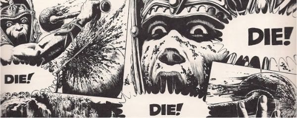
Zap # 4, Published by Last Gasp, 1969

"... the cartoon is ugly, cheap and degrading. Its purpose is to stimulate erotic responses, and does not, as claimed, deal with basic realities of life. It is grossly shocking, demeaning the sexual experience by perverting it...it is part of the underworld press--the growing world of deceit and sex, and it is not reality or honesty, as they often claim it to be. It represents an emotional incapacity to view sex as a basis for establishing genuine human relationships or as a normal part of human condition."

That's Judge Joel Tyler, talking about Zap #4. It's in the book A History of Underground Comics, written by Mark James Estren. I like that book, but I can't recommend it comfortably until Dan Nadel and Tom Spurgeon argue about it. But it sure seems alright to me.

My "get to these eventually" stack probably has quite a few more of these Important, Ground-Shaking reads in them, but finding them is just going to be dumb luck--I couldn't remember which issue it was of Zap that had Robert Crumb's "Joe Blow" story in it, so I'll admit to being pretty surprised that the exact issue fell into my hands during the random grab. Besides "Joe Blow", I'm guessing I have enough of these types of comics--Naughty Ones--to get me labeled a go-meet-the-neighbors pervert, which is probably something I should make sure my wife is aware of. For those who haven't read it, "Blow" is the cheeky story of an American family and the awesome sex they have with one another. Dad fucks Sis, Junior nails "the greatest mom a guy ever had", and the story closes with the two youngsters heading out into the world, where they will fuck and suck one another, as well as other people not related to them by blood. "Joe Blow" doesn't stand all alone on the cliffs of depravity, either: there's also a nasty piece of filth by S. Clay Wilson, where a couple of richie-rich types bang the hell out of the maid and end up shooting her with a musket ball that makes its way through her entire body before plugging up a guy's urinary meatus. Then there's science ficion fucking. After that it's--well, actually? Every story in here is about cocks, vaginas, semen, scabs, rape, incest, penetration, cunnilingus, homosexuality, heterosexuality, bestiality (with a happy little girl and her happy little cow), except for one, because it's a one-page Crumb-draws-black-people-as-monstrous-jungle-beasts story. So yeah, Zap # 4. This is 40 years old. It's still way further out there than anything that doesn't involve Josh Simmons. To be perfectly frank, a good portion of my time reading it was spent wondering what defense one might make to old Joel Tyler and his claims regarding this particular comic. Is it ugly? Yeah, I can see that argument being made about the subject matter, and except for when Mr. Peanut gets it on, the art isn't "pretty", no matter how much everybody in "Joe Blow" enjoys themselves. "Cheap and degrading" is a tougher sell for me--none of these cartoons have that sort of tossed off hack-ness that the Eros line pumps out. I don't know what to say to the idea that Zap #4 is designed "to stimulate erotic responses". I can see that being possible for some reader, sure, but there's a pretty long stretch of road between "some people might masturbate to Gilbert Shelton's drawing of a woman with eight breasts" and the conclusion "which is exactly why Gilbert Shelton drew it that way." From there, Joel just gets stupid: "[It] does not, as claimed, deal with basic realities of life." Yeah? Neither did Tommy Lasorda, and that man's belly was a thing of magic. Neither do those silly black gowns that judges wear. "Deal[ing] with basic realities of life" doesn't define the job of art, you dick. The job of art isn't a legal argument anyway, it's an aesthetic one, and aesthetics is supposed to be discussed during marathons of Tony Hawk Pro Skater the nights leading up to the final, or on blogs no one reads. "Grossly shocking" is another waste of time too--I'll admit to being a bit thrown by the whole musket-ball-in-the-meatus panel, but all it takes is one high-school girlfriend addicted to V.C. Andrew's Dollanganger series for incest to rapidly become something that's about as shocking as a lukewarm bath. I'd keep going, but it took me forever to decide whether or not to make a sarcastic remark about Jamie Reyes. Anyway, Zap #4: it's EXCELLENT. Just don't tell anybody that I own it.

Shade The Changing Man # 1, Published by DC Comics, 1977

Before you get into Ditko magic, here's case-in-point, example seventeen-thousand, why archiving every fucking comic in the world into a hardcover misses the point: Hostess Cupcake advertisements where Batman and Robin stop the evil Pigeon Person. It's the complete lack of inflection that makes this panel work. Exclamation marks are the sign of mental decay. This is what reading old comics are for. Not just because it's ridiculous, stupid, and worth a cheap laugh.
shadeadvertisment
Never mind actually. I think just because it's ridiculous, stupid, and worth a cheap laugh.

The other thing they're for is just...well, reading old comics. I'm more turned on by the Milligan Shade, but the Ditko stuff in here is pretty great. It's a smart opener--whatever Shade's M-Vest allows him to do isn't fully explored in issue one, and that leaves Ditko free to teach by showing. It's the showing that jumps the most, the exaggerated arms that expand, the collapsing side of Rac Shade's face as his hair turns into a Spidey-signal against the wall behind him, grinning like a maniac all the while. Ditko's 4th World looking antagonist shows up to cause problems, so Shade assists in killing him with a feedback loop, and the whole plot probably takes place in about six minutes, following the initial World-Goes-Crazy opening. What's most interesting to me about Shade is that he doesn't have the personality normally attributed to the innocent-man-on-the-run type background. (If you haven't read it, Shade and a bunch of death row prisoners escaped the "Meta Zone" and a few have made their way to the "Earth Zone", only to find themselves hunted, U.S. Marshals style.) Shade's got the dogged "I'll find the guy who framed me" determination, he's probably going to try to reunite with his ex-girlfirend turned Tommy Lee Jones as well, but he's also a little bit crazy and mean. Regular people don't interest him, it seems, and he moves around them the way you might imagine Ditko does when he doesn't feel like explaining his politics or talking about Spider-man. This is a VERY GOOD comic. But they should make sure they include Pigeon Person when they reprint it. (Which they apparently have no plan to do, because God hates you.)

Vanguard Illustrated # 4, Published by Pacific Comics, 1984

Although it's the Steve Rude cover and continuing story of the world's most masochistic encyclopedia salesman--is it really worth selling a deluxe edition if you have to fight cannibal tribesman to do so?--that serves as the main feature of this issue of Pacific's anthology-by-way-of-fan-letters comic, there's a back of book story by Paul Neary and Mick Austin that really wins the day. A couple of pipe-cleaning robots meet on their way to blow up each others respective "zone", engage in a debate on the success rate of mutually assured destruction, only to be destroyed by their human overlords when the lil' devils realize that bloodthirsty general-types are rarely sane. The script is clever, but it's the art that kicks ass and makes this one worth the search. Apparently the success rate of Vanguard stories was determined by fans writing in and saying "more please", which is probably why we've never heard anything else about Quark, a young boy hero story that's about as compelling as fixing a water cooler. Still, for an anthology comic, Vanguard's a hell of a lot more interesting than that Marvel thing where they reprint Myspace stories.

Peter Parker, The Spectacular Spider-Man Annual #6, Published by Marvel, 1986
todd_0002_NEW
I got this for free. I was willing to go as high as a quarter, but when I asked the guy how much a beat up copy of a comic featuring a variant Purple Rain cover cost these days, he just sneered and said "i could care less. Get it outta here." I don't know that there's any point in saying "this comic is sort of a generic story", because it's an annual, and that's an accuracy across the board--annuals are shitty comics as a rule. There's exceptions, sure, but I imagine a back-to-back annual take down would collapse under the weight of overly long shittery around the 12th copy of "When Green Arrow fell asleep and dreamed he was Robin Hood." There aren't even credits in the comic, although there are a few "editors notes" explaining that the word "Joint" means "Jail", so apparently there was a human hand involved in the construction and not just a crappy Spider-man story generator. Half of the panels are either unfinished or some kind of weird homage to Patrick Nagel, although you can find a couple of worthwhile drawings of a guy on a motorcycle where the speed lines go completely berserk. The strongest page in it is some ad for Marvel's New Universe imprint, an ad that chooses not to showcase any of the New Universe titles or characters, just a gigantic bolt of lightning destroying about 35% of the globe. That's kind of interesting. Apparently even in the 80's Marvel didn't even need to worry about the content when it came to hawking their wares: Something IS COMING YOU BETTER BUY IT, you don't see that kind of campaign too often, unless you're an Apple freak, or...well, Marvel Comics, honestly. Oh, there's a story too, it's about some gangbanger who decides to go legit after meeting Spider-man and besting him in combat. (The gangbanger can shut down Parker's spider-sense and avoid punches, making for some of the worst fight drawings I've seen since...oh, I'll be honest, I saw some just as bad about three hours ago.) Anyway, the guy's mom dies. He leaves town. I have the worst radar for Spider-man comics, apparently. It's CRAP, in case you're wondering, although it probably deserves some credit for ganking the iconography of Prince.

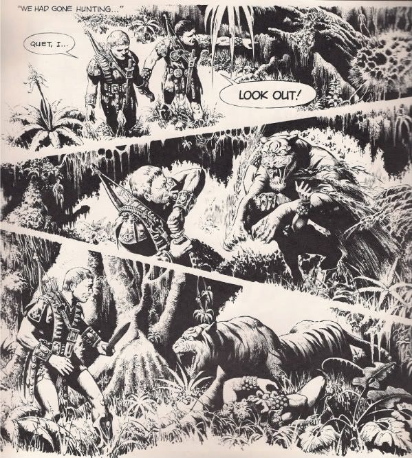
Elementals #2, Published by Comico, 1984

Why this got sent to me, I couldn't tell you. Maybe because I don't like Fables? I have no idea why someone would send a stranger two issues of Bill Willingham's 1980's Elementals comic. I do not want one issue of Bill Willingam's 1980's Elementals comic. After reading it, I guess the person who sent this thought I would do something funny, or say something funny, or...I don't know why people do things. This is just a boring super-hero comic about boring super-heroes and, if I remember it at all, it will be because it had a panel featuring an old man in a no-secrets spandex outfit talking to a woman who is also wearing a NO-SECRETS spandex outfit, and the woman's rear end is the focus of the panel. That was the only panel in the entire issue that I looked at for longer than it took for my brain to grasp the information in the panel and continue with the narrative. In other words, cheesecake caught my eye, but I'm sure I would've stopped at a panel where there was a close up of an old man's firm buttocks too, because that is unusual and therefore worth my time. Otherwise, this comic reminded me of a rulebook for those old Palladium role playing games, where almost every page had a drawing of some generic super-hero with rip-off powers. I'm not even sure what these Elementals can or can't do. One of them looks like She-Hulk, but she's apparently an Aquaman type of character. Somebody whose name I forgot dies, but I've already thrown the comic out the window into the abandoned lot that I threw my broken microwave into, and I can't be bothered to go all the way outside with a flashlight to check. It's CRAP as well.

The Princess of Time, Published by Picturebox, 2007

This is silent comic, sort of like the first issue of The Many Deaths of the Batman cross-over, except that one was about Batman and it was drawn by Jim Aparo and this one is about Ashley Glasscock, Gordon Hammie and Barnabus Conrad and it was drawn by Jon Vermilyea who I know because I secretly like his mean installments of fighting breakfast dishes in MOME more than I like the serious comics that David B includes, because I am a philistine. Princess of Time, if I was going to be a stickler, doesn't seem to have a Princess in it, unless that warped monster creature that gets slit open Tauntaun style to reveal a smaller monster is a female, and the slit is supposed to be a vagina, but I'm pretty sure the title has an arty meaning that Jog understands. I liked this one, it's big and gross and funny and it's printed on newspaper, which makes me less inclined to treat it seriously than I imagine most of its fans would prefer, but again, I don't care, because I'm old enough that I don't need more friends. The whole printing comics on newsprint is sort of genius to me, especially if you read some of what the random asshole club says about that Wednesday Comics thing, i.e. "How will I have a mint copy of this", which is sort of like--really? Really. Do you wet the bed, dickboy? I'd like to run over your face with a truck, shit-for-brains. I'd like to make your mom into a mint copy. I'd like to...this really doesn't have anything to do with anything, but seriously: there's no words in Princess of Time, how the heckfire am I supposed to talk about the comic without the words, I need the words, I gotta have a plot to grab ahold of, otherwise it's just art and stuff, and I'm not that guy, katzenjammer. But yeah, mint copies. Fuck mint copies. Newspaper comics--oh, just imagine the stores, if everybody did newspaper comics. We'd all stand around like a bunch of 1930's types, hats and all, Seth would get called "trendsetter", they'd deliver them in satchels, there'd be twine everywhere. I'd write blogs on a mimeograph machine, you'd never hear from me again, it would be the sweetness and the light. Oh, and this comic is GOOD up until the last panel, and then it either becomes VERY GOOD, or EXCELLENT, or VERY EXCELLENT.