A few thoughts on BEST AMERICAN + Cover Flow
/I quite like the BEST AMERICAN COMICS series. I think that it provides a generally decent overview of what's happening in non-cape comics in any given year, and I like it as an "entry drug" for civilians, as a retailer. This year's installment, guest-edited by Neil Gaiman, is another fine fat package of comic goodness, but I think a few of the flaws of the approach were pretty magnified this year.
Primarily, I was fairly dismayed at the length of some of the excerpts this year. While it was nice to see something capey make the book this year (well, last year they tried to get Batman Year 100 in there, but DC refused), and something from Marvel at that, printing an entire issue's worth of OMEGA THE UNKNOWN seemed a bit much. Even more so, including almost the entire second issue of CITIZEN REX seemed over the top. I strongly believe that the length of excerpts should almost certainly be limited to no more than 5% of the final work. With CZ being 120 pages from tip to floor, I'd submit that no more than 6 pages would be a much more appropriate length than 14 pages of it.
Second, as is typical, the "usual suspects" (Los Bros, Ware, Bagge, etc.) get a lot of space. There's no doubt these are creators doing great work, but they just feel a little too ubiquitous to this reader.
What excites me the most about a project like BAC is finding people/works that I "missed" -- this year the clear winner for me as an individual reader was a toss up between Dave Lapp and Michael Cho (who did the cover), both of whom I certainly want to see more from.
Overall, I thought this was a pretty solid package - well worth the $23 asking price, and it was a VERY GOOD package, missing the excellent only because of the length of some of the pieces included.
****
Now here is where it gets weird... I hit the web as I was reading through, looking up Lapp to see if I could find other work. For some reason, and I can't re-google my results that made me think this, I somehow led myself to a book called POWER OUT, which I then picked off my store's shelf and started reading. POWER OUT is actually by Nathan Schreiber, who isn't in BAC at all, and, so, I haven't got the foggiest notion how I got my signal's crossed so entirely. So, before I picked BAC back up to write this, I thought these two pieces were linked, and it turned out they aren't, even a teeny bit.
Having said that, Nathan Schreiber is also another nice "new talent" -- in his case he was a Xeric winner (and we always rack every Xeric book as a matter of course), and he's a gifted cartoonist, apparently working at Act-i-vate. I dunno, I'm not a webcomics guy myself.
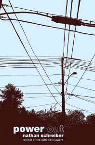
Anyway, what wanted me to write more about POWER OUT isn't actually the work inside (a solid GOOD, though it is), but, rather, about cover design and why we haven't sold one copy of this book, as good as it is.
So, that's a pretty awful cover -- not from rendering or anything, but from how it sits upon the rack. What are it's mistakes?
1) The image doesn't convey anything whatsoever -- while the premise of the story is two kids adventures when the power goes out over a weekend (when their parents are away), that's not communicated in the image at all. those power lines could mean ANYthing.
2) The cover and credits, and, especially "Xeric award winner" are in wholly the wrong place. The human eye (or, at least, the Western bits of that eye) scans a page left-to-right, top-to-bottom. That means that to the extent possible, you want everything that is important to either be on the left side, or along the top. The top left corner is the single most important bit of your real estate (look at a regular Marvel or DC comic if you don't believe me -- they got that way over years of development) -- putting your title on the bottom of the book is basically "burying the lede"
3) the two-tone color. While the book itself, on the inside, is toned that way, it doesn't "pop" off the shelf whatsoever as a cover.
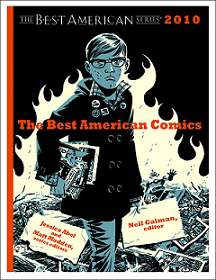
Interestingly, BAC itself almost has the same problems:
The advantage that BAC has is the red -- that makes things "pop" just fine; without the red, it would die on the shelf. But look where (what I as a bookseller consider) the most important part is: "Neil Gaiman, editor", ugh, it's down in the bottom right.
Seriously, when designing your covers, put the most important stuff to the left and on the top!
-B
