

A Review of Batwoman in Detective Comics Focusing Mostly on the Art
/![]() Detective Comics #858
Detective Comics #858
Here we have the fifth issue of the "Batwoman in..." iteration of this title, and the first chapter in a three-part Origin of Batwoman story. Writer Greg Rucka is on for the duration, as far as I know, but be aware that artist J.H. Williams III will be absent for a while following issue #860; Jock steps in as guest artist for issues #861 through #863, while #864 should see Cully Hamner, artist of the series' backup feature starring the Question, take that character up front while an unspecified artist (maybe Jock, maybe Williams) does a Batwoman backup. After that, issues #865-#869 should round out Williams' involvement with the series, god and schedule willing.
I don't know if Batwoman will stick around much after that, but I think Williams' departure might mark the 'end' of the run anyway for a lot of readers. Most eyes are on him right now as bringer of the book's identity, which isn't so common with superhero comics these days; even artists working in hypothetical collaboration with colorist Dave Stewart and letterer Todd Klein -- both surely on top tiers up front in Previews -- tend to register as secondary to writers. But Williams isn't a common superhero artist, and he seems to get less common with every new project.
I mean, go all the way back to Innovation's Hero Alliance Quarterly #2 in 1991 and sure, you'll find a novice artist, inked by one Ray Kryssing, parsing a pretty traditional superhero short concluding in a pretty traditional superhero fight, commonly awkward as first-time pencillers are.
From our comfy seats 18 years later, sorting through our official J.H. Williams III longboxes, maybe we might say up front that plain superhero action doesn't fit him well. That's totally flawed reasoning -- how many first-time superhero artists look good at all? -- though for some reason, maybe Chuck Dixon's scripting or the presence of toner Barb Kaalberg, or just the content, Williams seems more apparently suited to drawing NOW Comics' The Twilight Zone #4 in 1992, a few months later.
Ha ha, the first use of multiple art styles on one page! You wouldn't guess at the time what that kids' drawing anticipates. You could guess that Williams' shadowed, nervous characters would be suited to more explicit thrills, and you'd be right. Go forward, and you'll see him become a grounded horror artist, with an Eternity-published, Full Moon-approved Demonic Toys miniseries in 1992, drawn with Larry Welch and inked in part by Dave Lanphear.
And if that's a little slick for you, 1993 brought an abortice project at Faust homebase Rebel Studios: creator/writer Michael Christopher House's Empires of Night, only one issue published (along with a short story in Raw Media Mags #4), with Williams providing pencils and inks himself.
By 1995, Williams had broken in to DC, following Michael Avon Oeming as regular penciller on the American publisher's ill-fated domestic edition of Judge Dredd. He also did some scattered Milestone Media work, most prominently a miniseries starring an ultraviolent supporting character - Deathwish. It was an odd project, gun-toting costumed vigilante content subsumed into writer Adam Blaustein's bloody, bombastic tale of art and murder and transsexuality; such issues didn't start with Batwoman, you know. Williams began to transform, even beyond the obvious effect of teaming with inker Jimmy Palmiotti -- a semi-regular Williams cohort in the mid-'90s -- and painter J. Brown; his layouts began to take obscure yet oddly fitting forms.
Horror remained in his blood. It's easy to forget, but he seemed to be the Horror Guy. When he drew a story in the Annual-but-we're-not-calling-it-that Wolverine '95, the X-Men went to hell. Thought they didn't it that either.
Of the three inkers assigned to that story, one was Mick Gray. He and Williams were soon a devoted visual team. By 1996, they were taking on a fill-in issue of Batman (#526), a fine, dark superhero for dark, developing artists.
You can see how sturdy the figure work has gotten. You can sense how Williams & Gray would soon transition out of terror-type works into a broader space of moody superheroics. Williams' layouts would eventually become more decorative. But one final element needed to be firmly established, and I place its full arrival at the release of The Flash Annual #9, later in '96.
It's not unlike that kid's scribble six pictures up and four years prior - an item in a story, depicted as having different visual properties than the story itself. But here the emphasis is on total contrast: light with dark, simple figures with heavy ones. Williams was less than five years into his professional career, and there was the first real sign of a chameleon's trait. From there you can fill in the next 13 years, Chase and Promethea, Gray's departure and Williams' decision to only ink himself, Seven Soldiers and Desolation Jones. I haven't been close to comprehensive here, but the highlights add up, taking us to where Williams is now: the superhero artist as high goddamn formalist.
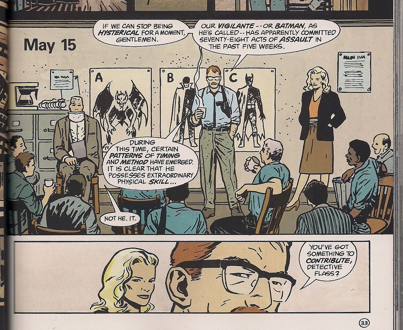
 (From Detective Comics #854; Batwoman pt. 1)
You see, somewhere along the line, a ways after the turn of the millenium, Williams' interest in design and his aptitude for adopting wildly varied visual styles evolved into a detailed usage of elements of the comics form, where his storytelling began resisting the value of simple, efficient guidance of the reader from one panel to another as an ultimate goal. His page layouts and panel innards began to draw specific attention to themselves, in that they took on specially and intuitively coded meanings, or violating the steadiness of tone typically demanded by 'realist' superhero art.
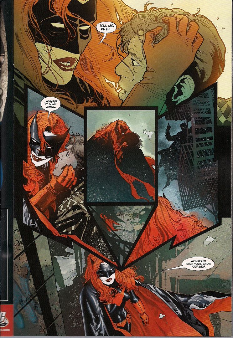
Williams's figures remain heavily realist, granted, but you can't quite say that of his art - look at the huge floodlight behind Batwoman in the top-most panel above. Look at how her skin is so white that her body is nearly a light source. Look at how the Bat-symbol that is the bottom-most panel doubles at Batman's POV, upsetting her by literally poking down at her head. Any one of these techniques could slip in and be welcomed in most realist-styled superhero comics, but all of them together upset reality itself. And Williams is just getting started.
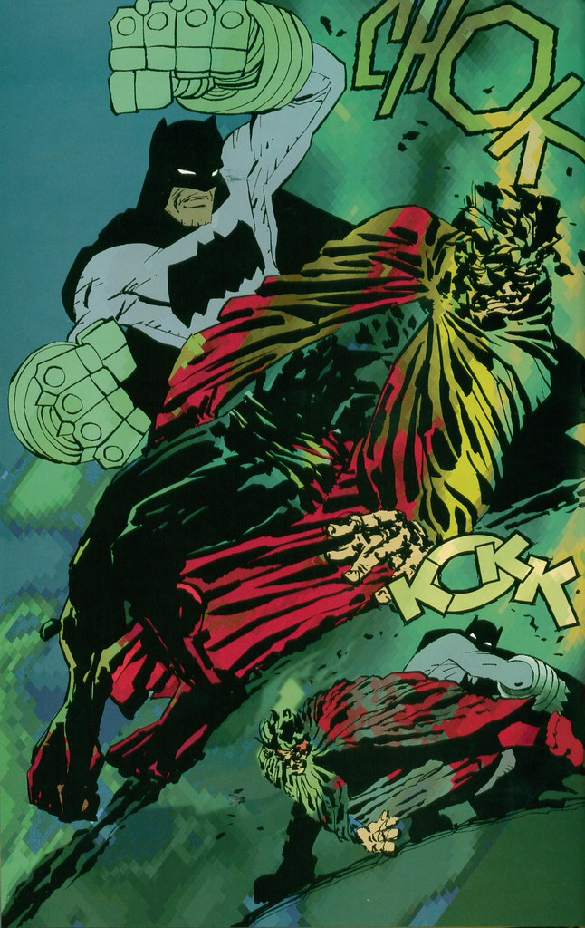
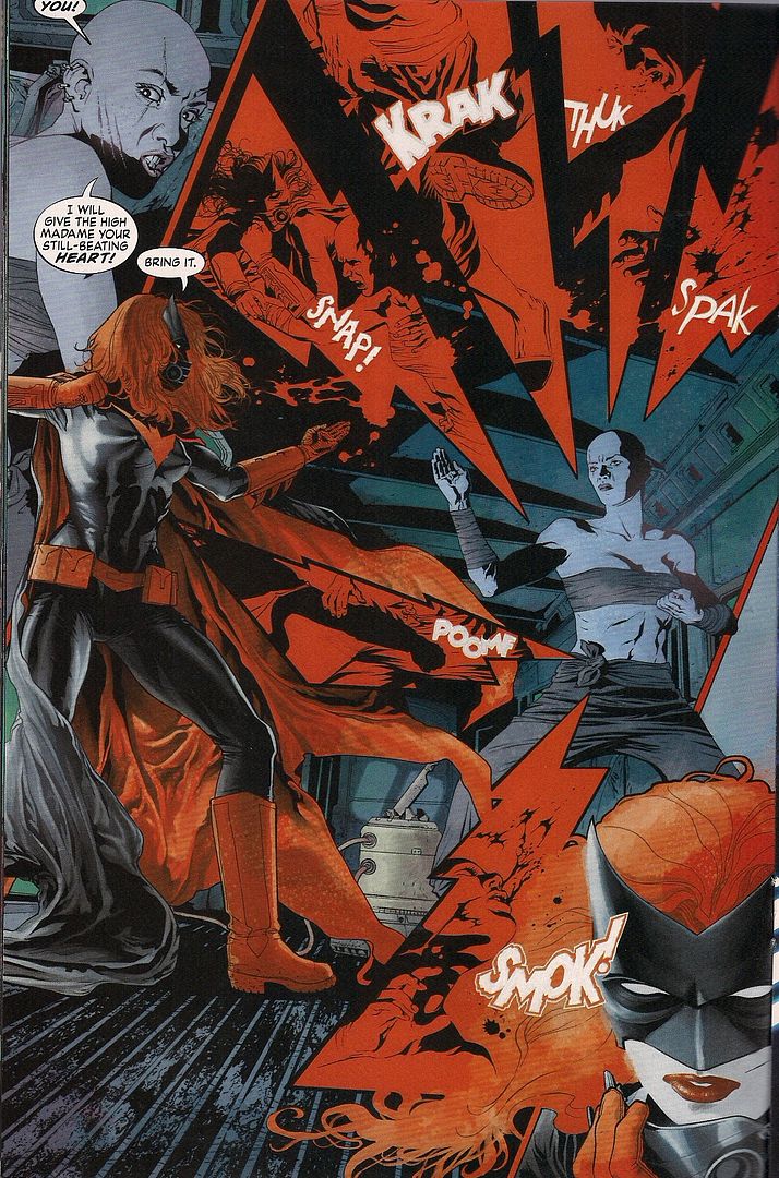 (from Detective Comics #857; Batwoman pt. 4)
This is a fight scene. One where the center figures don't actually move - a typical trap for realist superhero artists is leaving their detailed (perhaps photo-referenced) characters posed instead of moving in fights. Williams steps around this by stepping around the figures, trapping the action inside red bolts of PAIN. But there's more; remember the brightness of Batwoman, the backing floodlight and white skin. By this point of the story, Williams' visuals have established that Kate Kane is playing a role, that becoming Batwoman changes her.
We know, because Williams simply changes his art, so that bright, simply laid out domestic scenes of Kate out of costume contrast wildly with the sprawling layouts and burnished colors of her superhero life, prone to glowing red as markers of thrilling, visceral violence, a real horror idea first steadily used in Desolation Jones. Moreover, Williams shows one style bleeding into another at times, so that stepping into the superhero zone melts away one world, and that aspects of that superhero 'world' -- its special, unique art style -- can silently comment on the character's state of mind merely by appearing.
In this way, Williams' art tells a story in tandem with but also independent of Rucka's words. It's free to run ahead of the plot, giving away secrets or even undercutting the dialogue for a deeper total effect. To say that Williams' art is merely good-looking or well-designed is to deny how truly unique it is, not so much inhabiting narrative space as invading it, pushing the words around, probably, I expect, with Rucka's assent - it's easy to attribute the words of dialogue to Rucka, and the individual visual elements to Williams, but surely the approach to individual scenes comes partially from both of them, the writer discussing the art and the artist directing the writing. It's easy to credit the whole visual display to Williams (and Stewart, and Klein), but reality likely isn't so simple.
 (from Detective Comics #854; Batwoman pt. 1)
This is the tidy, domestic style, albeit with Kate's & her dad's psychological trauma lurking behind them. The splotchy watercolor effect becomes very important to the visuals; here in the first issue it's 'defined' as anxiety and inner hurt. Now go back up one image: it's soaked into the background of the fight. Back up another: it's all over, mostly in the center panels, most obviously around Kate as she notices Batman is looking at her, and then around Batman, though half-transitioned into a proper background of overcast Gotham skies. It's all over, and it all stems from that image in the center of the page just above, and this issue is where we find out what it all means.
Which isn't to say the issue's composed in that style. Oh no, that'd be too simple. I'm gonna start spoiling the plot now, by the way.
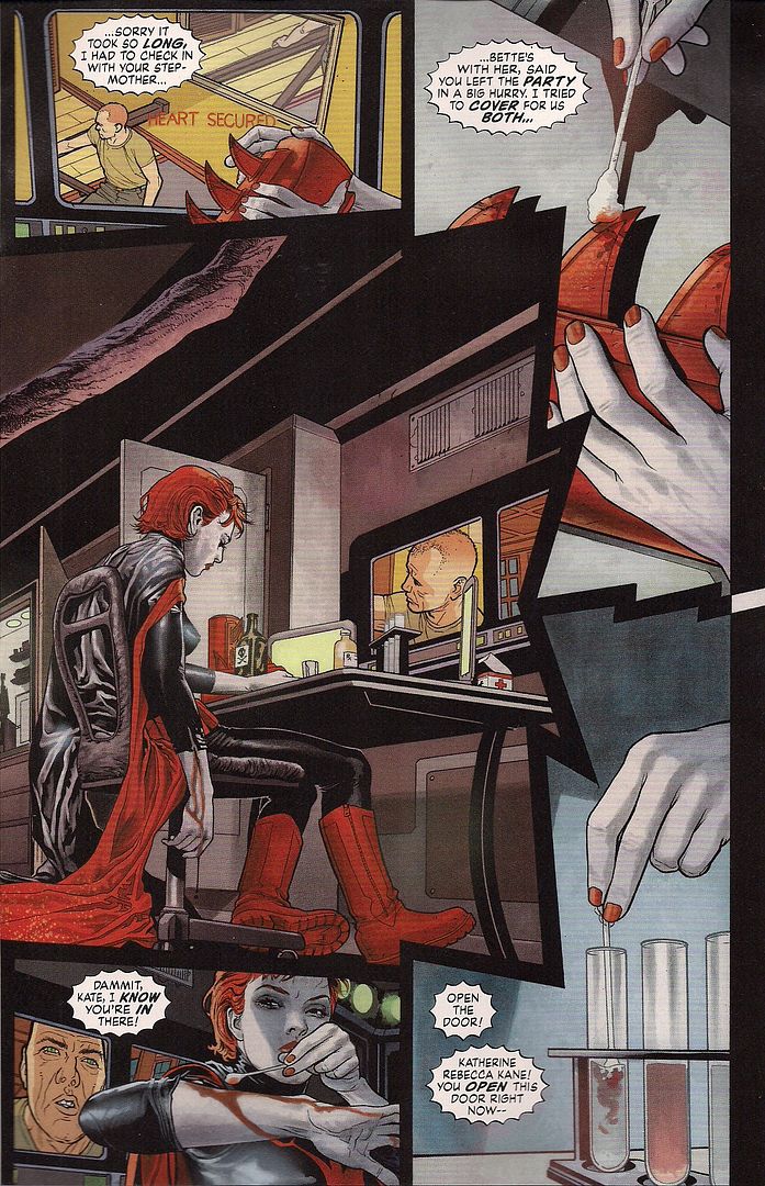
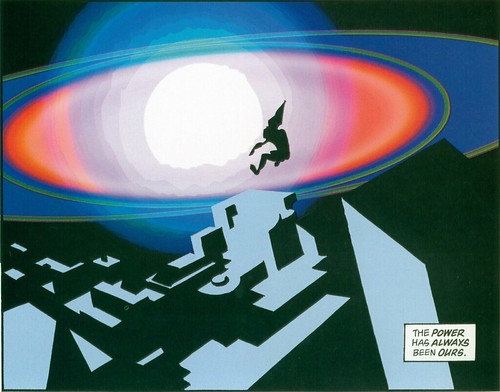
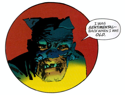
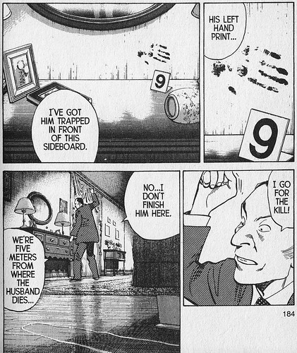
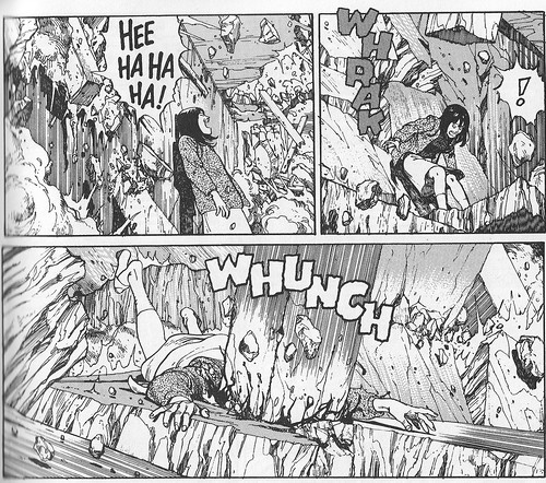
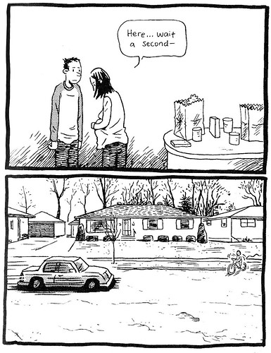
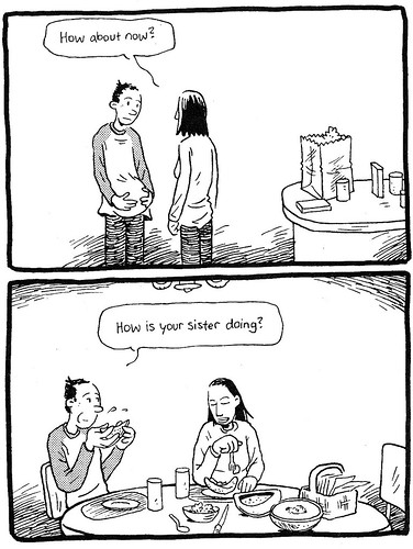
 (from Detective Comics #858; Batwoman pt. 5, which is the present comic I'm reviewing now, not that I'd blame you for losing track, I mean how many pictures is this? 12?)
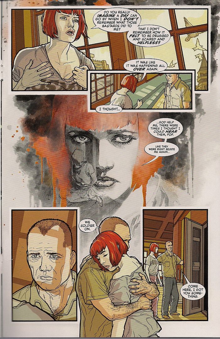
Here's lil' Kate and her twin sister Beth, twenty or so years ago. Crisp coloring -- and really, Dave Stewart is doing top-notch work on this series every issue -- not totally unlike the domestic scenes set in Kate's present. But there's something about this character art. Something familiar... like another Batman book... from twenty or so years ago...
 (from Batman: Year One)
Oh shit, it's David Mazzucchelli! My god, Williams must have found him at a rare con appearance or talk and touched his exposed skin and took his power! I wonder if he'll ever get to kiss Gambit? Hang on, Batman's Marvel, right? No, I checked. That answer's no. Maybe I need a more detailed refresher here.
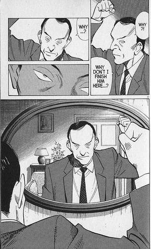
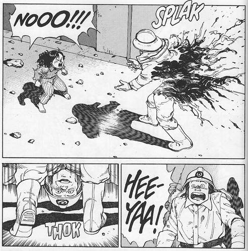
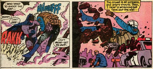
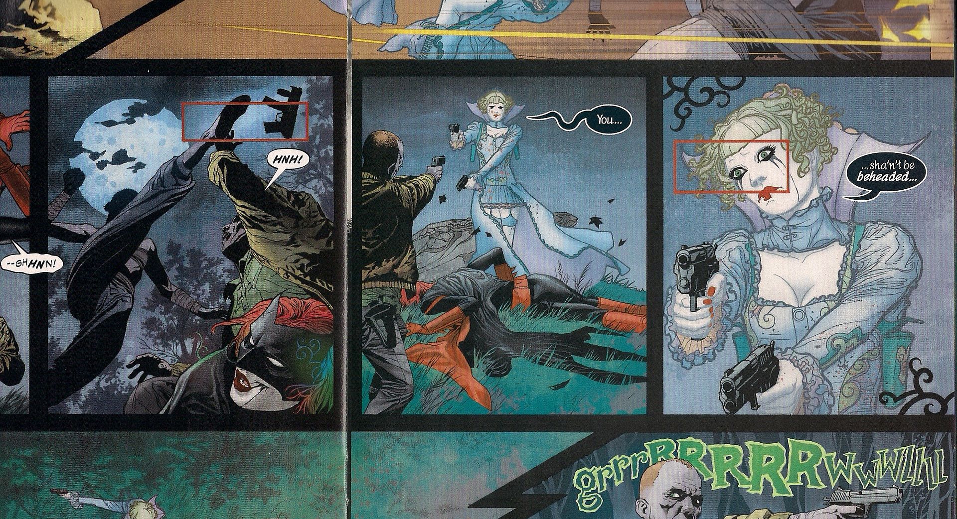 (from Detective Comics #855; Batwoman pt. 2... the story isn't called "Batwoman," btw, I'm just trying to put the whole run in sequence)
The bright young thing above is, apparently, Kate's sister Beth, as the Religion 'o Crime villain person "Alice." Or, that's what she told her in issue #857. I believe her, since the comic's visual storytelling, in retrospect, has been hinting at this for a while. This is a double-page spread detail, in which Kate's "Alfred" -- her military dad -- comes to her rescue. Note the red-border pain box on the far left, marking a point of foot-to-gun impact. Now see how the same pain box appears on the far right, apparently to highlight Alice's vision for no reason. This is a hint, a double meaning; she's pained to look at this man, because this is where she realizes it's her father.
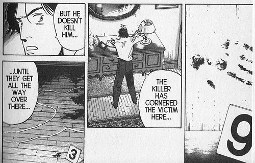
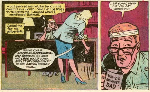
 (from Detective Comics #857; Batwoman pt. 4)
Here we are at the top of last issue, after Alice has kidnapped hers and Kate's father. Right on the first page (and on the cover, actually), Williams' layout reveals that the two are twins. We don't know until this issue that Kate has an actual twin sister, so the visuals are free to spoil while only seeming to trigger more basic concerns for duality - Alice is a painted Joker to Batwoman's Batman, both with white skin in the classic two-sides-of-one-coin conception. While Kate prefers pants and suits and 'masculine' clothes, Beth is almost a parody of frilly femininity. The dualism motif continues throughout the issue, until a segue at the end.
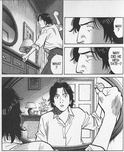
 (Id.)
(Id.)
All tone is ripped from the image as Batwoman processes Alice's revelation of their true relationship. Next issue, this issue:
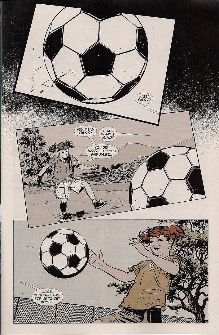
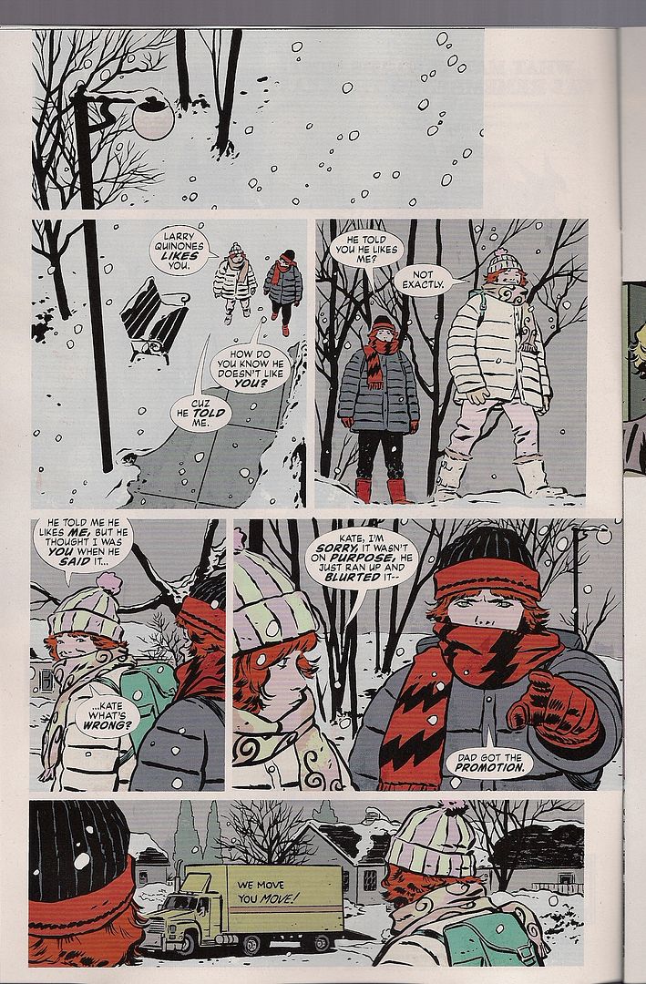
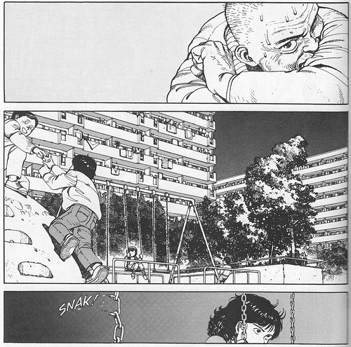
A reversal, as the b&w soccer ball comes toward lil' Kate, in her own memories.
It looks like Beth has taken after her mom, given her Alice persona's hair. Kate has short red hair when grown, like her dad. The body language of those kids is great; Williams is no simple impersonator, even leaving aside his own statements that Alex Toth went into this look along with Mazzucchelli. His craft is on high enough a level that he can take on a total visual persona, and work it smoothly into the series' overall visual display.
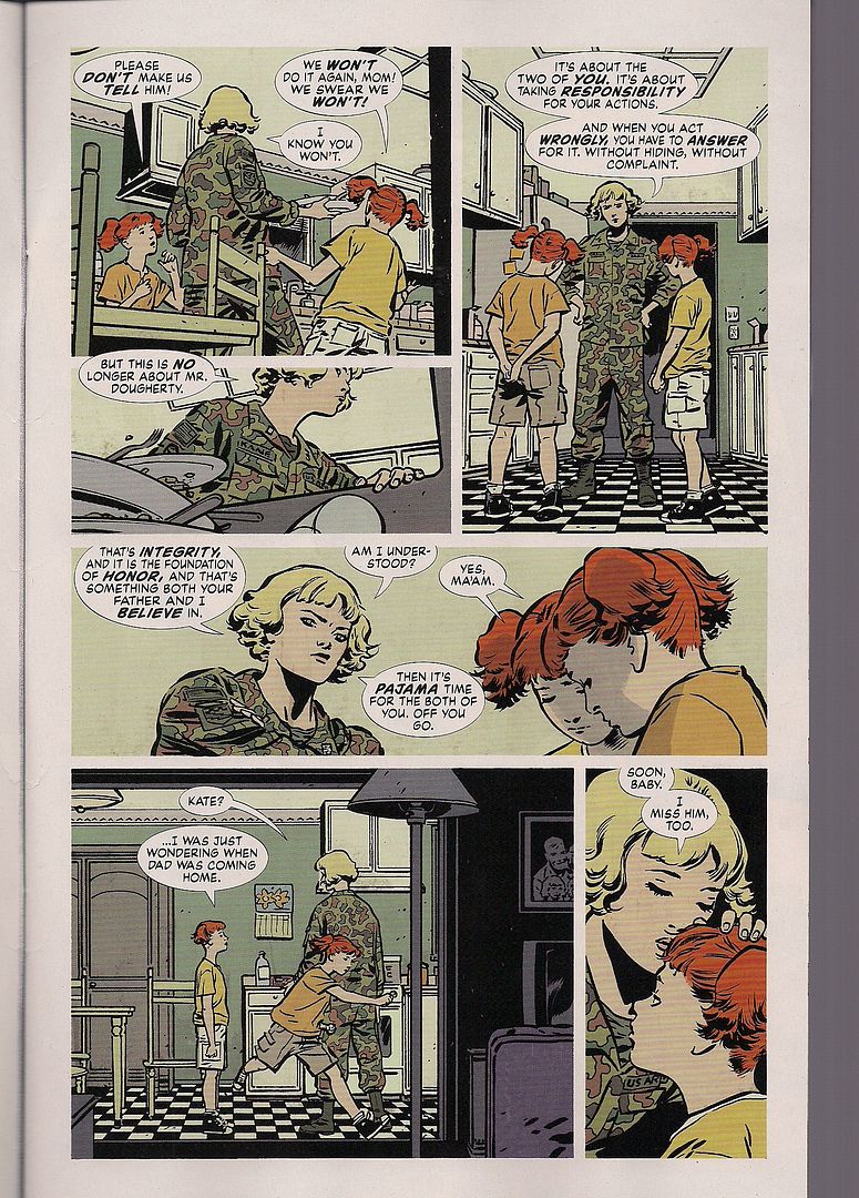
For example, as I mentioned above, the 'flashback' domestic scenes share various properties with the 'present' such scenes: clean, bright colors, placid panel layouts, etc. Now here's another part of this issue's flashback.
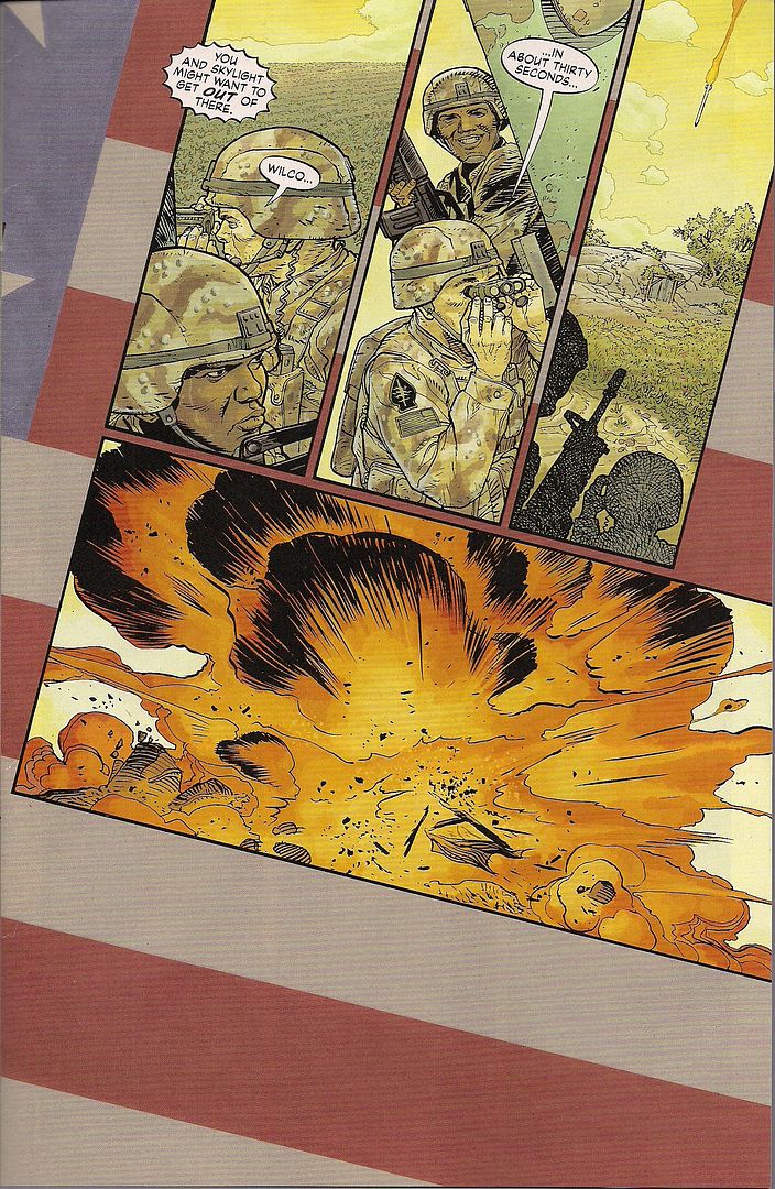
The visual difference between this and the image above it is obvious; the storytelling difference is that Kate isn't actually remembering this part, it's her impression of what her father was doing when she was a child, a memory of a memory. So, we get this excellent patriotic background and a bright-colored, heavy detailed visual display (just look at all the work in those shadows! that grass!), somewhere between the cleanness of Kate's adult life and the drama of her superhero life, well-organized panels simply tilted to the side. It's a continuum Williams has established, built up over close to 100 pages now, broad enough to accommodate semi-specific homage while maintaining a keen logic whereby every aspect of the page -- line, panel, color -- has a metaphoric charge that can be read and felt, and extrapolated from.
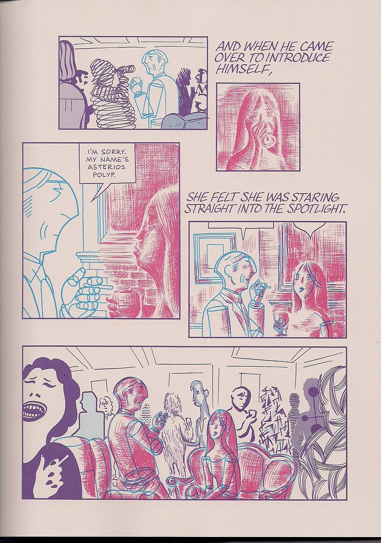
Or, to give a recent example, it's essentially what David Mazzucchelli does in Asterios Polyp. Like Williams, Mazzucchelli began in comics as an odd duck stylist staking a claim on the genre landscape. He matured, attained some mastery, and then became interested in elements of form as wittily literalized narrative items. For Mazzucchelli, though, the lattermost only happened after he departed from genre comics. I can imagine Williams vanishing one day too, only to return years later with a fat book of comics all his own. For now, however, Williams' own formalism is tethered to 'realist' interests, which include realistic figure drawing and reactions to (or subversions of) realism itself. It's telling that his Mazzucchelli style is kept the most distant from the story's living present, full of weighty, muscled people.
 (from Daredevil: Born Aga... wait... no, from Asterios Polyp)
Mazzucchelli himself, meanwhile, has tapped into stripped-down cartooning -- and he's doing all the letters and colors and writing himself -- so his hand is more free. An entire world of allusion looks ready for access, anything, anything capable of being visualized. Still, this approach is not reserved for literary comics, and its study needn't be restricted to non-genre works. Even as writer-driven a type of funnybook as today's superhero comic can address the form, and wring psychological depth and emotional power from the stuff of the page. That this most venerable DC title hews close enough to expected realist superhero visuals cannot prevent it from wielding the make-up of those visuals in a self-conscious, clever manner.
Which then raises the inevitable question: to what end? We're not talking abstract comics here. There is a minority opinion as to Mazzucchelli's comic, a dissent, holding that it's little more than busy prettifying of a banal, shallow story, the most ado ever about Doc Hollywood or Pixar's Cars, a dazzling display of craft that leaves hapless critics swooning from such sheer fucking bravura, cataloging every fresh swoop of the line or canny citation while failing to evaluate whether it adds up to anything soulful, or truly demanding or insightful, or really just damn anything beyond the egotism of aptitude just recited.
The key, I think, is in the reader's own willingness to draw pleasure from formal traits, to soak in the metaphoric power these books deal in, as related to their plots, to see the shades of character revealed not through psychological inquiry or even mere statement, but through the self-evident interrelation of elements of comics, icons against icons on a more basic level, defined and electrified and set loose among the icons-as-people that populate our picture stories. I've never found Chris Ware to be chilly either, cloudy as that makes the issue, I guess.
 (I suppose you're wondering about the backup story, huh? The Question? Its own first storyline ended this issue, and nobody has mentioned it all that much. Unfortunately, there just isn't much to say - as with every chapter beyond the first, this one sees Montoya evade a fix she's gotten into and investigate a location, this one bearing a plot climax and an opportunity for hero to vanish before the happy supporting characters can thank her. It's total superhero detective boilerplate, and while Rucka & Hamner don't do anything particularly wrong, there's nothing to distinguish it from hundreds of similar stories sitting around in just the past 800+ issues of Detective to say nothing of superhero history itself.)
Of course, none of that's to say Asterios Polyp and Detective Comics succeed in equal measures. Mazzucchelli's book leans very heavily on visual traits, taking its story into its heart like a power core, which gets its place and figures and letters and everything contorting to marvellous effect. Detective Comics actually promotes a more even balance between writing and art. But that's the problem.
I like the image just above. That's in the middle of this issue, a detail from the second of two double-page spreads that cuts Kate's flashback in half. It neatly allegorizes the growing break between Kate's private life and her Batwoman performance - Williams even sets up the bright 'domestic' scenes in square television screens that mock the staid, squares 'n rectangles layouts of those portions of the series. Kate is growing apart from that now, the vivid detail of her Batwoman body now making her seem especially hurt and tired, performing her detective work in a detective comic.
Yet there's no escaping that this remains a deeply typical superhero detective story, one with the tremendous benefit of such visual inspiration running along side it, but when you really look hard, it often only comments on Kate Kane's psychology, or anticipates some typical everything-in-its-place origin story twists, or plays with a Batman/Joker duality Alan Moore's had sitting in the freezer since the twilight of the Reagan administration.
Rucka is a skilled writer, but so far here he's neither deep nor subtle; the cut off point for the first half of this issue's flashbacks is no less than the doomed Kane twins and promising they'll always be together, accompanied by a dramatic fade to white (which could be Williams, mind you). As the obligatory tragedy that will set Kate on the winding path to superherodom draws near, irony is squeezed out as the girls misbehave, only for their demands to lead their poor mother right into danger, and pathos. Never mind the general three-act arc of the story, introducing a villain with a secret connection to the hero (pts. 1-4), leading into the revelation of the painful secret origin (pts. 5-7) and probably, I'd guess, culminating in some clash that sets up a status quo while not entirely foreclosing on future developments in the same vein (pts. 8-12, not counting the Jock and Hamner stuff).
Because the writing and the art run close, one can't pass the other by much, and to me there's always some dissatisfaction. I'd still call it GOOD, though folks more tolerant than me of some blunt, familiar genre mechanics will rank it higher, I'm sure. And this grade tries me, because seeing J.H. Williams III & co. at work in this way assures I'll look to them in the future, which I can't say of everyone. Mazzucchelli too, obviously.
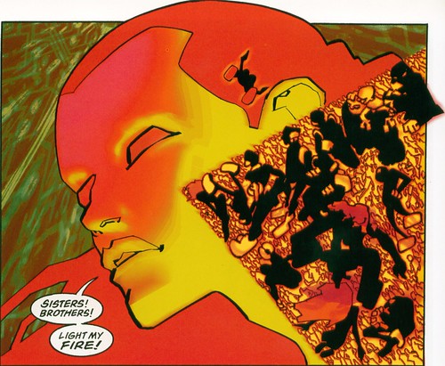
 (just guess, huh?)
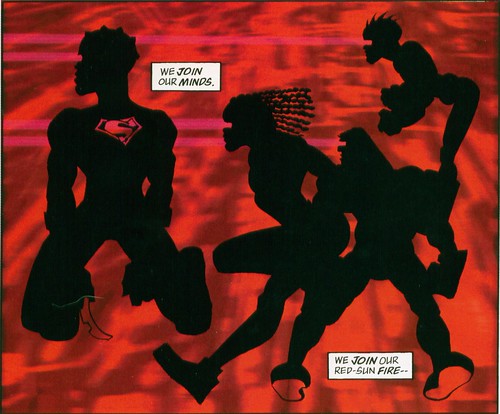
The two becoming one, the basic frameworks, the archetypes among archetypes becoming something greater and more shaded or sturdier through communication, feeding on each other's energy, enjoying one another's heat. Bits of form becoming fuller, getting -- eek! -- more realistic as characrers. You can go far with this.
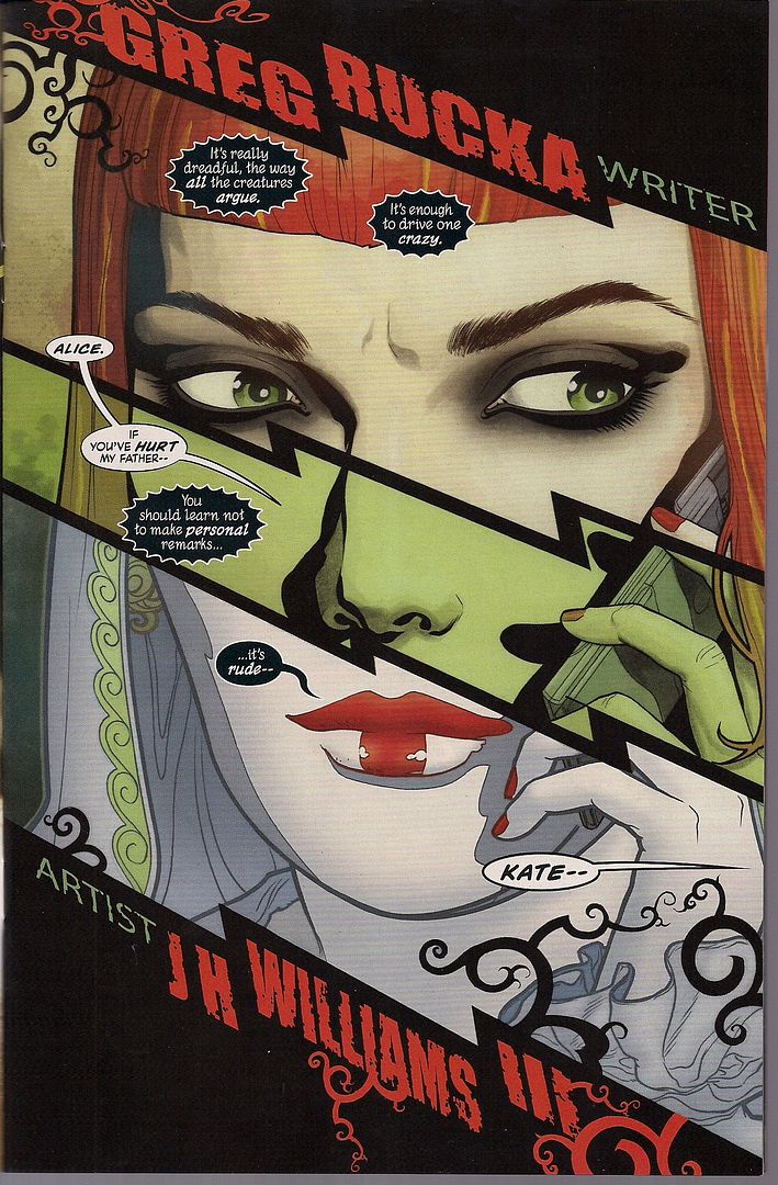
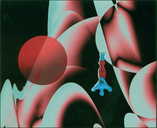
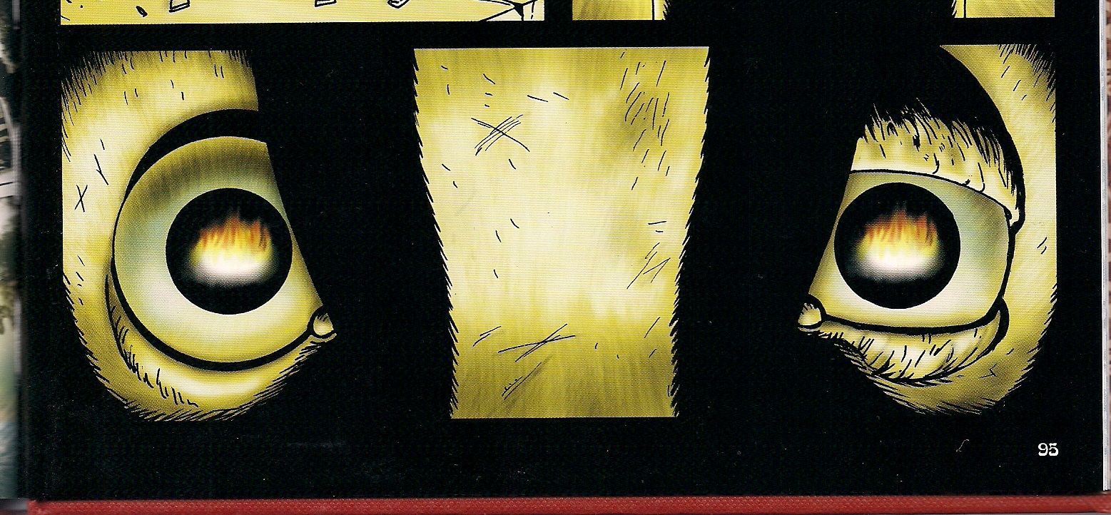
And as for Kate Kane.
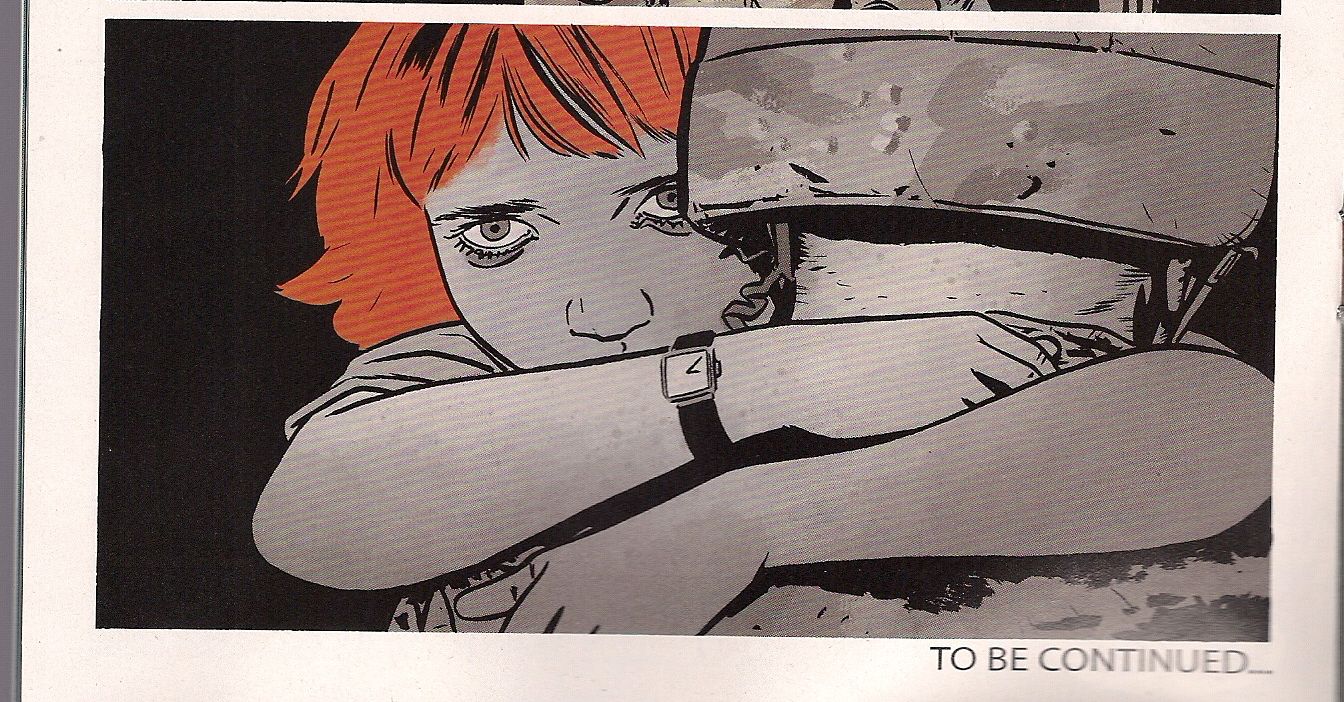
I don't know if you can even see it on the screen. It's better on paper. It's the last panel in the comic. She's just seen some bad stuff. Her white skin is no longer pure. In her arms, the watercolor splotching is present, very slightly. She's down the path of transformation just a tiny bit, that which will transform and delight her, but it's born from pain. The motif gains in meaning. No words are spoken. Her eyes tell a story, but there's more to a panel than that. Some artists know.


