Don't make me bored, you wouldn't like me when I'm bored: Graeme doesn't dig Hulk.

It's probably sad to point out that HULK #1 marks the point where Jeph Loeb has started recycling Al Milgrom plots, but I am a man cursed with a long memory for off-periods of Marvel history. But still, despite the seeming return of the Rick Jones Hulk - Didn't Rick die, on panel, in World War Hulk, or am I misremembering? - and the (unfulfilled) potential for big dumb visuals, this comic ends up feeling much more flat than it should.

Part of that is that, for all the ideas that feel as if they should be popping, none of them are actually taken anywhere new. A Hulk shooting bad guys with a massive gun? Not only does it sound like a bad idea straight from the 1990s - well, this is a Jeph Loeb comic, and he is friends with Rob Liefeld - but we've just come from the Planet Hulk era where a Hulk using weaponary (and dressed like a gladiator, to boot) was commonplace. A second Hulk - who may or may not be Rick Jones - is, as I said above, straight from Al Milgrom in the '80s. And the last page "shocker" comes directly from Mark Millar's Ultimates... But, unlike other, similarly Magpie-esque, comics from Loeb, this doesn't even feel like a greatest hits compilation for the character... it just feels done already.

For the sake of ease, I'm going to blame it on Ed McGuinness. It's not that there's anything especially bad with his work here, but somehow it's missing the fun that he brought to something like Superman/Batman... His characters seem more generic, and his staging more dull. In the past, he's managed to take books with less ideas or intelligence than this (See: Superman/Batman, for example) and nonetheless turn them into some bizarrely enjoyable pop moment of balloon-muscled square-jaws in colorful adventures. Here, that energy's gone, and it makes the problems with the writing that much more obvious.

It's a weird book in general; there's nothing in the set-up that doesn't feel temporary, which makes for an experience where it's hard to really care about anything (An experience which is also helped by the melodramatic, surface-deep, dialogue and characterization, and by the turn-around of status-quo of the two main characters just a couple of months after their fates in World War Hulk). Most of the characters are borrowed from other series, lending the whole thing a cheap mini-series feeling (Because, come on, like anything's going to happen to She-Hulk here. And isn't Doc Samson in some other book these days as well?), and with a movie coming in the summer that features Bruce Banner as a green Hulk, it's severely unlikely that we're going to stick with a red Rick Hulk beyond the opening arc of the series... So, instead of thinking "Where are they going with this amazing storyline?", the reader is left wondering "How quickly are they going to fix things?" before shrugging their shoulders, saying Eh, and going off to read something else.

Abhay Tries Writing About James Sturm & Rich Tommaso's Satchel Paige: Striking out Jim Crow

I. I first heard of James Sturm with the positive reception of The Golem's Mighty Swing, his 2001 comic about an all-Jewish baseball team lost in America during the 1920's. Sturm followed it with Unstable Molecules, an odd sort-of Fantastic Four comic but one transformed by Sturm and collaborator Guy Davis to elaborate upon themes from Golem: families struggling to stay together, families splintering apart; intersections between myth and reality; an America that seems to promise greatness if only just out of reach; grasping characters longing to escape from rural/suburban areas/their identities in society; et cetera.

Sturm's latest comic is a collaboration with Rich Tommaso entitled Satchel Paige: Striking Out Jim Crow. It’s “presented by” Sturm’s new school dedicated to comics, The Center for Cartoon Studies.

The comic's back cover purports that Satchel Paige will "follow Paige from his earliest days on the mound through the pinnacle of his career." It's a heck of a dishonest back cover: the comic doesn't "follow" Paige at all so much as present a story about the Segregation-Era South that happens to intersect with Paige's career at two differing points in time. It presents not a "story of a sports hero who defied the barriers of race" so much as an historic argument as to the significance of Paige. So: wag of the finger to you, dishonest back cover of Satchel Paige.

I wouldn't describe it as a history lesson. A few intriguing details aside, the comic is not heavy on historic detail, save what it provides in endnote annotations which prove far more interesting than the comic itself. (But shit: who wants to read endnotes when you could read comics instead?)

At a leisurely paced 85 pages, it feels like a short comic, which hurts here and there. The emotional life of Paige’s narrator (not Paige) dominates Satchel Paige, but given the length, the nameless generic narrator never becomes a full character so much as a stand-in for “all black people oppressed by segregation.” Some might find an unseemliness in presenting a comic about the black experience in US history, where all of one character is "Black Experience” but... you know, I’d imagine many readers will be forgiving given how interesting the figure of Paige himself is, despite the relative brevity of his appearances in the comic.

The high-point of the book for me: a swell 15-page chunk dives into the thoughts of a batter facing off against Paige. While I was reading that bit, I was hoping that would be the entire book. A comic going into a ballplayer’s head? Let alone in a situation like that? Good times.

And it shows off what I enjoy so much about Sturm’s baseball comics: Sturm/Tommaso might not consider the design of the entire page like a manga baseball author might (so it’s hardly never as plain-ol’-fun as baseball manga), but Sturm’s montages are always so crisp. Sturm/Tommaso especially know when to manipulate time— when to speed it up, when to slow it down. Tommaso? He has his highs and lows. Tommaso doesn't quite land the big bombastic moments: he’s doing a stiff “historical period piece” style that isn’t built for an exciting panel of a guy sliding into home plate, say. With Satchel Paige, the most show-off moment in a baseball comic is a double-page spread of cotton getting picked...? Also, Tommaso is disinterested in drawing backgrounds, so there are times when the backgrounds drop away for dramatic effect that are badly undercut by, you know, the other times they drop away. But Tommaso has his moments, too. For example, there’s a nice nighttime scene set in the rural south that plays to his strengths— it’s regrettable so much of the comic has to take place during daytime.

Still, the bad guy is “Segregation”...? Shit. I suppose you can’t really get that much nuance when your bad guy is Segregation, but I guess I should admit I got a little bored by the lack of nuance to the situation. I kind of know how I feel about segregation already. Personally? I’m against it! Also: I'm somewhat concerned to the extent the comic seems to almost argue that the powerful owners of industry, wealth and capital can be terribly challenged by minority entertainers (or any entertainers at all, for that matter).

I found it interesting how Sturm utilized the traditional Hollywood sports story, though. By gum, it’s a great recipe: (1) a game is "lost"; (2) a change in perspective takes place; and (3) after this change in perspective, a bigger, more important game is played where this change of perspective is tested. (There are, of course, fantastic exceptions to the formula—the skanky 70’s sports movies like Slapshot or North Dallas 40 being my favorite.) What’s interesting to me is how Satchel Paige adheres to the formula (e.g., ending with a Big Game), but plays off of it by making the "change of perspective" one of how the main character views Paige and how that view changes over time and through life-experience. I might have had mixed feelings about the content, but that structure-move had a certain elegance I admired.

II.

Still: Dude! Baseball comics!

Forgive any conflict of interest, but: Is there better material for comics than baseball? Jesus, it just has about everything a boy could want for a comic book: Exciting visuals? Larger than life characters? Rampant drug abuse? Check, check, and checkmate.

My favorite baseball comic creator is manga creator Mitsuru Adachi. Adachi does sports manga that are typically whimsical coming of age pieces; his H2, scanslated by the fine, fine folks over at Mangascreeners, is about a gentle rivalry between competing high school baseball stars and lifelong friends / romantic-competitors. They’re pretty shallow comics, though nastily addictive like all manga; but, shit, I just like how Adachi draws.

Here are fastballs from H2 and Satchel Paige. So... who do you think threw the ball faster? I'm going to go with Satchel Paige because he helped end segregation, apparently.

There’s more out there: Stopper Busujima. Touch. Taiyou Matsumoto’s Hanaotoko. There was Will Eisner. There was Charles Schulz. There was Ray Gotto.

Outside of comics, it’s not hard to find, either, no. There’ve been comedies, dramas, songs, poems. You can wind up with Charlie Sheen or Don Delillo’s Underworld; Phillip Roth or Walter Matthau. Here’s how James Sturm described it: “You could probably tell a hundred baseball stories, one could be about racism, one could be about closeted issues of sexual identity and another one could be about corporate corruption.”

III.

The downside is the competition; Joephisto can't beat the real thing:

In 1984, Dock Ellis claimed to have pitched a no-hitter on LSD. He says the ball told him what pitches to throw. If you say his name off a roll-call, it goes "Ellis, D." Bill “The Spaceman” Lee claimed marijuana made him impervious to bus fumes. In 1988 he ran for President of the United States on the Canadian Political Rhinoceros Party ticket. His slogan was "No guns. No butter. Both can kill." If elected, he promised to repeal the law of gravity. Steve Sparks dislocated his shoulder for the 7th time in his career trying to rip apart a phone book with his bare hands. As a “motivational technique.”

Here’s a quote from Mark Fidrych about giving up a home run to Carl Yastrzemski: "It blew my mind. It blew my goddamn mind. Just because ... hey the only reason it blew my mind was because, here I am, goin', I'm in front of my -- Fenway Park."

Former Kansas City Royal Mark Littell did an ad for athletic support that you can find online. My favorite part is when he says “Here we go, Ramrod.” Here’s Manager Phillip Wellman of the Mississippi Braves. Here’s a photo of Oscar Gamble. You can go to Las Vegas and Pete Rose will sign a ball to you that reads “I’m Sorry I Bet On Baseball” as a souvenir of your trip.

Pete Browning’s father died in a cyclone. He named all of his bats after biblical figures. He used to stare at the sun to “improve his lamps.” He was a “skilled marbles player” and “name figure skater.” He was deaf and illiterate. He was well-known for his love of booze and equally well-known for his love of prostitutes. He used to say “"I can't hit the ball until I hit the bottle!” He died after having lost his mind. The Louisville Slugger bat is named after him. His nephew Tod directed the movie Freaks.

Pitcher Rube Waddell used to leave the mound to chase fire engines. He wrestled alligators in the off-season. Opposing team fans used to hold up puppies to distract him on the mound. He was once bit by a lion. He was a superstar athlete. Some people now speculate that he may have been mentally retarded.

Groundhog Day: Douglas reads ASM

I'm probably a pretty decent test case for AMAZING SPIDER-MAN #546, since I haven't read a non-Ultimate series about Spider-Man regularly in many years, am fond of high-speed serialization in theory, enjoy Steve McNiven's artwork (particularly for action scenes), and don't have strong feelings about this particular continuity revision beyond my general distaste for it-was-all-a-dream soft reboots. (I should also note that the initial rumor I'd heard about the upshot of One More Day--about a year ago--was that it was going to reboot the entire 616 universe, the way Marv Wolfman intended to have Crisis on Infinite Earths reboot the DCU.) Jumping-on points? I'm all for 'em. So I've jumped on, and... it's Okay, but I don't think this is the train for me. The tone of Dan Slott's story is very much in the vein of what Spider-Man comics were like 30 years ago or so: there's a new villain with a cute gimmick, a couple of new supporting-cast members, J. Jonah Jameson is a one-dimensional jerk instead of the hardass newsman Brian Michael Bendis has turned him into over the last few years, Peter Parker can't catch a break, the storytelling is very straightforward despite the cute little temporal loop built into it, etc. In fact, the "this and that" page with the flashback to what Peter's been up to looks like a homage to the Ross Andru era of Amazing Spider-Man. (Note that we're seeing Hammerhead and the Rhino rather than, say, Venom.) And there are a couple of straight-up callbacks to Amazing Fantasy #15--Aunt May and her wheatcakes, the "I could have stopped the robber but I didn't" routine, etc. It's perfectly solidly executed, and Slott and McNiven are gratifyingly painstaking about the details: Jonah's mad-dog face, the cooing pigeon on the phone, even the filler text in the newspaper ads and the chairs (!) in the scene where Peter's interviewing for jobs. (I notice that the Ph.D. who interviews him is Stephen Wacker.) Everything that needs to be explained for someone who hasn't read Spider-Man comics in a while is there. And that first page of next week's issue that Wacker showed in his Newsarama interview yesterday is a fine little joke.

But there's a nasty irony to the scene where Peter wakes up in his aunt's house: he's too old for things to be exactly the same way they were long ago--he's still got his science-fair trophies in his bedroom, with the periodic table hanging over the bed--and it feels almost infantilizing, the same way this new direction for Amazing does. This issue is so thoroughly concerned with setting up the new ground rules for the series that it never quite gets to the exciting part: McNiven keeps drawing things from dramatically tilted angles to suggest a sense of chaos and drama (the entire final scene at the Bugle seems to represent the perspective of somebody overcompensating for a crick in their neck), but this is really mostly a talking-heads story, and not even very suspenseful.

Most frustratingly, there's nothing particularly fresh going on here--nothing that opens up the Spider-Man concept to the 21st century, or finds new depths in the 45 years of stories that precede it. There doesn't seem to be any subtext at all in this issue (what is it about? it's about Spider-Man, duh!), and there's barely any open space, either visually (the cover is almost the only image this issue that suggests Spider-Man's sense of free motion through the city) or in the story; I can't imagine the plot going anywhere unexpected or novel. I feel like this is an upgraded version of a story that was accidentally left out of Essential Spider-Man Vol. 7--sharper dialogue, prettier modeling for the artwork, but very much the opposite of brand new.

Brand New Year, apparently: Graeme, Spidey return.

"You missed One More Day!"

This was Hibbs, yesterday, when I went into pick up the books I've missed during my three weeks away from everything. And it's true, I did miss One More Day... or, at least, the end of it, the part that we all knew was coming and still managed to want to read nonetheless. I can't quite work out if I'm sad about that or not - Having kept track of all the upset, melodrama and gossip that's spun out of the damn thing, I kind of feel as if I've managed to read it after all, as if there was some kind of geek osmosis that gave me One More Day cooties through the internet just by reading about it.

(I also missed the chance to do any kind of "That was 2007, here were my favorite books from the year" thing. If you care, they would've included The Homeless Channel, The Professor's Daughter, Laika, The Salon, Casanova, King City, Darwyn Cooke's take on The Spirit and others that I can't remember right now. You probably didn't miss anything.)

Thing is, no matter how much they screwed up One More Day – and they really did, at least in terms of Marvel PR, which is normally much better than releasing promo images that had nothing to do with the story or having creators argue with each other through competing websites – none of it really matters to Brand New Day. It's a relaunch to the franchise, after all, and no matter how much continuity may be completely fucked, if the first issue of Brand New Day's brand new status quo was good enough, all would more likely be forgiven.

Here's the thing, though. While AMAZING SPIDER-MAN #546 may be one of the best Spider-Man stories that Marvel has put out in awhile, that's pretty much just because of the context of at least a year's worth of shitty stories preceding it. Taken on its own merits, it's just Okay.

A lot of this really comes down to the presentation; considering the writing in this issue – and the idea of the revamp in general – is so retro, using Steve McNiven's pretty-but-sterile-and-static artwork and that particular font for Peter's narration seems out of place and a little against the grain. There are some nice images, sure, but McNiven's stuff is weirdly lifeless to me and, maybe more importantly for a Spider-Man book, weirdly humorless as well. Don't get me onto why I dislike the lettering so much, because I doubt I could explain, beyond the fact that it's such an impersonal typeface, and I'm sure that Spider-Man's narration should at least pretend to be handwritten, so as to appear both more friendly and more neighborhoody. Yes, I'm complaining about the lettering on a book. I am a nerd.

Storywise, it's... It's fine. It's nothing that we haven't seen before - Even the cliffhanger is familiar - even if it's something that we haven't seen for awhile. It's perfectly okay, but there's nothing in it to excite you if you haven't been sitting around wanting it to be 1976 in the Spiderverse again. Dan Slott's script is servicable enough, especially considering the amount of world-building he's had to do, but still, there are questions that the book itself raises, outside of One More Day, that niggle; Why did Peter stop being Spider-Man, for one thing? It can't have been anything major, because in the middle of the issue he's all ready to put on the outfit again but stops for a pretty petty reason... The dialogue fits well enough, but that's kind of the problem: Everything is "good enough" instead of actually "good". Where's the excitement, or the humor, or the anything to try and win fans over?

I'll pick up the next issue, out of curiosity and because I kind of like weekly books in general, but so far, you'd be better off picking up an Essentials collection and getting more of the same thrills for your money.

We Found It: Jog scratches up some 1/9

Note that while the images I'm posting in the following review are in b&w, the actual comic is in full Laura Allred color. I just can't seem to find any color preview material, save for the Nick Cardy/Dave Stewart cover. To wit:

Teen Titans: The Lost Annual: This was originally known as the Teen Titans Swingin' Elseworlds Special, back in 2003 when it was first expected for release. The story and art were complete at that time, but the material was nonetheless denied publication for reasons that remain somewhat vague to this day. Penciller Jay Stephens has recently cited the dialing down of the Elseworlds line and a potential for confusion with the contemporaneous launch of the Geoff Johns-written Titans series as contributing to the situation, while earlier accounts suggested everything from the book's 'uncommercial' and 'weird' nature to its anti-war slant in the face of the just-begun Iraq conflict -- or even spillover controversy from inker Mike Allred's presence as artist on Marvel's X-Statix, then under close scrutiny due to its planned (and later aborted) Princess Di storyline -- as reasons for the postponement.

Regardless, it's only seeing print now as a pamphlet-format Annual, with last week's (cute as a button) Teen Titans Year One launch providing a nebulous tie-in. But while that current miniseries updates the original Titans lineup to adolescents of the modern age, this book sees the team romping around the '60s heyday of writer/co-creator Bob Haney, here providing his final comics script. It's not a clean timeline, mind you - the Titans didn't debut until 1964, while this story (by its own plot details) takes place no later than 1962, even though the team is already fully formed, and specific period details don't quite match up. The Elizabeth Taylor movie Cleopatra didn't open until after the Cuban Missile Crisis, for example.

Not that it matters much, given the deliriously messy allegory Haney cooks up. The story sees the team (minus useless Aqualad) whisked away to an alien world to save a brainwashed President John F. Kennedy from escalating a conflict between blue-skinned 'mod'/Yellow Submarine types and furry brown knife-swinging quasi-hippies, thus accounting for inter-counterculture strife, racial disharmony and Vietnam, all of it presented as the 'straight' Titans dealing with shifting cultural tides, while also simultaneously presenting JFK as an avatar for the decade's conflicted yearning for war and peace. In terms of sheer ambition, Haney's got the recent works of Stan Lee beat easily.

Truth be told, it's somewhat haphazard and overextended as a story, and I suspect a good portion of its success belongs squarely to the aforementioned art team; contrary to Hibbs, I liked Stephens as inked by Allred, in that the latter solidifies the former's simpler designs into just the sort of general DC '60s look amenable to conveying the broad swathe of time implicated by the script. I suspect the reverse would have looked too much like... Mike Allred, thus distracting things with specificity. And any less technically skilled a combo might have let the pages collapse into jabbering nonsense.

As it is, things proceed conductively, even as Haney piles on action sequence after action sequence, extends a Wonder Girl romantic betrayal well past the point of interest, and has the brainwashing plot turn on a scheme involving: (a) a special hat; and (b) potentially deadly blunt force trauma. Never mind that (b) does rather cancel out (a) in the world of logic - this story takes place on Earth Propulsion, and Robin only needs retrive a hat so that things can keep on moving.

In spite of that, I do feel this is still a GOOD comic, because Haney's hyperactive storytelling and inclusive setting, as well-served by the art as they are, ultimately compliment his extra-broad themes. This isn't any plainclothes 'relevant' story - it's a big, loud superhero epic aiming to embody a big, loud time, with larger-than-life symbols of one or more mighty social forces thundering around to and fro.

For example, one could say that Haney's characterization of the clear-minded Kennedy as a tireless advocate of peace is up for debate, but he's really playing off the notion of Camelot, the feeling that Kennedy came to embody for some, a state that's worth grasping in a superhero comic of this sort: everyone is sort of decent, nobody is beyond recovery and all trespasses are forgiven. This is presented as the natural state of affairs for superheroes, or at least the young superheroes of that time, acting as both reflections of and engines behind a distinct idealism. In this construct, they act to bring out the cooperative state in everyone.

That kind of thing can't really sustain itself, and the book knows it. The story ends with a major blow toward idealism (though, in keeping with the plot's temporal jumble, it's a shot fired before a lot of the strife represented earlier), and there's tears on the final page. As such, the story does feel like a final Titans adventure, if only in that it acknowledges the eventual downgrading of its own worldview. Growing old, if you will. It's is a hopeful comic book fantasy, however, and it suggests that not only could the heroes keep on fighting, but that the spirit of the time has merely gone somewhere else, and can be presumably be recalled. An effective sentiment for a comic so steeped in an older aesthetic - it's too damned upbeat to admit that funnies of this kind can't come back. I mean, look at what's in your hands!

Of course, that was all in a comic meant for 2003. And then it was 2004, and Bob Haney died. And now it is 2008, and the comic is finally here. And I think, in spite of all positive thought, it is not as easy as it seems.

New Year, Old School -- Hibbs on 1/9/08

I've been meaning to do an "old school" style Savage Critic for a while now, but keep running out of time at the end of each day. So today, I thought I'd try instead of reading everything, then writing it all up, that I'd write-as-I-go, in between helping customers (it's a slow day too, so I guess that works out). Hopefully this won't suck too hard...

This is pretty properly "old school" too in that I'm just writing up my reaction to the work presented, rather than actually reviewing anything, or being a "critic" -- most things will have two sentences or less. Its been a good long while since I've tried it this way, so be sure to tell me how much you hate it....

52 AFTERMATH THE FOUR HORSEMEN #6: All in all, pretty much a big nothing -- it strikes me any characters could have taken the place of the "trinity", so, meh. EH

AMAZING SPIDER-MAN #546: I've already talked about how I thought the "One More Day" story was stupid and contrived (if executed alright at the end), but if you put all of that aside (something I know many of you won't be able to do), I thought this was quite a decent "new start" for Spidey. The writing is crisp, the art is really nice, and, most importantly, it feels exactly like a Spider-Man comic book should (something that was missing through much of the JMS run). I won't know for a little while whether people are BUYING this or not (as I write this, I've been open for 20 minutes), but I'm willing to look at OMD as a band-aid ripping off -- sure it stings, but you're better off at the end of the day. Judged on its own, I thought this issue was pretty GOOD.

BAT LASH #2: Great Severin Art, solid enough story, so let's say GOOD.

BOYS #14: Good enough conclusion, if uninspiring. A low GOOD.

BPRD 1946 #1: Terrific as always. VERY GOOD.

COUNTDOWN TO FINAL CRISIS 16: The last couple of issues have been pretty decent, I have to say. I'm going to go out on a limb and guess that they rewrote the back half of this series once they saw the commercial reaction. I wouldn't nominate the Mark II phase of COUNTDOWN for an Eisner or anything, but I've read far worse comic books. EH.

EVIL DEAD #1: I didn't so much "read" this as page through it. I have a hard time in believing that anyone, at this point, is looking for an adaptation of this film, even "expanded" like it is. Nice art, but who cares? EH.

GOON #20: Funny stuff, and very well drawn. VERY GOOD.

GREEN ARROW BLACK CANARY #4: Man, Cliff Chiang's gets better and better each issue; and Judd didn't do anything too objectionable here either. I think a "Hey, aren't you dead?" might have been nice from someone, and the kinda huge absurdity of the situation (Superman can't find a trace, the bullet also had a poison, and so on) works badly against it, but yeah it was pretty as fuck. Still, four issues in, it would be nice to know by now to know what the book is about, y'know, thematically? OK

GREEN LANTERN CORPS #20: Yeah, that was fine; nothing much more that I can say. OK.

HULK #1: There's something funny about the Hulk pulling out a gun and busting a cap in someone's face, but, like much of Loeb's work the "big funny idea" doesn't really play that much out into becoming a good comic. There's nothing really wrong with this book; but there's equally no real reason for this reader to come on back for issue #2. OK

INFINITY INC #5: Uninteresting characters, ugly art... but even with moving Pete Woods on to the book (see Newsarama today), it's hard to imagine any audience coming back/sticking with this. It's generally impossible to recover from such a lousy start. AWFUL.

JENNA JAMESONS SHADOW HUNTER #0: The cover price says $2.99, but it's actually meant to cost 25 cents. If you bought one, and your LCS charged you more than a quarter, go ask for your money back. In fact, if you paid that much, you might want to ask for your money back, since this isn't a story, but a "preview" of #1 (wait... what?!?). This can't even be rated, since it isn't actually a comic, but an ad they're charging for.... NO RATING

JLA CLASSIFIED #50: Stern and Byrne reunite for some "old school" JLA action -- decent enough material, but won't set the world on fire. A rock-solid OK.

MIGHTY AVENGERS #7: "Super hero hoo hah" is, I think, the phrase? I'd probably have been more enamored if we hadn't seen the Venom scenes what feels like 6 months ago. Lime green lettering on a yellow background is REALLY hard to read. Still and all, strongly OK.

NIGHTWING #140: I liked it. Solidly well written, with some interesting bits of history and whatnot. Though the idea of Bruce Wayne owning the Cloisters is... kinda strange. GOOD.

NOVA #10: I wish this stupid transmode virus storyline would end already -- I'm not interested in a page of it. On the other hand, being trapped in a transdimensional birth-canal is pretty much high concept. EH

PUNISHER WAR JOURNAL #15: A seriously nothing idea stretched out too long, and that didn't end as much as stop. Plus the art was pretty stinky. AWFUL

SALVATION RUN #3: What happened to Bill Willingham? Not that he's really needed here -- this is a limp premise, limply executed. Lots of running and hitting and gnashing of teeth, but nothing I especially care about or want to see how it ends up. AWFUL.

SCALPED #13: Really strong stuff. I haven't read the last 3-4 issues either, and I followed everything here just fine. This is probably Vertigo's strongest current title. VERY GOOD.

SIMON DARK #4: Pretty, but I just don't care about any of the characters or situations. EH

SPIRIT #12: I find myself carrying very little about the stories involved in this series, but instead just marveling over the art and storytelling. Cooke's amazing Eisner flashbacks raise that bar even further. A really strong GOOD.

SUICIDE SQUAD RAISE THE FLAG #5: solid enough espionage material, though a big part of me wonders why this is running concurrently with CHECKMATE when they both basically mine the same territory. Another part of me wonders how this lines up with SALVATION RUN, which shows some of these characters off world... Either way, a low GOOD.

SUPERMAN #672: Perfectly fine, I guess, but I was a bit more interested in the Chris-has-a-fever sections than the Insect Queen stuff... probably because she may look like Lana, she isn't. Reasonably OK.

TEEN TITANS THE LOST ANNUAL: Seriously strange (as was probably to be expected), but I think Jay Stephens inked by Allred didn't look as good as I was hoping it would -- the other way around might have been better? EH

TWELVE #1: No idea where this can/will go, moving forward, but as a single issue I was strongly entertained, both by the setup and fish-out-water elements, as well as the relative innocence of the "golden age" heroes. Spiffy art, too. VERY GOOD.

WOLVERINE #61: Another storyline that went probably an issue or two past its expiration date. The real problem is that despite the "stakes" and the Angel of Death and the talk of missing souls, there's little real tension involved here -- its not like they're going to kill Wolverine, after all. EH

WONDER GIRL #5: Terrible art, and a yammering on-and-on story (this coulda been 3 issues, tops) AWFUL

X-FACTOR #27: Another week, another chapter of crossover. Actually, this has been a reasonably strong event all around, but nothing thrilling for me. Probably because of all of the time travel elements, which seem like they're overwhelming the point of this. EH.

YOUNGBLOOD #1: Pretty generic hero stuff, and nothing that hasn't been done better elsewhere, really. EH

There, my patience came to an end -- not quite everything read, but most of it....

PICK OF THE WEEK: I'm going to go with THE TWELVE #1 -- nice solid read, with an intriguing set up

PICK OF THE WEAK: Let's say SALVATION RUN #3

TP/GN OF THE WEEK: This one is easy: BLACK HOLE COLLECTED SC -- if you haven't read it yet, it's the must have.

So, what did YOU think?

-B

Johanna Does DC: Atom, Supergirl, JLAC, Teen Titans

All-New Atom #19 -- A classic fill-in issue, with the first page featuring the hero thinking about all the things going on in the "regular" title storyline, before the rest of the book becomes about an unrelated adventure. Some have of his buddies have been exploring an abandoned mine, and they haven't returned in days. The Atom goes after them, with text lumps conveniently explaining heavy-handed plot needs to keep the story going: the radio must not work at that depth, no one can excavate because the ground gives way, and so on. A scary underground inbred community living like its the 1800s has already been done, and much better, by Grant Morrison and Frazer Irving in Klarion the Witch Boy. Here, it feels very by-the-numbers, and the "hero" is just along for the ride. He falls into a cavern, where he's thrown deeper, and he's freed from imprisonment because someone else gets a crush on him. He doesn't take any positive action or solve any problems on his own, even to the point of standing by helplessly while his best friend is dragged off to presumed death. The resolution only comes about through some pseudo-scientific claptrap leading to a punch and the bad guy going poof.

I don't understand why inker Keith Champagne keeps getting writing work. His plotting is mundane and his dialogue even more cliched. Expectations these days should be higher. Eh

Supergirl #25 -- The first page features before-and-after shots of Kara's best friend as a skull-crushed skeleton. This is really what gets approved by the Comic Code Authority these days? I guess it goes along with the creepy Terminator ad featuring a girl's head, breasts, and armless torso. Doesn't make me want to watch the TV show (even if it is River from Firefly). Instead, it makes me ponder when female dismemberment (even if she is a robot) became an attractive advertising feature.

Back to Supergirl. Apparently, she's having disturbing flashbacks about remembering how her world was destroyed. I guess it's a benefit that today's superhero comics can acknowledge post-traumatic stress disorder instead of the earlier generation's "gee, it's good to be here, cousin Kal!" I do wish it was handled more substantially, though. Or at all. Superman tries to talk to her, but the sum total of his message is "I feel it too". So it's always about you, dude? She reaches out, he bails... And then we get the other half of the issue, pointless fight time. I couldn't even tell what was supposed to be happening during some of it. And nothing's resolved, the better to try and bring the readers back next issue.

This was a waste of my time. Nothing about it was interesting or worth looking at. Awful

JLA Classified #49 -- This issue is a typical example of the problems of increasing continuity. I was intrigued by the cover, promising to focus on "those left behind" (which, from the image, was girlfriends, wives, and Alfred). The cover is misleading, by the way, instead being mostly a conversation between Alfred and Lois Lane when Bruce Wayne ducks out on an interview with her because the JLA is off fighting aliens.

I have no context for this story, so when Lois, greeting a returning Superman, says "we don't know each other well", I'm left wondering. Is this story set years ago? (Yet Lois uses a Blackberry.) Has DC decided they're not married? That she's married to Clark but doesn't know he's Superman? It's the only thing that sticks with me after reading, and that distraction does the story a disservice. Puzzled

I've just noticed I haven't bothered to mention the art in any of these comics. It's the generic mediocrity so common to DC these days. Competent, but nothing outstanding or memorable.

Teen Titans Year One #1 -- Always good to end on a high note. This is great stuff. I'm immediately interested in the characters and the mystery. Batman's going berserk, way too grim on minor criminals, and Robin's asking for help from other kid heroes. This is the best portrayal of what it would be like to be Kid Flash I've ever seen, with pages capturing the boredom he feels in only a few minutes.

Writer Amy Wolfram really gets what it's like to be young, with the kids communicating through IM and believable attitudes, ably backed up by Karl Kerschl, Serge LaPointe, and Steph Peru. Terrific stuff, made better by the way the text and art work together and Wolfram is willing to rely on the pictures to tell her story. Very Good

Letting The Days Go By: This Is Not Diana's Beautiful Comic, 1/3

I hate to kick a man when he's down (because, really, Chris Claremont couldn't be any further down at this point), but EXILES: DAYS OF THEN AND NOW presents the perfect argument to avoid the upcoming NEW EXILES relaunch. I'm going to expose a bit of a bias on my part here: in earlier times, Judd Winick's EXILES was my favorite X-book. Yes, even more than Morrison's NEW X-MEN. To this day, I think of EXILES as the last truly good book Winick ever wrote: the characters were dynamic and engaging, the line-up was fluid and changed frequently, the premise allowed for some interesting use of the old "What If" scenario, and the pace allowed an occasional introspective issue.

The shine came off during Tony Bedard's run - I tried to support it, but looking back I think Bedard's mistake was shifting the focus from the characters to the plot, and the series lost something in the transition (its "heart", if you will). I liked it, but I didn't love it anymore.

Still, I followed EXILES for eighty-nine issues and an annual (minus the two Chuck Austen runs, of which the less is said, the better). And when Chris Claremont's first issue came out, I took it off my pull list without a second thought.

Now, during my time as a comic critic, I've never concealed my belief that writers can be profiled according to their strengths and weaknesses - that they have certain qualities which travel from book to book. Any series by Mark Millar will utterly fail to understand the meaning of "subtlety" (or "overkill", for that matter); a Brian Bendis-written comic will feature a dozen characters using the exact same speech patterns, and will most likely focus on rewriting Marvel's past rather than directing its present; any women found in a Frank Miller comic will be... well, I'm sure you can guess. Of course, profiling isn't an inherently negative practice: Warren Ellis knows his sci-fi, and you want Ed Brubaker on a crime/noir series, etc. Neither are these values absolute - I suppose it's possible that Garth Ennis will one day write the world's greatest SPIDER-MAN LOVES MARY JANE, it's just not bloody likely.

My point is, there are certain qualities I've attributed to Chris Claremont over the years that make him black-list material for me. See, this is what happens when Claremont inherits a book: first he sets it up as a vehicle for his own wish fulfillment (look, Psylocke's back! And there's the male Mystique he always wanted!), then he spins his wheels with the old mind-control/slavery routine, then he starts dredging up decades-old abandoned plot threads (Merlyn, Roma and the Fury - AGAIN). As all this is going on, character dynamics become embarrassingly soaplike and dialogue mutates into some quasi-teen speak that makes you want to grind your teeth. It is, quite literally, "same old same old", and there's a healthy trail of incomprehensible comics Claremont has left in his wake to prove it, if you're inclined to look.

How does this relate to EXILES: DAYS OF THEN AND NOW? Precisely that it's everything Claremont's NEW EXILES won't be. For example, Mike Raicht's protagonist, Quentin Quire, visits four alternate worlds in about forty pages and not once does he meet anyone from the Fantastic Four. Or Storm. Or Kitty Pryde. Raicht depicts four worlds (five counting Quire's home reality, itself an interesting fusion of PLANET HULK and ANNIHILATION), and there's not a single Captain Britain in sight. And the team that ultimately emerges at the end of the issue is a diverse, interesting group - one I'd gladly pick over the Claremont Cast-Off Collection.

That's what used to define EXILES for me: unpredictability, the feeling that a beloved team member could drop dead and be replaced at any moment, that the next alternate reality could be paradise or purgatory, that their next mission could be eating a danish or murdering an innocent child to prevent genocide. For a little while, Mike Raicht brought that feeling back for me, in a GOOD show of variety and inventive decisions - things you won't find when the next issue comes out.

More of Hell's Mirrors: Jog swings down on his silken cord for 12/28

For the record, my experiment in reading only Grant Morrison's bits of the recent The Resurrection of Ra's al Ghul Bat-crossover wound up reconfirming that Morrison can write some decent, undemanding Big Superhero action - something I probably didn't need reconfirmed, but it wasn't unpleasant or anything. It seemed a bit like a constrained JLA.

Batman #672: As for post-crossover accessibility, this issue pretty much picks the story up from where it left off pre-Ra's (and pre-J.H. Williams III, for that matter), although there's always the chance that Morrison might string everything together later on. Or he's already subtly playing off of events in comics I haven't read. Certainly for me this run is already past the point where looking through prior issues feels like you're reading entirely new comics, due to the writer's foreshadowing and thematic play suddenly becoming clearer.

It's a technique Morrison generally pulls off with panache, although I suspect it might be working a bit stronger here since the actual stories he's been telling have been so thin. This issue is no more supple: a bombastic, quintessentially Morrisonian opening leads into some bland character work and a flurry of action and dramatic pronouncements that serve to both poke at things we already know and string out mysteries a little longer, the issue ending in a small jump forward. It might have stood out better with more distinctive art, but Tony Daniel and a squad of inkers is what we've got.

And don't forget the allusions - as Geoff Klock points out, the issue is also chock-full of nods toward prior Batman stories, especially Frank Miller's. It's all really starting to remind me of New X-Men in its notion of the hero(es) struggling to move beyond set ways yet being confronted with the same old issues (cleaning up the colorful baddies only to find more dirty cops, more political corruption), with the prospect of an awful future acting as the ultimate result of present-day discouragement. But while Batman #666 was much more fun (and a lot shorter) than Here Comes Tomorrow, the 'awful future' was a cleaner fit in the earlier work, since it doubles as a familiar X-Men trope itself.

Here, Morrison also sets up Batman's conflict as a doppelgänger of the challenges facing another major DC hero in the concurrently-running All Star Superman, with lots of troubled alternate versions of Our Hero running around. But most of these are demonic, dark Batmen, threatening to drag the real deal down into the muck and establish a most extreme '90s-style future; is it any wonder that Batman must set aside his street-level instincts and call on the likes of Bat-Mite for help? Is it all a critique of the grimmer side of the character? Might changes in the present be used to counteract the awful future? Will Jean once again give the cosmic wink so Scott can kiss Emma with his tongue, guilt-free, thus saving us all?

We'll only know in time. But unlike a lot of Morrison's longform superhero works, this run doesn't function very well as the series of stories it's nominally constructed as. Instead, it frustratingly seems to start and stops its long plot with breaks for things like an illustrated prose issue, a tepid (if visually rich) mystery and a line-wide crossover. Some of these detours do have thematic links to the main plot, and they may tie in more directly later, but none of them have been strong enough individually to alleviate the feelings of distraction and mild haste that have come to permeate the run; for once, the superhero serial form seems to be working against the writer. Makes for some EH chapters while waiting for the big picture to become clearer, although promise remains.

Diana Goes Digital #2: Our Princess Is In Another Castle

In connection with this week's featured webcomic, Dan Miller's KID RADD, I want to talk about cross-genre appeal. It seems to me that this particular creative strategy never works out well for the mainstream companies: I'm sure we all recall such catastrophic experiments as I HEART MARVEL and DC's line of ill-fated horror film adaptations. The failure was two-fold there - not only did the core readership stay away, but fans of those other genres such as romance and horror weren't interested either. That raises an interesting question: can comics accurately capture the cross-genre effect at all? Does MARVEL ZOMBIES scare you? Does it have the same effect as NIGHT OF THE LIVING DEAD? Or, to make the comparison fairer, did MARVEL ZOMBIES/ARMY OF DARKNESS appeal to EVIL DEAD fans, or fans of horror films in general? I don't think so.

It might be an issue of compatibility: horror, after all, relies on scaring the audience, on audio cues (the soundtrack), on boogeymen leaping out of the shadows. That's not really something a comic can replicate. Then again, romance actually gains something when you have imagery to go along with the words (well, unless you're a fan of the whole overwrought "he thrust his purple-headed warrior into her quivering mound of love pudding" style), and yet: Mark Millar's TROUBLE. Go figure.

The reason this is relevant to KID RADD is because, aside from telling a great adventure story, Dan Miller designs a fictional world that appeals to me as a fan of video games, especially games from the late '80s and early '90s. A lot of KID RADD's humor is derived from conventions you'd probably be familiar with if you ever played a SUPER MARIO BROS. game, and it's precisely that mix of mediums and genres that makes a good webcomic even better.

Radd, our titular hero, is the protagonist of a platform video game where he blasts mindless drones in a quest to save his girlfriend Sheena. The comic begins with an introduction to Radd, his world, the game, and his relationship with the unseen player that controls him. Together, Radd and his player eventually beat the game, repeating the cycle over and over until they master it completely. And then one day, Radd's player doesn't come back.

That's where the story really starts.

Don't let the quasi-simplistic pixel art fool you - Miller actually raises some pretty complicated issues in KID RADD, particularly when it comes to philosophies like nihilism, fatalism and determinism. These concepts aren't explored to any great length, but they add some depth to what could've been a straightforward boomfest. Miller also makes good use of the telescoping plot structure: as the series progresses, the stakes get higher and higher, the tale becomes more and more epic, and Radd evolves and grows.

KID RADD is also noteworthy for the ways it uses its "canvas": combining pixel art, animation and MIDI music, Miller creates a true multimedia experience. Additionally, the entire webcomic is available for download via a self-extracting EXE file: it's about 30MB, over 3,000 files, and like the magic sword in Jeph Loeb's WOLVERINE, I don't know how it works - only that it clearly does. As I understand it, the panels aren't single images but bits and pieces combined with background, foreground and so on to create the complete panel.

For story, art and characterization, I give this webcomic a VERY GOOD, but its technical construction is so impressive that I'm bumping it up to EXCELLENT.

Technical notes: this pixel-based comic ran from February 2002 to September 2004, for a total of 601 comics split into 29 chapters. It's in color and uses a HTML/GIF-based viewer. Though the main page warns against viewing it through Internet Explorer 6, I've been using that for a while now and never noticed any problems (though some MIDI files lag when you stream them online). There's a selection of amusing "extras" available both at the site and in the EXE file - worth checking out after you've finished the story.

Johanna's Last Marvel Review of 2007: Hulk/Fin Fang Foom, She-Hulk, Order

Hulk vs. Fin Fang Foom -- I'm surprised no one's thought of pitting the two green laconic purple pants-wearers against each other before. I was looking forward to a fun slugfest, but I was even more surprised that Peter David's put in a story. In a situation reminiscent of The Thing, a group of Antarctic scientists discover Fin Fang Foom under the ice. The art team of Jorge Lucas and Robert Campanella do a terrific job of capturing the original beetle-browed Hulk look. I'm ordinarily not a fan of Kirby lookalikes, but it's the perfect style for this kind of no-holds-barred adventure.

David's Hulk is simple but poignant in his desire to simply be left alone. Instead of some long drawn-out miniseries, we get a quick bout that leaves us wanting more. There's also a reprint of Foom's first appearance, complete with the gaudiest four-shade coloring I've seen in a long while: yellow Asians, orange dragon, blue walls... it's like Lucky Charms spilled over the page. Good

She-Hulk #24 -- After not enjoying the previous two issues, I promised writer Peter David I'd give it one more try, since this is the issue where the fighting's over and we get lots of characterization.

And, well, to me it starts like an episode of Law & Order: SVU. She-Hulk spats with booking cop who persists in using diminutive nickname. Partner Skrull Jen similarly has attitude with perp she's bringing in. Then the two swap clever dialogue with each other before a gang of kids from the RV park where they live wander in. There's also a troubled teen with father issues.

I'm thrilled to see women with distinctive personalities lead a superhero comic, since it's rare we see more than one female talk to each other in the genre, let alone about meaningful issues, but it's just not clicking for me. I like that there are so many different characters, but so far, they're flat, one-line descriptions intead of three-dimensional people. I don't feel anything to grab onto, any need to learn more about them. Sure, they've got to hold back to have somewhere to go in future... but I'm just not interested in the ride. I wish I was. I'd like to feel the curiosity of meeting new friends instead of the tedium of attending someone else's class reunion. Okay

The Order #6 -- This comic makes me feel the way I did when I first encountered The Legion of Super-Heroes during the 1990s run. There's a whole bunch of different characters with strong personalities, unusual powers, and codenames. Interpersonal relationships matter more than superhero battles. Every issue makes me want to reread the previous to make sure I'm caught up with what's going on. It's almost too much to keep track of, but the more attention you pay, the more you're rewarded.

That's a really cool feeling. I've missed something with that depth to hang onto. I also enjoy Matt Fraction's plot structure of having one particular character be interviewed every issue, running their narration parallel with the other events. I feel like I'm learning important, in-depth things about the cast, one at a time, and it allows him to do more subtle things than many books are able to. Barry Kitson's art is attractive but can be stiff, so the face-on interview panels turn that into a strength.

Pepper Potts is running this government-sponsored corporate superhero team on behalf of Tony Stark, which makes this the best thing to come out of Civil War. This issue focuses on Milo Fields, a paralyzed veteran whose robot fighting suit makes him Supernaut. Overall, he contributes to a very rich world with plenty to involve the reader -- plus action, suspense, conflict, humor, and plenty of cool people to fantasize about. Very Good

In order to justify adding an additional eight pages to their comics to support an increased ad count over the holidays, Marvel has been running interview and behind-the-scenes text pages. In this issue, one of them is called "What do you do with your comic books?" I found it amusing that out of the nine writers and artists who answer it, five give them away to friends, kids, or charity. The remaining four box them up and promise themselves someday they'll organize them. (The word "stockpile" is also used.) That's what happens when you get too many comics, kids -- they quit being entertainment and start being a task you'll never get to.

WARNING HOT HOT SPOILERS CONCERNING YESTERDAY'S LATEST ISSUE OF "THE PUNISHER" ARE FAST APPROACHING PLEASE REACT ACCORDINGLY: jog12/28reviews

But the first book up for review today is something different. I notice from the legal indicia that the title is still 'officially' Supergirl and the Legion of Super-Heroes, but I decided to go with the cover title since it establishes a clean break for the new creative team (and a lack of Supergirl). So - 

Legion of Super-Heroes #37: This one marks the return of veteran LSH writer Jim Shooter, who's done some other things since his last run. Being such a special occasion, I decided the time was right to sit down and finally read a full issue of this series - I figured it'd be a good opportunity to see if as unwieldy a thing as LSH could appeal to a new reader curious about the switchover.

The result is firmly OKAY. From my perspective as a novice reader, Shooter does an impressive job of parsing sections of the series' extensive cast so that their personalities can be sketched in quickly, without overwhelming the story. The current status quo is swiftly established - Lightning Lad is an inexperienced leader, leading to bureaucratic troubles and iffy reactions to danger alike, while others in the crew strive to cope. If there is any word that best describes this writing it is efficient.

That's not to say there aren't some curious burps; the issue begins with all of the characters being identified via caption, their powers included underneath regardless of whether they use them in the story, but then suddenly switches to only giving the names via caption while establishing character abilities through dialog. It's no big deal, but the first time I saw "LIGHT LASS" with no powers underneath, I thought "oh no, even DC can't remember what the hell she does!"

I can't say the plot is at all striking or surprising. You'll need the will for Shooter's melding of would-be youth enthusiasm (extreme snowboarding!!) and mannered space-speak, leading to the occasional howler: "And the body on those perky yumdrops...! Makes my metab rate spike!" Indeed, there's a nervous teenage horniness running through the thing, not just in the multiple glimpses of bare flesh, but the anxious attitudes of the characters - it's non-adult thing, something that I most associate with shōnen manga today, though I recall the approach from some of Chris Claremont's teen mutant comics, from the era of... Jim Shooter.

It's all well enough tuned to character introduction, and some might find it charming. The visuals do the trick with little fuss. Penciller Francis Manapul has a firm grip on a certain character design aesthetic, although the inks and color effects (by 'Livesay' and Nathan Eyring, respectively) have a tendency to outline his figures sharply in action sequences, creating a somewhat detached, 'pasted' feel. Certainly not bad; same goes for the whole. I'll stick with it for a while.

The Punisher MAX #53: The penultimate issue of writer Garth Ennis' penultimate storyline on the series he built, and there's some conflict. On one hand, this is an action-heavy issue that serves to explode the story's ever-building intensity into a veritable barrage of violence. On the other hand, there's an element of wheel-spinning to the conflict, aggravated by the nature of the revelations the issue is built around.

I kind of wish Ennis hadn't taken this extra step with arch-villain Barracuda, who has the source of his violent nature revealed: Daddy kicked the shit out of him when he was a kid, and he's spent his whole life impotently striking back. It's just about the easiest, most familiar route to motivation (and audience sympathy!) I can imagine, and stands out as grossly typical against the otherwise world-weary, relatively nuanced characterizations Ennis gives the series' villains - they're often prone to defiantly revealing their motivations before Frank finishes them off, and while all of them are loathsome, they do react well with the bleak outlook of the series. Barracuda's revelation seems easy in comparison, and quickly prompts his transformation into a horror movie-type quasi-sympathetic human monster, who just keeps coming.

And yet, I can't deny that this stuff fits with perfect logic into the storyline's ongoing 'parenting' theme, and pings with some satisfaction against Frank's own resignation as to the situation lil' Sarah has gotten into. There's a collection of really nice moments, from the image of spent cartridges pouring into the baby seat to Frank's method of getting Barracuda's attention in a firefight, and a clever poke at the use of torture in suspense entertainment. Hell, it's even pretty fitting with the series' deadpan-excessive, blackly comic tone to have the villain screaming about papa then lurching around wailing "HAW!!" and "FUCK!!" with strips of flesh hanging off him while Frank tries to detach a baby from a live bomb.

Strange particulars. It's still a GOOD installment of the story, in spite of my hesitation. It can be wrapped up well next month.

One Day At A Time

First off, as you may have read a few other places, Paul "Zeus" Grant died a few weeks ago. That probably means very little to most of you, but for those of us early adopters of comics-talk on the internet its kind of a big thing. Zeus was a key part of Doug Pratt's Comics forum on the old CompuServe, back in the days of dial-up, and no-picture intarwubs. That's where "The Savage Critic" original came from, that old CompuServe forum, and Zeus was one of the biggest boosters of me writing on the net about our beloved funny books. Zeus was a big man, and a happy man, and he burned with passion for funny books, in a really "old school" kind of way -- he read nearly everything, and he was really passionate and enthusiastic about it all, and that's a really rare thing.

Zeus (and his son Phillip) came to San Francisco on a couple of occasions, and each time I was struck by what a kind and wonderful man he was -- he was the kind of a man who really didn't have a bad word for anyone, and who really embraced his passions deeply, but never took anything too far. In a lot of ways he was a real model of how one should communicate on the internet, and he was genuinely passionate about what he loved. Not in a "things should try to suit me" kind of way so many modern fans are, but in a genuine love for the medium, for the form, and for the people who made them.

When I think about "the old days", Zeus is up on the top of that list (along with Carl Pietrantonio, Lou Perez, Cheryl Harris, well and so many others really), and it was a real punch in the gut to me when I read that he died.

Rest in Piece, Zeus, and my deepest condolences to Phillip Grant who was loved by his pop like no other.

How about a review?

AMAZING SPIDER-MAN #545: The final part of "One More Day". The thing that gets me here is that it really isn't a "Marvel" comic. Marvel's remit, or so they've claimed over the decades, is that they're "realistic", that they (and I think this is a direct quote from Quesada [or maybe Jemas]) "don't DO 'Crisis'es" -- things flow from story and from character rather than from outside events.

So, yeah, from any kind of a "classical Marvel style" POV this is probably the worst comic idea they've had since, dunno, "teen Iron Man" really? I mean, seriously: the Devil offers to change time and rewrite history so that Aunt May is never shot, but MJ and Peter lose their love because of it? Jinkies.

I know there has been a certain amount of "retcon creep" over the years, of course -- the Marvel characters never were involved in the Cold War, now it is Desert Storm or something -- but, GENERALLY those were about things that probably didn't matter *that* much. Maybe it doesn't matter WHICH war was involved, or if it was "the reds" versus "terrorist extremists" or whatever, but I think this is the first time that Marvel has flat out said "yeah, well that stuff never ever happened, deal"

It's... well it's such a DC move, y'know?

I mean, this means that pretty much every Spider-Man story since 1987 (or, possibly, before) didn't actually happen, or at least not in the way you remember. This issue makes it very clear that, at the least, the "unmasking" never occurred, which seems to me knocks CIVIL WAR off its pins a bit (I mean, then why is Spidey even in The Avengers, in the way he is these days?), and that's just the tip of the iceberg, isn't it?

That's cheap, and it is lousy, and it is, I think, a betrayal of what Marvel is and what Marvel does, and the fact that it happened from editorial fiat (AND has been telegraphed in much of Q's public statements over the last 2-3 years, rendering the potential "suspense" of the story as basically nil) makes it that much worse.

This was a CRAP idea, and was handled in a bludgeoney awkward way from a plot perspective. Big big thumbs down from this reader on the meta level.

Buuuuttt....

...and maybe this is just the tiredness of the holidays mixed with the mad rush for the truncated new comics day speaking (plus I'm getting a cold), but I pretty much didn't hate this individual issue of the comic book, as an individual reading experience.

...in fact, I kind of liked it.

Throwing out all of the meta stuff, all of thinking this was a good or bad idea, all of the plot-hammering, and this, as a single individual entertainment unit was actually pretty decent. There felt like honest emotions on display, genuine moments of pathos. An impossible situation and they make an impossible decision, and they still love each other, maybe more than ever before, and there's a really clear "way out" dangled in front of them, when 20 years from now under a different editorial regime, they decide to reinstitute the wedding, and they'll be able to do so. The writing was strong, and I even thought that Q's art worked in this chapter where it didn't in the first three), and yeah, I was touched a little bit by some of the moments inside.

So, yeah, TERRIBLE fucking idea, clumsy and anti-Marvel staging for the bludgeon of it, but this single individual issue of it? A (low) GOOD read, in and of itself.

Yes, I'm surprised with my thoughts too.

What did YOU think?

-B

To the end of taste: Douglas reads Carl Wilson's new book

I figure if movie reviews are fair game here, so's a review of a book with "lots of little words and no pictures," as Fred Hembeck once put it--especially when it's a book as relevant to criticism and savagery as the Excellent book I just read, Carl Wilson's Let's Talk About Love: A Journey to the End of Taste, and especially at the let's-recap-our-judgement moment of the end of the year. Wilson's book never mentions comics, but it has everything to do with why people (including me) get so vehement about loving one cartoonist, or kind of comics, and hating another. It's the most recent volume in the 33 1/3 series of short books about albums (full disclosure: I wrote one in the same series a few years ago, about James Brown's Live at the Apollo). This one is about Céline Dion's 1999 album Let's Talk About Love--the one with that Titanic song on it. What's unusual about Wilson's book is that he can't stand Dion's music. But this isn't a book about why her music sucks: it's a book in which he tries to understand why he thinks so, and why the tens of millions of people around the world who adore it think it's wonderful.

And that takes him straight into the problem of taste. (The book's subtitle is a little joke--a reference to another famous Céline.) Dion, in Quebecois slang, is kétaine: tacky, naff, Liefeld-esque. The first few chapters of the book ("Let's Talk About Hate," "Let's Talk About World Conquest," "Let's Talk About Schmaltz") talk about how she got that way: they run through the curious particulars of her biography, her commercial domination of the globe, and the history of the particular pop-music aesthetic she embodies. Then we get to the core of the discussion, a pair of chapters called "Let's Talk About Taste" and "Let's Talk About Who's Got Bad Taste."

Wilson runs through the old but still vexing question of criticism's relationship to populism (e.g.: which is a more important or meaningful seal of approval: critics raving about Exit Wounds or Thor selling 100,000+ copies?); he talks about Vitaly Komar and Alex Melamid's brilliant Most Wanted/Unwanted Paintings project, and the related Most Wanted/Unwanted Song project. (What would be the Most Wanted Comic, using the same principles?... I'm tempted to say Countdown: Arena or something.) He quotes David Hume's description of a person with good taste (which is essentially someone who likes things that will stand the test of time), and points out that that standard tends to favor tradition over innovation.

And then he gets into Pierre Bourdieu, whose name is commonplace in cultural-studies circles and not terribly well known otherwise. To quote Wilson's summary: "What we have agreed to call tastes, he said, is an array of symbolic associations we use to set ourseles apart from those whose social ranking is beneath us, and to take aim at the status we think we deserve. Taste is a means of distinguishing ourselves from others, the pursuit of distinction... In early twenty-first-century terms, for most people under fifty, distinction boils down to cool. Cool confers status--symbolic power. It incorporates both cultural capital and social capital, and it's a clear potential route to economic capital." Wilson has plenty of points of disagreement with Bourdieu (and so do I), but he notes that "even if Bourdieu was only fifty percent right--if taste is only half a sub-conscious mechanism by which we fight for power and status, mainly by condemning people we consider 'beneath' us--that would be twice as complicit in class discrimination as most of us would like to think our aesthetics are."

The rest of the book is Wilson playing around with taste in general and taste for Céline in particular. He interviews a handful of big fans (of one of them, he writes: "His taste world is coherent and an enormous pleasure to him. Not only does it seem as valid as my own, utterly incompatible tastes, I like him so much that for a long moment his taste seems superior. What was the point again of all that nasty, life-negating crap I like?"); he goes to see "Brand New Day," excuse me, "A New Day" in Vegas (and has a miserable time that leads him to meditate on why sentimentality in art gets such a bad rap, and how aesthetes tend to sentimentalize ambiguity); he forces himself, at last, to listen closely to Let's Talk About Love and write about it. And then, in the final chapter, he tries to imagine a new and more "democratic" kind of criticism: "What would criticism be like if it were not foremost trying to persuade people to find the same things great? If it weren't about making cases for or against things?... It might be more frank about the two-sidedness of aesthetic encounter, and offer something more like a tour of an aesthetic experience, a travelogue, a memoir."

Which leads me to the question I'd like to open up, as this calendar year ends, to the questionable democracy of the comments section. I've been asked, various times and in various contexts this year, where I think arts criticism is heading and where it should go. But Wilson's book suggests that people like me aren't the only ones who should be answering that question. So I'd like to know: what kinds of comics criticism are most meaningful or interesting to you, and why?

My Life is Choked with Comics #15 - Little Sammy Sneeze: The Complete Color Sunday Comics 1904-1905


The true meaning of Christmas, as dozens of imaginary theological scholars have told me, is swapping boasts about awesome gifts. It's all in the Bible, I think somewhere around the Book of Numbers; maybe that isn't where you'd expect to find information pertaining to Christmas, but life does like to carry its surprises.

I got this book as a gift. It's a dandy.

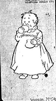
Riding high at the extravagant front of today's Golden Age of Reprints is Sunday Press Books, which attracted a lot of attention last year for its first publication, Little Nemo in Slumberland: So Many Splendid Sundays!, a very large (21" x 16.2"), very expensive ($120.00), 120-page 'best of' presentation of episodes from the famous 1905 newspaper creation of one Zenas Winsor McCay, who absentmindedly misplaced his first name somewhere on the road to fortune. Pursuing the "imperfect ideal" of vintage newspaper reproduction, Sunday Press struck a nearly perfect balance between refurbishing McCay's famous artwork, and preserving the off-white backing & slightly imprecise color printing of period technology. The result, presented in hardcover on fine paper, wowed many and sold more.

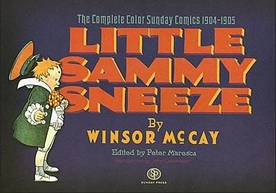
The publisher has since solidified its position in the comics world. Earlier this year it teamed up with designer Chris Ware for Sundays with Walt & Skeezix, a similarly deluxe sampling of Frank King's Gasoline Alley Sunday pages, obviously poised as a premium companion tome to publisher Drawn & Quarterly's ongoing, Ware-designed Walt & Skeezix dailies series. And now comes Little Sammy Sneeze: The Complete Color Sunday Comics 1904-1905, a comparatively budget-minded ($55.00), landscape-format (11" x 16"), 96-page hardcover, devoted primarily to the aforementioned McCay's second most famous newspaper strip to star a little kid.

Naturally, my first thought upon finishing the book was to present my thoughts as part of the unchallenged wave of prolificacy that is this column. Let's get right to it.

A COLLECTION OF FIVE THOUGHTS REGARDING THE FINE BOOK IN THE TITLE OF MY COLUMN TODAY:

1. Books, Unsurprisingly, Tell Stories

One interesting side effect to the sheer variety of vintage reprint compilations on today's shelves is that it's become easier to discern the distinct character of each. Today's compilations often come equipped with all sorts of historical supplements and bonuses, and often a particular design aesthetic - this is especially evident in collections of aged newspaper comics, where packaging and context can go a long way toward defining a 'tone' for the old material to ring with, if only through association.

Those Ware-designed Frank King books exude wistfulness and delicacy, bolstered by those dozens of silvery b&w photographs of family and landscape, while its essays emphasize King's sensitivity and devotion in matters both artistic and personal.

Fantagraphics' Peanuts books rely on muted cover colors, sporting reflective introductions by well-known personalities, the totality of which casts Charles Schulz's work in a nostalgic, gently melancholic light.

In contrast, Fantagraphics' Popeye hardcovers are tall, loud things with blazing dot colors and die-cut covers, as if each individual copy had been broken over the head of a small animal in preparation for the two-fisted comics fun rustling within. Eat your goddamned spinach.

But these are comprehensive projects, aiming to compile, in as perfect an order as possible, a large, particular span of a work. Sunday Press does not release that type of collection; their books excerpt from larger runs, and thus the very arrangement of the comics inside becomes a variable element of each book's character.

So what is the character of this Sammy Sneeze book? Simulation!

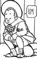
You see, this book doesn't just present a bunch of Little Sammy Sneeze strips. It also features the complete run of another, even more obscure McCay strip of 1905, The Story of Hungry Henrietta, along with selections from three additional, non-McCay strips: John Prentiss Benson's 1904-05 The Woozlebeasts, Gustave Verbeek's 1903-05 The Upside-Downs of Little Lady Lovekins and Old Man Muffaroo, and Verbeek's 1905-11 The Terrors of the Tiny Tads. Note the matching years - that's the key.

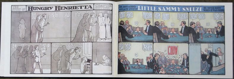
Not content to simply make its sturdy archival pages look like old newspaper clippings and match the appropriate period size (11" x 16" being about how one of these features would be read on half a broadsheet of 1905 funnies), Sunday Press is now trying to replicate some part of the action of reading old funnies from the New York Herald. One side of each of this book's pages contains a full-color Sammy strip, while the other side features a monochrome strip from among the four others, all of which might have actually been found on the other side of Sammy in 1904 or 1905, with all lack of color typical for a time period in which only half of the paper's Sunday strips got full benefits.

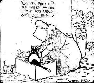
It's a novel approach, and also a handy way to fill out the book, given the restrictions of its feature presentation. Little Sammy Sneeze initially ran weekly from July 24, 1904 to December 9, 1906, with intermittent daily appearances occurring in the next decade, but the careful reader will have already noticed that this book only collects the complete color Sundays, which ran for the years of the title. Other Sammy installments, including the famous panel-breaking number seen in altered form up top (and dutifully pasted in Sunday form into the book's Introduction), are not included. Among the supplementary materials by the likes of editor Peter Maresca, McCay biographer John Canemaker, historian & McCay biographical fiction writer Thierry Smolderen, comics scholar Jeet Heer, ComicsResearch.org director Gene Kannenberg, Jr. and miscellaneous compilation regular Dan Nadel, it would have been nice if a concise history of the strip's publication vis-à-vis the book's contents had emerged.

But I'm willing to let some things slide in light of intuitive construction. The word Complete isn't the focus of the book; it's the effort made to bring the reader into the seat of the work's original primary audience, and there are some revelations that eventually rise through that.

2. Adults Are Merely Human; Children Are Monsters From Hell

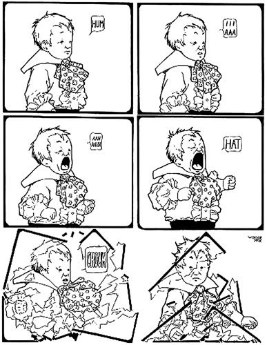
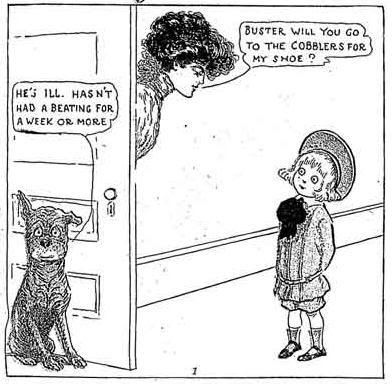
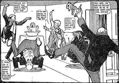
Here is how your typical Little Sammy Sneeze Sunday page goes.

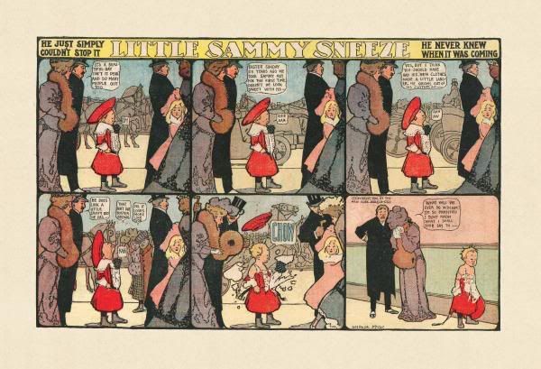
These old b&w images are typical for some McCay collections, as well as great websites like Barnacle Press, but be aware that the book is in lovely full color.

Sammy's strip is a one-joke affair.

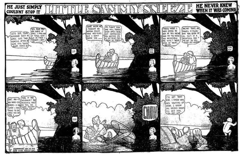
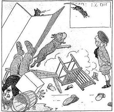
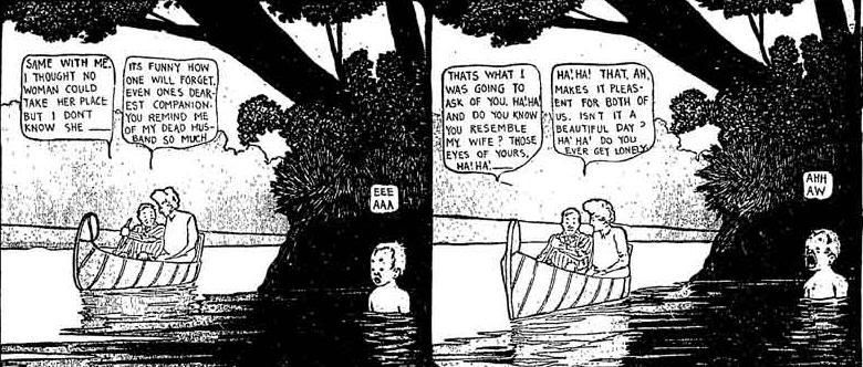
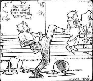
In most episodes, the first four panels depict people or creatures or devices milling around a scene, often fixed in perspective, while the titular foppish lad's sinuses grows more and more irritated. His mouth stretches enormously.

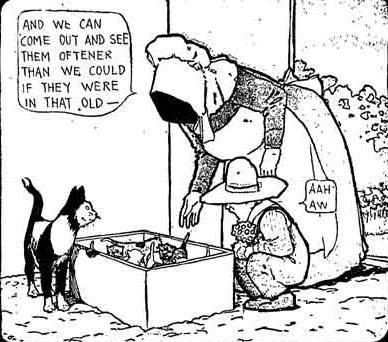
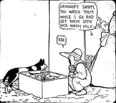
Every fifth panel is the same.

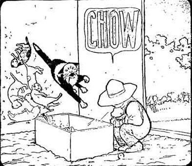
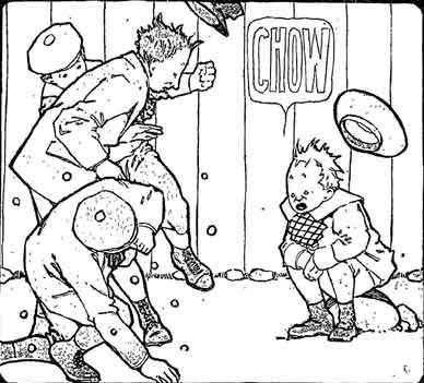
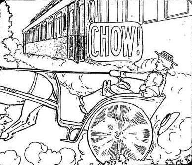
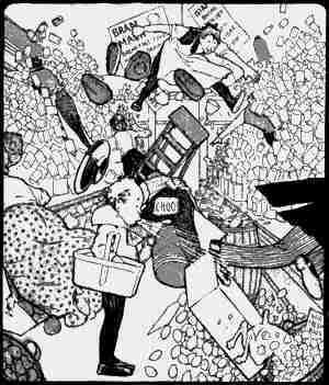
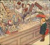
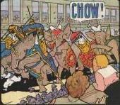
And each sixth and final panel contains some (usually rueful) denouement in which the pieces are put back together, often with Sammy getting a sharp kick in the ass for his troubles. Sometimes Sammy's sneezes are helpful -- foiling burglars or the machnications of that notorious, perhaps not entirely monolithic early 20th century villainy organization the Black Hand -- but usually his nose is nothing but ruin. They vary wildly in power, sometimes acting only to upset a little girl's tea party, but sometimes rocking a train with enough force that passengers demand to know if a bomb's gone off somewhere. Folks are perpetually stymied.

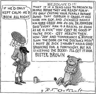
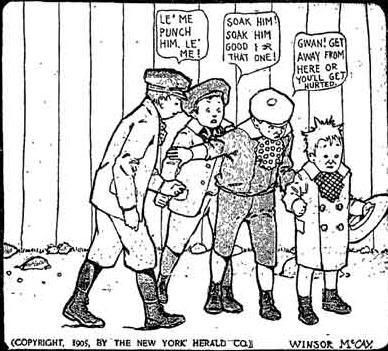
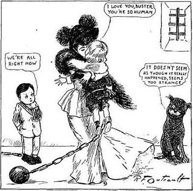
Therefore, as Kannenberg perceptively indicates in his supplemental piece, Sammy is one of an extremely popular character type among newspaper strip children of the time: the Horrible Demon (my title). It's a long and proud tradition, going all the way back to R.F. Outcault's Mickey Dugan -- the famous Yellow Kid -- and extending into the likes of Rudolph Dirks' Hans und Fritz antics, which started up in 1897, and still runs somewhere today as The Katzenjammer Kids. But the king shit miniature Satan of the time was another Outcault creation, the eponymous tot of 1902's Buster Brown.

There's a lot of particularly common ground between Buster and Sammy. Both characters are American-born children of well-to-do parents, indicating a break from the earliest child characters of US funnies, which tended to be poor, and not entirely assimilated away from their obvious immigrant heritage.

Their antics were supposed to be earthy, I guess, although they can carry some charge of laughter toward the impolite ways of the Other. Outcault, at least, couched his characterizations in terms of the rambunctious soul of Our United States, the Melting Pot, while some artists, like Dirks, actually were immigrants of the ethnic groups they focused on. But characters like Buster Brown brought that same spirit into the finer homes of America, mercifully lacking the labored dialect humor of preceding ragamuffins, and contextualizing their wicked behavior as not just a specific quality of an American class, but of childhood.

I like Buster Brown a lot. It's direct and funny, often beautifully drawn, and sometimes wonderfully ironic, a quality rarely associated with comics over a century old. It's not just that Buster misbehaves in a violent (if nominally good-natured) way, it's that each strip features a special moral, delivered in a large caption, in which the tyke resolves to take the week's lesson to heart, if often in a way contrary to typical moralizing.

But Sammy Sneeze is not Buster Brown.

McCay's literary and aesthetic values are plainly different from Outcault's. Sammy not only doesn't have control over his sneezes, he doesn't really have any personality at all. Actually, he doesn't even talk - all of the words out of his mouth are simple preludes to the gale-force means of expression indicated by his familial name (and yeah, his dad is Mr. Sneeze, his mom Mrs. Sneeze, etc.). This doesn't prove to be as much of a problem as you might think - not only does the nature of the strip's one and only joke require no verbiage on Sammy's part, but the character's lack of meaningful interaction with the world around him aids McCay's perspective on the character.

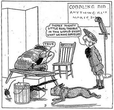
Canemaker makes note of McCay's use of fixed backgrounds as presaging his pioneering work in animated film (starting in 1911); I'd agree to an extent, but I think the technique works best in the context of the strip itself as drawing out the tittering nature of adulthood, or older children acting in measurably 'adult' ways. It's fitting that Sammy doesn't talk; he doesn't even seem to comprehend, which strikes me as far more reasonable a depiction than the mannered devilry of other naughty kid characters. His naughtiness isn't purposeful, or even 'realistic.' Instead, McCay draws our attention to the chit-chat of maturity by the activities of the non-Sammy characters, wandering around unchanging scenes. Taking a detail from the full strip seen above:

Some commentators have called McCay a weak writer, in contrast to his superb draftsmanship. I disagree - McCay's writing is stylized and idiosyncratic, and all those Oh!s and Ah!s do tend to grate after a while, but I think his work on this strip is appealing in its dilly-dallying rhythms, with word balloons often ending in incomplete sentences, and thoughts dropped across the span of dialog. It doesn't sound real, but it feels authentic.

More importantly, McCay establishes an environment that seems natural for every character except Sammy, who constantly plays the role of dull onlooker, until his inevitable sneeze upsets everything. It's tempting to read a political motive into this approach: Sammy as the lil' anarchist, deflating pomposity, smashing conformity, and frustrating bourgeois pleasure through absurd destruction. Maybe he went Dada once he grew up and the Great War hit?

But I don't think McCay's work quite plays that interpretation out. Rather, Sammy's surreal, constant reaction to McCay's 'realistic,' constant displays of activity seems more a sign of childhood lashing out comedically at adulthood.

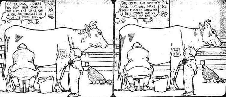
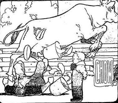
Unlike Buster Brown and others, Sammy doesn't want to cause funny trouble, he absolutely needs to, and his compulsion is always presented in terms of knocking down maturities, no matter how small. It could be a train coming to run him over, or a villain arriving to do him harm, or a show he's watching, or a parade, or other children having a formal party, or a classmate reciting a lesson, or lovers floating down a river, or someone showing him how to milk a cow - any way you slice it, for good or (more often) ill, Sammy sneezes to upset a world he cannot obviously understand.

Because how could he understand it? He's a little child.

And he's only a hellion in that he comes from a place the grown-ups (or wannabes) fail to grasp.

I'll be upfront: Little Sammy Sneeze isn't as funny a comic strip as Buster Brown. Most of the humor hits as soon as you see what kind of situation Sammy has wandered into this week - after that, it's all inevitable. McCay's lovely visuals are present too, of course; nobody of his period could quite draw large places in and out of motion like he could. But the repetition of the strip is beguiling, and it's a fascinating counterpoint to seemingly like-minded comics of its time.

3. Big Helps Out

Speaking of other strips of the time, the book presents alternative views on childlike action through its backup strips. My main reaction: thank heaven for large printing.

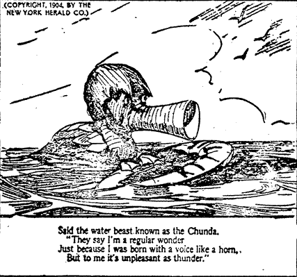
The Woozlebeasts, I'm sorry to say, is stone-dead boring. I suspect it'd be the same way at any size, but at least those authentic period proportions help Benson's draftsmanship shine a little better (and note again that the strips included in the book look nicer than what you see here). But it's a simultaneously dour and uninteresting thing, being a series of limericks about unfortunate or allegedly whimsical creatures, which are dutifully illustrated for your pleasure.

This doggerel wasn't particularly new to comics or children's literature, even in 1904 -- just one year prior, McCay himself had illustrated the deeply brow-furrowing Tales of the Jungle Imps to George Randolph Chester's poems -- but we're told (by Nadel, I think - the book's essay layout is kind of confusing) that Benson apparently managed to inspire a number of subsequent features conjoining verse and odd beasts, though I don't think any of them lasted all that long. The Woozlebeasts itself manages to end its run right in the middle of the book's selected time period, so we at least get to enjoy an olde tyme farewell strip.

We're also told that strips of this sort were commissioned as a salve to growing complaints of the ruckus predominant in the naughty kid strips mentioned above. Knowing this makes McCay's enlightened, admittedly gentler take on the tropes seem all the more skillful.

Verbeek's work comes off a good deal better; even his similarly-situated The Terrors of the Tiny Tads, only one episode of which is provided, seems more visceral and spooky and fun. And I'll say with total honesty that this large printing size has facilitated the first-ever time The Upside-Downs of Little Lady Lovekins and Old Man Muffaroo has ever worked for me. You see, it's sort of a trick strip - you first read its six panels as you normally would a comic, and then you turn the newspaper upside-down to read the strip again. All of Verbeek's art is designed to provide different, comprehensible visuals in both directions, for a total of 12 panels.

So, while in one direction you might see Lovekins and Muffaroo (a pair of storybook fantasy-type adventurers who appear to be living in sin, or in some mistress - sugar daddy arrangement) baking apples over a roasting clam...

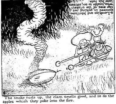
...the other direction sees Our Heroes using pikes to rip the eyes out of a giant serpent that's risen from the abyss.

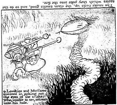
The effect is sometimes pretty dazzling, even at a reduced size, although Lovekins has always been a sticking point for me. That's not a hat, miss - that's a guy's legs. The trick is to focus right on her face, and try to forget a lot of her surroundings; Verbeek is pretty good with facial expressions, which goes a long way toward curing the awkwardness of his (highly ambitious!) concept. But that's not the sort of thing that registers unless you can see things really clearly, and you can only do that when the printing's very large. Which is to say, the size it was drawn to be read in.

How many other critical perspectives on older comics have been shaped by constrained perspectives? Isn't it a good artistic value to direct your work toward its mode of presentation? How many comics artists lost something across history due to changing standards? Under the assumption that 'bigger' only means 'more impact'? Books like this challenge such preconceptions.

4. Hungry Henrietta is Different From Just About Everything Else Winsor McCay Did, and Valuably So

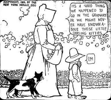
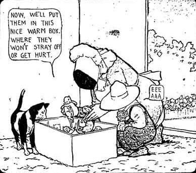
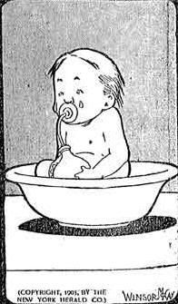
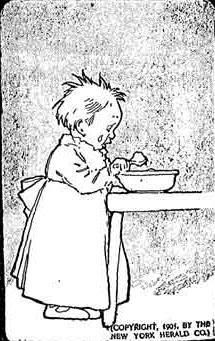
And then, there's The Story of Hungry Henrietta, the book's only sop toward the completest impulse. It's another McCay kid strip, this time an honest-to-god serial, presented (almost) weekly for 27 chapters, all of which are presented. The monochrome strip ran on the literal backside of the color Little Sammy Sneeze in 1905, and the two do act as companion pieces, in that the back work is also a one-joke strip about a kid with an odd ability: Henrietta, the protagonist, can eat. A lot.

But there are many differences, astonishing ones. Henrietta's strip is no less than the chronicle of her life; she's three months old in Chapter One, and ages three months with every subsequent installment (as McCay is wont to point out in-strip over and over again). Henrietta doesn't seem to have any strange abilities at first - the early chapters are pure domestic satire, with McCay presenting the continuing antics of a clueless clan of upper-class folks who don't know how to calm their infant child. Often, their capering causes Baby Henrietta to cry, compounding their confusion.

So they feed her.

If Little Sammy Sneeze's humor is front-loaded in merely seeing what situation Sammy is up for ruining, The Story of Hungry Henrietta's is practically latent. If you've seen one strip, you've seriously gotten the 'joke' in full. Every episode trudges not merely toward an inevitable conclusion, but through an equally inevitable setup, with Henrietta's parents acting in exactly the same hopeless manner, toward the same end.

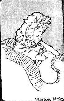
But then, a funny thing happens. As Henrietta grows, it gradually becomes apparent that her hunger has reached superhuman proportions. McCay begins isolating the child not only in a final panel of her eating, but in an opening panel of her seeking food. She eats a whole bowl of brandy sauce and gets silly. She devours fruit off a fancy hat. She rips into a beekeeper's equipment looking for honey, and gets stung. She even makes a color appearance in Sammy's strip, in which the boy sneezed a bowl of fudge into her face, and she picks it off and eats it right up. Her parents grow worried and disenchanted. Yet they can't cope. They're not prepared. She eats more.

By the time McCay is whipping up ominous panels of the angelic girl sitting shadowed in a cherry tree she's just been picking barren, the strip has wandered more into what's now called 'magical realism' than the knockabout comedy of Sammy. McCay does render the stories with his expected light touch, but there's a palpable undercurrent of sadness -- even horror -- to what's going on. And don't go expecting a resolution - Henrietta's story merely stops at age six and three quarters, despite the feeling that it's building toward something awful. Gosh, you think people didn't like it?

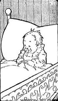
But even in 'incomplete complete' form, The Story of Hungry Henrietta draws attention to strengths that McCay is usually not known for. His human figure drawing, truth be told, is often rudimentary and lumpen, but the large size of this book reveals a keen command of Henrietta's body language, which communicates fear, cunning, shame, and the serenity of fullness, in lieu of many spoken words. McCay is also overtly satirical, as he would again be in his 1905-10 A Pilgrim's Progress, damningly criticizing the rearing mores of a class he belonged to. But he does it not only through gags, but cumulative build across many chapters, an eye-opening accomplishment for a man not well known for week-by-week pacing.

Maybe it goes even deeper. Despite her extravagant gorging, Henrietta never seems overly plump - McCay generally can't draw an attractive woman to save his life, but his Henrietta is always angelic in laying waste to foodstuffs. I suspect that's because the child is based on McCay's own daughter, much in the way a certain Nemo was based on his son. But then, what does that say about McCay, a well-off, famous success known for spending just as extravagantly as he earned? It could be that this story acts as self-critique as much as anything, giving form to lingering fears about raising a young child in the lap of luxury. And just as McCay's fantasies so often took terrifyingly large form, he could well have blown his personal concerns into a building Armageddon, with a gag-friendly touch.

I sure as hell don't know for sure. But the comic stands as perhaps McCay's darkest work, and a fitting compliment to his more famous strip in every way.

5. A Child's Life is Out of Control

Such is the greatest, if accidental benefit of this book - its simulation of 1905's reading style inadvertently throws a spotlight onto McCay's approach to his child protagonists. It's not the same approach every time - just as Sammy's body rages against the incomprehensible overload of the adult world in dazzlingly, surreal color, Henrietta grows into an unstoppable product of that same world's shortcomings in placid, slate tones. Let's not put too much emphasis on the colors -- after all, the Sammy strips not presented in this book saw an origin/return in monochrome too -- but we should remain appreciative of how they can flag McCay's portrayals of different aspects of a child's life.

I'd like to believe Sammy wouldn't hurt a fly, given his druthers, although McCay suggests that he's too young to have an internal life of note anyway. He instead reacts involuntarily in great, surreal, comedic waves, although we're left with the feeling that nobody is dreadfully harmed, and he'll maybe grow into a comprehending adult; whether that's triumph or tragedy is up to you. The scenes from his life are fit for the episodic format, as if bits of childhood fondly recalled, with each blast a different velocity to match the beloved situation.

But Henrietta is a child of serialization, and we therefore must accept the cumulative force of her ominous growth. She's as helpless as Sammy, but we can see the marks left on her by the adult world; her uncanny ability develops toward an endpoint we are not privy too. There is no indication that's she'll grow out of anything. Really, she'll grow in, her hunger growing larger and larger, with every unseen chapter. The indication is that we'll all see it soon enough.

What's even clearer, though, is the commonalities. Neither child is capable of taking their life entirely into their own hands... being children and all. McCay understands this helplessness, and recasts the fantastical humor of his young protagonists as reactions to adulthood, rather than actions toward adults. This portrayal of the world is also evident in the looming, shifting, unknowable spires and hues of another, far more famous serialized McCay work with a child hero, or even the temporary adult chaos of Dreams of a Rarebit Fiend, where all control is lost, all across the globe, for one night only.

Other, earlier strips were right in suggesting the mischievous potential of young children. But as authentic as literary characters as Buster Brown and the like might have been, they were still fashioned to the adult's perspective. McCay's nattering dialog suggests an understanding of adult ways, but his fantasy is primed as authentically childlike: helpless, curious, cradled, vulnerable.

The juxtapositions of this book, set down in natural size and authentic color, reveal these workings of McCay's. I wonder if those actual readers of 1905 made any subliminal note of these contrasts in their semi-similar morning papers. Well, this isn't a newspaper anyway. It's another worthy nugget from the Golden Age of today, an an especially edifying one through its construct. What relief! Like a bad sneeze fading into a lingering, cozy yawn.

Oy to the World, Part 2: Jeff Looks at the 12/19 Books.

Wow. Thank goodness things picked up there at the end.

MARVEL HOLIDAY SPECIAL: This year's story by Andrew Farrago and Shaenon K. Garrity had some really cute moments, like the jingle noises on Santa's Sentinel, but seemed forced in a way last year's story by them (the AIM holiday party) did not; the Loners story by C.B. Cebulski and Alina Urusov made me interested in characters I've never read about previously (and had really lovely art to boot); and the Mike Carey and Nelson story about a reporter asking Marvel characters about the meaning of Christmas was, like the Hembeck reprint and the Irving pin-up, well-intentioned filler. It's high EH, particularly at that price point, but it doesn't make you feel like a total chump for indulging in nostalgia and buying it.

MIGHTY AVENGERS #6: It's amusing to pick up a title you dropped six months earlier and notice you've only missed two issues, although probably not as amusing for Brian Bendis, Tom Brevoort and retailers: crafted to be a quick-read of an oversized adventure, the ending wouldn't have felt as lame, I think, if it'd come out on time. And it'll probably be pretty decent as a trade. But disconnected from the momentum of the story, watching a hairy guy play Fantastic Voyage, then the shock-ending from six months ago makes this extraordinarly EH. If I hadn't quit on the title first, I'd probably drop that even lower as these are the kind of hijinks that actually punish readers for buying periodicals and not waiting for the trade.

SHADOWPACT #20: First issue I've read since issue #2 (which I didn't much care for) and thought it was highly OK. Kieron Dwyer's art looks crude (deliberately so, I think) but always has a lot of vigor and the storytelling is clear. It's particularly well-suited here, as the Shadowpact are trapped in a grimy, devastated landscape. I also liked Matthew Sturges' economical script which set up situations (Jim's lack of faith in himself, Blue Devil's cliffhanger) and then resolved them neatly. The characters are straightforwardly drawn--maybe a little too much so--but if the book always has this much forward momentum, I could see its appeal. Like I said, highly OK, particularly for a new reader.

SUPERMAN #671: Had me at that first Superman scene, which I thought was a fine updating of the Silver Age "Superman does cool show-offy shit for charity" trope, and the rest of the issue had a similar "how can we take classic bits and update them?" vibe to it. I'm fussy, so I can't give it more than a high Good, but I thought it was quite fun.

SUPERMAN BATMAN #44: Not perfect, but I thought this issue did a nice job of setting up an interesting story in a dramatic way, and it even involves an event that previously happened in the title. I'm more than a little leery--I'm not 100% onboard with the characterization, and there's a lot of stuff you have to take on say-so because the DCU's history is now about as stable as Lindsay Lohan's electrolyte levels--but considering I picked up this issue with genuine dread and I'm now curious as to where the story may go next, I think it's deserving of a high OK.

THE ORDER #6: First issue of this I've read (although I picked up the first five issues the other week and haven't read them) and Kitson's art and Fraction's dialogue make for an appealing book. I'm kinda shocked nobody thought the black band running behind the interview panels wouldn't screw up the way people would read those first two pages (ditto for the panels at the bottom of that tidal wave spread, now that I look at it), but, y'know, it happens. It may be paced a bit too quickly--I'm not sure if I really like anybody, except the character interviewed in the first few pages--but that's far from a sin these days, and I assume the back issues will flesh the characters out. I'd call this pretty GOOD.

UMBRELLA ACADEMY APOCALYPSE SUITE #4: Not particularly big on action, but this issue was well-packed with great visuals, a brisk wit, and a ton of charm. As a bonus, the editorial page lists Rocketship owner Alex Cox and Cade Skywalker as heroes (I think Cox is a far bigger hero than Skywalker, even if Skywalker wasn't packing a hair-metal mullet). I may be falling under the sway of the book's brio, but I'm gonna go with VERY GOOD and hope the miniseries lives up to its potential.

WOLVERINE ORIGINS #20: Having not kept up with this title, I read the text page intro and, wow, what a weird metastatement Wolverine's origin has become: "The mutant Wolverine has spent a century fighting those who would manipulate him for his unique powers..." If you think of "those who would manipulate him for his unique powers" as the creators who are always retconning more convoluted backstory bullshit into his history, you could maybe make the case that Wolverine is an utterly post-modern superhero, a figure whose struggle outside the comic--to retain his iconic power and relevancy (his identity) no matter what is foisted on him--is more or less the same one he faces inside the comic. For that matter, that struggle taking place outside the frame is the same one faced by every superhero with more than twenty or so years under his belt.

Hmmm.

Anyway, in this issue, Captain America clenches his teeth and beats the shit out of Wolverine just like he did the last time I read this lousy fuckin' book. AWFUL stuff, and apparently how Steve Dillon wants to make a living which I find horribly depressing.

WORLD OF WARCRAFT #2: It makes sense. World of Warcraft has something like an estimated nine million subscribers: if you can get 1% of that base reading your book, you've got a very healthy 90,000 readers. But I can't imagine these people want to read about Walt Simonson's characters any more than I wanted to hear about somebody's fourth level Halfling thief back when I was playing D&D. I would think an illustrated "World of Warcraft for Dummies" where the "story" like a fancy, tip-filled walkthrough for noobs and munchkins, would probably have a better chance at gaining that audience. As a fantasy book illustrated in the Rodney Ramos manner, it's highly EH. As a tie-in to one of the great gaming successes of our times, I think it probably ranks far lower.

X-MEN FIRST CLASS VOL 2 #6: If the proportions of this were reversed, and it was a sixteen page story with Marvel Girl and Scarlet Witch illustrated by Colleen Coover and a six page "to be continued" story with depowered X-Men and attacking Sentinels, I would've given this sucker a high Good: Coover's work has so much charm, and Parker really seems to enjoy working to her strengths. Sadly, I gotta go with OK because I find Roger Cruz's art very dull and it's the larger part of the book.

****

And since this week has (nearly) all of my favorite manga:

DRIFTING CLASSROOM VOL 9: Just when I thought this book was getting a little off-track with its creepy mutants, it brings back the Lord Of The Flies backbeat and gives us some underage knife-fights and senseless life-taking territory wars. And, just because it loves us, there's also an appendectomy performed without anesthesia and giant carnivorous starfish. I read this at a breathless clip and think its VERY GOOD material in its startling, go-for-broke way.

GOLGO 13 VOL 12: Probably my favorite volume so far, as it's got Golgo versus his Russian counterpart in the first story, and a nifty piece of Southern exploitation trash ("Shit, they make you a Colonel for fryin' chicken down there.") in the back-up. GOOD stuff, although it looks like we won't be getting any of the truly batshit crazy stuff in this collection.

NAOKI URASAWAS MONSTER VOL 12: Like the previous volume of Beck, the only drawback for me is that the length of time between volumes means a longer time for my involvement with the material to ramp back up. While I appreciate the recaps and character flowcharts Viz uses here, it's just not the same: I can't imagine how engrossing it would've been for this stuff to unfold on a weekly basis. VERY GOOD material, though.

OTHER SIDE O/T MIRROR VOL 1: Jo Chen's artwork is so lovely, I had to pick this up. And while there are dozens of effortlessly sensual illustrations, both the narrative flow and the story itself are pretty amateurish stuff. It's not so much the lack of drama--on the contrary, for a few pages, it almost seemed like we were going to get Barfly as drawn by Ai Yazawa and I was downright giddy--as much as Chen doesn't have the chops to bring any depth to her lead characters and so give their struggles any resonance. I hope her talents continue to develop, but this deeply EH volume suggests she's still got a way to go.

PICK OF THE WEEK: IMMORTAL IRON FIST #11 and/or UMBRELLA ACADEMY #4. Good work by new(ish) talent. That's encouraging, isn't it?

PICK OF THE WEAK: I only brought down the CRAP hammer on FOOLKILLER #3, but that may be because I'm building up a slight immunity to Countdown related events.

So. Since next week's books come in on the 28th, and I work both the 29th and 31st, I think this will be my last "what the hell is he thinking" mega-roundup for the month. I'd like to figure out a proper way to work this kind of thing into my schedule, but posting may be a little spotty for the next month or two as other parts of my life get busy. Again, lemme thank everyone for taking the time to read these and throw in their two cents, and sorry I didn't get a chance to respond to everyone who commented in the detail they deserve (particularly in that thread where there were many fine comments from old-schoolers like gvalley and Heinz Hochkoepper). Hope everyone has a fine ol' set of holidays and, should I not get back to here before 12/31, a most excellent New Year!

Who are we to deny it in here? HIbbs on Todd: the movie

The good thing about Tim Burton's SWEENEY TODD: THE DEMON BARBER OF FLEET STREET is that it really works remarkably as a film -- I went in with a fair deal of trepidation over the changes I knew were coming, but virtually all of them worked pretty darn well. The cuts to the libretto that were made, were overall, pretty good -- I didn't really know if it could survive removing the (various) "Ballad(s) of Sweeney Todd", but, for the most part one didn't miss them. And while a couple of pieces were missed (I was sort of looking forward to the four-part disharmony of "Kiss Me/Ladies in Their Sensitivities"), it kicked the momentum of the story dramatically forward. I'm glad, of course, that Judge Turpin's "Johanna" ("Mea Culpa, Mea Culpa, Mea Maxima Culpa") was cut, because that's pretty much the one song even in the full version that I can live without. Other than that, most of the cuts were in Act II, with the "Wigmaker Sequence" and "The Letter" and "Parlor Songs" all excised completely.

Several other songs were pretty dramatically truncated -- "Green Finch and Linnet Bird" was maybe half of its normal length, "Pirelli's Miracle Elixir" seemed chopped down, and "The Contest" was as short as it could be (the original original version goes on and on and on, featuring BOTH a shaving contest, AND a tooth-pulling one, too!). "God That's Good" cut out all of the general public embracing the pies, as well as all of the business of bringing in the chair and "...I have another friend!" (Sweeney builds his own in this version, in songless montage), but again, they mostly got their points across fairly well. But the cut in length that probably bothered me the most was to "A Little Priest" which seemed like about 2/3rds its normal length, and THAT just seems wrong to me to cut by even a single bar.

But one things that the cuts do is basically remove all of the humor from the play entirely. To me, one of the greatest things about SWEENEY is that, yes, it is a astonishingly dark Shakespearean-level tragedy, steeped in blood and horror and madness, but it is also laugh-out-loud, slap-your-knee hysterical in places. Which, I think, is eminently necessary because murder and meat pies needs some levity to not have it be desperately bleak. But in this version, a lot of the jokes are either cut, or delivered so seriously as to dull them and render them dark, not funny.

The singing itself is pretty Eh -- everyone can carry a tune alright, but most of the actors (being actors and not singers) don't have enough depth or range in their voices to carry it off. When Depp first started singing, I went "Oh god, this is going to be a rough ride", but by the second time I started to throw away my preconception of the deep strong voice needed for the role because Depp's *acting* is so strong and nuanced.

Bonham-Carter, on the other hand, wow, she can't sing at all, sounding far too weak and whispery and "little girly" to really carry it off at all. And while Depp did hid best portrayal of Todd, Bonham-Carter seemed to me as if she was playing... well, Bonham-Carter for the most part, and I didn't get any real sense of Mrs. Lovett, as opposed to girl-who-looks-physically-right-playing-against-Depp-as-Romantic-Leads. I thought Bonham-Carter's line-readings were mostly wrong, and that she just rushed through too many of the proper shadings in "Worst Pies in London" or "A Little Priest". SHe's also (well, everyone is, really, with the sole exception of Toby) something like 10 years too young for the role. Interestingly, I thought on the few occasions when she went down an octave or two, it fit the songs and character much better, and she sounded as if she had a fuller, rounder voice. Her acting was fine though.

The orchestration was really excellent, with a much much larger orchestra than usually performs SWEENEY, though there's certainly times it swells way up to compensate for the less-than-professional singing. There's a couple of places where I swore I could also hear cuts between different takes as they tried to match Depp and Bonham-Carter up (I've read that they were in different studios to record and different times, and, I think there are 1-2 places where it seems a little obvious. There's a pretty glaring cut where Sascha Baron Cohen's Pirelli does that high note, and it didn't sound at all like his own voice (sounded like a woman's voice, honestly)

Cohen was really great as Pirelli (as I think we all expected him to be), and his singing was probably stronger than Depp's, but I think it was Alan Rickman's singing voice that surprised me the most for being stronger than I would expect for an actor-not-singer. His duet with Depp on "Pretty Women" is really very nice.

All of the kids were adequate, I guess -- the girl playing Johanna didn't seem to have any of the gothic haunted madness that I want to see in the character ("Green Finch and Linnet Bird" seemed more like "I like birds" than "Oh god, I'm trapped in this cage and I NEED TO GET OUT!", the latter being the way I like), and the boy playing Anthony seemed less than a sailor who has "sailed the seas, and seen its wonders", then someone who still had to finish their senior year in high school, but both sung well enough, and, anyway, their parts were basically shortened enough so that it didn't matter much either way. The one bit I did like was the physical staging of Johanna's near-miss at the end worked a lot better than it has in any staged version I've seen, but Anthony sort of just disappears about 10 minutes before the end of the movie and we never see him again.

Having an actual child play Toby is, I suppose, logical, but I still prefer the slightly-retarded-young-man model ala Broadway, because I think his youth really works against "Not While I'm Around" in a pretty big fashion, and it completely blows the humor of "Gentlemen, you're about to see something that rose from the dead. (woman's gasp of impropriety) On the top of my head!" when it's a 10-year old delivering the line. I also had a much harder time with Toby's finale (with 90% of it, probably wisely, being excised, really) with him being a kid, and there was a brand new bit of business involving Gin that I thought just didn't work at all either.

But even with all of my griping about the weak singing, and the casting, this still worked very very well as a movie -- without the humor, it's just a pretty terrifying thrill ride, probably darker than anything Burton has ever done before, and it zips along well as a film. Even Tzipora, who usually rolls her eyes at my love of Sweeney, and who hasn't seen it all the way through except for once 15-ish years ago on a lousy quality video cassette, was well entertained walking out of the theater, saying she enjoyed it. But she, like I, sort of has a hard time picture it doing well at the box office -- Depp fans who know him from commercial-ish stuff like PIRATES OF THE CARIBBEAN probably won't respond well to the gore and darkness of this; it's big-time NOT a movie that you walk-out of thinking "Merry Christmas!!"; and the studio has been, I think, both under-promoting it, as well as trying to cut trailers that underplay the fact it is a musical.

Overall, I liked it to at least call it GOOD, and maybe even VERY GOOD, but I also think the worst cut was losing its sense of humor. Having the cast all rise from the dead at the end to sing the "Ballad(s)" helped I think relieve some of the unrelenting darkness of the play that ending the movie on an image of the most blood-drenched version of The Pieta that you've ever seen just doesn't do. No, that was an arresting, disturbing image to end a powerfully made movie, but I want to see all of the corpses get up at that point and remind me that "To seek revenge may lead to hell/ but everyone does it and seldom as well"; somehow that makes it easier to bear.

Parenthetically, the single weirdest thing about the film was that before it started (but after the trailers, and the "Silence is Golden", and the THX logo) there was this 5-ish minute long thing that sort of just showed clip after clip of previous Burton/Depp collaborations. It didn't have a voice over, or a narrative and it went back and forth from film to film with no real rhyme or reason that I could see, and it felt like someone somewhere was trying to say "you liked these other films, please please don't walk out of this one". Strangest god-damn thing I've ever seen before a film in my life, and I honestly don't get it.

Either way, it's good, go see it -- then rent the DVD of the stage play (or, better still, go see the touring stage company) to compare.

What did YOU think?

-B

Oy To The World: Jeff Looks at the 12/19 Books (Part 1 of 2)

I mean this in the least Chicken Little-ish way possible, but Good Lord, this marketplace is glutted. I'm not sure how big or small a week retailers would consider this to be, but there are 80+ items that came into CE this week under the classification of "comic book" (and an additional 35+ items under books, mags & stuff). No wonder Hibbs talks in his latest Tilting about his newfound "I see dead trades" superpowers and how to best use them for the good of his store. The big two have their furnaces open wide and are shoveling terrifying levels of product onto the market, which may be fine for them--in the non-returnable market, they're at least making their money back--but I would think it would get harder and harder for retailers to make what could be considered profit. I mean, I'm not a retailer (and I'm not at all good with money, in fact) but how is a retailer supposed to take home any cash when each invoice grows bigger than the last? It's tough because the titles I like from the big two are frequently considered marginal titles (like Blue Beetle) to say nothing of all those lovely reprints they're putting out, but I find the situation as a whole is troubling.

Or maybe I hide my grumbling about how many comics I have to review in the guise of worrying about the direct marekt. I dunno.

ARMY @ LOVE #10: Veitch's pacing is top-notch; he's moving his characters along on their personal arcs at a decent clip; really, the only complaint is that now that he's put forward his themes of how warfare and entertainment are dovetailing, and how the corrupt boomers and the self-absorbed Gen X and Y'ers are each responsible for it, I'm not sure if he knows where to go with it. For a work of satire, it doesn't seem angry or outraged or, despite the every issue's naked boob, particularly titillated. It's GOOD work but I feel it's missing the potential to become something greater, to take the sort of risks a more impassioned--and less mature--artist might make.

BATMAN & THE OUTSIDERS #3: I can kinda/sorta see the rationale for the issue--two of the more prominent members of the old Outsiders team are now in the Justice League so have them show up here for some insta-conflict--but the results are the standard "we're going to talk/now we're going to fight/well, we're back to talking, we're all on the same side, aren't we?" set of scenes that make me think all superhero comic book writers grew up with alcoholic parents. Julian Lopez's art is pretty (and keeps the cheesecake out of the fight scenes, which is a plus) although the characters' acting is a bit broad. I guess if you can swallow the conceit of the issue--which I couldn't, frankly--you could go with a low OK. Me, I'll take the EH road.

BIRDS OF PREY #113: Apart from the last three pages where Superman acts like a judgmental dick for no good reason, I liked this: I can't really tell if Nicola Scott can do action scenes yet, but her characters look great and "act" well, and McKeever has all the main characters' voices down. The ending was overwrought, and a re-read shows that maybe the page-turns were a little forced, but I'd go highly OK for this, despite the ending. I'd like to see next ish.

CAPTAIN AMERICA CHOSEN #5: I feel sorry for David Morrell here--whatever reason he had for this mini, it seems utterly moot in light of the current Cap storyline. The whole thing looks and feels like something that was supposed to come out in the John Ney Rieber/Cassaday "relevant" era (if you can eight months an era). Although, honestly, I wouldn't have liked it then, either. I'll go sub-EH out of pity (and respect for a guy who's written some bitchin' action novels) but it's not good at all.

CATWOMAN #74: That cover hurts my neck just to look at it. Seriously, Adam Hughes, if you're going to put Audrey Hepburn's head on Pamela Anderson's body, at least pretend there's a spine connecting them. Inside, the action scenes alternated between dynamic and a bit confusing, the plot has a few bits I can't buy, and Calculator's whole "if I'm not back at my computers in an hour, the city will lose power!" scheme for protecting himself is pretty lame (and plot-convenient). I wasn't crazy about the ending either, so I think I'm going with a high EH on this one. It had its moments, though.

COUNTDOWN ARENA #3: That bit where bald Superman grabs the heat vision of Dark Knight Superman and Red Son Superman and uses it to clonk their heads together (because the heat vision is still coming out of their eyes) is such a dramatic misunderstanding of how a particular power works--it's like if you read a Fantastic Four book and The Thing pulled rocks off his body and threw them at people--I was rendered giddy at the dopiness of it all. Most of this train wreck isn't nearly as entertaining (although there is one panel where one Wonder Woman appears to put her foot through another Wonder Woman's uterus), just mindless and messy in an AWFUL early 90s Image book kind of way. However, I hold out hope that next issue someone will grab the speed lines coming off the Flash and garrote somebody else with them.

COUNTDOWN RAY PALMER SUPERWOMAN BATWOMAN #1: A story so intricately constructed it needed two writers, four pencilers, and six inkers: The Challengers go to a planet where everyone's gender is reversed and Wonder Man and his army of amazons get their asses kicked for twenty pages. That's it. And while refreshingly free of cheesecake, isn't that the only thing that would've made this interesting? There's something dishonest about making a planet where all the DC Heroes are Heroines and not then fucking with a fanboy's complex internal relationship with his or her favorite superhero (I'll admit I thought female Aquaman was really hot, for what it's worth). I mean, what's the point otherwise? To point out how ragingly sexist the power line-up of the DCU actually is?

To be fair, there was something almost Silver Age about this issue's execution--it finds each new iteration of reversed gender fascinating for its own sake, the way a Mort Weisinger book would--and that's kinda charming. But because this book exists for absolutely no other reason than to bilk money from the Countdown completist, it's really just a cynical cash grab which is an AWFUL thing to be.

COUNTDOWN TO FINAL CRISIS 19: I gotta give it up for colorist Pete Pantazis--he assigns a pallette to each set of characters which makes it easy for the reader to follow the scene changes quickly. Also, I think the reason I initially thought the art was the best in this issue I'd seen was the extra little touches in the scenes with Piper and Trickster (Piper's glowing eyes, the light reflected in the water). Apart from that, the only thing that struck me about this issue is that maybe Paul Dini's secret goal on Countdown is to make the second season of Lost look tightly constructed by comparison. Certainly, I cared for the characters in Lost for a lot longer than any of the characters here. Mr. Pantazis brings this up to a proper EH.

DETECTIVE COMICS #839: In most of the panels, Batman looks like his lower jaw is unhinging so he can swallow a field mouse. Also, there's a great few panels where Rolbin and Nightwing are up on a cliff watching Batman fight and Nightwing says, "Everyone's concentrating on Bruce and Damian, but those monks need help, too. Alfred...?" And the next panel is Alfred with a "what the fuck am I doing here?" face beating on a Ninja and saying, "Say no more, Master Dick!" Comedy. Gold. I can only wait for future crossovers where everyone sits back and has the hired help do everything. ("Hey, Alfred, we wouldn't Bane to make off with the Star of Carpinthia, would we?" "Say no more, Master Dick!") I'm sorry, but I thought this was AWFUL.

EX MACHINA #33: I gave up on this title quite some time ago so I have no idea if every issue is as crazed as Mayor Hundred receiving an exorcism from the Pope even as Russians are trying to force him (the Mayor, not the Pope) to commit murder. But if so, I'm picking up the back trades pronto. And that double-paged spread of Hundred's religious vision bumps this issue up to a high GOOD all on its own. I worry that maybe Vaughan's lost control of his book's tone, but considering I found that tone pretty dull, who cares?

EXILES #100: Although very, very, very cheap, there's something kind of clever about having the last issue of Exiles reprint the first issue of Exiles, which ends on a cliffhanger so the dutiful reader can then pick up the second issue of Exiles, and keep the wheel of comic book nerd turning and turning...As for Claremont's story in the front of the book, it does pretty much what you'd expect and writes out all of the original characters (except Morph) so he can regale us with cross-omniversal slash fanfic featuring all his favorite characters. I'm going with AWFUL, because Claremont's story was a mess and the reprint is actually a punishment to the faithful reader/collector who's been following the book since the beginning. Sad.

FOOLKILLER #3: Foolkiller takes place in on Earth Max, a world exactly like ours in every detail except people have no bones whatsoever, and a guy with a sword as thin as a riding crop can slice off a man's arm with no exertion whatsoever. You know this book is going to end up in a quarter bin somewhere and eventually end up being read by an impressionable eight year old and scarring them for life but, apart from that, this book serves no good end whatsoever. CRAP.

IMMORTAL IRON FIST #11: Continues to blow my mind with its mix of clever dialogue, quality characterization, crazy-ass ideas and gorgeous art. VERY GOOD stuff and I hope the team stays on this book for as long as possible.

INCREDIBLE HULK #112: As you probably know if you've been following me through December, I missed World War Hulk altogether, and based on this issue, I'm sorry I did: I liked the characters of Amadeus Cho and Hercules (although Herc looked great but sounded like Keanu Reeves in a few too many places); thought the mix of classic mythology and modern continuity was pretty keen; and the art was just really damn lovely. But there's another element to this issue that makes me wonder about WWH--the big ol' bait and switch. I mean, this issue is not a Hulk comic at all, unless (and, frankly, even if) you count the presence of a supporting character that's been in the title for less than a year.

Weirdly, although I've never given two shits about comic book completists, those guys who shell out money to have every issue of a book's run no matter whether they read it or not, I feel they're being horribly mistreated by the direct market as it stands. Their reward for their character's recent popularity (and Greg Pak's reward for steering the character so well) is to have to buy issues of the book that have nothing to do with the character they're collecting, while Jeph Loeb and Ed McGuinness relaunch the character in another title that they'll also have to buy.

Anyway, it's a GOOD issue, but it's a crap way to treat customers and retailers, and sooner or later they're going to stop sticking around for it.

JUSTICE LEAGUE OF AMERICA #16: The first story is a big lead-in to another book you have to buy for this book to make any sense, and the back-up story has no impact unless you remember two Teen Titans stories and is a lead-in to another book you have to buy. See what I mean about mistreating customers and retailers? At least the book allowed me to coin a new term: the "done in none" where one issue is self-contained but serves no purpose other than to sell you other books. AWFUL in that regard, but EH overall.

Okay, that's the first part. I'll be back tomorrow (or sooner) with the second.

Mind the oranges, Marlon: Douglas looks at 2000 A.D.

I got my first look at the weekly British anthology series 2000 A.D. sometime around 1980 or 1981, when Mile High Comics had a "five bucks for ten randomly selected British weeklies" special--the issues I got included a couple of the Judge Dredd stories that Brian Bolland drew, and I was pretty impressed, especially by how tightly constructed the stories were. With only five or six pages to an episode and at least five stories in each issue, there was a lot happening in very little space. In 1982, I got to visit England, went to Forbidden Planet in London, and bought a pile of 15 or 20 recent issues (excuse me "progs"), in the 250-275 range. This time I was riveted: the enormous, roaring Apocalypse War storyline was going on in "Judge Dredd," and there was also Alan Grant and Ian Gibson's "Robo-Hunter," Massimo Belardinelli's totally silly artwork for "Ace Trucking Co.," Dave Gibbons occasionally popping in to draw "Rogue Trooper"... I read them over and over, and after that, I made a special effort to find stores in the U.S. that carried the series.

It may be hard to imagine how exciting 2000 A.D. was in the early '80s if you've only read individual series in collections, but it was usually at least 3/5 awesome. And it kept getting better and better over the next few years, especially after Alan Moore started writing a bunch of serials--"The Ballad of Halo Jones," "Skizz," "D.R. and Quinch." Series I hadn't liked much at first, like "Nemesis the Warlock" and "Strontium Dog," started to grow on me. Even the lamer stuff had its charms--"Harry Twenty on the High Rock" was a by-the-numbers defiant-prisoner story that just happened to be set in outer space, but it had some nice art from Alan Davis. ("Sláine" never did much for me--somebody got sword-and-sorcery in my SF comic!--but I grudgingly accepted it.) And "Judge Dredd," usually written collaboratively by John Wagner and Alan Grant in those days, was always a treat. The setting was much sharper satire of American culture than I noticed at the time, and their Dredd was a fascinating character: a despicable hero, unutterably brave and devoted to his city but also an inhuman fascist.

In retrospect, 2000 A.D. had probably peaked by around 1987 or so, but it didn't decline quickly--there was Grant Morrison and Steve Yeowell's "Zenith," some really nice Simon Bisley art on the still-not-my-thing "Sláine," amusing weirdness like Peter Milligan and Jamie Hewlett's "Hewligan's Haircut," Garth Ennis and Mark Millar cutting their teeth. And Dredd, semper Dredd. By '92, there were signs of decline, like a Moore-less sequel to "Skizz" and updated callbacks to not-exactly-thrilling early series like "Flesh"; by the mid-'90s, I realized that it had been a good long while since there'd been a new series I'd really liked, but Dredd--once again written by John Wagner--and the occasional Morrison/Millar serials were good enough to keep me seeking out the series as it showed up in the U.S. (usually in clumps of four or five weekly issues at a time).

I finally stopped buying it a few years later--Dredd usually still delivered the goods, but the now-full-color-and-glossy 2000 A.D. Weekly had gotten awfully expensive in the U.S., and the "Nikolai Dante" and "Sinister Dexter" serials kept going and going and going and never caught my interest. But I still check in every year or so, when they published a special issue. And when the Complete Judge Dredd books started appearing, I snapped them up--the first few years' worth are pretty dodgy, but after that, they really hold up.

This brings us to Prog 2008, published last week--not the 2008th issue (this week's issue will be Prog 1567), but the end-of-2007 special. It's 100 pages long, with a bunch of features, but what's particularly interesting about it is that it's the first issue that Clickwheel is offering for sale as a downloadable PDF; each issue will be available for download a week after it comes out. Which is to say: it's in a time-frame and a format more sensible than any of the major American comics companies have yet offered.

The lead story is a Dredd Christmas special, written by Wagner (who's been writing the series on and off for the last few years), and it's built around a character moment that doesn't quite scan to me, since I haven't been following Dredd lately--but at least it makes me want to find out why it's so important "to put the mutant question to another vote." Beyond that, there's the first episode of something called "Shakara the Defiant," which has rich, intriguing art by Henry Flint (entirely brown, black and white, except for a few flashes of bright color), and a totally incoherent story; the first episode of "Kingdom: The Promised Land," which I should've given up on as soon as I saw that the post-apocalyptic barbarian hero who looks like Cable is called "Gene the Hackman"; a pretty but dull Nikolai Dante quickie; a beautifully rendered (by D'Israeli) black-and-white piece called "Stickleback: England's Glory" whose plot I might have found comprehensible if I'd read earlier installments; a Sinister Dexter one-off, arguably a little too conventionally nicely drawn for its jokey tone, that's effectively about what a one-note gun-for-hire cliché that whole series is; and an episode of another series that's apparently been running for a bit, "Caballistics, Inc.," that has the look of old-school 2KAD high-contrast black-and-white, but takes ten pages to accomplish what would once have been done in four. Finally, there's a Strontium Dog story, by Wagner and Carlos Ezquerra (with wretched computer coloring); it's fine, and I always like seing Ezquerra's work--he's been drawing for 2000 A.D. since the beginning--but Strontium Dog never had a sense of forward motion like Judge Dredd, and it's an exercise in nostalgia at this point.

So is a lot of the non-story material this issue. A few pages are devoted to "Great Moments in Thrill-Power," new illustrations of memorable bits from the past: the apparent suicide of Dredd from #262, the Angel Gang from #158, a nice Bryan Talbot drawing for the Nemesis serial "The Gothic Empire" from #387-406. There's a feature where fans are asked for their favorite 2000 A.D. covers. They name progs 5, 85, 112, 216, 230, 406, 469, 473, 620, 669, 686 and 883--most of them in that 1981-1990 sweet spot, none after 1994. (Also worth noting, on 2000 A.D.'s own site: the list of readers' twenty highest-ranked stories from the history of the series. Aside from three Wagner-written Judge Dredd serials, they're all pre-1993.) In some sense, it's kind of nice to know that other people agree with my sense of 2000 A.D.'s golden age, but it's depressing to think that the last 15 years' worth have produced so little of note.

The art in Prog 2008 is better than it's been the last few times I've picked up an issue--in particular, I'm going to be looking for more of Henry Flint's work (his Omega Men series wasn't nearly this cool-looking)--and reading the Dredd story made me want to catch up on the last few years' worth of Wagner's stories, at least. But I can't give this more than an Eh, because there's nothing else I want to keep reading--the delicious hypercompression and barbed comedy I associate with vintage 2000 A.D. isn't there any more. Tweaking them for their title isn't a new joke, but the fact that they're stuck with it suggests what's gone wrong: their aesthetic once implied the looming future, and now it's stuck in a past that's still sort of close but getting farther away, week by week.

Diana Goes Digital #1: Baby Remember My Name

What better way to kick off this series than by featuring a webcomic about webcomics? Kristofer Straub's CHECKERBOARD NIGHTMARE lays it all out in the very first strip (which doubles as a cast page): Chex is a cartoon character obsessed with webcomics. He wants to go all the way to the top without investing any long-term effort or talent. Since this shake-and-bake strategy brought about the Great Boy Band Epidemic of the early '00s, it's hard to argue with his logic. Unfortunately for Chex, all he's got going for him is a short attention span and a knack for plagarism. Fortunately for us, that translates into a brilliant comedy that follows our hero's hilarious schemes.

CHECKERBOARD NIGHTMARE has a lot going for it: it's based on a simple four-panel formula where the first three panels set up the punchline and the fourth panel delivers, and this runs on a daily basis for five years, but even Straub's most repetitive gags (ie: Vaporware's choking fetish) never cross that line where they stop being funny. His style of humor is sophisticated without being exclusive, and that's important to me as a reader because I don't see the funny in fart/poop jokes, but the other end of the spectrum can come off as horribly pretentious.

I think the key to Straub's success, the reason why CHECKERBOARD NIGHTMARE is so entertaining, is his understanding of the principles of balance: just when you think you're getting tired of the done-in-one jokes, a whole storyline pops up about Chex's #1 Fan (there is no #2 Fan), or a send-up of cop-based action series, or a glimpse of Dot's ill-fated singing career. And not to spoil the ending, but let's just say Straub makes an astonishing use of continuity during the series' climax.

This strip is also unique in that, while it heaps satire on specific webcomics as well as the conventions of the medium itself, it's also a fairly educational tool. It's part of the strip's duality, a rather clever trick Straub is playing: every strategy or gimmick Chex fails to appropriate has succeeded elsewhere, whether it's using insult humor (SOMETHING POSITIVE), joining a popular webcomic group (Keenspot, Graphic Smash, etc.) or using a "safe format" to attract wider demographics (GARFIELD). These tactics don't work for Chex, largely because he misunderstands why they're supposed to work (and that, in turn, goes to the core of the character's comedic tendencies), but they're the foundations of many other popular series.

So in reading this EXCELLENT series, not only do you come away with a smile, you might actually learn a few things about webcomics too.

A few technical notes to wrap things up: the main CHECKERBOARD NIGHTMARE series ran from November 10, 2000 to November 11, 2005. Though Straub released a few sporadic strips after the big wrap-up, they were mostly topical done-in-one gags. According to the FAQ, the series has no regular update schedule - prior to its most recent August 31 update, the series was last updated September 1, 2006. Straub has since moved on to STARSLIP CRISIS, another EXCELLENT webcomic I'll probably be reviewing at a later date. The archive is conveniently ordered both chronologically and by storyline, making for easy navigation. The strip is primarily in black-and-white, though Straub switched to color during its final year.