Let's see if this image posting thing works: Graeme also reviews something from 8/8.
/What is it about Grant Morrison and JH Williams? The two of them get together, and all of a sudden, the pop thrills get dosed with feelings of dread and portentiousness. Take BATMAN #667, for example; up until this point, there's been a devil-may-care feeling about Morrison's Batrun - the idea that, no matter what death-traps may show up, it's not to be taken too seriously and everything will end up fine in the end. But now that Williams has appeared for the first of three parts of "The Island of Mister Mayhew," it all seems much more dangerous and grim. Which isn't to say that it's not enjoyable, because it is - but there's such a change of tone that it's somewhat disconcerting to the few of us who were enjoying what we'd previously seen...
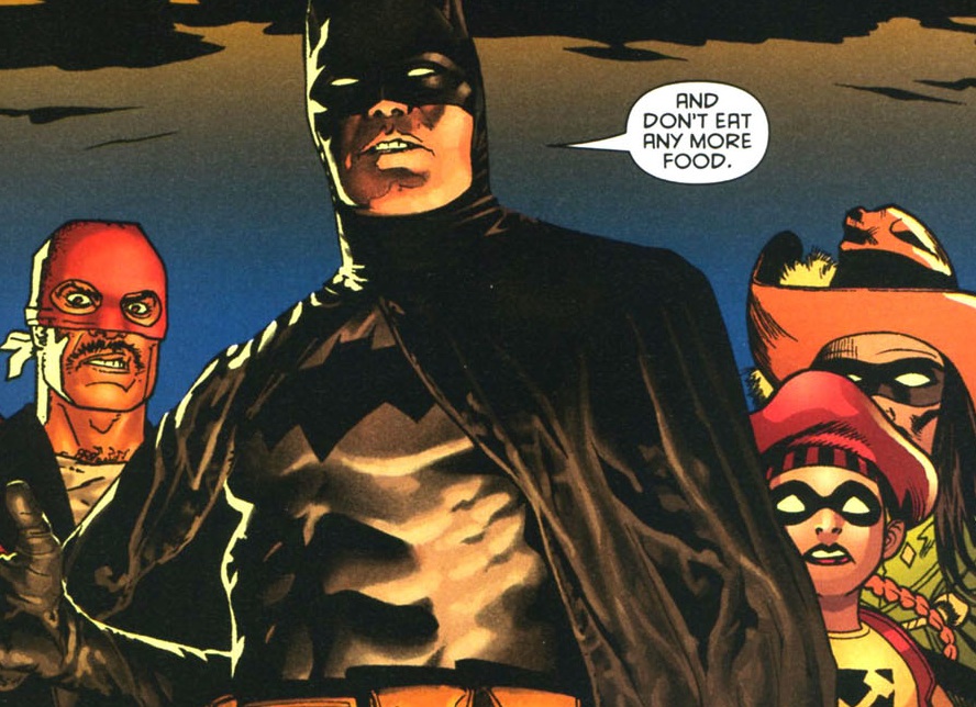 The real star of the show here, though, is JH Williams and the amazing work he puts in here. Even if you can somehow ignore his sense of design - which is pretty tough, considering some of the pages he puts in here (His old school opening double-page splash, with the logo contained within a Bat-icon isn't even the most eyecatching one on the issue - the hand-shaped panel with exploding plans gets my vote, instead) - this would still be one of the most visually impressive mainstream books of the year based on the different art-styles Williams appropriates for the different characters; seeing him do perfect versions of Chris Sprouse's line, Howard Chaykin's, or Ed McGuinness's would be worth-seeing on its own, but to see him manage to mix those styles not only into the same story, but the same panel is pretty damn great.
Don't get me wrong - This would still be worth reading even if Andy Kubert or whoever was drawing it, but it's the artwork instead of the writing that raises it from a "If you like Batman, sure, go ahead" to a Very Good must-see.